
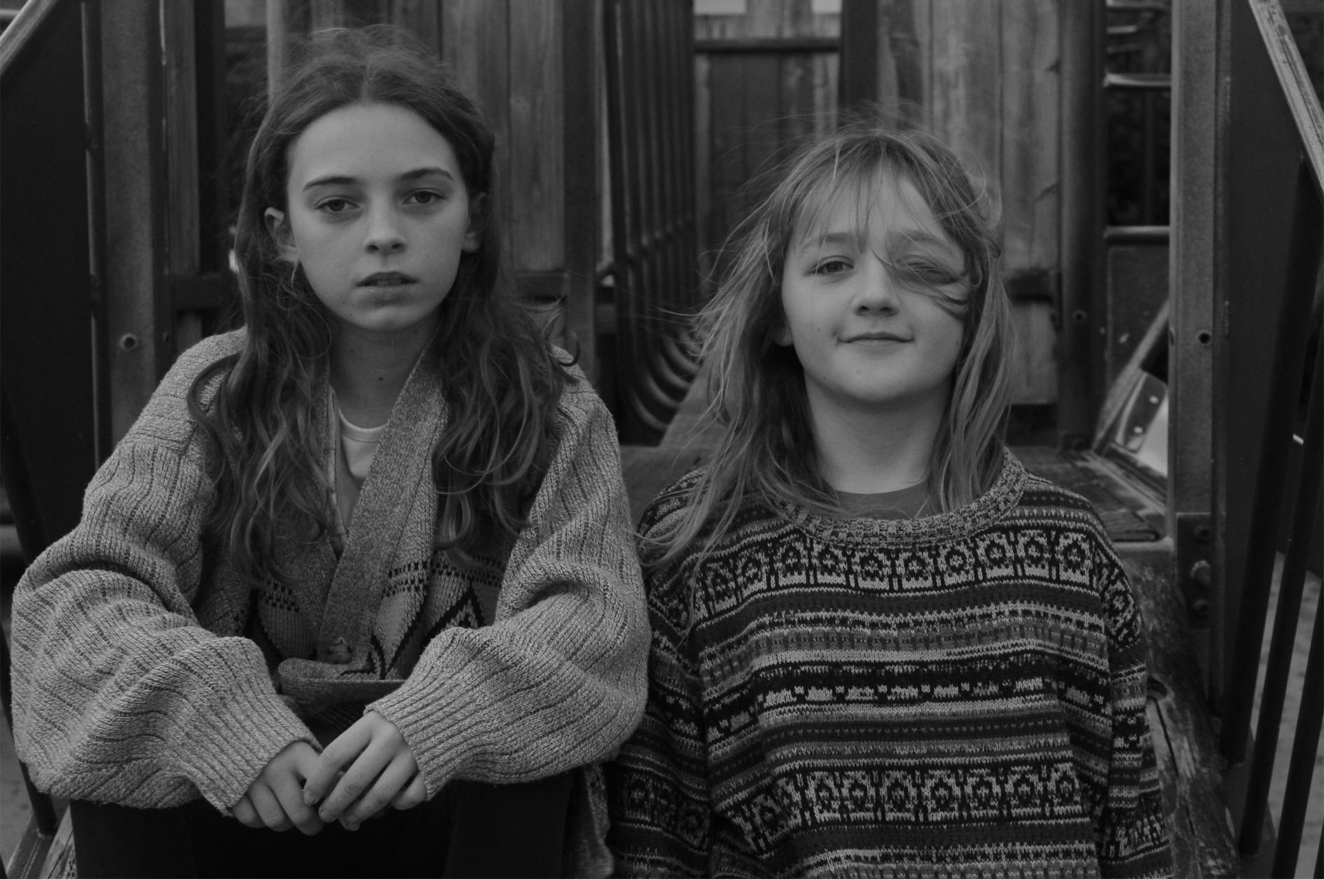
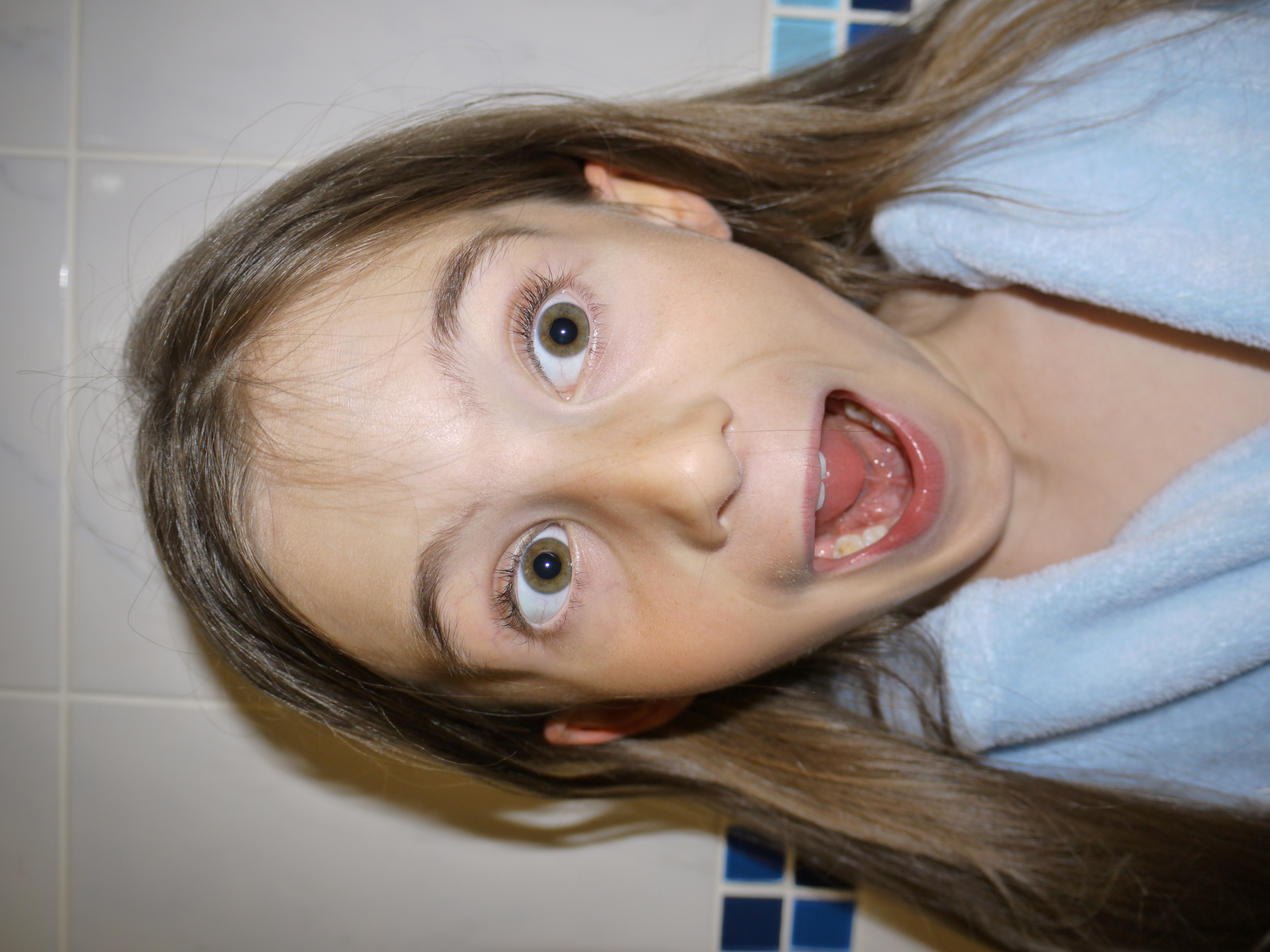
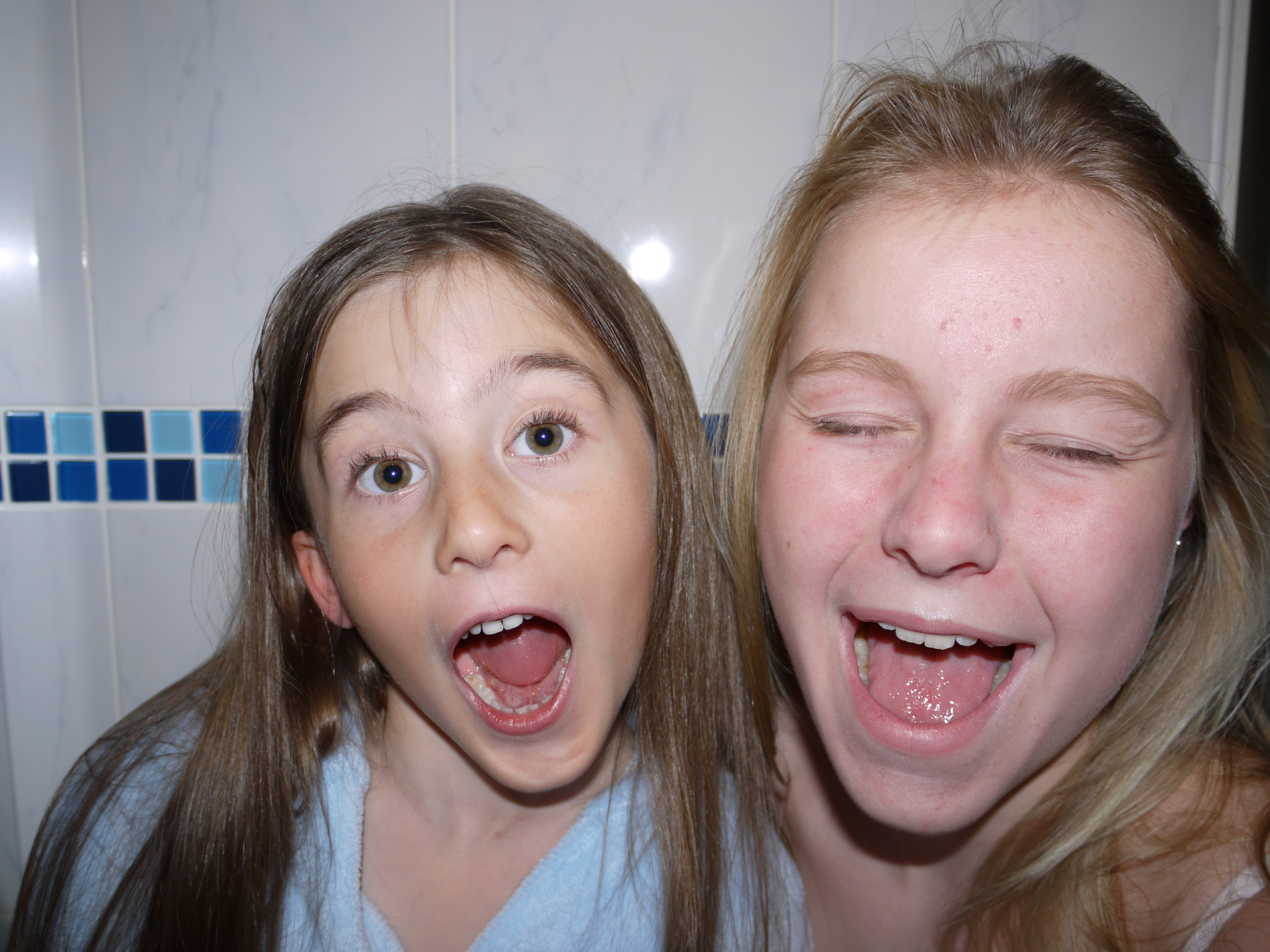
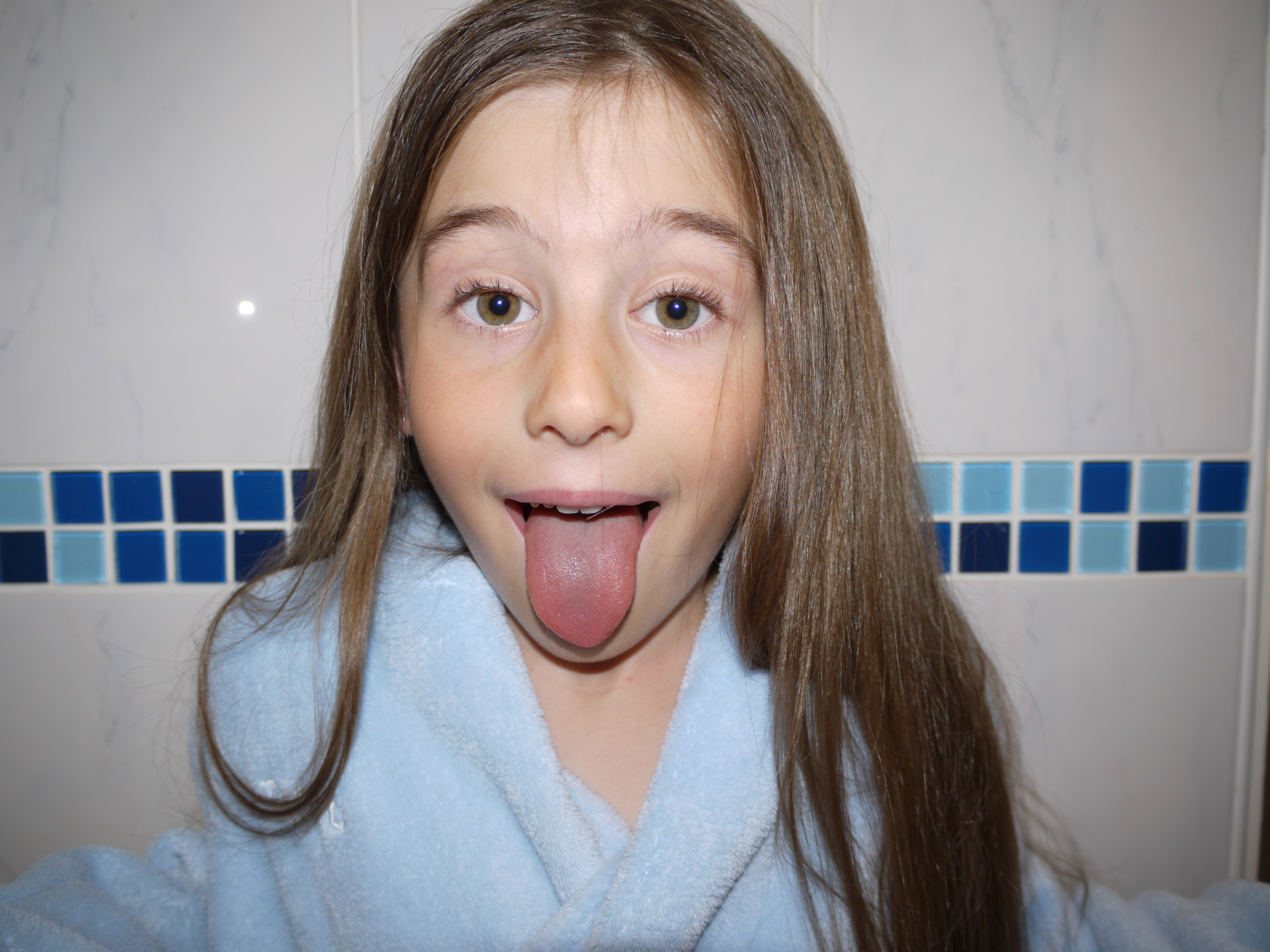
ACTION PLAN:

I am particularly inspired by both Elaine Constantine's work, especially her concept of focusing on the youth culture's social interaction and Jim Goldberg's work. Therefore I am going to base my photo shoot on a teenagers social interactions among their friends. I want to especially focus on their careless and carefree attitudes and behavior. I don't want to completely stage my shoot as I want my images to look as natural as possible. Therefore, I am going to photograph my friends just hanging out and will casually be taking photos spontaneously, without them fully realizing and being able to pose themselves properly. I will be using a cheap Boots disposable camera because I feel that you take more spontaneous images with them, which have a more natural care-free look and feel to them. I will be using the natural lighting of the room however I will mainly be using the flash on the disposable camera to ensure that my images are clearer and easier to see.

Once my images are edited and printed out on A4 paper, I will rework into my images by adding text and outlining some of the people/objects in the photographs. This idea came from Jim Goldberg's work. I will ask the subjects what they want to say about the image and add that text onto the image. I will also add the time the the images were taken onto the photographs. I will hand-draw and hand-write onto the images.
Monthly Archives: January 2019
Filters
Photoshoot 2 + Editing Ideas
Action Plan
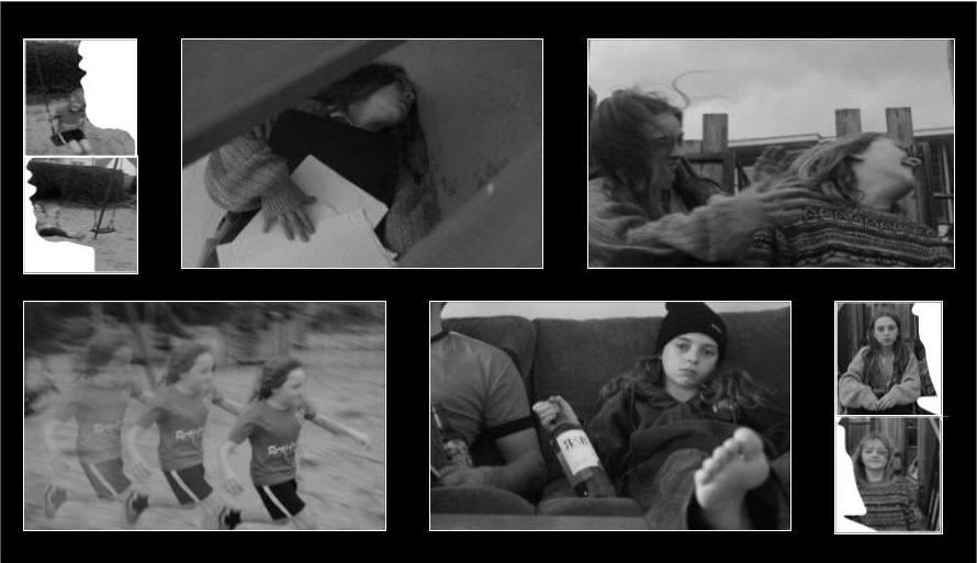
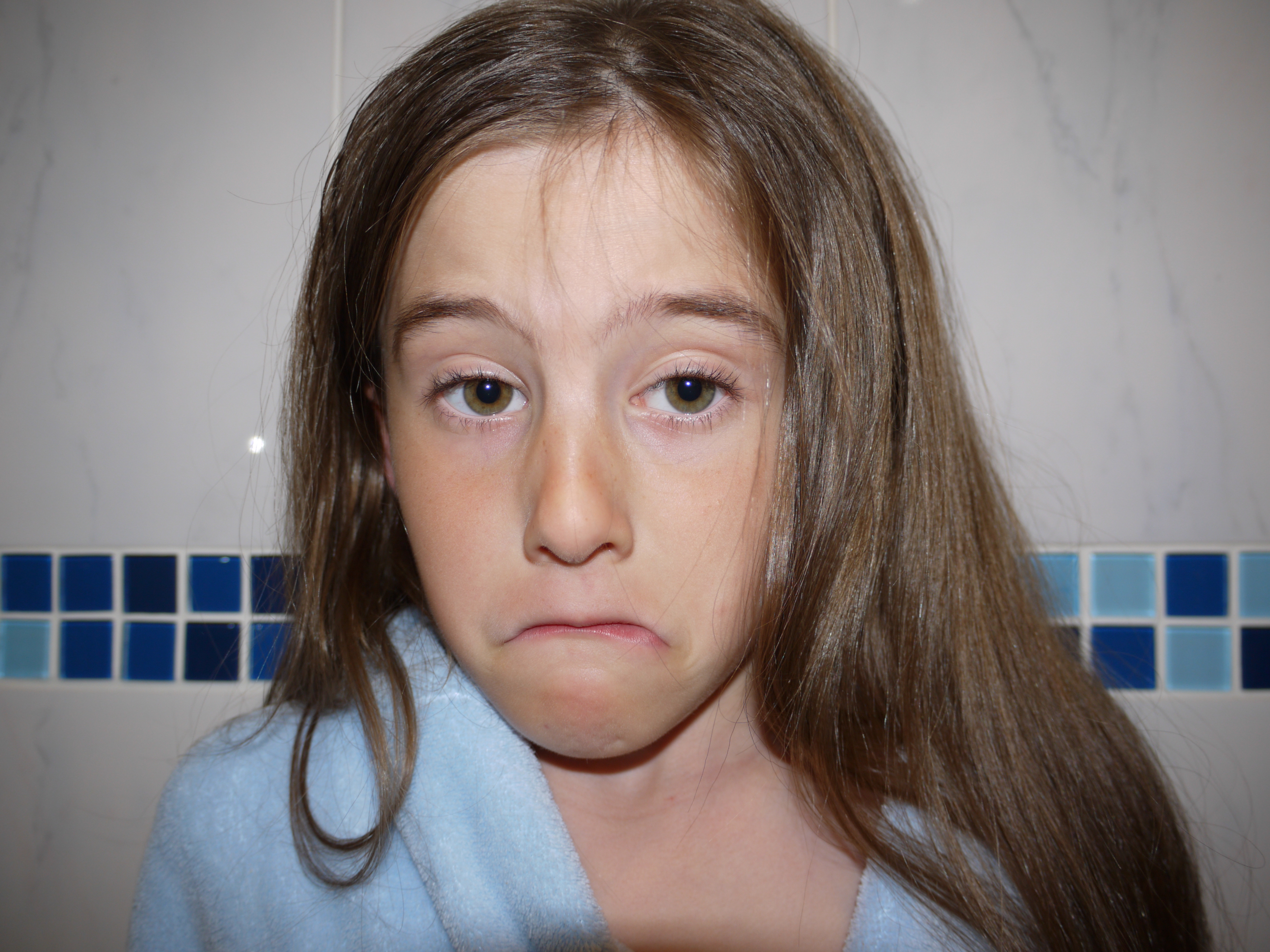
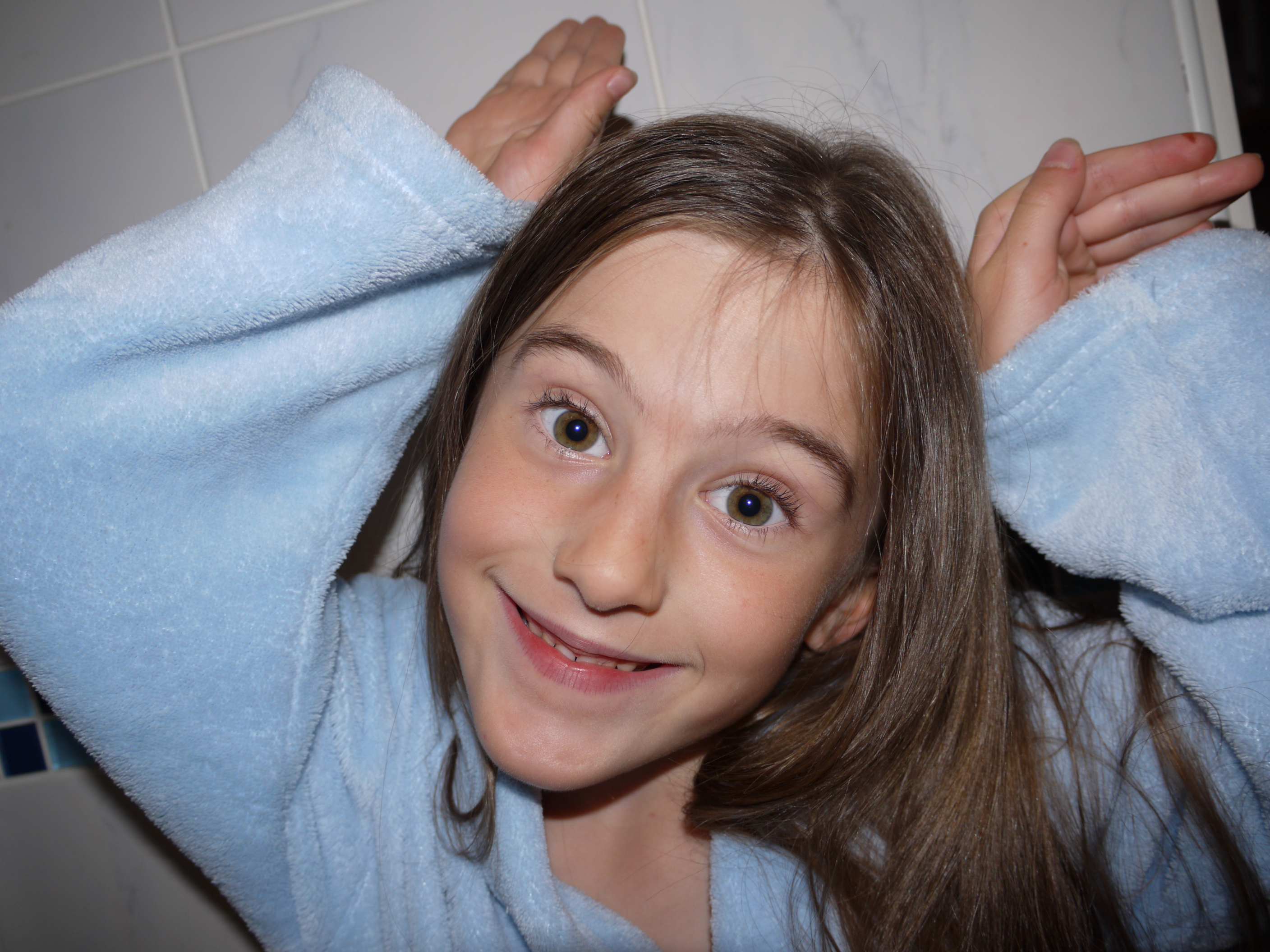
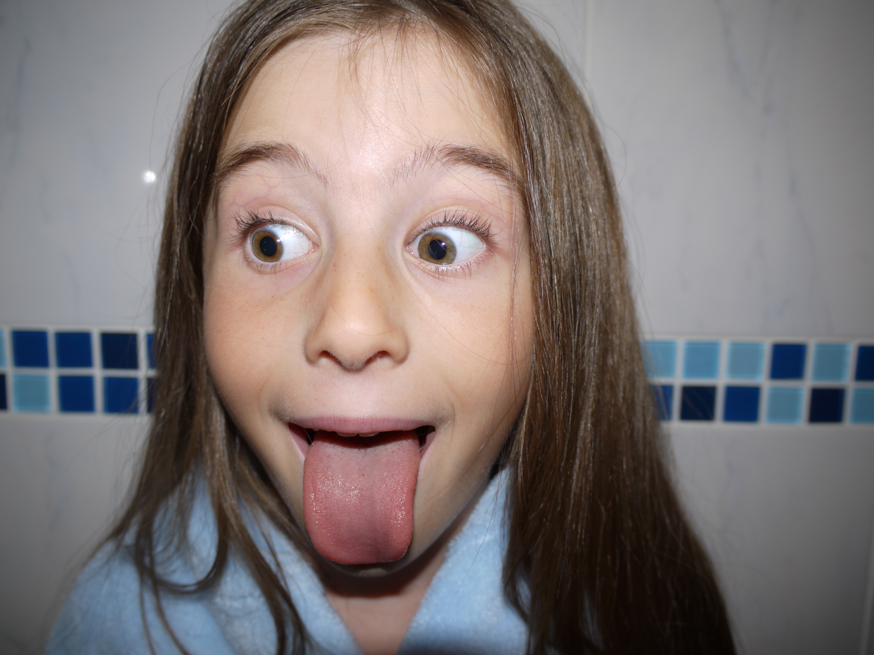
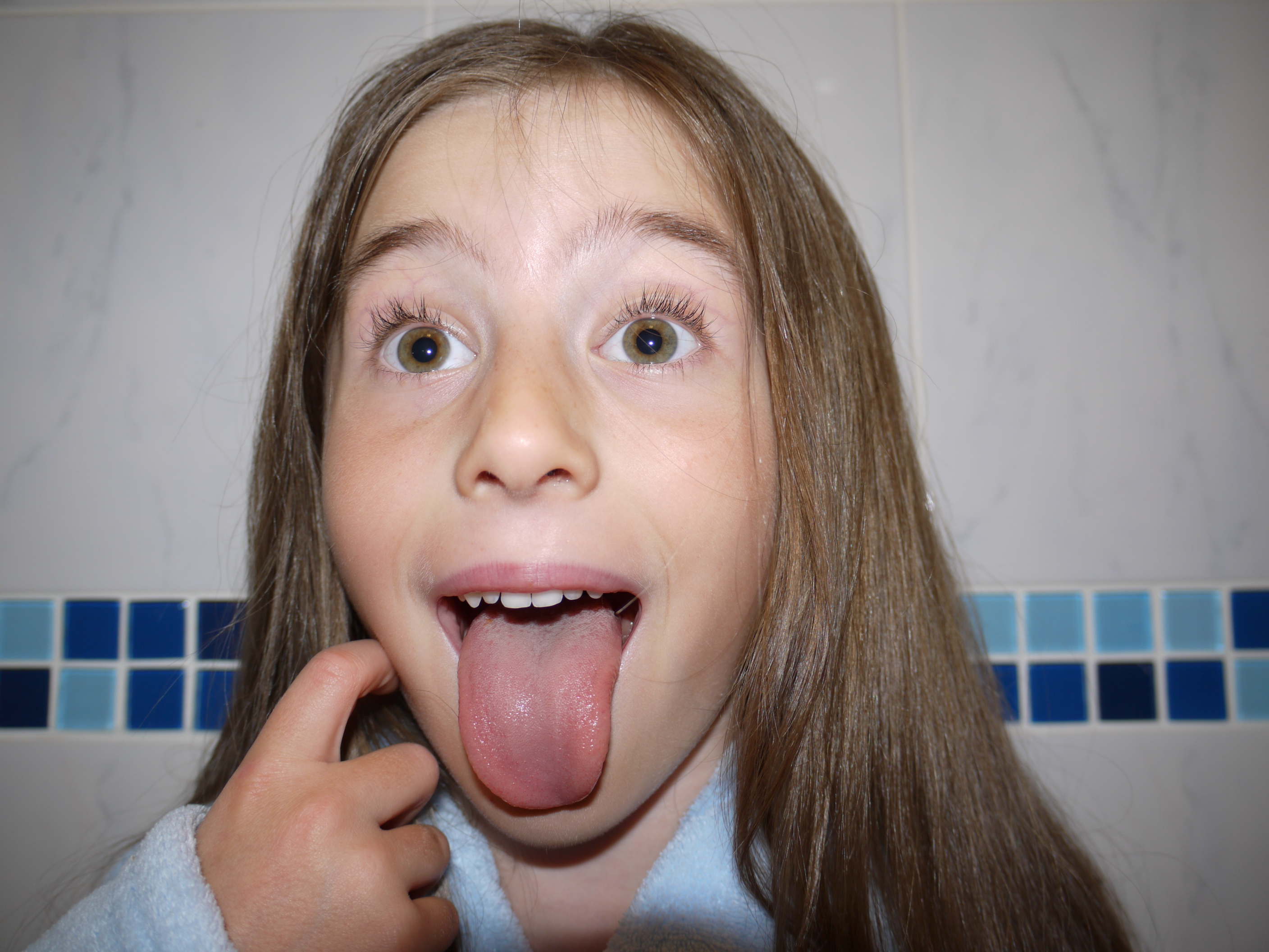
Me and a group of friends decided to explore an area of woods just outside of our local town, as we had heard people talking about a potential old German bunker being found in these woods. I decided to bring along my camera and capture some portrait photographs at the same time. The images are a mix of images of my friends taken by me and portraits of me taken by them and sometimes self portraits taken by placing the camera down and using a self timer
Due to the complete absence of natural lighting in the woods, I had to constantly rely upon my camera flash, so as a result, there are some over exposed images and negatives. I took all images holding the camera as I find tripods way too immobile for a situation like this.
Contact sheet
Here is my contact sheet from the shoot. I have included all images from the shoot and I will use this sheet to aid me in eliminating any negatives and unwanted images. Here is the contact sheet
Standout Images
Here are some images that I find stand out from the shoot. I will also include my thoughts on the nature and composition of the images.
Image 1
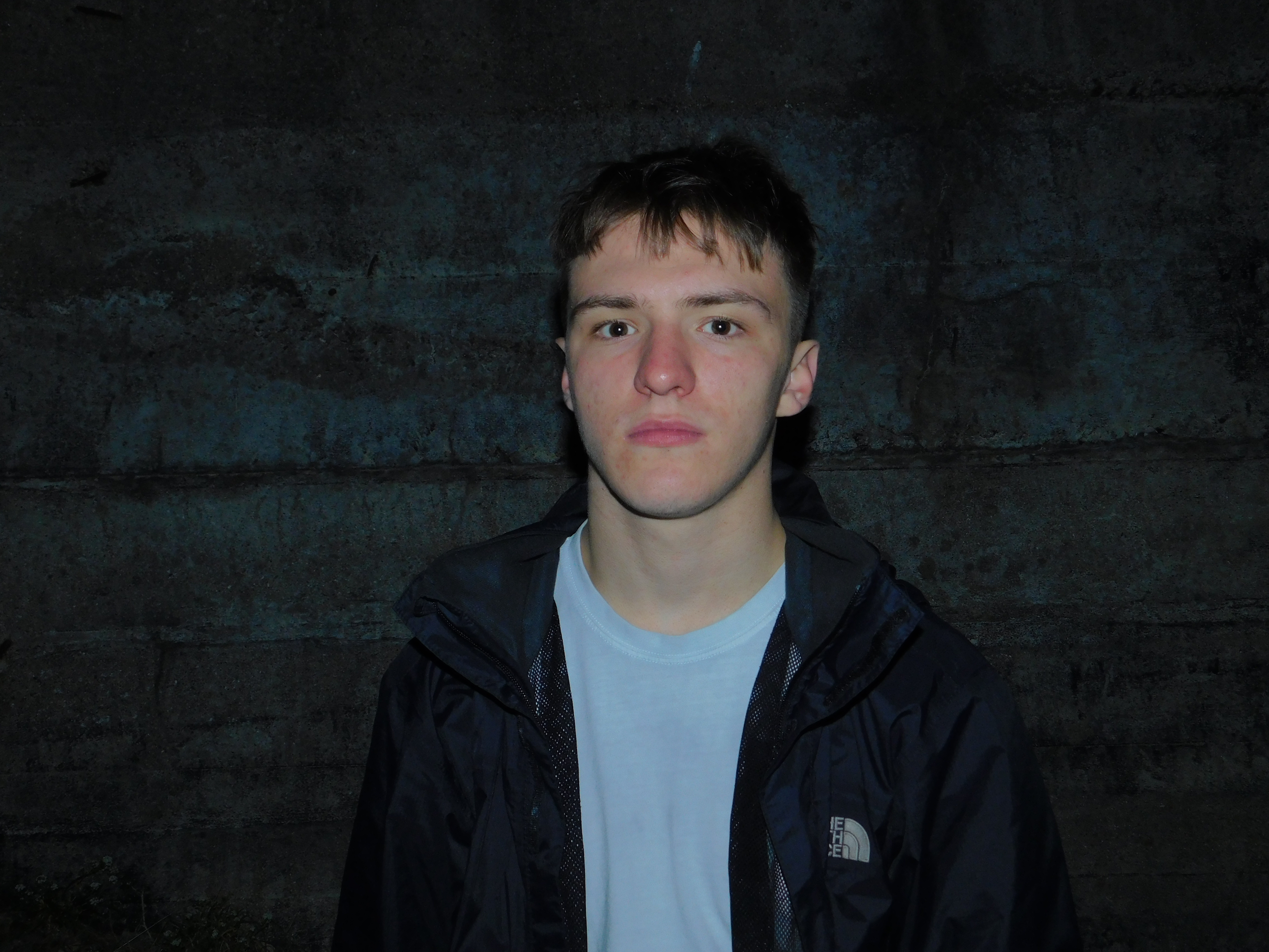
I like this image due to the subject standing out from the background. This is achieved through the background, Being the wall of a 1940s era German Bunker, featuring signs of decay and age, In comparison to the subjects clean manner. The brighter colors of the subjects skin tone and T shirt help to create a nice color contrast and make him stand out much more. I find that the image will require a slight bit of cropping due to an apparent vignette around the corners of the image.
Image 2
This image features myself and is taken by a friend. I particularly like the composition of the image and the out of focus nature, which creates and in camera form or blurring, Meaning that I will probably only have to edit this image slightly in order to achieve the effect I am looking for
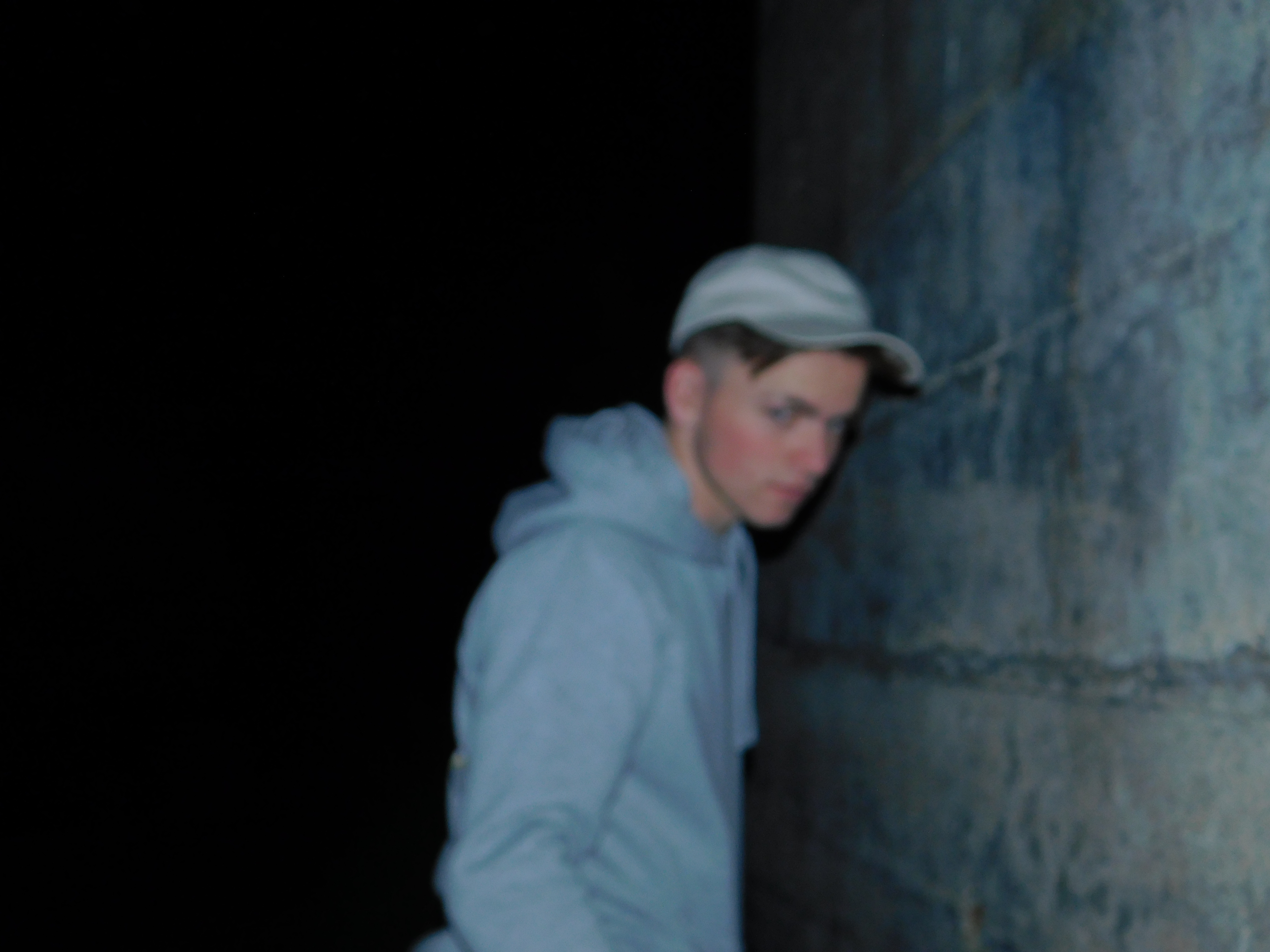
Image 3
Here is another Image where I have utilized self portraiture. The photo was taken on a 10 second self timer and I adjusted the Hue setting on my camera to give the image a very slight blue tint in order to highlight the blue colors in my outfit. I Like the angle of the image as I had propped my camera up on a rock and I am happy with the angle and how it turned out.
Physical editing Ideas
For Photo shoot 1, I outlined my ideas for manipulating the images through photoshop. I would also like to experiment with editing the Physical photograph itself. I will achieve this through the processes of taping and tearing. Taping will involve either black gaffer tape or grey duct tape on top of a printed image and Will be used to conceal the identity of the subjects in the images. Tearing will be used to remove facial features and features of identity by physically tearing up a Printed image. I would also like to experiment with scratching an image with sandpaper to give off a distressed effect to the image.
Here are some outcomes of my different physical editing techniques
Taping
For this particular image, I have decided to utilize black gaffer tape as I feel it gives off quite an industrial attitude towards the piece. It is also quite an interesting texture and I like the patterning on it. I have cut the tape into strips and created a cross to give off a “patchwork” type effect. Here is my Image with the taping method applied: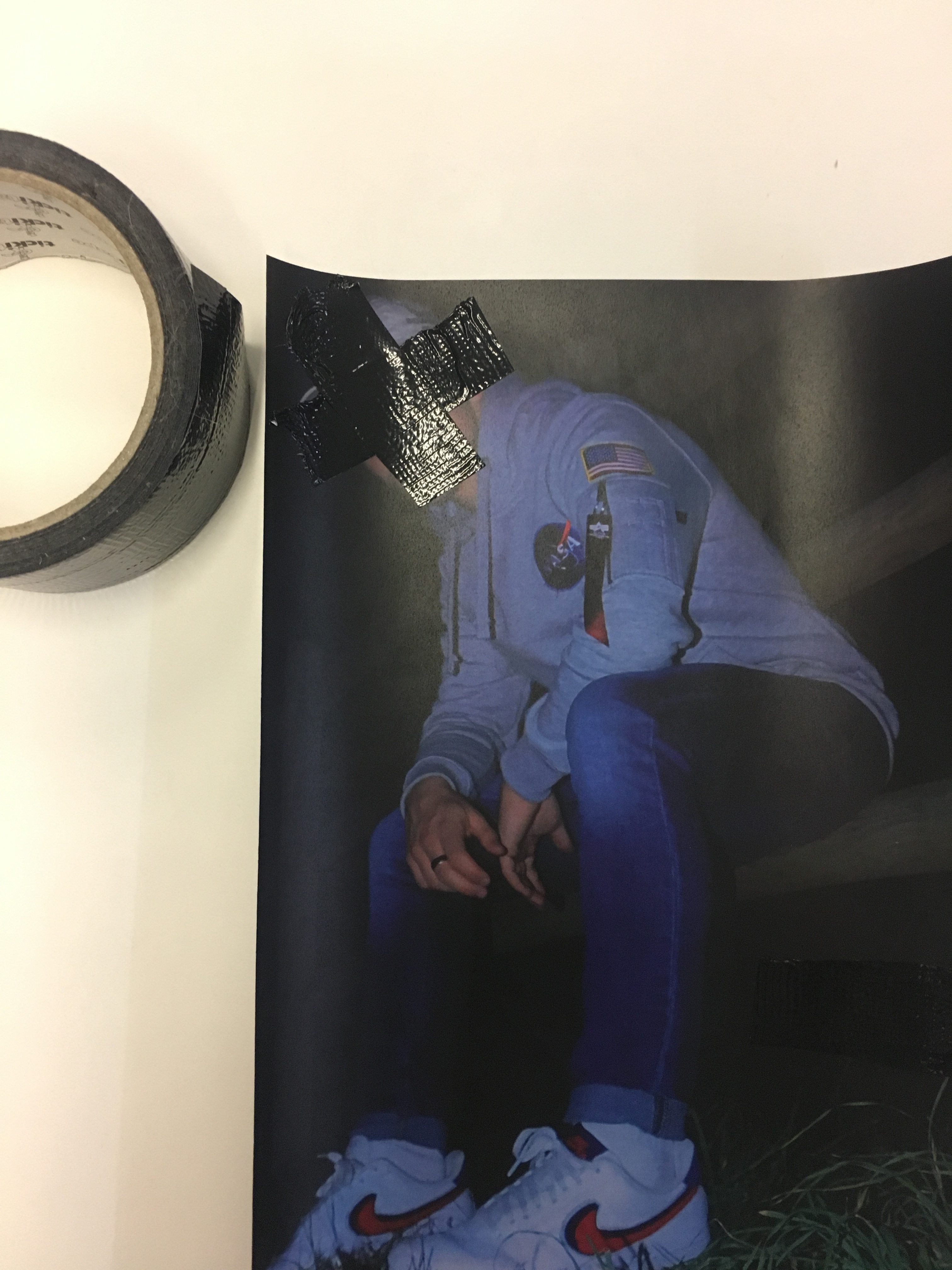
Tearing
I find that tearing out the face from an image is a great way to remove the identity of the person photographed. This method has spanned from michal makus idea of gellage, the sense of physically transforming an image by tearing. I however, Am focused on tearing out facial features and removing the identity of the person so all that is left is their figure and clothing. Below are some images of the tearing process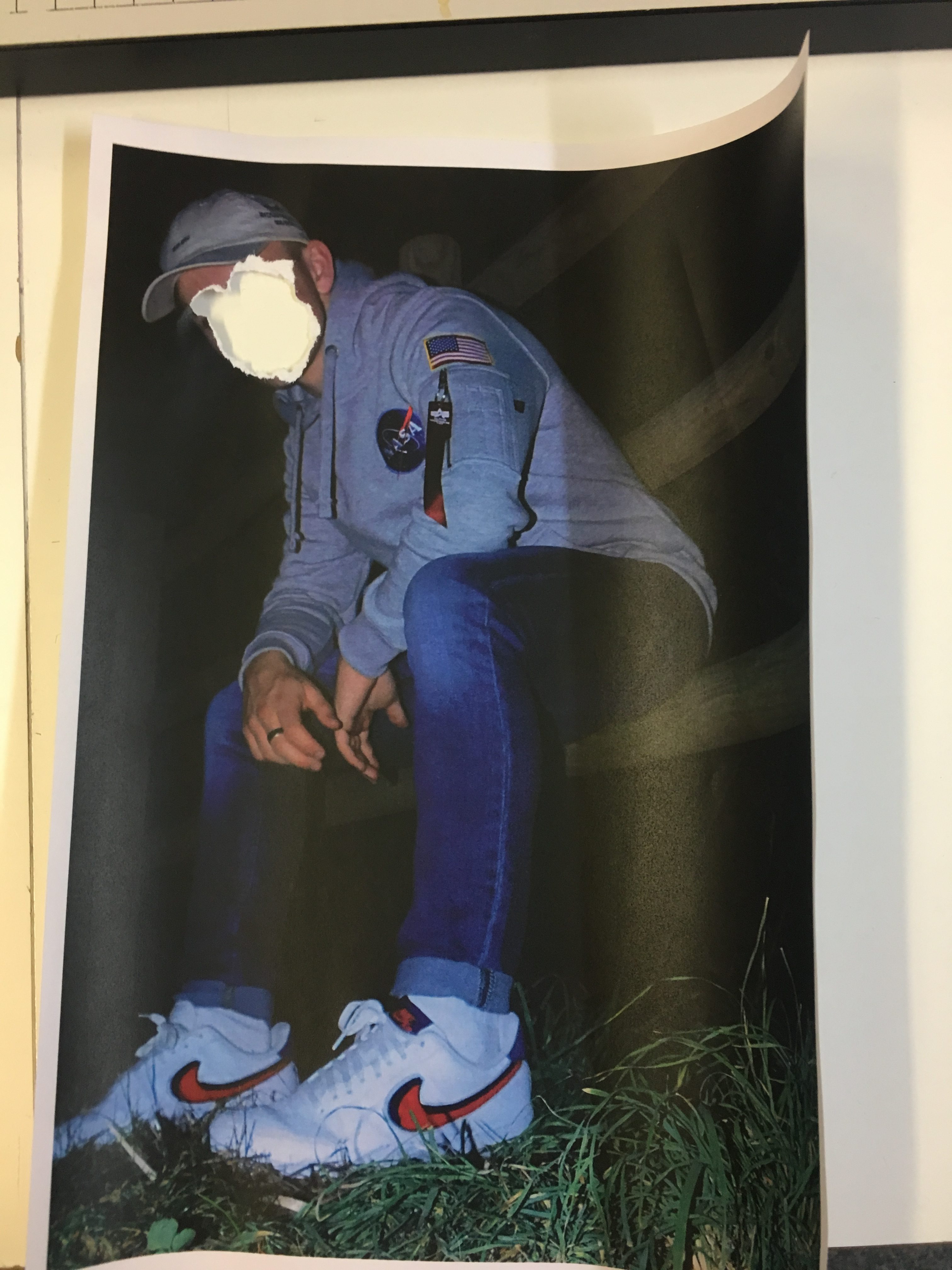
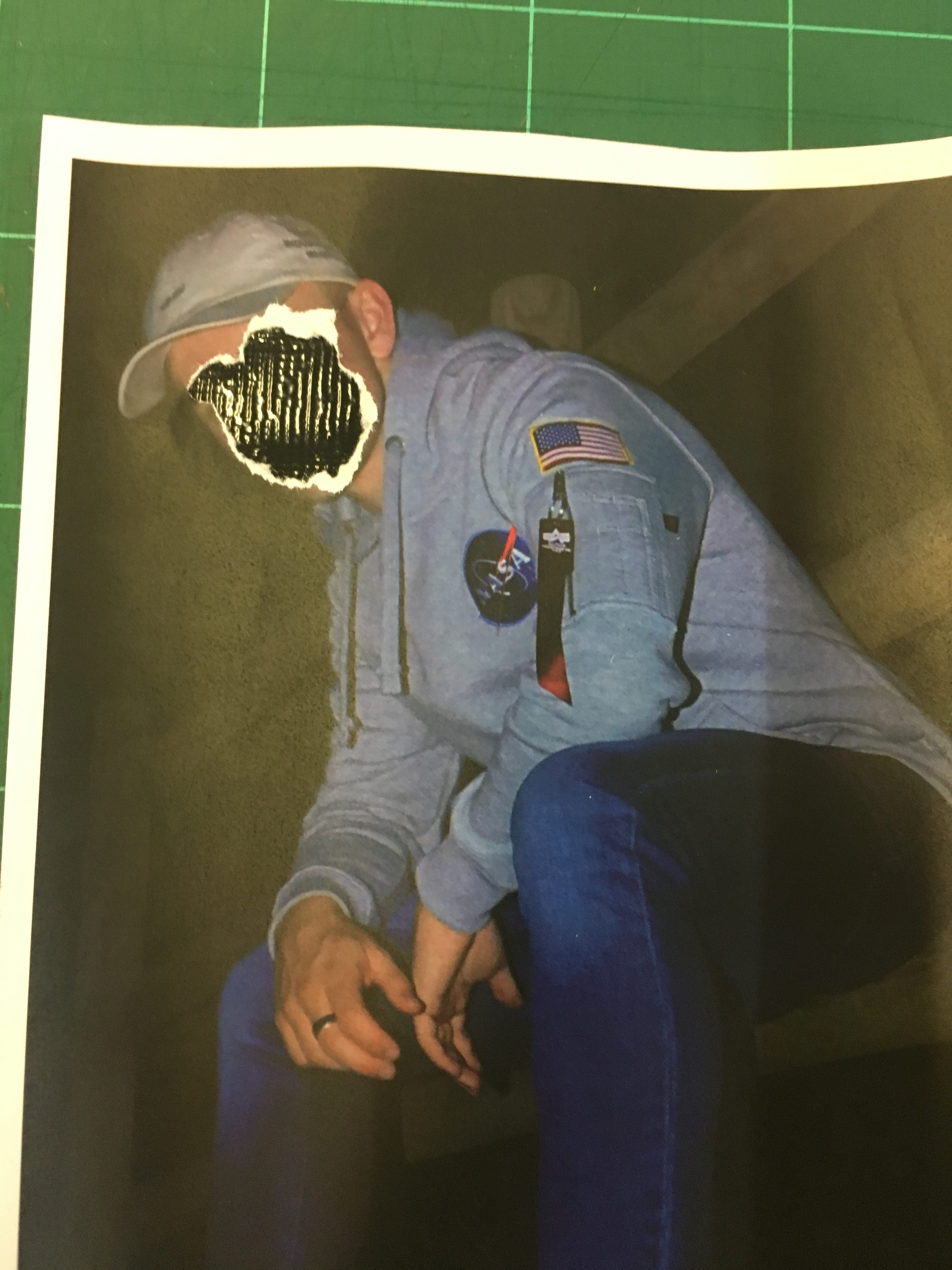
During the process, I also experimented with the idea of tearing and placing black gaffer tape underneath the image to give the tear a background. It portrays quite a dark sense of loss of identity but is effective at making the image bold at the same time by adding more texture and detail to it.
I have also explored the idea of tearing for aesthetic. I wish to give my work an aged and distressed feel, Which will easily be accomplished through the scratching process that I will discuss later on in the post, However Tearing for aesthetic can also help me achieve this distressed look. Here is an image where I have added in an element of tearing that does not necessarily involve the obscuring of the face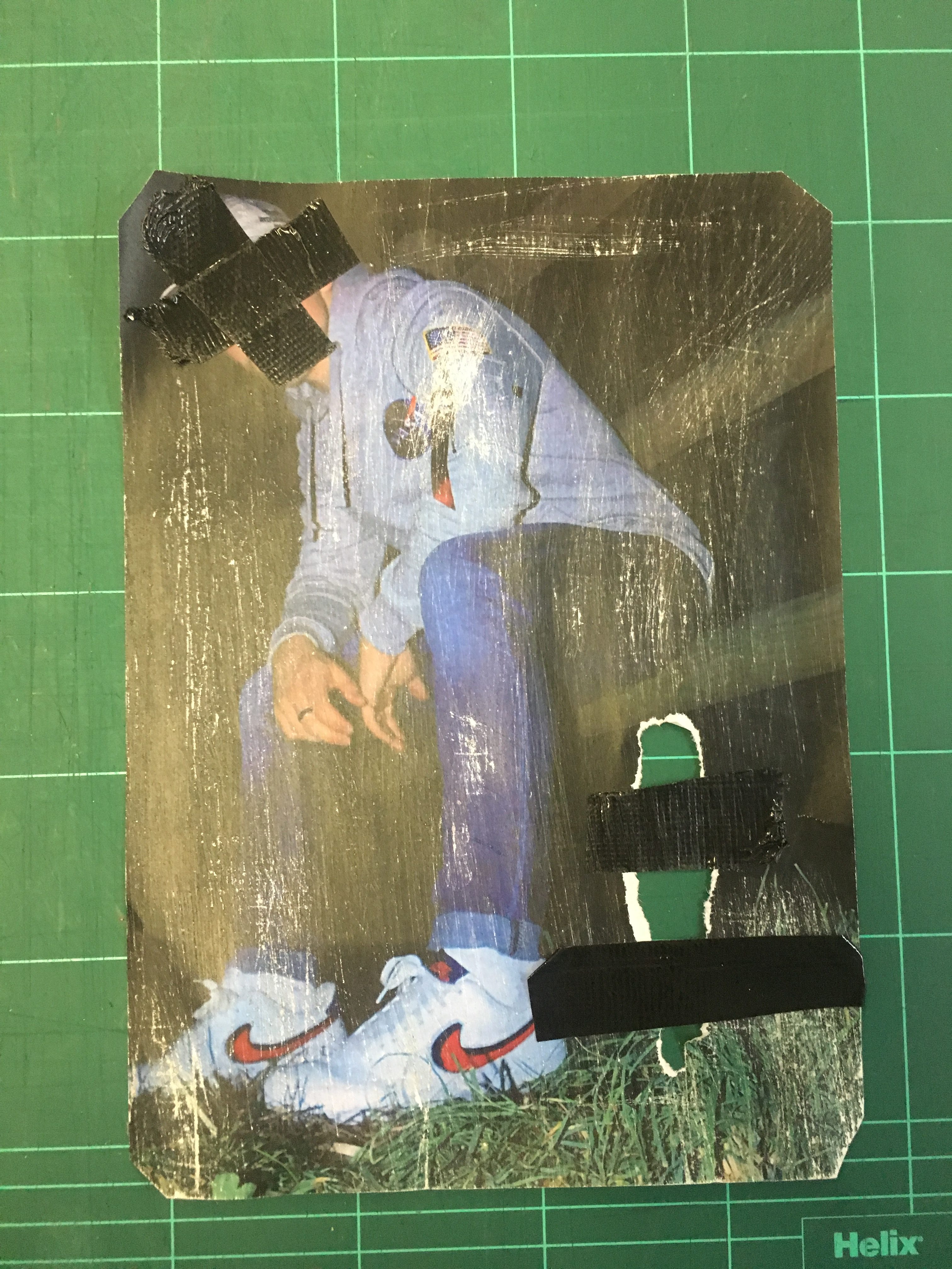
I have incorporated the tear into the bottom left hand corner of the piece and taped over it to connote the idea of attempting to reconstruct and repair the image.
Scratching
Scratching a printed image can give off quite a worn, distressed feel to the image. It also alters the texture and makes the image unique. I achieved this effect through the use of sandpaper and rubbing it on my physical print. In some areas I have applied more pressure in order to create variation throughout the image. Here is an example below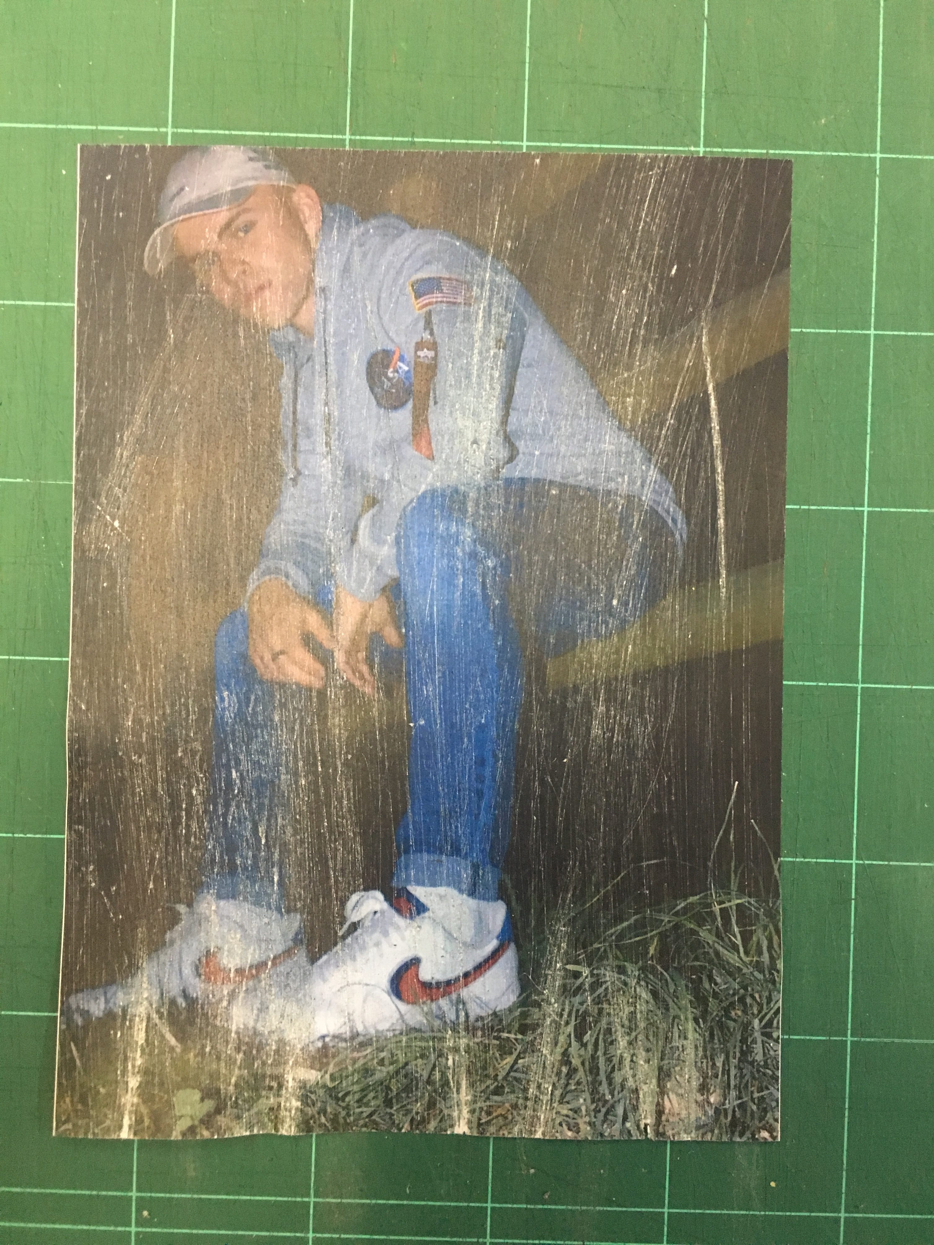
I like the idea of scratching all over, purely for aesthetic but as you can see in the next photo, I will also use scratching to obscure identity as I find it is an effective way of achieving the effect I am after.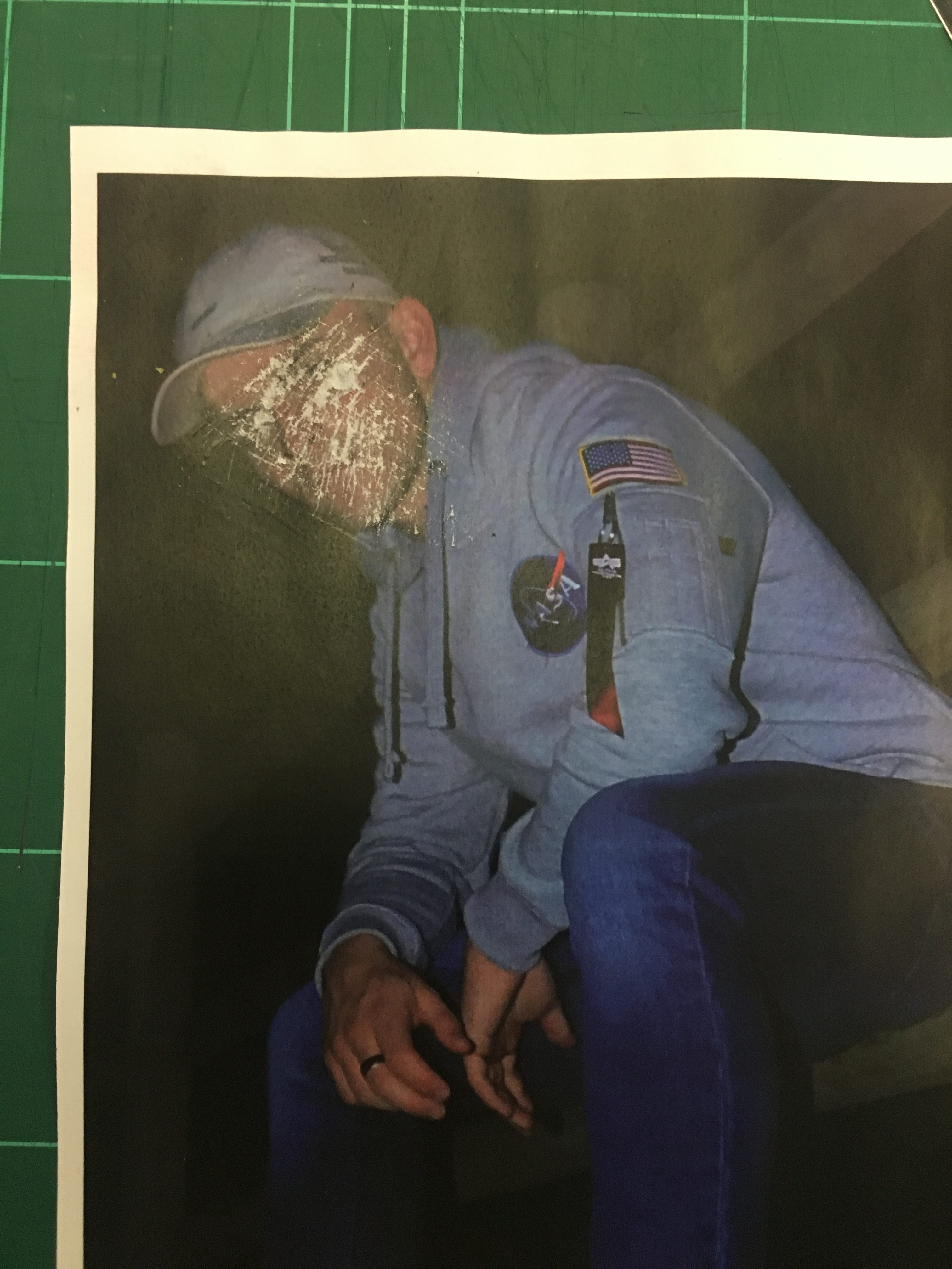
Identity and Place Mock Exam MOOD BOARD AND ARTISTS
MOOD BOARD:

IDENTITY:
The definition of identity is: the fact of being who or what a person or thing is.
However, there is a difference between being an identity and what it means to have an identity. What it means to have an identity is the strong characteristics, definitions and quirks that makes the person individual. To have a strong sense of identity is often thought as having a thorough understanding of oneself's thought patterns, strengths and weaknesses, traits and preferences. Every individual have different levels of self identity, whilst some have an incredible strong sense of individuality, some require time to discover themselves. Our identity is what makes us unique and not one person has the same identity.
ARTISTS I’M INSPIRED BY:
ELAINE CONSTANTINE:https://www.theguardian.com/film/2015/feb/05/elaine-constantine-interview-northern-soul https://www.theguardian.com/theguardian/2007/may/24/features11 Elaine Constantine is both a filmmaker and photographer who has a talent of capturing the British youth culture. What I love about Constantine's work is that I feel she really captures the carelessness and how reckless teenagers/young adults can be, and she especially captures their joy and excitement. Constantine tends to use flash when she captures her images which I believe adds an extra vibrancy to her photos, which also adds to the concept of the vibrancy and excitement her subjects have. Most of the pictures that Constantine takes are staged, as she directs the models. One of her most famous images of the girl feeding a seagull was directed as Constantine asked the model to hold out a chip to feed the seagull, however the model had to close her eyes as she flinched when her eyes were open when she fed the seagulls. Therefore, Constantine told the model to close her eyes when feeding the gulls and caught the image. Constantine's ability to capture the youth'joy and excitement also displays the variety of identities that are displayed in the images. The way they dress and present themselves can reveal how the young adults want the audience and others to view and interpret their identity. Also their facial expressions and body positions is another way of being able to identify and interpret their personalities, and identities. JIM GOLDBERG: Jim Goldberg is a photographer who combines mediums such as photographs and text. Goldberg's work reflects his deep and meaningful collaborations he has with the ignored and neglected out-of-mainstream subjects. He uses his text to tell the stories and points of view of the subjects in the images. The text is written in multiple languages, most of the time by his subjects. Goldberg also integrates his art by drawing and outlining some of his images in different colors. Goldberg typically applies a documentary style to capture his images, with his straightforward approach. His ability to story tell through the use of photography aids in revealing his subjects identities and situations. Their added commentary assists in giving an insight into their minds and what is really going on in their lives. Goldberg's ability to expose multiple bodies of self is what I draw inspiration from.
Goldberg, Jimhttps://www.artspace.com/artist/jim_goldberg
Identity: Concept and Ideas
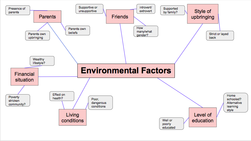
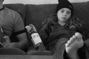
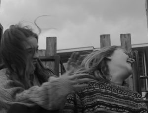
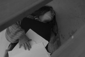
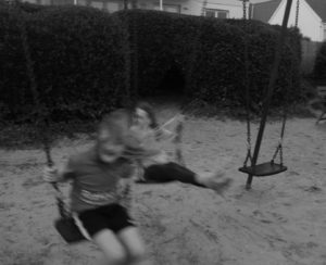
For my project into identity, I have decided to focus on the different factors that help to develop and influence the identity of young children. I feel like this is a relatively broad topic, as the factors that influence children and how they perceive themselves range from the influence of parents, to the influence of media and their peers. I will be focusing on how the different factors that play into children’s everyday lives effect and influence them, either positively or negatively, and help to shape how they identify themselves and others around them.
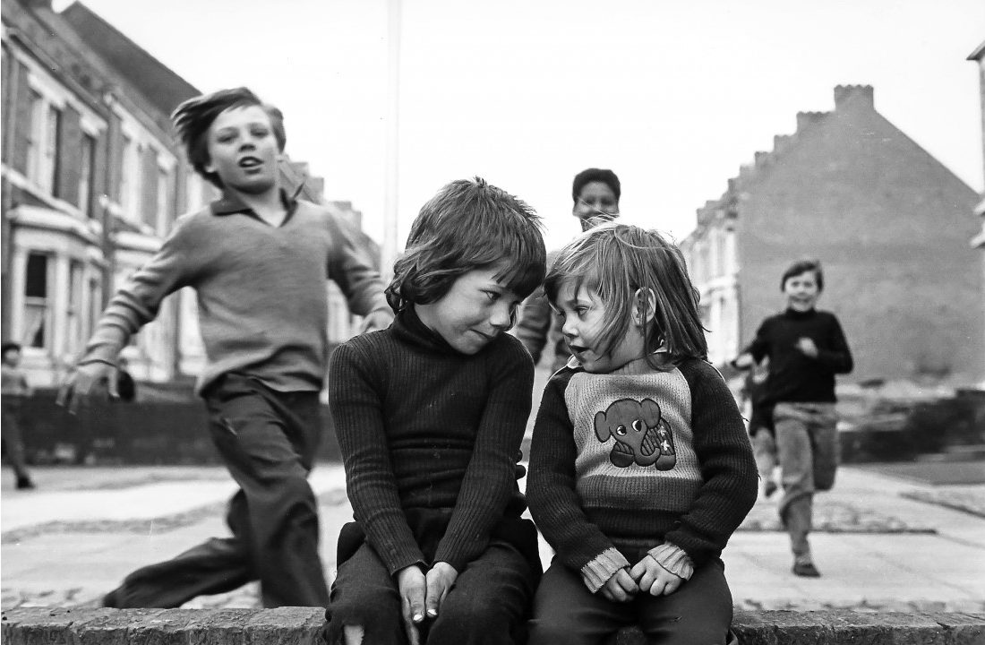
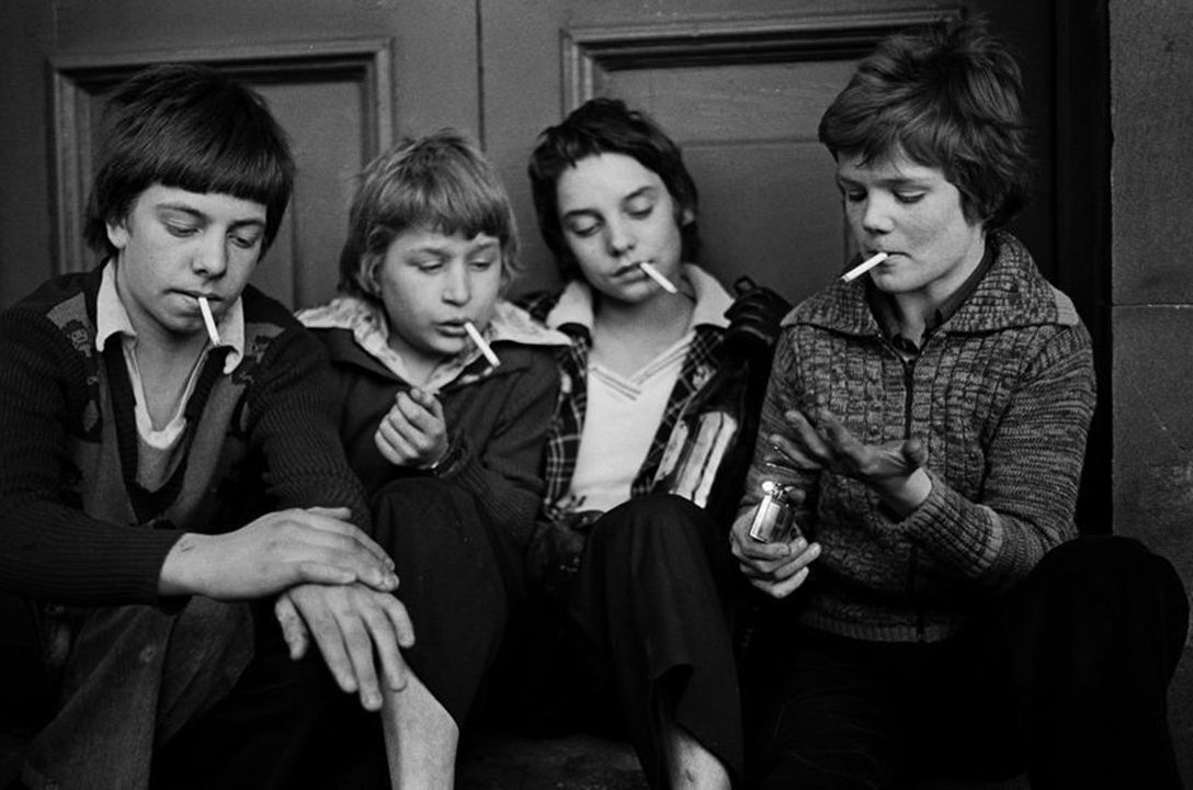
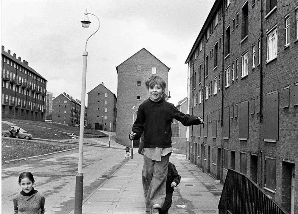
I will be taking inspiration from the artist and photographer Tish Murtha, as I feel that her documentary style photography of working class subjects in the mid to late 20th century documents how social, political and economic factors in their lives influences and shapes their social identity and behavior. I will be taking inspiration from Murtha’s documentary style photography, as well as using the concept of external factors influencing identity in order to complete my project into how children develop their identities.
The below images are examples of where Murtha has used children of subjects in order to display the complex nature of the social dynamics of children’s relationships with one another. Murtha’s work also shows how children’s external environment effected them during the 1970’s-80’s, as the children depicted in her images are often shown to be playing freely and with little supervision:
I conducted a range of photo-shoots in order to collect images that can be used to present my theme of how factors influence the developing identity of children.
A portion of the images I took use the documentary style that is also utilized by Murtha, as the subjects are captured in candid, natural poses. As well as the images that make use of documentary style photography, some of the images are posed, inspired by the close up shots that Murtha took of children in and around the area in which she worked.
For the layout of my final images, I have decided to create the following pattern, using 8 of my final images in order to fill the boxes. I feel like this layout is eye-catching, and allows for certain photographs to be emphasized, whereas others are more subtle presented, allowing the viewer to see the different aspects of the images in different ways.
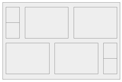
The following images will be used in this final piece layout:


Upon printing, the bottom 2 images will be physically torn in half, to create a divide between the 2 subjects, before being used as the smaller images in the top left and bottom right of the layout.
The final layout of the piece will resemble the following:
In addition to this layout, I will be using the following as a second final piece:

And after the following image is printed, it will be physically sewn into to add to the layer of editing on the photograph:
Identity: Final Ideas
From the photo-shoots I completed for my identity project into how the environment of a child influences the development of their identity, I have decided on the following final images from each shoot:


In order to take physical inspiration from Murtha, I decided to edit some of my images so that they are black and white in color, which mimics the color scheme of Murtha’s work.
Final Ideas:
The above layout is made out of 6 images I have taken as part of my project. These images are heavily influenced by the documentary photographer Tish Murtha, and I have taken inspiration from her concepts and documentary style, while also using black and white coloring to emphasize the shapes and perspectives in the images.
In addition to this layout, I will be using the following as a second final piece:
And after the following image is printed, it will be physically sewn into to add to the layer of editing on the photograph:
Portrait images for final pieces
Final piece images

These are the portrait images that i am going to be using for my Photoshop final pieces . I have chosen these because they are simple and easy to blend well with other photos , they are crisp and in focus they have a sharp clean feel to them. The expressions are meant to represent what i want to convey with in the the images e.g confusion, sadness or misunderstanding.  I have chosen this background because it mirrors the geometrical buildings and wood that i am going to be blending the images with gives the images a background structural components adding depth to the images all so intrigue . The cool muted blue tones of the images complement the yellow of the wood sculpture i made for them to be combined with. Each image has a different  focal point depending on where the model is in relation to the border of the image. I have experimented with different image alignments where the model is not the in the direct middle of the photos but off center to the left or right. Theses images were successful and means that the wooden sculpture will fit into the original images well because it is also off center.
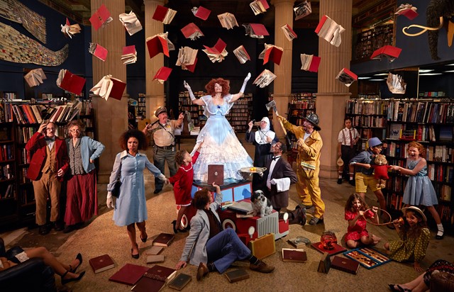
Tableaux Vivants
Tableaux- Mood board

Mind map:

What is Tableaux Vivants?
Tableaux is a french word for ‘living image’ and is a representation of scene, painting, sculpture, etc, by a person posed or grouped together in silence and motionless. When creating he Tableaux vivant it is key that the subject carefully positioned in place usually in costume with props to really help to set the scene. A tableaux vivant can be presented in a multiple of way including a ‘live performance’, sculpture, painting and photography. The most common movement of tableaux vivant is in the words of the Romantic, Aesthetic, Symbolic and Art-nouveau. In the 1970s and 1980s a man named Jean-Francois Chevrier was one of the first to introduce tableaux vivant into art photography when he wrote an essay entitled “The Adventures of the Picture Form in the History of Photography” in 1989.
The below image is a prime example of a photographer using a famous painting and recreating though people in poses, using costume and props.

Below shows a different tableaux photography by Ryan Shude, his work is not so much recreated from paintings but is still set up and staged.


Action plan:
For tableaux Vivant after looking at such different types of photographers it inspired me myself to be a bit more adventurous and really find a deeper image that i can portray in different lights. That when I started looking at fairy tales. my initial idea was Alice in Wonderland but after looking deeper its was clear to me that ”Snow White and the Seven Dwarfs” provided more doors for me to go through. After finally deciding on what I wanted to base my Tableaux Vivant I needed to select a final scene. I did a brain storms of the key moments in the story and came to the conclusion that the scene where the wicked queen is disguised and giving snow white the apple would be the most effective in this case. i then found my models, simple costumes and props and went down to the studio. This was then followed by the hard decision of what lighting and background I needed to portray this vital scene.
My Response:


Visual:
For both images they have a set plain black background, which helps the characters stand out more. By using the black background I believe it help emphasizes the different personalities of snow-white whom is illuminating of the black background compared to the Witch who is somewhat merging into the darkness of the background. I believe this to help set the atmosphere, and how to feel about the characters. The image overall has a very dark feeling towards it with a white light mainly being focused on the representation of snow-white. To create this white image I used a ring light to help portray the correct textures as well as helping to set the mood. The view point is fairly straight on so the viewer is presented with almost a perfect side view of both characters, linking to the symmetry of the image. Although different heights the idea of symmetry is still presented in the scene of a side image of both model and both essentially reaching out the object. I think this helps divide the emotions towards the different characters with the witch model have a more mysterious, covert and dark feeling strongly contracting with the bight eyed character of snow-white who gives off a more bright and blissful feeling. overall providing us with a very balanced image due to the contrasts of the well know characters and their stereotypes.
Technical:
For this image I chose to use a white ring light that firstly gave off a whitey and blue light which I thought to deem appropriate to the scene. I placed the light at a slight light as I thought this would be important to help portray characters and help improve the over all understanding of the image. the ring light was positioned to the left of the image- closer to ”snow-white”. I did this because snow-white is the much brighter character and ore oblivious of the darkness. I think by positioning the light in the place it help illuminate snow-white character improving the overall representation of the image. Due to the type of lighting the image has a much more colder representation to it rather than a warmer color and feel.
Conceptual:
Originally this image was from the cartoon film ‘Snow White and the Seven Dwarfs’ produced in 1937 by Walt Disney. The story is about White’s beauty, the wicked queen orders the murder of her innocent stepdaughter, but later discovers that Snow White is still alive and hiding in a cottage with seven friendly little miners. Disguising herself as a hag, the queen brings a poisoned apple to Snow White, who falls into a death-like sleep that can be broken only by a kiss from the prince. This particular image was taken from the film when the wicked queen was giving Snow White the apple. presenting the innocence from snow white and the darkness and evilness presented from the wicked queen.
Contextual:
Although originally I took these image using the set prop of an apple, I also wanted to look at something different and add my own interpretation to provide a deeper meaning to viewers. After my using the prop of an image i turned to the idea of the wicked queen handing over a phone, conveniently an Apple iPhone. Once this idea came to place, the deeper became evident. With the original concept being handing over an apple that kills Snow White linking to the idea that technology is now starting to kill us off, so therefore by giving a phone to Snow White is give the idea that with social media taking over our lives and the new addiction to looking down at our phone, we are slowly wasting away and dying on the inside. The representation that technology is melting our brain has been a worry of people all over the world with now media starts taking over completely. The poison is now our technology.
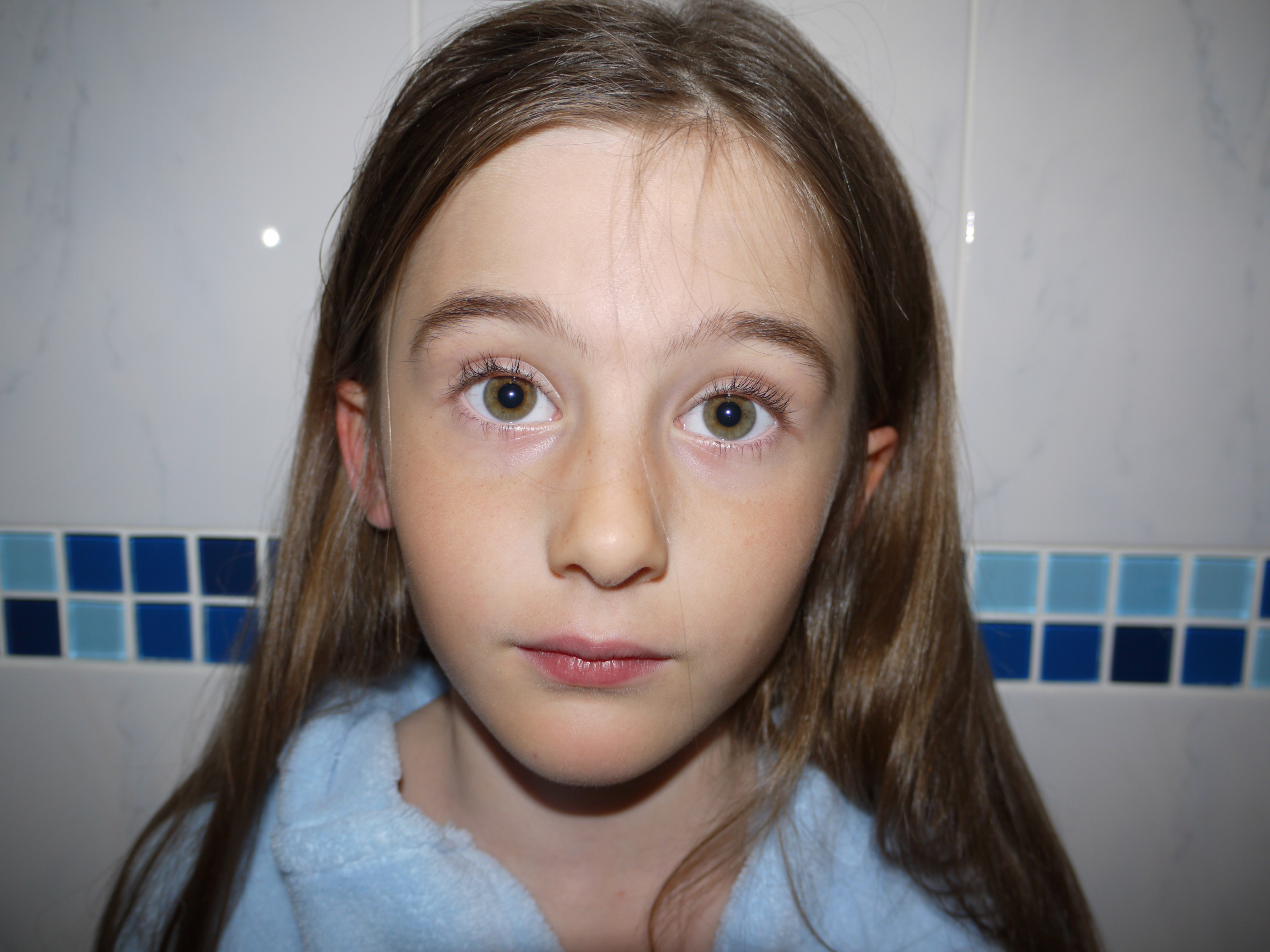
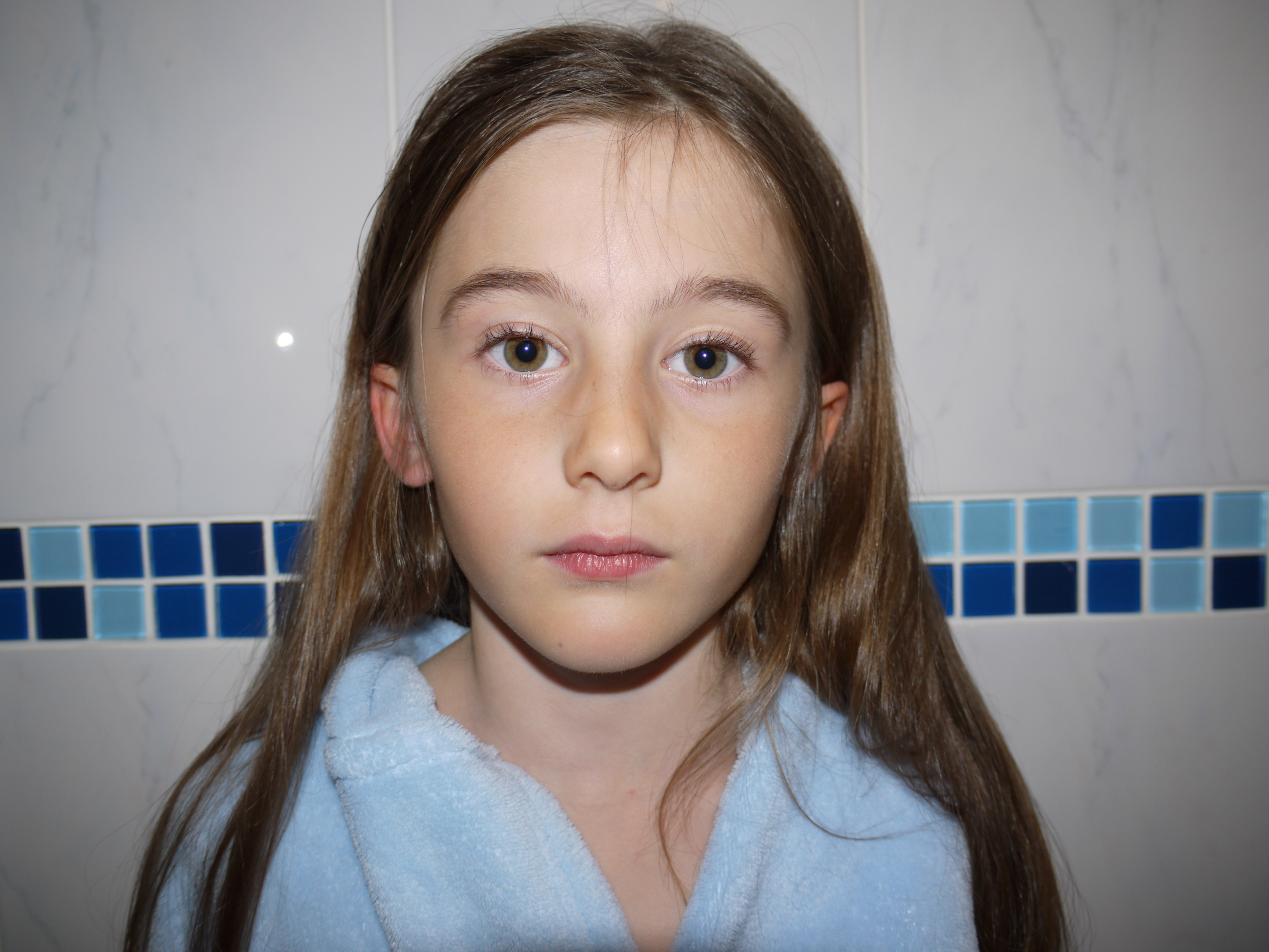
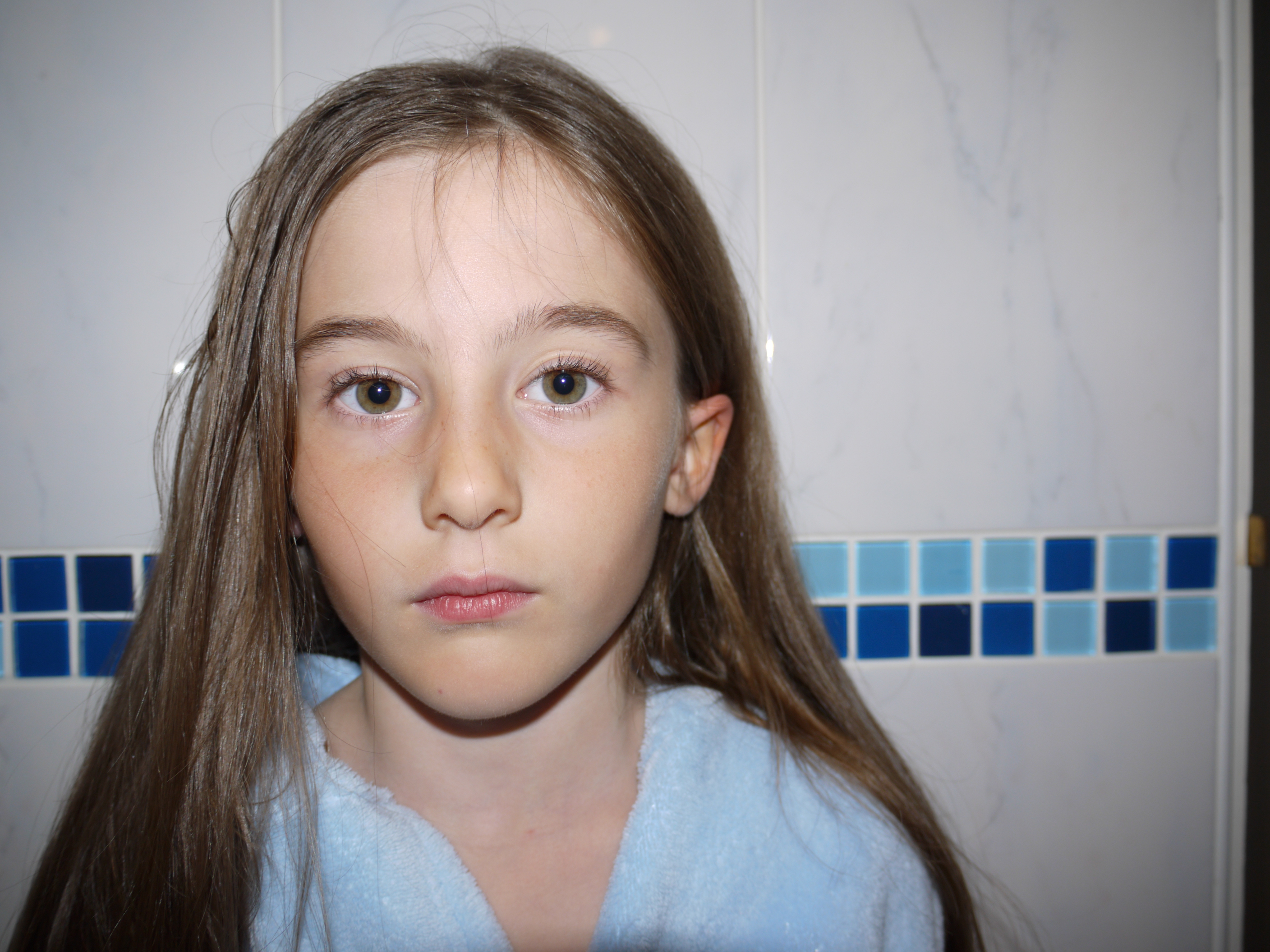
Identity FINAL PIECES + analysis
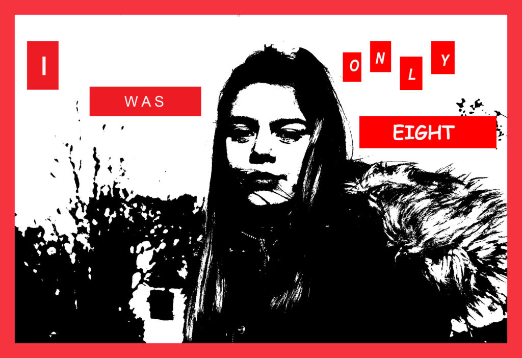
This is the first image, in my somewhat series, of 5 final pieces. I chose to use this image as Katie is looking directly at the camera, however her facial expressions are not happy. I’ve chosen the phrase ‘I was only 8’ as my story started when I was 8 years old, and what I experienced shaped my identity into the person that I am today, 9 years later.
I took inspiration from Krugers editing but the ‘secrets’ told in Rosenfields ‘What I Be’ project. I personally feel this looked, visibly very effective because although the text automatically catches attention, the black and white image is also so strong and consequently very eye-catching.
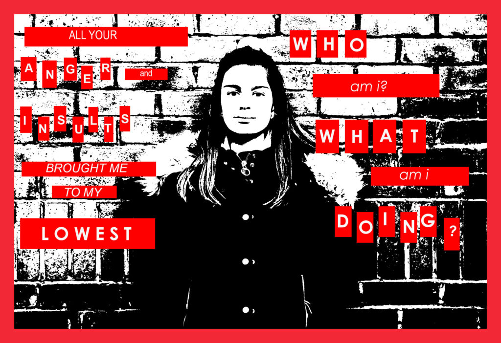
In my second image I touched on how bullying/verbal/emotional abuse caused a loss of identity, and some of the questions that we ask ourselves when we do experience this.
who am i?
what am i doing?
I broke some of the words up into separate boxes for separate letters, Kruger did this in one of her images and I thought it was interesting, I think it brings a lot of emphasis to individual ‘significant’ words.
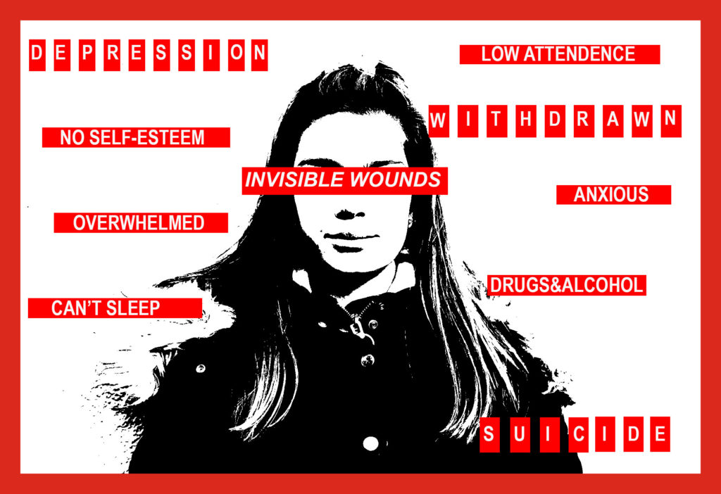
In this image I’ve put the text ‘INVISIBLE WOUNDS’ across Katie’s eyes, I’ve done this because if something is invisible, you cannot see it, around Katie I’ve stated some of the serious effects that can be caused by these issues alongside the loss of a persons sense of self.
This final image is personally my favourite as even though it’s extremely personal to me, it does raise awareness on the issues that children and teens can involuntarily be forced to face, and all of these ‘invisible wounds’ are heavily stigmatised, causing young people to stay silent.
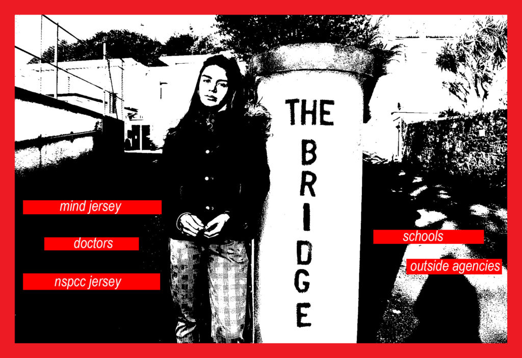
For this final edit I have chosen to use a photo of Katie at ‘the Bridge’. The Bridge is somewhere where children & families can access support, I thought this was appropriate for this image as in my text, I have listed places that young people can approach for help and support.
I thought that this was important to have incorporated somewhere in my finals because, not only do these issues usually require help, my story involved all of these people – another personal touch to my ‘identity’.
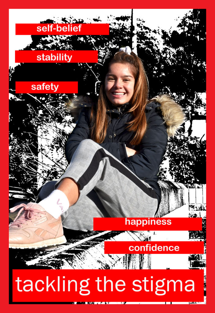
My final, final piece represented recovery and moving on.
In this edit I’d used the history tool to bring Katie back to colour, I did this because colour is often associated with happiness, where as black and white images are usually seen as depressing and sad.
I’ve written about what recovery can bring a person, for example; happiness, confidence and self-belief or self-worth. I’ve also written ‘tackling the stigma’ larger than the rest at the bottom of the image, this is because I feel that through my images I have tackled stigma.
Research- 2019 mock
Who is Francesca Stern Woodman?
Francesca Stern Woodman born on the 3rd of April 1958 was an American photographer and best known for her black and white images.
Francesca was born in Denver, Colorado. her Jewish mother names Betty Woodman and her father from a Protestant background, George Woodman who were also both artists. Woodman also had a brother who grew up to become a professor of electronic art. overall Woodman had a fairly creative and artistic family. From the age of 13 is where Woodman really learnt her love for photography whilst attending a public school in Colorado, whilst she wasn’t in Italy with her family. Moving on to high school in 1972 where she attended Abbot Academy. This is when she concentrated on developing he skills and overall perspective on photography and graduated in 1975. After her excellent performance at her middle school she was then able to go on to attended Rhode Island School of Design in Providence, Rhode. In 1977 she studied in Italy as part of a honors program. Graduating in 1978. In 1979 Woodman decided to more to New York to ”make a career in photography”. Woodman worked hard for a long period of time sending of portfolios to anyone that would have a look and consider them. however still in 1980, woodman had not yet been successful. This was Woodman’s lowest time as that same year she attempted suicide and after recovery moved to live with her family in Manhattan, where she could rebuild herself- well that what her parents thought. soon to be proved wrong when on January 1981 Woodman jumped out of a loft of a building and died at the age of twenty-two.


Visual:
Francesca Woodman’s images are always portrayed with such a strong once looking at them. In this image you see an empty room which some what looks dirty with the walls being marked. The room gives off a cold feeling and lonely feeling with the image of the woman, doing what looks like reaching down to the floor. However her whole figure is distorted and blurred so you are unable to see any feature of her body or face. Although her shoes are still in fair quality this will be down to the fact she hadn’t yet moved when the photo was being taken. By being able to see her shoes it implies a woman is being photographed due to the high heels that are worn. The woman is positioned to the left of the image and what feels fairly manipulated to be presented as far away from the camera right up near the wall.
Technical:
In this image there is a clear representation of shadows being produced this could have been effected by natural daylight shining in through the window. The main focus of the image is the woman who is located on the fair left and positioned far back at the wall from the camera. It’s clear that for this image to have the appearance it does the camera must have had an extremely low shutter speed in order to create the blurriness of the figures movement. To me this image is displaying a mixture of texture with the wall and floor almost feeling gritty and unsmooth compared to the figure who is over ‘’smooth’’ in the sense that there are no lines or clear outline to the woman creating a distorted feeling to the image.
Conceptual:
How does this image make you feel? The image present the feeling of loneliness this is represented through the feeling of the rustic empty and oversized room. With then only one distorted figure cramped in the order. Her movement almost like she’s trying to break out from that corner and start to spread out. The blurred figure gives the feeling of rushing that she was moving fast, possibly wanting to get away from something- the loneliness?
Contextual:
From research it is clear that Francesca Woodman ad a hard and what she felt dark. With loving photography so much and no one else appreciating it like she did. The idea of the loneliness in this image could be portrayed as Woodman emotions of her own work the idea that she was alone with no one else to look and view her work.
Identity & Place Editing (MOCK EXAM)
first edit:
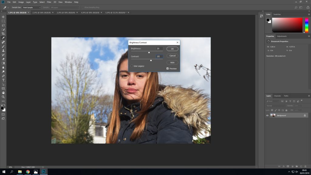
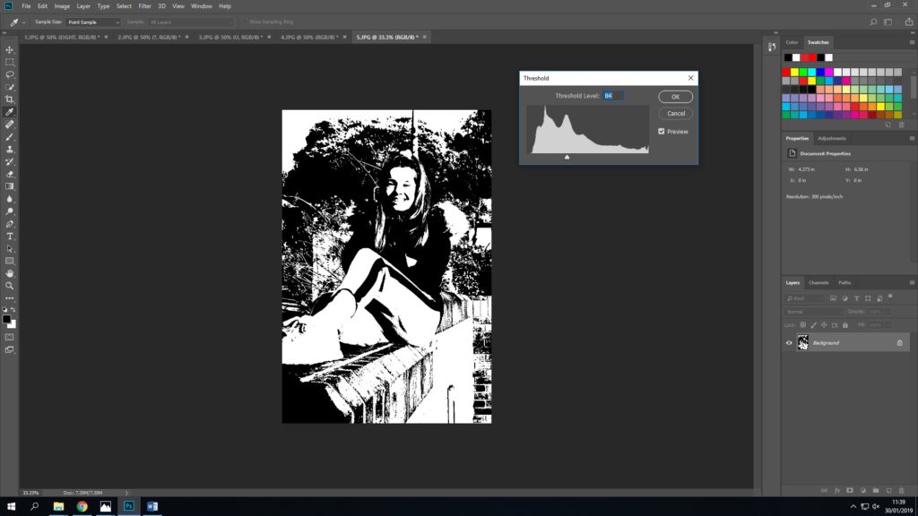
First I started by increasing the brightness of the original image to +20 and the contrast to +25. I thought this may give me more control over the darker and lighter areas when I came to adjust the threshold.
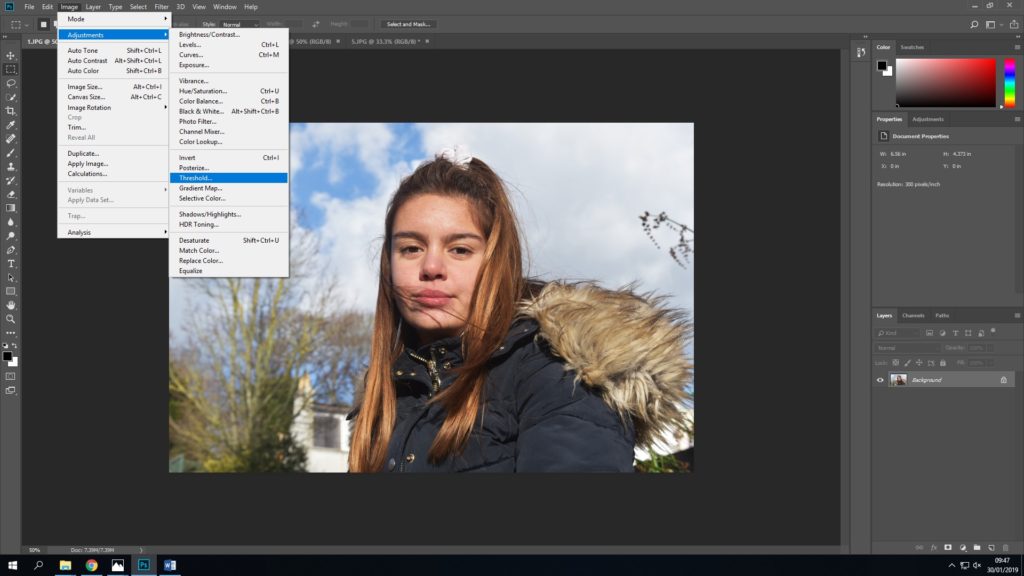
I then used the threshold option to turn the image into a heavily contrasted black and white photograph – inspired by Kruger.
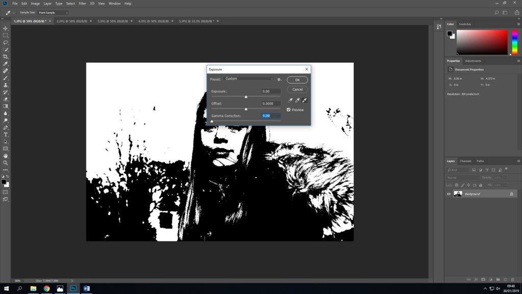
A lot of parts of this image were black, and so I attempted to use the exposure settings to try and change this. I changed the gamma correction to 9.99, which was the lowest.
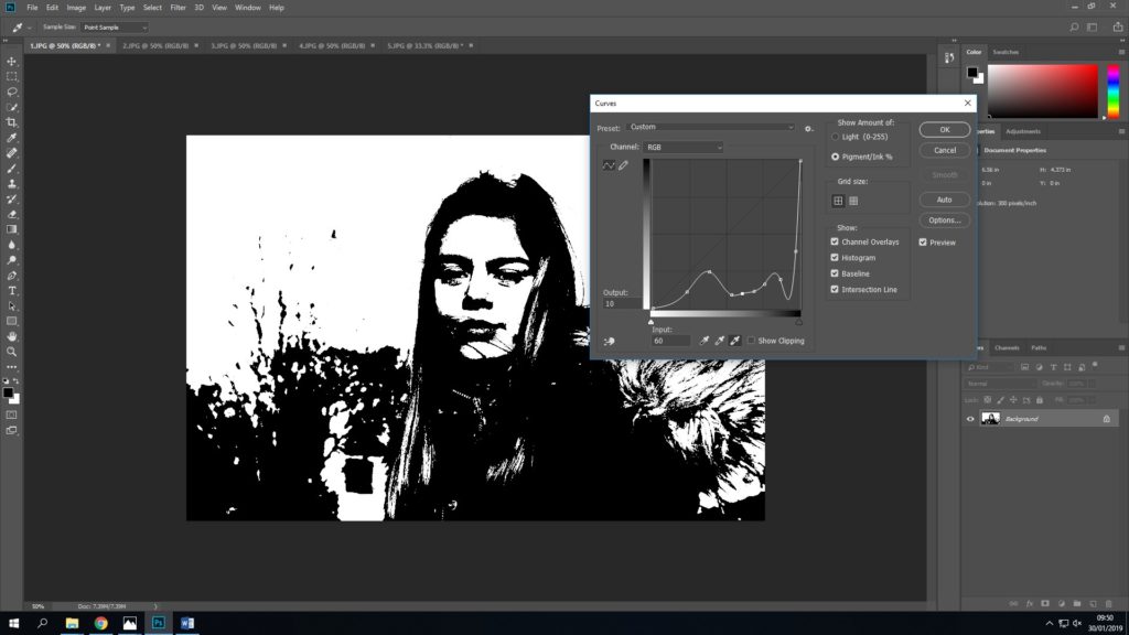
I then played a bit with the curves to see if I could lighten anything to bring out some detail, this was totally trial and error.
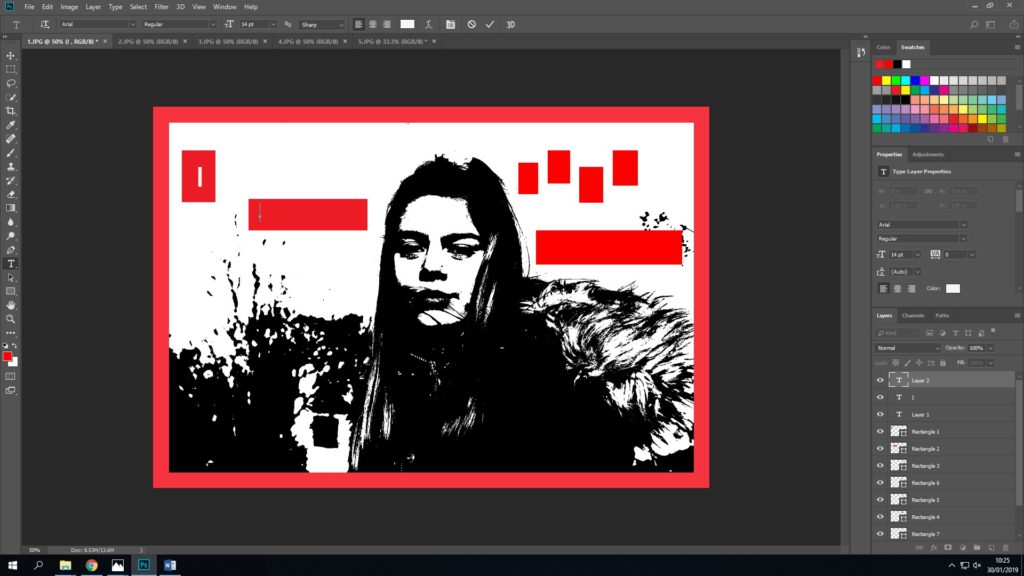
I finished by adding text, and the red border.
another edit:
I began editing this piece by using threshold, I tried to use the amount where you were still able to see detail on the wall and the trees behind Katie.
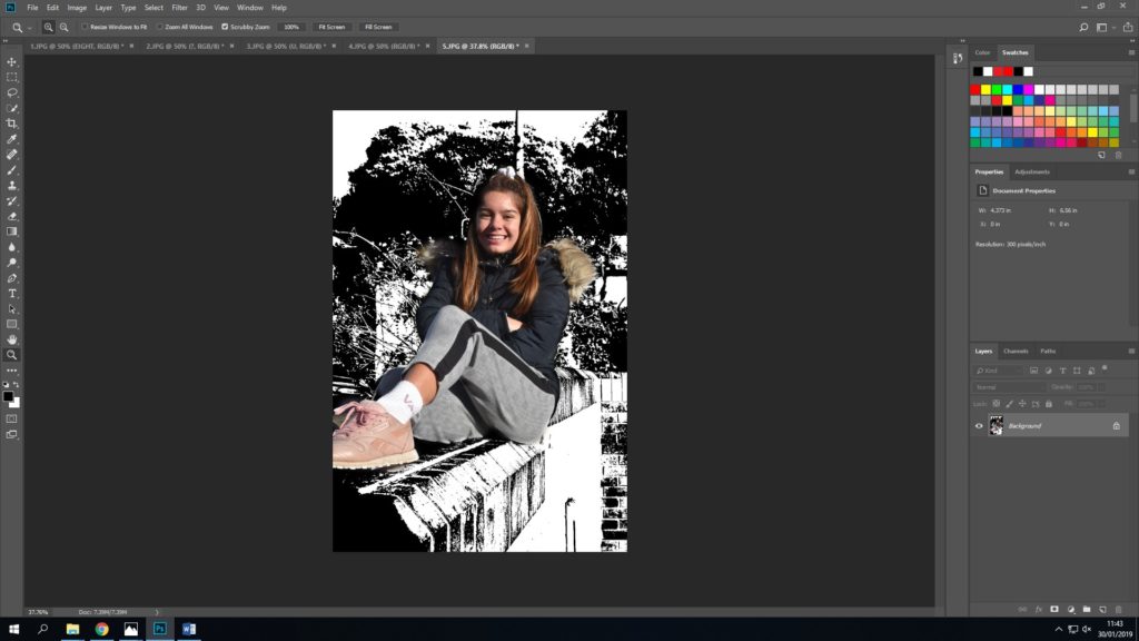
As this image was a lot happier, I did want some colour, and so I then used the ‘history tool’ which enables you to ‘colour’ things in to rewind them to their unedited, original state.