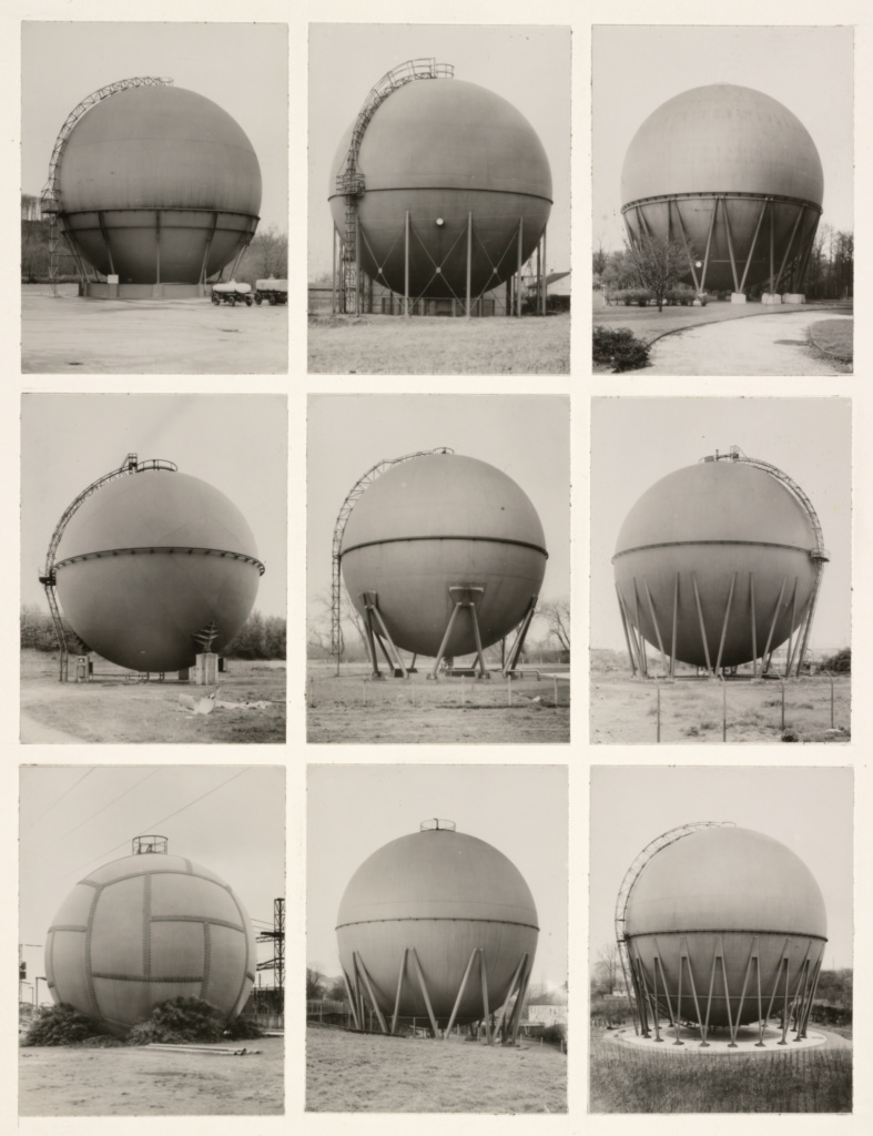
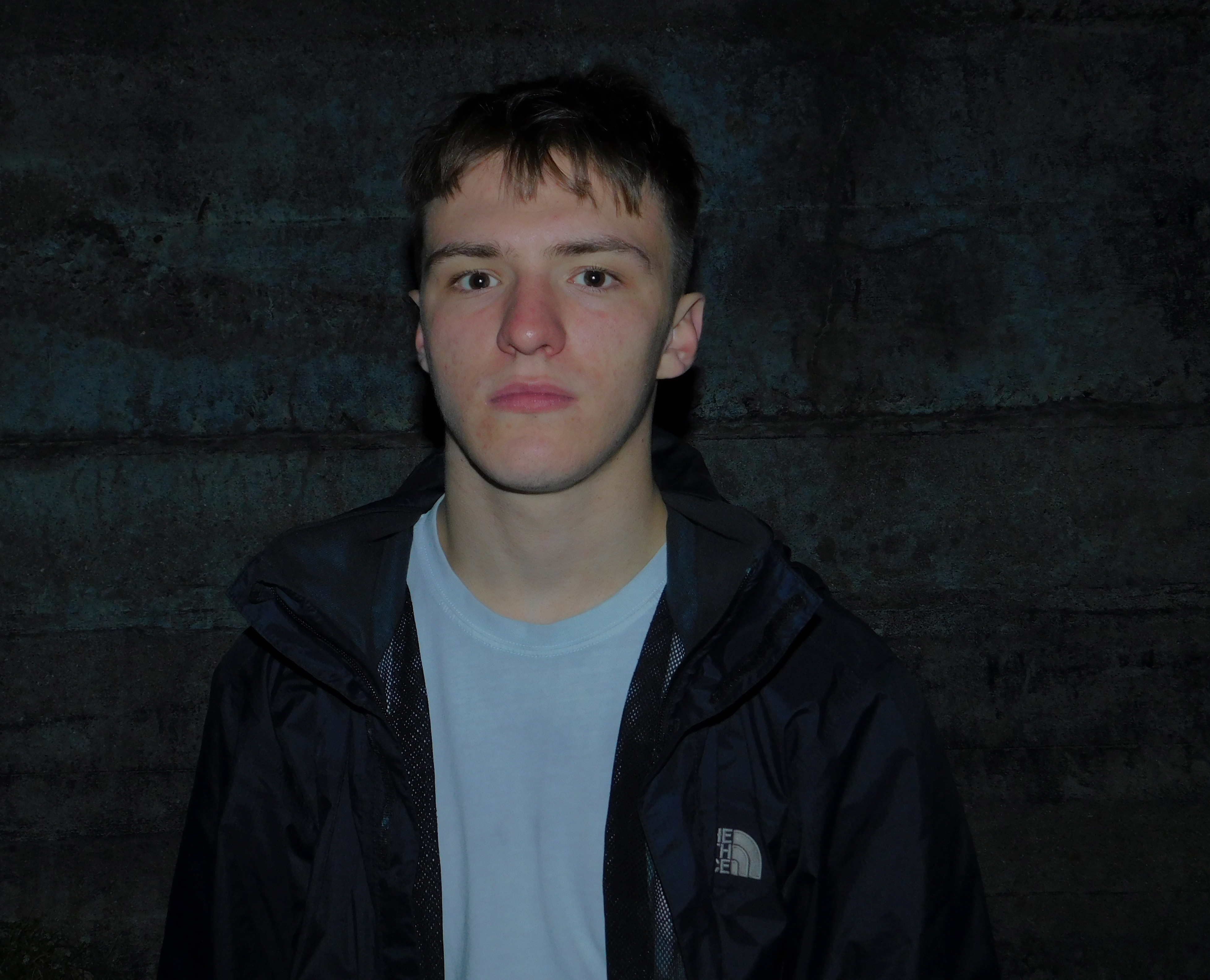
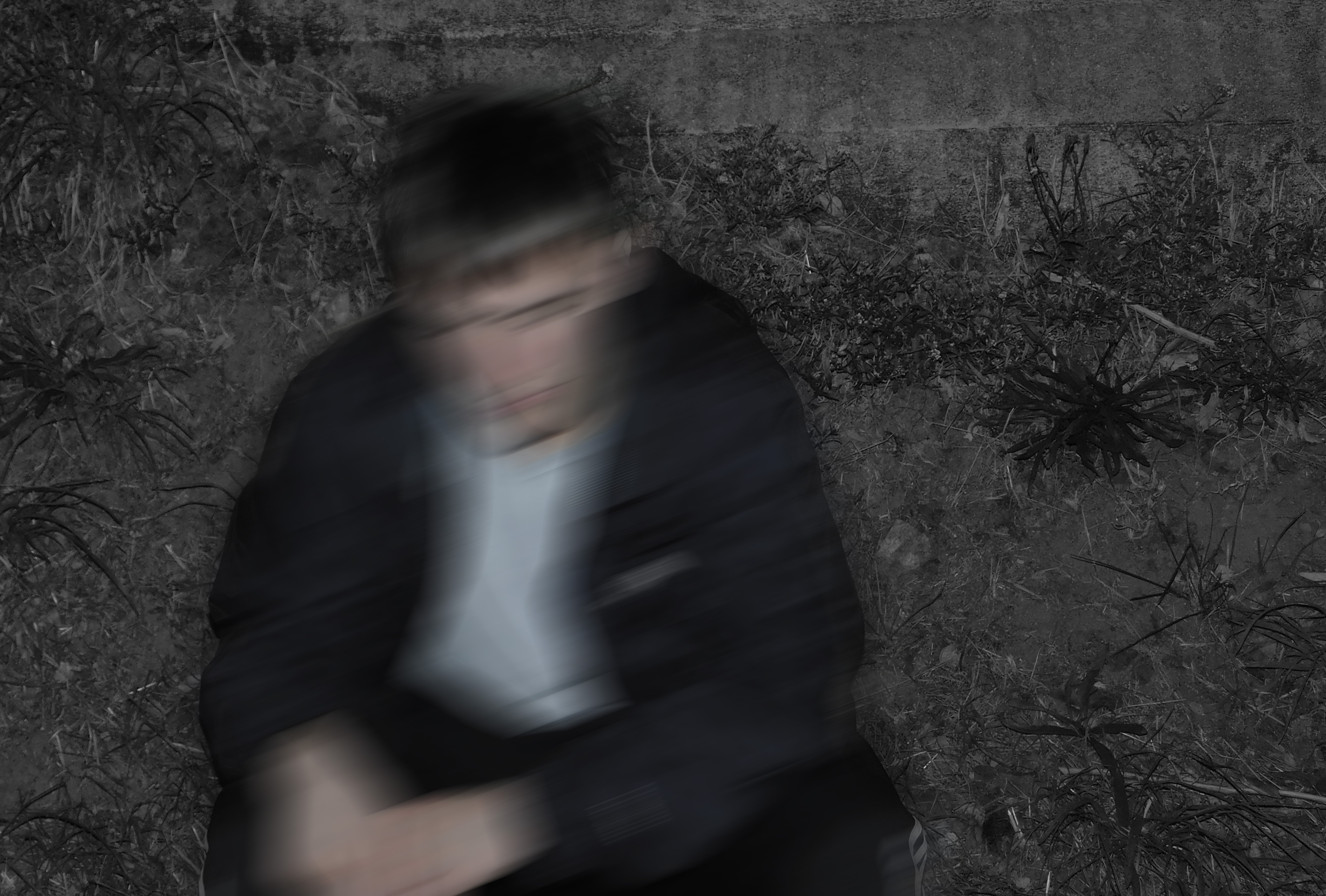
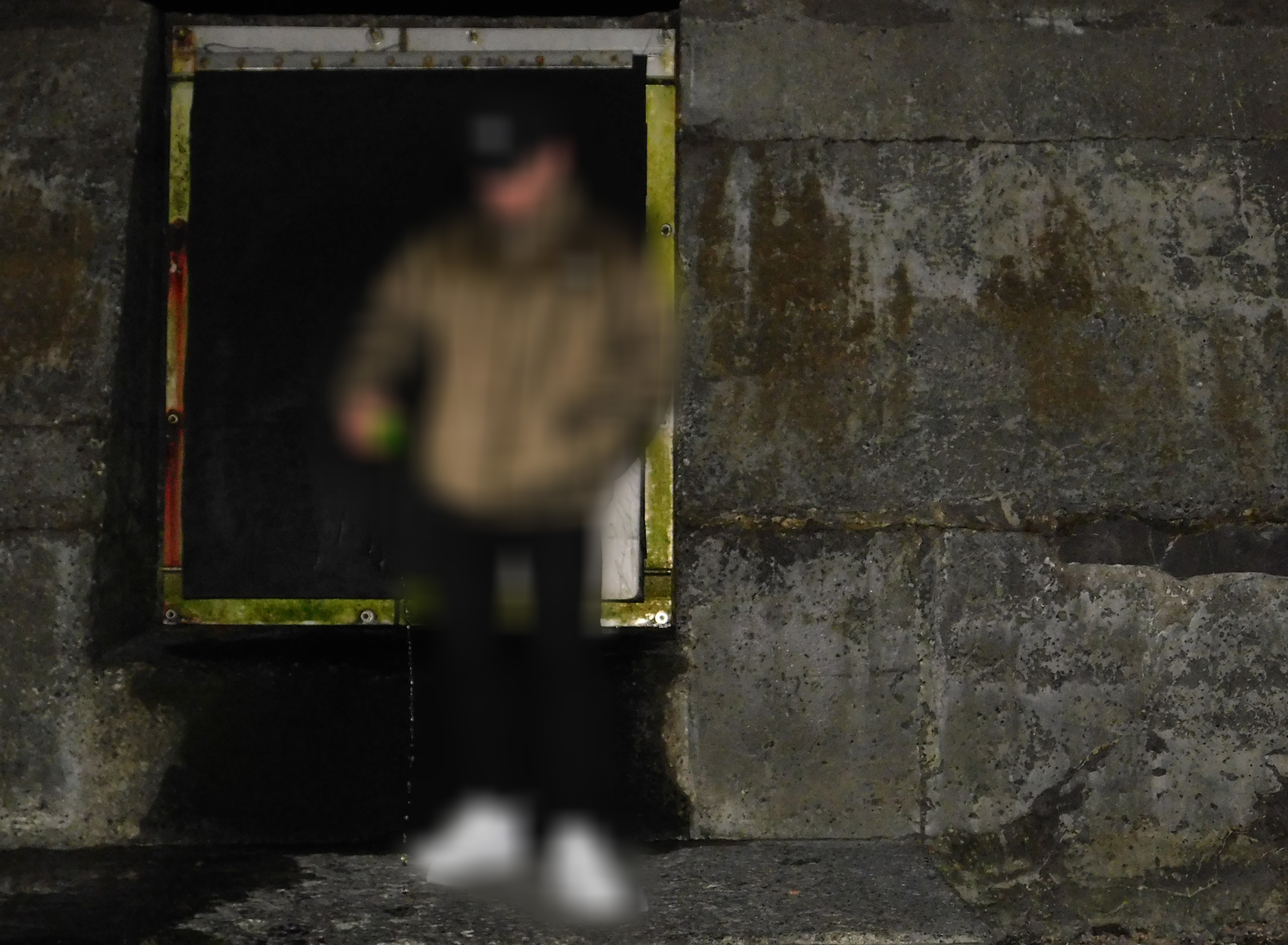
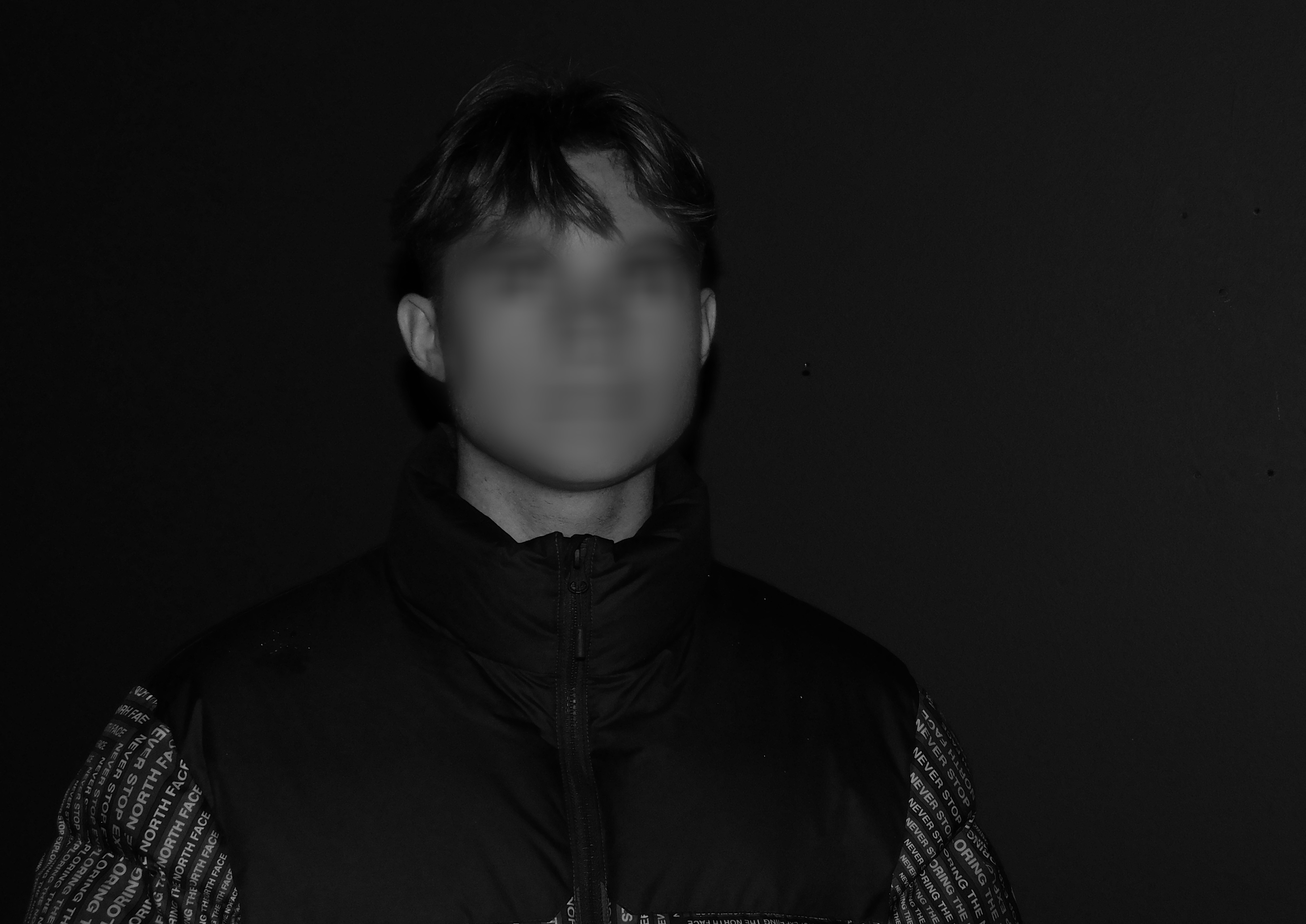
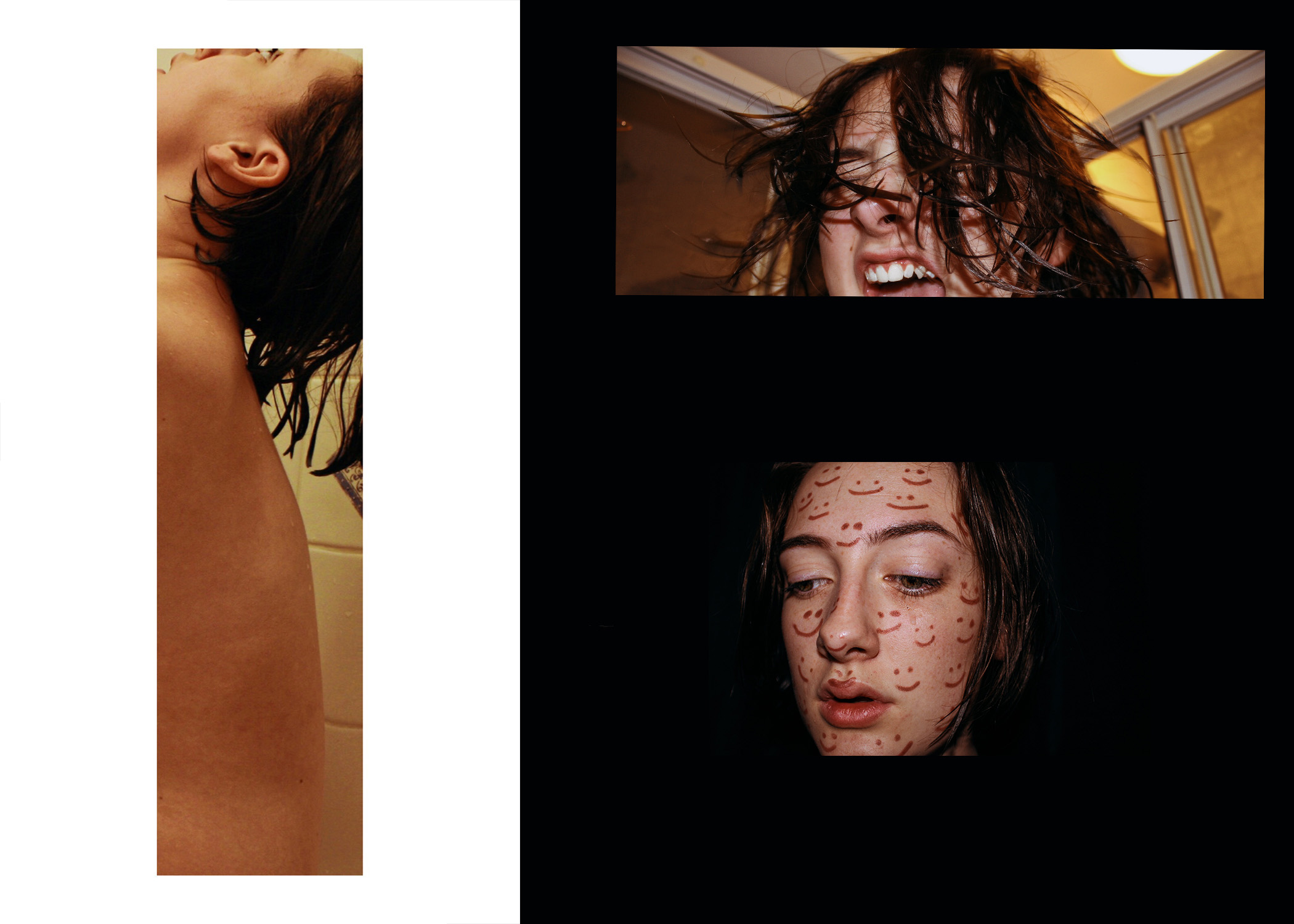
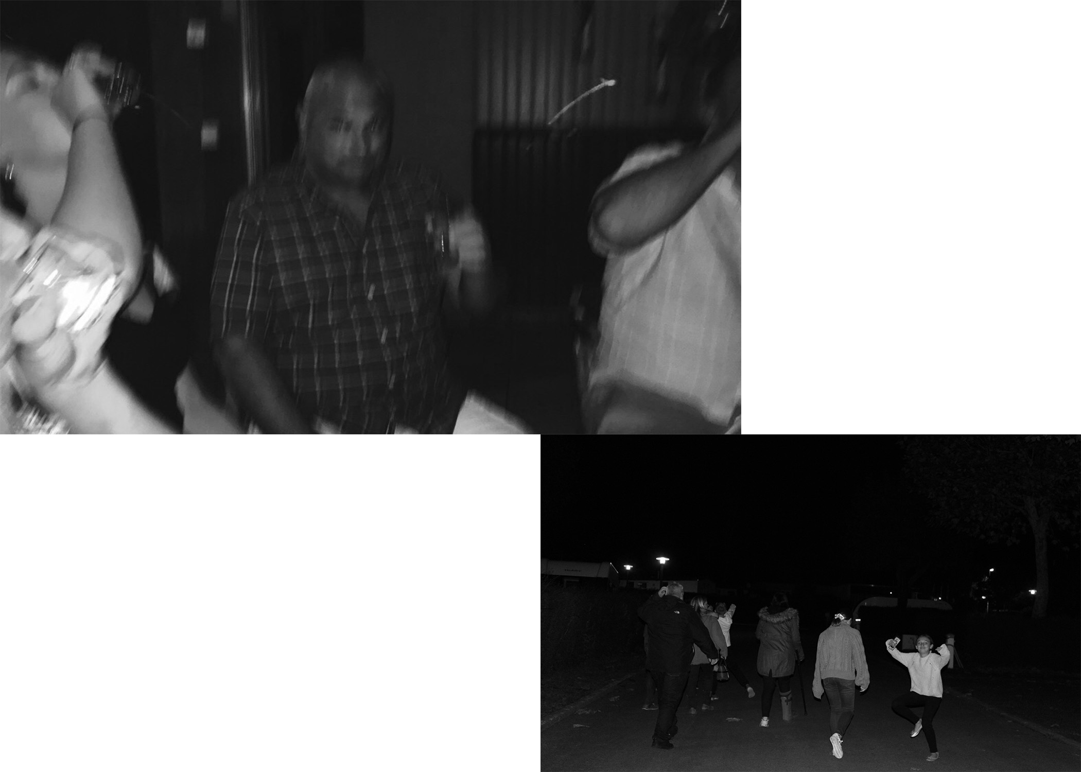
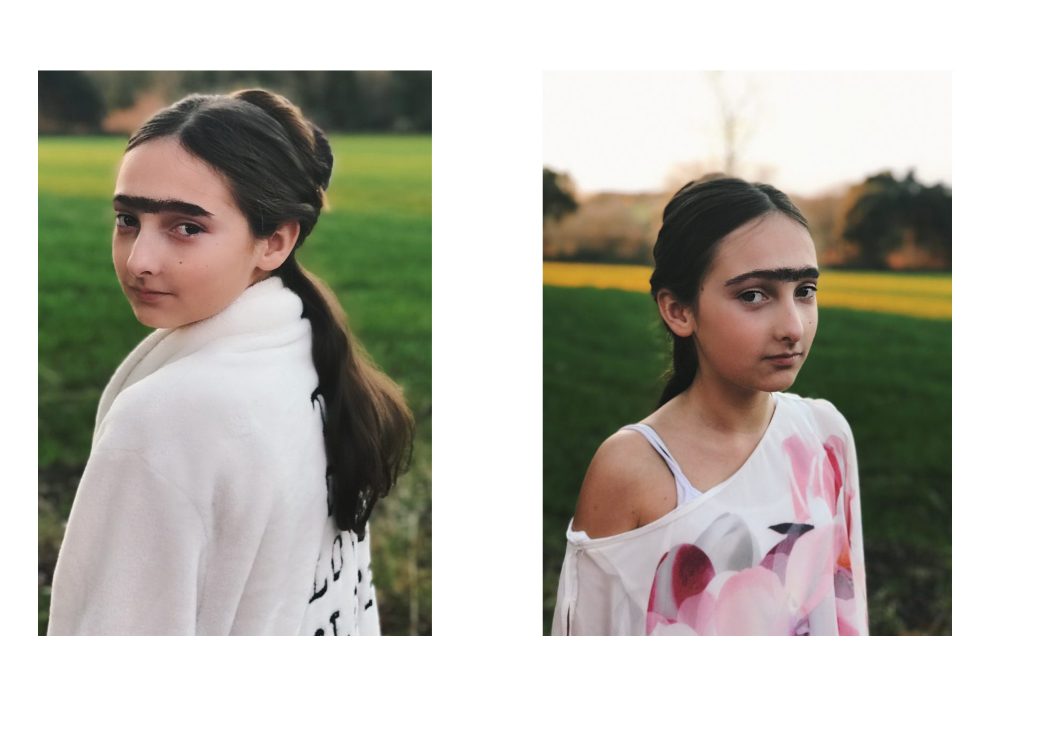
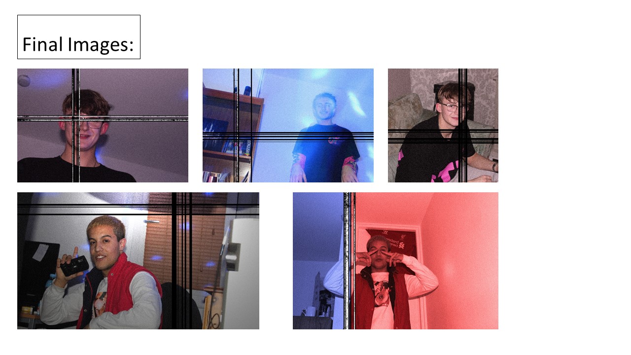
SELECTING FINAL IMAGES
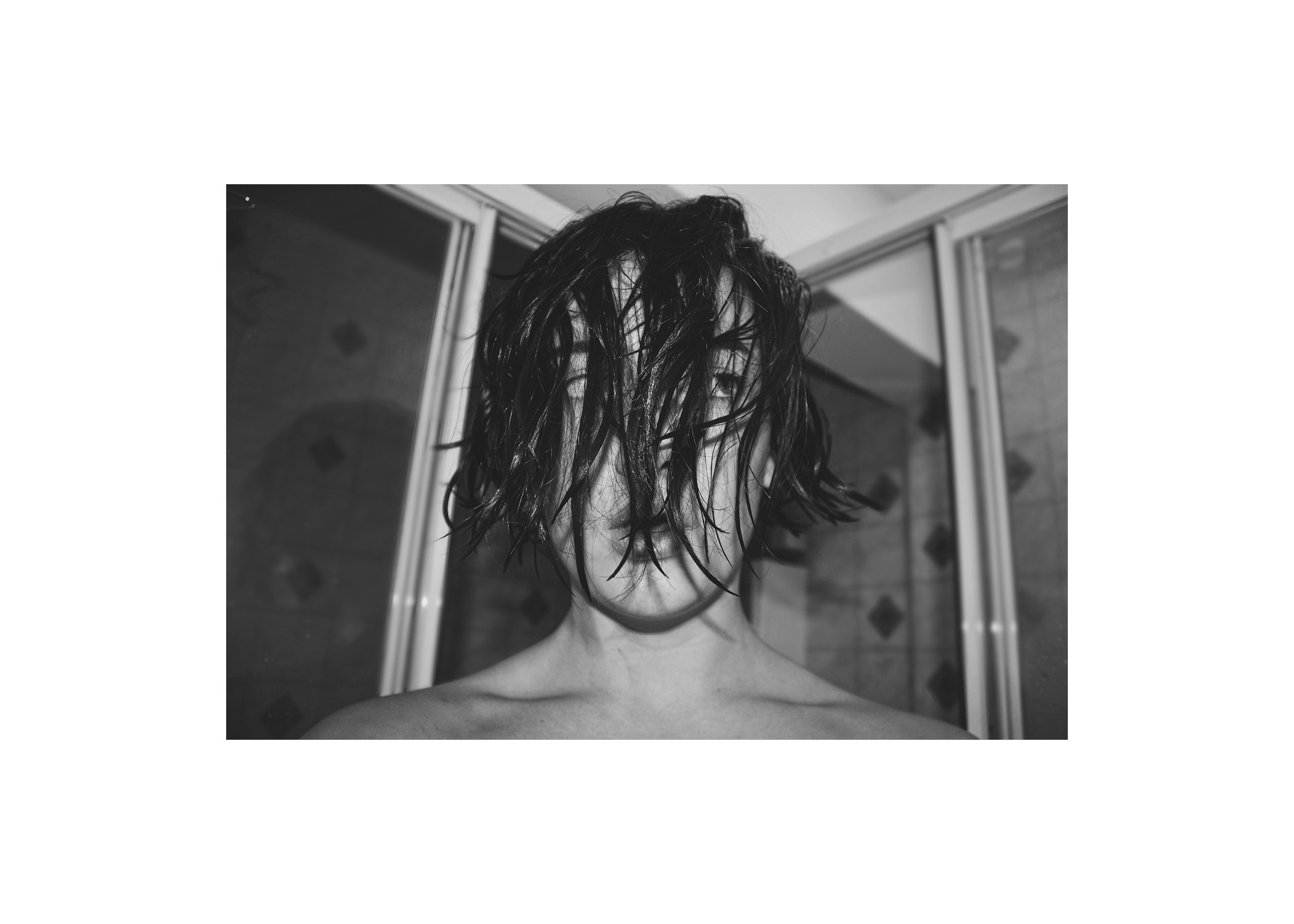
Image 1;
Image 2;
Image 3;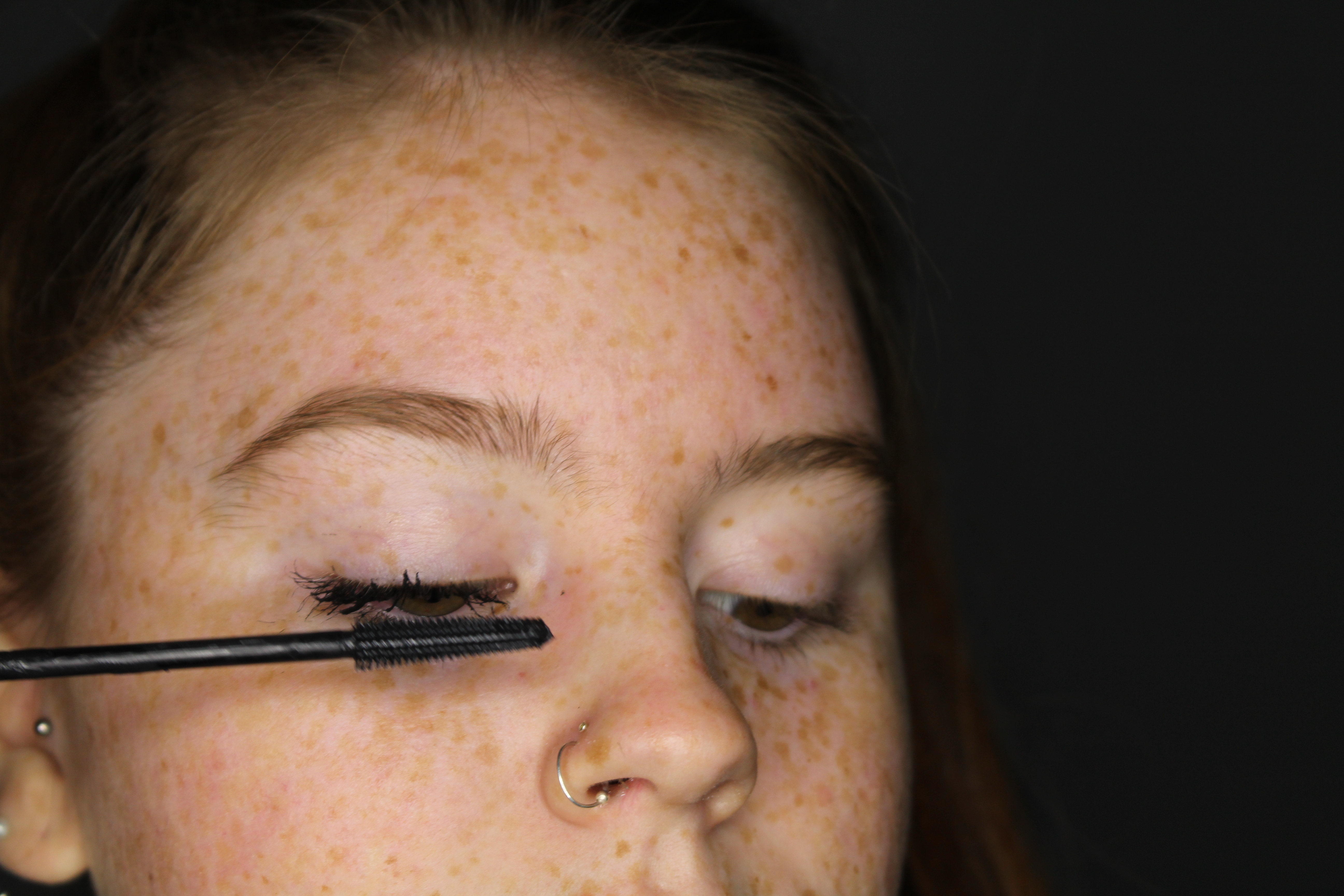
Image 4;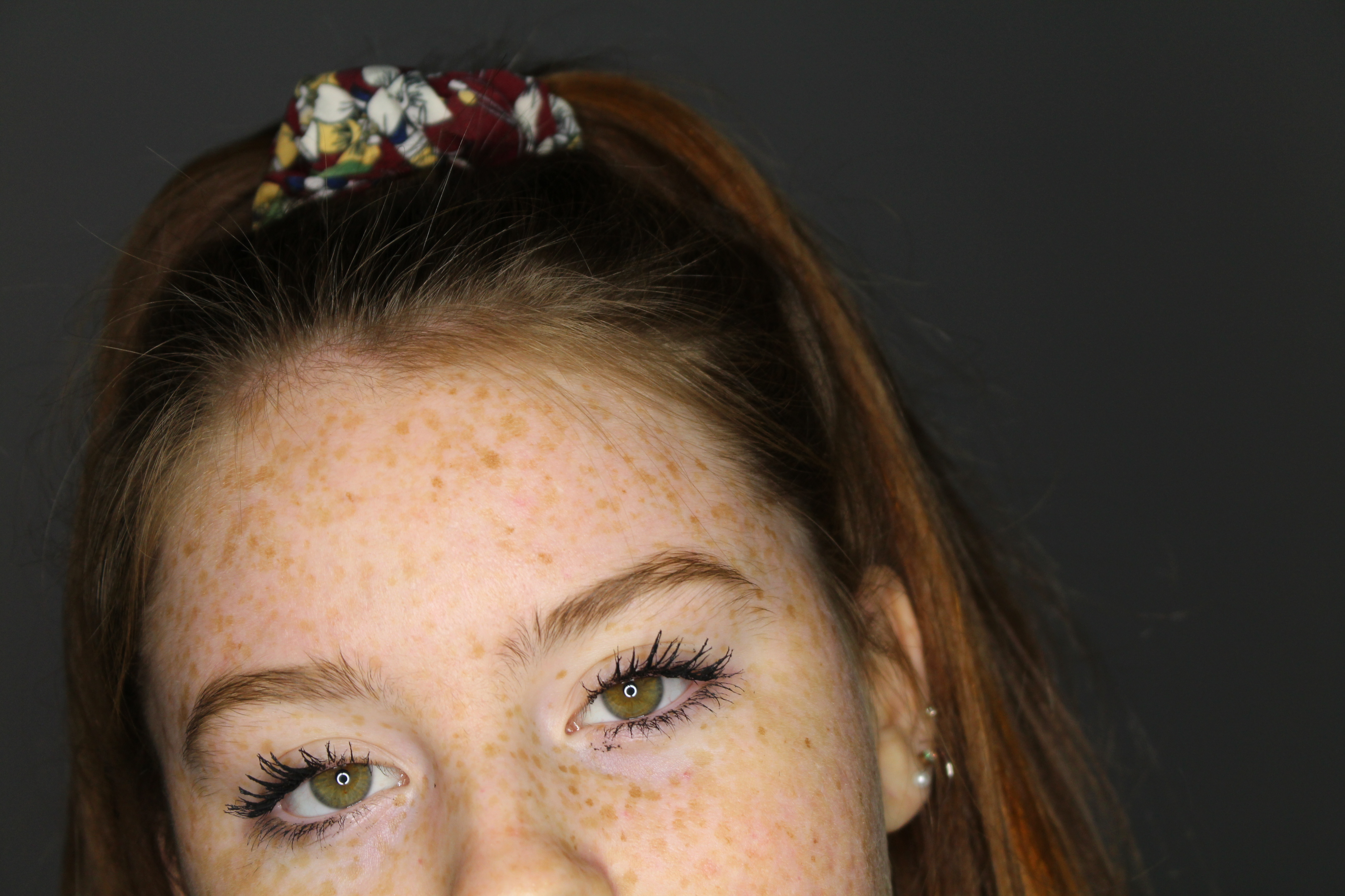
Image 5;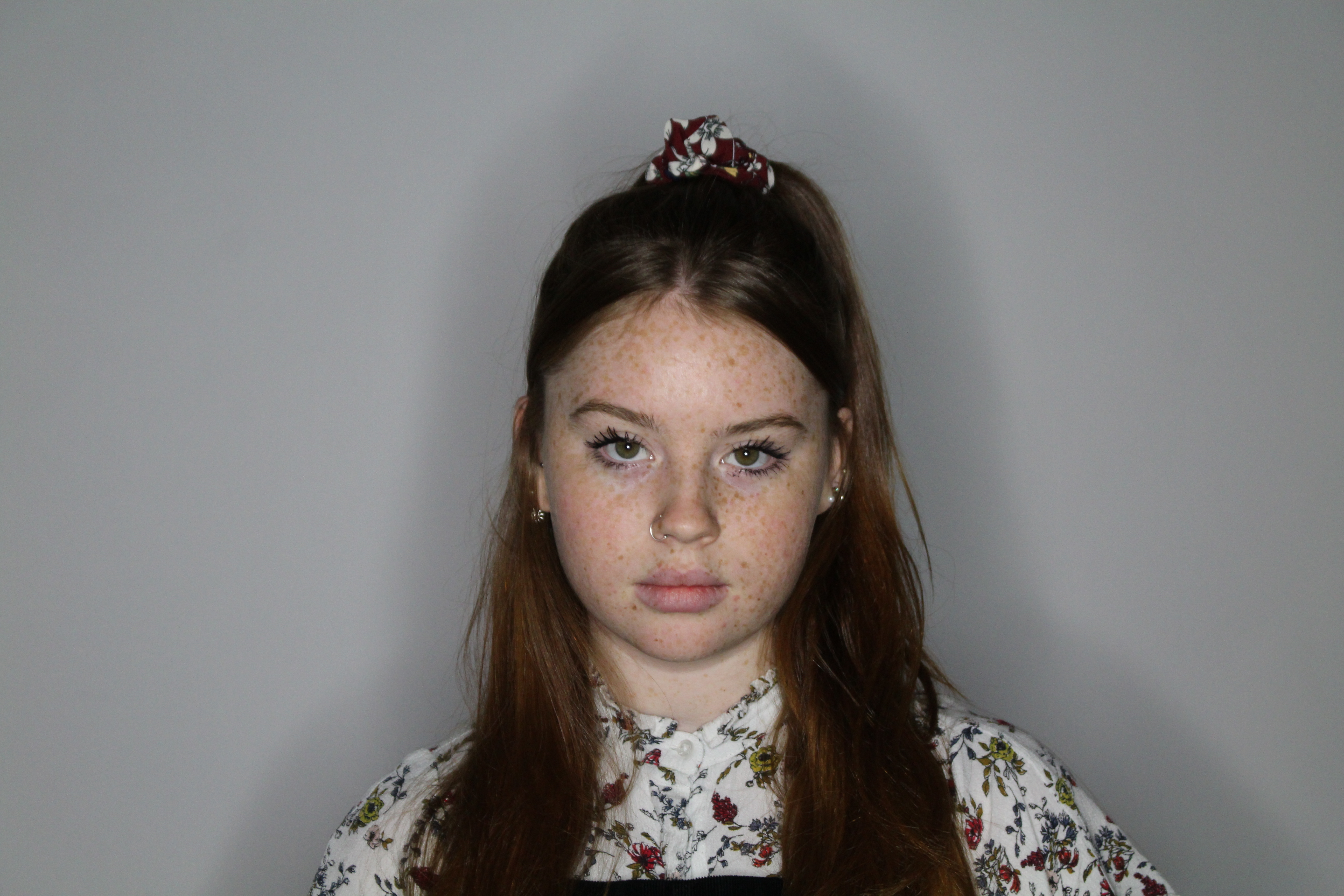
Image 6;
Image 7;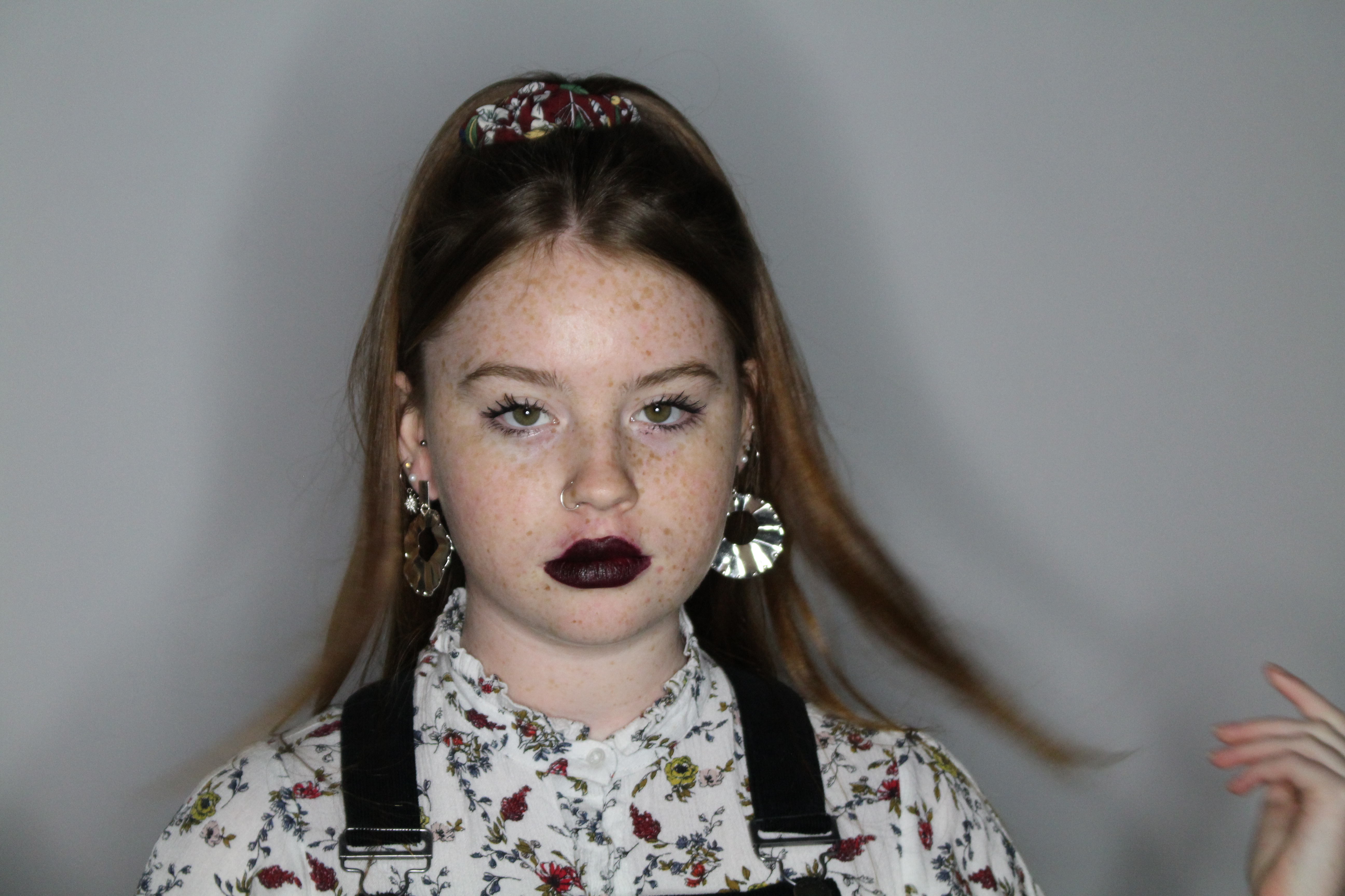
Image 8;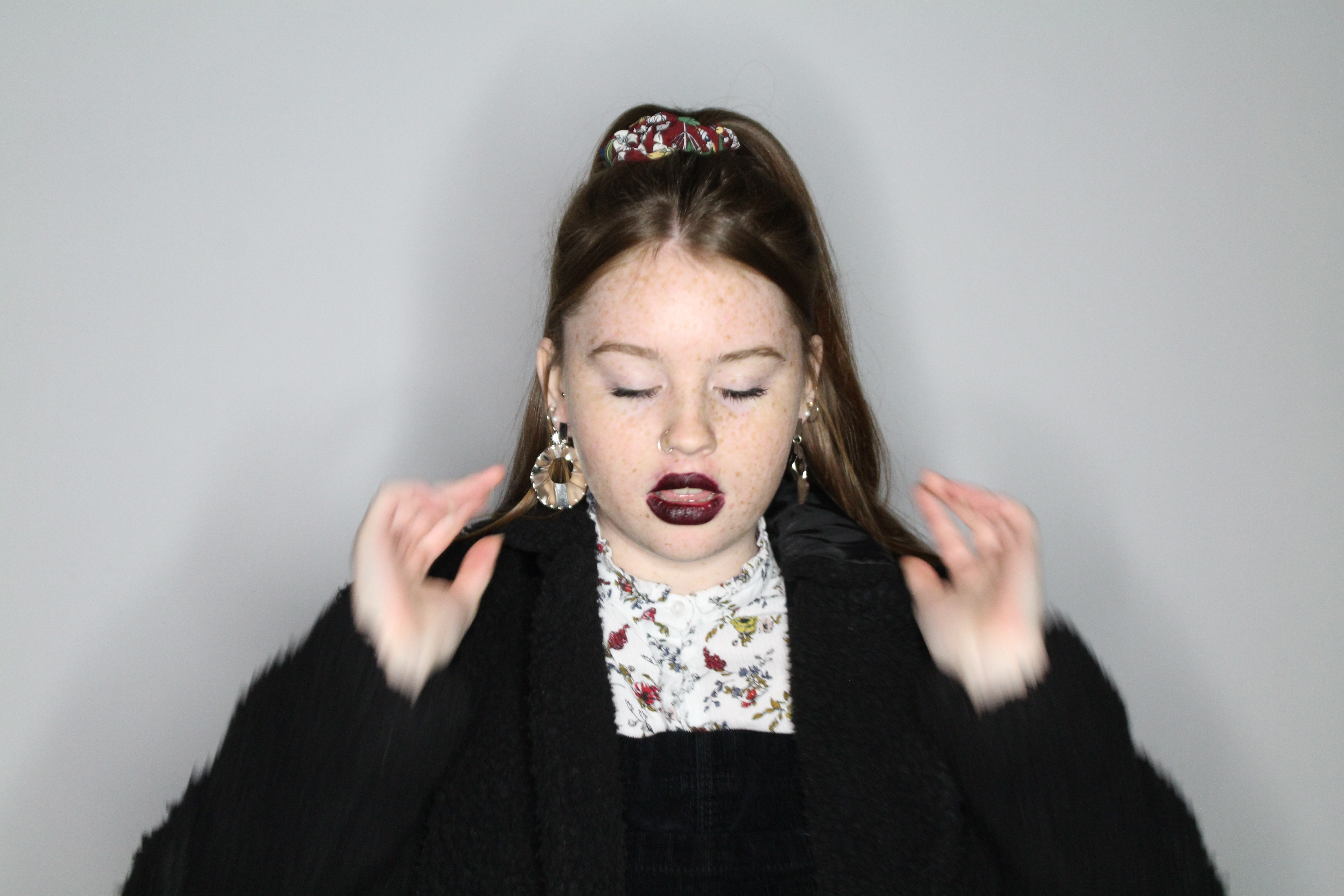
Image 9;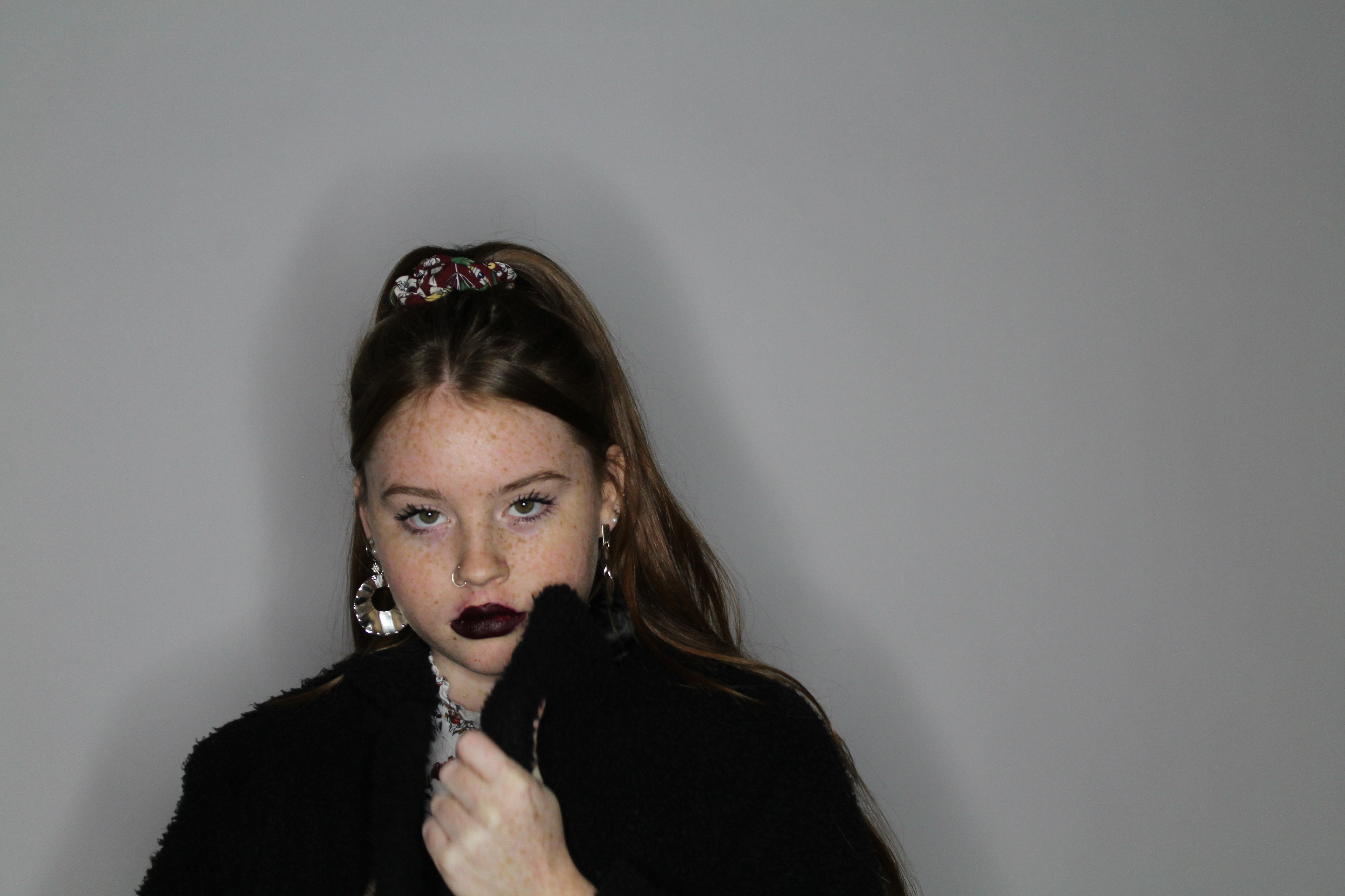
EDITING
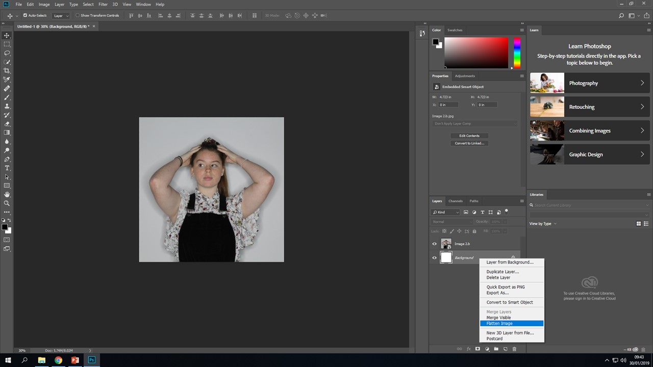
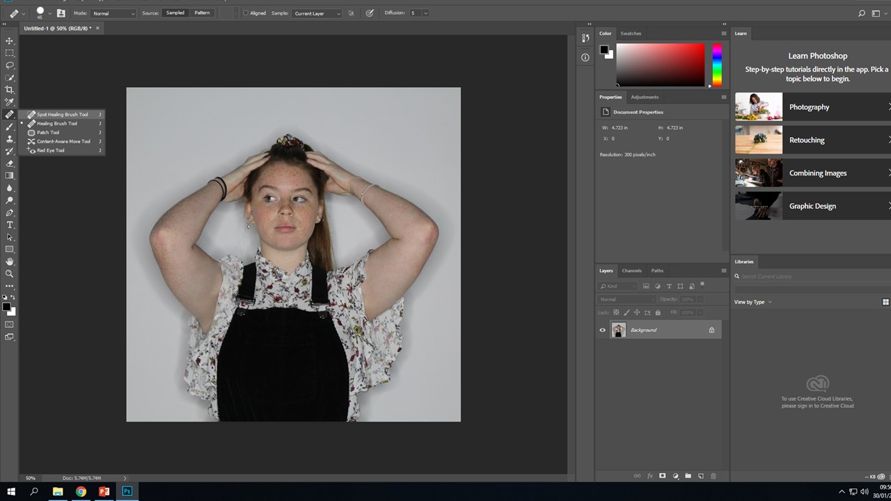
I will repeat this process for every photo, using the healing brush will allow me to even out her skin tone and remove any blemishes within the photo. Certain photos may require me to use more tools, I will show how I used them and what the effect it had on my image;
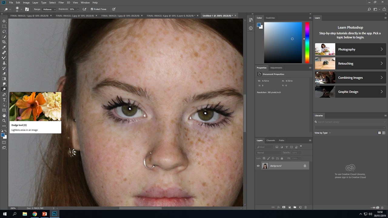
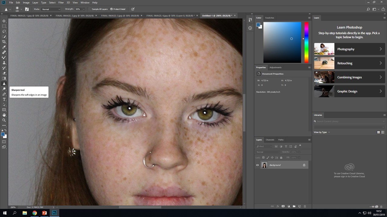
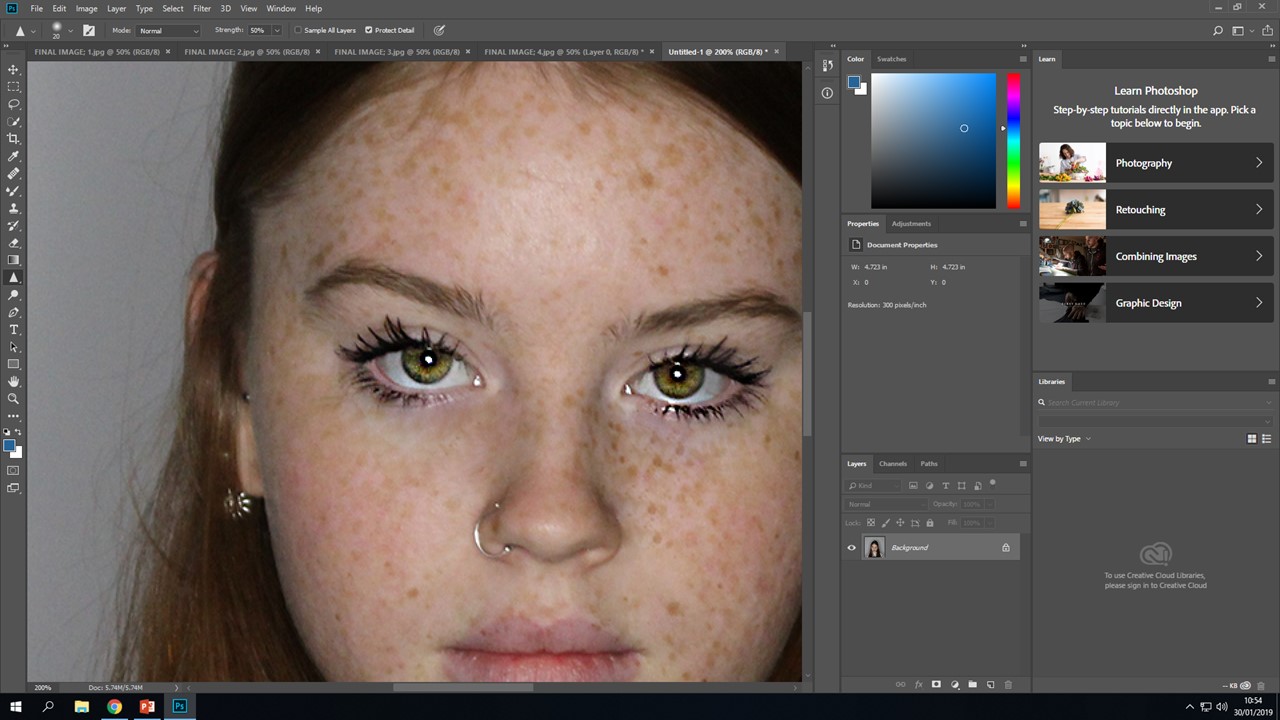
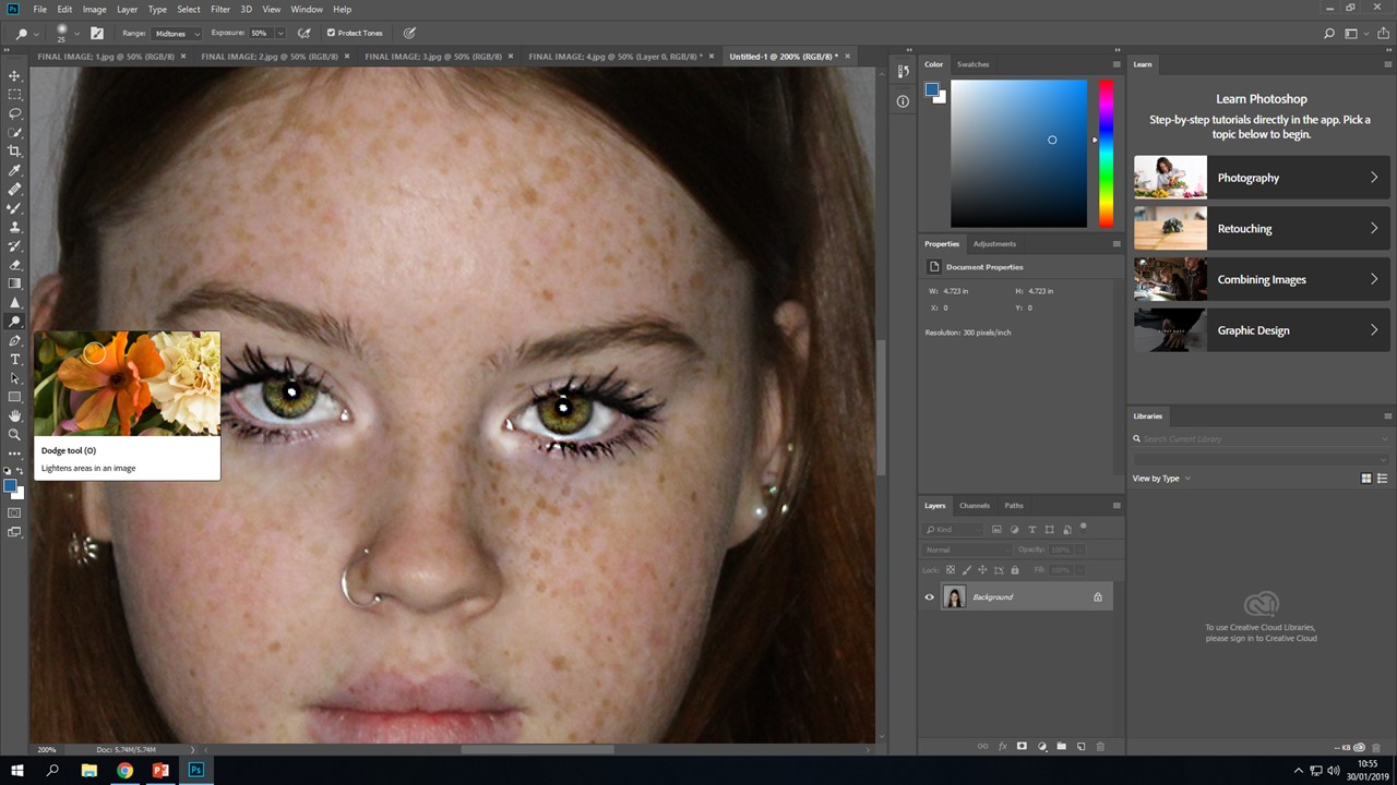
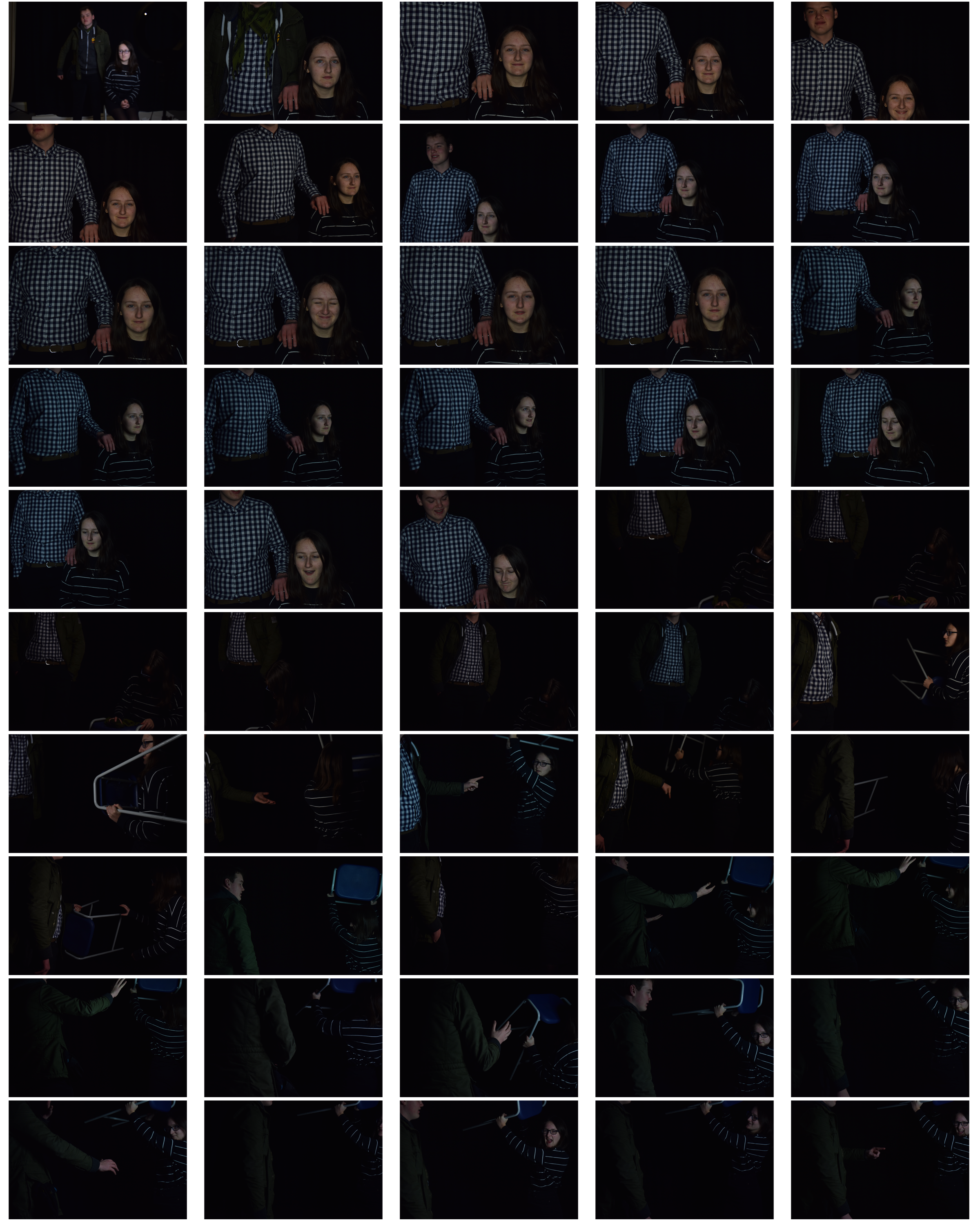
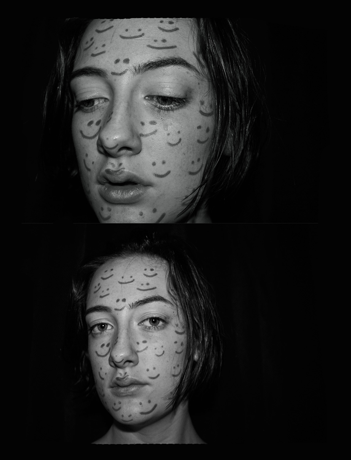
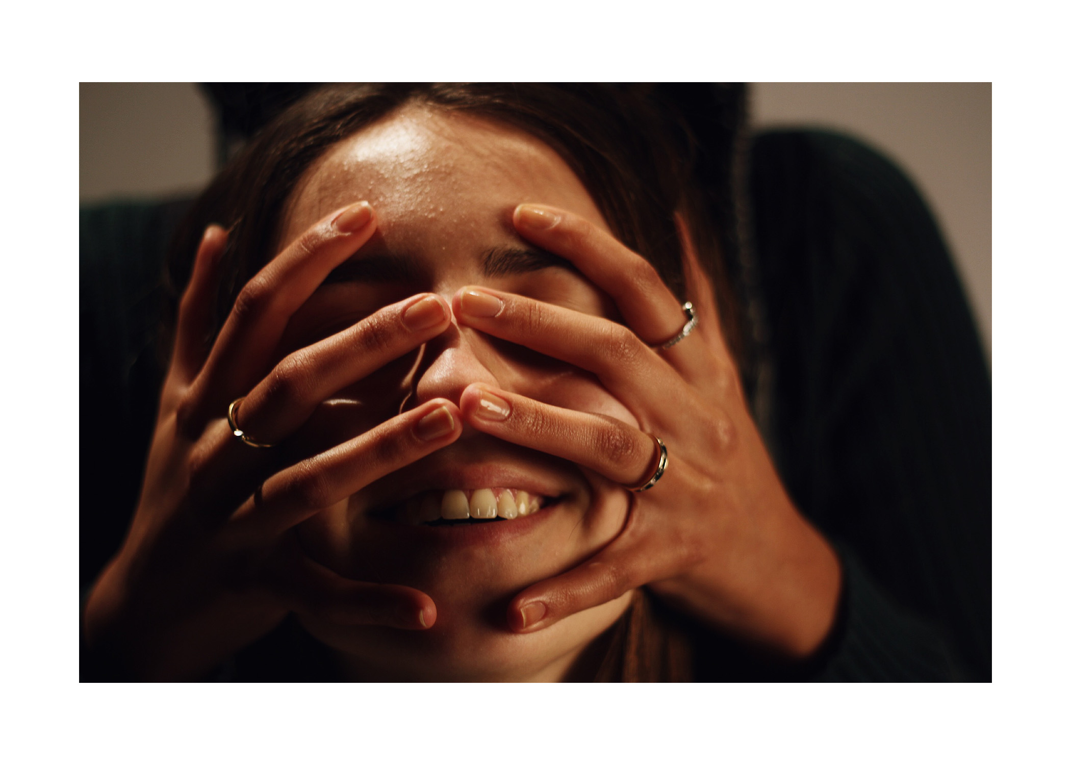
This sequence of photos bellow, show me editing this specific image as I wanted this one to stand out more and be more dramatic, this is because it was a close up of her face, so features needed to pop more and be brighter. I firstly used the sharpen tool, this allowed me to make her features more dramatic, I then used the healing brush to hide the mascara that she got on her face and cover up some redness, I then went in with the dodge tool, this allowed me to make parts of her face brighter, I highlighted the features that needed to be brighter, such as under the eyes and straight down the nose, I then when back in with the sharpen tool to go back over the eyes to make sure they stand out and are capturing. These three images show the changes and what they did to her face;

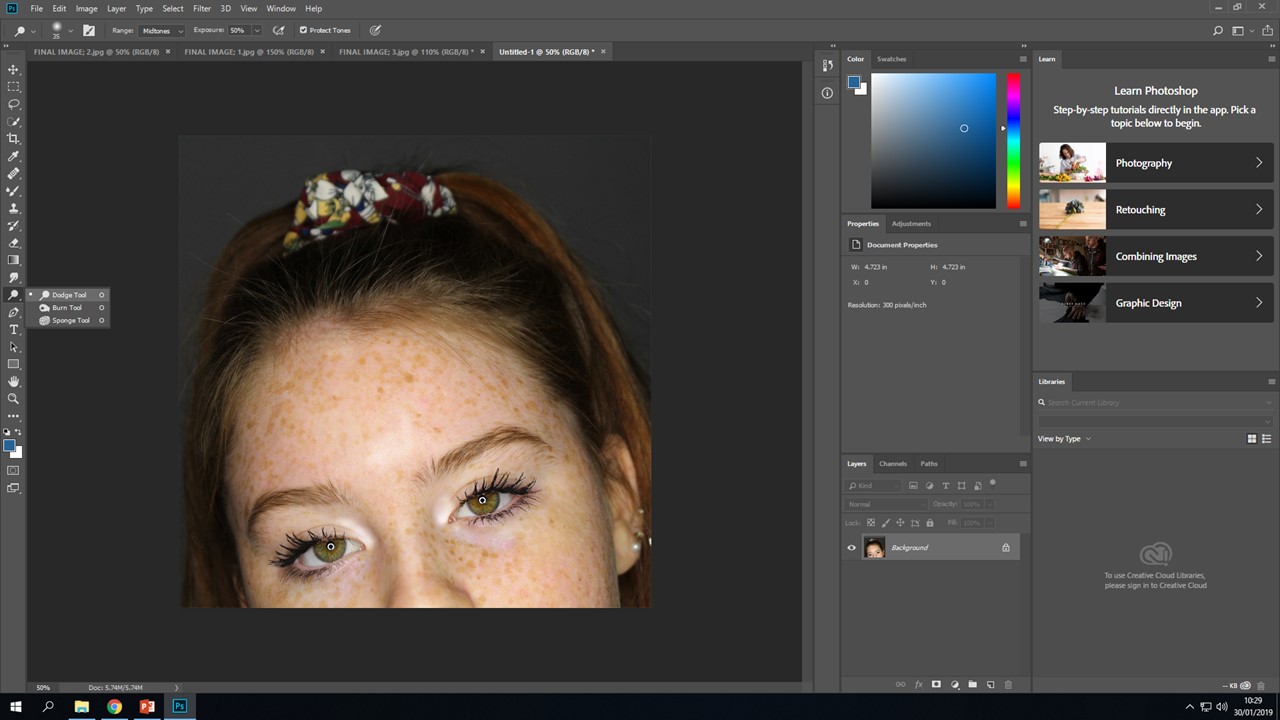

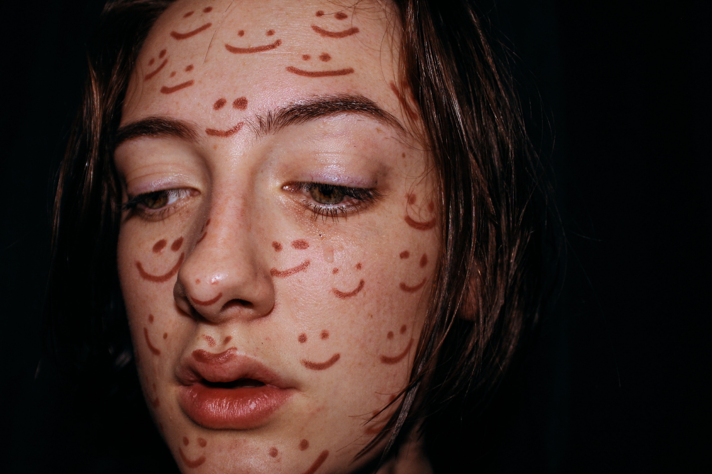
These screenshots show how I made her eyes brighter and more dramatic, it shows the steps and results of me using certain types of tools. I decided to brighten up the eyes and make them the most dramatic part of this image, as I want to show the change from going from having no make up to then applying it,. This is to make the ‘transformation’ from going from her self to society norms more dramatic, as did Leigh Bowery, he made the makeup on his models so dramatic, so I have decided to dramatize certain features to really show the change. This is what I have done;

MY FINAL EDITS
1;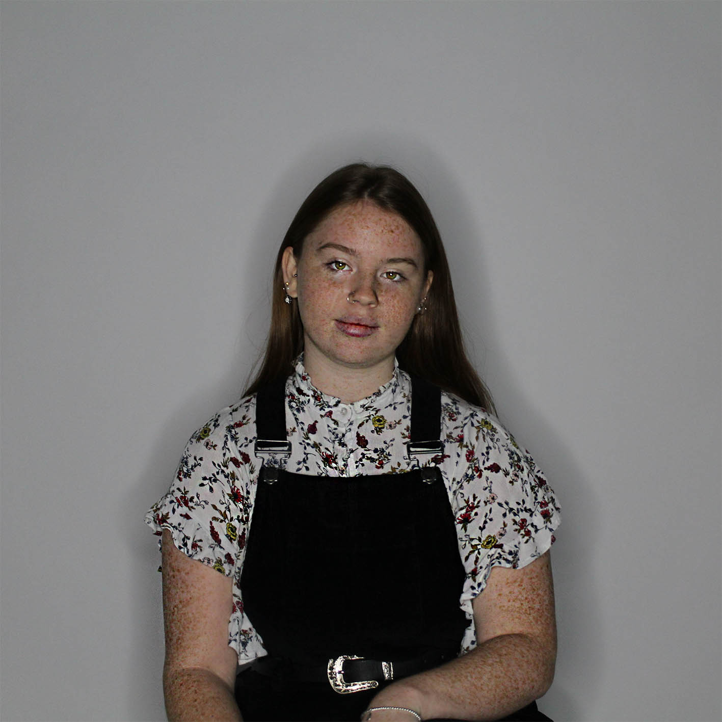
2;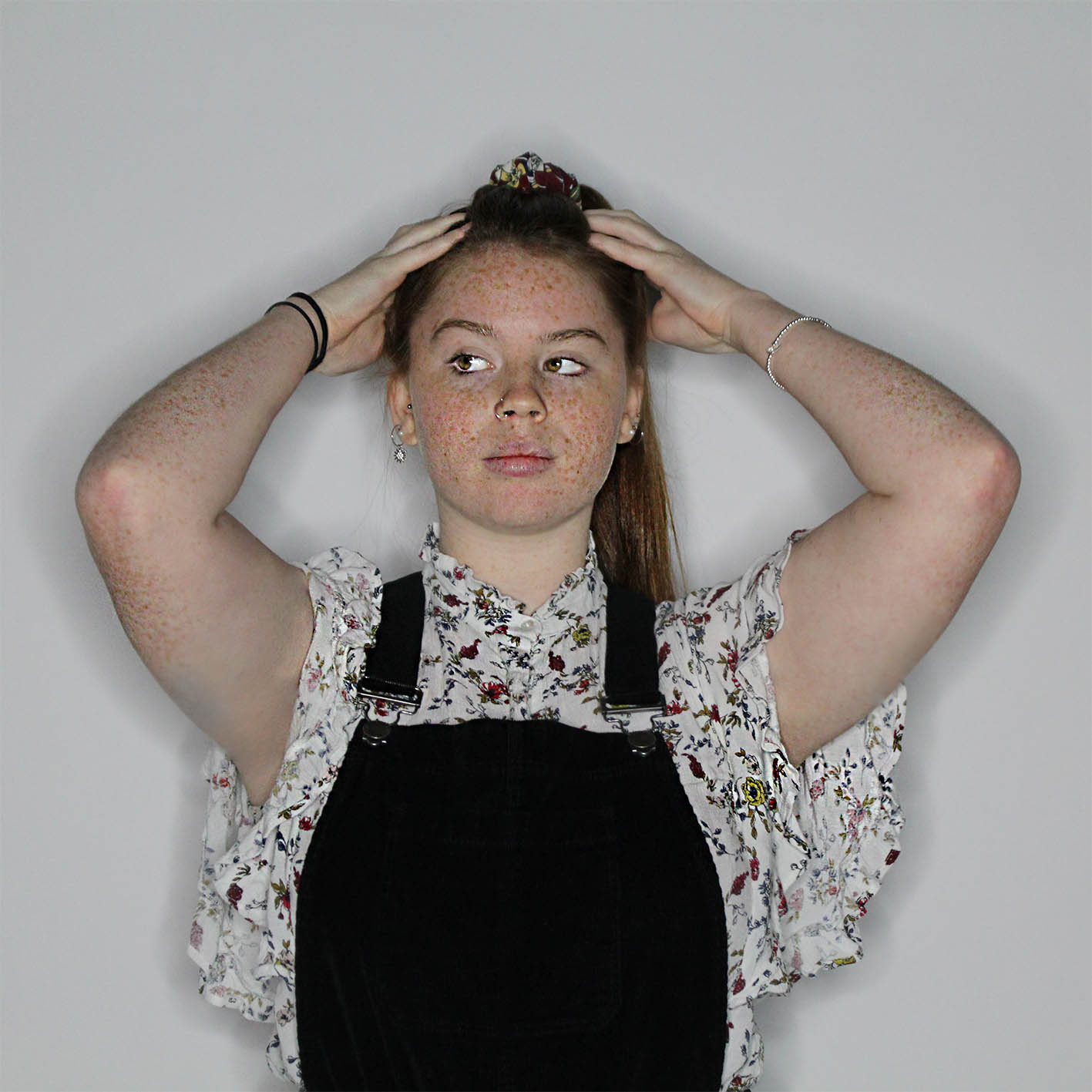
3;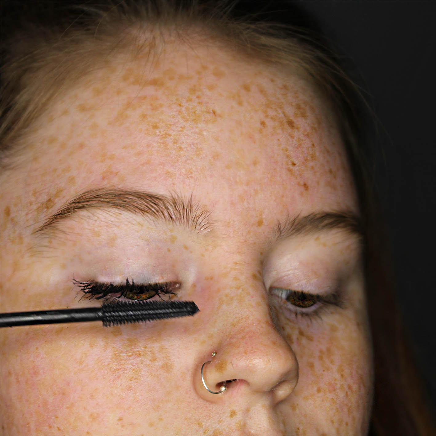
4;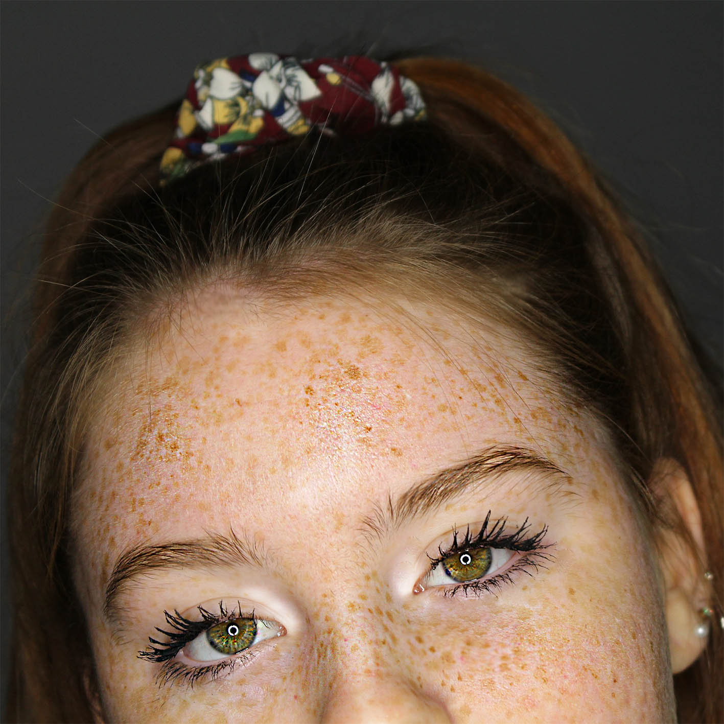
5;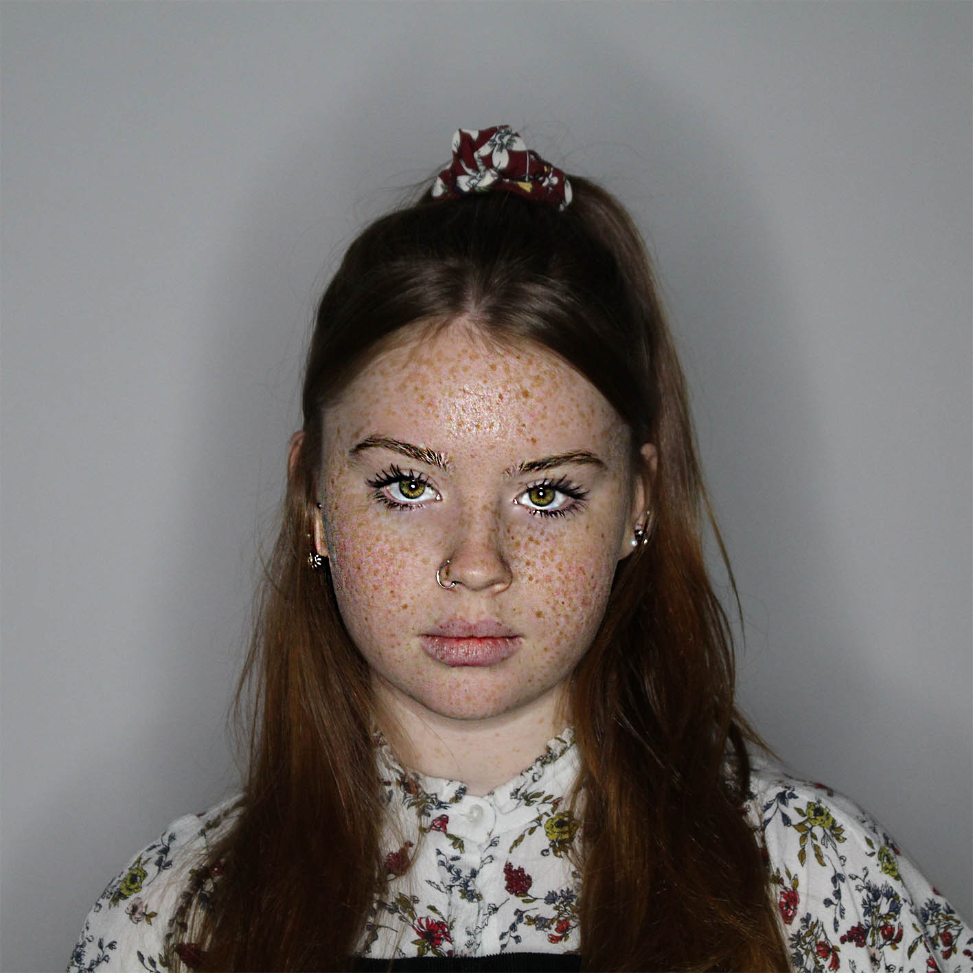
6;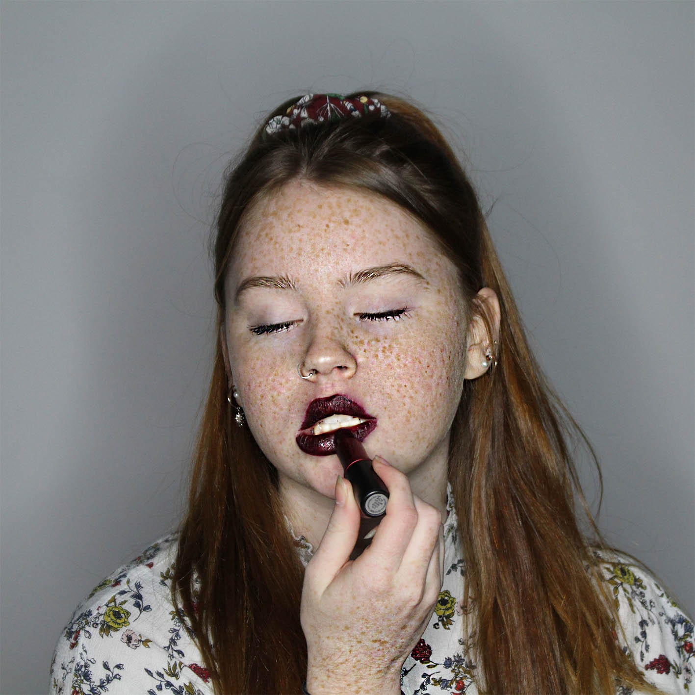
7;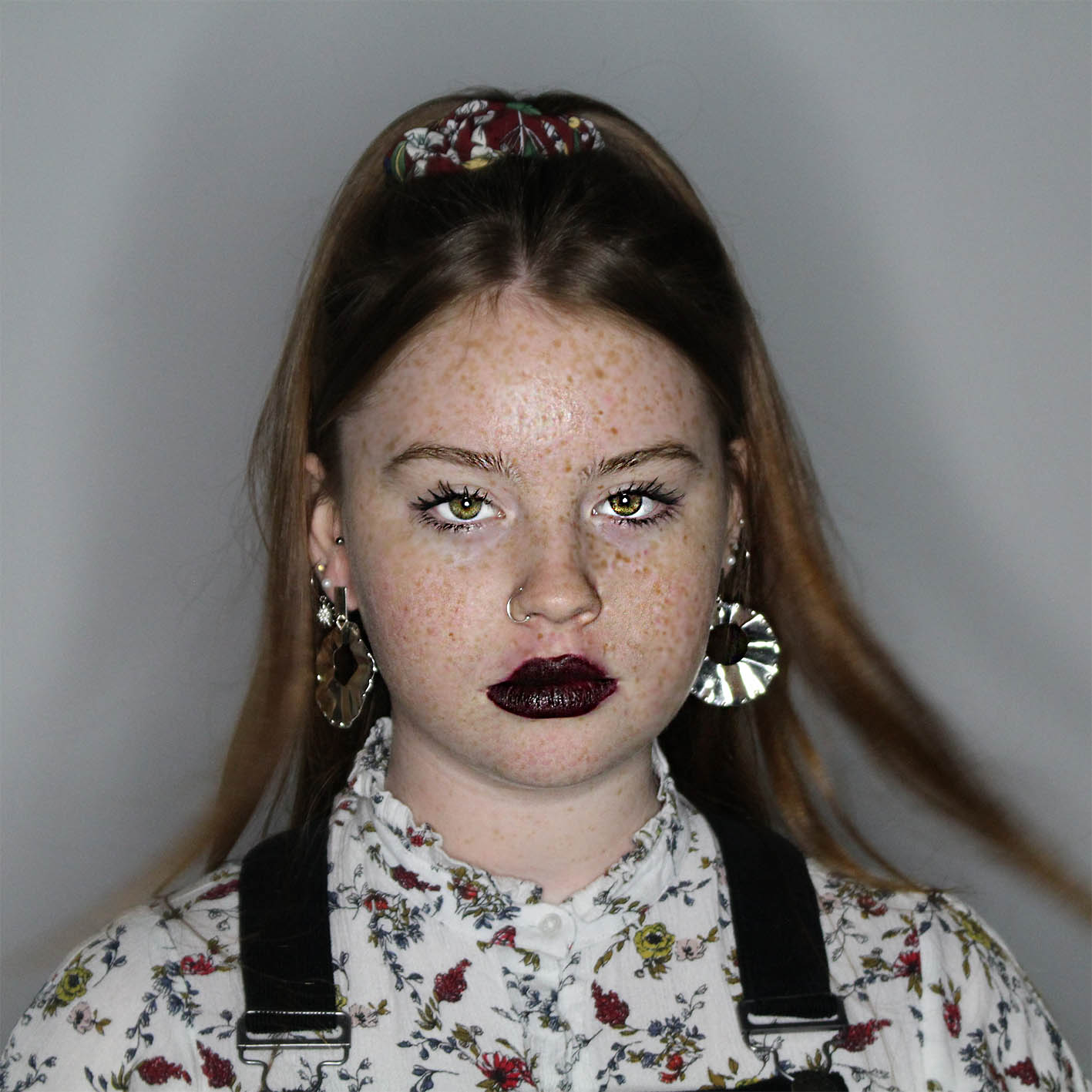
8;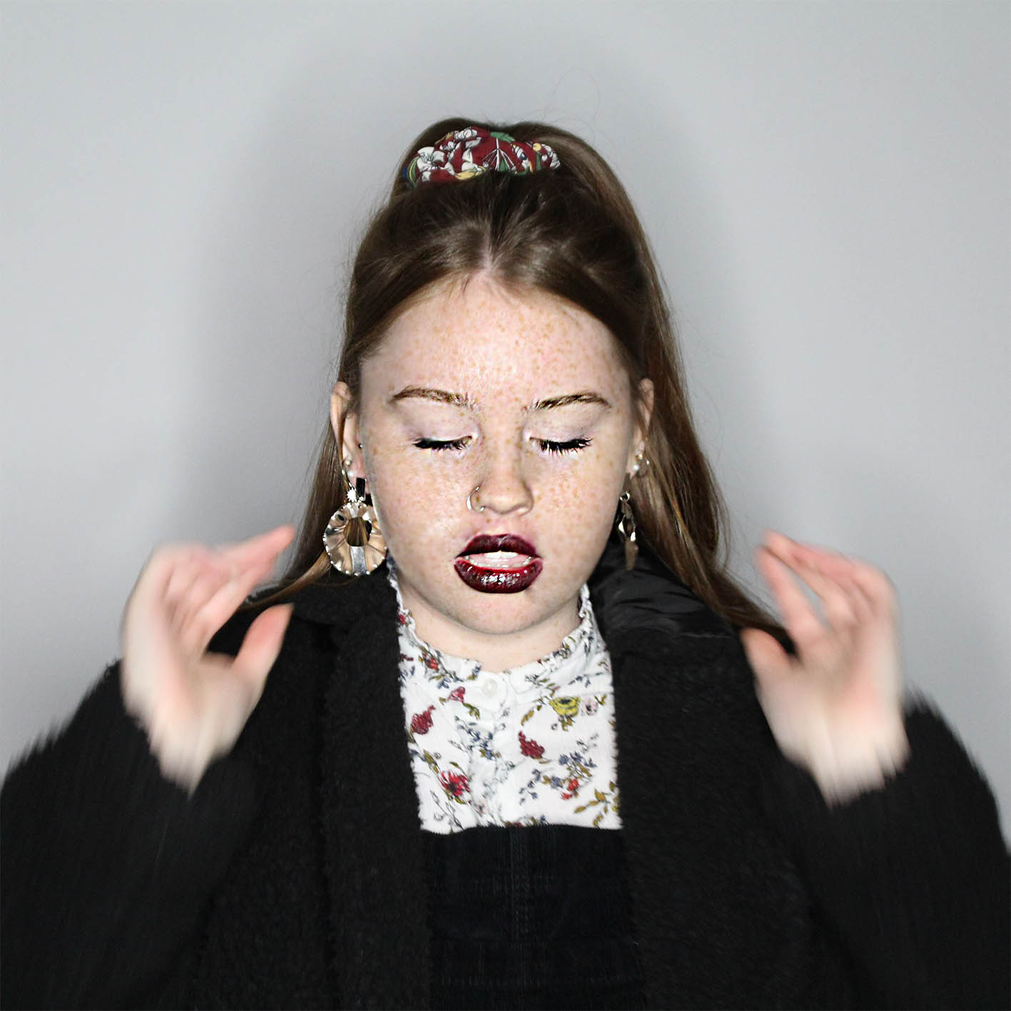
9;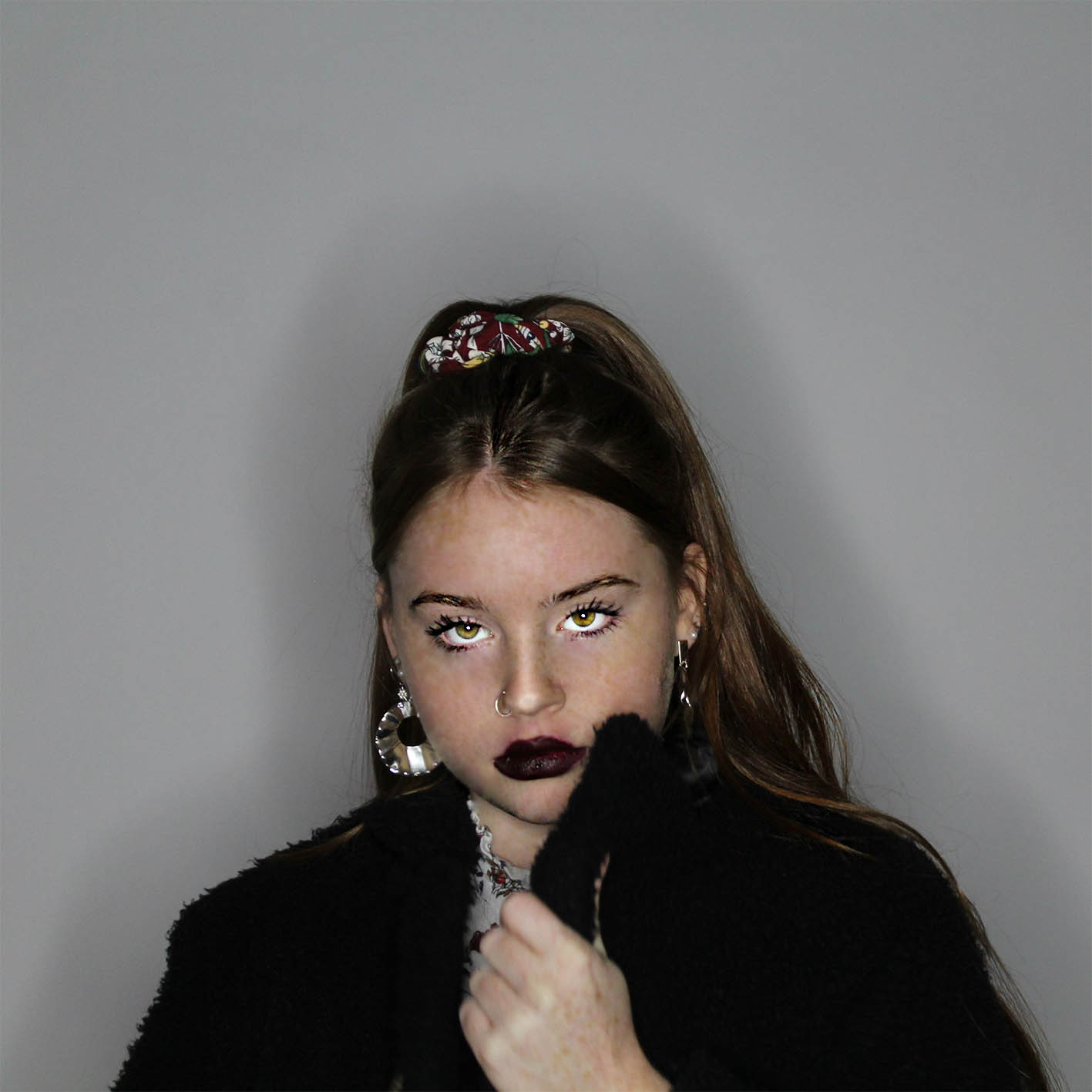
PRESENTATION
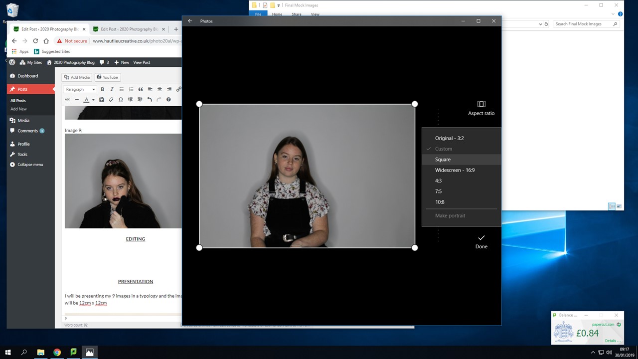
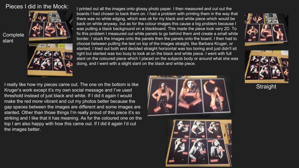
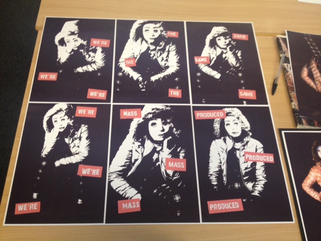
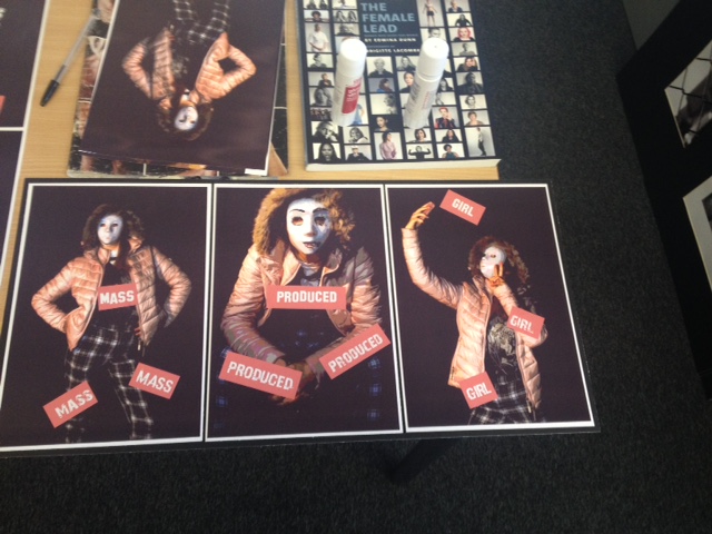
I will be presenting my 9 images in a typology and the images size will be 14cm x 14cm;
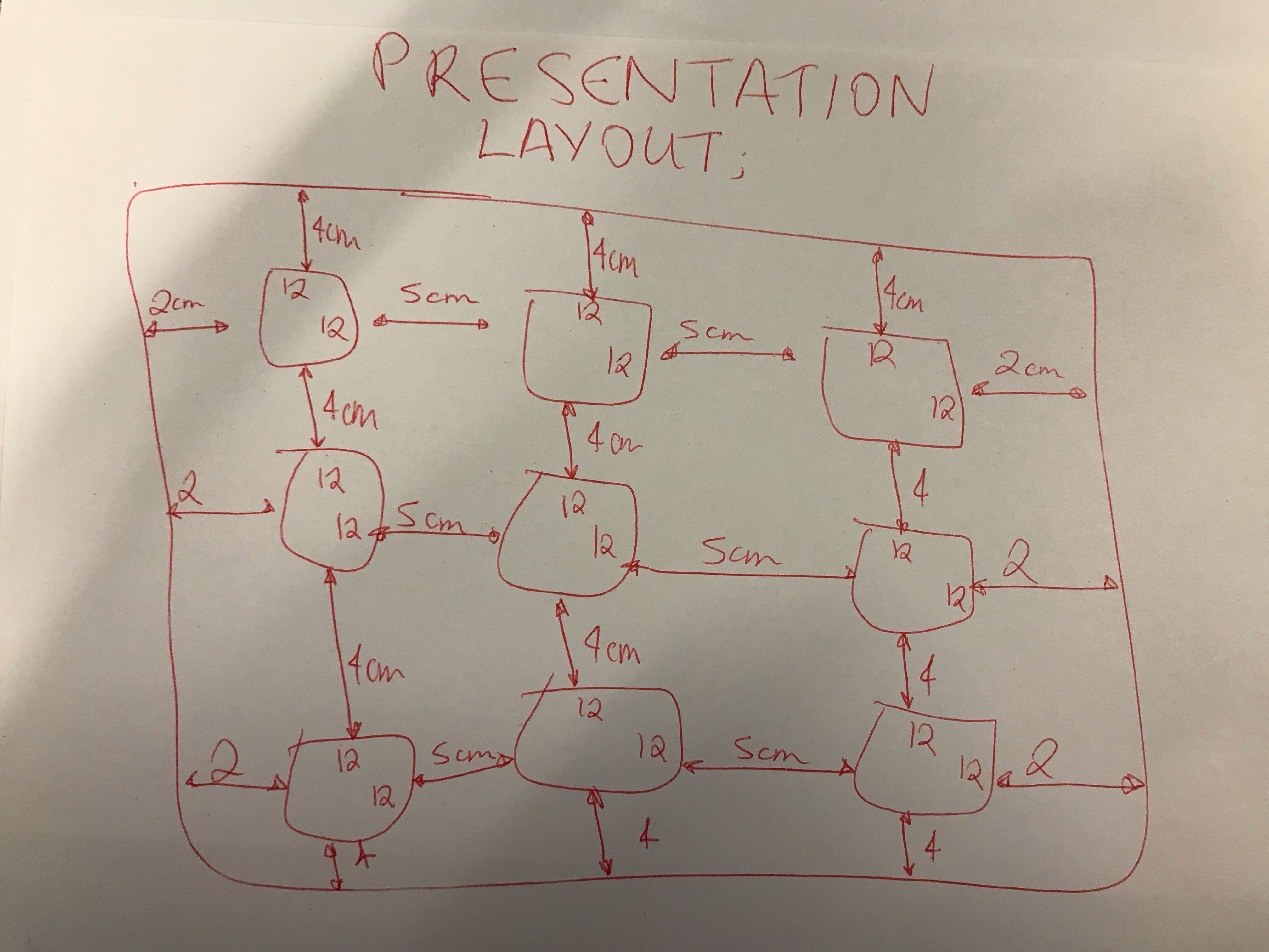
This is a smart way to present my work and it will be easy to show the images in order from start to finish. I am going to mount my images onto individual squares of foam board, and then mount the individual squares onto another piece of foam board, this will make the presentation of my images more interesting.
EVALUATION
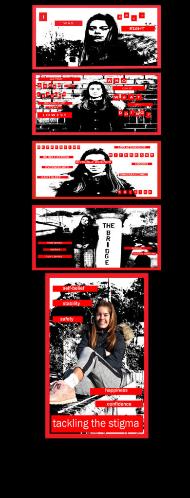
Overall during this project I have researched about identity. I chose Leigh Bowery as the artist I would take inspiration from. Bowery’s images where exaggerated to mock the changes people make to themselves to fit into the ‘norms’. I mainly focused on how women change themselves, by showing some of the steps but also wanted to show the drastic changes they make to themselves and how it makes them look like a completely different person.
This project allowed me to go back into the studio to take images for this section, along with using my knew skills learnt to put towards this project, such as changing settings on the camera to fit the type of image I wanted, along with figuring out what type of lighting would be best, such as the angle it is coming from so I would highlight specific facial features and finally cop-orating with my model, by encouraging them and giving them feedback on what they should do next and what was good during the shoot. As I had more knowledge, my shoot in the studio went a lot smoother than previous experiences. It helps that I had already planned ideas (on previous blog) as that allowed me to focus in on what I needed to be doing instead of taking longer, it meant I could get more photos on certain things I needed instead of having a couple of random photos, instead I had catches of images for specific reasons.
When editing my photos to get my final images, in the first few photos I really focused in on exaggerating her natural skin, so I sharpened up her freckles to make the bolder and stand out more, also making her eyes more green, this presents a more natural look. As the images go on I edit them more and more, such as the last image I have edited her skin to make to look flawless and her eyes big and bold as this is representing what women feel like they need to look like and what other people think women should look like, with the flawless skin and perfect features.
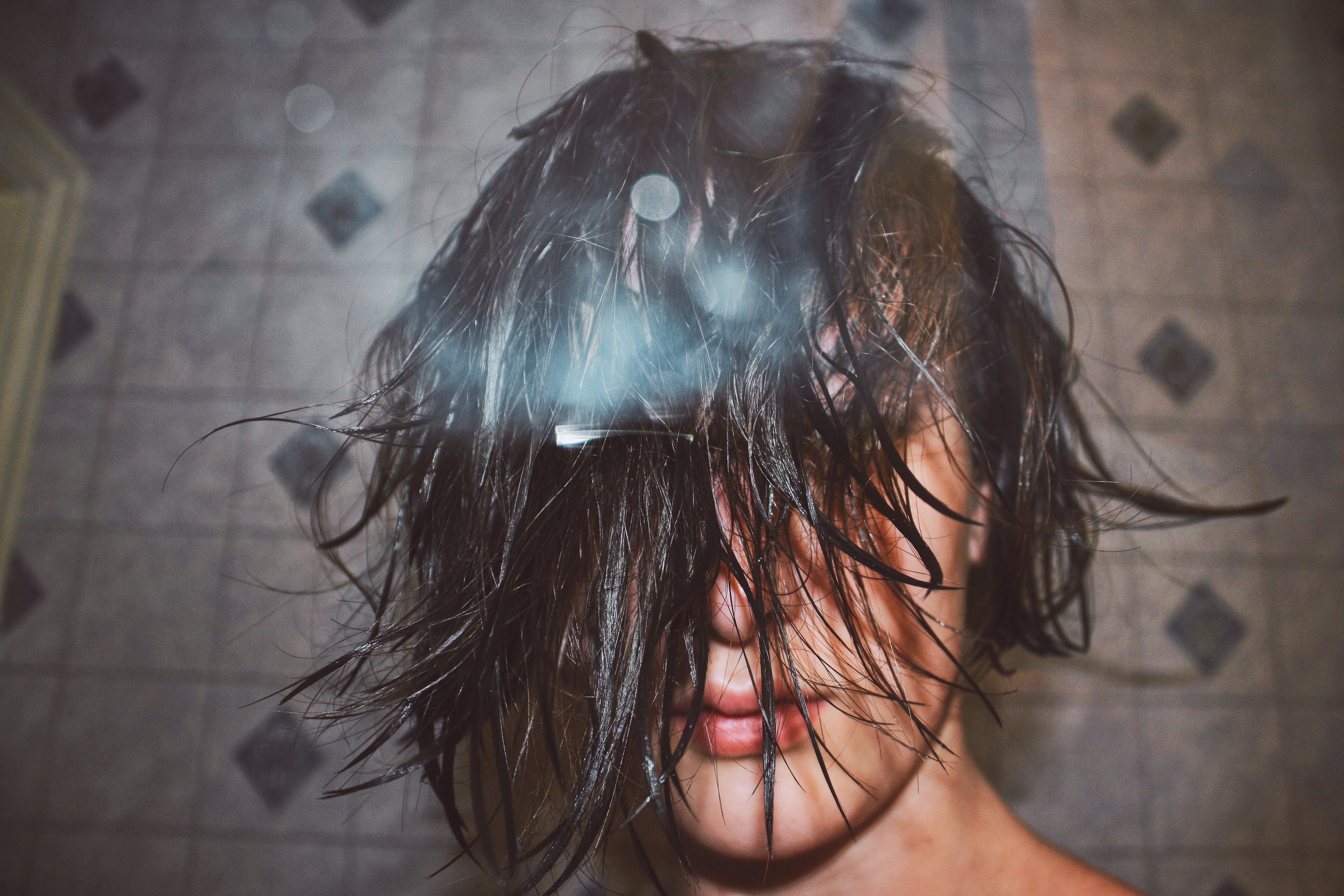
Some of the images I took needed to be improved by adjusting the focus, to make sure the image was sharp. My first image before it was edited wasn’t that clear, it almost looked hazy, but by adjusting it on Photoshop I was able to make the image look stronger. The silhouette around my images add an extra part of interest to my image and I did this by using a white background so shadows could be projected onto them as I was shinning a light directly towards my model, the middle of the the ring light was in line with her eyes, this made her eyes pop as you could really see the color that was spread throughout her eyes.


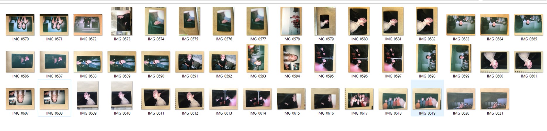 I decided that because I had already made a selection of images that I should edit, I should look at them closer up on Adobe Lightroom and make a further selection on which of the images are the clearest/most suitable for editing.