When Time was Prime 4 — Editing Images*

When I looked over the images some had parts that were overexposed, this wasn’t a problem as I was shooting in raw so I was able to fix any exposure issues. I also cropped some of them but I had to maintain the scale so that they will fit on my final presentation.

These were only minor changes, the main one that I had to do was to make sure that all of them had the same levels of saturation, the reason for this is because it was an overcast day and the only light source that I had available was the sun, due to the cold light a lot of the images were under saturated so I had to boost it and have it so they all look like they are all equally saturated.

To change the saturation All I had to do was move the circled slider, the problem I had was getting them all to be the same, the way i overcame this is I had one image opened with the correct levels of saturation on one monitor and I was editing all of the other ones to make sure that it matched of the second monitor. This worked well as I could easily refer to the colours that I wanted.


As can be seen below the images turned out well and I am happy with the colour grading and saturation that they all have. 

Joachim Schmid – Case Study (Identity and Place)

Joachim Schmid

“Joachim Schmid is a Berlin-based artist who has worked with found photography since the early 1980s”. https://en.wikipedia.org/wiki/Joachim_Schmid

The work of Joachim Schmid focuses on photographs that are produced and seen everyday, and challenges the idea of ‘art photography’. https://www.telegraph.co.uk/culture/3675573/Joachim-Schmid.html

Examples of his work:


Image result for Joachim Schmid
Joachim Schmid
Image result for Joachim Schmid
Joachim Schmid
Image result for Joachim Schmid
Joachim Schmid

Ideas:

For my mock exam I wanted to explore photo montage as I really like the idea of experimenting with the photos I have taken. I wanted to experiment with cutting images in half and sticking them together to create a new “identity”.

I really liked the idea of doing this one of my photos and then getting a photo from iconic films 90s films such as “Pulp Fiction”, “Lost Boys” or the “Goonies”. I want to show how different  the 90s were from today.

Experiments:

“Pulp Fiction” and Photo from Tableau Project
“The Matrix” and Photo from Identity and Place Project
Jami Gertz and Photo from Studio Lighting Project
“The Shining” and Photo from Identity and Place Project
“Fight Club” and Photo from Studio Light Project

Overall I am very happy with how these experiments came out. I think the mixture of old and new is very refreshing and creates nostalgia.

Bibliography

Bright, S. and Van Erp, H. (2019): 18 Photography Decoded. London: octopus Publishing House 

Bright, S. and Van Erp, H. (2019): 18 Photography Decoded. London: octopus Publishing House 

History.com editors. (2017):1. Surrealism History  

https://www.history.com/topics/art-history/surrealism-history

Souter, A and Baillie, R. (2017):1 The Art Story:Claude Cahun-Biography and Legacy  

https://www.theartstory.org/artist/cahun-claude/life-and-legacy/

 Souter, A and Baillie, R. (2017):1 The Art Story: Claude Cahun-Biography and Legacy 

https://www.theartstory.org/artist/cahun-claude/life-and-legacy/

Jung. J.(2012):1 The Art Story: Man Ray 

https://www.theartstory.org/artist/ray-man/

The Art Story. (2012) Francis Picabia- Biography and Legacy 

https://www.theartstory.org/artist/picabia-francis/life-and-legacy/

The Encyclopaedia Britannica. (1998) Heraclitus 

https://www.britannica.com/biography/Heraclitus

Jung. J.(2012):1 The Art Story: Man Ray 

https://www.theartstory.org/artist/ray-man/

 Clarke, G. (1997) How do we read a photograph?. The Photograph 

https://www.photopedagogy.com/graham-clarke.html

 Clarke, G. (1997) How do we read a photograph? The Photograph 

https://www.photopedagogy.com/graham-clarke.html

Souter, A and Baillie, R. (2017):1 The Art Story: Claude Cahun-Biography and Legacy 

https://www.theartstory.org/artist/cahun-claude/life-and-legacy/

Top Outcomes – Identity

I have gone through all of my photo shoots which have been conducted throughout the portrait project, and have selected the top outcomes from each shoot. The aim of this is to begin to make final selections of images which could lead to final pieces. Moreover, it is a chance for me to reflect and see what I have achieved throughout this project, and display my best outcomes as a collective. These images are initial thoughts of what could lead into final pieces, and is beginning to make me think about ways of displaying these images, and what message I am wanting to get across.

Response To Identity:

The images below are my top edits, which I believe have the strongest link to loss of identity. Moreover, all of the photographs clearly show good camera techniques and my ability to experiment, and use Photoshop in order to manipulate my images. These photographs have been taken from the two photo shoots and the old picture edit files, which I have produced in the past couple of weeks for the lead up of the mock exam.

Response To Photo-Montage:

These are my top two photo-montages, which clearly show images being layered on top of each other to create an overall photograph. These two images showcase the inside of a person, by moving the head and placing objects in that and around that area, showcase the type of person they are. Both of the edits are showing the model to be smart, through the use of equations and elements off the periodic table.

Response To Tableaux:

I believe my tableaux photographs are the weakest images that I have produced from this project, as a result of this I have only one image which clearly showcases my approach to this style of photography. The image shows lighting and camera techniques, which help to build a story of what is happening within the photograph.

Response To Studio Lighting:

I had a large number of studio photography portraits, which I thought are successful. Due to having so many successful outcomes I am thinking of displaying 9 of the best outcomes, in rows with the middle image being in color. These are the nine best images which I would want to use, and think are the most successful.

Response To Street Portraits:

Very much like the tableaux images, I felt that I was limited of successful images produced which therefore left me with three photographs which I believe could lead to potential final outcomes. These images clearly present the concept of street photography, through the nature of the model not being aware that I am capturing them in a photograph.

Response To Environmental Portraits:

I had a large selection of images which I could have used to showcase my response to environmental portraits. Due to the photo shoot I conducted showing the contrast of male and female stereotypes at retirement, I felt that it was appropriate to showcase two images, one of my male model and one of my female model. These two images, really outlined the contrast of gender roles I was trying to establish and therefore, I believe that they are my strongest outcomes in response to environmental portraits.


Photo-montage – Response to Annegret Soltau

Annegret Soltau is a German visual artist. Her work marks a fundamental reference point in the art of the 1970s and 1980s. Photomontages of her own body and face sewn over or collaged with black thread are the most well-known works done by her.

Contact sheets:

Contact sheet

Contact sheet

Contact sheet

For the images I took, I was looking for a more portrait like pictures. I had the subjects look directly into the camera at some points, look away at others, do different facial expressions to give me some sort of variety when it came to choosing the images I was going to use for the photo-montage. I didn’t get too many images but I defiantly got enough to be able to use for my final piece for the response to Annegret Soltau, however many of them were either too over-exposed or blurry.

Chosen images to create photo-montage:


Base picture

I chose this for the base image because it has a calm tone to it compared to the other pictures – here the subject is just staring into the camera, a picture which is perfect for my response to the photographer as she uses a normal base image too.

Second picture- the mouth was taken

I chose this image because I wanted to use the subject’s mouth, as in one of Soltau’s work, she has an image of someone’s open mouth covering someone’s face, so I wanted to replicate that aspect.

Third picture – I used the mouth and eye

And for the final image, I chose this one because I was interested in using the mouth and the eyes. Unlike Soltau’s work that i’m getting inspiration from, I’m using two mouths to add a bit of a quirk to it.

How I did it:

To change my work into a response to Annergret Soltau, I first went and printed out my chosen final images which I would be using for the photo-montage piece. I then went and ripped each image of the subjects up into calculated pieces,  and then arranged them into weird and quirky ways which still resembles a person, and then took black thread and sewed them together to create the unique look of Soltau’s work.

This is a picture of the final piece of the photo-montage in repsonse to Annegret Soltau . I got to this point and was thinking about stopping here as I liked the arrangement of the eye and mouths, and was deciding whether or not adding hands would be too much or would complete the final piece. Originally, I wanted to add both of the eyes instead of just one but it would have looked like too much and too messy if I had done that, and in the end I decided not to add the hands for that exact same reason.

I like my final outcome as I believe it portrays Soltau’s work perfectly. I used the same black thread to sew the pieces together, I took images of different body parts of a person and stuck them in ways which makes them unrecognizable but still obvious that it’s a human. I also believe that the images I chose for this project were appropriate for my aim and I put together the pieces well. I like the placement of the eye and mouths as I believe it gives it a bit of a unique and interesting look. However, I’m not too keen on the messiness of the threads, I believe I could have made it look more neater and made each thread look more even. I also dislike the fact that I didn’t edit the images before hand. I believe that I should have made one or two of the images into a black and white version to give a bit of an edge to the final piece, or I should have at least adjusted the brightness and exposure on all the of the images before hand.

I quite enjoyed making this piece, it was practical but it didn’t demand too much hard work, time and materials. However, choosing the right images and pieces from those images was a bit tricky, as I had to choose which ones would suit the original image without making that part the center of attention.

Further Loss of Identity Edits

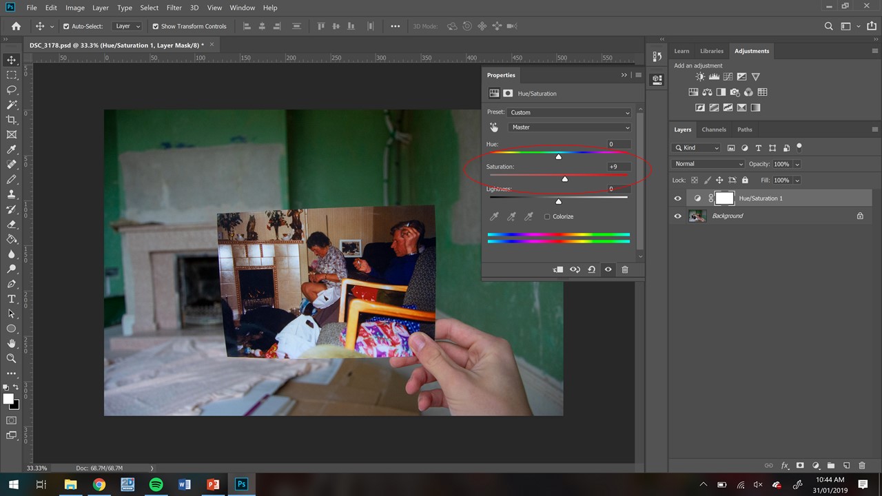
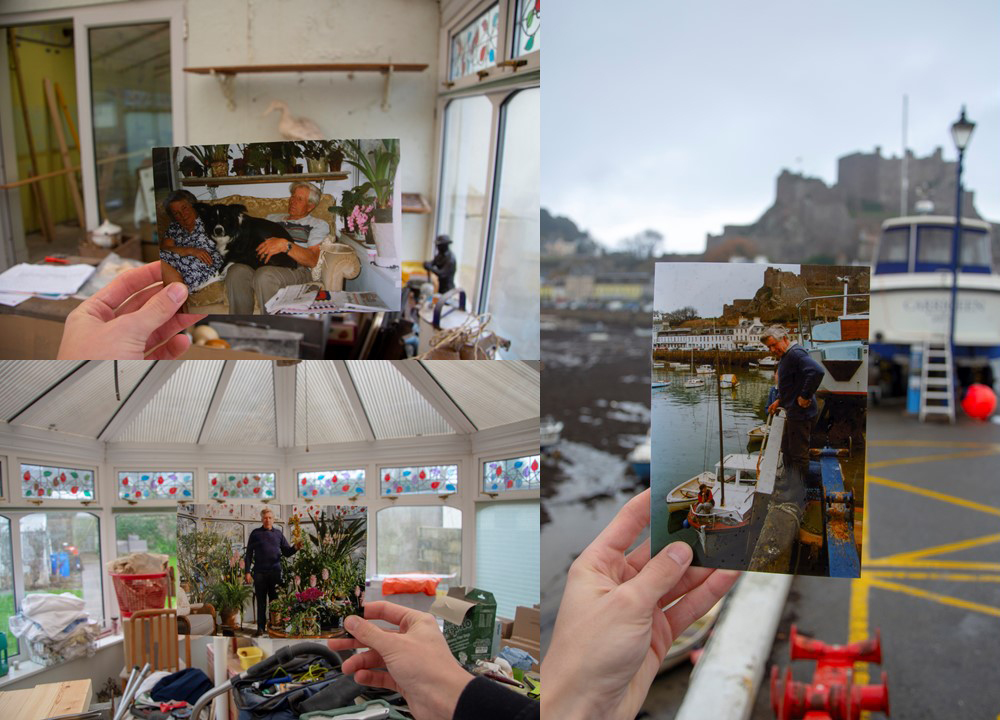
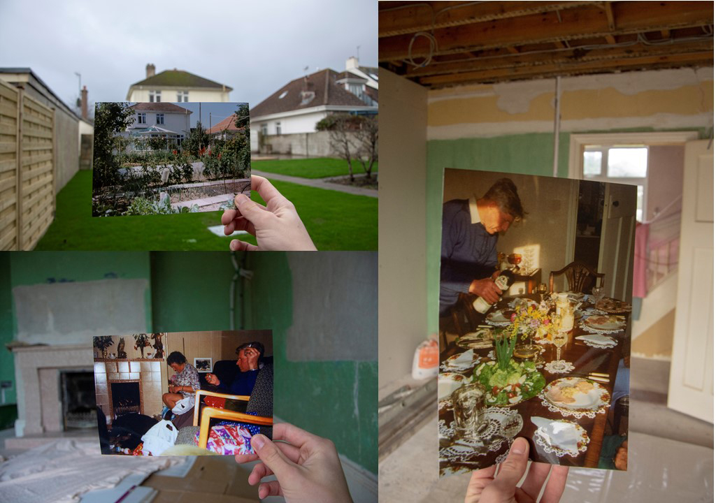
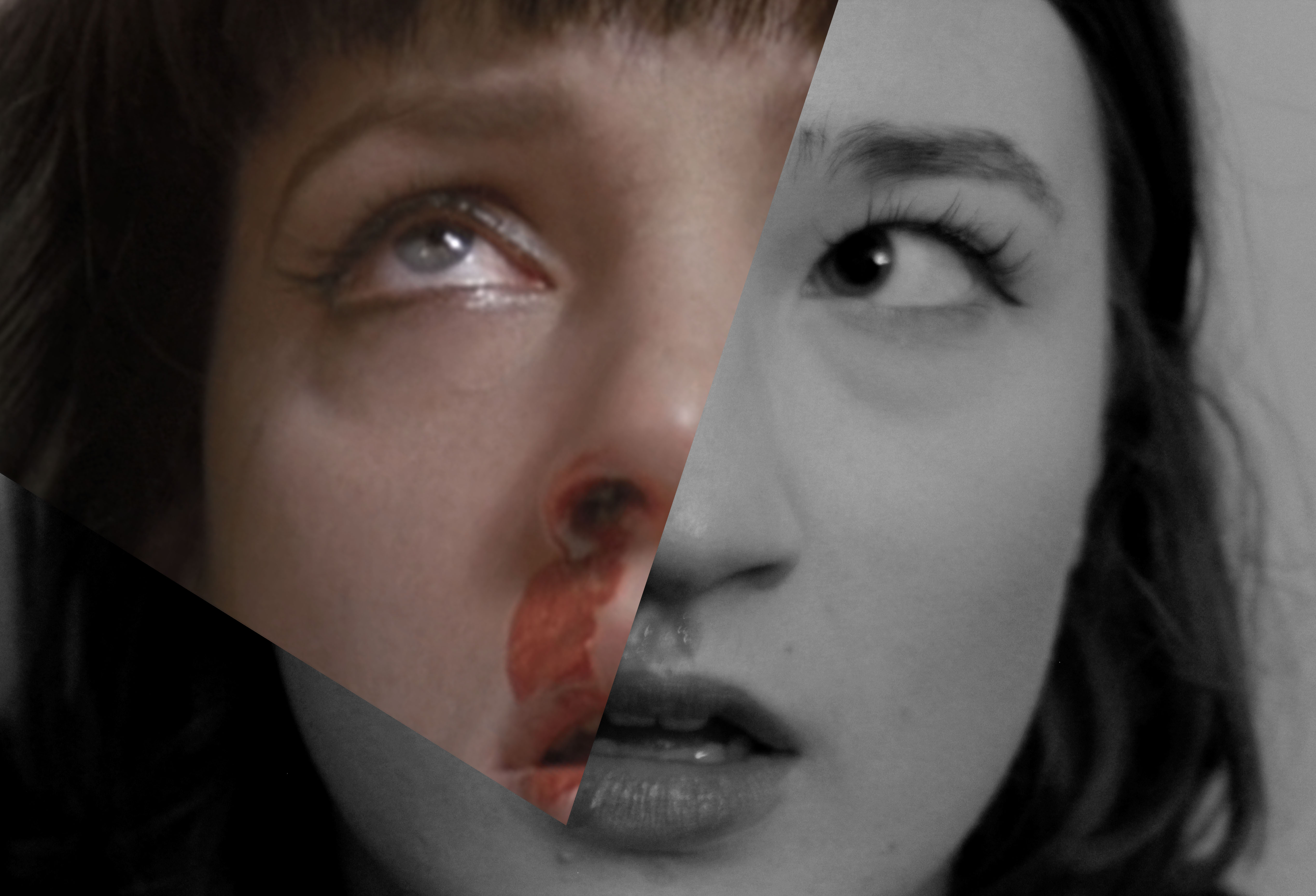
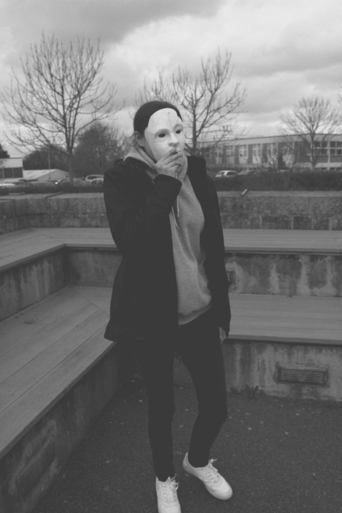
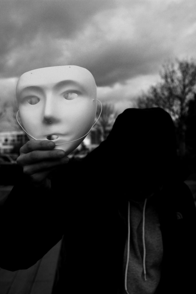
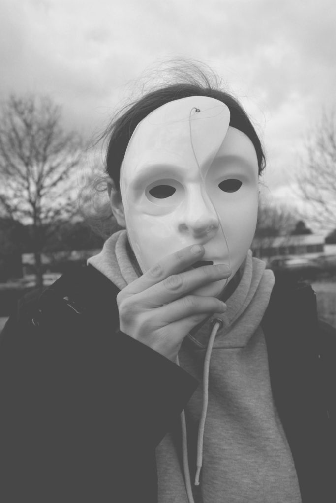
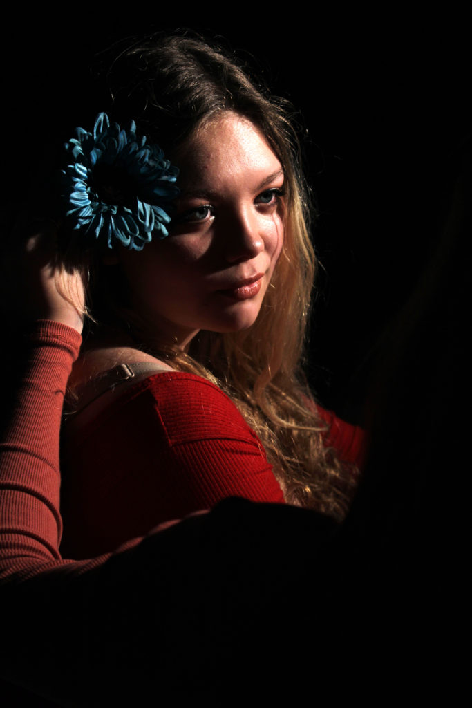
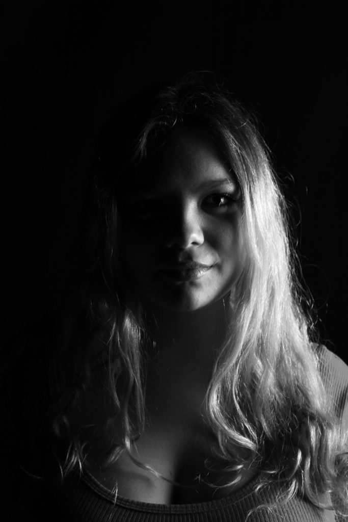
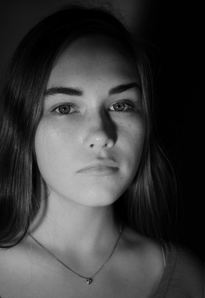
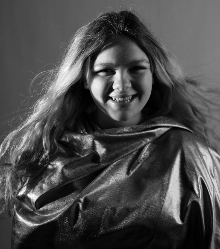
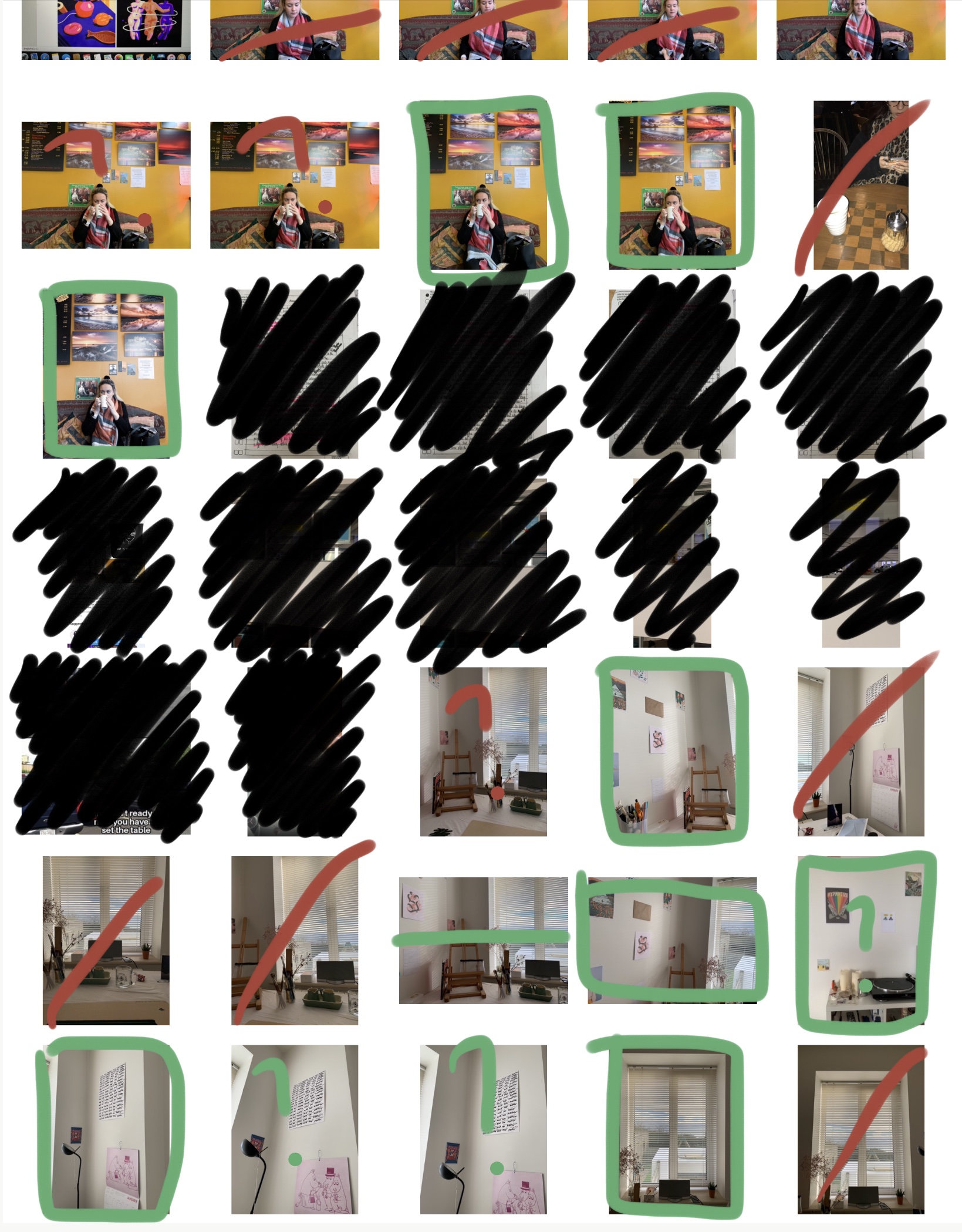
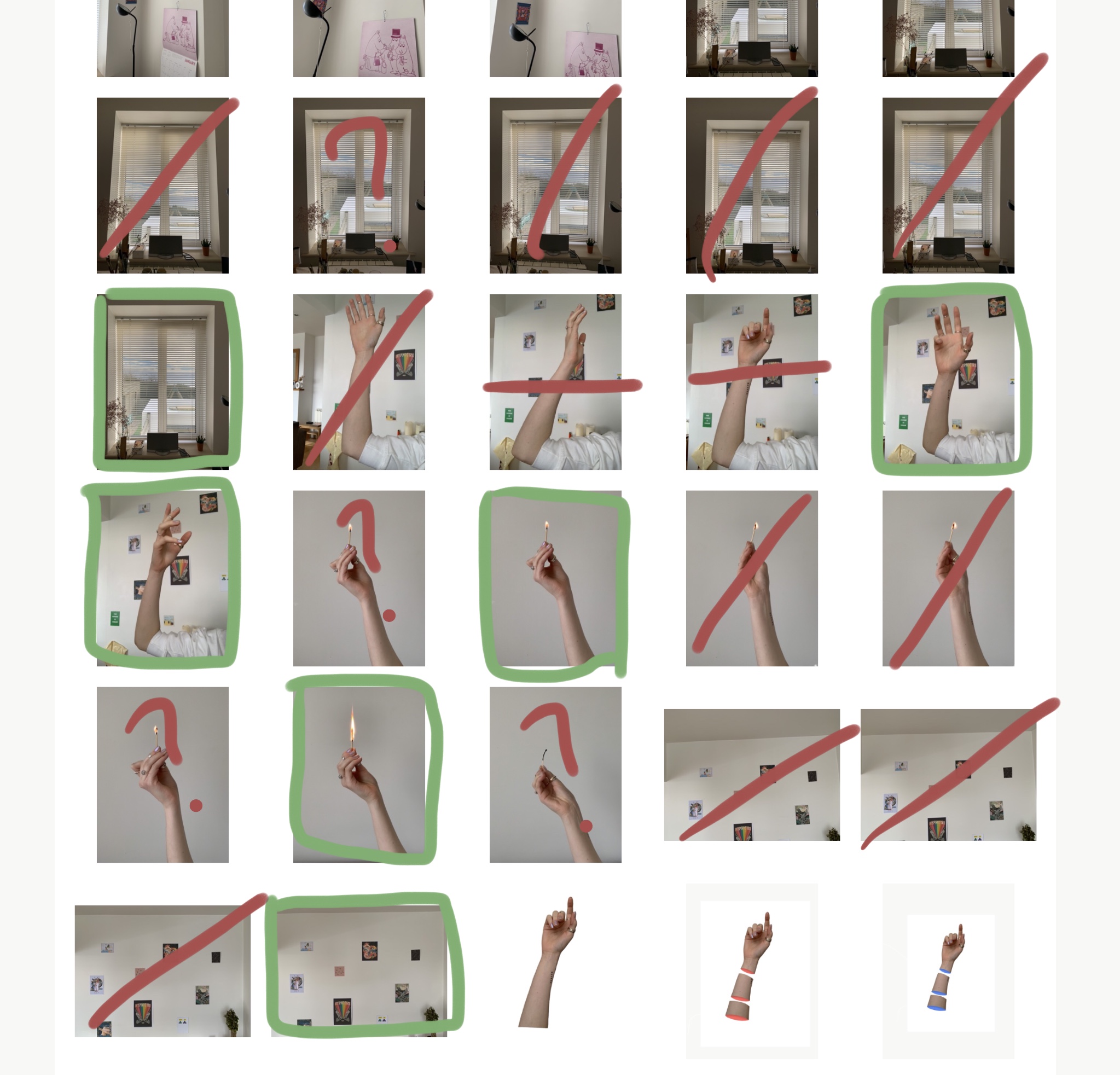
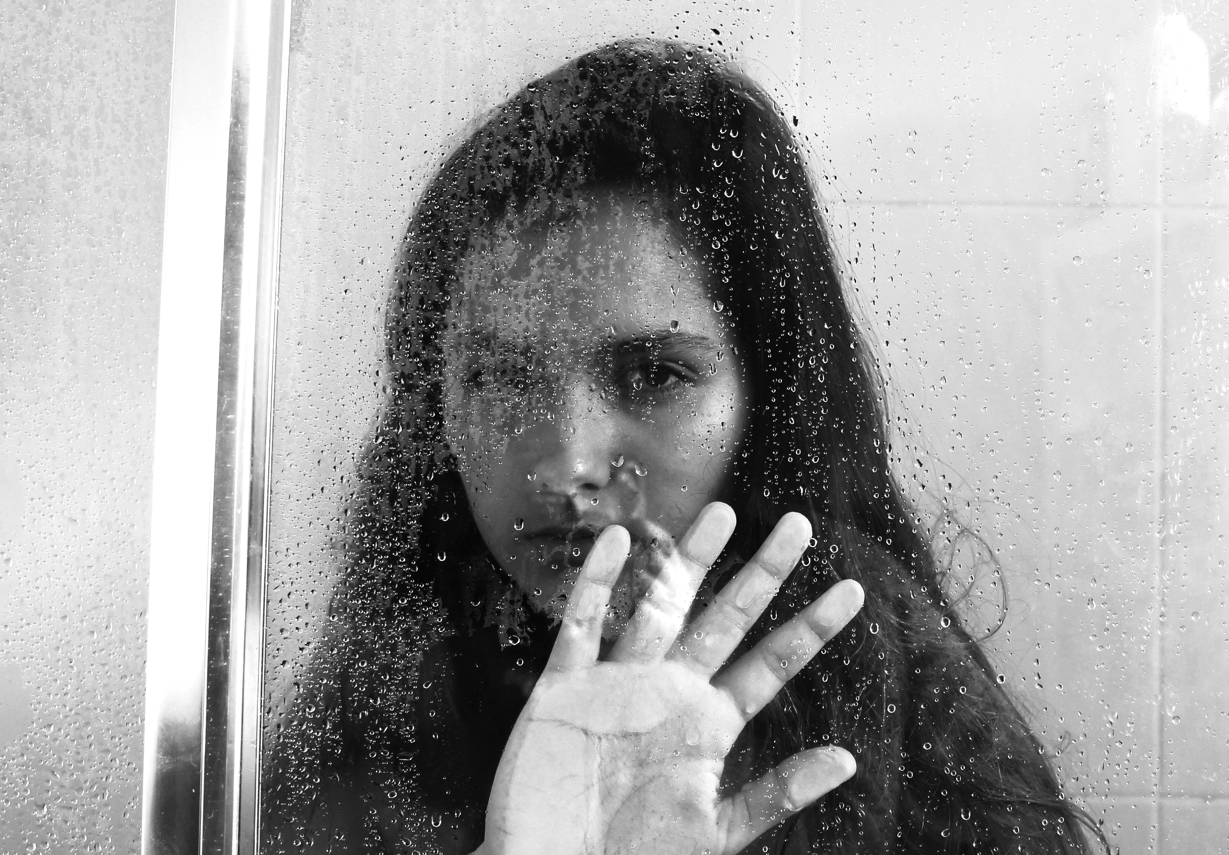
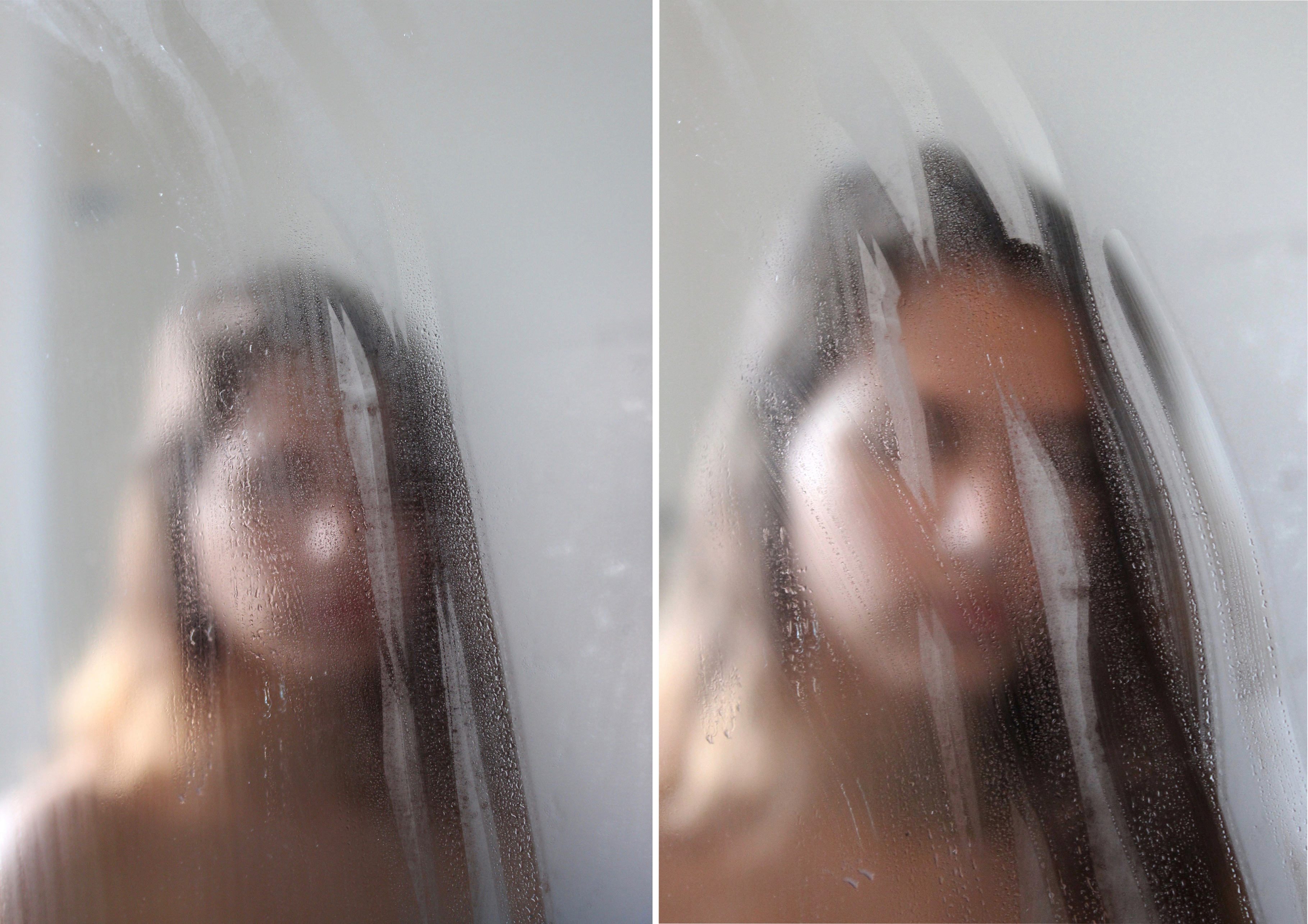
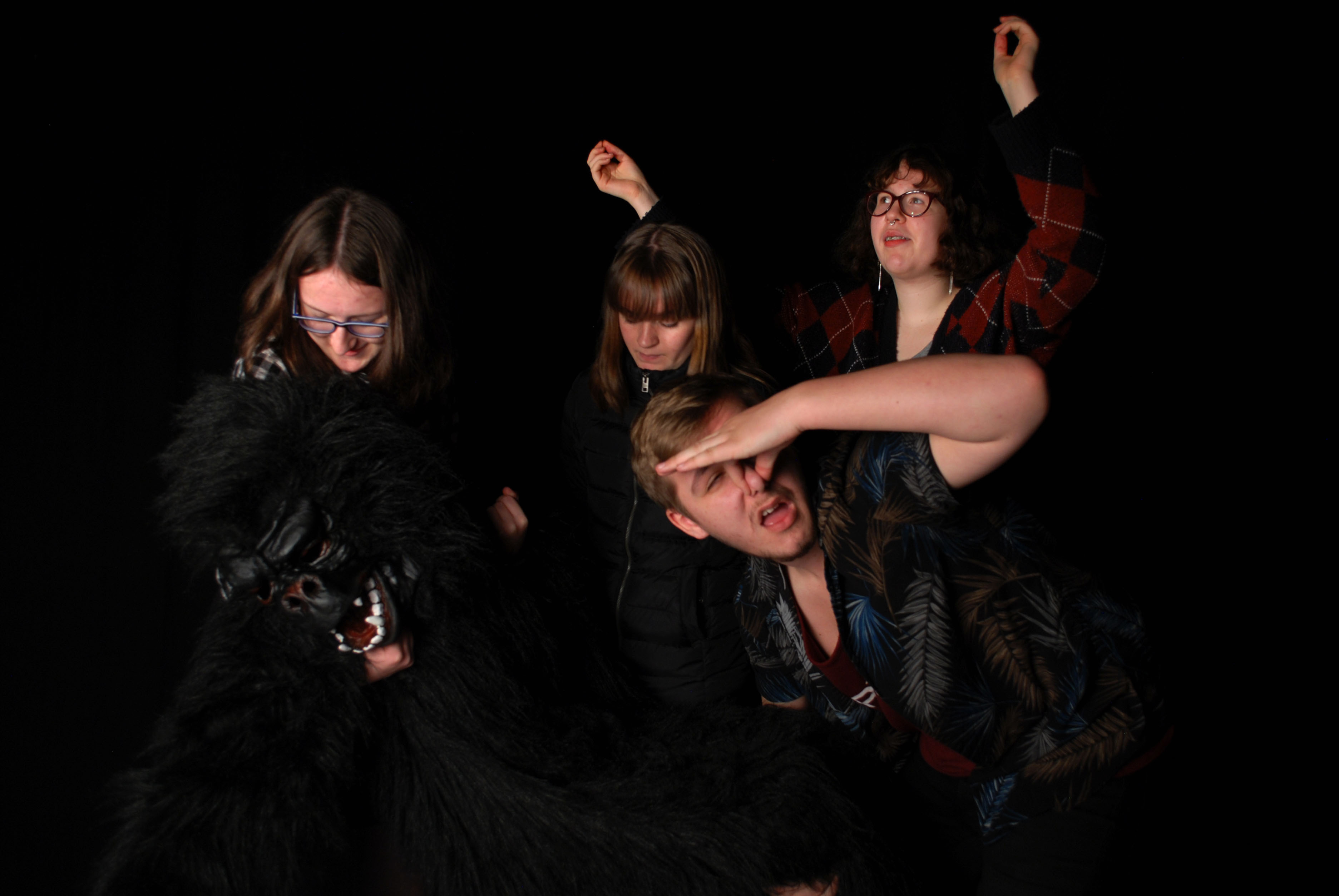
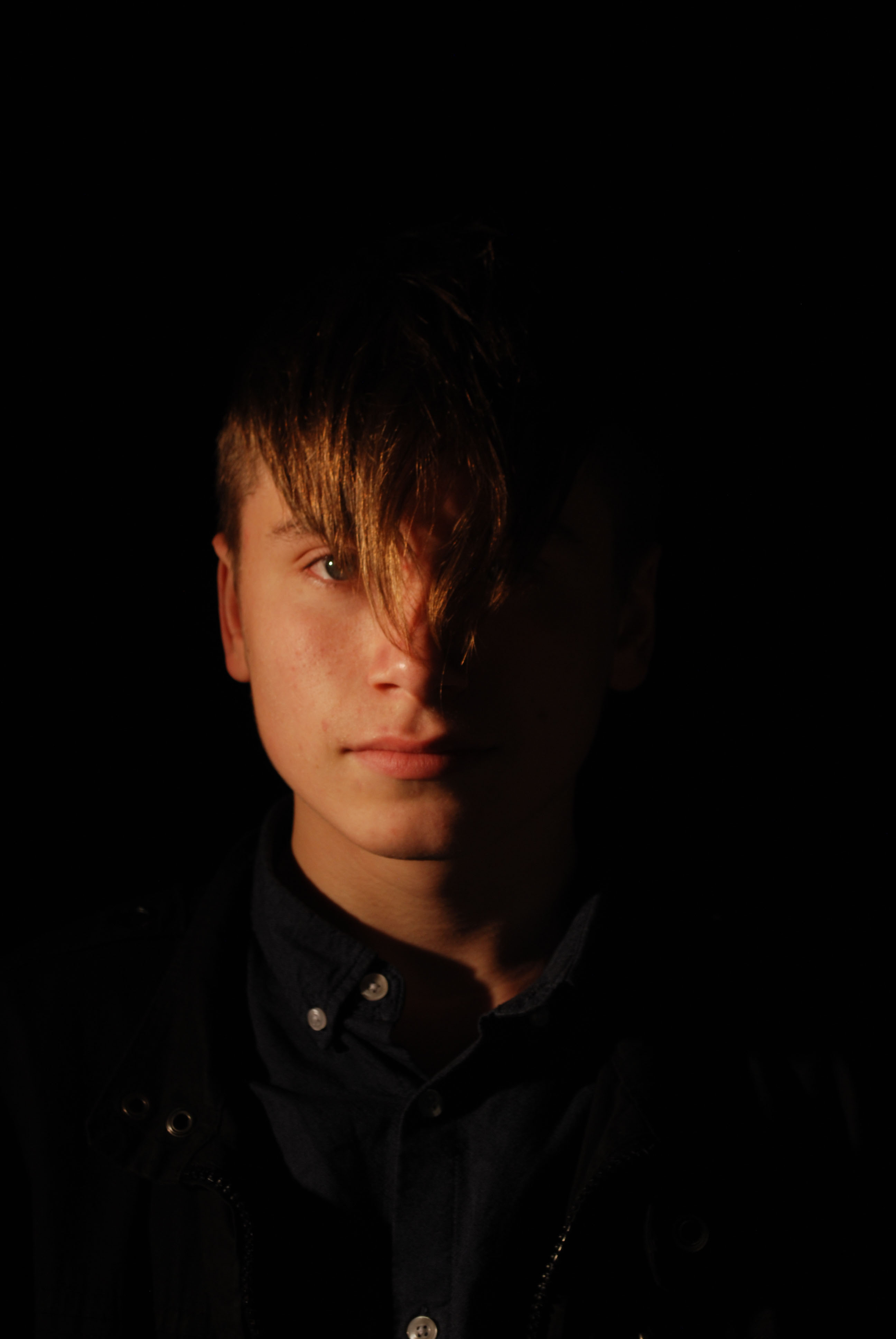
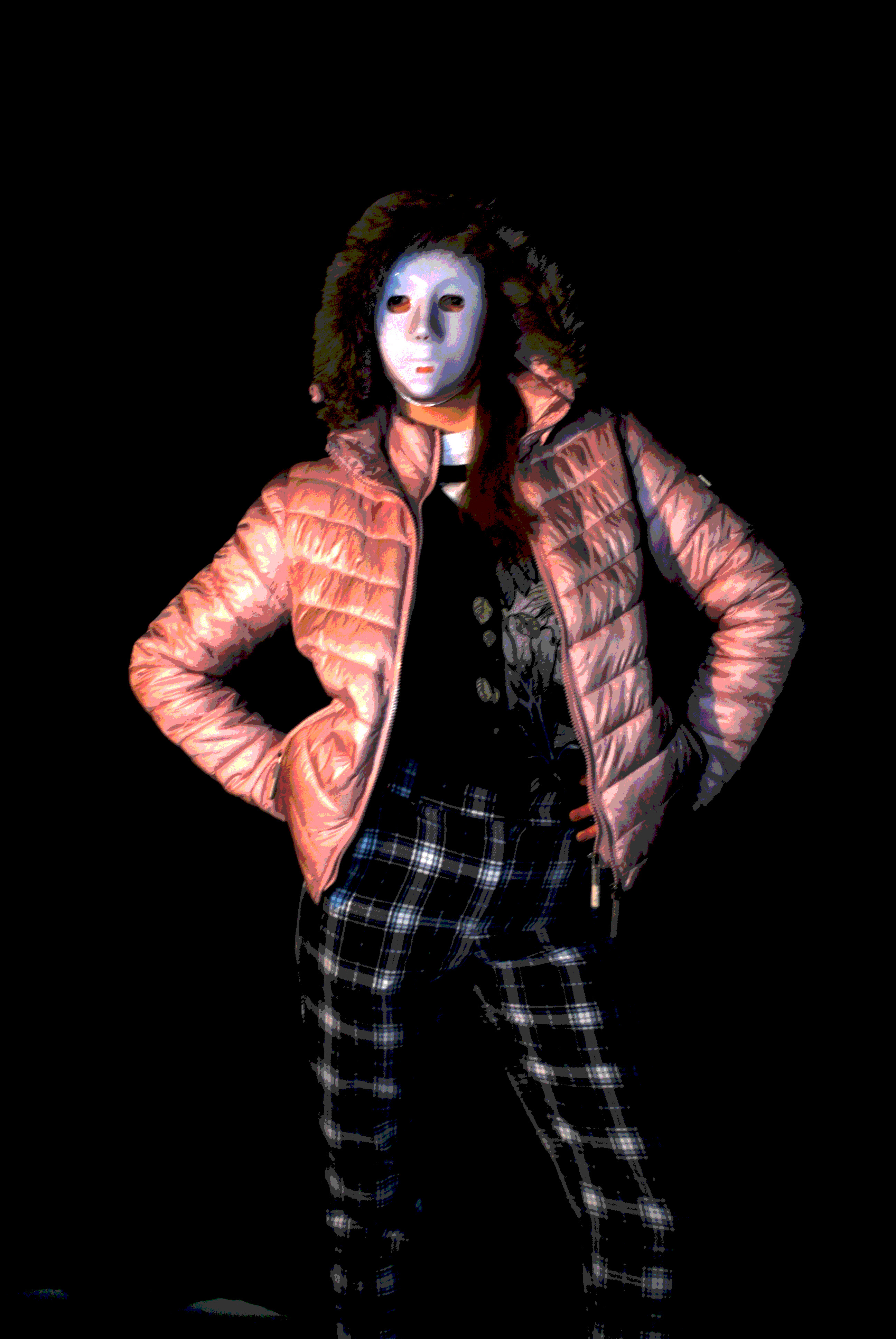
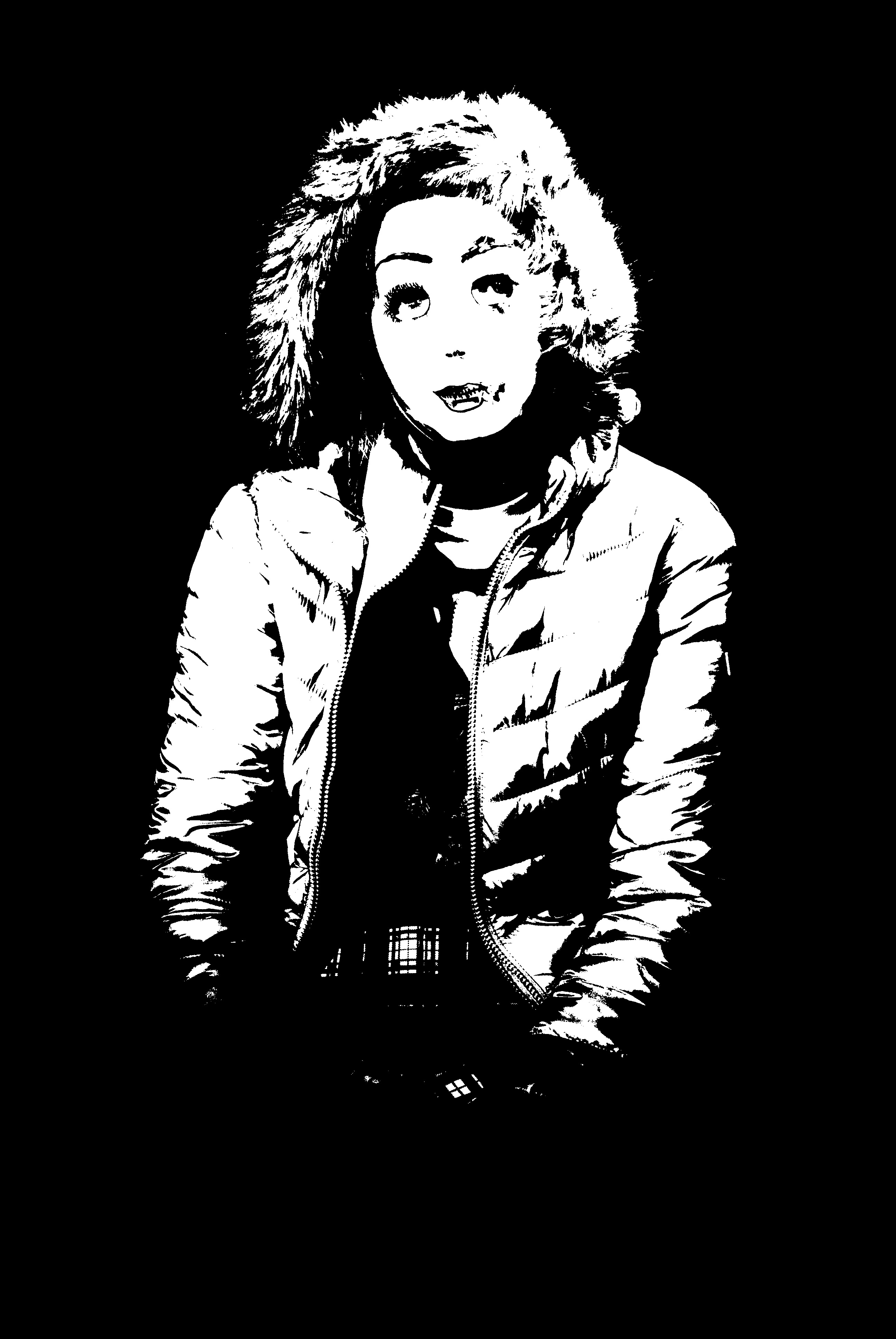
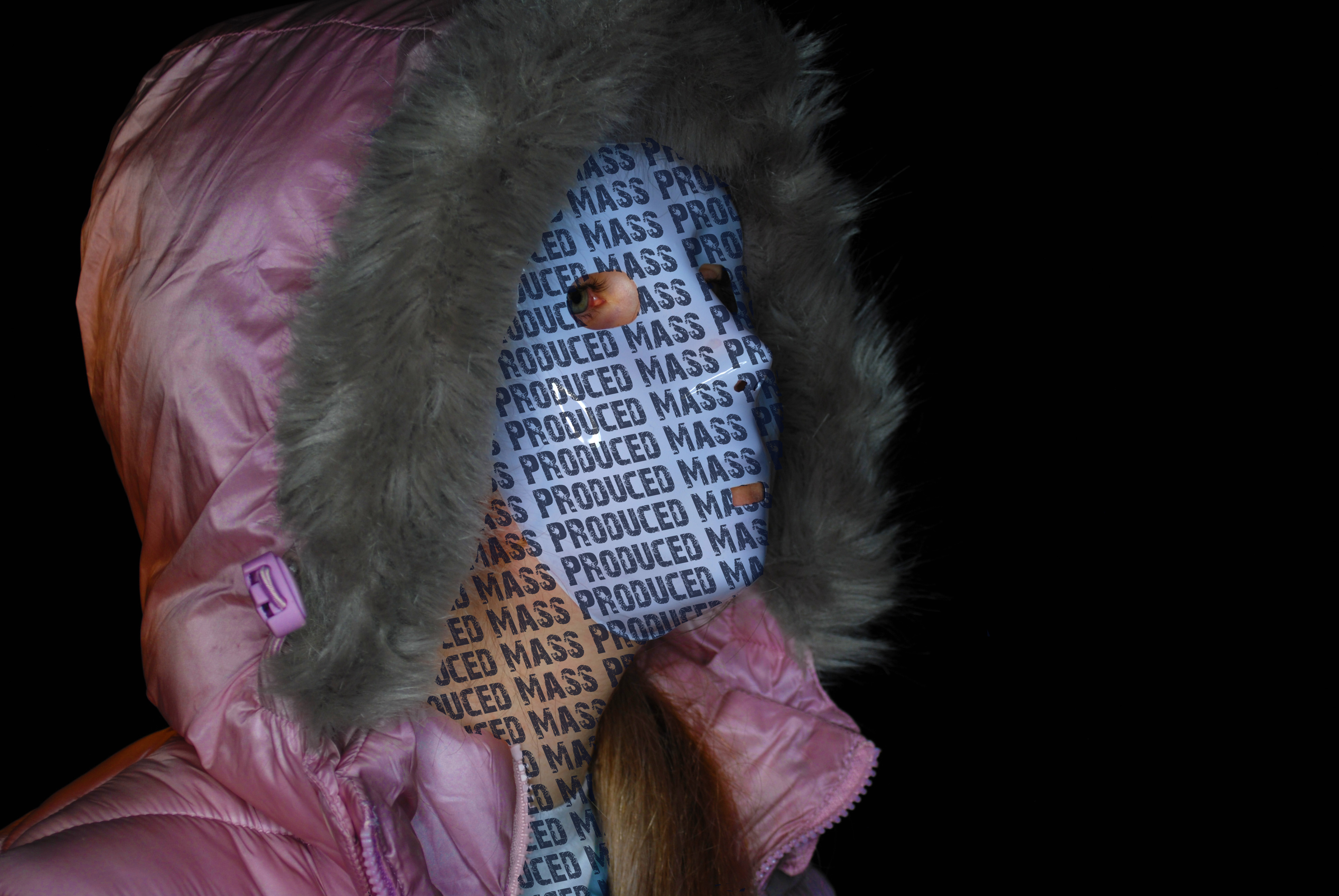
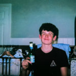
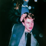
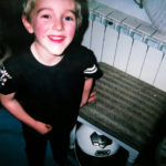
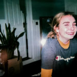
When sifting through my photographs, which have been taken throughout the portrait project, I have found some images which could be manipulated in order to show loss of identity. These images are essentially the ‘forgotten’ images which I believe have potential to be something more. For all the edits I levelled and adjusted the curves to make the image darker and lighter, depending on how much of a tonal contrast I wanted to create.

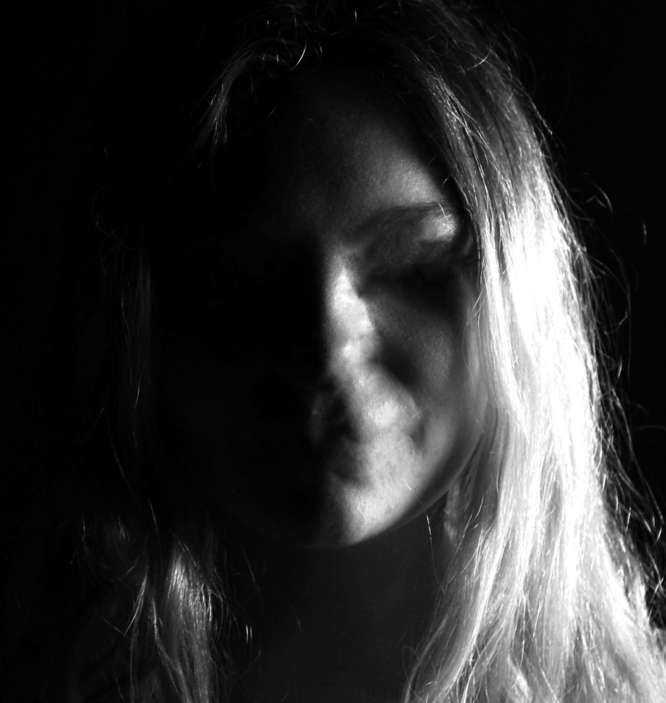
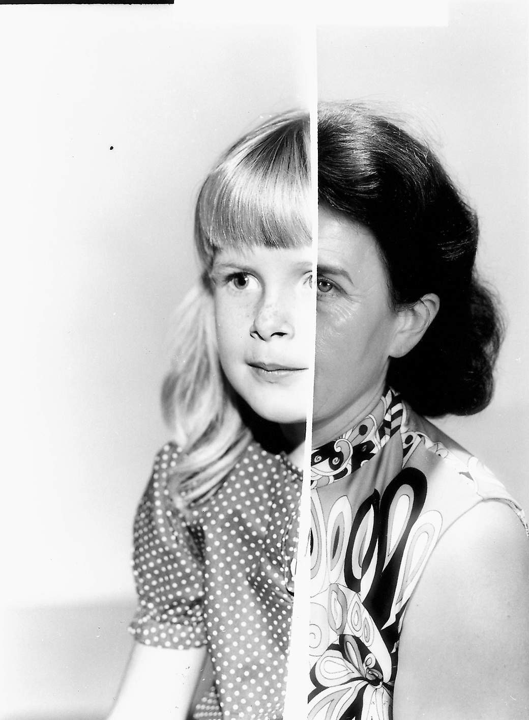
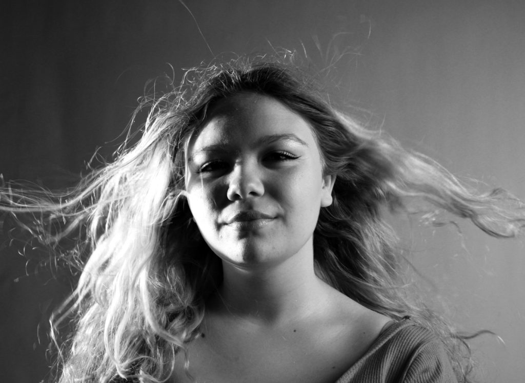
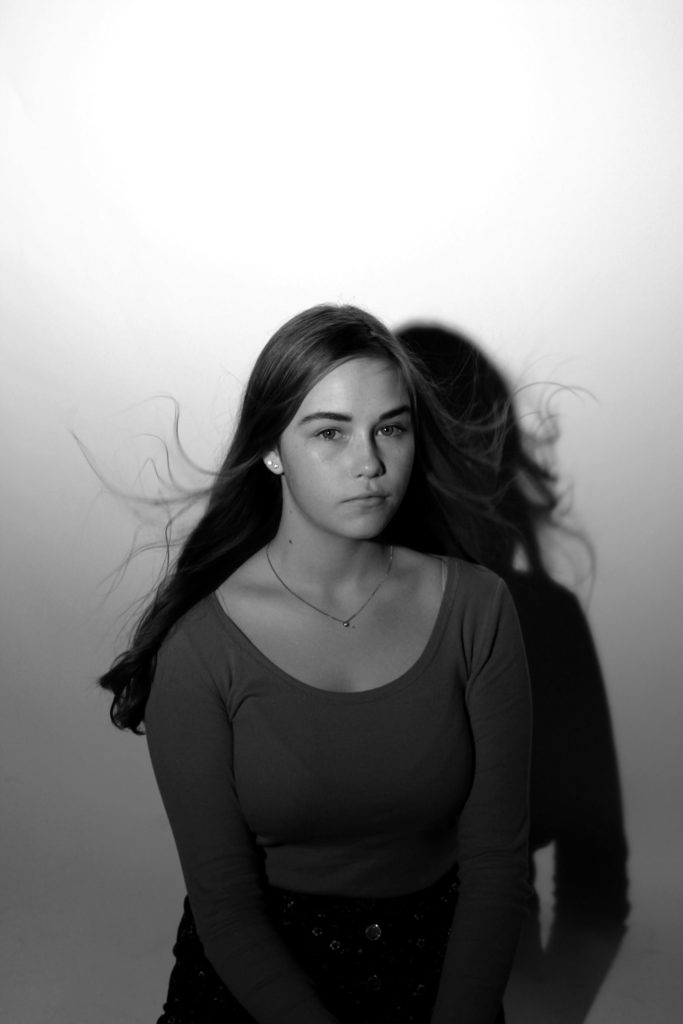
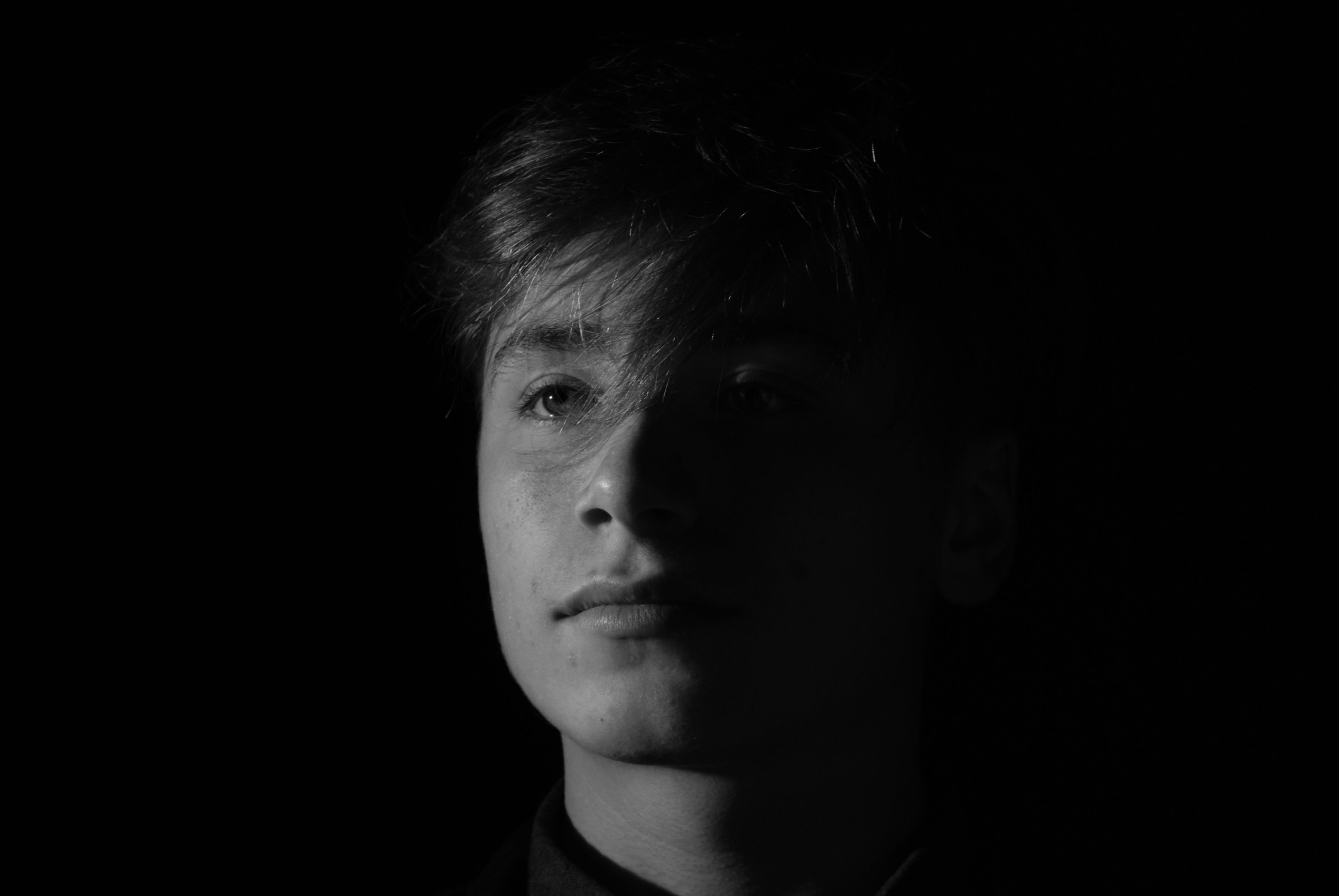
In my first edit I wanted to physically represent my model loosing her identity. this image was taken from the studio lighting shoot, in particular when I looked at the chiaroscuro effect. I started of by cropping the image to be solely focused on the face of my model. The using the spot healing tool I went over the eyes, nose and mouth which erased them from the image. I then went over any areas of facial structure, which shows how the model has physically lost her identity. The black and white also presents no identity as colour has been taken out of the image. I really like how the image has high contrast which allows the facial features, which have been taken away, easily seen. Therefore, this edit successfully present a loss of an identity.

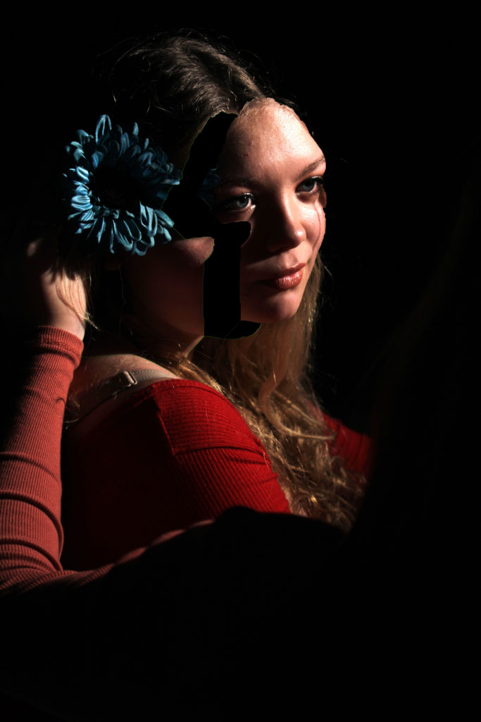
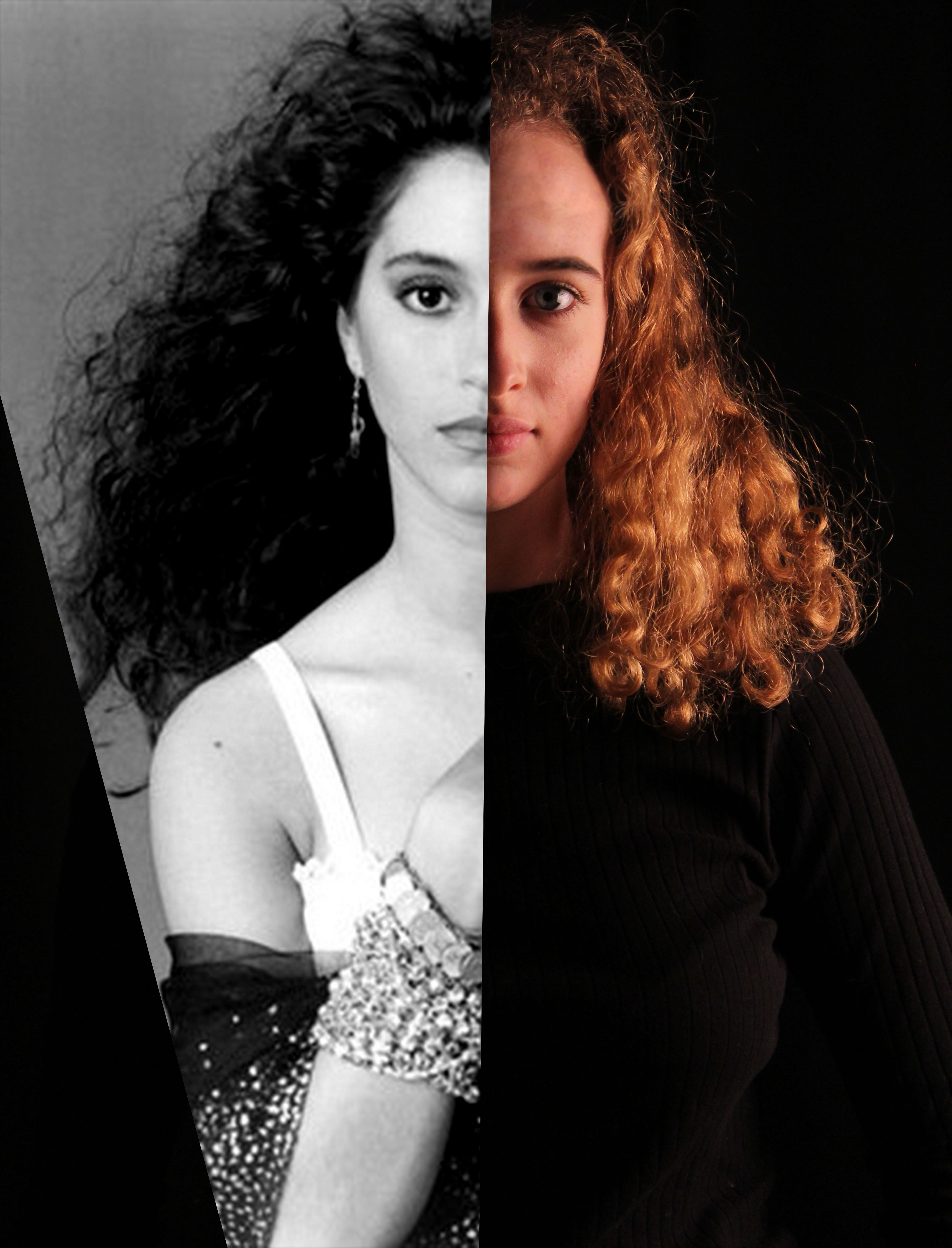
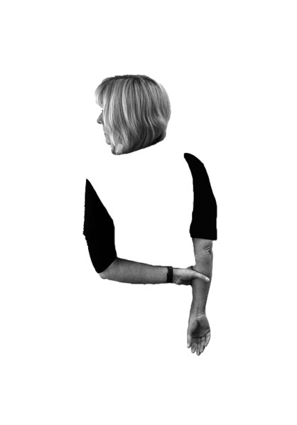
For my next edit I wanted to show the process of losing an identity, physically. I took inspiration from Marccelo  Monreal, who did a similar style of photo manipulation. In Monreal’s image he added flowers behind the cut out of the face, due to this being loss of identity I decided not to include the flowers as I felt that it presented to much of an identity. To do this edit I used the quick selection tool and went over the face, I then pressed layer via cut in order to make the face a new layer. I then used the move tool and  moved this cut out face slightly up and to the right in order to make it look like the models face is being taken away. Due to this edit showing the process of losing an identity I felt that this image should be in colour as it shows the before stage. Although I like the way this edit looks I do not feel that it has strong links to the theme of loss of identity, and therefore am not considering making this into a final piece.

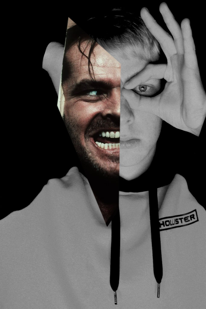
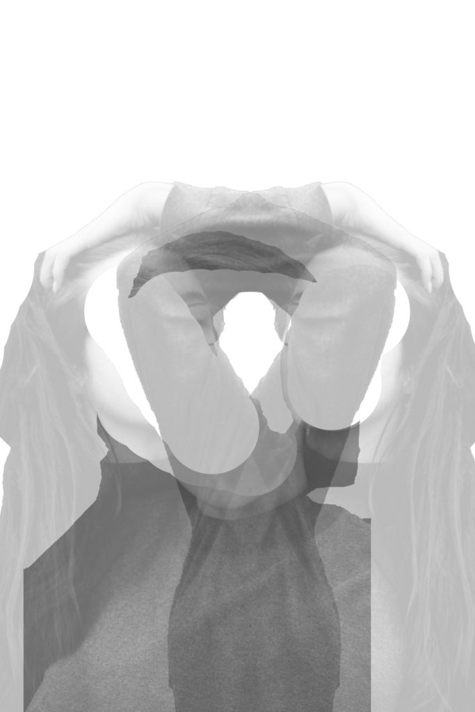
In this edit I wanted to look at the double exposure technique, where I would use two different images to formulate a whole image. I opened up the two images and cut the out using the quick selection tool and made them into separate layers by pressing layer via cut. I then moved these cut outs onto a new A4 white document. Using the rubber tool I decided to rub out the face, only leaving the body. I then placed the two images in the centre of the page and decreased the opacity of both, in order to see both images. I then decided to duplicate the layer with the model playing with her hair, and placed it the other side. Pressing ctrl + t allowed me to make the image face the other way. This final piece shows loss of identity as the models poses shows that she is confused, moreover the missing face suggested that she is lost. Finally the image is presented in black and white, making all aspects of colour identity being taken away.

Series of Three

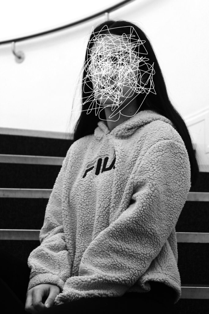
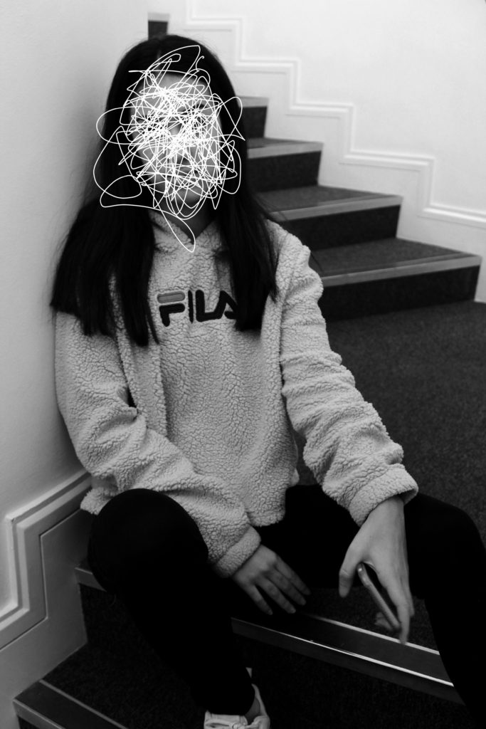
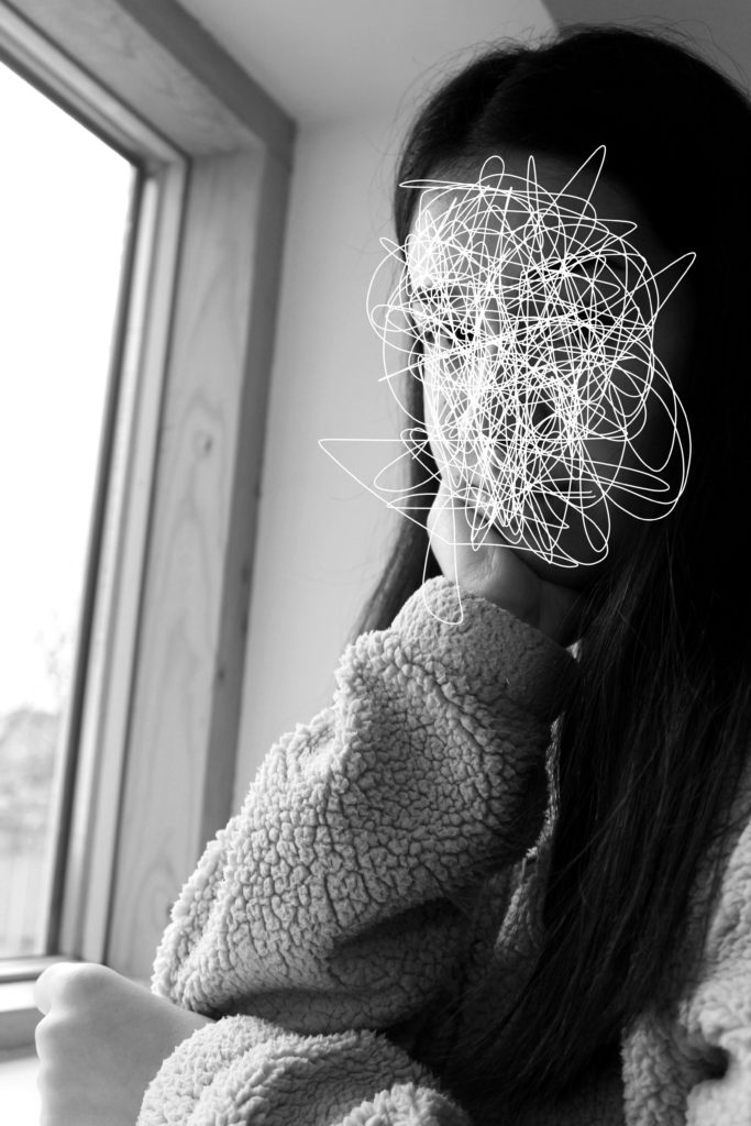
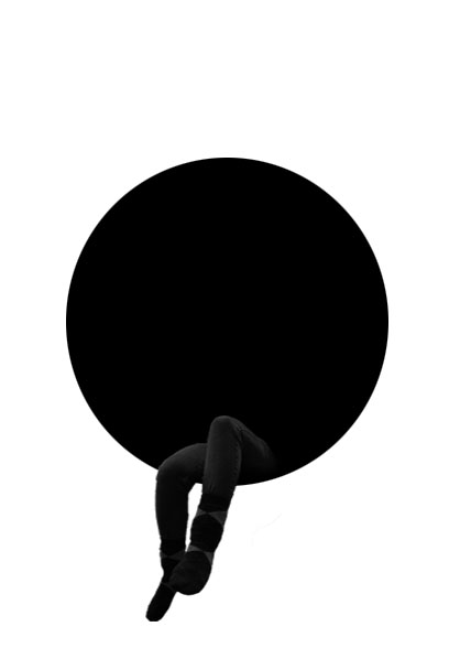
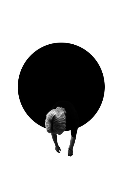
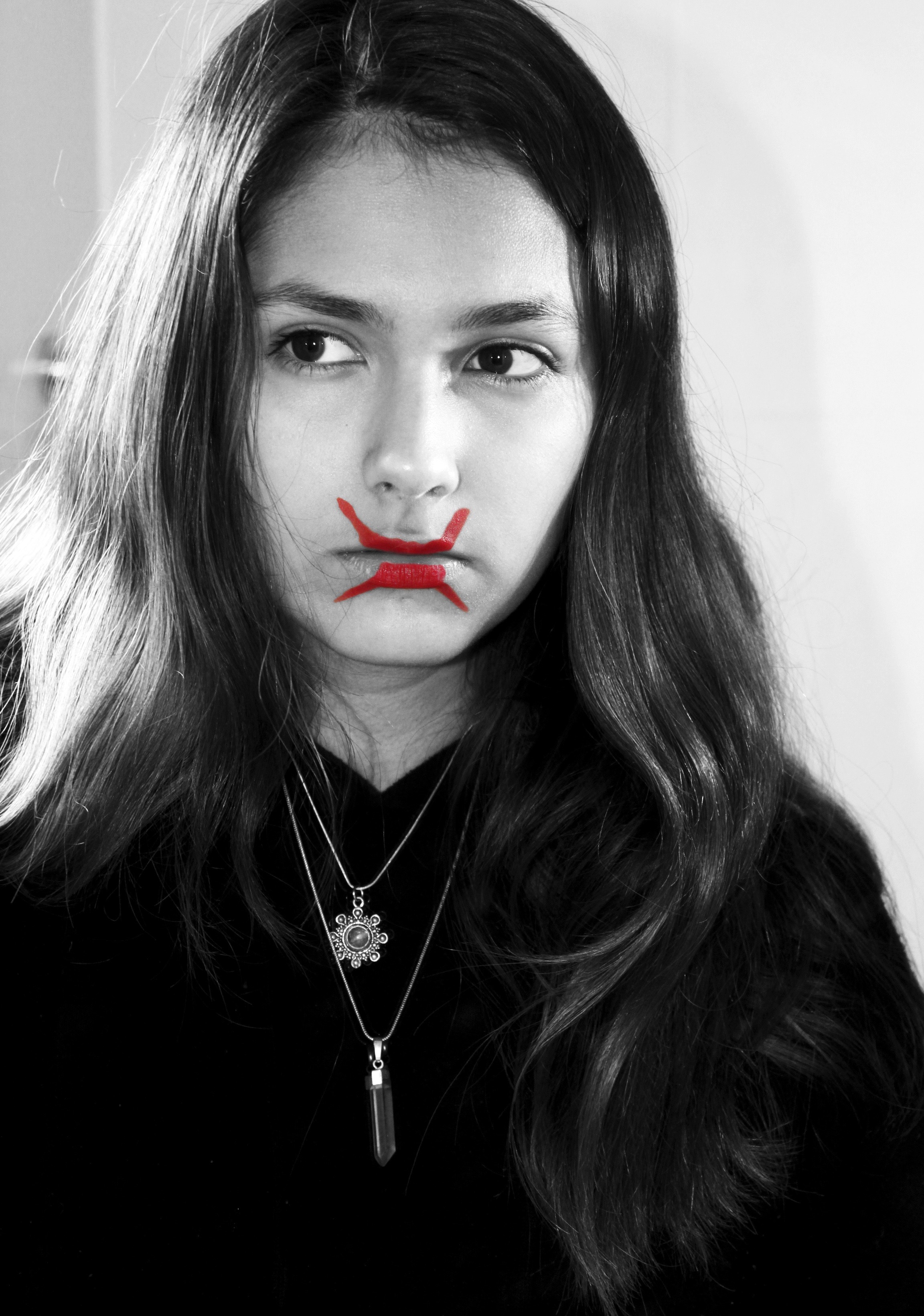
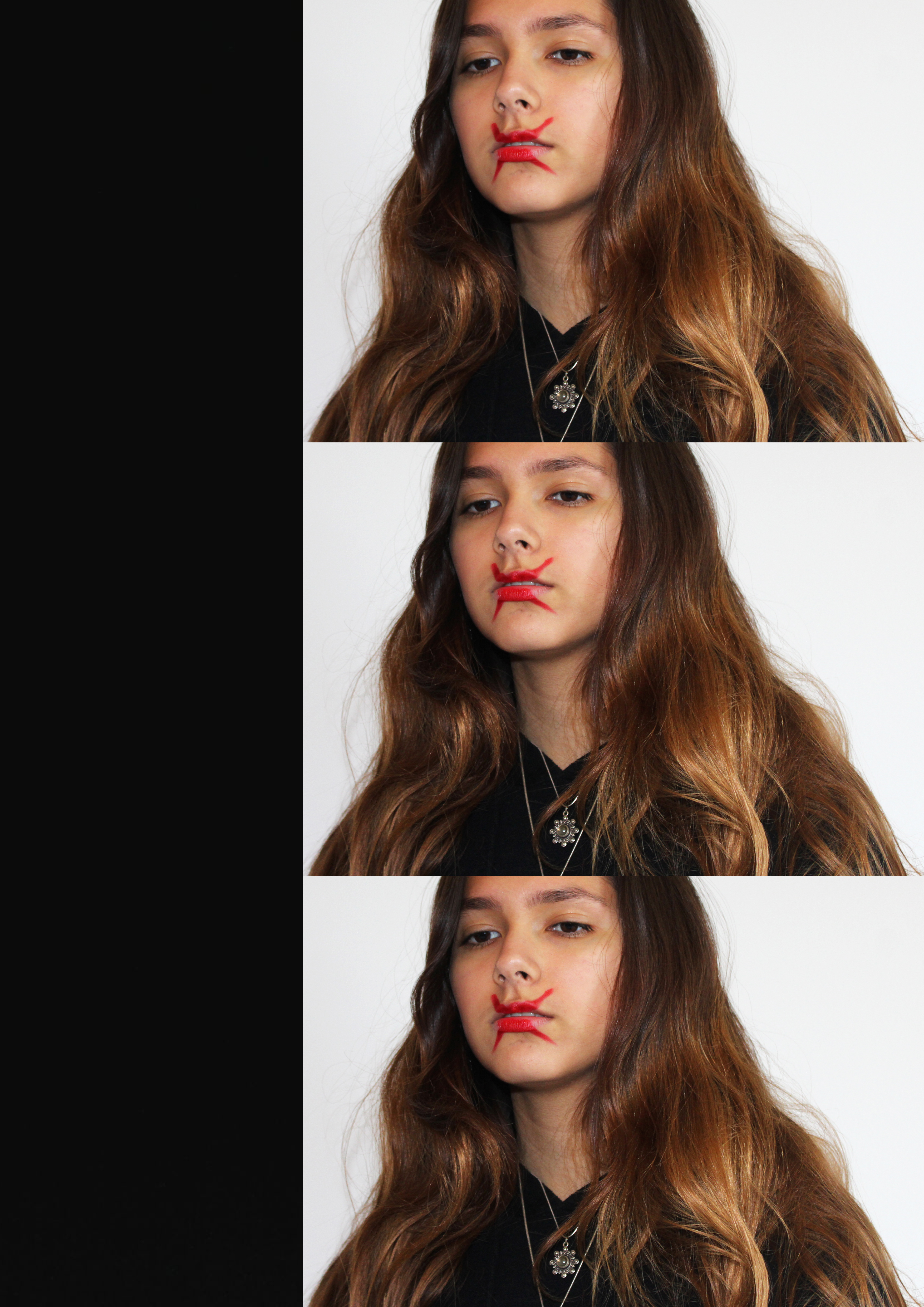
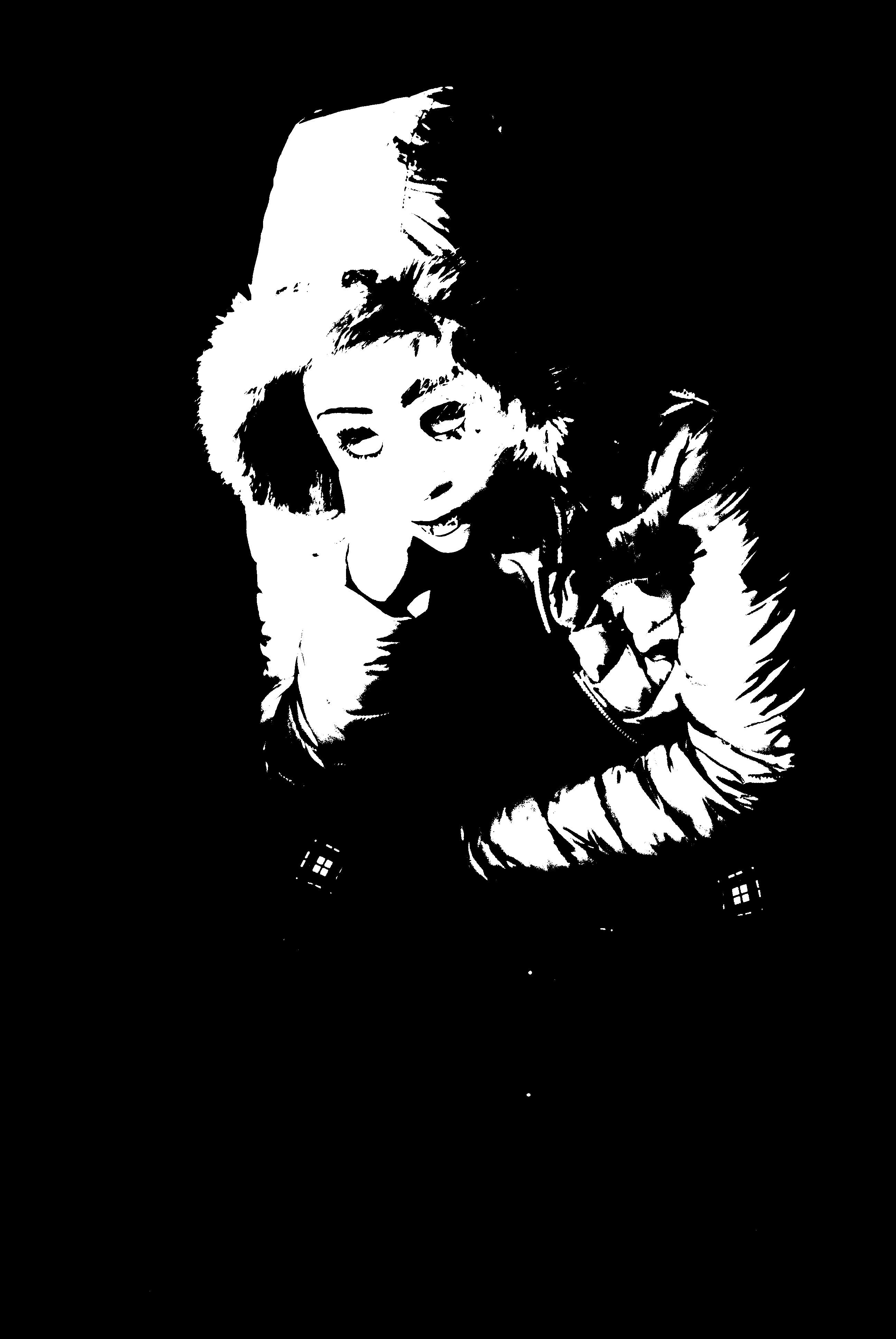
For the next three ideas I followed a similar approach as the first idea, I wanted to physically shows a person who has lost their identity. To do this I simply made the image black and white, to remove colors, and used the paint brush tool (white paint) to scribble of the face. This creates the concept that the image has been scratched to remove the identity of the model. These three edits are the most successful, due to the strong link it has with the theme of loss of identity. Moreover, I believe that these could be a potential final outcome for the loss of identity project.

Series of Two

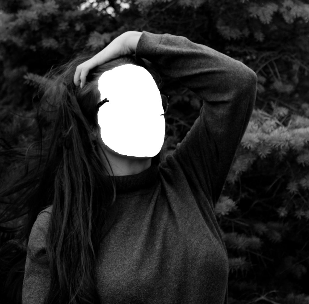
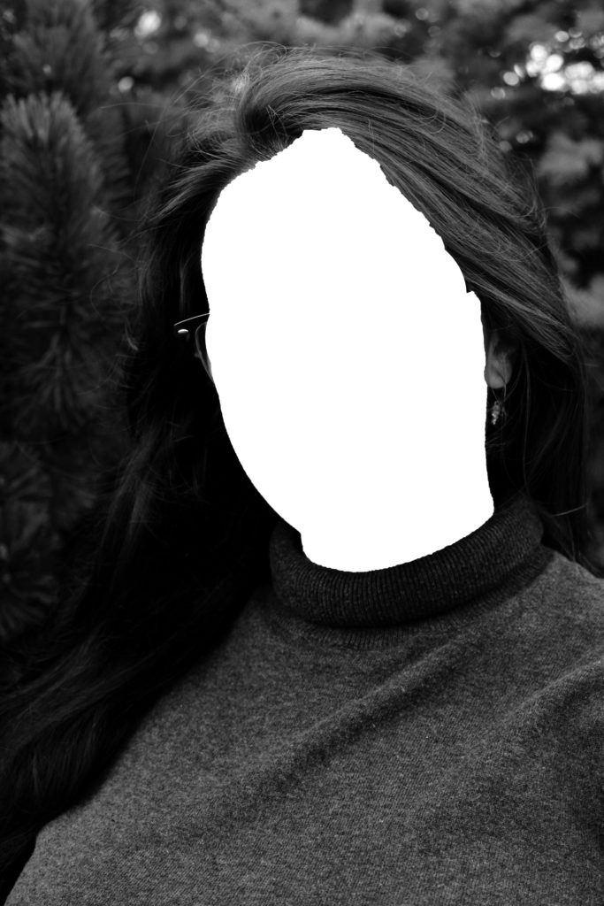
For my final two edits I wanted to physically show a persons loss of identity, as it tends to have the strongest connection with the theme. I followed a similar approach as the edits above, but decided to completely remove the face of my model. To do this I used the quick selection tool, and pressed layer via cut, in order to make the face a new layer. I then deleted the face layer, leaving the body and a white area where the face is meant to be. These edits are strong edits due to the not neat edges, from where I cut out the face, this metaphorically represents the idea that losing an identity can leave marks and scares and is not a tidy process to undergo. I really like the way these edits turned out, but believe they would have been more successful with darker and more sinister images, as the overall tone of the images could then match the concept trying to be presented.

To evaluate these edits, I believe I have produced some strong connections between my images and loss of identity. Moreover, I have managed to incorporate the ‘forgotten’ images and include them into the project successfully. I believe that some of these edits can be furthered into final pieces, due to meanings and representations the images hold. I have been able to clearly show a variety of Photoshop skills in order to manipulate my images in many ways, presenting different approaches to the theme of loss of identity. Thus, these edits have clearly benefited me and my exploration towards the theme of loss of identity.

Isabella Madrid: Photo Shoot 2

MY RESPONSE

To respond to Isabella Madrid’s photography work, I will take inspiration from some of her images and try to recreate them in my own style. I chose this photographer since she conveys ‘loss of identity’ through many of her edited images. She does this by concealing a part of her face through photo manipulation or using paint/textures to hide herself away from the frame. I will take several self portraits of myself using a tripod to replicate her style of photography which is very personal and aimed for self discovery. I will be taking these self portraits in my room and bathroom, a place which is intimate and personal. After selecting the best images from the photo shoot, I will edit them all in different ways to create an effect which will further express the theme ‘loss of identity’. Just like the photographer, I will experiment with textures, colours, light and the black and white filter on photoshop.

FINAL OUTCOMES

To capture this image, I ran the shower with hot water to steam up the glass pane of the shower and to create a raindrop effect. The water drops created a nice effect to the image because water is a very compelling element. Once in the shower, I placed the palm of my hand onto the glass pane. The palm is the main aspect in this image since it’s in the foreground and is much brighter than anything else in the frame. This aspect helps to create an eerie and dark atmosphere to my image since it looks like the subject is calling out for help. The black and white filter also helped to convey the theme ‘loss of identity’ since it generates a mysterious effect. The subject has been darkened by increasing the contrast on photoshop and experimenting with the curve image adjustment. The subject is slightly blurred on the left side because the water drops and steam conceal a part of her face. This helps to further emphasise ‘loss of identity’ since part of the subjects face is hidden.

I have joined two images for this outcome since they are both similar but the subject is in a different position. Like the previous image, I have used a glass mirror that has been steamed up to capture images for my theme ‘loss of identity’. To create texture, I ran my fingers across the mirror to create streaks. These streaks will reveal a part of my face. The two images are blurry which shows ‘loss of identity’ since the subject’s facial features have been hidden. In the first image I am positioned further away from the mirror, whereas in the second image I am a lot closer and my eyes are looking towards the floor to convey an emotion of sadness. When taking these images, I made sure that it was the time of day where sunlight would be streaming in through the bathroom window. I wanted there to be highlights and shadows on the subject since Isabella Madrid is always experimented with light in her photography work. I placed these two images side by side to show the different hand marks I created on the mirror and to make it more visually interesting. I have replicated her style in this outcome by capturing simple images that convey a sense of being lost and confused with ones own identity.

Before capturing images, I used red face paint to draw a cross over my lips. I did this to replicate one of Isabella Madrid’s image because It relates to ‘gender identity’ since most women in the past were silenced to keep their opinions to themselves. This also relates to ‘loss of identity’ since opinions make up a part of our identity and if one is made to be silenced, one is loosing a part of it. I took images by placing my camera on a tripod and using the flash settings to illuminate myself through the mirror. I took this image through the mirror to show the subject looking into it and conveying an emotion of sadness as they feel that they cannot express their identity. Since the photographer conveys ‘loss of identity’ through her edited images I decided to edit on photoshop. I opened up the same image twice and made the front image black and white while keeping the background image the same colour. With the eraser tool I erased the areas of paint so the colour red would be revealed. Afterwards I adjusted the saturation so the colour red would pop in the image and capture the viewers attention.

I took this image in my bedroom and used flash to illuminate the subject. I kept the red x over my lips and was looking towards the ground when capturing the image. On photoshop I opened up a page and inserted 3 of the same image on top of one another. Since there was a lot of empty space because of the blank white wall, I opened up a solid black image and placed it the left side. I was inspired to do this edit by an error that occurred in my photo album. Afterwards, I adjusted the saturation by increasing it so the subject would be vibrant and bold

IDENTITY AND PLACE MOCK EXAM FINAL IMAGES AND PRESENTATION:

MY FINAL IMAGES:
After manipulating my images, these are the images that I want to send off to be printed. I will then rework them when they're printed off. I will rework the images by writing text on them, my idea is to ask the subjects what they think about that moment of time an write it on the image. I was inspired by Jim Goldberg's work, so I thought I would also re-work my images by adding both text and drawings into my work.

THE PRESENTATION:
To present my images I will be placing them on foam board because the crop of the images makes them different sizes, which wouldn't look very aesthetically pleasing on a mount. I will also be reworking into the images by hand-writing text onto them. I will also be hand-drawing outlines that i think will also make the images look more interesting. 
Another reason why I think having my photographs on foam board is a good idea is that I will have flexibility on how and which order I can arrange my images in. I can have them up as individual images in multiple locations or I can have them set out as a series. As the originals are printed out photographs, in real life photos are arranged in various orders, such as photo albums or in photo frames around the house/premises. Therefore, by having the flexibility of having the images on foam board replicates the flexibility you have when you have your photos printed out.