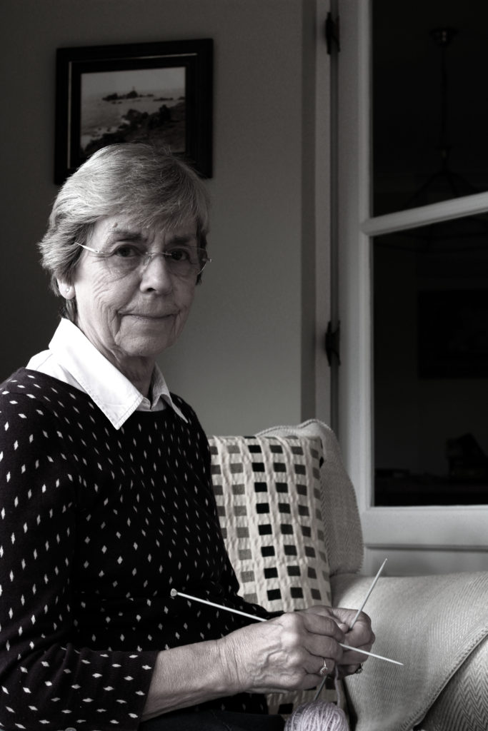
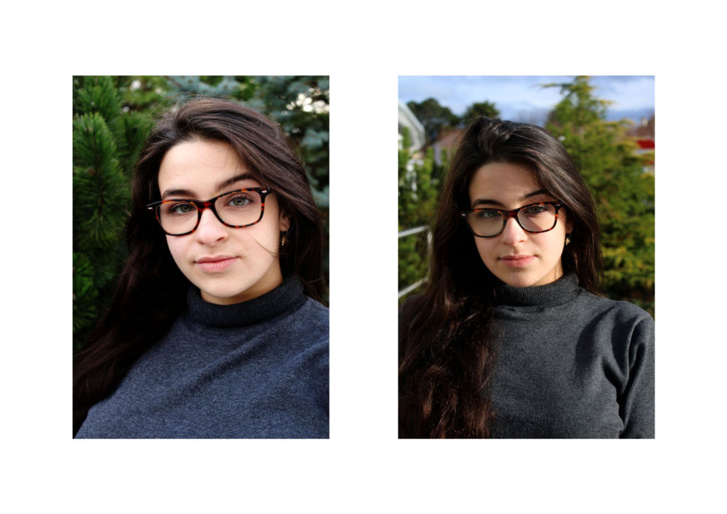
Final Piece 1: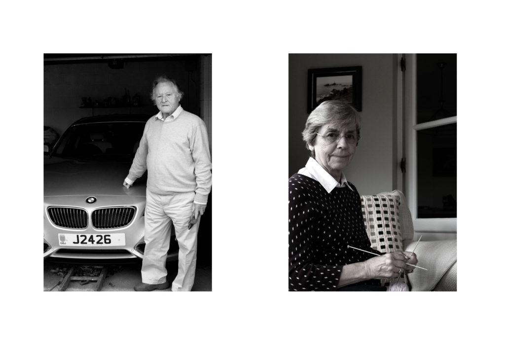
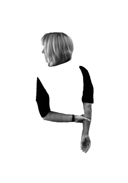
For my first final Piece I will be displaying my environmental portraits. I selected my top two images, which showed gender roles and resized them to be A4 images. To display them I am going to mount them on foam board next to each other, 4cm apart from each other. I feel that a white background suits the two images, and allows them to neatly be presented.
Final Piece 2: 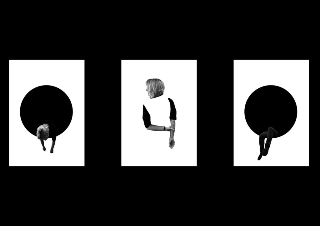
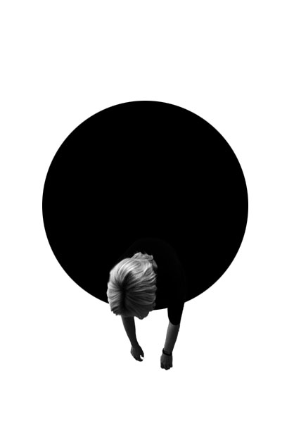
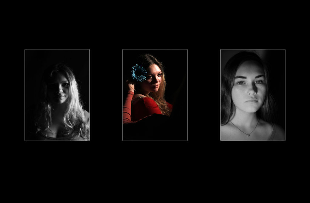
For my next final piece I am displaying the edits from my first photo shoot of loss of identity. I felt that these three images contained a simplistic design and represented the idea that my model has lost their identity, therefore I will be displaying the photographs in a triptych arrangements. All the images will be separately printed on A4 paper, and will be mounted as a window frame. The card is going to be black, due to the image background being white. They will be 4cm apart from each other and 15cm from the top and bottom of the frame.
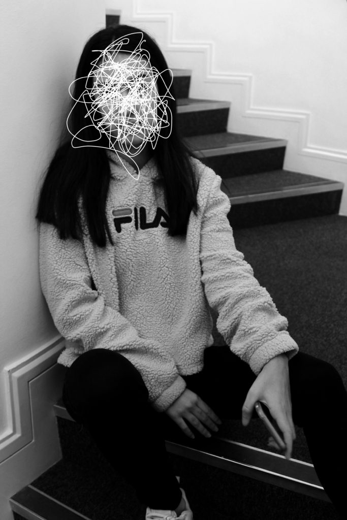
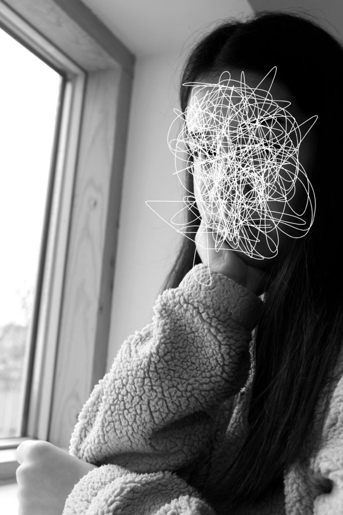
Final Piece 3: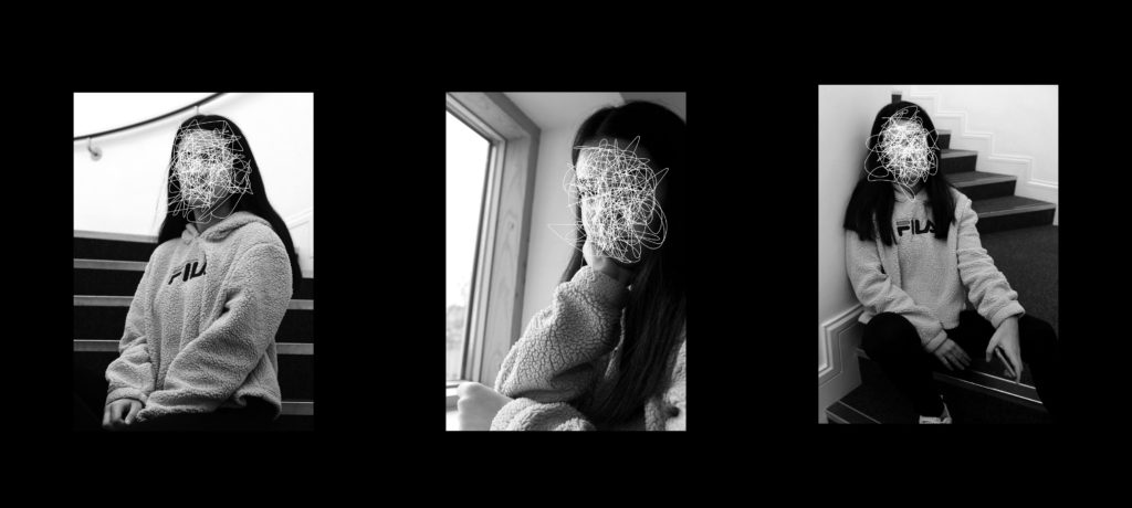
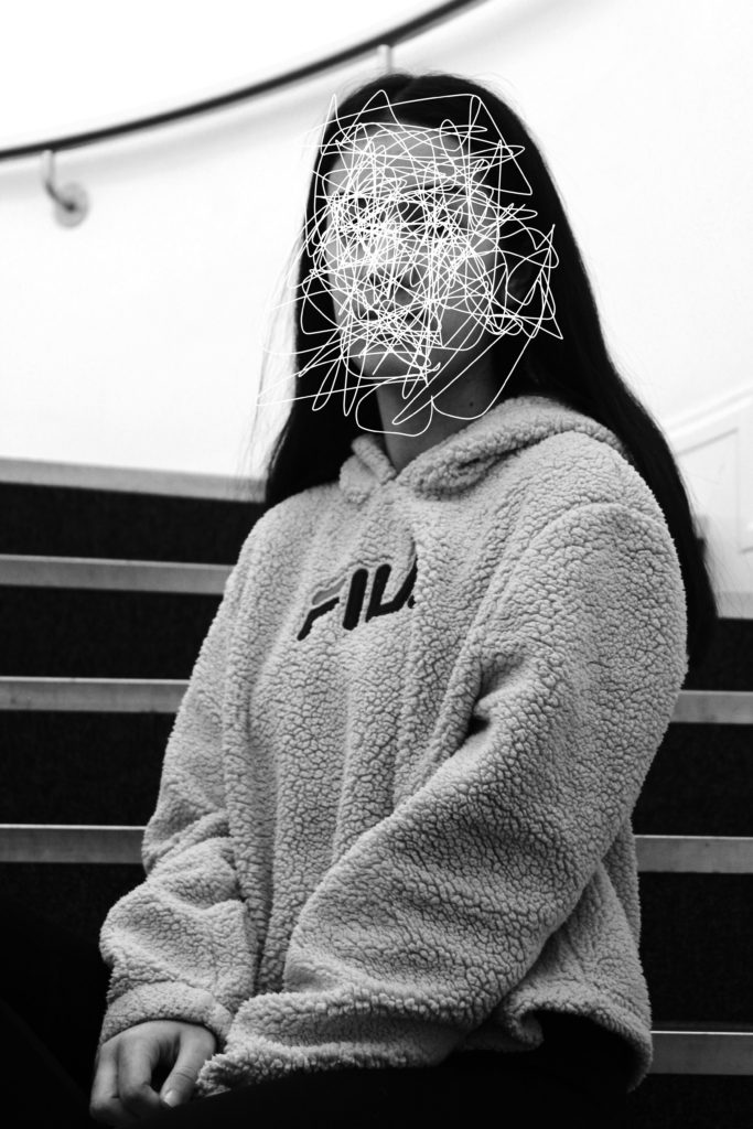
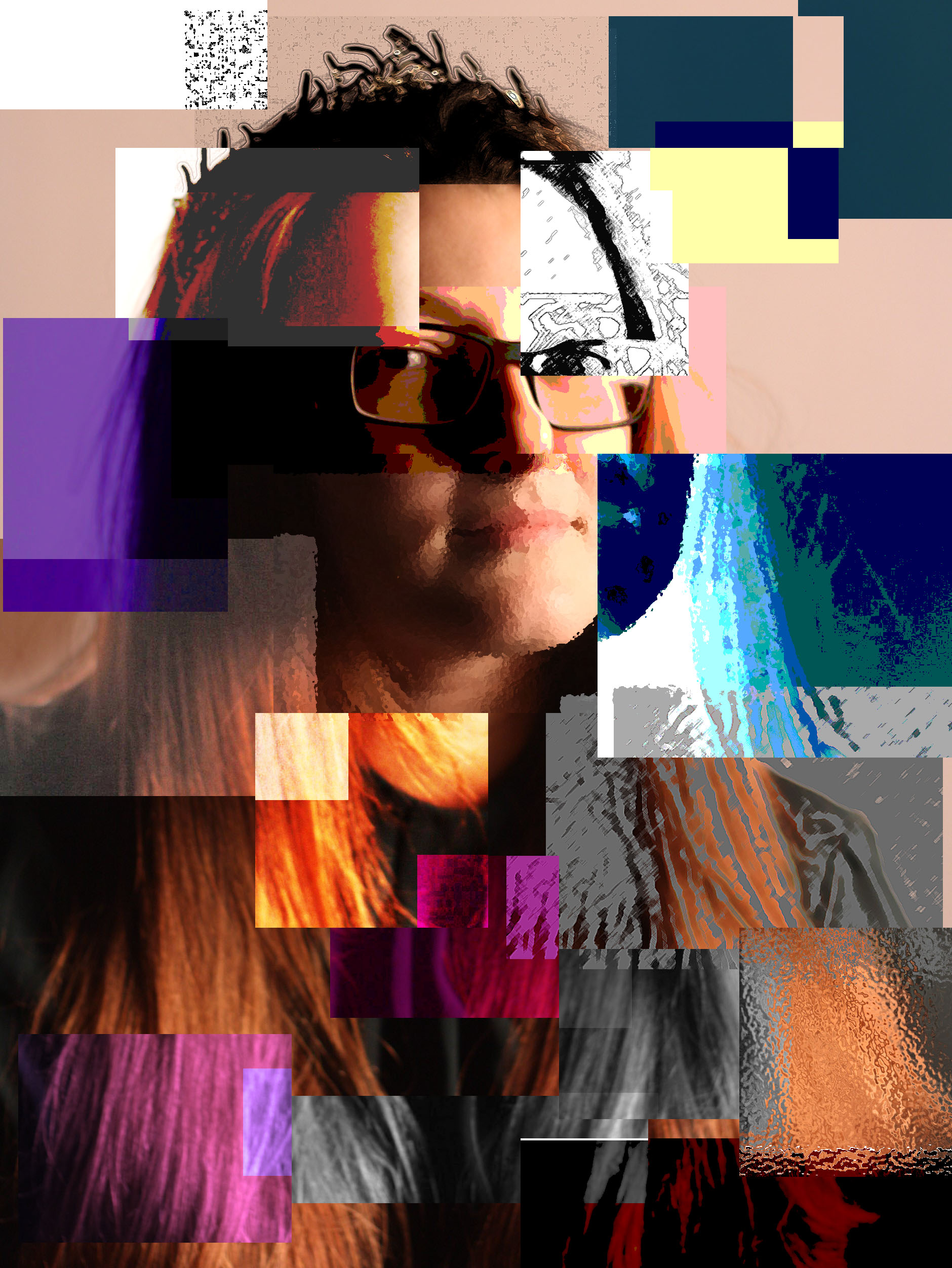
For my third edit I wanted to showcase, the scribble edits, which I created using the forgotten images. I felt that these images had a strong link to loss of identity and felt like the three images would produce a strong outcome. To do this I will print the images on A4 paper, and will be mounted as a window frame. The card is going to be black, due to the image background being white. They will be 4cm apart from each other and 15cm from the top and bottom of the frame.
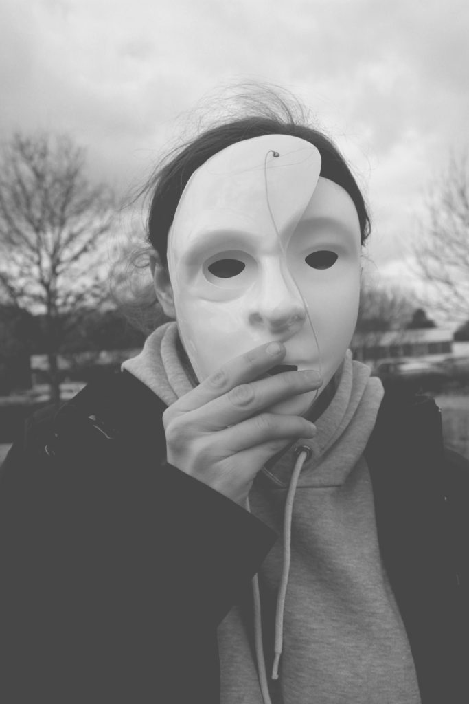
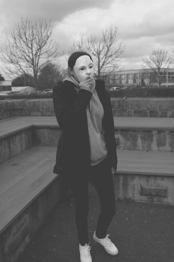
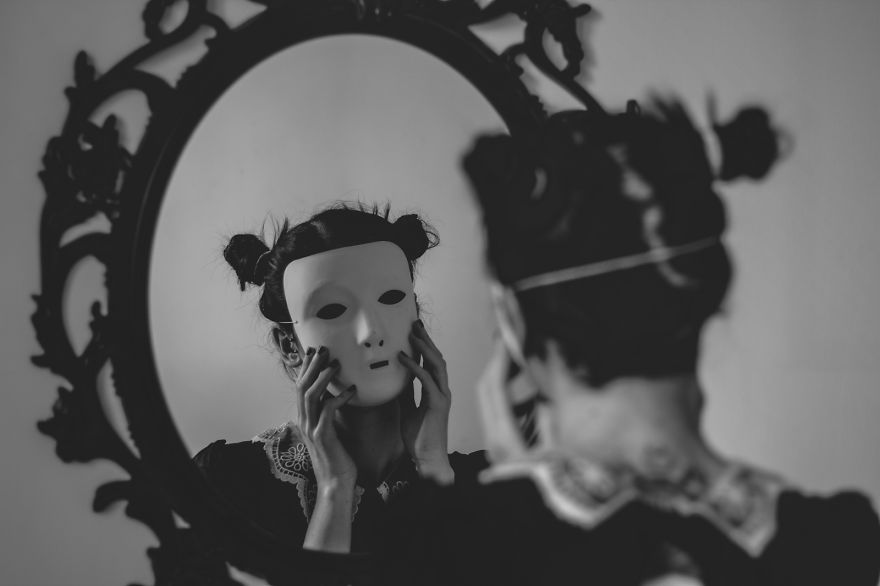
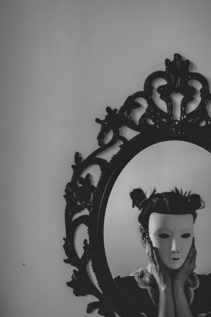
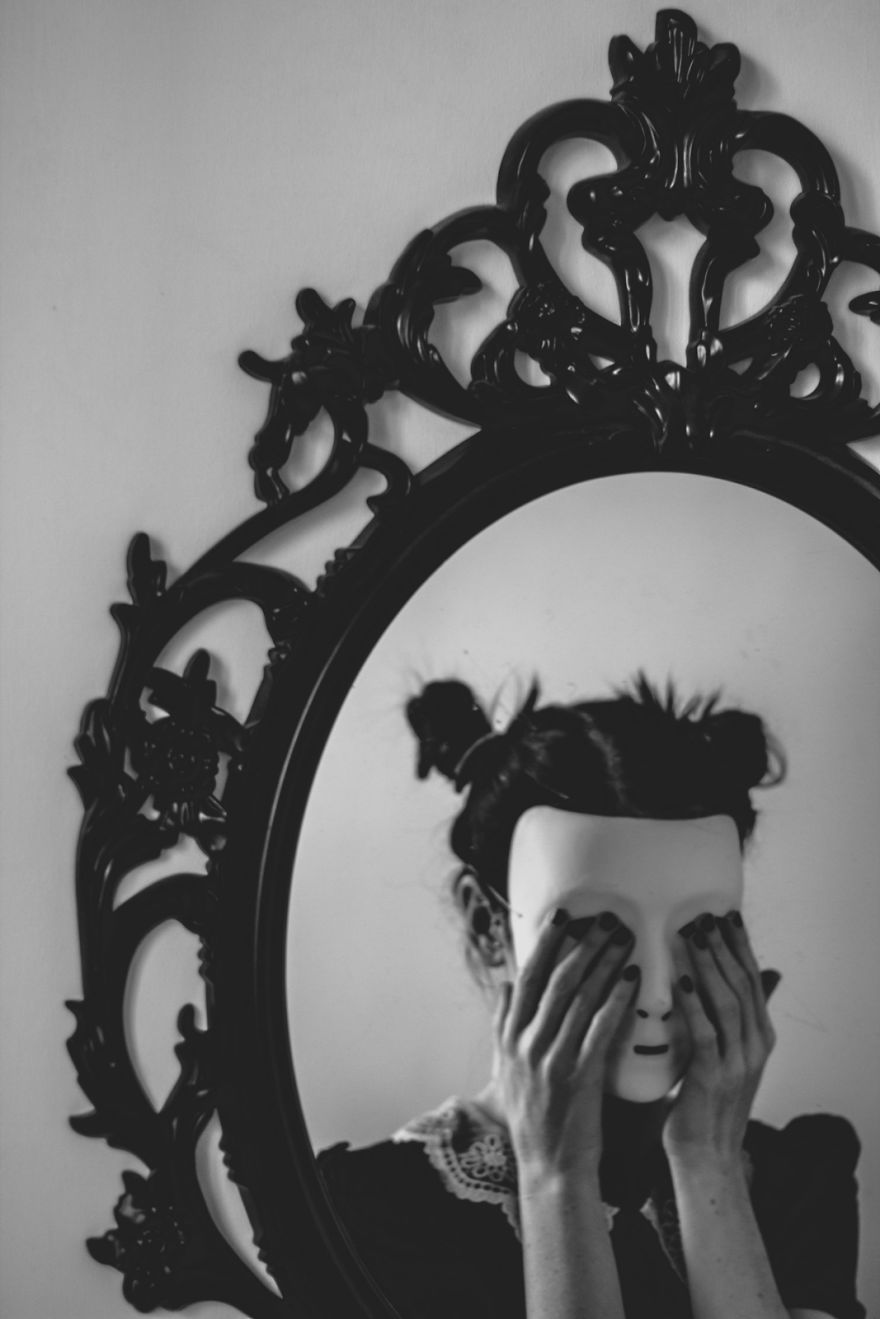
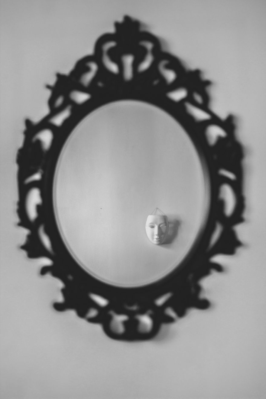
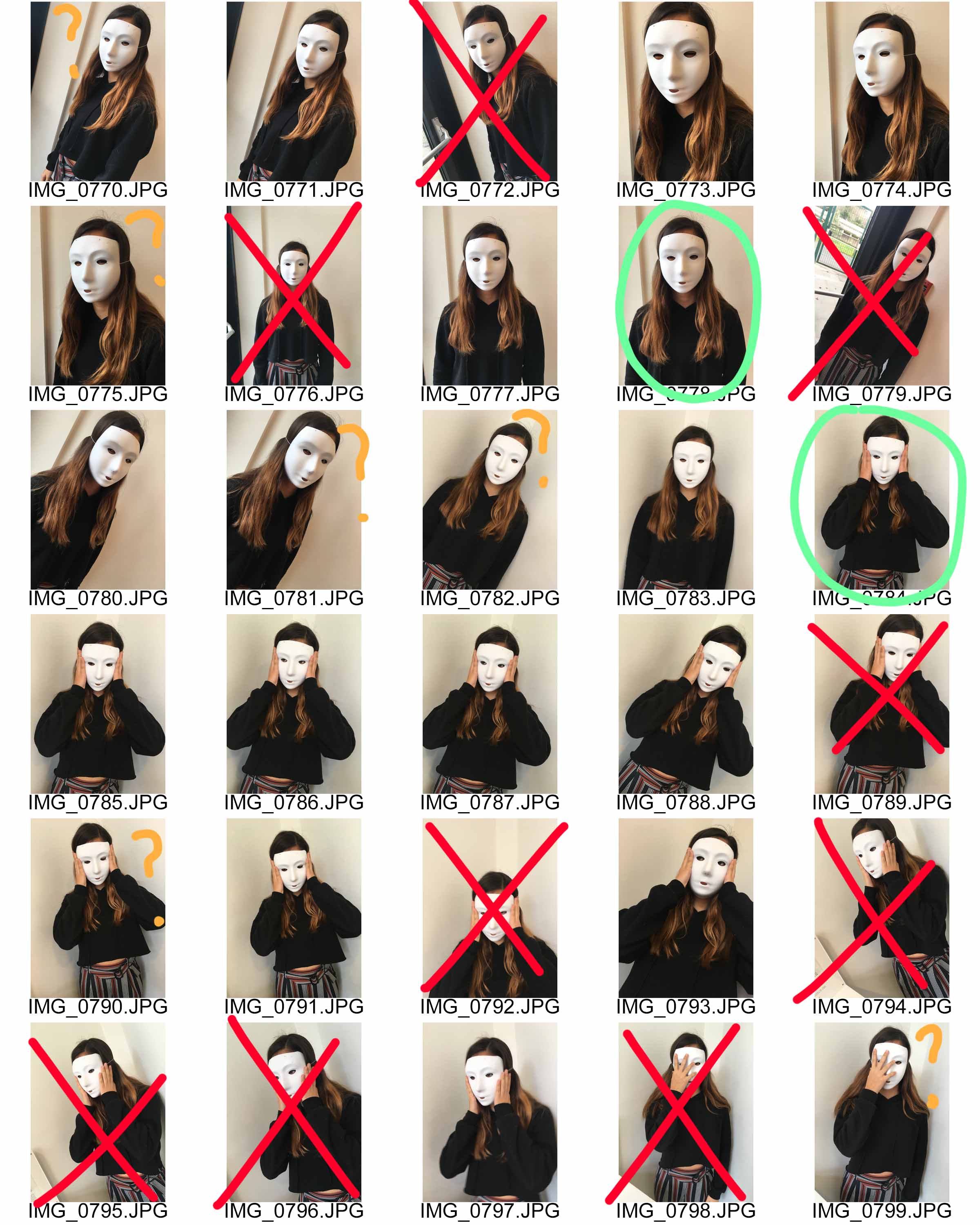
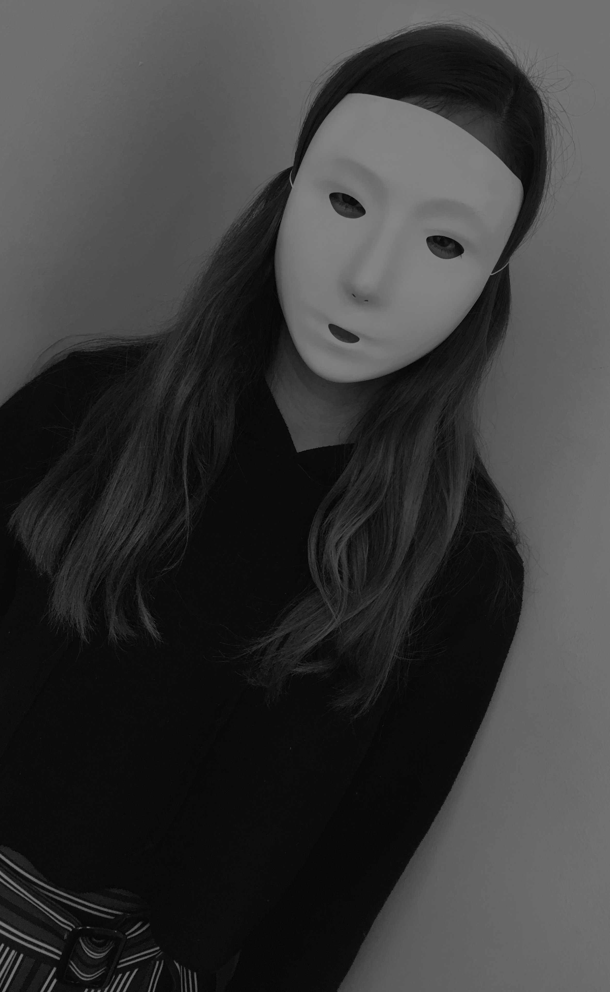
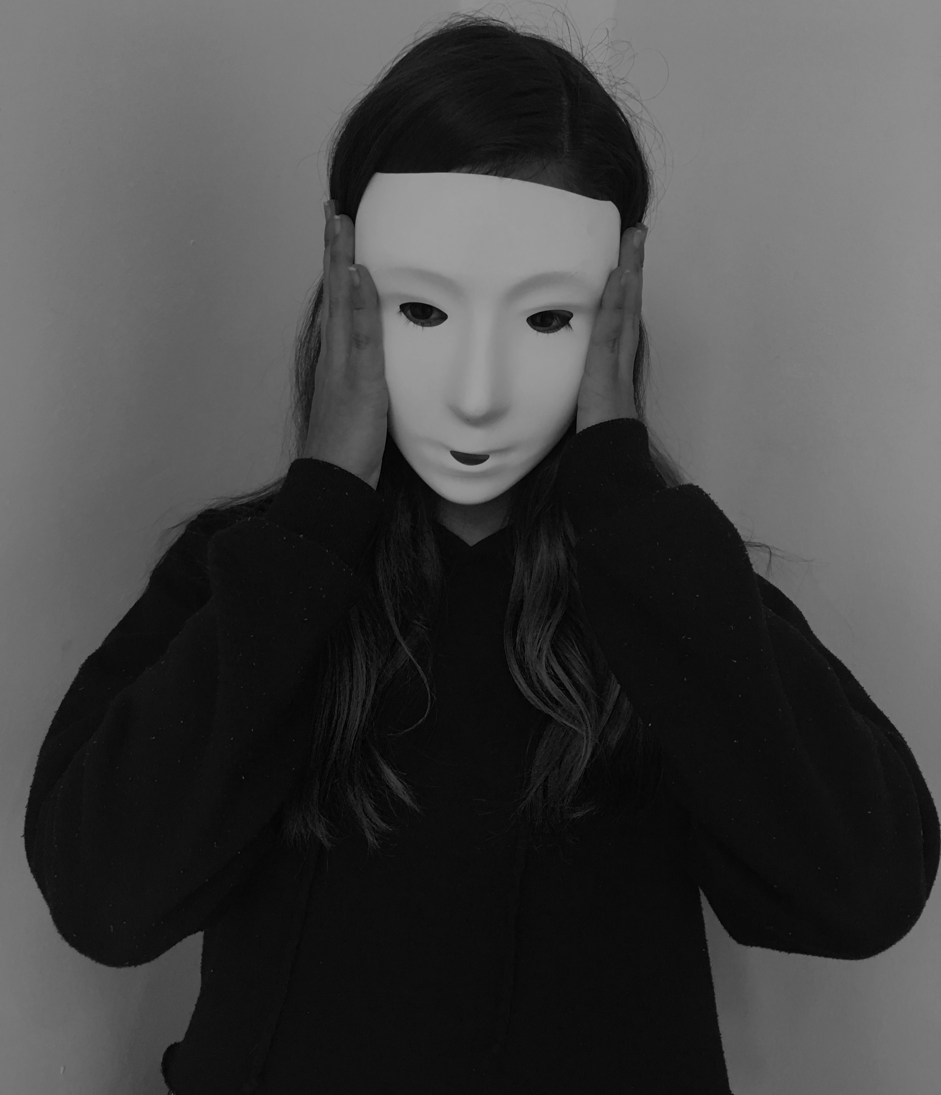
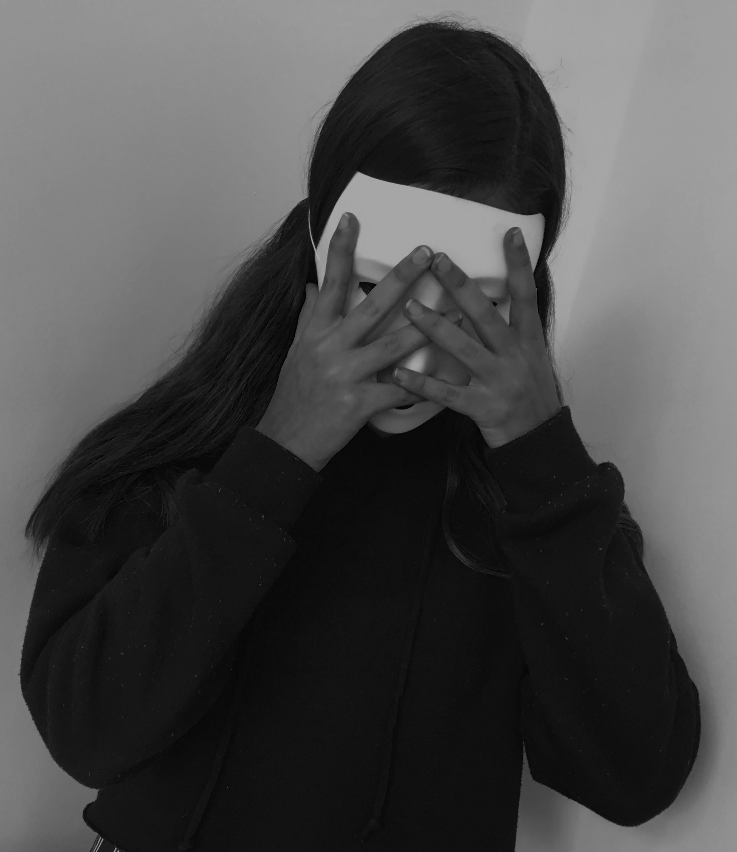
Final Piece 4:
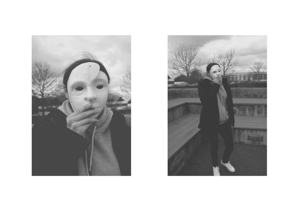
For my next final piece, I wanted to present my top outcomes from my mask photo shoot. I selected these two images, as I felt that they worked well together as a small photographic series. I will be displaying them as a Diptych Arrangement. Due to the two images being naturally lighter I feel like it would be appropriate to display them on white foam board, next to each other. I intended it have the images roughly 6 cm apart from one another and 6 cm away from the edges of the foam board.
Final Piece 5:
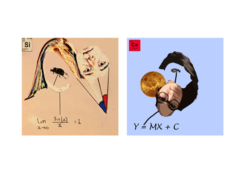
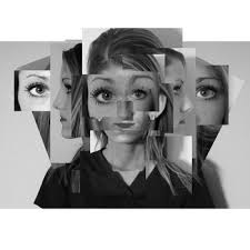
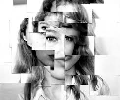
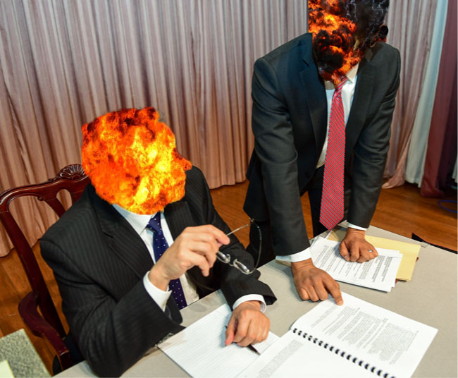
For my next final piece, I want to showcase my strongest photo montages. I decided to use these two montages as I felt that they worked well together. Due to the images being square, I have placed both images on the same A4 paper and will display through a window mount. This will allow the square shape to be kept. The two images are 3 cm apart from each other and will be a distance away from the edges.
Final Piece 6:
In my next final piece I want to display the photographs I captured when I studied natural lighting photography. These two images are my strongest outcomes and I feel like they work well together. I will print them out on separate A4 pieces of paper and frame them using foam board. The images will be 10 cm apart from each other and from the edge of the foam board.
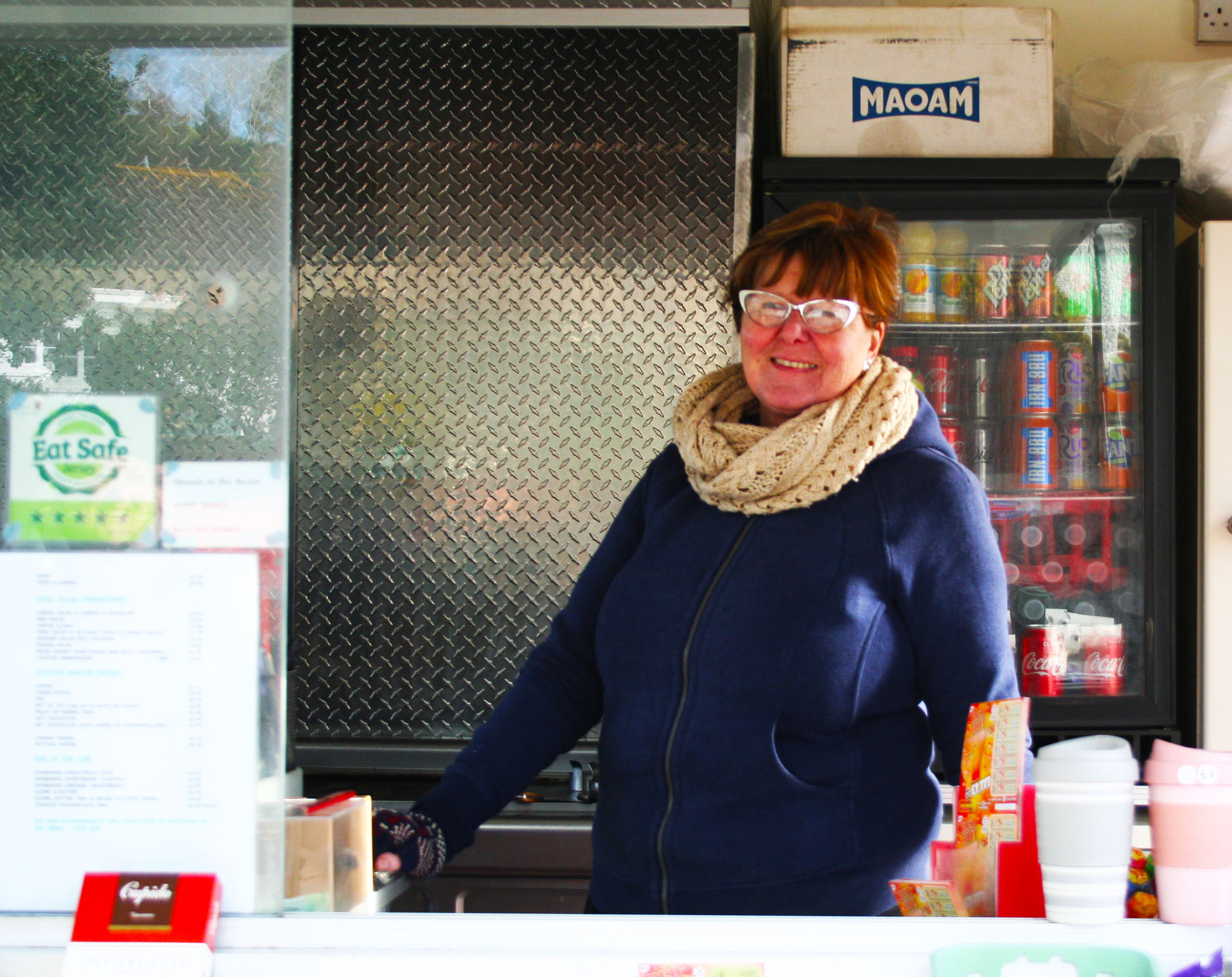
Final Piece 7:
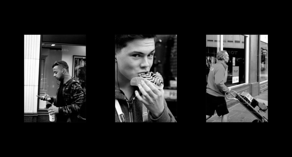
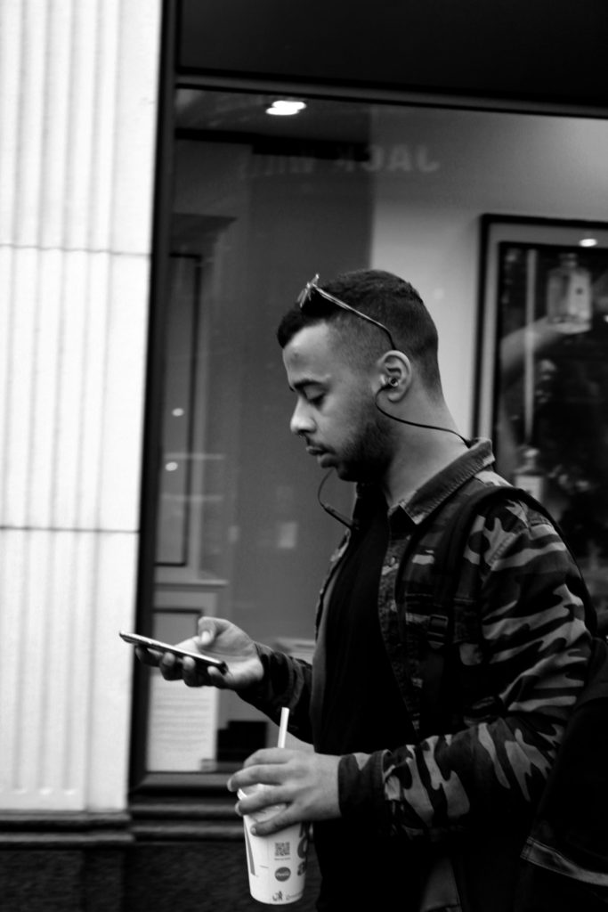
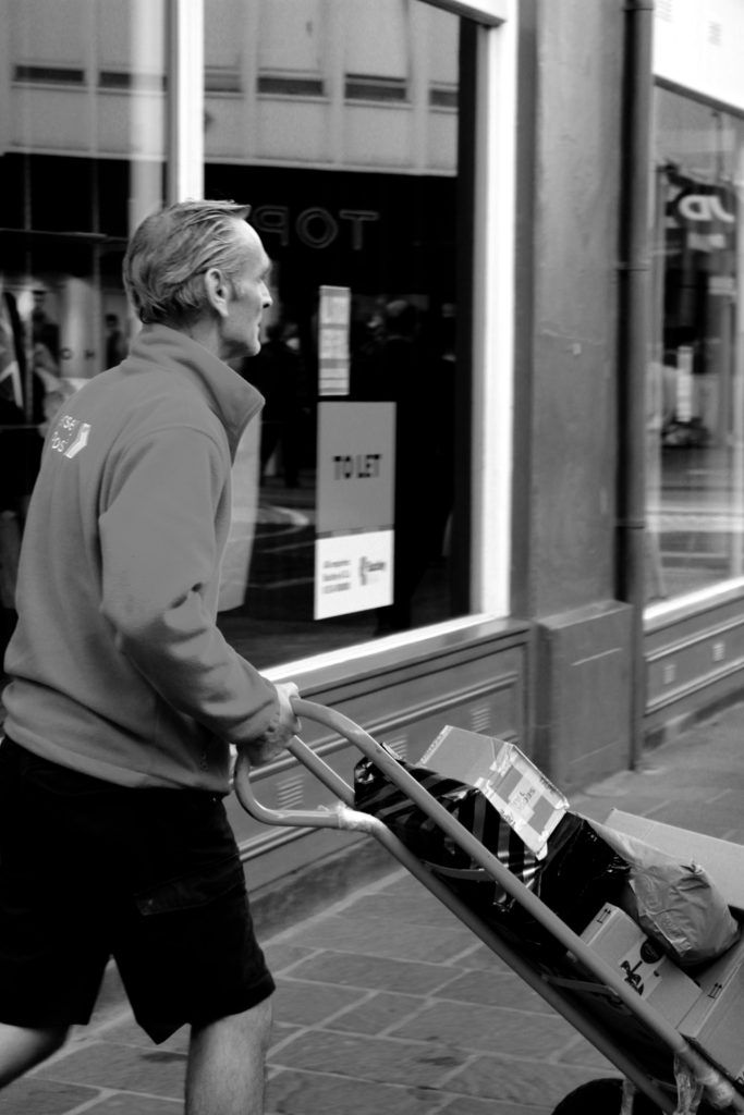
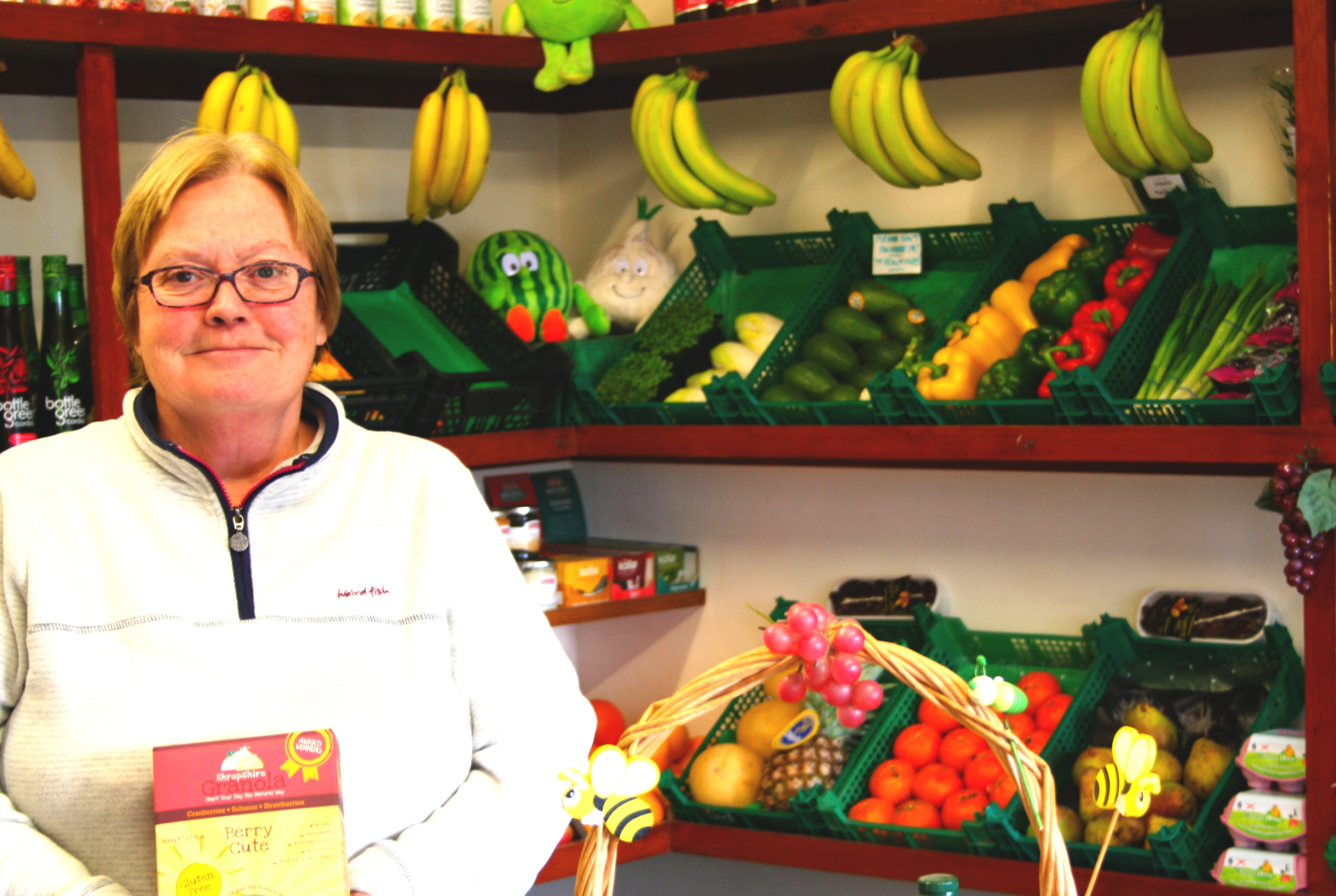
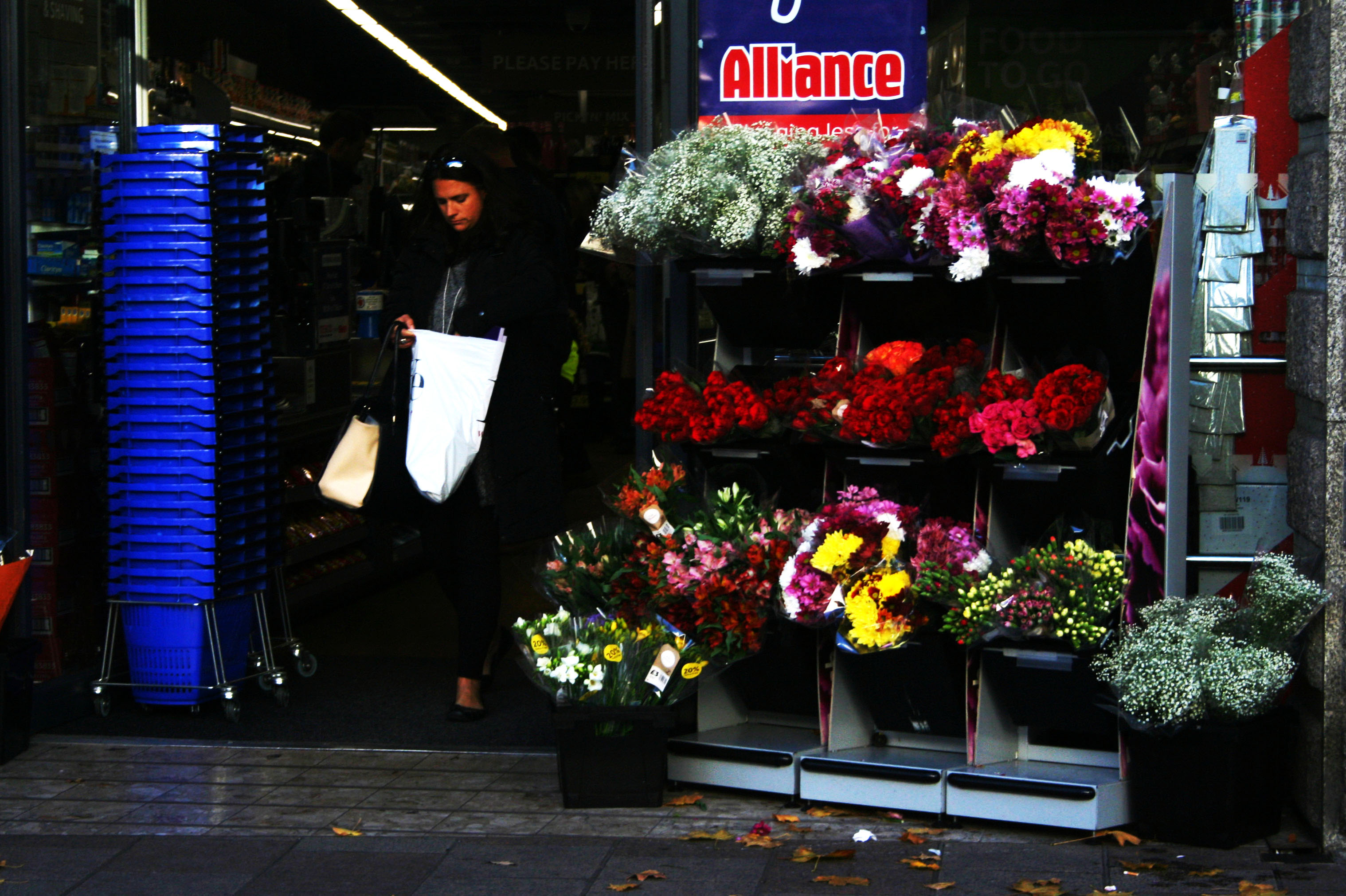
My next final piece showcases my attempt at street photography. I have used my top three images from this shoot and am going to display them next to each other, horizontally. The images will be printed out on A5 paper and be displayed using a window mount. The photographs will be 6 cm away from each other and 10 cm away from the edge of the window frame.
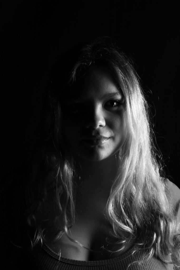
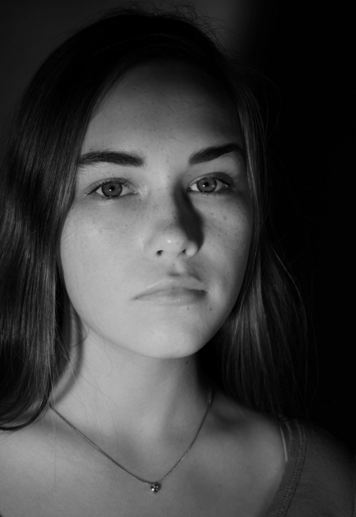
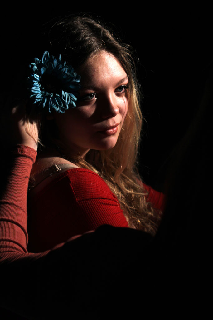
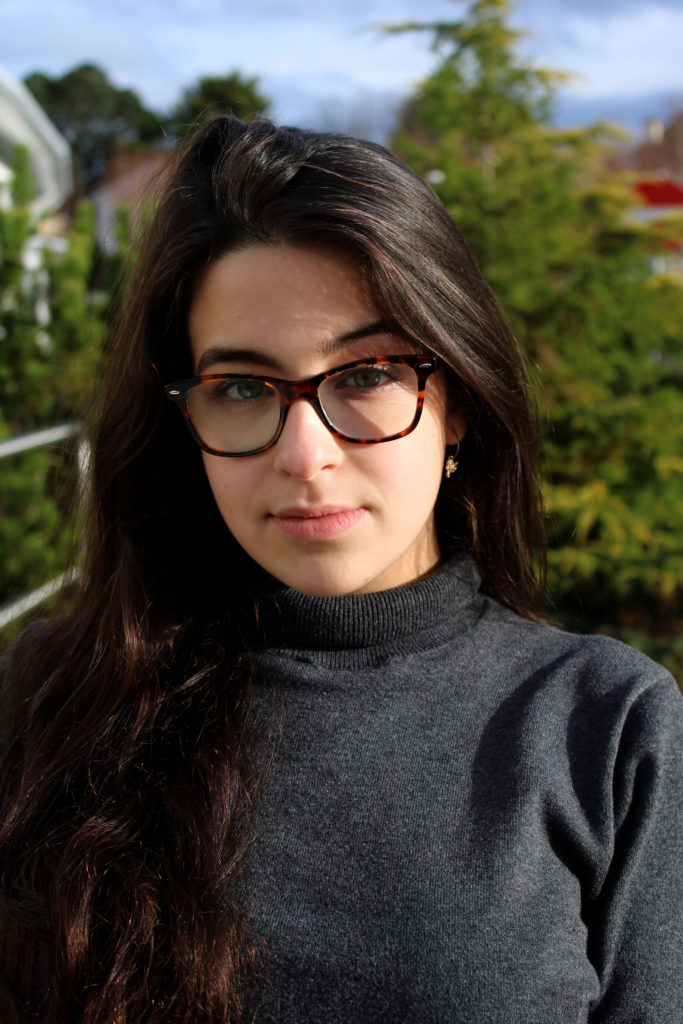
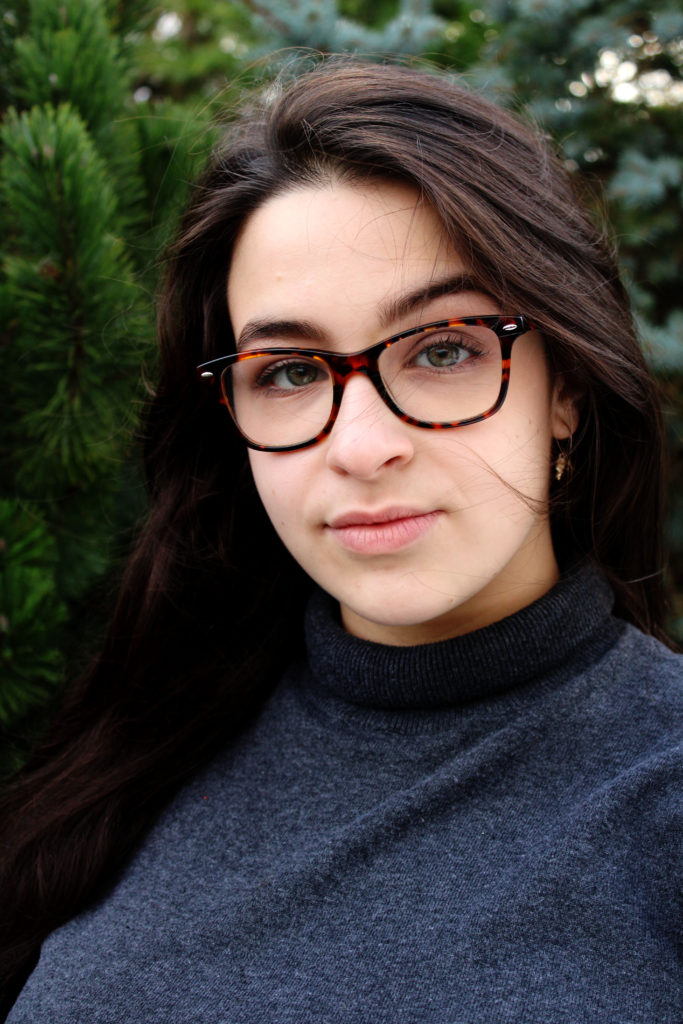
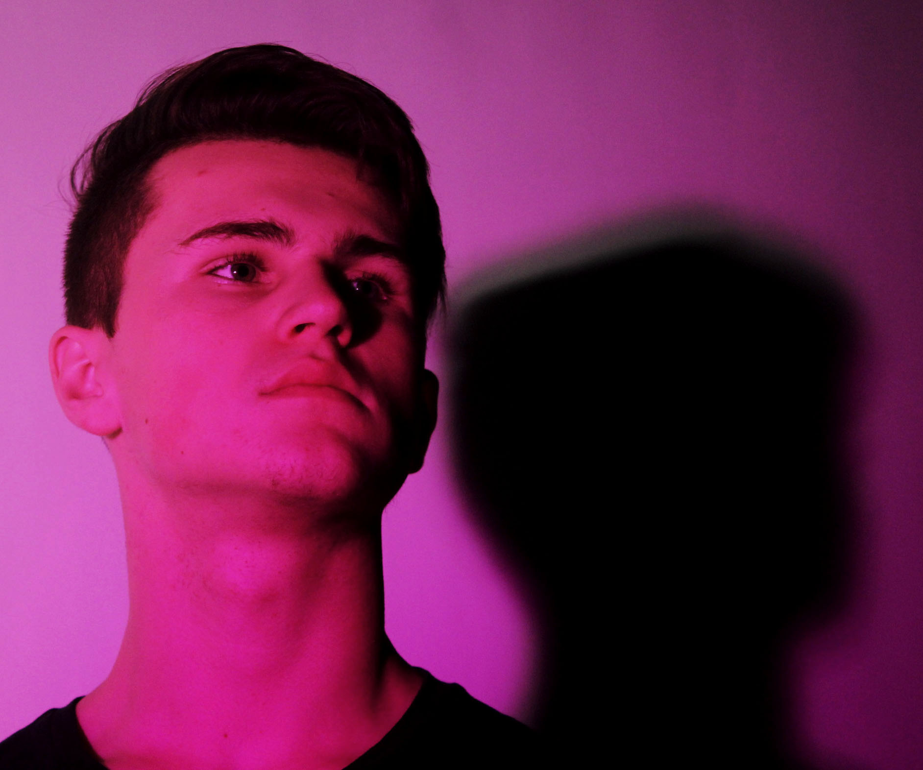
Final Piece 8:
In a similar formate to the final piece above, I want to showcase my studio photography images. These images have been selected as it showed my ability to use different lighting and camera techniques, which shows my development as a photographer. The images will be printed out on A5 paper and be displayed using a window mount. The photographs will be 6 cm away from each other and 10 cm away from the edge of the window frame. The middle image has been left in color as I felt it added variety and makes the final piece visually stimulating.
Final Piece 9:
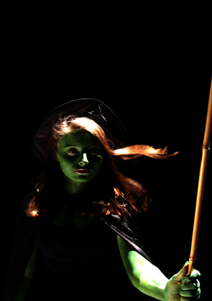
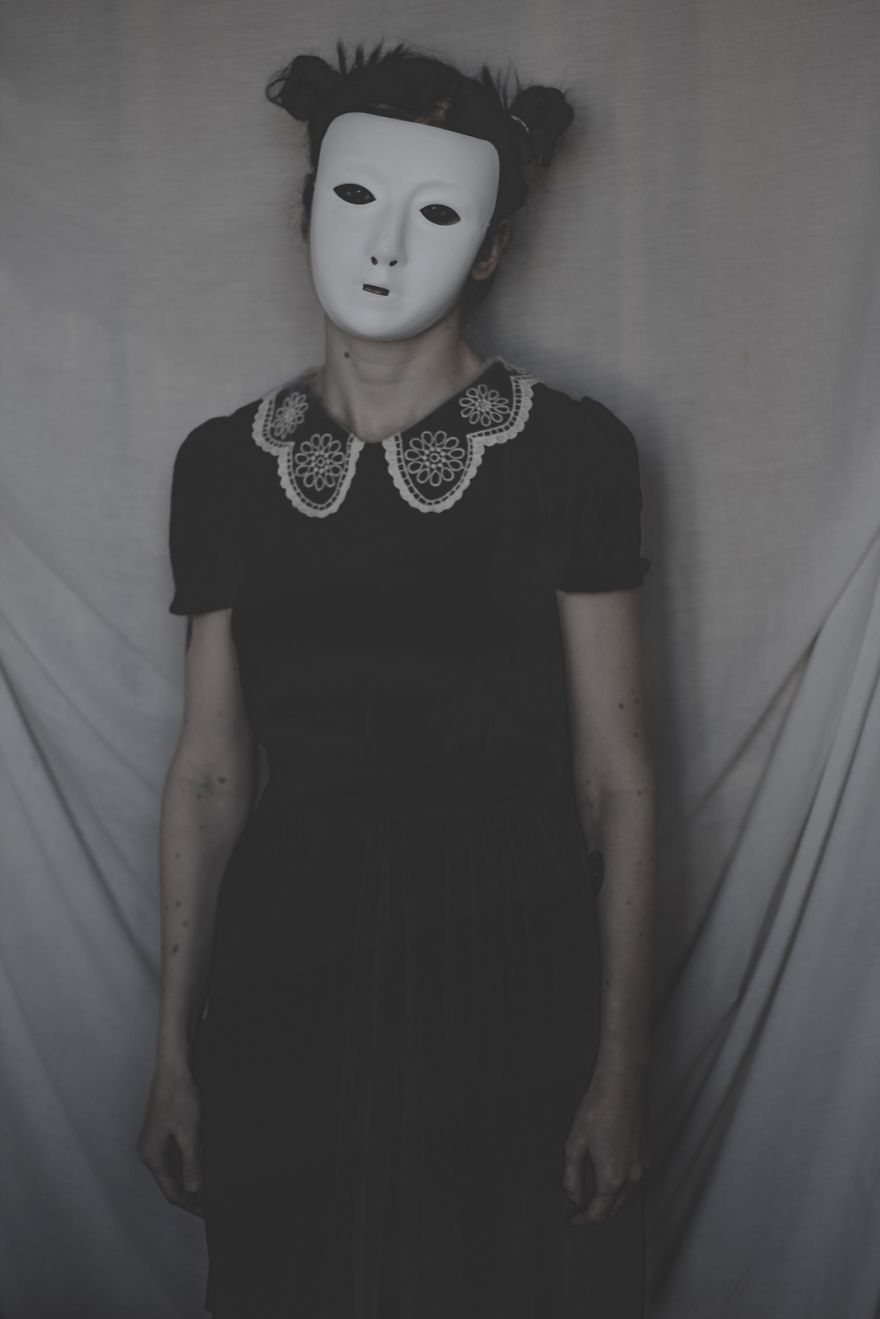
For my last final piece I intend to showcase my top image from the tableaux photography shoot. I will print this image out on A5 paper and then mount it on black card, allowing the mount to not distract viewers from the actual picture.
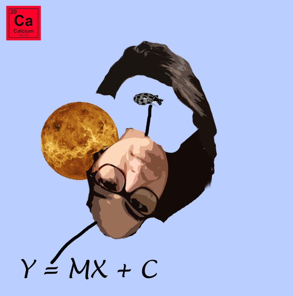
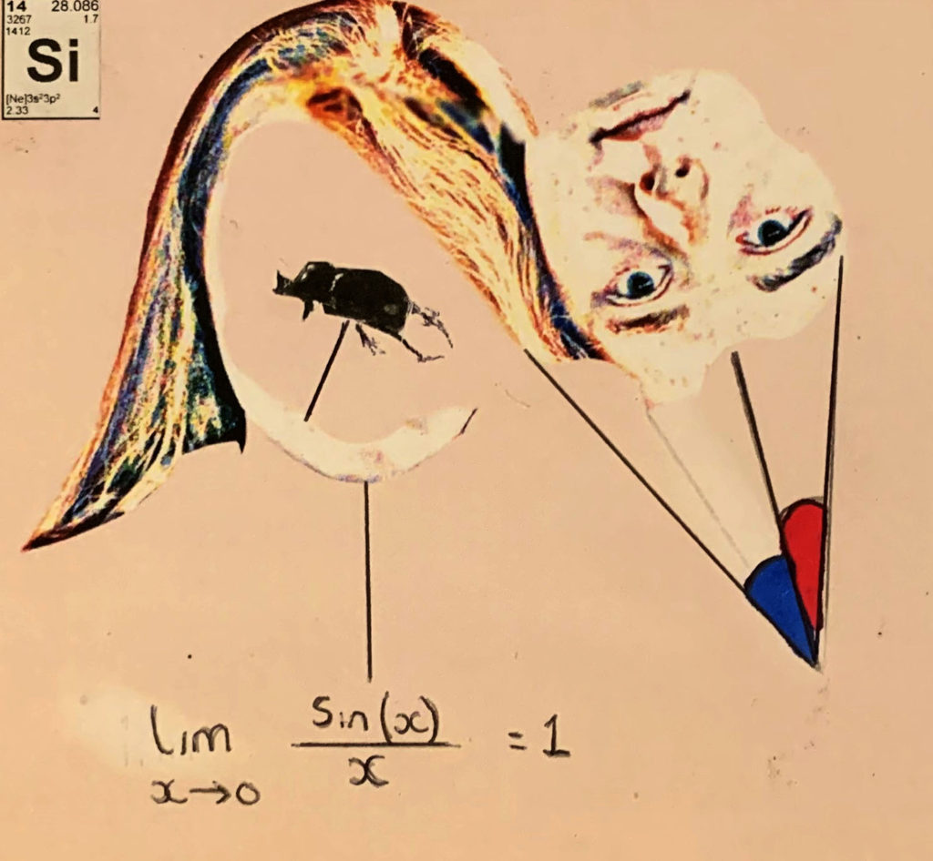
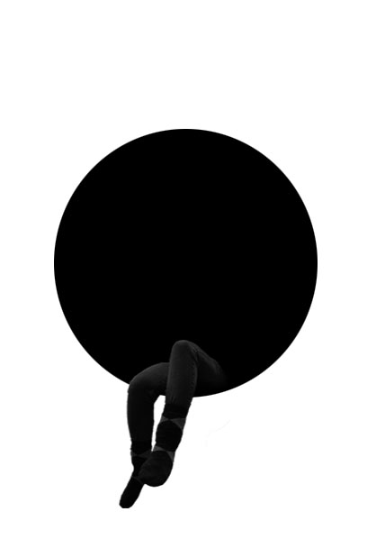
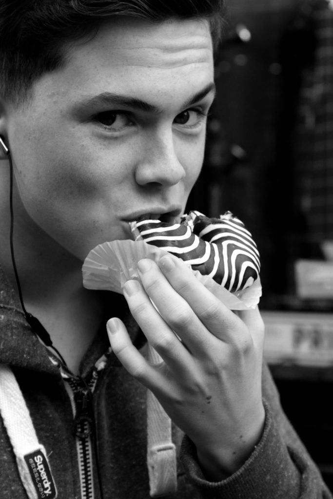
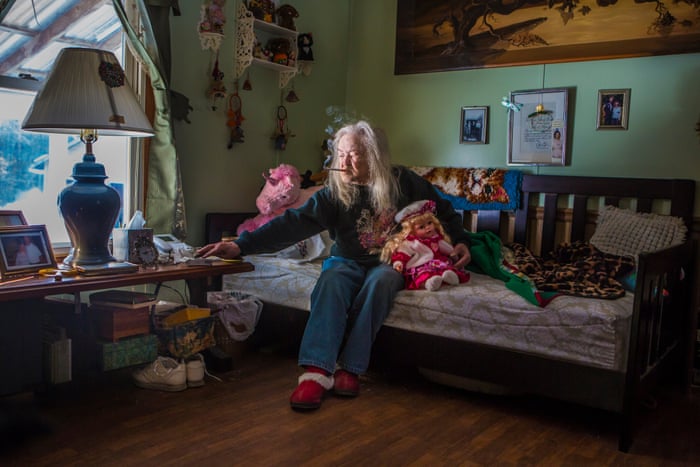
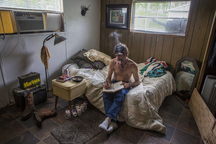
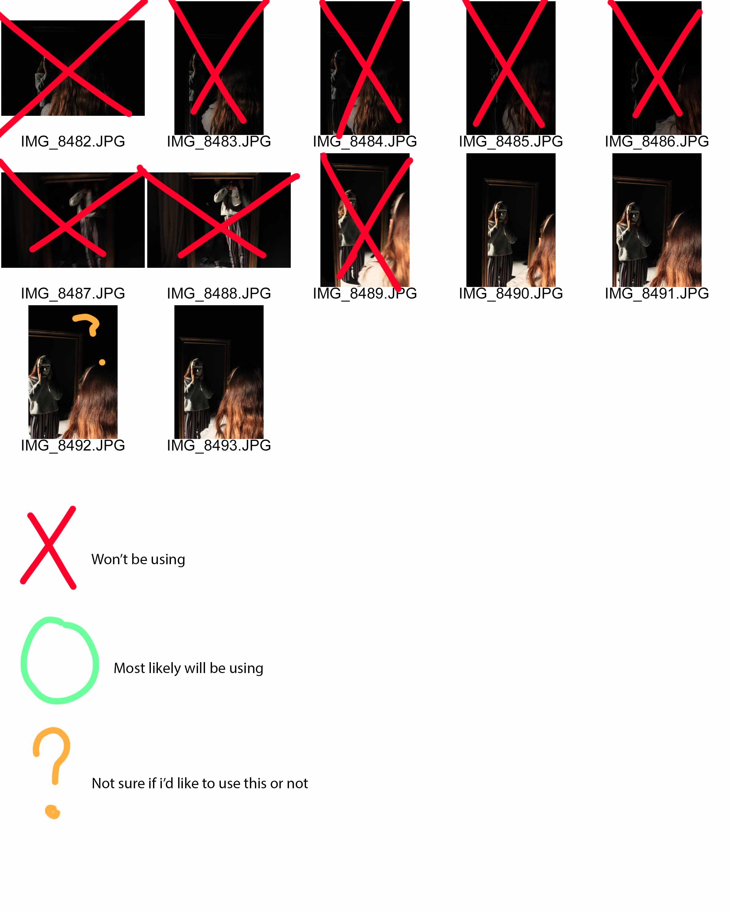
All Images Being Made Into a Final Piece: