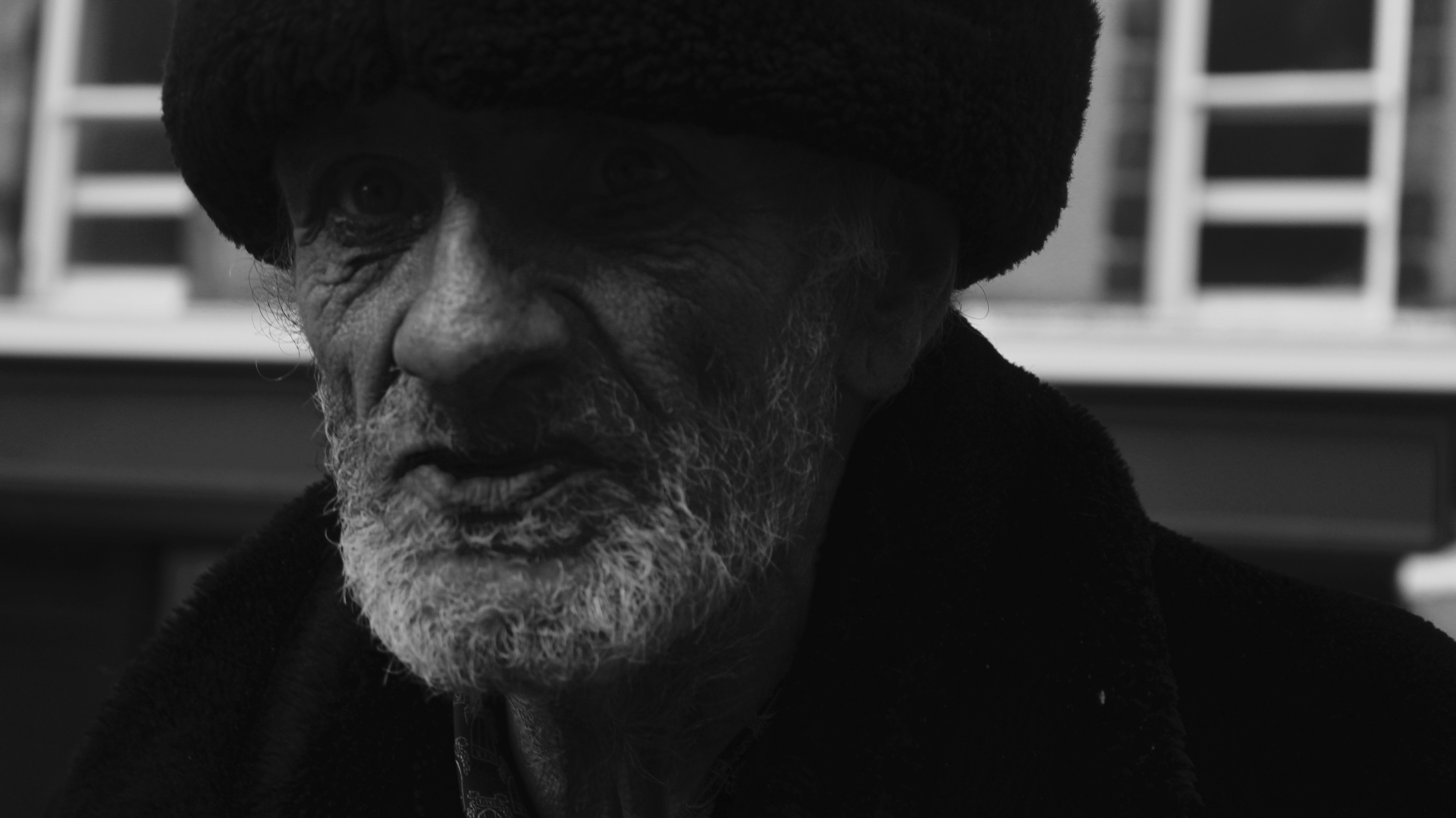
Street Photography Contact Sheet
Final Images
Edited
Will be displayed as two images in a frame as so ^^

Will be displayed as two images in a frame as so ^^
For the second photo-shoot I had a clear idea of what i was going to do and so it came out rather small, this is because I was simply photographing several smaller items relating to my brothers identity in the style of the typologies of Brend and Hilla Becher. these images in conjunction with he first photo-shoot create a similar effect to the typology work of Rita Puig Serra Costa except without the human subject in the photo. I used the same setting on the camera aside from using a ISO of 100 for some of the images and 200 for the rest since the lighting was much brighter than in the first photo-shoot.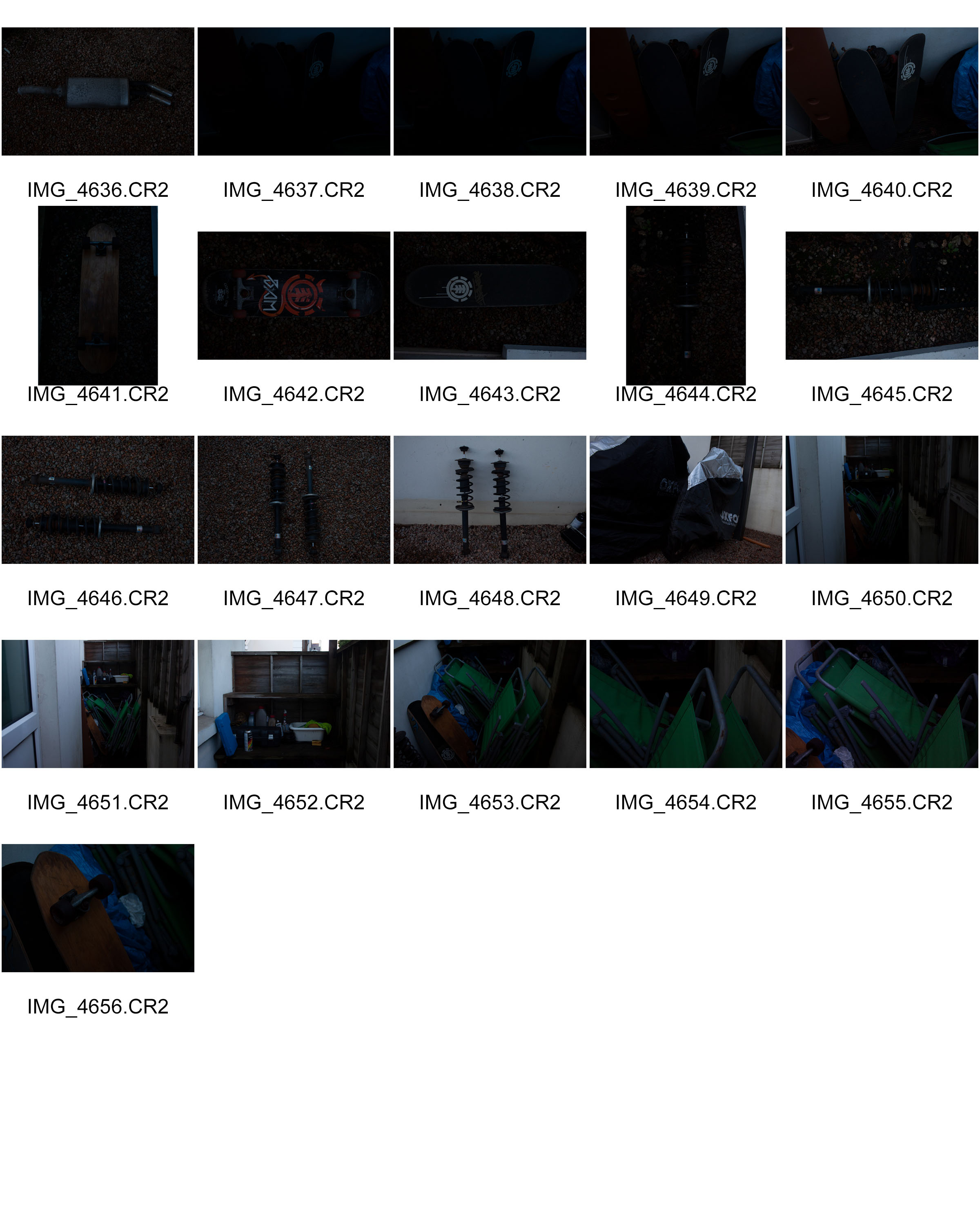
Portrait Project – Evaluation
To evaluate the portrait project I believe that I have been able to develop my technical camera skills and my skills on Photoshop due to the different approaches of portraiture I studied. The project started off with me looking at Environmental portraits, which allowed me to focus on implementing context and concepts (Gender Roles in Society) into my images. It allowed me to think before I capture, as I had to decide whether the portrait I am capturing is conceptually showing what I envisioned. This photo shoot developed my skills as I am more aware of how I can always add conceptual and contextual factors to my images. After looking at this style of photography I moved on to look at Henri Cartier-Bresson, who looked at street photography. Conducting a photo shoot in the style of Bresson, was nerve racking and allowed me to step out of comfort zone, as capturing strangers on the street is scary, as you are unsure what reaction you may get. In this photo shoot I developed the skill of adjusting your camera settings quickly in order to capture the people in the street, without them walking off. Afterwards, I looked at studio lighting, which allowed me to explore and experiment with different lighting techniques. Within this shoot I learnt what : One Point Lighting, Two Point Lighting, Three Point Lighting, Ring Lighting, Warm/Cold Lighting, Intensity of the Light and Lighting Rig (On Ceiling). I experimented with all these styles of lighting in order to get an understanding of different affects, for example chiaroscuro. Due to the different lighting styles, it allowed me to experiment more with the way I edited my photographs, all the edited images I always attempted to make them as if they are ready to be placed into a magazine. In contrast to artificial lighting, I then looked at natural lighting and how reflectors can be used to light up the whole of the model. Within this shoot I produced some strong images, however it did allow me to focus on my camera settings. I mainly looked at depth of field and white balance, this shoot allowed me to use these setting more confidently. Next, I looked at tableaux photography and how a still image can present a story. In this I looked at a contextual piece and recreated it, as it again allowed me to develop my confidence in attempting to implement contextual factors into my photographs. After that, I looked at the show Wicked, and how could create images inspired by the show but still create a story within the still image. In this I developed my confidence in adding conceptual factor into my photographs, making me more aware and attentive to what I am photographing. I then looked at photo-montage, which allowed me to explore and develop my skills in Photoshop. In this I used photographs which have already been taken from previous photo shoots, and used the different tools in Photoshop and other images to produce an overall image. I looked at two aspects within photo-montage dadaism and surrealism allowing me to explore these two different approaches. The Photoshop skills I acquired was, using different tools to cut out segments of the model, being able to combine and implement image and text and being able to add effects to layers of the image in order to make the cut outs stand out. I feel that the broad approach to portrait photography has allowed me to explore different portraiture techniques. Overall, I have been able to produce strong outcomes towards the style of photography and have made clear links towards my work and the artists work.
Loss of Identity – Evaluation
Moving on to looking at identity, I decided to go down the route of loss of identity. The portrait project nicely linked into this project. I was able to use the different skills I acquired from the portrait project and used them within identity. Only having three weeks to explore this theme, I believe I managed to achieve a lot. I started off by looking at the different types of identities, but felt loss of identity best suited my style of photography. I started off by looking at Lorna Simpson who photographed their model without capturing the face, which inspired my first photo shoot. This photo shoot allowed me to use my creativity, as I had to come up with different ways of taking a picture of a model whilst disguising their face. This also allowed me to ‘play around’ with the camera settings as I explored making the photograph darker and lighter via the shutter speed and ISO. I also looked at Saul Stienberg who introduced me to the concept of mask photography. I was able to explore different ways of using a mask to disguise and hide the identity of my model. This allowed me to use Photoshop skills when editing, as I looked at being able to use the hue/saturation tool to make the image naturally lighter and darker. As time was short I was unable to research more case studies, which limited my understanding and research into loss of identity. However, I did manage to conduct more Photoshop edits with left over images from the portrait project. In this I was able to use different tools in Photoshop, such as the different filters, the paint tool and the spot healing tool. Due to these Photoshop edits I managed to broaden my understanding of Photoshop and showed further experimentation towards this small project. Overall, I believe I have been able to manage a lot in the short time frame I have had to complete this mini project. I have been able to produce and edit some strong photographs which had clear links towards the theme of loss of identity.
Evaluating my final outcomes, I believe that I have chosen strong responses which showcase my understanding towards that style of photography. Each photograph also shows my camera skills which I have developed as well as my different Photoshop skills. I am very happy with all the outcomes I have produced and displayed as it has clear links to the theme of the project/photo shoot they were taken from.
Overall throughout the project I feel I have tried to explore each different type of portrait well and to my best, such as studio, tableaux and environmental. I feel that trying out and experimenting will all the different ways and styles of taking these portrait has been able to lead me to the point of my final outcomes well and has produced a lot of ideas and my pictures have developed throughout. Overall I feel my final outcomes came out in a way that I wanted them to and can be linked back to my photographers such as Philip-Lorca diCorcia.
One thing that I struggled with over the project was working with my camera specifically in getting my photographs to be in focus. This is something which I eventually had to work into my final outcomes and try to play for the ones which became slightly out of focus. Although this was a struggle I feel some of my camera skills have developed throughout the project and this could be seen in certain photographs such as some of the studio portraits or the environmental portraits.
Over this portrait project I feel my development and my experimentation with the styles of pictures I have been taking have been better than the last in Abstract and I feel this has helped me move forward with my development.
For my overall final piece I feel it finished as something I was happy with however could have been made better in certain ways, the quality and clarity of the photographs could have been better and I feel lets the images down slightly, although I did try to work this in by having all of my photographs edited and finished in the same way so that they all still had some fluidity. During the process I came across issues when working with the pain pens and this then cause the words and the outlines on the photographs to not come out as well as I’d hoped, if I was to do this again I would possibly try experiment with doing the lines on photo-shop as to eliminate this issue that came about. Overall I am happy with the way that I displayed my photographs as I feel it is effective and works well to show the trio of photographs that I have produced.
The last photographer I will be looking at is Mahaela Ivanova.
Mihaela Ivanova is a Bulgarian photographer who experiments with simple conceptual shots and black and white series. The works below focus on the concept of identity, with the subject holding a part of a portrait of a different person, whether it be the eyes or the mouth, in front of their own face, hiding their identity.

Contact sheet:
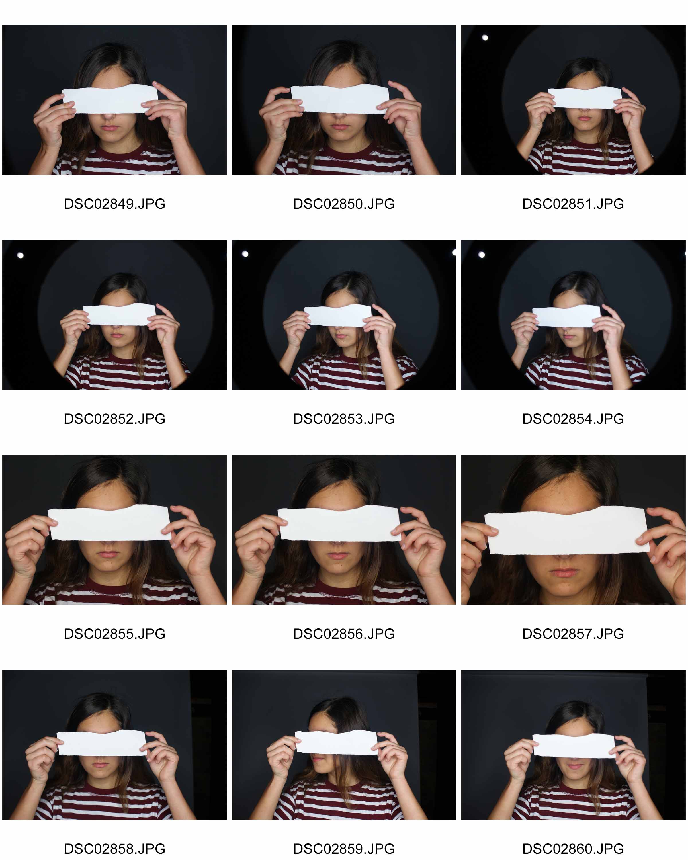
In the pictures I took, since I wasn’t able to get a picture of another person’s face in time for the photo shoot, I instead used a blank piece of paper for the subject to hold over her eyes, and will be photo shopping another person’s face into that piece of paper to create the look of Mihaela Ivanova’s work. I told the subject to look directly into the camera with the ripped piece of paper over her eyes to get the right pose, which resulted in these photos.
Chosen edited picture:

How I did it:

I started off by choosing an image which I could use, it being this one.

I then went and chose a picture of myself and copied half of my face, and then pasted it onto the picture where the stirp of paper would be. I then reduced the opacity and erased the excess image around the strip of paper. I got rid of some of the image on the strip of paper around the edges to try and create a ripped effect, as in Ivanova’s work. I also brightened my eyes using the dodge tool to make them stand out more.

Since i had pasted a picture over the original image, I covered all the shadows, so I had to implement them in myself to give it more of a 3D look, as if the piece of paper with the image on is actually there in her hands. I did this by using the eyedropper tool to take the colour of the image underneath her fingers, darkening the colour a few shades to almost a black, and then taking a soft brush tool and drawing it on where the shadows should be.

To make it look more natrual, I reduced the opacity down to 30%.

To clean it up and to make the shadows actually underneath the fingers and not on top of them, I carefully erased the excess shadows which were on top of the fingers.

To comply with Ivanova’s style, I changed the image to black and white, playing with the settings until I got my desired look.

I then went and adjusted the brightness and contrast, making the image darker and creating a dramatic contrast between the darks and lights.

Finally, I adjusted the levels, making the background darker so it brings out the subject.
This is my final outcome in response to Mihaela Ivanova. I believe it was successful, it’s clearly inspired by her work, with the ripped out person in front of someone else’s eyes, hiding their true identity,and the black and white filter on the image which gives it a dramatic effect. I like how well the photo is put together, and how I managed to put the image of my eyes onto the ripped piece of paper without making it too obvious that it’s photoshopped, however I don’t like how my face doesn’t align up with the subject’s, like in Ivanova’s works. It doesn’t look like it’s actually part of her face, the nose is out of line and the face is too wide compared to the subjects. I should have made the image of my eyes less wide and positioned it better or chose a different image which fit better.
It fits the concept of lack/loss of identity because you can’t make out who the person behind the piece of appear it, you can only see the lower half of their face.It may also be perceived that the subject hasn’t got an identity and is longing to be someone else, hence the image of someone else in front of their own face.
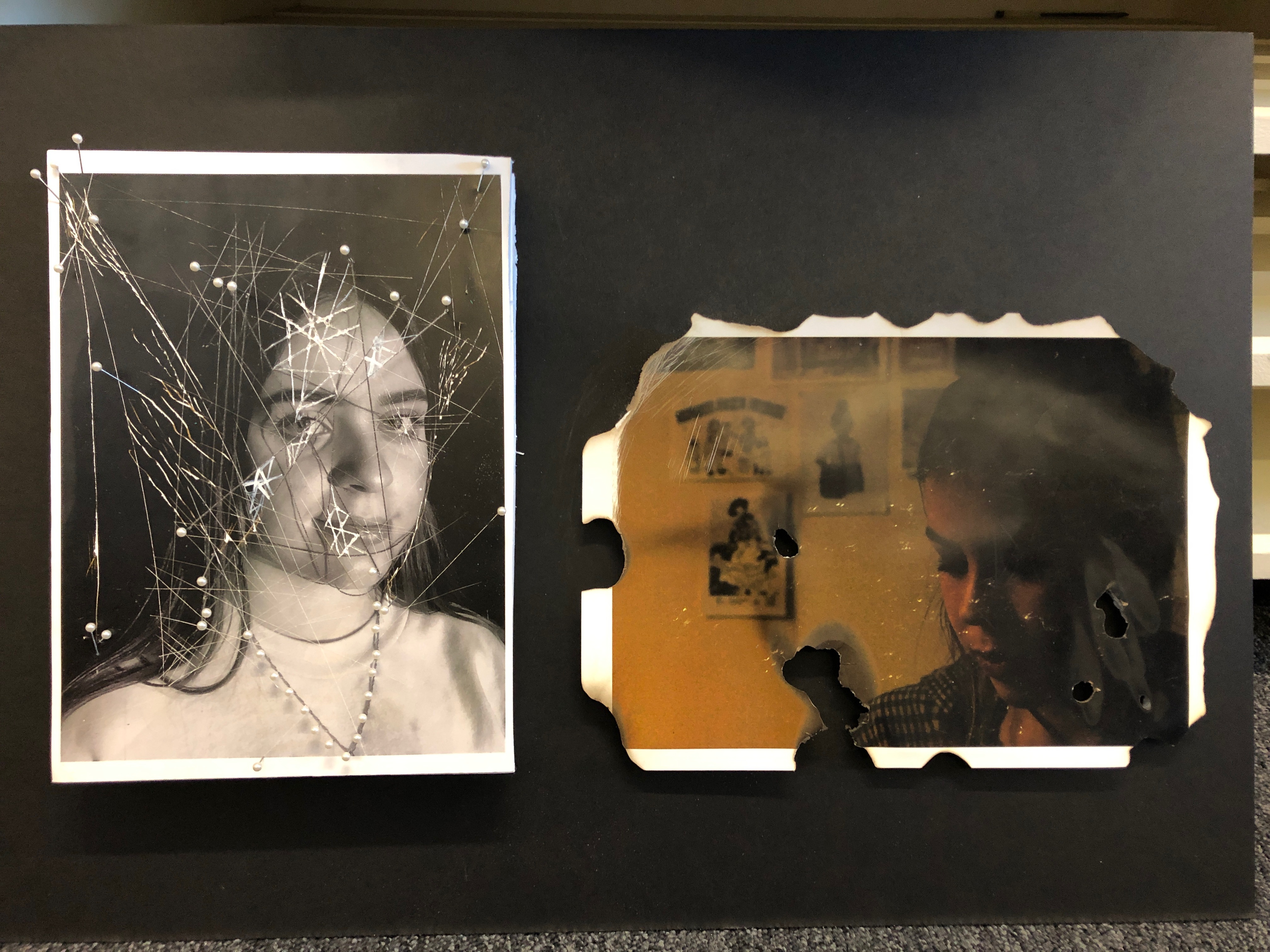
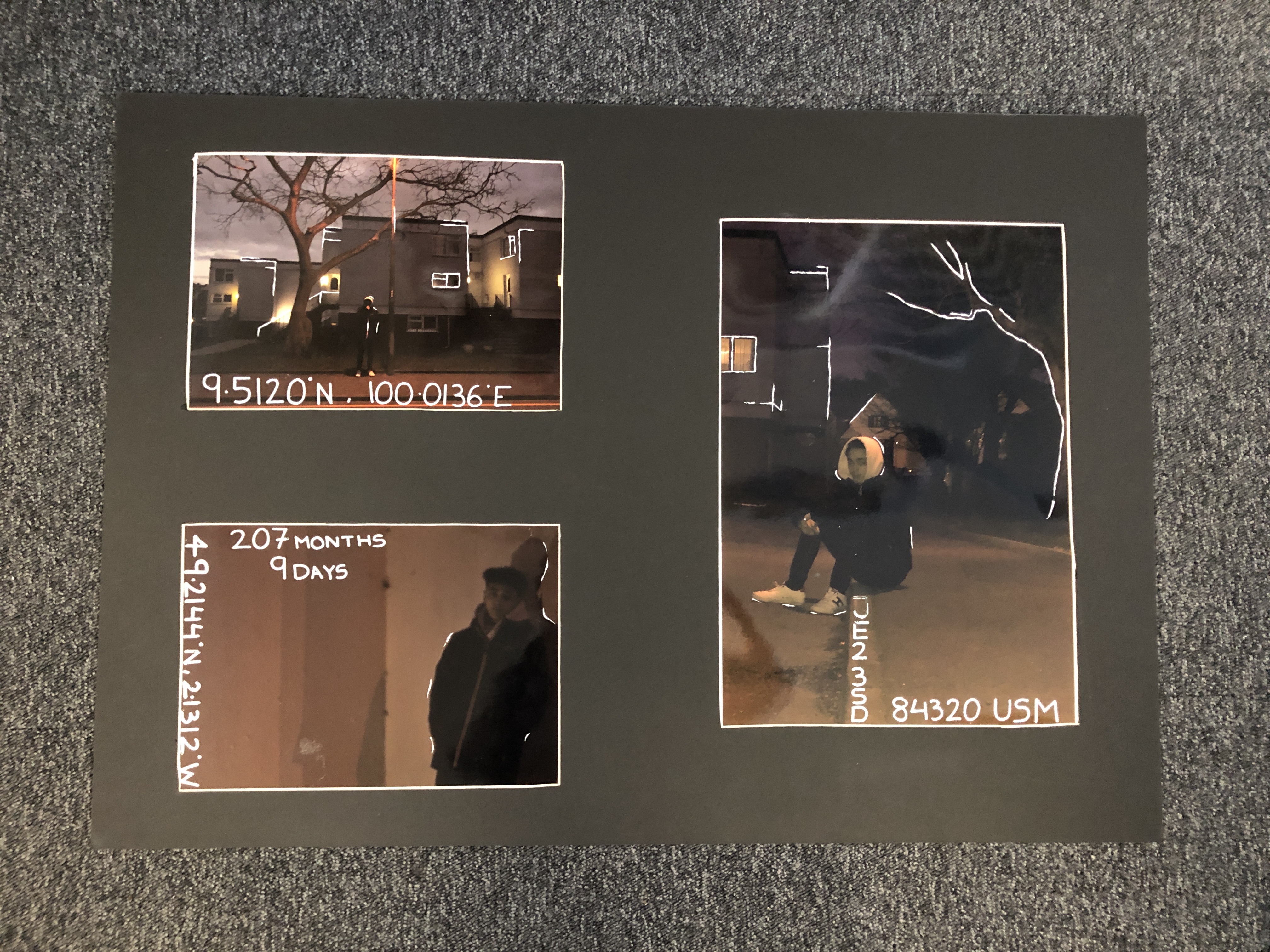
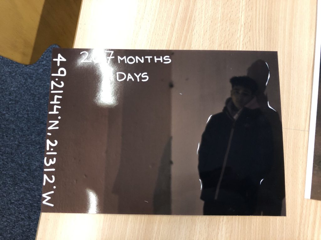
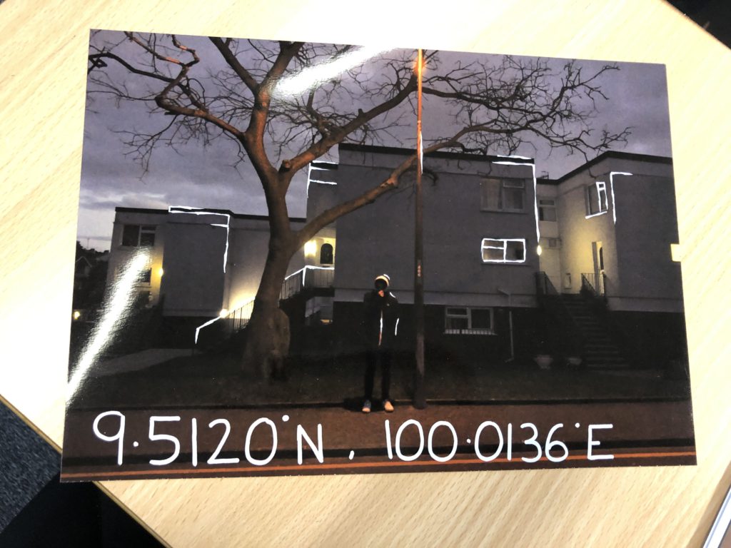
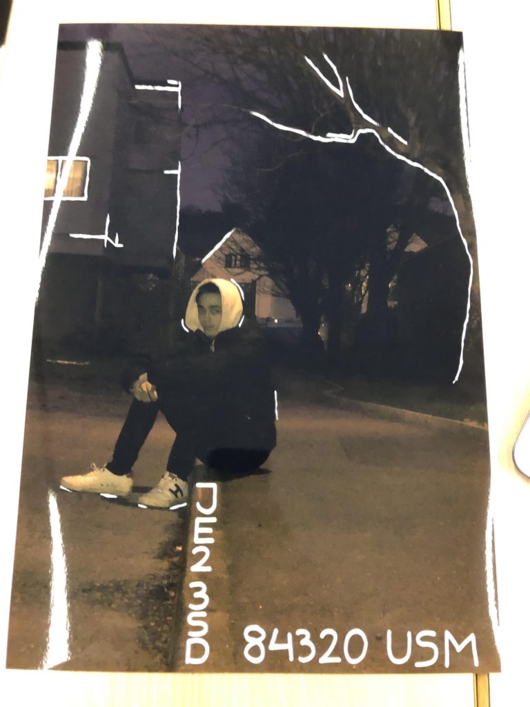
For my ideas for the theme of Identity I am choosing to draw and write onto the physical pictures. I’m going to be doing this using white paint pens, writing and creating comments on the persons identity with the writing surrounding them.
I am going to be finding close information about the subject to write along the pictures, to make it a bit more intriguing and interesting I am going to be finding other ways to write the information such as significant places written using the longitude and latitude of places. This will make the information more interesting and mysterious as it will not be immediately clear what it means.
Above shows a piece done by conceptual artist Mel Bochner who has been active since the 1960s. A highly versatile artist, Bochner works with painting, installation art, and photography. His thesaurus paintings show overlapping synonyms executed in rainbow colors, while other pieces often take a single word, repeated for effect.
Although I am not working into a sculpture or the surroundings to then take the picture I feel I can relate what I am doing some how to Mel Bochner as I am going to be writing certain things for an effect just as Bochner does with the idea of repeating a word. This is a photograph an artist I can show where some of my inspiration has come from with how to go about the writing.
Before going straight onto the actual images I started by printing on paper my layout to test how to work the paint pens and what I wanted going where so I could get a rough idea of what works and what doesn’t and also testing the thickness of the pens.
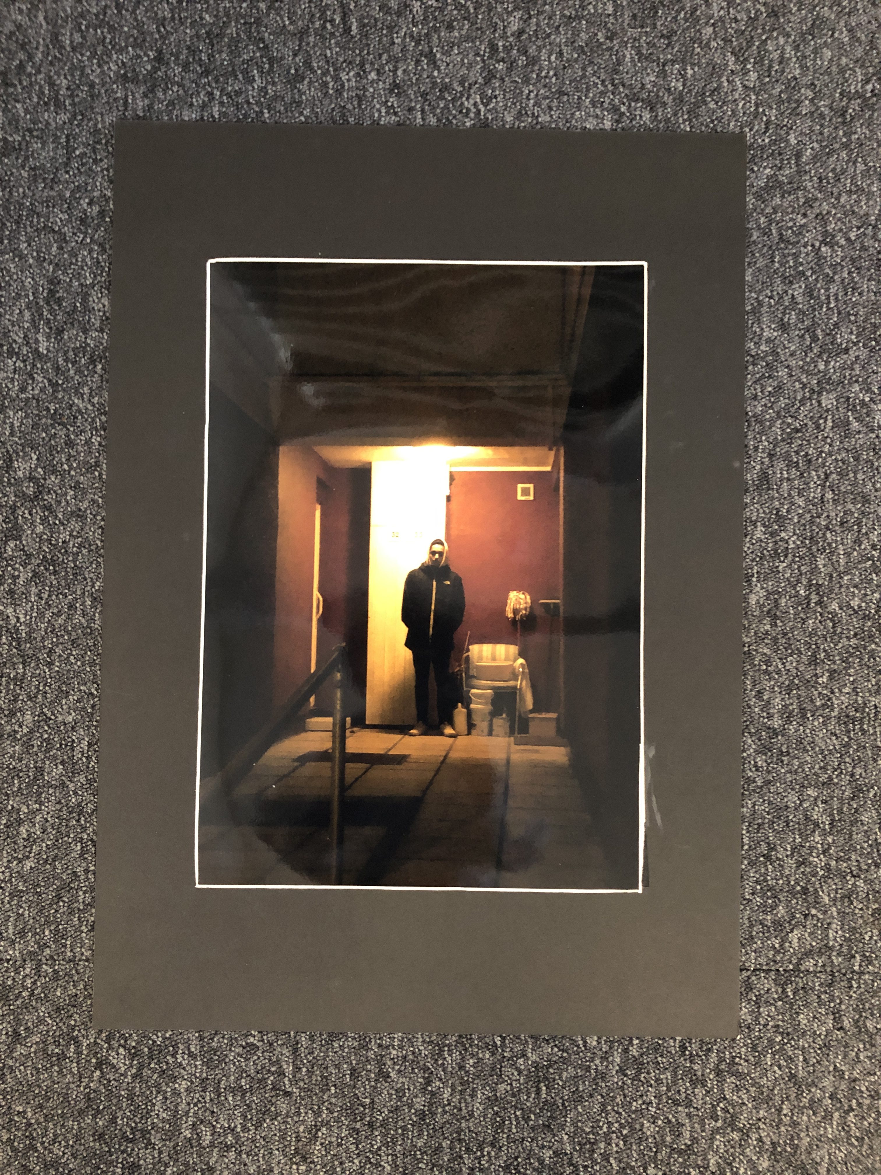
I have stuck to having only 5/6 ‘facts’ across the whole layout as I don’t want to over crowd the photographs, I have also chosen to draw into the actual photos not just with words as to make the photographs more intriguing.
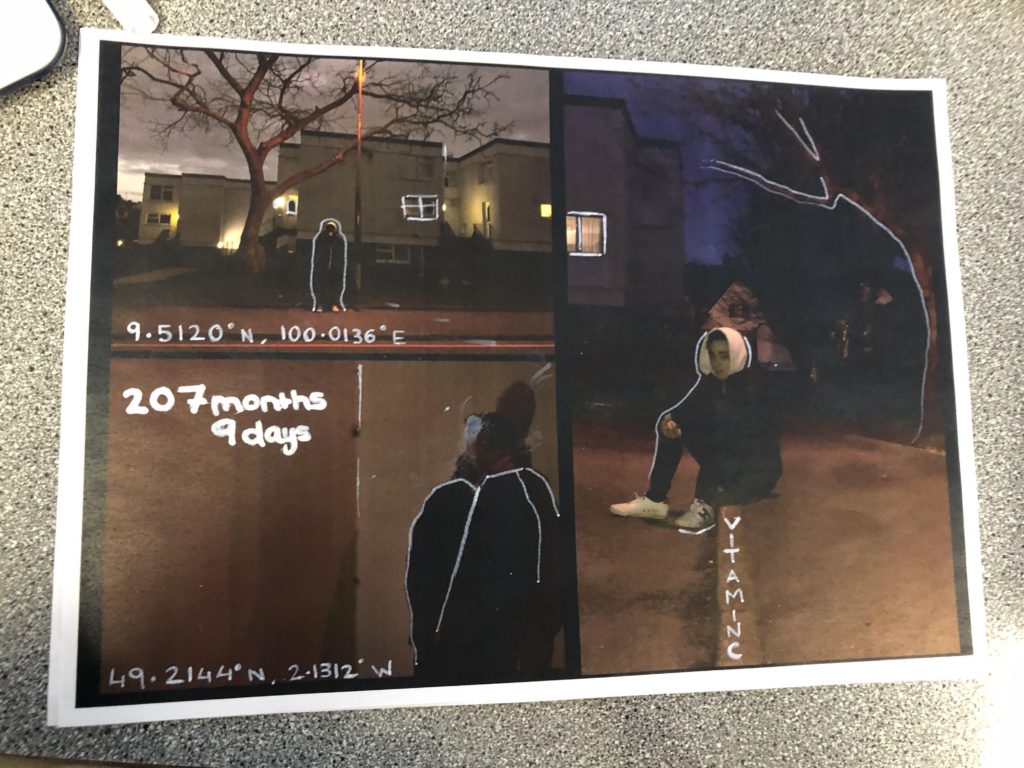
Below shows how I finished off editing straight onto the prints, I stuck mostly in using codes as references towards significant places or things to do with the subjects identity. I have done this to try and make it more intriguing, knowing that the codes stand for something however they are not completely clear.
I have also added some outlines as highlights to certain parts of the page this is just to add something to the photograph and to make it more pleasing to the eye.
While editing onto the actual prints I did encounter some trouble with using the paint pens and this halted the process a little bit and made things a little more difficult however I feel that they still turned out in a way that I wanted them too.
Photoshop Example (1)
I have decided to use Photoshop to experiment whether I would keep my images the same or play around with color saturation. Here are some of my examples and the steps I took to achieve these first attempts.
As i am not a photo shop genius, this took me at longer than anticipated but however i am proud of my end results.

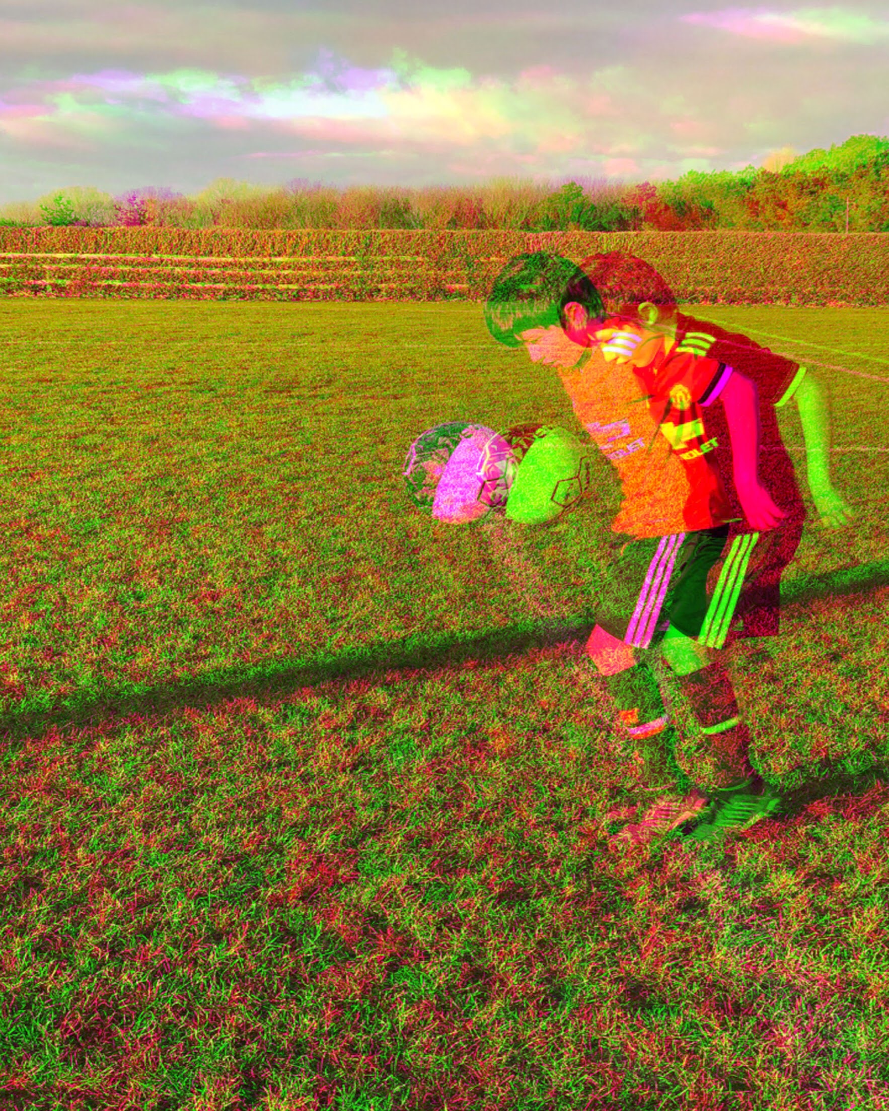
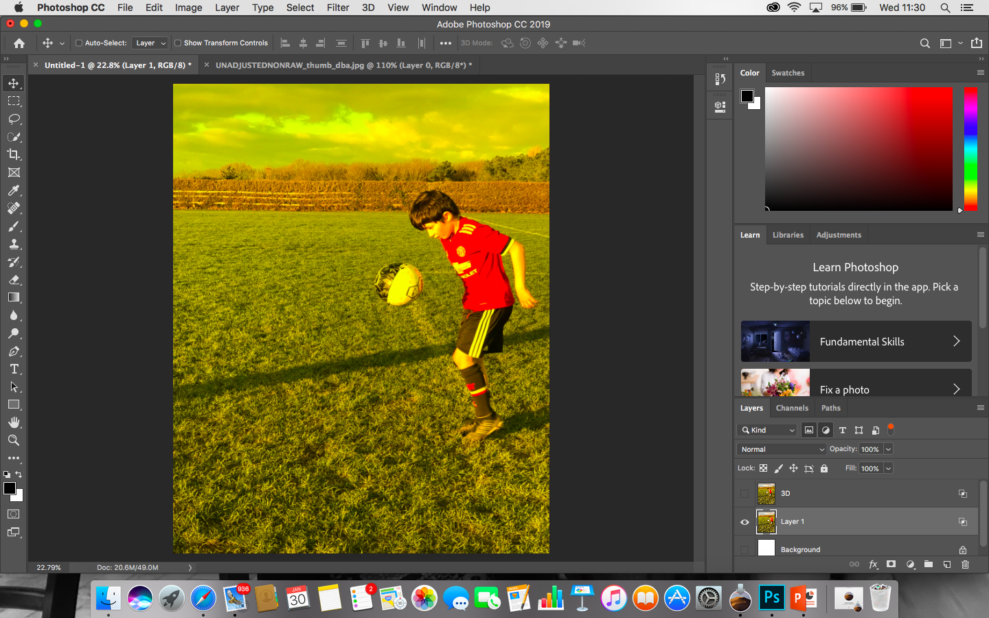
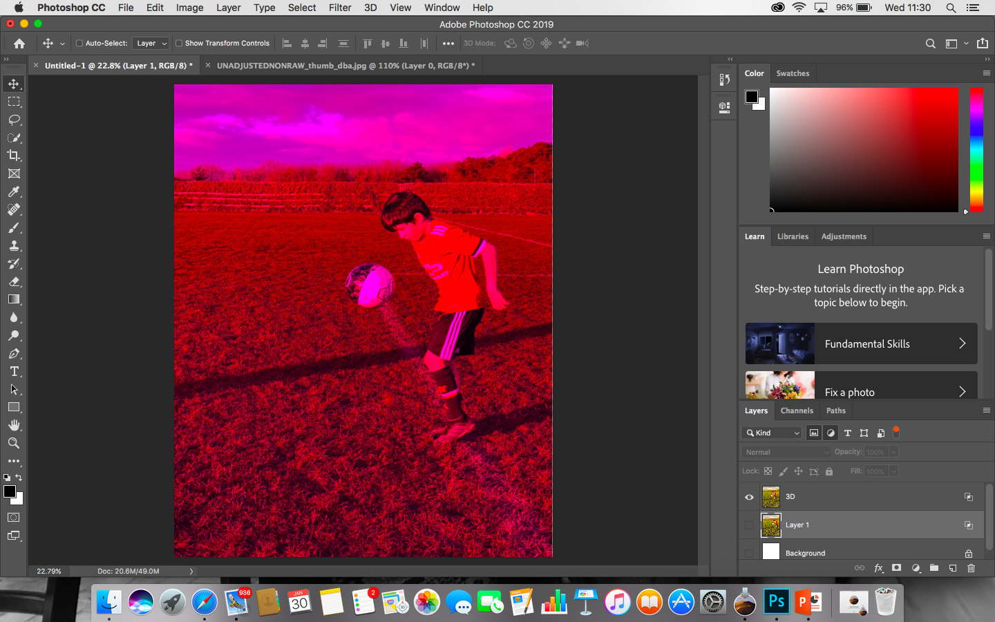
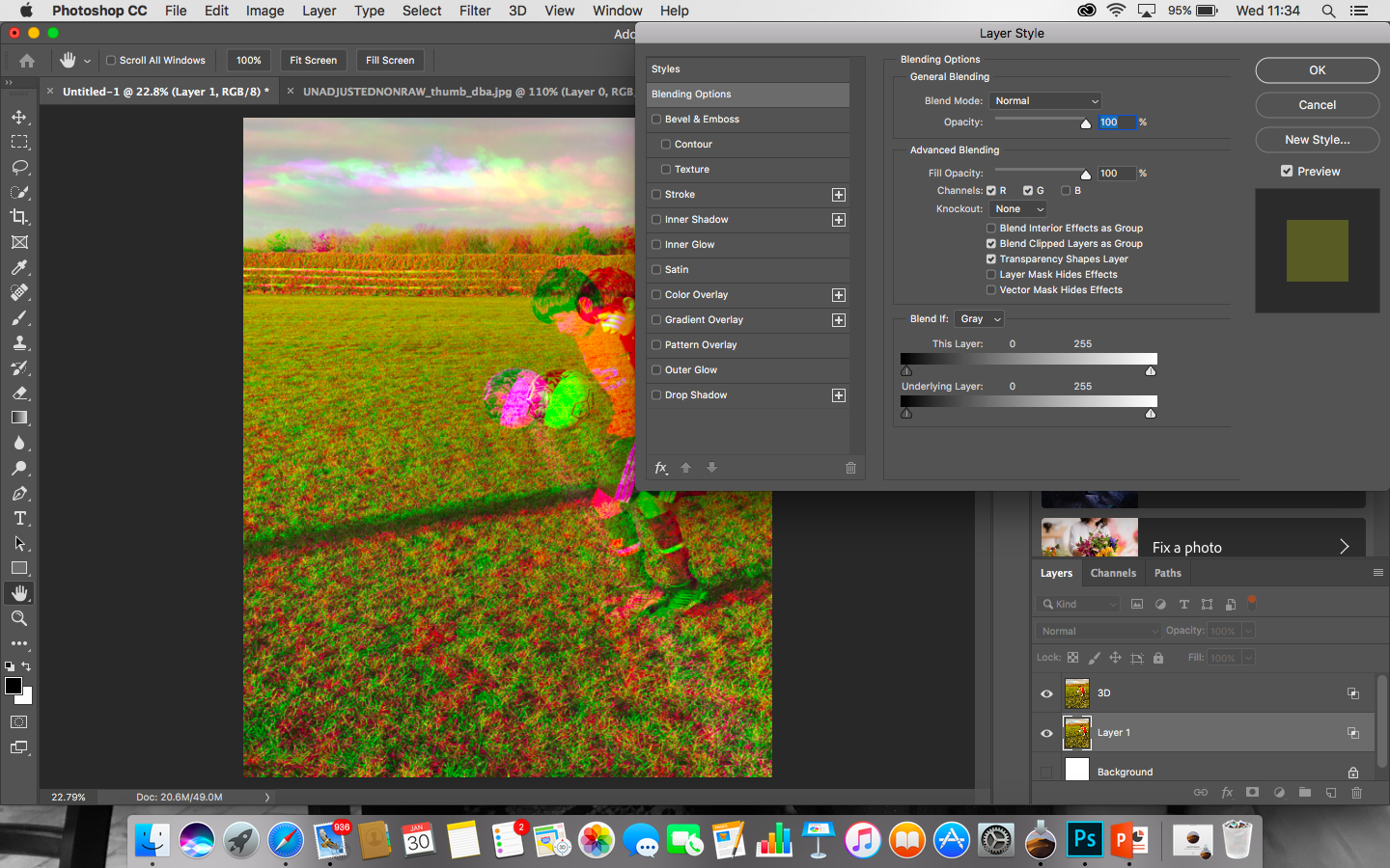
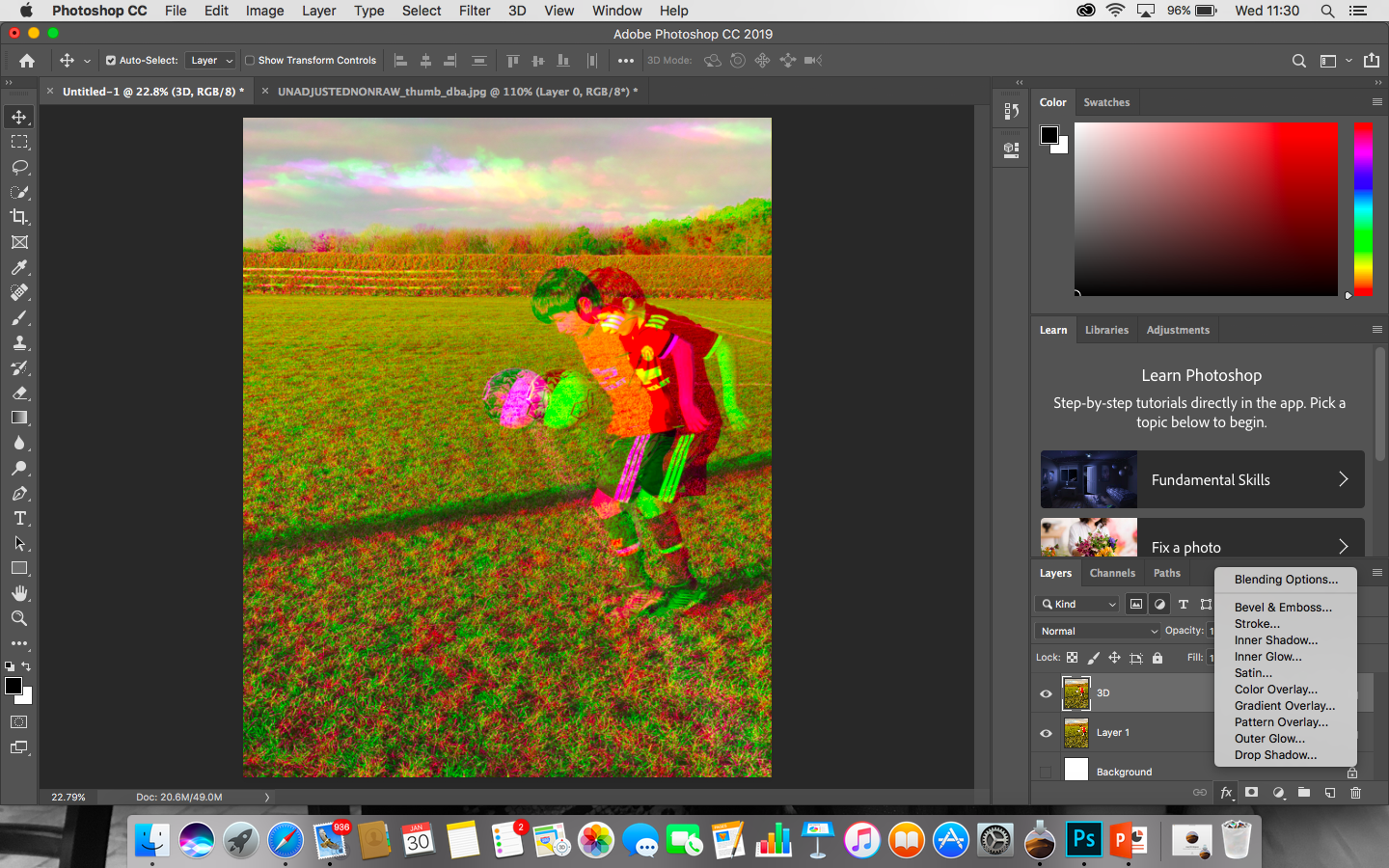
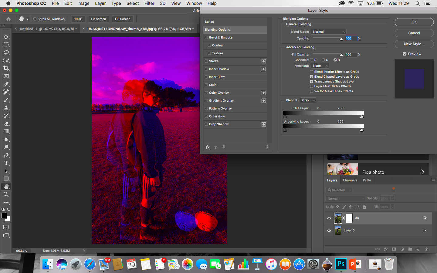
I decided to challenge myself and present 3 different images and blending them all together to create one simplistic image.
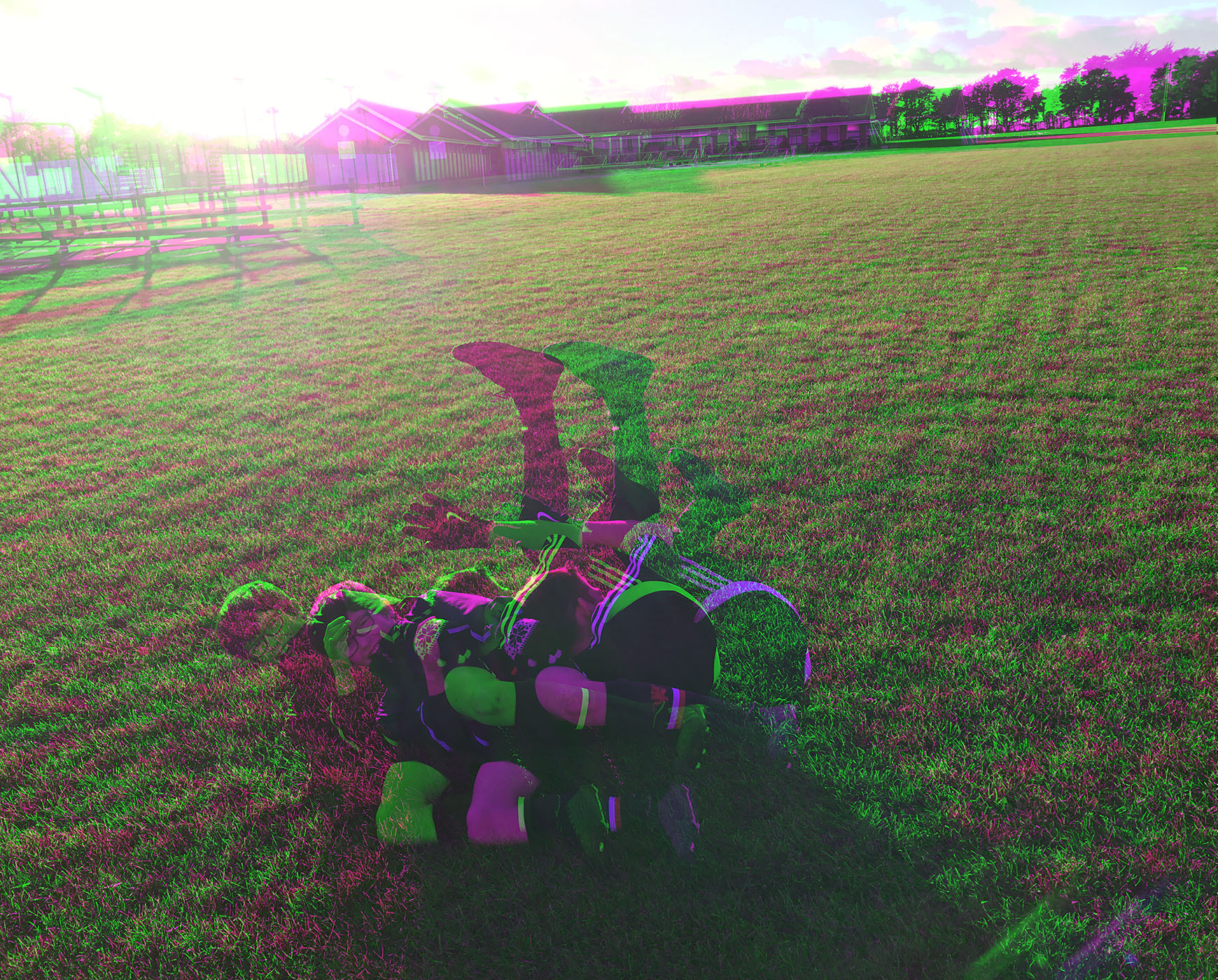
In the image above i have done nothing with the brightness, shadows, contrast. I chose to leave it because i found that due to the natural lighting of the sun the image really shows warm tones like yellows and golds to create this afternoon sort of shade. The other technical aspects like the positioning of myself and the model was well thought out as well, however in one of the images you can see my shadow and if i was to do this again i would have tried to stay out of it just because it also draws attention to it due to it being black. In this example i made my brother run towards me as he was kicking the ball, however i was positioned very close to him but i did that because i wanted to capture the sense of movement which wouldn’t have been achievable from far away.
I chose to insert 3 images into one because it adds movement to the image. By movement i mean that there is multiple things happening. Not only that but by trying to add a football vibe to it. What i mean by this is that when footballers are playing a game it is very rare you see anyone actually standing still. By combining these 3 images and lowering the opacity of each image its trying to capture that it can be tiring and it should be effort but if its something you are passionate about them it should seem more like a hobby rather than a chore.
https://www.digitalartsonline.co.uk/features/illustration/best-photoshop-tutorials/#75
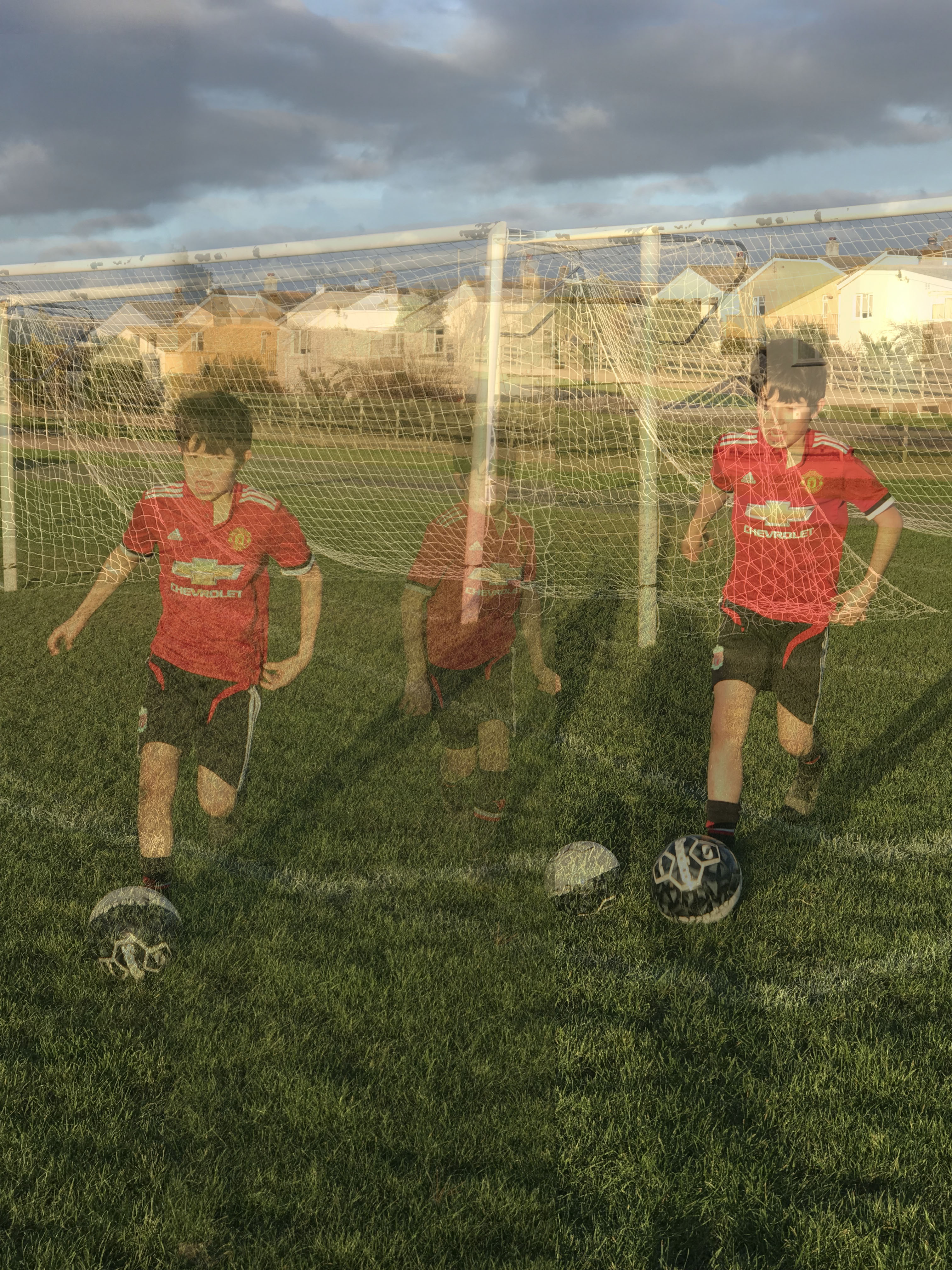
The images below are my respone to both the theme ‘ Identity and place’ and the response to my artists one being Eamonn Mccabe and Brad Mangin. As my action plan consisted of my brother playing foot ball and the process which a young footballer has to take due to play as best as he can. Some of these images are what id like to call action shots. This is my interpretation of identity being the child and place being in his element which is football fields and some images are captured indoors to show the process of him getting ready for training.
Here are my images in a form of a contact sheet.
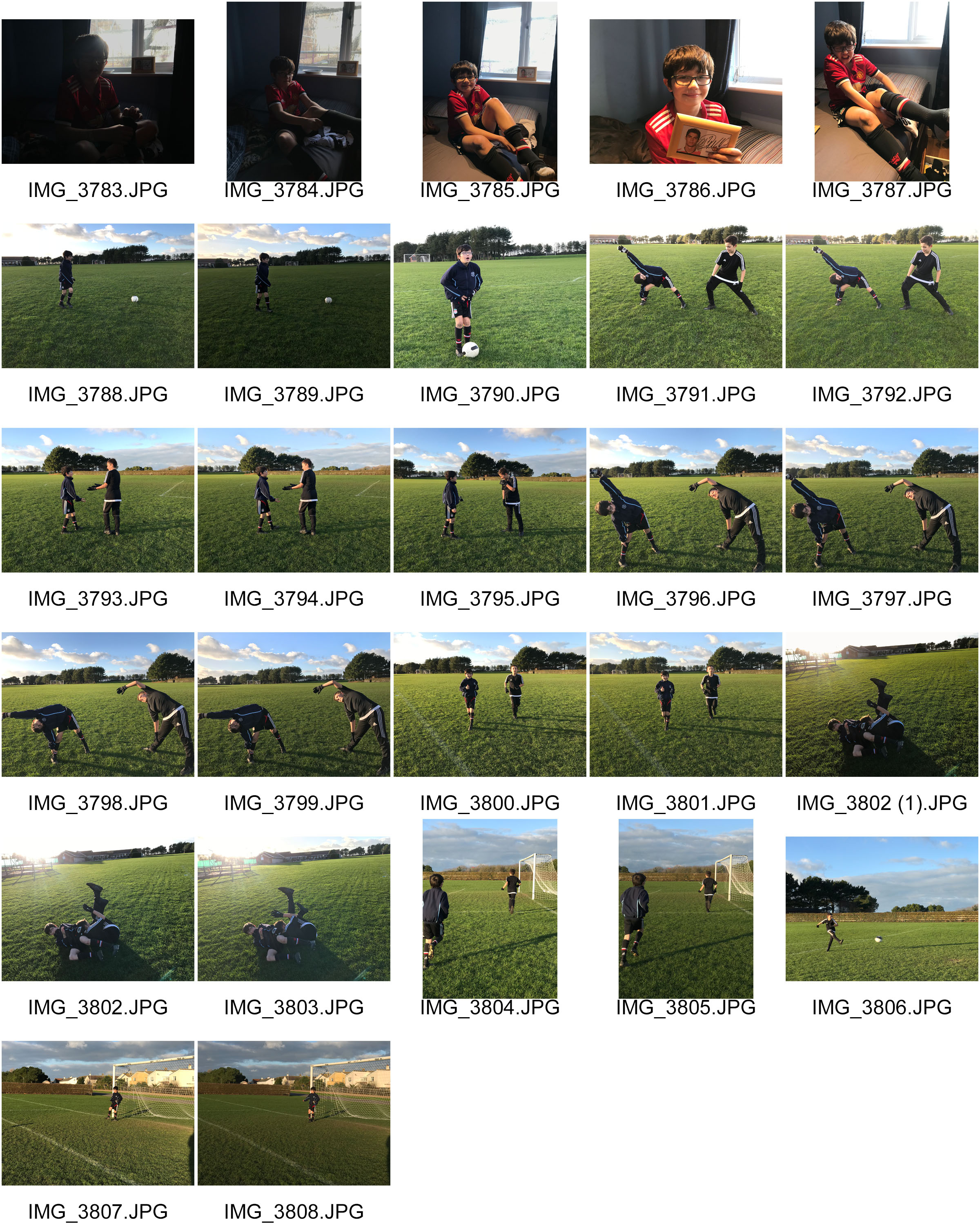
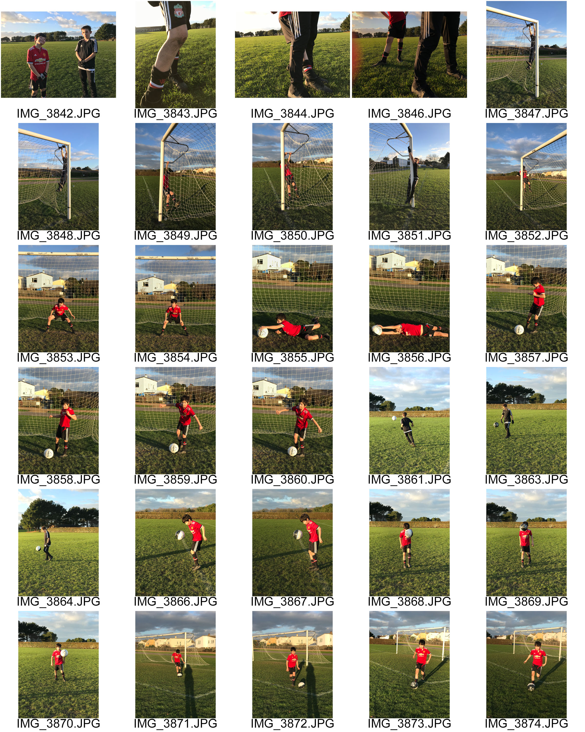
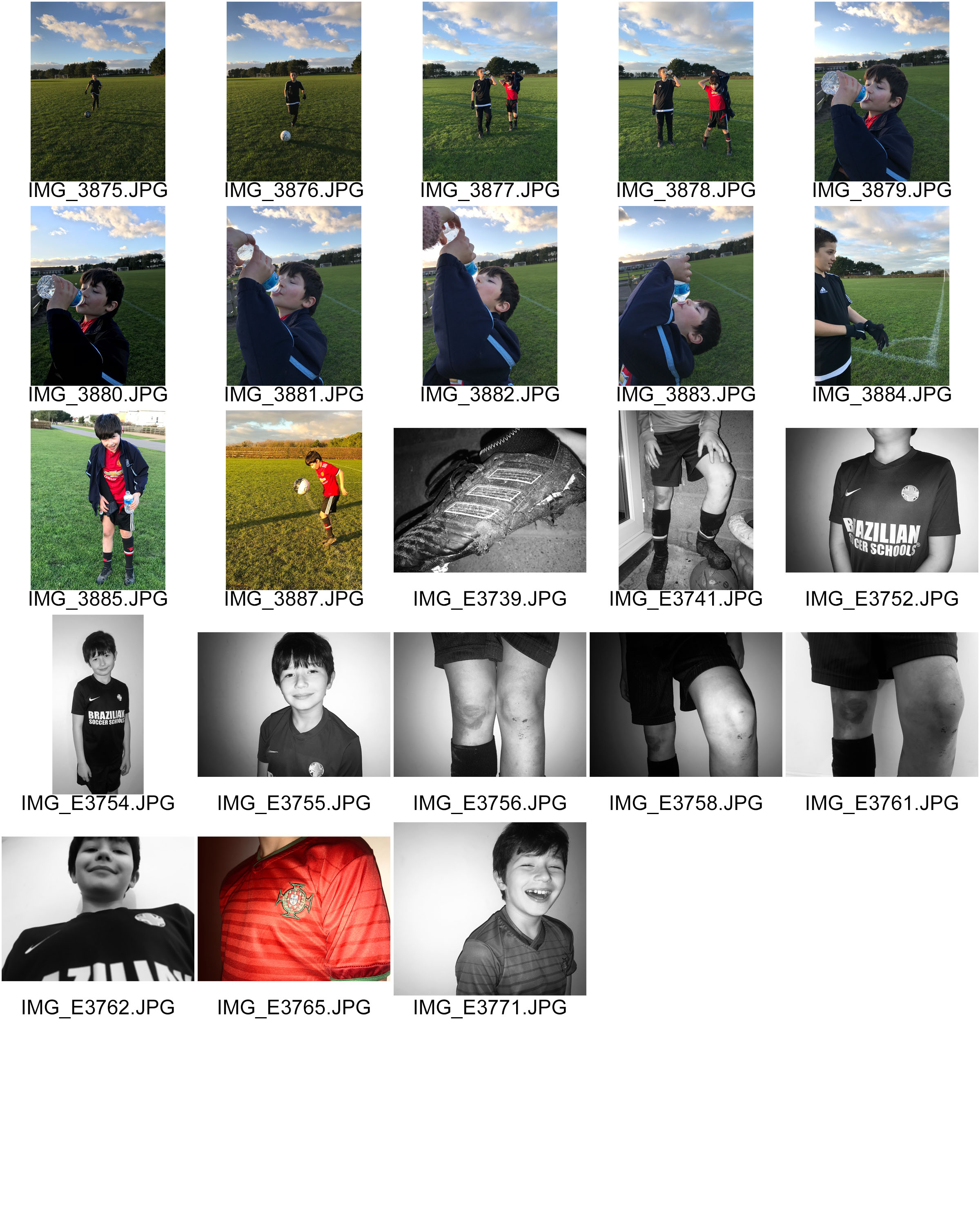
In the examples below you can see I have drawn over the images. have done this because some of them are under exposed therefore to dark so I am unable to edit it I have done that in (red) . Additionally if the image is too over exposed or under exposed i have decided to cross it off In (blue) .If the image is out of focus I have chosen to cross it out in (pink) Finally if the image I think has too much negative space behind it which makes the images look quite bland and boring I have crossed out the space in (white)
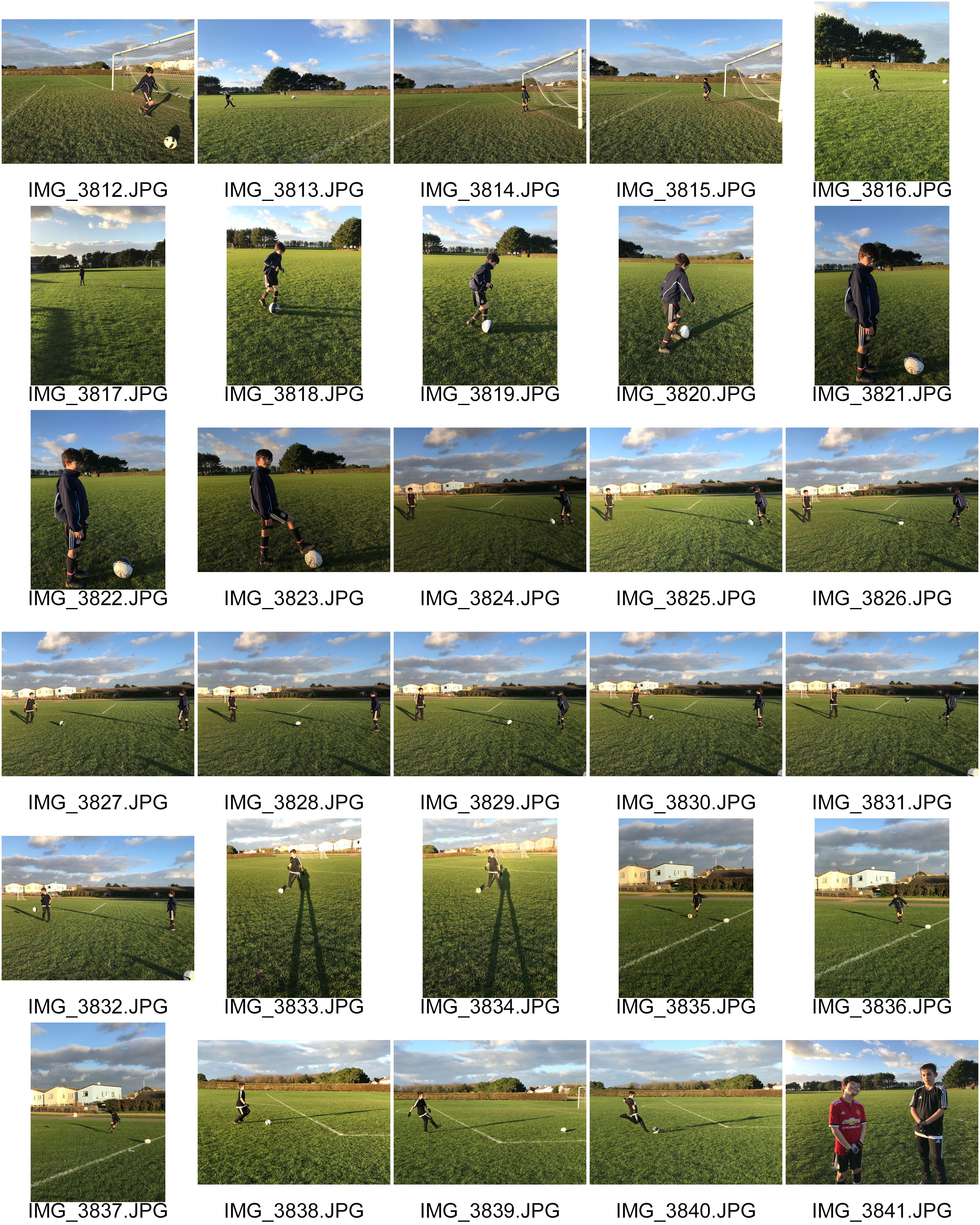
Now having looked closer to these images, its evident that some are better than others in terms of the lighting quality the picture just how its presented visually and the context behind it.
Visually, when i was planning this photo shoot i could not have picked a better day in terms natural lighting, the glow in some of the images really make the image more welcoming to look at giving it quite a warm temperature as well, unless i’ve chosen to add them images into black and white. However if it wasn’t for the light of the sun the 3D effect i was after would not have been achievable. I also like how some images have the shadows in the background because it fills the image more which is something i had a problem doing when i did the photo shoot. On the other hand some could say the space helps the image as it slightly draws attention to the small people in the image.
In terms of detail due to the drastic, golden effect of the sun i have been able to capture quite heavy amounts of detail like the individual lines and patterns from the grass and the goal even the close up details of the football and background. I captured these images on the quennevais football fields which actually adds a bit of value to the images as its where my brother began to play football. We would usually take him there in the afternoons and just have a kick about which now has lead him to having a passion for this area of sport,which now is involving as he’s just practiced for the island trials. Now he uses this time in the afternoons when he gets home from school to go out and practice with one or two friends which day by day is improving his skill and technique.
BIOGRAPHY: he was born in 1948 currently 71 years of age. He is a British professional photographer who began his carrier as a sports photographer and who has won four times sports photographer of the year between 1978-1984. He then changed his attention to The Guardian and The observer for more general editorial portraiture. Not only that but McCabe managed to cover 3 of the Olympics.


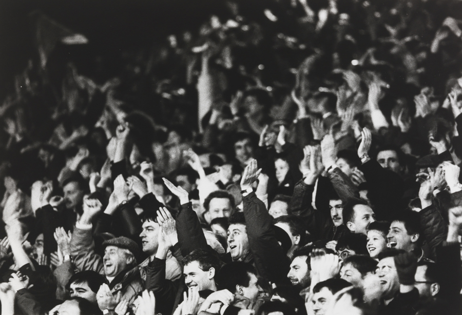
Visually, the images above all have a story behind them.The purpose of photography is to capture moments which make you reflect on the day, the event, the moment. Here, the first image i have interpreted it as a celebratory moment. By looking at this image its quite evident just by the body language of the man that he had clearly scored a goal and this was his celebration moment. The shutter speed in the image would have had to on a fast setting to be able to capture the moment he started running towards the camera and we can see that by the way his hair is being breezed backwards. The image itself is focused well and the contrast between the man and the people in the background that almost look gutted that they didn’t manage to black the goal. Additionally , the image is quite happy to look at and gives a sense of almost achievement as if we were there to cheer with them. The iconic 1970s English soccer player, Kevin Keegan was the first sports personality to actively enter into what was then known as a “face contract” for what were essentially his image rights.
The last image from the ones above i chose to insert into the blog as it caught my eye as its like an action shot. This drew to my attention due to the posture of the footballers.
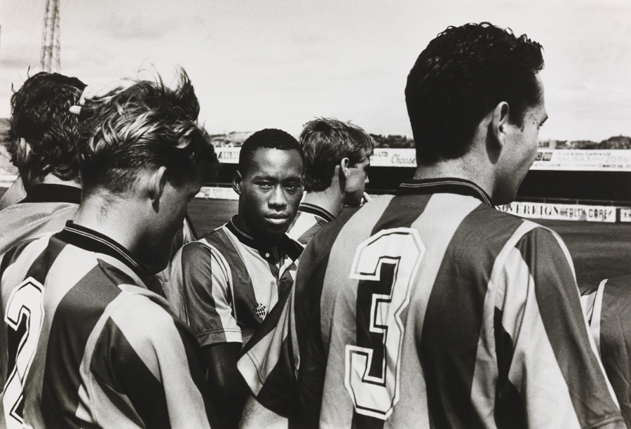
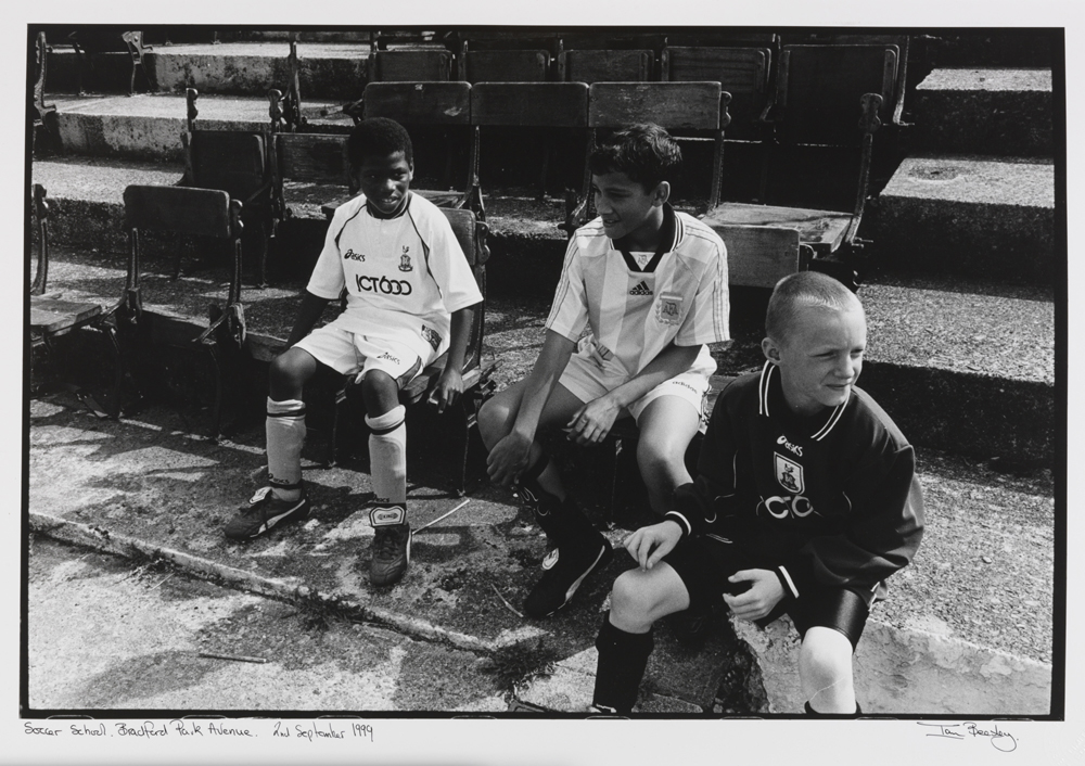
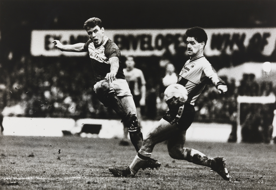
Furthermore, Eamonn McCabe was the Bradford Fellow in Photography for 1998, and photographed City both on and off the pitch. Bradford-born Ian Beesley captured City’s first season in the Premiership. His photographs reflect the emotions of not just a professional photographer, but also of a Bradford City fan. Hence the story of the images below. Examples :