For my project I will be following the style Koenig and the subject of it is my late Grandfather as I have a large amount of photos from his life and from when he lived in his house which is now empty and being redone for renovation, and it is almost completely empty with no wall paper not carpet and no ceiling just the floor above.
The project is an exploration in the sense of loss and change. The photos will be framed as such that they will be in the position that they were taken and should line up with the main features that still remain in the house, I will then take a step back and take a photo en capturing the photo and the background to show how the area as changes and how that his absence from the space has meant that a change has come about. It will also comment on how that the house and the area reflected his personality and that once he left his personality left not long after.
For my first photo shoot i am going to be doing a tableaux vivants inspired shoot.
Image in recreating..
Technical analysis
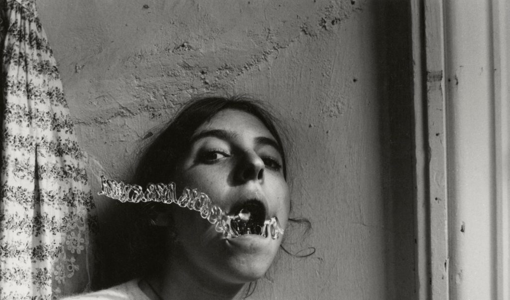
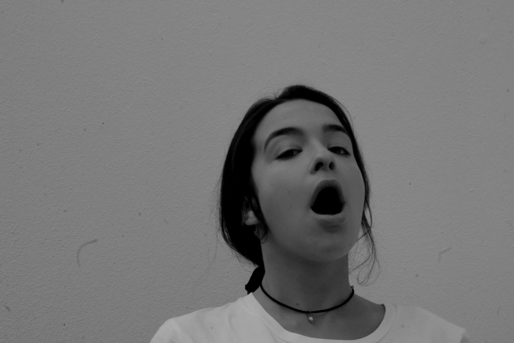
This image has been taken in natural lighting with a daylight white balance. It seems as if the ISO setting is very low in this image, however the shutter speed would be very high.
Visual analysis
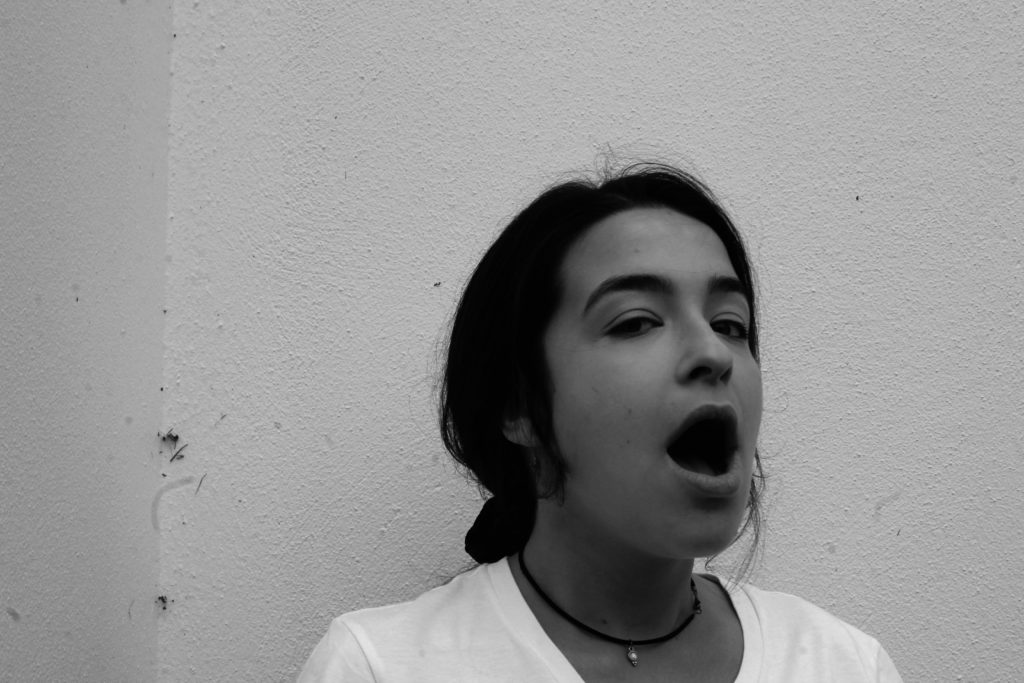
When looking at this image i can bee the model is in the middle of the image. It has been edited in black and white to show contrasting shadows and light, adding tone to the picture. The image is in 2D and doesn’t have much texture in the image. We can see that there has been a a slight use of photo shop when editing the water coming out of the mouth.
Conceptual analysis
In this image i think that the edited water coming out of the models mouth is representing her as drowning. Her mouth being open when looking directly into the camera also gives a sense of vulnerability.
Contextual analysis
Her images were published after her death and therfore are only known by date and location. There is no back story
This image is one of Francesca Woodman’s. In order to do this tableaux vivants image successfully i will use a similar location to Woodman’s and will therefore use my cracked garden wall. For the shoot, i plan to only use natural light as the original image was taken in natural light. Therefore i will take the image mid day so that their is a fair bit of natural light. I will use a daylight/ cloudy White Balance in order to ensure that the photo is very similar and i will find which ISO and shutter speed to use when im in the conditions. To make the image identical i will also hand a flower printed top on the left hand side of the image as this is included.
There will be one model involved in the shoot which will be dressed in the appropriate clothing ( a white t-shirt, black string necklace and have hair tied back).
Aspects to include
Natural lighting- daylight/ cloudy WB, high shutter speed.
Image to be taken outside for the cracked wall
Wide depth of field- Make image look 2D
High ISO
Facial expressions- Showing with eyes
Props- Flower shirt hanging
Model to wear a white t-shirt, black string necklace and have her hair in a loose low pony
Lightly lit image
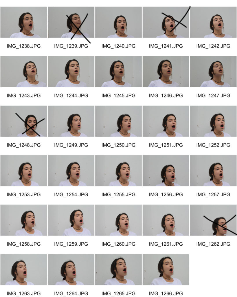
Contact sheets
Possible final outcomes
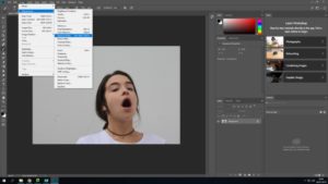
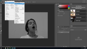
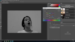
Editing my final images
All photos below have been edited using Adobe Photoshop. These are the first edits for these images and more editing will be added further into this project. All images below are my own and are being used to create a tableaux vivants.
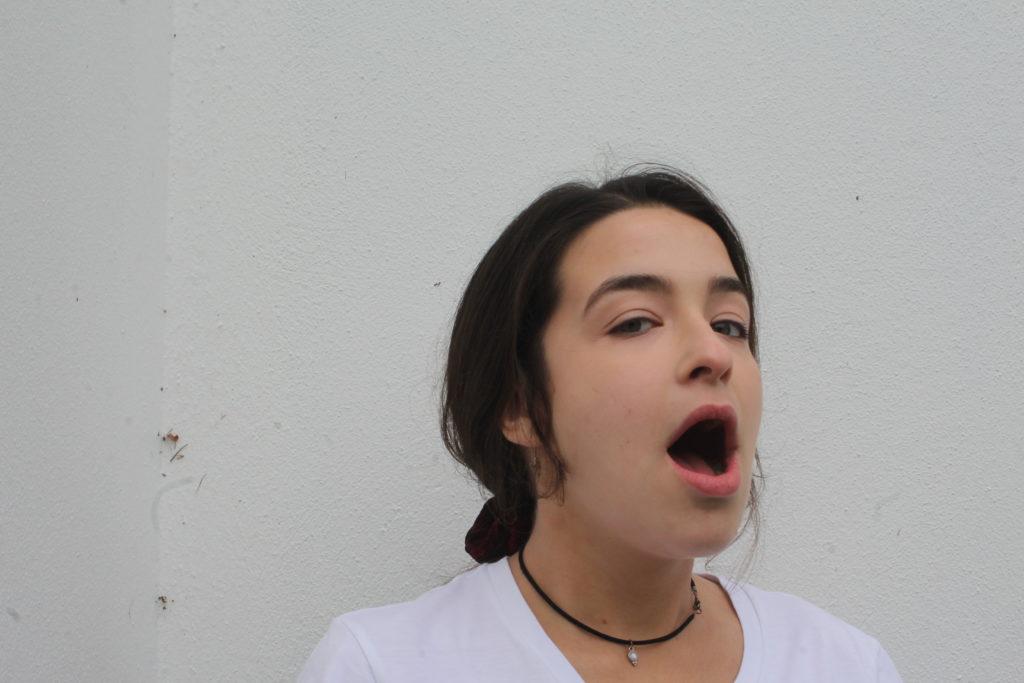
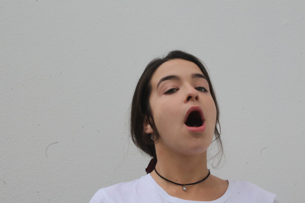
The image i have chosen to use out of the two possible chosen is picture one. This being because it has more of the details that the original image has.. ie the small cracking/ dirty wall and my models face is at a more similar angle than the other image.
Next stage of editing
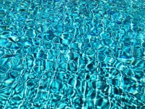
In my next stage of editing i will need to edit the water coming out of the models mouth in a ripple effect. In order to get the first image of the water i have chosen on off the internet…
– image taken from internet. NOT MY IMAGE-
Editing the water
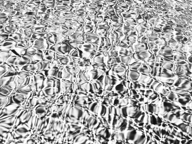
When looking at the water included in the original image, i saw that it was very light and had a ripple/ swirly effect. It was edited into black and white and had contrast included.
Taking all these analysations in mind a created the water which i would cut out and use.
Adding both images together
In order to ensure that the stuff coming out of the mouth looks like water i used the image below and layered in on top of the other water image.
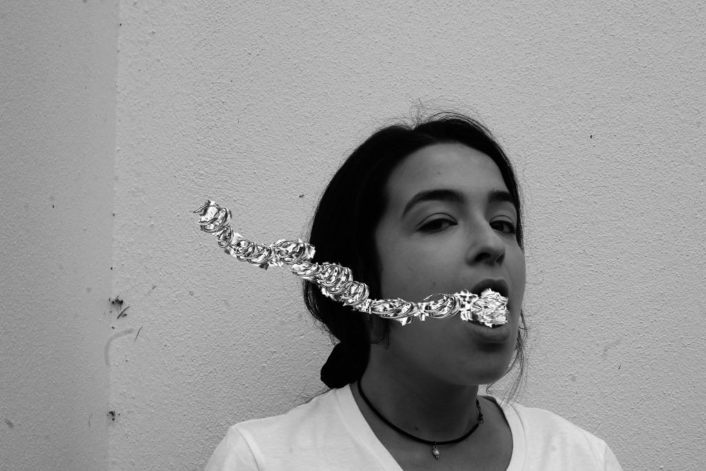
Final image
Technical analysis
This image was taken on a Canon Camera with a standard lens. It was also taken in natural day light and i therefore used the ‘cloudy’ white balance. When taking this i had my ISO setting on 6400 and my shutter speed on 1/24. However, i mistake i made was forgetting that the original image used a fast shutter speed instead of a low one like i did. This made my images not fully focused.
Visual analysis
When looking at this image i can see that the model is in the middle of the image. The image has been edited in black and white, showing contrast and tone in the picture. The image is in 2D and doesn’t have much texture in the image. We can see that there has been a a slight use of photo shop when editing the water coming out of the mouth.
Conceptual analysis
This image has been edited as same as the original image and water has been edited coming out of the models mouth is representing her as drowning. Her mouth being open when looking directly into the camera also gives a sense of vulnerability.
Sarah Maple was born in 1985 to an Iranian Muslim mother, and a Christian father. Most of her work stems from her mixed cultural upbringing, and challenges the traditional social role of women, and also concepts of religion. Some of Maple’s work can be viewed as controversial as she’s pictured herself doing things such as smoking in a hijab.
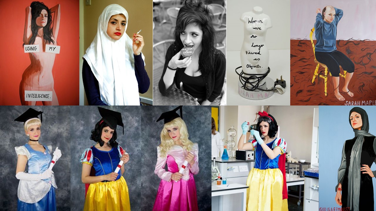
Mood board
Images/paintings by Sarah Maple
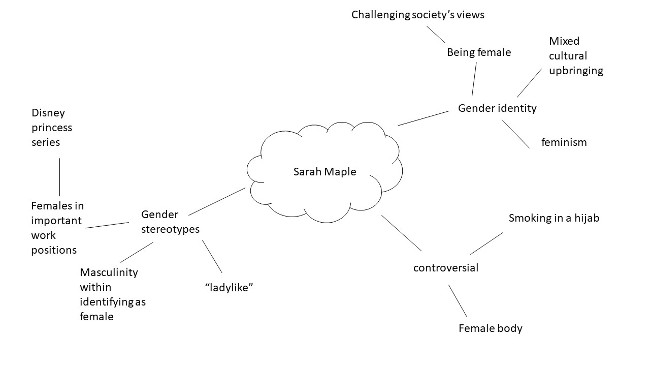
Mind Map
Analysing
Image by Sarah Maple.
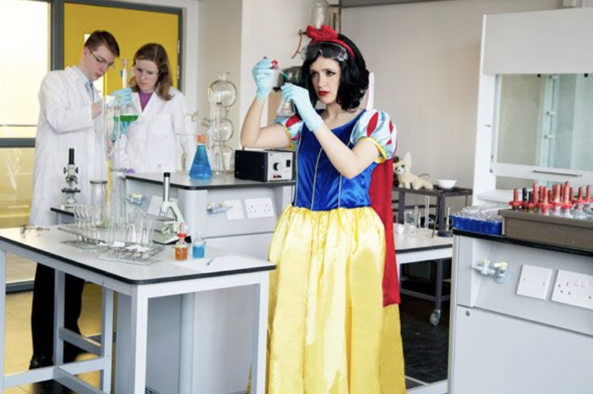
Context
This is an image from Sarah Maple’s Disney Princess series.
Visual
In this image we see 3 people in what seems to be a scientific lab setting. ” of the people are in the background and the third person is in the centre of the frame dressed as snow white while handling a beaker.
Concept
I think this image is very powerful in breaking gender stereotype perceptions. This image shows a Disney princess in what could be considered a very professional and respected job role. By having a stereotypical female, who’s wearing a dress, and makeup taking on the role of a princess Maple is trying to convey the fact that females are fully able to be in respected job roles.
Analysing
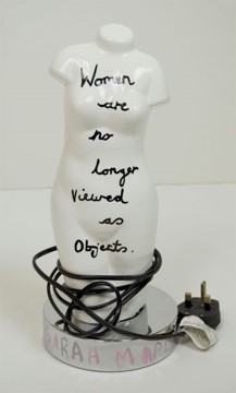
Context
This is a mixed media art piece, Created by Maple then photographed by her.
Visual
This image shows a white lampshade in the shape of a female body, with the message “women are no longer viewed as objects” written on it in a black pen.
Concept
This image is very powerful in conveying Maple’s opinion on the female body. Although the message written on the lampshade says that women are no longer viewed as objects, this image suggests that she doesn’t think that’s true. This is due to the fact that the message is literally written on a lampshade, which is an object, in the shape of a female body. I think this is a very interesting image as the artist has contradicted herself in order to gained the viewers attention, in order for them to understand the concept of the sculpture.
For this comparative essay I have chosen to examine these two pieces of photography due to the contrasting nature of the composition and the surroundings.
Firstly, I thoroughly enjoy the work of both Cahun and Rae, Rae following a similar style to Cahun in which she is part of, or the main subject of the photo. Rae tends to incorporate herself into the landscape more as opposed to being the focal point of the image. The strange contortions that she sometimes does during photoshoot is an attempt to flow into and become one with her surrounding. The soft and subtle clothing that she chooses to wear during these photo shoots, illustrates a delicate and fragile side of her that allows her to blend in. I have also noticed that in the majority of her photos she is facing away from the camera , or she is at a disctance where it cannot be seen clearly. This once again suggests that she doesn’t want her identity to shine through as our face is one of our most distinctive features, rather allowing her environment to be the biggest contributor of the image. In this photo, her attempt at fitting into the cart makes her seem small and insignificant in the maze of archives surrounding her. Rea, like Cahun, works in black and white imagery which again allows her to blend well into her surrounding with the monotone shades that her photography produces.
The work of Rae, although similar to Cahun’s, has some distinctive differences. Cahun also tends to set a lot of her photos outdoors, yet the main target that Cahun has is to explore and capture her out of the ordinary identity. Her strong facial features are clearly captured in the image. The smooth curves of her arms and face are the main center of the photo, contrasting the busy flowers that are in the foreground. Due to the technology of the time, Cahun worked only in black and white imagery but I feel this is was also an advantage as she allows all the character to come from the interesting compositions and themes as opposed to color and tone. Cahun is often discussed in relation to Butler’s idea of the performativity of
gender because of the role that gender performance plays in Cahun’s photographic self- transformations. While Cahun and Moore’s photographs of Cahun are certainly relevant to Butler’s theories of gender it was the ideas such as androgyny and the “third sex,” raised in the 1920s and ‘30s, which truly influenced their work. This image was prior to Cahun shaving her head and completing her androgynous look, portraying more as female. Preharps even the flowers in which she has chosen to stand in is a sort of irony of the traditional views of society and how women are viewed as “innocent flowers”.
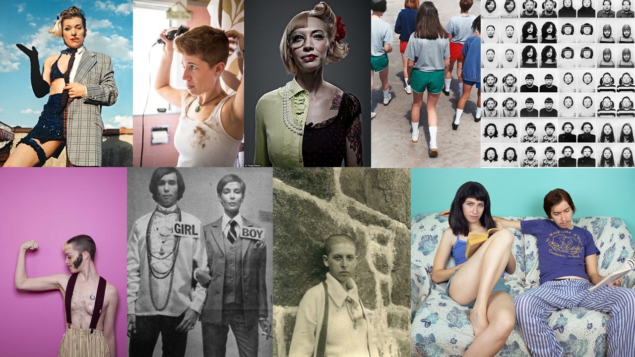
Gender identity is described as being one’s perception of their own gender. This can be the same, or can also differ from one’s assigned sex at birth. In today’s society it is relatively agreed on that children form their own personal gender identity by age 3, and they are able to do things such as choose toys that are considered “appropriate” for the gender they identify with. This shows how we live in a society where genders can still be stereotyped to the point where children who see themselves as being females choose to play with dolls, and children who see themselves as being males choose to play with toy cars.
In this day and age, I believe that it’s more acceptable than it used to be to do and wear things that a few years ago would be deemed as “not appropriate” for the sex you were. For example, until 1993, Women weren’t allowed to wear trousers on the U.S. Senate floor as trousers were considered “menswear” and In 2003, male employees received paid statutory paternity leave for the first time as taking care of children was seen as “women’s work”.
Although, advances to break gender stereotypes have been made in the past few years there are definitely many stereotypes that are deeply rooted into society, which I think would be very interesting to explore for the theme “identity and place”. For this project I will be focusing specifically on the female gender. Most of this project will focuses on challenging stereotypical views that society may have of females.
John Bulmer was born on the 28th of February 1938 in Herefordshire. When Bulmer was young he was interested in photography but mostly as a technology. Despite that, when he was a teenager he became a great admirer of Henri Cartier-Bresson. Bulmer went on to study engineering at Cambridge where his interest in photography began properly. After beginning this he went on to get his work published in lots of different magazines and newspapers such as Varsity magazine and the Daily Express. His ambition was photography journalism.
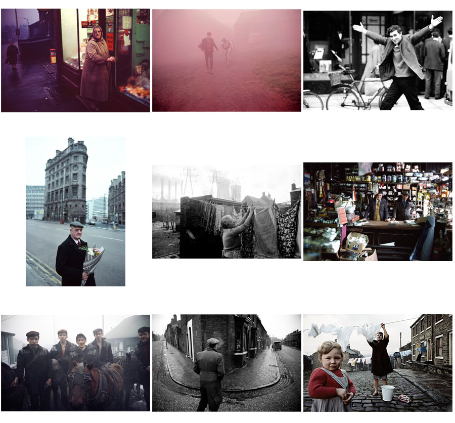
These are a selection of my favourite images by John Bulmer. These images show Bulmer both using colour and black and white. He began using colour after it was required for one of the magazines he took pictures for asked for it. His images often displayed people from the working class such as miners or factory workers.
Images by John Bulmer
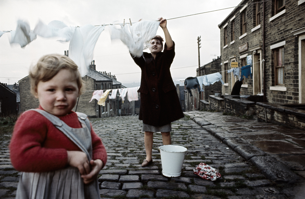
The image below is one of John Bulmers best images. It displays people in the North of England in their village hanging up clothes to dry.
Technical: This image makes use of natural lighting. This type of lighting is used because of the setting and to display the bright but dull looking weather of the area the image is taken. This image may have also taken the image at a time like this to make the area seem constantly cold and damp.
Visual: Bulmer has taken this photo at a time where the sky was bright and cloudy. This has created a contrast between the white background and the darker foreground. This makes the figures and the details in the image easily visible. This image also has form in it creating a 3D effect showing a long cobblestone road in the image. This creates an idea of community as all the buildings shown are close together and similar to each other.
Contextual: This image taken by Bulmer uses colour film. This was thought of as a difficult move for photographers at the time this image was taken. This is because colour may be harder to use than black and white for a lot of people. Bulmer is thought of as a pioneer of coloured photography because of his images, like this one.
Also, this image like a lot of Bulmer’s other work is used to show the true life of the people in the North of England. The image has been taken in a dull village and shows a mundane task to display the uninteresting lives of people in the working class in the North of England.
Conceptual: The idea of this image is that Bulmer wanted to capture the life and identity of people in the North of England. He has done this by capturing some people from the area with the old grey buildings and horrible weather to display the geographical identity of the area. This image also shows the identity of the community. This is also done through the long road with all the buildings close by each other, this along with the fact that there are two people of different age groups shows that people are close together with each other in the village.
An environmental portrait is a portrait executed in the subject’s usual environment, such as in their home or workplace, and typically illuminates the subject’s life and surroundings. The term is most frequently used of a genre of photography.
how to take good environmental portraits?
1.Spend time getting to know your subject
Before you select a location and start shooting, spend some time getting to know your subject. Find out where they spend their time, what the rhythm of their life is like and observing their personality. Out of this you’ll not only find appropriate locations but will begin to get a feel for the style of shots that might be appropriate and you’ll begin the process of helping your subject relax into the photo shoot. If possible it might even be helpful to accompany your subject to some possible locations to see both how they look but also how your subject behaves and interacts there.
2.Choosing a Location
Sometimes a location chooses you (it’s easy) but on other occasions you need to be quite deliberate and purposeful in making your choice (and it can take a lot of searching). When choosing your environment you ideally want to get one that:
says something about your subject – after all that’s what this style of photography is all about
adds interest to the shot – as I’ve written in previous tutorials – every element in an image can add or detract from your shots. The environment that you place your subject in needs to provide context and be interest without overwhelming the shot
doesn’t dominate the shot – sometimes the location can dominate the image so much that it distracts your viewer away from your main focal point (the subject). Try to avoid cluttered backgrounds (and foregrounds), colors that are too bright etc. Keep in mind that you might be able to decrease the distractions with clever use of cropping, depth of field and subject placement.
3.Posing
What sets the environmental portrait apart from candid portraits is that you post your subject (it’s a fine line and you might end up doing a bit of both in any given shoot). Don’t be afraid to direct your subject to sit, stand or act in a certain way that fits with the environment that you’re shooting in. Some of the poses might seem slightly unnatural and dramatic but it’s often these more purposely posed shots that are more dramatic and give a sense of style to your shot.
The expression on the face of your subject is also very important in environmental photography and you should consider how it fits with the overall scene. For example if you’re shooting in a formal environment it may not be appropriate to have your subject with a big cheesy smile and you might like a more somber or serious look. Again – mix it up to see what does and doesn’t work.
4.Camera Settings
There is no right or wrong way to set your camera up for an environmental portrait as it will depend completely upon the effect you’re after and the situation you’re shooting in. You might find that shooting at a smaller aperture (larger numbers) will be appropriate as it will help keep the foreground and background in focus. I generally shoot with a wider focal length in these situations also to give the environment prominence in the shot. Of course this doesn’t mean you can’t shoot more tightly cropped or with a large aperture and shallow depth of field – ultimately anything goes and you’ll probably want to mix up your shots a little.
experimenting with environmental photography:
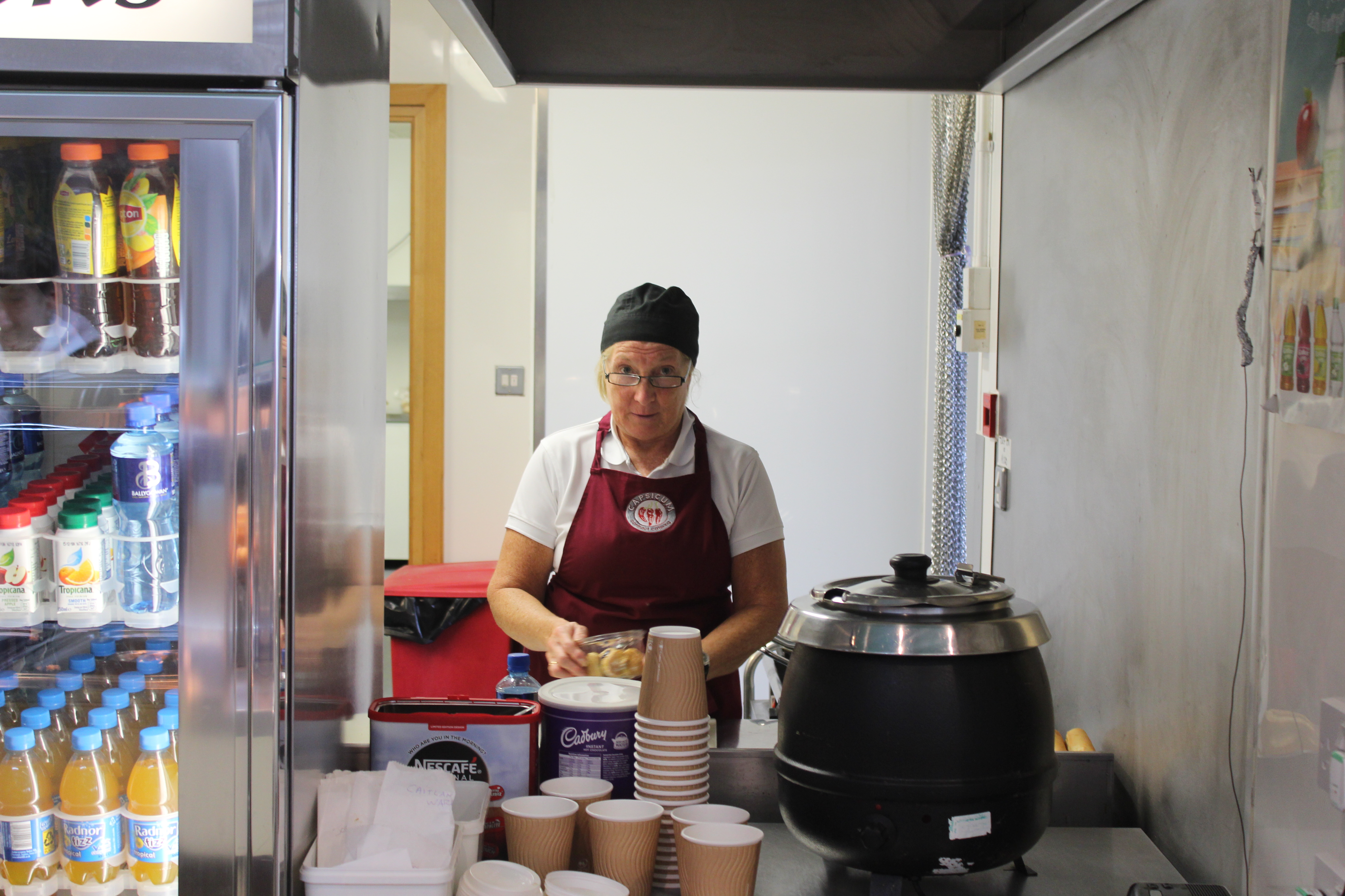
in school we were asked to take environmental portraits in the streets of St. Helier but as i didn’t attend that class i was asked to take the portraits inside the school, so my best bet was to go to the canteen in the staff’s working time. And this is what i came up with:
Before i took the portrait i asked the canteen lady to have direct contact with the camera and she kindly accepted. as you can see she is working as she naturally would.
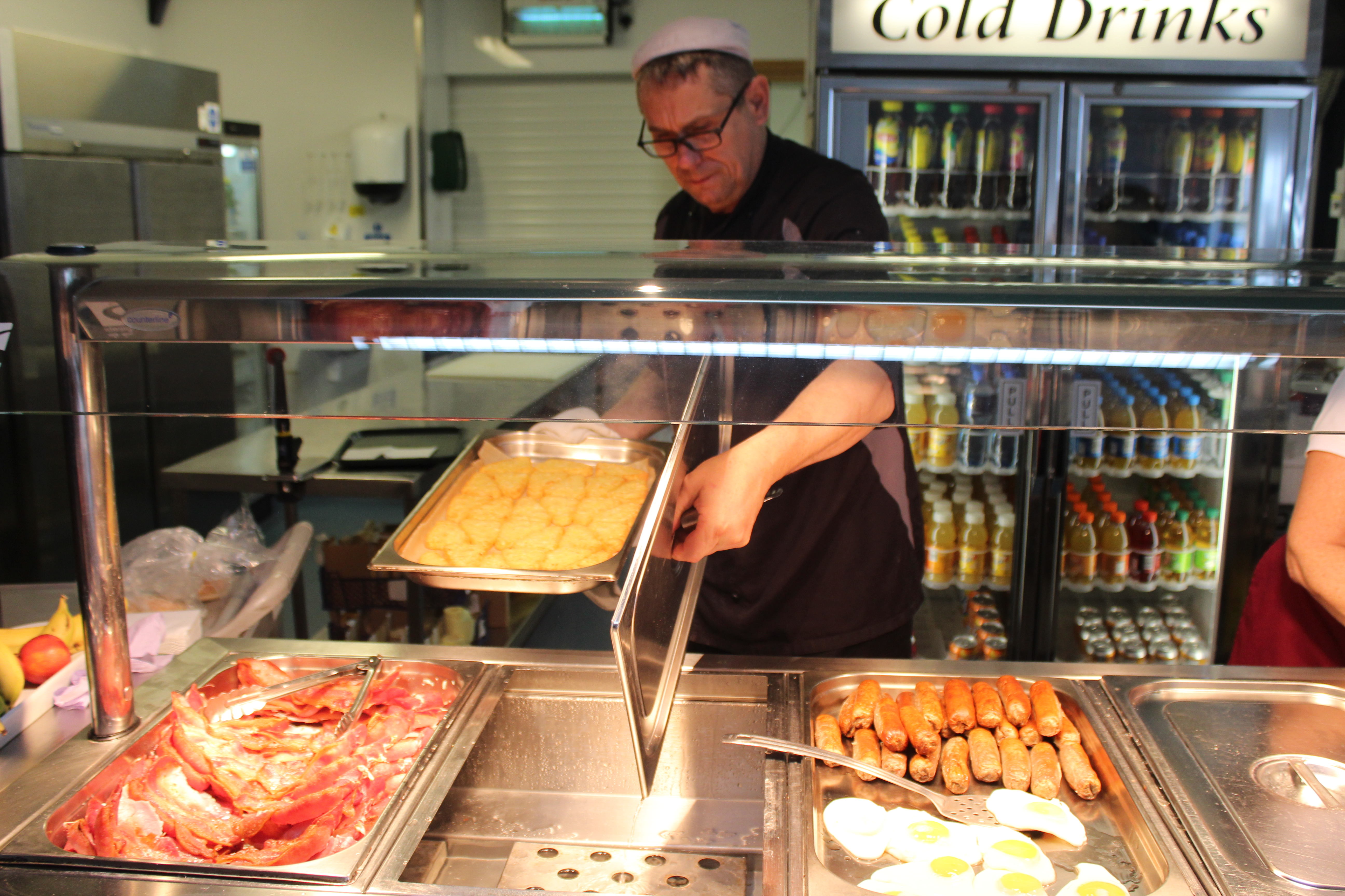
And over here i didn’t ask the chef i i could photograph him i did it without his notice to get a fully natural portrait. but of course i asked if i could use the photograph later on.
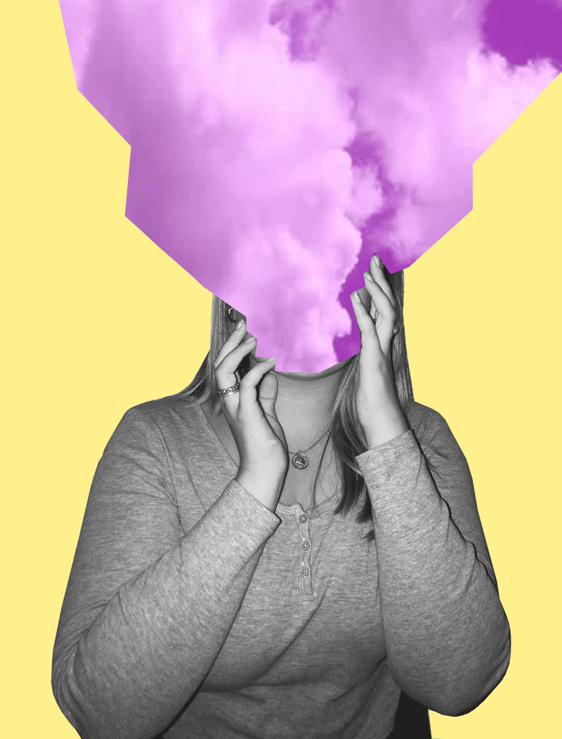
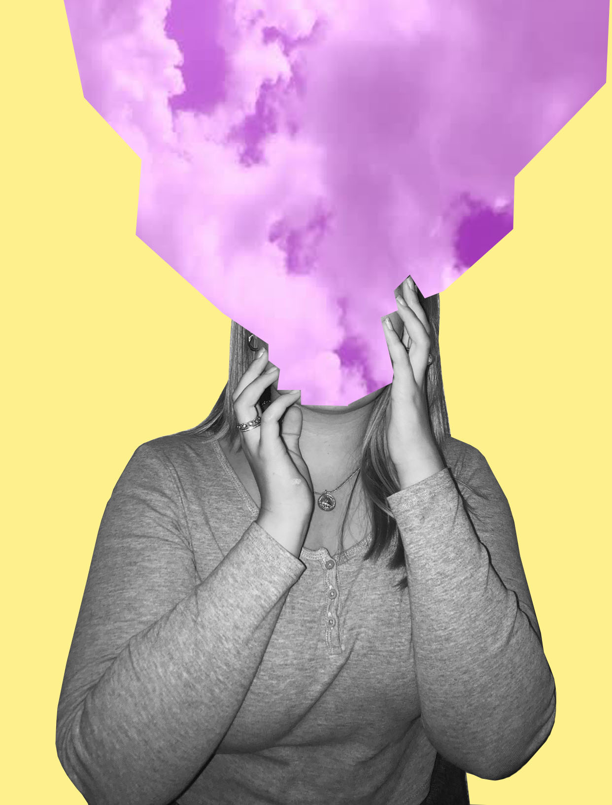
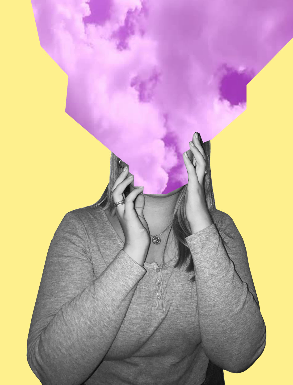
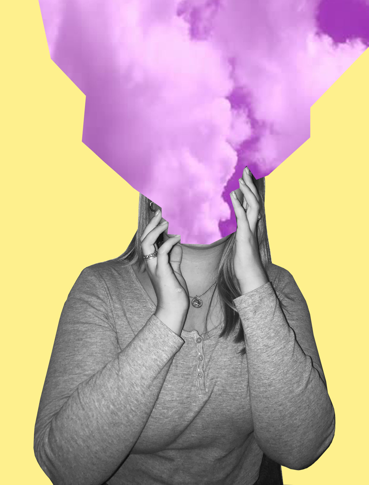
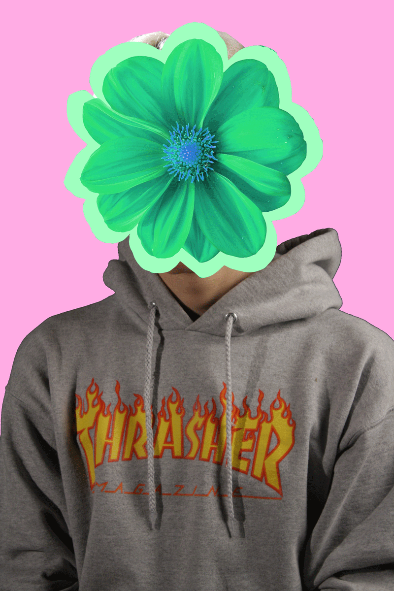
For my first two photos I decided to recreate pieces in the style of Tyler Spangler. I really enjoyed doing these pieces because I really like Tyler’s style of photography.
1st Photo:
For my first photo, I recreated a photo in this style –
My Photo:
I’m really happy with how this photo came out. The message behind this piece is about how sometimes people feel like their head is in the clouds and how sometimes people don’t pay attention to their surroundings, and has their attention in their own thoughts. I wanted to keep the theme of identity and place present but not too obvious as I want people to interpret this photo in any way they want to.
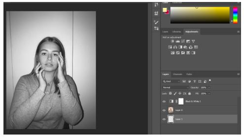
Step By Step on How I Created This Photo:
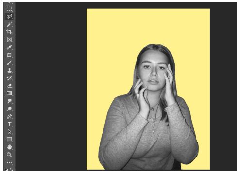
Firstly, I made the photo black and white.
I then cut out the image and put it onto a pastel yellow background.
Shutterstock
I then got this photo of purple clouds from google images.
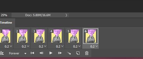
I then cut the purple clouds image onto three separate images. I used three different angles of the purple clouds to get three different images of the clouds.
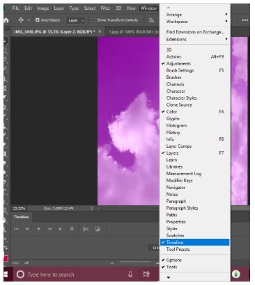
I then pressed windows, then timeline to get the animation window.
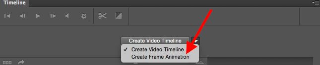
Then I clicked create frame animation.
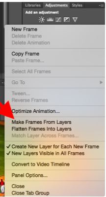
I then clicked make frames from layers to make each layer into a frame.
I then duplicated the three layers and made them last 0.2 seconds long.
2nd Photo:
I also recreated this photo –
Tyler Spangler
My Photo:
I really liked this piece as I like how it turned out. I think I was able to to capture the photographers style very well, but still having elements of my style in it. Even though the model is not in black and white I still like it in colour. Again this photo is open for interpretation and is loosely based off of identity and place.
Step By Step:
PlusPNG
For this I basically copied the same steps in the first photo, but instead of the sky I took a picture of a flower from google, changed the colour of it and made it spin around the models head.
3rd Photo:
Even though this photo took me longest and was the most challenging one out of the three, I really like the end result of it. I added noise to the photo and I really like how that looks. Also again this is loosely based off of the theme identity and place.
This photo was inspired by Eugenia Loli’s Photo –
Eugenia Loli
Overall, I’m really happy with how all my photos turned out and I really like working in this style of photography because of the freedom you have with the photos.
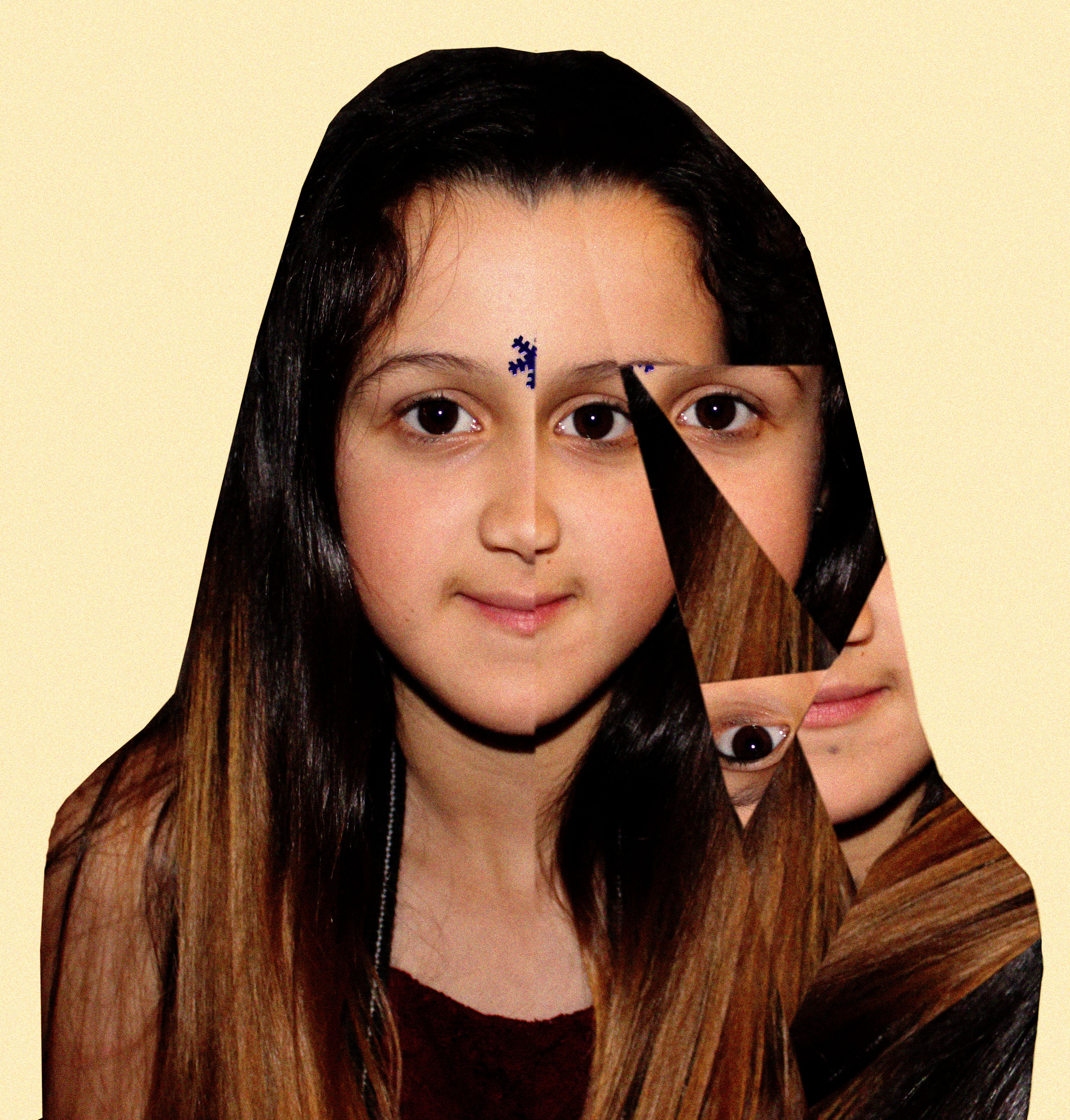
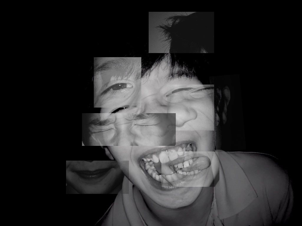
Brno Del Zou is a French artist born in 1963. In his “photosculptures” series, Brno Del Zou uses the fragmentation of the body in order to better understand it. The body and the faces are revisited and their volumes are highlighted in order to create installations of multiple scales. In Brno’s work he is trying to explore the human body but by doing this his style, rather unusual but unique really goes with what he was trying to explore. By him being different it makes his work one of a kind and interesting to look at he’s expressing parts of his identity which is what should always be done when creating “your own work”. I like his work due to the layered fragments of the face creating a bizarre outcome, the use of black and white helps with distinguishing the mood that hes trying to share however some of his images have tiny elements of colour which makes the models features easier to spot and draws automatic attention. His work itself is leaning to the more unrealistic side of photography which gives him the ability to work with what he has an extend it for something meaningful which has been fulfilled in his case.
For every great image is a story or an idea. For Brno’s work its evident that the idea of identity and expression is clearly shown, ashore the story behind it could be that Brno is trying to explain that our mind can be our biggest challenge we face daily. Some images show various expressions, this can be used to symbolise the feelings we might feel In day to day life. This clearly highlighted the importance of what our minds can do which lead to a powerful message being shown through art and creativity instead of chunks of writing.
The set of photographs are all take as portrait at a straight on angle, which allows the models face to be the main focus point which is what Brno was aiming for .The tone of the photograph is quite light as there tends to be no shadow given off the body parts nor the face itself. The lighting used seems to be artificial lighting, which creates a soft tone allowing the models body to easily be recognised. The background of these photographs are plain which allows the viewer to focus primarily on the distorted models face.
Photo montage is the process and the result of making a composite photograph by cutting, gluing, rearranging and overlapping two or more photographs into a new image. Sometimes the resulting composite image is photographed so that a final image may appear as a seamless photographic print
Mood Board: Examples
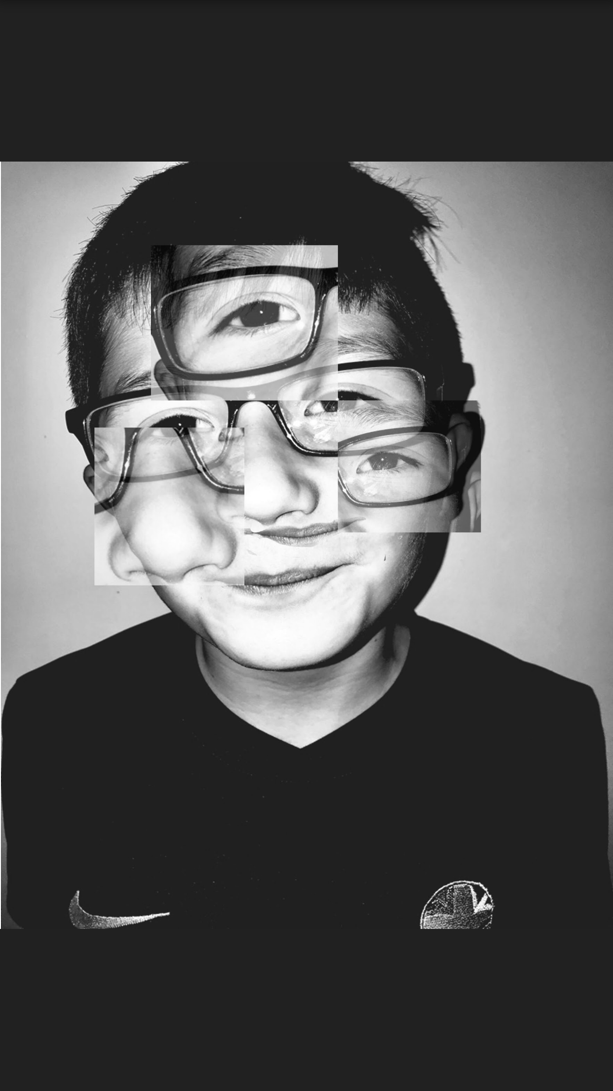
My first Attempt at Photo- Montage using Photoshop:
My Process:
As I mainly forgot to screenshot a long the way I decided to write out the process which I followed to achieve this image. Firstly although this took me over 45 minutes to figure out how to over lay layers and fade them out. Firstly i selected which image i wanted to use as the montage examples. Secondly i had to decide whether i would be using the same image or a different one when adding it over one another. I chose to stay with them same image as i was inspired by the artist Brno Del Zou and in most of his outcomes he sticks to the same image but just creates multiple layers. As this was my first attempt as a beginner i found it quite hard but In not too disappointed by the result. After having copied the image a couple times i decided to crop into certain areas of the face making another face but above another one. Therefore here i chose to crop parts of the eyes,mouth and nose to create a weird, distorted image. Then finally i edited the cropped areas by changing the opacity of each section by making it lighter giving it a transparent look.
The technical aspect of this image, when looking at lighting its quite dark, however there are some elements in this image that are put there to draw attention. For example the big eye in the middle of the forehead, giving it this aspect of abnormality and weirdness draws attention if you look closely you can see harsher tones of blacks and grey and then lighter mixes of white tones. This attracts the eye to look at areas that sometimes aren’t highlighted in normal room lighting. This image was also taken using flash hence why theirs a circle almost shape going around the face which just supports my point that the attention is drawn immediately to the face.
Visually, other than light, if i was to complete this image again, i would try to fade out the corners of the boxes or at least learn a way to blend them in a bit better as it makes a slight contrast with the additional background due to them being different tones of white and one slightly more faded.
The context behind the picture was that it was actually taken for the studio lighting section but as my chosen artist worked with portraits i decided to pinch one picture from here.
Here are some of my other attempts and experiments at Photo Montage using more than one image:


 Context