Identity: Tish Murtha Case Study

For my identity project into the influence that adults have on the development of children’s identity,  I have decided to take inspiration from the work of Tish Murtha, a social documentary photographer who worked in Britain. she is was best known for documenting more marginalized communities, such as the working class in the North East of England.

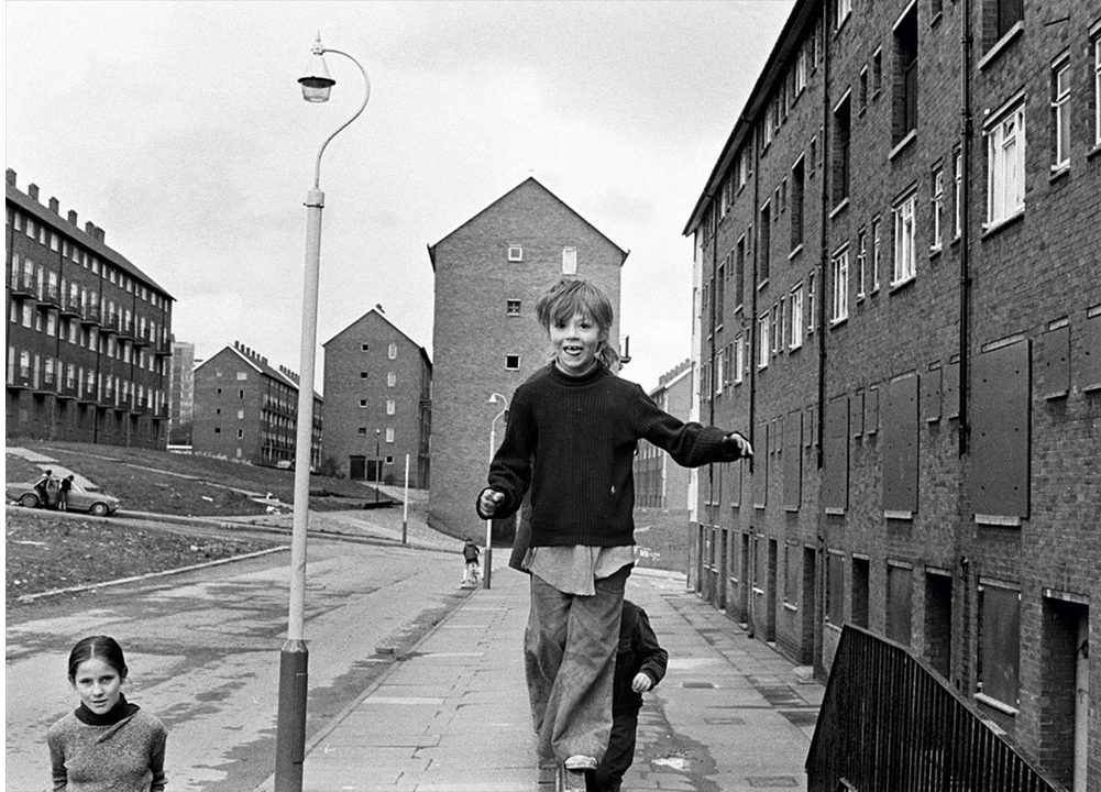
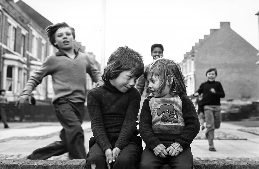
Her photography is documentary style, and often uses candid photography in order to truly show a true to life representation of the life, struggles and social workings of the groups she photographed. Examples of her work can be seen below:

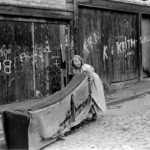
Her work often shows the raw emotion on the faces of her subjects, allowing for the identity of the subjects to be presented through their emotions, feelings and reactions to their present situations.

Murtha uses her photography to inject personality into the individuals who are often simply stereotyped and grouped into certain groups of people. Her photography gives individual personalities to the people who are often shun by society due to their social class, position in society, age, gender or job.

Murtha produced exhibitions such as Youth Unemployed (1981), Elswick Kids (1978) and Juvenile Jazz Bands (1979), which showed the struggles of children living in the lower bands of society during the 70’s and 80’s, using photography to display real life issues such as poverty, unemployment, conflict and a lack of individual identity within the children of the working class.

Elswick Kids – Tish Murtha (1978)

Through her photography, Murtha raised important issues about society with the public, as her work depicted the struggles of the working class, and the social issues they face, which the viewer can then compare to the issues they themselves face.

Murtha, born in South Shields in the North East of England, was accustomed to the poverty and deprivation that was common in the area. Her work focused a lot of attention to proving that, although the subjects in the photographs often look care-free and happy, the environment in which they live is often poverty-stricken, run down, and appears to lack any outside help in order to make it safe and appropriate for living in.

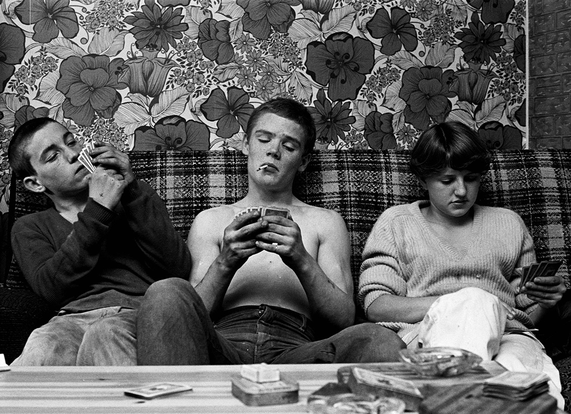
The above image was taken by Murtha as part of her Youth Unemployment exhibition. This image uses the shock factor of the young boy holding a cigarette so nonchalantly in his mouth, in order to draw the attention of the viewer, before allowing them to understand the underlying meaning. This image portrays the children in a situation (playing cards and smoking cigarettes) that would normally be associated with adult behavior. Here, Murtha is commenting on the fact that a deprived environment often forces children to grow up faster than they should, and the situation they are placed in (poverty) influences them to take the identity of the adults around them.

The above image is an example of where Murtha took close up head-shots of individuals living in the run down areas of Newcastle. Murtha incorporated elements of both candid and posed photography. The above image focuses on the appearance of the subject in the foreground, who appears to come from a poorer, lower class background. While the subject appears to be from a less privileged background, his facial expression does not convey negative emotions, rather he seems distracted by something interesting. 

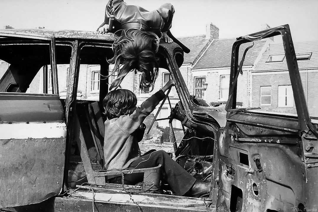
This image by Murtha really conveys the theme that all of her work follows. The young girl in the image is seen jumping on an abandoned car, a dangerous activity in a hazardous run down area that now days, would violate health and safety regulations immediately. However, the context of the image indicates that the subjects are actually enjoying this activity, with the subject in the background moving to stand back on the car roof (presumably after already jumping off). Here, Murtha is able to covey that, even among the deprivation and poverty, children still adapt to their environment and create fun out of seemingly dangerous or boring situations.

Photo-montage: Response to Peter Kennard

In order to experiment with photo-montage, I have decided to create a response to the artist Peter Kennard. His work focuses on portraying his views on political and social issues, such as war, politicians and environmental concerns. His work often criticizes the use of nuclear weapons, and highlights the importance of protecting the earth and innocent lives from the consequences of war

Below is a montage of the work of Kennard that challenges the current politics and social issues:

Taking inspiration from Kennard, and his criticisms of politics, the first photo-montage I created involved using Photoshop to cut and paste different facial features of different well known politicians onto the face of the current prime minister of England. For this image, I have taken inspiration from an image created by Peter Kennard, who used an image of the prime minister and photos-shopped another politician into her head. This is a statement made by Kennard voicing his opinion on UKIP, and the decisions made by the politicians involved.

The image I have created also criticizes the current political situation of the UK, and incorporates the same style as Kennard (using a black and white color scheme, and using a black background in order to draw maximum attention to the image in the foreground).

My photo-montage
“Where’s UKIP now?” – Peter Kennard

As well as criticizing politics, Kennard also uses his photo-montage work to criticize the physical state of the world and environment.  He uses photo-montage to show his opinions on how human activity destroys and disrupts the environment.

Kennards photo-montage depicting a nuclear power plant as the top half of earth, created to criticize human use of resources that produce waste harmful to the environment

In order to further experiment with photo-montage, I decided to take inspiration from Kennards work revolving around criticisms of environmental issues, and created the following photo-montage:

This image uses the same color scheme (grey-scale) as Kennard, which helps to emphasis the image in the foreground. As well as taking inspiration from Kennards work for the color scheme, I have also used a plain black background, as I feel like this allows for the image in the foreground to warrant maximum attention of the viewer, and helps to show the issue presented in the montage as an issue separate from anything else, allowing the viewer to focus all attention on the issue at hand.

After looking further into Kennards work, I have produced a variety of images that take inspiration from his photo-montage style, but do not replicate his work exactly (they include some original ideas and concepts). Below are the results of this:


Editing Potential Final Outcomes

I have had a go at editing some of the images I have taken in the past that I may use as final pieces or to help inspire me and show me some of the styles I could use for my final pieces.

On this image I started by using the cropping tool so that I could easily focus on the main point of the image which was the person.

After this I used the black and white option that can be found under – Image > Adjustments > Black and White in Photoshop. I have tried using this with a few of my images because the photographers I have looked at in my case studies all started in black and white.

I have then used the Brightness and Contrast option. I have tried not to use this excessively. I used it to make the darker areas in the image darker to make the person stand out more especially since his hair has come out dark.

This is the final outcome from the small amount of editing I have done on the image. I like how the image has come out using the black and white filter over the top. I like how this image has come out, it doesn’t really create a detailed view of the persons life though.

This is another one of the images I have taken that I thought I could edit a bit, to experiment using different tools. I have started by using the cropping tool to avoid having too much white space around the person. This also allowed me to use the rule of thirds.

After this I changed the exposure settings to make the background a lot brighter and consistent in colour. This also allowed me to have the light on the person sort of blend in with the background, on the left side.

I have also experimented using the vibrance settings on this image. This allowed me to make the colours seem like they are darker, but look as if they glow a little bit to help them stand out more. 

This is the final outcome of this image that I have come with while experimenting with these features. I like how the image has come out using the rule of thirds, but it could use something in the background other than white, as it makes the image look barren and doesn’t really create an identity for the person.


Typologies Research

I have decided that I’m going to present my images in the format of a typography. since a lot of my images in the first photo-shoot are very similar in composition and feature the same subject, I believe that a typology would be a good way of presenting my images and thus I will adapt my future photo-shoots for the project to the format of a typology.

One of the most notable photographers in typologies are Brend and Hilla Becher while there work doesn’t thematically link to mine as they photographed buildings as opposed to possessions however I believe that their work is some of the best examples of typologies available.

Image result for typologies becherImage result for typologies becher

Image result for typologies becher

Some other examples of photographers that have used typologies as a form of presentation for their work include Zhao Xiaomeng, his work with typologies is also more closely related to mine as it deals with possessions in the format of a typology.

Image result for typologies photography zhao xiaomengImage result for typologies photography zhao xiaomeng

I believe that typologies give the photographer the freedom to use a variety of images which is especially helpful if you believe that there isn’t a single image that could properly represent the best of the photo-shoot and convey the message of the photo-shoot properly.

Idris Kahn experimented with the photos of Bernd and Hilla Becher and presented his own take on the ideas of typologies. The images are essentially multiple exposures overlayed over each other. Since the images all come from the same typology they are very similarly composed and thus give an interesting effect with a Gaussian distribution.Image result for idris khanImage result for idris khanImage result for idris khan

Photo-montage – Peter Kennard Case Study

Kennard is a British contemporary artist who experiments with photo montage in order to express his opinions on issues such as politics, environmental concerns and social problems. He is the Senior Research Reader in Photography at the Royal Collage of Art (London). He was an active participant in the anti-Vietnam war movement, and used his artistic background to create photo-montages in order to spread images showing the consequences of continuing the war. He also involved himself in the Campaign for Nuclear Disarmament in the 1970’s-1980’s.

Kennard is an activist for world peace, and conveys his passivism through his photo-montage work. His work often includes relatively basic layouts, involving only 1-3 images with a black background, use to draw maximum attention to the photo-montage in the foreground. Below are examples of Kennard’s work:

Kennard describes his own work as used to: “Rip apart the smooth, bleached and apparently seamless surface of the media’s presentation of the world and to expose the conflict and grubby reality underneath.” This quote indicates that Kennard used his work to portray the reality of life, not leaving out the horrors and atrocities that come with war, human suffering and conflict. His work contrasts how the media typically presents such issues, as the media often glances over the severity of certain issues such as the increasingly advanced technology used to produce nuclear weapons, and focuses more on issues that, arguably, matter much less (such as celebrities).

The above image was created by Kennard to emphasis that the world (more specifically, politicians and those in power) focus so much on developing unnecessary weaponry and war supplies, while completely ignoring the, arguably, more important issues such as world hunger and poverty. This image is designed to mimic a poster, and uses photo-montage editing techniques to reflect the contrast between a loaf of bread (representing hunger) and a nuclear weapon. This image is used to highlight the worrying order of the priorities of those in power, where they continue to mass produce harmful, dangerous weaponry while turning a blind eye to the real issues at hand.

The image seen above is used to convey Kennard’s opinion that those in charge are playing a dangerous game (gambling) with issues as serious and hazardous as the development of nuclear weaponry. It emphasizes that such a serious topic is often treated like a game, which contrasts the reality of what should occur, given that weapons are designed to destroy lives. Here, Kennard’s anti-war beliefs come through his work, as he highlights the careless and shameful way that those in power treat serious topics that could ruin uncounted lives.

Kennard often injects a sense of irony into his photo-montages. Above is the image of a skeleton (representing death) reading a manual on how to survive. These two elements clearly contrast each other, and so Kennard is able to convey the irony of handbooks that were distributed by the government in the 1970’s listing what to do in the event of a nuclear attack. Kennard believed that in the possibility of the event of a nuclear attack, the government clearly did not feel enough concern for the population to take more drastic measures, and simply handed out leaflets stating how to survive. This image projects Kennard’s opinion, that the government took very basic, almost pitiful action, when in reality, drastic measures would be necessary in order to do any real good.

When Time Was Prime 3 – Selection of Images*

When I went to take the images I changed the way that I did the images and set them up. One way that it changed was that I was planning on taking the photos so that they lined up perfectly with the background, the way that i re did this is that I lined up one major feature within the picture and the same in the background like a door frame or a window.

For the first image there are multiple attempts as I was trying to line up the shot and then changed to the style of showing that I am in the same location by including features and the scene.

Paul M Smith – Gender and Identity (Masculinity)

Paul M Smith originally studied fine art between 1991 and 1995 at Convent University. After completing his degree at Conventory he completed a masters degree in photography.

Paul M Smith’s most recognized and influential pieces of work is the well known album covers of Robbie Williams where he is every person on the face of the cover of the album (like seen in the picture)

I like these style of photos as it explains and shows skill within taking photos, directing the model and editing the photos pre-release.

Many other people have used this type of editing and photo style, the most common use of this modelling is to take a series/multiple photos on every single seat on a plane then used overlay and edited them to make it look like you are filling every seat on a plane and it has been captured in one picture.

To recreate Paul M smiths photography I will be exploring Gender and Identity, more importantly Masculinity. To achieve this I will be using 3 photshoots.

1-Rugby, a classic example of men using aggression.

2-A music band rehearsal, this is because most band members and bands are mainly male, with the odd case of female band members.

3-Doing typical female chores such as cleaning and washing, to show that men can do stereotypical female chores as well as being masculine, and performing ‘manly’ chores

Image Selection/ Editing (Part 1)

This Photo-shoot was inspired in terms of composure by the images of Zhao Xiaomeng. I used an ISO of 1600 in these images in order to have some grain in the images while allowing for well lit sharp images without a tripod. All images in this photo-shoot were taken using the same settings apart from the first 4 which were taken using a lower ISO than the other images in the series, as for other settings i used an F stop of 5.0 and a shutter speed of 1/125. All these images were taken using raw images in the CR2 format, this allowed for more options when it came to editing the images in light-room.

My personal favourites of this photo-shoot are photos 4584, 4590, 4592, 4593, 4596, 4598, 4601, 4606, 4608, 4610, 4614.

Below are some examples of lightly edited images

IDENTITY AND PLACE

WHAT IS…

IDENTITY – Identity relates to our basic values that dictate the choices we make (e.g., relationships, career). These choices reflect who we are and what we value.

CULTURAL IDENTITY – Cultural identity is the identity or feeling of belonging to a group. It is part of a person’s self-conception and self-perception and is related to nationality, ethnicity, religion, social class, generation, locality or any kind of social group that has its own distinct culture

SOCIAL IDENTITY – Social identity is the portion of an individual’s self-concept derived from perceived membership in a relevant social group.

GEOGRAPHICAL IDENTITY – 1. An individual or group’s sense of attachment to the country, region, city, or village in which they live. 2. The key characteristics with which a particular country, region, city, or village is associated.

LACK/LOSS OF IDENTITY – Loss of identity may follow all sorts of change; changes in the workplace, loss of a job or profession, loss of a role that once defined us, as a child, as a parent, as a spouse. … When we lose our identity and sense of self, we are likely to seek our sense of self-worth from others.

IDENTITY MIND MAP: 

MARCIN SACHA 

CRITICAL ANALYSIS OF WORK:

VISUAL:  The image has very obviously been heavily edited, creating a spiral like warp on the image which twists and contorts the image and buildings in the backdrop. It shifts the model from a horizontal position to a vertical position. The overall image is composed of extremely dark, blue based tones. The focus of the image is mostly on the model, who is in the very foreground of the image. The clarity of the image is lost and it becomes more blurry as you move up the image and into the backdrop of the image. the buildings on either side of the street create a sort of guide for the eye, leading it down the street and making you focus on the darkness of the sky in the backdrop. The spotlight which has been incorporated onto the model, highlights her and makes her the focal point of the image. It illuminates the body and the ground which she lays upon. There is also observable light reflection in the windows of the building which draws more attention to them. The darkness of the walls accentuating this illumination. The position of the model, the dark and eerie mood of the image suggests themes of death, evil and depression. Upon a closer look, another human figure can be seen on the street in the distance, possibly suggesting that the woman in the foreground was in some way hurt by the figure.

TECHNICAL: I believe that in order to create this image, multiple images and heavy editing was used in order to achieve the final outcome. This is also extremely staged therefore models and extra equipment such as lighting was used in order to create the image. Photoshop was later used in order to warp the image and create the dream like fluidity of the image which guides the eye to the center. The model has also been staged in order to face the camera with the dead-like facial expression. The colors have also been highly saturated in order to give the dark and grungy look. The sky is extremely dark, grim and highly contrasted to the pavement, this I also believe has been edited in to give extra darkness.

CONCEPTUAL/CONTEXTUAL: “I live in Tarnow, in the south of Poland. Photography became my passion in 2005. I began with nature photography and later, landscapes. I recently became also interested in pictures on the boundary of photography and graphics. My achievements to date include nine solo exhibitions and over forty collective exhibitions in Poland and abroad, I have a title Artiste FIAP La Fédération Internationale de l’Art Photographique In my photo montage I often use paper, clay, bricks and ceramic forms prepared by myself. I create from them the scenery and by playing with the light I try to get an interesting abstracts, which imbue a specific mood of composition of light and shadow in the plane of the frame. My worlds even if habited by people are dominated by shapes, shadows and lights. These worlds are alien to them.”

source: https://www.behance.net/salimaf754

Identity and Place Image Manipulation Example (Photo-shoot 1)

For this image in particular I began in light-room where I most notably adjusted the exposure, contrast and cropped the image, however I did also make some changes to settings such as color temperature and vibrancy. I also made minor adjustments to sharpness and noise reduction settings, this was because although I like the grain created on this image, it looked too heavy in certain areas and in my opinion was affecting image quality.

In photo-shop I only used the selective color tool to reintroduce some of the warmer tones into the whites of the image and increase the blacks in some areas.

OriginalRetouched