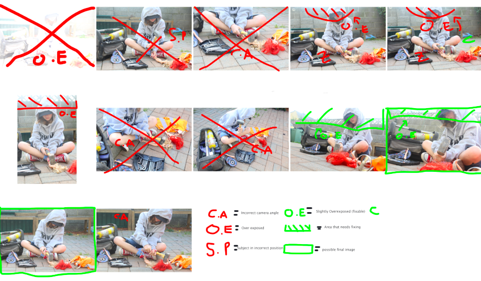
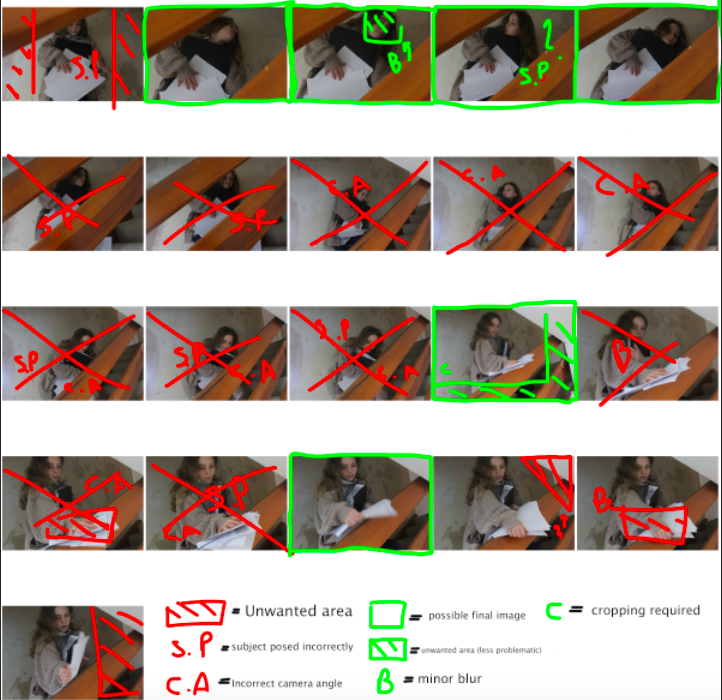
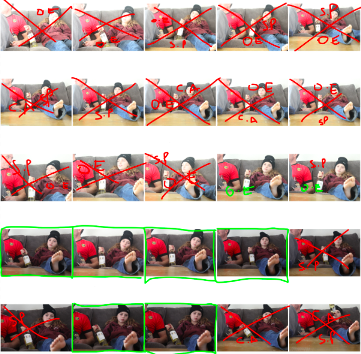
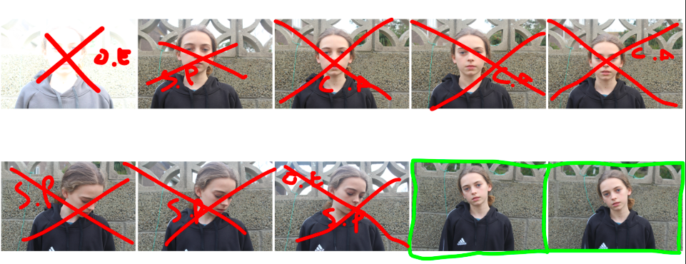
Identity: Photo-shoot 1 Contact Sheets

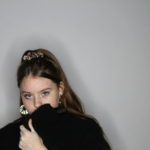
For the first photo-shoot I completed, I focused on a range of different factors that can influence the identity of children, including the anxieties of adults and how they influence children, as well as how family history and loss can effect a child’s development of identity.

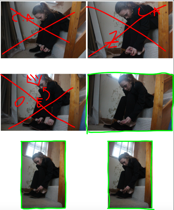
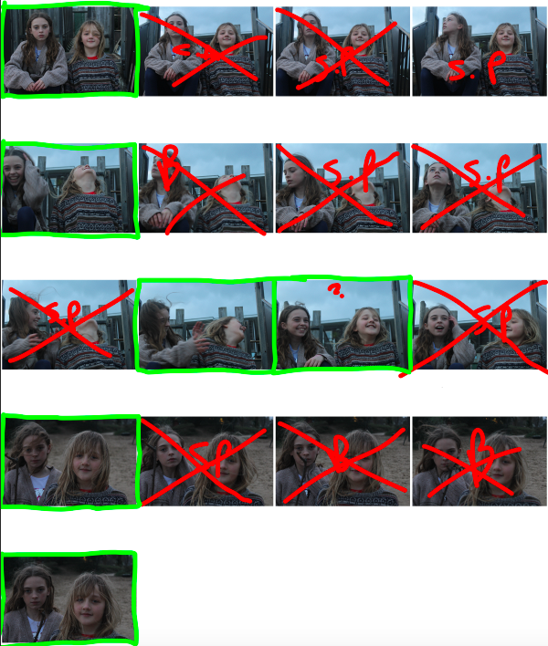
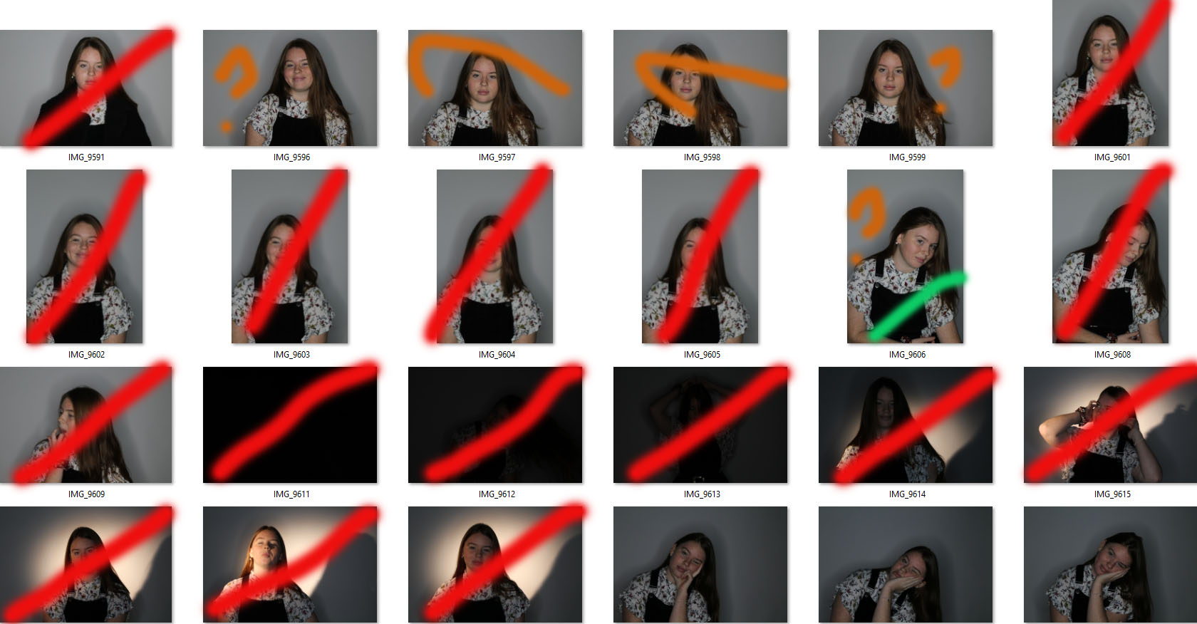
The following contact sheets work as evidence for my thought process when ruling out and selecting images from this photo-shoot:


Identity 1; The Shoot&Selecting Images (Jan 2019 Mock)

THE SHOOT 

For the shoot itself I used a canon camera with a standard lens, this is so I had a range of zoom that I wouldn’t of had if I was using a portrait lens. The standard lens made the shoot less stressful. I used the ring light as my main source of light, I used this light because it is a strong powerful white light, but doesn’t create harsh shadows on the models face. The ring light also had a dimmer on it, this allowed me to control how strong the light was.  I made sure the background of my images was white as it makes Erin stand out. I

I had my camera settings on 1/200 shutter speed and and ISO of 200, these settings where perfect for my photos as they were sharp and powerful. I could adjust the focus by using the focus lens at the end of my camera lens.

Like any shoot I had difficulties, they included making sure the light was at the right angle to create the silhouette around my individual and ti highlight certain areas of her face that I needed to be bright and exaggerated. Another difficulty I had was making sure the settings were correct, I had to take many test photos, this enabled me to adjust my settings as I knew what needed to be changed, in order to get the effect I wanted.

SELECTION PROCESS

Image 1 selection; (before she changes herself) 

Image 2 selection; (beginning the change)

Image 3 selection; (step one in the change)

Image 4 selection; (zoom in on the eyes)

Image 5 selection; (changing her hairstyle)

Image 6 selection; (adding on another layer to cover herself up)

Image 7 selection; (adding more)

Image 8 selection; (before she changes her outfit, which shows her personality)

Image 9 selection; (the final look)

Identity and Place

Identity – “The fact of being who or what a person or thing is”. Identity can be influenced by many factors, which all have a different impact on people identity. One factor effecting people identity is the place in which they live in. For example if someone is brought up in a very religious environment, they will be living and doing certain things that according to the religion. The different types of identity are:

  • Social Identity: the portion of an individual’s self-concept derived from perceived membership in a relevant social group. 
  • Cultural Identity: the feeling of belonging to a group, and culture is all the aspects that make up the way a person lives.
  • Geographical Identity: an individual’s sense of attachment to the region in which they live or the key characteristics in which a particular region/country associates with.
  • Lack/Loss of Identity: personal psychological conflict that involves confusion about one’s role in society or the sense of loss in a community.
  • Gender Identity: a person’s perception of their own or other people’s roles based on their gender.

Identity and Place Mood Board:

Identity Mood board


Photo montage

Photo montage combining previous images 

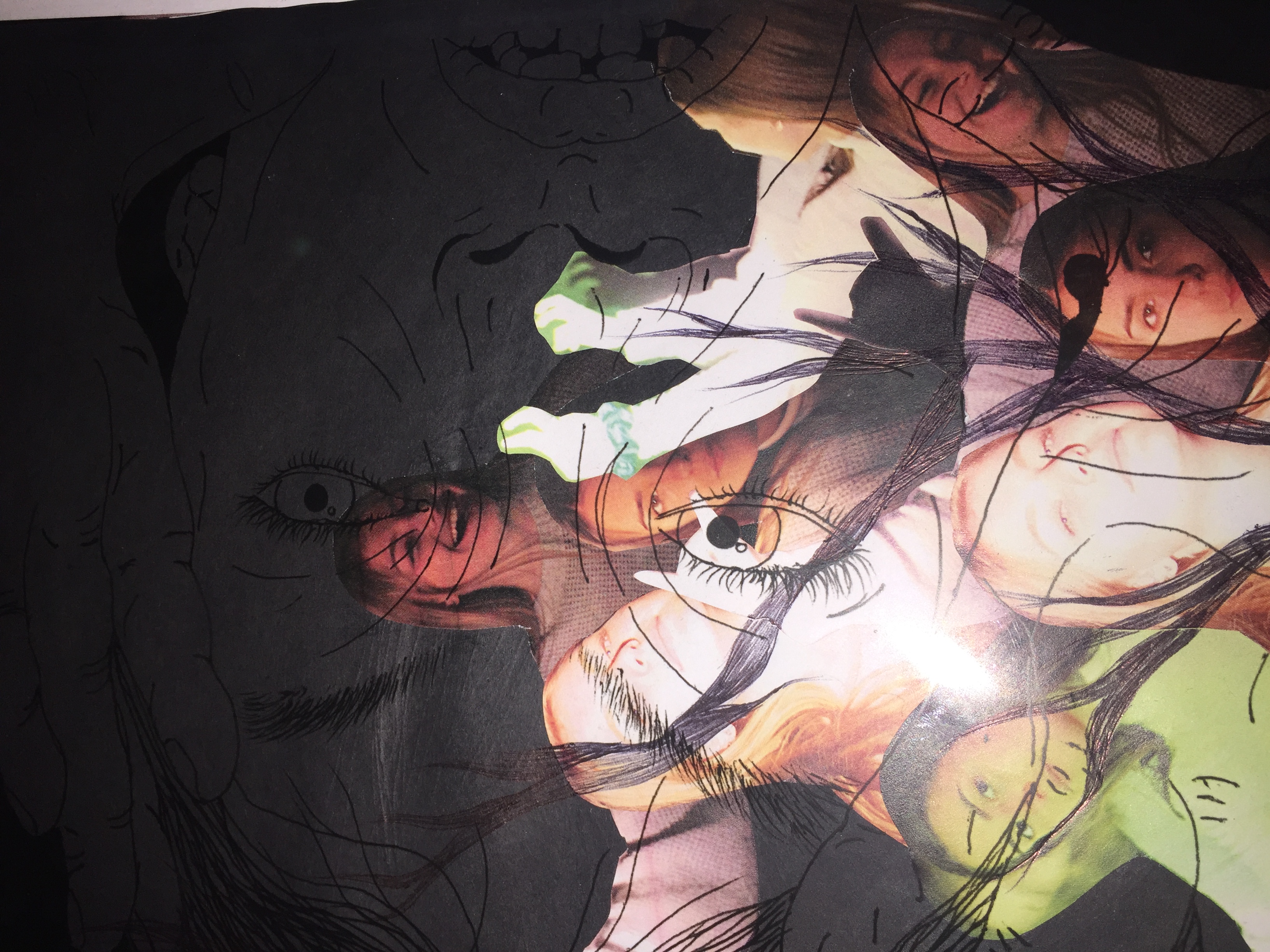
For this photo montage i created a background layer using the studio lighting photos and then drew into it using the original ideas of the broken wooden buildings the pen wraps around the face symbolizing the  encapsulation that the ever growing industrialization has on us and how we can get away from it.

For the upper layer i used acetate. I used one of the photos from the  merged  faces and building images. I drew this in pen on a white background creating a light and dark contrast. Then i decided to layer it over my original images collage to create the merged feel the the picture so it fits in well with my final idea and building up work to it. This image also is meant to feel like you are looking into the head of the model and there inner thoughts reflecting on there self identity and industrial visions and how it is effecting and entwining them.

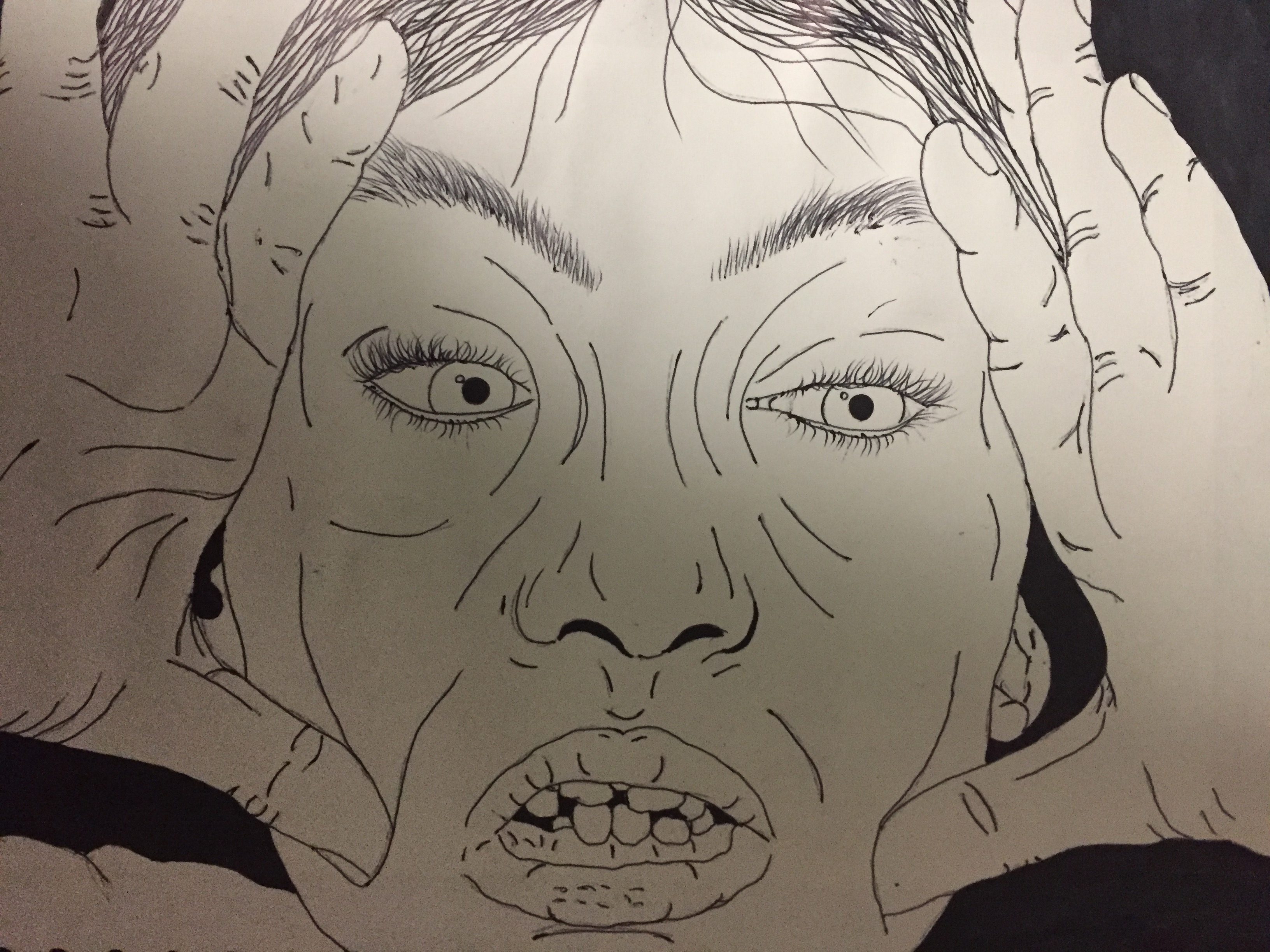
This was my original drawing for the image looking at the dark and light the way she is grabbing her face is meant to reflect how industrialization cause confusion for the persons  identity and  place of origin.  Because this running theme of building and industrialization reflects how i have built up the image with lots of different layers creating a visually capturing and interesting image. This is because there are lots off different components to understand and appreciate.

Identity 1; Planning (Jan 2019 Mock)

PLANNING FOR MY SHOOT;

What is included and who is involved?

A series of 9 images of Erin getting ready to take a photo of her self, this will show how a modern day girl changes her identity to fit society and to blend in with everyone else around her and to show the parts of herself she wants people to know about her even if it isn’t true.

When and where is the shoot happening?

25th January in the studio. I chose to do the shoot in the studio as the blank background will really allow me to focus on Erin and the concept of the shoot, also I can adjust the lighting in the room with the lights, by making it brighter or darker and the angle of the lights, this is so I can highlight certain areas that I want a dramatic focus on.

Why am I planning the shoot and what does it connect to?

These photos connect to identity. I am showing the loss of identity to the younger generation and how we change ourselves to make us fit in. This is producing a society where we are all the same and nothing tells us apart for each other anymore because no one it willing to experiment with their look and they don’t want people knowing certain things about them so they hide it all by copying everyone else.

Technical approach; 

I am going to use a standard lens during this shoot as is allows me to have a wider range of zoom than a portrait lens would. Whilst using a standard lens the camera will be on a manual setting, this is so I can adjust what I have in and out of focus so I can highlight certain areas within the photo.  For the lighting of the image I am going to have a light facing straight onto my models face, as the light will highlight her features and create attention to her.  

As I am doing a set of 9 different images, showing how Erin changes herself to fit society’s ‘norms’. I want each image to show a different step, this will enable people to see the changes she goes through. Image 1 will be Erin being herself, this is the before she alters herself and then Image 9 will be the final look that she’s has created for herself that she knows as the norm.


Identity 1; Research&Facts (Jan 2019 Mock)

RESEARCH

Femininity is a set or attributes, behaviours and roles associated with girls and women. Femininity is socially constructed, made up of socially defined and biologically created factors. Traits of a women traditionally include, gentleness and sensitivity. The appearance of women are traditionally long flowing hair, perfect skin and a narrow waist. Hyperfemininty is the exaggeration of stereotyped behaviour of women. This is where the qualities that are believed to be feminine are exaggerated. Gender roles play a huge part in how women are ‘meant to be’ as society expects women to act and dress in certain ways, this leads to women changing who they are, so they can fit in to the social ‘norms’. Even in different ethnic groups, they have certain role expectations, but for women they aren’t that different.

In the 21st century it is critical that you are physically attractive, this can be achieved by make up or procedures. This results in women spending more time, effort and money on their appearance, this is because it has been socially learned from the female image. A thought experiment is that if children were introduced into a world where physical appearance was unimportant, they wouldn’t care about how they looked or how anyone else looked. As children are now introduced into a society where looks and appearance is everything, they are pressured to make themselves look like everyone else. Females spend an average of $700 a year on clothes before entering their older age. As women increase in earning power and social status their interest in physical appearance will increase even more. A study shows that half of girls feel stifled by gender stereotyping, as they are to believe that they are valued more for their appearance.

There are four types of gender stereotyping affecting women, which include; personality traits, domestic behaviour, occupations and physical appearance. Personality traits for females include in them being emotional and accommodating. Domestic behaviours such as taking care of children, to cook and clean are expected by women. Occupations such as a teacher or a nurse are assumed to be done by females. Finally, physical appearance is the main stereotyping that females are affected by, as they are expected to be thin, graceful and pretty looking, even if this involves in them changing who they are to feel like they fit in. If society didn’t have these brutal expectations for women, women wouldn’t feel the need to change who they are as they would feel comfortable and accepted in their own skin.

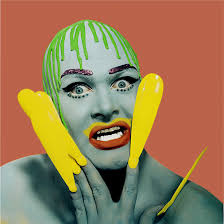
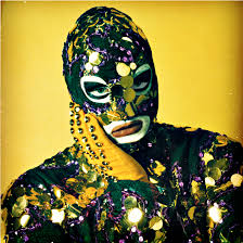
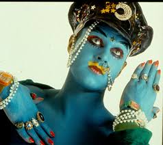
LEIGH BOWERY 

Bowery was born 26 March 1961, he was an Australian performance artist, club promoter and fashion designer. He was mainly known for his bold and interesting looking costumes and makeup in his images. He was mainly based in London during his adult life and inspired many artists, such as Lucian Freud who was a British painter. Bowery states that ‘fashion, where all girls have clear skin, blue eyes, blonde-brown wavy hair and a size 10 figure…STINKS’. He really exaggerated and almost took the mick out of models, applying all the makeup to himself to make himself ‘look like’ the typical model was a big statement in itself, as you can understand what Bowery’s concept of his images are, that girls are expected to have perfect features and alter themselves but it just makes them look stupid and that they should learn to love themselves.

Leigh Bowery over exaggerates the appearance of genders and how they are meant to look to look due to the ‘norms’ made by society. The reasons behind his exaggerations, is to present how ridiculous it is to apply so much ‘cover’ to yourself to hide the real you.

Leigh Bowery, Dazed Digital

I’m choosing Leigh Bowery as my lead artist as I love the way that he exaggerates his makeup and costumes to show hoe ridiculous it is to change yourself to fit the ‘norms’, also his facial expressions show his emotions and it is a contrast between look and emotions. My favorite images by Bowery are;Image result for leigh bowerythe boldness of the lips and the outfit choices and props used makes this image stand out to me as it is so unique. I feel like Bowery’s concept of this image is to show the boldness and extremes that people will go to, to make themselves look a certain way


Plan (MOCK EXAM)

Plan

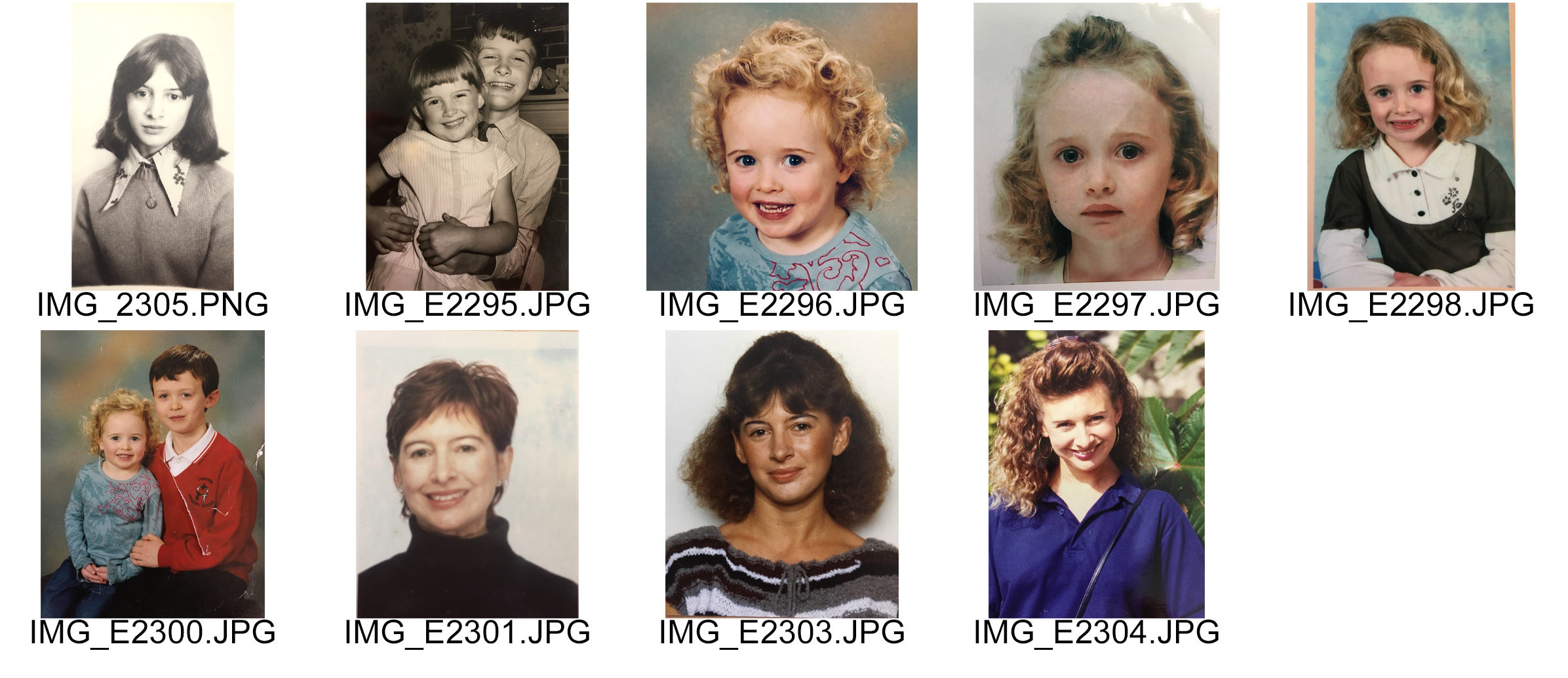
My plan is to create pieces of work based on how a person’s identity is shaped through their upbringing, genes and their parents & family.  I have planned to use archival imagery of my family, in particular my Mum and I, and create a series of photo-montages based on different features and genes which I have inherited from my Mum and also incorporate things that are different between us, such as: different features on the face or hair when we were both growing up. I am interested in physically taking old & new photos, cutting/ripping them apart and putting back together, taking out parts, sewing things in order to create something new out of it. This demonstrates the way in which old traits and genes from parents are passed onto the child and although they become influenced by many different things, their physical and personality traits are mostly  handed down from their parents.

I have found various photos of the two of us when we were aging and growing up. I also found some photos that are eerily similar, despite having been taken 30-40-50 years apart. These are the photos I have used to make my photo-montages from. There is a variety of photos of me, my mum, my uncle & my mum and me & my brother. There are also a variety of black and white, and color photos. Some are passport, school and Polaroid photos, and others  are just simply photos which have been randomly taken. I think this is a good mix to have in order to create more diversity in the photo-montages.

Case Studies

I have done case studies on Annegret Soltau & Joachim Schmidt and I am influenced by their work and the methods they have used in order to create it. Annegret’s timeline of her daughter & grandmothers bodies was thought provoking to me, and I have decided to develop my work along same lines as her. My photos reflect that my mum and I  have done similar things, taken the same photos but just in a different time and with different people, and I want that to be able to be seen through my work.

My Own response to Xavier Ribas

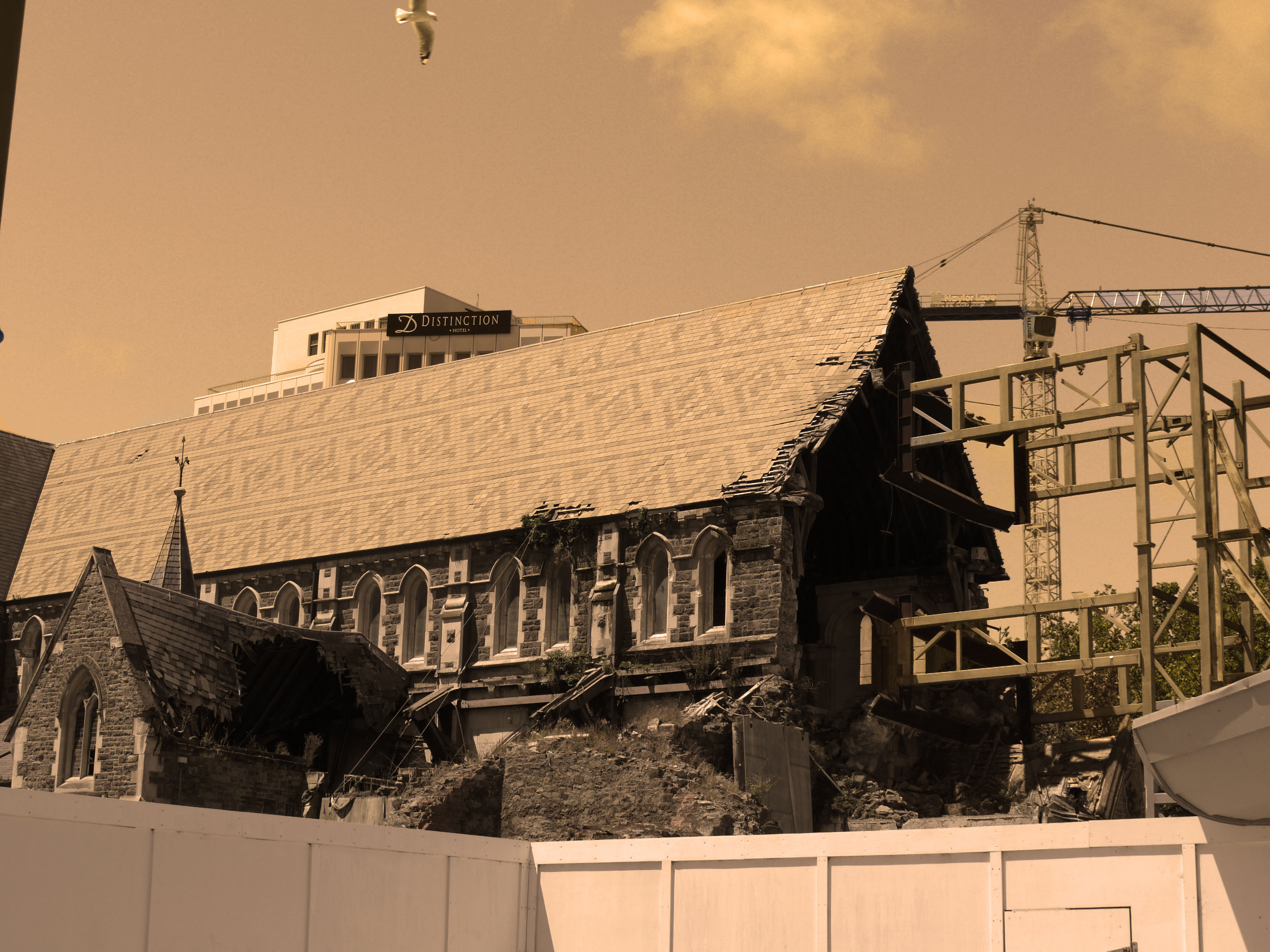
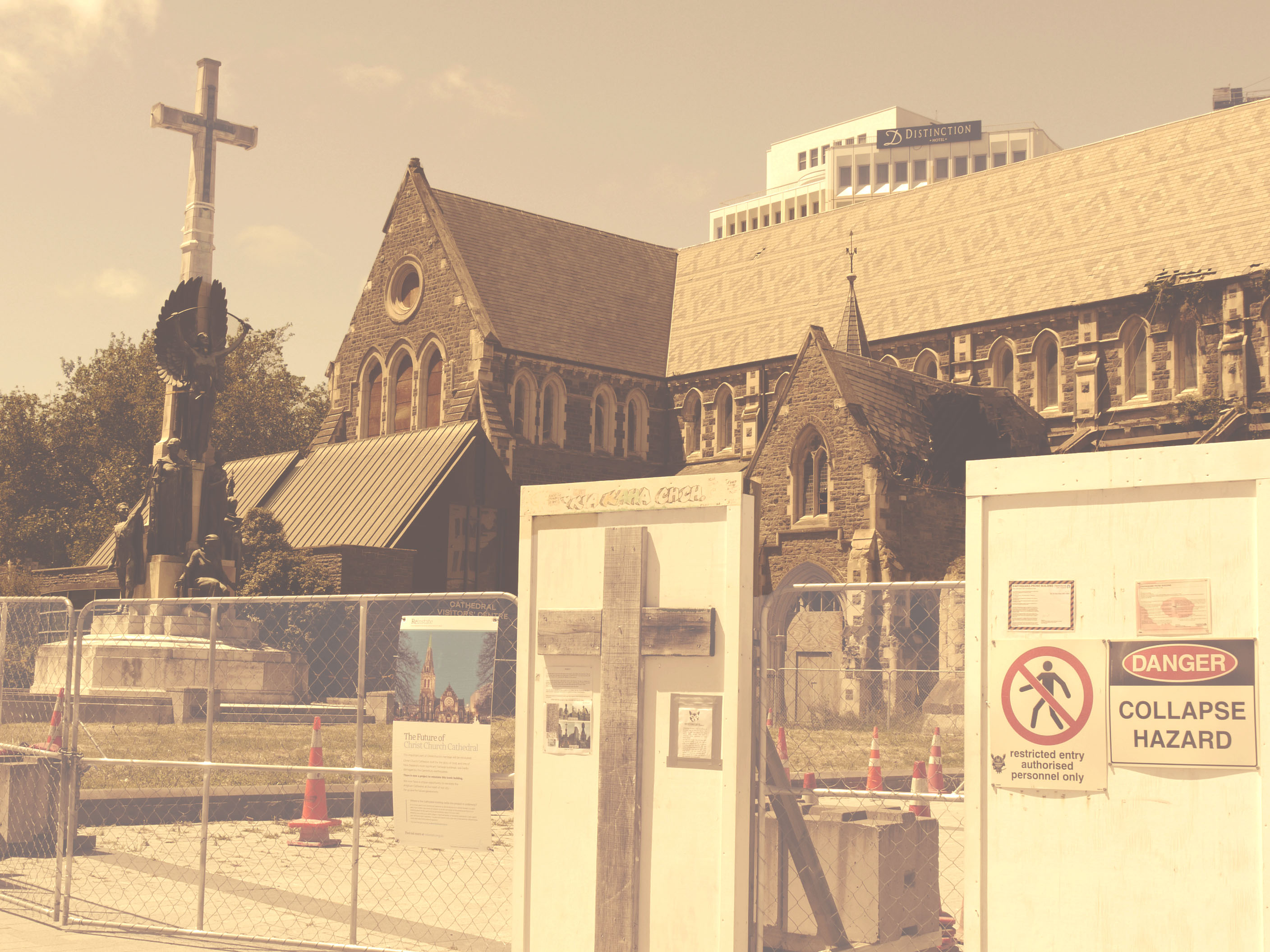
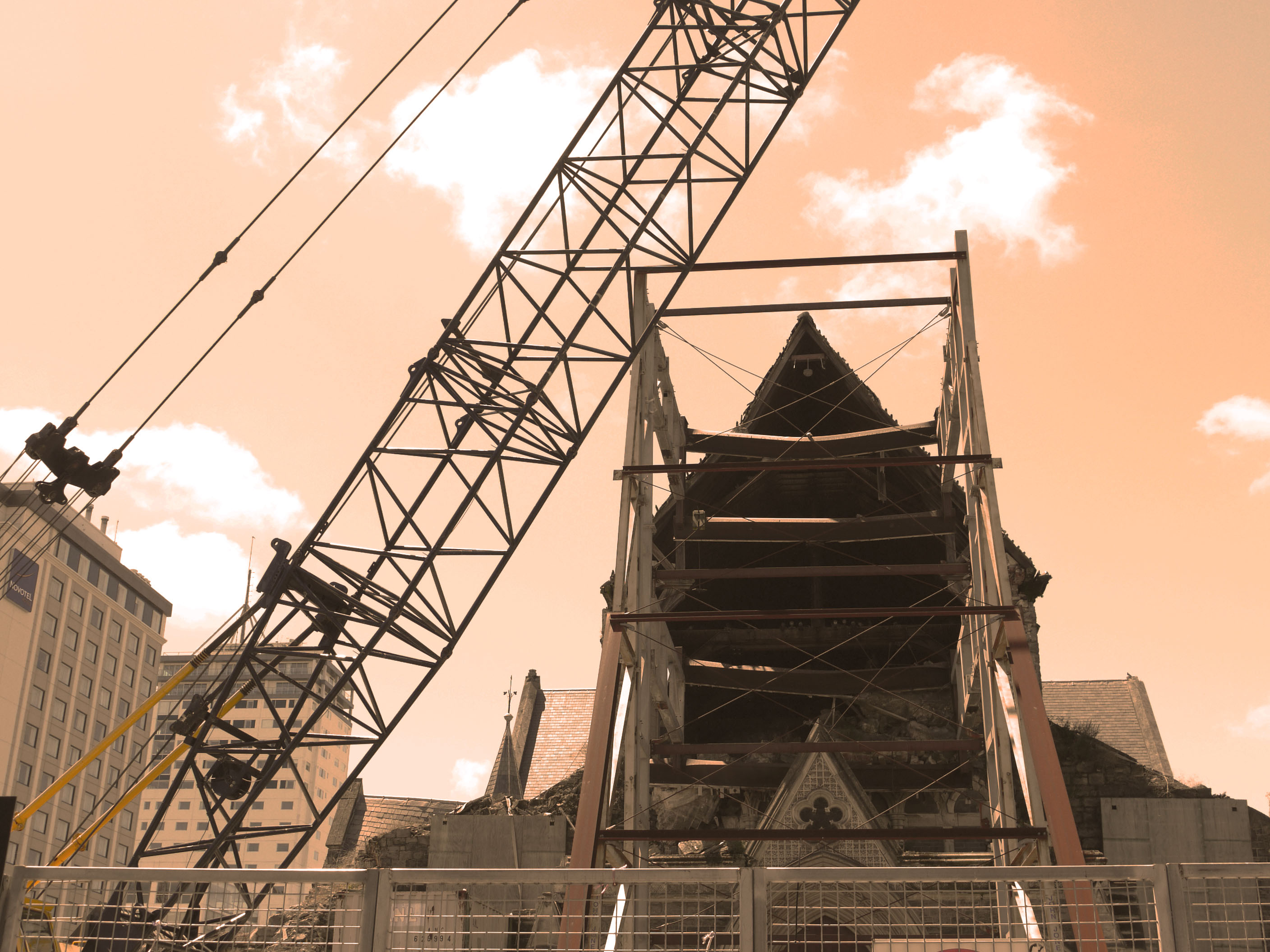
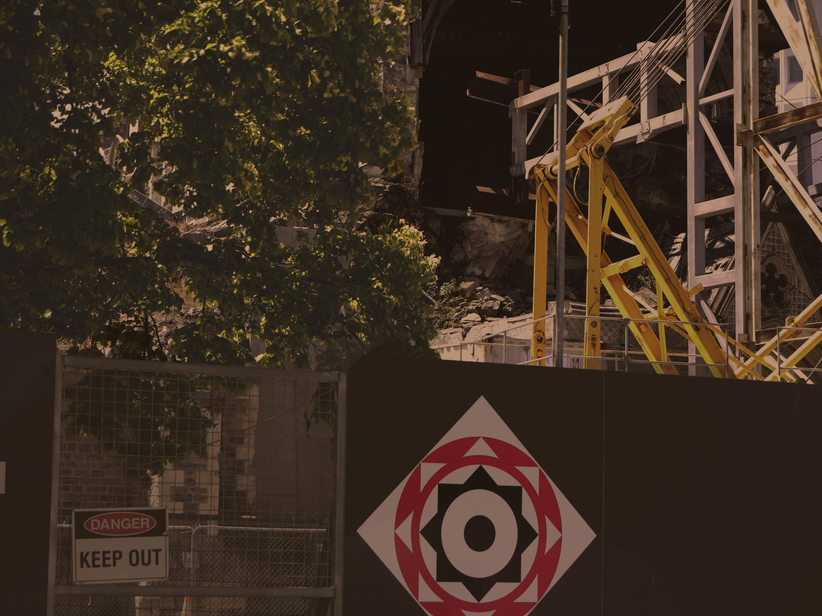
Xavier uses muted yellow tones in his photos which i have tried to replicate on photo shop. Using the image -adjustments tool and then using a different process on each photo.  I looked at the main cathedral in new Zealand when i went there in Christ church and the destruction that the earthquake caused and how the city and nature moves around it with out taking much notice because it has just become normality. This links in well with Xavier's work because its all about how society just molds and grows round destruction and damage

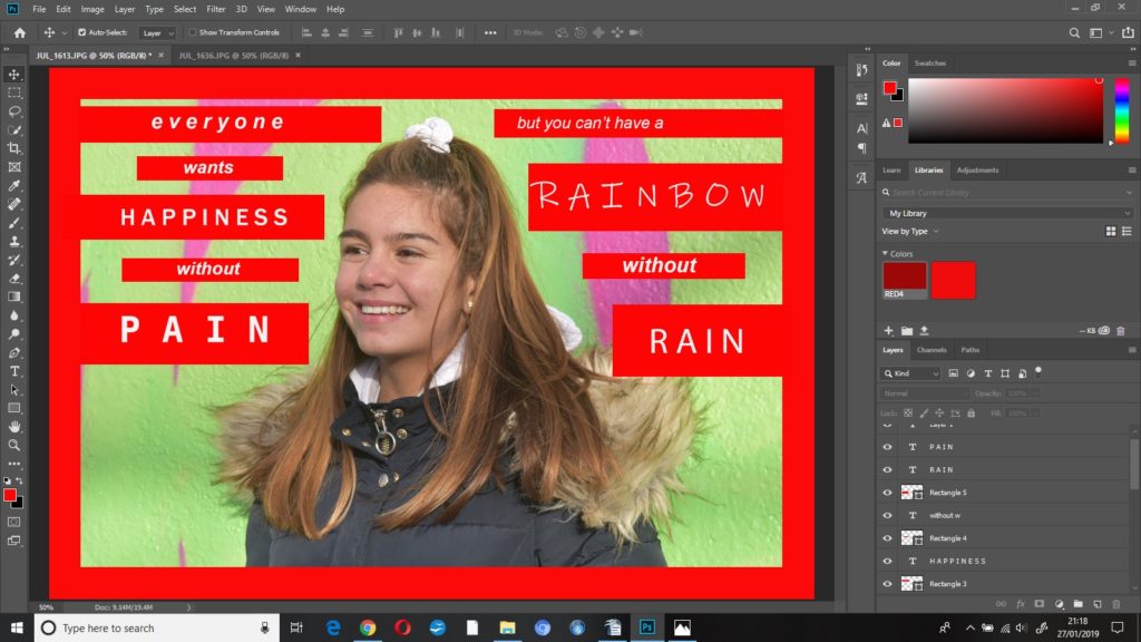
Response to Barbara Kruger

Barbara Kruger generally uses black and white photographs with heavy contrast as her background layer underneath bold red text boxes usually stating strong, somewhat controversial lines.

As I knew beforehand that I was going to be editing these images more than I usually would, I wanted to use natural lighting portraits as my background to even that out.

Although Kruger doesn’t use her photos as a ‘series’ I did want to use mine this way, whilst also addressing some topics that I’m extremely passionate about – the effects of mental illness, abuse, and the stigma that inevitably follows. 

Editing

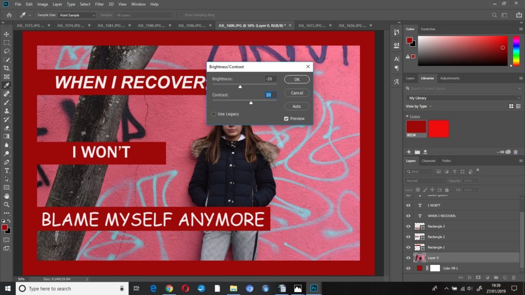
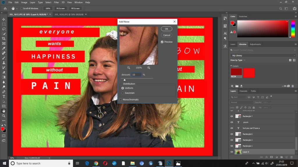
first edit: when i recover; i won’t blame myself anymore

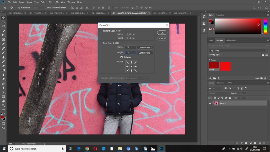
The first thing I did to this image was increase the canvas size so that I could then create the thick red border around the image – I increased the height and width to 1.5cm after a bit of trial and error to see which thickness I thought appeared best.

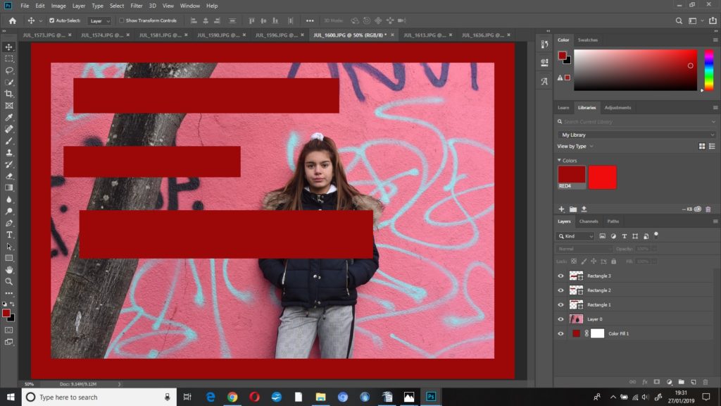
I created a ‘colour fill’ layer and dragged that underneath ‘layer 0’ in the layers column. I used the rectangle tool to create some rectangles, filled with the same shade red as the border, where I wanted the text to go.

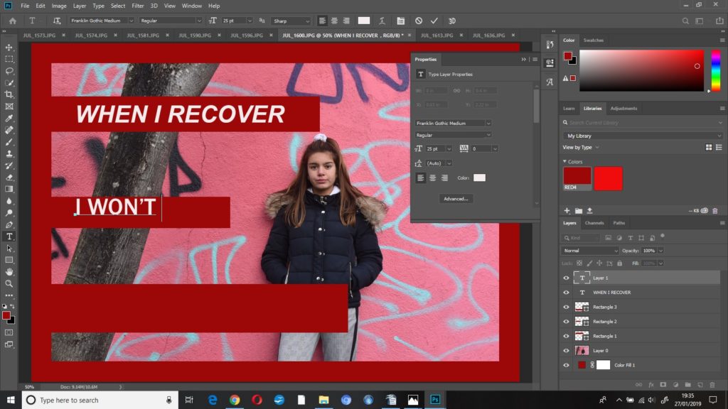
I used the horizontal text tool to then place the text where I wanted it – I opened the ‘properties’ panel to adjust the font, size and colour of the text.

I then started to edit my photograph. I decreased the brightness to -20 and increased the contrast to +20. This made the whole image a bit darker but the colours a bit brighter – I did this so that when I put the image into black and white, I’d know which parts of the image were going to be darker and which were going to be lighter.

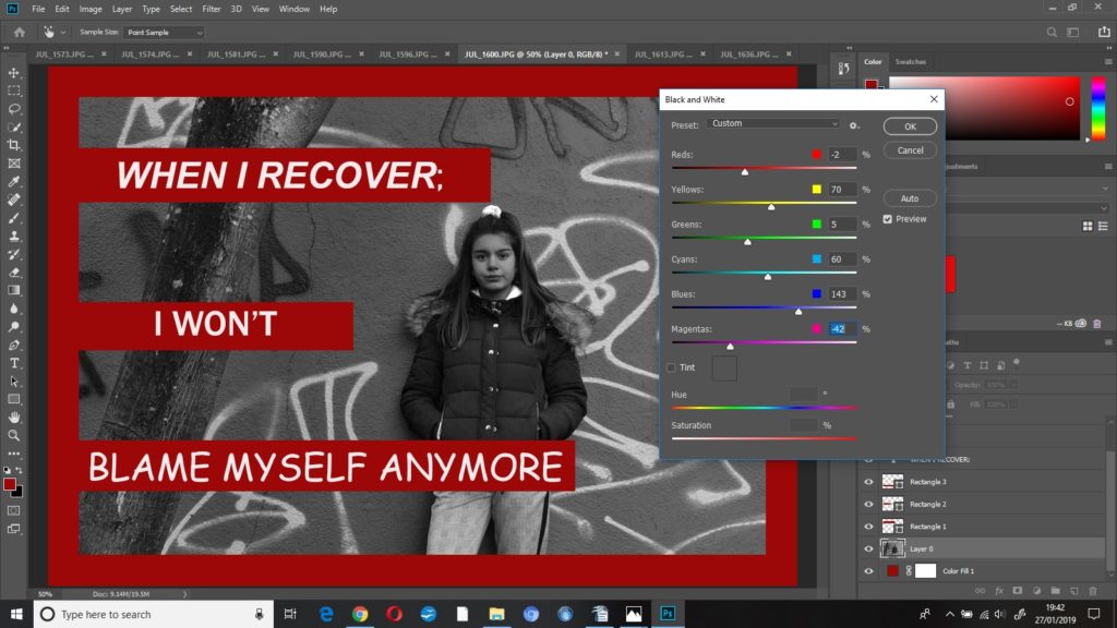
I put the photo into black and white, but I played around with some of the colour settings until the photo looked how I wanted it to look, this resulted in;

reds -2%

blues 143%

magentas -42%

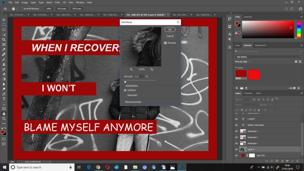
I added some grain ((noise)) to this image to make it look more dramatic and give it some harsher editing, I increased the noise to 5.5% .

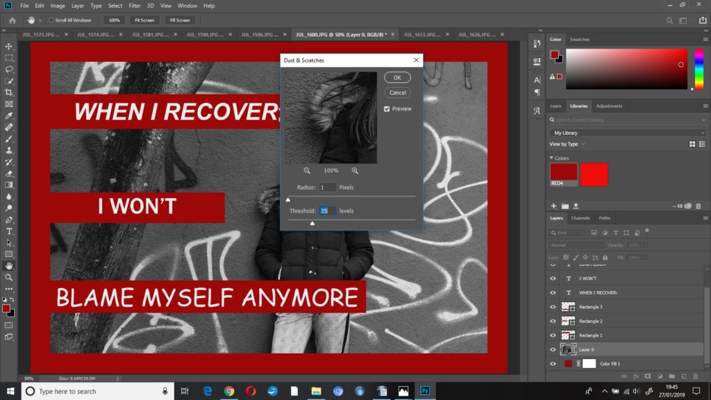
To finish this edit I added some dust and scratches, I left radius at 1 pixel and increased threshold to 35 levels.

second edit; you can’t have a rainbow, without a little pain

I started this edit by doing the same as the previous with the red border and text, however I used a brighter, more vibrant red as this was a more positive photo.

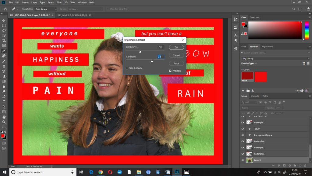
I started editing this image by decreasing the brightness to -40 and increasing the contrast to +40, I wanted the background to appear brighter, and as the subjects skin tone was slightly washed out, I decreased the brightness.

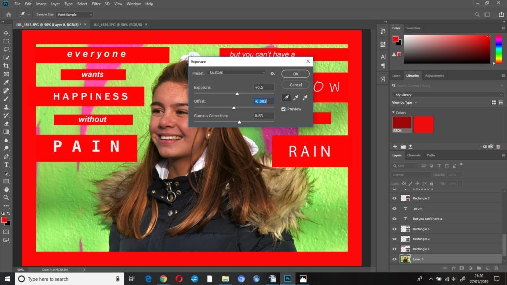
I kept adjusting the exposure settings until I was happy with how the photo was looking, the final settings were:

exposure +0.5

offset -0.002

gamma correction 0.83

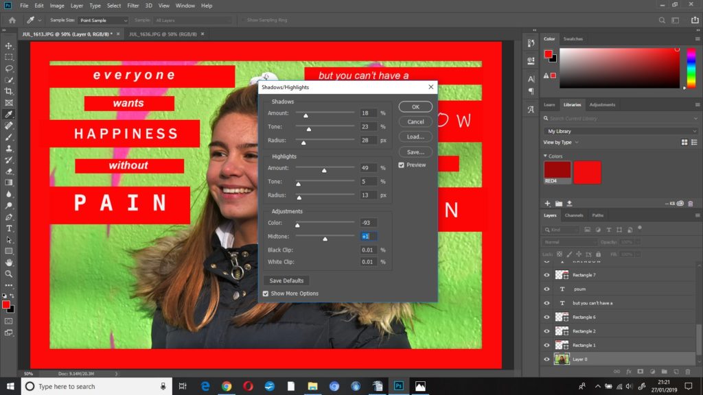
I changed some of the settings in shadows/highlights:

shadows

amount 18%

tone 23%

radius 28

highlights

amount 49%

radius 13

adjustments 

colour -93%

midtones +1

To finish this edit I added noise at 10%, uniform.

Street Photography

Street photography, also sometimes called candid photography, is photography conducted for art or enquiry that features unmediated chance encounters and random incidents within public places. Although there is a difference between street and candid photography, it is usually subtle with most street photography being candid in nature and some candid photography being classifiable as street photography. Street photography does not necessitate the presence of a street or even the urban environment. Though people usually feature directly, street photography might be absent of people and can be of an object or environment where the image projects a decidedly human character in facsimile or aesthetic.

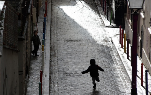
Image result for absent of people street photography  Image result for absent of people street photography

The photographer is an armed version of the solitary walker reconnoitering, stalking, cruising the urban inferno, the voyeuristic stroller who discovers the city as a landscape of voluptuous extremes. Adept of the joys of watching, connoisseur of empathy, the flâneur finds the world “picturesque”.


The street photographer can be seen as an extension of the flâneur, an observer of the streets (who was often a writer or artist).


Framing and timing can be key aspects of the craft with the aim of some street photography being to create images at a decisive or poignant moment.Image result for framing street photography

Street photography can focus on people and their behavior in public, thereby also recording people’s history. This motivation entails having also to navigate or negotiate changing expectations and laws of privacy, security and property. In this respect the street photographer is similar to social documentary photographers or photojournalists who also work in public places, but with the aim of capturing newsworthy events; any of these photographers’ images may capture people and property visible within or from public places. The existence of services like Google Street View, recording public space at a massive scale, and the burgeoning trend of self-photography (selfies), further complicate ethical issues reflected in attitudes to street photography.Image result for ethical issues street photography
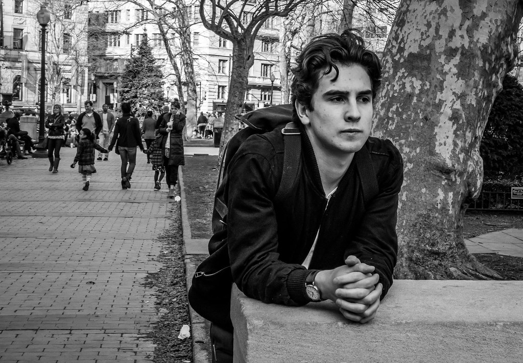
Much of what is regarded, stylistically and subjectively, as definitive street photography was made in the era spanning the end of the 19th century through to the late 1970s, a period which saw the emergence of portable cameras that enabled candid photography in public places.

experimenting with street photography:

as i was not able to go to town with the class i burrowed a camera from school and went to the schools street and starting taking pictures of people passing through the street while to trying to surprise them to get good reactions in the photographs, and this is what i came up with with:
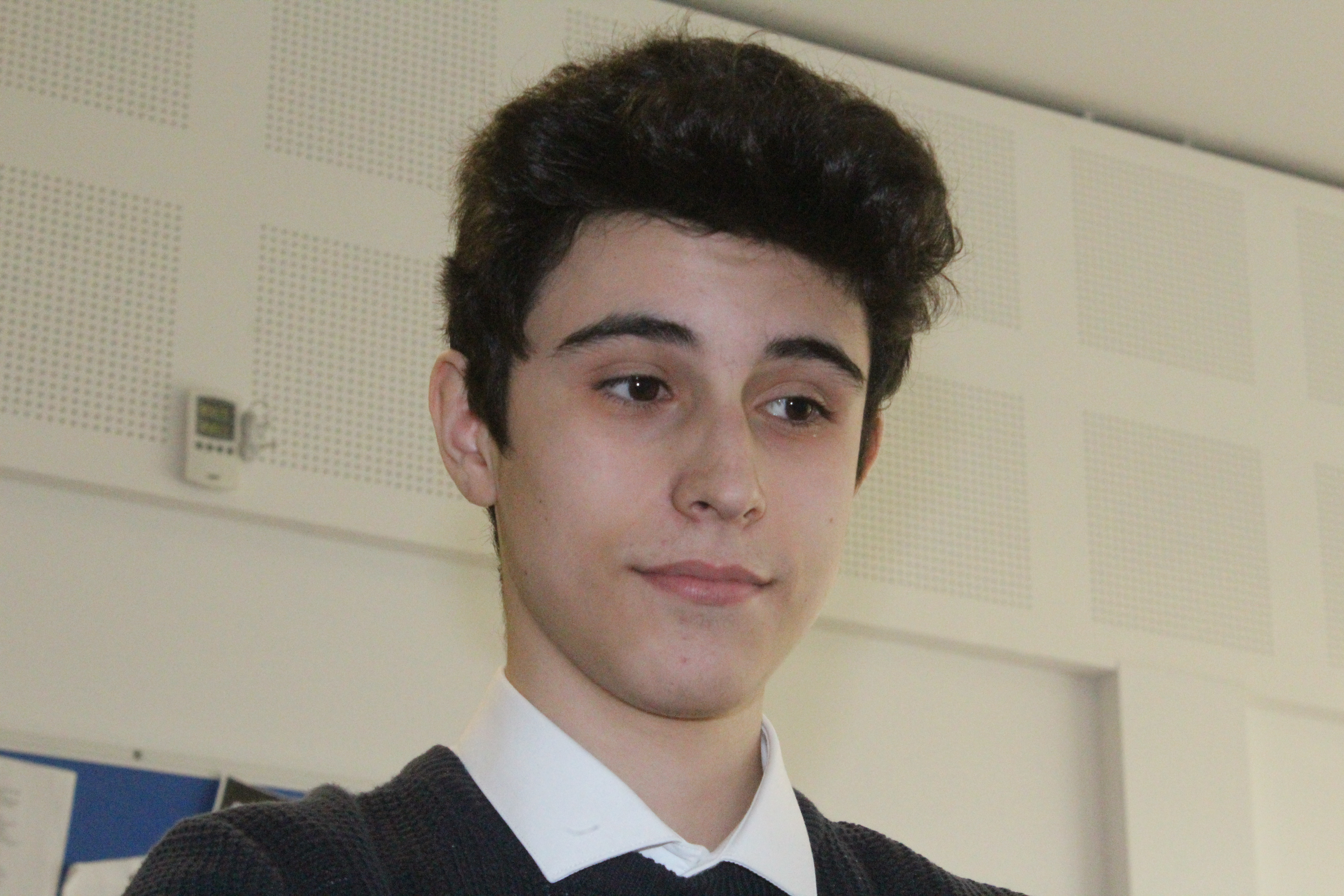
In this photograph i took it without letting the person realize so i had to turn off the flash and that’s why the photograph is a bit dim, although the face expression of this student is quite interesting.
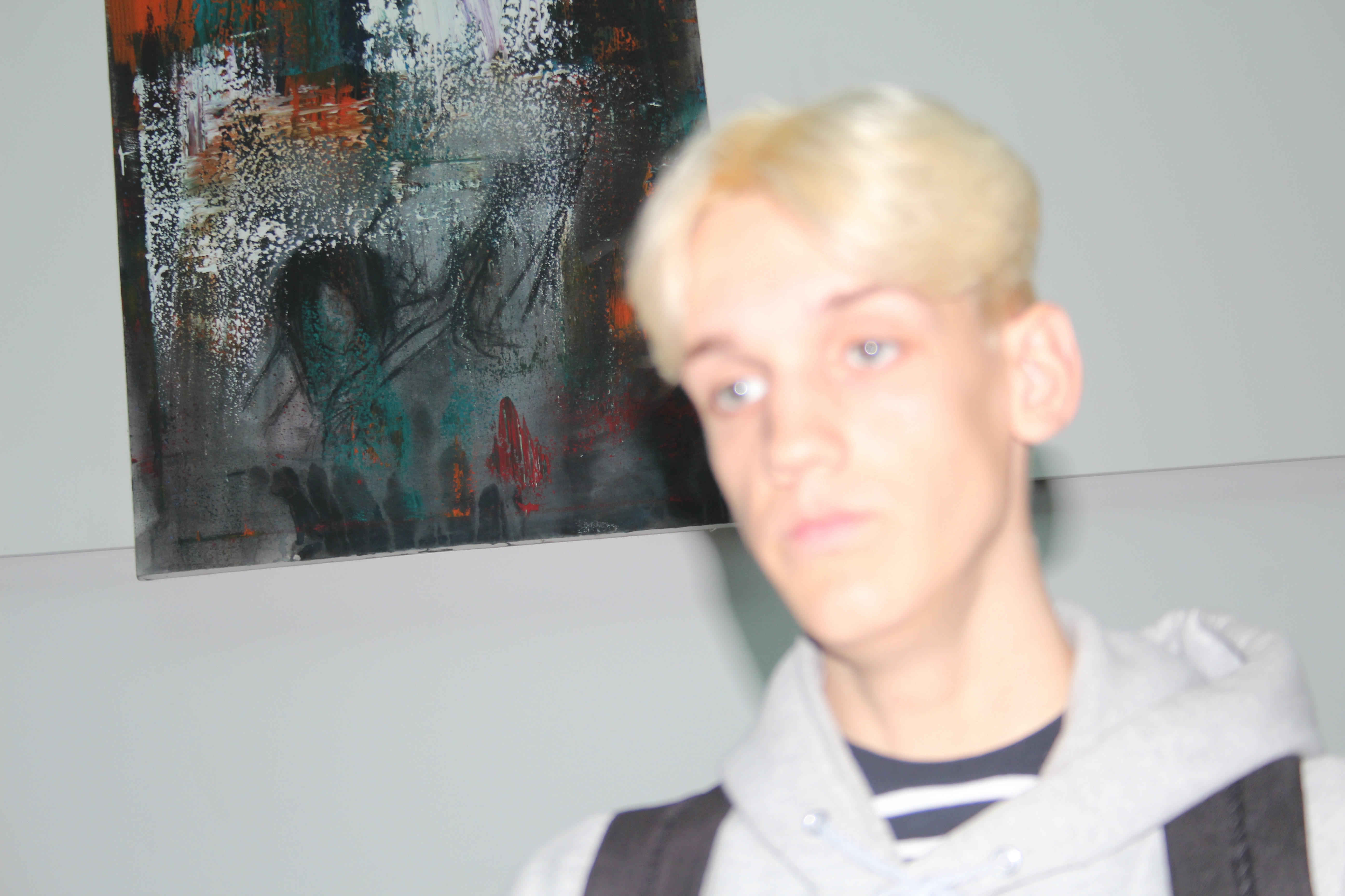
I took this photograph partially by mistake, this person was passing bu and my camera wasn’t setup yet so i didn’t know what the settings was on but i took it quickly anyways and while going through my photos it caught my eye. the brightness is so high and it wasn’t focused. and i didn’t adjust the white balance, but it did turn out quite interesting.
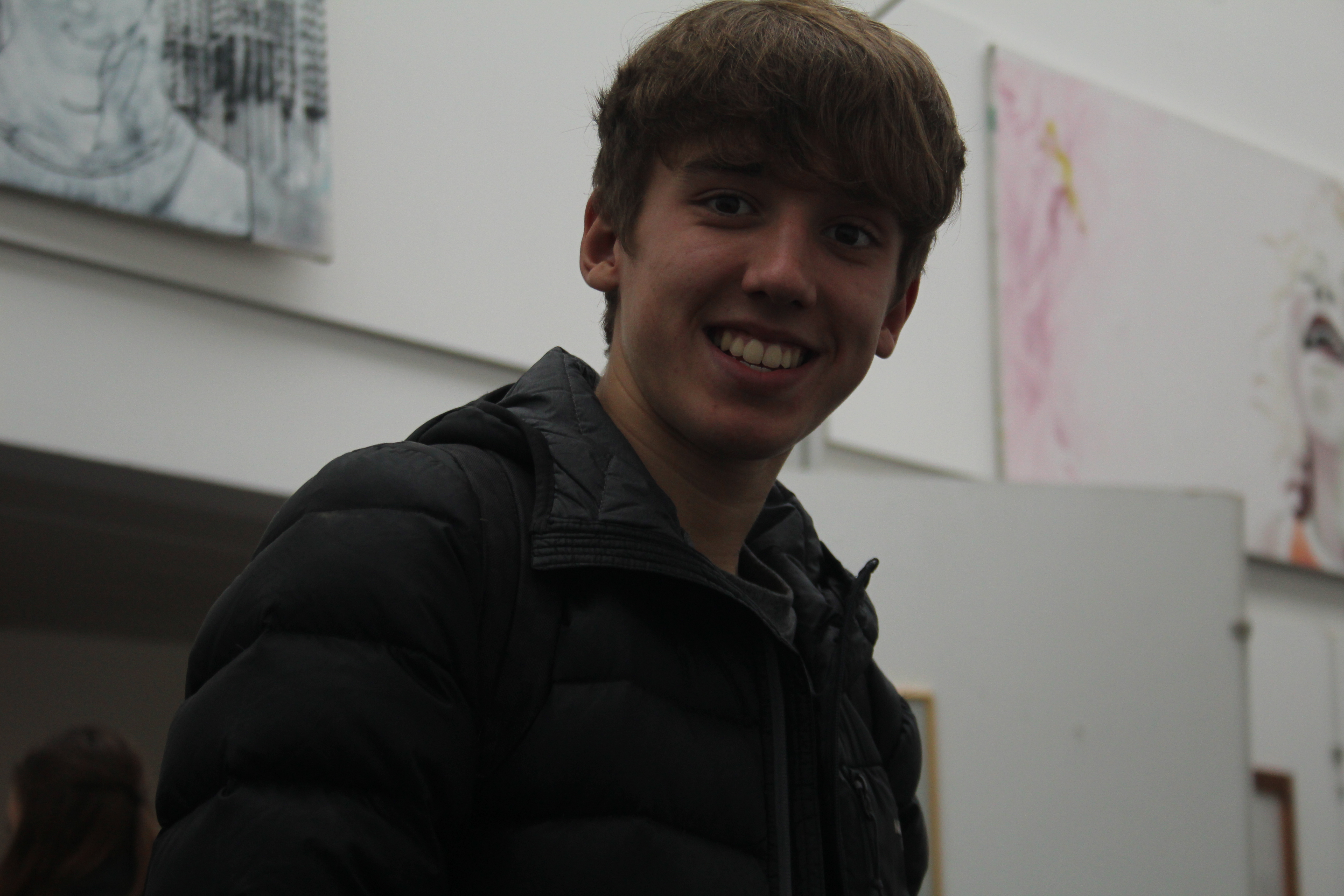
I tried to take this photograph without the persons notice but seconds before the shutter closed he looked and laughed, this made him look as if he was smiling for the camera although the photograph is very dim and that’s due to the lack of flash.
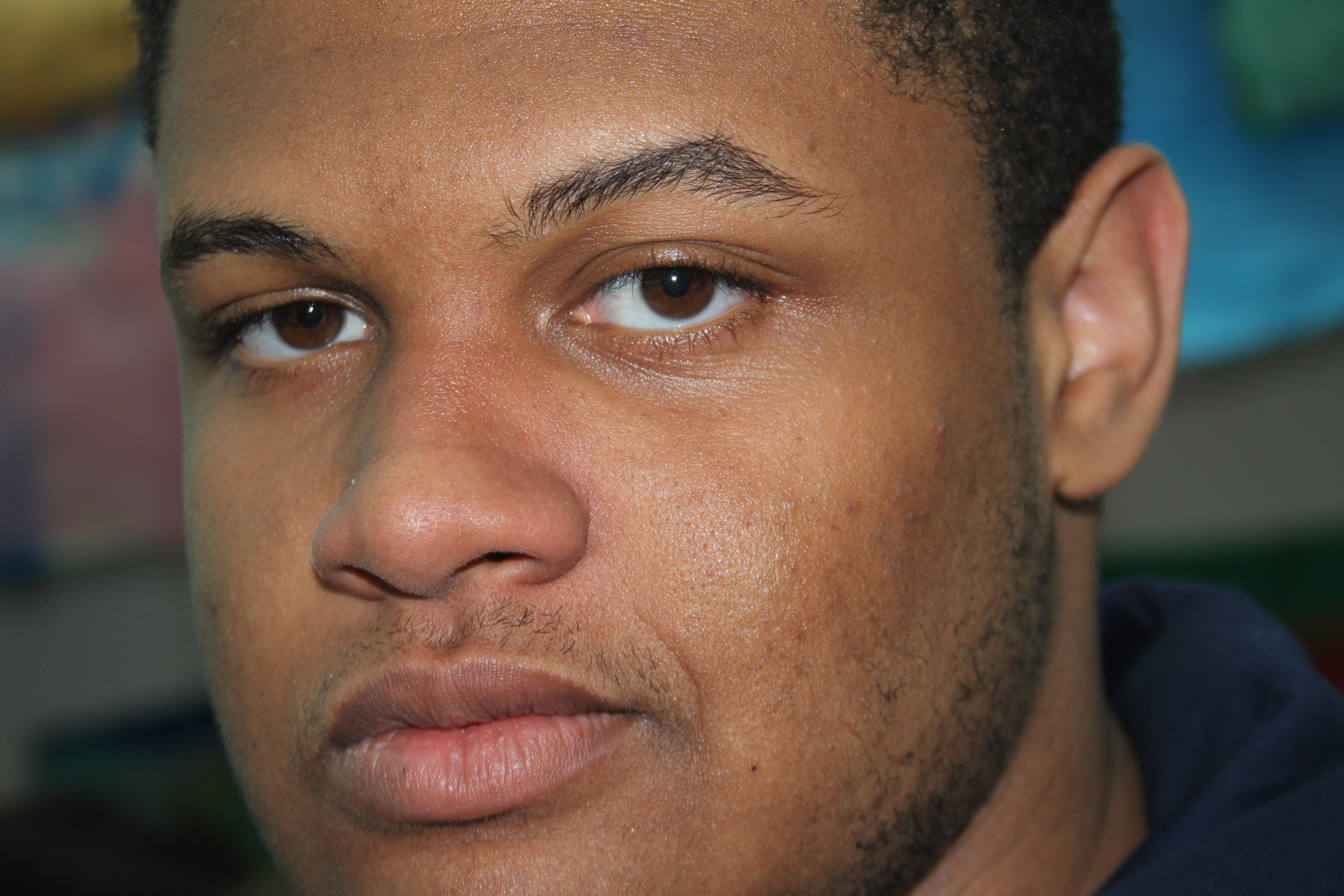
i took this photograph while the person was looking at the camera but made it quick so i wouldn’t lose his reaction. and the flash along with the fast shutter speed created a highly bright photo.
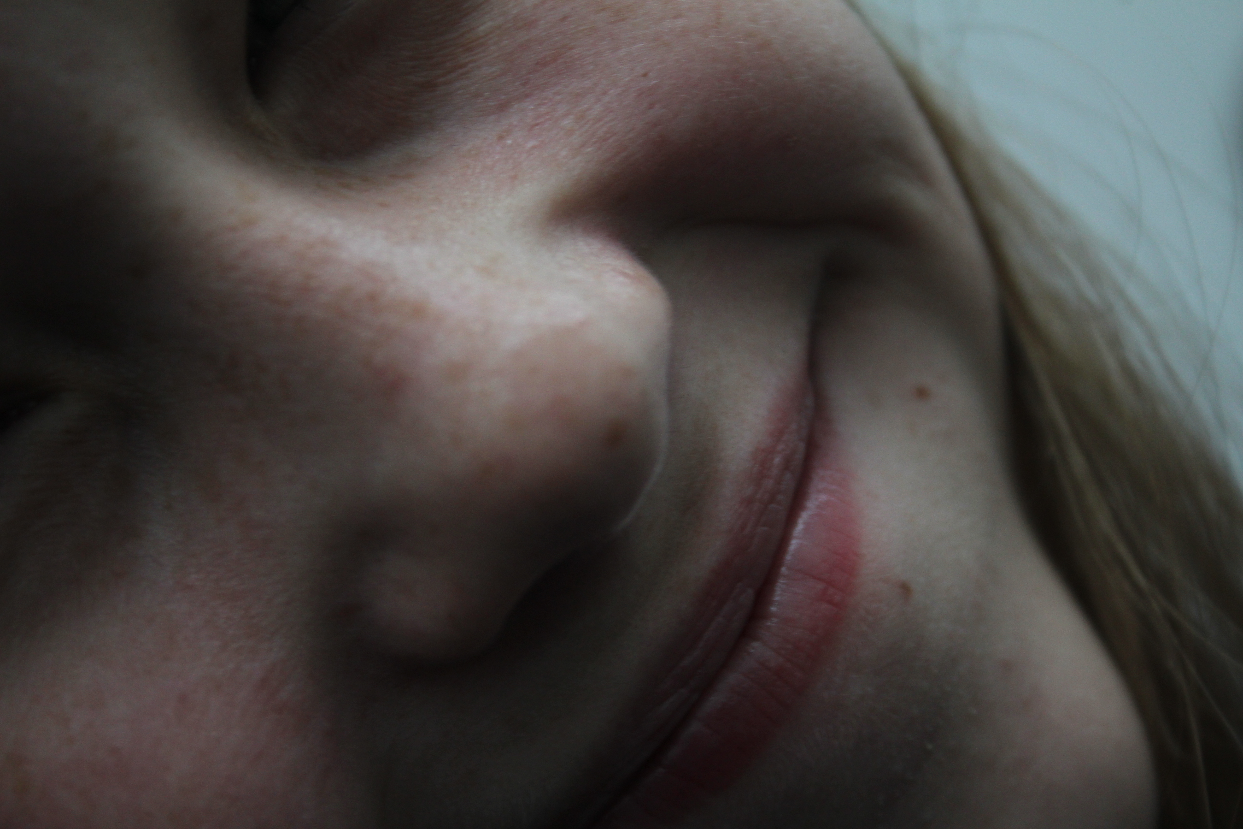
I took the photograph without flash while it was fully zoomed in so almost only her smile and nose are visible.
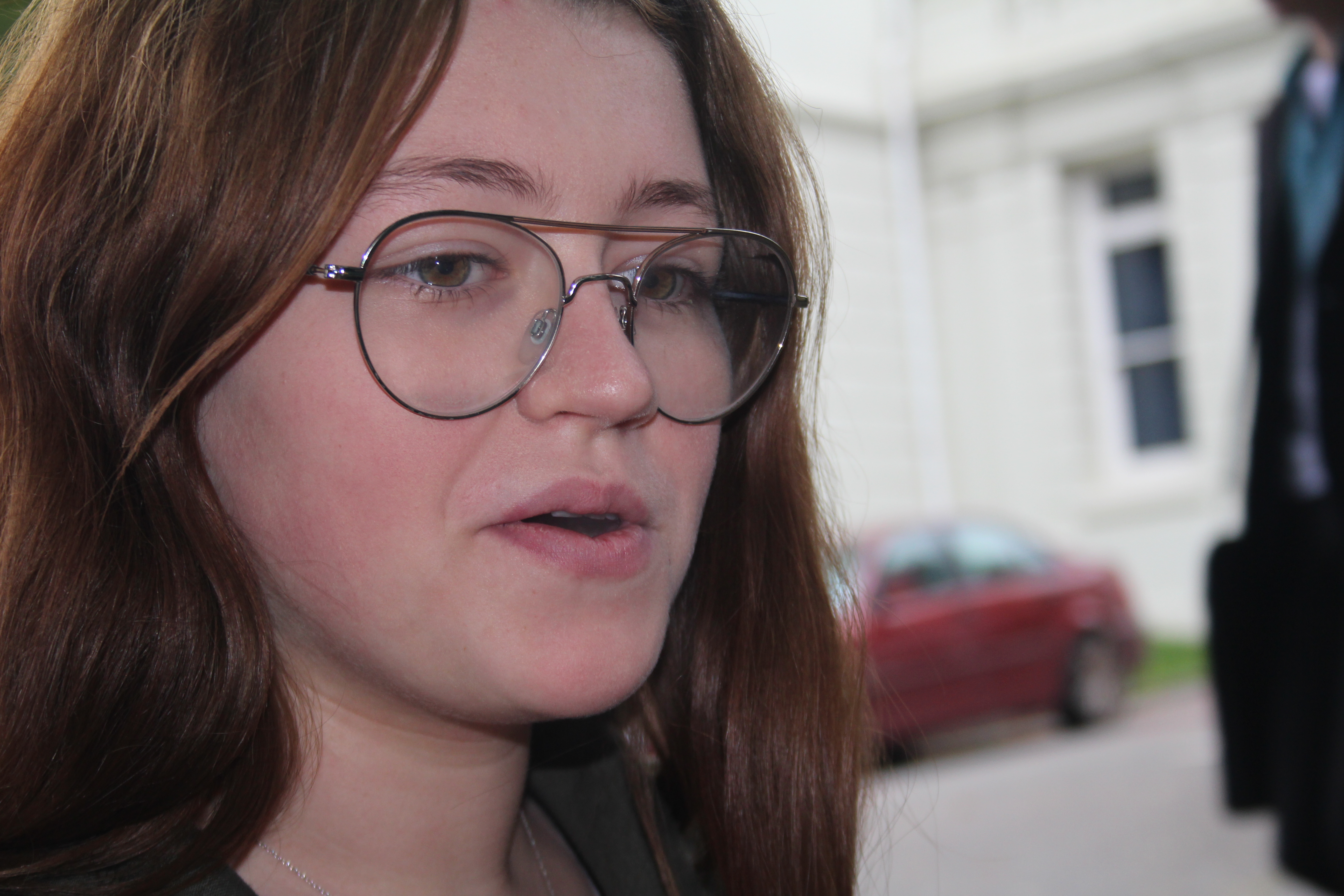
I took this photograph of a person in the smoking area while they were busy doing other stuff so weren’t paying attention to the camera which created a photography with an anonymous definition.
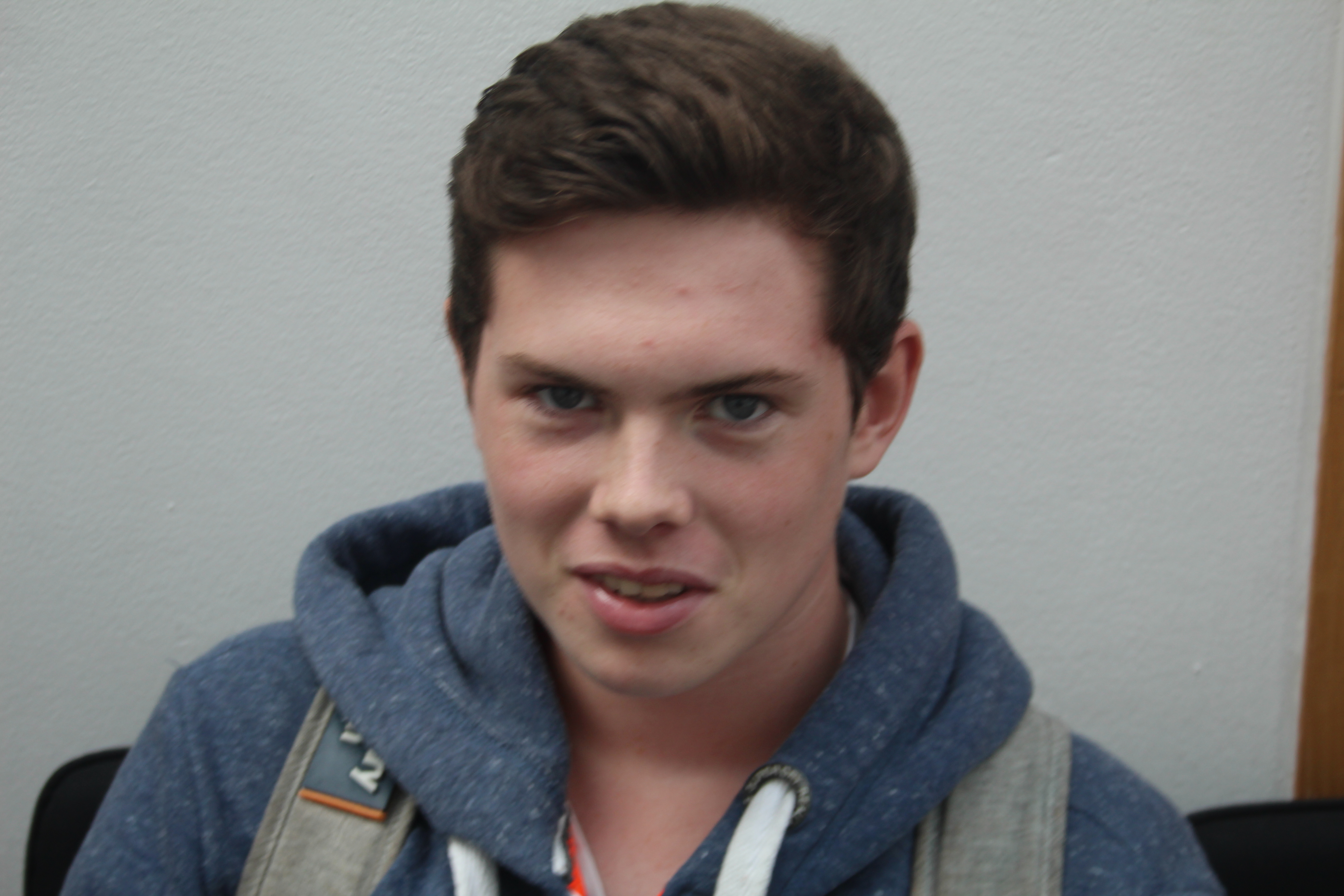
This photograph was taken so quickly that it caught the reaction of the person between changing it from one reaction to another.
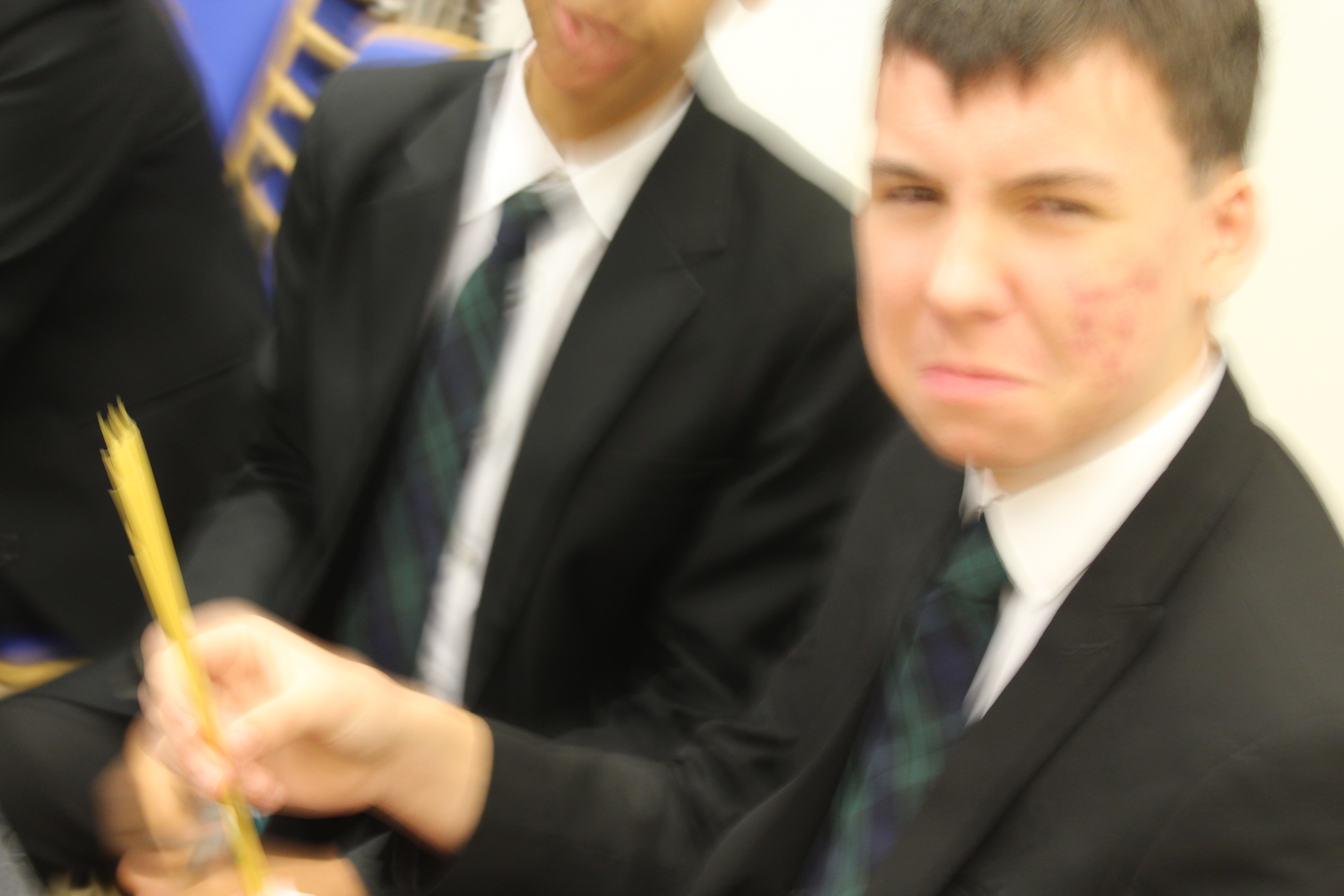
I took this photograph while this person was doing a pasta competition so they were angry that i was distracting them which created a good photo with an interesting face expression. Also the settings was on low shutter speed which created some movement in the photograph.
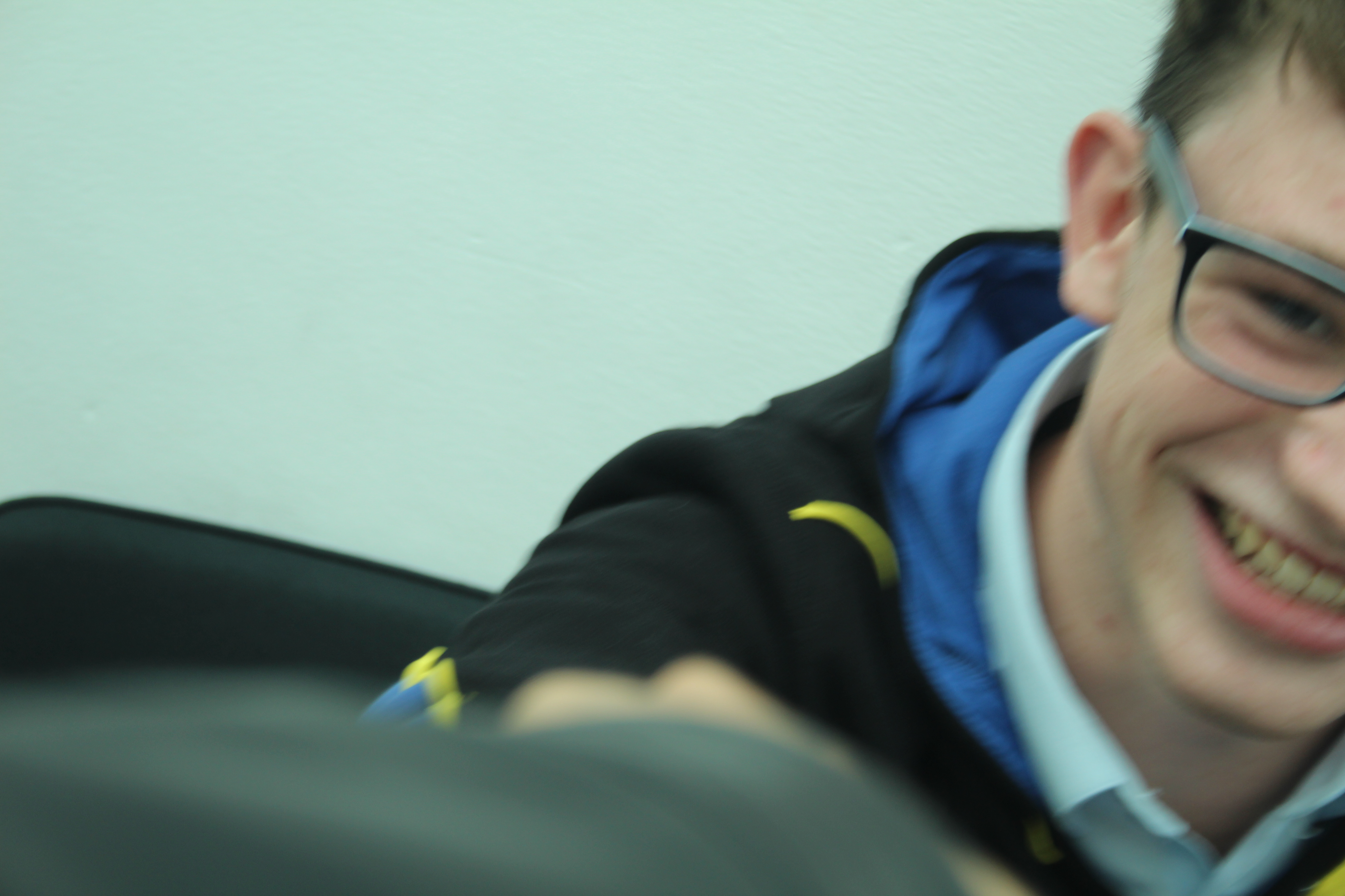
I took this photograph right after i told the person in it a joke so i had to take it quickly before he loses his reaction so due to the lack of time to set up the cameras position it only took half of the persons face which still created an interesting photograph so i decided to put it on my blog anyways.
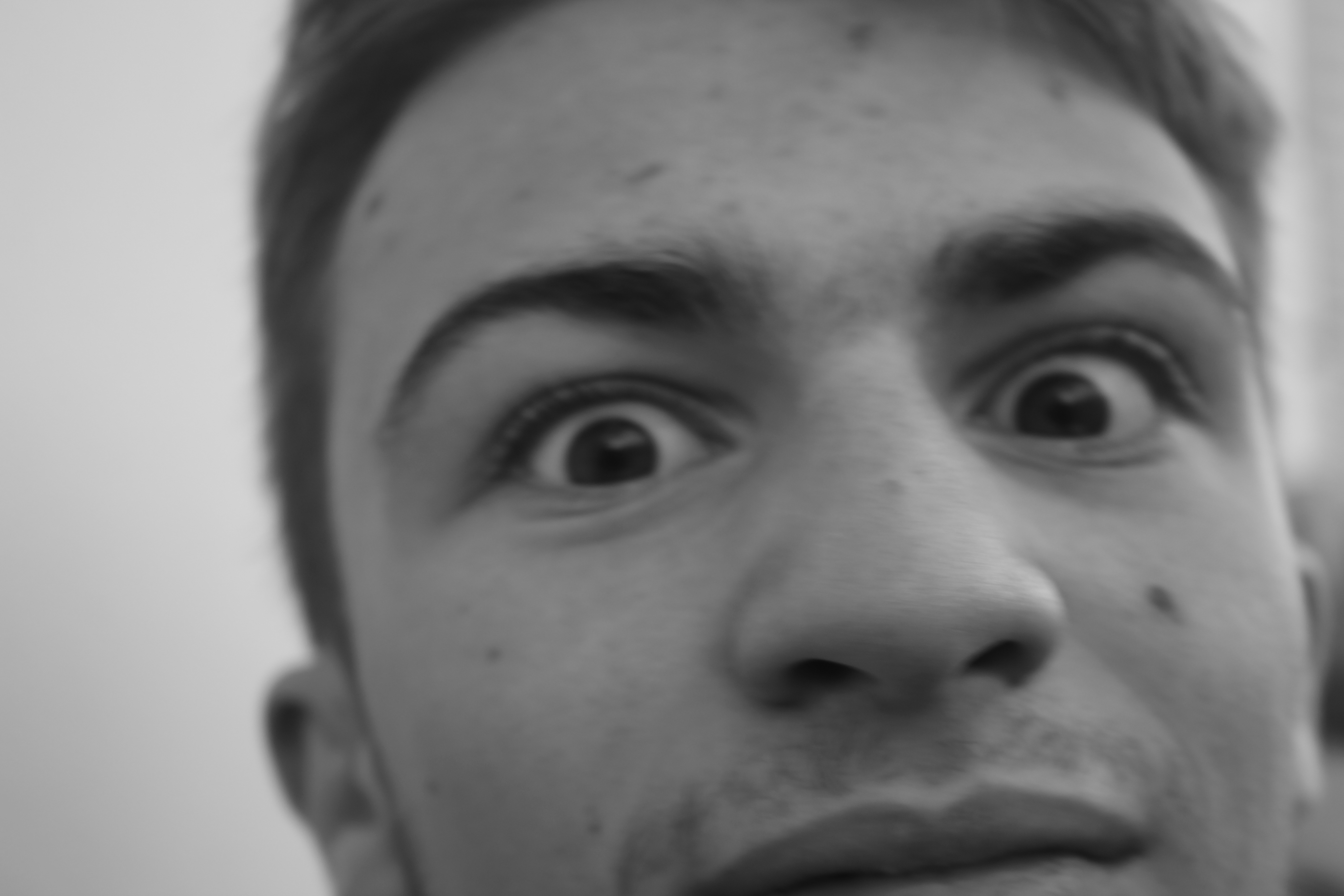
I took this photograph of this students face expression with black and white settings and no flash light.
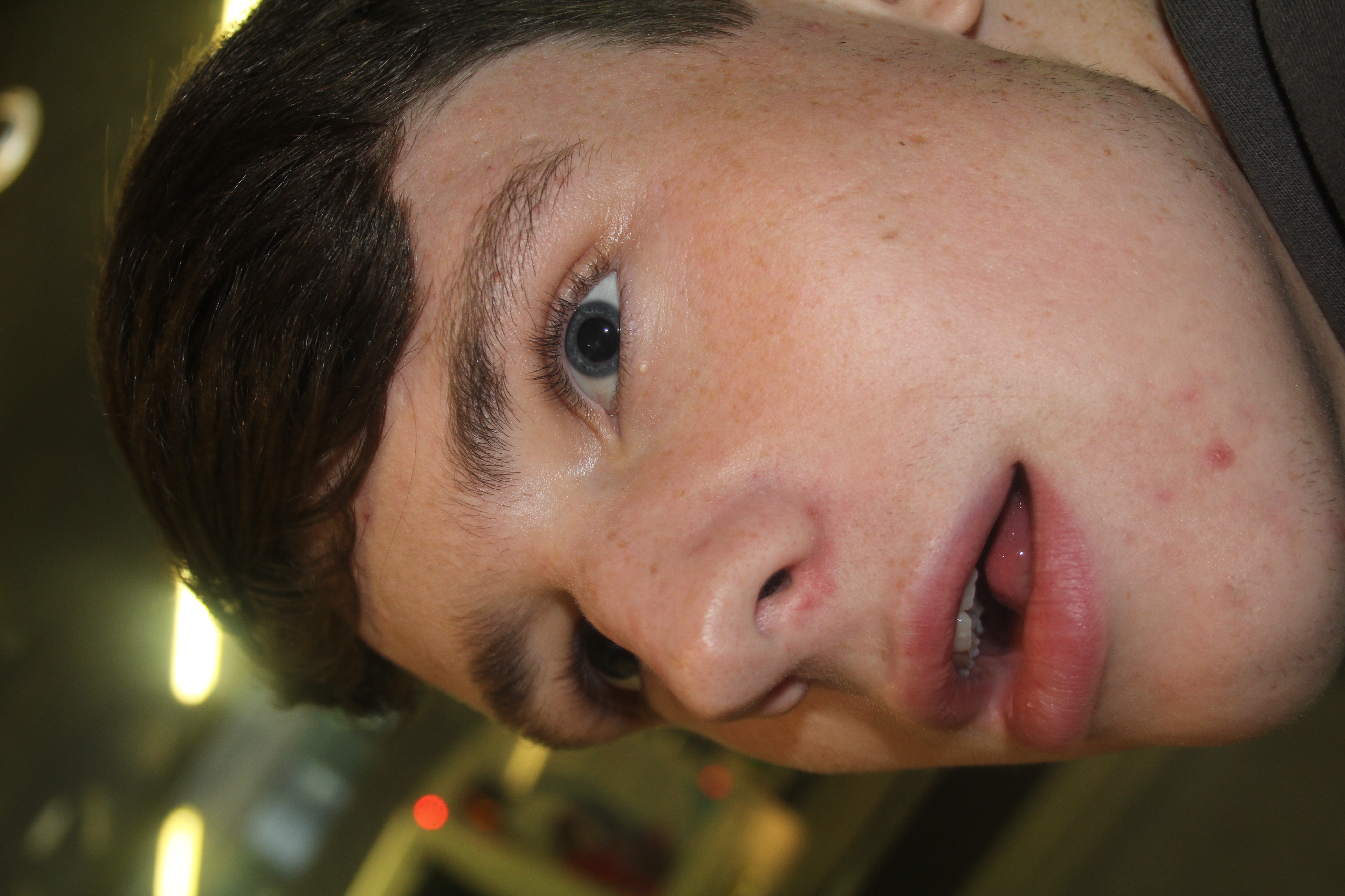
This photograph was taken meanwhile the person was busy talking to another person.