
LOSS OF IDENTITY IMAGES
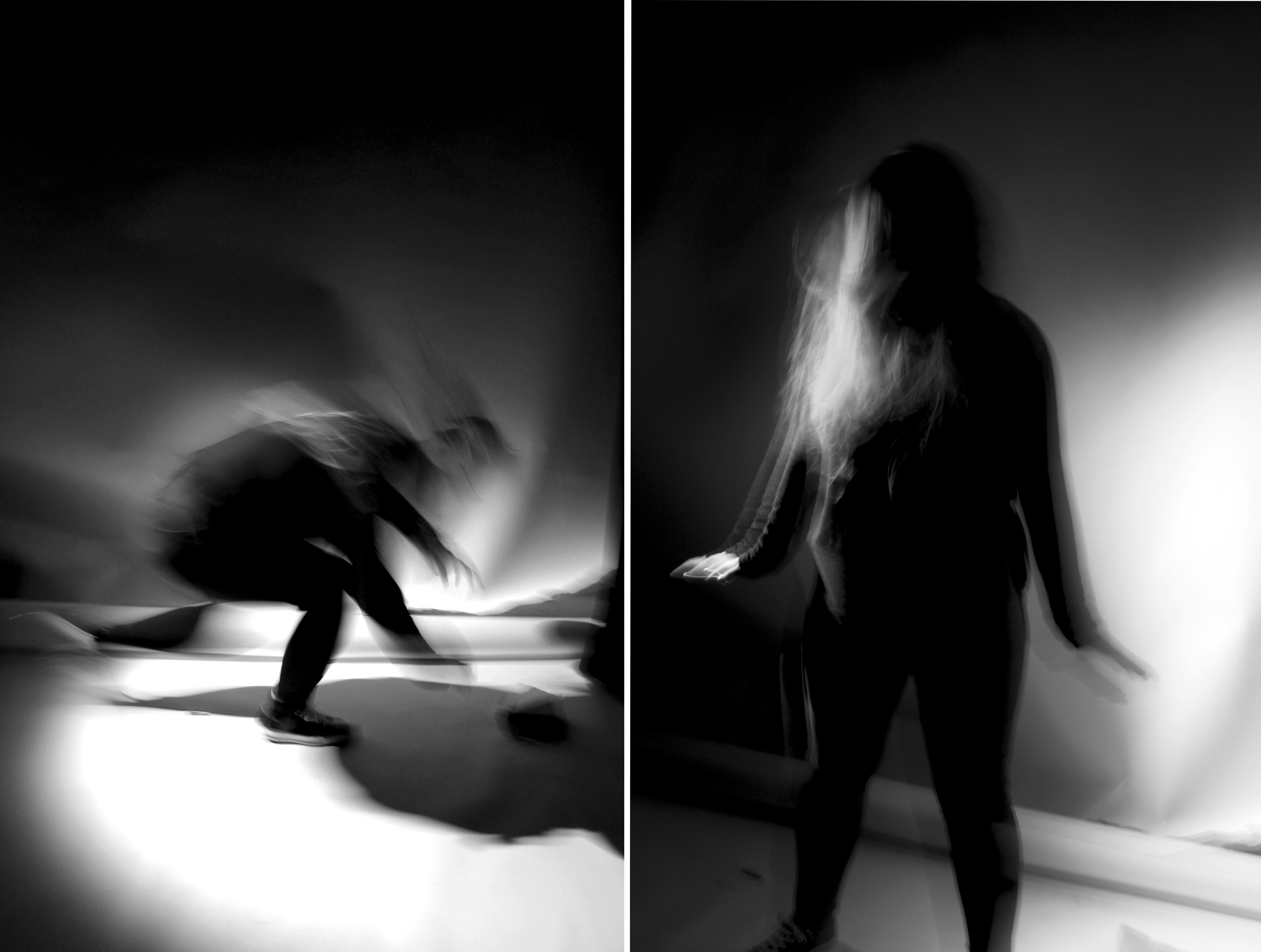
I chose this as one of my final outcomes because it responds to Francesca Woodman’s photography and the theme ‘loss of identity’. I decided to join these two images side by side since together they would create a visually interesting outcome. Both images respond to ‘loss of identity’ because her facial features are hidden through movement. The rapid movement emphasises loss of identity since she appears lost and confused through motion blur. The black and white filter creates a dramatic and choatic atmosphere to the image since the shadows and highlights are exaggerated through contrast. I am printing this image in A5 because Francesca Woodman’s images exaggerate fragility by the fact that the photographs are printed on a very small scale. I want to create the same personal and intimate effect.
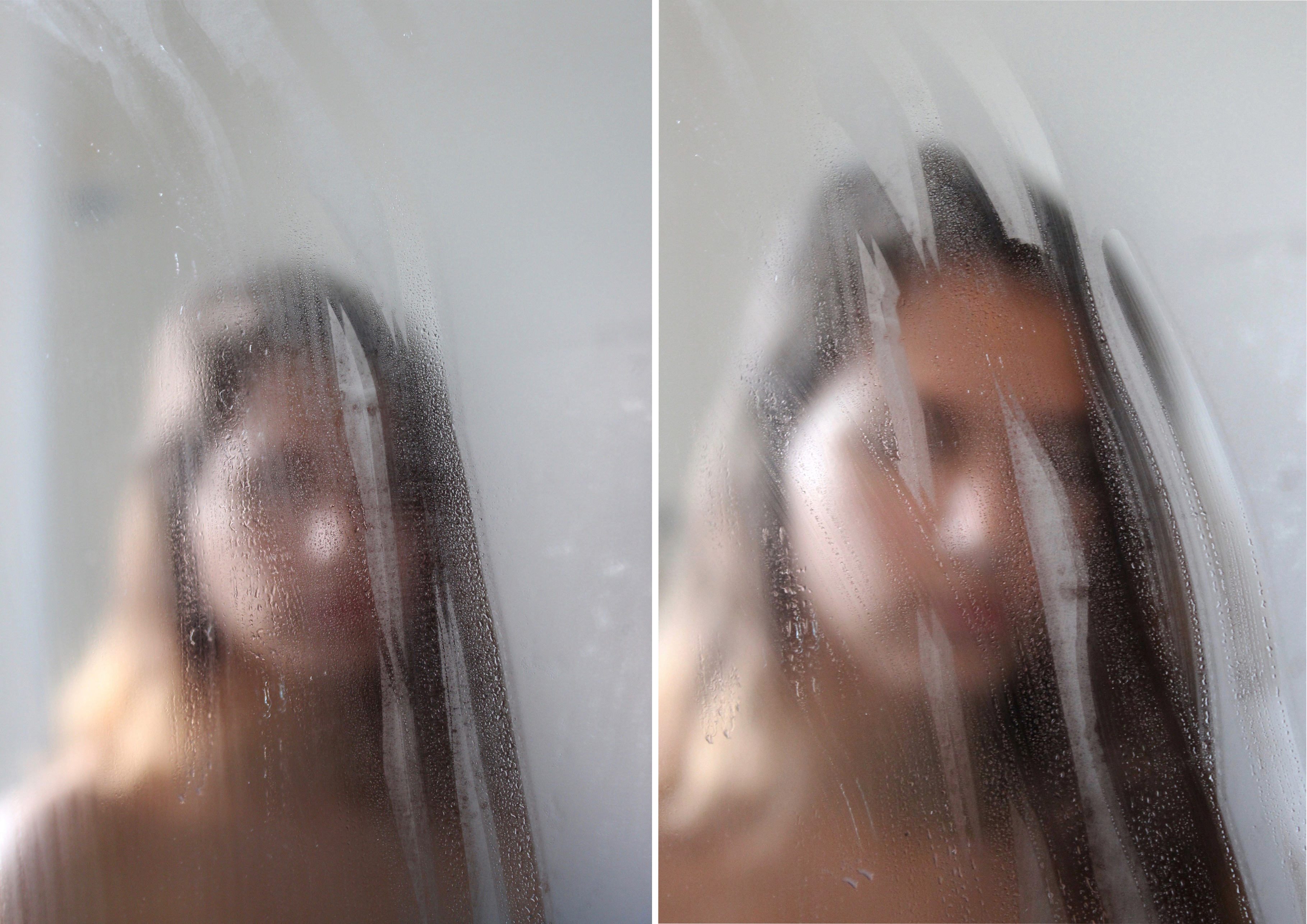
I chose this as one of my final outcomes because it responds the photographer Isabella Madrid. Although these two images are similar the subject is in a different position. This outcome relates to ‘loss of identity’ because the subject’s facial features have been hidden by the steam on the mirror. These two images have been placed side by side to show the different hand marks on the mirror and to make the outcome more visually interesting. I think I have successfully responded to Isabella Madrid’s photography work because I have replicated her style which can be seen through this outcome: simple images that convey a sense of being lost with ones own identity. I have chosen this to be printed on A4 since I believe that it would be a reasonable size for these two images.
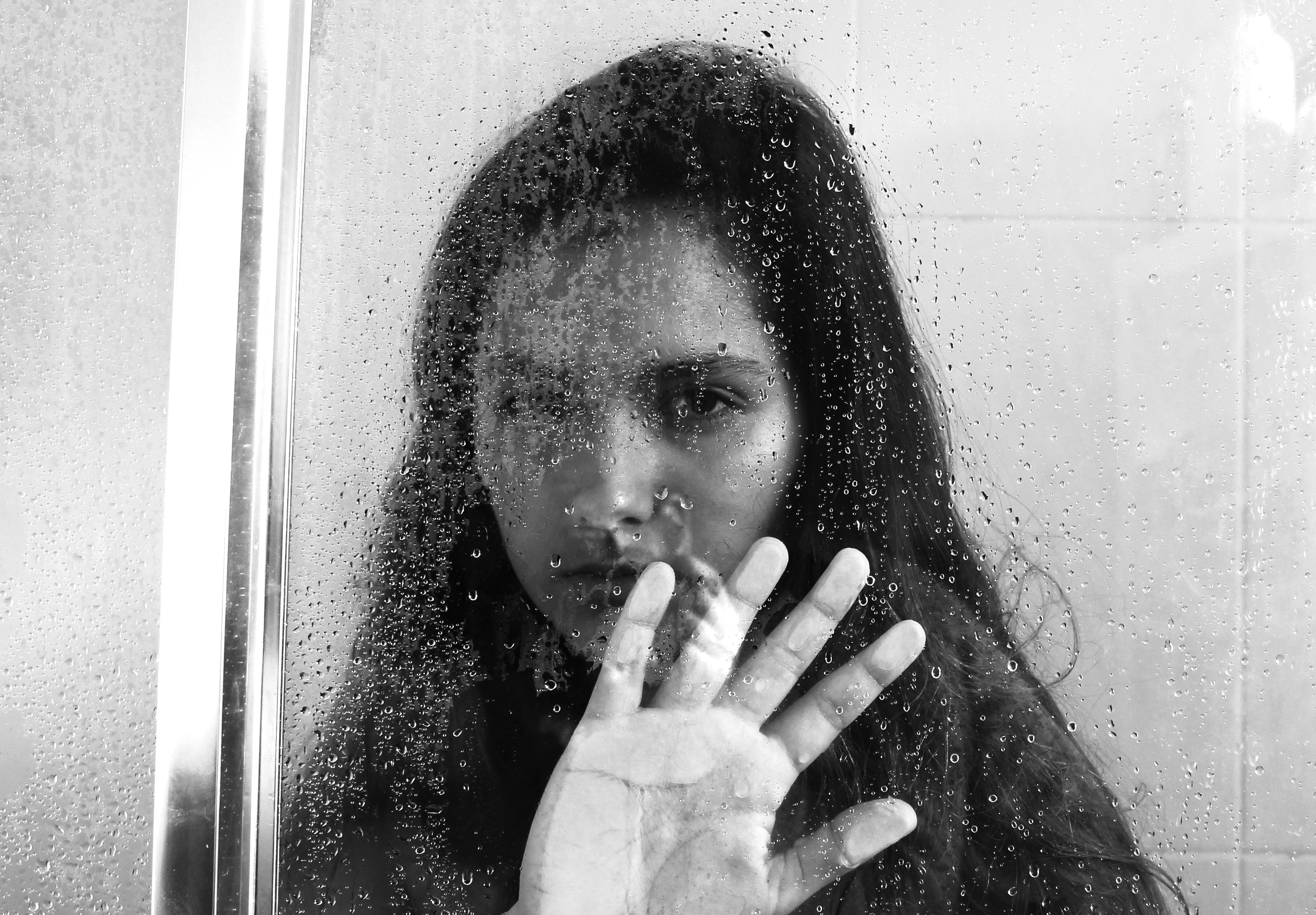
I chose this image as one of my final outcomes because of the mysterious effect which helps to convey the theme ‘loss of identity’. This effect has been created through the black and white filter and the water drops which conceal a part of my face. In my opinion I think this image is a successful replication of one of Isabella Madrid’s photographs because of the eerie and dark atmosphere I created through contrast. I am printing this image in this size because it will have a larger impact on the viewer if printed on a larger scale. The detail of the shadows, highlights and water drops will be seen more clearly once the image is printed on A3.
STUDIO IMAGES
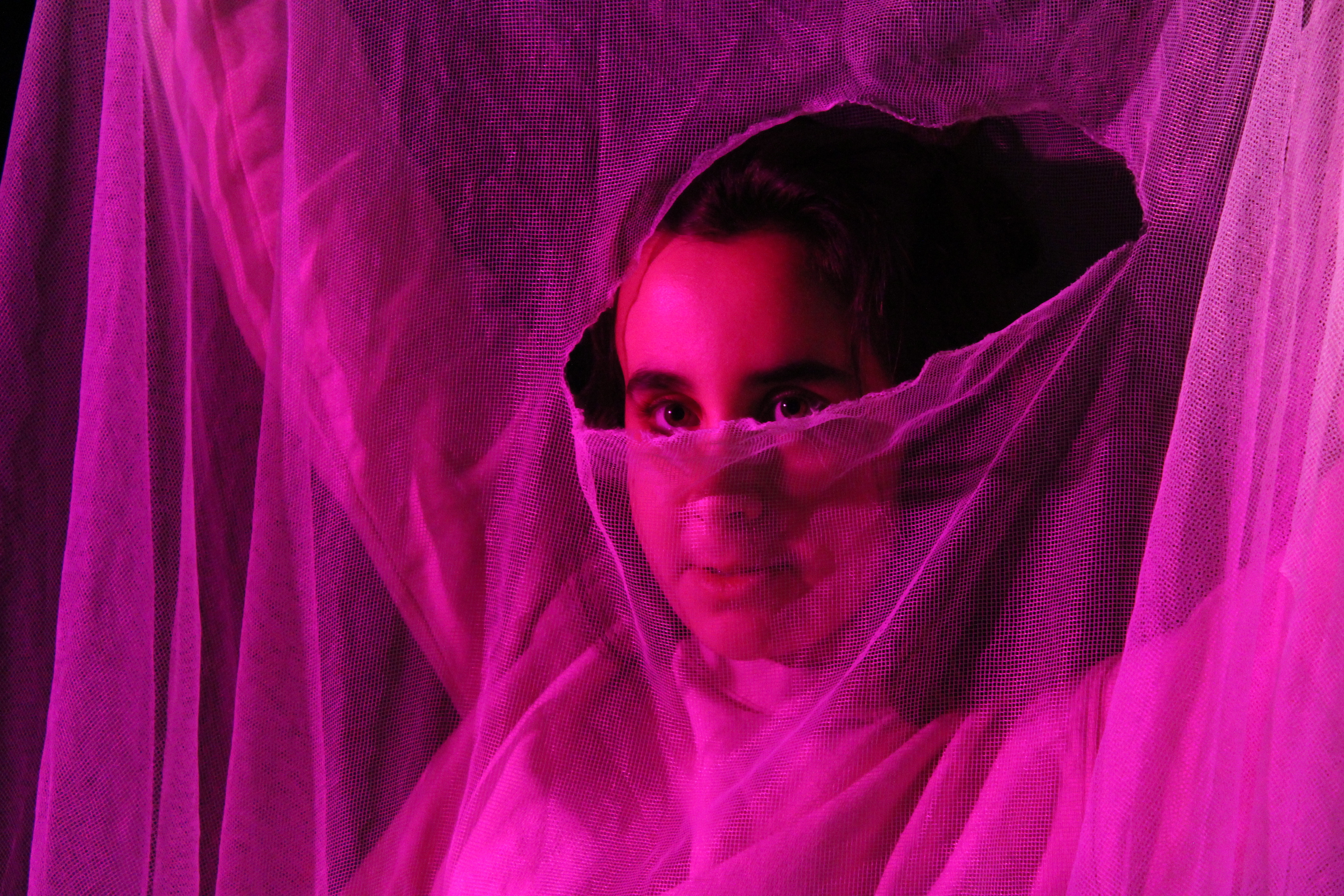
I have chosen to print this image for my portrait project since it’s one of my most visually interesting images that I have taken. I captured this image in the studio room using the spot light and a pink colour filter to cast a pink shadow onto the subject. The subject is holding a net fabric with a tear in the middle. The tear reveals the subject’s eyes which captures the viewer’s attention since it’s the only area without texture from the fabric. I think this image shows my technical skills in photography since I have adjusted my camera settings so the image has the correct exposure and focus.
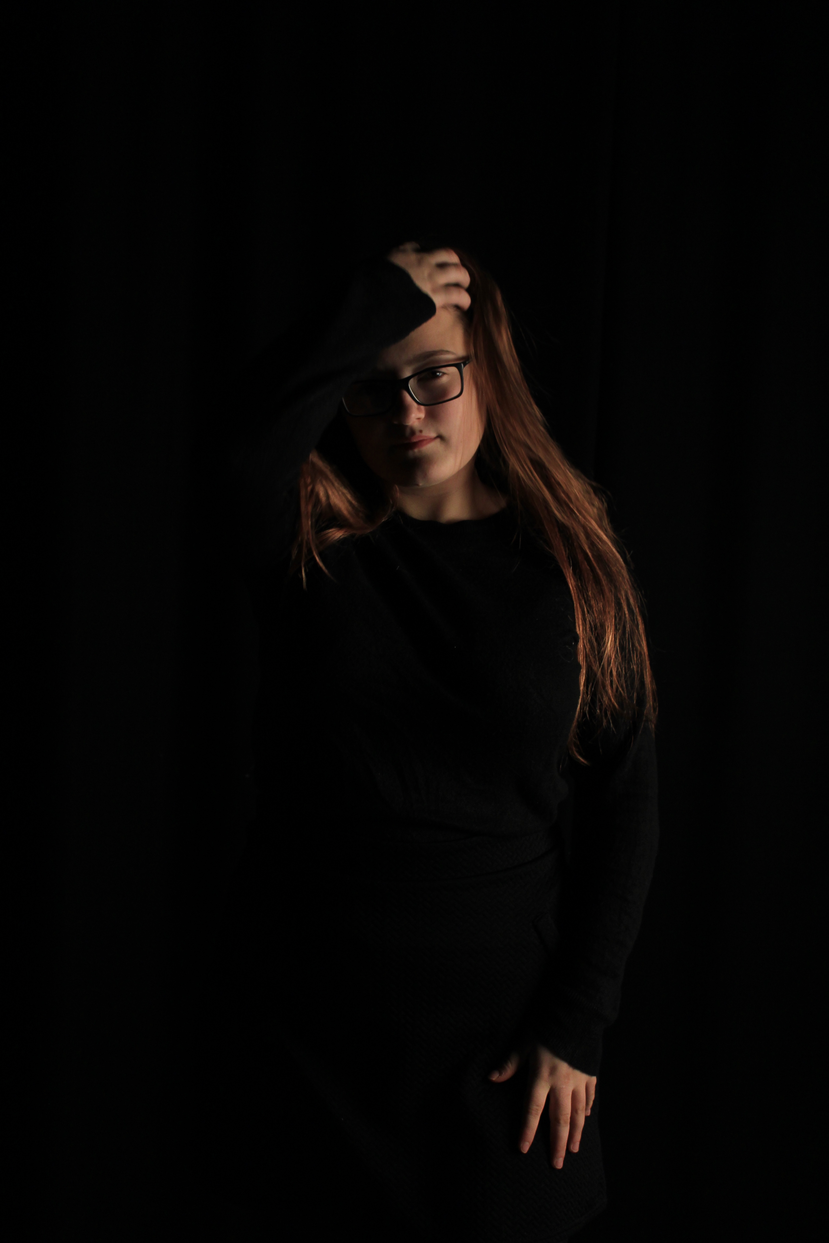
I have chosen to print this image for my portrait project because in this photo you can see that I have applied the Chiaroscuro technique. To create a strong contrast between light and dark, I told my subject to wear all black in the studio room so the results of the photographs would have the subject blended into the black background. To cast light areas on the subject, I used a soft box light and placed it on the right side so it emits a soft, even light onto one side of the subject’s face. This image shows that I can apply techniques that I have learnt from photography lessons into my photography work.