Photoshop Example (1)
I have decided to use Photoshop to experiment whether I would keep my images the same or play around with color saturation. Here are some of my examples and the steps I took to achieve these first attempts.
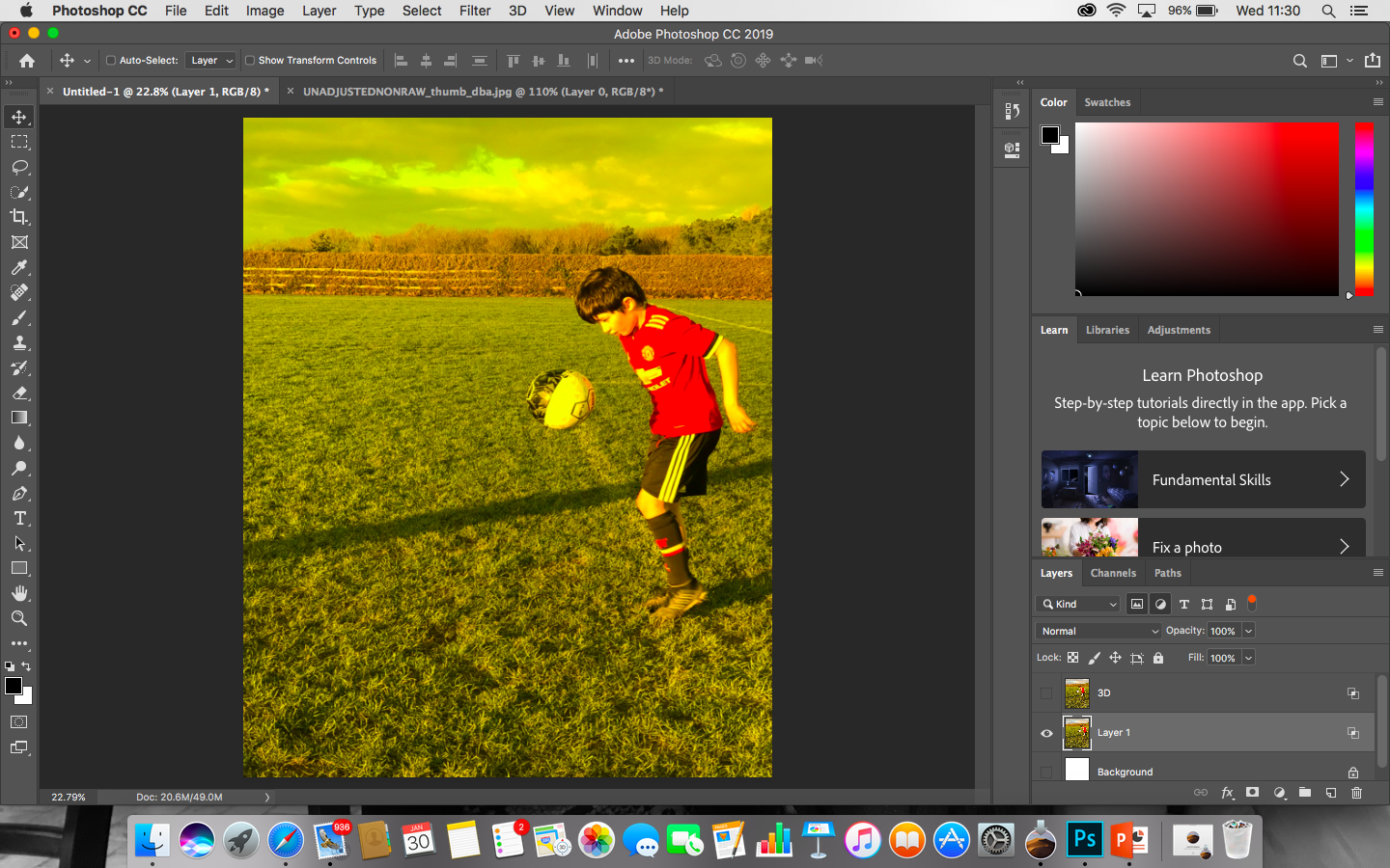
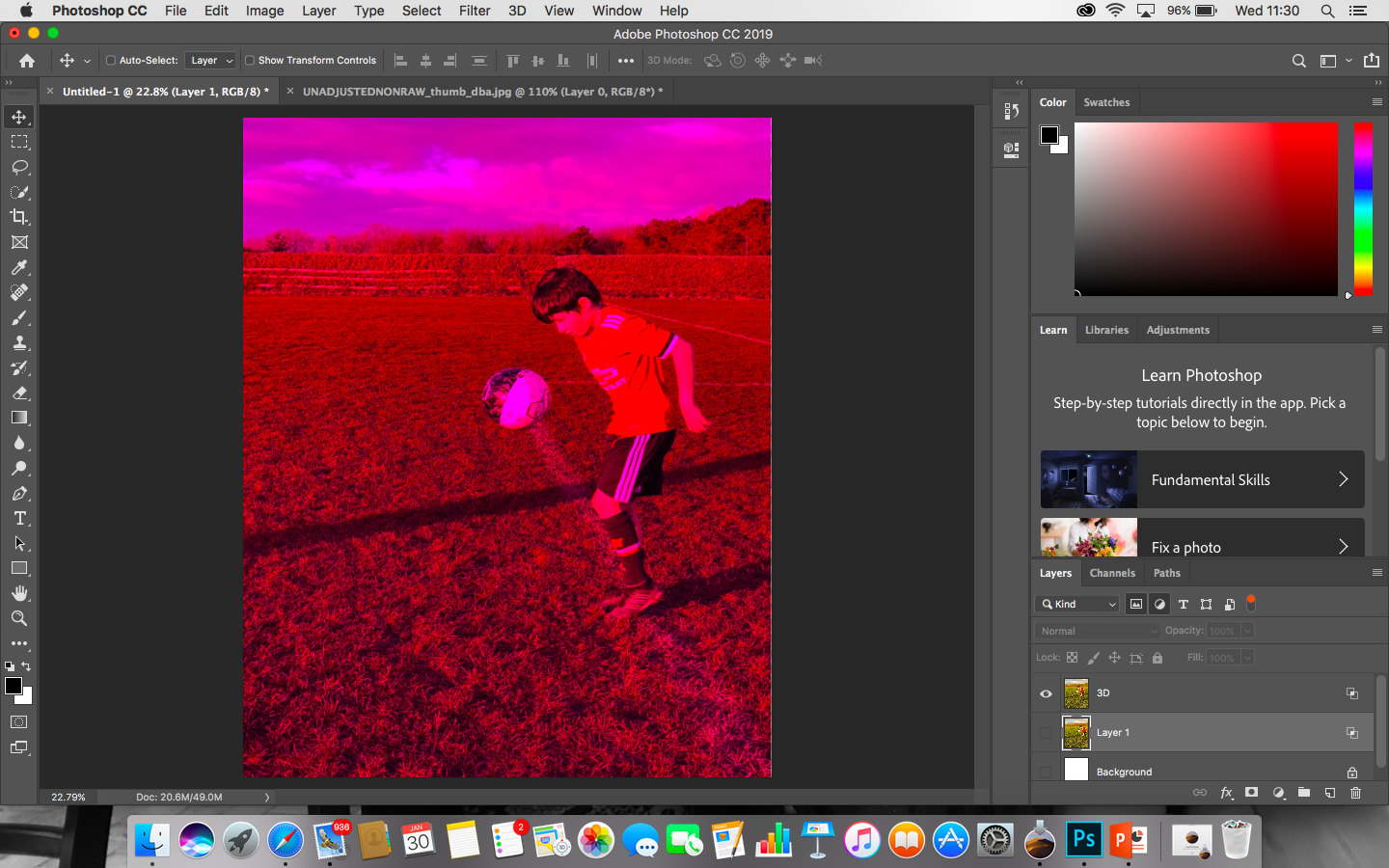
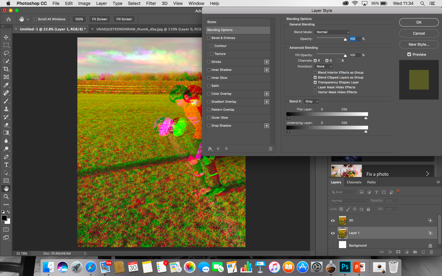
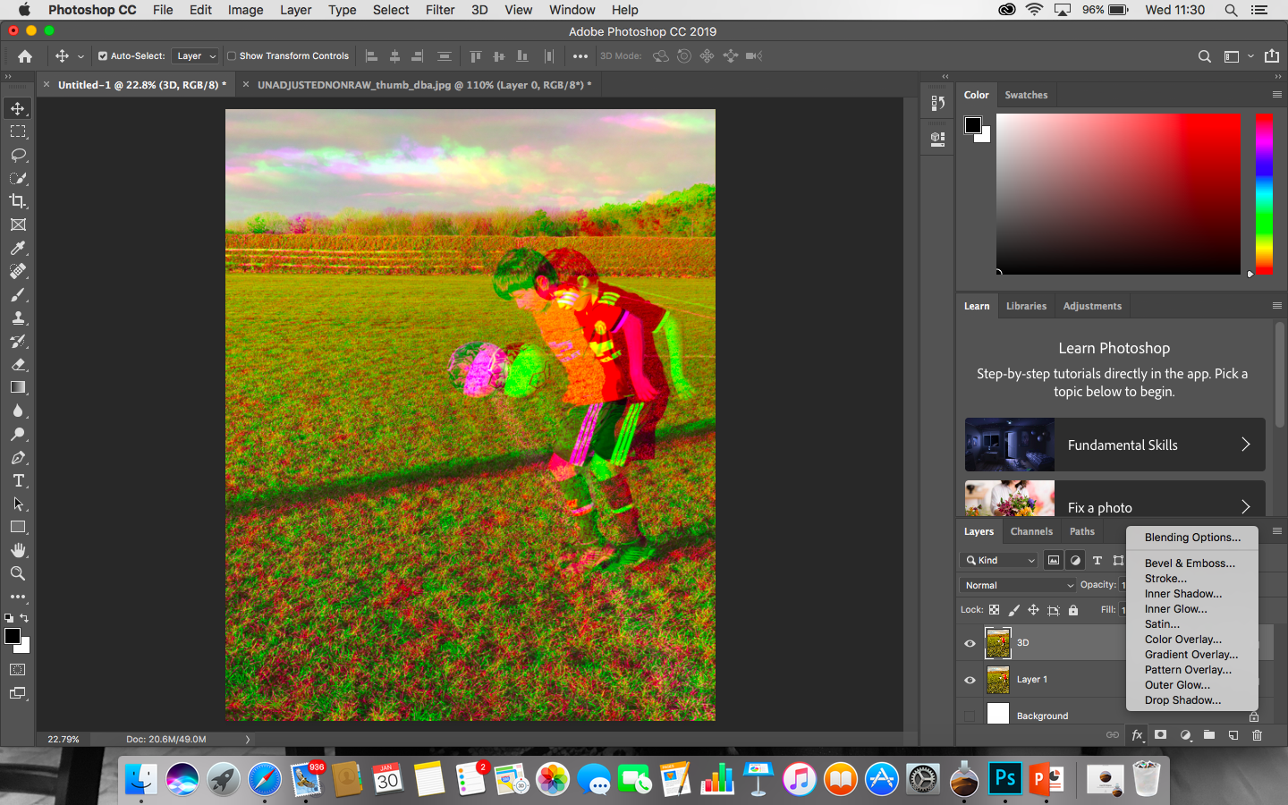
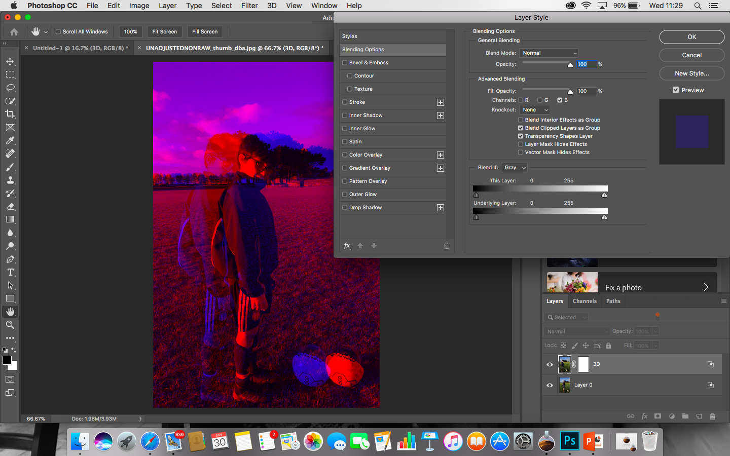
As i am not a photo shop genius, this took me at longer than anticipated but however i am proud of my end results.

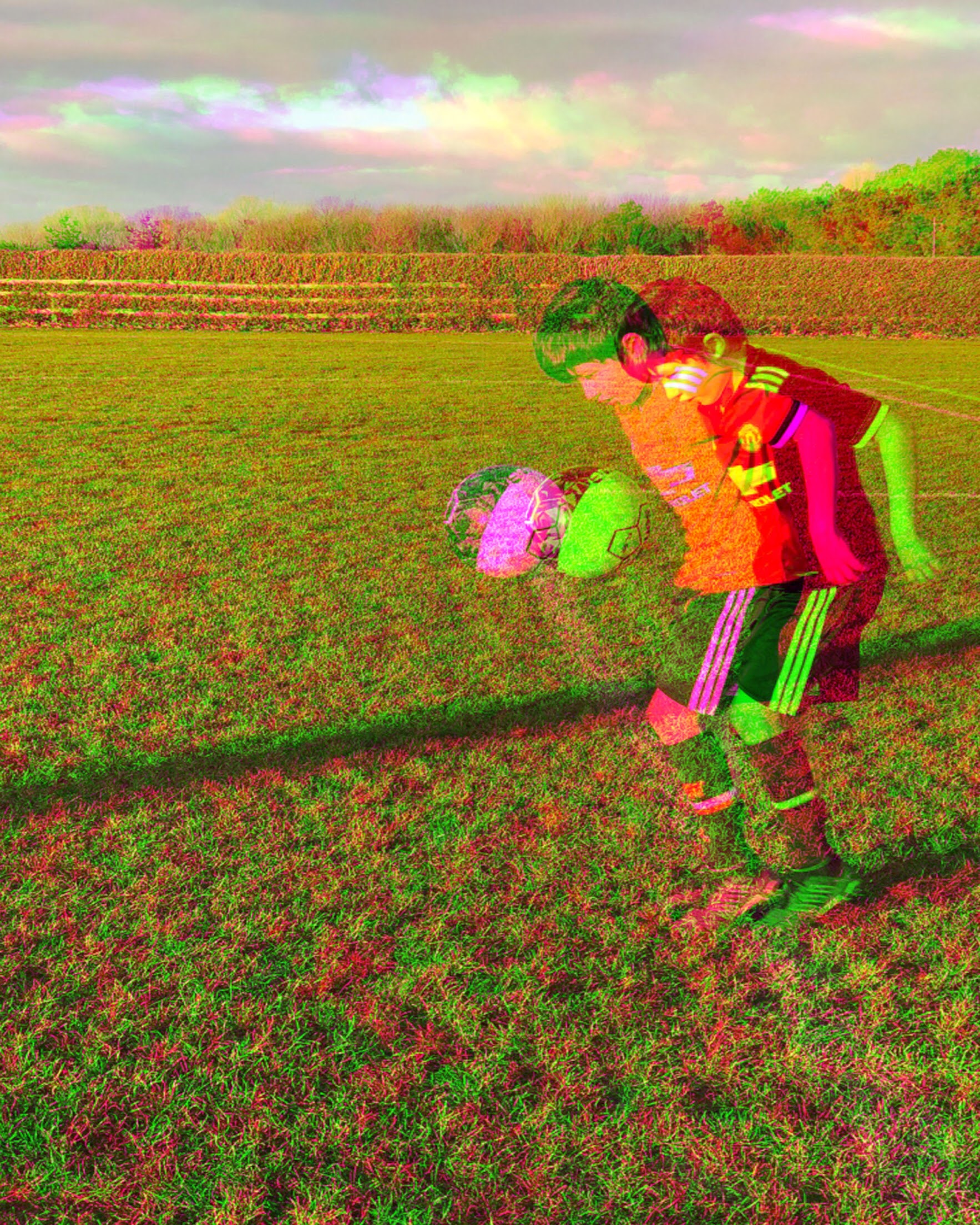
I decided to challenge myself and present 3 different images and blending them all together to create one simplistic image.
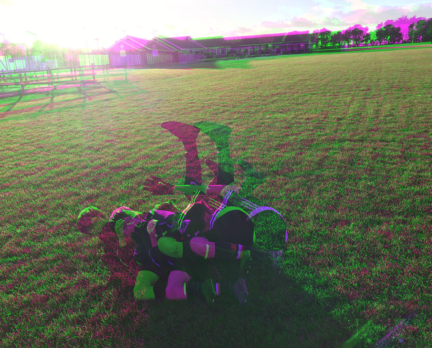
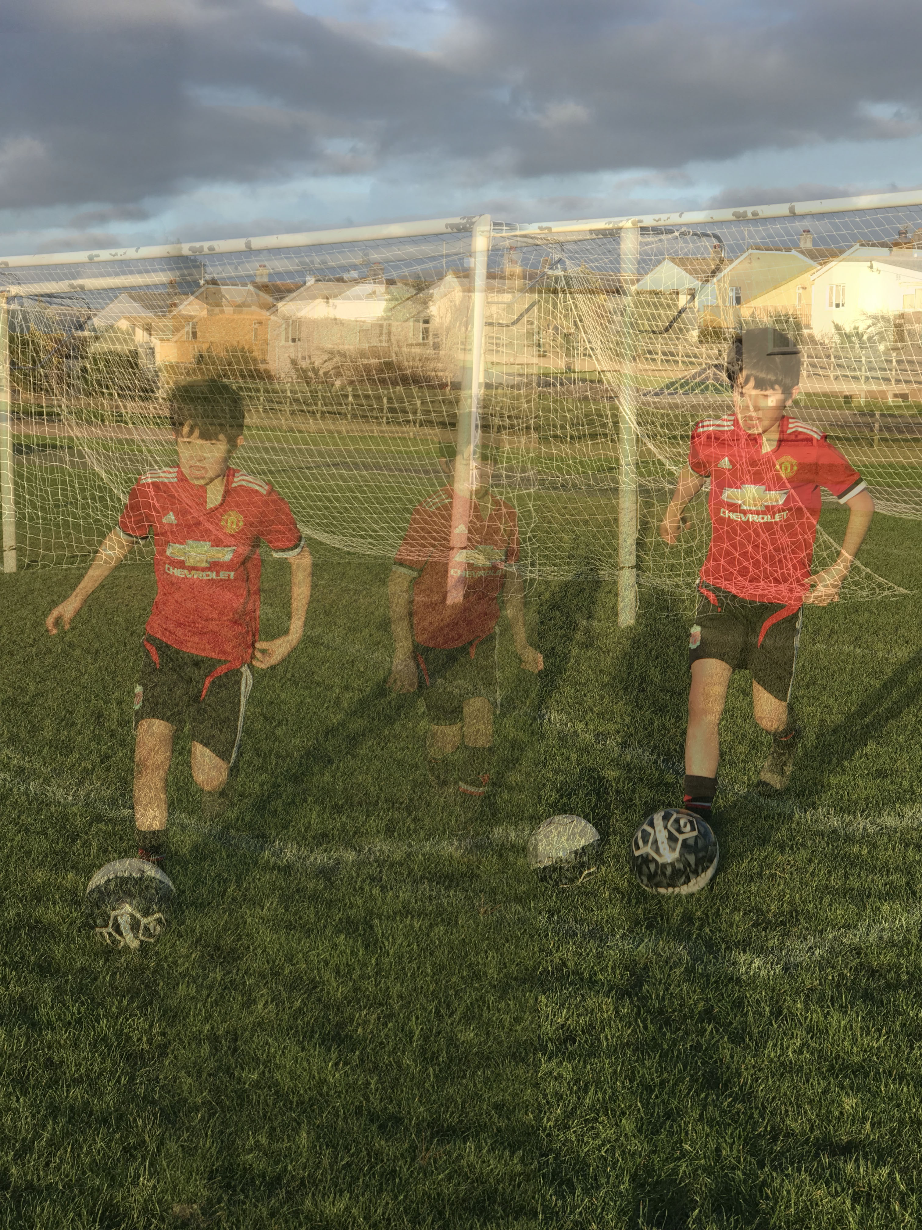
In the image above i have done nothing with the brightness, shadows, contrast. I chose to leave it because i found that due to the natural lighting of the sun the image really shows warm tones like yellows and golds to create this afternoon sort of shade. The other technical aspects like the positioning of myself and the model was well thought out as well, however in one of the images you can see my shadow and if i was to do this again i would have tried to stay out of it just because it also draws attention to it due to it being black. In this example i made my brother run towards me as he was kicking the ball, however i was positioned very close to him but i did that because i wanted to capture the sense of movement which wouldn’t have been achievable from far away.
I chose to insert 3 images into one because it adds movement to the image. By movement i mean that there is multiple things happening. Not only that but by trying to add a football vibe to it. What i mean by this is that when footballers are playing a game it is very rare you see anyone actually standing still. By combining these 3 images and lowering the opacity of each image its trying to capture that it can be tiring and it should be effort but if its something you are passionate about them it should seem more like a hobby rather than a chore.
https://www.digitalartsonline.co.uk/features/illustration/best-photoshop-tutorials/#75
