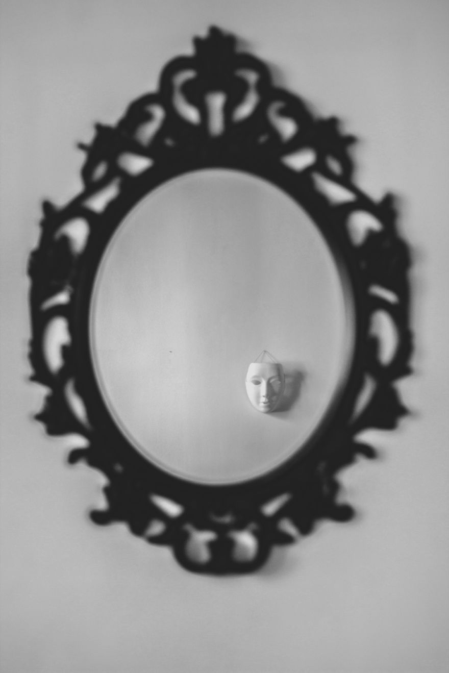
Final Outcome Choices

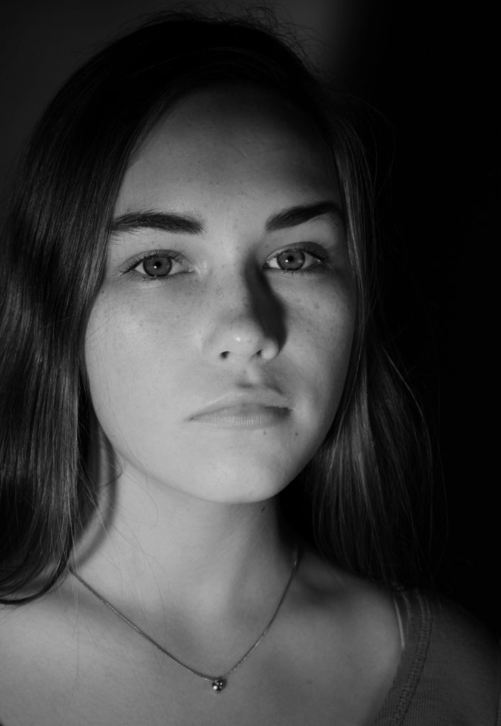
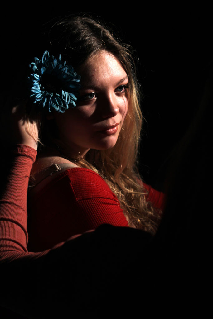
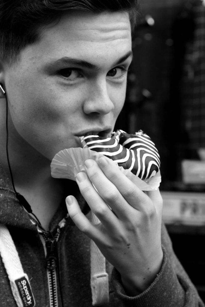
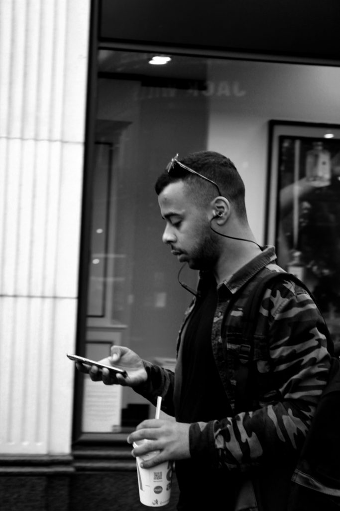
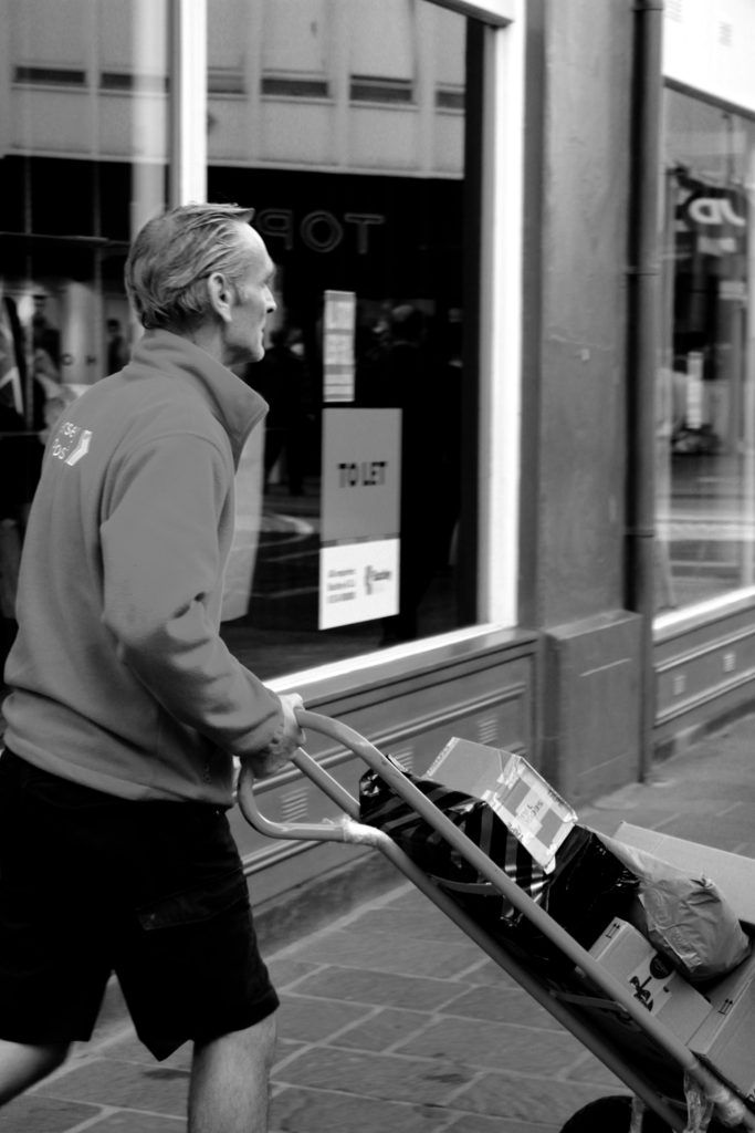
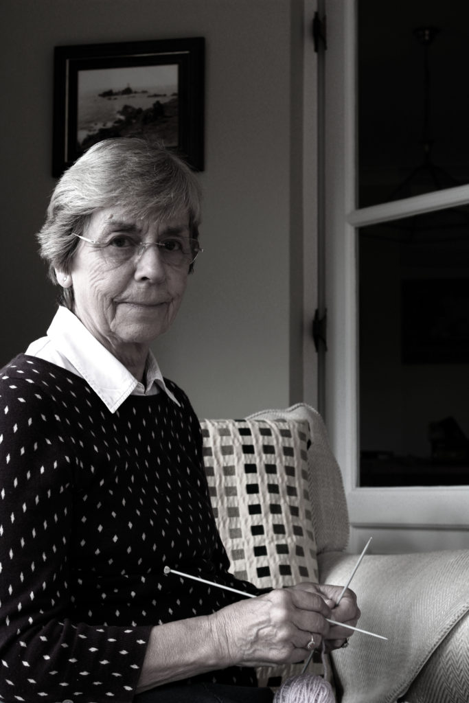
These are some of the final outcome ideas that I have come up with using my favourite and best images.

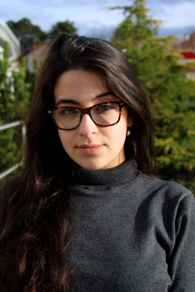
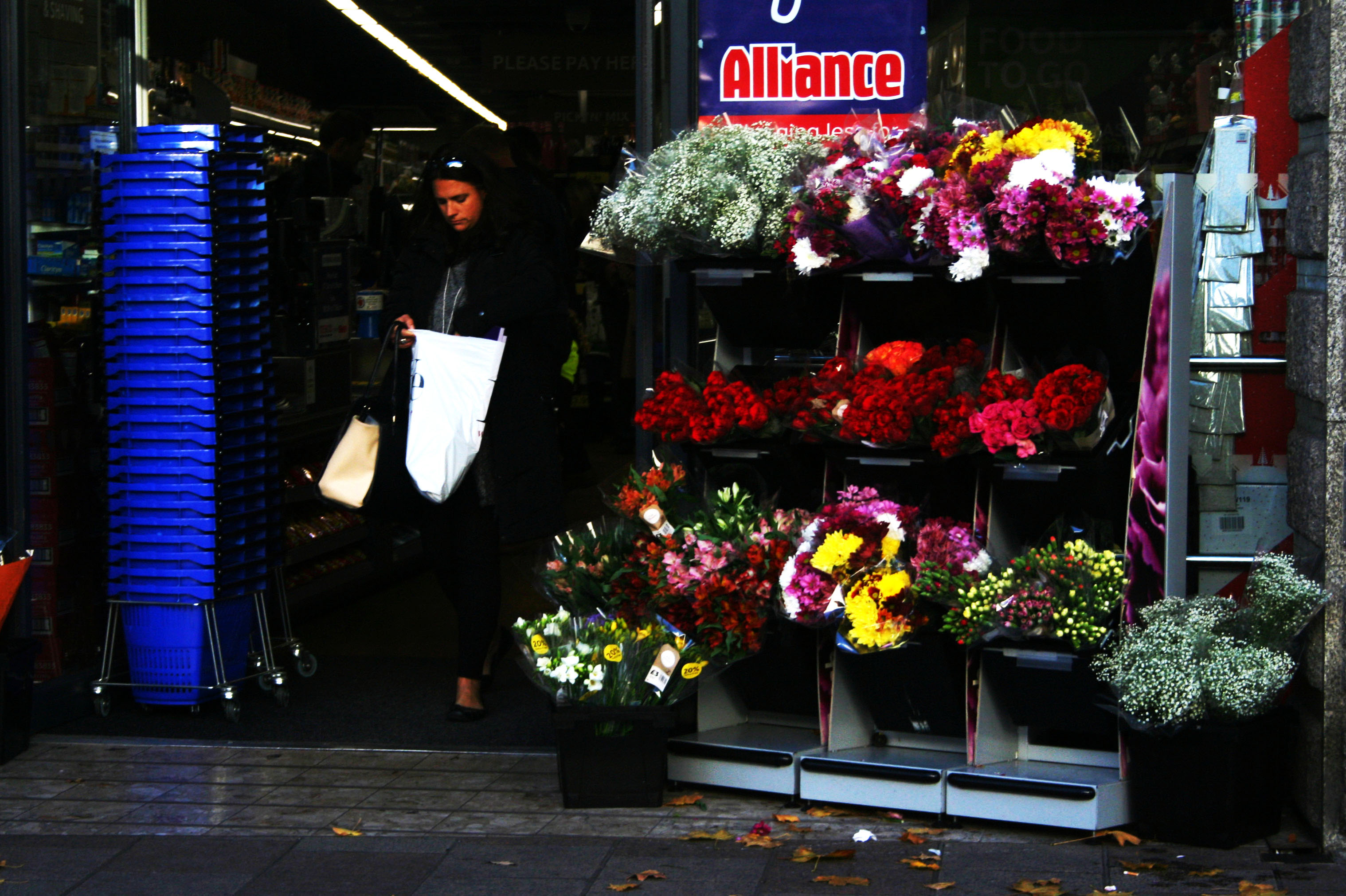
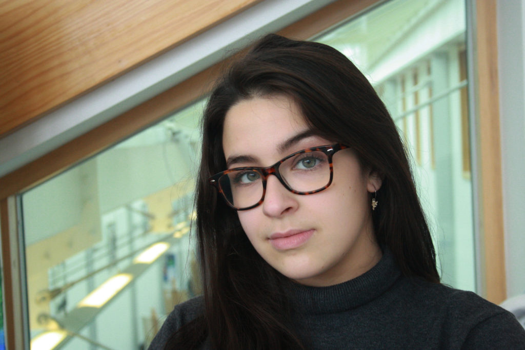
The first two images shown below I have not really edited a lot. This is because I was trying to do them like John Bulmers work and didn’t want to overdo the editing, as John Bulmer did not normally edit his work. Although these two haven’t really been edited a lot I like how they came out, especially the first one due to the saturation used to make her face stand out along with the other darker colours in the glass and the drinks in the fridge.


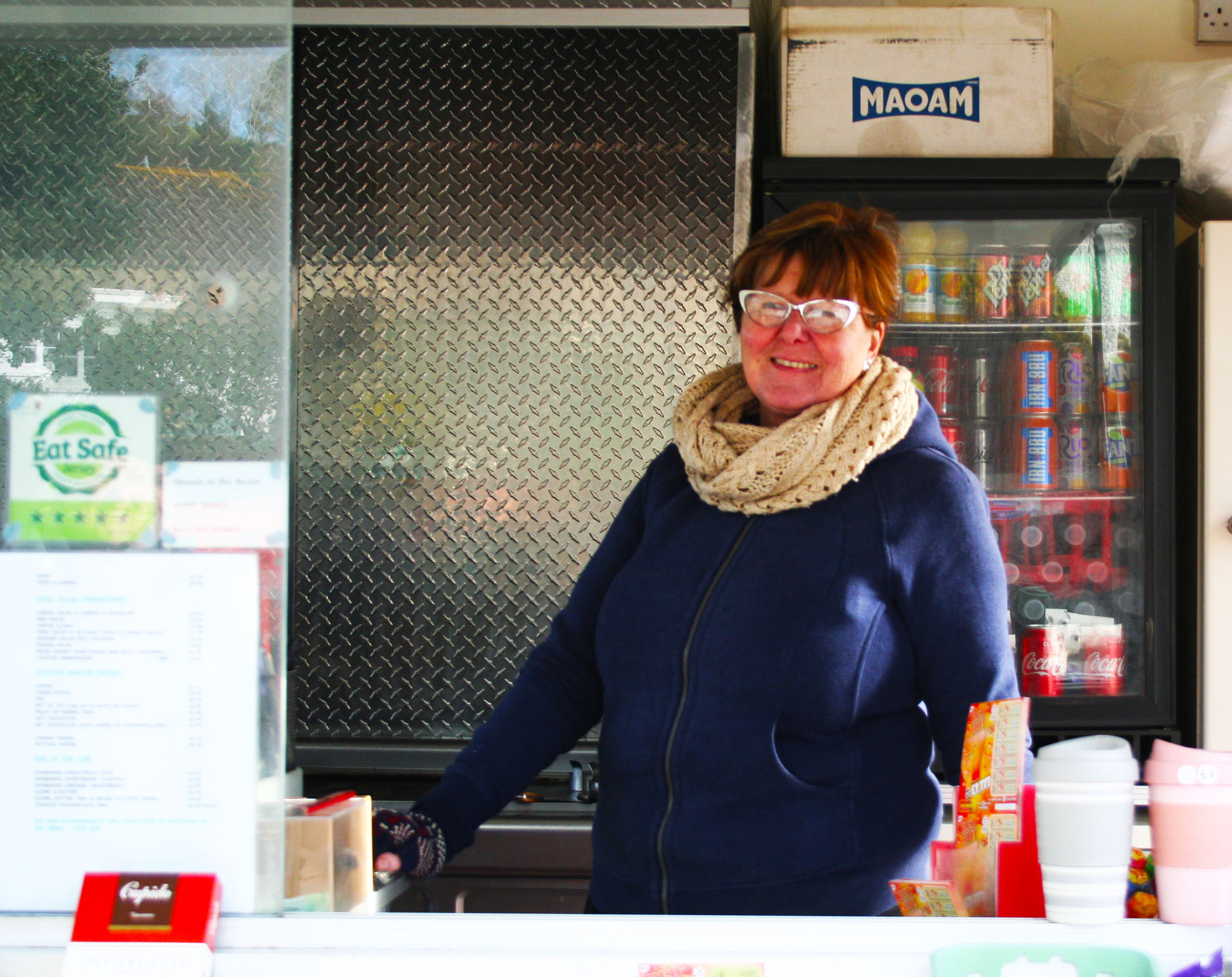
With this third image I changed the contrast and the exposure so that her face in the image isn’t as dark as in the original image because it was quite hard to see her face in the original image. I have also transformed this image to turn it as I took it on an angle.

The images below are different than the ones above as they aren’t taken as street photography and are instead studio photography.

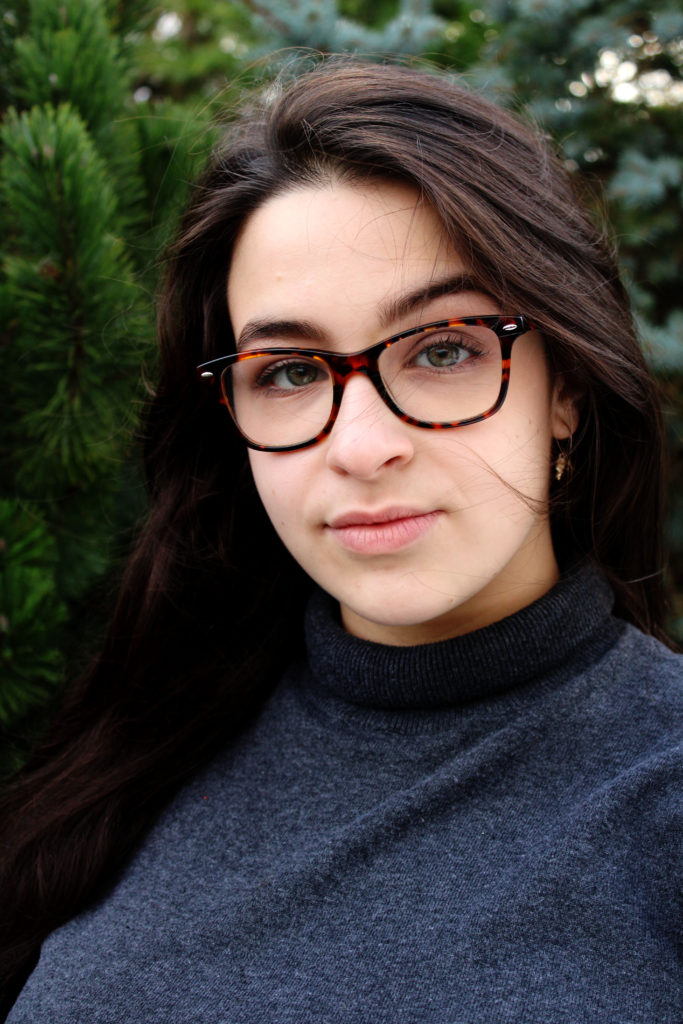
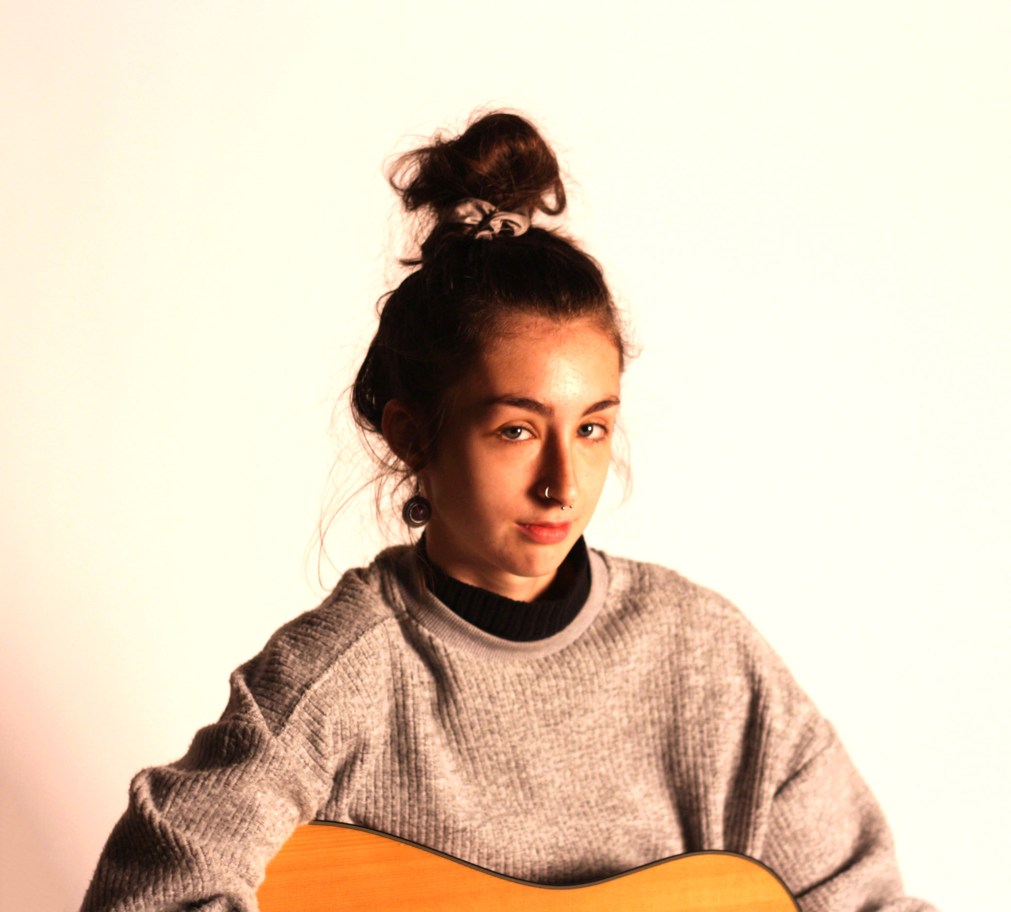
This fourth image I have taken on a white background with artificial one point lighting. I like how this one came out because of how sharp it was, this along with the high contrast I have added, makes her hair and face stand out over the rest of her body

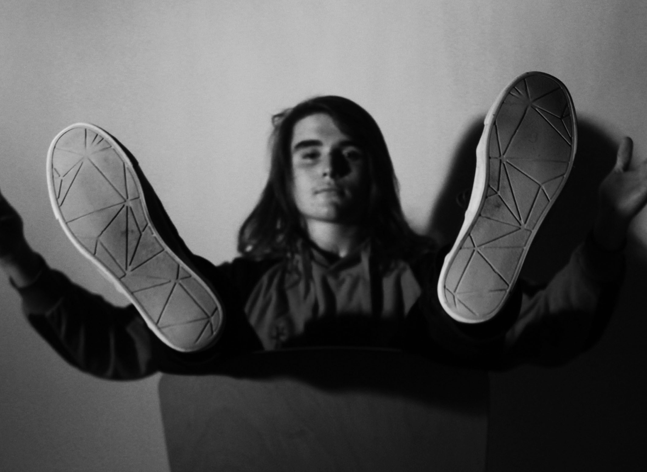
I have picked this last image because of his pose in the image. This image isn’t the sharpest image, but this is because the camera was focused onto his feet so that his face and body was put into the background. The pose he is in may show people what the persons personality is like.

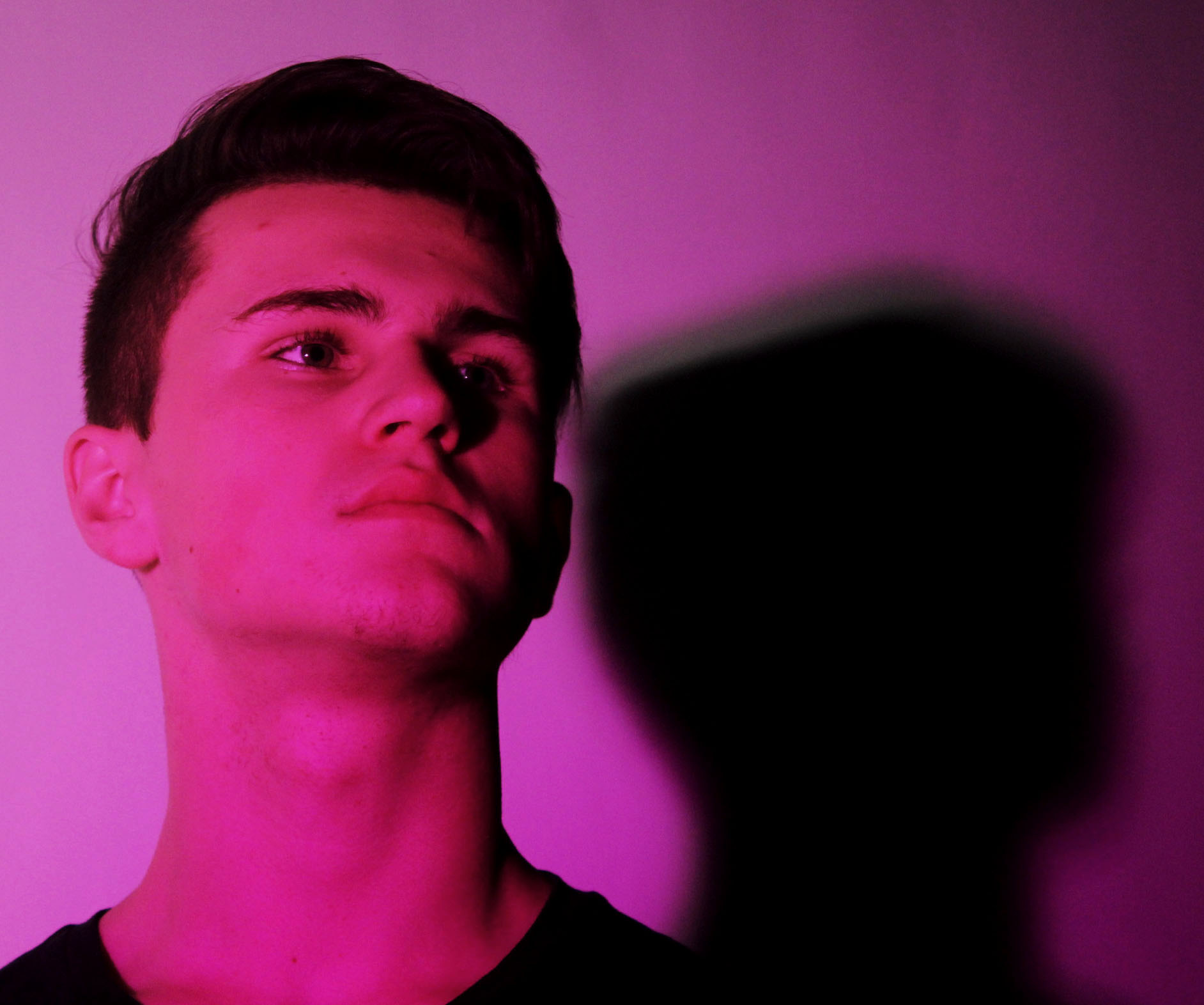
This image like the one above, shows the person in a pose. This pose is a lot simpler as it is just him looking away. I have taken the image from underneath to make them look as if they’re higher up than others.


Brad Mangin – Sports Photography

Brad Mangin 

Brad is actually a sports photographer but as my theme is identity and place and that my model is my brother playing football to symbolise his idea of valued place to portray his hobby I thought that looking at a bit of sports photography would be great.

Bio:

Brad Mangin is a Bay Area freelance sports photographer. Mangin has done eight cover shots for Sports Illustrated. Mangin graduated from San Jose State in a degree in photojournalism. He was born in 1965 and is now age 54.  Mangin is known for his  photographing of Major League Baseball for clients like Sports Illustrated and Major League Baseball Photos since 1987.

The reason i have chosen Brad Mangin to study is because it links well with the idea of identity and place. He chose to place himself in areas of the game to capture action shots like some of the examples before. This links well with my idea as im doing sports as part of the identity of my model. I’ve also decided to use the times before and after the games as almost like a before and after to capture the tiredness and the determined facial expressions of the individuals.

Image result for brad mangin

Image result for brad mangin

Image result for brad mangin

Image result for brad mangin

Image result for brad mangin

Having looked at Brad’s work, I have chosen to go down the lines of social identity and enviromental portraits.  To be able to achieve sports photography,

However having reviewed over more photographers that base around the area of Sports photography i have decided that i do not just want to  stick to the idea of just photographing my brother playing sports in a field but to capture his passion for football. I am going to portray a series of images that rather than just being seen as a simple images with no context there will be a story of a boy who aspires to be a famous footballer and play for teams like Manchester United and Portugal, not to mention his slight obsession with Ronaldo, whom  he sees as a role model.

Editing Photos from my Final Photoshoot

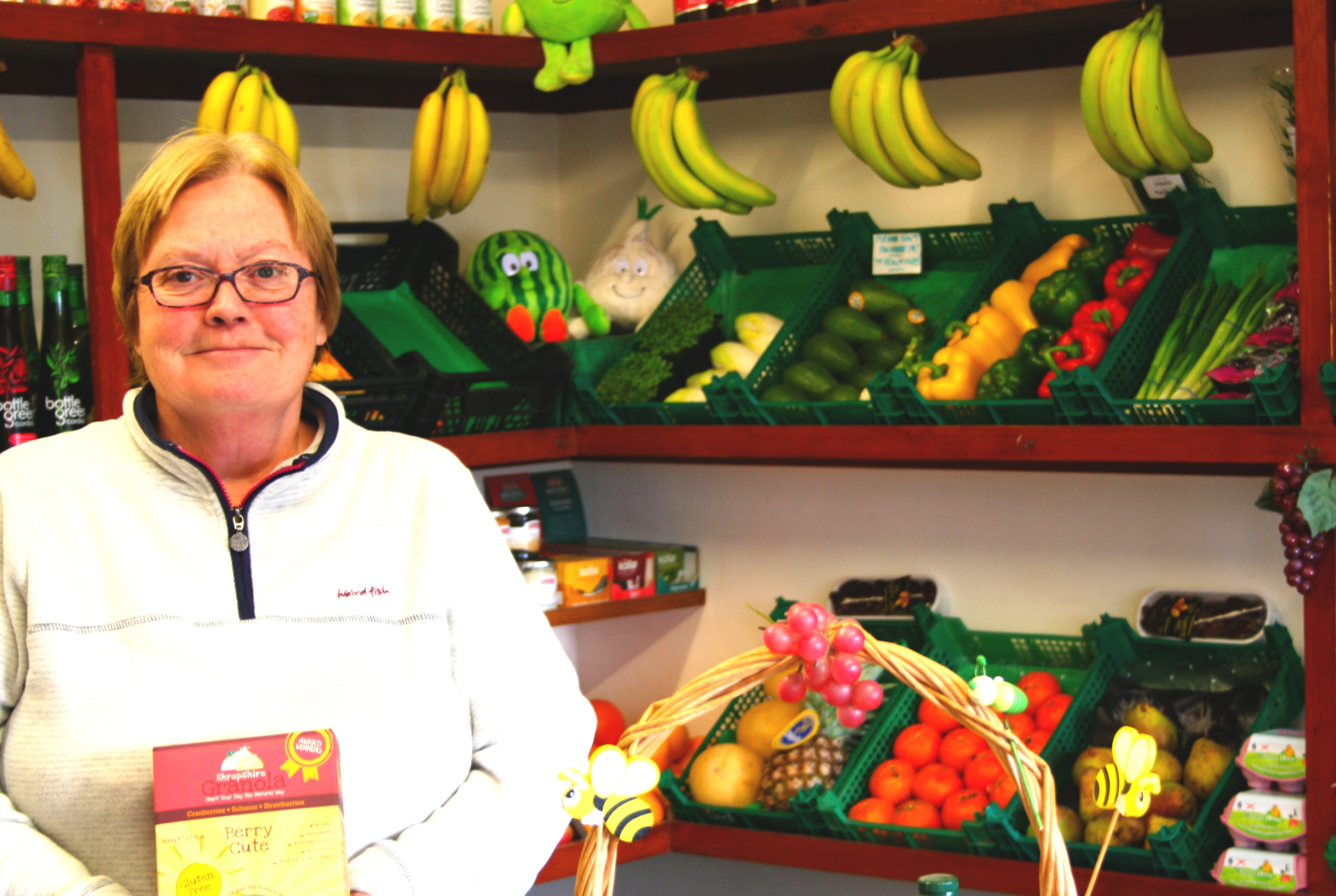
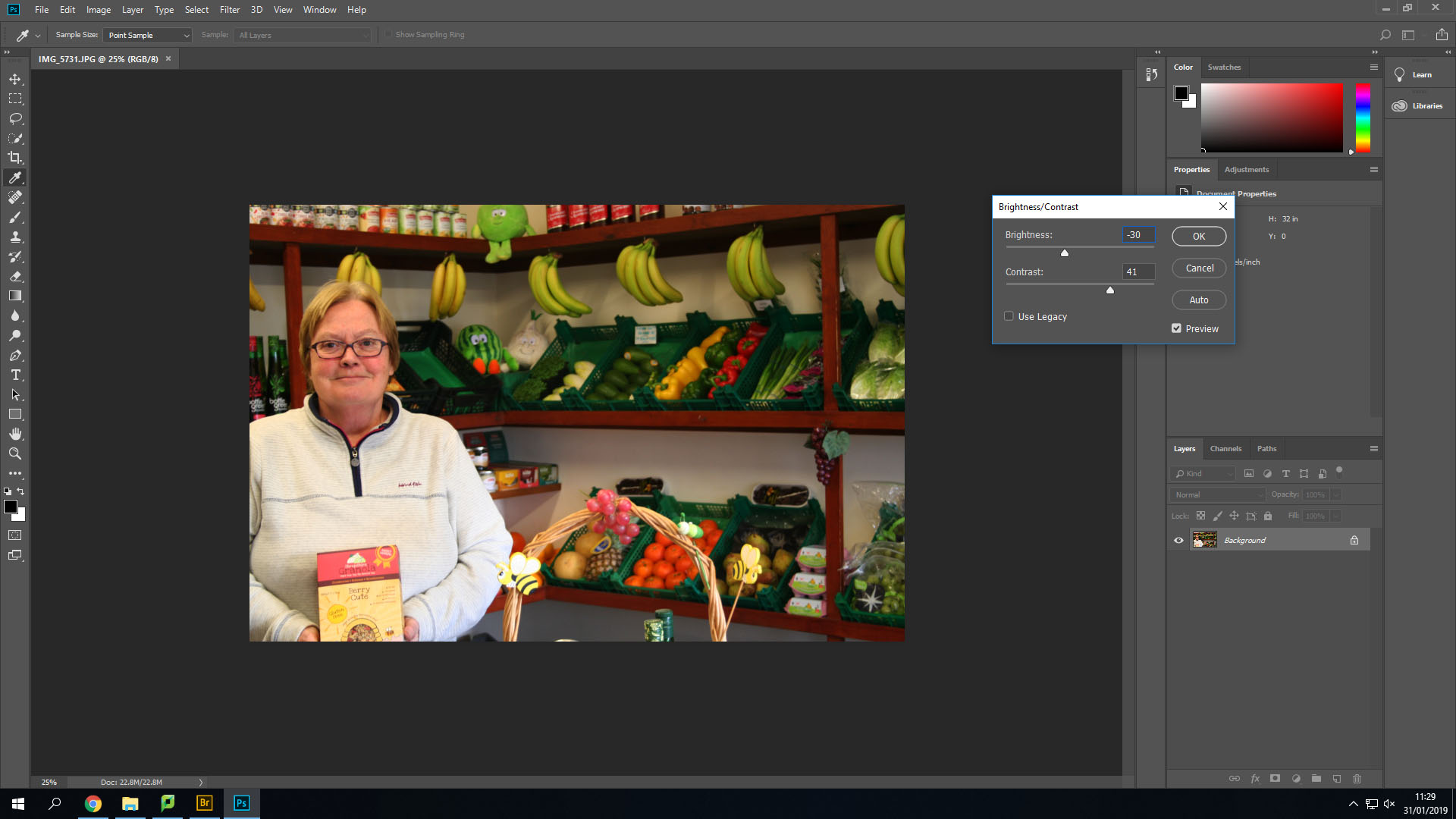
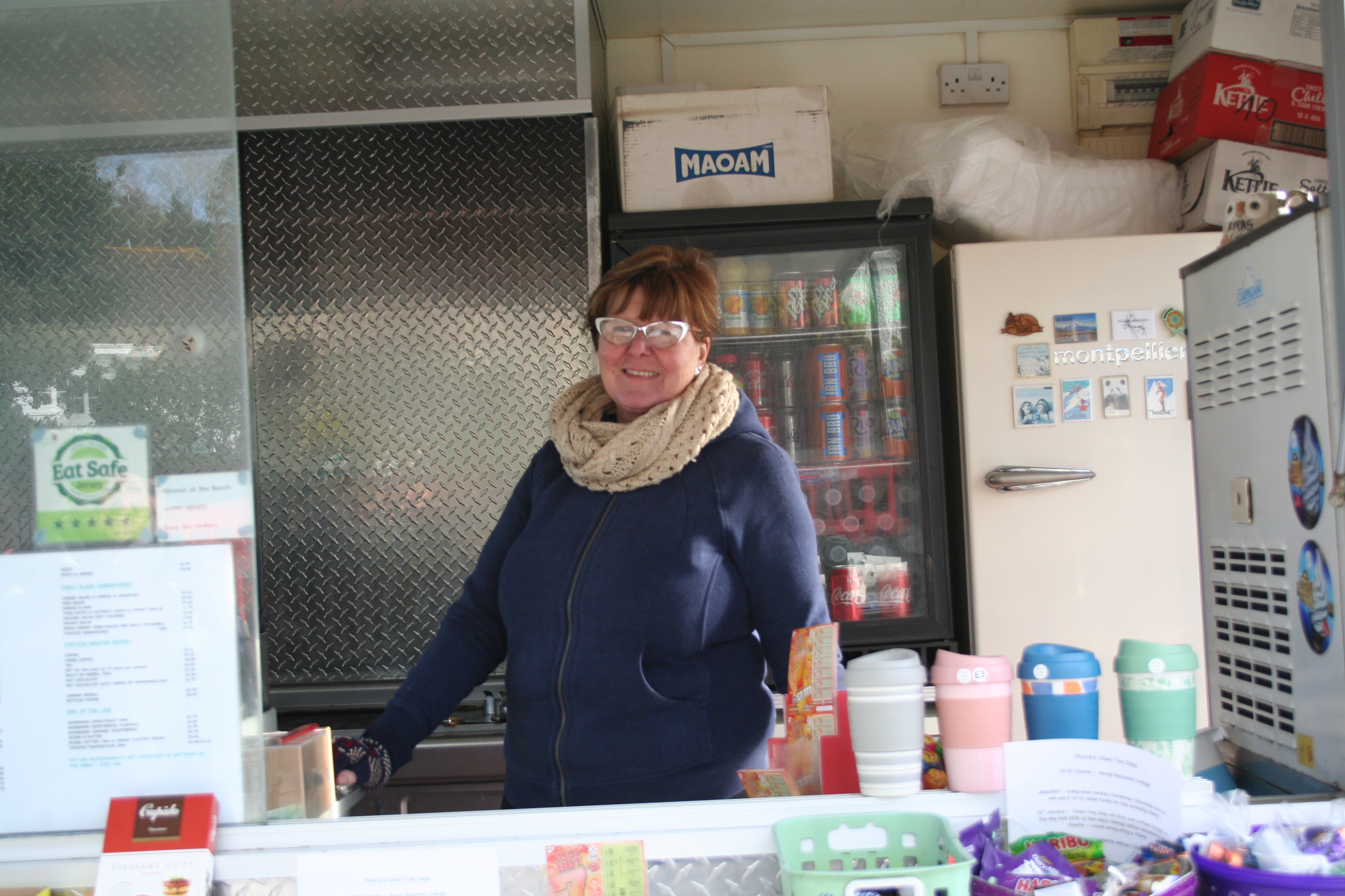
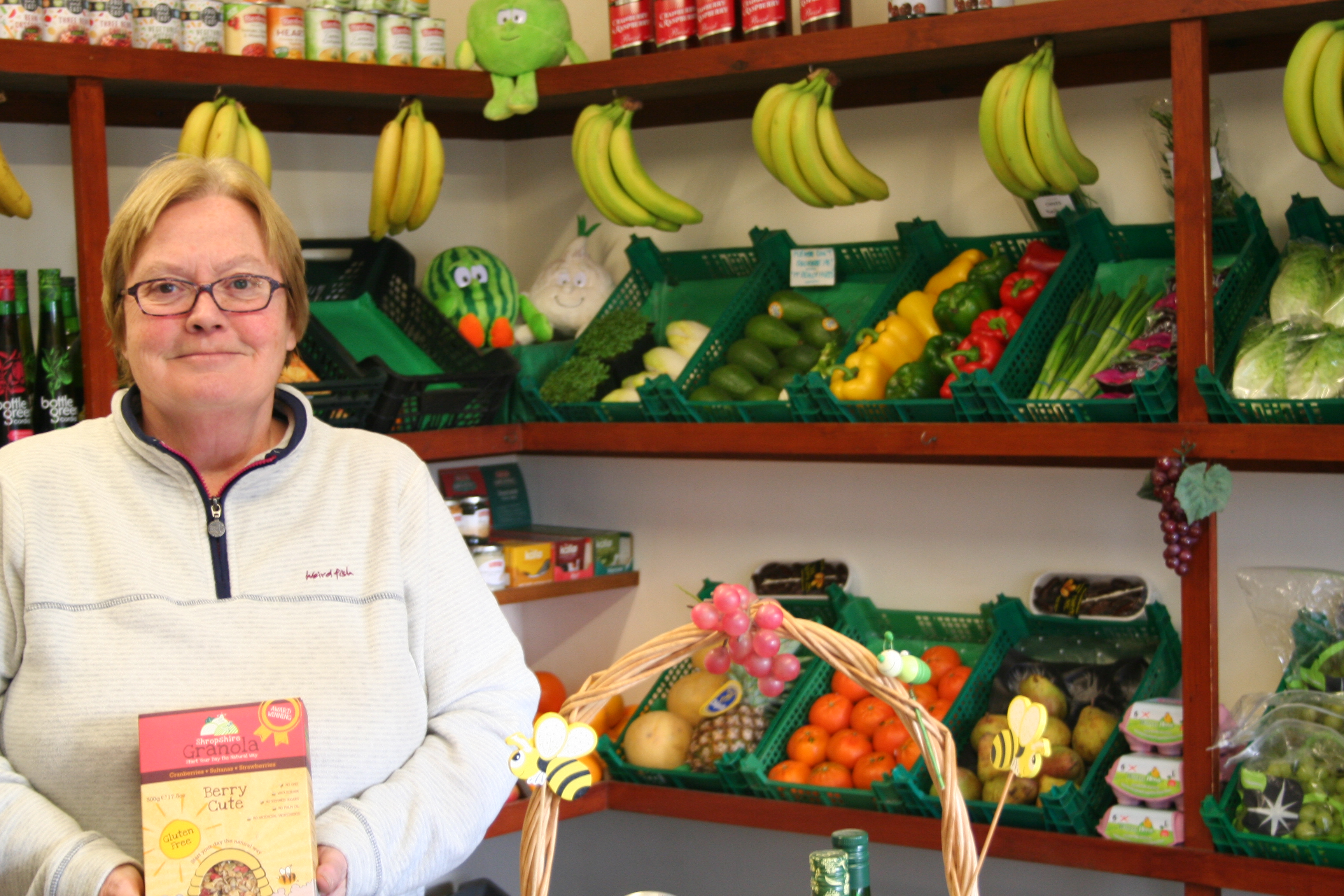
This is the original image. It is bright and uses natural lighting and artificial lighting from above.

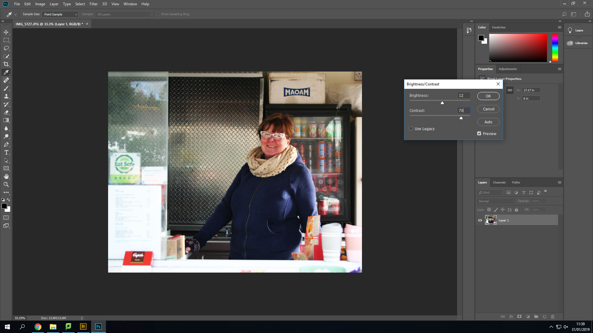
Firstly, I changed the contrast and the brightness to make the image slightly brighter, but also so that I could add more shadows in the background such as under each shelf.

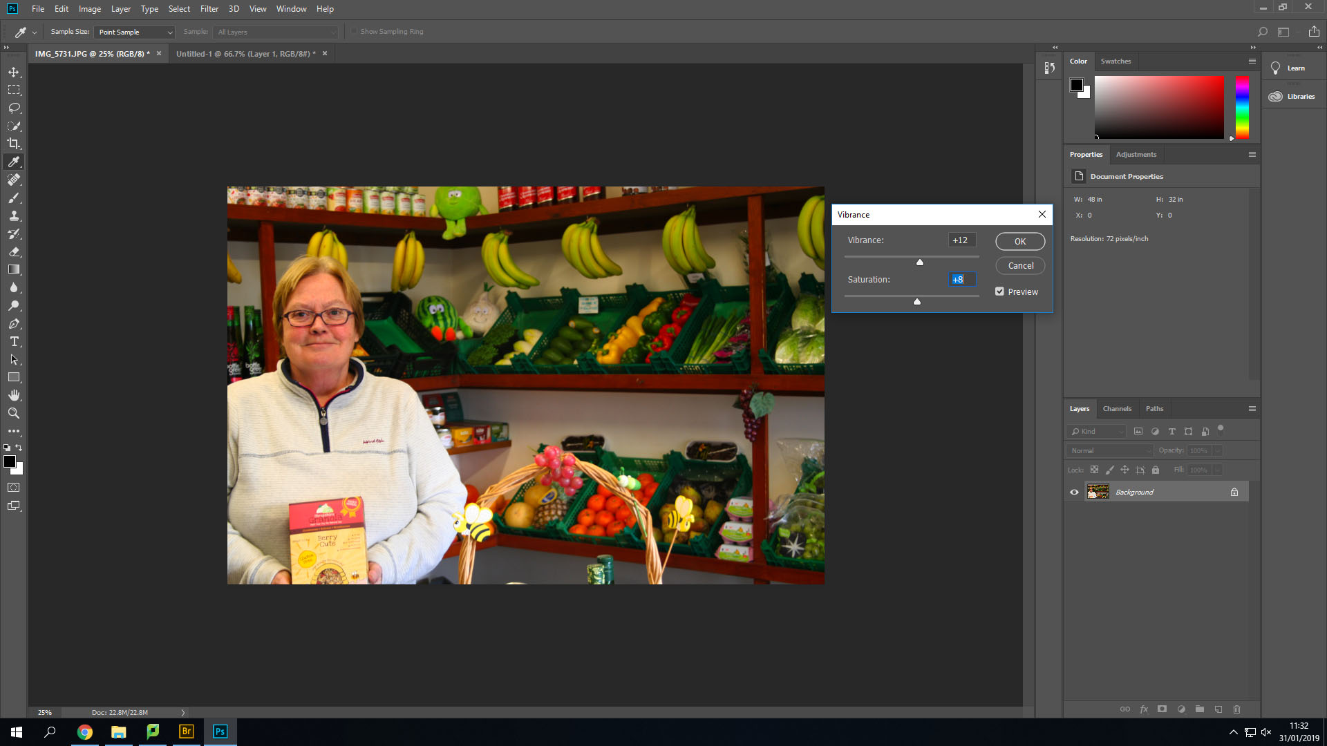
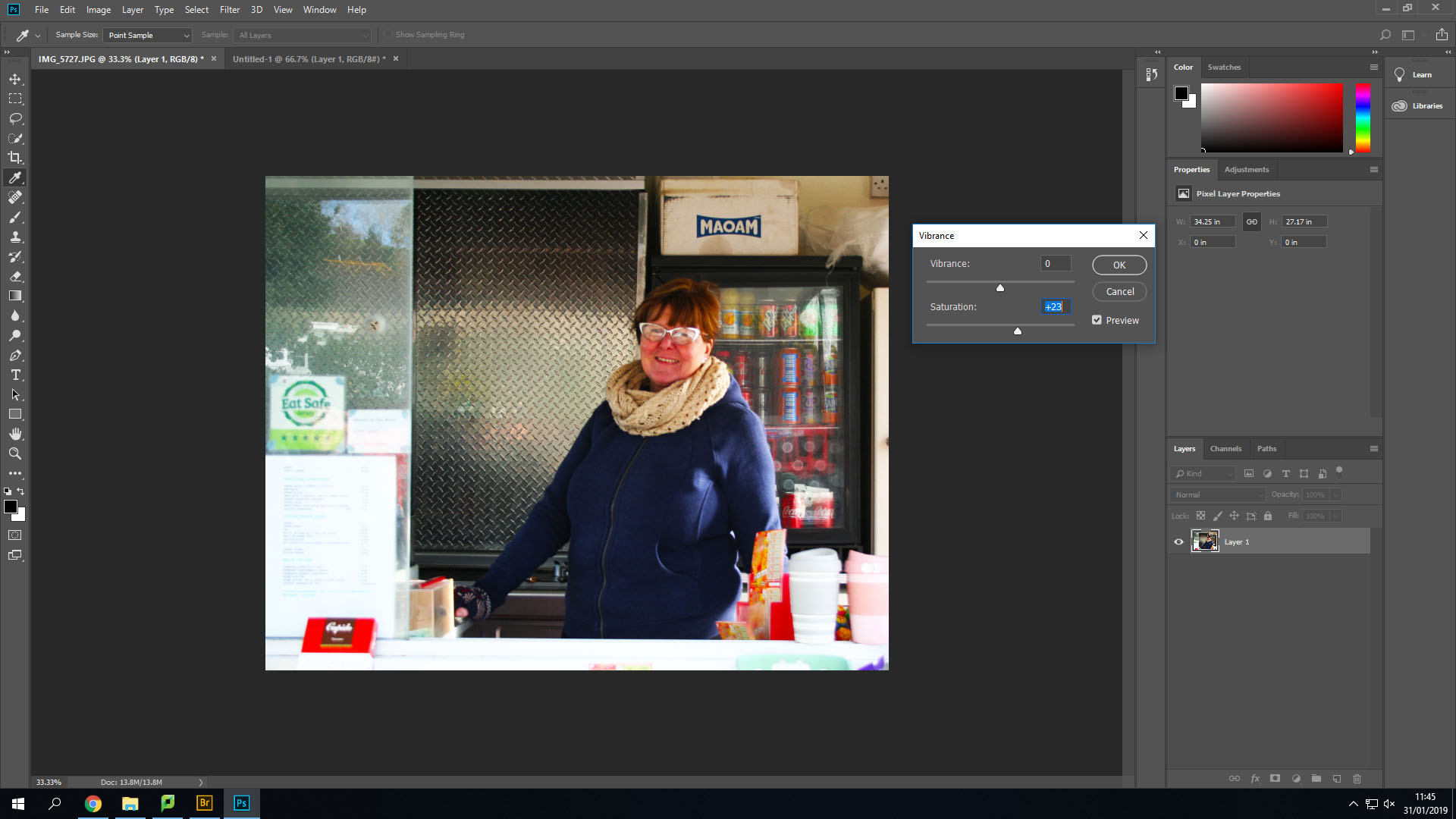
Secondly, I changed the Vibrance and saturation options to make the lighter colours stand out more and become brighter.

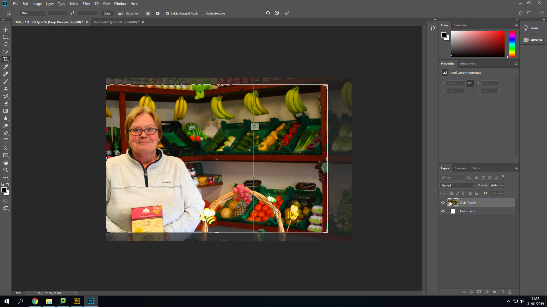
After this I cropped the image down a little bit to remove her hands from the image and line up her face into the middle of two different thirds.

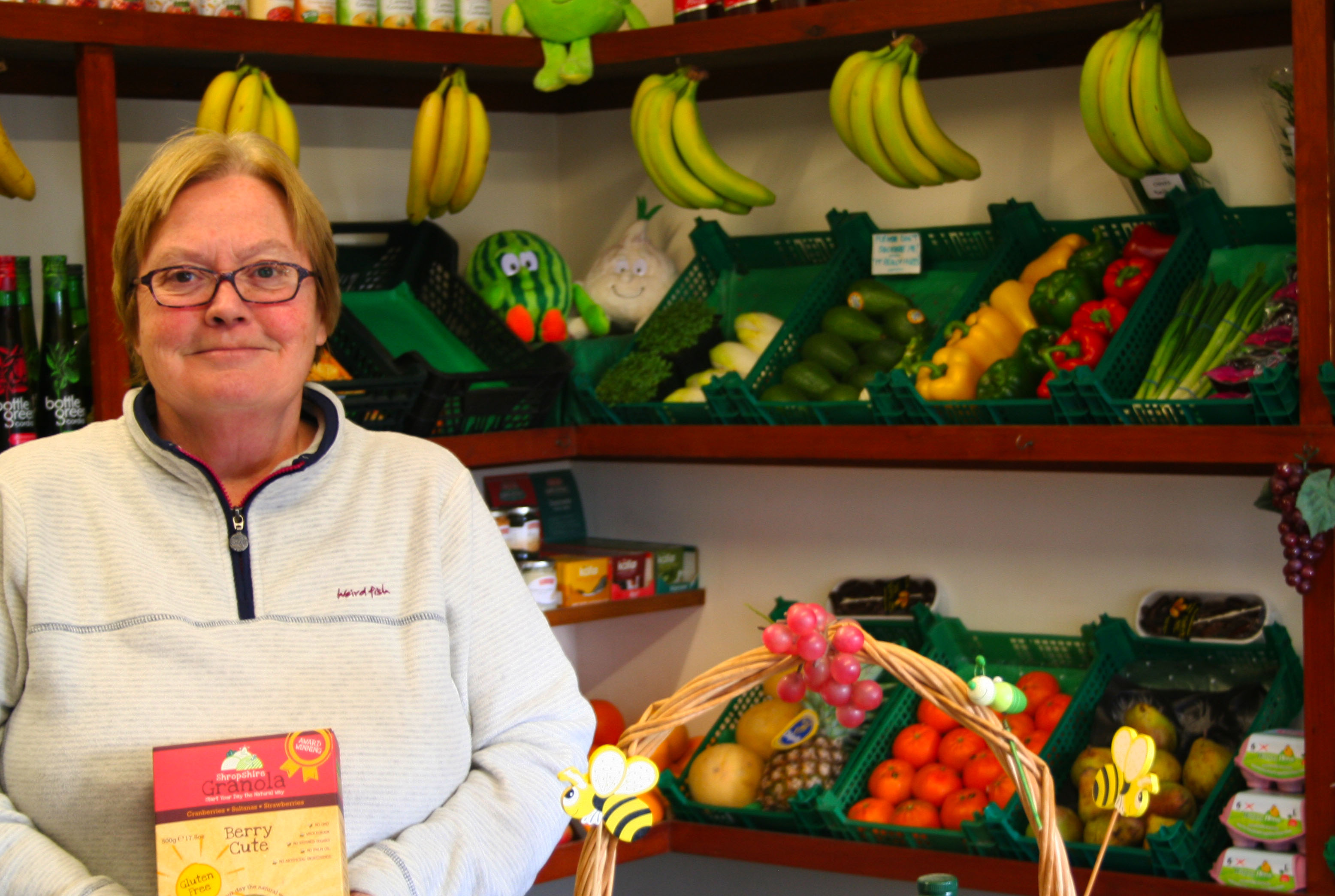
This is the final outcome of this image. I like how it has turned out. I could edit it more, but I do not want to overdo the editing as it could become far from the original image and be very different from the images like Tish Murthas and John Bulmers.

The image below is also one of the original images I took.

Firstly, with this image I transformed the image and turned it slightly to remove the angle that I took the image on. After that I cropped it down to remove the background showing behind the image that was created after I turned it. Then like the first image I changed the brightness and contrast to make the shadows larger and appear darker.

Secondly, I changed the vibrance and saturation again. This allowed me to make her face which was red at the time stand out more and let other colours such as the drinks in the background and the reflection off the glass to appear more easily.

This is the final outcome of that image. I especially like how this one turned out by using the high saturation.


Case Study:Barbara Peacock:American Bedroom-Mock:Identity and Place

Barbara is an American photographer/photojournalist. She is one of five recipients of the Getty Images annual Grants for Editorial Photography programme, which gives photojournalists an award of $10,000 as well as the agency’s support in pursuing projects of their choosing. American Bedroom is an ongoing series of portraits in which she explores the complexities of contemporary American life. American Bedroom is a cultural and anthropological study of Americans in their private dwelling; their bedroom. The nature of the project will be portraits of individuals, couples and families that reveal the depth of their character and spirit.

Cody, Portland, Maine: ‘It’s been really frustrating. I can’t do anything. I can’t hang out with my friends, can’t play sports. I’m stuck here … just me and my illness’ [rheumatic fever]
Pepere, Jay, Maine: ‘I am so quiet in the morning when I wake up so I don’t disturb her. Then I remember she is gone’
Betty, Sweden, Maine: ‘My husband died. I can smoke in the house now’

https://www.theguardian.com/artanddesign/gallery/2017/sep/12/american-bedroom-by-barbara-peacock-photographic-portraits

My Concept:

Barbara’s project on American Bedrooms has influenced me to do a similar idea for the ‘Place and Identity’ mock, in which I am going to take photos of people in Jersey in their bedrooms. I want to be able to explore the inside private space of the people on this island and how their bedrooms reflect their self.

I was also influenced by the media theorist, Goffman who came up with the concept of ‘The Representation of The Self in Everyday Life’ which is the idea that we all have a ‘back and a ‘front’ self, the front  is the one we let everyone see and we want everyone to see and the back is the one that is private to us that we conceal from others. I see a bedroom as a persons ‘back’ self a place or privacy and self expression, the actual person is the ‘front’ self, they leave their bedroom everyday to face the public world they dress themselves up to make an impression on others. I also want to explore how bedrooms change as people age, my impression is that the older you get the less expressive your bedroom becomes and it becomes more neutral and simple. Also it will be interesting to see how the dynamics of marriage and sharing rooms changes a persons private space.

Analysis Of Peacock’s Work:

Image result for barbara peacock photography

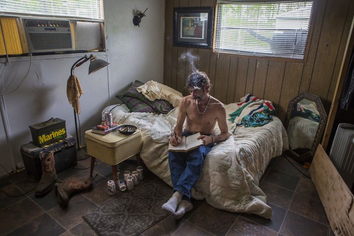
Barbara’s concept is simple yet complex because the idea of taking a picture of someones bedroom seems easy but it’s the people she chose to take pictures of it intriguing. For instance in the image above there is a middle aged looking man with a cigarette, no clothes on and a reasonably bare room. At first glance it’s just a picture of a man in this room but it tells a story, such as the fact that he smokes inside might mean he lives alone and this bare chest also suggests this. Also the lack of feminine touch indicates that he doesn’t have a women in his life, as well as that the bed being up against the wall makes me think that he doesn’t have a partner because most couples have their beds in the middle of the room so that it is accessible for both of them. The number of beer cans suggest he is a heavy drinker and the ash tray full of cigarette buts indicates he is most likely addicted to nicotine. The lack of portraits on the wall suggest he is a lonely man, possibly no kids and his parents maybe have pasted away. The boots and tool box suggest he could be some sort of builder or construction worker, this links to the number of beer cans and how working on construction sites means you are around males mostly and going out for a drink it a key aspect of workmen culture.

Barbara uses natural lighting to capture the true lighting of the room as this can indicate to a persons identity for instance some people much prefer having the blinds up or being in rooms with less light, which could suggest they are shy or constantly tired or are more of an evening person. The colours are neutral which creates a warm tone which is contrasted with the dingy feel of the room and how some light coming through is blocked by a yellow object which creates a dirty looking light, this mirrors the old cans lying on the floor and ash scattered on the bedside table. Although the room feels dirty it isn’t messy, the lack or furniture creates a repetitive structure which ties in with the idea that the mans life is very structured, work, smoke, drink, sleep and how it lacks the excitement of family and love. On the other hand the thing that sticks out the most visually in this photo is the notebook and how it seems out of place and you would think that he is not the type of man to write, this empathises how we judge people to quickly on their looks (front self) and it’s when they go home that they become their real self.


Introduction-Mock:Identity and Place

Identity is the fact of being who or what a person or thing is. Place is linked to identity as it shapes a persons characteristics, for instance living in a slum with no money can make a person more appreciative towards the little things in life and have more empathy towards others. Whereas people who live in places like Beverley Hills in huge mansions don’t value money as much they spend it likes there is an unlimited supply and generally look down on others with less money. Also places like Russia have extremely high levels of domestic violence and alcoholics, which has been a consistently high rate for centuries now, which says something about the culture in Russia.

Gender Identity is the personal sense of one’s own gender. Gender identity can correlate with assigned sex at birth, or can differ from it. All societies have a set of gender categories that can serve as the basis of the formation of a person’s social identity in relation to other members of society.

Cultural Identity is the identity or feeling of belonging to a group. It is part of a person’s self-conception and self-perception and is related to nationality, ethnicity, religion, social class, generation, locality or any kind of social group that has its own distinct culture.

Social Identity is the portion of an individual’s self-concept derived from perceived membership in a relevant social group.

Geographical Identity is an individual or group’s sense of attachment to the country, region, city, or village in which they live.

Political Identity– refers to political positions based on the interests and perspectives of social groups with which people identify. Identity politics includes the ways in which people’s politics are shaped by aspects of their identity through loosely correlated social organizations.

Lack of / Loss of Identity-An illness, injury, and even aging can take a serious toll on the physical self, leading people a physical loss of identity that can sometimes be accompanied by a loss of self-worth.

Final Piece Displaying

Final Piece 1:

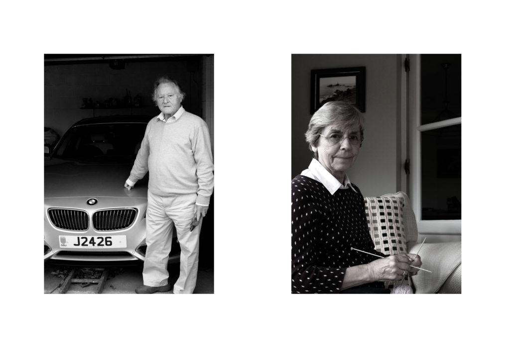
For my first final Piece I will be displaying my environmental portraits. I selected my top two images, which showed gender roles and resized them to be A4 images. To display them I am going to mount them on foam board next to each other, 4cm apart from each other. I feel that a white background suits the two images, and allows them to neatly be presented.

Final Piece 2: 
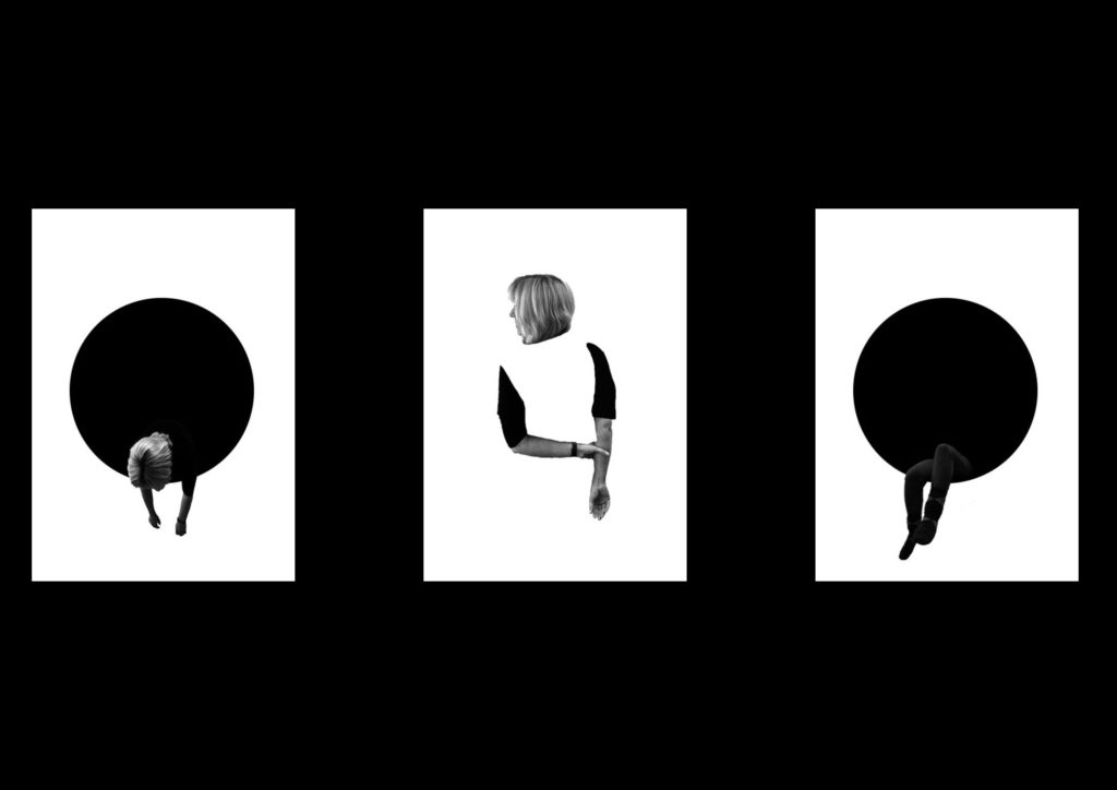
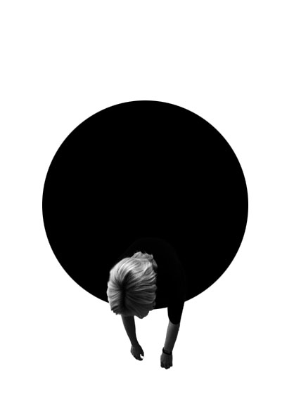
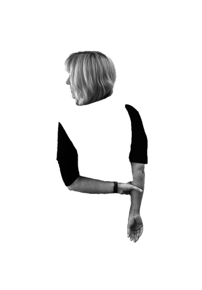
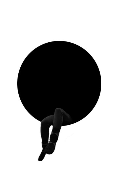
For my next final piece I am displaying the edits from my first photo shoot of loss of identity. I felt that these three images contained a simplistic design and represented the idea that my model has lost their identity, therefore I will be displaying the photographs in a triptych arrangements. All the images will be separately printed on A4 paper, and will be mounted as a window frame. The card is going to be black, due to the image background being white. They will be 4cm apart from each other and 15cm from the top and bottom of the frame.

Final Piece 3:
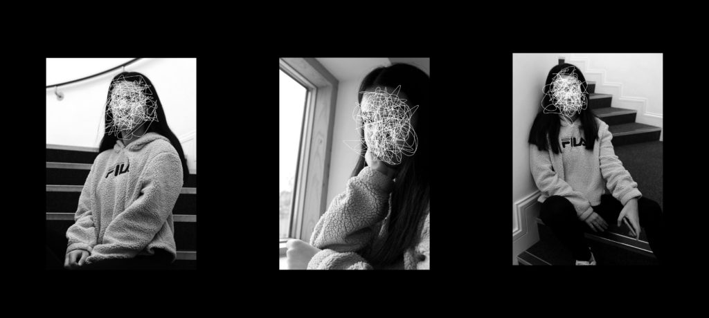
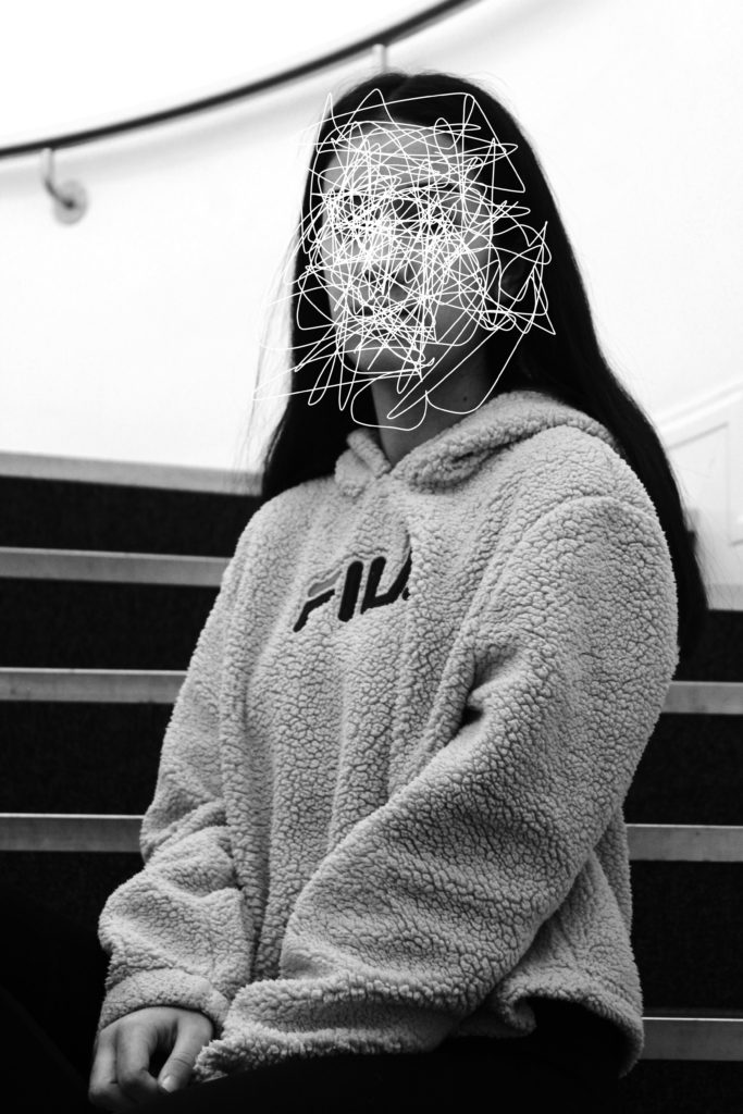
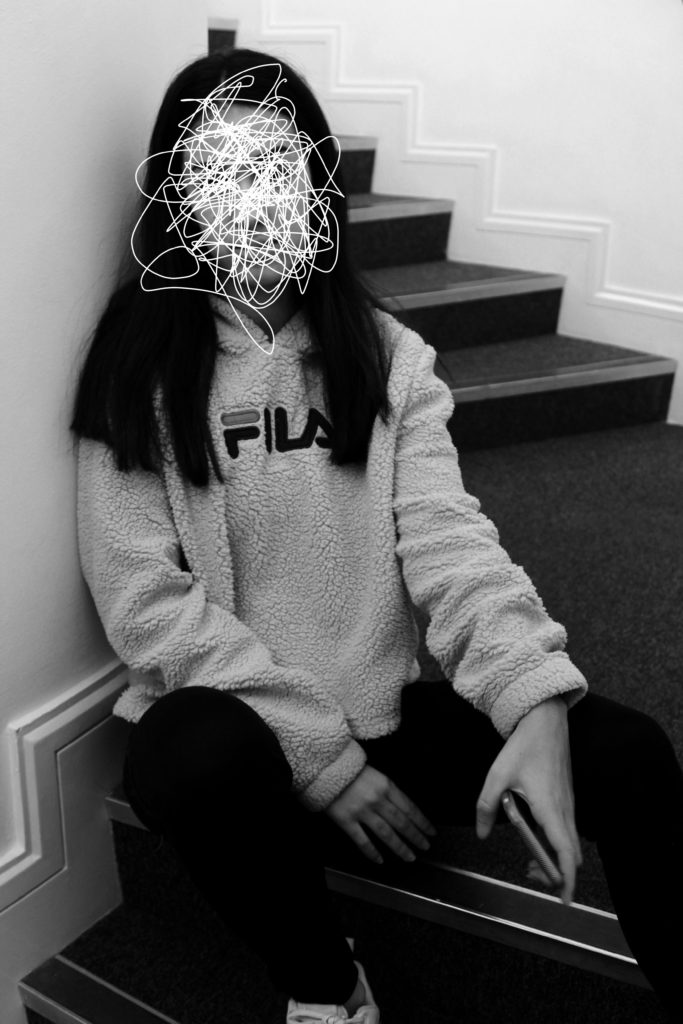
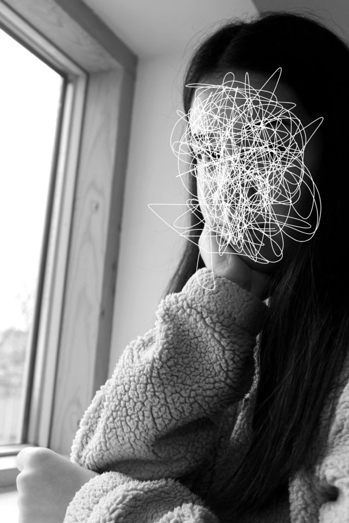
For my third edit I wanted to showcase, the scribble edits, which I created using the forgotten images. I felt that these images had a strong link to loss of identity and felt like the three images would produce a strong outcome. To do this I will  print the images on A4 paper, and will be mounted as a window frame. The card is going to be black, due to the image background being white. They will be 4cm apart from each other and 15cm from the top and bottom of the frame.

Final Piece 4:
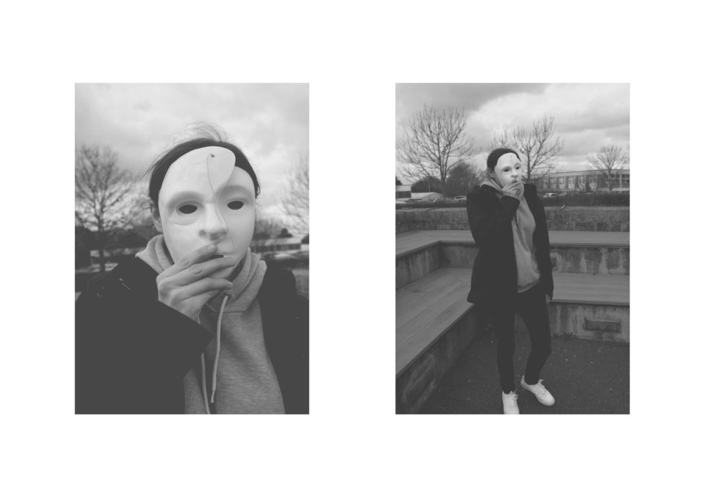
For my next final piece, I wanted to present my top outcomes from my mask photo shoot. I selected these two images, as I felt that they worked well together as a small photographic series. I will be displaying them as a Diptych Arrangement. Due to the two images being naturally lighter I feel like it would be appropriate to display them on white foam board, next to each other. I intended it have the images roughly 6 cm apart from one another and 6 cm away from the edges of the foam board.

Final Piece 5:
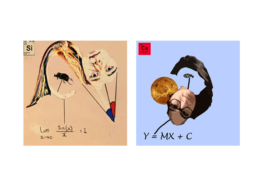
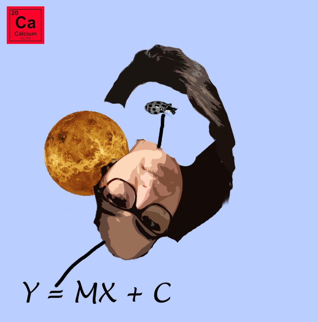
For my next final piece, I want to showcase my strongest photo montages. I decided to use these two montages as I felt that they worked well together. Due to the images being square, I have placed both images on the same A4 paper and will display through a window mount. This will allow the square shape to be kept. The two images are 3 cm apart from each other and will be a distance away from the edges.

Final Piece 6:
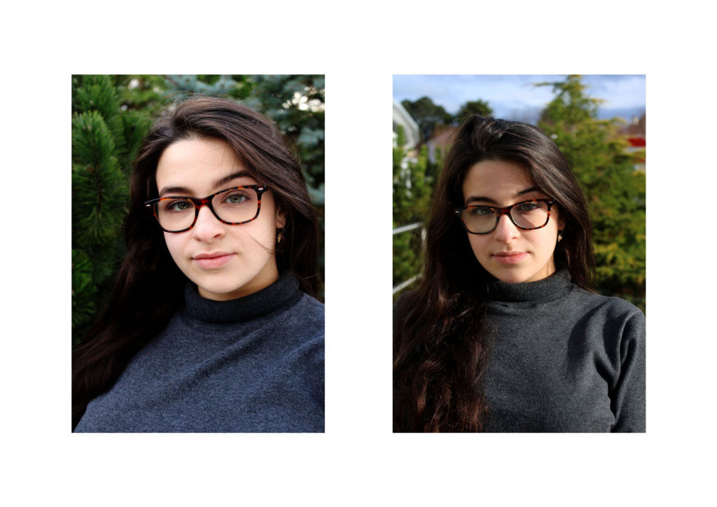
In my next final piece I want to display the photographs I captured when I studied natural lighting photography. These two images are my strongest outcomes and I feel like they work well together. I will print them out on separate A4 pieces of paper and frame them using foam board. The images will be 10 cm apart from each other and from the edge of the foam board.

Final Piece 7:
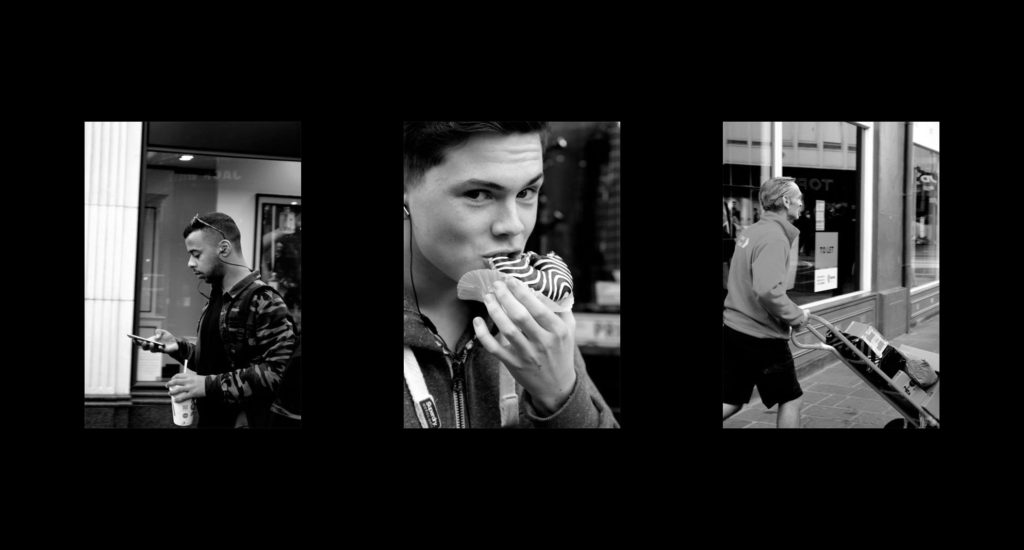
My next final piece showcases my attempt at street photography. I have used my top three images from this shoot and am going to display them next to each other, horizontally. The images will be printed out on A5 paper and be displayed using a window mount. The photographs will be 6 cm away from each other and 10 cm away from the edge of the window frame.

Final Piece 8:
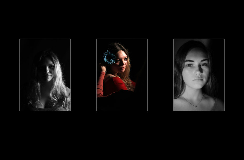
In a similar formate to the final piece above, I want to showcase my studio photography images. These images have been selected as it showed my ability to use different lighting and camera techniques, which shows my development as a photographer. The images will be printed out on A5 paper and be displayed using a window mount. The photographs will be 6 cm away from each other and 10 cm away from the edge of the window frame. The middle image has been left in color as I felt it added variety and makes the final piece visually stimulating.

Final Piece 9:
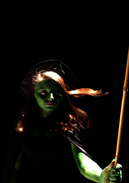
For my last final piece I intend to showcase my top image from the tableaux photography shoot. I will print this image out on A5 paper and then mount it on black card, allowing the mount to not distract viewers from the actual picture.

All Images Being Made Into a Final Piece:
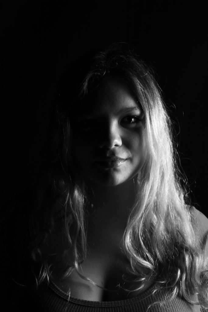
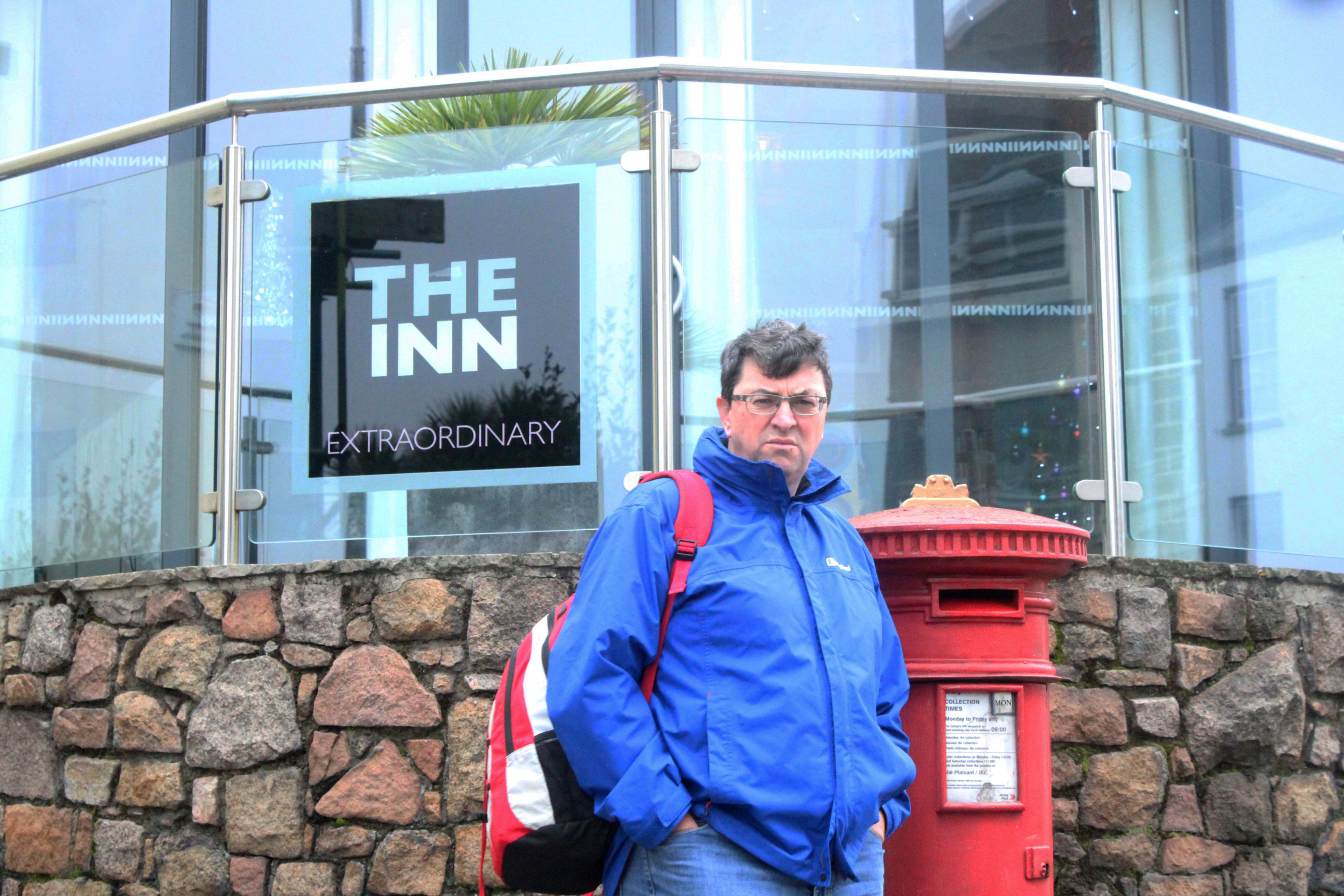
Final Portrait Project Photoshoot – More Street photography

This is the final photoshoot I have done. I have done some more street photography for it. I have decided to do more street photography for it as it allowed me to get some more images like the ones Tish Murtha and John Bulmer have taken.

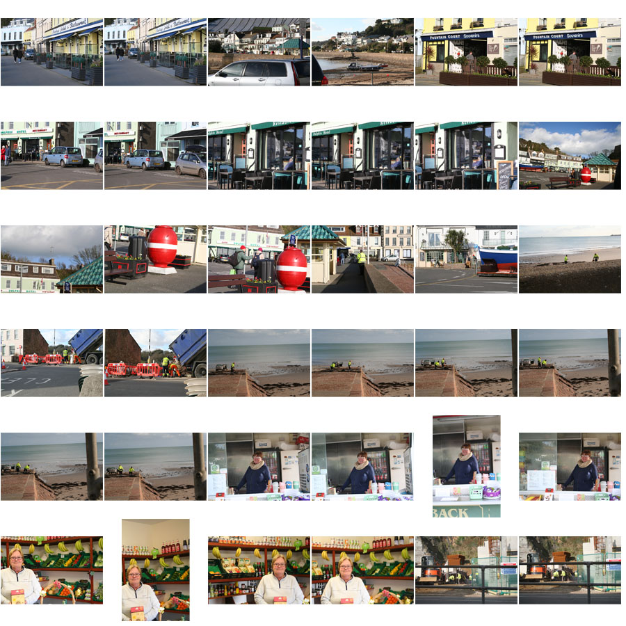
Below are a selection of the images I have taken on this photoshoot. A few of them turned out to be quite good images, that I may be able to use. Quite a lot of them didn’t turn out how I would have liked though, without many faces showing or being very dark or coming out blurry due to me using a higher shutter speed for some of the images.

The images below are the best two I have taken.

I have picked the image above because it came out to be a sharp image. If I were to edit it I would crop the image at the bottom to remove her hands and the bottom of the box and change the contrast in the image.

I have picked this image as it turned out sharp. When taking this image I purposefully angled it slightly. Though when editing I may take the image off of an angle as I don’t think the angle works. I may also add some saturation to make some of the lighter colours and the colours in her face to stand out.

PhotoMontage Case Study:
David Hockney:
Was born in Bradford, England on  9 July 1937.

Is an English painter, draftsman, print maker, stage designer, and photographer. He is considered one of the most influential British artists of the 20th century.  Hockney’s of of   Portrait of an Artist (Pool with Two Figures), sold at auction for £70 million, where it became the most expensive work for a living artist.  Hockney has experimented with painting, drawing, printmaking, watercolors, photography, and many other media including fax machine, paper pulp, and computer and iPad drawing programs to create his pieces of works.

Examples of his works:

David Hockney


David Hockney


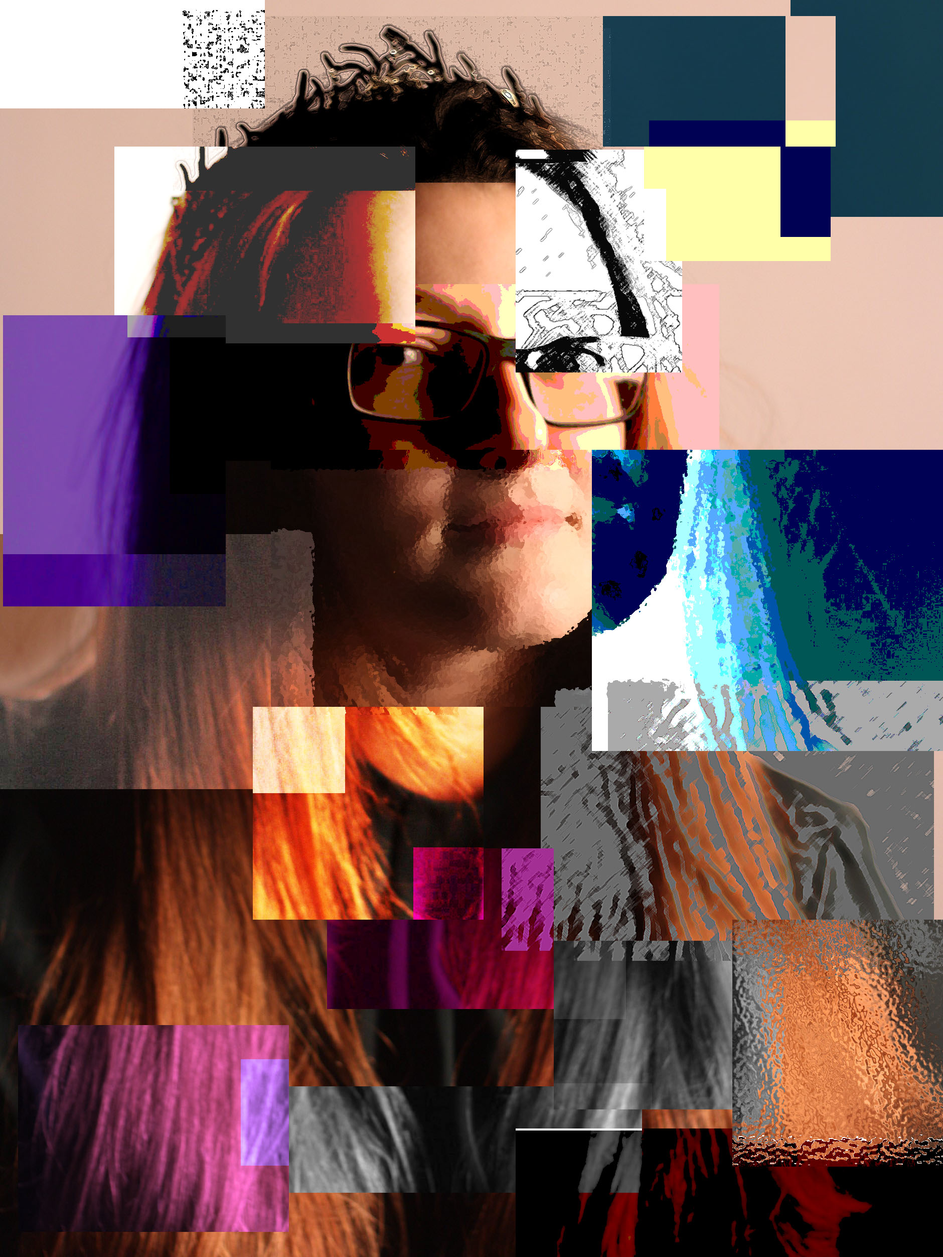
My response to David Hockney’s:

By Kimberley N

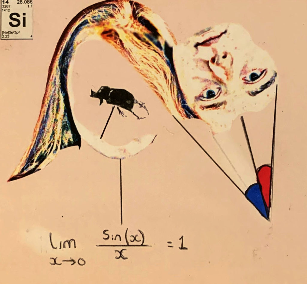
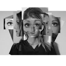
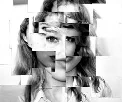
For this I experimented with With using different Adjustments for example I used as filter called ocean ripple where I could select the piece of the picture I wanted then, then I applied the effect making it look like it is under water. The other effects that I have included is Inverted, the colours. Then I placed the different layers on the original photo to create a effect of loss of identity as everything as been cut to change the identity of the person.

Identity – Michalina Woźniak

The theme I will be exploring is the lack/loss of identity, and i’ll be looking at multiple different photographers to gain ideas to add to my final piece.

Michalina Woźniak is a self-taught Polish photographer and has been taking pictures since 2009. In her Identity Series, she focuses on the loss/lack of identity and portrays it through dark and gloomy images.

I’m a self taught 21 y.o. photographer based in Lublin (Poland). I’m in love with deep and dark emotions, the more disturbing they are, the more powerful they’re for me. I need those strong connections between me and another worlds (creations) to FEEL it and to be able to touch it somehow.

This story is about Identity and alter ego, but everyone can find whatever he/she wants here. I don’t want to tell you what’s it all about, I want you to look for it and to feel it.

Photography is like a poem – it’s all about the impression and impulse. You need to feel it, to find the moment.

– Michanlina Wosniak

Michalina Woźniak Identity series

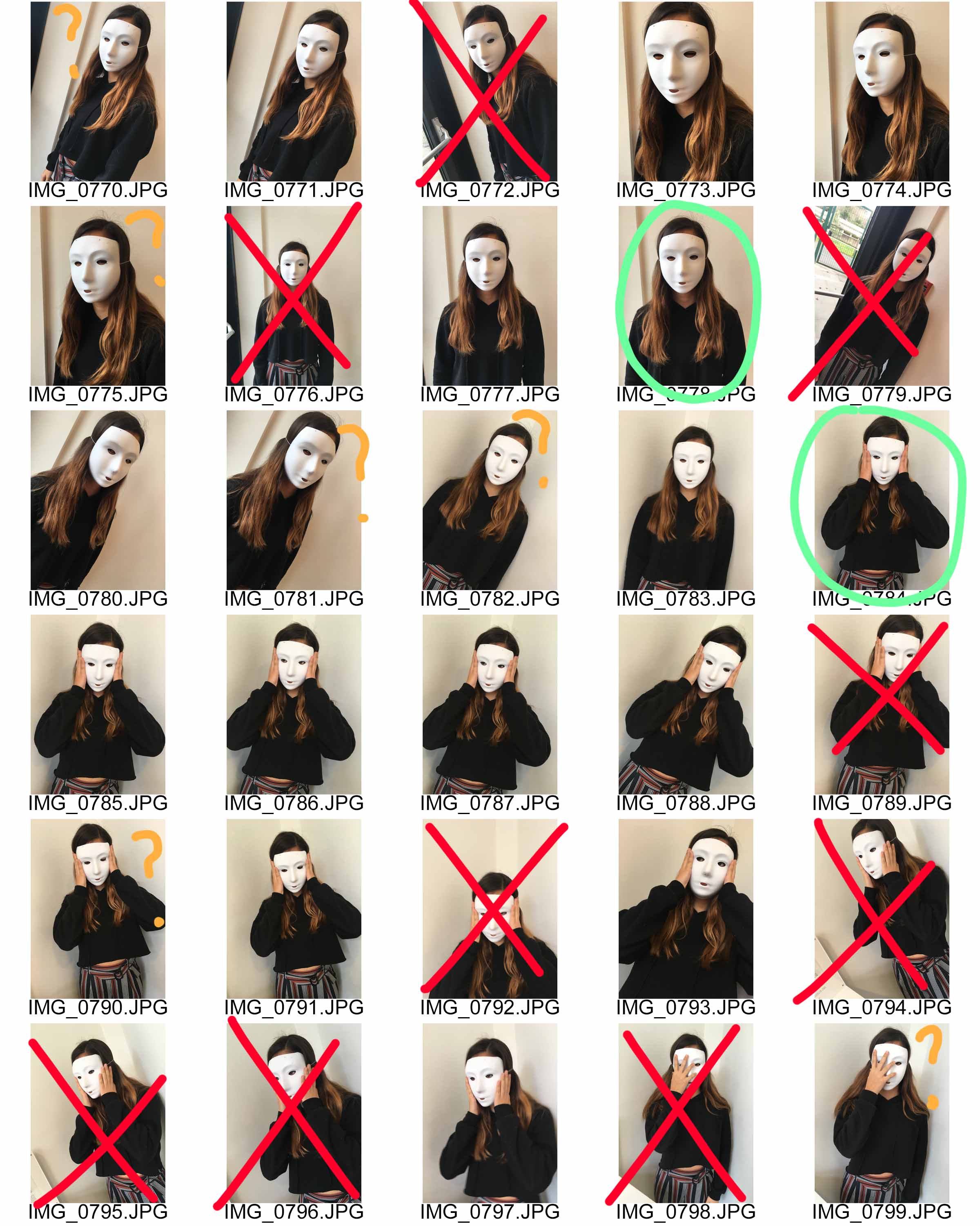
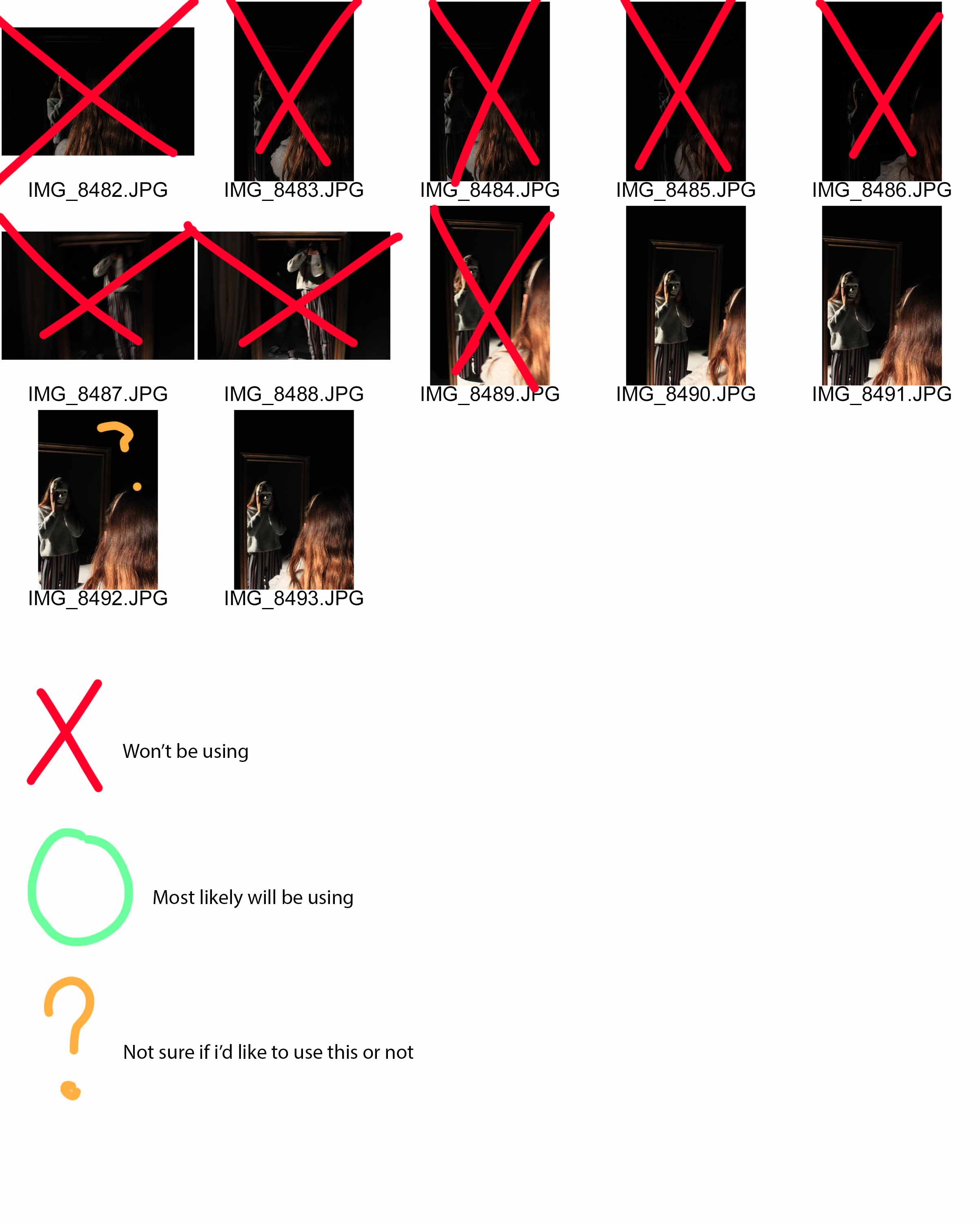
Contact sheets:

Contact sheet
Contact sheet
Contact sheet

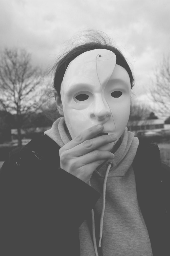
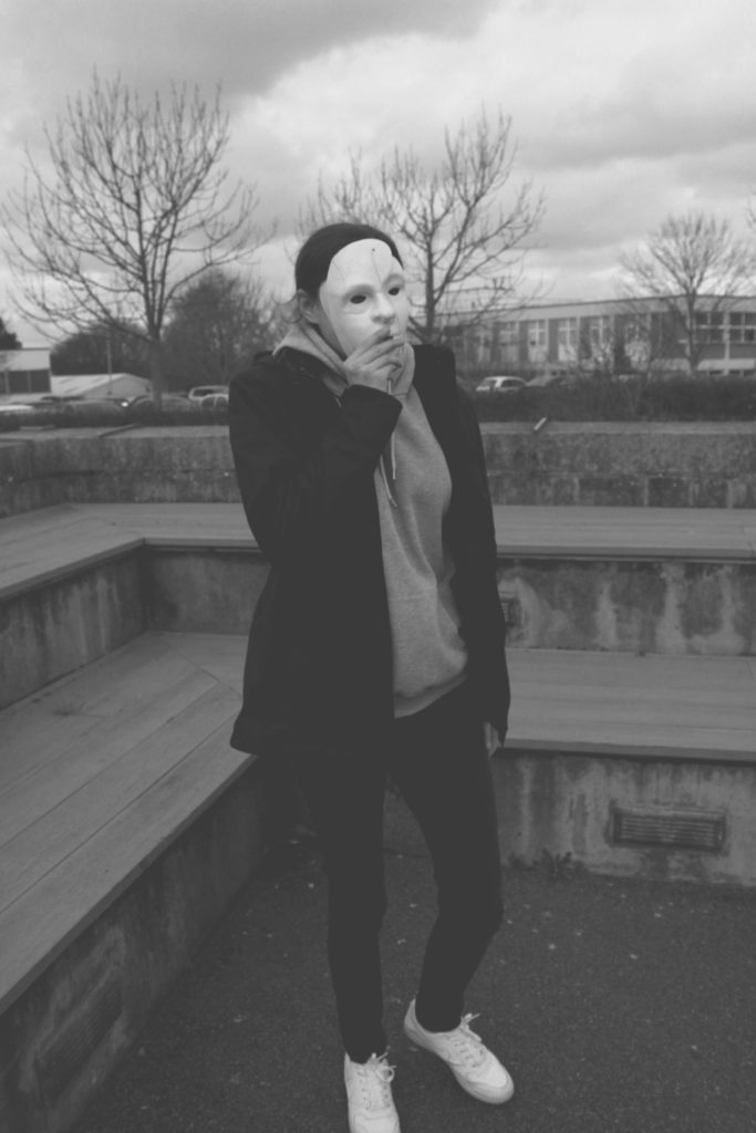
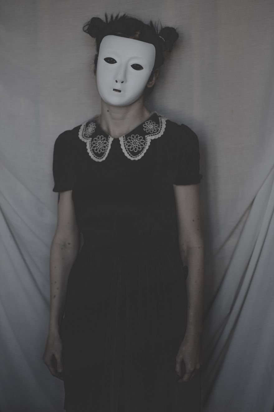
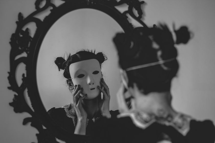
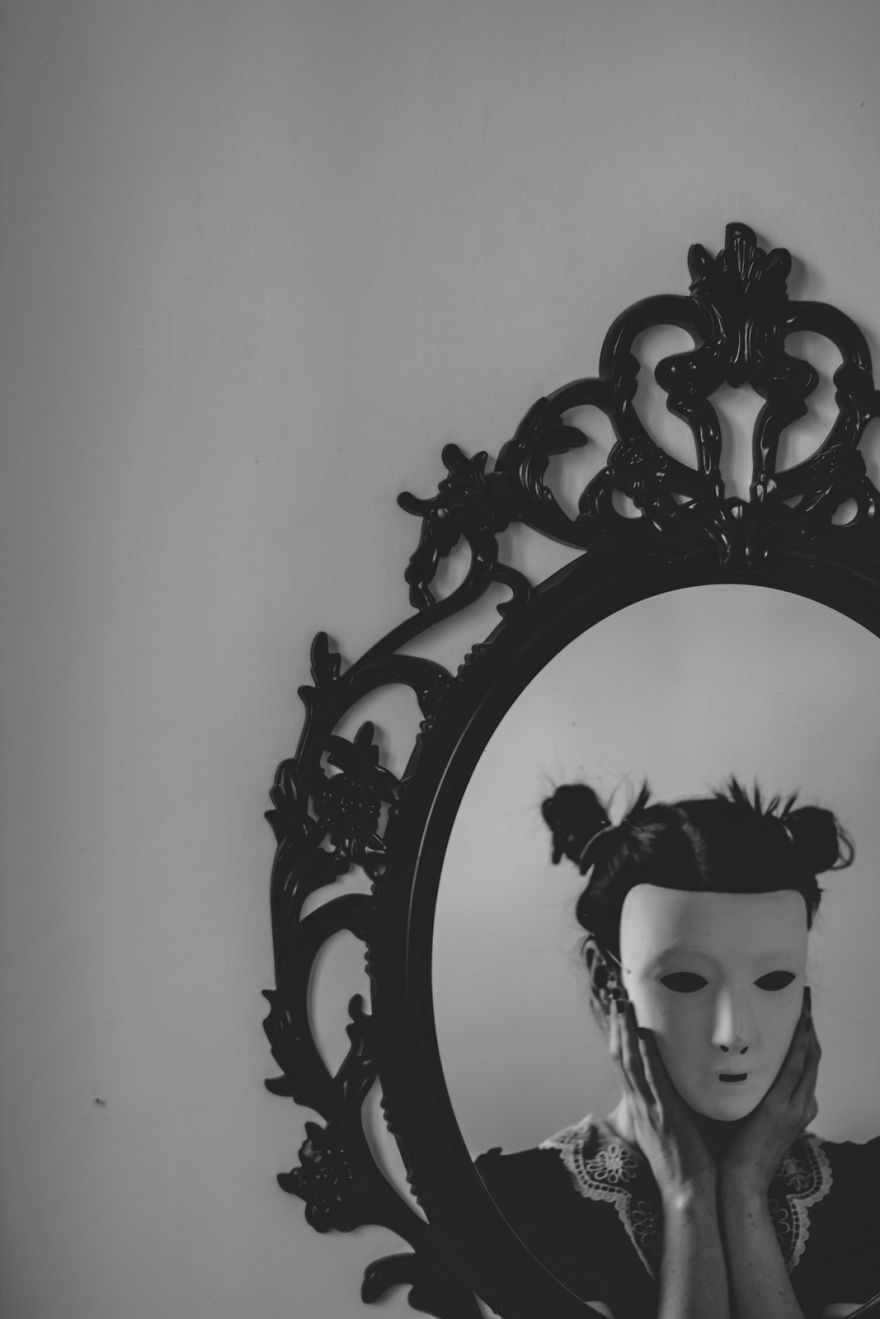
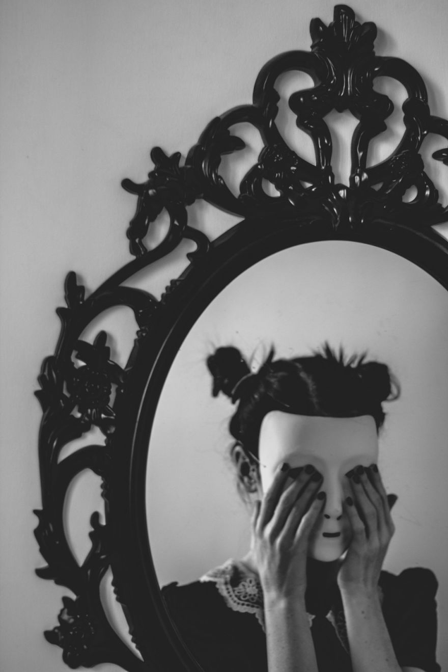
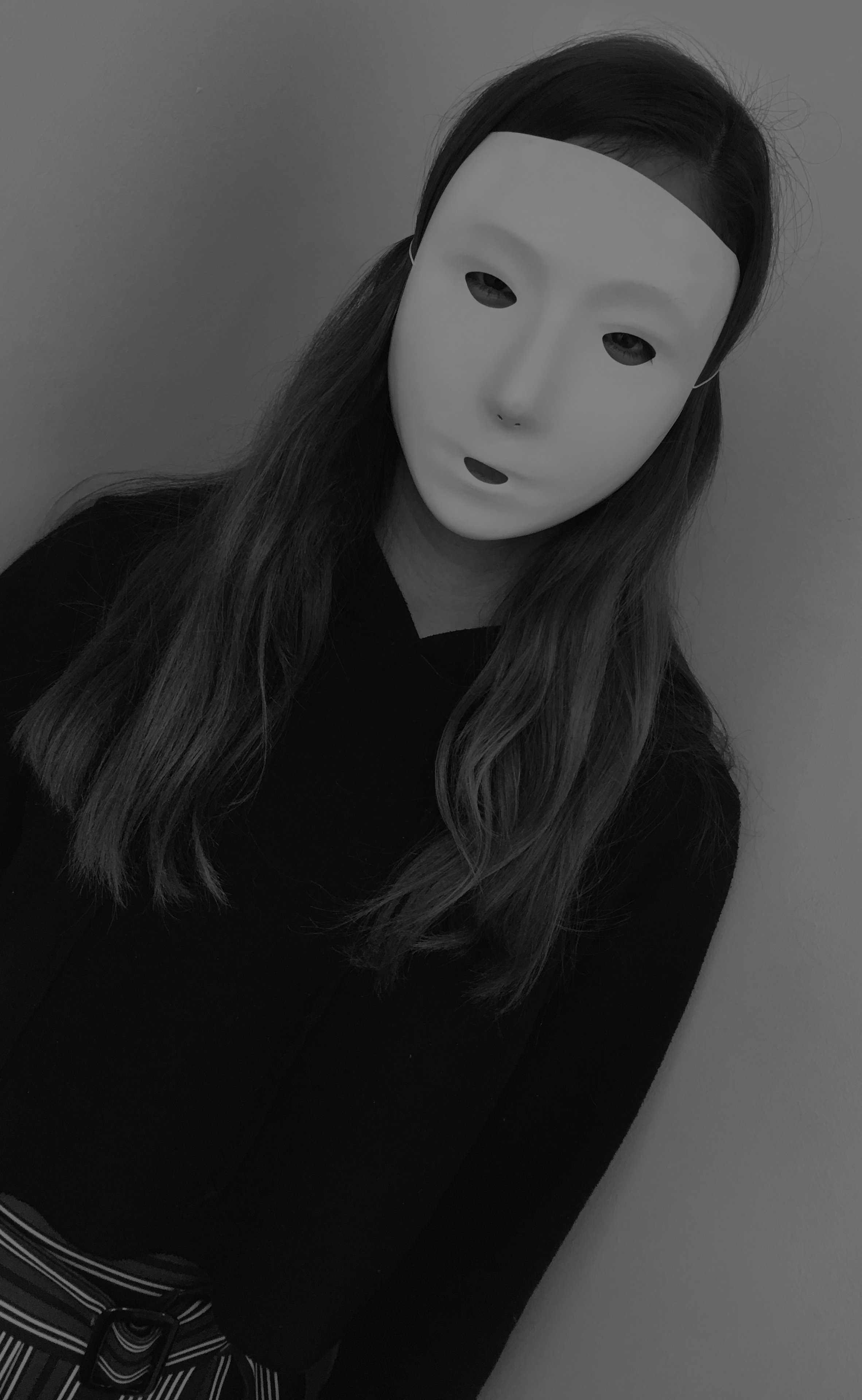
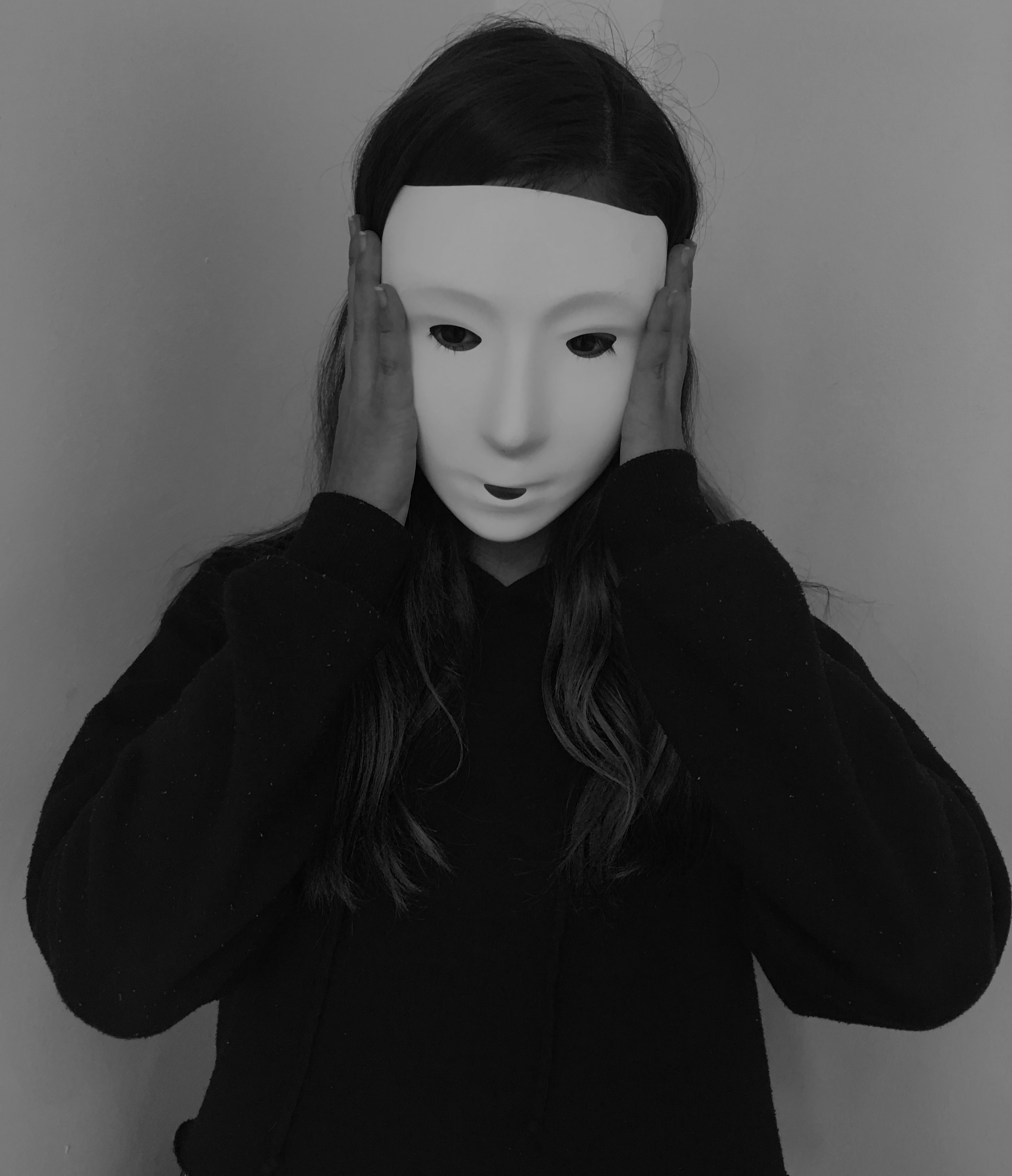
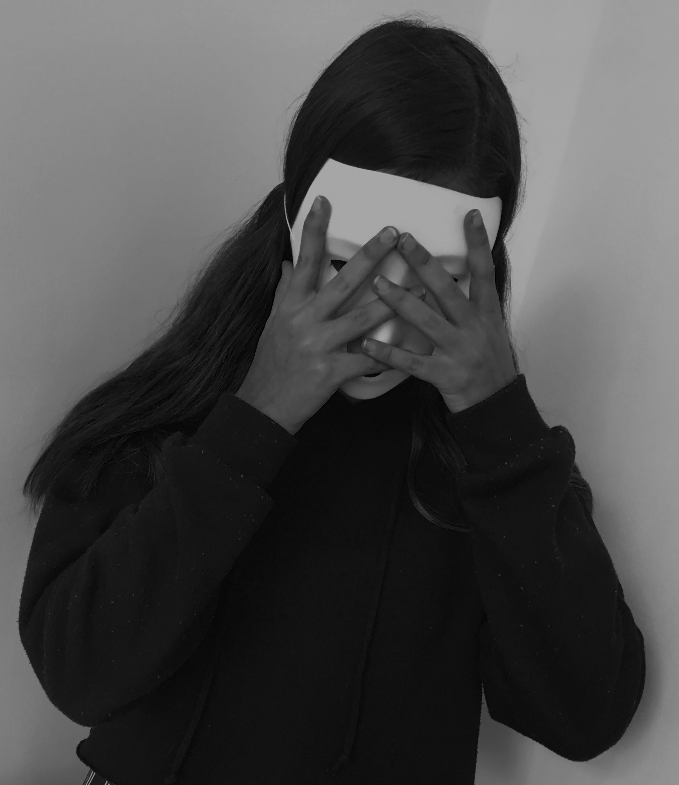
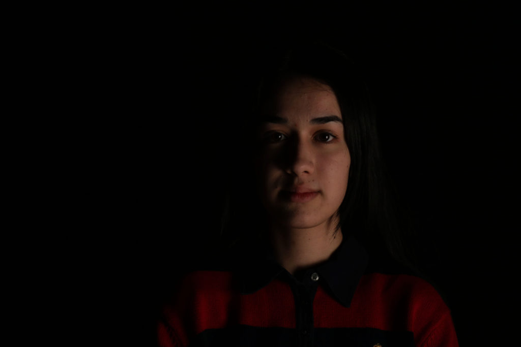
For my theme, I focused on the aspect of a masked face, and not being able to see the identity of the model in the picture. I also tried replicating pictures done by Wozniak, of a masked person looking into the mirror, surface which gives off a reflection, or looking directly into the camera. These link to my theme of the lack/loss of identity as the face of the person is hidden, and them looking into the mirror with the mask on, touching their face as if in confusion or distress, suggests that they themselves don’t know who they are. I got my subject to do multiple poses for this project,  looking right at the camera with the mask, touching their face with their hands, and looking to a mirror or reflection.

Chosen edits:

First image
Second image
Third image

I chose these images because I believe that they relate to the theme of lack/loss of identity and portray Michalina Woźniak’s work successfully, with the masked subject and the eerie black and white setting. I think they also show a story, the first picture she seems normal, staring into the camera as if nothing’s wrong. Then in the second image, she’s touching her face as if she had just realised something, maybe the fact that she lacks identity. And in the last image it’s as if she’s in distress, her hands covering her mask as if she’s hiding away.

I like my final outcomes, they tell a story of someone who’s lost their identity and don’t know who they are, but I believe I could have taken more of a variety of images, with more mirrors, more poses and different people, including me. That would have defiantly increased the quality of this project.


FINALIZING MY IMAGES

Final images 

My response to Environmental portraits

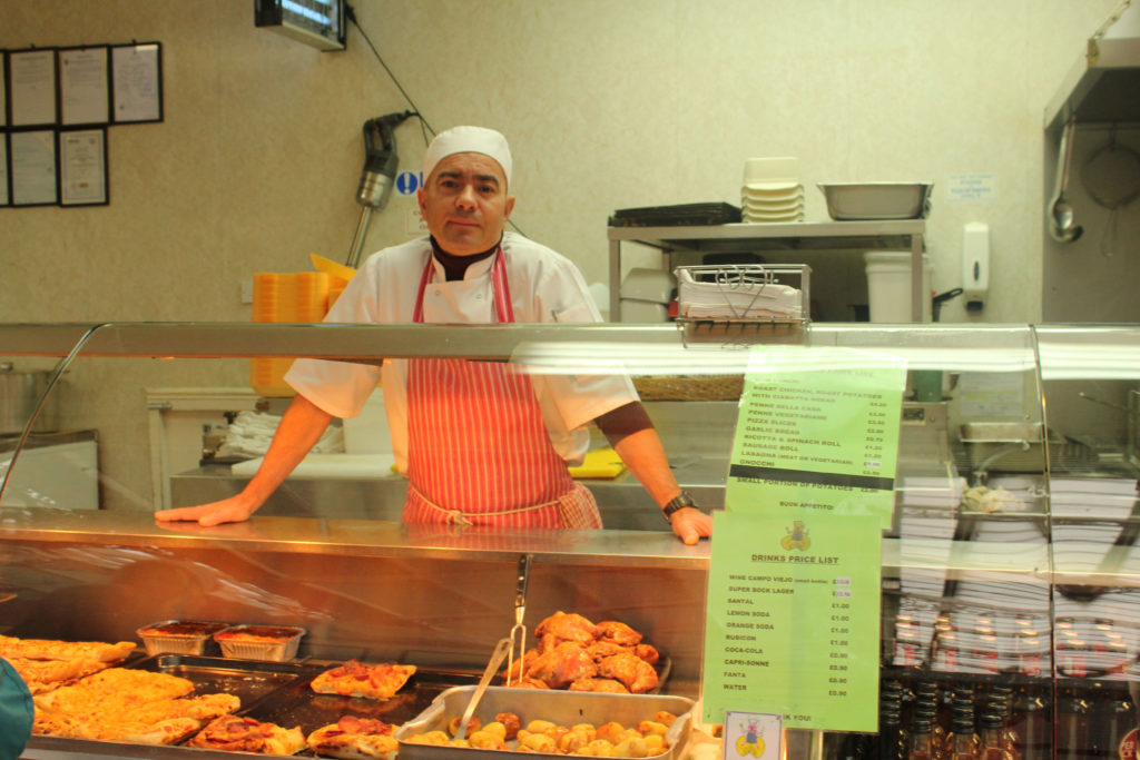
In this environmental shoot i used a Canon EOS 1300 D on manual focus. The image was taken under natural lighting and therefore i had my white balance on the ‘cloudy’ setting, as well as having a shutter speed of 1/250.

The image shows a butcher in his working environment.


My response to natural lighting 

When taking this portrait image I used the manual focus setting on my camera so that I could adjust the ISO setting to 400 and the shutter speed to 1/250 to ensure that the images weren’t too under or over exposed. I also used the ‘daylight’ white balance setting so that the color balance was correct. The image was also taken inside however directly in front of a very large window which let in a lot of daylight, i also used a reflector so that the models face was evenly lit up.


My response to street photography 

In this street photography experiment, i used a  Canon EOS 1300 D and the image was taken in Manual Focus. Using Manual focus allowed me to change the white balance to cloudy as this image was taken in natural light, as well as being able to change the shutter speed to 1/250 and experiment with the zoom lens.

We don’t know what the man was originally doing before this photo as i took the image in a moving car.


My response to photo montage 

This image was edited using Adobe Photoshop.


My response to studio lighting 

In this studio photography experiment i used a Canon EOS 1300 D with a manual focus setting. The use of this setting allowed for me to change the white balance of this image to auto as well as being able to change the shutter speed to 1/250.


My response to identity and place 

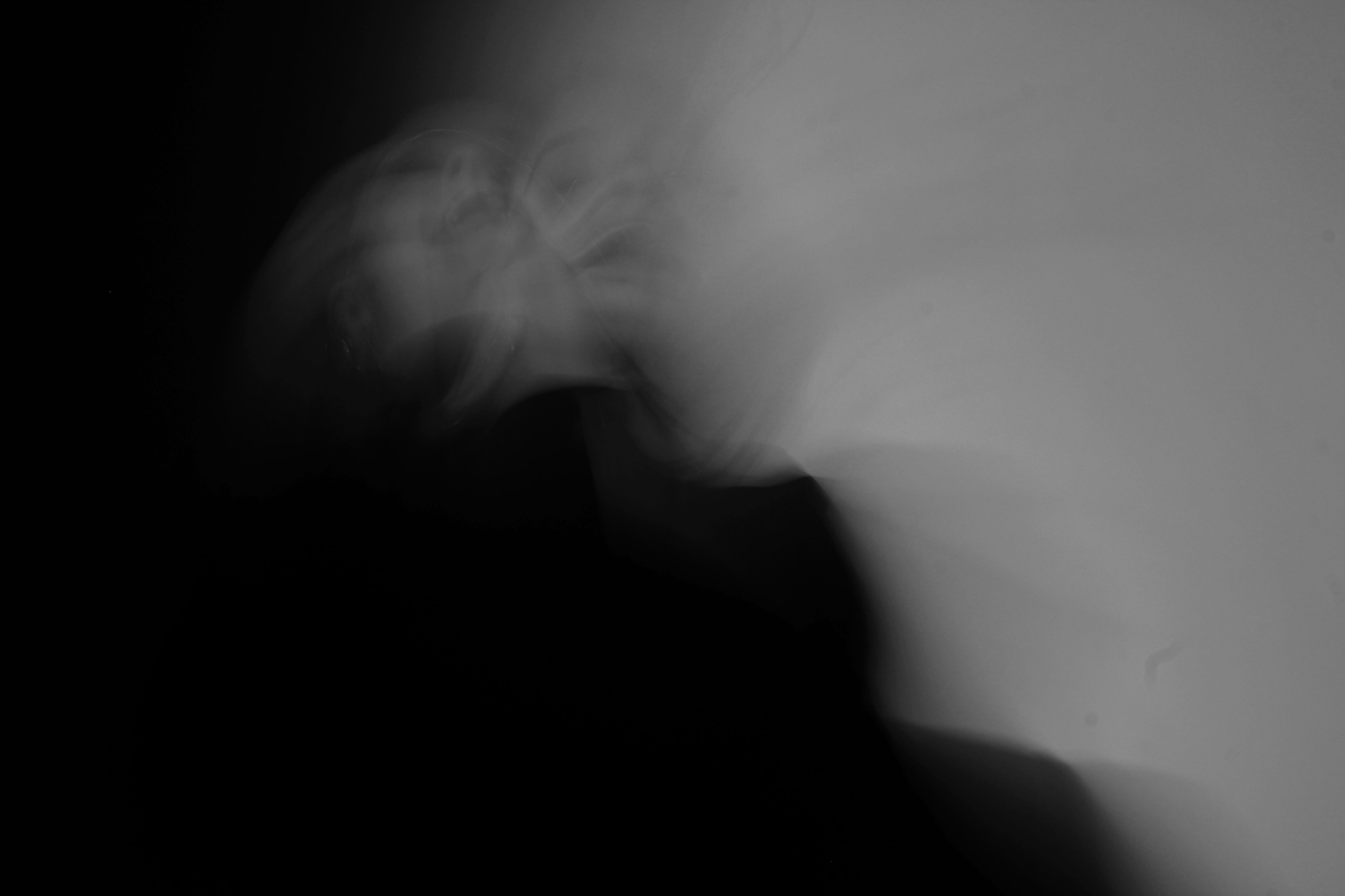
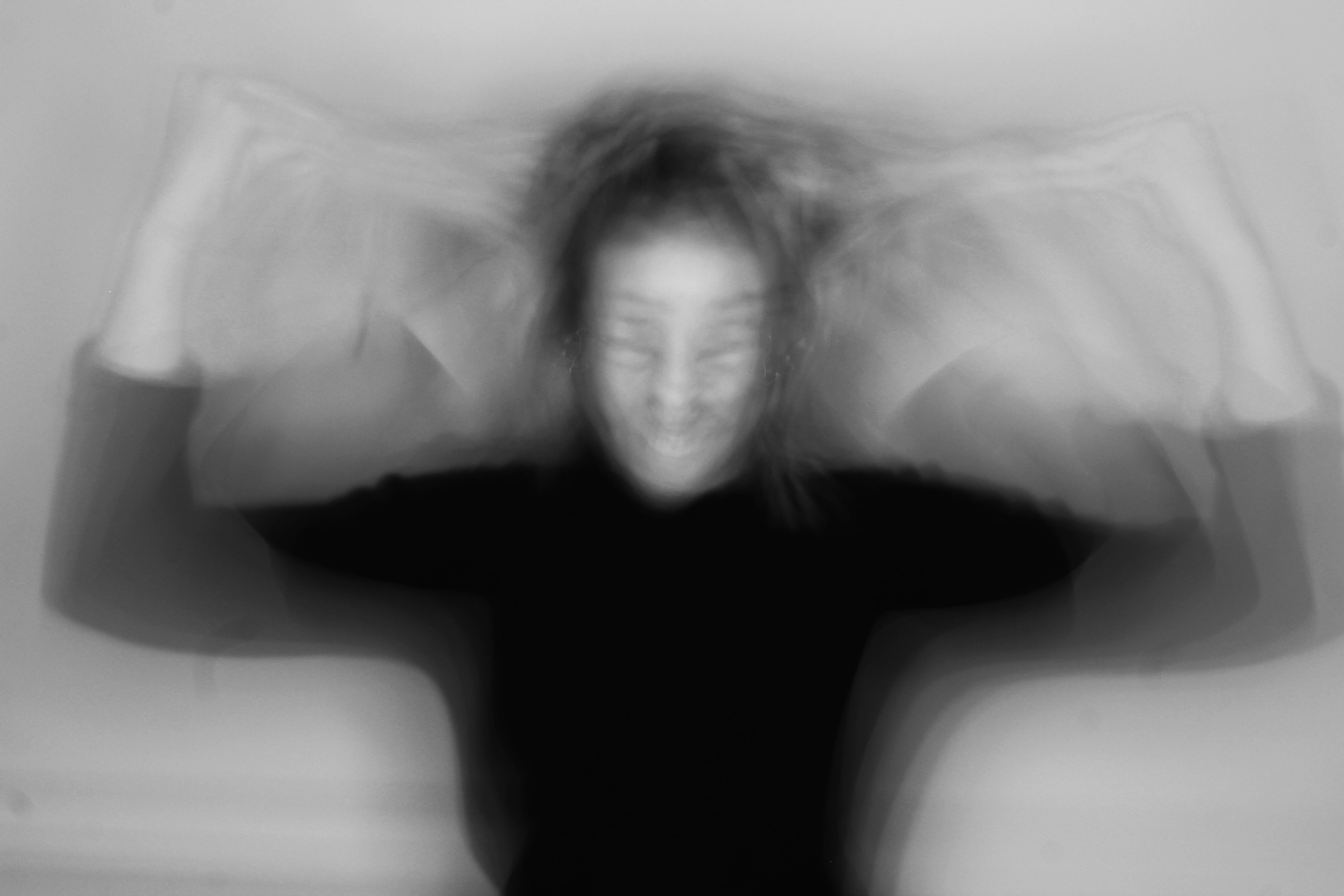
These images were taken on a Canon EOS 1300 D on manual focus. My camera being on manual allowed me to be also to zoom in on the models to create a disorientated effect, as well as being able to change the white balance to fluorescent. No flash was used when taking these pictures.

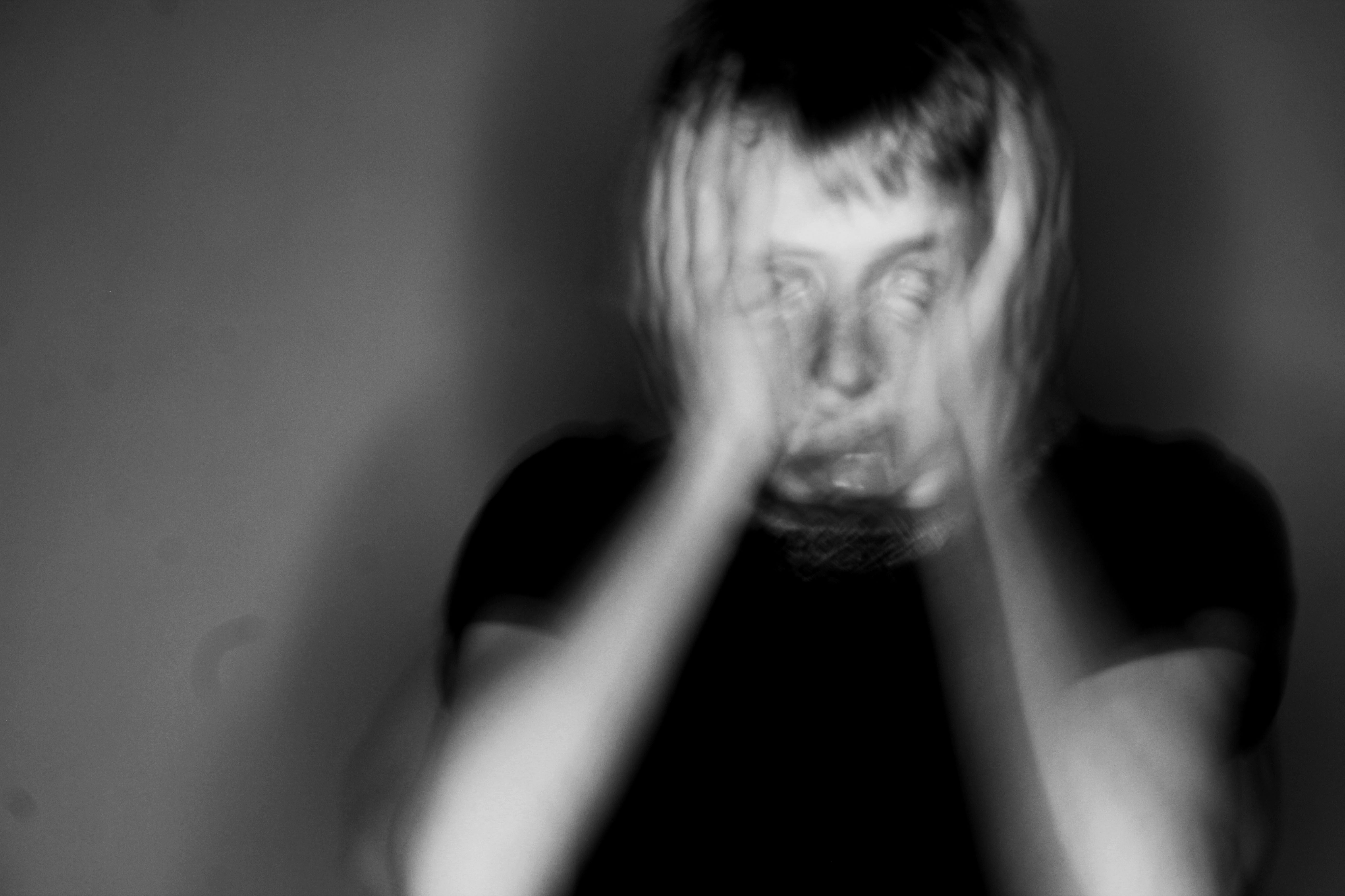
In the images we can see that there is a loss of identity due to the movement of the models. The positioning they create gives a sense of confusion, loss and craziness. The black and white edit adds a darker feel to the image, as well as the darkness on the left hand side of the picture.