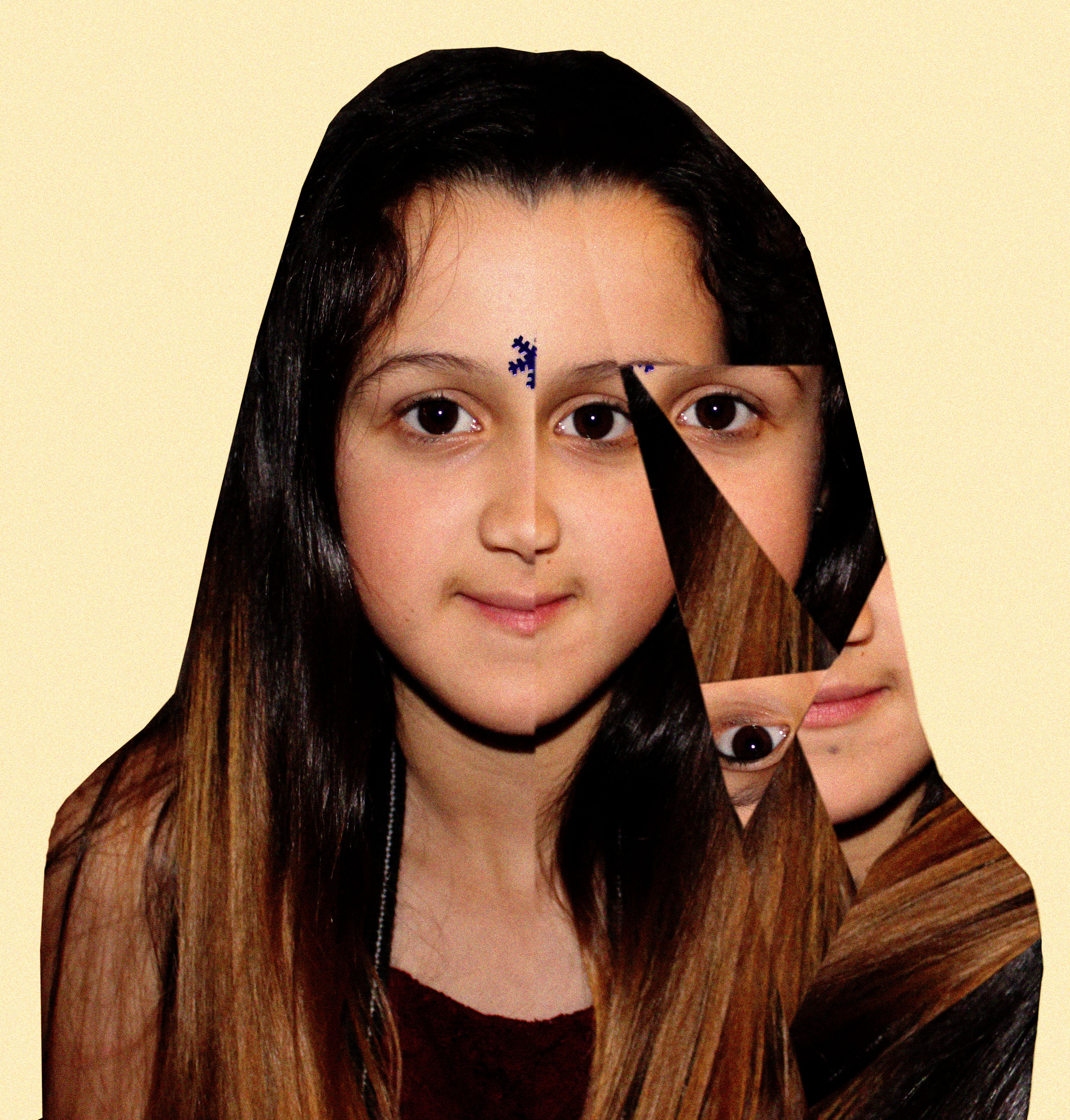
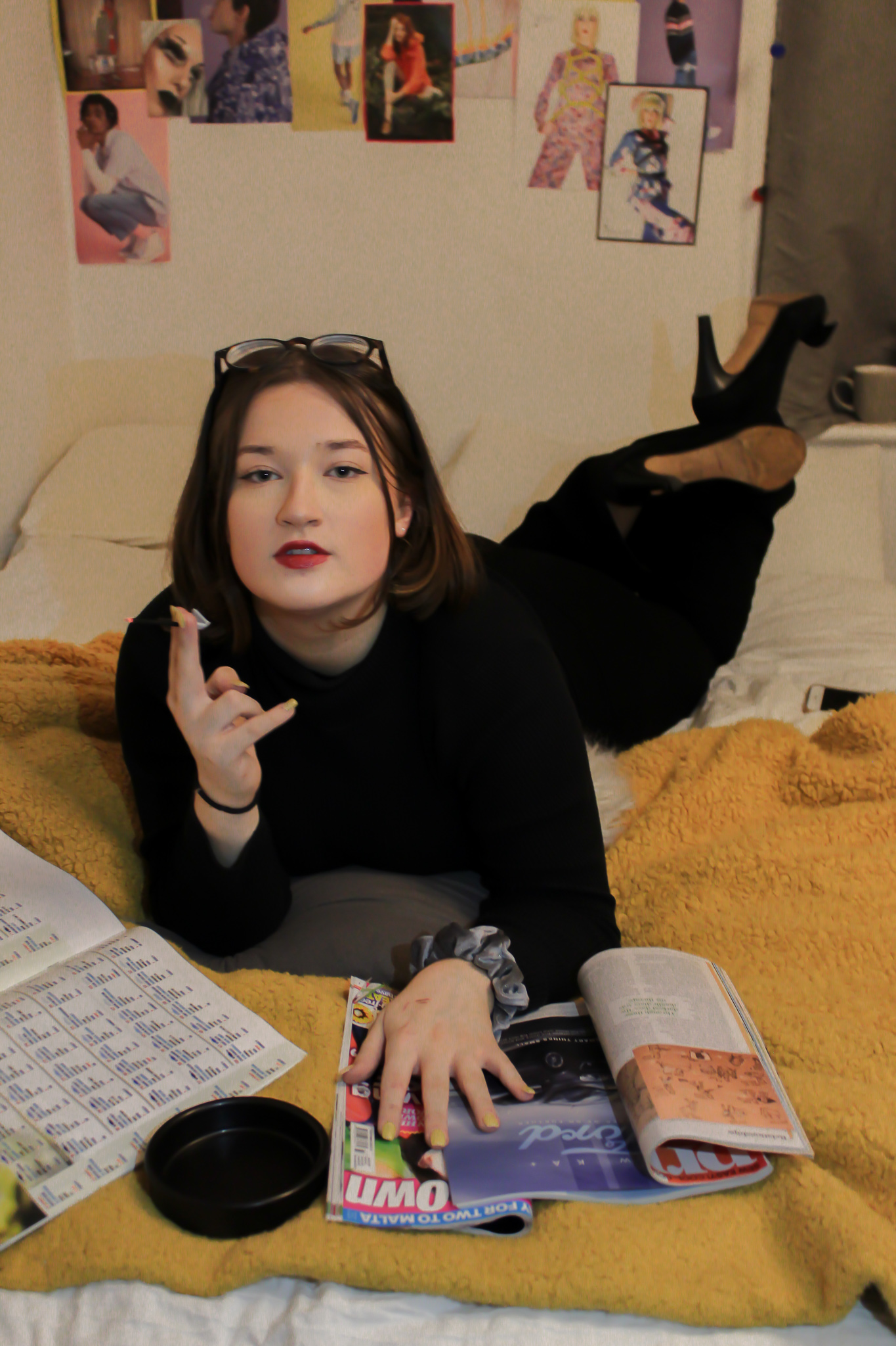
I have compiled several Images that I think are the best candidates for identity and place. These images also show my camera skills and photo shop skills.
Potential Prints:
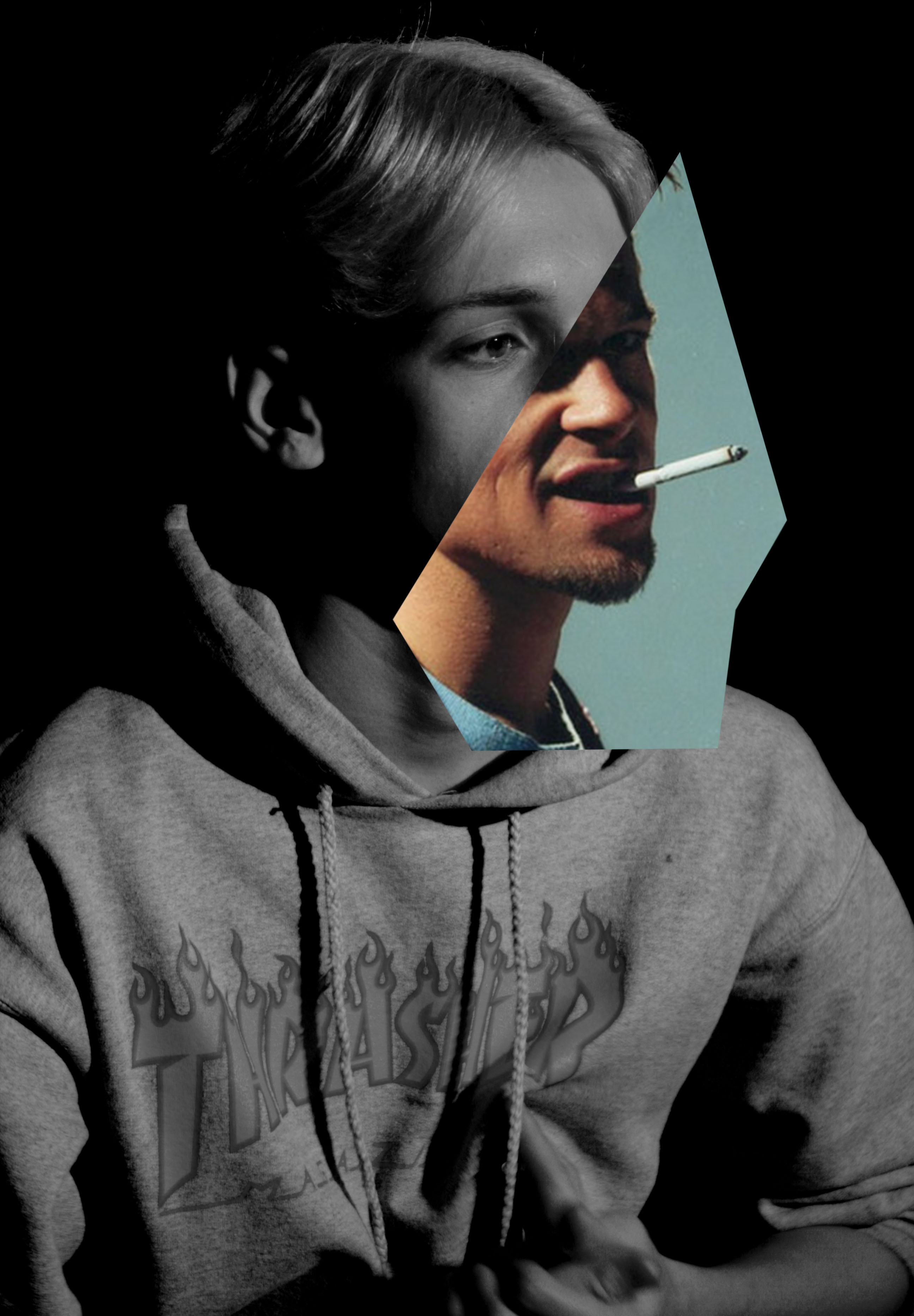
I really like this photo because I love the faces almost line up perfectly and creates a new face. 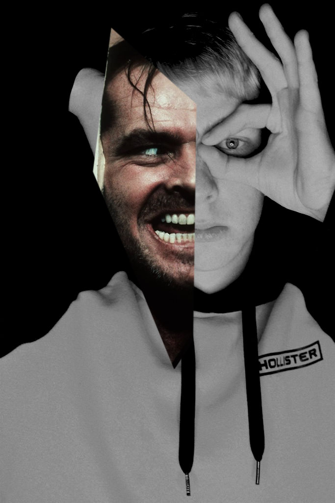
I really like this because it kind of shows two personalities in one person, it gives me a Jekyll & Hyde feel.
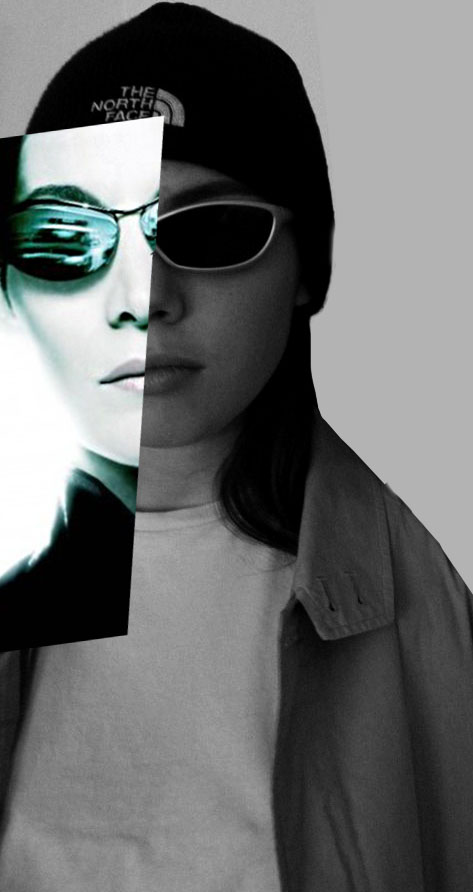
I think this photo is okay. I wish I had executed it better because I like the idea of it but I don’t like the outcome of it.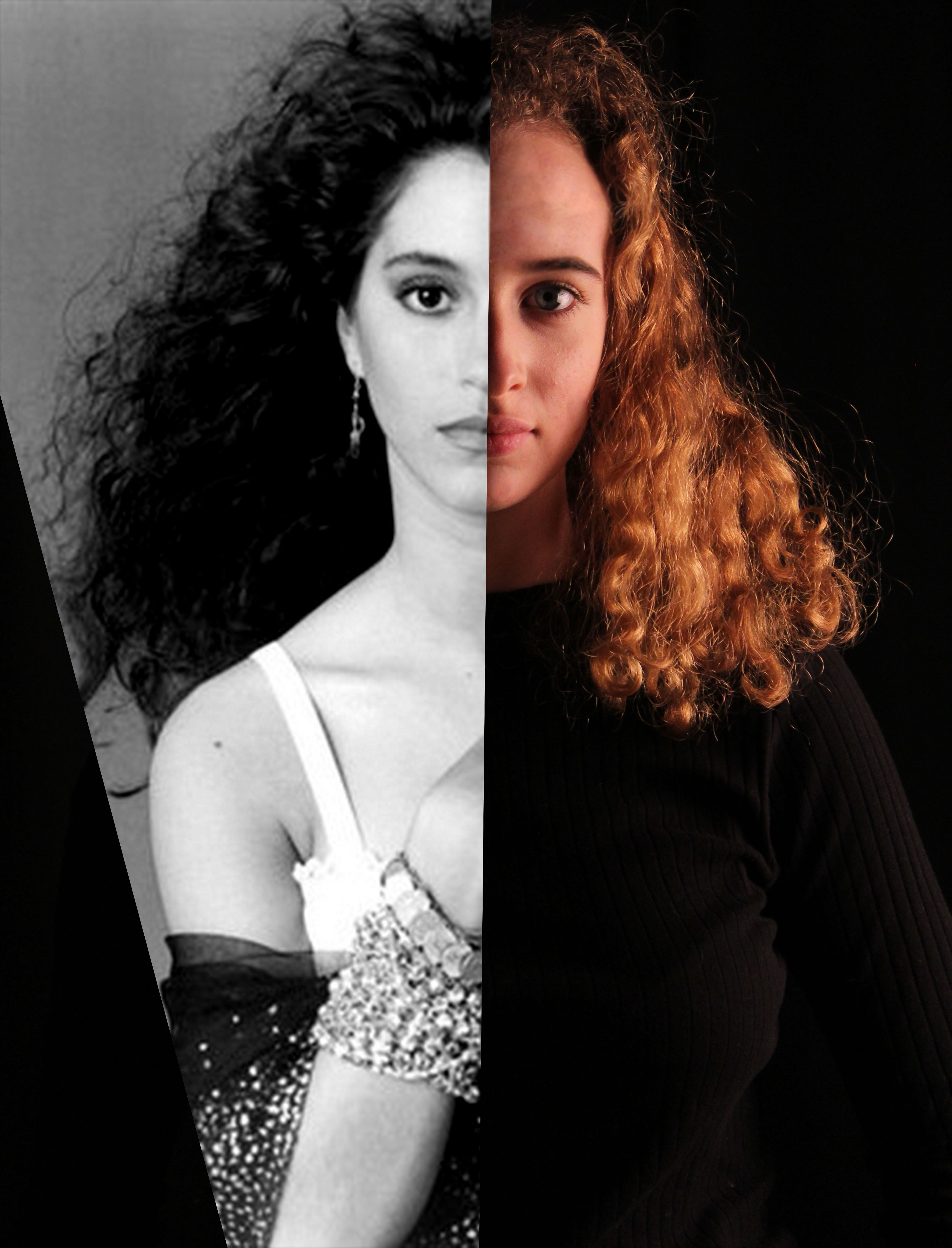
I also think this photo is okay. I like the fact that they both have curly hair and similar face shapes. I wish this photo had come out a bit better.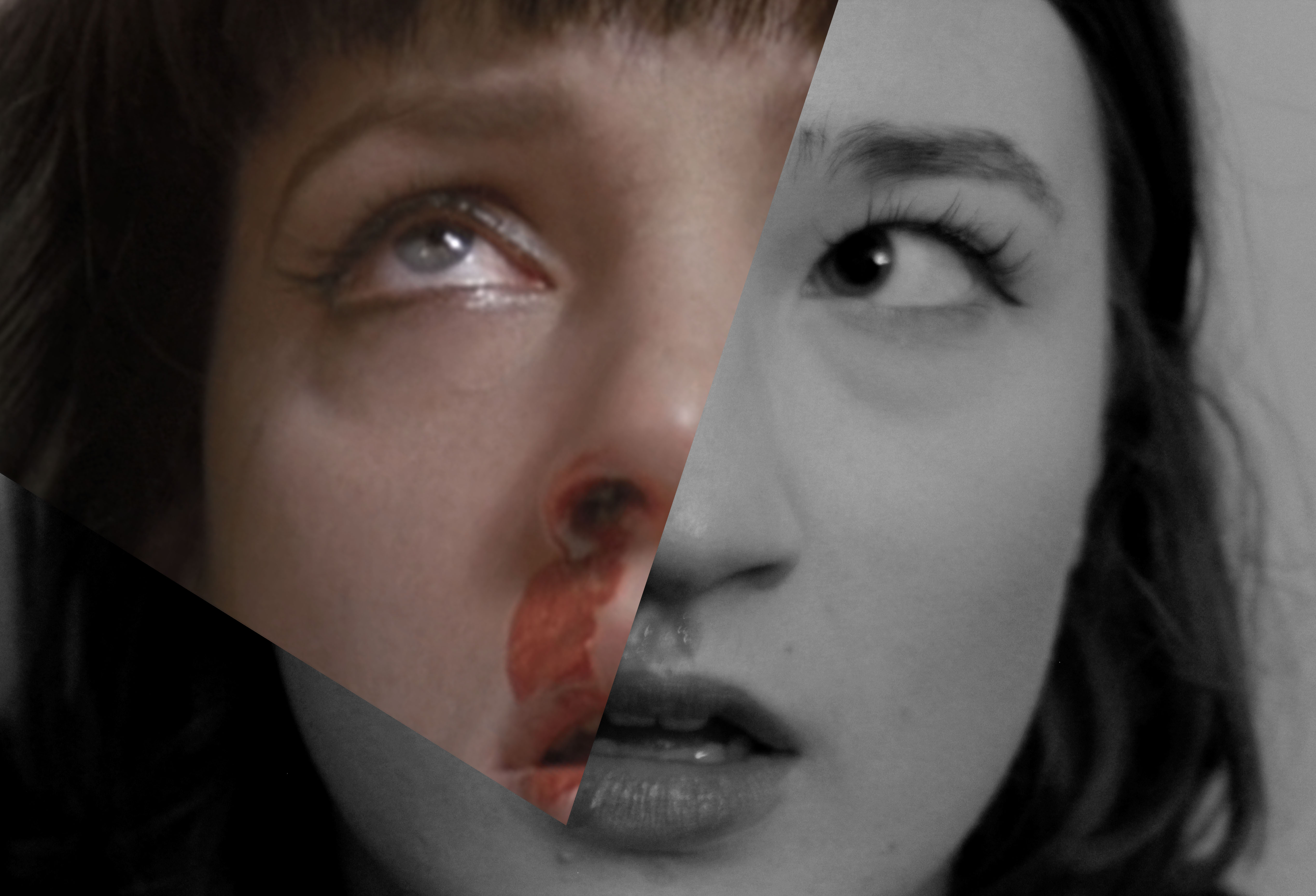
I really like this photo. I think the two different photos compliment each other very well and create a very pleasing photo.
I feel that most of these photos are worthy for printing, however there are a few that I’m not happy with so they will probably not be printed.
GIFS (Photo Montage):
I wanted to experiment with GIFS because I feel when I make GIFS, they come out very well. I decided to make around 3 GIFS.
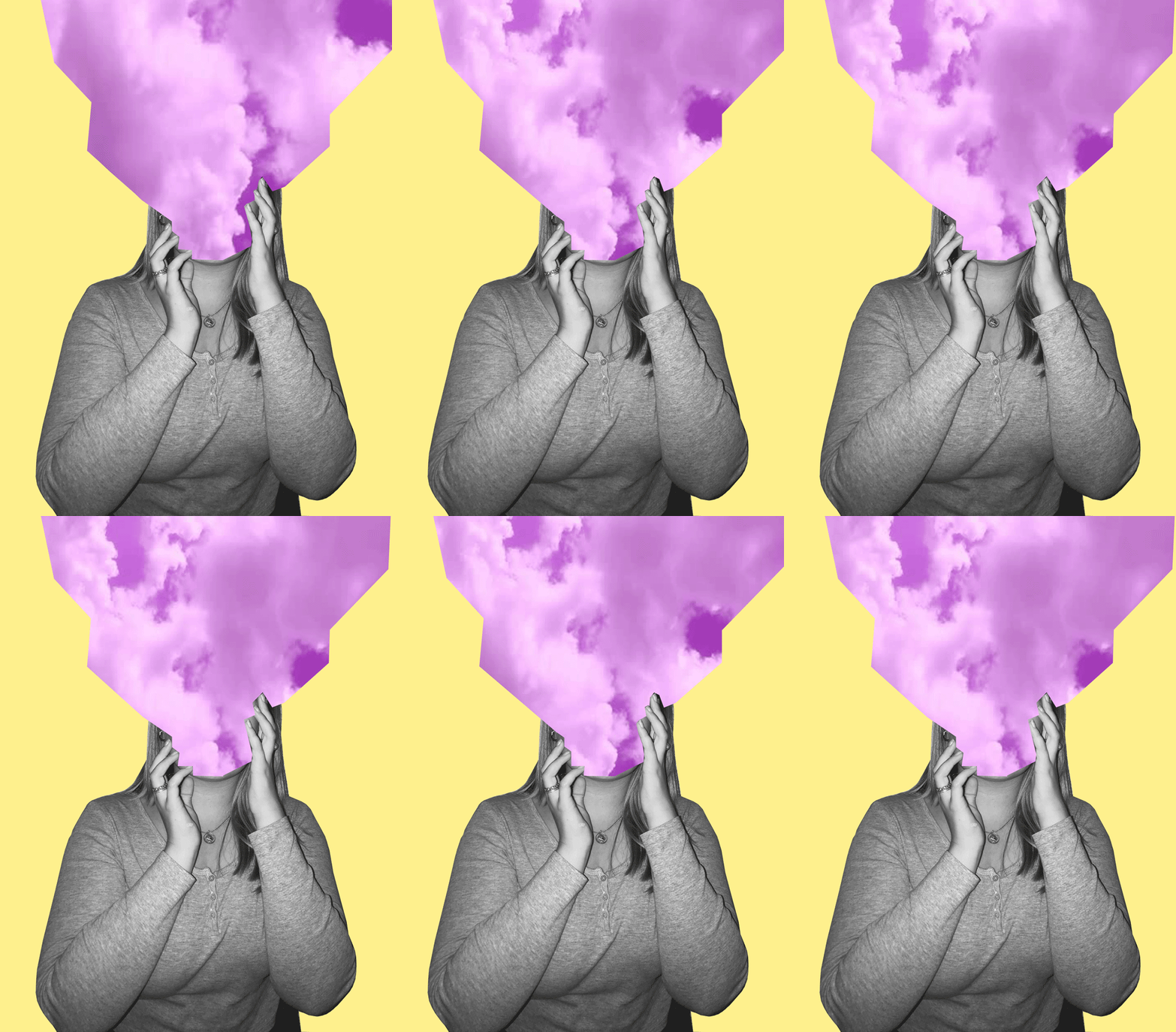
This photo was made in the photo montage project, but I feel as though this image fits in very well with the theme of identity and place.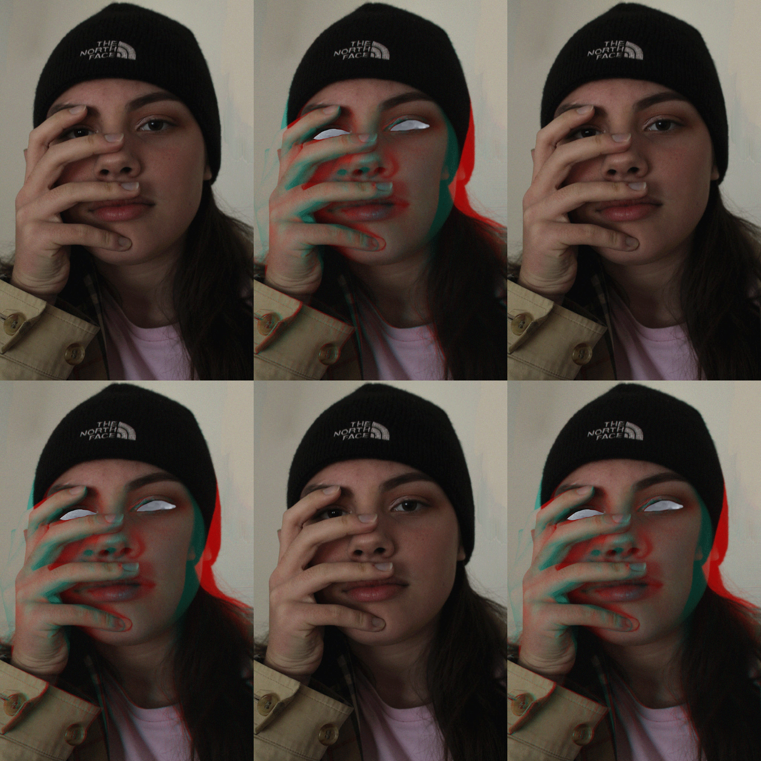
I really like this image because of the contrast of the original image and the edited image. I used RBG to create the distort split colour glitch look.
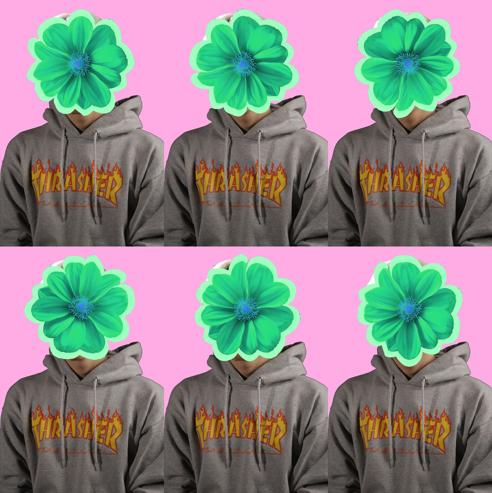
I really like this photo because I think the flower works really well with the image.
Other Photos:
These photos are ones that I like and could be potential for printing out.
