These are my best photos from the two photo shoots which I did for Identity. I focused on personal identity and emotions, this resulted in a lot of double exposures to help portray multiple emotions in one image.
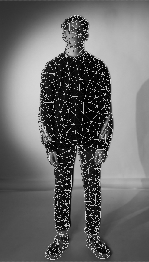
This image wasn’t actually planned, I was editing a photo of my friend Alex and I needed to align two photos so I used the puppet warp tool to do so. When you use this tool it displays triangles to show proportions across the photo, I really liked the look of these shapes so I saved this work in progress version and decided to use it.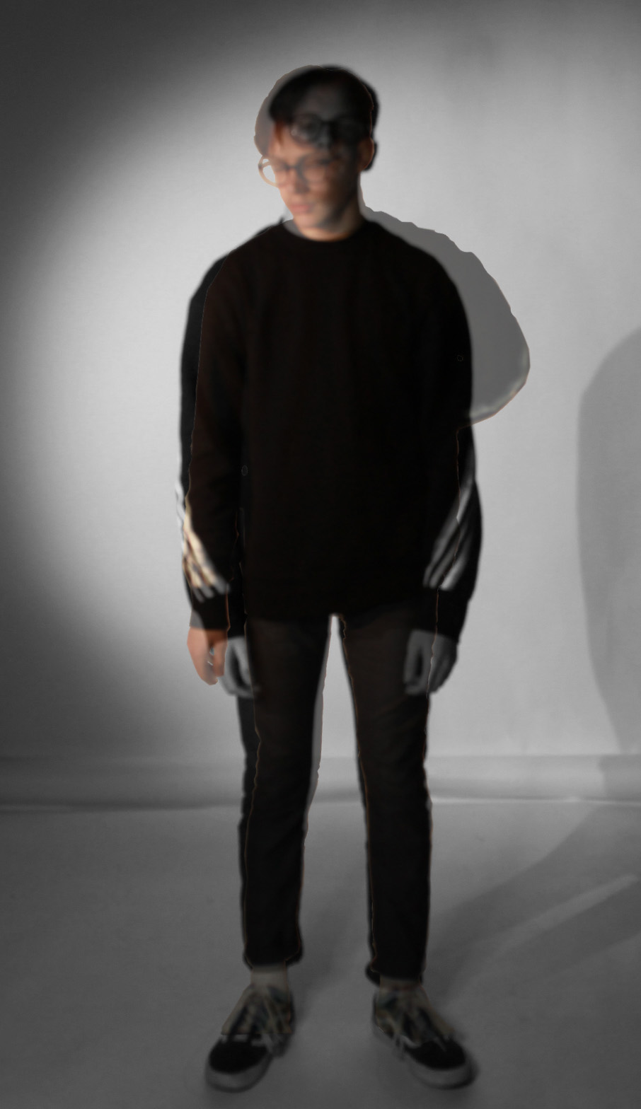 This is the photo I was editing when I accidentaly created the last one. I cropped out a second photo of my friend standing in the same spot, but in a different pose and placed it on top of the first photo. One of the photos is in black & white, whereas the other is in colour, this helps portray the different emotions in the two layers.
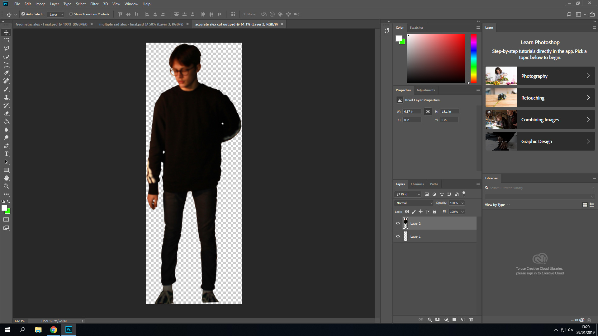 This is a work in progress screenshot of when I cropped out a picture of my friend, before pasting it on top of the other one.
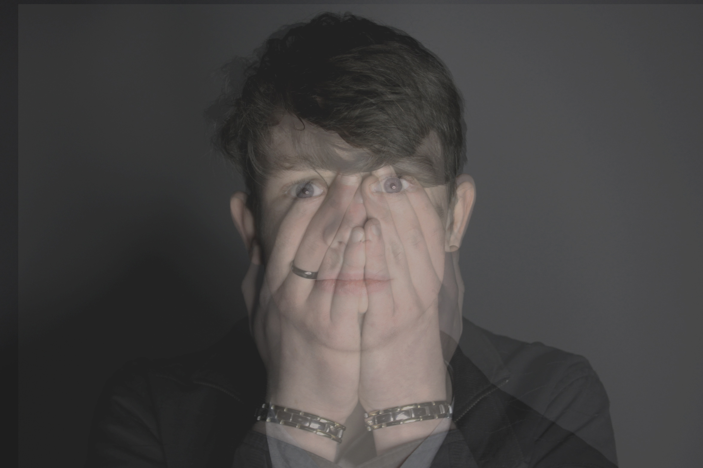 This is another multiple exposure image, I took two photos of my friend standing in the same spot. I’m not too happy with the angle of the first one as ideally I wanted it to look more vulnerable and sad, but the image still works. It shows how we hide emotions, outside we don’t show any signs, but sometimes there is a problem deeper within.
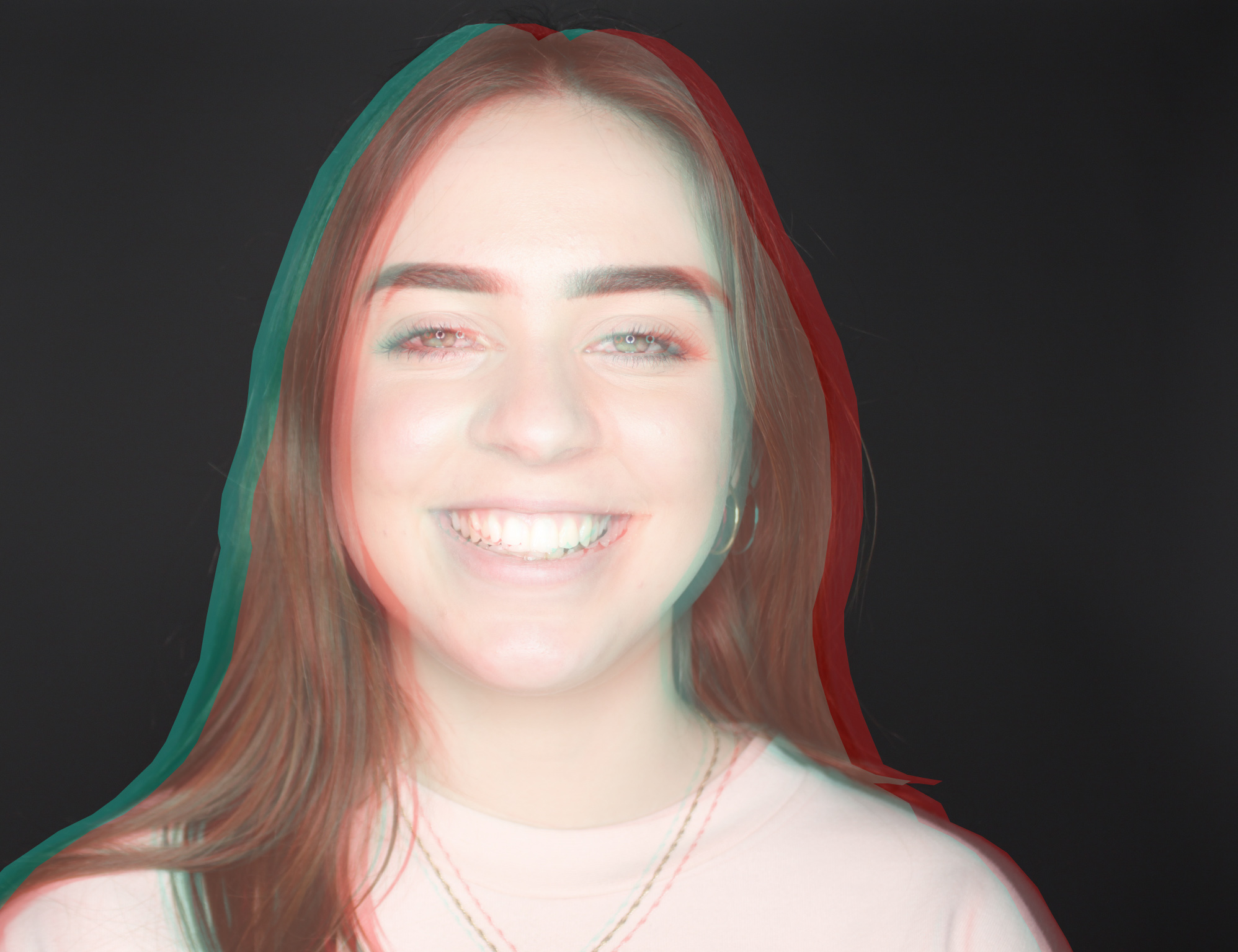 This is a lighter take on the ’emotions’ theme, its about expressing hapiness. I cropped out the outline of my friend and overlayed blue/red colours over two copies of it, them lowered their opacity and shifted them to the sides. This gives an old school 3D movie look, and it helps widen the smile and eyes, which are connoted with more hapiness.
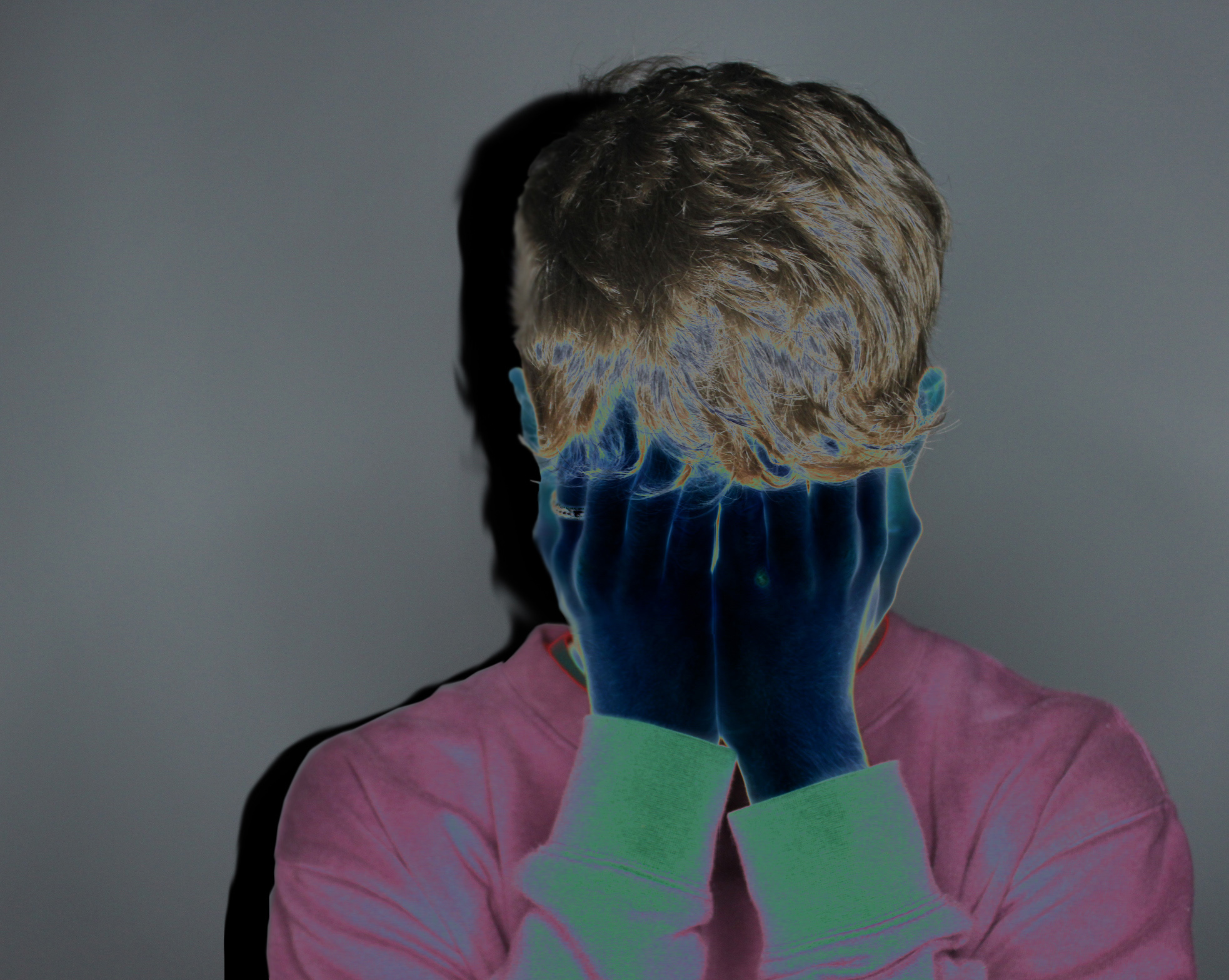 This final image is a photo I took of myself, I tried to create a similar effect to the one in image 4 on this post, but my hands were blending in with my hair too much so I solarized the photo. This helped exaggerate me holding up my head with my hands, which portrays more emotion. I also created a copy of my outline, made it black and put it a layer behind to imitate a shadow, this adds darkness into the photo, which also connotes sadness.
