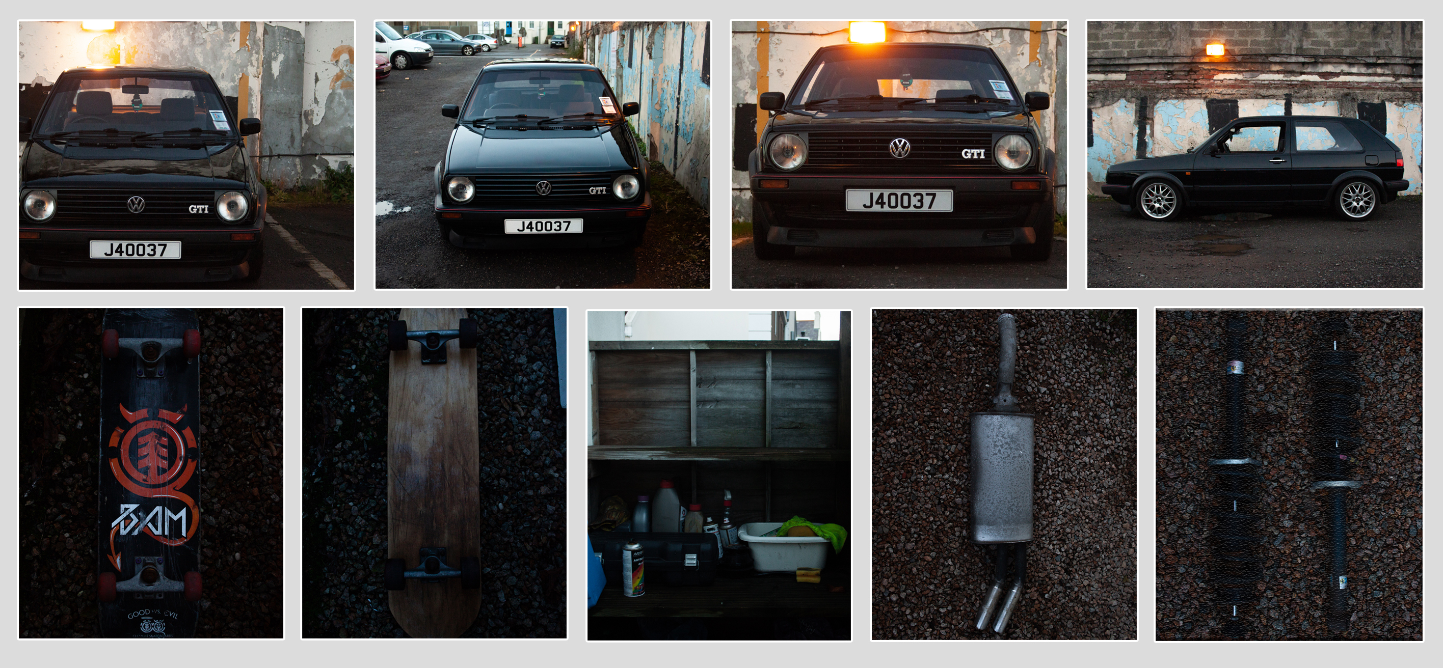
 I decided to choose white card for my typology as opposed to the standard black card for the aperture as the images are mostly dark around the outside and so the black card would distract from the images whereas the white card allows the images to better stand out. I have dedicated the bottom row to the photos of smaller individual items and the top row to the first photo-shoot. In order for this to work i have cropped all the images to the same aspect ratio, this allows the images to be equidistant to each-other in both axis.
