These are some of the final outcome ideas that I have come up with using my favourite and best images.
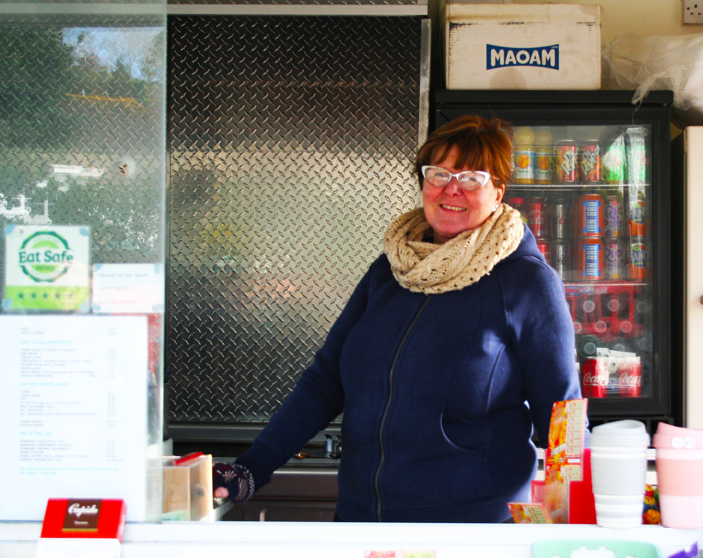
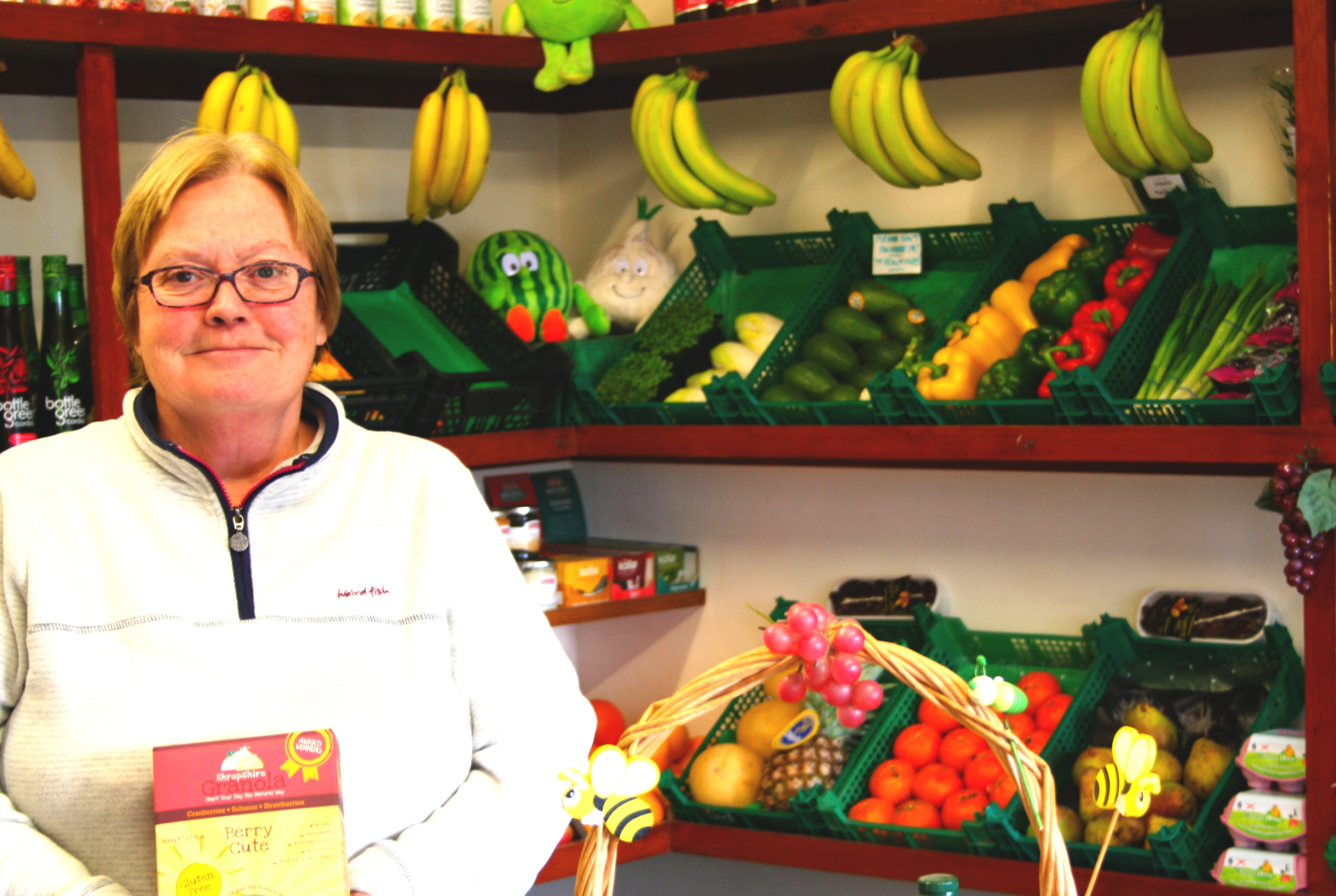
The first two images shown below I have not really edited a lot. This is because I was trying to do them like John Bulmers work and didn’t want to overdo the editing, as John Bulmer did not normally edit his work. Although these two haven’t really been edited a lot I like how they came out, especially the first one due to the saturation used to make her face stand out along with the other darker colours in the glass and the drinks in the fridge.
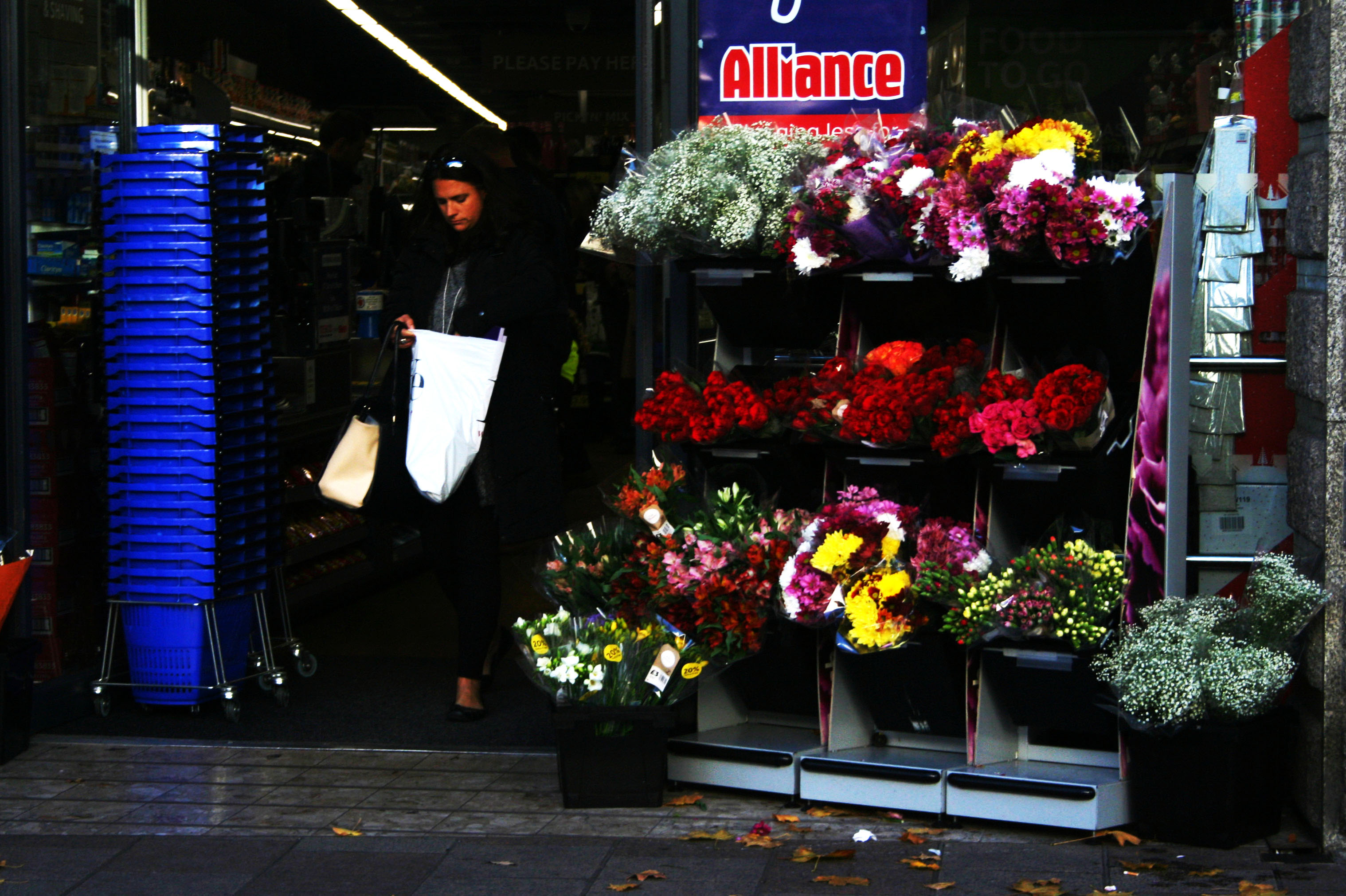
With this third image I changed the contrast and the exposure so that her face in the image isn’t as dark as in the original image because it was quite hard to see her face in the original image. I have also transformed this image to turn it as I took it on an angle.
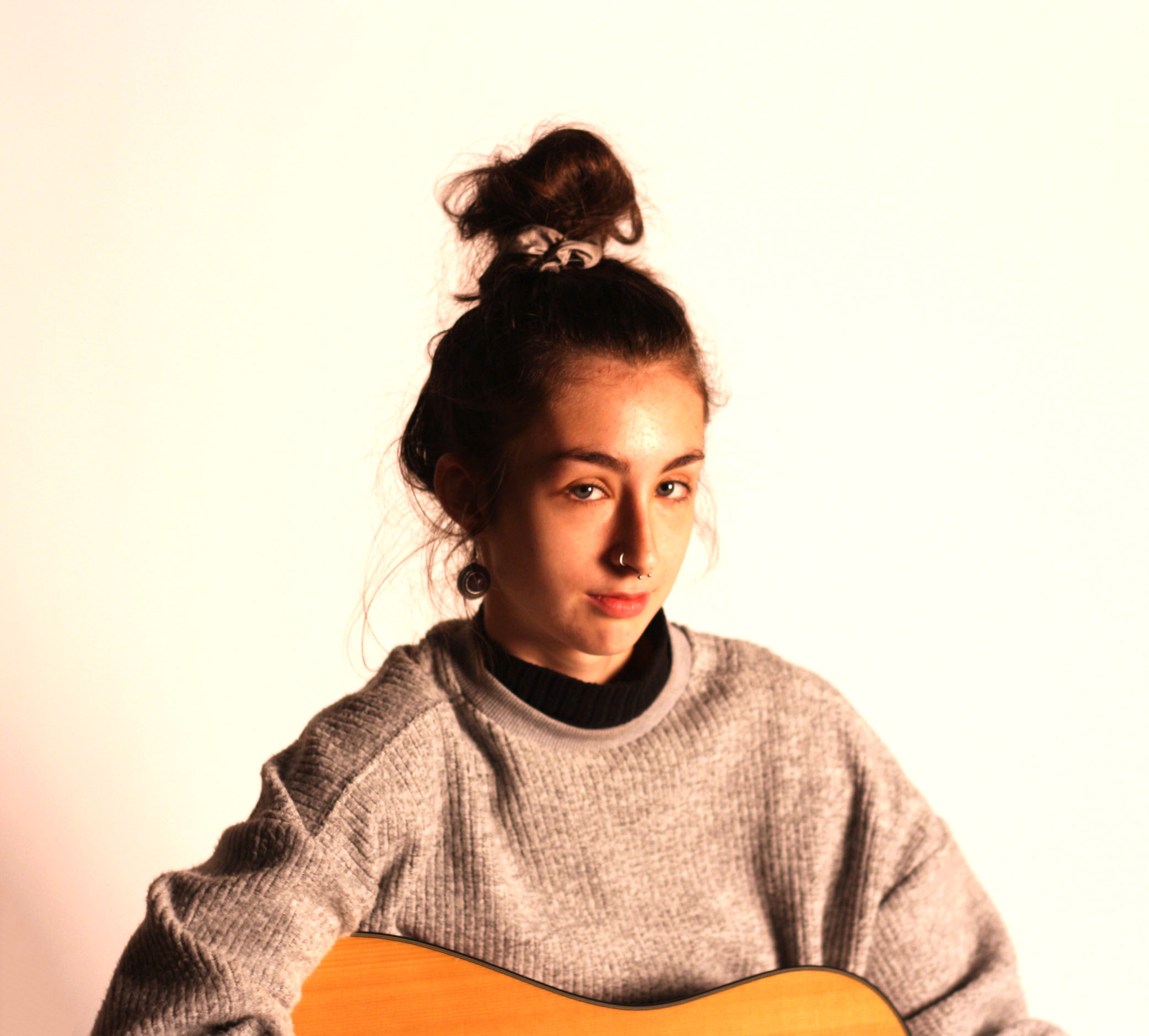
The images below are different than the ones above as they aren’t taken as street photography and are instead studio photography.
This fourth image I have taken on a white background with artificial one point lighting. I like how this one came out because of how sharp it was, this along with the high contrast I have added, makes her hair and face stand out over the rest of her body
I have picked this last image because of his pose in the image. This image isn’t the sharpest image, but this is because the camera was focused onto his feet so that his face and body was put into the background. The pose he is in may show people what the persons personality is like.
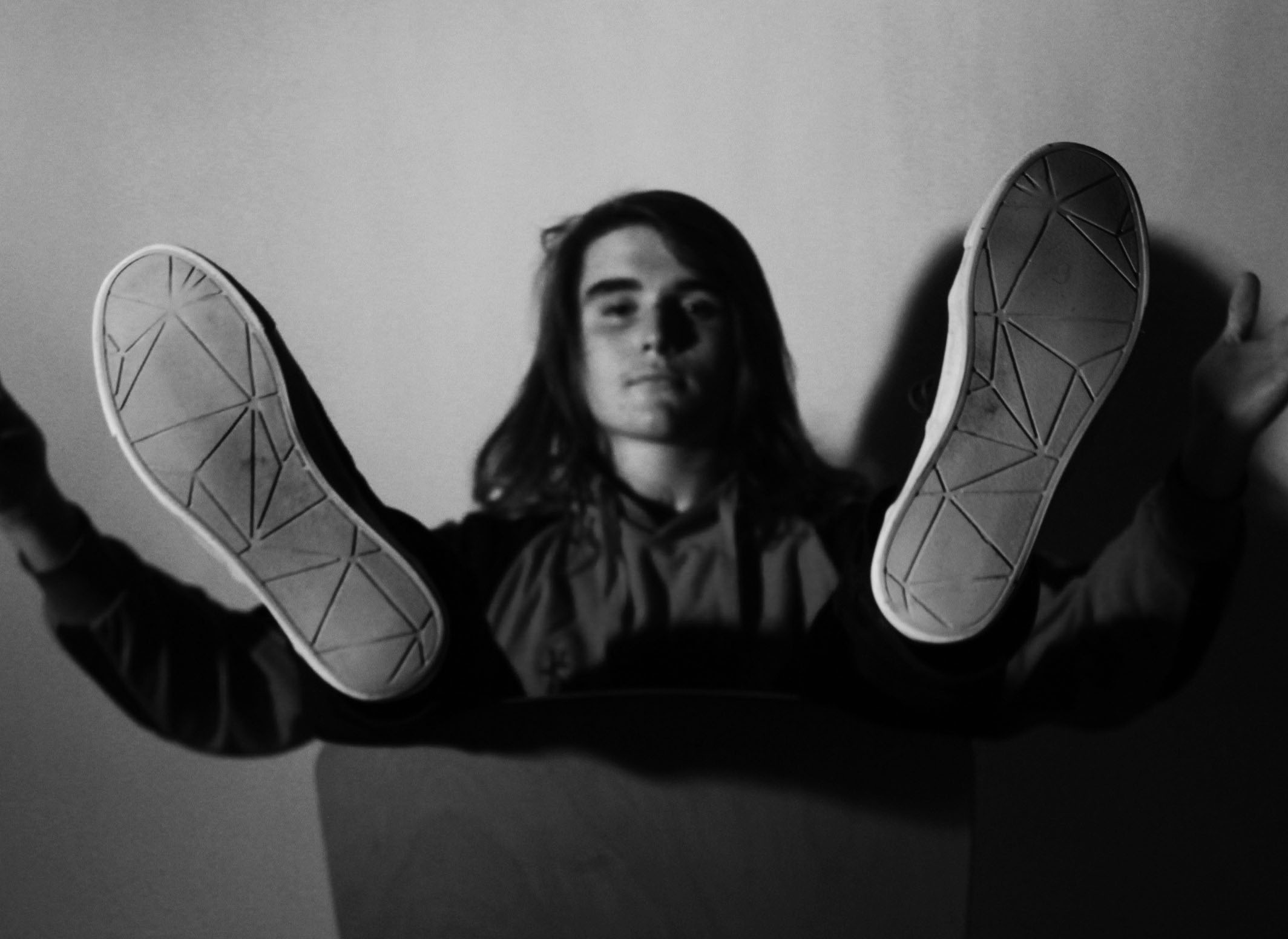
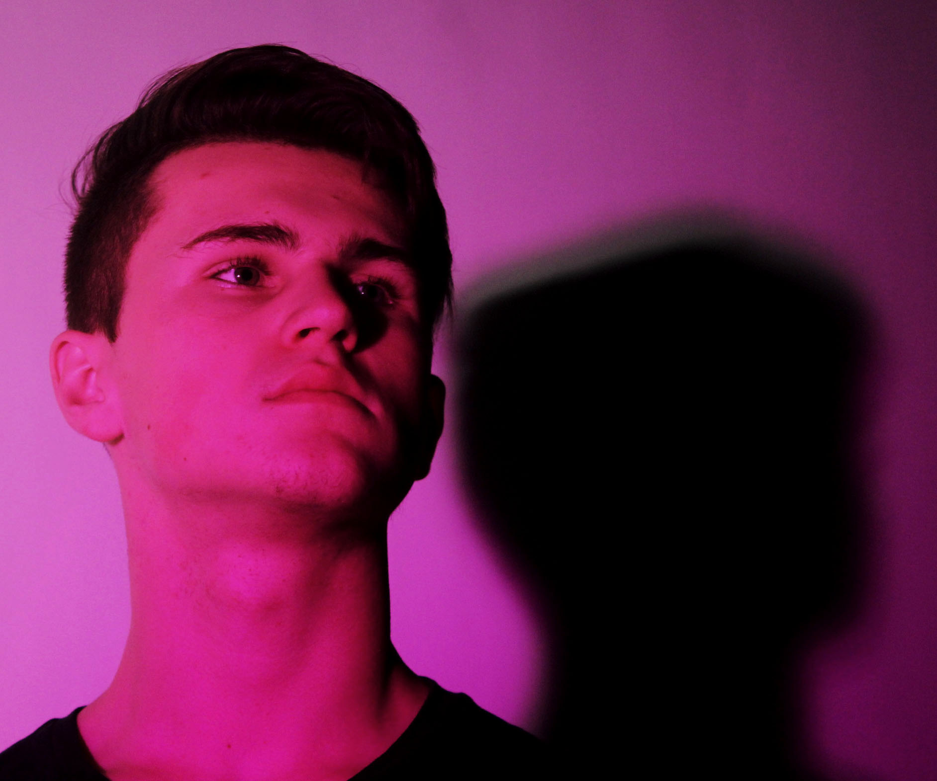
This image like the one above, shows the person in a pose. This pose is a lot simpler as it is just him looking away. I have taken the image from underneath to make them look as if they’re higher up than others.
