Action Plan
Me and a group of friends decided to explore an area of woods just outside of our local town, as we had heard people talking about a potential old German bunker being found in these woods. I decided to bring along my camera and capture some portrait photographs at the same time. The images are a mix of images of my friends taken by me and portraits of me taken by them and sometimes self portraits taken by placing the camera down and using a self timer
Due to the complete absence of natural lighting in the woods, I had to constantly rely upon my camera flash, so as a result, there are some over exposed images and negatives. I took all images holding the camera as I find tripods way too immobile for a situation like this.
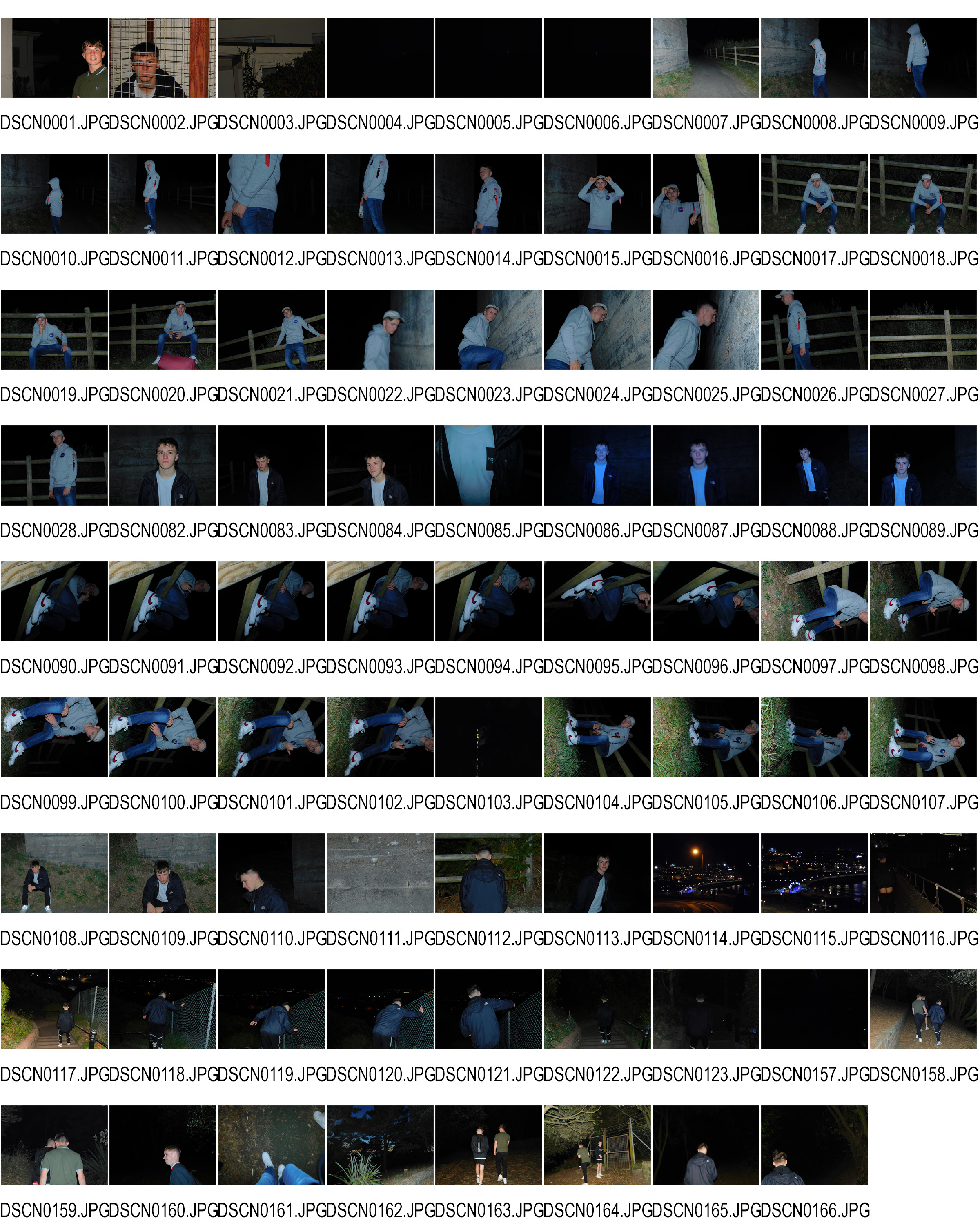
Contact sheet
Here is my contact sheet from the shoot. I have included all images from the shoot and I will use this sheet to aid me in eliminating any negatives and unwanted images. Here is the contact sheet
Standout Images
Here are some images that I find stand out from the shoot. I will also include my thoughts on the nature and composition of the images.
Image 1
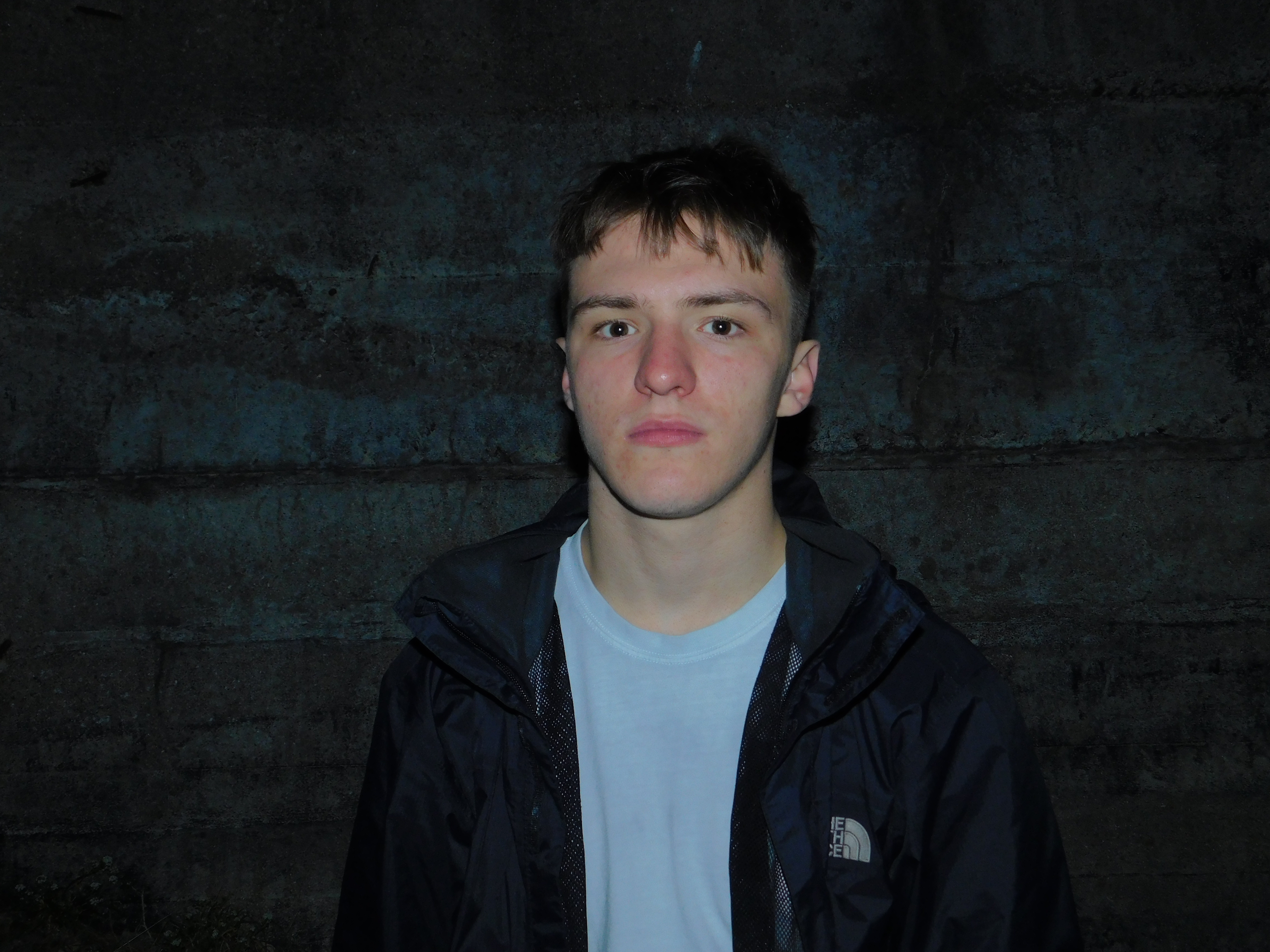
I like this image due to the subject standing out from the background. This is achieved through the background, Being the wall of a 1940s era German Bunker, featuring signs of decay and age, In comparison to the subjects clean manner. The brighter colors of the subjects skin tone and T shirt help to create a nice color contrast and make him stand out much more. I find that the image will require a slight bit of cropping due to an apparent vignette around the corners of the image.
Image 2
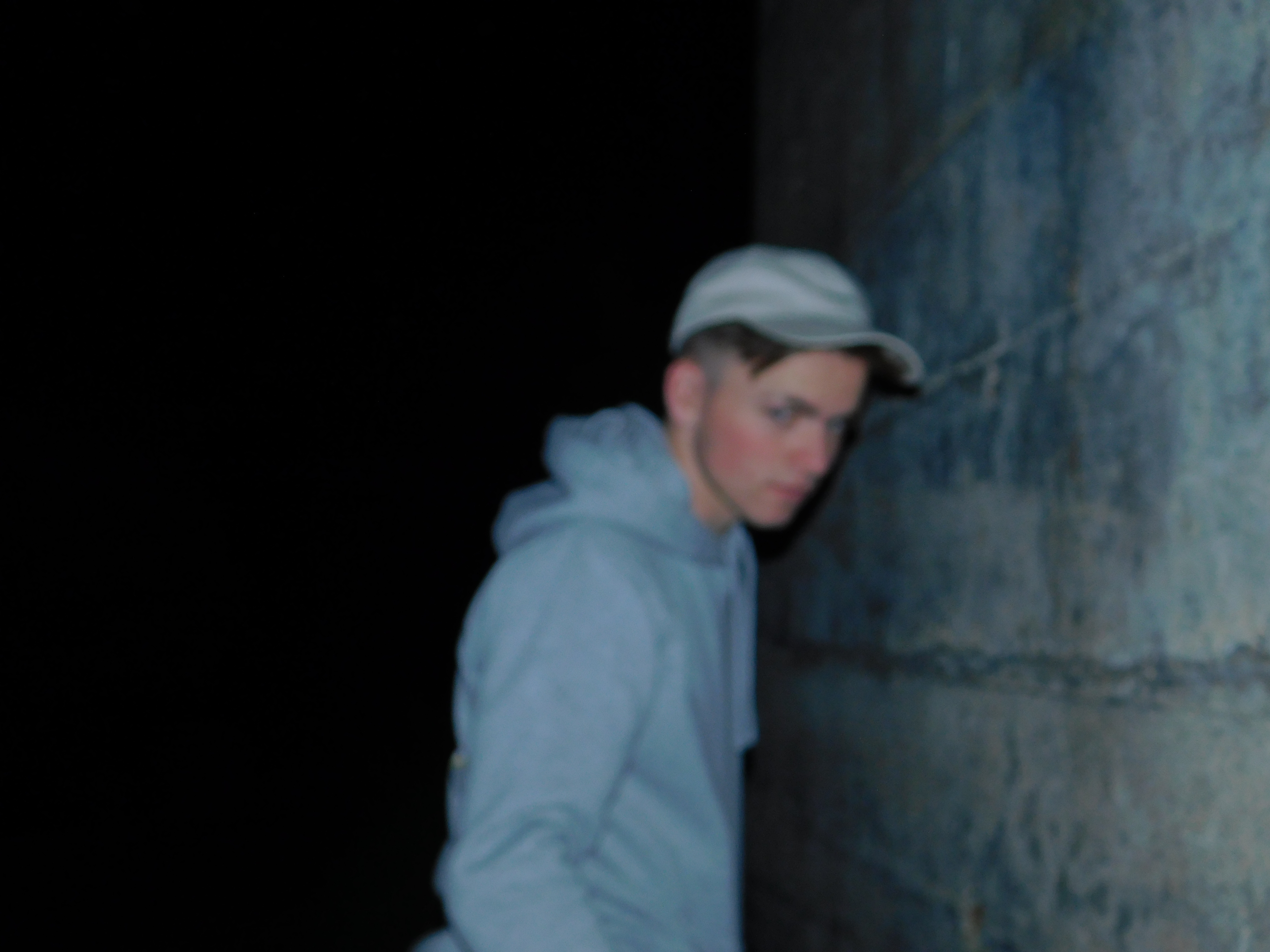
This image features myself and is taken by a friend. I particularly like the composition of the image and the out of focus nature, which creates and in camera form or blurring, Meaning that I will probably only have to edit this image slightly in order to achieve the effect I am looking for
Image 3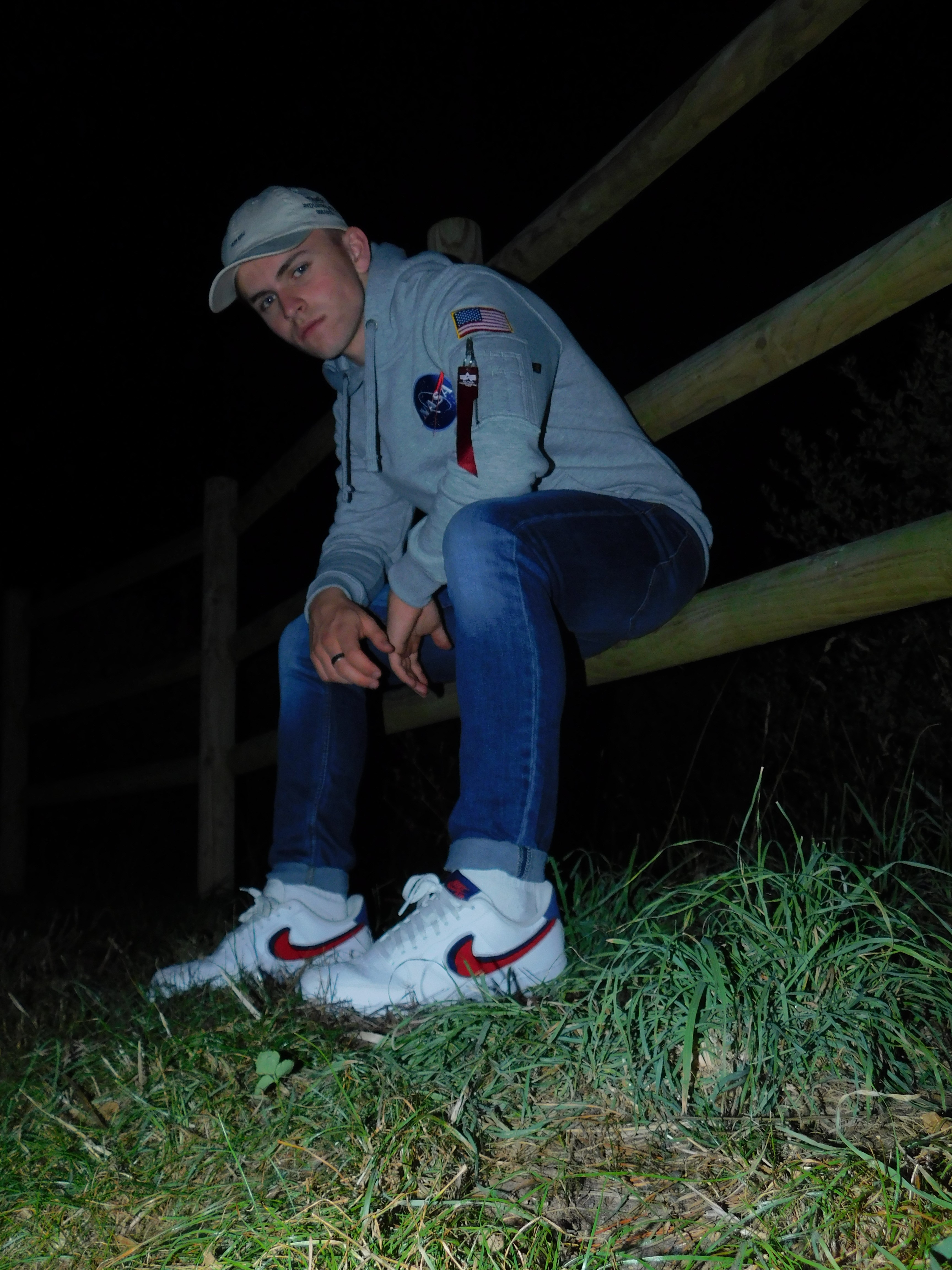
Here is another Image where I have utilized self portraiture. The photo was taken on a 10 second self timer and I adjusted the Hue setting on my camera to give the image a very slight blue tint in order to highlight the blue colors in my outfit. I Like the angle of the image as I had propped my camera up on a rock and I am happy with the angle and how it turned out.
Physical editing Ideas
For Photo shoot 1, I outlined my ideas for manipulating the images through photoshop. I would also like to experiment with editing the Physical photograph itself. I will achieve this through the processes of taping and tearing. Taping will involve either black gaffer tape or grey duct tape on top of a printed image and Will be used to conceal the identity of the subjects in the images. Tearing will be used to remove facial features and features of identity by physically tearing up a Printed image. I would also like to experiment with scratching an image with sandpaper to give off a distressed effect to the image.
Here are some outcomes of my different physical editing techniques
Taping
For this particular image, I have decided to utilize black gaffer tape as I feel it gives off quite an industrial attitude towards the piece. It is also quite an interesting texture and I like the patterning on it. I have cut the tape into strips and created a cross to give off a “patchwork” type effect. Here is my Image with the taping method applied: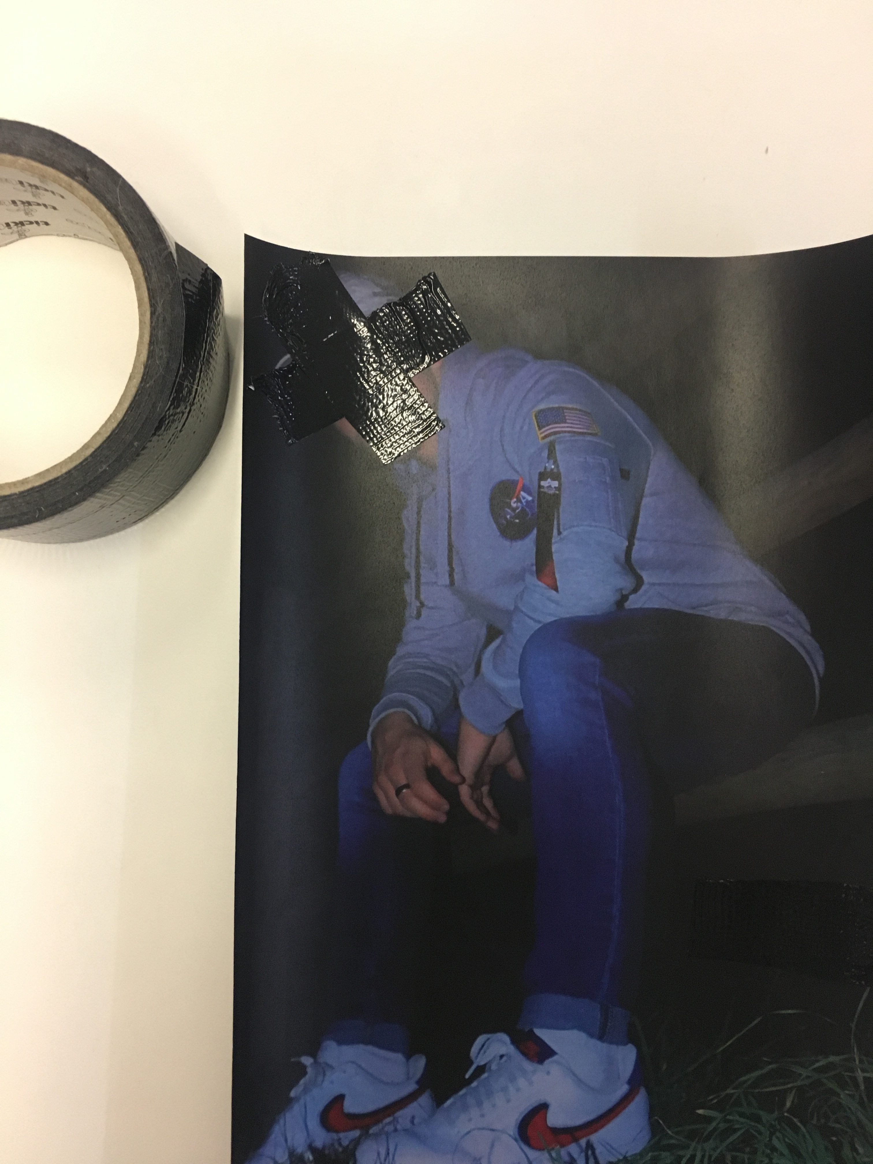
Tearing
I find that tearing out the face from an image is a great way to remove the identity of the person photographed. This method has spanned from michal makus idea of gellage, the sense of physically transforming an image by tearing. I however, Am focused on tearing out facial features and removing the identity of the person so all that is left is their figure and clothing. Below are some images of the tearing process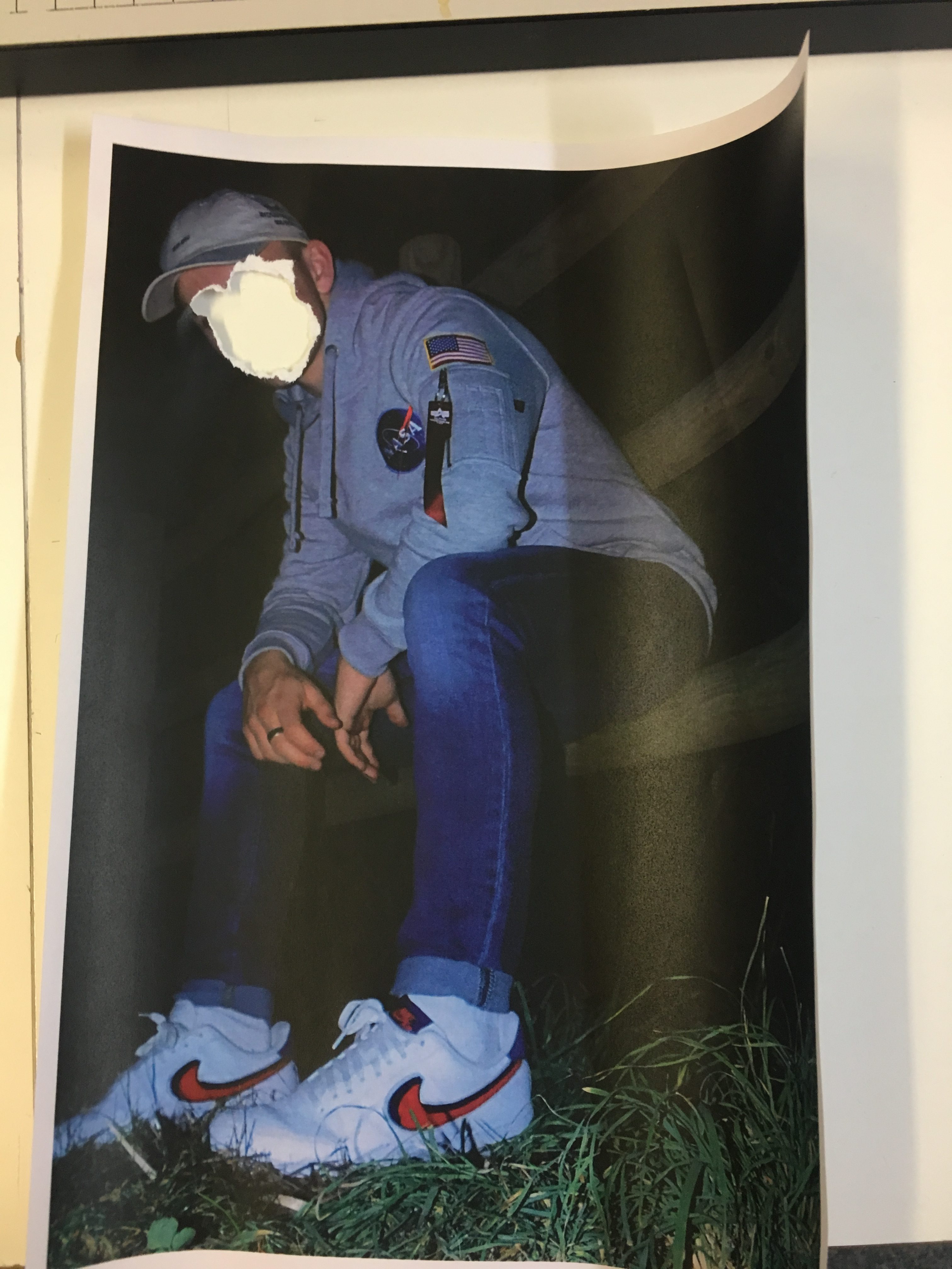
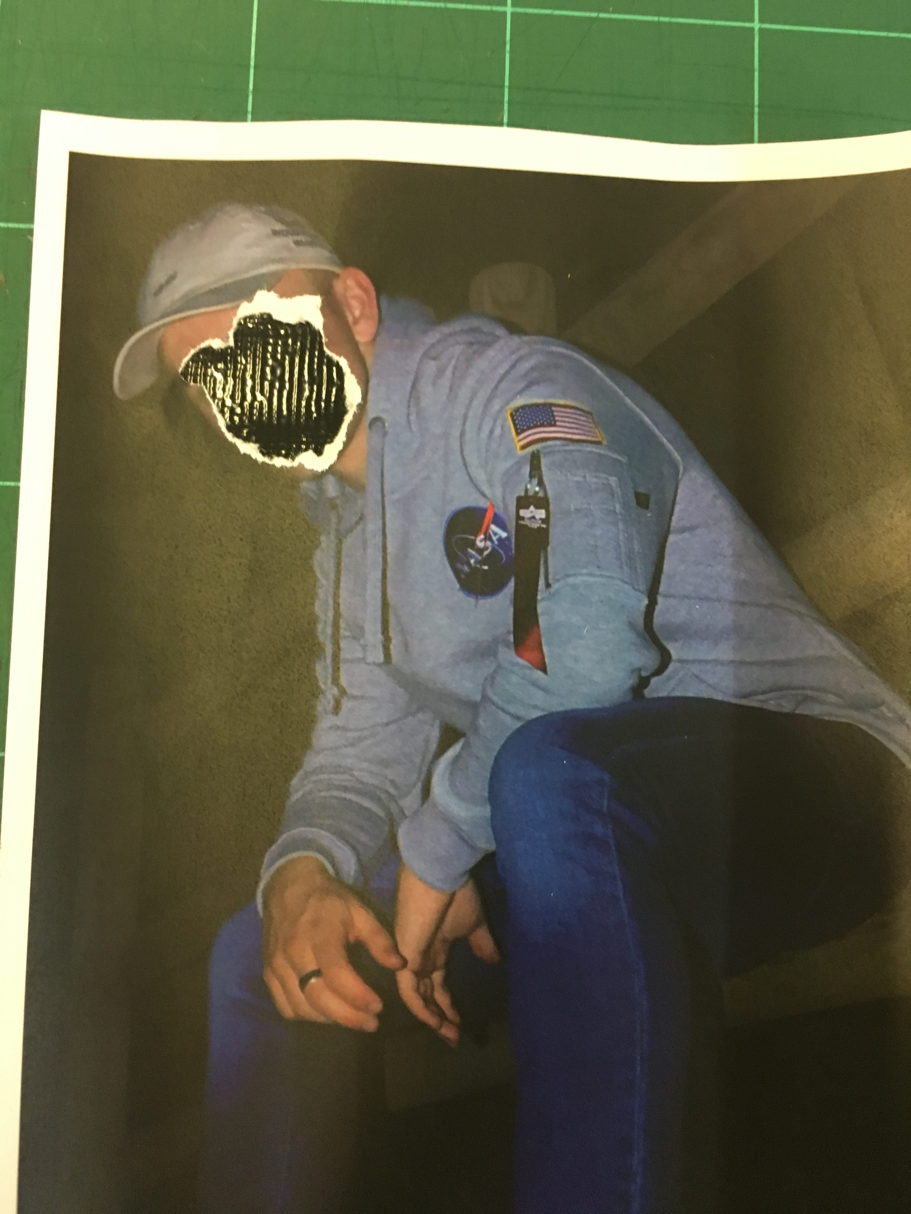
During the process, I also experimented with the idea of tearing and placing black gaffer tape underneath the image to give the tear a background. It portrays quite a dark sense of loss of identity but is effective at making the image bold at the same time by adding more texture and detail to it.
I have also explored the idea of tearing for aesthetic. I wish to give my work an aged and distressed feel, Which will easily be accomplished through the scratching process that I will discuss later on in the post, However Tearing for aesthetic can also help me achieve this distressed look. Here is an image where I have added in an element of tearing that does not necessarily involve the obscuring of the face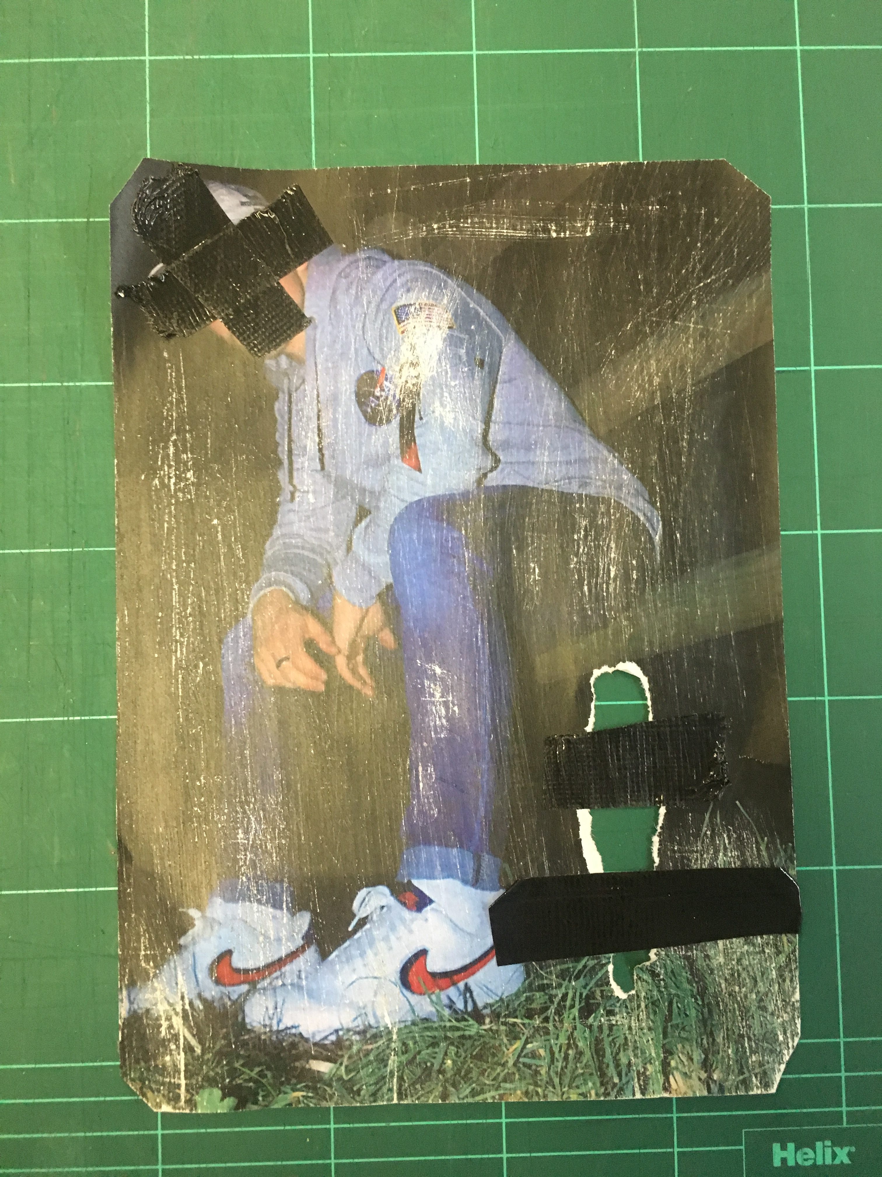
I have incorporated the tear into the bottom left hand corner of the piece and taped over it to connote the idea of attempting to reconstruct and repair the image.
Scratching
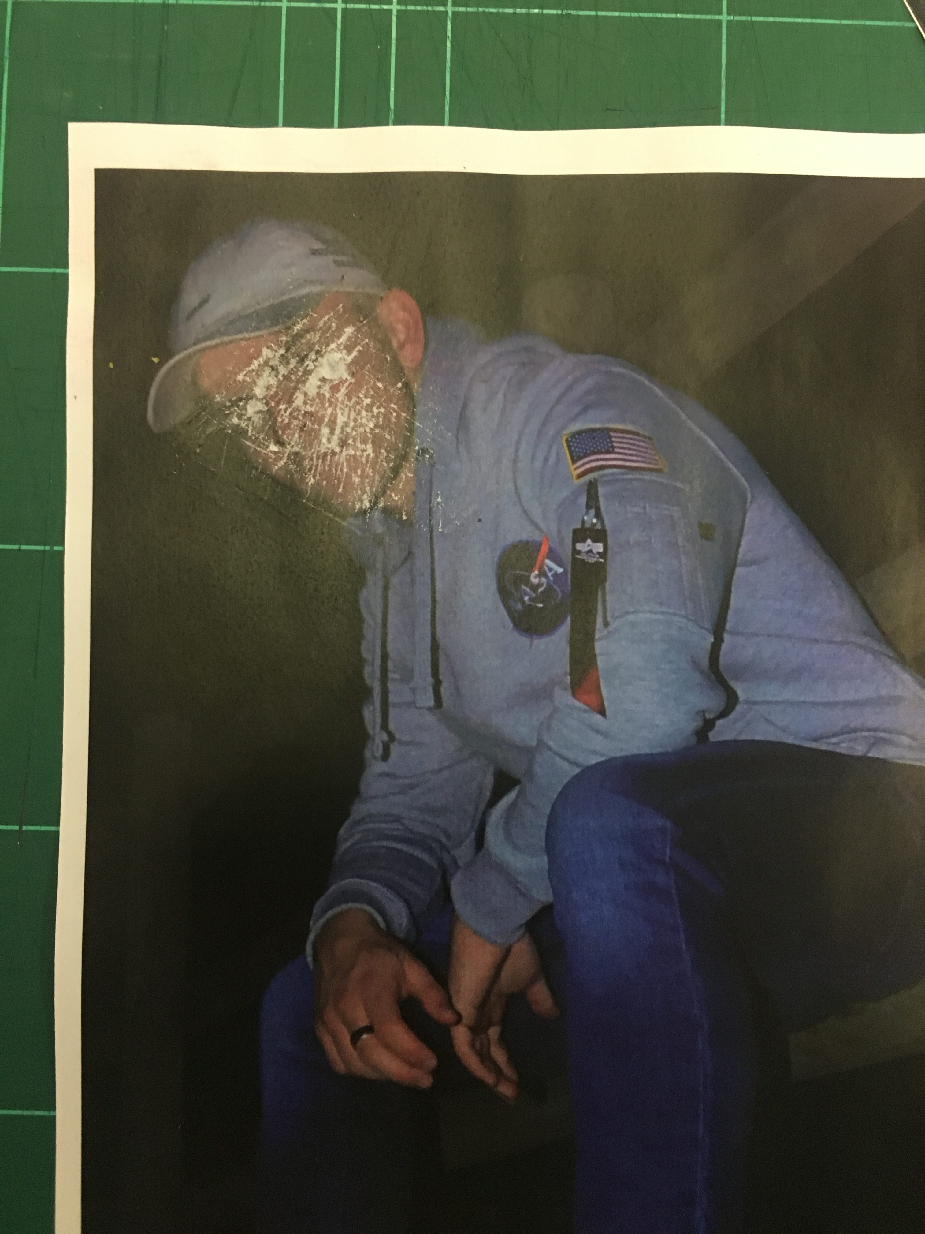
Scratching a printed image can give off quite a worn, distressed feel to the image. It also alters the texture and makes the image unique. I achieved this effect through the use of sandpaper and rubbing it on my physical print. In some areas I have applied more pressure in order to create variation throughout the image. Here is an example below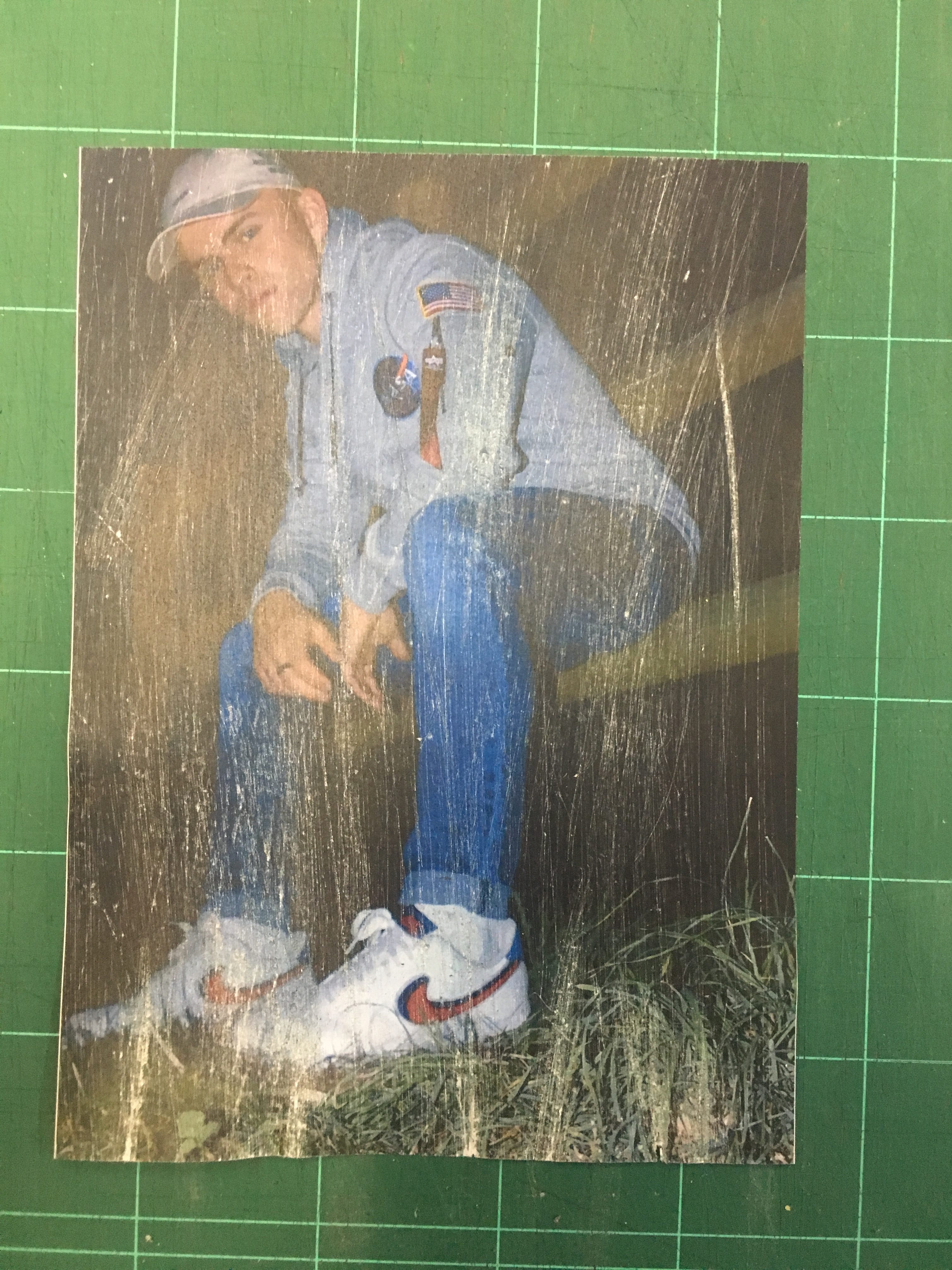
I like the idea of scratching all over, purely for aesthetic but as you can see in the next photo, I will also use scratching to obscure identity as I find it is an effective way of achieving the effect I am after.