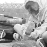
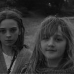
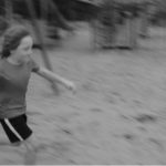
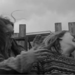
Below is a gallery of the final images i selected fro the contact sheets of my first photo-shoot:
In order to take inspiration from Murtha’s style of photography as well as her concept, I edited each image so that they followed her black and white coloring, and made a range of other edits in order to alter and enhance each image, the following images are the results:
The above gallery displays the images after the editing process. Some involved more editing than simply changing the color of the image.

The above image involved editing 3 different images together, in order to give the appearance that the cardigans in the background are floating on their own. This was done as a representation of loss, as both cardigans appear to belong to the generation before (grandparents). This editing was done in Photoshop using the following process:
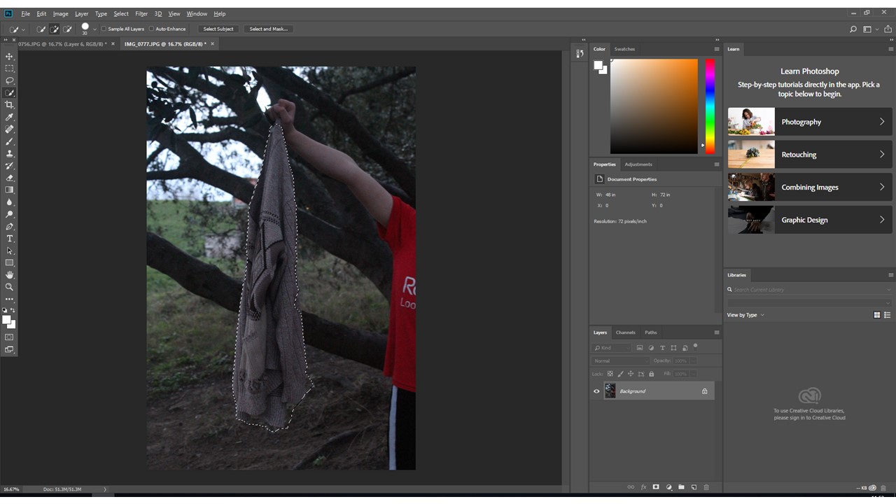
I used the quick selection tool in photo-shop to select the cardigan separately from the background, and pasted this selection into the other image, therefore merging the 2 images. The same process was used for the second sweater.
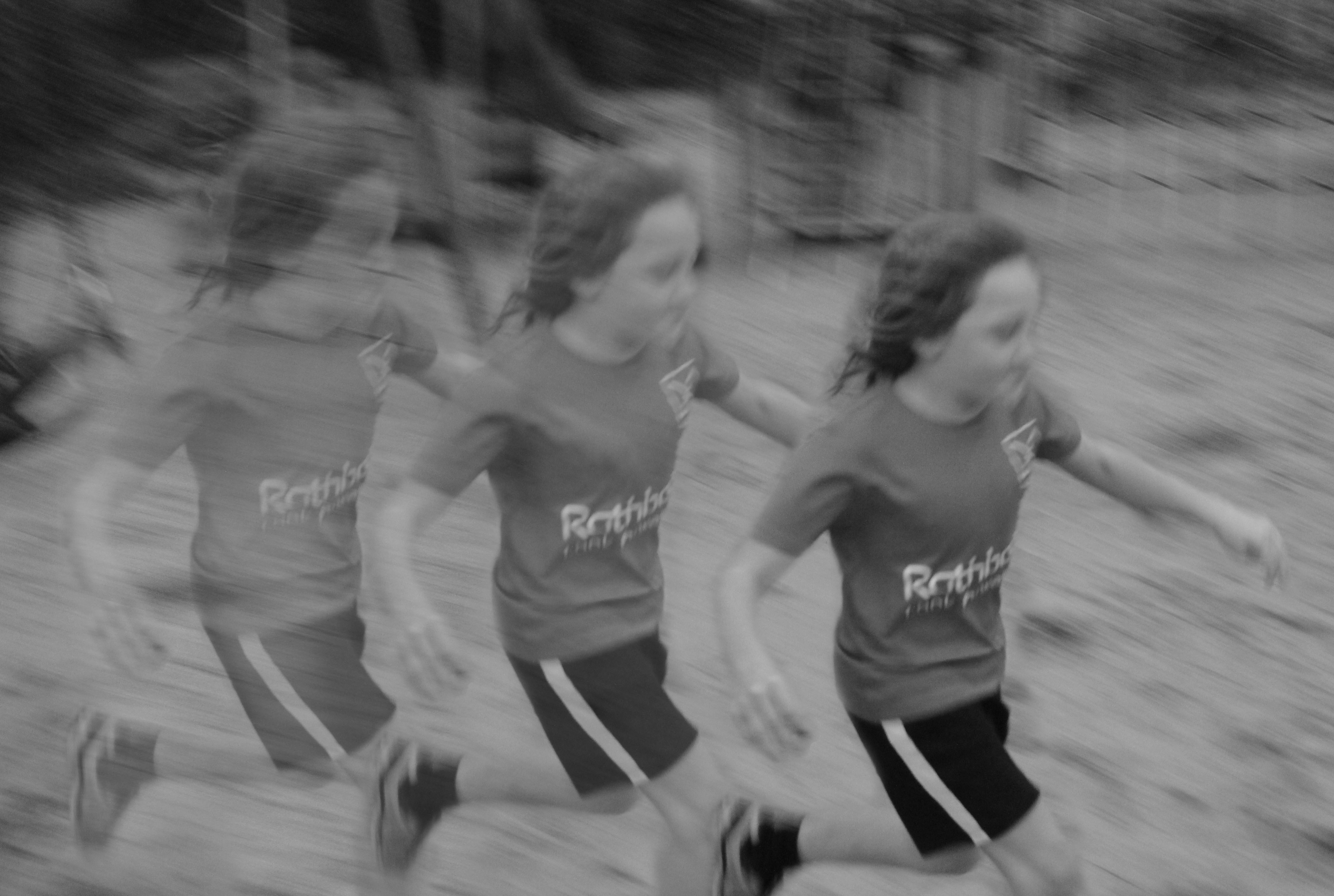
Editing was also used to create different effects on my photographs, such as the following:
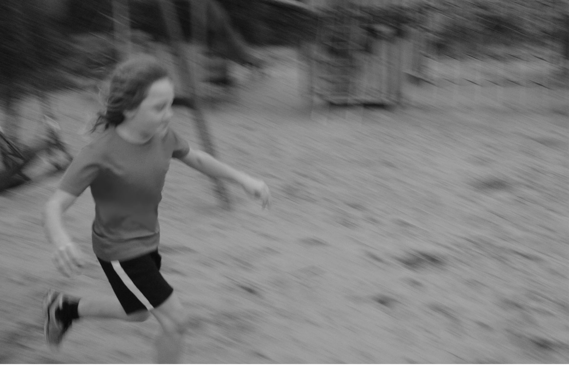
In order to create the final image from the above photograph, I used photo-shop and lowered the opacity of the eraser tool, and using different layers, created 3 versions of the subject, each one slightly more erased than the last:
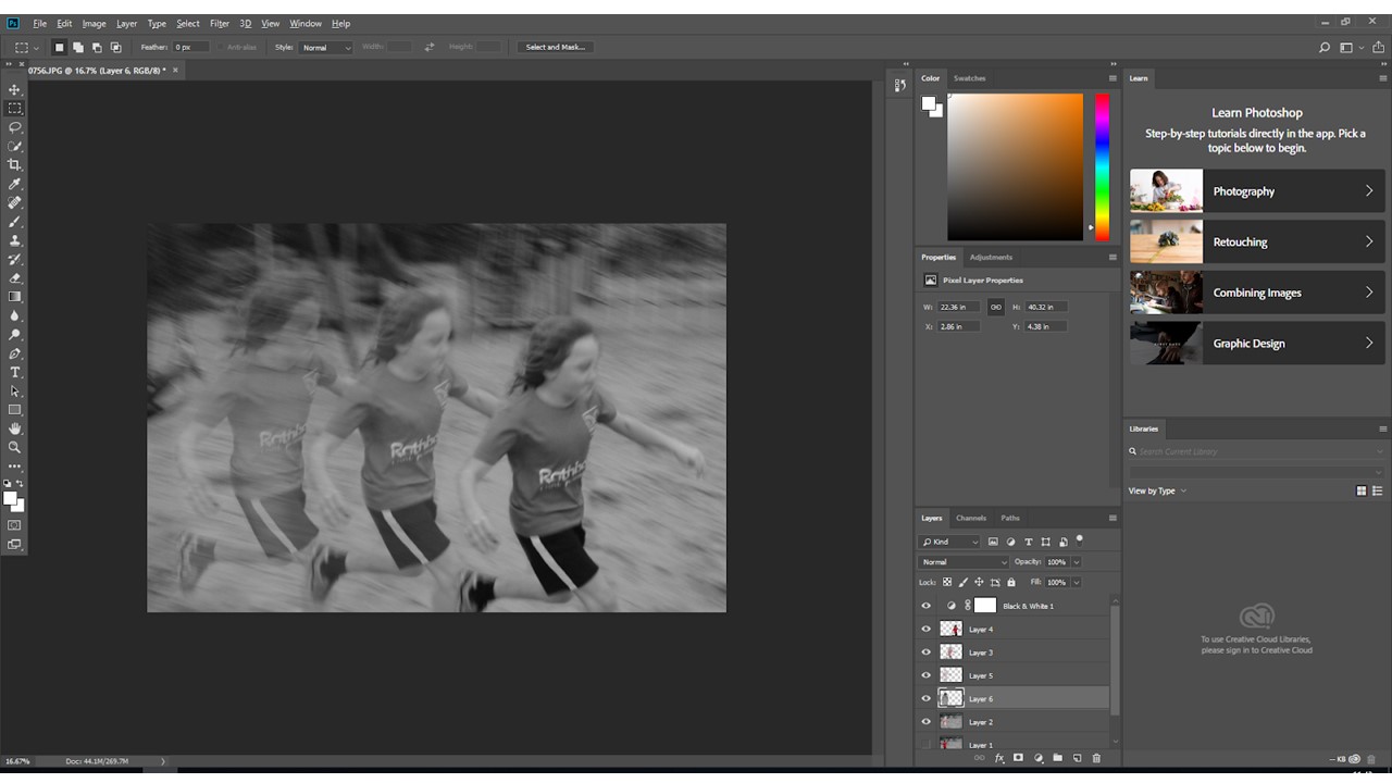
The final image (below) takes inspiration from Murtha’s work through the color scheme and documentary style photography, while also keeping with the theme of the identity project (showing the development and change of a child as they grow and, literally, move forward)
