
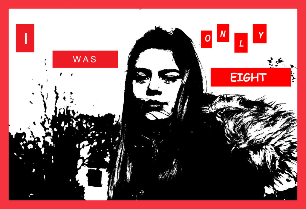
This is the first image, in my somewhat series, of 5 final pieces. I chose to use this image as Katie is looking directly at the camera, however her facial expressions are not happy. I’ve chosen the phrase ‘I was only 8’ as my story started when I was 8 years old, and what I experienced shaped my identity into the person that I am today, 9 years later.
I took inspiration from Krugers editing but the ‘secrets’ told in Rosenfields ‘What I Be’ project. I personally feel this looked, visibly very effective because although the text automatically catches attention, the black and white image is also so strong and consequently very eye-catching.
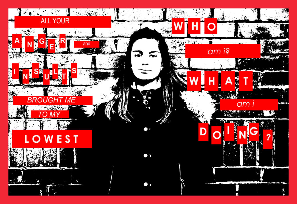
In my second image I touched on how bullying/verbal/emotional abuse caused a loss of identity, and some of the questions that we ask ourselves when we do experience this.
who am i?
what am i doing?
I broke some of the words up into separate boxes for separate letters, Kruger did this in one of her images and I thought it was interesting, I think it brings a lot of emphasis to individual ‘significant’ words.
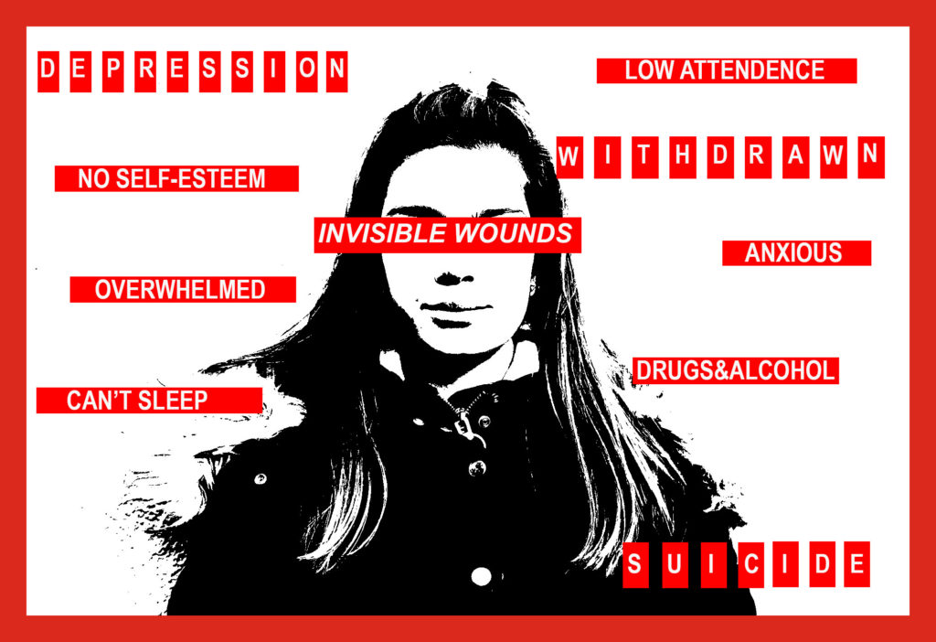
In this image I’ve put the text ‘INVISIBLE WOUNDS’ across Katie’s eyes, I’ve done this because if something is invisible, you cannot see it, around Katie I’ve stated some of the serious effects that can be caused by these issues alongside the loss of a persons sense of self.
This final image is personally my favourite as even though it’s extremely personal to me, it does raise awareness on the issues that children and teens can involuntarily be forced to face, and all of these ‘invisible wounds’ are heavily stigmatised, causing young people to stay silent.
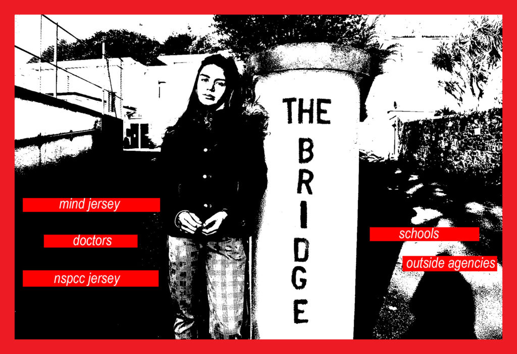
For this final edit I have chosen to use a photo of Katie at ‘the Bridge’. The Bridge is somewhere where children & families can access support, I thought this was appropriate for this image as in my text, I have listed places that young people can approach for help and support.
I thought that this was important to have incorporated somewhere in my finals because, not only do these issues usually require help, my story involved all of these people – another personal touch to my ‘identity’.
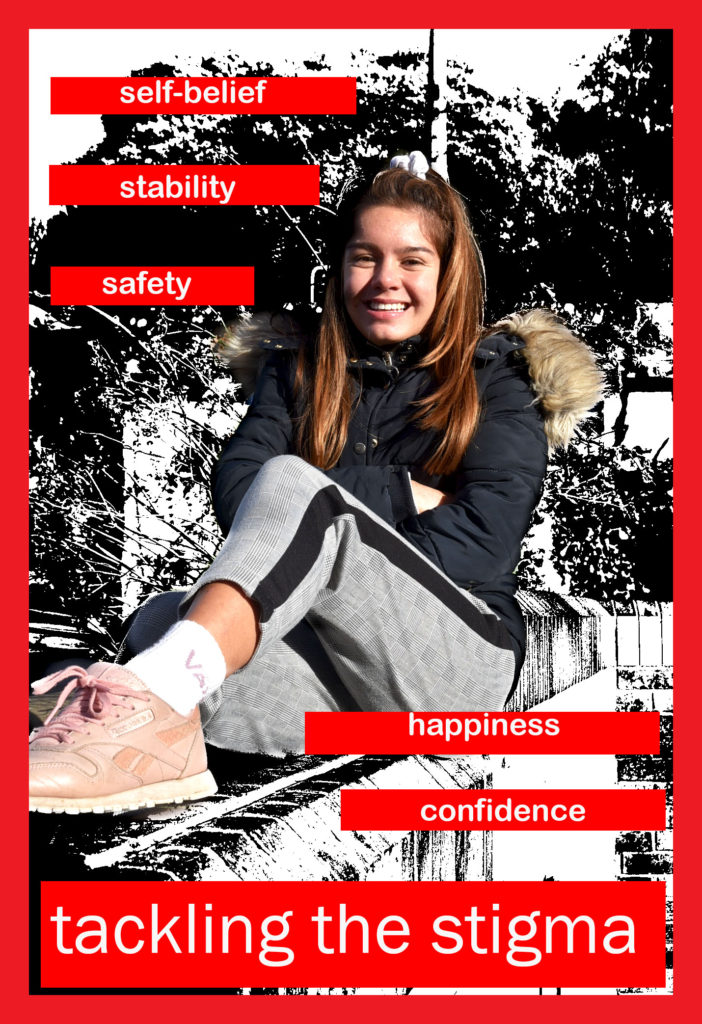
My final, final piece represented recovery and moving on.
In this edit I’d used the history tool to bring Katie back to colour, I did this because colour is often associated with happiness, where as black and white images are usually seen as depressing and sad.
I’ve written about what recovery can bring a person, for example; happiness, confidence and self-belief or self-worth. I’ve also written ‘tackling the stigma’ larger than the rest at the bottom of the image, this is because I feel that through my images I have tackled stigma.