These are my final photo-montages in a series of 3, which I have made as a response to the ‘Identity and Place’ stimulus.
The method I used to create these was first finding all these photos and taking some more recent ones. Next I photographed all the photos using my phone and transferred them over to my computer where I then printed them all out and began to experiment with what I was ripping/cutting out and where I was going to sew the piece back on. After deciding on what was going to go where, I scrunched up all the photos to make them look torn and then used glue to stick the pieces on. When the glue had dried I then started stitching into the photos with black thread and a needle, in order to make the pieces like patches.
Final Outcomes
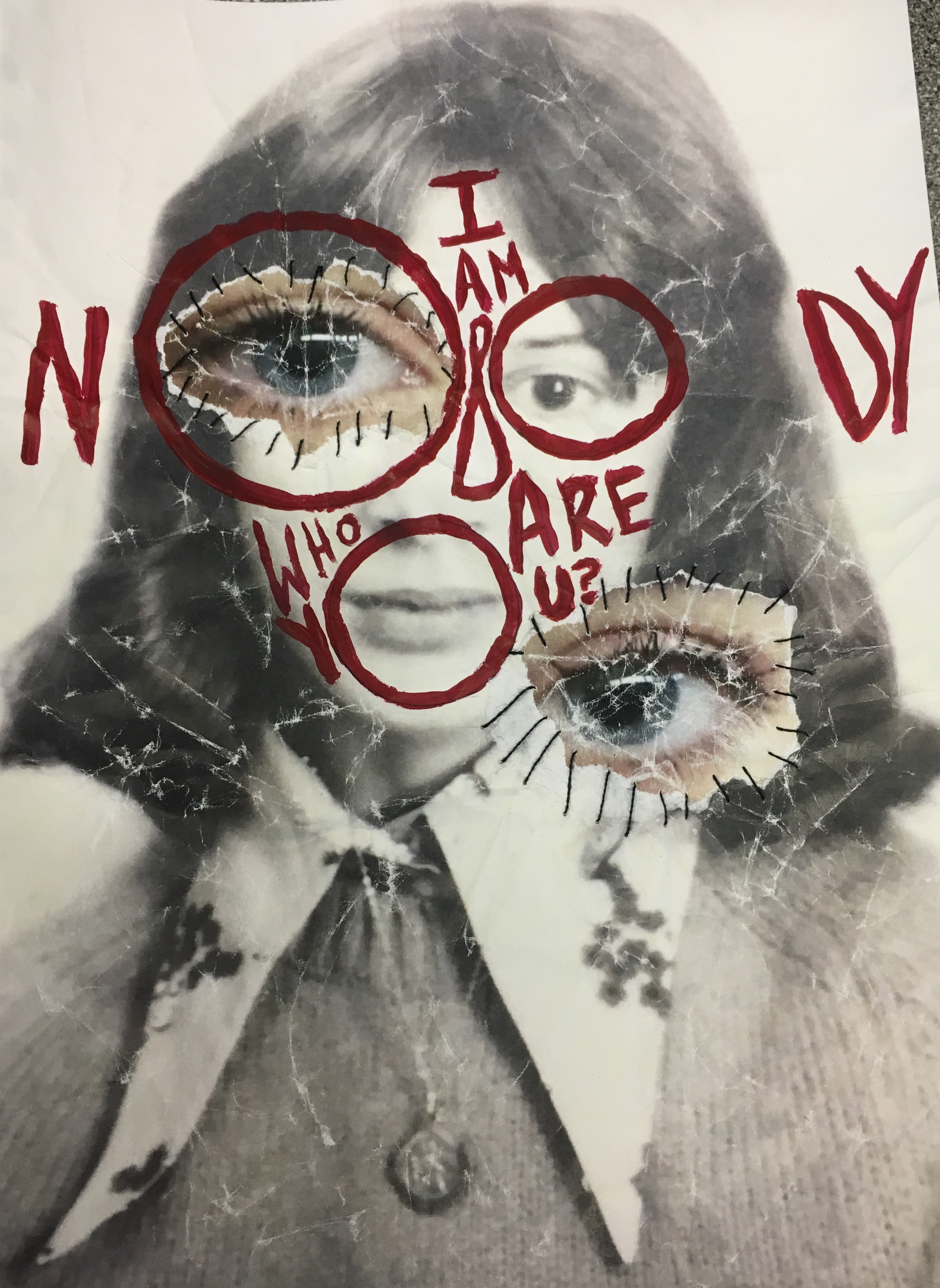
This is the first one in the series, and one of the only ones that I only used 2 photos to create. The base picture is a passport photo of my mum from the 70s and the two eyes are from a photo of me, which was taken about a month ago, this age difference contrasts the base photo which is around 40 years old. This can also be seen through the fact the most recent one is better quality, there is less blurring and it is in colour. Whereas the older one is in black and white and the features on the face do have some blurring. This photo-montage was also the only one which I decided to add text to. I used acrylic red paint in order to paint on the words “I am nobody, who are you?”. I chose to write this as I felt the piece was missing something and the words link in the identity theme. The original creator of this phrase (which has now become a popular saying) was Emily Dickinson. Dickinson was a notable poet, born in 1830-1886. Her poem ‘I am nobody!’ has now become one of her most famous. The poem addresses a feeling of being on the outside, it is about being “us against them”.
I’m Nobody! Who are you?
Are you – Nobody – too?
Then there’s a pair of us!
Don’t tell! they’d advertise – you know!

How dreary – to be – Somebody!
How public – like a Frog –
To tell one’s name – the livelong June –
To an admiring Bog!

Emily Dickinson
The inspiration for the layout of the text came from an artist named Dominic Beyeler. I first saw one of his pieces based on this saying on the Instagram Explore page, and I just thought it looked really interesting and cool, the way he had laid out the text over the persons face, and how it all fit perfectly. Therefore I decided to try it out on my photo-montage as it was lacking something, and I think it turned out really well. The painting could have been neater and more exact however, I feel that a messier look gives the photo-montage more authenticity.

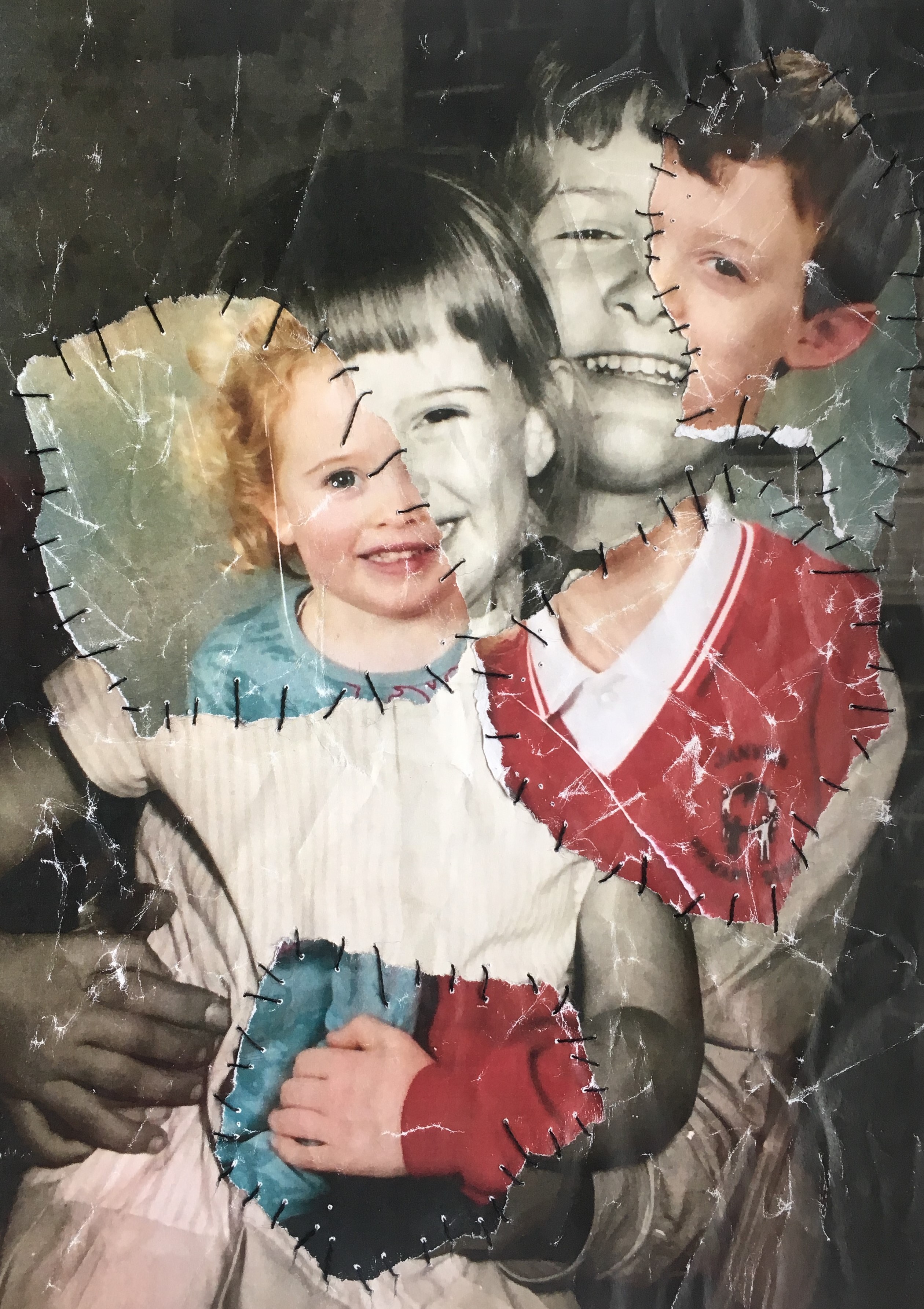
Above is the second photo-montage I made. I used two photos to make this: the black and white one is of my mum and her brother, playing and posing for a photo. This was around the late 60s. I like how both of them seem happy and smiling, it is a breath of fresh air which contrasts some of the more depressing photos which are more common these days. The coloured photo is one from the early 2000s of me and my brother, posing for a school photo together. I thought this was quite a weirdly strange photo-montage as the two photos fit together quite well despite being taken a long time apart. Some parts are almost perfectly matched such as the hands at the bottom. The stitching in this one is also a lot more prominent than the last and there is more of it due to there being more pieces of photos to stitch on. Overall I enjoy the contrasting colours of the two photos and how they match together really well apart from at a few places.

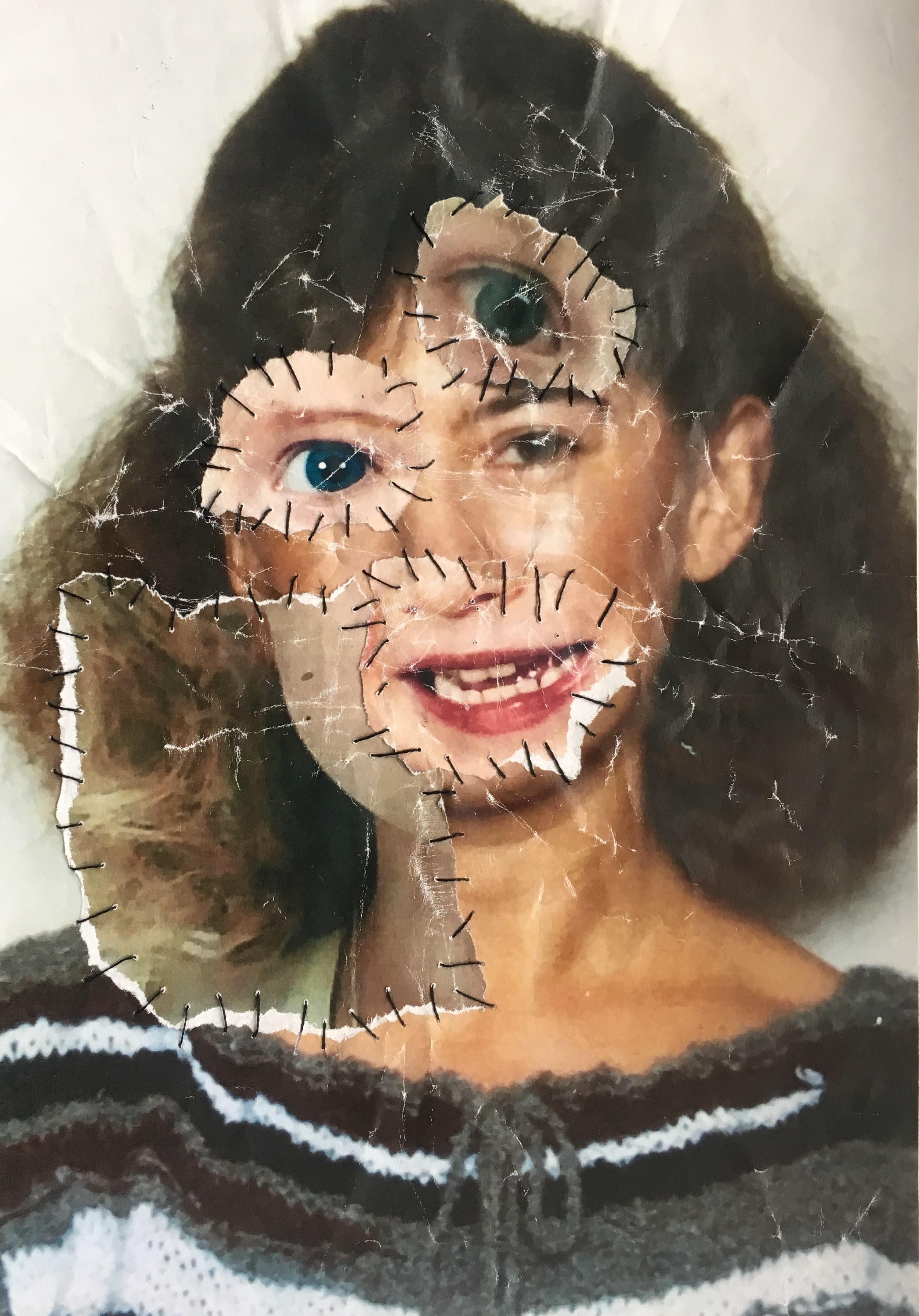
This is my last one in the series. It is solely portraits/passport photos of me and my mum, at different ages in our lives. The base photo is a coloured photo of my mum in her 20/30s. I have layered over the top ripped out features from photos of me. Some of them match well and others don’t, which was the point of what I was doing. The piece of neck/jaw/hair matches almost perfectly with the base photo of my mum, some parts are a bit off because of the sizing of the photos but I think that this makes the finish product look more interesting and cool to look at when the pieces don’t match up. The addition of an extra eye also makes the portrait even less ordinary.
