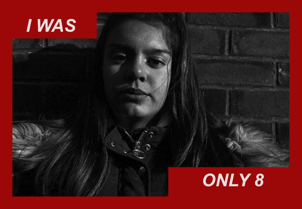
For my first edit I used a photo that was already quite dark, this was because I took this photograph as soon as I turned the camera on, the sun was only hitting one side of Katie’s face and therefore my camera was obviously on the incorrect settings, because the image came out extremely dark and shadowed, which I then tried to adjust while editing late on using the brightness and highlights settings.

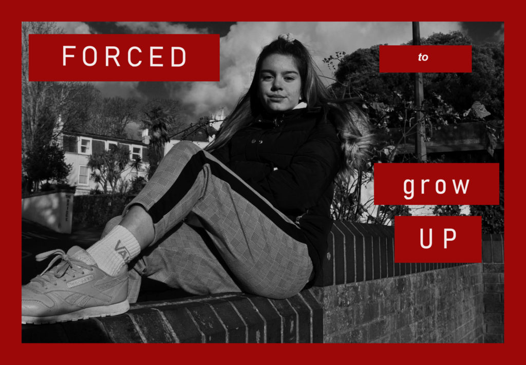
I personally think that this photo looks a lot better as it wasn’t so close up and so I had more room to place bigger text surrounding Katie, I also took this image whilst sunlight was surrounding her, and so therefore, even before editing, the image was brighter and lighter.

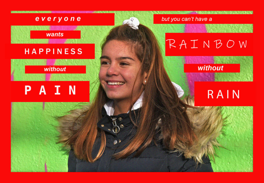
As this image was a lot more positive, I chose to keep and enhance the colours, and use a brighter red background, I don’t think that this image looked as effective as it could have, this is because the coulors, although bright, don’t particularly go with each other nicely.

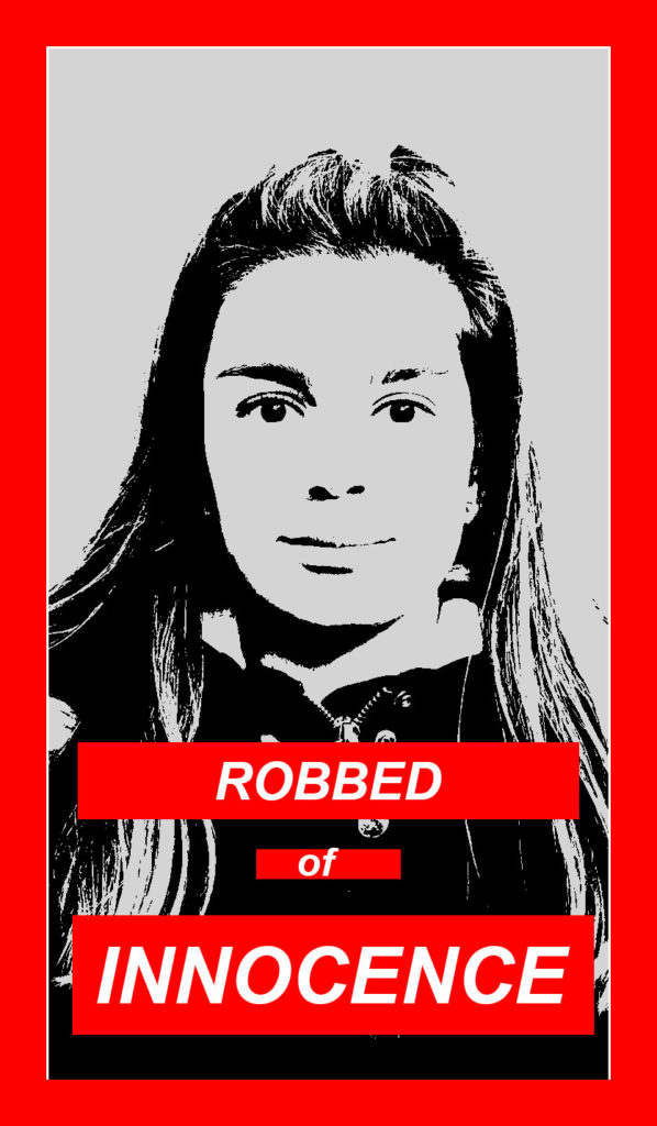
I think that this image was the most like Krugers out of all of my experiments, this is because Kruger uses extremely heavy editing and there is a lot of black contrast, I have edited this image using the ‘threshold’ tool on Photoshop and this is something that I’ll probably take into the editing of my final images.
