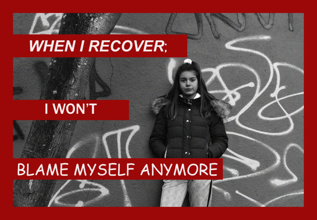
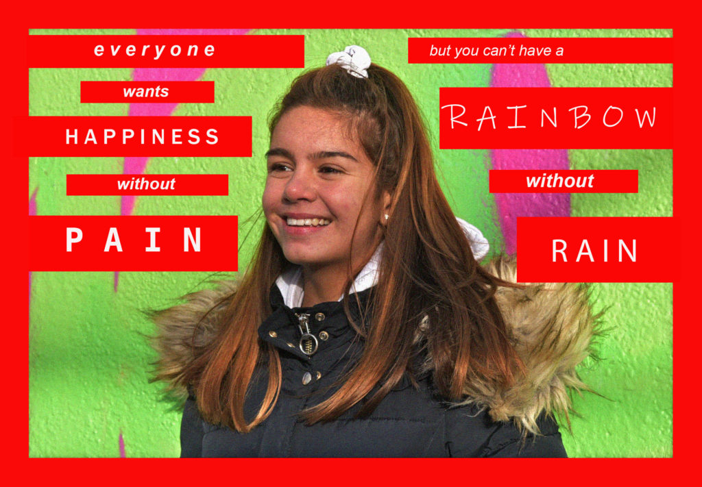
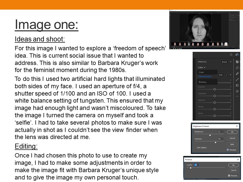
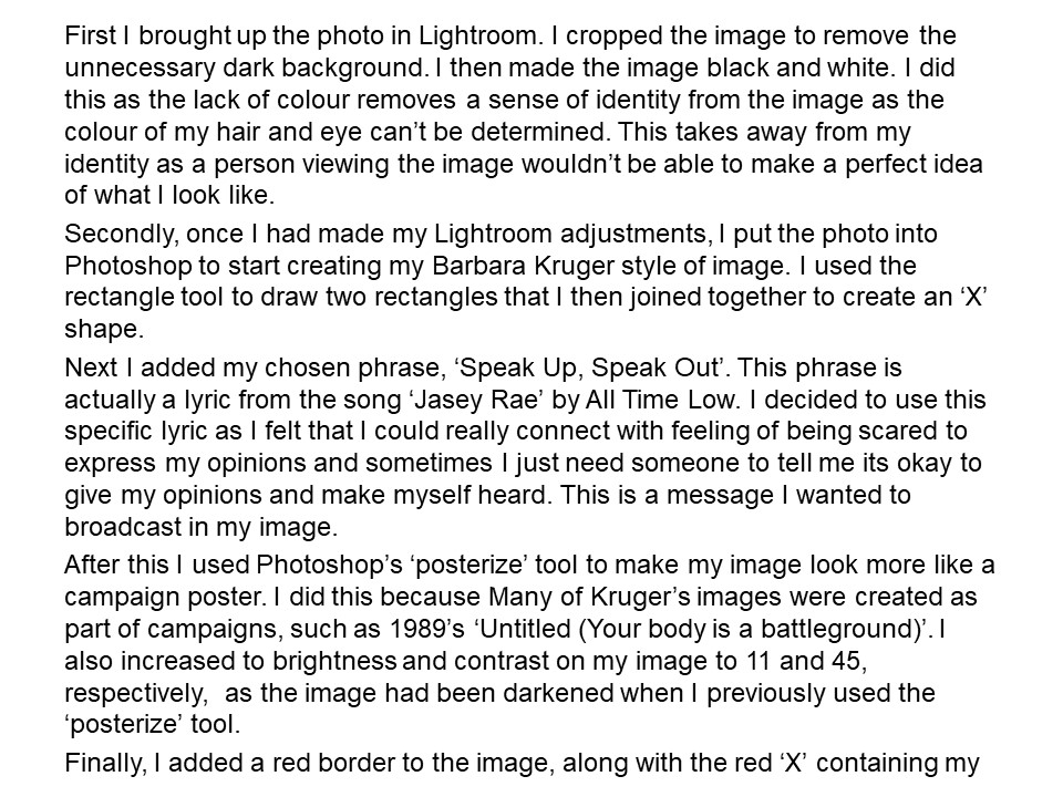
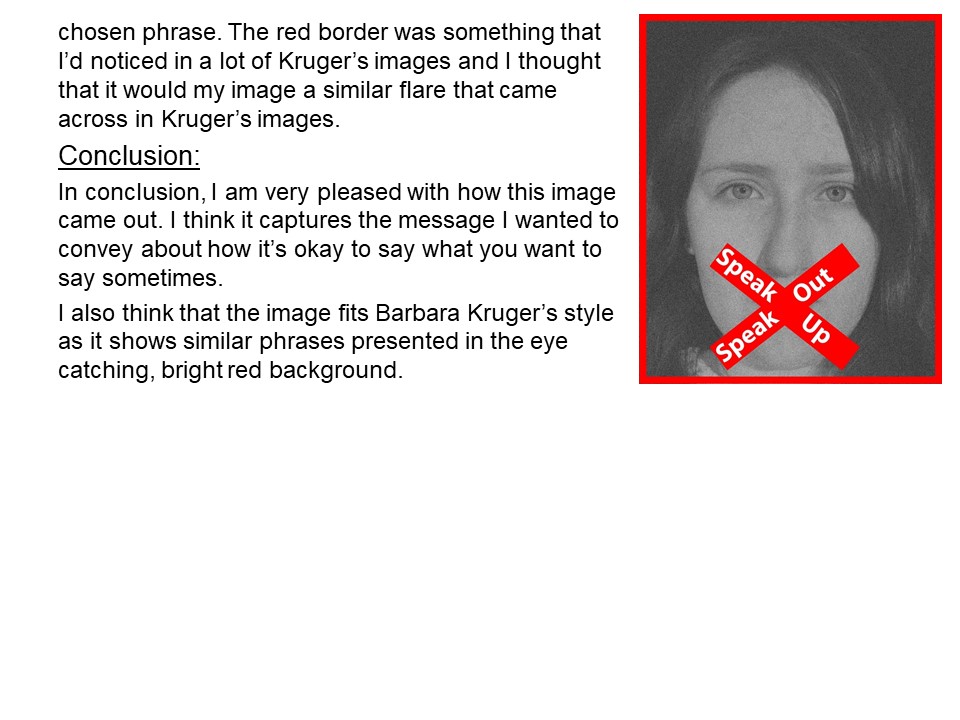
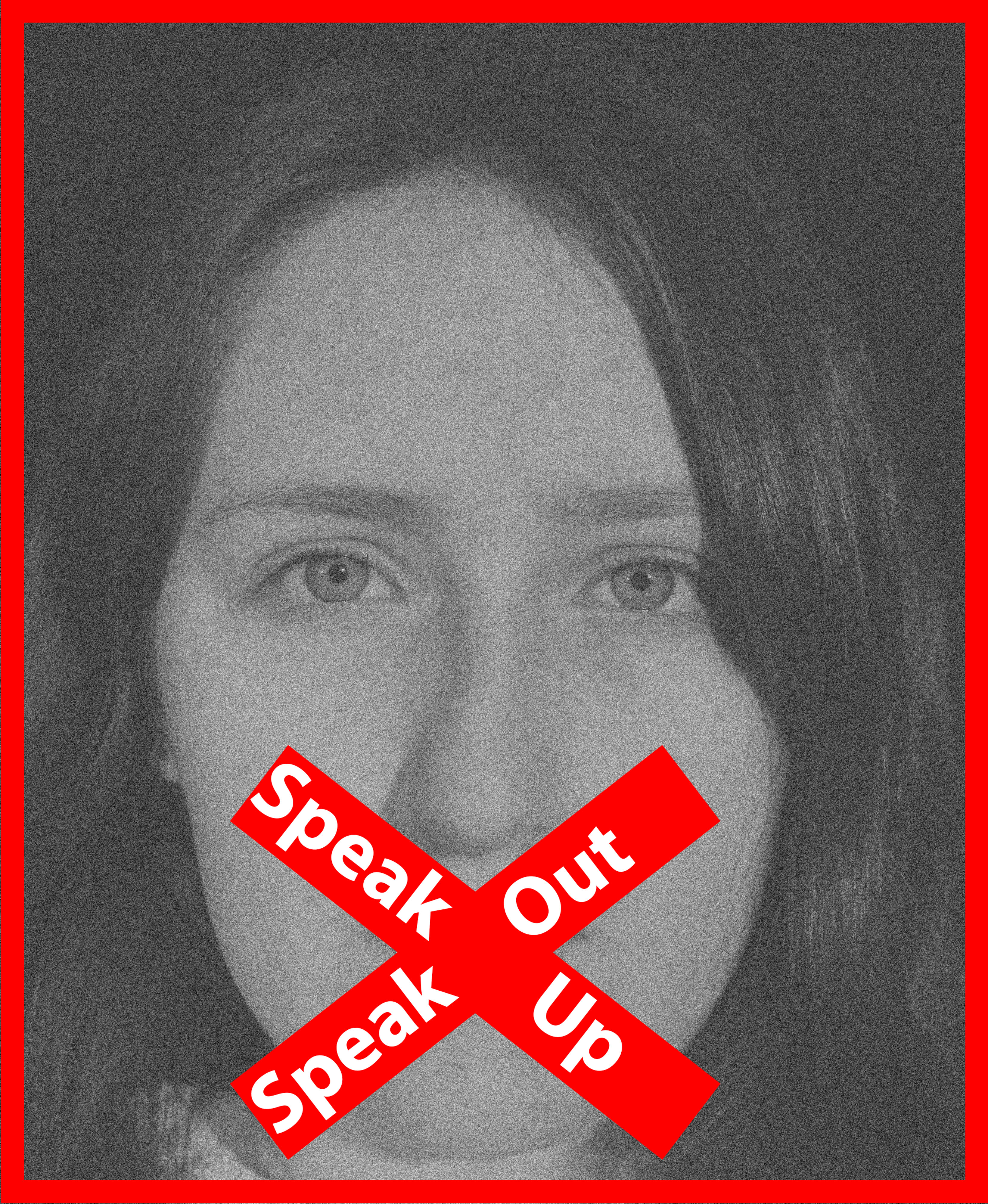
In the exam I want to produce my final images by taking inspiration from the artists Barbara Kruger, and Steve Rosenfield. My final images will consist of portraits alongside text, they will be edited in the style of Barbara Kruger using Photoshop, but take the same approach as Rosenfield in regards to the text.
Personally, I believe that self portraits would have been more appropriate for this concept, however I did not feel comfortable doing this and so therefore have chosen to use portraits of some of my closest friends; Erin, Daisy, and Katie, as they influence my social identity.
I’ve chosen to tackle some extremely controversial and sensitive topics, emotional abuse and mental illness and how the stigma and after effects can lead to ones loss of identity, and the consequences that change a person, whether that be for the better or not, afterwards, I have made this personal to me by incorporating some of my story and making it more personal.
I’m aiming for my images to be in a sort of ‘series’ and tell a story whilst also being able to be separate, individual images.
I want my final pieces to represent how these negative factors, that are very stigmatised, and very frowned upon and judged, do have long term effects on a child’s identity growing up, however that is not always negative. I want to represent the ‘loss of identity’ a child can feel and experience due to a negative environment.
To finish, I’d like to frame my final images together so that they can be seen as a whole story.
In this image, I took a tableaux approach, where I attempted to create a story within the image. The story being told is that a woman who has lost her identity, is placing makeup on her face in order to rectify the issue. The makeup represents a cover up for the loss of identity, which shows how society wants us to act when we lose our identity. In order for this story to clearly be presented I felt that the image needed to be naturally darker, and so I adjusted the levels and curves to do so. I also decided to turn the image into black and white which has allowed the idea that the woman has no identity to be clearly presented. Although I like the way this image has turned out, I do not feel that it has strong links towards loss of identity, and therefore I believe that this is more least successful outcome.
In my second edit, I wanted to showcase my surrealist approach to mask photography. Instead of using a mask I used a bed sheet and rapped it around both of my models heads. I placed the taller model in the foreground and the shortest in the background. From looking at other surrealist photographers work, most of the images are presented in black and white, I believe that the black and white look allows the image to be high in tonal contrast which emphasize the entrapment of my models, and how losing your identity can trap people in their own minds. The bed cover acts metaphorically to represent the mind trapping people. To edit this image I simply adjusted the levels and curves to ensure that the image would produce high tonal contrast.
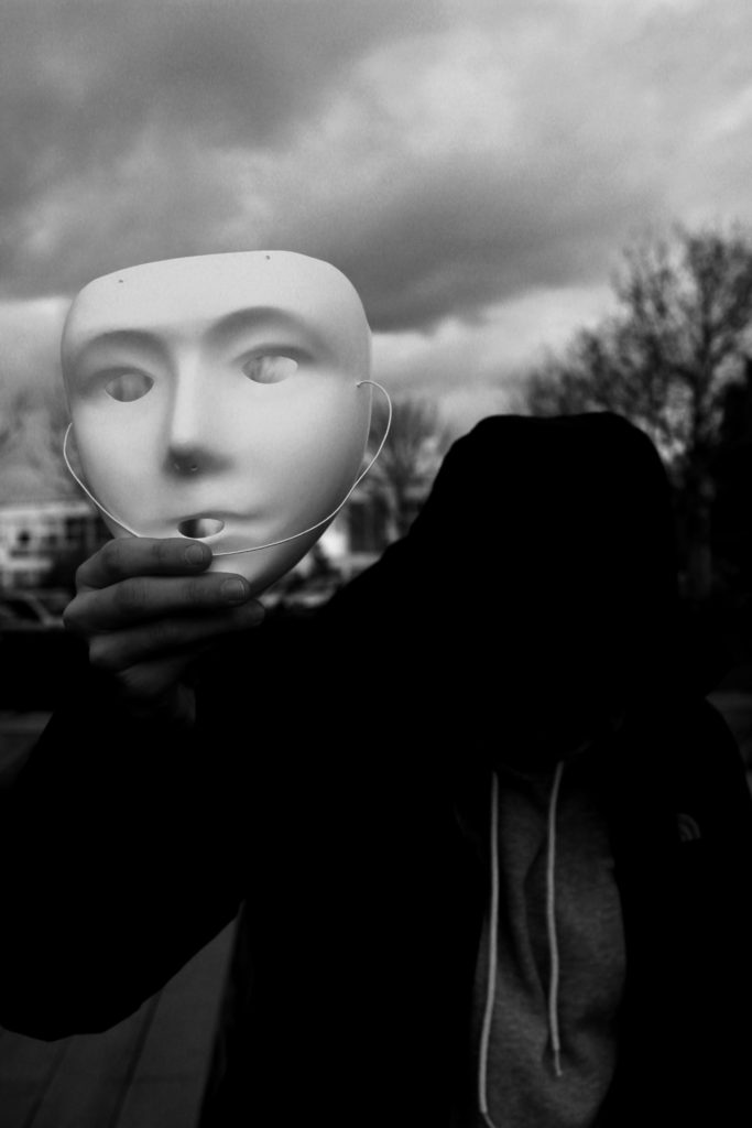
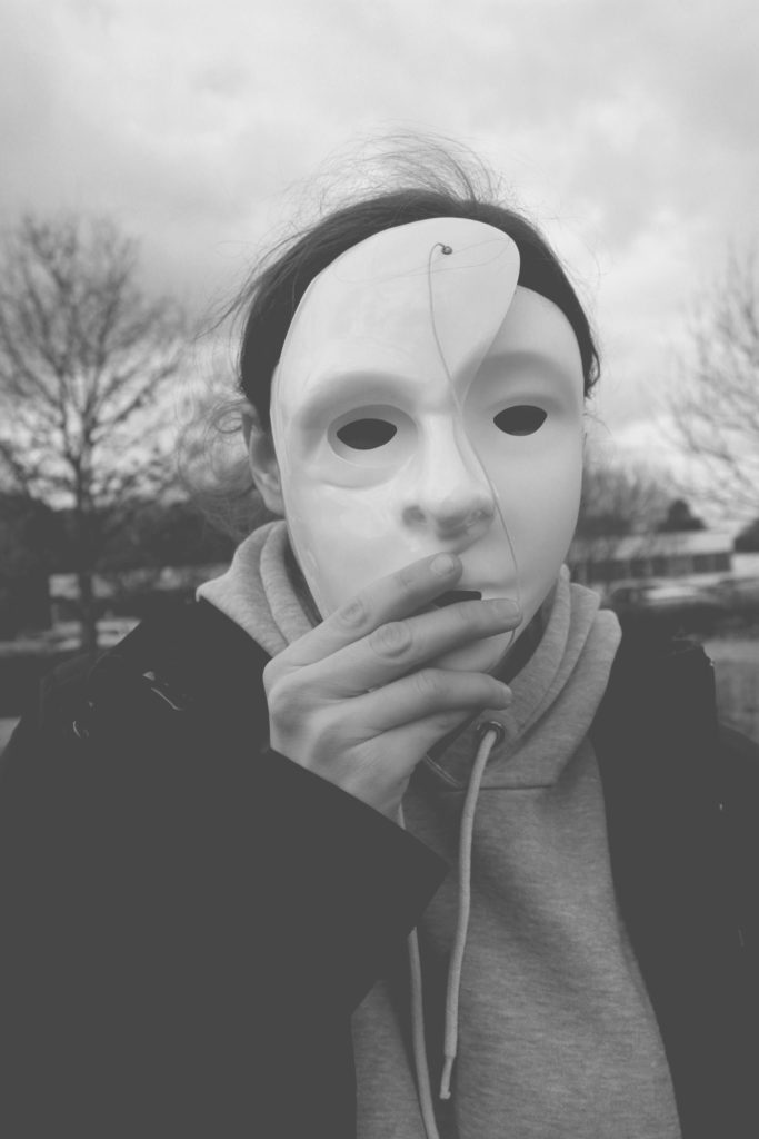
In my next edit I wanted to show my model presenting her mask, before she puts it on, taking away her identity. As seen the models face is not seen and completely black which represents her identity being lost. In order to allow the face to be completely black I made the image seem naturally darker by adjusting the levels and curves, I then decided to turn it into black and white in order to allow the whole face to be completely black. I chose the main focus point to be on the mask as I felt that it represented the importance of ‘putting on a mask’, putting on an act, when you lose your identity. I feel that this image is one of my more successful images due to the different photography techniques that are shown and the editing techniques I used.
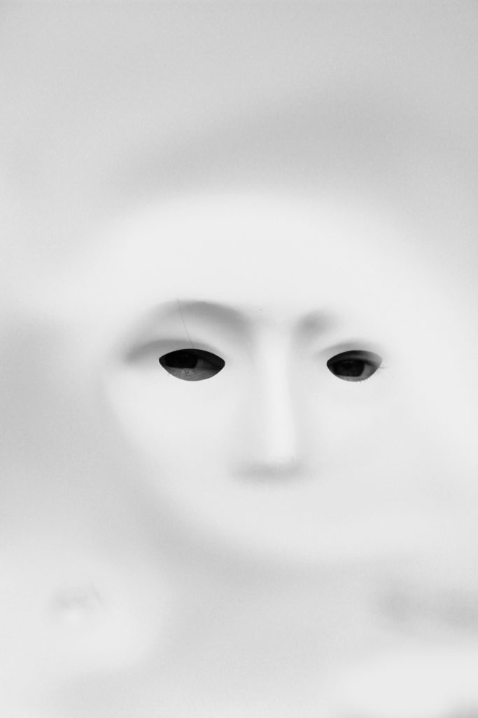
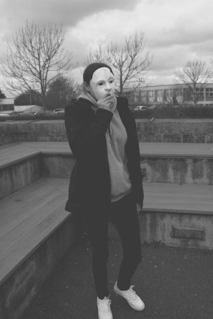
In my next edit we are presented with the mask, looking out of a mask. The idea of this image was to showcase, what viewing the world and others through a mask, when you lose your identity. To edit this photograph, I wanted to ensure the mask on the face could still show facial features, like the nose and eyes, but had the rest of the frame white. To do this I made the image lighter by adjusting the levels and curves, and turned the image into black and white. I areas I went over with the paint brush tool (white) in order to conceal any darker areas. This image strongly portrays the theme of loosing an identity but shows it from the viewpoint of someone who has lost their identity.
In my next edit, I selected the image where a half mask is placed onto of the full mask. This represents the model falling deeper into the obis of losing their identity. This denotes that losing an identity can layer up and become hard to find themselves again, which shows the importance of speaking to someone when you begin to lose an identity. To edit this image I adjusted the levels and curves and turned the image black and white, in order to make it high in tonal contrast. I then decided to lighten the image by adjusting the lightness to be brighter. This made the image seem more grey, and old which adds to the overall sinister tone of this image.
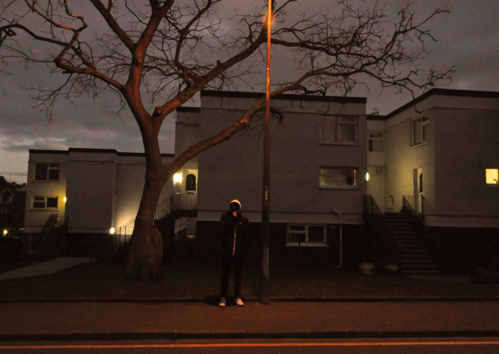
In my final image I took the same approach as the edit above. I decided to follow the same technique, in order to make a mini series of the layering of the mask. These two images work well together as they are taken at different viewpoints and show two different styles of portrait photography. In this image we see the model in a desolate area looking as if she is walking somewhere, in hope to find someone for help. In the background we see corner stairs, which are used to represent the entrapment and how losing her identity has trapped her and how she is searching for help.
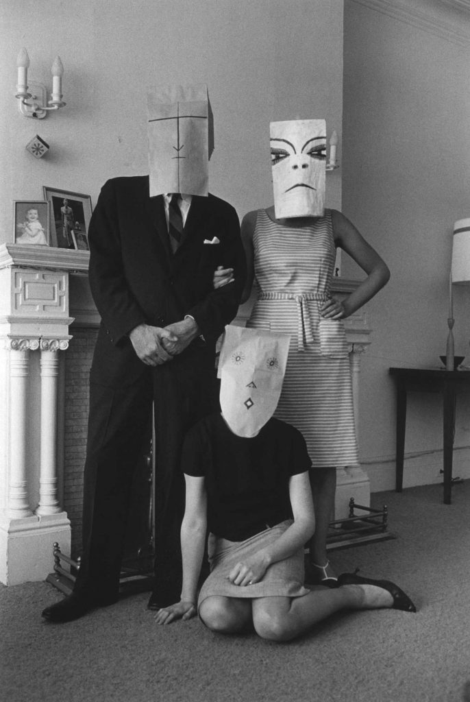
To compare my work to Saul Seinberg, I believe that my approach has a stronger link to the loss of identity. To technically compare my image to Seinberg’s, I took the same idea of using a basic background in order to present context to the image. my background is more isolated and worn down, where as Seinberg’s image uses a posh home environment which creates an identity for those people. Both images seem to use natural cold lighting which adds to the eerie tone which was trying to be created. Both images are presented in black and white, which allows colour to be taken away, which can help present an identity. Moreover, it allows the formal element of tone and shape to be clearly presented within both of the images. One difference is that Seinberg uses paper bags with faces where as I use masks, although I like the paper bag concept I felt that it began to create an identity, which was not the aim of this photo shoot. Therefore, using a mask I felt was more appropriate. Finally, my image uses a short depth of field compared to Seinberg’s image. I felt that the main focus point being on the model helped to isolate the background, allowing the focus to be on the model allowing the clear message to come across.
To evaluate these edits I believe that I have managed to produce a strong response to mask photography, which could then develop into final pieces for the theme of loss of identity. The edits have used simple photoshop techniques which has allowed the theme to clearly be portrayed in every photograph, making these edits successful.
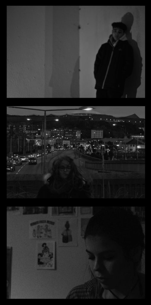
For my final outcome I would like to create a series of photographs that go together across the theme of Identity, so this means I will be choosing multiple images that follow through and compliment each other to sit in a series together.
I have chosen to trial my images in the specific layouts that I would use so that I can see how they fit and how I would organise them.
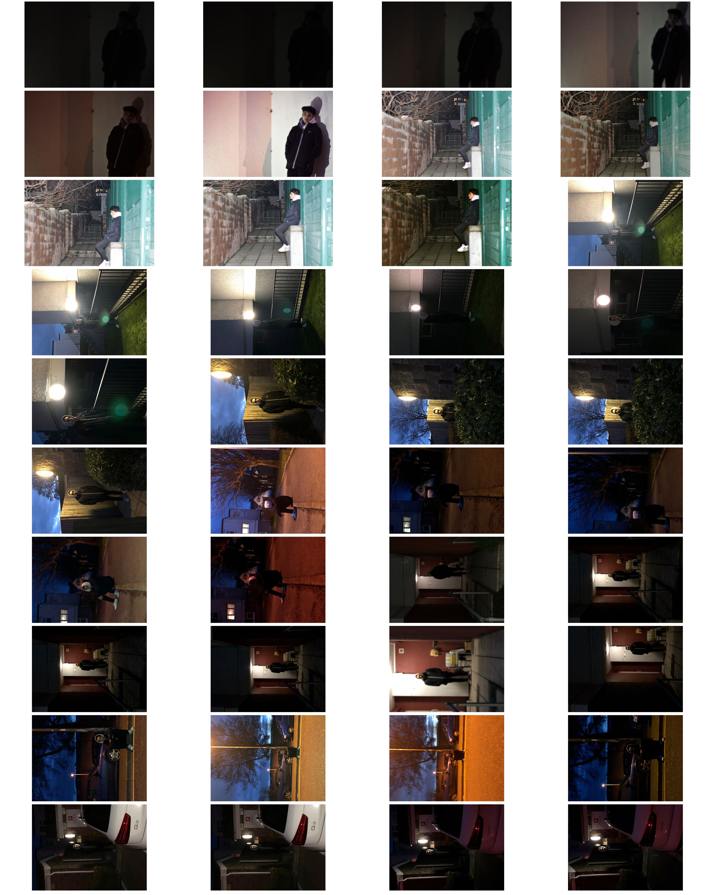
First Trial
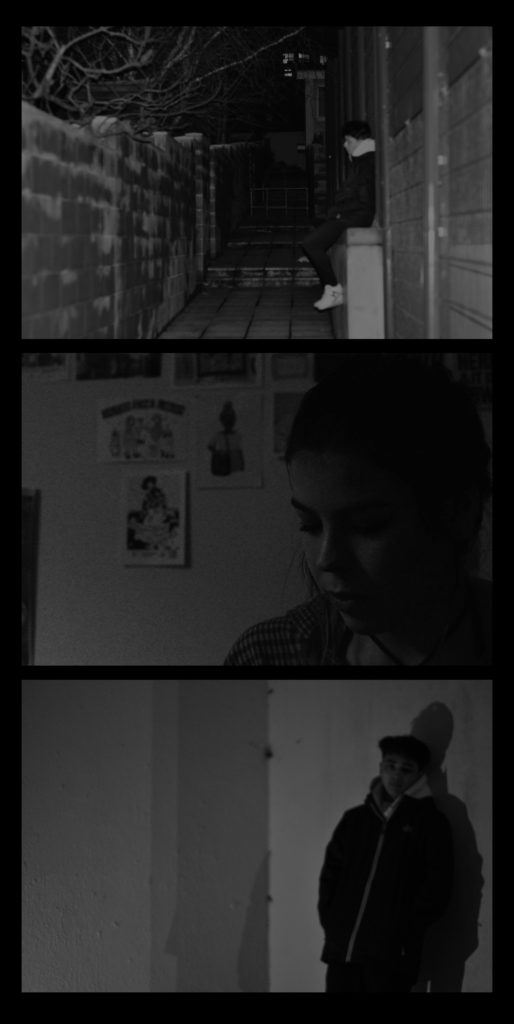
Below shows my first trial and experiment for the series of photos I want to produce. All of the photographs have been produced previously in the project under the influence of Philip-Lorca diCorcia, I feel the top and bottom image are working better together rather than the middle image as it has a lot of noise to the image and I feel it distracts from the quieter images above and below it. I feel the two images on top and bottom are more personal images and intimate in a way specifically the bottom image and I feel this is why those two work together.
Choices 1st trial
Second Trial
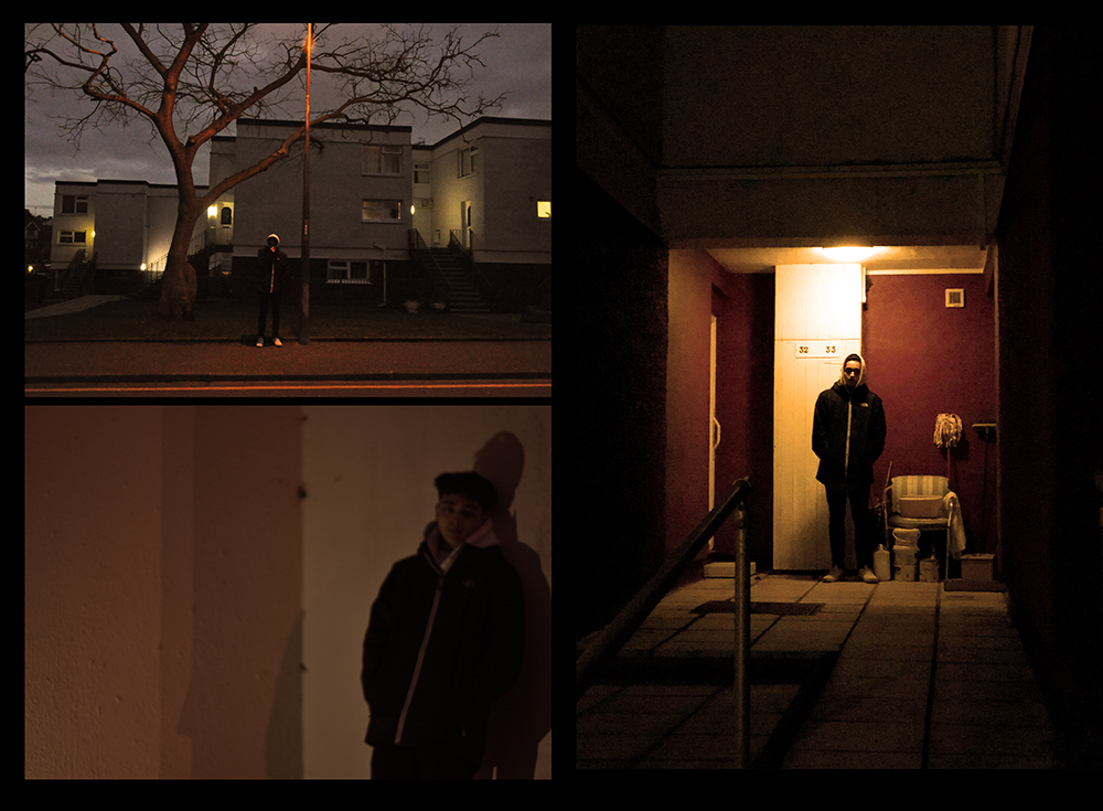
Below is my second trial of three images working with each other. The images I am trialing with jow have not been the most clear photographs throughout the project however I feel that in some ways they can work together as it does not stand out as one unclear images among clear images I feel this is helping them work together. This trial below is using two of the photographs from the previous trial however with a different third image that came from the same shoot as one of the others, I feel it is a more interesting and personal image compared to the previous one I used, however I still feel there could be better photograph compositions for identity.
Choices 2nd trail
Third Trial
This is an experiment layout with my newer images that I have specifically taken for the final outcomes. I like this layout and collection of photographs as I feel each image is interesting and intriguing and I feel the images work well with each other. I feel this is one of the better layouts that I have produced and one that I feel could work well.
Choices 3rd trial
Fourth Trial
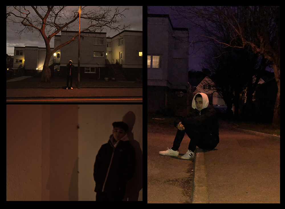
This is a similar layout to the one I produced above however with a different larger image on the side, I feel it creates a bit of difference to have the subject sat down in the larger image compared to being stood up in the other two and I feel this works well as he is turned to face me however his body is still moving away and it means the subject is not stood the same in all of the photographs.
Choices 4th trial
Fifth Trial
This was an experiment layout with one of my other images to test how it would work with the other, I don’t feel it is my most successful layout however was a good experiment for testing and trailing how they work together and how the tones work together which I feel for this layout is letting it down as being a successful layout.
Choices 5th trial
Sixth Trail
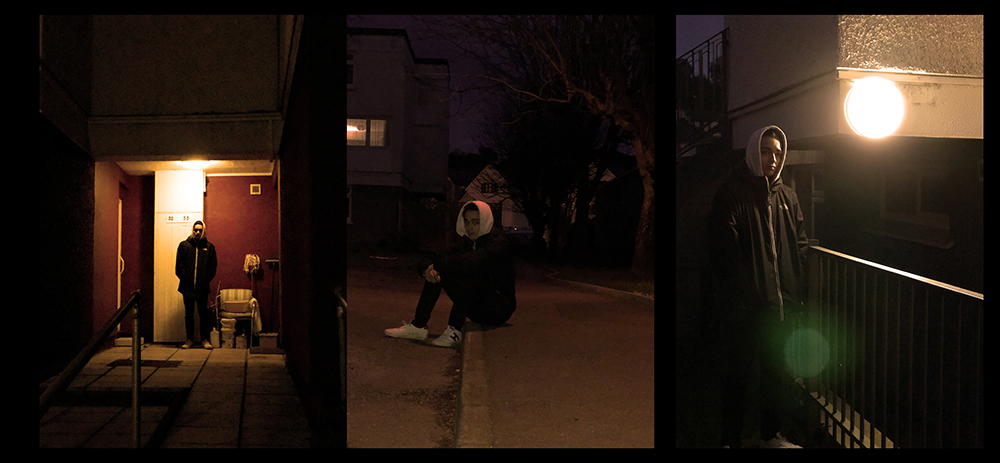
This was another experiment trial layout with my more successful images however having them in a triptych layout, I feel that the photographs are working well together with the colours and the tones. For this layout of these specific photographs I have chosen to have the two images of the subject stood either side of the image sat down to test how to show different levels.
Choices 6th trial
Seventh Trial
This is a different variation of the same image layouts as above however I have placed the two images where the subject is looking out and slightly away from the camera on the edges as they are looking out of the frame and then the centre image has the subject directly looking forward with their body and their eyes.
Choices 7th trial
Final Choice to Print
Final Choice Layout and Images
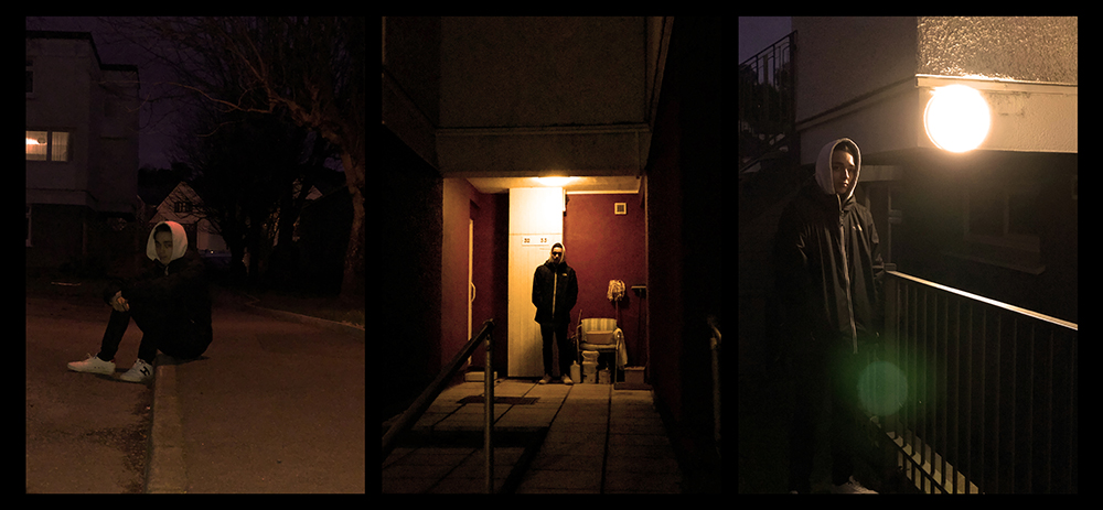
This is my final choice of my images and of my layout that I will be using in my final outcome. I have chosen this layout as I feel it works well the best and all the images work well together and hold a good sequence. I feel I can relate them back to Lorca diCorcia’s work and show that this is where I have my inspiration from. I feel these images are the best for showing my inspiration and relation to him.
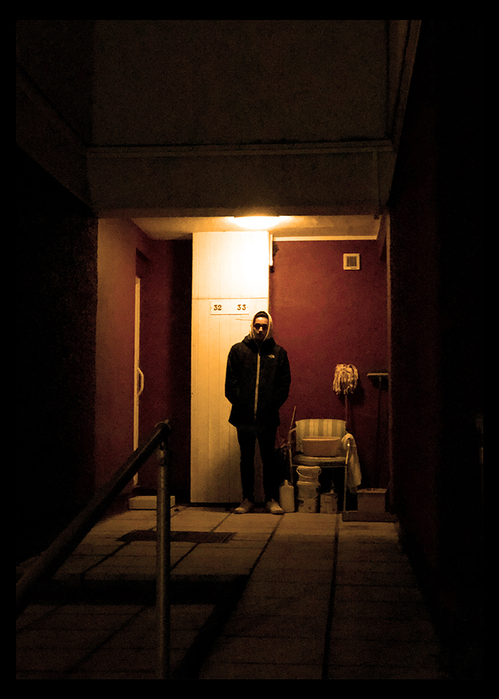
I have also chosen to print another of my outcomes by itself as an extra, the reason I chose to have this image by itself and not in the trio was partly because I want to have variation in the trio of images with how the subject was positioned but also because I feel this images is the one that will work best on its own and as a large image will be more impactful individually rather than the other option would be.
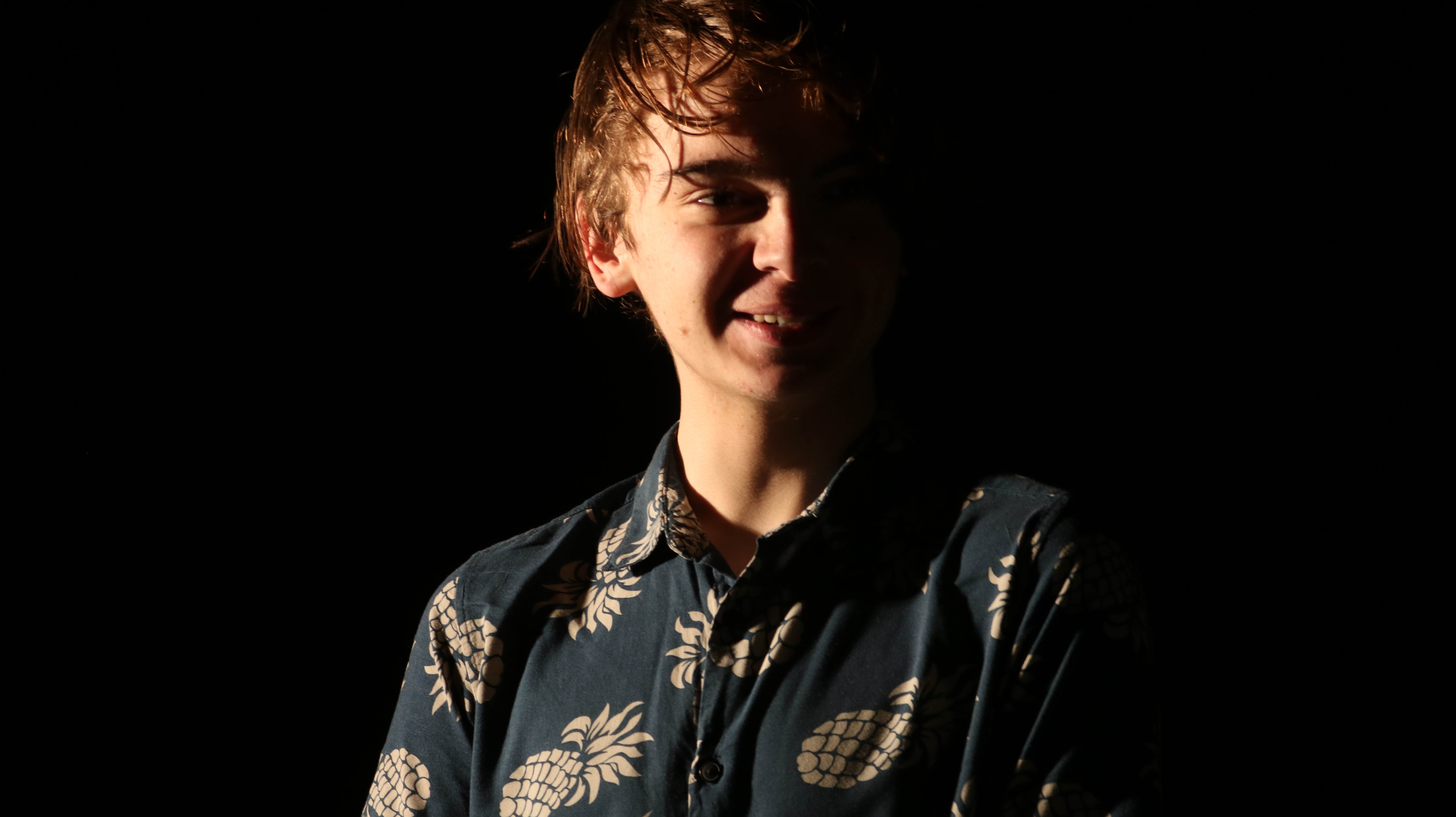
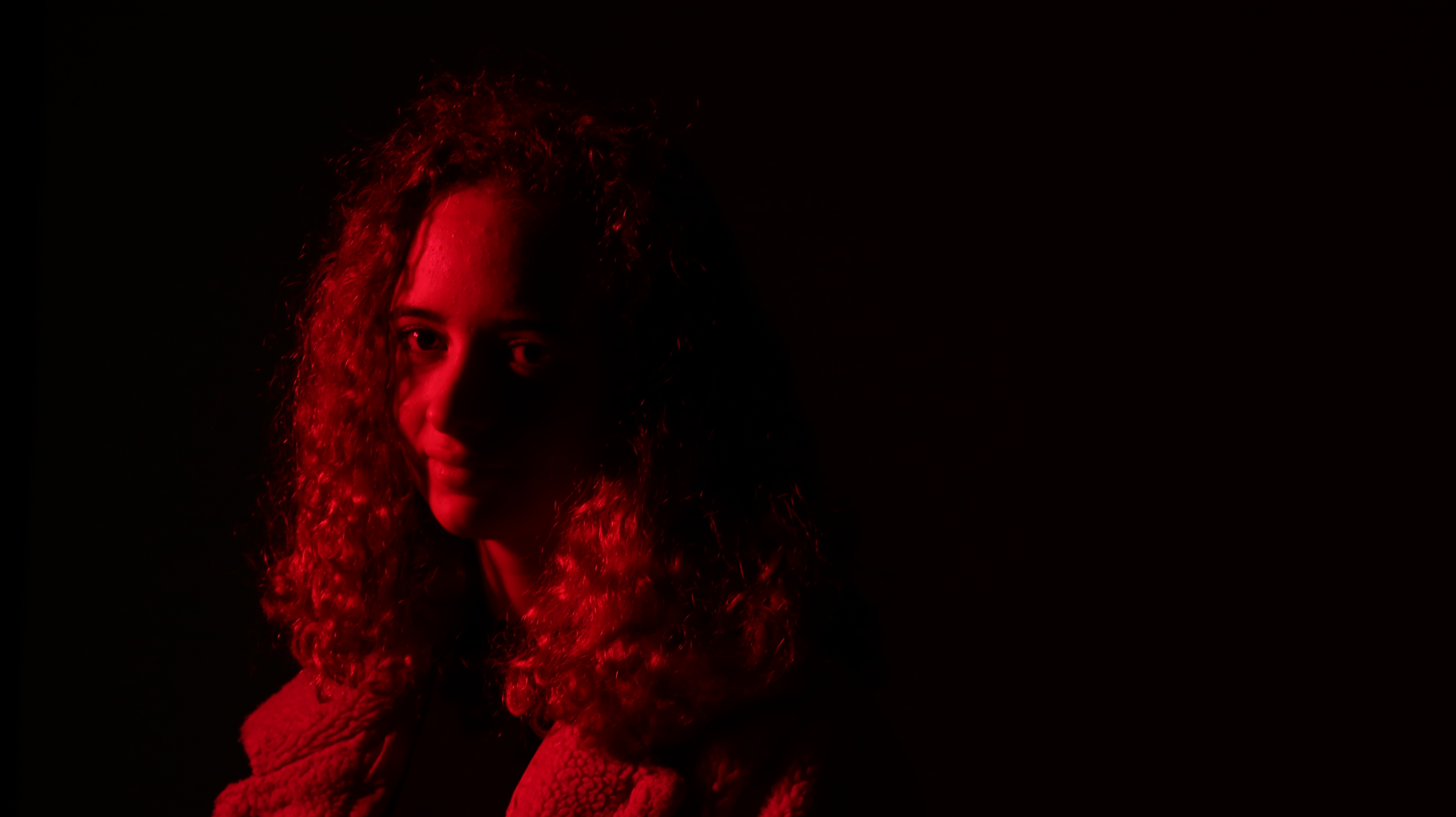
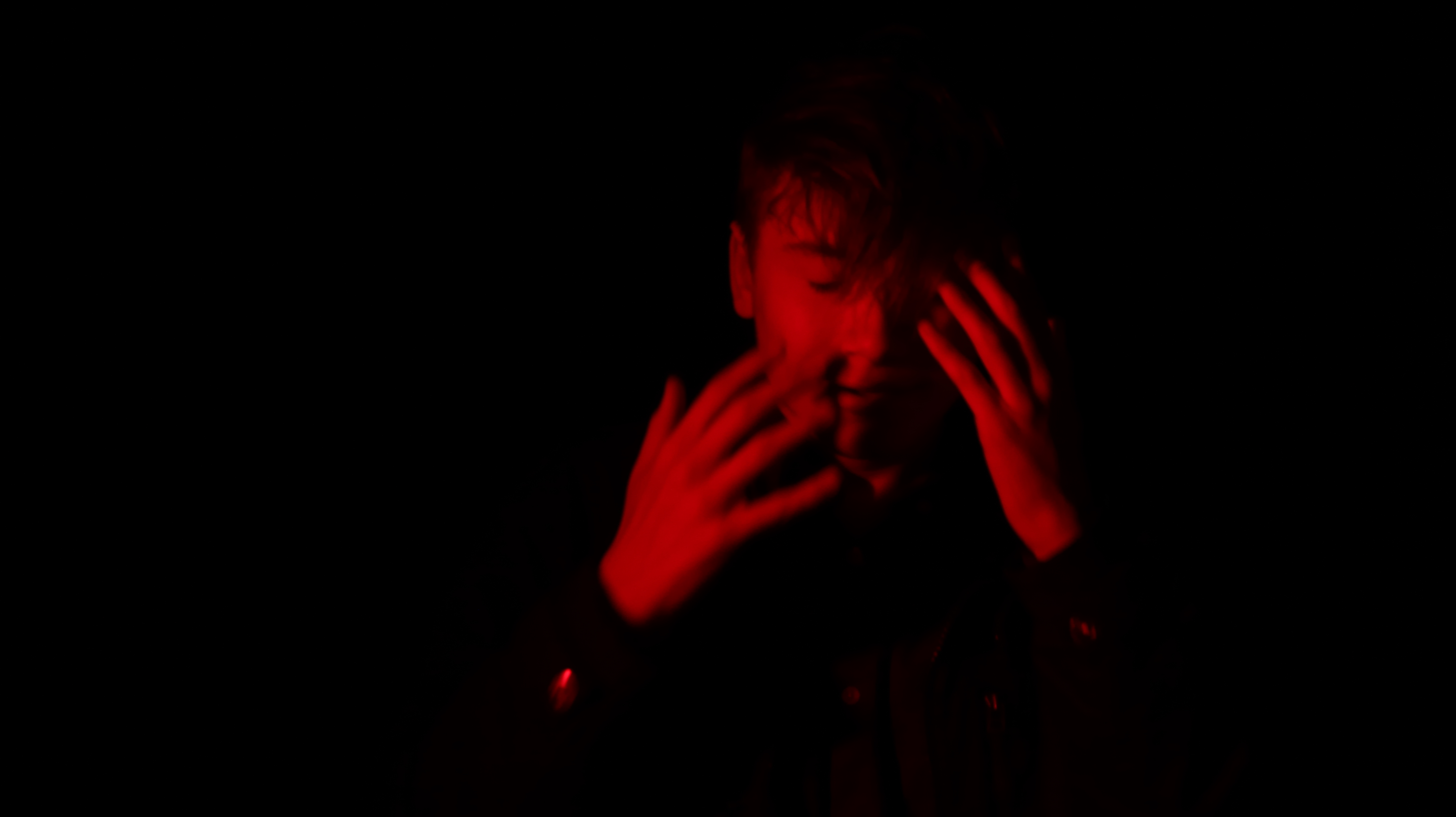
Philip-Lorca diCorcia’s work is very cinematic and this is something I would like to be able to try and recreate that filmic quality that he has with his work. His work has a very warm colour palette there is a running sort of theme throughout his images in that the eye is draw to the stand out warmer parts of the photographs. My aim will either be to capture this in the camera or to be able to edit this later in photo-shop.
Outcomes
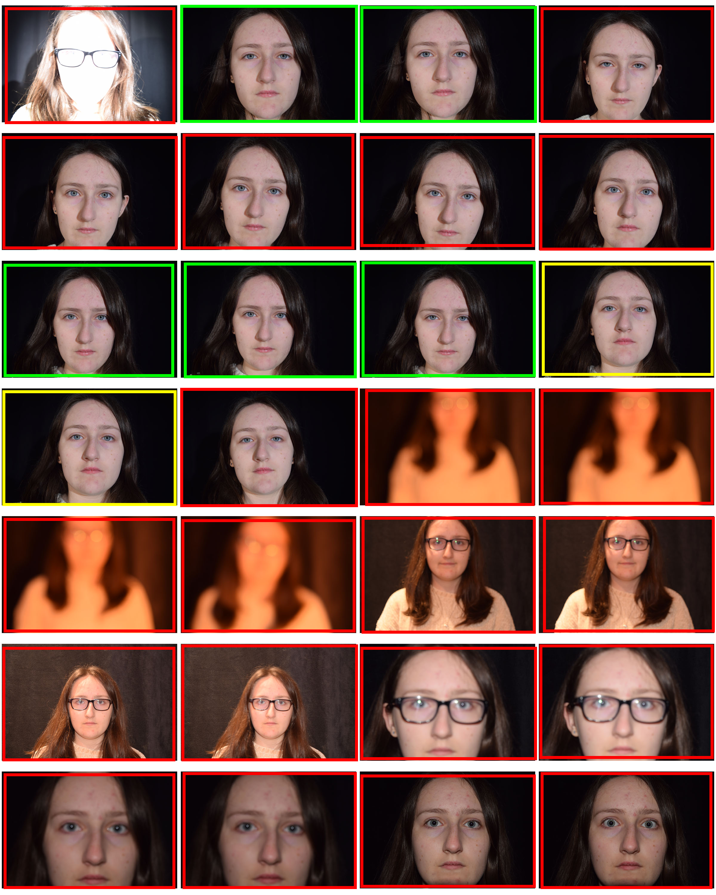
Contact Sheet
Above shows a contact sheet of the outcomes of the photoshoot in response and inspiration to Philip-Lorca diCorcia. I went out from 5:15pm to 6:00pm as this was were the sun was setting and it was becoming dark, towards the later side of the shoot it soon became too dark to be taking the pictures however I feel I came out with some good outcomes. I tried to find an area that had access to warm toned lights and streets that were quiet enough for me to take the pictures but also had some interesting surroundings and where needed I will edit the photographs to enhance the warm lighting.
Possible Outcomes
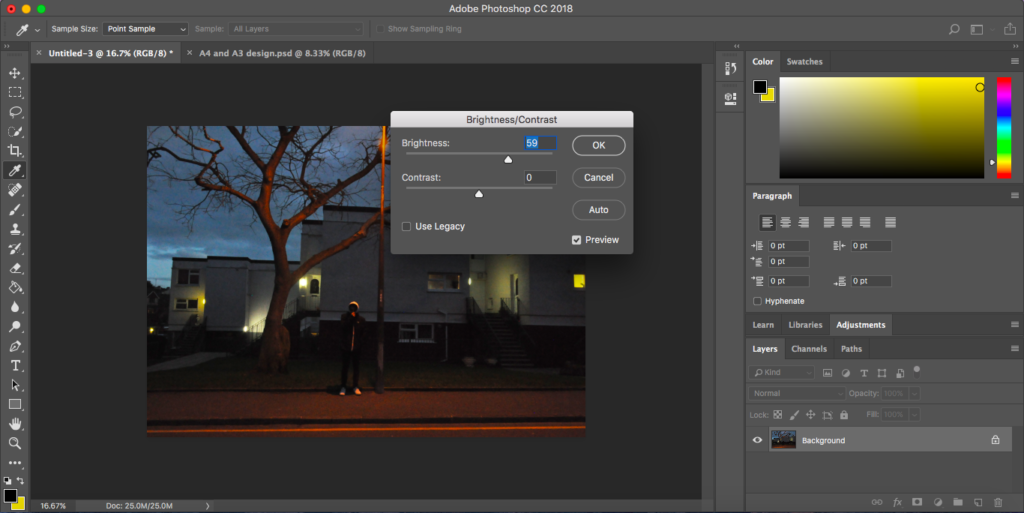
For the more successful of the images I edited them to have a warmer tone to the photograph, I did this by adjusting the brightness as needed and then using a warming filter (LBA) on photoshop, some needed more editing than others however I was able to give all of the successful images a warm tone to the image.
Edit stage 1Edit stage 2
Below shows some of the outcomes after they have been edited, these were some of my more successful images that have come out of the shoot that I feel may be right for my final outcomes in a trio layout.
What I want to achieve going into the exam.
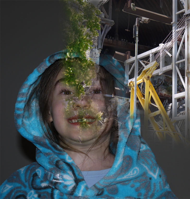
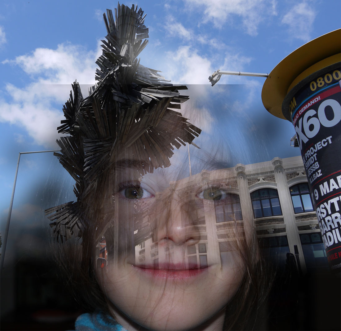
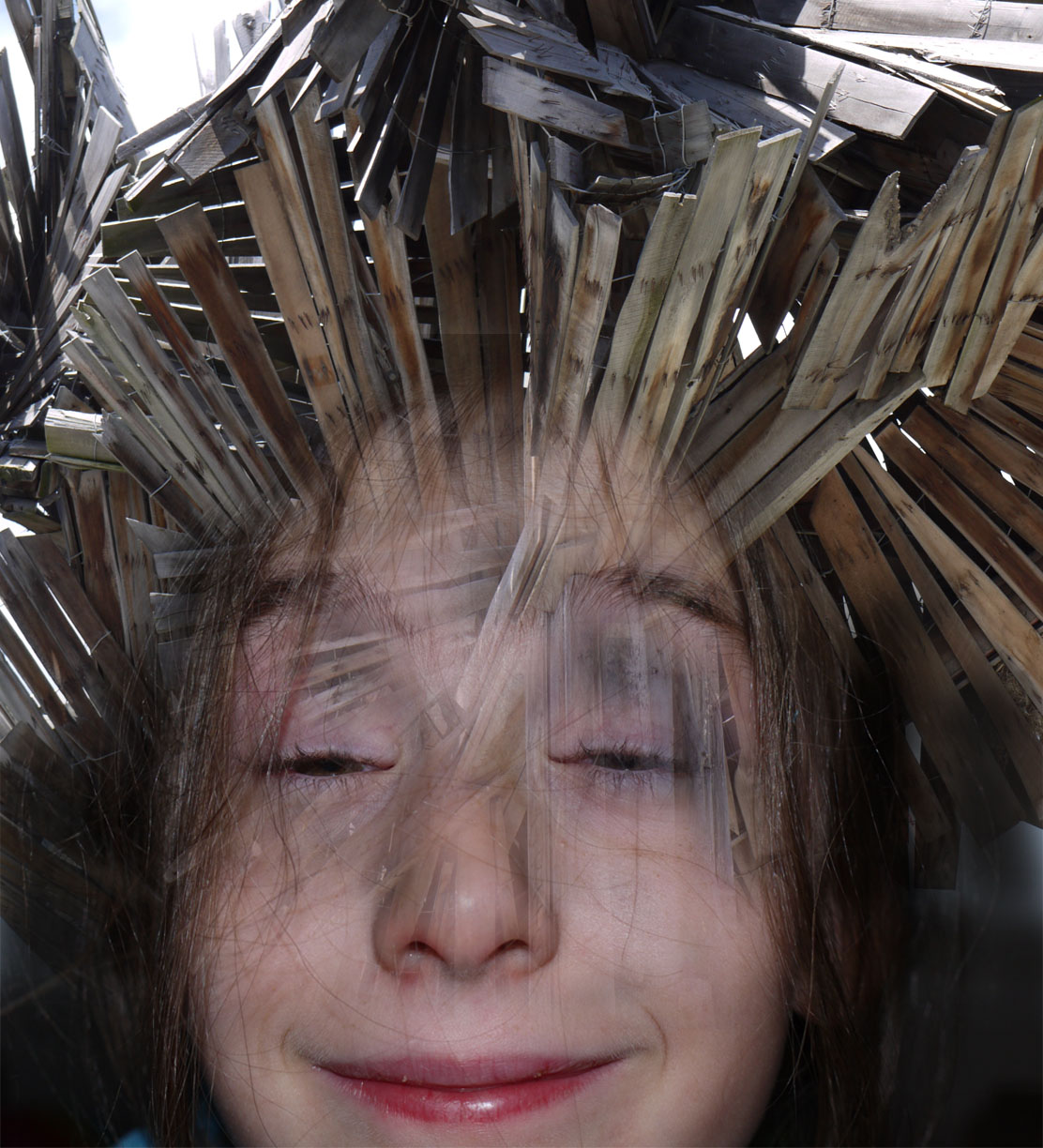
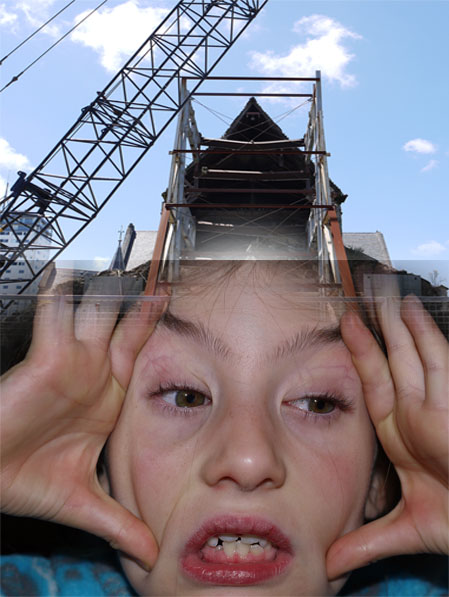
In the photography exam my plan is to create a combination of images that are merged both in Photoshop and made by hand . These final images are going to be a combination of inspirations of work from John Stezaker and Francesco paleria. These images are going to consist of faces and industrial building worked or structural shapes so will link in the influence of Xavier Ribas. One of my experiments shows what sort of thesem of work i want to be producing when it comes to the final exam .This image is what i want to be editing and creating with in the exam. My aim for the exam is to edit the existing images that i have prepared and work on combining them with my urban landscapes in the first half of the exam in the second half of the exam i would ideal like to be creating my hand made blended photos. For on of my final pieces i may make a combination of one die Photoshoped and the other made using physical techniques this to me will reinforce the concept of identity and how my own work had its own style and creativity. Also there should be a noticeable idea running through of how industrialization shrouds our minds and how we let it take over our day to day life with no care in the world, also how it just happens around us over the nature that we all so preserve so important yet we do noting about. I want my final pieces to give off this idea that our identity and the places we live are ever changing and we just have to adapt to them. Also i want it to represent how the place we live in no water how natural with always be subjective to industrialization ans we just let this happen as if it is a normal thing because it is all we have ever know. I want the images to show how imprinted industrialization is on our minds. My final outcomes i am hoping for at least one A3, A4,A5. That is the photoshoped images and then however many hand made edits depending on how much time i have left.
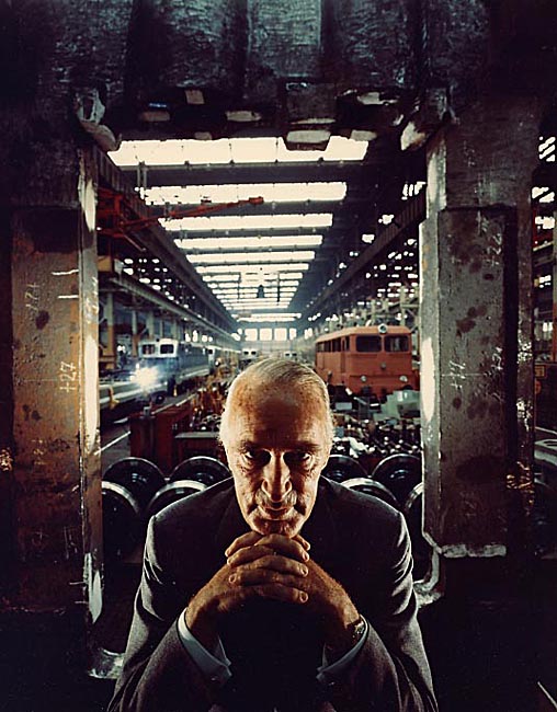
An effect of contrasted light and shadow. We used a single, direct light coming in from the side to create this effect. To make it more interesting, we also added coloured filters over the lights
Arnold Abner Newman was an American photographer, noted for his “environmental portraits” of artists and politicians. He was also known for his carefully composed abstract still life images.
Context
The photo was taken in 1963. The man being photographed is Alfried Krupp, a Nazi, who owned a company that supplied the Nazi’s with military supplies.
Francesco Paleari and my interpretations of his work
The artist that i am going to be focusing on for my exam inspiration is going to be Francesco Paleari. Francesco Paleari’s ‘Milano’s Profile’ series tells an architectural story, a personal story, and a demographic story simultaneously.  The photographs are personal in the sense that they tell a story of Paleari’s perception of Milan. He tells his story through portraits of the Milanese. Their portraits are also building profiles. The stories of people and buildings create the city’s collective profile. Paleari’s title for this series is very fitting. Each image is a profile view of a person combined with a building’s profile.Here is Francesco Paleari’s description of the series: ‘Milan in architectural profiles of a historic city and modern at the same time, Milan in the profiles of the people who live it every day.’Here is Francesco Paleari’s description of the series: ‘Milan in architectural profiles of a historic city and modern at the same time, Milan in the profiles of the people who live it every day.’There is something to be said about how Paleari decided to blend the two profiles. There is a set of decisions that dictate whether to fade out the building to highlight the person’s profile or whether to fade out the person to highlight a building’s profile. I think his decision-making was very successful. Paleari is basically stating that the building and the person tell the same story, and the collective stories of buildings and people tell the story of a city. Some images of his work that i've decided to base my inspiration off of.

 I have decide to create my own interpretations of his work by using Photo shop creating a blank document creating to different layers of images then using a layer mask and the brush to to fade them together.
Photomontage is often used as a means of expressing political dissent.

It was first used as a technique by the dadaists in 1915 in their protests against the First World War. It was later adopted by the surrealists who exploited the possibilities photomontage offered by using free association to bring together widely disparate images, to reflect the workings of the unconscious mind.

In 1923 the Russian constructivist Aleksander Rodchenko began experimenting with photomontage as a way of creating striking socially engaged imagery concerned with the placement and movement of objects in space.

Other key exponents of the medium are John Heartfield, the German artist who reconstructed images from the media to protest against Germany’s Fascist regime and Peter Kennard; whose photomontages explored issues such as economic inequality, police brutality and the nuclear arms race between the 1970s and the 1990s.
John Stezaker - Photo montage
John Stezaker’s work re-examines the various relationships to the photographic image: as documentation of truth, purveyor of memory, and symbol of modern culture. In his collages, Stezaker appropriates images found in books, magazines, and postcards and uses them as ‘readymades’. Through his elegant juxtapositions, Stezaker adopts the content and contexts of the original images to convey his own witty and poignant meanings.

In his Marriage series, Stezaker focuses on the concept of portraiture, both as art historical genre and public identity. Using publicity shots of classic film stars, Stezaker splices and overlaps famous faces, creating hybrid ‘icons’ that dissociate the familiar to create sensations of the uncanny. Coupling male and female identity into unified characters, Stezaker points to a disjointed harmony, where the irreconciliation of difference both complements and detracts from the whole. In his correlated images, personalities (and our idealisations of them) become ancillary and empty, rendered abject through their magnified flaws and struggle for visual dominance.

In using stylistic images from Hollywood’s golden era, Stezaker both temporally and conceptually engages with his interest in Surrealism. Placed in contemporary context, his portraits retain their aura of glamour, whilst simultaneously operating as exotic ‘artefacts’ of an obsolete culture. Similar to the photos of ‘primitivism’ published in George Bataille’s Documents, Stezaker’s portraits celebrate the grotesque, rendering the romance with modernism equally compelling and perverse.


His work fits in well with the concepts of photo montage.
A photo montage is a collage constructed from photographs.
Historically, the technique has been used to make political statements and gained popularity in the early 20th century (World War 1-World War 2)
Artists such as Raoul Haussman , Hannah Hoch, John Heartfield employed cut-n-paste techniques as a form of propaganda…as did Soviet artists like Aleksander Rodchenko and El Lissitsky
Photo-montage has its roots in Dadaism…which is closely related to Surrealism

This work really reflects this whole idea of combinations of photos. I would like to do some experiments looking at creating real photo montages made by hand not sure made using Photoshop. These montages interest me because there have multiple focal points creating a visually exiting images with lots of components made the build a whole picture.


 This image is what i want to be editing and creating with in the exam. My aim for the exam is to edit the existing images that i have prepared and work on combining them with my urban landscapes in the first half of the exam in the second half of the exam i would ideal like to be creating my hand made blended photos. For on of my final pieces i may make a combination of one die Photoshoped and the other made using physical techniques this to me will reinforce the concept of identity and how my own work had its own style and creativity. Also there should be a noticeable idea running through of how industrialization shrouds our minds and how we let it take over our day to day life with no care in the world, also how it just happens around us over the nature that we all so preserve so important yet we do noting about. I want my final pieces to give off this idea that our identity and the places we live are ever changing and we just have to adapt to them. Also i want it to represent how the place we live in no water how natural with always be subjective to industrialization ans we just let this happen as if it is a normal thing because it is all we have ever know. I want the images to show how imprinted industrialization is on our minds. My final outcomes i am hoping for at least one A3, A4,A5. That is the photoshoped images and then however many hand made edits depending on how much time i have left.


 I have decide to create my own interpretations of his work by using Photo shop creating a blank document creating to different layers of images then using a layer mask and the brush to to fade them together.


 His work fits in well with the concepts of photo montage.