
Barbara Kruger generally uses black and white photographs with heavy contrast as her background layer underneath bold red text boxes usually stating strong, somewhat controversial lines.
As I knew beforehand that I was going to be editing these images more than I usually would, I wanted to use natural lighting portraits as my background to even that out.
Although Kruger doesn’t use her photos as a ‘series’ I did want to use mine this way, whilst also addressing some topics that I’m extremely passionate about – the effects of mental illness, abuse, and the stigma that inevitably follows.
Editing
first edit: when i recover; i won’t blame myself anymore
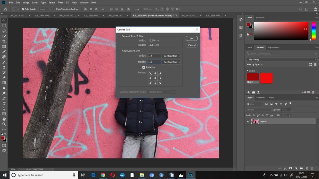
The first thing I did to this image was increase the canvas size so that I could then create the thick red border around the image – I increased the height and width to 1.5cm after a bit of trial and error to see which thickness I thought appeared best.
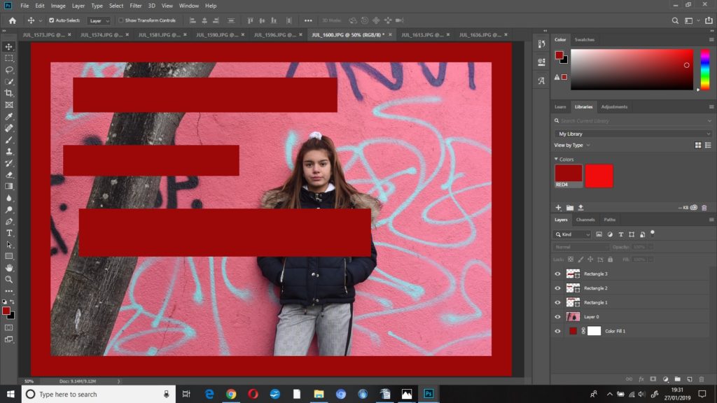
I created a ‘colour fill’ layer and dragged that underneath ‘layer 0’ in the layers column. I used the rectangle tool to create some rectangles, filled with the same shade red as the border, where I wanted the text to go.
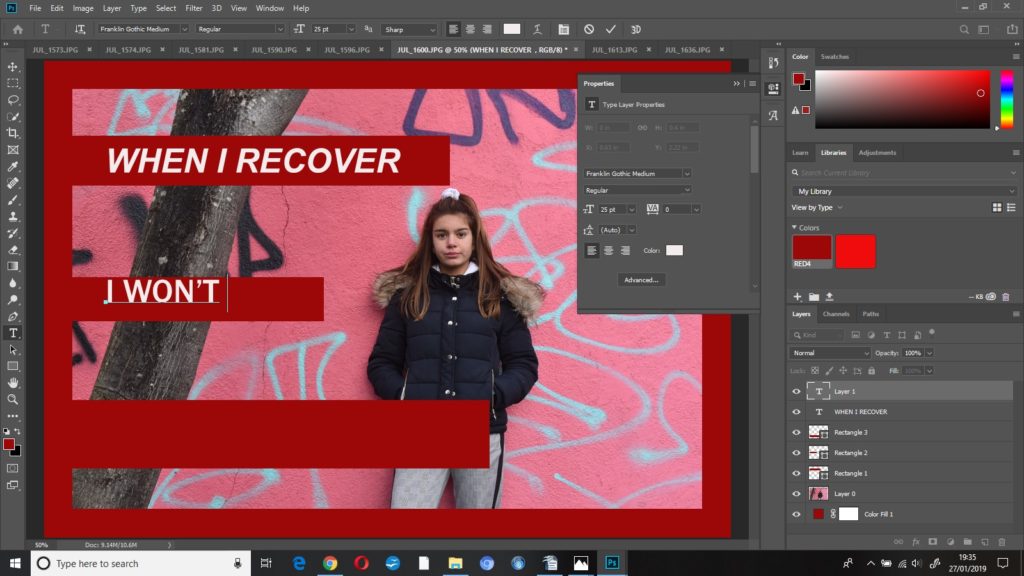
I used the horizontal text tool to then place the text where I wanted it – I opened the ‘properties’ panel to adjust the font, size and colour of the text.
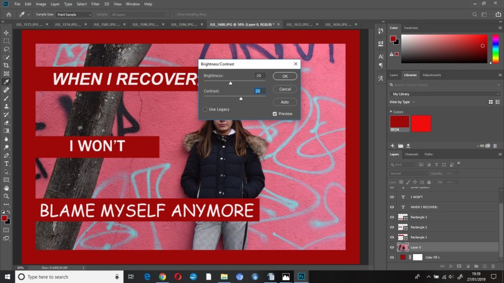
I then started to edit my photograph. I decreased the brightness to -20 and increased the contrast to +20. This made the whole image a bit darker but the colours a bit brighter – I did this so that when I put the image into black and white, I’d know which parts of the image were going to be darker and which were going to be lighter.
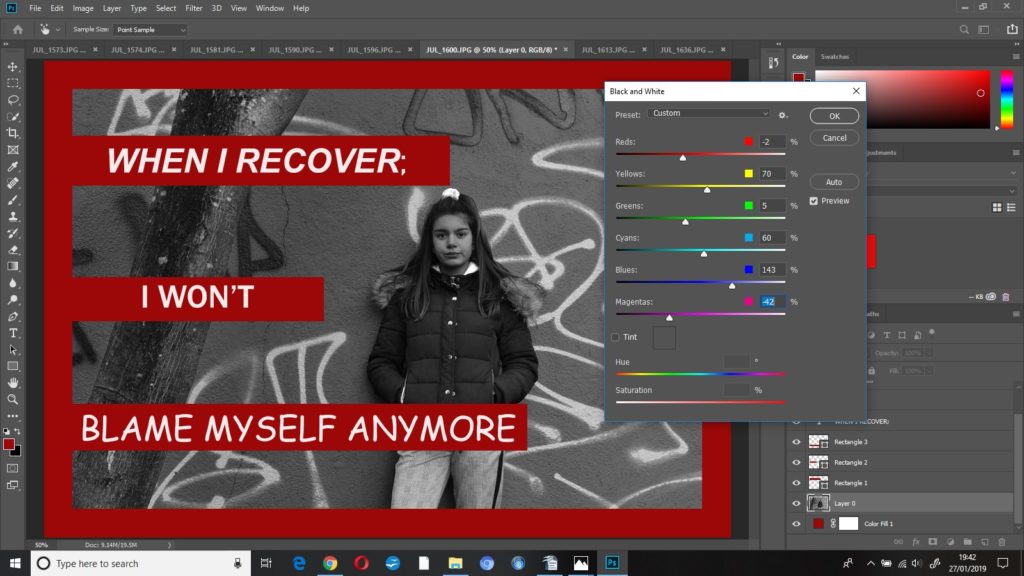
I put the photo into black and white, but I played around with some of the colour settings until the photo looked how I wanted it to look, this resulted in;
reds -2%
blues 143%
magentas -42%
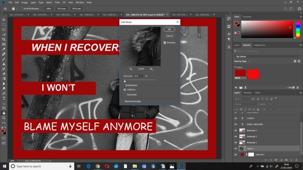
I added some grain ((noise)) to this image to make it look more dramatic and give it some harsher editing, I increased the noise to 5.5% .
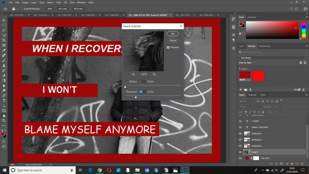
To finish this edit I added some dust and scratches, I left radius at 1 pixel and increased threshold to 35 levels.
second edit; you can’t have a rainbow, without a little pain
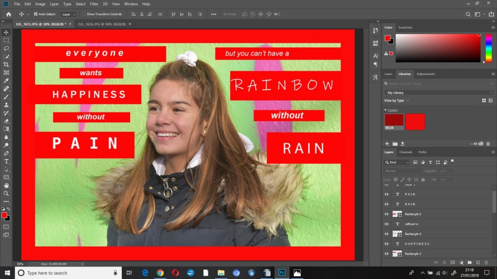
I started this edit by doing the same as the previous with the red border and text, however I used a brighter, more vibrant red as this was a more positive photo.
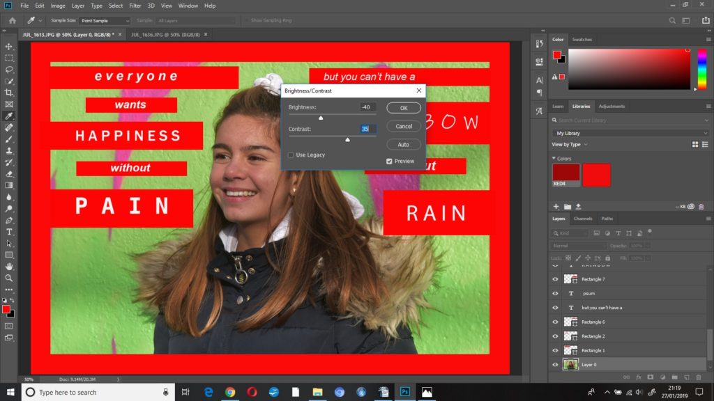
I started editing this image by decreasing the brightness to -40 and increasing the contrast to +40, I wanted the background to appear brighter, and as the subjects skin tone was slightly washed out, I decreased the brightness.
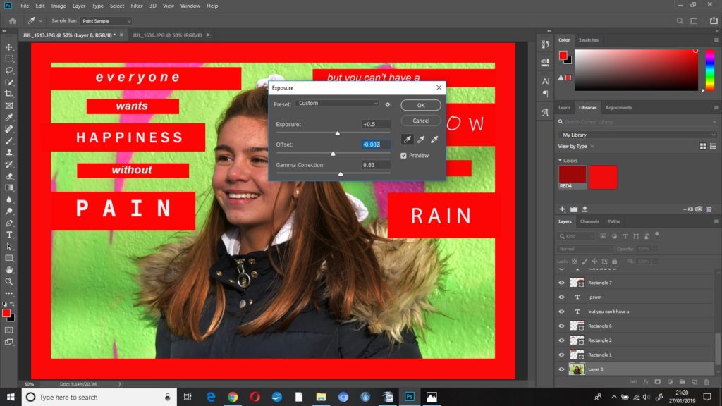
I kept adjusting the exposure settings until I was happy with how the photo was looking, the final settings were:
exposure +0.5
offset -0.002
gamma correction 0.83
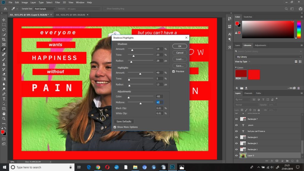
I changed some of the settings in shadows/highlights:
shadows
amount 18%
tone 23%
radius 28
highlights
amount 49%
radius 13
adjustments
colour -93%
midtones +1
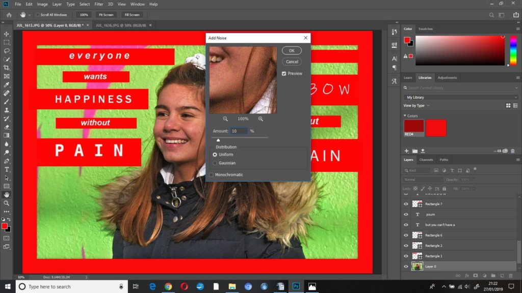
To finish this edit I added noise at 10%, uniform.