Kennard is a British contemporary artist who experiments with photo montage in order to express his opinions on issues such as politics, environmental concerns and social problems. He is the Senior Research Reader in Photography at the Royal Collage of Art (London). He was an active participant in the anti-Vietnam war movement, and used his artistic background to create photo-montages in order to spread images showing the consequences of continuing the war. He also involved himself in the Campaign for Nuclear Disarmament in the 1970’s-1980’s.
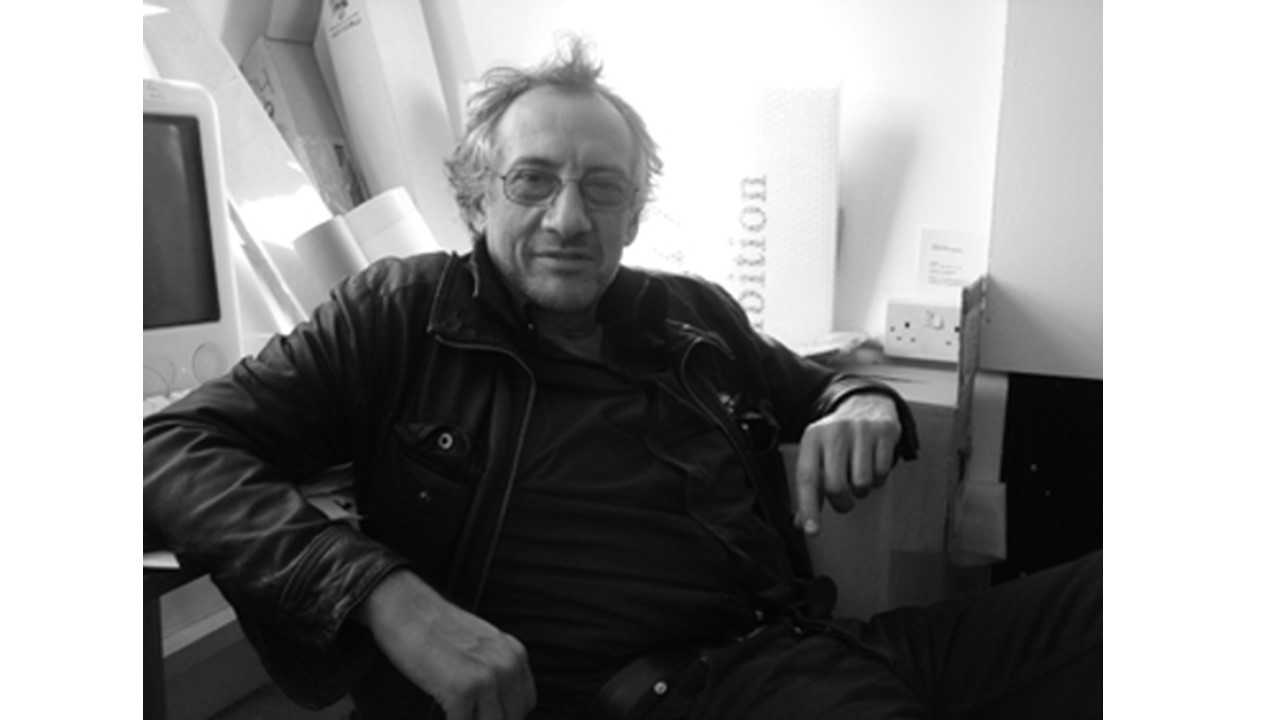
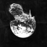
Kennard is an activist for world peace, and conveys his passivism through his photo-montage work. His work often includes relatively basic layouts, involving only 1-3 images with a black background, use to draw maximum attention to the photo-montage in the foreground. Below are examples of Kennard’s work:
Kennard describes his own work as used to: “Rip apart the smooth, bleached and apparently seamless surface of the media’s presentation of the world and to expose the conflict and grubby reality underneath.” This quote indicates that Kennard used his work to portray the reality of life, not leaving out the horrors and atrocities that come with war, human suffering and conflict. His work contrasts how the media typically presents such issues, as the media often glances over the severity of certain issues such as the increasingly advanced technology used to produce nuclear weapons, and focuses more on issues that, arguably, matter much less (such as celebrities).
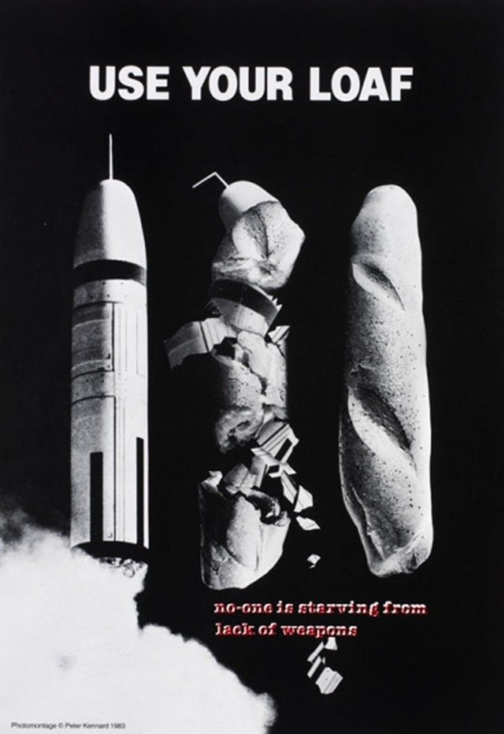
The above image was created by Kennard to emphasis that the world (more specifically, politicians and those in power) focus so much on developing unnecessary weaponry and war supplies, while completely ignoring the, arguably, more important issues such as world hunger and poverty. This image is designed to mimic a poster, and uses photo-montage editing techniques to reflect the contrast between a loaf of bread (representing hunger) and a nuclear weapon. This image is used to highlight the worrying order of the priorities of those in power, where they continue to mass produce harmful, dangerous weaponry while turning a blind eye to the real issues at hand.

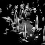
The image seen above is used to convey Kennard’s opinion that those in charge are playing a dangerous game (gambling) with issues as serious and hazardous as the development of nuclear weaponry. It emphasizes that such a serious topic is often treated like a game, which contrasts the reality of what should occur, given that weapons are designed to destroy lives. Here, Kennard’s anti-war beliefs come through his work, as he highlights the careless and shameful way that those in power treat serious topics that could ruin uncounted lives.
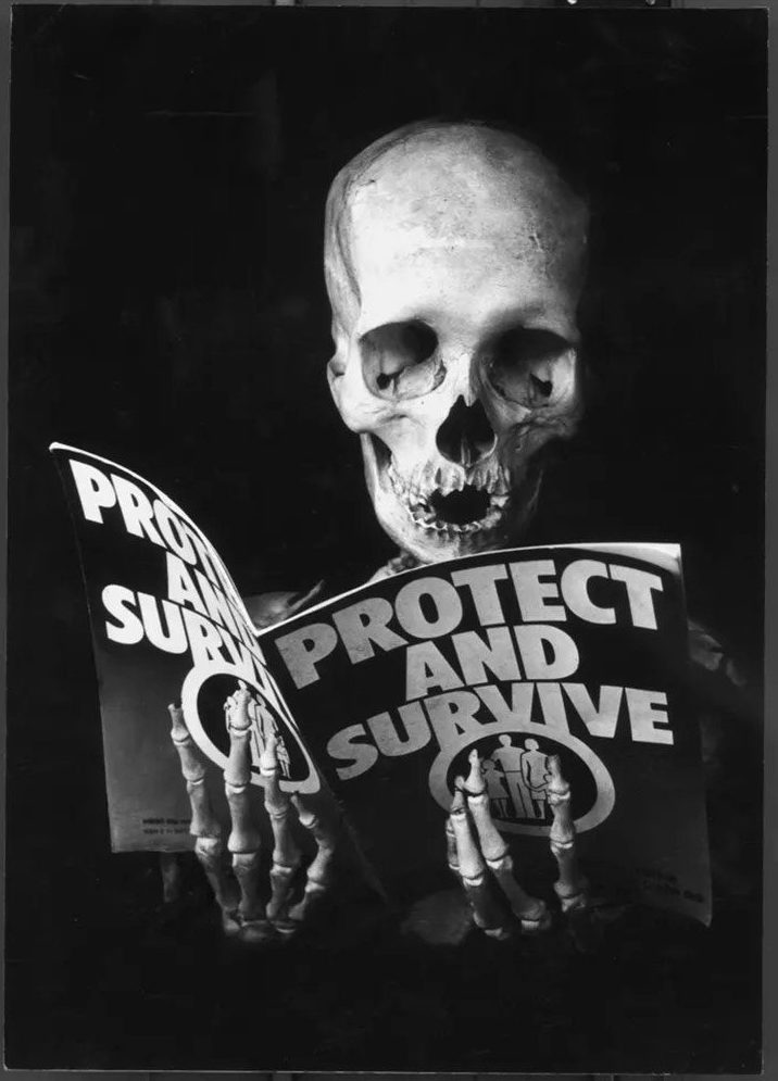
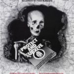
Kennard often injects a sense of irony into his photo-montages. Above is the image of a skeleton (representing death) reading a manual on how to survive. These two elements clearly contrast each other, and so Kennard is able to convey the irony of handbooks that were distributed by the government in the 1970’s listing what to do in the event of a nuclear attack. Kennard believed that in the possibility of the event of a nuclear attack, the government clearly did not feel enough concern for the population to take more drastic measures, and simply handed out leaflets stating how to survive. This image projects Kennard’s opinion, that the government took very basic, almost pitiful action, when in reality, drastic measures would be necessary in order to do any real good.

