
Barbara Kruger was born in New Jersey, 1945. She attended a School of Visual Arts and went on to study Art and Design at Parsons School of Design in New York. She went on to get a job with Conde Nast Publications as a graphic designer, she was quickly promoted to head designer and carried on getting jobs such as; graphic designer, art director and picture editor.
Barbara Kruger is now a very conceptual artist, most of her work is made up from black and white photographs with strong text overlaid.
“I try to deal with the complexities of power and social life, but as far as the visual presentation goes I purposely avoid a high degree of difficulty.”
– barbara kruger

Analysis
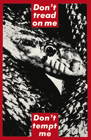
This image is titled ‘Don’t tread on me. Don’t tempt me’ and is a good example of Barbara Kruger’s quickly recognisable aesthetic. Krugers aesthetic generally includes phrases layered against a black and white photograph.
In this print Barbara Kruger presents an image of a snake, surrounded by a thick, bold red border, with text boxes splitting the phrase at both the top and bottom of the image. The font used is typically used in advertising, specifically, the well known, popular brand, supreme. Using a familiar and bold design catches peoples attention immediately, therefore reaching a greater amount of people.
Kruger uses red text boxes against black and white photographs producing a contrast between the text and the background, personally I think this is also highly effective as it keeps the two elements separate, rather than merging the whole image into one ‘layer’.