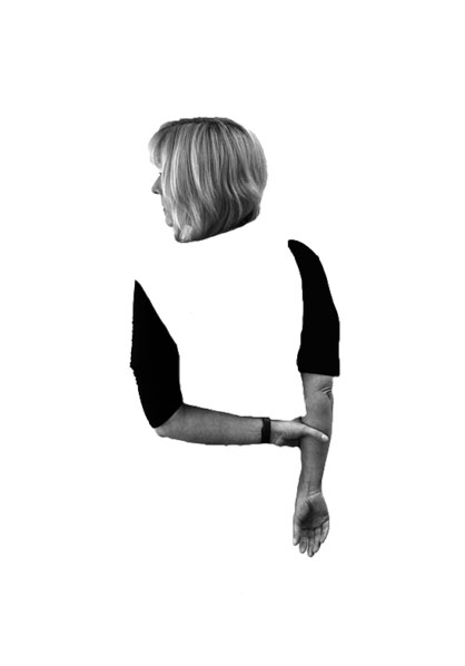
In my first photo shop idea I wanted to show the body of my model disappearing. I decided I wanted to get rid of the body but keep the arms and the head. My model has her head slightly turned showing her nose, this makes it look like she is looking out to the horizon, potentially looking for her identity. Her arms are joined which shows she is trying to keep herself together, due to the disappeared body implies that she is finding it hard to do this. The image is in black and white like Simpson’s work and clearly demonstrates my model loosing her identity. In order to achieve this I cut out my model using the quick selection tool, and placed this layer onto a new A4 white page. I then used the rubber tool in order to rub away the body. I then leveled and desaturated the model layer in order to allow a high contrast in tonal regions. I believe that this edit is successful as it shows the process of the model loosing her identity.
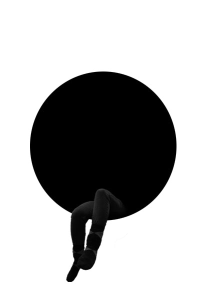
In my second edit I wanted to make it more symbolic, through the use of shapes. In the centre of the image is a black circle, this circle is used to represent the model being swallowed up (her identity being taken away). The color black and white represent a empty void where nothing is, conceptually showing what it is like when you lose your identity. The models legs are sticking out as if she is sitting in this void. This shows that she is so far in (highly depressed) she does not want to come out and talk about, which is usually the best option. Like the other idea no colors have been used in order to prevent a small identity being shown. In order to achieve this idea I created a new A4 page and place a black circle in the center of the page using the ellipsis marquee tool. I the opened up the image I wanted to use and used the quick selection tool to cut out my models legs. I then placed the leg layer on to the A4 document and used the burn and blur tool to blend the legs into the black circle. Using the transformation tool I made the legs smaller, to shows how small loosing your identity can make you feel. I am extremely happy with the outcome of this edit and believe it matches the theme of loss of identity.
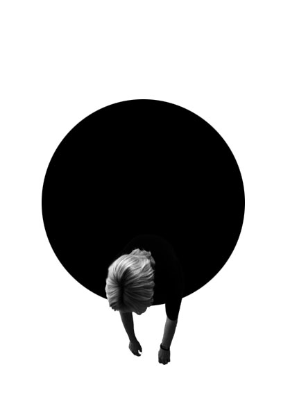
Due to the success of my second edit I wanted to use use the black circle again due to meaning and representations it bought to image. I started off by using the quick selection tool to cut out my model, in the bent over position. I then placed the leg layer on to the A4 document and used the burn and blur tool to blend the legs into the black circle. Using the transformation tool I made the legs smaller, to shows how small loosing your identity can make you feel.
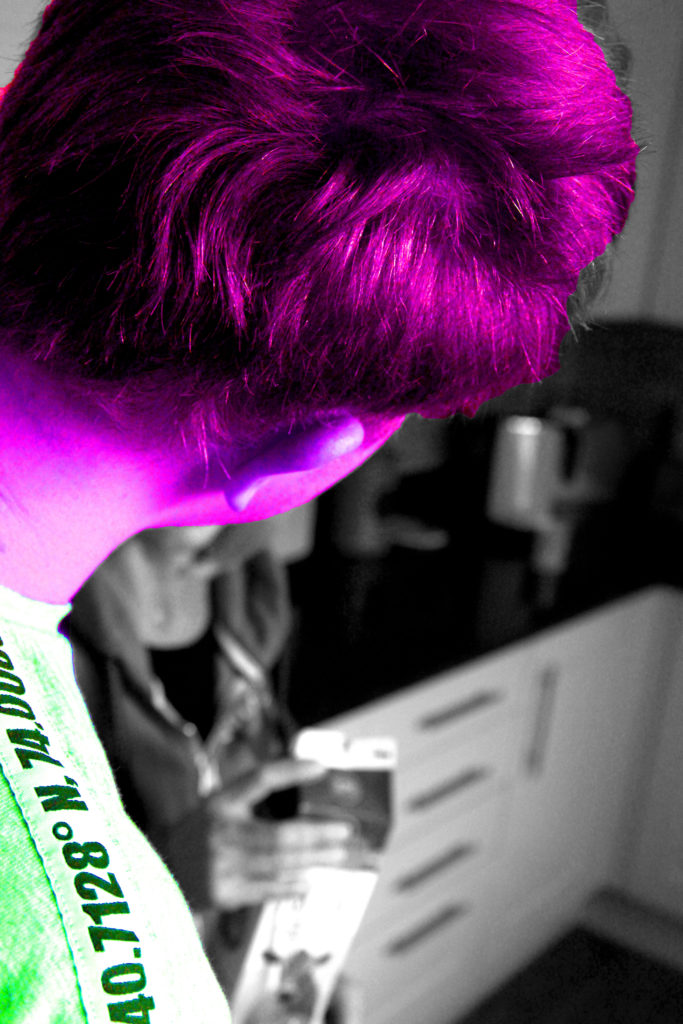
In my next idea, I selected the image were someone else was covering the face of the model who has lost their identity. In order to show this person having an Identity, I decided to use the quick selection tool to cut them out. I then turned the background layer black and white by pressing ctrl + U. This created a colour splash, I felt that I could expand this idea. I decided to change the colour of my model to a ‘wild’ colour in order to create a dramatic contrast. I did this by pressing ctrl + u and altered the hue slider. This contrast I feel clearly portrays someone with identity to someone who has lost their identity. The model who has lost their identity can be seen in the background as a blur, which shows that she is a minor and does not want to be seen by others, thus it helps to create a powerful image.
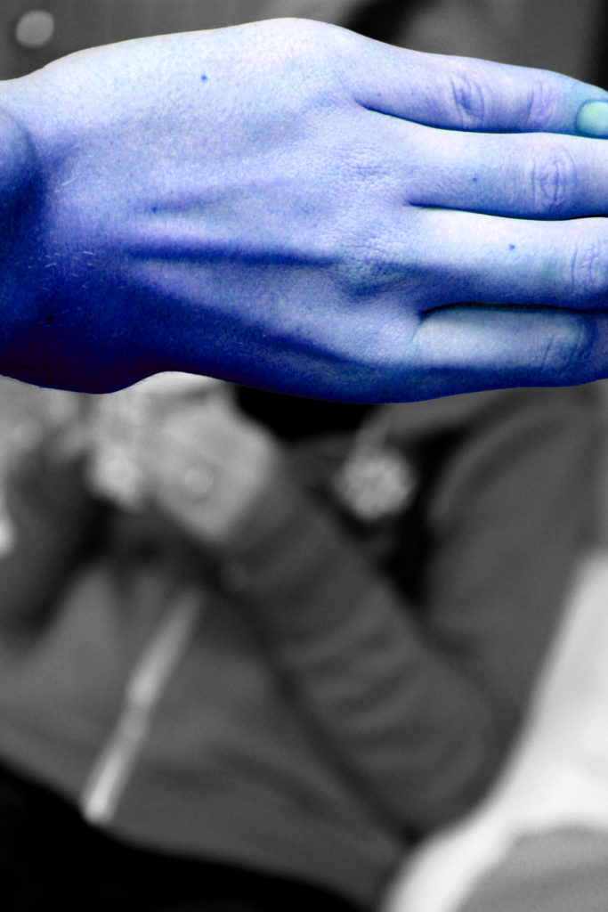
Due to the success of the idea above I decided to follow the same steps but with the image above. Having the hand of someone else covering the models face shows how she is not important and should not be looked at, also presenting what it is like to have lost an identity.
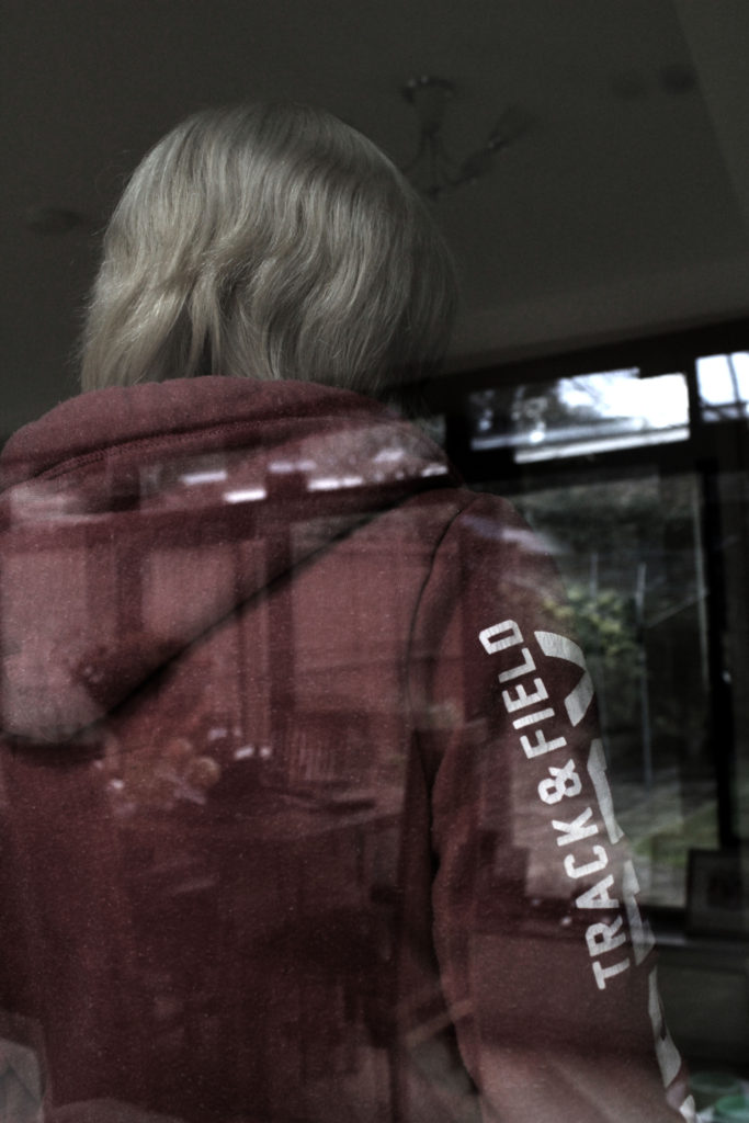
In my final idea I wanted to showcase this natural double exposure. The image was taken through a window, so you are able to see the model and the background being reflected by the mirror. In order to show this I adjusted the levels and curves in order to allow both the model and the scenery to clearly be visible. I turned down the saturation of the image as well to create a dark and depressing mood to the image. I created this to show a before and present image. The scenery is what life was like before the model lost their identity and the model herself is seen looking the other way showing that her life is nothing like this anymore.
I am very happy with all my outcomes from this photoshoot as I believe they all showcase what life is like when you loose your own identity. I believe that these outcomes could lead to successful final pieces.
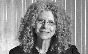
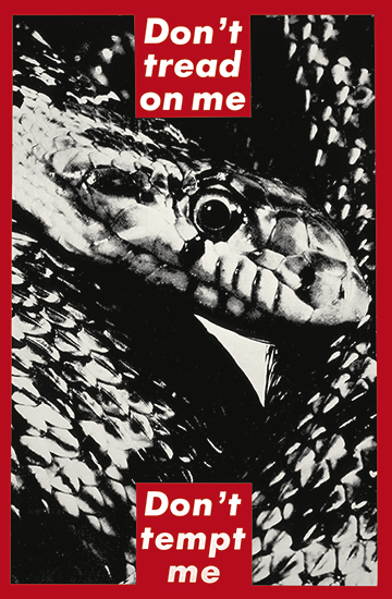




 I like How the gallery is organised and presented as the spacing between the images allows the pictures to breathe, not overcrowding any walls with images. I believe this was done also to only allow the very best of their work to be displayed to portray the photographers best work better. I do however believe that it would be better to not separate the photographers’ between 2 different rooms as this doesn’t allow viewers to compare and contrast their work under more scrutiny.