STEVE ROSENFIELD & ANALYSIS (MOCK)

Steve Rosenfield was born and raised in Boston, USA but now lives in Sacramento, California. He started to photograph live music, weddings, senior portraits and other events.


“in 2010 i wanted to do more with photography and hoped i could change the way people looked at their friends, family, significant others, and even themselves – thats where the ‘what i be project’ was created”

– steve rosenfield 
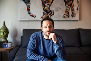
Steve Rosenfield – photographer
What I Be Project 

The What I Be project is Rosenfields most successful photography project.

The What I Be project was a “social experiment” that quickly changed into a movement about honesty and empowerment. In today’s society we are told to look a certain way, or act a certain way and if we do anything differently from these typical standards we’re often judged, or bullied.

 “I started this project in hopes to open up the lines of communication, and to help everyone accept diversity with an open mind & heart and empower those who feel they suffer for something they may see as a flaw.”
– steve rosenfield 

Analysis


Steve Rosenfield – ‘I am not my abuse’


The model in the photograph is throwing  her insecurities out and into the open, and exposing a side of herself that she hadn’t previously shared with anyone. She’s done this by stating “I am not my abuse”, by this she is saying that she does in fact struggle with these issues, but it does NOT define her, her character, her personality, her identity. This project was created to spread awareness on the affects of societies closed thinking and the serious and very stigmatised issues, that unfortunately, some individuals have to fight on a day to day basis.

Technically this photograph is not very complex, it appears like this has been taken in a studio lit by artificial lighting. However, although maybe not the most technically difficult, I feel that this approach was extremely effective and appropriate, I feel this way as it keeps all the attention on the subject and the writing across her body, which does result in the awareness raising aim that Rosenfield had in mind for this project.

Claude Cahun / Clare Rae Exhibition Analysis

The Claude Cahun and Clare Rae exhibition was very inspiring. It clearly demonstrated how the work of Cahun had inspired the work of Rae. Each photographer had their own room with their photos hung up on the walls, with the sizes of the photos ranging. Both Rae and Cahun take their images in similar styles, with most the images being in black and white, with the main focus being portraiture.

Image result for claude cahun
Claude Cahun


This is my favorite Claude Cahun image. It shows a women sitting down, wearing a shirts saying “I am in training, don’t kiss me”. This shows how Cahun might be trying to pass a message saying that as she is a female that she has to train herself to live up to the expectations of society. Cahun could also be trying to get her personality across by wearing the clothes that she has on.

Clare Rae

This is my favorite Clare Rae image. It shows a women cramming herself under a trolley in what looks like a office. Rae might have done this to show that women might feel trapped in today’s society, so she portrayed this by putting herself under a trolley in a small corridor. Rae also might have taken this photo to express previous experience she might have had.

Tish Murtha

Tish Murtha was born on the 14th of March 1956 and died on the 13th of March 2013. She was a social documentary photographer. She was brought up in Newcastle and went to the University of Wales. In 1978 she came back to Newcastle wanting to document “marginalized communities from the inside”. In this she was documenting what her life and her family and friends lives were like living in the working class. She created black and white images. She often worked with teenagers and younger children to show how their lives were.

Murtha, like Bulmer is best known for documenting social realism and the working class. Though she is also known for documenting marginalized communities. She did most of her work in the North East of England and in Newcastle upon Tyne, also like Bulmer.


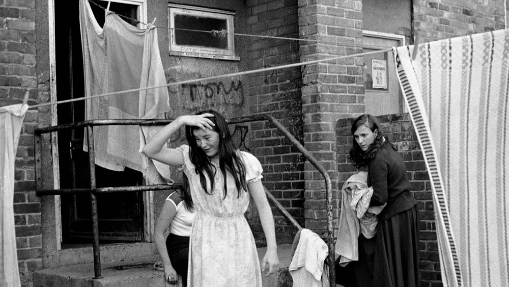
Images by Tish Murtha
Youth Unemployment – Tish Murtha

Technical: This image seems to use natural lighting. This is used to make the image look natural and show their true daily lives without making their lives seem more glamorous than they are.

Visual: The image has been taken in black and white. Though this was likely because of the limitations Murtha had when she took the image, this use of black and white shows us now that life was a lot simpler in the past. Though the faces of the people show that they may be having some hard time.

Contextual: This image is called “Youth Unemployment” the title tells us that these people were likely poor and could not afford luxuries and lived off of bare essentials and would have had to be looking for jobs constantly to make a living to provide for their families.

Conceptual: Murtha may have taken this image to show the lives of people living without any means of income. This can especially be seen from the face of the person in the foreground of the image, as her face shows that she is upset about something.


When time was prime 2 — Shoot plan*

My plan is to go to the locations depicted by the photos and then have my camera set up on  tripod and either hold the images or suspend it from fishing wire. The images will either line up almost perfectly with the background, or if that is too difficult I will have the image so that it is in a position where it is clear that it is where it was taken there, and some major features line up but it shows a wider field of view and area is shown clearer.