Planning my photo shoots
For my first photo shoot i am going to be doing a tableaux vivants inspired shoot.
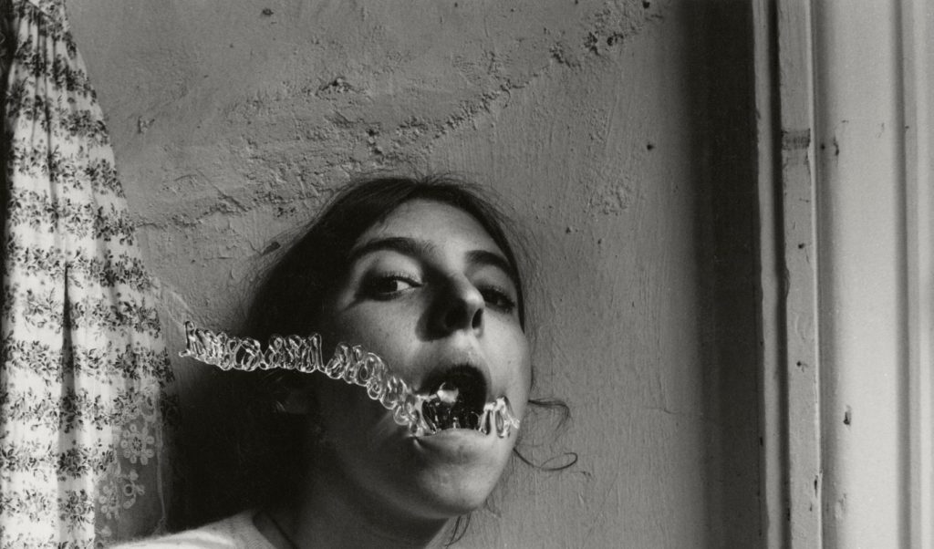
Image in recreating..
Technical analysis
This image has been taken in natural lighting with a daylight white balance. It seems as if the ISO setting is very low in this image, however the shutter speed would be very high.
Visual analysis
When looking at this image i can bee the model is in the middle of the image. It has been edited in black and white to show contrasting shadows and light, adding tone to the picture. The image is in 2D and doesn’t have much texture in the image. We can see that there has been a a slight use of photo shop when editing the water coming out of the mouth.
Conceptual analysis
In this image i think that the edited water coming out of the models mouth is representing her as drowning. Her mouth being open when looking directly into the camera also gives a sense of vulnerability.
Contextual analysis
Her images were published after her death and therfore are only known by date and location. There is no back story
This image is one of Francesca Woodman’s. In order to do this tableaux vivants image successfully i will use a similar location to Woodman’s and will therefore use my cracked garden wall. For the shoot, i plan to only use natural light as the original image was taken in natural light. Therefore i will take the image mid day so that their is a fair bit of natural light. I will use a daylight/ cloudy White Balance in order to ensure that the photo is very similar and i will find which ISO and shutter speed to use when im in the conditions. To make the image identical i will also hand a flower printed top on the left hand side of the image as this is included.
There will be one model involved in the shoot which will be dressed in the appropriate clothing ( a white t-shirt, black string necklace and have hair tied back).
Aspects to include
- Natural lighting- daylight/ cloudy WB, high shutter speed.
- Image to be taken outside for the cracked wall
- Wide depth of field- Make image look 2D
- High ISO
- Facial expressions- Showing with eyes
- Props- Flower shirt hanging
- Model to wear a white t-shirt, black string necklace and have her hair in a loose low pony
- Lightly lit image
Contact sheets

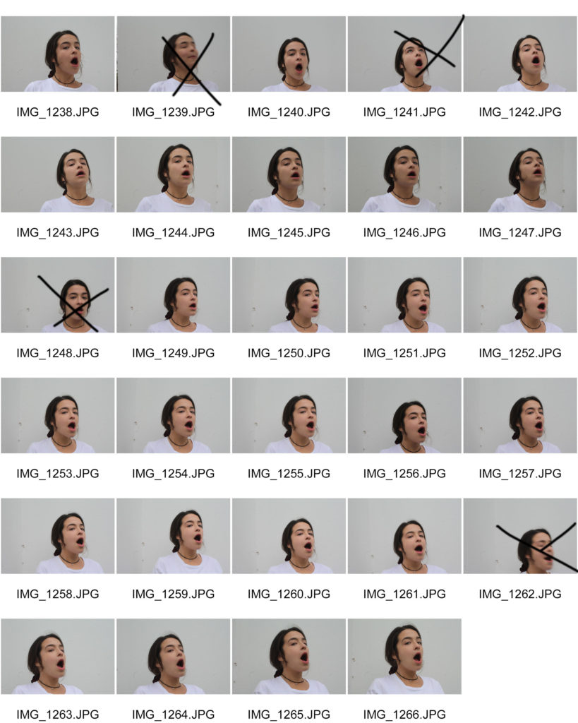
Possible final outcomes
Editing my final images
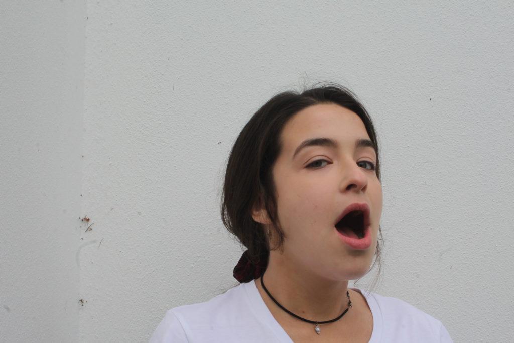
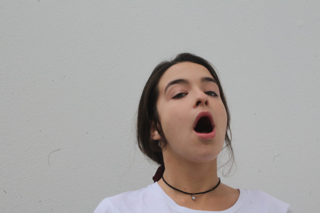
All photos below have been edited using Adobe Photoshop. These are the first edits for these images and more editing will be added further into this project. All images below are my own and are being used to create a tableaux vivants.
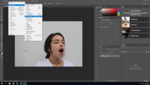

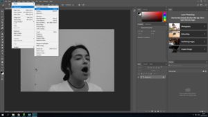

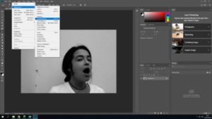

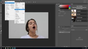

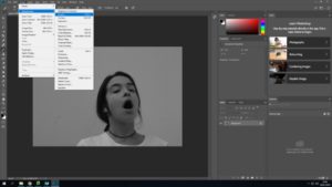

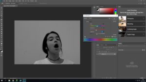
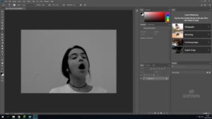
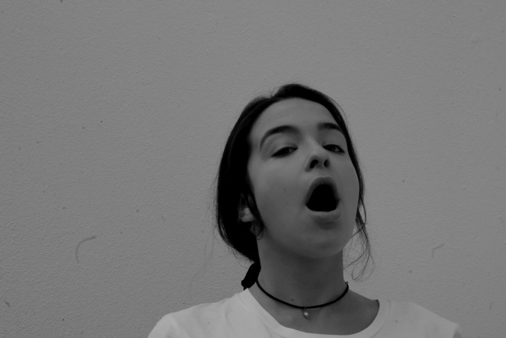
The image i have chosen to use out of the two possible chosen is picture one. This being because it has more of the details that the original image has.. ie the small cracking/ dirty wall and my models face is at a more similar angle than the other image.
Next stage of editing
In my next stage of editing i will need to edit the water coming out of the models mouth in a ripple effect. In order to get the first image of the water i have chosen on off the internet…
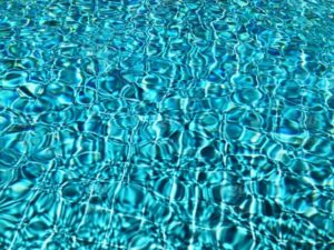
Editing the water
When looking at the water included in the original image, i saw that it was very light and had a ripple/ swirly effect. It was edited into black and white and had contrast included.
Taking all these analysations in mind a created the water which i would cut out and use.


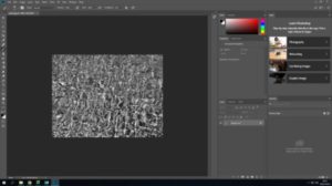
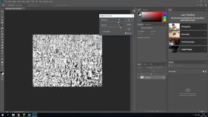

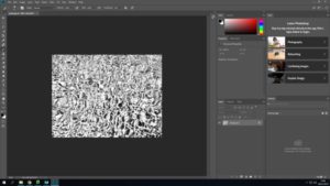
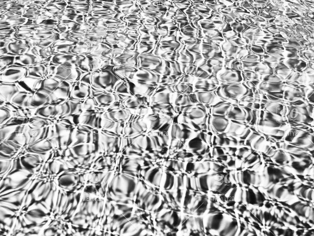
Adding both images together
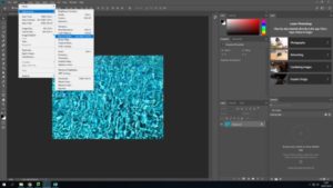
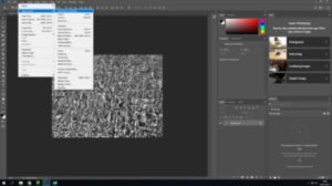
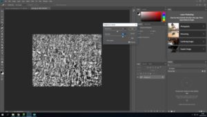
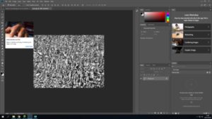

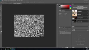


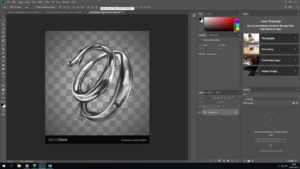
In order to ensure that the stuff coming out of the mouth looks like water i used the image below and layered in on top of the other water image.
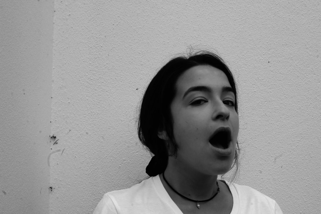
Final image
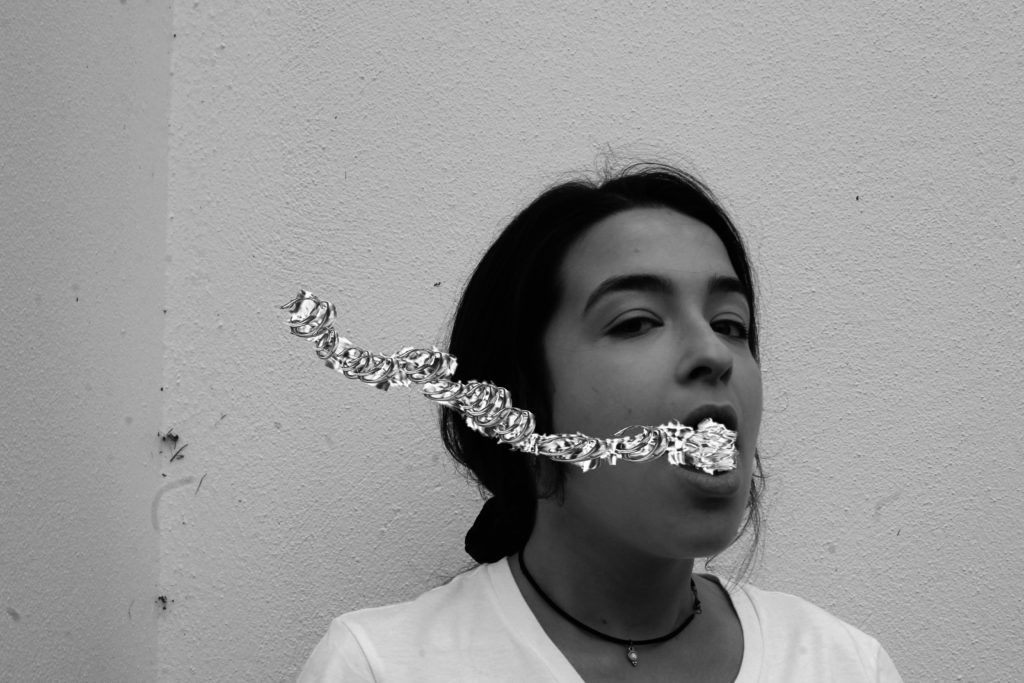
Technical analysis
This image was taken on a Canon Camera with a standard lens. It was also taken in natural day light and i therefore used the ‘cloudy’ white balance. When taking this i had my ISO setting on 6400 and my shutter speed on 1/24. However, i mistake i made was forgetting that the original image used a fast shutter speed instead of a low one like i did. This made my images not fully focused.
Visual analysis
When looking at this image i can see that the model is in the middle of the image. The image has been edited in black and white, showing contrast and tone in the picture. The image is in 2D and doesn’t have much texture in the image. We can see that there has been a a slight use of photo shop when editing the water coming out of the mouth.
Conceptual analysis
This image has been edited as same as the original image and water has been edited coming out of the models mouth is representing her as drowning. Her mouth being open when looking directly into the camera also gives a sense of vulnerability.
Comparison between original and final outcome


