
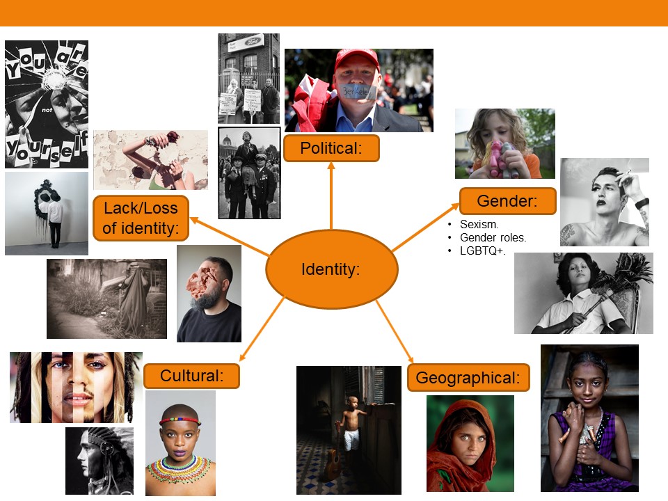


The exhibition focused on the different ways that the Australian photographer Clare Rae, who now lives in jersey, has responded to the works of the french photographer Claude Cahun who takes picture to explore the different views of identity and gender through self portraits. Through the the comparison of both artists you could see the the influence that Claude Cahun had on Clare Rae, this was evident at the exhibition, they both did there photos in black and white and and contrasting colors, you could see the similarities of both photographers.
Clare Rae:
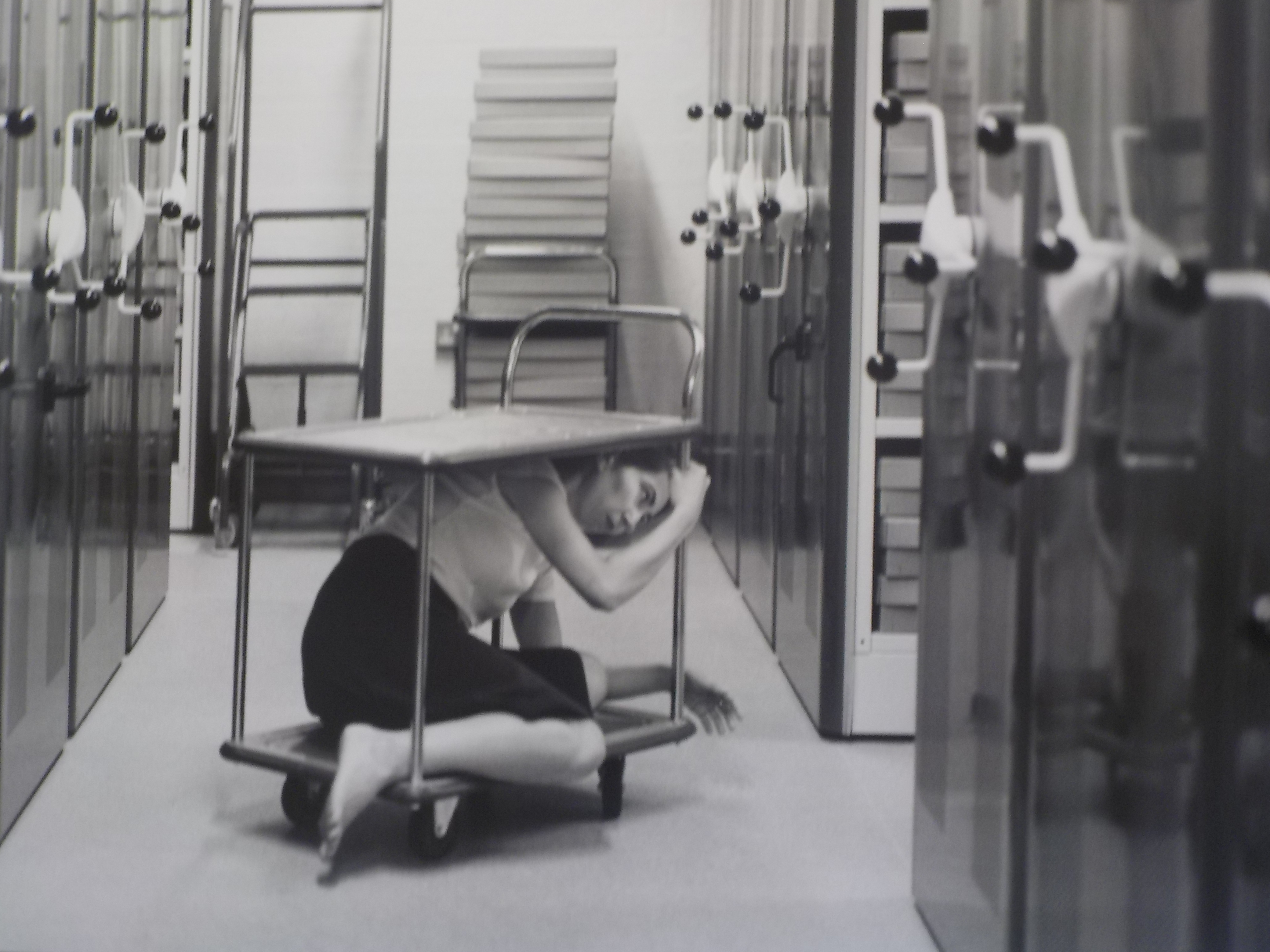
In this picture you can see the artist Clare Rae is under this trolley, this could symbolize that she is feeling trapped and scared this tells us that she was trying to explore feminine and how woman feel about them selves. In the picture it looks like she is in an office basement where they keep all the files from years ago, also suggested by her body language it can tell you that she is feeling distressed about where she is. The picture has been done in Black and white which could mean that she is trying to erase the thought or is trying to tell us something.
Claude Cahun:

In this photo you can see Claude Cahun is in the center with a mask which is black and white with a white background. I feel that she is trying to express her feeling on feminine and how other woman or men feel about this photo. I also think it explores the different ideology of how men perceive woman in to day world. In the photo Claude has a straight face this could symbolize the fact she is doesn’t agree that men should treat woman disrespectfully. This photo could also symbolize they way she feels about her body and how she copes with her feelings.
Personally I think that the expedition showed the contrast between the two different photographers and how they response to each others work, and how similar their objectives are, the expedition also showed the different views about being a feminism and how different people have different viewpoints about these artists. I can also express the need to encourage talking about feminine people and not letting themselves down.
For My ideas i have decided to use beach junk e.g Sea Glass, Sea pottery, As i think that it would relate to the lack or loss of identity if i place over the picture.
Sea Glass meaning and history:
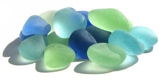
Naturally produced sea glass (“genuine sea glass“) originates as pieces of glass from broken bottles, broken tableware, or even shipwrecks, which are rolled and tumbled in the ocean for years until all of their edges are rounded off, and the slickness of the glass has been worn to a frosted appearance.
Sea pottery meaning and history:
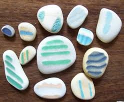
Sea pottery (also known as “sea china” or “sea porcelain” or “beach pottery”) is pottery which is broken into worn pieces and shards and found on beaches along oceans or large lakes. Sea pottery has been tumbled and smoothed by the water and sand, creating small pieces of smooth, frosted pottery. It is often collected with more common sea glass by beachcombers.
Beach Junk meaning and History:
beach junk can also be known as jetsam this is wear unwanted material or goods that have been thrown overboard from a ship and washed ashore, especially material that has been discarded to lighten the vessel.
i thought that i would have two different photos of member of family, For example i would have a younger generation vs Older generation. Then i would place the sea glass and beach pottery over the photo to disfigure it and then i would use the beach junk to cover the photo in places this would represent loss of identity.

My chosen theme for this shoot is self expression; how people express themselves through what they wear and how they communicate (facial expressions and body language).
The purpose of this photo shoot is to explore diversity within the community, how people within the same community differentiate themselves from one another, as well as how they react differently to being placed in the same environment and treat identically.
The shoot will take place in the photography studio where I will take photos of my friends in the exact same way; the camera angle and where they are standing will be identical every time, but it will be up to them how they pose and express themselves in the photos. I will also let them decide what they want to wear for the shoot.
They won’t be doing the same leaning pose as here but the shoot will work in a very similar way. The angle and basic setup will be identical but it’s up to the people being photographed to express themselves. The only difference is that in my shoot I won’t make everyone pose in the same way, that will be up to them.
For my project I will be following the style Koenig and the subject of it is my late Grandfather as I have a large amount of photos from his life and from when he lived in his house which is now empty and being redone for renovation, and it is almost completely empty with no wall paper not carpet and no ceiling just the floor above.
The project is an exploration in the sense of loss and change. The photos will be framed as such that they will be in the position that they were taken and should line up with the main features that still remain in the house, I will then take a step back and take a photo en capturing the photo and the background to show how the area as changes and how that his absence from the space has meant that a change has come about. It will also comment on how that the house and the area reflected his personality and that once he left his personality left not long after.
For my first photo shoot i am going to be doing a tableaux vivants inspired shoot.
Image in recreating..
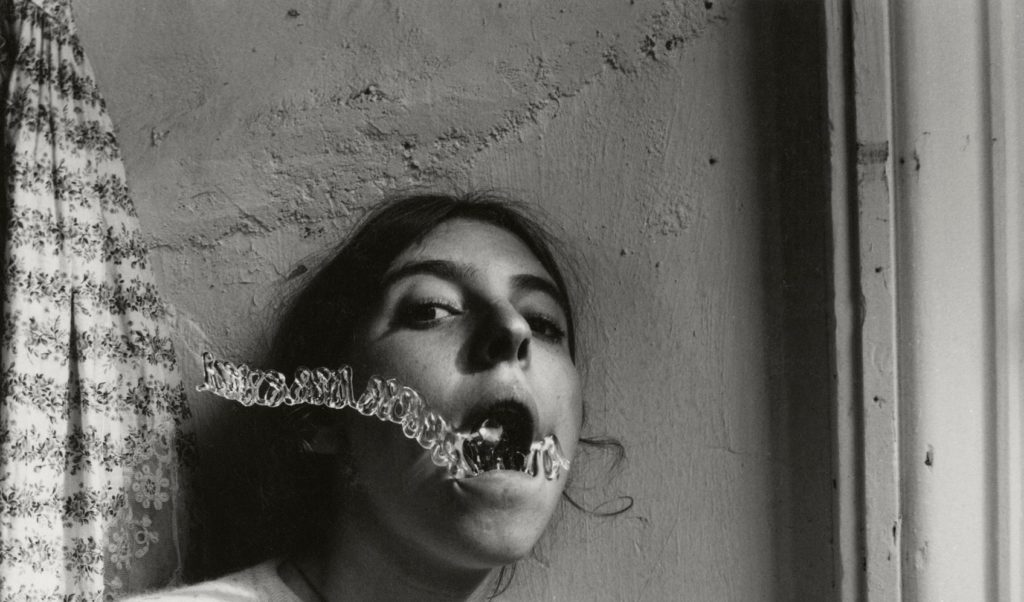
Technical analysis
This image has been taken in natural lighting with a daylight white balance. It seems as if the ISO setting is very low in this image, however the shutter speed would be very high.
Visual analysis
When looking at this image i can bee the model is in the middle of the image. It has been edited in black and white to show contrasting shadows and light, adding tone to the picture. The image is in 2D and doesn’t have much texture in the image. We can see that there has been a a slight use of photo shop when editing the water coming out of the mouth.
Conceptual analysis
In this image i think that the edited water coming out of the models mouth is representing her as drowning. Her mouth being open when looking directly into the camera also gives a sense of vulnerability.
Contextual analysis
Her images were published after her death and therfore are only known by date and location. There is no back story
This image is one of Francesca Woodman’s. In order to do this tableaux vivants image successfully i will use a similar location to Woodman’s and will therefore use my cracked garden wall. For the shoot, i plan to only use natural light as the original image was taken in natural light. Therefore i will take the image mid day so that their is a fair bit of natural light. I will use a daylight/ cloudy White Balance in order to ensure that the photo is very similar and i will find which ISO and shutter speed to use when im in the conditions. To make the image identical i will also hand a flower printed top on the left hand side of the image as this is included.
There will be one model involved in the shoot which will be dressed in the appropriate clothing ( a white t-shirt, black string necklace and have hair tied back).
Aspects to include

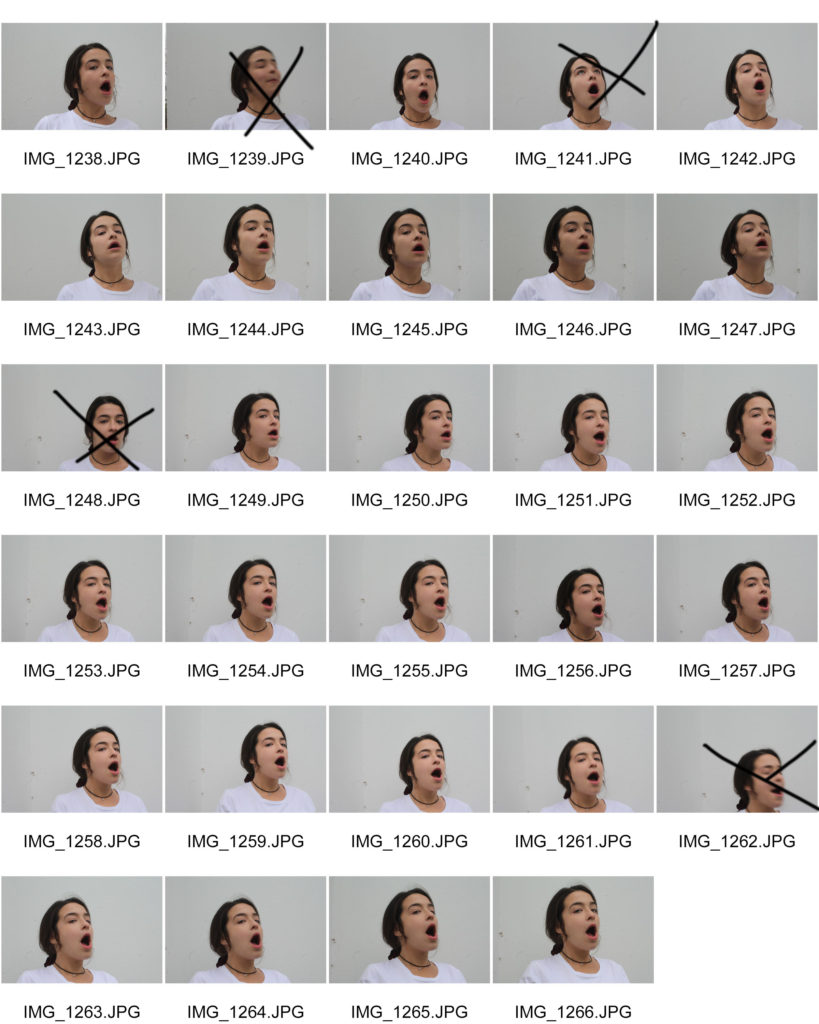
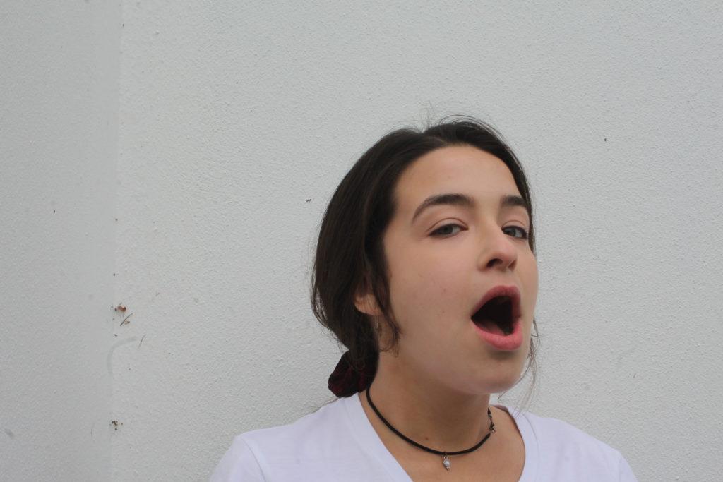
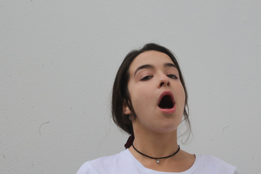
Editing my final images
All photos below have been edited using Adobe Photoshop. These are the first edits for these images and more editing will be added further into this project. All images below are my own and are being used to create a tableaux vivants.
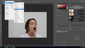

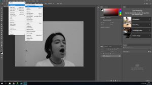

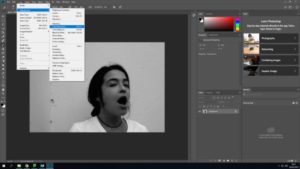

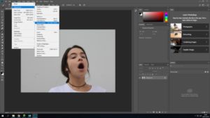

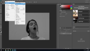

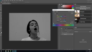
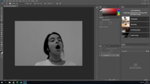
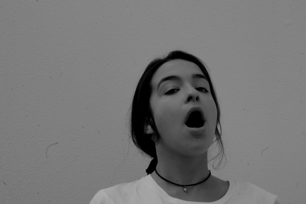
The image i have chosen to use out of the two possible chosen is picture one. This being because it has more of the details that the original image has.. ie the small cracking/ dirty wall and my models face is at a more similar angle than the other image.
In my next stage of editing i will need to edit the water coming out of the models mouth in a ripple effect. In order to get the first image of the water i have chosen on off the internet…
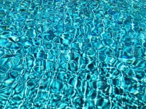
Editing the water
When looking at the water included in the original image, i saw that it was very light and had a ripple/ swirly effect. It was edited into black and white and had contrast included.
Taking all these analysations in mind a created the water which i would cut out and use.


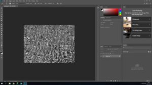
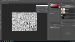

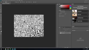
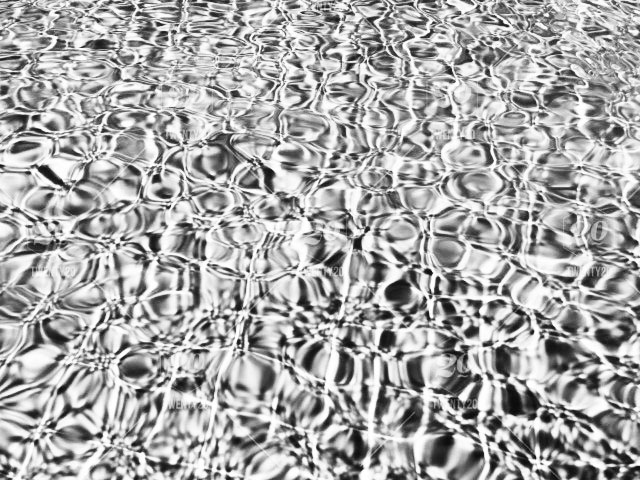
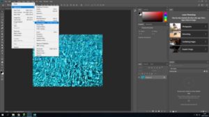
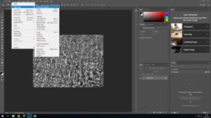
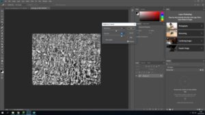
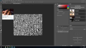

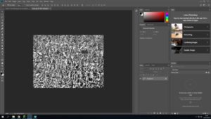


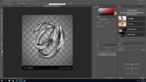
In order to ensure that the stuff coming out of the mouth looks like water i used the image below and layered in on top of the other water image.
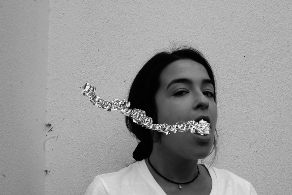
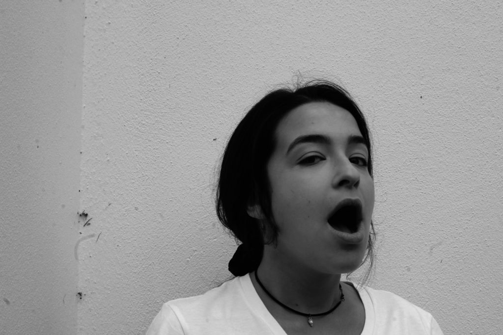
Technical analysis
This image was taken on a Canon Camera with a standard lens. It was also taken in natural day light and i therefore used the ‘cloudy’ white balance. When taking this i had my ISO setting on 6400 and my shutter speed on 1/24. However, i mistake i made was forgetting that the original image used a fast shutter speed instead of a low one like i did. This made my images not fully focused.
Visual analysis
When looking at this image i can see that the model is in the middle of the image. The image has been edited in black and white, showing contrast and tone in the picture. The image is in 2D and doesn’t have much texture in the image. We can see that there has been a a slight use of photo shop when editing the water coming out of the mouth.
Conceptual analysis
This image has been edited as same as the original image and water has been edited coming out of the models mouth is representing her as drowning. Her mouth being open when looking directly into the camera also gives a sense of vulnerability.

