For my first two photos I decided to recreate pieces in the style of Tyler Spangler. I really enjoyed doing these pieces because I really like Tyler’s style of photography.
1st Photo:
For my first photo, I recreated a photo in this style –
My Photo:
I’m really happy with how this photo came out. The message behind this piece is about how sometimes people feel like their head is in the clouds and how sometimes people don’t pay attention to their surroundings, and has their attention in their own thoughts. I wanted to keep the theme of identity and place present but not too obvious as I want people to interpret this photo in any way they want to.
Step By Step on How I Created This Photo:
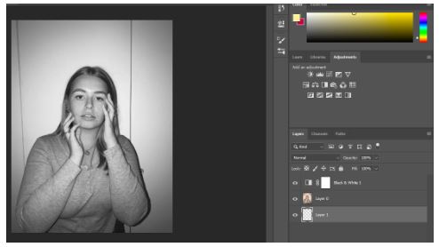
Firstly, I made the photo black and white.
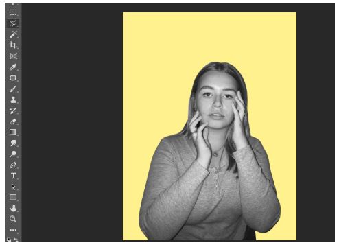
I then cut out the image and put it onto a pastel yellow background.

I then got this photo of purple clouds from google images.



I then cut the purple clouds image onto three separate images. I used three different angles of the purple clouds to get three different images of the clouds.
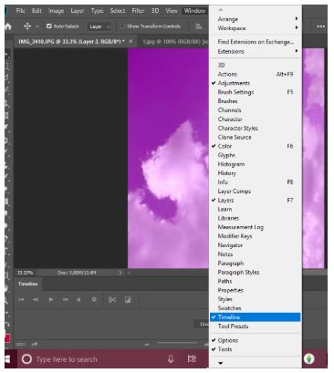
I then pressed windows, then timeline to get the animation window.

Then I clicked create frame animation.
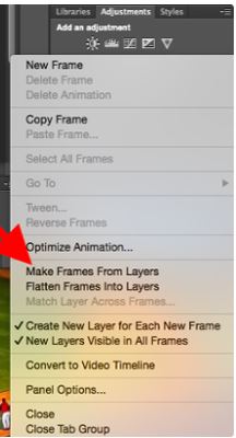
I then clicked make frames from layers to make each layer into a frame.
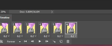
I then duplicated the three layers and made them last 0.2 seconds long.
2nd Photo:
I also recreated this photo –

My Photo:
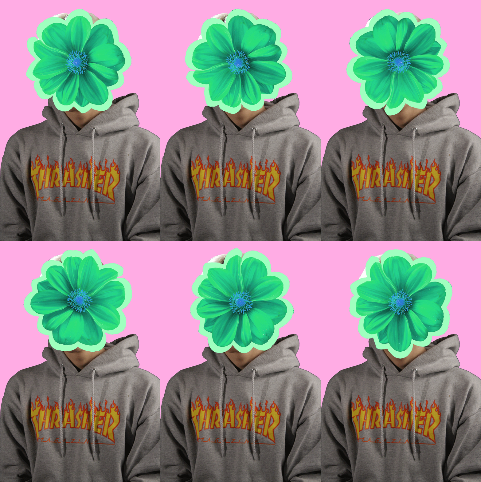
I really liked this piece as I like how it turned out. I think I was able to to capture the photographers style very well, but still having elements of my style in it. Even though the model is not in black and white I still like it in colour. Again this photo is open for interpretation and is loosely based off of identity and place.
Step By Step:
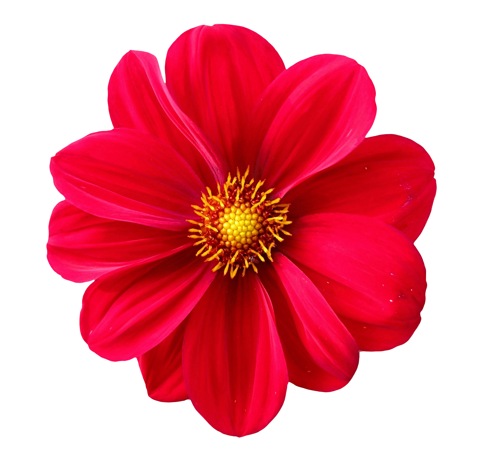
For this I basically copied the same steps in the first photo, but instead of the sky I took a picture of a flower from google, changed the colour of it and made it spin around the models head.
3rd Photo:
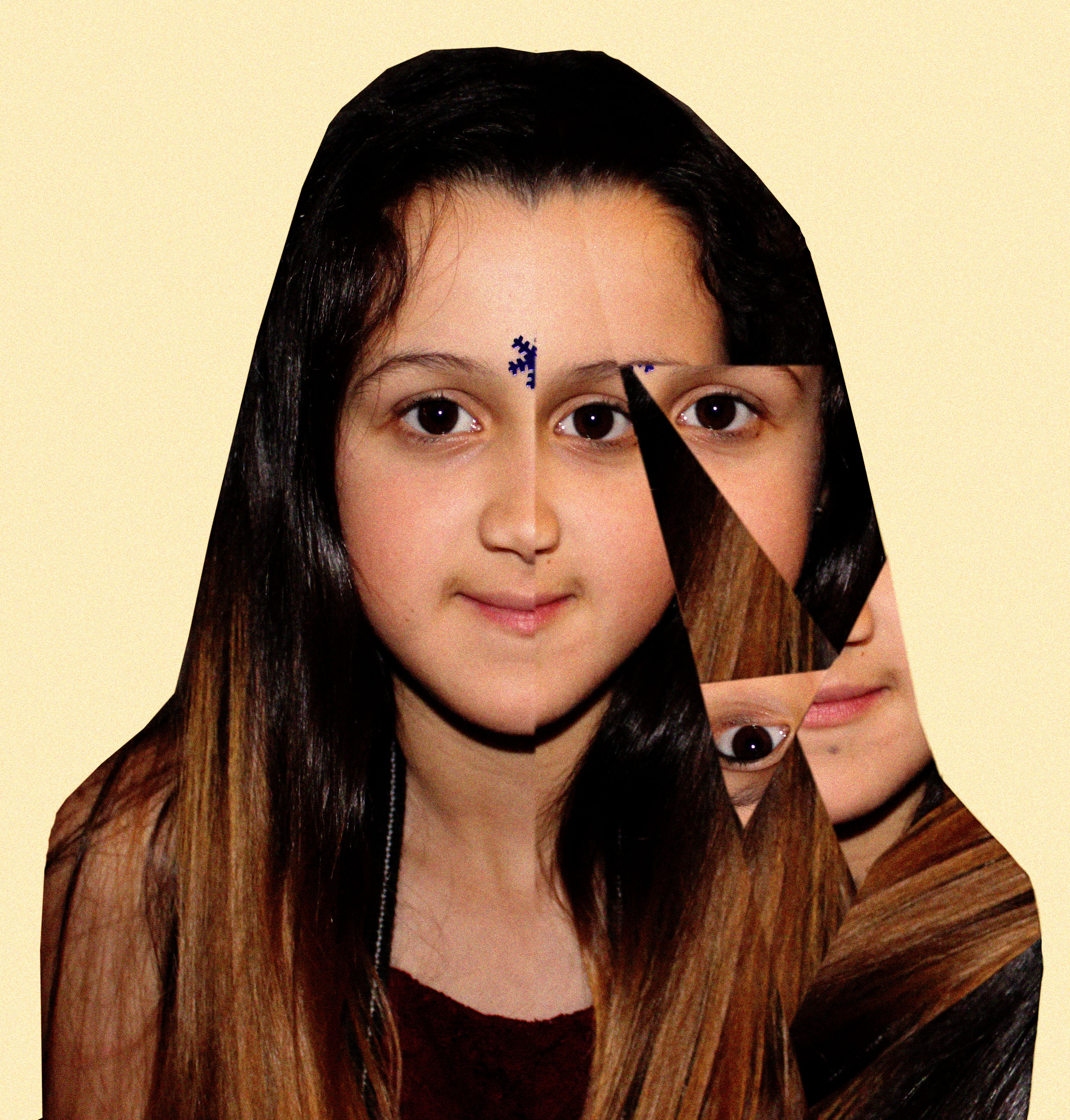
Even though this photo took me longest and was the most challenging one out of the three, I really like the end result of it. I added noise to the photo and I really like how that looks. Also again this is loosely based off of the theme identity and place.
This photo was inspired by Eugenia Loli’s Photo –

Overall, I’m really happy with how all my photos turned out and I really like working in this style of photography because of the freedom you have with the photos.

Concept; street wear and youth culture as expression of identity
Context; cultural appropriation and references to key historical turning points / empirical dominance etc
Research; https://www.independent.co.uk/life-style/fashion/cultural-appropriation-appreciation-difference-meaning-fashion-examples-chinese-prom-dress-a8332176.html
References; Kiki Xue / Yinka Shonibare / David LaChappelle / Tim Walker
Photo-shoots: studio based-street wear and youth culture
Outcomes: TBC
Also look at Nick Knight !
http://www.nickknight.com/