Identity and Place Case Study- Sarah Maple

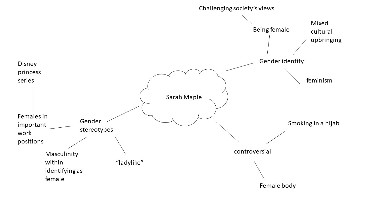
Sarah Maple was born in 1985 to an Iranian Muslim mother, and a Christian father. Most of her work stems from her mixed cultural upbringing, and challenges the traditional social role of women, and also concepts of religion. Some of Maple’s work can be viewed as controversial as she’s pictured herself doing things such as smoking in a hijab.

Mood board
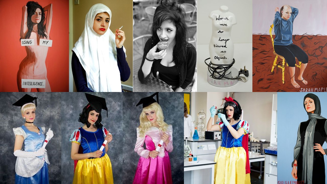
Images/paintings by Sarah Maple


Mind Map

Analysing

Image by Sarah Maple.
Context

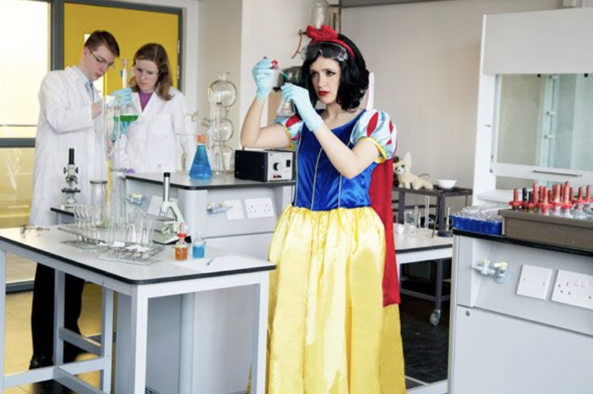
This is an image from Sarah Maple’s Disney Princess series.

Visual

In this image we see 3 people in what seems to be a scientific lab setting. ” of the people are in the background and the third person is in the centre of the frame dressed as snow white while handling a beaker.

Concept

I think this image is very powerful in breaking gender stereotype perceptions. This image shows a Disney princess in what could be considered a very professional and respected job role. By having a stereotypical female, who’s wearing a dress, and makeup taking on the role of a princess Maple is trying to convey the fact that females are fully able to be in respected job roles.


Analysing
Context

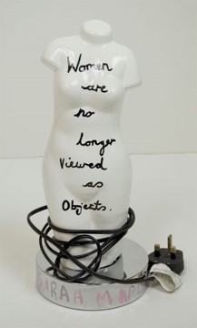
This is a mixed media art piece, Created by Maple then photographed by her.

Visual

This image shows a white lampshade in the shape of a female body, with the message “women are no longer viewed as objects” written on it in a black pen.

Concept

This image is very powerful in conveying Maple’s opinion on the female body. Although the message written on the lampshade says that women are no longer viewed as objects, this image suggests that she doesn’t think that’s true. This is due to the fact that the message is literally written on a lampshade, which is an object, in the shape of a female body. I think this is a very interesting image as the artist has contradicted herself in order to gained the viewers attention, in order for them to understand the concept of the sculpture.



Claude Cahun and Clare Rae comparative essay

EXAMINING THE ARTISTS’ WORK 

For this comparative essay I have chosen to examine these two pieces of photography due to the contrasting nature of the composition and the surroundings.

Firstly, I thoroughly enjoy the work of both Cahun and Rae, Rae following a similar style to Cahun in which she is part of, or the main subject of the photo. Rae tends to incorporate herself into the landscape more as opposed to being the focal point of the image. The strange contortions that she sometimes does during photoshoot is an attempt to flow into and become one with her surrounding. The soft and subtle clothing that she chooses to wear during these photo shoots, illustrates a delicate and fragile side of her that allows her to blend in. I have also noticed that in the majority of her photos she is facing away from the camera , or she is at a disctance where it cannot be seen clearly. This once again suggests that she doesn’t want her identity to shine through as  our face is one of our most distinctive features, rather allowing her environment to be the biggest contributor of the image. In this photo, her attempt at fitting into the cart makes her seem small and insignificant in the maze of archives surrounding her. Rea, like Cahun, works in black and white imagery which again allows her to blend well into her surrounding with the monotone shades that her photography produces.

The work of Rae, although similar to Cahun’s, has some distinctive differences. Cahun also tends to set a lot of her photos outdoors, yet the main target that Cahun has is to explore and capture her out of the ordinary identity. Her strong facial features are clearly captured in the image. The smooth curves of her arms and face are the main center of the photo, contrasting the busy flowers that are in the foreground. Due to the technology of the time, Cahun worked only in black and white imagery but I feel this is was also an advantage as she allows all the character to come from the interesting compositions and themes as opposed to color and tone. Cahun is often discussed in relation to Butler’s idea of the performativity of
gender because of the role that gender performance plays in Cahun’s photographic self- transformations. While Cahun and Moore’s photographs of Cahun are certainly relevant to Butler’s theories of gender it was the ideas such as androgyny and the “third sex,” raised in the 1920s and ‘30s, which truly influenced their work. This image was prior to Cahun shaving her head and completing her androgynous look, portraying more as female. Preharps even the flowers in which she has chosen to stand in is a sort of irony of the traditional views of society and how women are viewed as “innocent flowers”.


Claire Rea, Les Blanche Banques 2017


Claude Cahoon JHT/1995/00032/p

Gender identity

Gender identity is described as being one’s perception of their own gender. This can be the same, or can also differ from one’s assigned sex at birth.  In today’s society it is relatively agreed on that children form their own personal gender identity by age 3, and they are able to do things such as choose toys that are considered “appropriate” for the gender they identify with. This shows how we live in a society where genders can still be stereotyped to the point where children who see themselves as being females choose to play with dolls, and children who see themselves as being males choose to play with toy cars.

In this day and age, I believe that it’s more acceptable than it used to be to do and wear things that a few years ago would be deemed as “not appropriate” for the sex you were. For example, until 1993, Women weren’t allowed to wear trousers on the U.S. Senate floor as trousers were considered “menswear” and In 2003, male employees received paid statutory paternity leave for the first time as taking care of  children was seen as “women’s work”.

Although, advances to break gender stereotypes have been made in the past few years there are definitely many stereotypes that are deeply rooted into society, which I think would be very interesting to explore for the theme “identity and place”.  For this project I will be focusing specifically on the female gender. Most of this project will focuses on challenging stereotypical views that society may have of females.

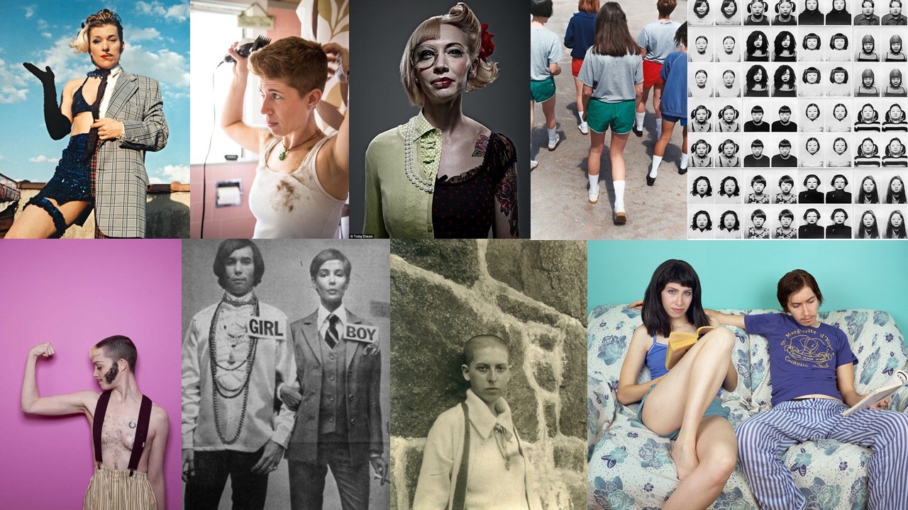
Mood Board

Not my images.

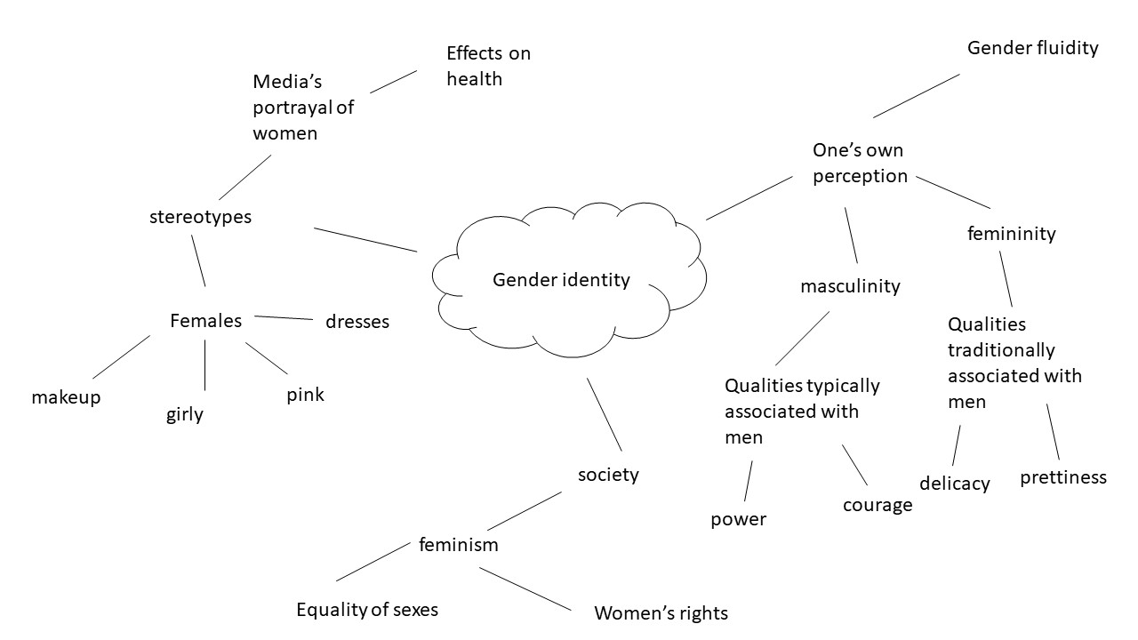
Mind Map


John Bulmer Case Study

John Bulmer was born on the 28th of February 1938 in Herefordshire. When Bulmer was young he was interested in photography but mostly as a technology. Despite that, when he was a teenager he became a great admirer of Henri Cartier-Bresson. Bulmer went on to study engineering at Cambridge where his interest in photography began properly. After beginning this he went on to get his work published in lots of different magazines and newspapers such as Varsity magazine and the Daily Express. His ambition was photography journalism.

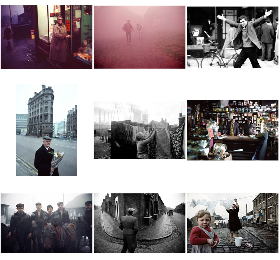
These are a selection of my favourite images by John Bulmer. These images show Bulmer both using colour and black and white. He began using colour after it was required for one of the magazines he took pictures for asked for it.  His images often displayed people from the working class such as miners or factory workers.

Images by John Bulmer

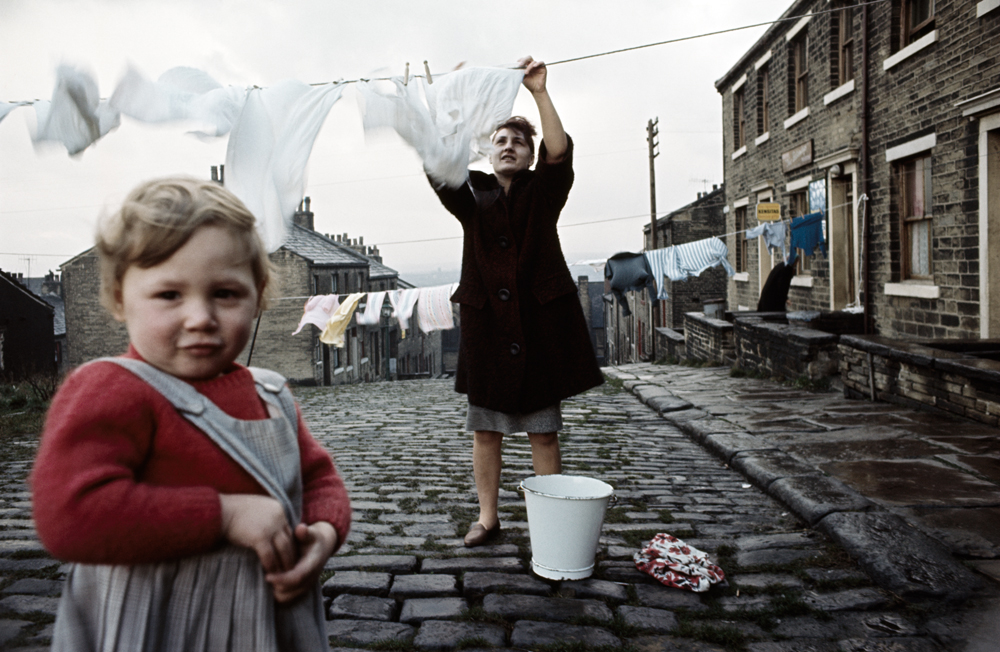
The image below is one of John Bulmers best images. It displays people in the North of England in their village hanging up clothes to dry.

Technical: This image makes use of natural lighting. This type of lighting is used because of the setting and to display the bright but dull looking weather of the area the image is taken. This image may have also taken the image at a time like this to make the area seem constantly cold and damp.

Visual: Bulmer has taken this photo at a time where the sky was bright and cloudy. This has created a contrast between the white background and the darker foreground. This makes the figures and the details in the image easily visible. This image also has form in it creating a 3D effect showing a long cobblestone road in the image. This creates an idea of community as all the buildings shown are close together and similar to each other.

Contextual: This image taken by Bulmer uses colour film. This was thought of as a difficult move for photographers at the time this image was taken. This is because colour may be harder to use than black and white for a lot of people. Bulmer is thought of as a pioneer of coloured photography because of his images, like this one.

Also, this image like a lot of Bulmer’s other work is used to show the true life of the people in the North of England. The image has been taken in a dull village and shows a mundane task to display the uninteresting lives of people in the working class in the North of England.

Conceptual: The idea of this image is that Bulmer wanted to capture the life and identity of people in the North of England. He has done this by capturing some people from the area with the old grey buildings and horrible weather to display the geographical identity of the area. This image also shows the identity of the community. This is also done through the long road with all the buildings close by each other, this along with the fact that there are two people of different age groups shows that people are close together with each other in the village.

environmental portraits-half term homework

what is an environmental portrait?

An environmental portrait is a portrait executed in the subject’s usual environment, such as in their home or workplace, and typically illuminates the subject’s life and surroundings. The term is most frequently used of a genre of photography.

Image result for environmental portrait

how to take good environmental portraits?

1.Spend time getting to know your subject

Before you select a location and start shooting, spend some time getting to know your subject. Find out where they spend their time, what the rhythm of their life is like and observing their personality. Out of this you’ll not only find appropriate locations but will begin to get a feel for the style of shots that might be appropriate and you’ll begin the process of helping your subject relax into the photo shoot. If possible it might even be helpful to accompany your subject to some possible locations to see both how they look but also how your subject behaves and interacts there.

2.Choosing a Location

Sometimes a location chooses you (it’s easy) but on other occasions you need to be quite deliberate and purposeful in making your choice (and it can take a lot of searching). When choosing your environment you ideally want to get one that:

  • says something about your subject – after all that’s what this style of photography is all about
  • adds interest to the shot – as I’ve written in previous tutorials – every element in an image can add or detract from your shots. The environment that you place your subject in needs to provide context and be interest without overwhelming the shot
  • doesn’t dominate the shot – sometimes the location can dominate the image so much that it distracts your viewer away from your main focal point (the subject). Try to avoid cluttered backgrounds (and foregrounds), colors that are too bright etc. Keep in mind that you might be able to decrease the distractions with clever use of cropping, depth of field and subject placement.


3.Posing

What sets the environmental portrait apart from candid portraits is that you post your subject (it’s a fine line and you might end up doing a bit of both in any given shoot). Don’t be afraid to direct your subject to sit, stand or act in a certain way that fits with the environment that you’re shooting in. Some of the poses might seem slightly unnatural and dramatic but it’s often these more purposely posed shots that are more dramatic and give a sense of style to your shot.

The expression on the face of your subject is also very important in environmental photography and you should consider how it fits with the overall scene. For example if you’re shooting in a formal environment it may not be appropriate to have your subject with a big cheesy smile and you might like a more somber or serious look. Again – mix it up to see what does and doesn’t work.


4.Camera Settings

There is no right or wrong way to set your camera up for an environmental portrait as it will depend completely upon the effect you’re after and the situation you’re shooting in. You might find that shooting at a smaller aperture (larger numbers) will be appropriate as it will help keep the foreground and background in focus. I generally shoot with a wider focal length in these situations also to give the environment prominence in the shot. Of course this doesn’t mean you can’t shoot more tightly cropped or with a large aperture and shallow depth of field – ultimately anything goes and you’ll probably want to mix up your shots a little.

experimenting with environmental photography:

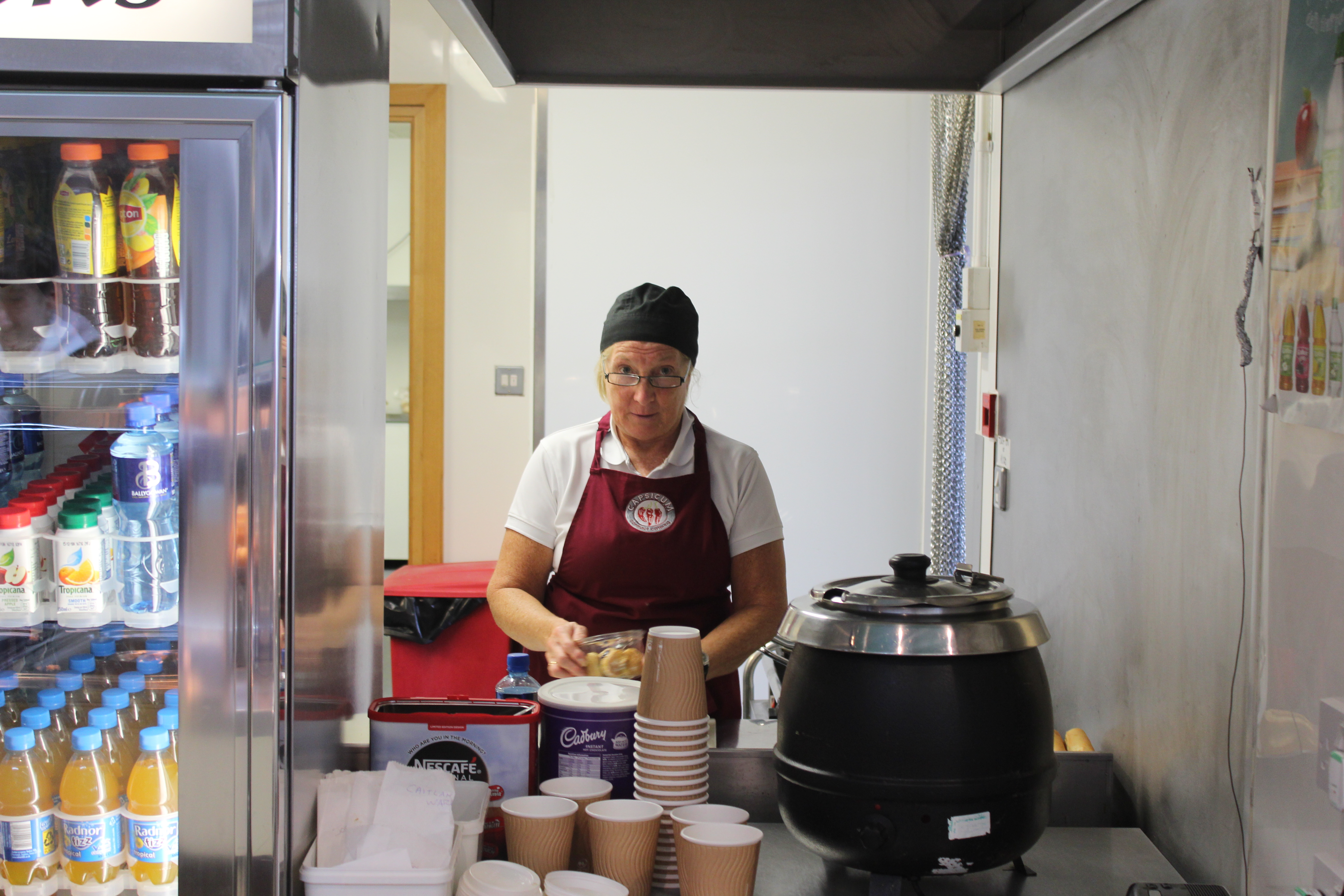
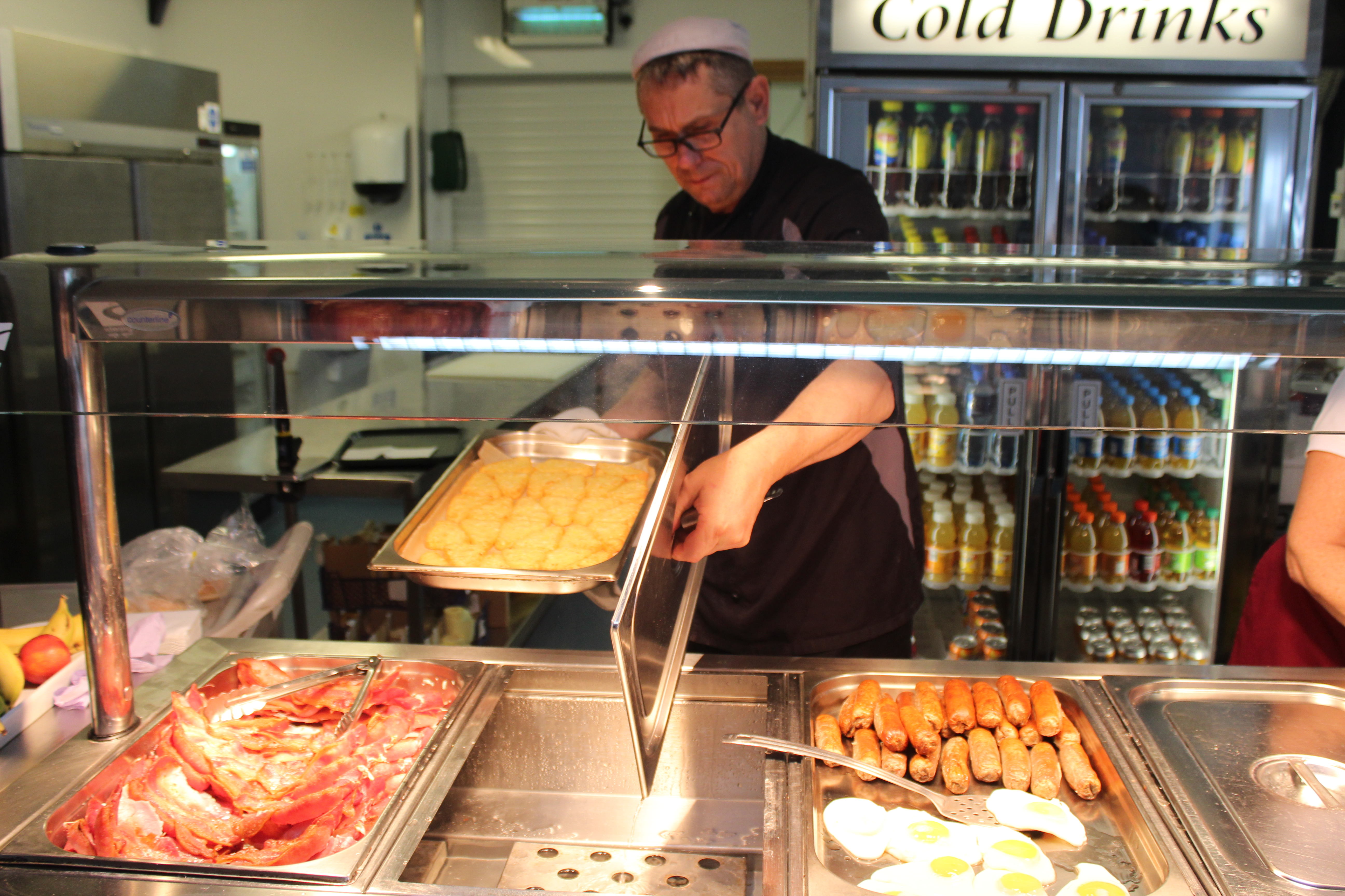
in school we were asked to take environmental portraits in the streets of St. Helier but as i didn’t attend that class i was asked to take the portraits inside the school, so my best bet was to go to the canteen in the staff’s working time. And this is what i came up with:


Before i took the portrait i asked the canteen lady to have direct contact with the camera  and she kindly accepted. as you can see she is working as she naturally would.

And over here i didn’t ask the chef i i could photograph him i did it without his notice to get a fully natural portrait. but of course i asked if i could use the photograph later on.

Photo-Montage Experiments Task 3

For my first two photos I decided to recreate pieces in the style of Tyler Spangler. I really enjoyed doing these pieces because I really like Tyler’s style of photography.

1st Photo:

For my first photo, I recreated a photo in this style –

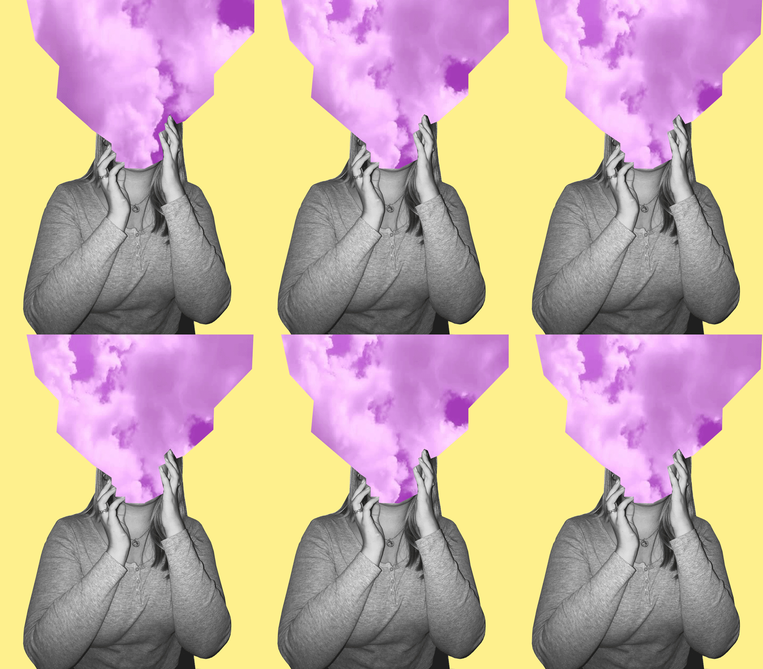
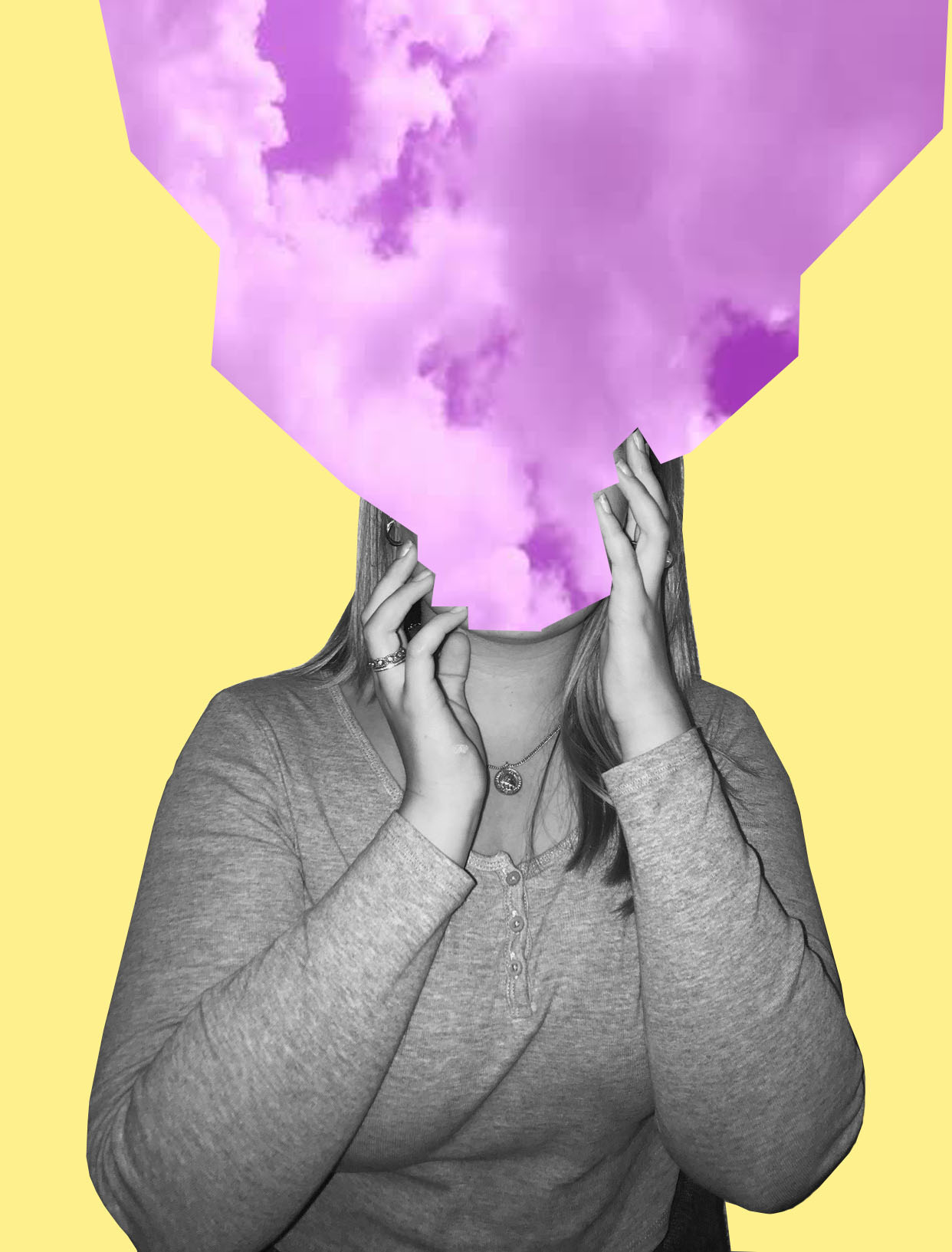
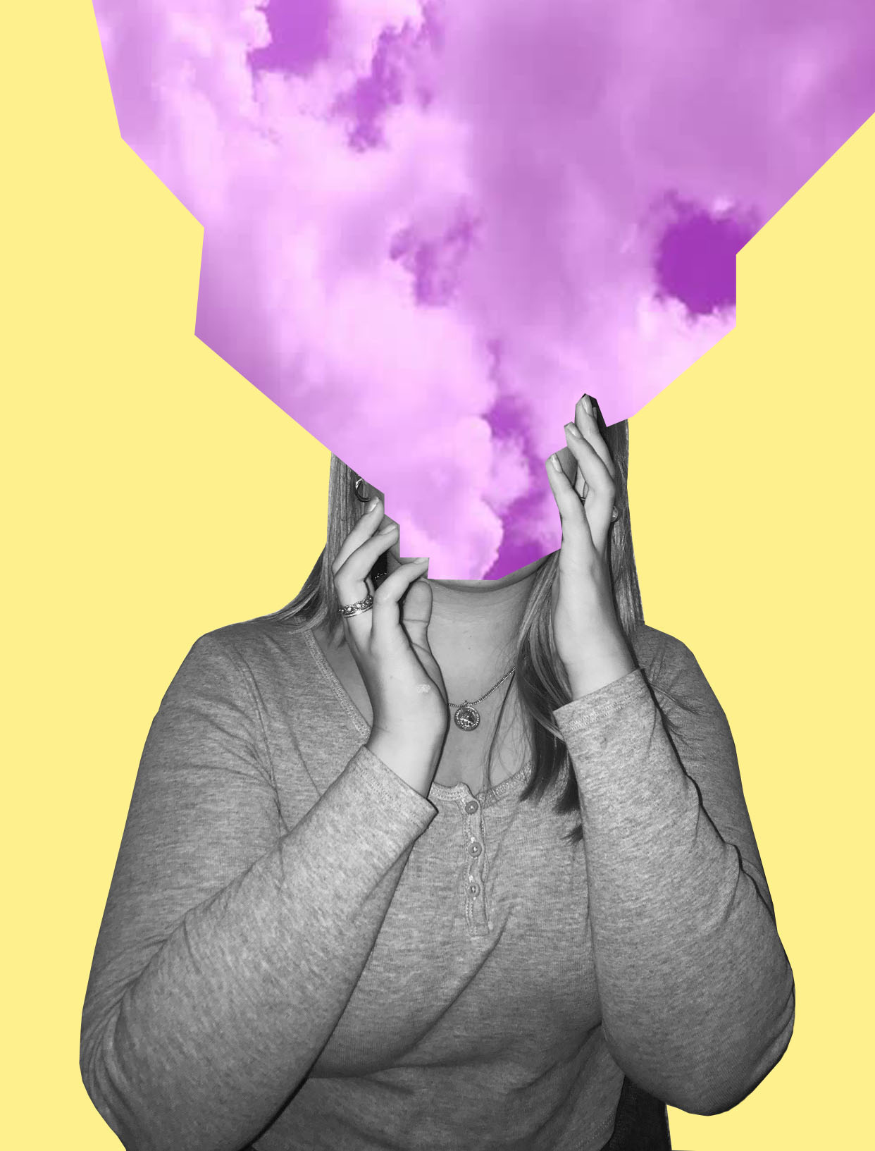
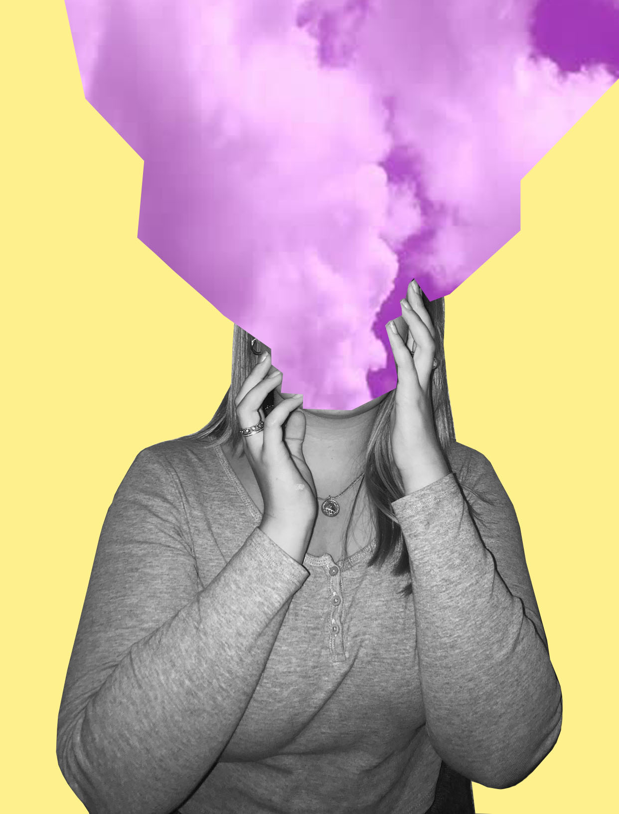
My Photo:

I’m really happy with how this photo came out. The message behind this piece is about how sometimes people feel like their head is in the clouds and how sometimes people don’t pay attention to their surroundings, and has their attention in their own thoughts. I wanted to keep the theme of identity and place present but not too obvious as I want people to interpret this photo in any way they want to.

Step By Step on How I Created This Photo:

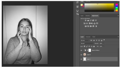
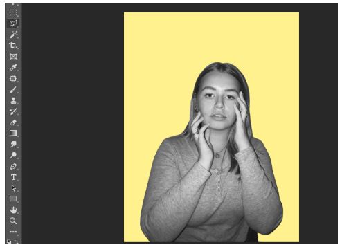
Firstly, I made the photo black and white.

I then cut out the image and put it onto a pastel yellow background.

Shutterstock

I then got this photo of purple clouds from google images.

I then cut the purple clouds image onto three separate images. I used three different angles of the purple clouds to get three different images of the clouds.

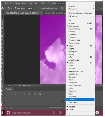
I then pressed windows, then timeline to get the animation window.

Then I clicked create frame animation.

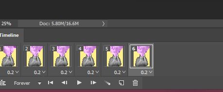
I then clicked make frames from layers to make each layer into a frame.

I then duplicated the three layers and made them last 0.2 seconds long.

2nd Photo:

I also recreated this photo –

Image result for tyler spangler
Tyler Spangler

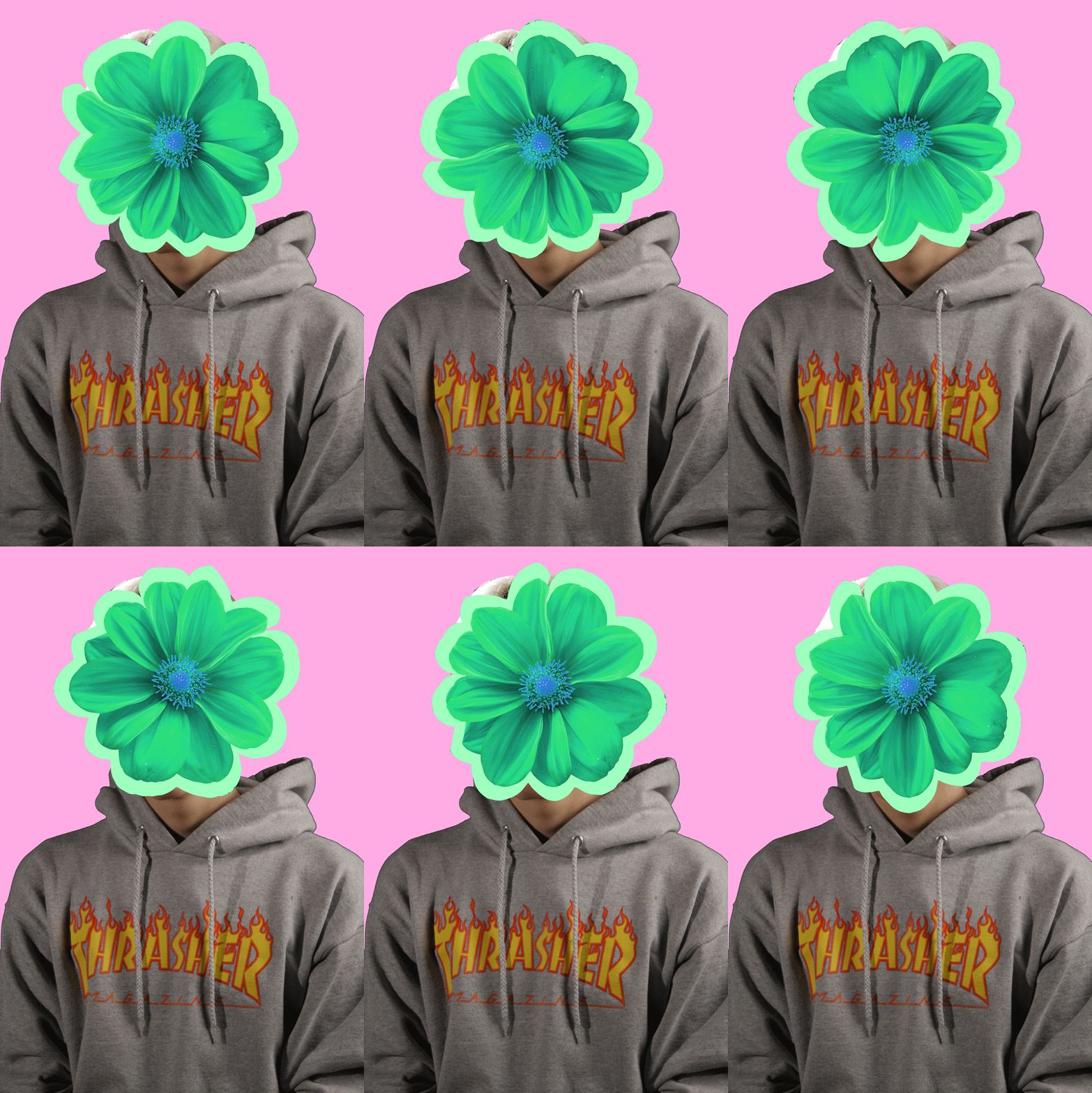
My Photo:

I really liked this piece as I like how it turned out. I think I was able to to capture the photographers style very well, but still having elements of my style in it. Even though the model is not in black and white I still like it in colour. Again this photo is open for interpretation and is loosely based off of identity and place.

Step By Step:

PlusPNG

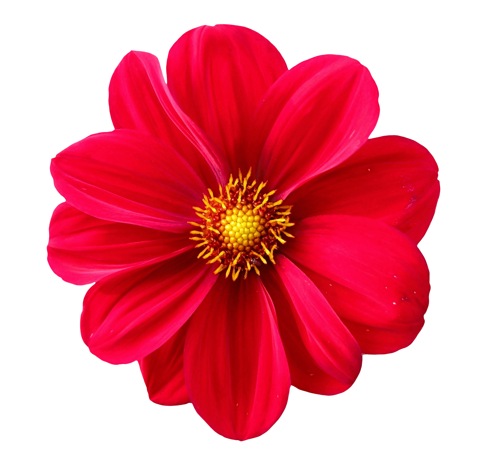
For this I basically copied the same steps in the first photo, but instead of the sky I took a picture of a flower from google, changed the colour of it and made it spin around the models head.

3rd Photo:

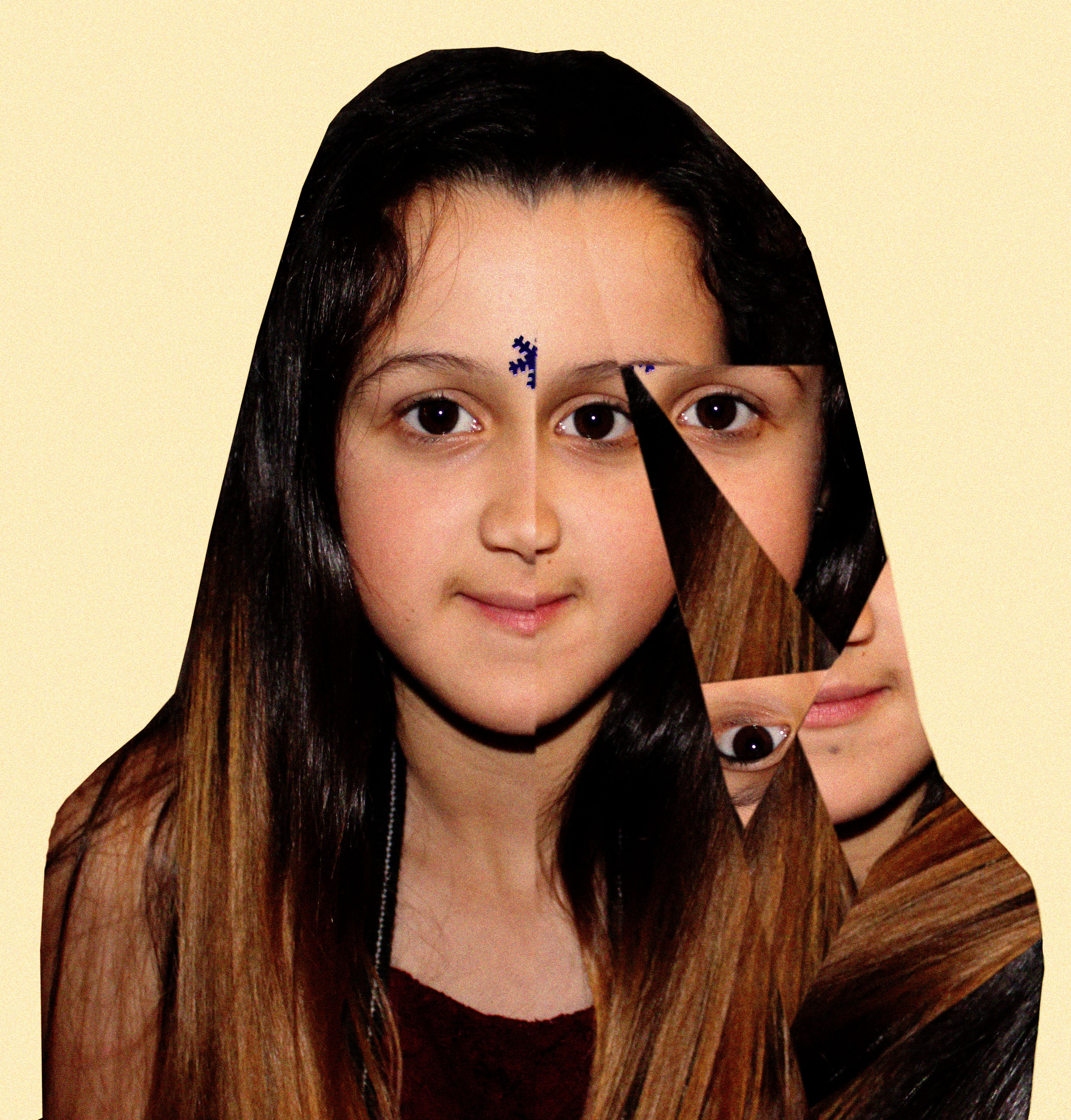
Even though this photo took me longest and was the most challenging one out of the three, I really like the end result of it. I added noise to the photo and I really like how that looks. Also again this is loosely based off of the theme identity and place.

This photo was inspired by Eugenia Loli’s Photo –

Image result for eugenia loli
Eugenia Loli

Overall, I’m really happy with how all my photos turned out and I really like working in this style of photography because of the freedom you have with the photos.