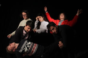
Caravaggio- Deposition
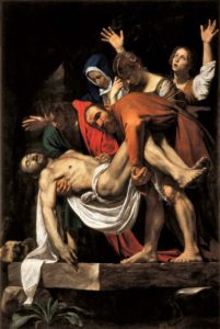
Caravaggio was born as Michelangelo Merisi in Italy around 1571. He was orphaned at age 11 and apprenticed with a painter in Milan. He moved to Rome, where his work became popular for the tenebrism technique he used, which used shadow to emphasize lighter areas. Using this technique is what led Caravaggio into success as it added realism to his images. Caravaggio the colorful, sometimes violent street fighter but ultimately brilliant painter, applied an extreme form of chiaroscuro (light and dark) to his work and was directly influenced by Rubens, Hals, Rembrandt, Vermeer, Velazquez and Bernini.
Our class process to imitate the image:
Here are some of the best outcomes:

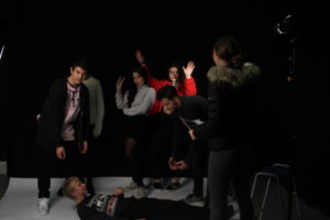
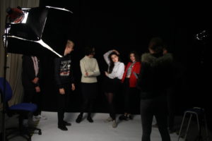
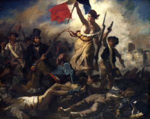
Liberty Leading the way- Eugene Delacroix
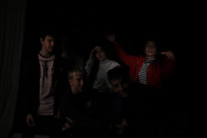
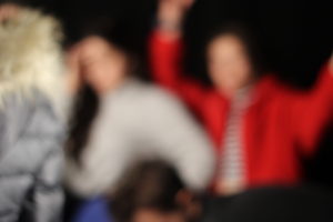
We had a second attempt at tableaux photography with this image

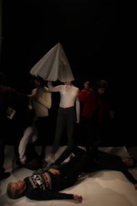
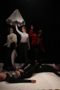

The second image in my opinion was harder to re- create and copy as firstly we needed more people but in terms of lighting it was hard to pin point where we trying to focus. However these image have been focused on the center of the image which therefore has made the images come out darker than excepted. This image also took longer as we were trying to angle the light in the same direction as the image but having looked at the image now the light seems to be coming from behind the woman in the middle. overall the process of figuring out where to put lights and where to stage people was a better outcome than the image itself but our first attempt was a best outcomes.
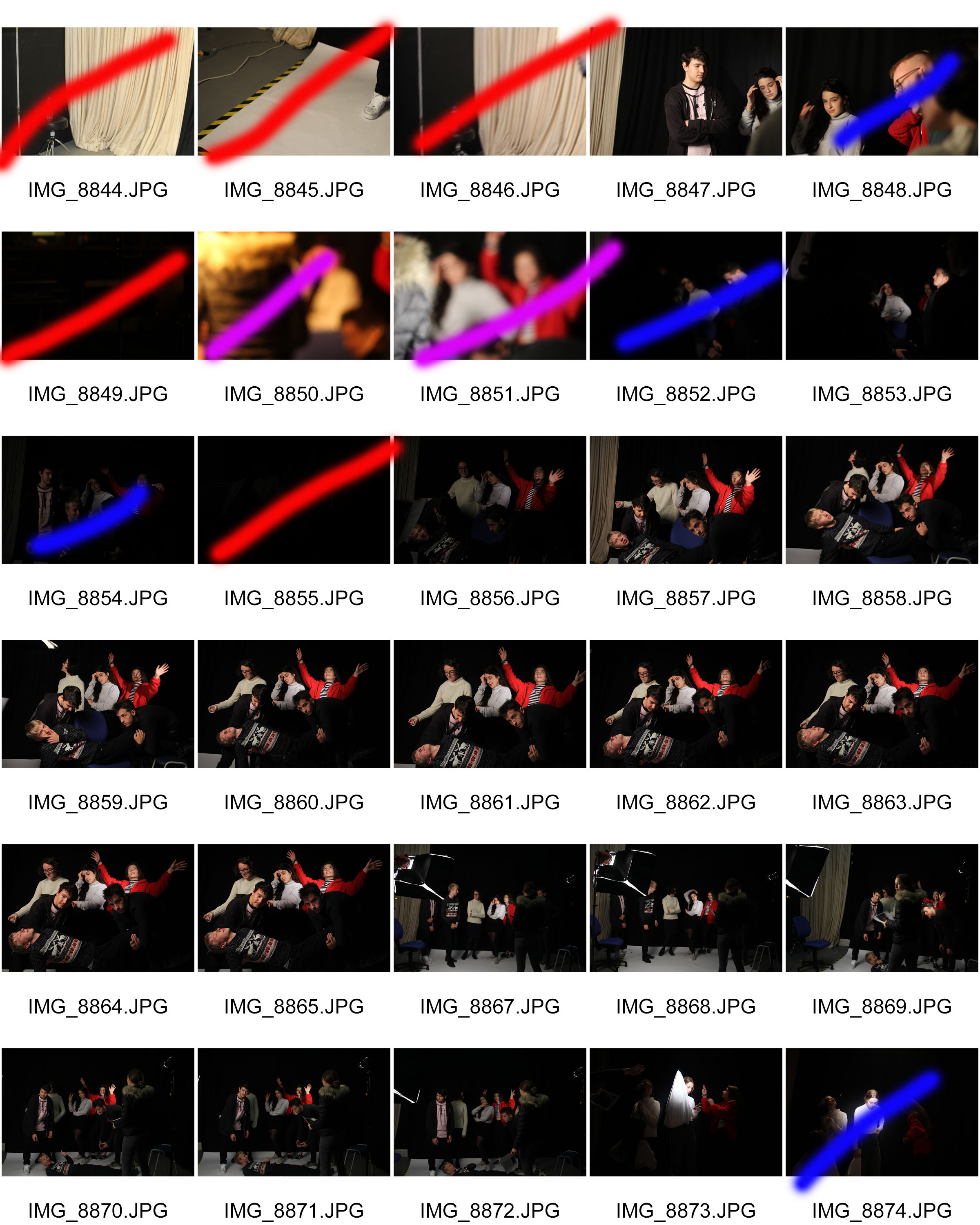
These are the contact sheets i made from our class attempts:
In the examples below you can see I have drawn over the images. have done this because some of them are under exposed therefore to dark so I am unable to edit it I have done that in (red) . Additionally if the image is too over exposed or under exposed i have decided to cross it off In (blue) .If the image is out of focus I have chosen to cross it out in (pink) Finally if the image I think has too much negative space behind it which makes the images look quite bland and boring I have crossed out the space in (white)