What Is Photo-montage?
Photo montage is the process and the result of making a composite photograph by cutting, gluing, rearranging and overlapping two or more photographs into a new image. Sometimes the resulting composite image is photographed so that a final image may appear as a seamless photographic print
Mood Board: Examples

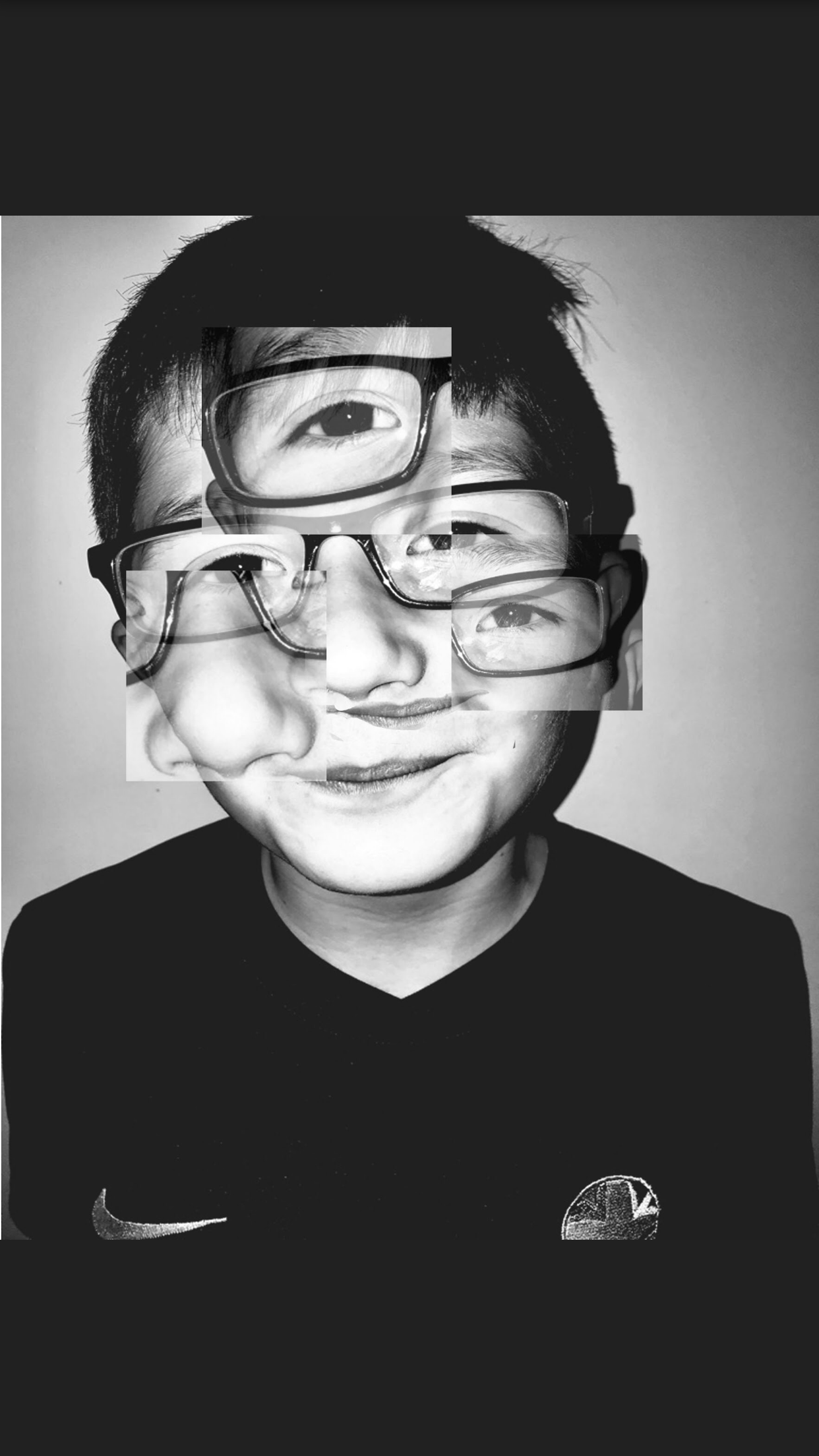
My first Attempt at Photo- Montage using Photoshop:

My Process:
As I mainly forgot to screenshot a long the way I decided to write out the process which I followed to achieve this image. Firstly although this took me over 45 minutes to figure out how to over lay layers and fade them out. Firstly i selected which image i wanted to use as the montage examples. Secondly i had to decide whether i would be using the same image or a different one when adding it over one another. I chose to stay with them same image as i was inspired by the artist Brno Del Zou and in most of his outcomes he sticks to the same image but just creates multiple layers. As this was my first attempt as a beginner i found it quite hard but In not too disappointed by the result. After having copied the image a couple times i decided to crop into certain areas of the face making another face but above another one. Therefore here i chose to crop parts of the eyes,mouth and nose to create a weird, distorted image. Then finally i edited the cropped areas by changing the opacity of each section by making it lighter giving it a transparent look.
The technical aspect of this image, when looking at lighting its quite dark, however there are some elements in this image that are put there to draw attention. For example the big eye in the middle of the forehead, giving it this aspect of abnormality and weirdness draws attention if you look closely you can see harsher tones of blacks and grey and then lighter mixes of white tones. This attracts the eye to look at areas that sometimes aren’t highlighted in normal room lighting. This image was also taken using flash hence why theirs a circle almost shape going around the face which just supports my point that the attention is drawn immediately to the face.
Visually, other than light, if i was to complete this image again, i would try to fade out the corners of the boxes or at least learn a way to blend them in a bit better as it makes a slight contrast with the additional background due to them being different tones of white and one slightly more faded.
The context behind the picture was that it was actually taken for the studio lighting section but as my chosen artist worked with portraits i decided to pinch one picture from here.
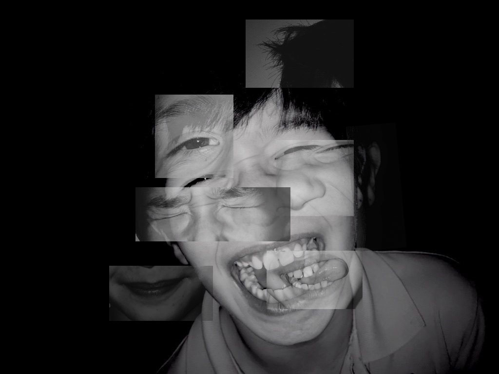
Here are some of my other attempts and experiments at Photo Montage using more than one image:

