Brno Del Zou-Artist

Brno Del Zou


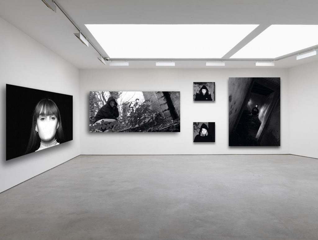
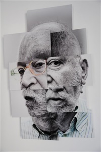
Brno Del Zou is a French artist born in 1963. In his “photosculptures” series, Brno Del Zou uses the fragmentation of the body in order to better understand it. The body and the faces are revisited and their volumes are highlighted in order to create installations of multiple scales. In Brno’s work he is trying to explore the human body but by doing this his style, rather unusual but unique really goes with what he was trying to explore. By him being different it makes his work one of a kind and interesting to look at he’s expressing parts of his identity which is what should always be done when creating “your own work”. I like his work due to the layered fragments of the face creating a bizarre outcome, the use of black and white helps with distinguishing the mood that hes trying to share however some of his images have tiny elements of colour which makes the models features easier to spot and draws automatic attention. His work itself is leaning to the more unrealistic side of photography which gives him the ability to work with what he has an extend it for something meaningful which has been fulfilled in his case.


For every great image is a story or an idea. For Brno’s work its evident that the idea of identity and expression is clearly shown, ashore the story behind it could  be that Brno is trying to explain that our mind can be our biggest challenge we face daily. Some images show various expressions, this can be used to symbolise the feelings we might feel In day to day life. This clearly highlighted the importance of what our minds can do which lead to a powerful message being shown through art and creativity instead of chunks of writing.


 The set of photographs are all take as portrait at a straight on angle, which allows the models face to be the main focus point which is what Brno was aiming for .The tone of the photograph is quite light as there tends to be no shadow given off the body parts nor the face itself. The lighting used seems to be artificial lighting, which creates  a soft tone allowing the models body to easily be recognised. The background of these photographs are plain which allows the viewer to focus primarily on the distorted models face.
Here are some examples of his work
Image result for brno del zou
Action Plan:
  • who? Leandro
  • Where? Sports field
  • When? During the day- after schools- weekends
  • How?  Get pictures of my brother whis

Photo-Montage Post One

What Is Photo-montage?

Photo montage is the process and the result of making a composite photograph by cutting, gluing, rearranging and overlapping two or more photographs into a new image. Sometimes the resulting composite image is photographed so that a final image may appear as a seamless photographic print

Mood Board: Examples


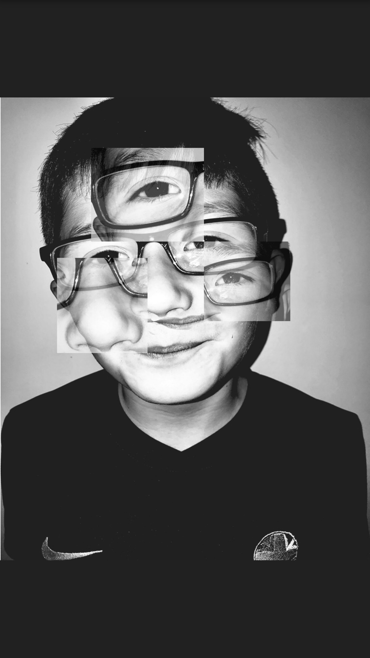
My first Attempt at Photo- Montage using Photoshop:

My Process:

As I mainly forgot to screenshot a long the way I decided to write out the process which I followed to achieve this image. Firstly although this took me over 45 minutes to figure out how to over lay layers and fade them out. Firstly i selected which image i wanted to use as the montage examples. Secondly i had to decide whether i would be using the same image or a different one when adding it over one another. I chose to stay with them same image as i was inspired by the artist Brno Del Zou and in most of his outcomes he sticks to the same image but just creates multiple layers. As this was my first attempt as a beginner i found it quite hard but In not too disappointed by the result. After having copied the image a couple times i decided to crop into certain areas of the face making another face but above another one. Therefore here i chose to crop parts of the eyes,mouth and nose to create a weird, distorted image. Then finally i edited the cropped areas by changing the opacity of each section by making it lighter giving it a transparent look.

The technical aspect of this image, when looking at lighting its quite dark, however there are some elements in this image that are put there to draw attention. For example the big eye in the middle of the forehead, giving it this aspect of abnormality and weirdness draws attention if you look closely you can see harsher tones of blacks and grey and then lighter mixes of white tones. This attracts the eye to look at areas that sometimes aren’t highlighted in normal room lighting. This image was also taken using flash hence why theirs a circle almost shape going around the face which just supports my point that the attention is drawn immediately to the face.

Visually, other than light, if i was to complete this image again, i would try to fade out the corners of the boxes or at least learn a way to blend them in a bit better as it makes a slight contrast with the additional background due to them being different tones of white and one slightly more faded.

The context behind the picture was that it was actually taken for the studio lighting section but as my chosen artist worked with portraits i decided to pinch one picture from here.

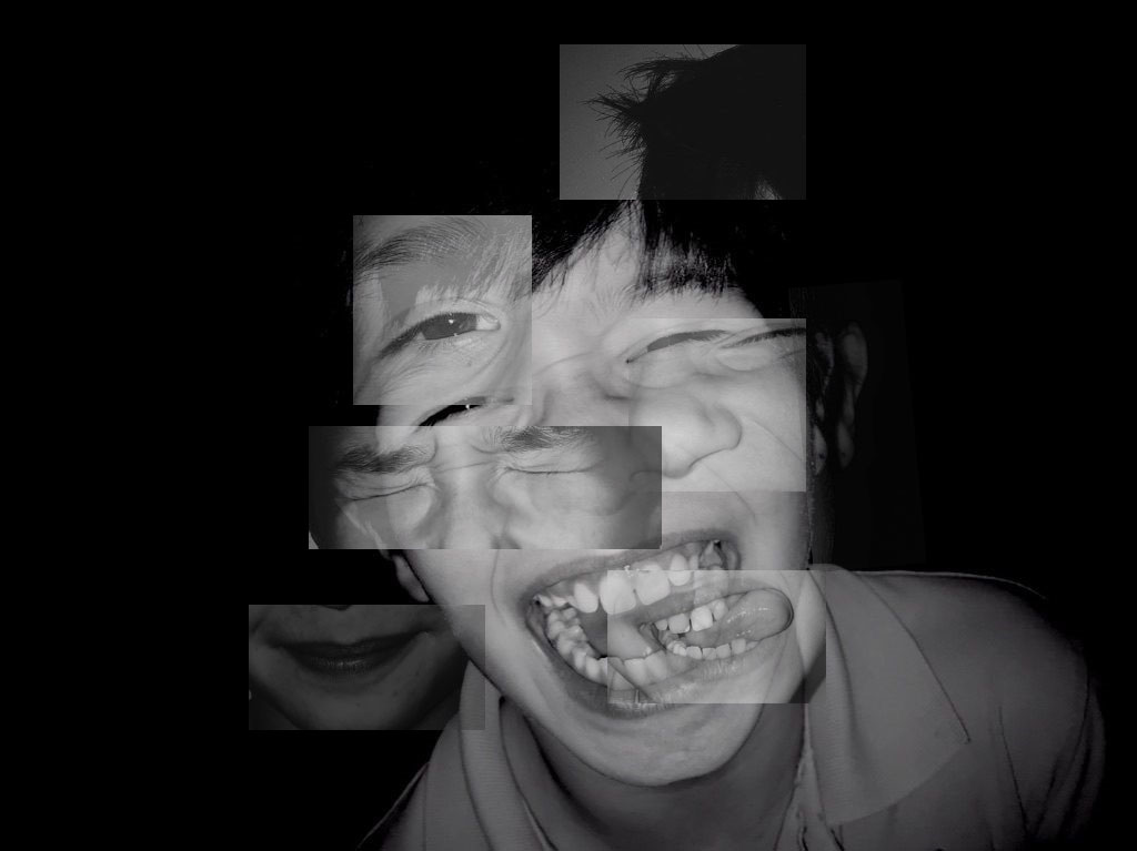
Here are some of my other attempts and experiments  at Photo Montage using more than one image:

Tableaux Outcomes

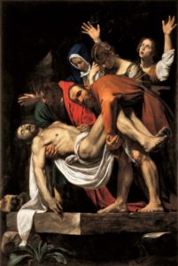
Caravaggio- Deposition 


Caravaggio was born as Michelangelo Merisi in Italy around 1571. He was orphaned at age 11 and apprenticed with a painter in Milan. He moved to Rome, where his work became popular for the tenebrism technique he used, which used shadow to emphasize lighter areas.  Using this technique is what led Caravaggio into success as it added realism to his images. Caravaggio the colorful, sometimes violent street fighter but ultimately brilliant painter, applied an extreme form of chiaroscuro (light and dark) to his work and  was directly influenced by Rubens, Hals, Rembrandt, Vermeer, Velazquez and Bernini.

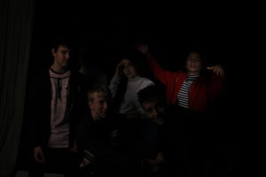
Our class process to imitate the image:

lighting in the image above isn’t quite the tone we needed
as evident this image was out of focus
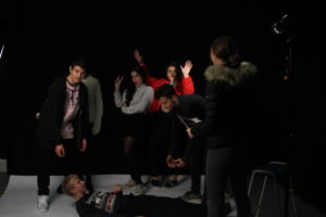
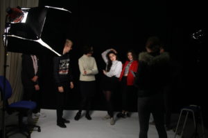
This image was taken as we were trying to stage everyone into the positions that we needed to be in
preparing p2

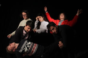
Here are some of the best outcomes:

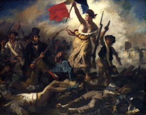
Liberty Leading the way- Eugene Delacroix 

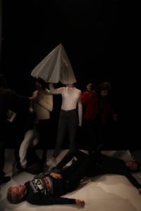
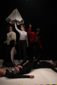
We had a second attempt at tableaux photography with this image

Liberty leading the people by Eugene Delacroix

The second image in my opinion was harder to re- create and copy as firstly we needed more people but in terms of lighting it was hard to pin point where we trying to focus. However these image have been focused on the center of the image which therefore has made the images come out darker than excepted. This image also took longer as we were trying to angle the light in the same direction as the image but having looked at the image now the light seems to be coming from behind the woman in the middle. overall the process of figuring out where to put lights and where to stage people was a better outcome than the image itself but our first attempt was a best outcomes.

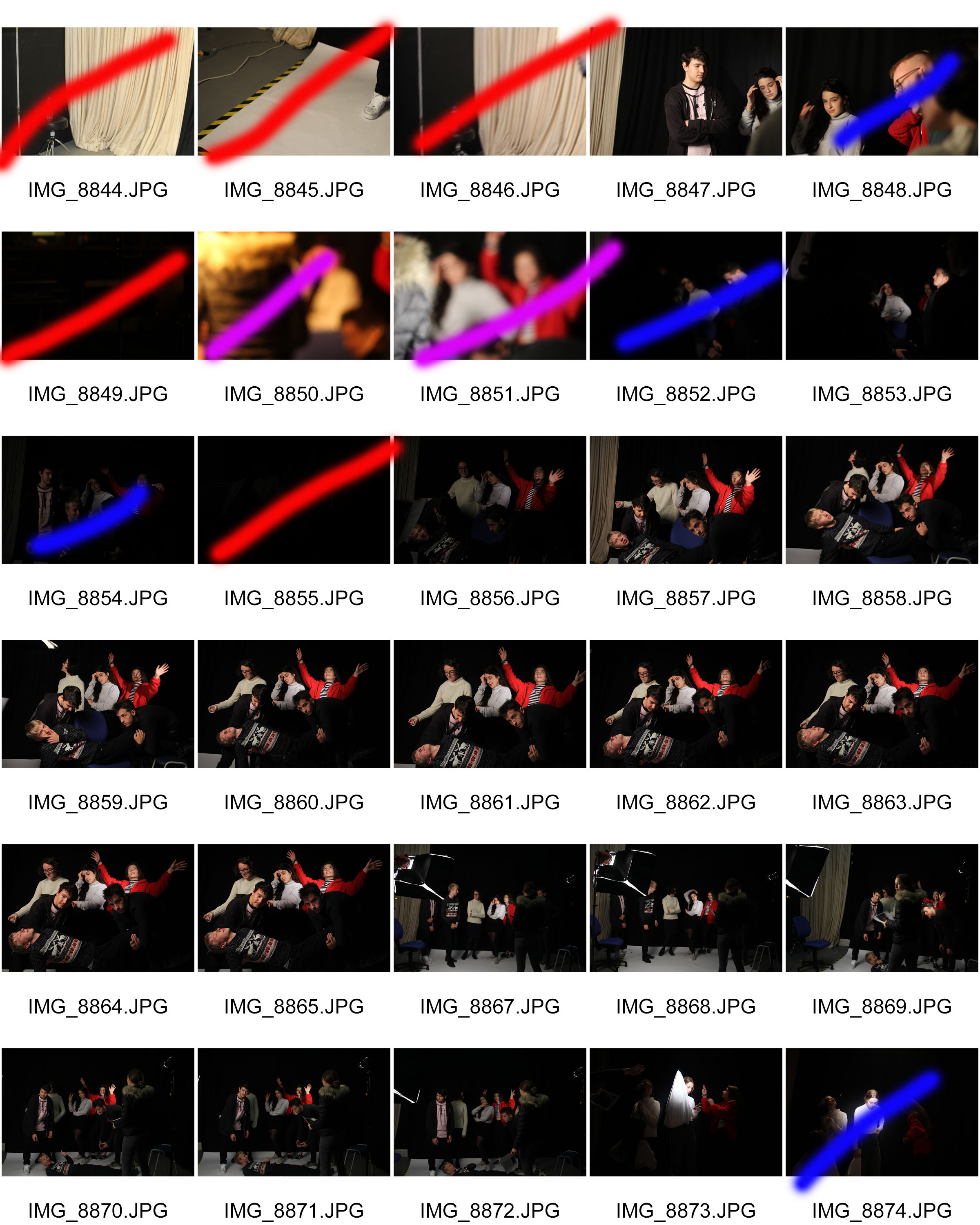
These are the contact sheets i made from our class attempts:

In the examples below you can see I have drawn over the images.  have done this because some of them are under exposed therefore to dark so I am unable to edit it I have done that in (red) . Additionally if the image is too over exposed or under exposed i have decided to cross it off In (blue) .If the image is out of focus I have chosen to cross it out in (pink) Finally if the image I think has too much negative space behind it which makes the images look quite bland and boring I have crossed out the space in (white)

Lorna Simpson – Case Study

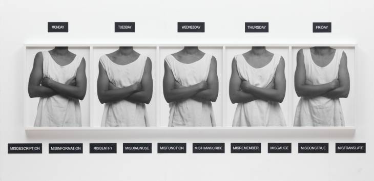
Five Day Forecast 1991

Lorna Sampson has created this image of a person of everyday of the week. Conceptually, she created it to show what her life was like when she had to work multiple jobs in order to fund her hobby of art/photography. There are words which hold negative connotations towards them at the bottom of the image, this implies that Sampson did not enjoy the multiple jobs due to the chaotic and horrible life style it bought. Technically, the images are presented in black and white which allows the images to be high in tonal regions. The main formal elements within this image is repetition, due to the same image being used, and texture due to the creases found in the tank top. The creases inform us that this person does not have much time, due to the multiple jobs, therefore the creases are found upon the shirt. The main focus point is the models waist, these are used to help guide the viewers eyes around the frame. It seems that the ISO used was low due to no noise being presented within the images. The shutter speed is likely to be kept low as there is no intended blur within the repetitive images. The aperture is likely to be on a ‘normal’ setting as the images are not significantly light or dark. The depth of field is large as within the images everything is in focus. The background found is plain white, which also adds to how plain and boring life was like working these multiple jobs. With the models arms being crossed conveys a negative connotation to how this model is feeling. Psychologically speaking having the arms crossed means that people are not likely to take on information that people are saying and are very close about their life. This implies that maybe the model is very closed about their life and entraps the feelings. Towards the bottom of the images there are a bunch of  adjectives which all hold negative connotations, this positions the viewer to understand this time in Simpson’s life. This piece of works links into loss of identity as it shows that by having multiple jobs made Sampson unhappy, less sociable and she lost her identity. Colors are not used as that presents an identity, which was not the aim of the piece. Moreover, one of the words used is ‘Misidentify’ which implies that she is mistaking her identity and slowly loosing it due to her lifestyle.

Taking from Sampson’s piece I like the idea of only presenting the body of my model. This means that an emotional attachment can not be created as there is no face. Moreover, I like how black and white has been used to take away color, as colors can help build a persons identity. The use of negative words about losing identity could easily be implemented within my work allowing words and photography to combine to create a powerful piece. As an action plan I will carry out a photo shoot where I will capture my model without capturing the face. I will do this by placing the model in random locations and positions in order to create different meanings.


Identity

What is identity?

  • Qualities
    this is somebodies personality traits e.g the way they look, body posture
  • Beliefs
    Somebodies beliefs in the way they live e.g religion
  • Geographical
    An individual or group’s sense of attachment to the country, region, city, or village in which
    they live
  • Cultural
    feeling of belonging to a group
  • Lack of/loss of
    being able to see yourself as the same person in the past, present, and future
  • Gender
    personal sense of ones gender
  • family
    express in your family rules, goals and vision
  • social
    is the portion of an individual’s self-concept
  • Political
    the interests and perspectives of social groups with which people identify.


MOCK- FRANCESCA WOODMAN

Francesca Woodman

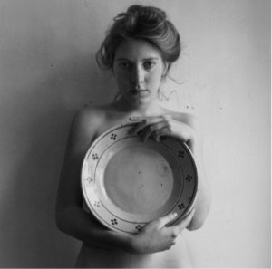
Francesca Woodman was an American photographer who was born in Denver, Colorado. Her mother was Jewish and her father from a Protestant background. She took her first self-portrait at age thirteen and continued with photographed until her death. She went to a public school and then a private school from 1972 where she developed her photographic skills and became fully interested in the art form. She moved to New York City in 1979 ” to make a career in photography”. She sent out many portfolios of her work to fashion photographers but they did not lead her anywhere. Due to her failure, she became depressed and attempted suicide in 1980.

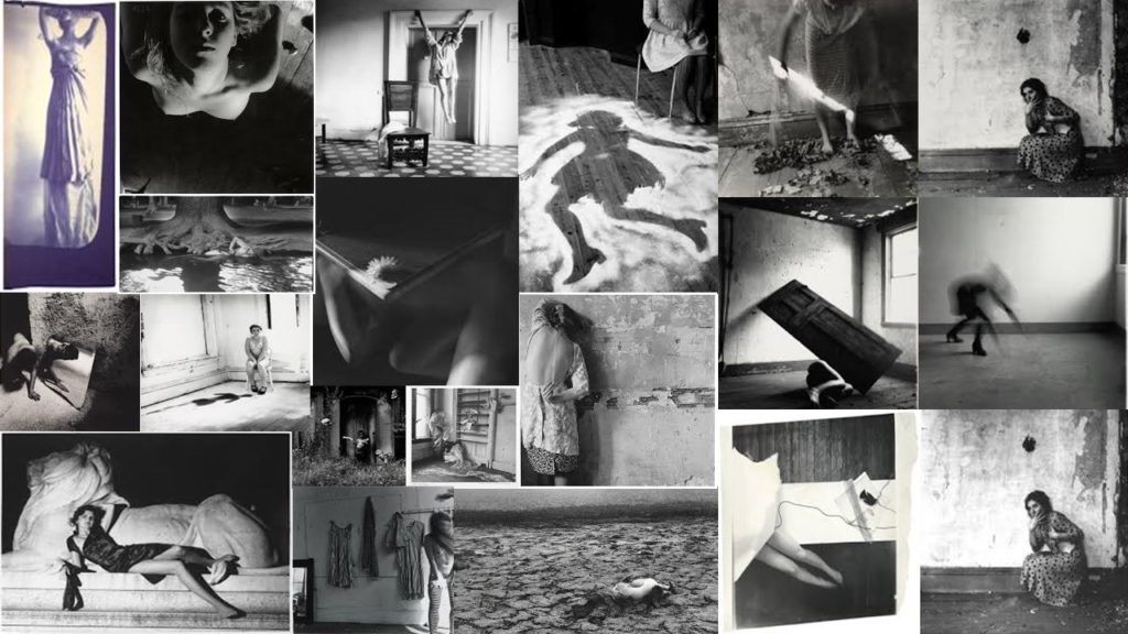
During the time of 1972- 1980 was when she made most of her photos most of which were black and white images including either naked women or clothes merging with their surroundings. She took all her images with medium format. She created over 10,000 failure images which her parents keep, otherwise the 120 images which have been produced are found by location and date.

After producing all these images and most of them being a failure, she ended up dying from another suicide attempt age twenty two by jumping out of a loft window in New York City. After her suicide, her father suggested that her suicide was related to an unsuccessful application for funding from the National Endowment for the Arts.

In a exhibition in 1998, many people were very interested in her work and they had “strong reactions” to her ” interesting” photographs. Many people found her pictures inspirational.

Her work 

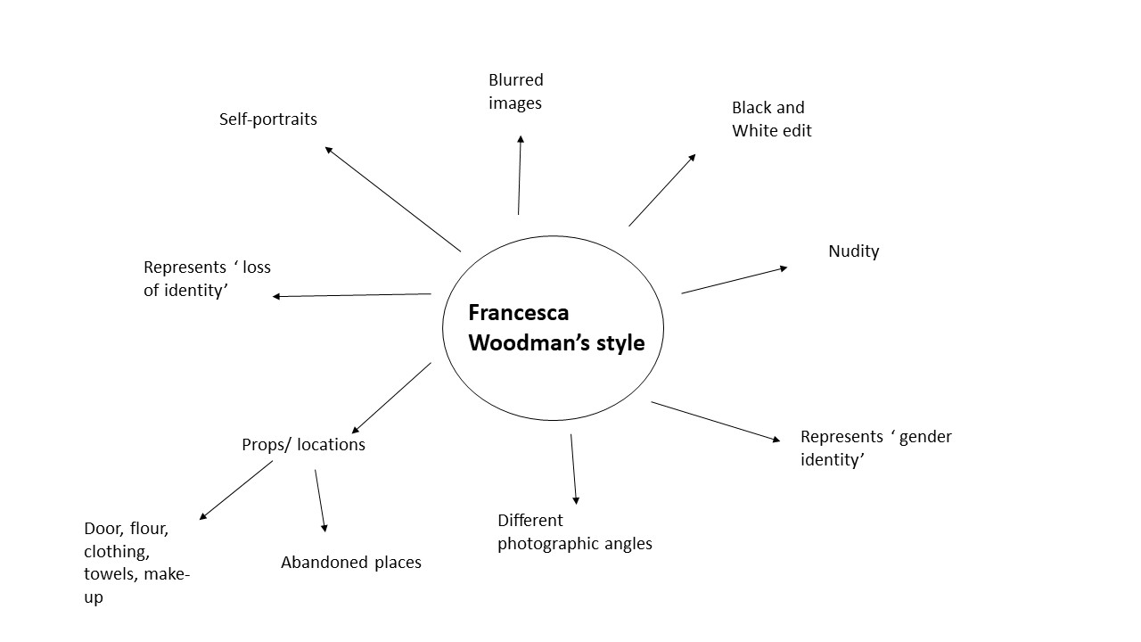
When looking into her work i noticed that a lot of her work was very blurred to hide the identity of people in the pictures. Otherwise, the models were placed in very peculiar positions, acting as if they weren’t in their normal bodies, almost acting as an escape. The fact that most of the models weren’t clothed also suggests that Woodman was trying to show the real them and not who they pretend to be behind their clothes and makeup.

Her creations…

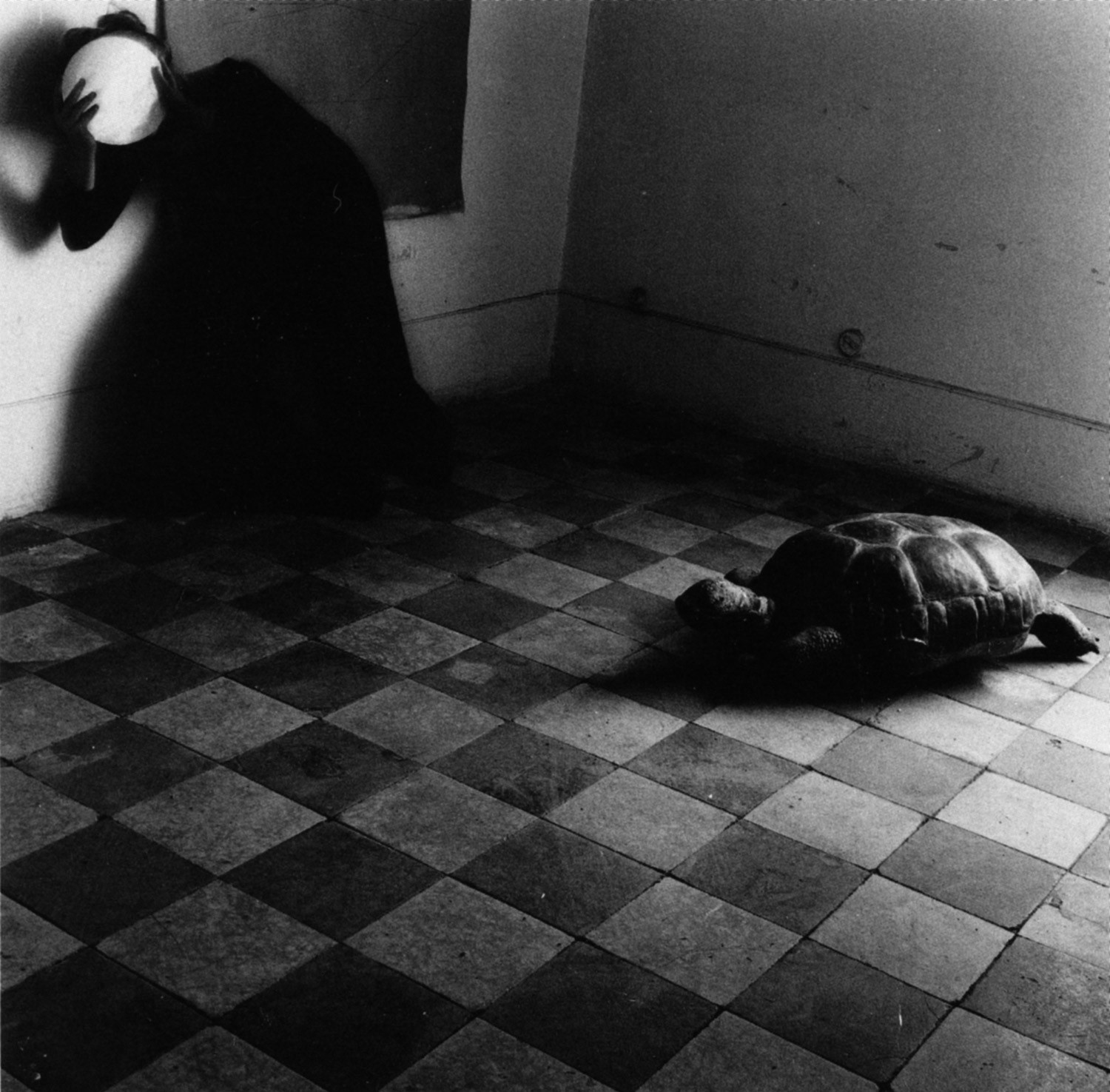
Analysation image..

Technical analysis 

In this image we can tell the image has been taken with a wide depth of field as the image is fully focused in a natural light. We can tell that this is in a natural light due to the one source of light on the right hand side of the image from a high angle. Due to the natural lighting, i assume that the white balance was set to a daylight mode or shade mode. We can also tell the this picture has been taken with a quick shutter speed to allow the image to be fully focused.

Visual analysis 

This black and white edited image can be seen as helping to bring out different tones in the picture. The edit also provides more of a dark concept. We can see by the floor tiles that the image has a great deal of texture due to the dirty floor. We can also see that this image is in 2D, that there is no pattern in the image and can overall tell that it is very unique.

Conceptual analysis

When looking at this image i have drawn to the crouched lady at the back left of the image. Her choice of wearing all black adds a dark feel to the already darkly lit image. In the image she is covering her face with a white circle, this could have multiple meanings but to me it suggests that she doesn’t know her identity, who she is. The white circle is acting like a blank canvas and she is suggesting that someone comes and draws the ideal look on her face. This image has shown to be heavily related to ‘loss of identity’.

Contextual analysis 

Woodman didn’t release any of the images which are online today and therefore all the audience know is the location the picture was taken and the date it was taken. There is no back story to this image.

Defining Identity (MOCK EXAM)

Identity

 The definition of identity is who you are, the way you think about yourself, the way you are viewed by the world and the characteristics that define you. An example of identity is a person’s name. Some forms of a person’s Identity could be: the environment they have been brought up in, their gender, and their culture. Some people may also experience a lack of identity and are struggling to “find themselves”.

How Environment Affects Identity

Our environment and surroundings have a large effect on our identity, as we often try to observe what is taking place and imitate it. A person’s environment strongly influences the way they think and act because it influences what they are exposed to and the opportunities they have. For example: if a person is raised by parents who do not have a formal education, they may grow up to believe that education is not important. They could be influenced by their parents to think that leaving school and getting a job is normal. This would affect their attitude towards education, making them appear unmotivated. If they did end up leaving school, this would influence the decisions they are able to make and the opportunities they would have in the later life.

How Gender Affects Identity

Gender identity is defined as a personal conception of oneself as male or female (or sometimes, both or neither). This concept is intimately related to the concept of gender role, which is defined as the outward suggestions of personality that reflect the gender identity. Gender identity, in nearly all instances, is self-identified, as a result of a combination of different factors such as environmental factors. Gender role, on the other hand, is manifested within society by observable factors such as behavior and appearance. For example, if a person considers himself a male and is most comfortable referring to his personal gender in masculine terms, then his gender identity is male. However, his gender role is male only if he demonstrates typically male characteristics in behavior, dress, and/or mannerisms.

In a person’s adolescent years the influential factors of sexuality, personality traits or disorders, peer interaction, and anxieties are most important in gender development. The gender identity, fostered from infancy to childhood by parents, is first strengthened by playmates, schoolmates, and others. It is usually enhanced by the development in puberty of a child who progresses into adolescence. Although many believe that gender identity is fixed in early childhood, it is more certain that, by late adolescence and early adulthood, an established gender identity is in place.

How Culture Affects Identity

Everyone has a cultural identity. Knowing where you come from can give you a sense of belonging and a sense of self. Culture is all the things that make up a certain way of life or living. That includes all the beliefs and values, language, customs, style of dress, food, song, and stories that belong to a group of people. A person’s cultural identity comes from the way they take certain aspects of each of the cultures they belong to and use them to shape and define who they are.

 A strong cultural identity is important to a child’s mental health and well-being. As they are growing, having a strong sense of their own cultural history and traditions helps young people build a positive cultural identity for themselves, gives them a sense of belonging and self-esteem and supports their overall well-being.

 Young people often find it hard to make sense of their cultural identity. They might have a mixed background or be living in a society where the main culture is different to their own. They might feel for a while like they don’t fit in anywhere and might resent or reject certain parts of their cultures in an effort to feel more accepted by others.

Lack or Loss of Identity

Developing a sense of self or an identity is an essential part of every individual developing and becoming mature. Identity or parts of identity may be classified by any number of things such as religion, gender, or ethnicity. Some traits, such as race, are chosen at birth. Some traits may be modified later in life such as language(s) spoken or religious preferences. Struggling with various parts of identity is natural and normal. Developing an identity or sense of self and those traits a person desires to have can take time and may be challenging. Not having a strong sense of self or struggling with identity issues may lead to anxiety and insecurity.


Sources:

https://www.weeklystandard.com/reuel-marc-gerecht/a-muslim-identity-crisishttps://www.quora.com/What-are-the-possible-causes-and-consequences-of-a-lack-of-…https://emedicine.medscape.com/article/917990-overviewhttps://www.kidsmatter.edu.au/health-and…/cultural-identity-matters-children’s-wellbein…www.commonground.org.nz/common-issues/identity/cultural-identity/
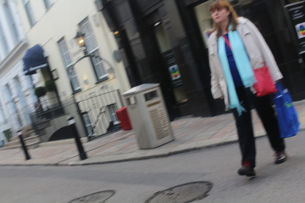
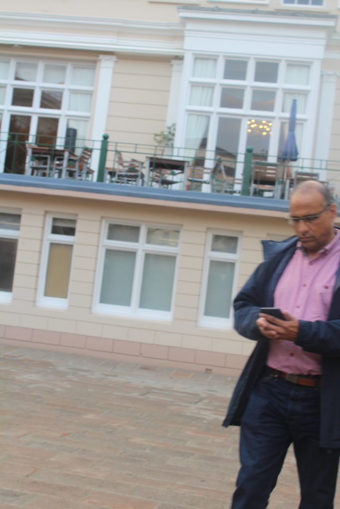
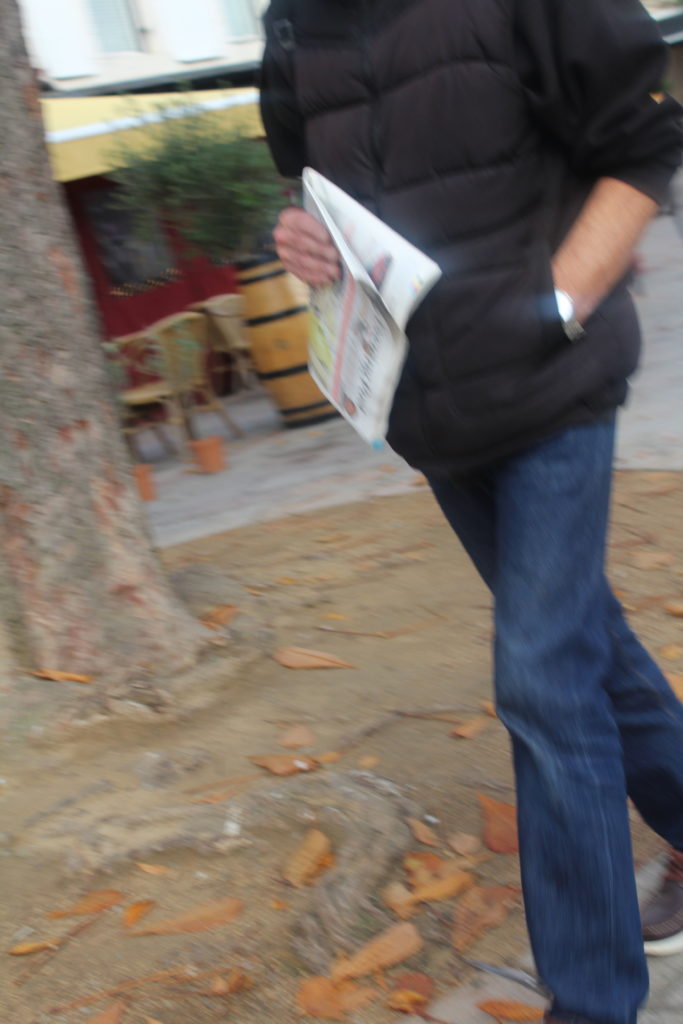
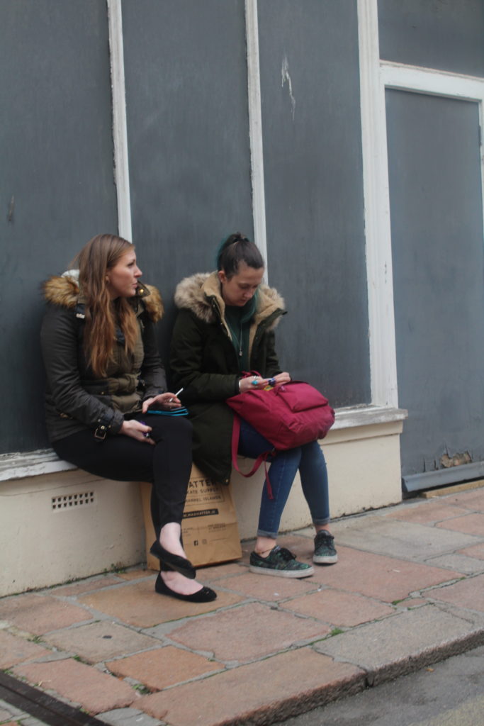
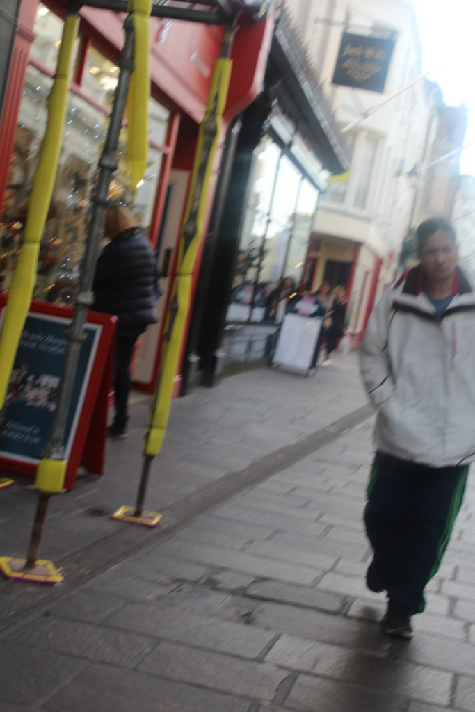
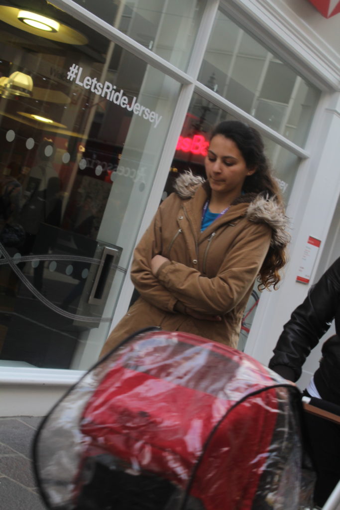
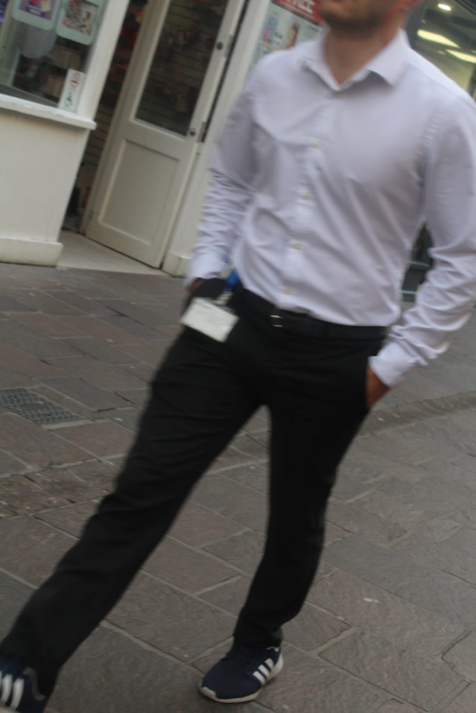
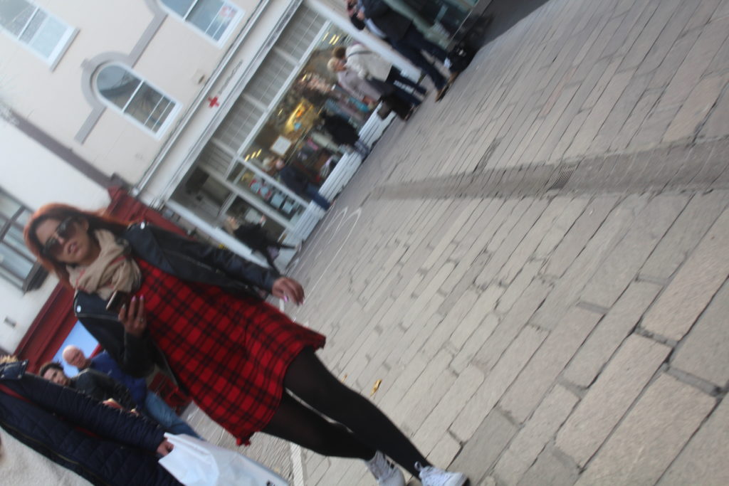
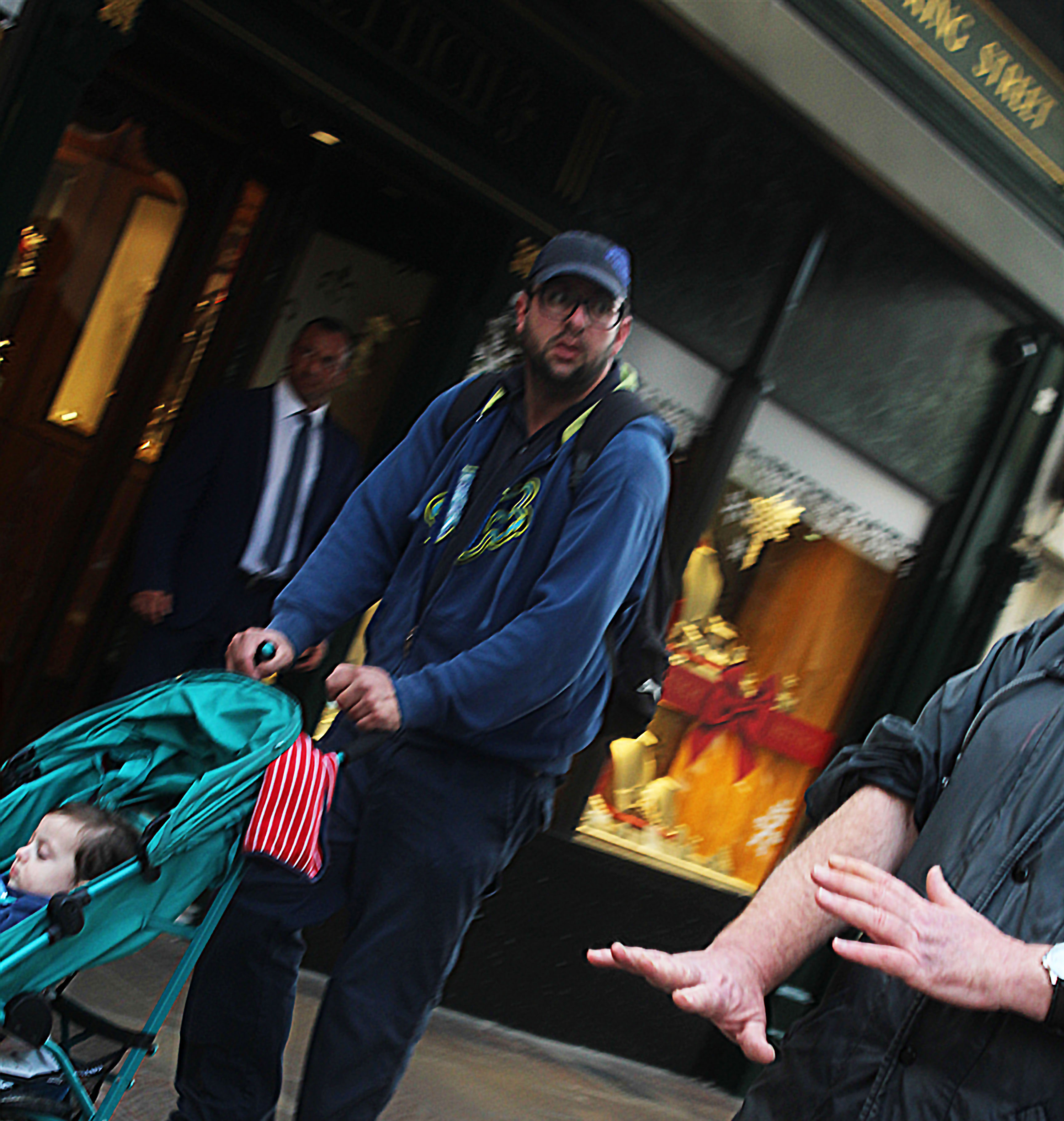
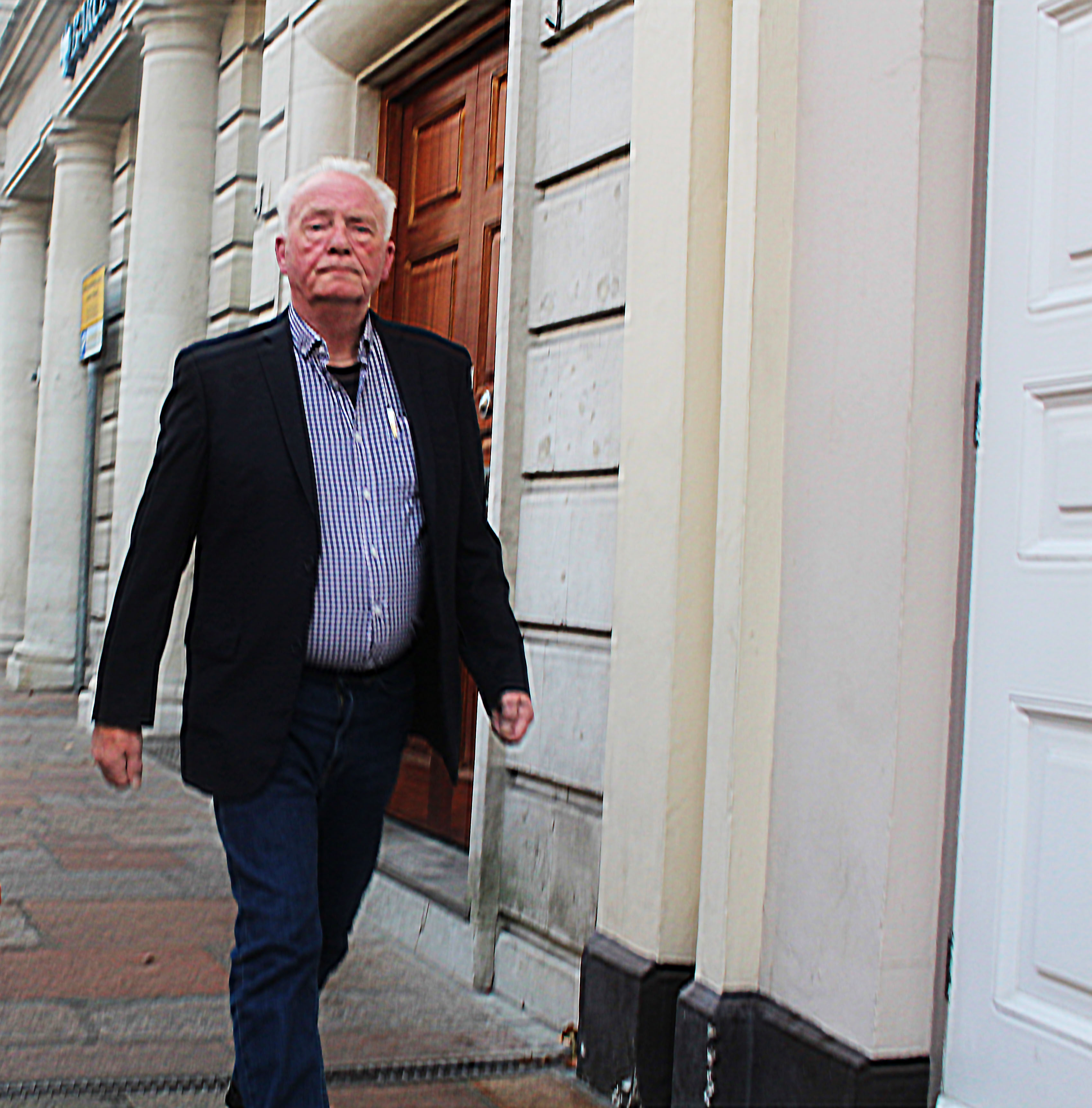
Street Photography

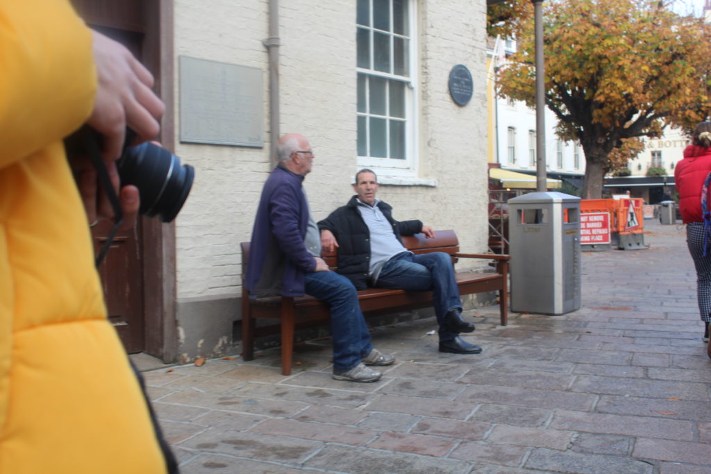
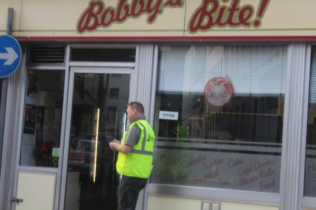
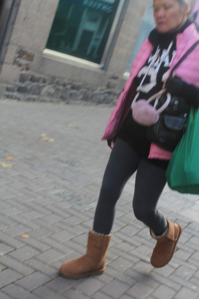
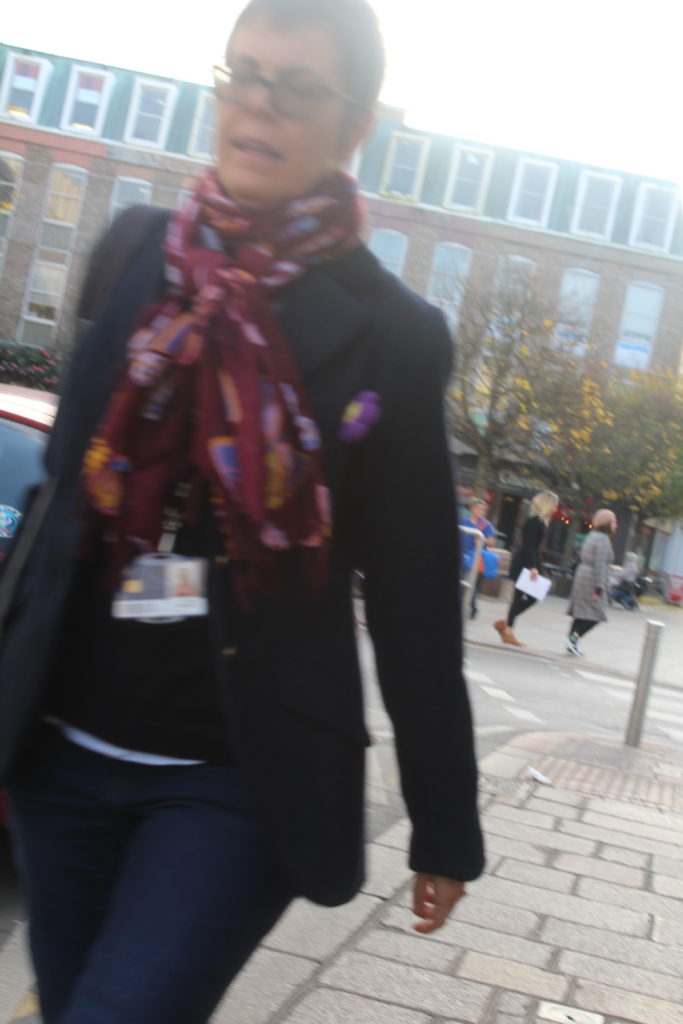
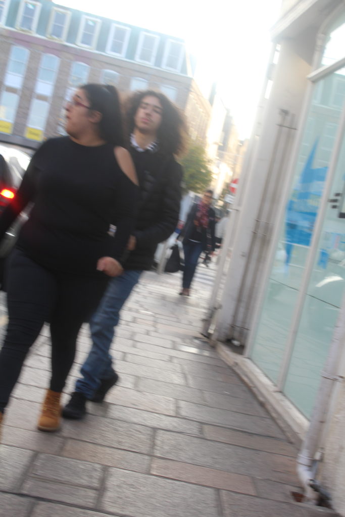
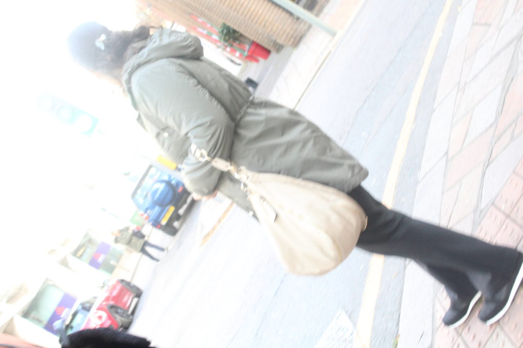
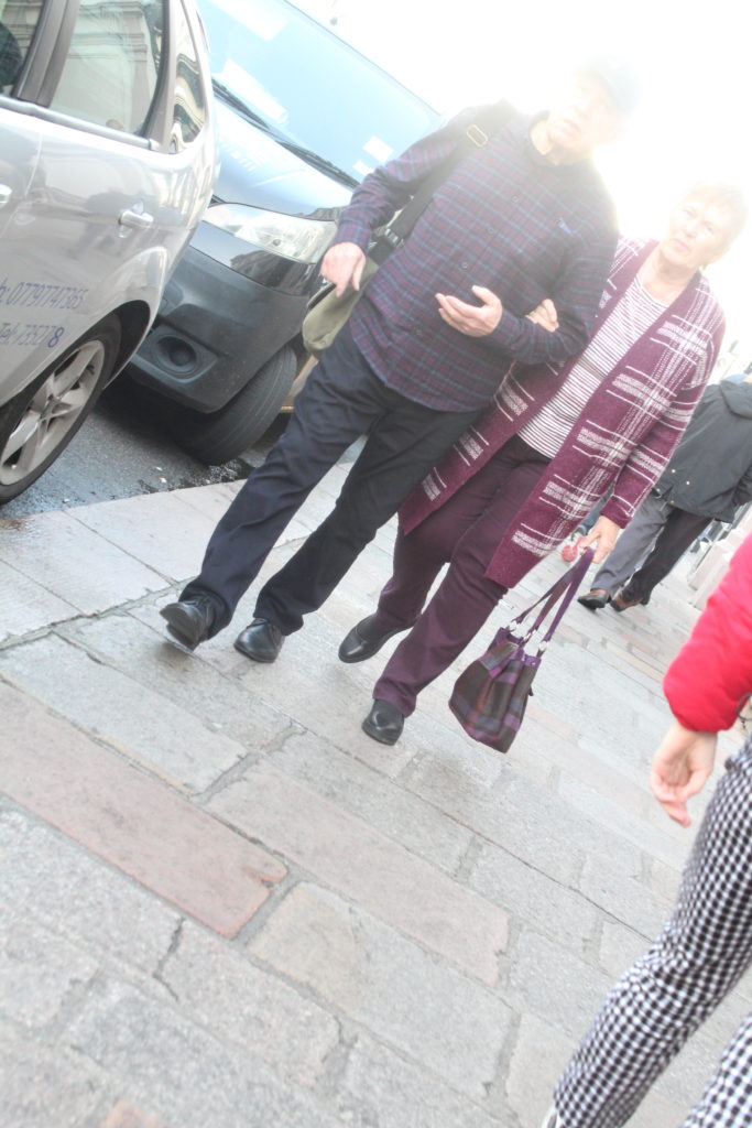
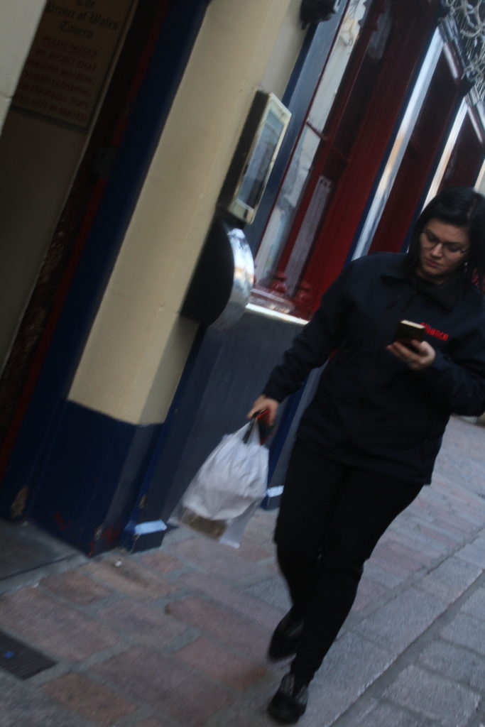
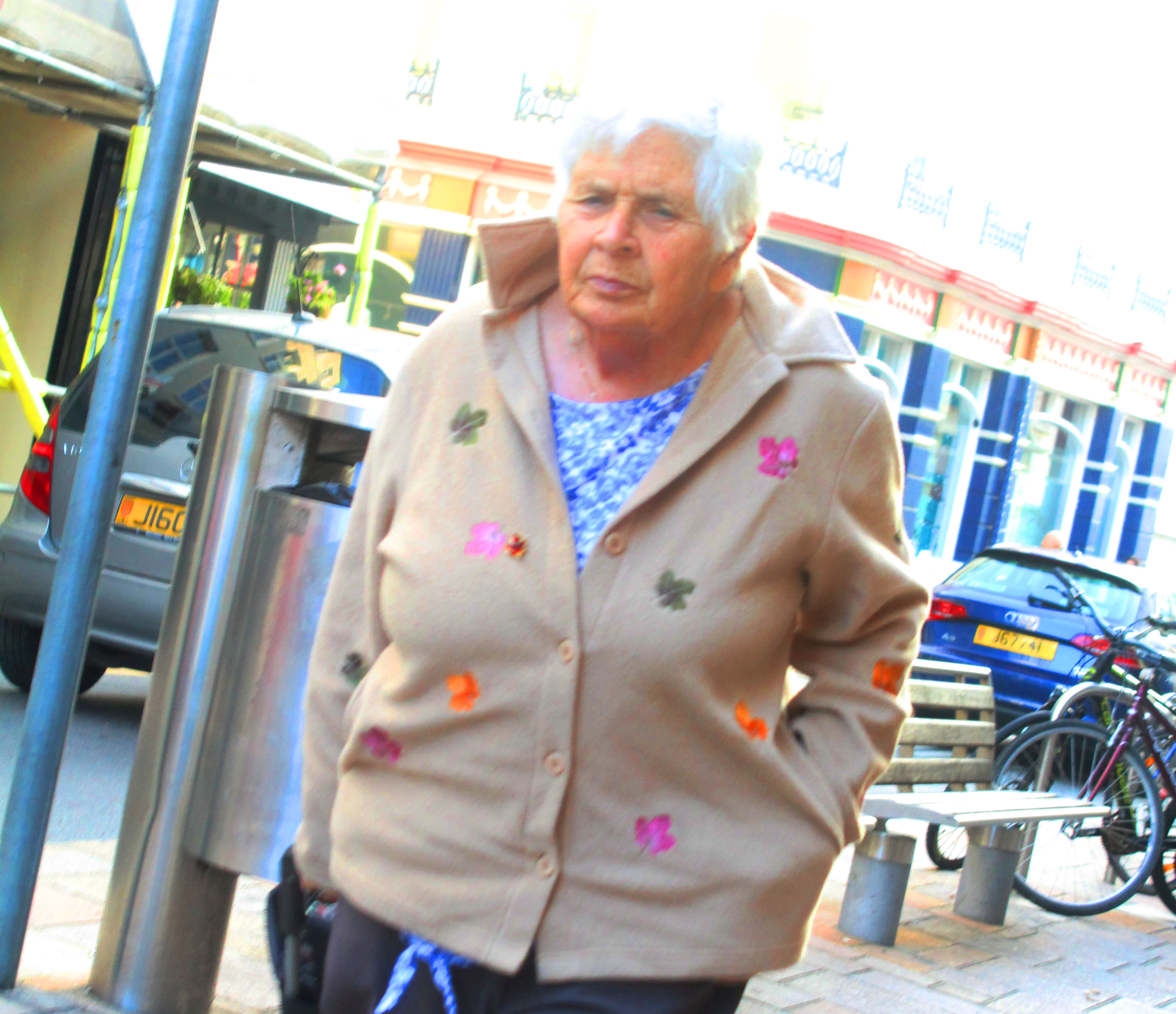
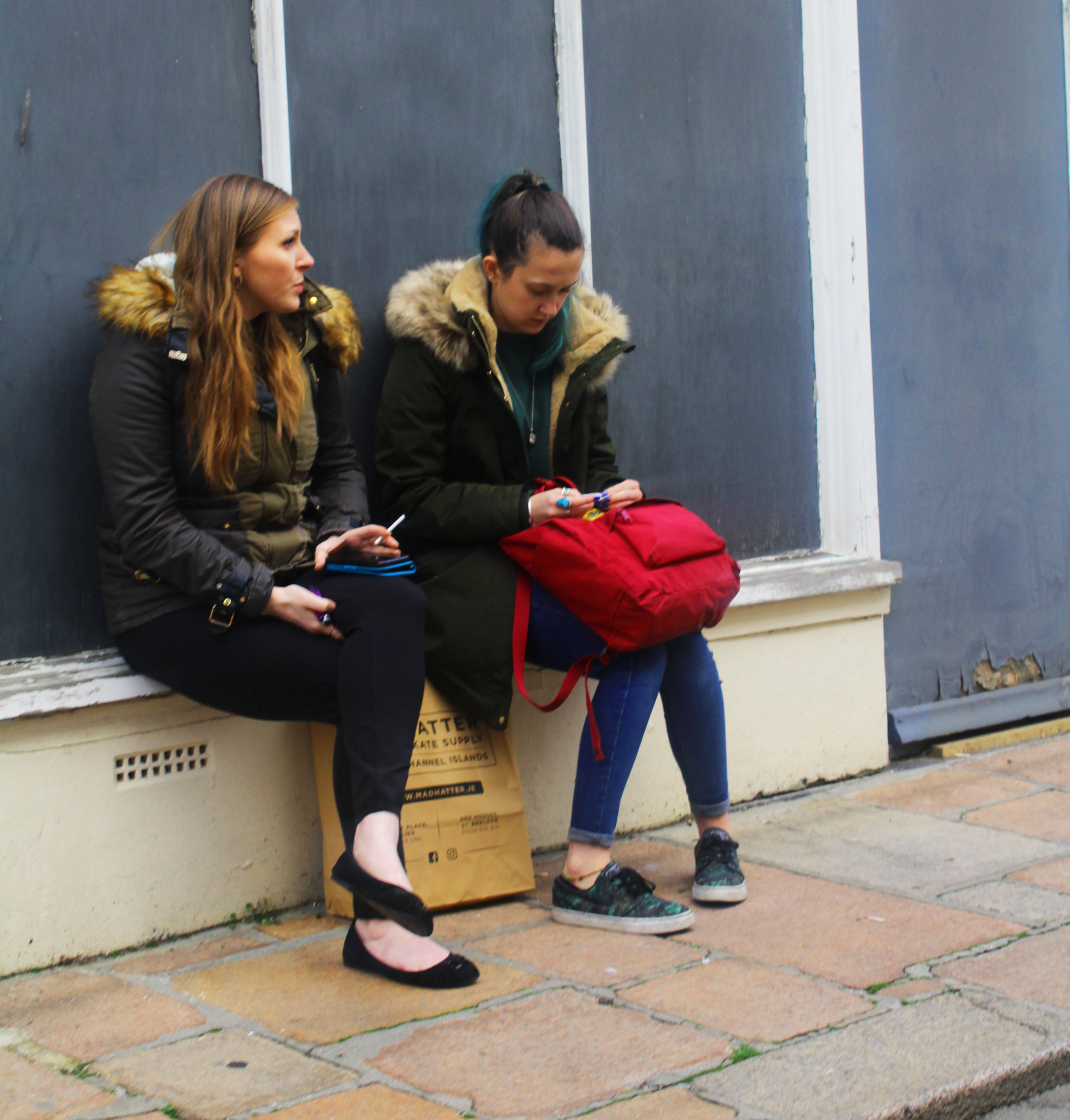
Street photography involves taking candid photographs of individuals on the street, without interacting with them or asking them to pose beforehand in any way. This results in photographs which display the subjects in in the moment, showing their natural poses and stances, and the genuine emotions they are feeling at the time of the photograph.

In order to experiment with street photography, I used participants that were available to me in town on an afternoon. I set my camera settings to a faster shutter-speed

The following are my final choices for the street photography images I have taken, after I have attempted to edit them in order to make the colors bolder and in some cases, lower the exposure.


Lack and Loss of Identity

Concealment of Identity through photography

Portraying the concealment of identity is a process that is essentially reliant upon editing techniques. While ideas surrounding the sense of preserving identity can be portrayed through a lens, Editing software such as adobe Photoshop can play a crucial role in bringing ideas to life. Methods such as blurring and pixelation can be applied to obscure the Identity of a person or an object for many reasons. The most common everyday reason is to preserve a persons identity in an occasion such as a Crime documentary or news report. it can also be used to portray a sense of loss of personality and lack of self knowledge.

Moodboard

Here are  a variety of Images I am taking inspiration from for this project. I have decided to have a mix of Pixelated, Blurred and distorted Images, with my main source of inspiration coming from crime documentaries, where witnesseses, victims and perpetrators alike have their identity concealed by an area of enlarged pixels or blurring in order to protect their identity and reduce the risk of any repercussive harm to them through the publishing of the documentary. In some instances, a strong back light can be utilised to give off an impression of a silhouette to further conceal the identity

Here are a few images that inspire my ideas

Image result for silhouette interview

Image result for identity protection interview

Image result for hiding identity pixels


Image result for criminal video interviews pixelation