Case Study – Xavier Ribas

Xavier Ribas


Xavier Ribas is a photographer, senior lecturer at the University of Brighton, and visiting lecturer at the Universidad Politécnica de Valencia. He studied Social Anthropology at the University of Barcelona and Documentary Photography at the Newport School of Art and Design. His photographic work investigates contested sites, histories and memories. His earlier works looked at peripheral spaces and geographies of abandonment in photographic series such as Sundays (1998), Sanctuary (1998-2002)and Habitus (2007). His recent works grouped under the title of Concrete Geographies (2003-2009) take the form of large photographic grids, looking at temporary settlements, sites of corporate urban development and exclusion, and border territories.

Ribas has been involved in many international exhibitions and his work is represented in major public and private collections. He has received awards, commissions and fellowships from the Arts and Humanities Research Council (2012-2015), the International Photography Research Network (2006), Commande Publique du Ministère de la Culture et de la Communication, Centre National des Arts Plastiques (2006), among others. 

I wanted to use his work for my interspersion because i like the idea of the identity of a place can change due to abandonment. The color pallet of his images are very interesting he uses muted tones to give the effect of life being lost in abandonment. His work appeals to me because it almost paints abandonment in a more beautiful way because its not just dark and dingy, it shows how life can circulate around the unwanted and grow upon it to create beautiful images

case study-Kurt Schwitters

Kurt Hermann Eduard Karl Julius Schwitters (20 June 1887 – 8 January 1948) was a German artist who was born in Hanover, Germany.

Schwitters worked in several genres and media,

Kurt Schwitters Photo

including dadaism, constructivism, surrealism, poetry, sound, painting, sculpture, graphic design, typography, and what came to be known as installation art. He is most famous for his collages, called Merz Pictures.

After studying art at the Dresden Academy alongside Otto Dix and George Grosz, (although Schwitters seems to have been unaware of their work, or indeed of contemporary Dresden artists Die Brücke[4]), 1909–1915, Schwitters returned to Hanover and started his artistic career as a post-impressionist. In 1911 he took part in his first exhibition, in Hanover. As the First World War progressed his work became darker, gradually developing a distinctive expressionist tone

Directly affected by the depressed state of Germany following World War I, and the modernist ethos of the Dada movement, Kurt Schwitters began to collect garbage from the streets and incorporate it directly into his art work. The resulting collages were characterized by their especially harmonious, sentimental arrangements and their incorporation of printed media. He actively produced artistic journals, illustrated works, and advertisements, as well as founding his own Merz journal. He wrote poems and musical works that played with letters, lacing them together in unusual combinations, as he’d done in the collages, in the hope of encouraging his audience to find their own meanings. His multiple avant-garde efforts culminated in his large merzbau creations. These works, collaborations with other avant-garde artists, would start with one object to which others were added, causing the whole piece to change and evolve over time, growing to great proportions that forced the viewer to actually experience, rather than simply view, the art.

Important Art by Kurt Schwitters

1-Revolving (1919)

Revolving (1919)

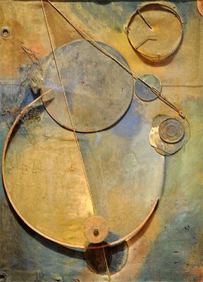
Artwork description & Analysis: This work demonstrates a significant shift in Schwitters’ early artistic practice from primarily conservative figurative painting to abstract collage. After World War I, Schwitters began to collect broken and discarded materials he found on the streets and arrange them into works of art. Born from the rubble left by the war, these works emphasize the fact that art can be made from destruction; that urban detritus could be made into something beautiful. In Revolving, found items are organized to form lines and shapes to which he adds bits of yellow and blue paint for shading.

2-(The Clown) (c. 1945-7)

Untitled (The Clown) (c. 1945-7)

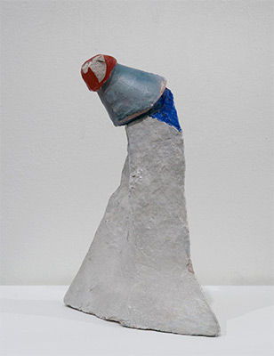
Artwork description & Analysis: Fashioned from plaster and found objects, this diminutive assemblage is characteristic of the mixed media sculptures Schwitters produced toward the end of his life, while exiled in England. Despite its unassuming stature and materials, this sculpture embodies the enduring tenderness and whimsy unique to the artist’s oeuvre.

my favorite art pieces of his:

Image result for Kurt Schwitters

Image result for Kurt Schwitters       Image result for Kurt Schwitters    Image result for Kurt Schwitters


I really enjoy looking at Kurt’s art as it has a lot of texture, color, and meaning to it. I also like the fact that he uses anything like garbage scraps and scraps left from the after war to create his master pieces.

photo montage task

what is it?


 Photomontage is the process and the result of making a composite photograph by cutting, gluing, rearranging and overlapping two or more photographs into a new image. Sometimes the resulting composite image is photographed so that a final image may appear as a seamless photographic print. A similar method, although one that does not use film, is realized today through image-editing software. This latter technique is referred to by professionals as “compositing”, and in casual usage is often called “photoshopping” (from the name of the popular software system). A composite of related photographs to extend a view of a single scene or subject would not be labeled as a montage.

history of photomontage:


The first and most famous mid-Victorian photomontage (then called combination printing) was “The Two Ways of Life” (1857) by Oscar Rejlander, followed shortly thereafter by the images of photographer Henry Peach Robinsonsuch as “Fading Away” (1858). These works actively set out to challenge the then-dominant painting and theatrical tableau vivants.

In 1916, John Heartfield and George Grosz experimented with pasting pictures together, a form of art later named “Photomontage.”

The pioneering techniques of early photomontage artists were co-opted by the advertising industry from the late 1920s onward. The American photographer Alfred Gescheidt, while working primarily in advertising and commercial art in the 1960s and 1970s, used photomontage techniques to create satirical posters and postcards.

Image result for first photomontage

this is probably the first photomontage ever came out

late 20th century photomontage eh Hannah Hosh

Hannah Höch ; 1 November 1889 – 31 May 1978) was a German Dada artist. She is best known for her work of the Weimar period, when she was one of the originators of photomontage.[1] Photomontage is a type of collage in which the pasted items are actual photographs, or photographic reproductions pulled from the press and other widely produced media.

Höch was not only a rare female practicing prominently in the arts in the early part of the 20thcentury – near unique as a female active in the Dada movement that coalesced in her time – she also consciously promoted the idea of women working creatively more generally in society. She explicitly addressed in her pioneering artwork in the form of photomontage the issue of gender and the figure of woman in modern society. Her transformation of the visual elements of others by integrating them into her own larger creative projects evidenced a well-developed early example of “appropriation” as an artistic technique.

Image result for late 20th century photomontage eh hannah hoch
Höch also helped expand the notion of what could be considered art by incorporating found elements of popular culture into “higher” art. She was one of many Dadaists to take advantage of such means, but she was both among the first, and one of the most self-consciously explicit in describing the goals and effects of doing so.

Identity and place introduction

Identity and place

I would describe identity as being a person’s personality and character, but i can also involve a person’s gender,geographical location, political views and social standing. Identity also encompasses one’s culture and this can be influenced depending on someone’s social or geographical location, or their place. 


Mind map

Mood Board

Not my images.

Tableaux Part1:

Tableaux Photography:

what is it?

A tableau vivant, French for ‘living picture’, is a static scene containing one or more actors or models. They are stationary and silent, usually in costume, carefully posed, with props and/or scenery, and may be theatrically lit. It thus combines aspects of theatre and the visual arts.

The idea of tableaux photography is so that we can re create famous images by finding similar props and outfits. The setting and lighting also have an imapct on the outcomes for tableaux. The whole point is to make the image as close to the original as possible. Therefore the setting and all the models expressions have to be near enough the same.

Above this post are all of our class attempts for tableaux photography. We found it quite challenging to keep the same facial expressions because we were stationed in all sorts of positions so at the end of the day most of the outcomes are either fairly blured or fairly dark, however re- creating the images from Caravaggio was quite fun.


Mood Board:


These are just examples taken off google images when searching in ‘ Tableaux Vivant’ some examples in the mood board above are actually examples from Tom Hunter, who’s worked is based on tableaux photography.

Zhao Xiaomeng/ Rita Puig Serra Costa – Case Study (Possessions)

I chose to study Rita due to the sense of identity in her portraits of still life items. While there is no human subject in the photo, it is still structured like a traditional portrait allowing the photos to tell a story behind the object while leaving an air of ambiguity around the photos.

As far as technical aspects of the images go, they are structured like a typical portrait with soft lighting to avoid harsh shadows and a typically larger aperture to allow for a narrow depth of field while still allowing for a wide DoF in wider shots. She also appears to use a slower shutter speed due to the strong contrast and colors in the photos. The subjects in most of her photos are centralized in the image creating a fell of importance to the subjects. It looks as though her images could made using film due to the slight grain and Gaussian blur. The lower images seems to be exhibiting bokeh as well also suggesting that this is taken on film.

Image result for rita puig serra costaImage result for rita puig serra costa

Images Sampled from Rita’s Book ‘Where Mimosa Bloom’

I like the idea of taking a portrait of a statue as it allows for exploration of traditional portraiture techniques while still sticking with the idea of still life portraiture and I believe that the broken statue can tell a much more powerful story than a traditional portrait.

Zhao Xiaomeng took many photographs of abandoned bikes scattered across the streets of Beijing. I personally like how much about someones personality you can tell from the scattered bikes, they all have various adjustments and additions made to make the previous owners life just a little bit easier. I like the compositions of the images as I like how somewhat abstract still life photography is being framed as though it is a traditional portrait, with rather blank backgrounds to allow the subject to strongly contrast it. Most of the subjects have some strong color either from the weathered paint or the rust patina. It looks as though he has used a small aperture due to the wide depth of field, as a consequence of this I believe that the photos were taken using a long shutter speed and low ISO due to the amount of detail captured in the photos. The photos are rather de-saturated but still show color depth.

Image result for zhao xiaomengImage result for zhao xiaomengImage result for zhao xiaomeng

Identity and Place – Post 5 (Editing)

Masked Portraits

Editing Process:

1. Original image opened in Adobe Photoshop.

2. First I used the “curves” to change the tonality of the image and to create highlights, low lights and increase contrast.

3. I then used the “black & white” feature to take the colour out of the image and cause the mask to stand out from the black hoodie and darker grey background.

4. I then added a tint from the colour library in the “black & white” menu to add subtle tint to the image

5. I repeated step 2, adjusting the curves after having set the image to black and white to ensure the image had slightly more extreme levels of contrast than I wanted.

6. Finally, I used the “brightness/contrast” function to actually decrease the “contrast” as i found this resulted in the shadows on the mask being smoother.

7. I repeated these steps for all 4 of my final images from this shoot.

Final Edits:


Edited Portraits

Editing Process:

1. Original image opened in Adobe Photoshop.

2. I began with the “spot healing brush tool” in order to clear the skin of any blemishes or marks.

3. Then I used the “blur tool” in order to minimise pores and smooth out the skin to make hiding features easier.

4. I selected the “lasso tool” and cut out a smooth area of the face with minimal amounts of colour differences so the cut out area is not noticable after blending.

5. Using “ctrl+J” and “ctrl+T” I resized and re-positioned the cut out area over the mouth. Then selecting “flatten image” to allow me to start blending out the border between the image and the cut out

6. Using a combination of “spot healing brush tool“, “healing brush tool” and “blur tool” I blended the cut out area in with the image to create a face without a mouth or noticeable editing lines or patches.

7. I then repeated steps 4-6 to cover the nose.

8. I selected the “black & white” feature, increasing the brightness of reds to create a paler complexion and help separate the face from the black background.

9. Finally I used the “sharpen tool” on the eyes to cause them to stand out more and bring the face together.

Final Edits: