Chiaoscuro and Rembrantdt lighting

What is Chiaoscuro?

The book definition of Chiaroscuro is when an image is manipulated to the effect of contracted light and shadow. Chiaroscuro is an Italian word simply translated to ‘light-dark’. In the painting industry (paintings etc.) the particular description refers to sharp tonal contrasts which can be and often are used to suggest the volume and modelling of the subjects being used. Similar effects in cinema and photography also are called chiaroscuro. Artists often used bold contracts to help emphasis the image and the overall affect.

In photography, chiaroscuro can be produced with the use of Rembrantdt lighting.  In more highly developed photographic processes, this technique also may be know as ambient/natural lighting although when done so for the effect,. This can make the image look artificial and not generally found to be ‘natural’.

Artists who are famed for the use of chiaroscuro include Leonardo da Vinci and Caravaggio. Leonardo employed it to give a vivid impression of the three-dimensional  figures within his image, while Caravaggio used such contrasts for the sake of drama. Both artists were also aware of the emotional impact of these effect of this technique.

The term chiaroscuro originated during the Renaissance as drawing on colored paper.

Traditional realism painting:

Image result for renaissance paintings dark and li8hgt

For example one of Leonardo da Vinci most famous paintings entitled The Mona Lisa:

Image result for mona lisa

What is Rembrantdt lighting?

Rembrantdt is linked to studio with the use of either one studio like pols a reflector or two studio lights. Rembrantdt lighting gave photographers the opportunity to produce images that allow for some what natural feel whilst also have a more  complex side to that particular image while only using a minimum about of equipment. This made these types of images much easier to produce. Rembrantdt is named after the Dutch painter, Rembrantdt who was often found using this lighting. Rembrandt lighting is described as a illuminated/ bright triangle under the eye of the subject on the less illuminated/dimmer side of the face.

Most commonly, the main light is placed higher, to one side at the front behind the camera and then the reflector is positioned half- height and on the other side at the front, behind the camera. This is set to about half the power of the key light (main light) with the subject facing at an angle to the camera,  with the key light illuminating the far side of the face. What is evident, is that to fully and correctly use this particular type of lighting, it is important  to create the triangle or diamond shape of light underneath the eye. where one side of the face is illuminated from the main source of light while the other sided being covered in shadow, to create the geometric form on the subjects face.

One of Rembrantdt’s paintings:
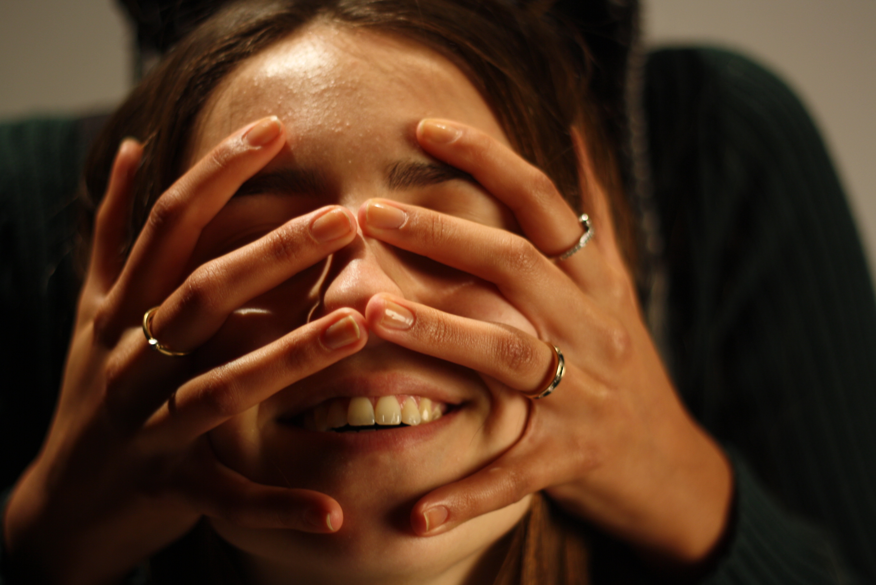
 

My own Work:

After researching Chiaroscuro and Rembantdt lighting I had ago at creating my own images much inspired by these two types of lighting to do with light and dark contrasting with shadows. For my first image i kept it simple with one subject facing onward to the camera with the light shinning on to the subjects face from her left causing the the right side of her face to be covered by shadows causing a dramatic effect and feeling from the image.

 After taking multiple picture using the traditional method i then decided to experiment with  the subject and the colors created. I wanted to see how color could effect the overall feel and effect of the image whilst still considering the Chiaroscuro and Rembantdt lighting technique. This is what i cam up with.

I created four images with all different poses with a selection of  four colors- blue, pink, green and yellow using the Chiaroscuro and Rembantdt lighting method. Each image i believe created a different view and opinion as color are fairly contrasting with different poses leading to unique emotions being created from the image.

Other images:

Studio Lighting

Types of lighting

There are many different types of lighting that create many different types of images and can cause different feelings towards an image. These include:

  • Intensity of the light
  • Direction of the light
  • Temperature of the light and white balance
  • Using reflectors (silver / gold)
  • Studio lighting
  • Natural lighting

Flat light:

Flat light is very different from soft and hard light, flat lighting causes the minimum contrasts in an image/scene.This means there is pretty much no significant contrast between the highlights and shadows of that particular image.

Split light:

Split lighting is simply the use of one light angled at 90 degrees from the subject you are photographing and placed a bit higher that their eye level. Leaving one half of the face exposed to the light and other in shadow.

Back light:

Back lighting is basically the main light shining in from behind the subject, pretty much so that the back light is some what facing onward towards the camera.

Natural lighting:

Natural lighting is the most basic type of lighting and refers to mainly light produced from the sun.  In other words ambient light (meaning the available light in an environment) can be considered as natural light as it is photographer’s lighting equipment. This usually indicates natural lighting from outside that lights up a room through a window. There are three different types of natural lighting they include:

  • Intensity of light
  • Direction of light
  • Temperature of the light

Studio lighting:

Studio light is essential for most photographers and allows photographers to create natural lighting effects in a variety of situations that the photographer controls. This helps us change and alter things:

  • Filter lighting
  • Distance from subject to create hard / soft light
  • Angles and directions
  • reflectors and diffuses

By using studio lighting it allows a large range of equipment to be used, for example, soft-boxes, umbrella lights, spot lights and floodlights.

Why use this particular lighting?

Studio lighting allows the photographer to have full control of the image being created, and can help us imitate almost all types of lighting with the right equipment.

Flash:

Flash units offer a range of possibilities in both low and high lighting scenarios:

  • fill-in flash flash “bouncing”
  • TTL / speedlight flash
  • remote / infra-red flash (studio lighting)
  • fast + slow synch flash
  • light painting c/w slow shutter speeds

What is the difference between 1-2-3 point lighting and what does each technique provide?

Point lightning 1:

Point lighting is the most common and can sometimes be accidental for example when taking a photos outside with the sun shinning- this is a prime example of one point light this can be proven to mainly natural images/light. However one point lighting could lead to a rather dramatic image being produced, with the light being focused on one section/area/or the whole subject.

Point lightning 2:

Although not as popular 2 point lighting can also be proved to be extremely beneficial as the  lighting allows the main subject to stand out much more, creating a stronger 3D image as the two point lighting creates much stronger shadows leading to more dimensional angles  throughout.

Point lightning 3:

The goal of three point lighting is to create the illusion of a three-dimensional subject in a two-dimensional image.  whilst removing background shadow produced by the subject/ clashing lights. this is proven an extremely popular technique commonly used.


WEEK 6- CREATING PHOTO MONTAGES

Creating photo montages

In order to understand more about photo montages, i created multiple montages using adobe Photoshop. When creating my montages i used Eugenia Loli as a inspiration for my images as i though her photo montages were very unique ( separate page on her work).

In this experiment i wanted to create a piece which was similar to Eugenia Loli’s. I liked the overall concept stylistic approach that she created and in order to create the same stylistic picture i used a layering technique. I kept my image very colorful just like Loli’s as it gives a child like look to the image which i quite like. I used the galaxy background as my first layer which i didn’t edit at all. My second layer was the man in the image which i edited out of the original image by using the cut out tool. This tool cut around the man in the picture so that i was able to drag this section out of the picture to layer one. Once the man was placed how i wanted it on layer one i then focused on layer three where i used the same technique to cut the blue hand out of an image. The blue hand originally came from the artist Steven Spangler who i had gained inspiration from in the past and i though that this image would be a good fit for the theme i was creating. My other aim for using the layering technique was to create a noticeable 3D technique which is successfully did. My final step of this montage what editing the brighness to higher than it originally was which has made the image stand out more.  I am overall very happy with how this turned out.


In my response to John Stezaker, i decided to create my own photo montage. First of all i used a picture off the internet of two people in offices which i then edited using Photoshop. When editing this image, i created a layer each for the fire explosions. I then cropped each original picture to the part of the fire i wanted and used the ‘move’ tool to move the layer to layer 1 ( office layer). Using the ‘brush’ tool, i then made the fire into head shapes. My reasoning for making their heads into fire explosions is due to that being the mind set that they have. Their heads act as the disaster which they are putting into the world.  This photo montage is used to express my negative viewpoints towards the government and the way that their minds cause our misery.  As seen their is a similarity between mine and Stezaker’s work as we both edited different images onto people faces.


Michael Dickinson – Photo Montage

Photographer Reference

Michael Dickinson

Micheal Dickinson isn’t for the faint hearted. This artist creates photo montages that deal insensitively to world politics and disasters. His work depicts dark scenes which offend and uncivilly reflect work crisis or extreme politics.

I became interested in his work due to his style of having no limits or boundaries-   has no line to cross. He unveils taboo topics and makes them worthy of talking about. For example: in one of his compositions he has placed 3 malnourished children in a market place, the idea of this sounds cruel but it does have a message and in this instance its about how readily available resources are yet they never reach the ones in need most.

Analysis

VISUAL

This composition is of 3 malnourished children, surrounded by a ‘market place’ – this actually all made up of food magazine photographs. In the background there are cafe signs with ‘Hungry Man’ branding, this contradicts and juxtaposes the idea of these starving children.

TECHNICAL

In order to create this image, Dickinson has digitally manipulated individual images then layered them to create a readable image. These images started off as magazine adverts and articles then were removed from their origin, placed into another and manipulated to still make sense.

CONTEXT

‘Historically, photo montage has been used for powerful political expression and outrage. But that was then. Back in history. When Hitler walked the streets, and the world was a terrible, terrible place. Now it’s far more complicated. We need some courtesy. Some restraint. We need affirmative images. Positive things. Not offensive depictions that no one cares about in the slightest.’


Own Responses – Photo Montage #3

My Photo-montages

In the style of David Hockney

David Hockney is well known for his ‘Joiner Portraits’ in which he would piece together different and varying numbers of Polaroid snaps or prints of a single subject. Hockney arranged a patchwork to make a composite image. One of his first photo-montages was of his mother. Because these photographs are taken from different perspectives and at slightly different times, the result is work that has a relation to Cubism, which was one of Hockney’s major aims: exploring the way human vision works and how things are portrayed.

“In the early 1980’s, English painter David Hockney began creating intricate photo collages that he called “joiners”. His earlier collages consisted of grid-like compositions made up of polaroid photographs. He then switched to photo lab-processed 35mm photographs and created collages that took on a shape of their own, creating abstract representations of the scenes he had photographed. The varied exposures of the individual photographs that make up each collage give each work a fluidity and movement that otherwise might not be found.” Juxtapoz Magazine.

My Response

Passport photo of my Mother in the 70s

The photo-montage above is a response to David Hockney’s style. I used an old passport photo of my Mother from the 70s, in order to create an old fashioned and vintage style photo-montage. I experimented with using Photoshop, cutting out different sections of the photo and re-pasting them on in different positions, and places where they do not belong.