WHAT IS A PHOTO MONTAGE:
Photomontage is a combination of several shots joined together for artistic effect or to show more of the subject than can be shown in a single artwork. Images were composed by cutting, gluing, arranging and overlapping two or more photos or reproductions of photos together, sometimes in combination with other non-photographic material such as text or other abstract shapes.
source: https://www.widewalls.ch/photomontage-art/
MOODBOARD:
Photomontages vary a lot in style and design. Artists choose to use a multitude of subjects such as portraits, natural environments, natural landscapes, city landscapes and different objects which are combined together for artistic effect.

MIND MAP:
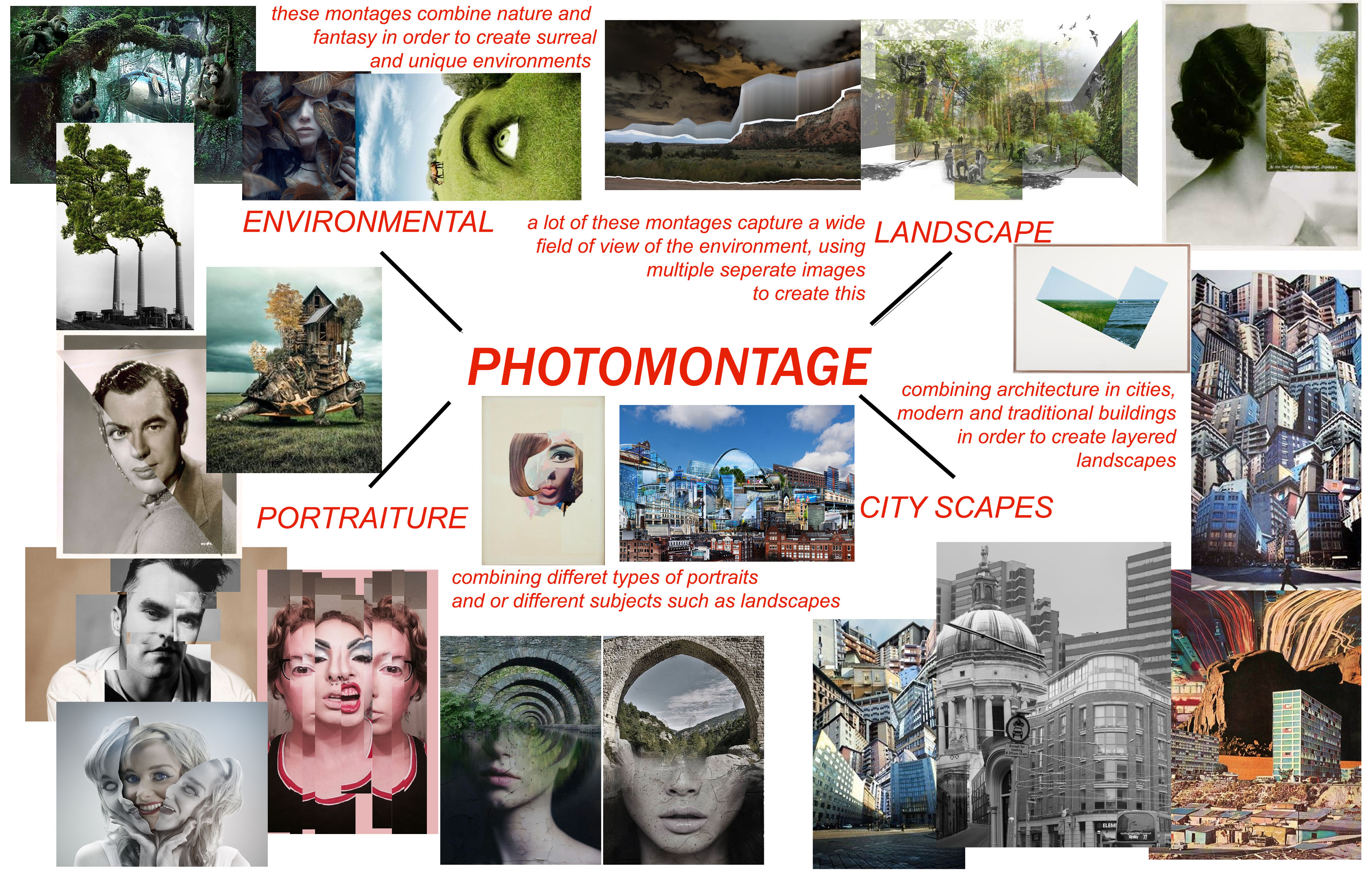
When looking at the search results which come from searching “photomontage”, there are 4 main themes which typically come up. Therefore I separated my mind map into 4 sections, environmental, landscape, city-scapes, and portraiture.
JESSE DAXLER:
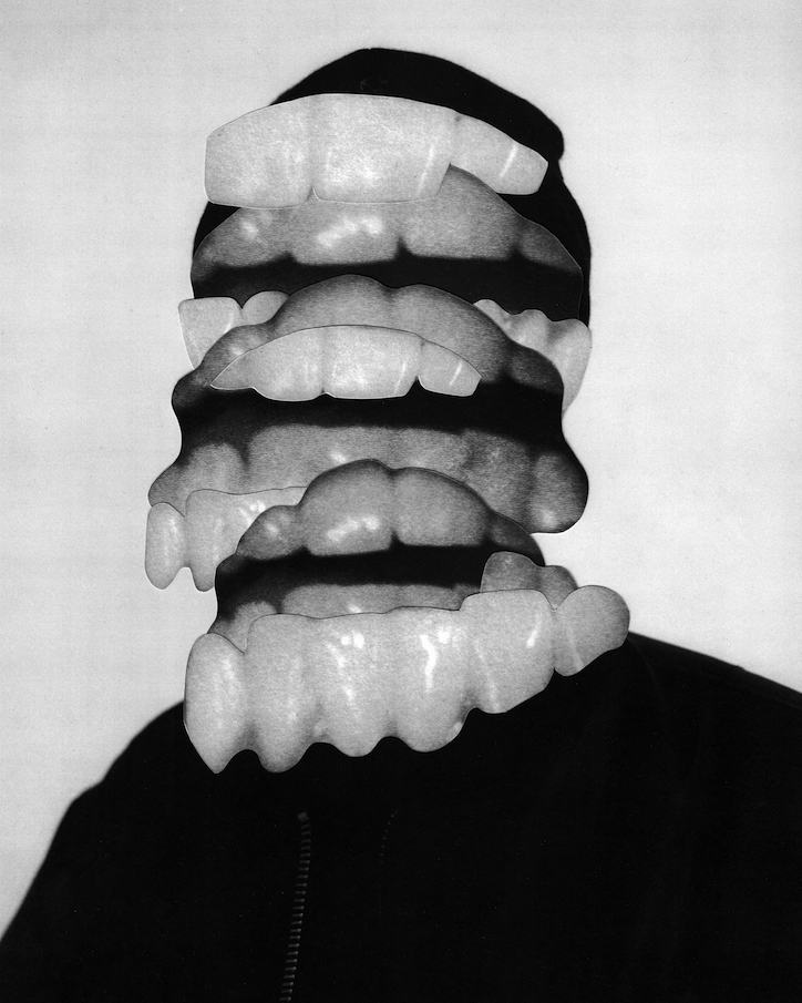
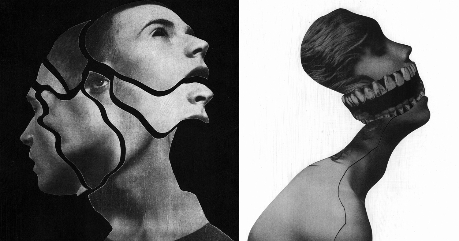
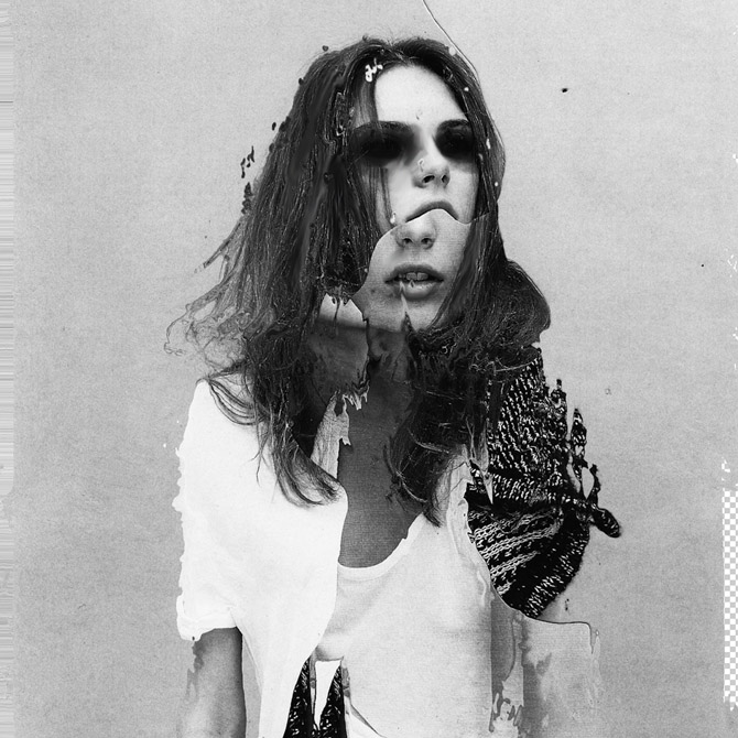
The artists work which intrigued me most when researching the topic of photo montages was Jesse Daxler, a photographer which uses portraiture in order to create her art work.
Jesse Draxler is an American artist, born in 1981 in Wisconsin. He lives and works in Los Angeles. He obtained his Bachelor of Fine Arts from the College of Visual Arts in St. Paul, Minnesota. The artist has a mixed approach: he does collages, but also texts or animated portraits in GIF. The central theme of his work is to transform and twist the original image, and turn it into something else. Mainly known for his collages, they often have sexual connotations, a visual impact and an attractive aesthetic, willing to shake up, or even disturb the spectator. Jesse Draxler likes deconstructing the classic idea of beauty and therefore paint Greek statues with spray paint, spilling ink on a fashion photo or cutting parts of human bodies. The artist makes hand-made collages, with the desire to make the spectator wonder if something is hidden under the surface. Jesse Draxler’s work was recently exhibited during solo exhibitions at Booth Gallery in New York (2016) and during collective exhibitions at The Unit in London(2015). Jesse Draxler also works with magazines, brands and designers. Among his clients are New York Times, Alexander McQueen, The Black Queen, or even Prince.
JESSE DRAXLER: “It’s a scientific exploration of what our knowledge of mortality does to our psyche. Basically, it says that everything we do in life, on every level, is at the core influenced by the idea that we’re going to die someday. It’s something that I’ve researched a lot, but I had never found a scientific exploration of it. It’s always an emotive or philosophical way of writing, so a scientific exploration was really refreshing—straight facts and research. I first came across it midsummer last year. My friend Greg Puciato, from Dillinger Escape Plan, we have a lot in common, so we were exchanging books and he told me to check it out.”

CRITICAL ANALYSIS OF WORK:
TECHNICAL –
In terms of the technical aspects of this photo, extremely heavy editing has been used in order to create a very surreal, almost abstract image. Various editing techniques have been used from simple color adjustments, geometric cutting, using the brush tool and smudge tool. The overall image has also been made back and white which remain consistent throughout Draxlers work. It is also very bright and slightly overexposed. He has also chosen to remove a little slice of the background in order to reveal the checkered blank Photoshop document. I believe this image was likely taken in a studio environment judging from the even lighting which hits the face of the model.
VISUAL –
The initial feeling which hits the viewer upon seeing this image is unease. The dark, colored in, black eyes make this image quite unsettling, making us question why this has been done. The tone of black which has been used for the eyes is very dark, making them the focal point of the image, drawing in the viewer. There is a certain sense of juxtaposition in this image with the use of the youthful model, editing the images to become jagged old and unsettling. The correlating themes of this image which come to mind are delusion, possession and evil. I come to this conclusion through the collective visual effect of all the different elements in this image, the edges, juxtaposition, use of grey scale and strong editing. The black and white filter which has been applied to the image dulls out any life in the image, and makes it monochromatic.
The edges of the different layers of the image are quite jagged and uneven, which gives the image a weathered and old feel. The messy hair and black eyes of the model could potentially signify mental illness or other forms of hallucination. The backdrop is white and clean, making the main subject of the image stand out in the foreground. There is no real sense of pattern or symmetry in this image, everything is chaotic and uneven. Draxler has also used negative space in this image to give another layer of depth to the image. The jagged nature of the edges, gives the image a lot of texture. Although being monochromatic, the image is fairly light and bright as Draxler has used white negative space and the clothing of the model is also light in color.
CONCEPTUAL –
All of Draxlers work is composed of a black and white color pallete, commenting, “When I began working exclusively in grey scale is when everything seemed to start to make sense,” says artist and illustrator Jesse Draxler of his dark, brooding style that combines collaged photography and painting, manifesting in large-scale paintings or commissioned illustrations. “It’s as if by freeing my mind from having to think about color I had gained a greater clarity for everything else, like when someone loses a sense their other senses heighten to compensate.” Jesse suspects that his preference for a black and white palette is informed by the fact he’s color blind, or “color deficient” as he calls it. “Though I don’t put too much weight behind just that.”
source: https://www.itsnicethat.com/articles/jesse-draxler-alexander-mcqueen-art-190318
CONTEXTUAL –
Jesse Draxler’s pieces are enigmatic explorations of existentialism. The artist tackles ideas of beauty, nihilism, sexuality, and absurdity through deconstructed images that incorporate found photos, abstract painting, and design, and the resulting pieces are dark, monochromatic, and visually challenging.
ACTION PLAN:
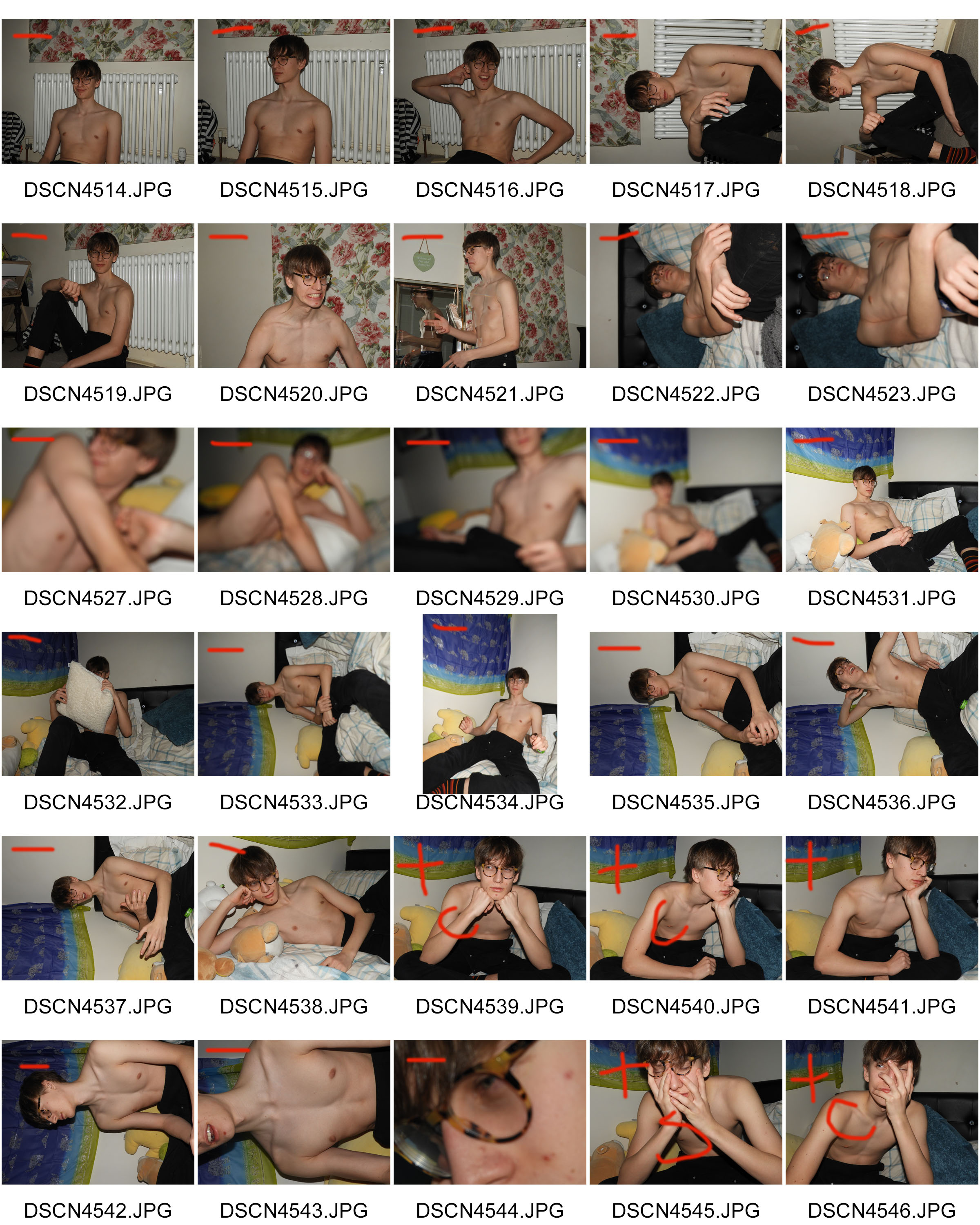
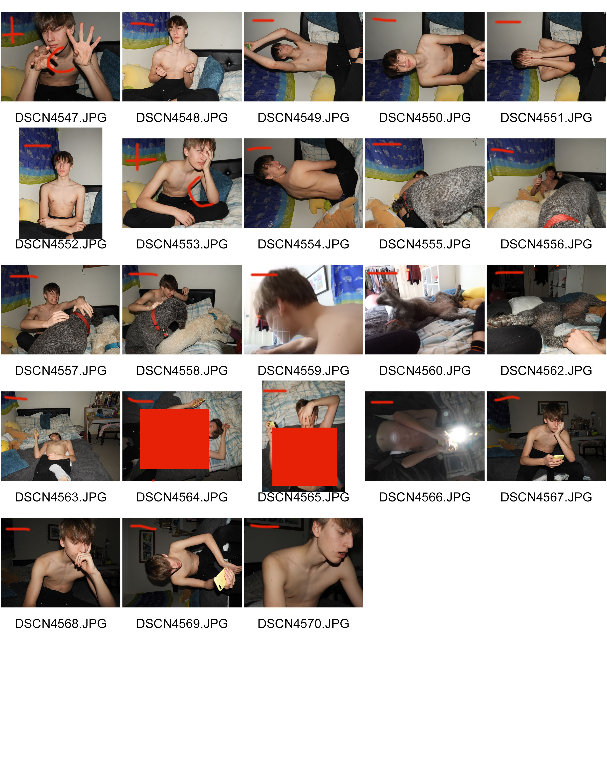
WHO – I took very causal images of just one model.In order to retain consistency and have a clearer canvas to work with when editing, the model is not wearing a shirt.
WHAT – I wanted to take as many images as possible in different positions in order to have different layers which I can later add to my photo montage.
WHEN – This was taken during the evening as I used lash photography and wanted there to be a striking contrast between the backdrop and the model.
WHERE – The images were taken indoors.
WHY – The images were taken as the starting material to use for my photo montage later, using different editing techniques in Photoshop in order to create a final product which incorporates artistic intentions and photography.
HOW – I used a dark room and flash photography in order to create the images.
CONTACT SHEETS:
EDITING TECHNIQUES:


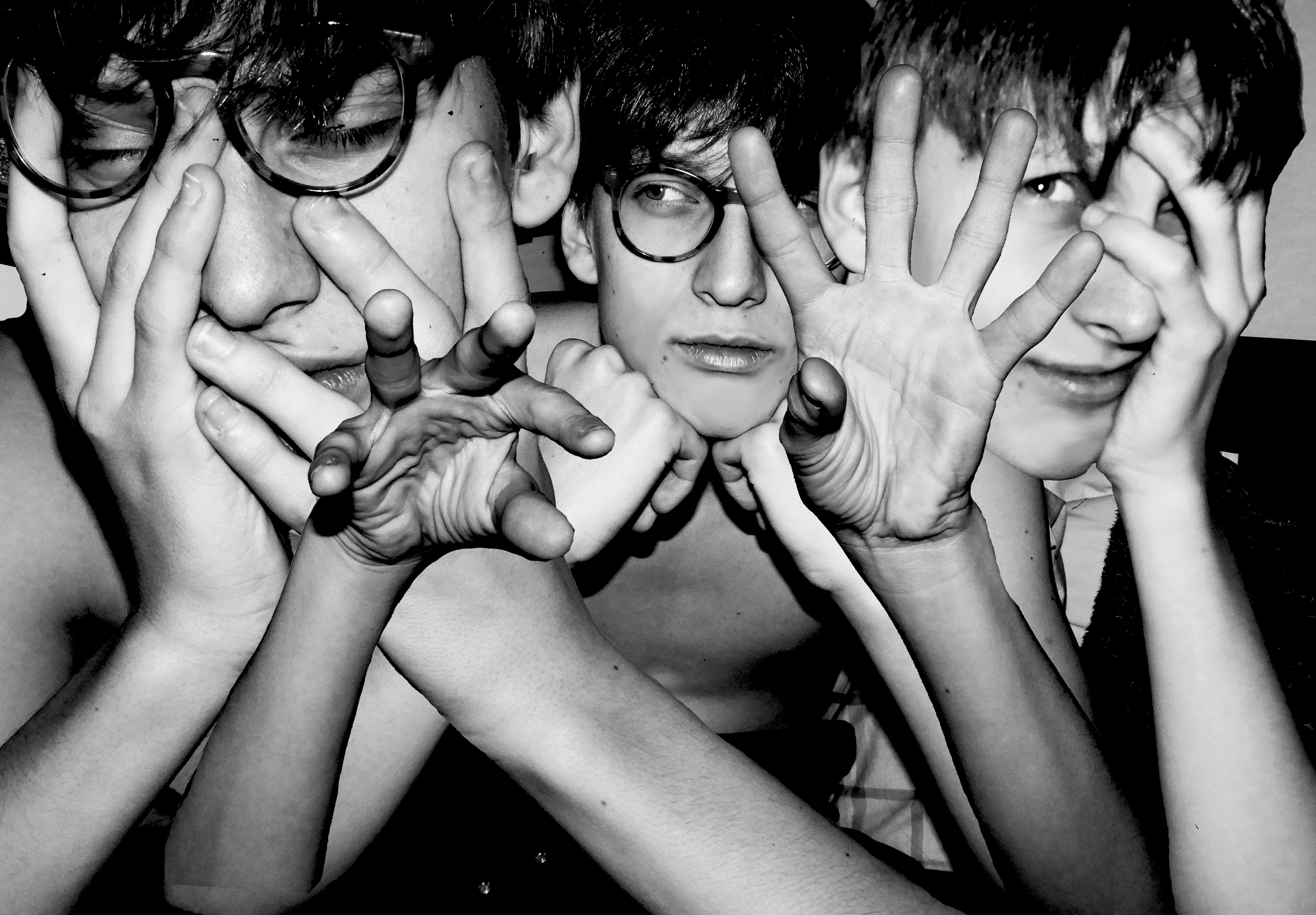
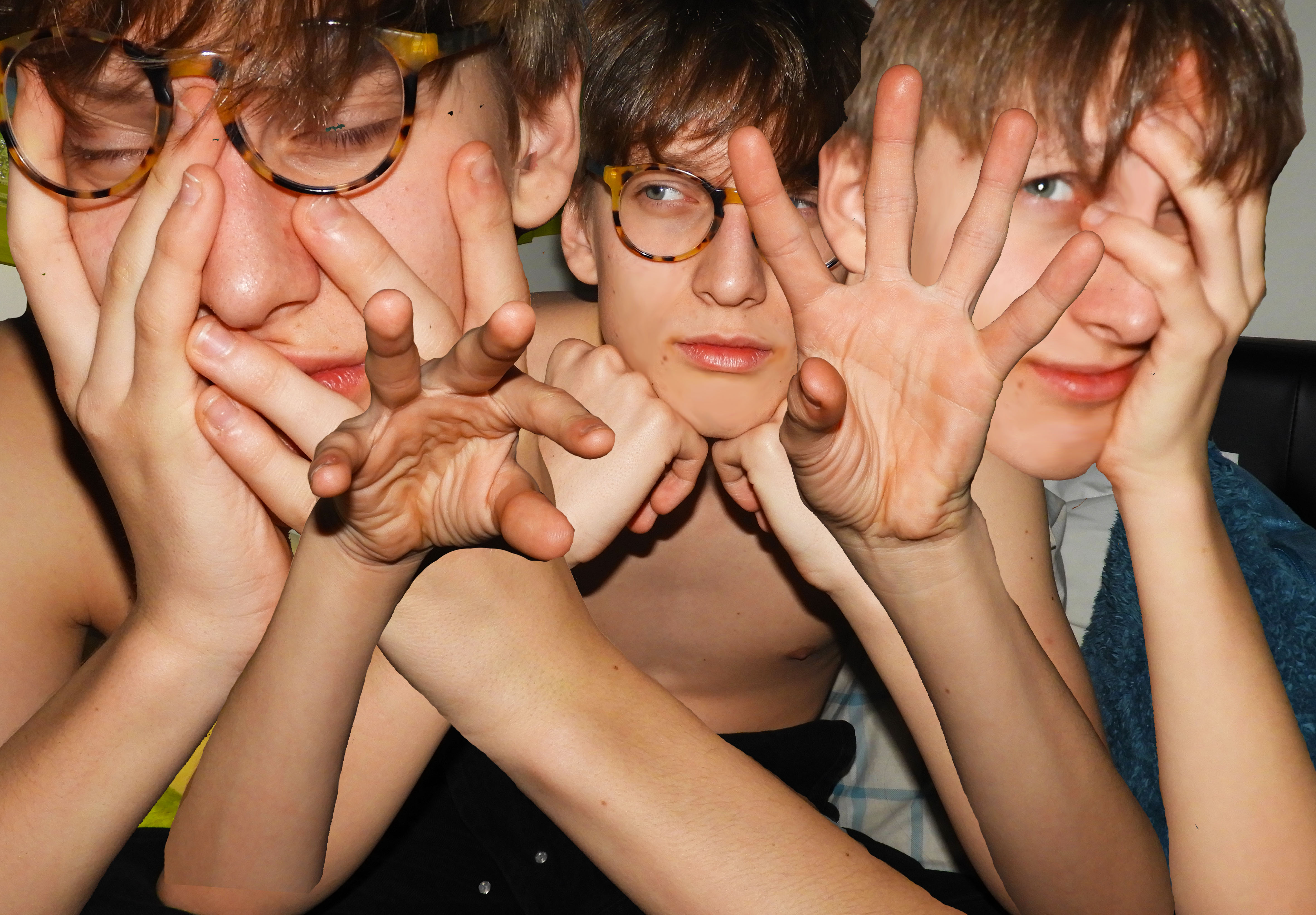
When editing this photo montage, I used multiple editing techniques in order to achieve the final product. I started with my base image, cropping it and perfecting the skin of the model in order to have a clean canvas to work with. I used the blur and smudge tool in order to smooth out the skin of the model. I imported another 3 additional images for the layering of the montage. The main tools which I used to cut out the hands and torso of the model was the magic wand, quick selection tool and magnetic lasso. I found the magic wand tool to be very useful as it allowed me to get rid of large areas of background quickly and efficiently. I only used the magnetic lasso tool when the area I was selecting had a clear backdrop, as the tool is very sensitive and catches onto other unnecessary parts easily.
I later on also used the eraser tool to smooth out any rough edges around the arms which were left behind. When arranging the arms, I used a transparent gradient so that they blend well into the skin around it, preventing harsh edges. I adjusted the size and positioning of the different layers so that they fill the surrounding space effectively and blend together seamlessly. I moved different layers around so that the central hands were in the very foreground of the image.
Once this was done, I again used the blur tool to soften the edges of the hair and make them a little less harsh. In the final stages of editing, I added a black and white filter onto the image and increased the contrast. I decreased the ofset in order to deepen the black and create a stronger gradient of black and white.
MY RESPONSE:
EVALUATION:
The overall process of creating this photo montage was fairly easy yet time consuming. The most difficult aspect was finding appropriate images which conveyed some feeling and variation in the facial expression of the model. I also wanted variation in the hand position of the model, as this is what makes the image unique and different. A key aspect of Draxler’s work is the consistent use of grey scale therefore I experimented with the different depths of black and white in the image.
COMPARISON TO KEY PHOTOGRAPHER:
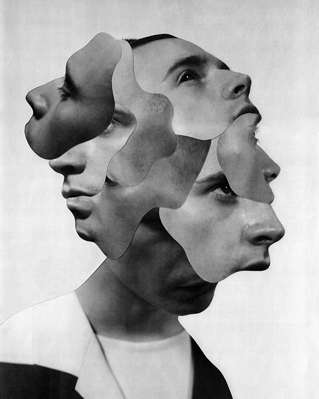
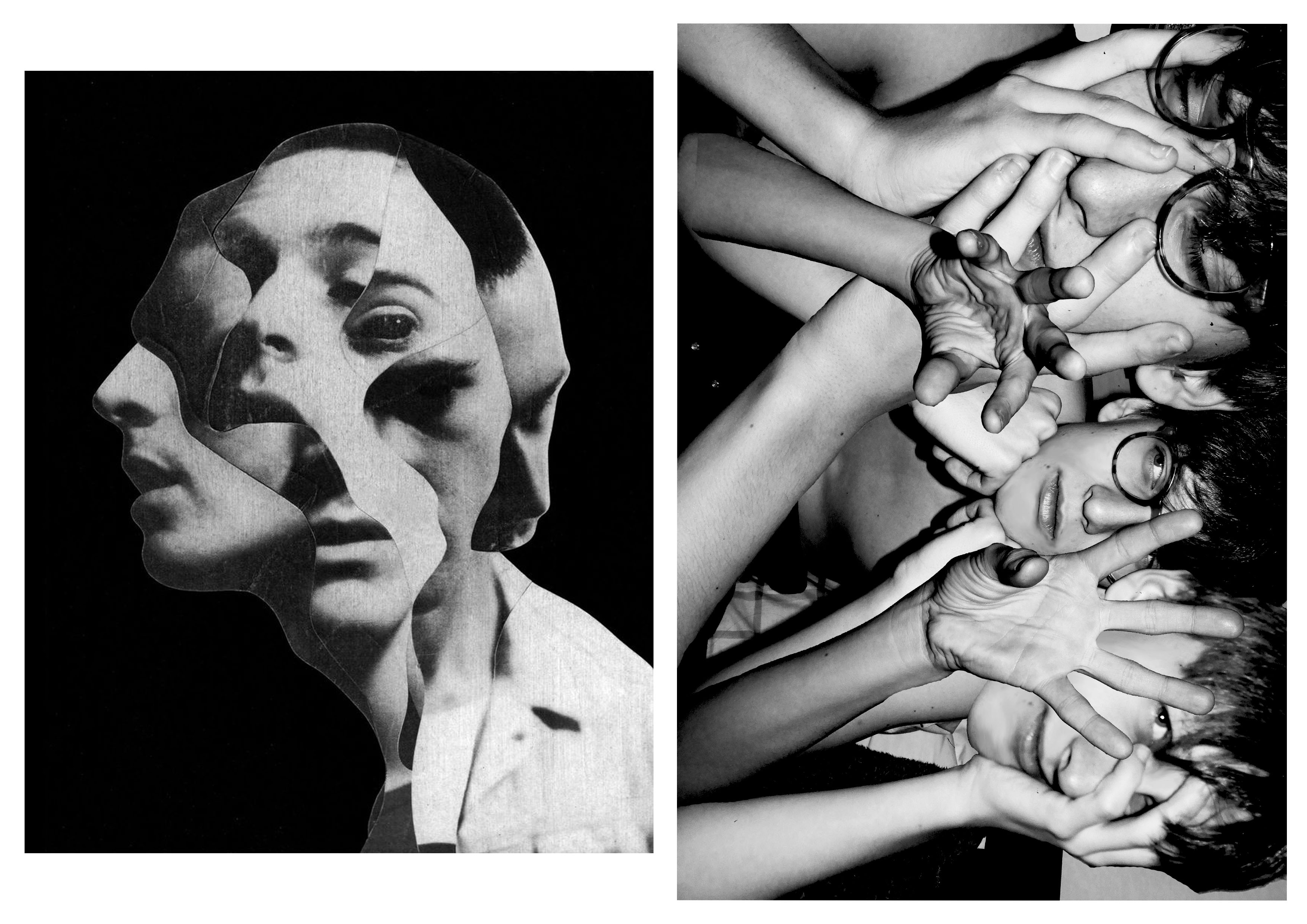
When making my photo collage, this specific photo from Draxler (misophonia) was my main inspiration. The main concept which I was trying to replicate was the duplication of the face of the model in the image. In order to add my own artistic elements and to differentiate my work, I decided not to use the irregular cut out pattern of Draxler. Another element which I used was the strong grey scale filter. I previewed my work without the filter and came to the conclusion that in order to create impact, the filter was needed.
CRITICAL ANALYSIS:
TECHNICAL –
During this photo shoot, the main objective was to create strong contrast between the backdrop and model using flash photography. It proved to be very effective as during the editing process, I could easily use the magic wand tool, lasso, and quick select tool to get rid of the backdrop. Whilst adjusting the light, I increased the exposure and contrast of the image to create dramatic lighting. I did not use any additional equipment such as tripod as I wanted the images to be less staged and more relaxed and casual, making the facial expressions of the model more genuine.
VISUAL –
I think when you first look at the image it is very striking and bold with the highly contrasting black and white, creating a monotone state. The themes which come to mind when looking at this image is worry and stress as expressed by the models face and hand positioning, touching the face and hair. There are many elements and layers involved in the image which create confusion. The hands central in the image have a gesture which pulls the viewer in, a sort of hypnotizing movement that makes them focus in. The straight lines of the edges of the arms, guides the eyes from the bottom of the image to the top where the hands and face are located. The central and right hand face are both looking into different directions which make the viewer question the circumstances of when the image was taken and what exactly the model is looking at. There is a sense of repetition and pattern with the use of the same face with different facial expressions and hand position. The hands of the model take position in the foreground of the image and the face in the mid-ground as they are covered by the hands and are shifted further back.
CONCEPTUAL –
The concept of this whole photo shoot was to be as authentic and relaxed as possible. Prior to the photo shoot, I asked the model what emotion they felt most significantly, tho which the answer was “worry”, therefore this was the theme which I tried to sustain throughout and make it clear in the final product. I chose images which clearly reflect this emotion and could be recognized by the viewer.
CONTEXTUAL –
The purpose of creating photo montages is to create hyper reality. Something which is pasted together to create an art piece which is surreal and fantasy like.
The process of creating a collage photo can be traced back to the first darkroom printing attempts, when photographers experimented with direct contact printing of objects placed on photographic plates, or techniques such as double exposure and masking. Of course, the art of “mounting the photos together” doesn’t have to involve the creation of new pictures at all – it can employ found and existing prints only as well, depending on the artist’s intentions and goals. Finally, with the advent of computers, the need of having physical imagery disappeared altogether, as today’s examples of photomontage art are being assembled within editing softwares and often never end up in a printed form.
Perhaps the most famous photomontage came during the mid-Victorian era. Then called “combination printing”, it was created by Oscar Rejlander, a pioneering photographer who was one of the experts in the field. His 1857 collage photo The Two Ways of Life was followed by the 1858 Fading Away by another artist, Henry Peach Robinson. By the end of the century, many other artworks came to life, specifically in forms of funny-looking postcards which often featured the wrong head stuck on a different body, or the creation of strange, impossible creatures. By the beginning of World War I, the method gained its first momentum, with photographers all over Europe producing postcards showing soldiers departing for battle with their loved ones seeing them off. More specifically, it was the Berlin Dada group that developed it as a tool of protest against the war and other political issues of the period, turning it into a proper modern art form.
source: https://www.widewalls.ch/photomontage-art/

Identity :
Concept; banking and lifestyle, the vaccuum of St Helier
Context; narrow options for young people—dreams, ambitions
Research: Lewis Bush / Mr Toft /
Experiments; gifs, time lapse, slo-mo, street photography appraoches
Photo-shoots; town shoot
Outcomes; range of options—you must look at visual examples to work towards