HAUTLIEU SENIOR MEAL – ENVIRONMENTAL

Sunday 16th December 2018

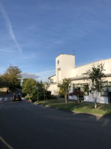
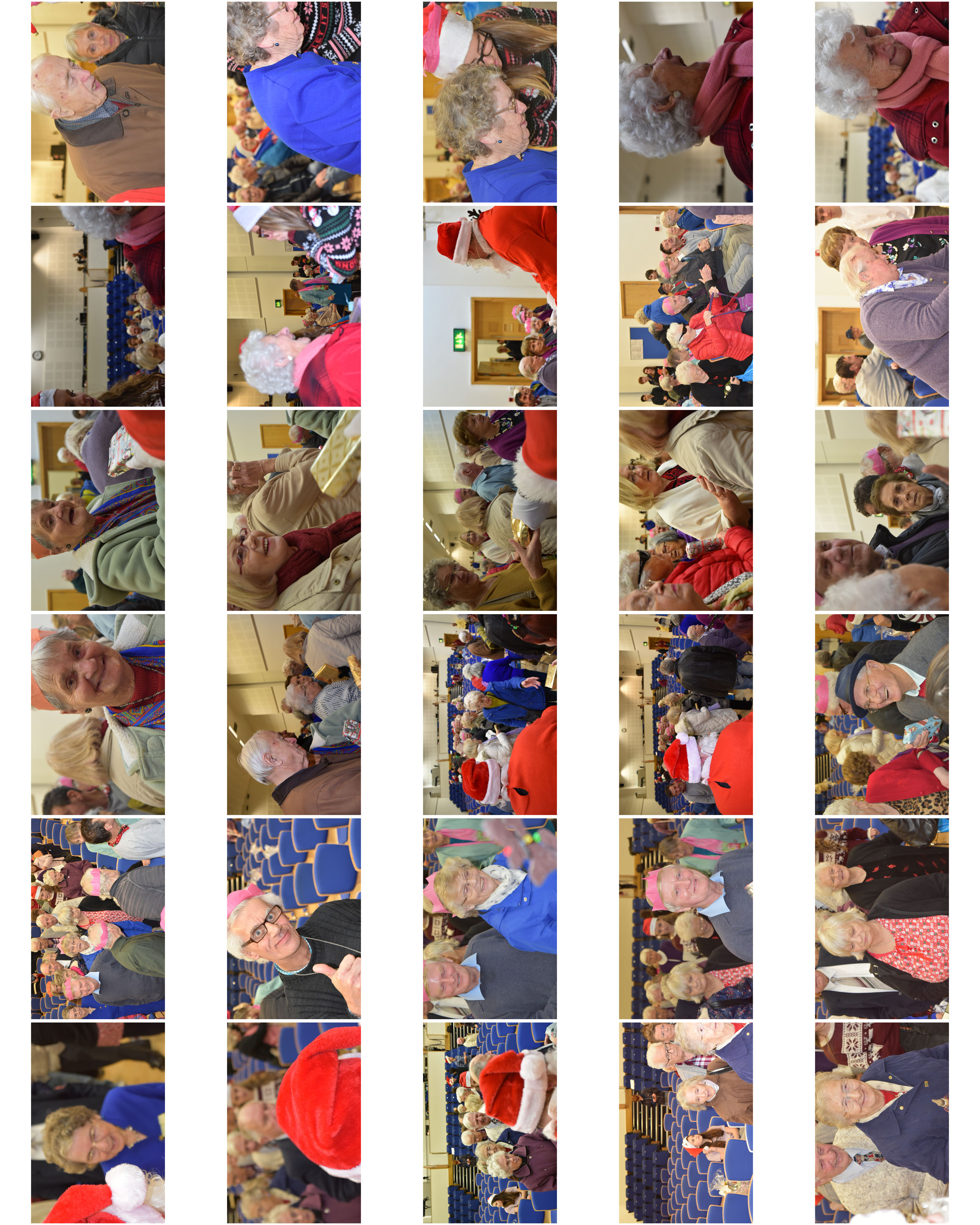
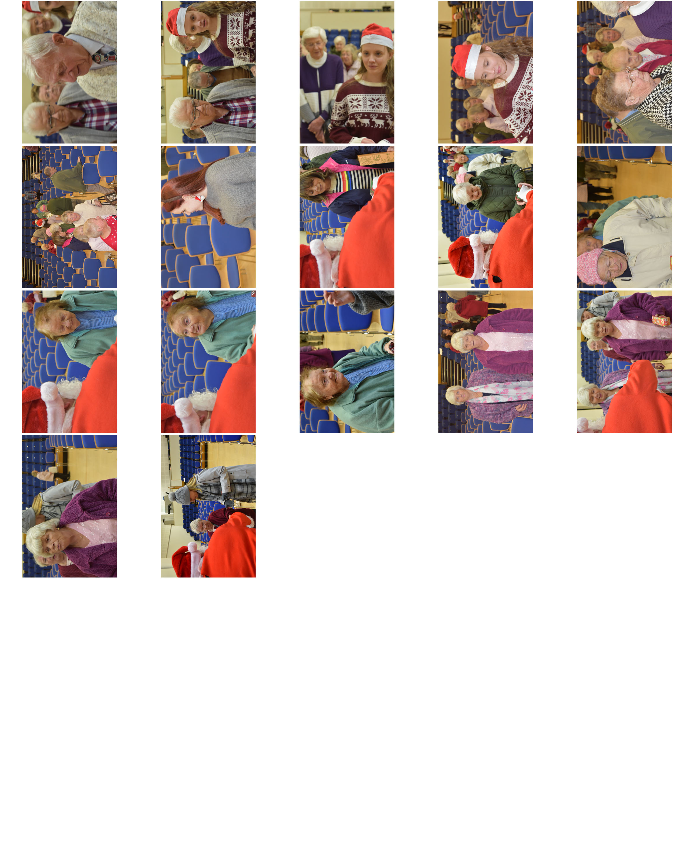
Each year Hautlieu School students and staff come together to host a Christmas party for the senior citizens that live in the school parish, St. Saviour. Hautlieu do this at Christmas time to ensure that seniors are included in our Christmas celebrations whilst also giving back and building a relationship with our wider community.

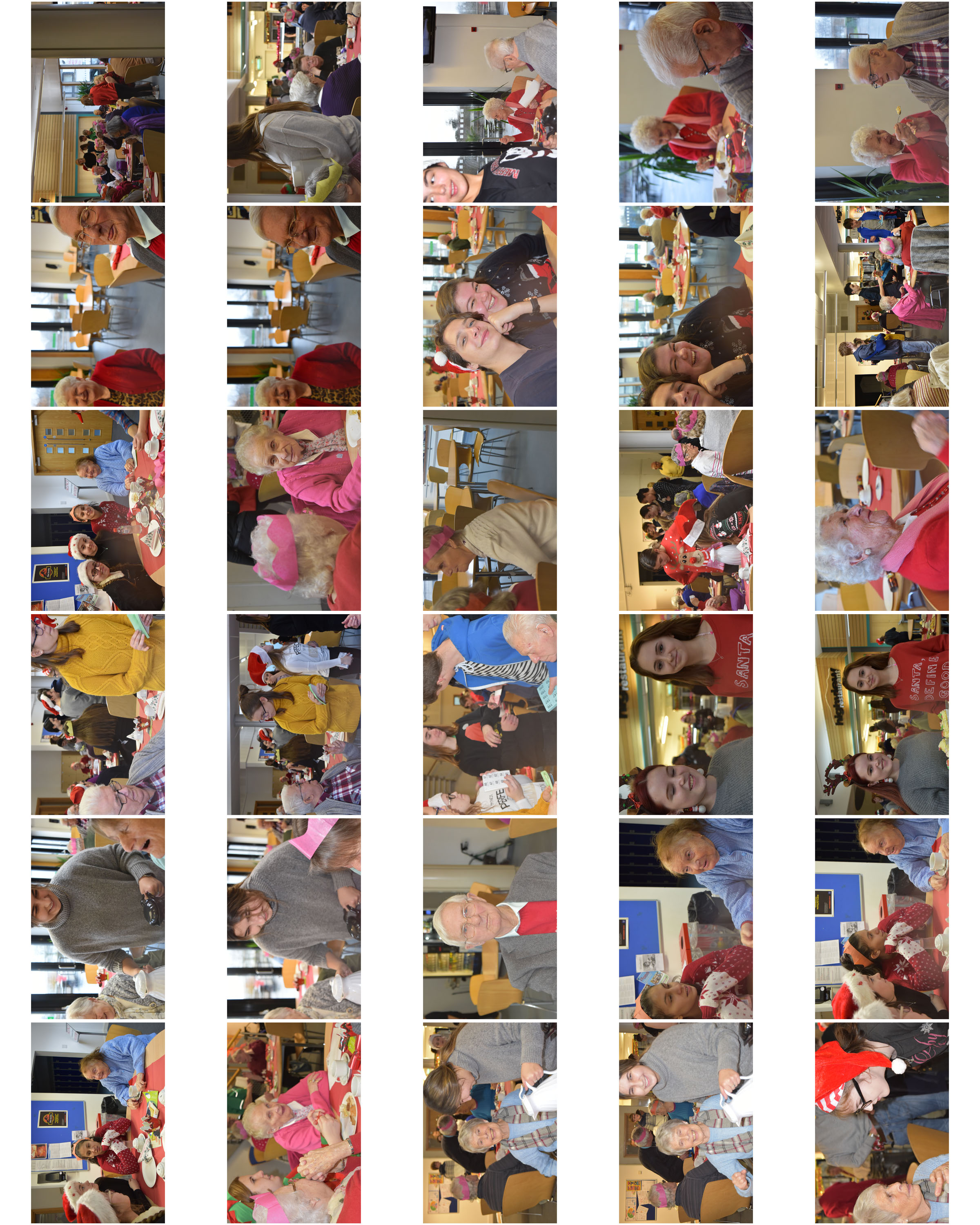
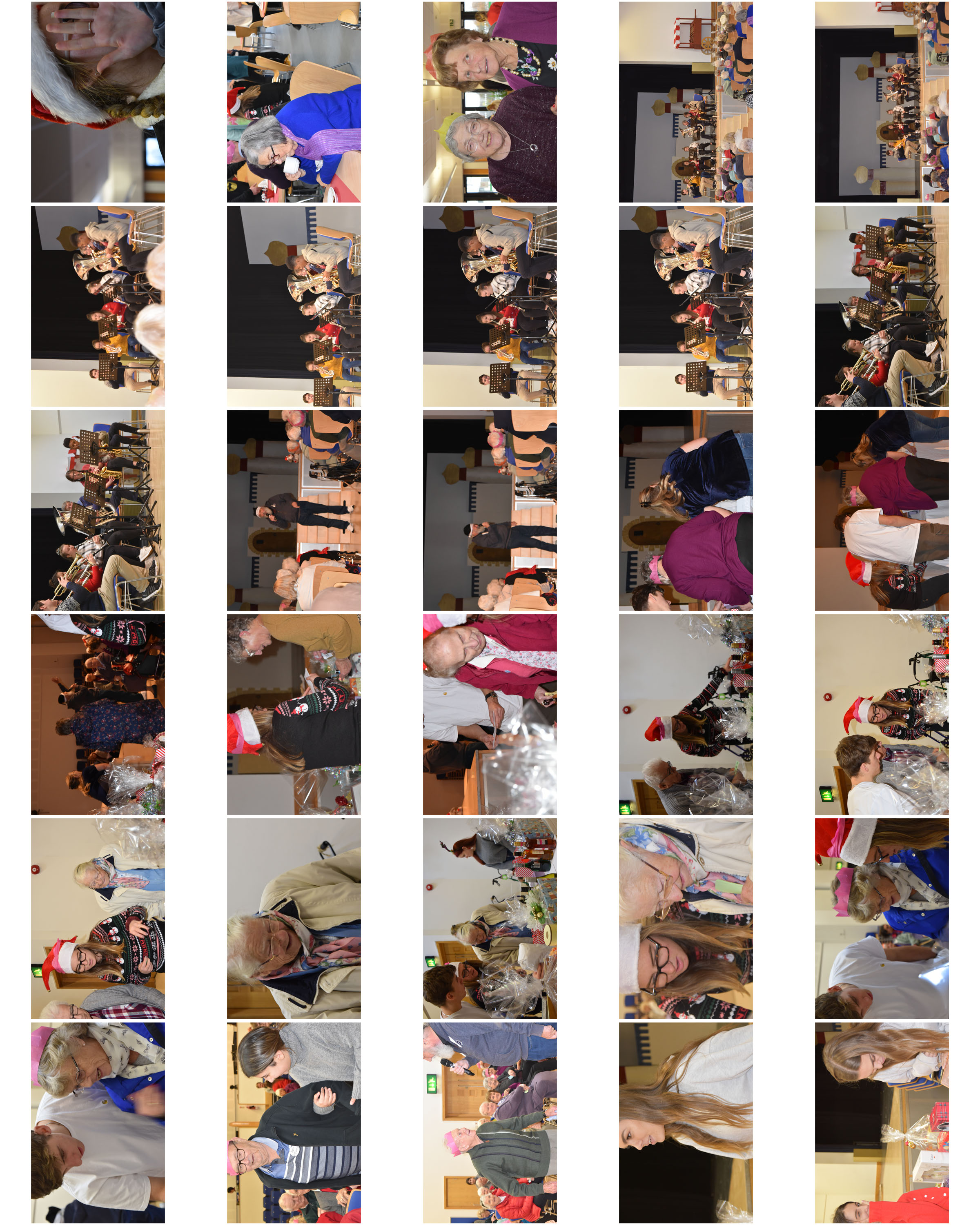
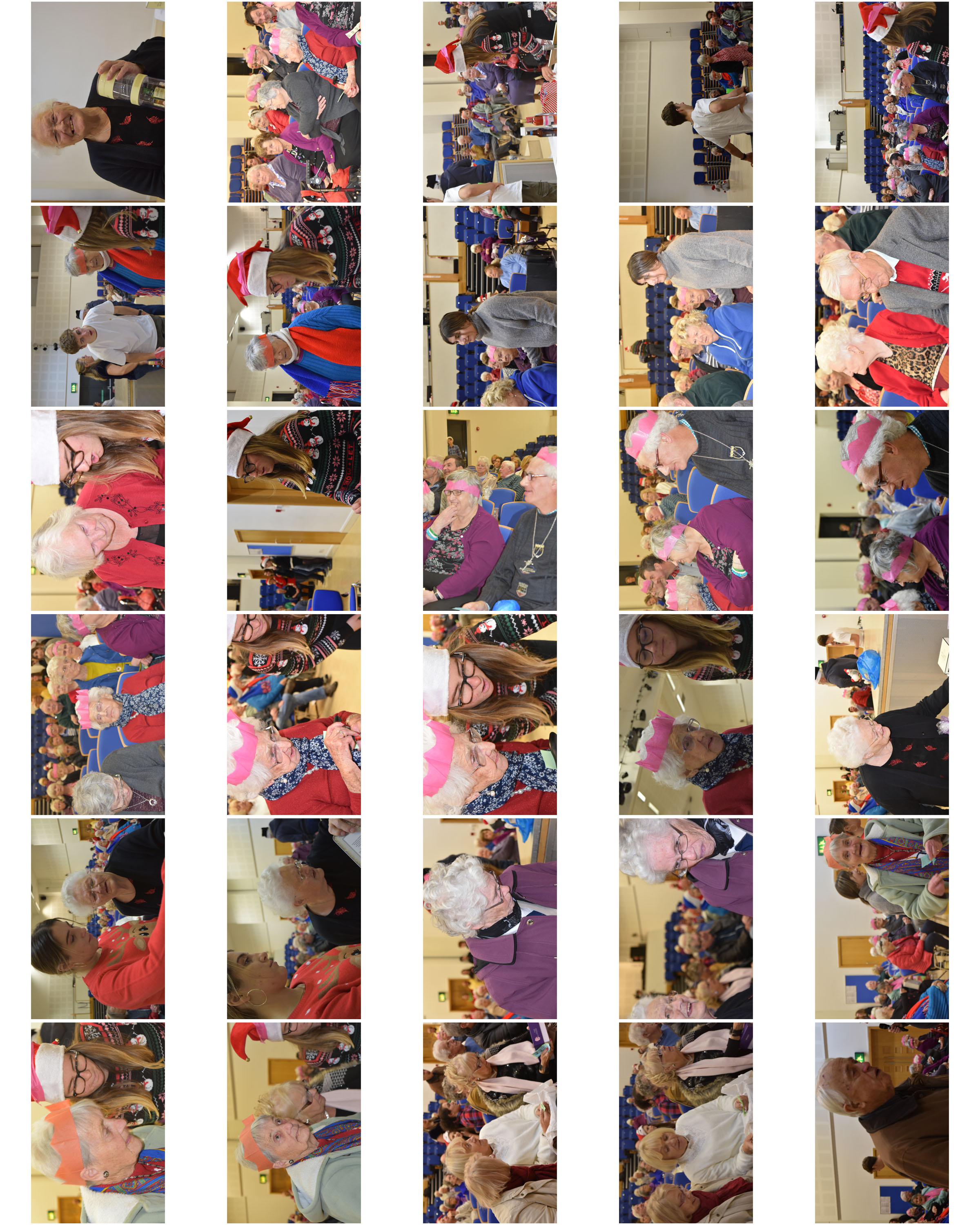
This year I had the opportunity of capturing the event in photographs.

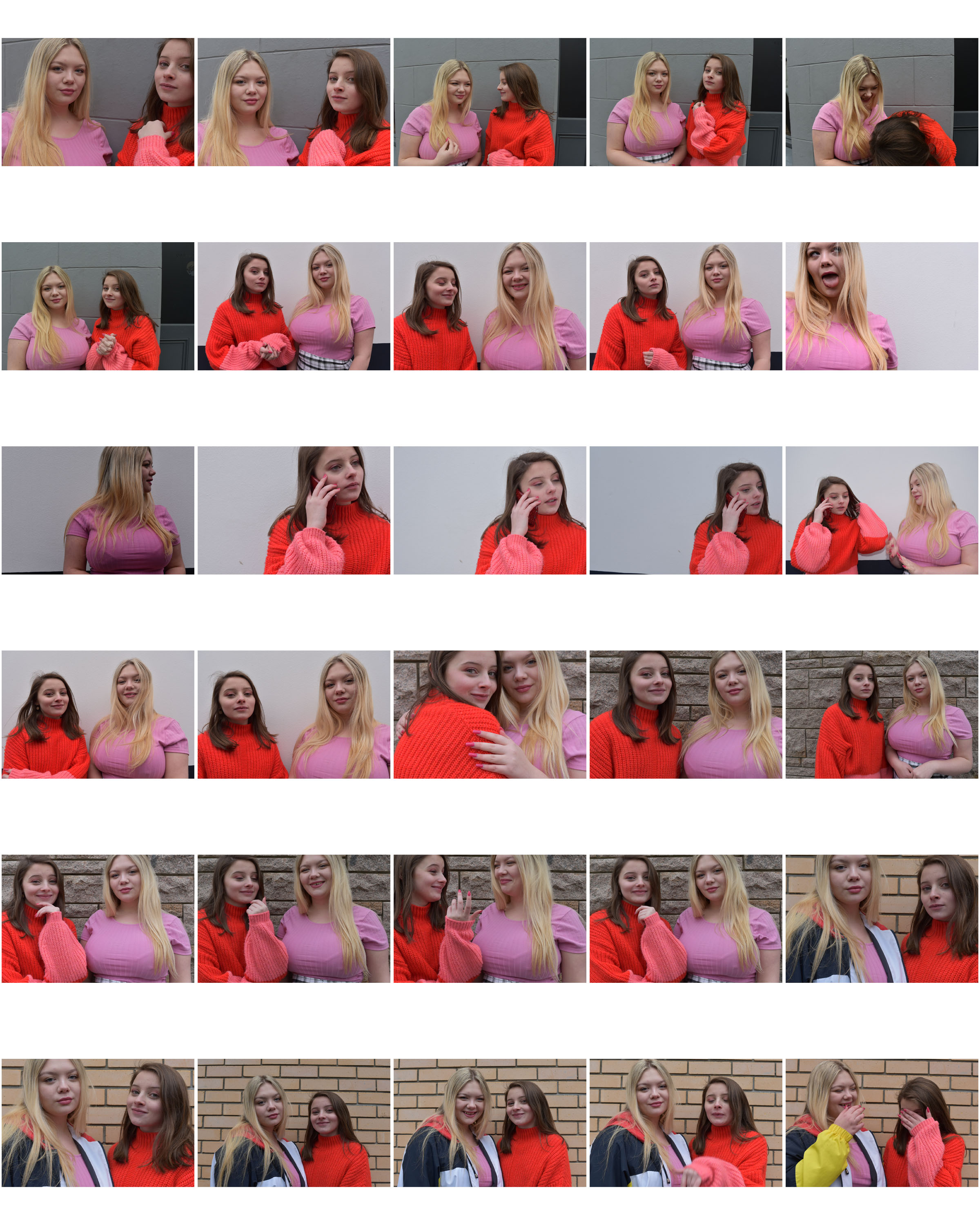
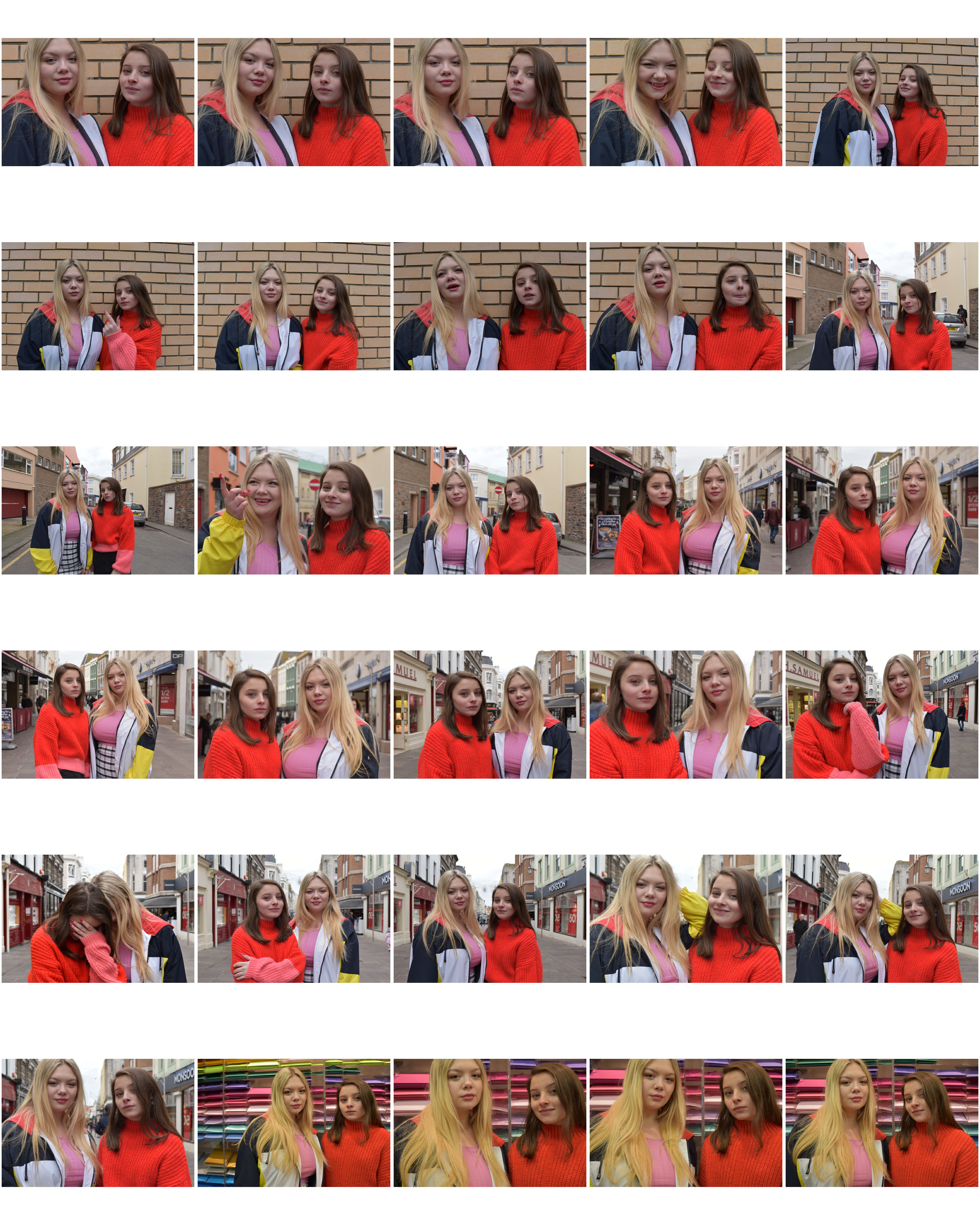
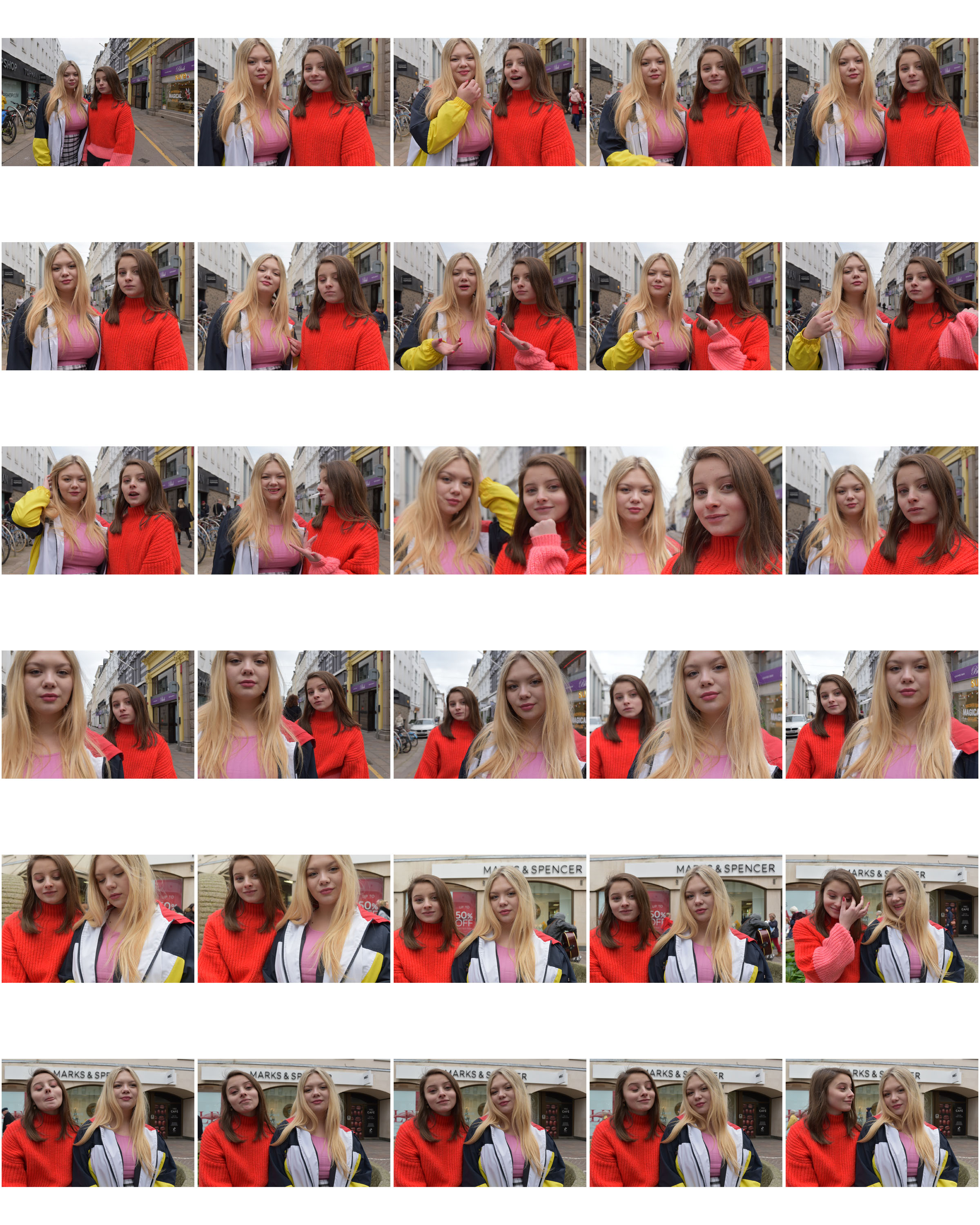
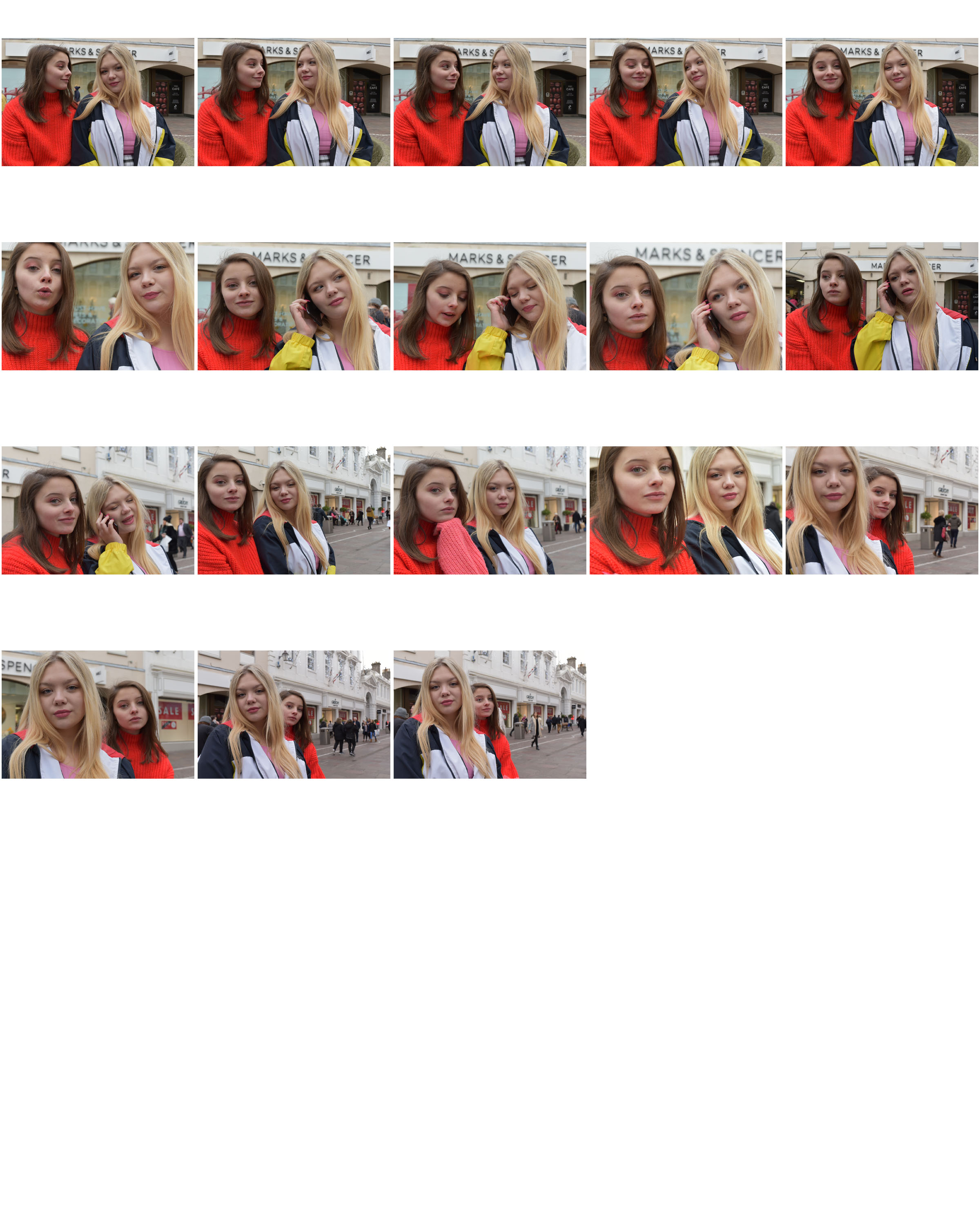
Contact Sheets

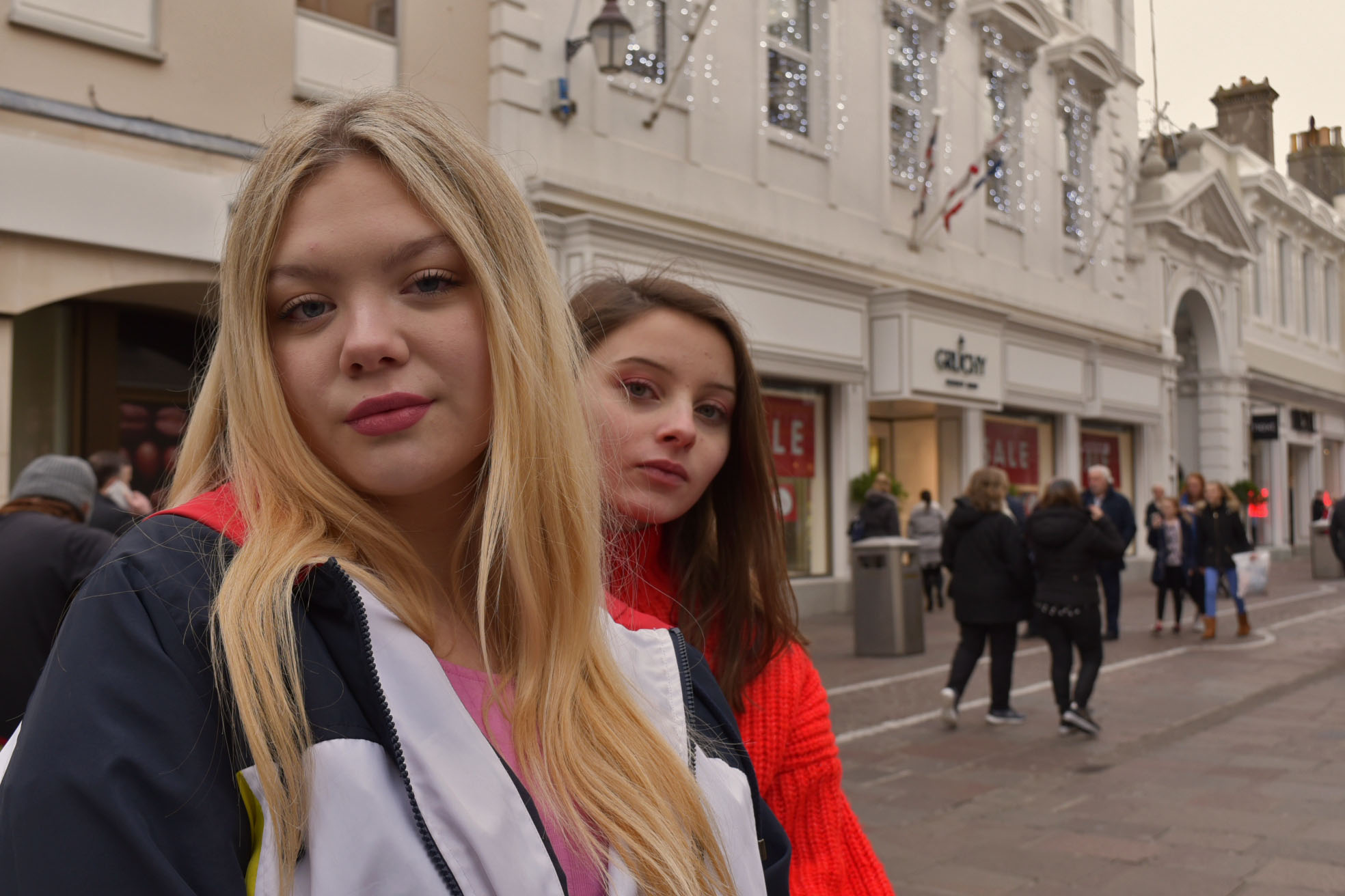
NATURAL LIGHTING PORTRAIT FINALS

While editing this photograph I added a warning filter, after doing this I adjusted the shadows, highlights, and midtone which also made the blurry lights in the background stand out more while enhancing the filter subtlety
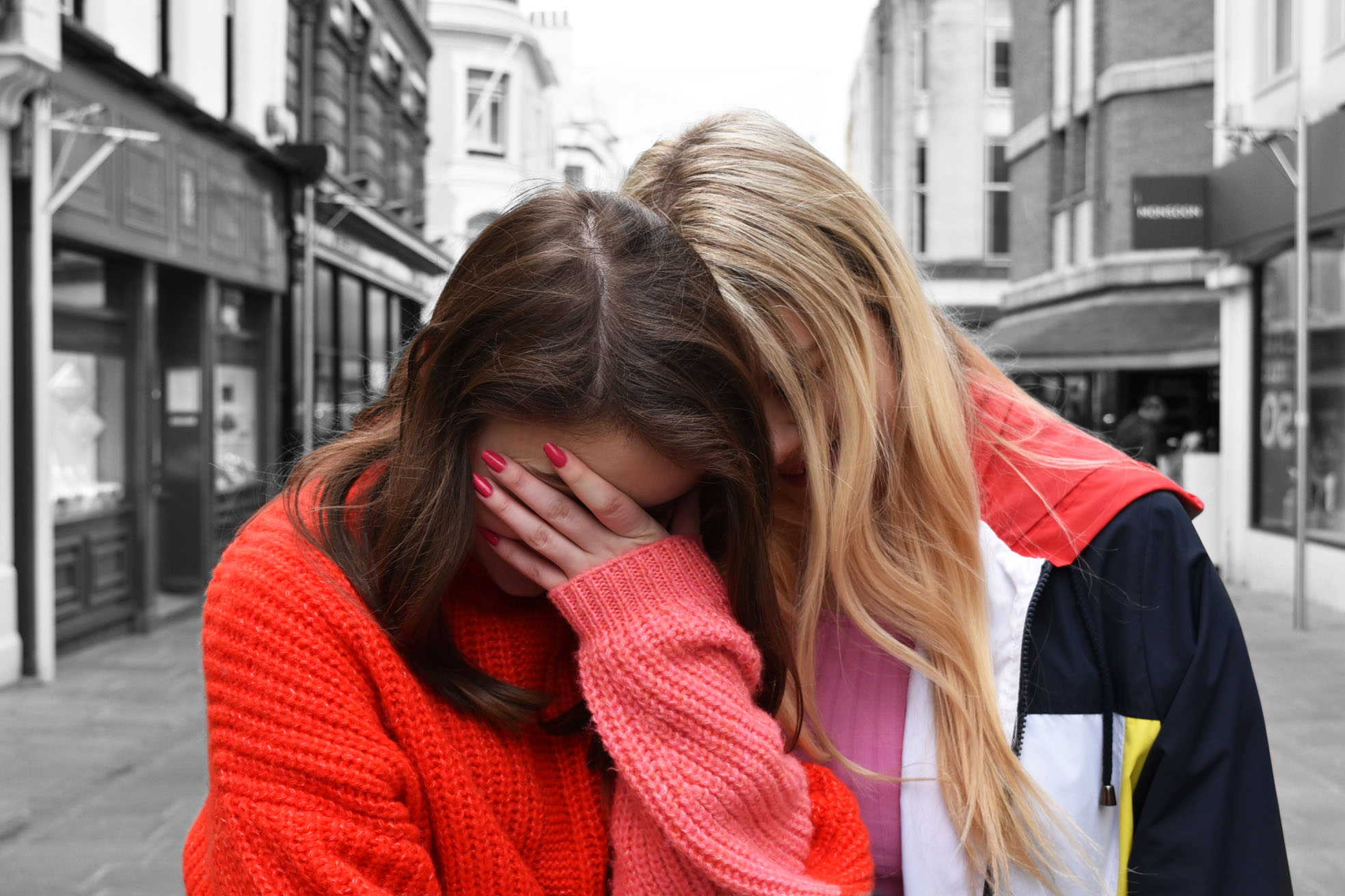
I duplicated this photo before editing, I then turned the photo into black and white before using the history tool to bring the subjects back into colour and upping the contrast and brightness to enhance the red that they were wearing.

EDITING NATURAL LIGHTING PORTRAITS

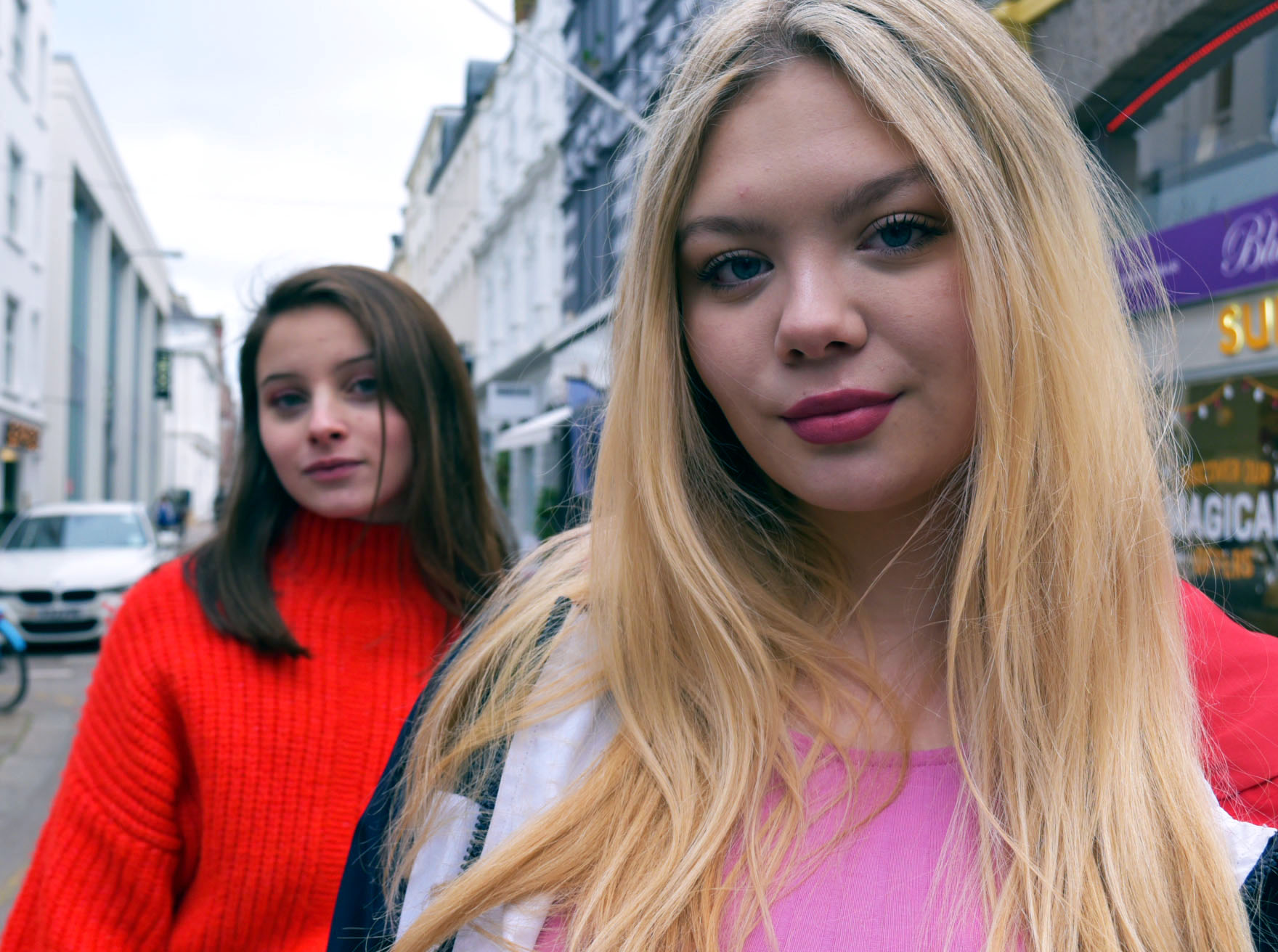
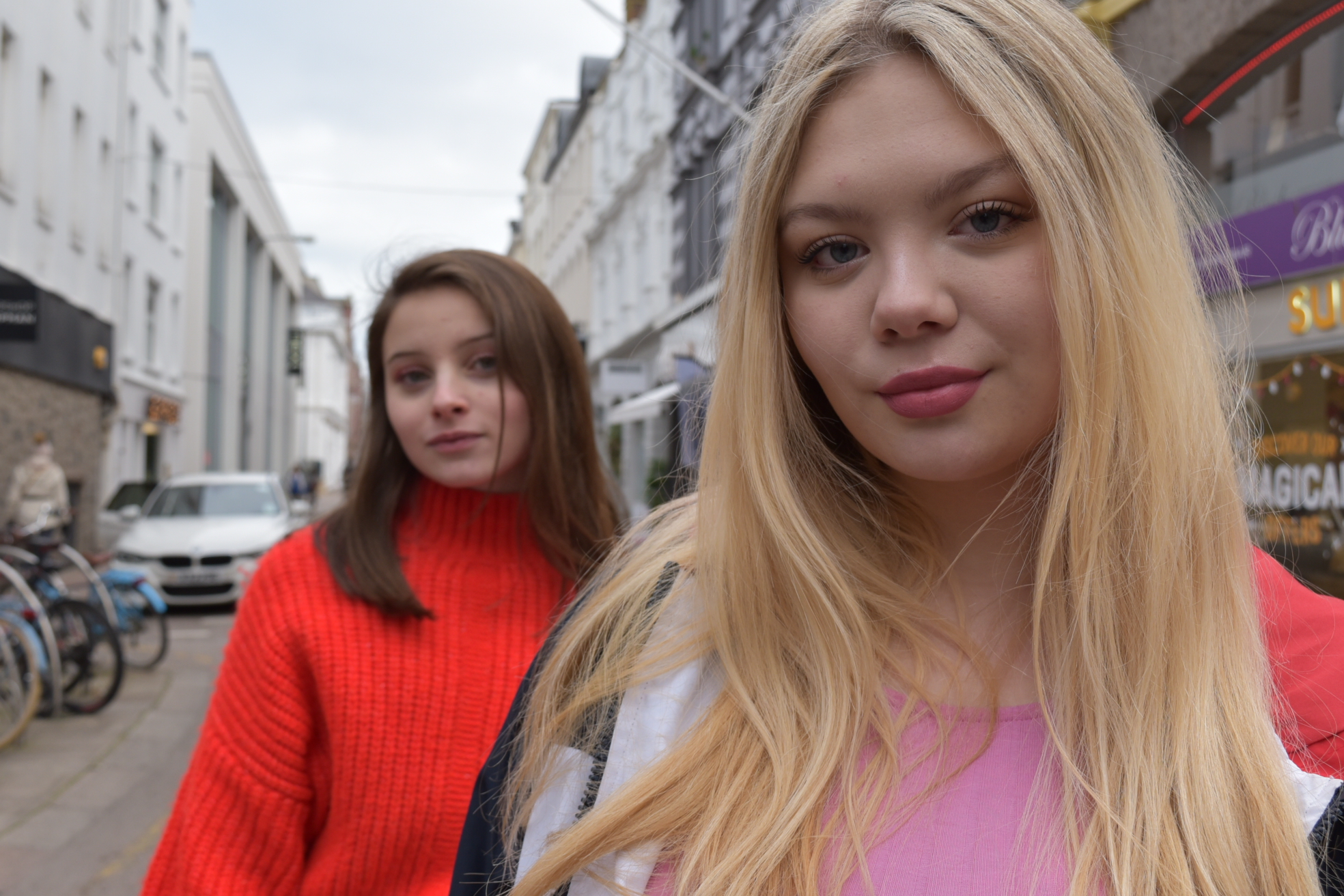
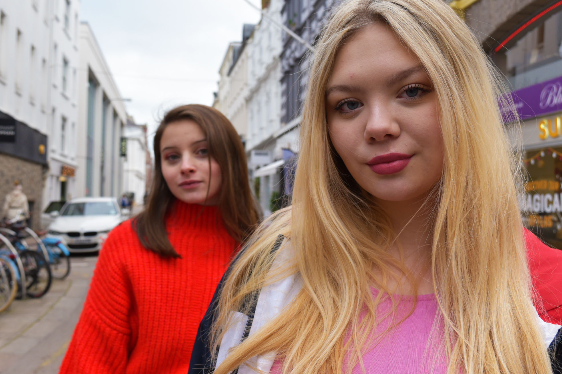
I chose to edit this photograph as I liked that because of the depth of field each model was in a different amount of focus and the model standing in front catches your attention straight away.

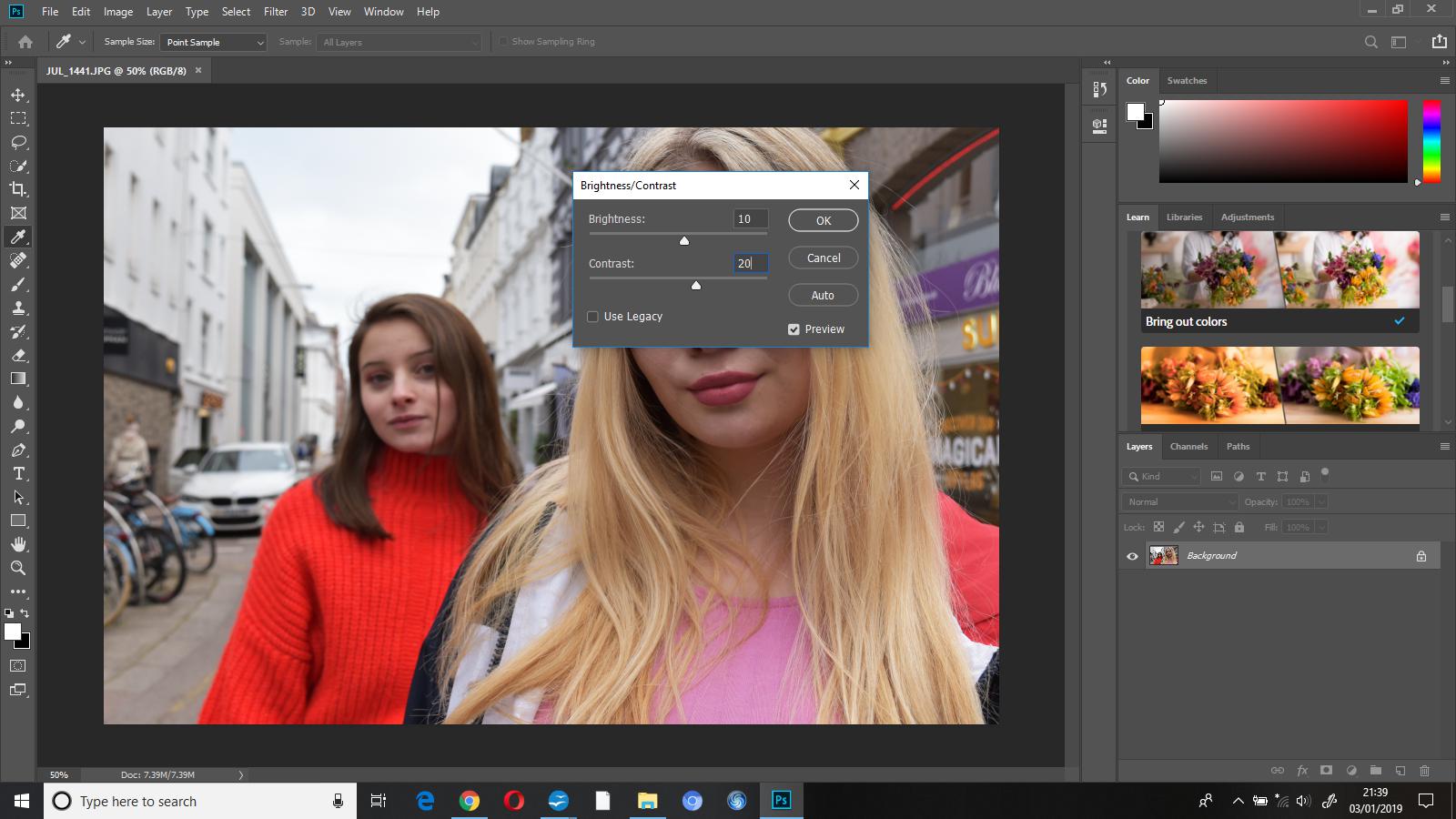
Once I’d opened this photo up in Photoshop the first thing I did was adjust the brightness to +10 and the contrast to +20, I did this to bring out some of the vibrant colours. Doing this helped to bring out the colours as the brightness affects the highlights, and increasing the contrast made the lighter colours in the photo lighter and the darker colours darker, ultimately making them stand out more.

I then went to image-adjustments-vibrance and increased the vibrance to +35 and the saturation to +2 to add to the pop of colour I was going for in this edit.

As you can see, after making these adjustments the model in the foregrounds hair appeared very warm toned. I went to image-adjustments-colour balance and changed shadows (-20,0,+15), midtones (+10,0,+5), and highlights (+8,5,+12) and this gave the image an overall cooler tone.

To finish off this edit I cropped out the bicycles from the left side of the photograph, to both make the photo less busy and cluttered, and keep the focus on the subjects.

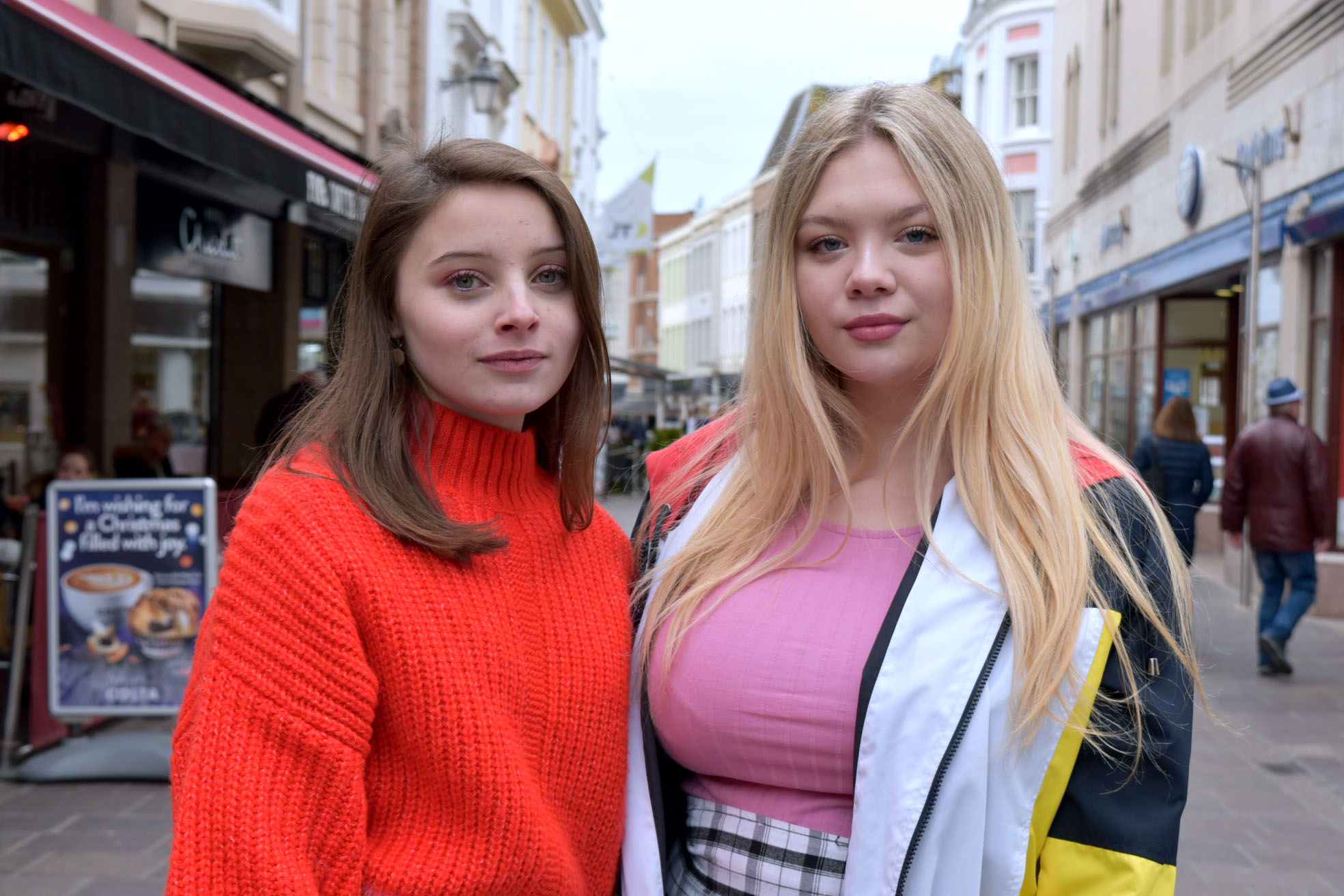
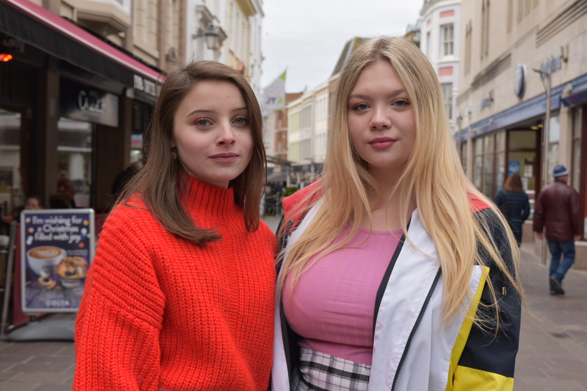
second image unedited


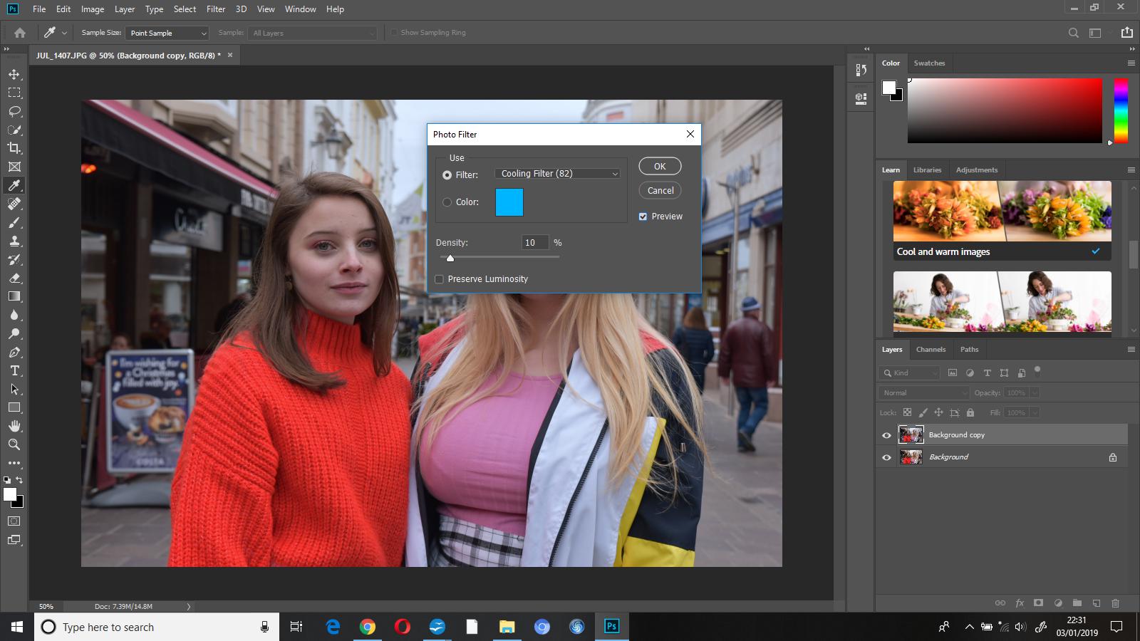
The first thing that I did when beginning to edit this photo was add on the ‘cooling filter (82)’ at a density of 10%, this made the photo cooler toned. I experimented with the density a little bit before deciding on 10% as I did not want the photograph to look as if it had a blue coloured overlay.

To finish this edit I increased the brightness to 5 and the contrast to 15, I did this to just enhance some colours while still enabling the edit to look somewhat natural.

Identity and Place – Post 2 (Influences)

Masked Portraits:

My inspiration for my masked portrait project was Ralph-Eugene Meatyard. He always believed that everyone is connected but when you use the mask, you take away the differences. Everyone is unique and individual but also the same. Taking away from the trivial importance of appearances.

Meatyard once explained his reasons for the project, saying “the idea of a person, a photograph, say, of a young girl with a title ‘Rose Taylor’ or the title ‘Rose’ or no title at all becomes an entirely different thing.  ‘Rose Taylor’ is a specific person, whether you know her nor not. ‘Rose’ is more generalized and could be one of many Roses—many people. No title, it could be anybody.” And in the same way, a mask “serves as non-personalizing a person.”
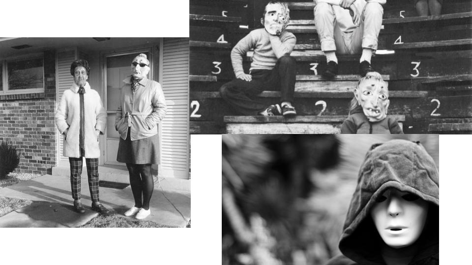
This inspired me as it allows for individuality without concern for appearances or reason so be insecure over these differences. This project allowed me to explore portraiture without a need to worry about a physical appearance, giving me more freedom to compose the images how I wanted to, and be able to photograph a person without the focus being on the face or the identity of the person behind the mask.

In a way this was liberating as I could tell a story without context or a character. I was able to simply compose the images I wanted with my own narrative. There is no opportunity to “judge a book by its cover” or judge a person by their appearance as it remains concealed throughout the project.

Edited Portraits:

My inspiration for this project came from several things. During the portraiture unit I have been drawn to obscure portraits that focus on particular facial features, especially the eyes. I have always found the eyes to be one of the things I focus on in pictures and wanted to capture this during the project.
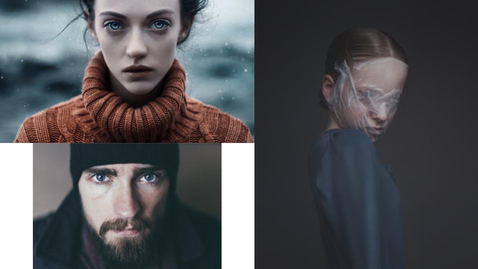
Secondly I was influenced by images regarding covered faced. Whether the face was hidden or partially covered by something in the image or the photograph had been manipulated in some way to hinder the view of the face. I found this really interesting as similarly to my masked portrait project it involves hiding identity.

Despite wanting to cover the face up I did not want both my projects to involve a lack or hiding of identity, so combined partially hidden faces with strong and bold features. My ideas began to flow from there and in the end I combined the things that inspired me and came up with the concept of hiding the face yet capturing the strongest feature on the face which I believe to be the eyes.

My project focuses on covering up the face in order to declutter the image and keep some elements of a hidden identity but in doing so focusing on the rest of the image and especially the eyes.