
My final Images what I feel they show and the impression I want them to give off These were my final set of images that i sent off at the end of my exam for printing. They all show development through the project they show how my work has change and been influence and taken inspiration from other artists work with there own-style of photography. I feel like this first image is my favourite, it shows a clear technical skill behind the work. I feel like the image encapsulates the stimulus of 'identity and place'. The story/ theme that i am trying to portray behind the image is one of confusion and enclosure within the ever changing identity of the landscape we live in and how it has shaped us as people. Change is a huge part of human life it engulfs us every day, yet we turn a blind eye to it or take one glance and never look back. Constance change will impact the identity of a place and the people living in it and that is what this image is meant to capture. This is what the two images bellow convey to me when I look at them.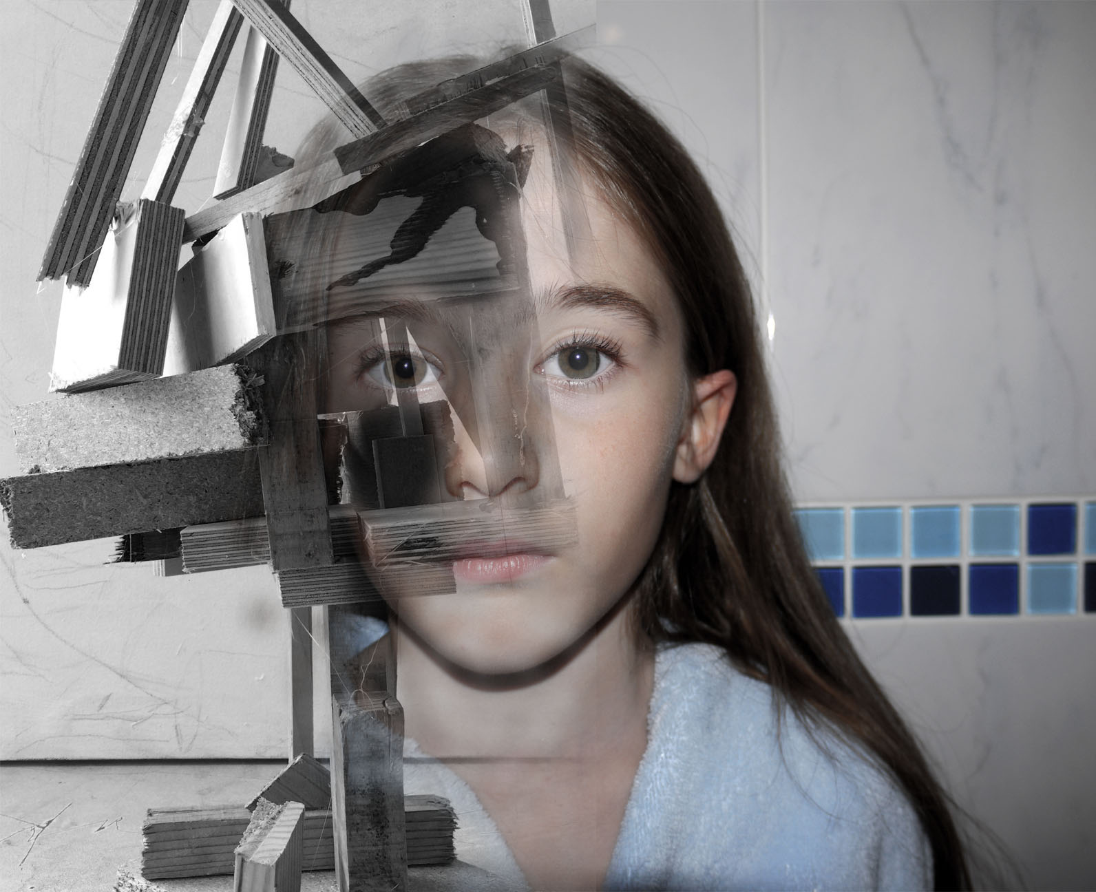
This image was created from the soul idea that from the destruction of a place new life and ideas can be created. The wooden image was taken in New Zealand, all the wood this sculpture is made from was wreckage from the earthquake that hit Christchurch. This was then made into art, I found this sculpture when walking through the main city I feel it shows the identity of the place and what happened but also clouds people views of how hard it is to move on after that. This dilemma of if this constant reminder of identity and place should be celebrated or ignored. Thats what i hope my image conveys conflicting views on whats the right thing to do let go or hold on. I want my image to be a talking point not just something to be looked at something to be discussed relating to the identity and place. This is same with the orange cathedral image as well there is debate on weather they should leave the main cathedral as it is with the deviation of the earthquake or renovate it. I chose to over lay the colour orange over it because all the petition signs to keep it the way it was were orange, so i thought i brought the contextual identity to the image through the use of colour. Also i took inspiration from Xaviers work on derelict buildings and how the city just carries on life around it. I feel this image portrays this very well with like skyscraper to the left creating perspective and framing the image, also the crane across the middle breaks up the rigid vertical lines within the image creating a visual focal point to start off at.

This image was my favourite out of the studio lighting portraits because it looks like it tells a story or has a real secret meaning behind it. I fell like it creates intrigue and makes the audience want to ask questions. This is my main focus for my work is to make the audience think and come to there own concussions about the images and i feel like this black&white portrait does this perfectly.
This last image to me is from my photomontage experiments. This photo leaves you with a-lot of questions wanting to be answered. My main focus behind the image was to show pressure through facial expression and confusion through shape. This image is meant to make you feel like you are looking into someones brain while they are stressed and being able to notice each and every individual thought almost as the image is made up of individual memories each telling a different story which you can visually interoperate through imagination. This is what I wanted to convey through this image and inner look into people thought patterns and identity.
Monthly Archives: January 2019
Filters

Final Images Colour Experimentation
Image Colour Changes and Experimentation I wanted to initially change all of the images to black and white . Then I realised i could change individual layers to black and white, I thought this gave the images a new range of depth and visual interest. I selected the individual layer that I wanted to edit - Then I went to image - adjustments - black and white- then moved the colour sliders up and down until I got my desired outcome, which was a light grey back ground with the wood being darker and being lighter in the lighter parts to create more of a contrast.I also tried doing it the other way around with the same image. The exact same process on a different layer. I decided that i didn't like this image as much as the other one it just didn't look right to me. The contrast of the brown wood on stark grey background looks underwhelming. They look like two purposefully different images when they are actually meant to blend and flow together. These images together in this colour pallet just creative unwanted visual noise which confuses the audience because they are just drawn to the contrast of the colours not the actual image itself.
In this image i am moving around the colour settings so that there is more contrast between the light and dark of the wood in this image. In the first image they were just set to the factory black and white settings so i changes them to have my desired out come. I fell like it makes the image look more interesting and the left eye blends effortlessly into the wood because the pupil of the eye is the same tonal colour pallet range.
I have decide that for this image the face is to colour full it created imbalance in my photo the face shouldn't be as vibrant and it should be a cooler colour pallet to complement the b&w wood structure.
This image in balanced nether of the images over throw the other there is no direct focal point in ether it is just left to the viewers interpretation. The main tool i used was the vibrance slider moving the sider down to -56 gave my desired image composition. This again was through using the image - adjustments tool . There is still the cool blue tones coming through to give that image the need colour but they are muted.

Another tool that i used quite frequently on the original face images was the levels tool to create more depth with in the eyes so that they stood out and didn't get lots within the images different layers.

Again using the same black and white process with the wood from the images adjustments black and white tool and then sliding it to create the desired b&w tonal look.
Again the vibrance tool to decrease the vibrance of the image to put a real focus on what the image is trying to portray rather that the initial combination of broken wood and a face. This vibrance decreases mean the image is seamless and creates a dimensional feel that you can look into the image in different layers but then you zoom back out it still looks like all one image.
For me when editing my photos that I had created the vibrance slider created the most desired outcomes then it came to editing the actual face images i used this tool on all of them. It created the colour pallet that i wanted to complement the black and white wood without becoming a black and white image in its self.
My final works
My overall aim for the mock exam was to explore the different places of safety and insecurity that are in our loves. Places make such a difference to our moods, and the people that dwell in these places. They can make our day, or can cause so much stress and can highten our emotions. But, at the end of the day, we’re in different places all the time, and we have to adapt to these in order to carry on; to keep ourselves sane.
This photograph was part of my environmental portrait section. It has become one of my best outcomes of the environmental section simply because it has the most character and authenticity. It was taken completely out of the blue; it was as unprepared as the model was. Sometimes the best photographs are the ones taken without even thinking twice, as they are the most raw and organic. I guess the way in which I took the photo depicted the message for me: the natural way is the best way.
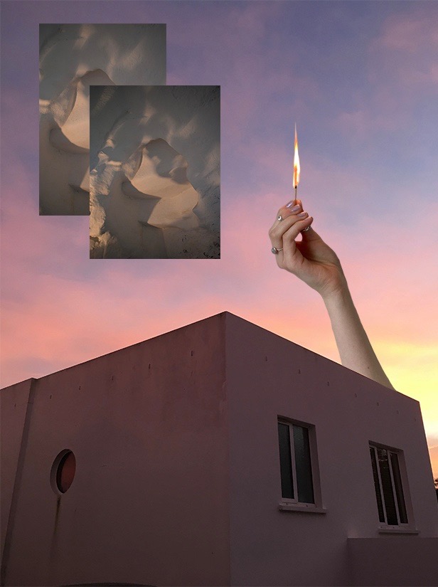
This photograph consists of several different images, all combined together through collaging. It included a picture of my house, a hand holding a lit match and two almost identical photos of a textured ceiling.
The overall look of this photograph has a very warm, orangey red tone – almost as if everything is on fire. You may interpret it as a warm, relaxed atmosphere, or a fiery and tense diposition . The house photographed in the photo has given me both: both the feeling of being intact, and the feeling of pure, wholesome range. It confuses me.

This work consisted of an old picture from my childhood, picturing me and my dad. Its also includes a landscape taken on film of the seaside where my family are from, in Ireland.
Initially, as part of my identity and place theme, I wanted to produce some works that conveyed my feelings of insecurity about myself, and the world. But after I thought about it, I wanted to focus on the stage of movement from the sinister place of insecurity to the overwhelming sense of freedom. When someone who has physically been in your life for so long, but not emotionally, suddenly dissipates from your entire existence, it forces you to realise how you were feeling back in the past. It enlightens you to a new sense; a new set of emotions that are pure and brand new. But because there has been so many confusing, complex times in your life, you have had to mold into several different versions of yourself, and the person who you trusted the most, that individual that is now the only person you have spiritually, seems to have holes and gaps in them too.

This window exists in my bedroom, but for so long my bedroom was a safe place that I hardly ever left. Yet part of me wanted to so desperately explore everything but the confounds of my own house. This photograph speaks for those times where I never had the confidence to explore the wider world when I so desperately yearned too. But I guess I have more time.
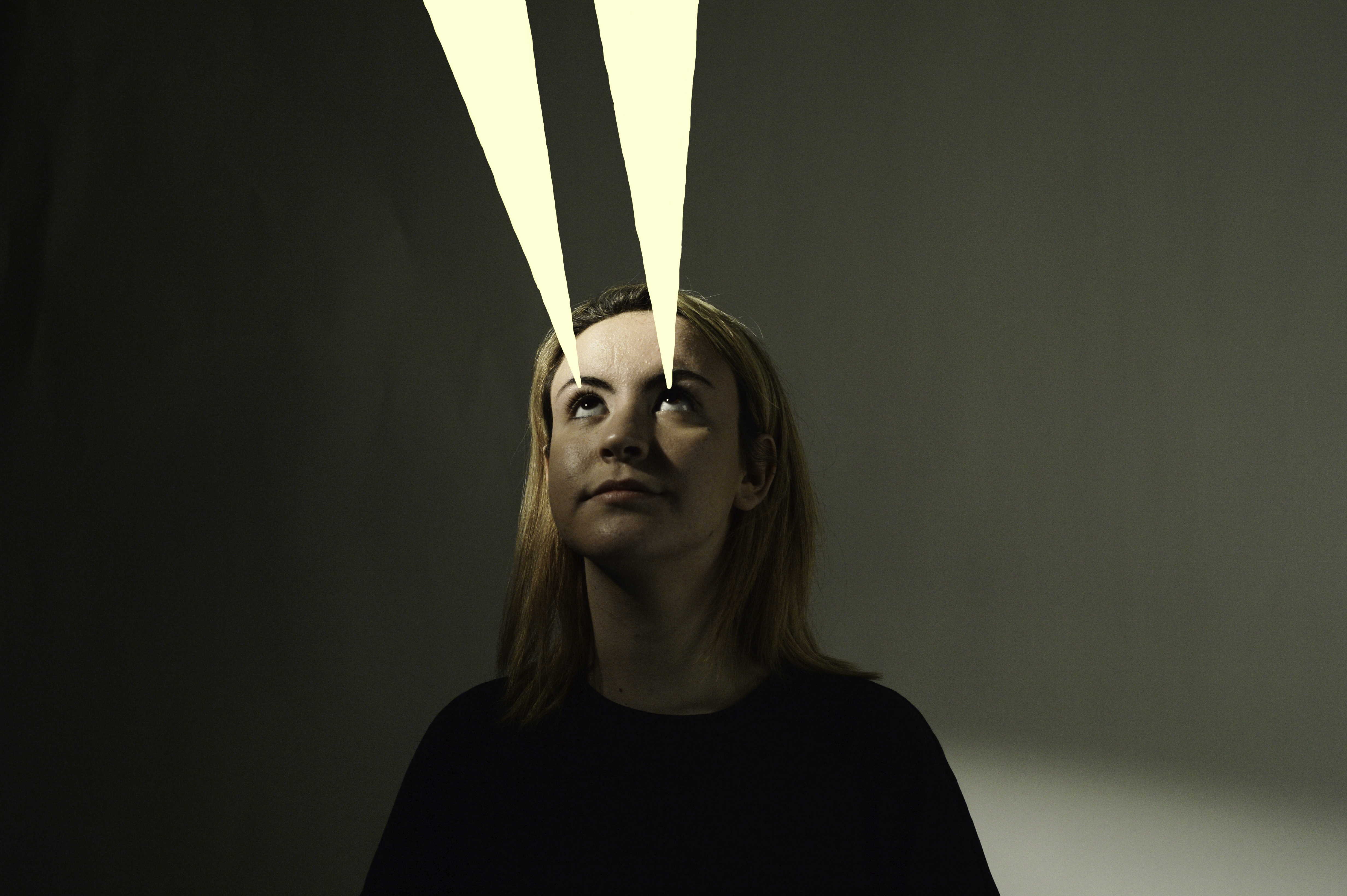
People often forget how they themselves influence their next moves, as we tend to focus on blaming other things that dictate what our next move will be. Our decisions can be optimistic or pessimistic: in this case the subject is lighting up a dark place so she can see again. The light she has created will help her and guide her to her next destination.

I’ve experienced times when the same place has given me two completely different feelings; the polar opposites of each other. It confounds me how one place can alter your emotions and feelings so much, too much. It makes me uncomfortable and insecure as I never know when this type of situation will make itself known again and confuse me once more.
Final Piece- Evaluation
EVALUATION
In conclusion this project I have completely focused on identity and place. My main artist I wish I decided to focus on was Francesca Woodman who I have based a lot of work on due to intricacy of her work. Francesca Woodman’s work have a turn more a much more darker feel but leaves the viewer with much more deeper meaning and leaves the viewer in ore. I strongly based my ideas on how woman portray themselves and how they feel about their appearance. This is an important area to focus on and I re4ally wanted to concentrate on this idea and fully portray it in its best light.
This project 9on identity and place allowed me to crea5te new Photoshop and try things I haven’t yet tried before. As well as going back to old Photoshoot and the photographs I took when traveling around Europe. With the new photoshoot I was able to experiment with new camera skills and try new things experimentally. This project allows me to use different types of light and provided me the best knowledge to go forward when photographing my images. Now having the awareness of how important it can be to plan shoot and how it can still work to be spontaneous and experiment with new idea.
When editing my photos it really challenged me as I had not been experienced with Photoshop, so at time found this extremely challenging. Although managed to perceive, with my original image it was my main focus to distort the powder paint colours on her face with dark shades. However still adding colour that would help emphasis the darker shades contrasting perfectly with the popping colours bursting through. To me I was happy with image however to improve next time I might have added more colour or possibly take the editing further and create something like a photo montage.
For my second image I was overall extremely happy with the outcome due to my inspiration of Francesca Woodman who I really took an interest in during this project. Woodman inspired to create my images and showed me the importance of deeper meaning and how vital it is to consider how the photograph will make the viewer feel. The mage and editing I was happy with however to improve I would consider doing more research in to similar photographer and see where that might take me. Possibly creating a selection of images all linking together.


Portrait – Final images
LOSS OF IDENTITY IMAGES
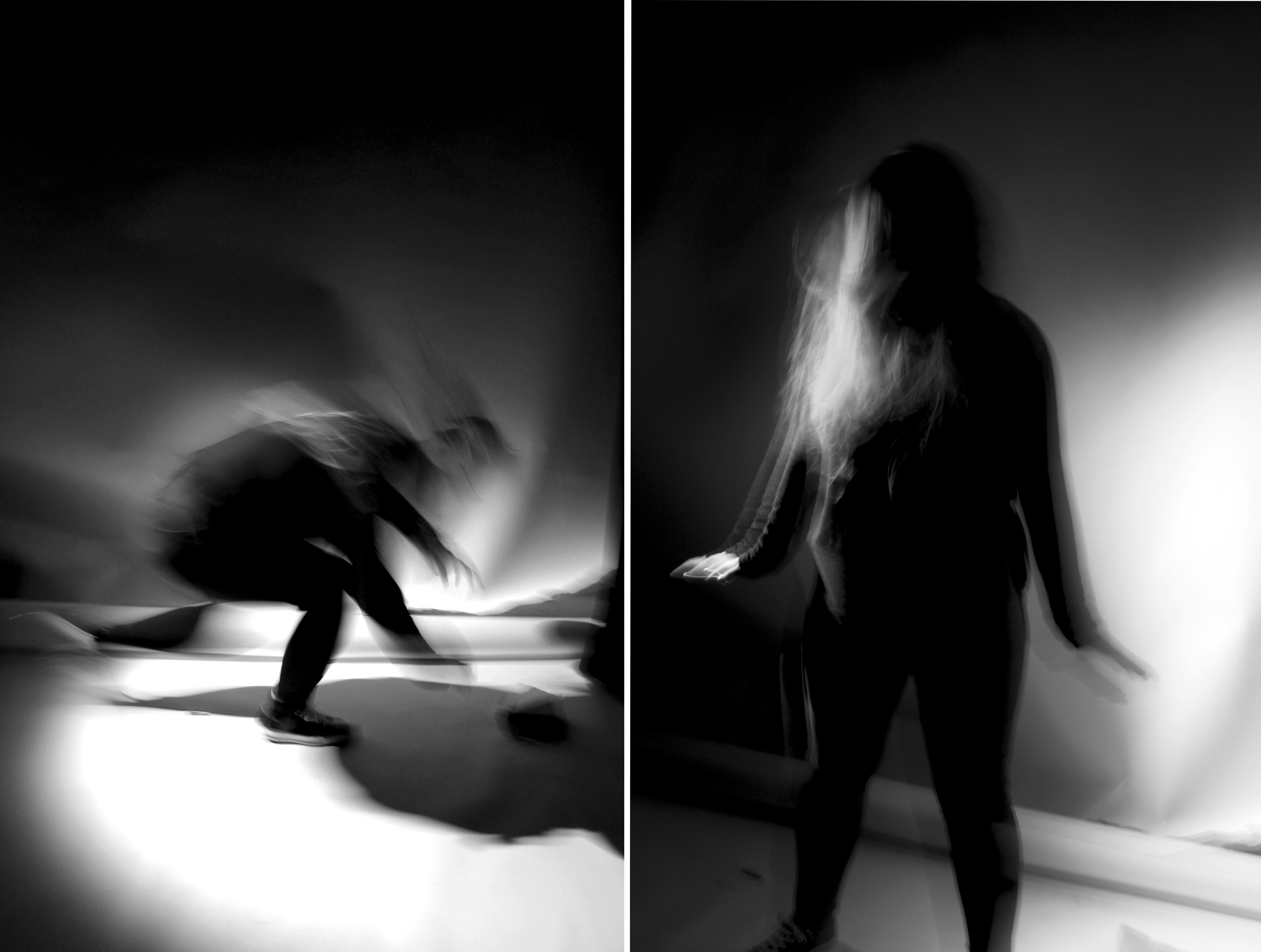
I chose this as one of my final outcomes because it responds to Francesca Woodman’s photography and the theme ‘loss of identity’. I decided to join these two images side by side since together they would create a visually interesting outcome. Both images respond to ‘loss of identity’ because her facial features are hidden through movement. The rapid movement emphasises loss of identity since she appears lost and confused through motion blur. The black and white filter creates a dramatic and choatic atmosphere to the image since the shadows and highlights are exaggerated through contrast. I am printing this image in A5 because Francesca Woodman’s images exaggerate fragility by the fact that the photographs are printed on a very small scale. I want to create the same personal and intimate effect.
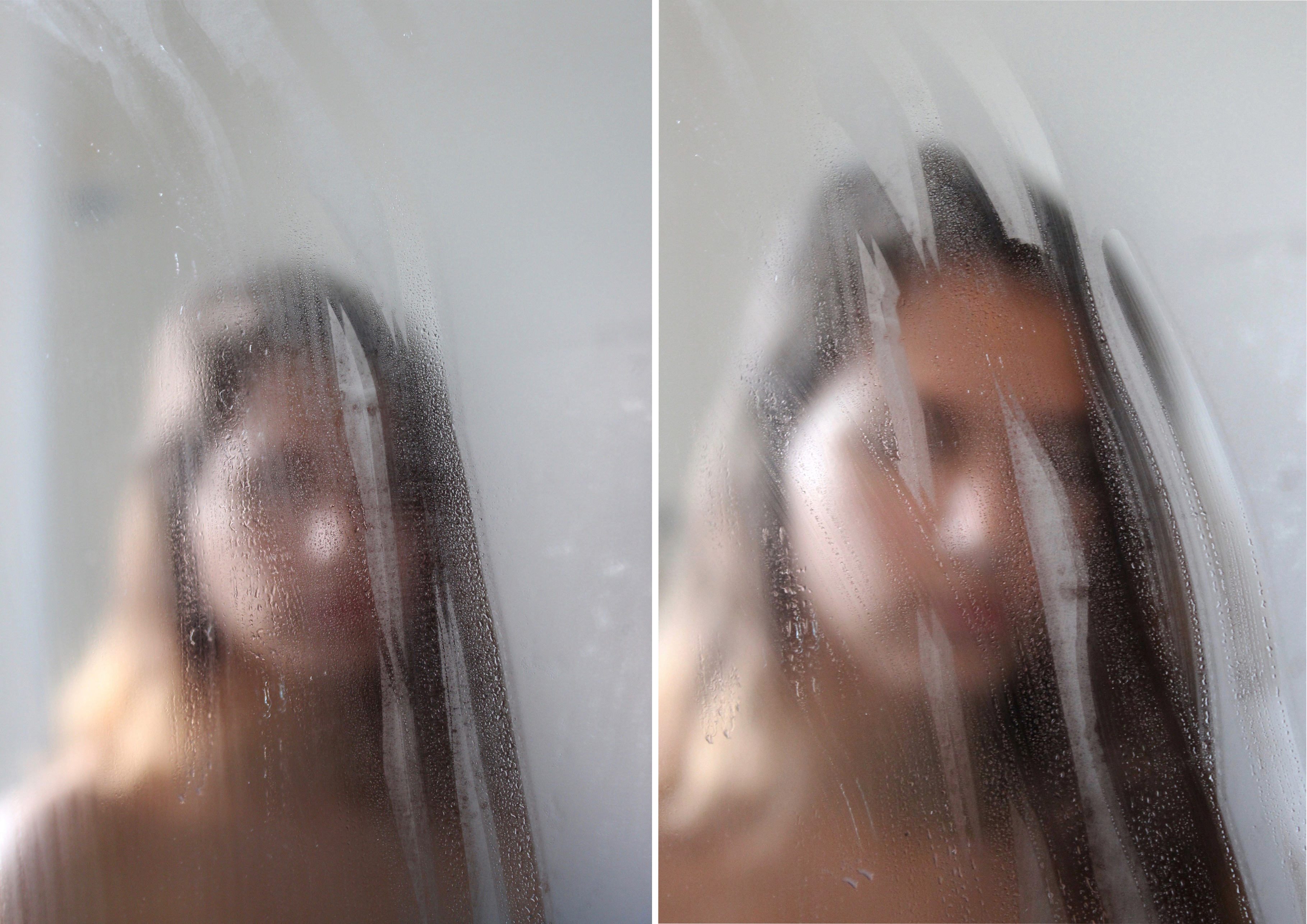
I chose this as one of my final outcomes because it responds the photographer Isabella Madrid. Although these two images are similar the subject is in a different position. This outcome relates to ‘loss of identity’ because the subject’s facial features have been hidden by the steam on the mirror. These two images have been placed side by side to show the different hand marks on the mirror and to make the outcome more visually interesting. I think I have successfully responded to Isabella Madrid’s photography work because I have replicated her style which can be seen through this outcome: simple images that convey a sense of being lost with ones own identity. I have chosen this to be printed on A4 since I believe that it would be a reasonable size for these two images.
I chose this image as one of my final outcomes because of the mysterious effect which helps to convey the theme ‘loss of identity’. This effect has been created through the black and white filter and the water drops which conceal a part of my face. In my opinion I think this image is a successful replication of one of Isabella Madrid’s photographs because of the eerie and dark atmosphere I created through contrast. I am printing this image in this size because it will have a larger impact on the viewer if printed on a larger scale. The detail of the shadows, highlights and water drops will be seen more clearly once the image is printed on A3.
STUDIO IMAGES
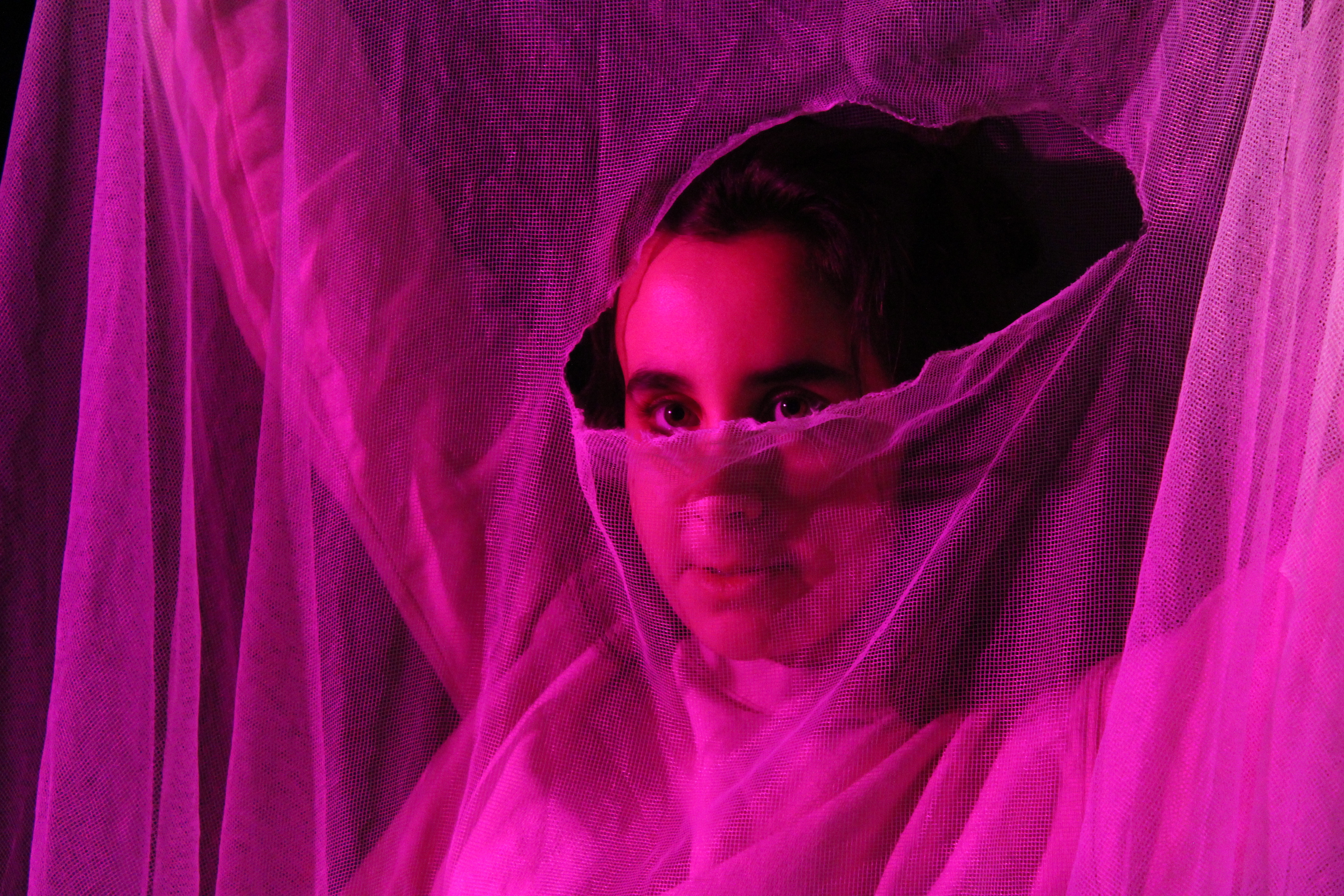
I have chosen to print this image for my portrait project since it’s one of my most visually interesting images that I have taken. I captured this image in the studio room using the spot light and a pink colour filter to cast a pink shadow onto the subject. The subject is holding a net fabric with a tear in the middle. The tear reveals the subject’s eyes which captures the viewer’s attention since it’s the only area without texture from the fabric. I think this image shows my technical skills in photography since I have adjusted my camera settings so the image has the correct exposure and focus.
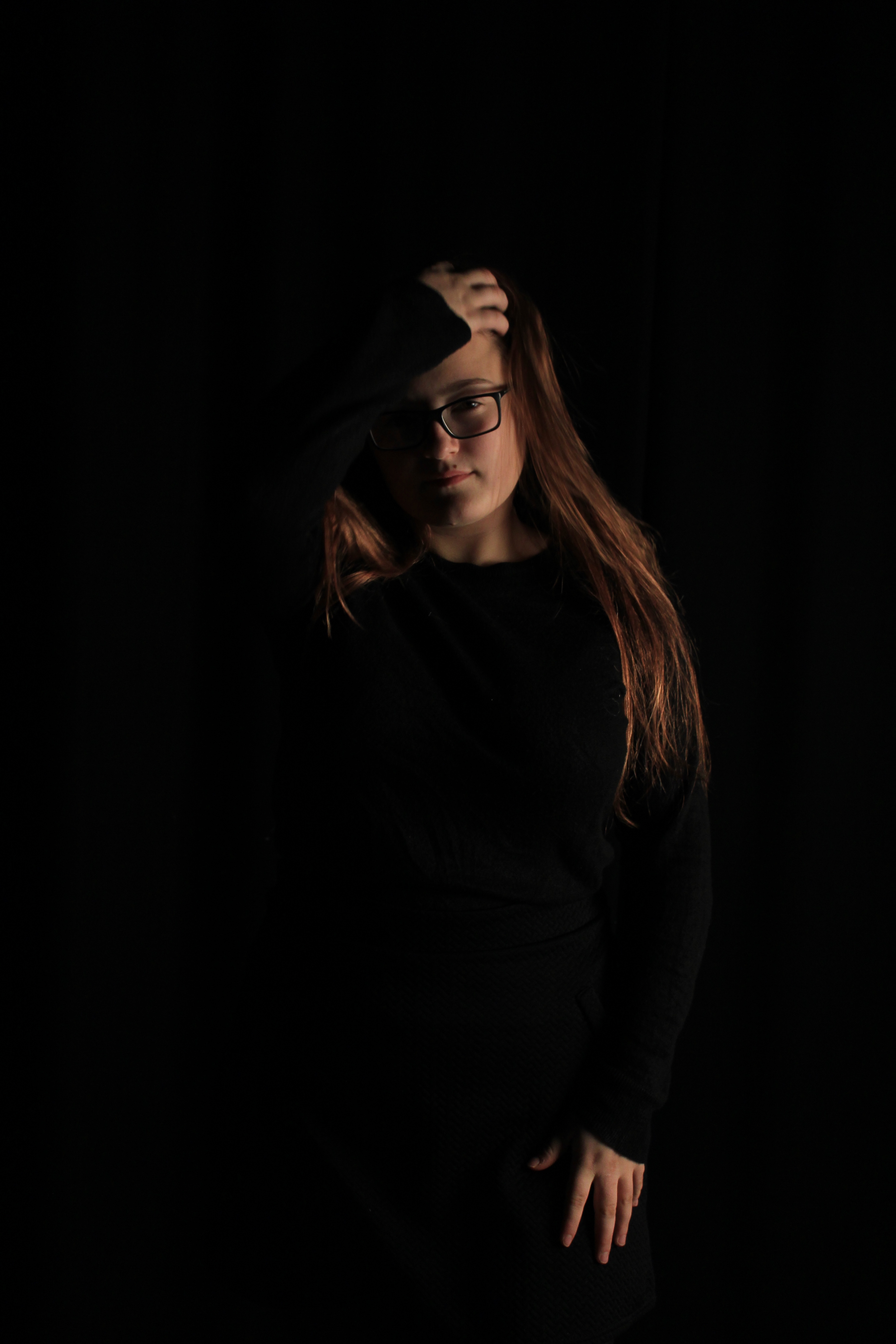
I have chosen to print this image for my portrait project because in this photo you can see that I have applied the Chiaroscuro technique. To create a strong contrast between light and dark, I told my subject to wear all black in the studio room so the results of the photographs would have the subject blended into the black background. To cast light areas on the subject, I used a soft box light and placed it on the right side so it emits a soft, even light onto one side of the subject’s face. This image shows that I can apply techniques that I have learnt from photography lessons into my photography work.
Photoshop Final images Experiments
Image Photoshoping process These images were blended using Photoshop. I created a new blank document - Then open the two images that I wanted to use - Then using a drag and drop method placed them on to the blank document- This then creates two different layers with the two different images on. - A the bottom of the of where the layer panel is you can add a layer mask it is the bottom square with a darker circle in the middle - Then making sure the layer mask is activated with a white box around it, I when on to use the brush tool to blend and fade the images in together- When using the brush tool i changed different sizes depending on if i was working on a large area or a small intricate part - The opacity of my brush stayed between 13% and 25% for a smooth transitioning blend with no harsh noticeable divide lines .
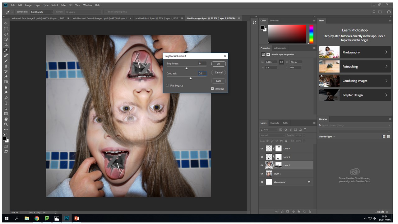
With this image I created two layer masks over the wooden images and one original layer mask over the upside down head. Then blending the tongue and the wood images, I found that control-+ was really helpful zooming in and being able to work using a really small brush size of 17 gave the best effect.


I decided to do some experimentation and try to combine one of the images I had chosen to work from in my final peaces and one of the images i had draw to be printed on asetae for the original collage. I feel like the composition of this image works well, the drawn hands frame the two blending heads that are creating an interesting view point for the observer because they can make there own judgement on what they feel in portrayed with in the image. For me what i want to be portrayed in the encapuslement of identity and how it shrouds our initial view point. This is what is happening towards the evey changing place we live in we are engulfed by industrialisation and this can become a-lot for people and this is what this image represents to me. The inner identity thoughts and feelings that only escape us when overcrowded with thoughts.
My final pieces- Editing
My Finals Pieces:
Editing
For my second final piece, I selected images from a previous photo shoot I did and selected one of images with the highest quality. For editing I used a black and white filter however targeted certain colors in the image to have certain levels and shades of black and white depending on the original colors. The theme was place and identity for our final pieces so i really wanted to go into more depth, therefore i used the titles o f one of the most famous beauty magazines ‘Vogue’ and cut and pasted the famous font title on top of the preciously edited image. Once again i felt like i needed to add some kind of color so put the title in a hot pink to really stand out from the dark shaded background.
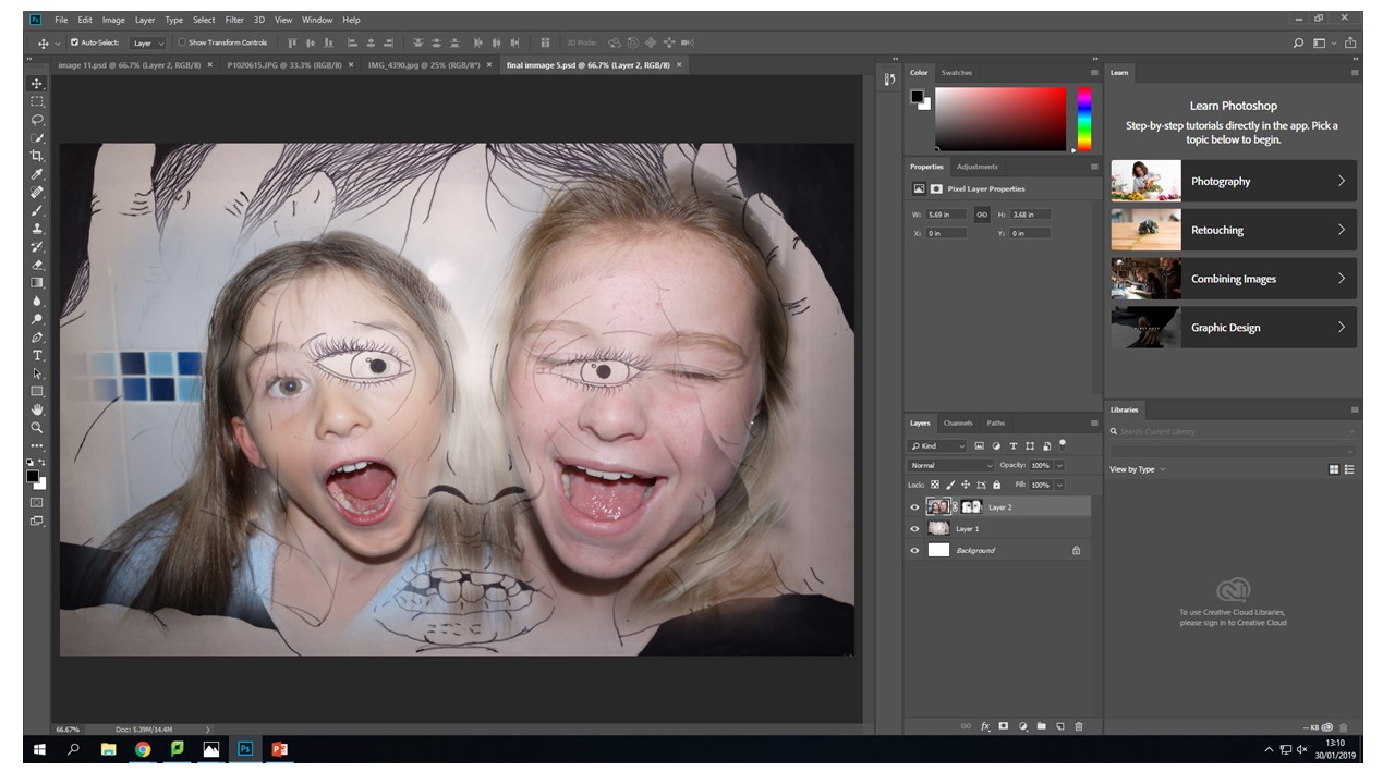
How did I edit the picture?
After the photo shoot I created a contact sheet in order to see which images I preferred and which photos I was going too used. Finally I selected my chosen image and opened it in adobe Photoshop. Firstly I smoothed out any over exposed or sharp edges on the image. Next I need to create the black and white however needed to make sure the power paint colours on her face were darkened/ brightened to really emphasis the different shades I wanted to portray within the image. For this detail I highlighted the image IMAGE > ADJUSTMENT > BLACK AND WHITE. Once selecting this a side tab came up with the strengths of shades each colour would portray in the image. I played around with this for a while till it was perfect with dark and lighter shade distorting her face. Finally I needed to add the vogue, I simply copied and pasted it and messed around with the different colours and decided that hot pink was the most appropriate colour and helped create deeper meaning to the image and the colour really popped in front of the black and white background.
Photoshop editing screenshots:


Editing
For the final image, i had previously looked into the photographer Francesca Woodman whom very much inspired me to create this image. She looked at using slow shutter speed and the model in the image being unclear and distorted. so this is exactly what i did for this image from the photo shoot i used two images and over layered them, altering the opacity so they merged into each other. Creating a distorted appearance.
How did I edit the images?
For this particular image I was very much inspired by previously mention photographer Francesca woodman who focused on the idea of blurring and distorting the model in the image. After completing the photo shoot I selected two images not to similar so it would be clear of two figures when I over layer they to get the distorted blurry feel to the image. I opened both images into Photoshop and edited them to black and white so they would display a much darker and uncomfortable feeling to the viewer. Next I copied and pasted one of the images on top of the other, after carefully deciding the opacity level the image was complete- not too strong from one or the other image. Providing a fair balance from both images so you could still see the difference.
Photoshop editing screenshots:


Planning for final pieces
What is included and who is included?
Image 1:
When first deciding what types of photo shoot I initially came to a halt for ideas. I soon remembered last year i did a fun run which involved powder paint and having left overs I knew I could start getting fairly creative with this. So i asked one of my friends to help me out we went somewhere where not too much mess could be made and then using three different colors of powder paint: orange, blue and pink. I began to blow it on to her face to create ‘patches’ of the paint to give a color and effective look, to me it was important that the picture portrayed different texture so i made sure i was a windy in order to get volume and movement in the hair.
Image 2:
For my second piece, I was at the art center for a rehearsal and one of our costumes was a dirty brown authentic looking dress which i deemed to be perfect for this occasion, and knowing this location fairly well mi was aware of an old set of stair case at the back of the stage so i asked a friend to help me out. I got her in costumer to run up and down the stairs a few time while i photographed as many photos i could in one lap of the starts in order to ha the same direction. This made it much easier when i went on to over laying y images and the stair cases lined up perfectly- this helped provide a much better overall affect.
Why this shoot and how is it connected to identity and place?
Theme: Place and Identity
Image 1:
For my first image I was originally looking closely into photo montages leading to me looking at magazines. That is when I came up with the idea of creating something do to with magazines. This links to identity as nowadays people are so set on being like all the models they see in the pages of magazines and how you should look. The idea that people will do nothing to look ‘perfect’ but realistically there is no perfect. People should be happy with themselves having their ow identity to everyone else. This is where my idea for my image came together. The power paint really helped me provide the image with the her face looking extremely distorted and looking different and original. Creating the opposite of what you would find on the front of Vogue.
Image 2:
For this image i was very much inspired by Francesca Woodman. Francesca Woodman had evidently a hard life with being an inspiring photographer , but with no one to show her work to. Woodman went though a dark stage where she didn’t know what she was doing and constantly went on about trying to find herself. The idea of loss identity and loneliness was clearly represented in her photographs. This is the road i wanted to go down the point of loss identity
Identity and Place- mood board and ideas
Mood boards:

Ideas:
- What type of identity? Loss of identity, gender, social etc
- Am I liking to places as in where some one thinks they belong from or where they actually are form
- Colors: black and white with burst of occasional color
- All black and white
- All color
- How many people will i use?
- What type of portrait will I include?
- Street, environmental, montage
- What do i need consider?
- How do i want this image to make people feel?
- Where will i take my photos?
- When will i take them?
- Who will I ask to model?
Paul M Smith- Recreate
As my final piece for the portrait topic I decided to focus my main piece around the photographer Paul M Smith. Smith’s most famous work consists of having the same model perform different roles and characters in the same photograph. I quite liked this idea of photography as it allowed me to be my own model, photographer and perform in activities I enjoy doing, such as fixing my bike and playing rugby.
As an example of Paul M Smiths work I decided to focus my main piece on a sports day, he took a series of photos of Robbie Williams as multiple people at a football match, whereas my version was myself as members of the crowd at a rugby match, as the try scorer and as the cameraman getting a photo of the try that I scored.
I liked the outcome of this photo as I individually cut out the figures and placed them onto the original background, this too quite a lot of time, as I was trying to get the perfect cutout of me in each position. I then perfectly matched them up to where their original positions were. The trickiest figure to place was the photographer as I had to adjust the size to make it seem life like compared to the player scoring the try, I also had to bring him forward to the line to make his figure look as if it wasn’t floating so rested it on the white line as a base. I really enjoyed this photo shoot as it allowed me to express what I like doing as well as taking photos of myself doing it.
I chose to do this rugby shoot as an example of Gender Identity as it shows my masculinity as a rugby player and supporter, which gives a stereotypical look to it. I would’ve liked to have had more of myself as the supporters but given the such small area to focus on the figures would’ve been overlapping each other and would’ve looked poor in standard.
Here is the photo Paul M Smith came out with 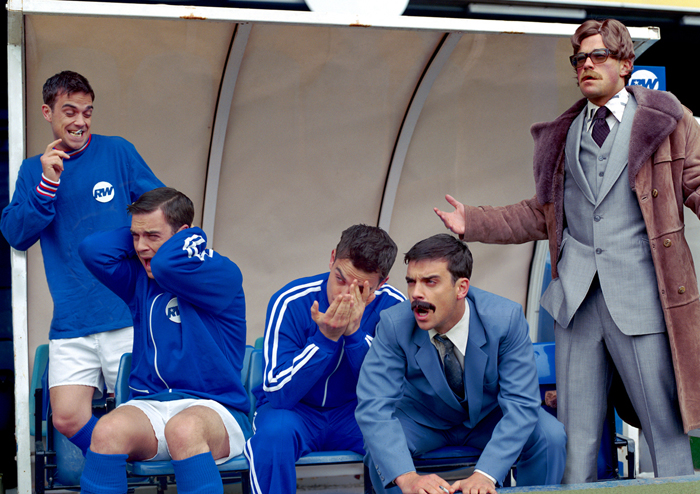
Another photo shoot I did was of me in my kitchen in my house. I chose to do this photo shoot as it shows the less masculine side of doing house-hold chores such as, the washing up and cooking. This shows how it doesn’t change your masculinity to do something not stereotypical of a man to do. I decided to do a different version of one of Smith’s photos. In his there is a man performing the roles of soldiers including the one getting buried. That photo shows masculinity as being a solider is a stereotypical mans role to perform, whereas my photo shoot is almost the opposite.
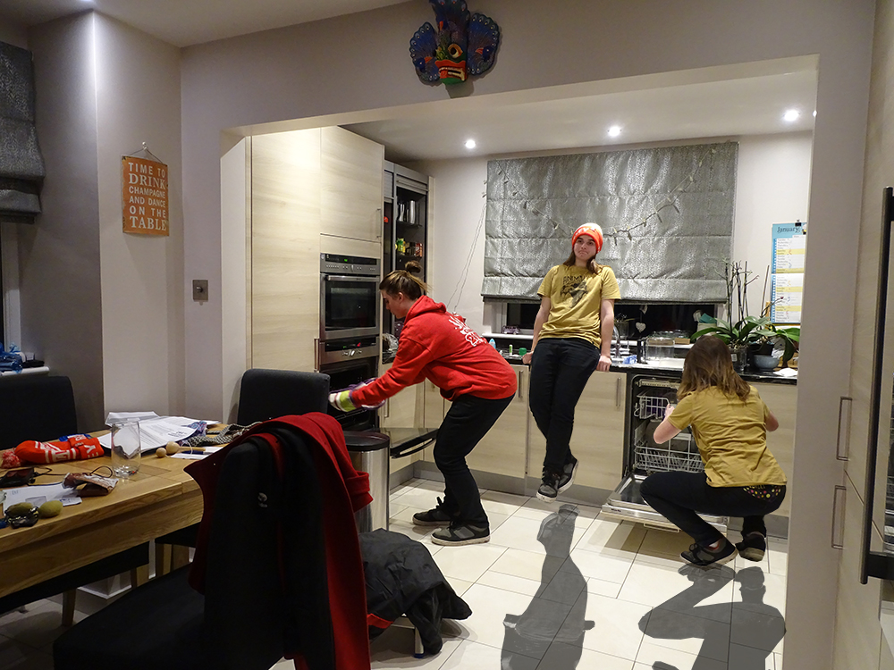
I really like this outcome as I added in a cast shadow on the floor to make it seem more life like, this was tricky as I had to copy the selected shape and then I changed it to black and white, then I changed the opacity and the fill layers, to change the darkness and to make it seem more shadow like.
Here is Paul M Smiths Army picture 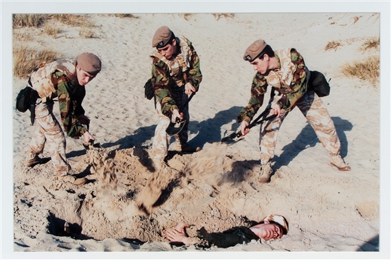
My third and final shoot for this topic was myself fixing my bike. I quite liked this outcome as it was tricky even though I only posed twice, but because of the spokes in the tyre it made it tricky to line up and fit in with the background, but with a bit of editing I made it work. I decided to do one fixing a bike as it seemed masculine to me, as in a stereotype place, women don’t fix bikes, so thought it was a good idea to do.
