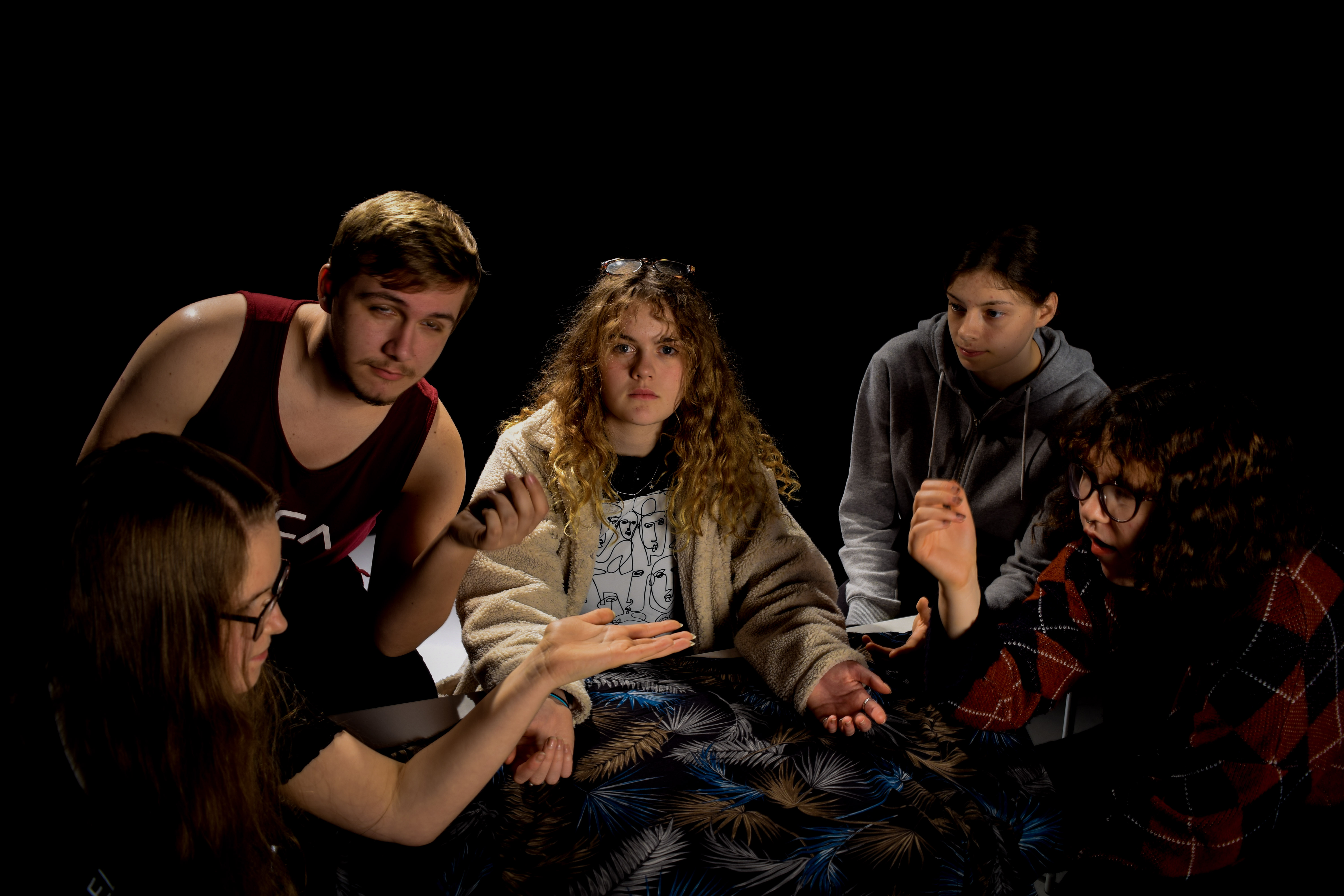
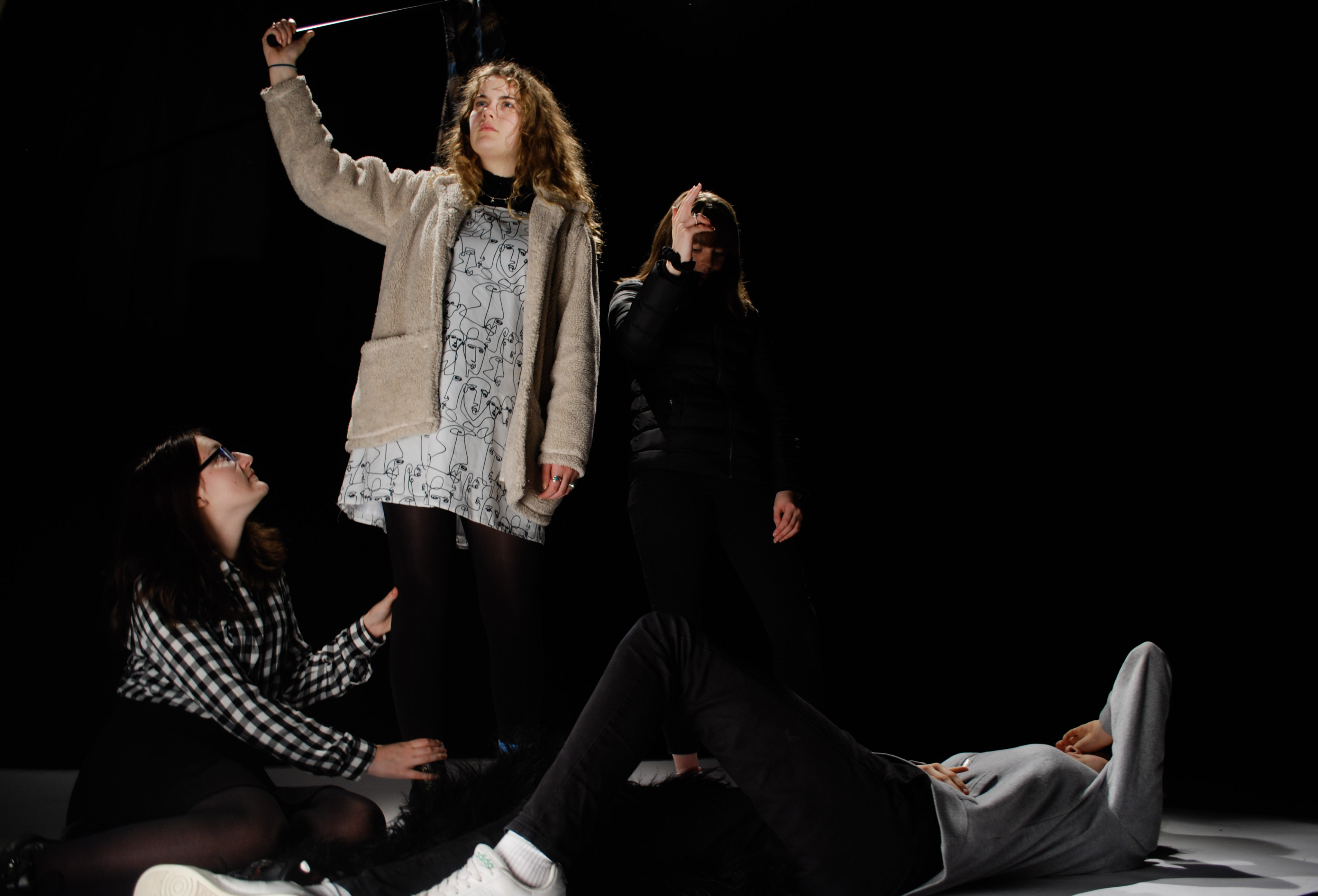
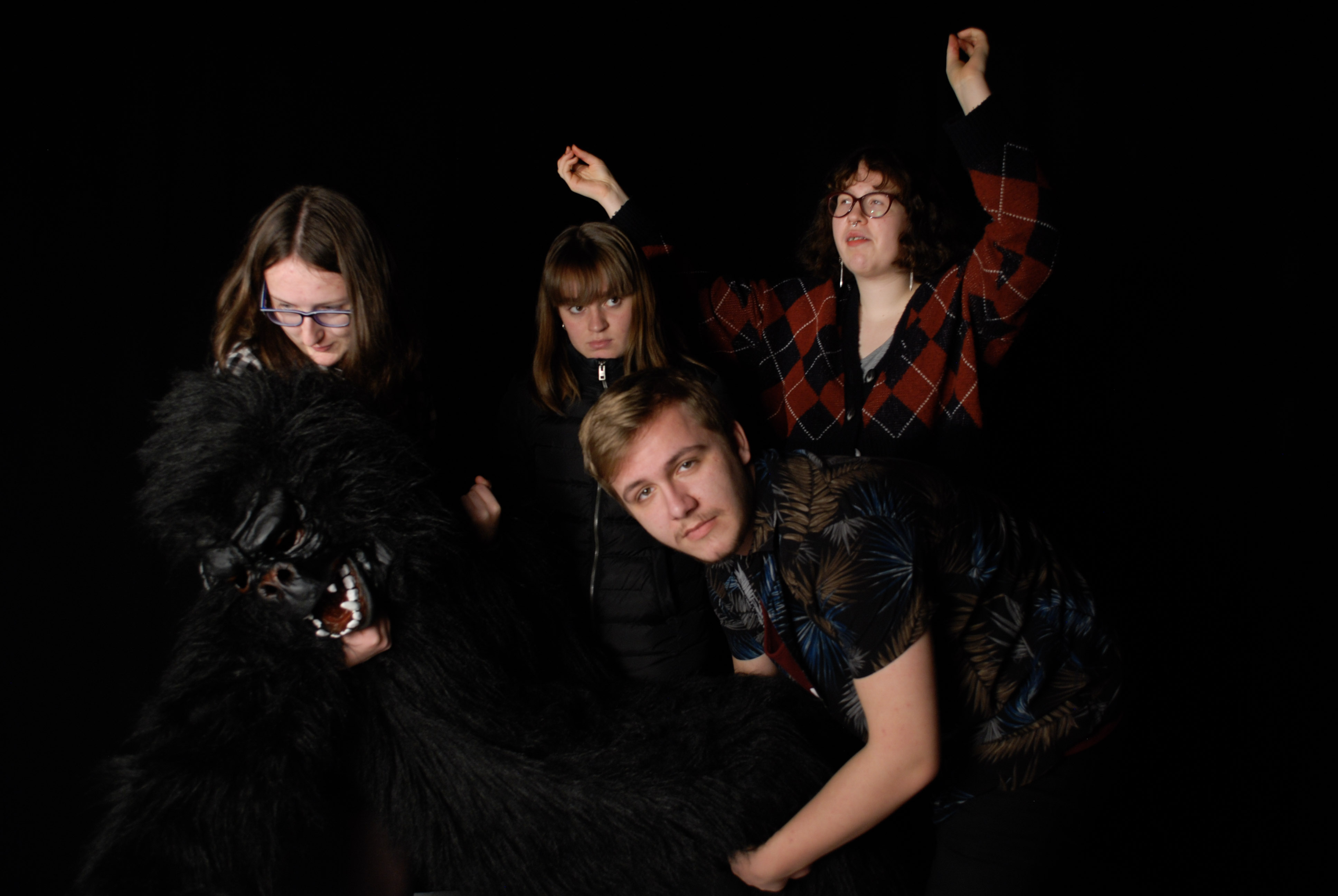
Tableau Vivants response planning

I have decided to do my own interpretations of music album covers as my response to Tableau Vivants. This is because they are often open to interpretation and sometimes have hidden meanings. This will make for a good response form as  it gives me a wide range of inspirations as well as a rough guide to what to do as the images will be my own take on certain album covers.

I was thinking of re-interpreting album covers such as ‘Starboy’ ‘Blonde’ and ‘Flower Boy’. I will end up doing more ideas than these, but they are the ones which I will prioritize.

The first thing that stands out in this photo are the artist’s eyes and cross. This is because the musician’s clothes and skin tone are all similar colours which helps his eyes and cross stand out as they greatly contrast as they are bright white. His body language also suggests despair and giving up. His head being low and in line with his shoulders makes him look vunerable which further helps portray this emotion. The lighting is blue which subconciously implies that he isn’t angry or hostile in any way, this is because western society portrays blue and green as calm colours.
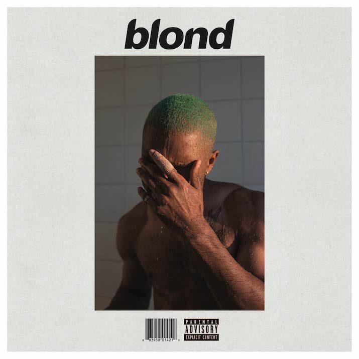
The part of this photo that stands out most is the artist’s green hair colour. This fits in with the theme of the album which is reminiscence and sadness at some points; as after a hard time such as a loss, breakup etc. a lot of people decide to make a big change in their appearance such as a haircut or dyeing it an extreme colour. The next part we pick up on is the water dripping off of the artist, it is due to him standing in a shower but as we can’t directly see the shower head it appears as those are his tears, almost as if his emotions have been materialised.  One more aspect of this photo which clearly stands out is the contrast between the artist’s skin tone and the background and border of the photo. This makes him stand out more and therefore makes the photo more striking.
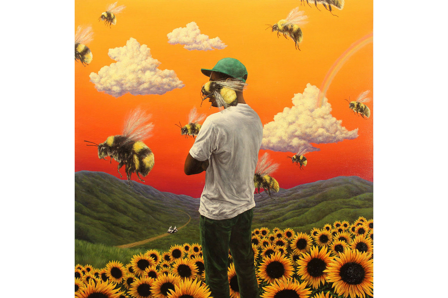
This album cover is less about portraying emotions or feelings, it is instead about self discovery. This theme is carried over through real life parallels which are present in both the songs on the album and on the cover itself. Firstly, there is a white Mclaren in the background on a winding road. He uses the car to portray the journey through life, and the winding road as problems you face on the way. Another important aspect of the cover is that one of the bees is covering the artist’s face, this raises the tension of the photo as we can’t be sure what’s behind the bee, this is also helped by most people’s fear of being stung by a bee or wasp; the bee on his face appears to be ready to sting him which may makes some viewers anxious for him. The bee’s wings are painted as if they are moving which  makes the photo more appealing as there is some sort of action happening.
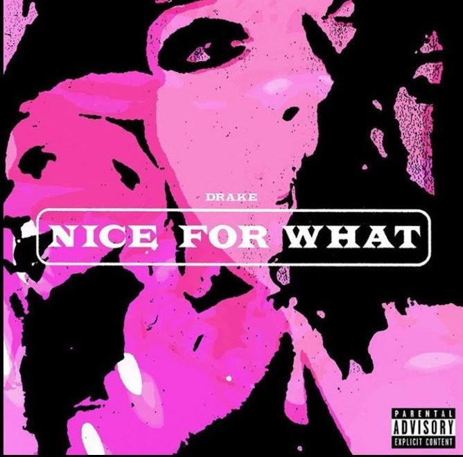
The last two album covers don’t have a deep meaning like the rest, but I have decided to replicate them as they have been edited in a very interesting way. The first cover has had threshold applied to it and had a pink filter applied over every segment of the photo which isn’t solid black. This creates an old school feel, and joined with bright pink creates a connotation of ‘fun’ which matches the song, there isn’t a deeper meaning, it’s just entertaining.
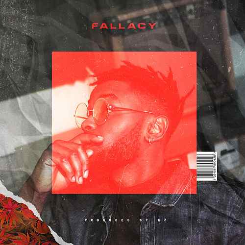
 

This album cover is just about exploring visual effects and using the ones that match the photo and look good. There are multiple exposures in this cover, a photo of the artist, crinkled bed sheets, a classic marshall speaker, and a tilted image of buildings. These help the photo look more full and eliminate any empty space. There is also a semi transparent box around the artist’s head, this highlights him being the most important thing in the photo, as well as strengthening the middle of the photo by differentiating it from the area around it. The bottom-left corner of the photo has been edited so that it appears as if there was a layer of plants behind the photo, the tear between the main image and the plants gives the photo a rough look. The crinkled bed sheets and slight distortion effect helps achieve this image of a torn up and battered album cover.

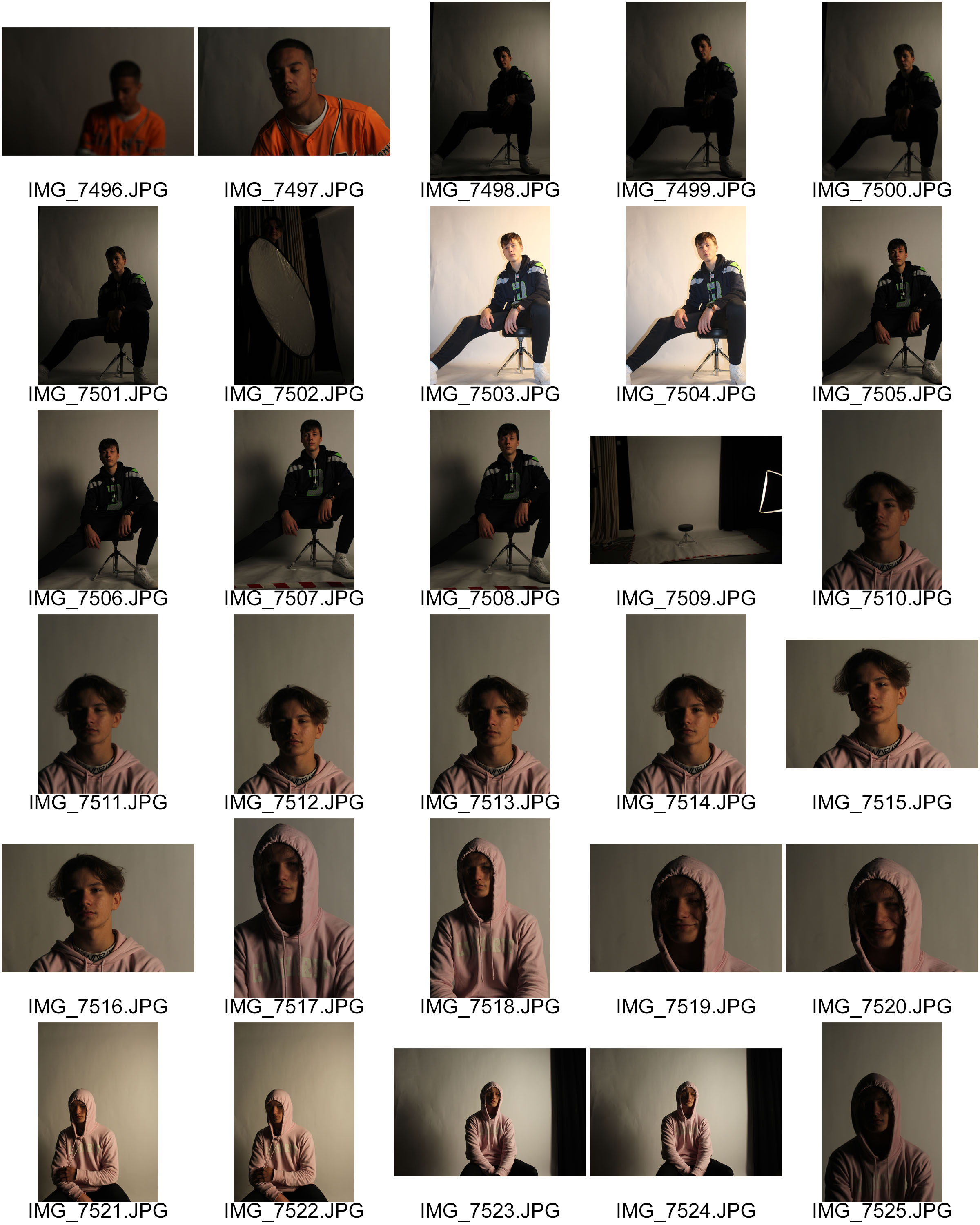
Studio Lighting Experimentation – 1 Point Lighting

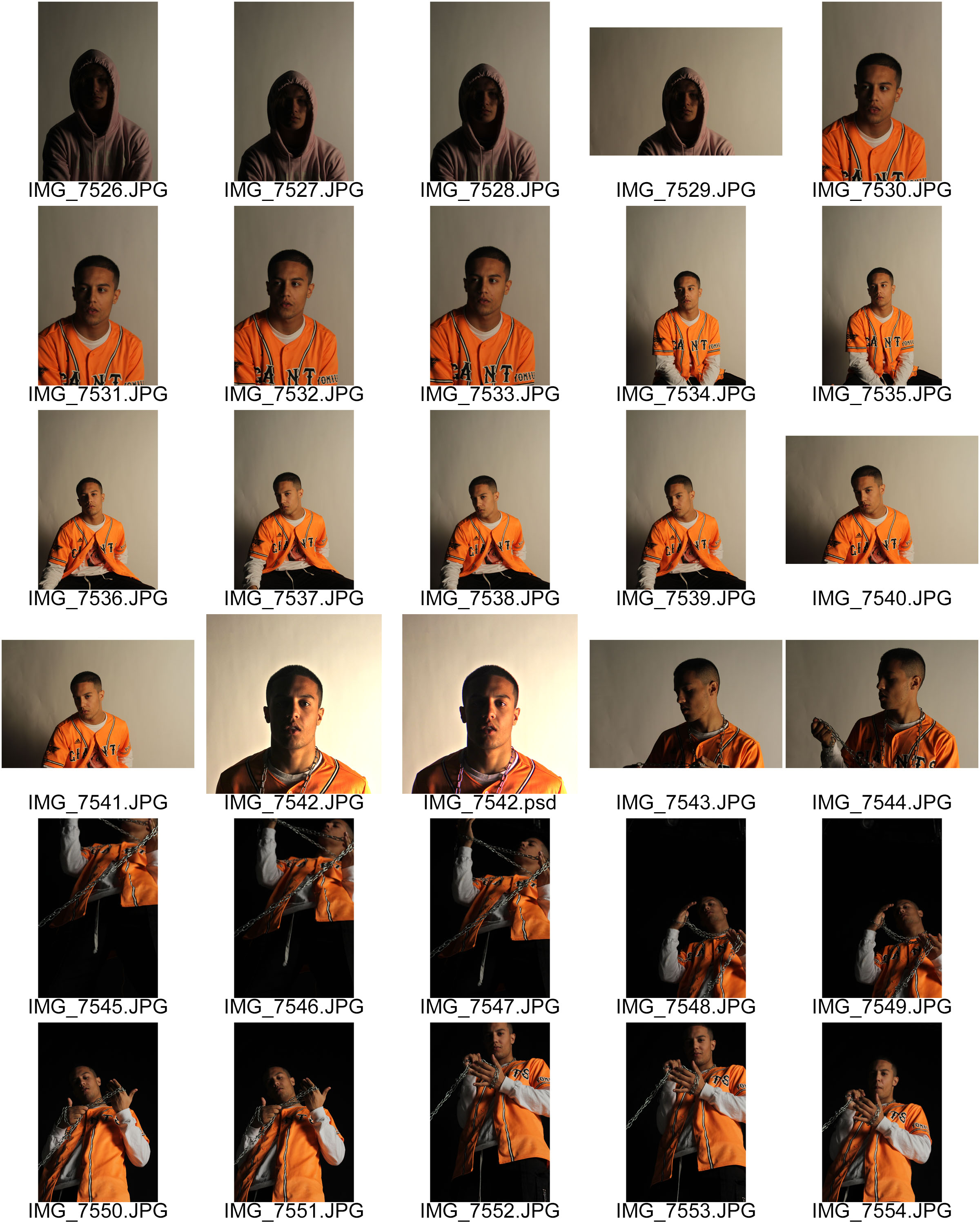
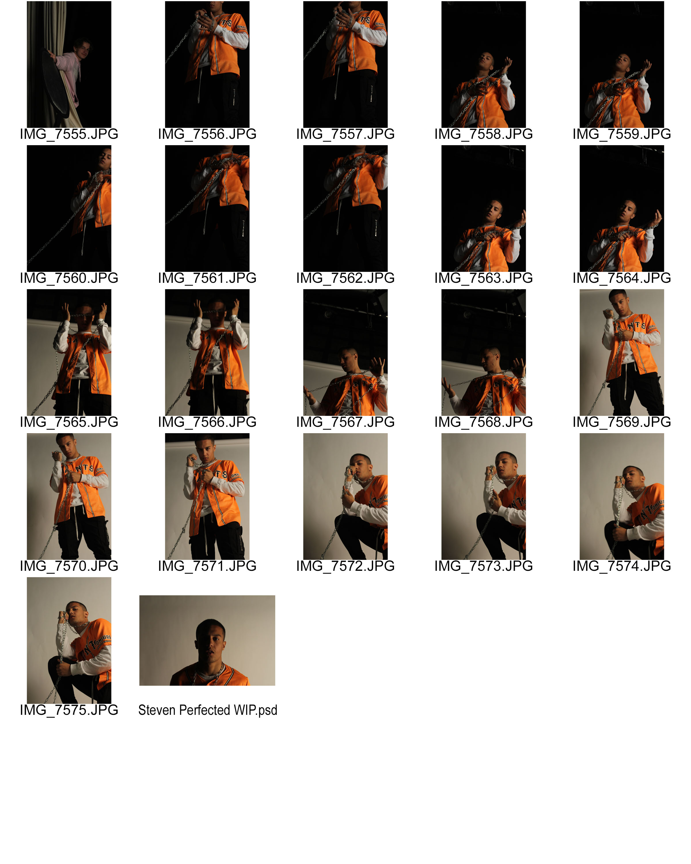
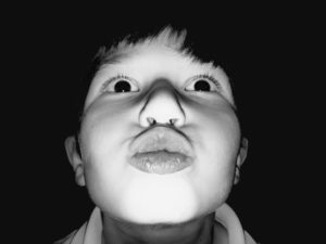
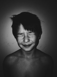
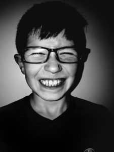
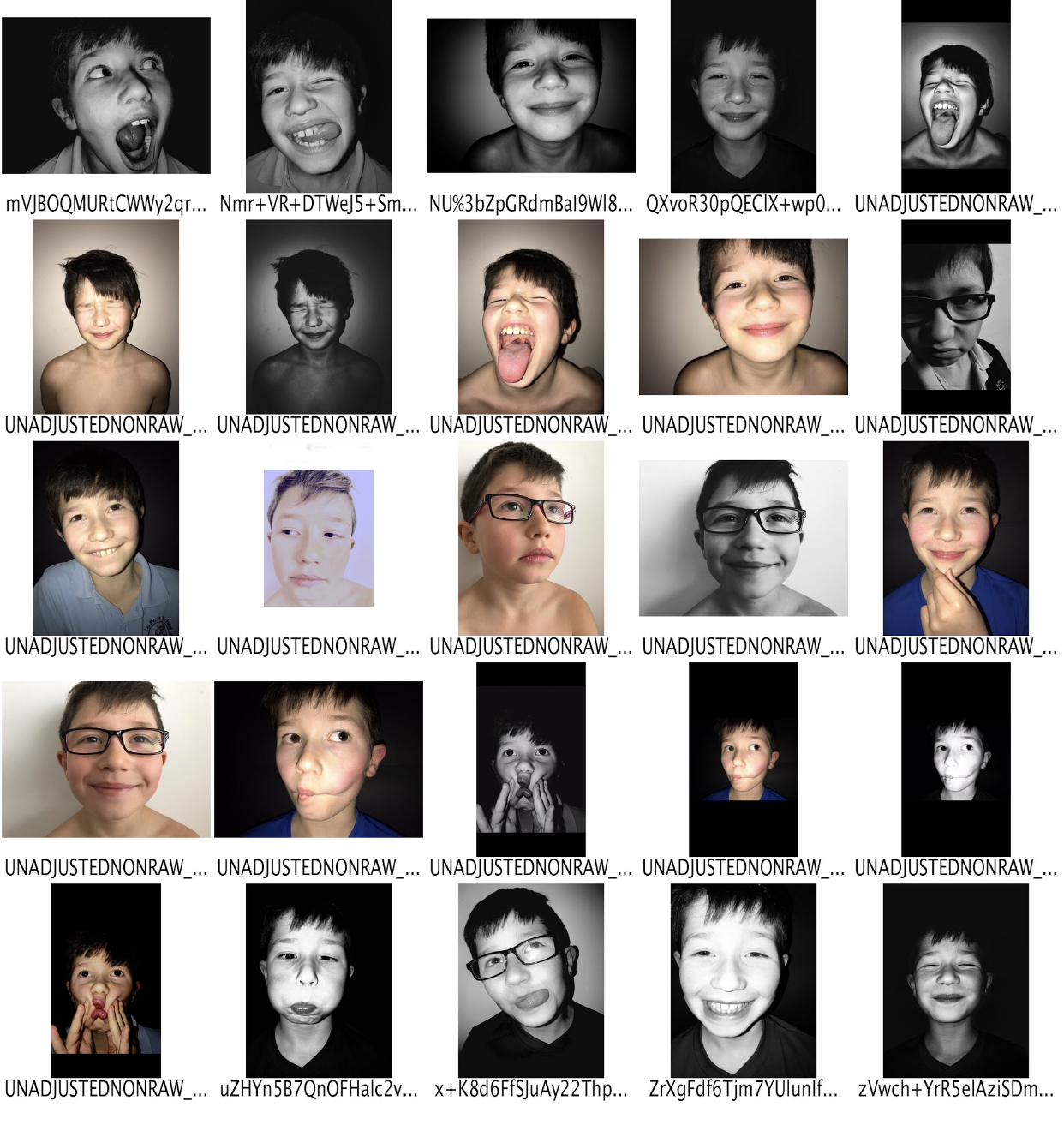
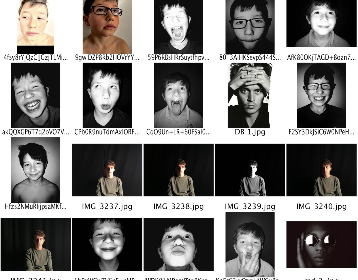
For this photo-shoot I primarily experimented using one point lighting in order to create a subtle chiaroscuro effect, I decided to be subtle about this effect as I wanted to have as many options available for editing as possible. With some of the later photos in the shoot i decided to make the effect more evident as i had a set idea for the look of the photos and thus wanted to minimize the amount of unnecessary editing I would have to do afterwards.

My personal favorites of the shoot are:

7564

7571

7544

These are mainly because i like the composition of the images and i like how the lighting complimented the colors in frame. The lighting created a good amount of vibrancy while not leaving the image over saturated. I also like the photo 7542 however i found that the lighting in that image required too much retouching and the edits became very evident.

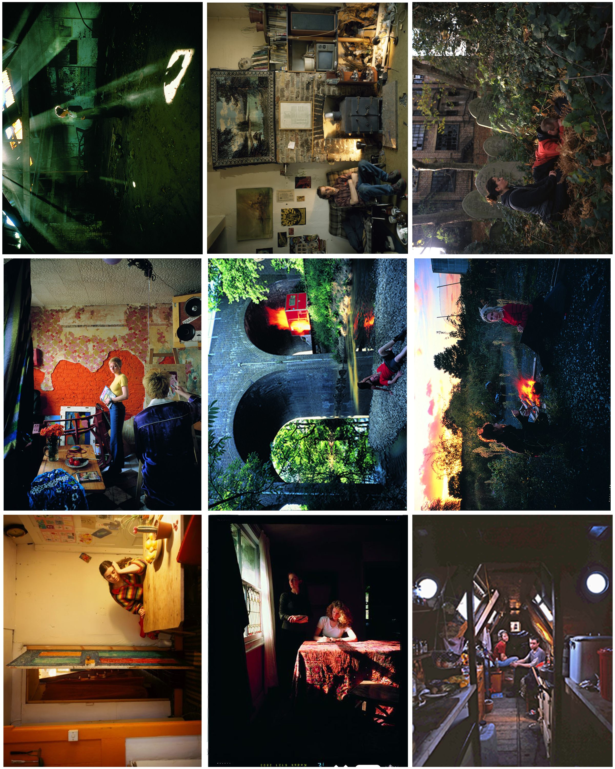
Tom Hunter, Tableaux Vivant Research

Tableaux Vivant and staged reality is photography that the photographer stages in such a way that it is almost like theater that emphasizes what the photographer wants the story to tell.

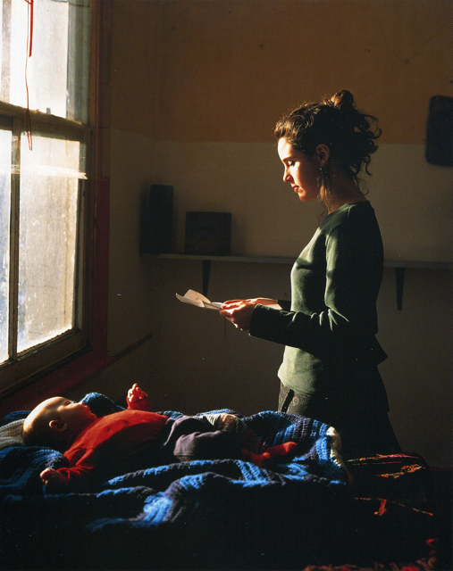
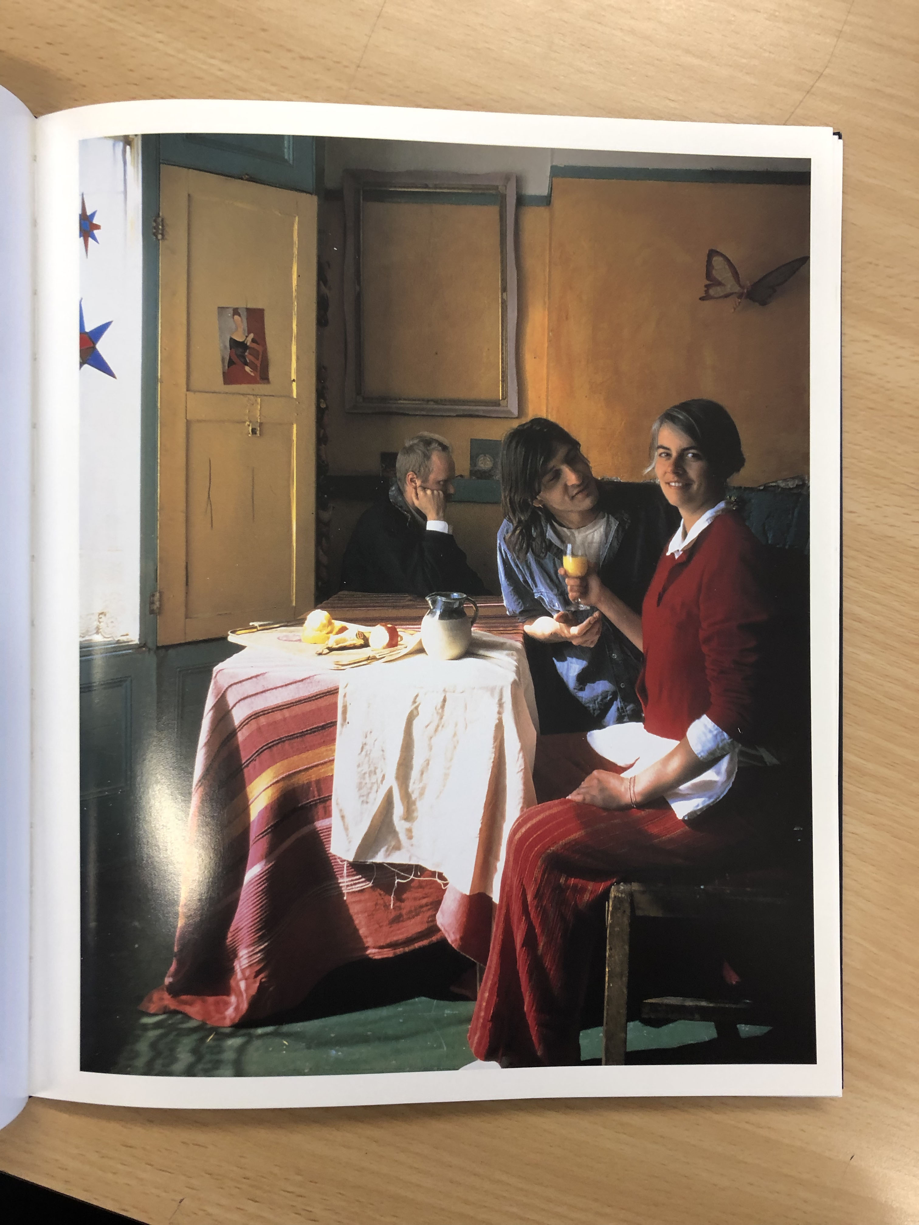
Tom hunter is an English photographer born in Bournemouth in 1965. His work was specialized in documenting life in Hackney. A lot of his images showed the local issues in the area at the time. His images also often referenced other artists work. Quite often he tried to recreate Johannes Vermeer’s work. An example of him doing this would be in his image “Woman Reading a Possession Order” which is shown below:

Woman Reading a Possession Order | Tom Hunter

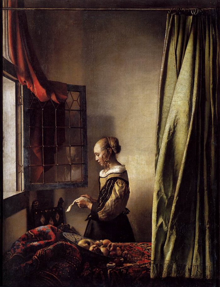
This image is a recreation of a Johannes Vermeer image as shown below:

Girl Reading a Letter at an Open Window | Johannes Vermeer

Contextual/Conceptual: Though, Tom Hunter took inspiration from Johannes Vermeer, he has added his own twist on it by showing a mother with her child reading a letter that says they are going to be evicted from their home. Rather than just a woman reading a letter with little meaning. The use of the child rather than just having a bowl of fruit makes the image look a lot sadder. The baby’s body is contorted in such a way that makes it seem like it knows what is going to happen to its home.

Visual: In the image, Tom Hunter has edited the tone in the image so that the image appears very dark throughout the image with the face appearing very brightly from the light of the window. He may have decided to edit the tone to be dark throughout to display the emotion that the woman would be feeling when reading the letter.

Technical: Tom Hunter seems to have only used natural lighting to create this image. This lighting is coming from the window and illuminates the woman’s face for the most part. Secondly, the image is quite over-exposed. This could have been created by having a long shutter speed. This makes the image seem a lot brighter in the light areas than the dark areas.


“Filipa had just had her first baby. We spent the whole day trying things out: we had a bowl of fruit, then we tried some curtains, then incorporated the baby. The light was perfect, a late winter sun coming through the window, really low, like the northern European light.” – A quote from Tom Hunter about how he came up with the image. From a guardian article:

https://www.theguardian.com/artanddesign/2009/nov/04/photography-tom-hunter-best-shot

Here is a selection of other Tom Hunter images that I really like and may try to recreate:

I have picked a lot of these as my favorites due to the way Tom Hunter uses lighting and because some of them simply display parts of peoples lives, such as grieving for others.

They are inspired by Vermeer and his use of light. The light can signify various things…such as hope.

Album cover responses

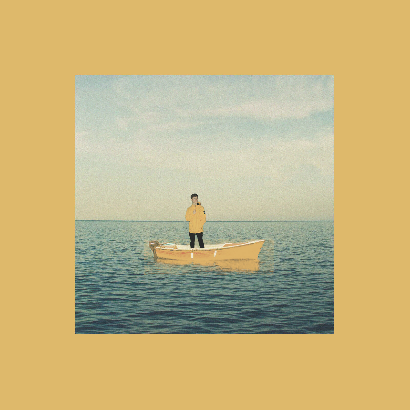
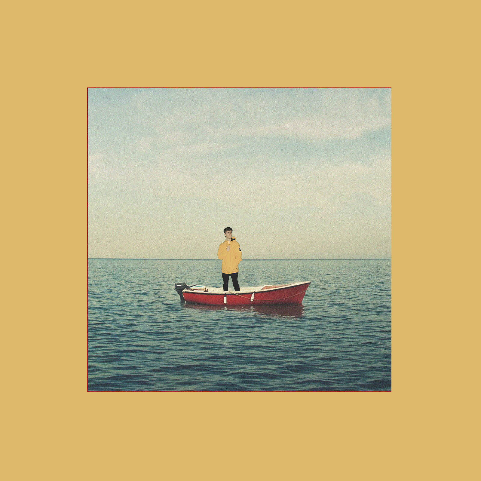
This photo is my recreation of the ‘Lil Boat’ album cover by Lil Yachty. In the original the artist’s clothing, boat, and frame are all very similar shades of red. Whereas in my version all of those elements are yellow, this is because I used a yellow raincoat in the shoot which meant i had to make every previously red element yellow. The original photo was taken in front of a green screen, then edited into the backdrop of the original album cover. I used the content aware brush to remove the artist from the picture and placed a picture of my friend. I used the colour range function to select the boat along with its shadow and change it to yellow. To change the colour of the frame I created a yellow layer the size of the whole cover, then moved it so that it was in front of the original red frame, but behind the image in the centre. I then applied some colour filters to the image of my friend and slightly blurred the edges to make him seem more authentic as part of the photo.

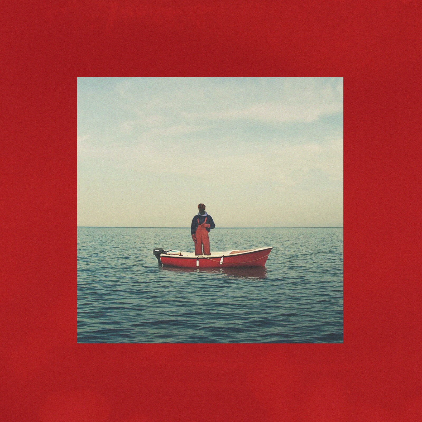
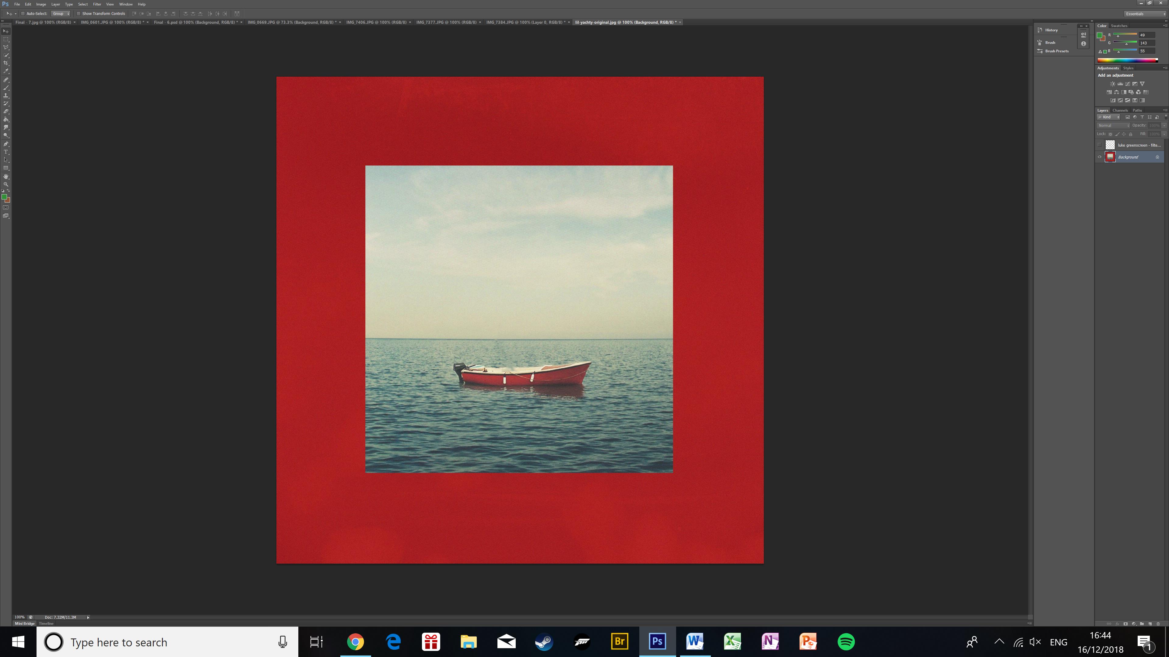
This is what the original cover looked like.
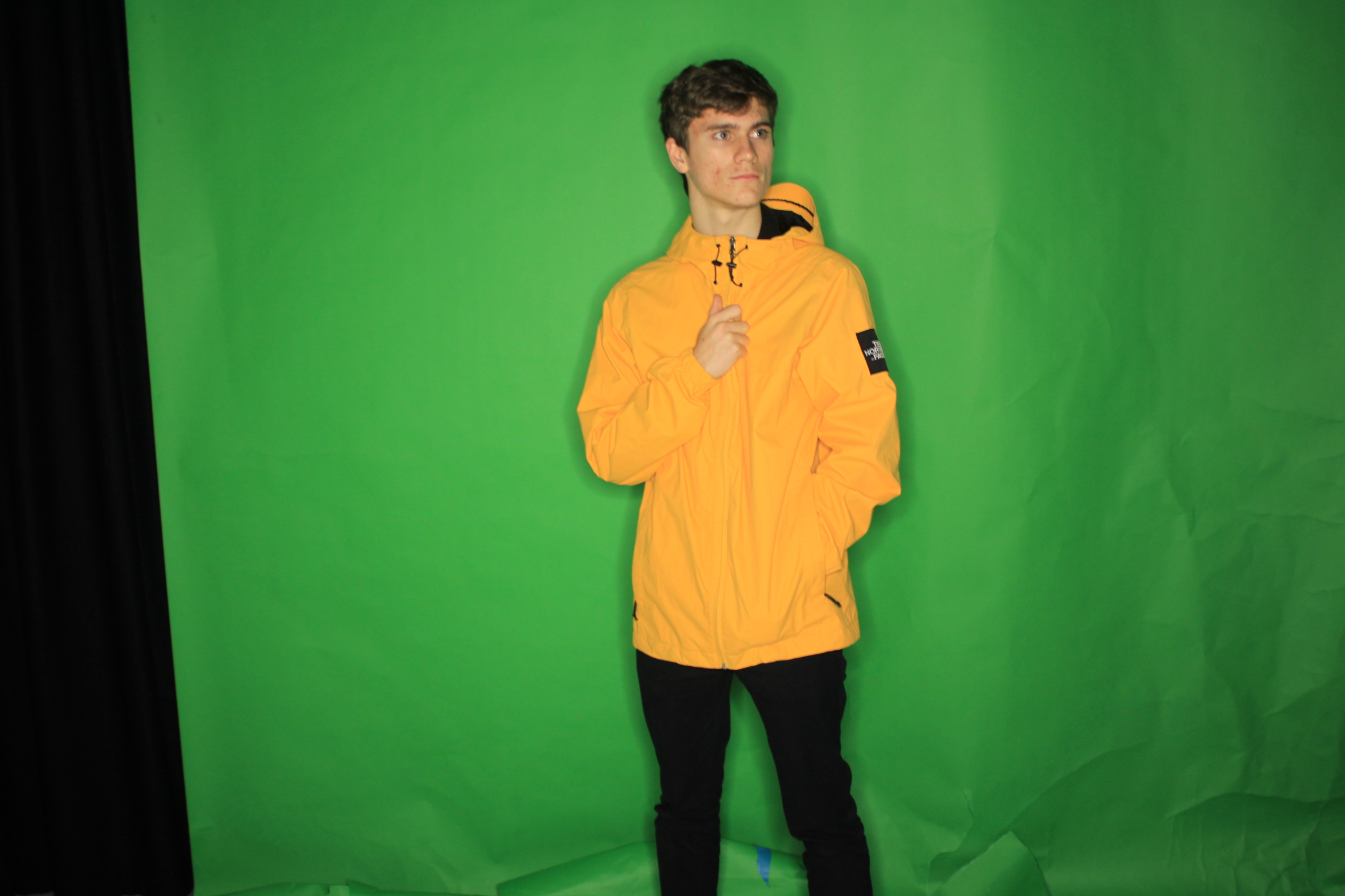
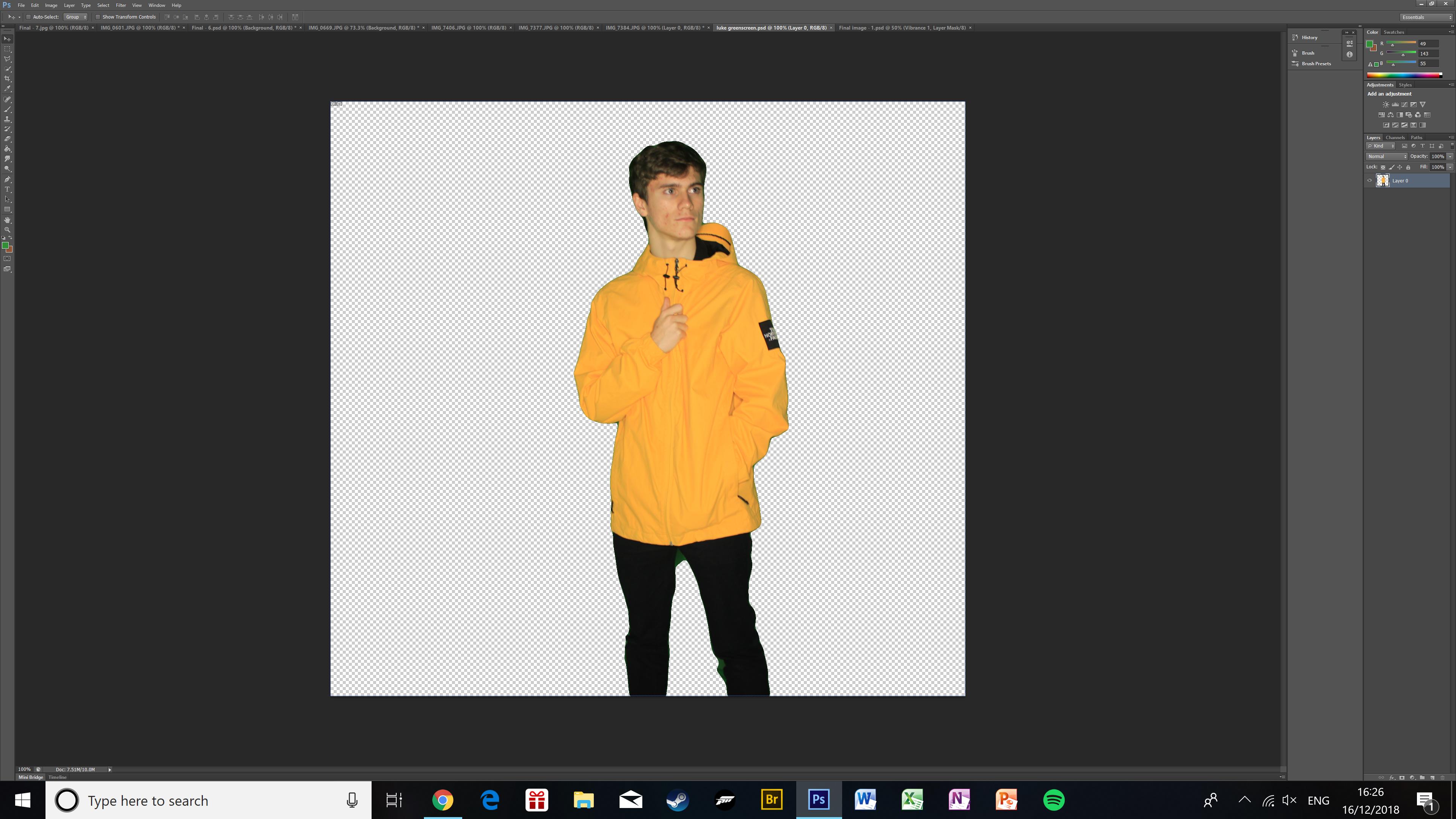
The green screen in the background is a bit creased towards the bottom, but luckily there is a lot of contrast between it and the trousers so it was easy to edit out the background.
This is the photo of my friend after I had removed the green screen, this is before any colour correction or editing was done so it there is a feint green outline and some green reflections.
This is the original album cover with the artist removed from where he was standing on the boat. I left his shadow in the water is it was easier to give it a yellow tint instead of erasing it all together and replacing it with a feint image of my friend.
This is the album cover with my friend placed in.
Here the frame has been coloured yellow, I used the eye drop tool to match the colour of it to the coat, this makes the photo more relaxing to look at because there is less variety of tones.

This is my take on the ‘starboy’ album cover. I had to change the colours as the blue colour scheme wouldn’t work as well as in the original because of my friend’s ethnicity. I also had to change the positioning of his hands because he has a different hairstyle and colour to the artist. If his hands were in the same pose they would stand out a lot more against his hair; which wouldn’t have the same effect. Also, due to his hair being longer his fingers would be covered up by his hair if he slid them up his head; which would also be less effective than the original album cover.
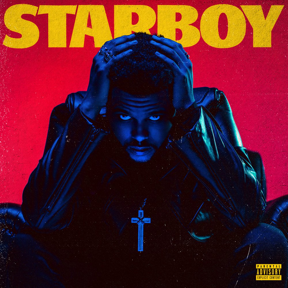
The original album cover, it has a much different colour scheme to my version, but these colours work well only in the original because of the artist’s and my model’s ethnicity. The theme of blue-lit black is possible here due to his dark skin tone. There is also a parental advisory tag in the bottom right due to the contents of the album, I didn’t include this in my version because I had already used that tag in previous covers in this project and i didn’t want to repeatedly use them.
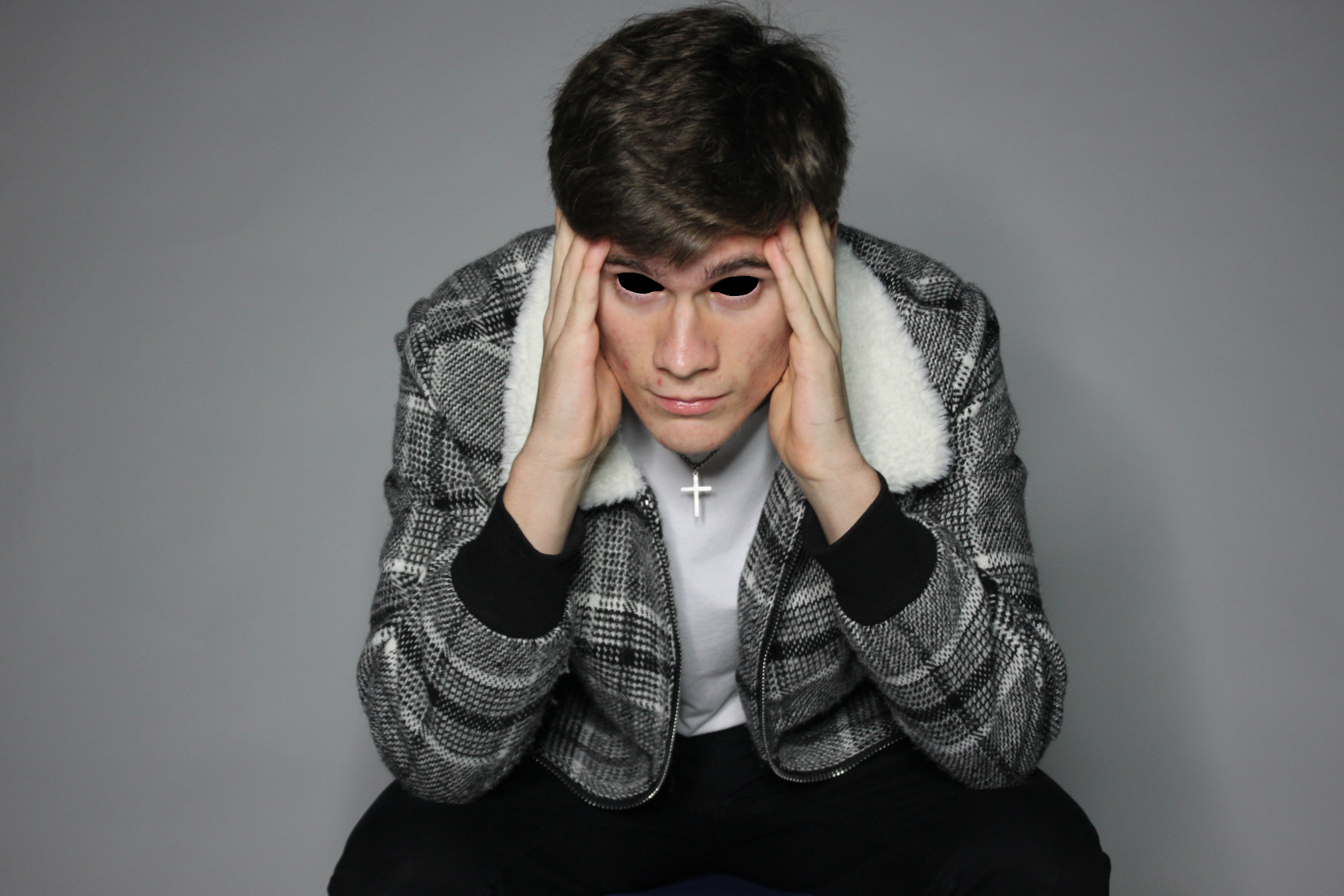
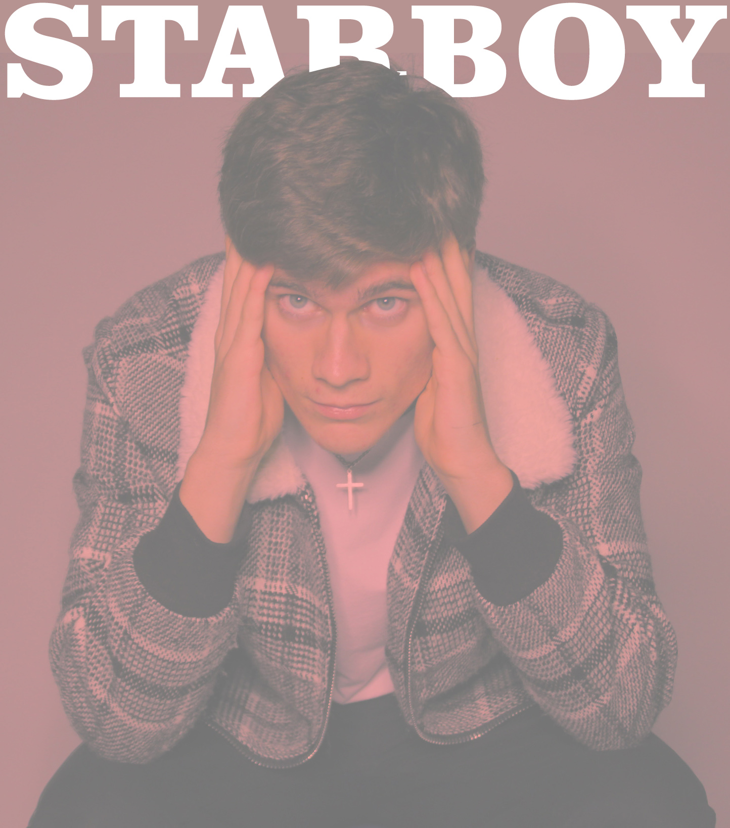
This is a work-in-progress edit of the photo which I decided to abandon because it looked too __ and didn’t fit the theme of the cover. My idea behind it was to make everything light colours apart from the eyes and cross (this is the opposite of what they did in the original album cover; everything dark apart from eyes and cross), I edited the eyes first and realised that the idea didn’t really work out so I didn’t bother editing the rest of it.
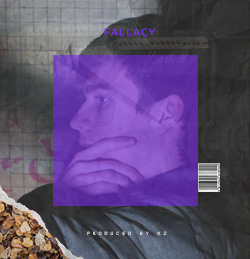
 

This is my take on the cover of ‘Falacy’ By Raheem Bakare. I have kept the basic composition very similar. However, I have changed around the angles, colours, and used different layers in the photo. I changed the overlays to purple as it complements the brighter skin tone more than red. I have overlayed images of crumpled paper, sound amplifiers, and strip lights, and there is a torn corner with autumn leaves behind it. I also took the photos in front of a subway background to match the urban look of the original cover.

This is the original album cover for ‘Fallacy’. It has a lot of layers placed on top of each other; which fills in the empty space which the main photo would otherwise have. There are plenty gray/dull coloured layers and red elements to highlight the artist’s head, title of the album, as well as leaves in the bottom left corner.
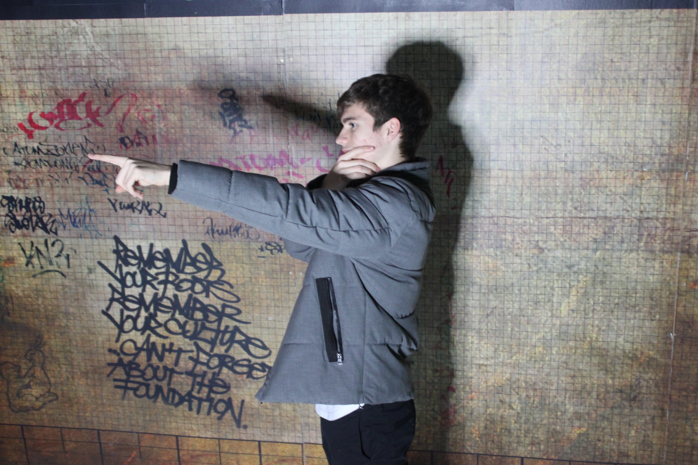
This is the original photo, it doesn’t have the same effect as the finished product as there is too much empty space in the background, the person is standing in the middle, in addition to there only being one layer present, which is the photo itself.

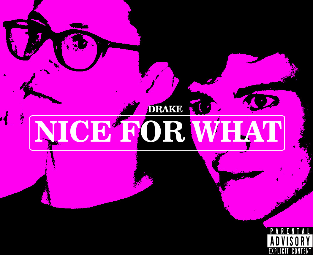
This is my recreation of the ‘Nice For What’ cover by Drake, I posterized it to create blocks of light/dark. I then applied a pink colour block to all the white areas of the photo to match the original again. However, I applied a much darker shade of pink to make the cover pop more as a whole, it also makes the writing in front of it easier to read.  I then cropped the photo to show a close up of two faces like the original cover. The writing is in two different fonts, with a lot of spacing added between the letters so that they fill out more of the box and appear more bold. The final step was adding the parental advisory stamp in the bottom right corner to match the original.

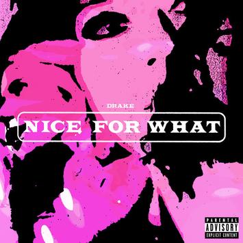
This is the original ‘Nice For What’ album cover, it’s edited so that you can’t really tell what’s going on but it’s possible to make out the main shapes and the title in the middle.


This is the original photo, I chose to take it in front an urban background in hope to achieve some distortion in the background after I applied the filters.
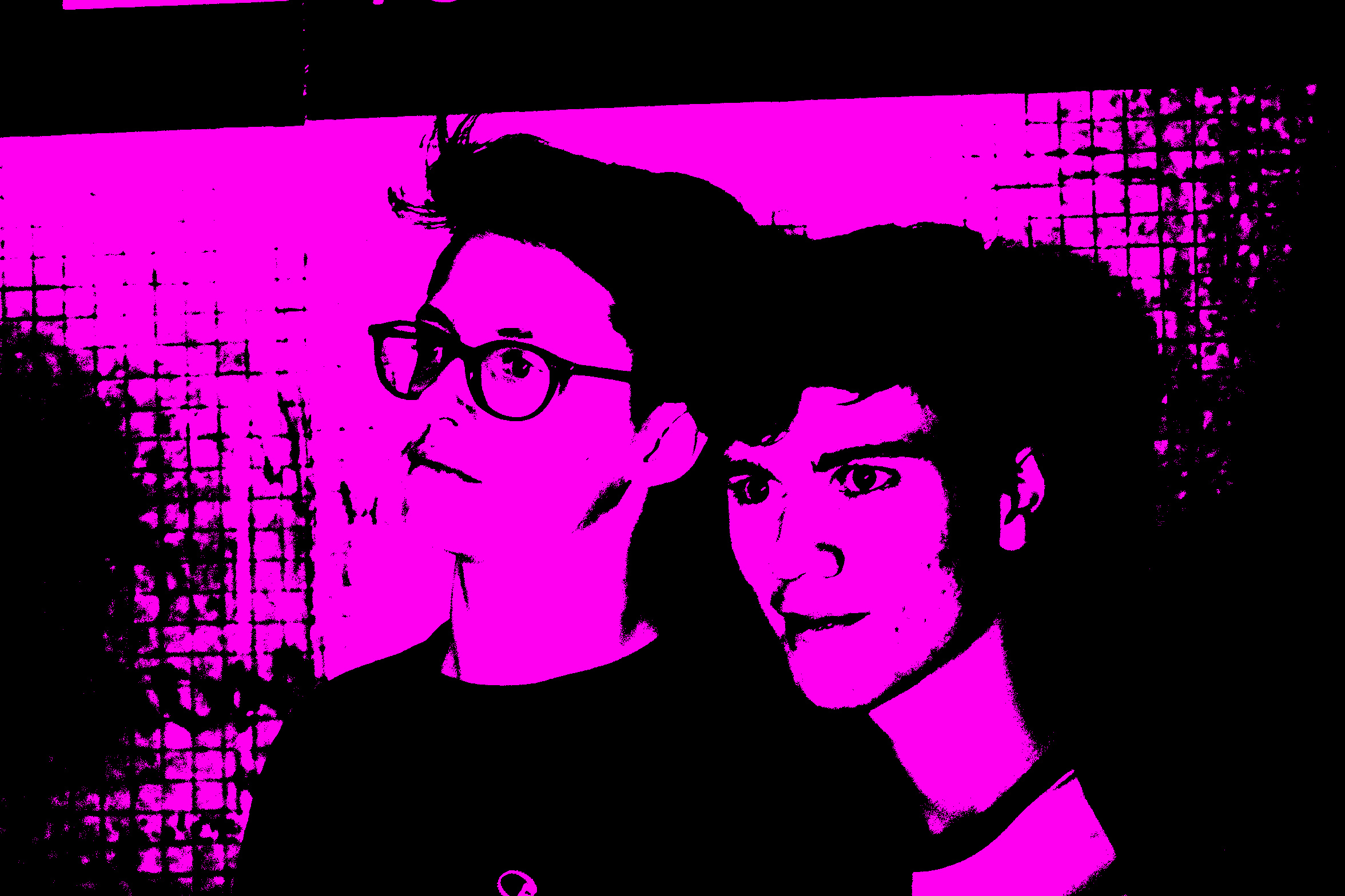
This is the image after I had edited it, but before cropping and adding and lettering. As you can see there is distortion in the background due to its texture, however its only present around the outer edges, so it wasn’t visible in the final cover after I had cropped it.
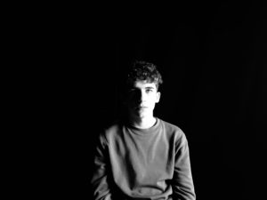
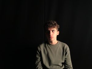
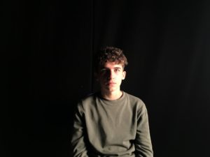
Chiaroscuro Part 2/ Studio Lighting

Studio Lighting Attempts:


The reason i have chosen to put these images in black and white is because I like the colour contrast it creates highlighting features that should normally be highlighted but with an extra touch of softness. Chiascuro doesn’t have to limit itself to black and white images as back around the time of the renaissance they wouldn’t have limited everything to shades but added colours like darker shades of brown.

Chiascuro photography cannot work without lighting special effects. Having tried this in many different places light rooms, dark rooms, average to darker lighting then having played with the shades that appear in the images I have managed to touch on areas that perhaps wouldn’t have appeared so dark on just the camera image.

Some of these images were easier to capture than others. In terms of lighting and working to achieve Chiaroscuro the main part of the image should be extremely dark.  I have worked with achieving chiaroscuro not only in taking pictures but drawing it as well some of the images i decided to leave in color because even though there isn’t a big element of darkness there are features that you normally would not be able to see. it highlights areas and features of the face that make the image 10 times more interesting to look at due to the high level of detail.

My thought process for these images, due to them being taken at home was harder for me as i find my brother quite a good model as he usually pulls expressions that i couldn’t make my friends do because of it being too ’embarrassing.’ These images (most of them) were actually taken in my room either using natural lighting and flash or a low exposure with a low brightness setting. I also decided to change the background because having a white background when trying to create a chiaroscuro effect might not work in my favor, therefore i used a black sheet of A5 paper and blue tacked it to my wall and simply made my brother stand in front of it. I think this worked well in my favor for some of my images.

The images themselves don’t have a lot of texture apart from some areas of high detail on the faces. The lens focus perfectly on the area that i was aiming for which was more a less the center of the face.  The white balance of the image is focused on the right setting for most, obviously there will be the odd that’s either to over exposed or too under exposed but most of them came out the right temperature.

The Lighting Technique


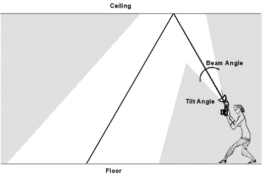
Image result for bouncing the flash

An example of bouncing the flash to soften the effects and create a larger fill area this can be used when there is white ceilings\ wallsImage result for 1 2 3 point lighting

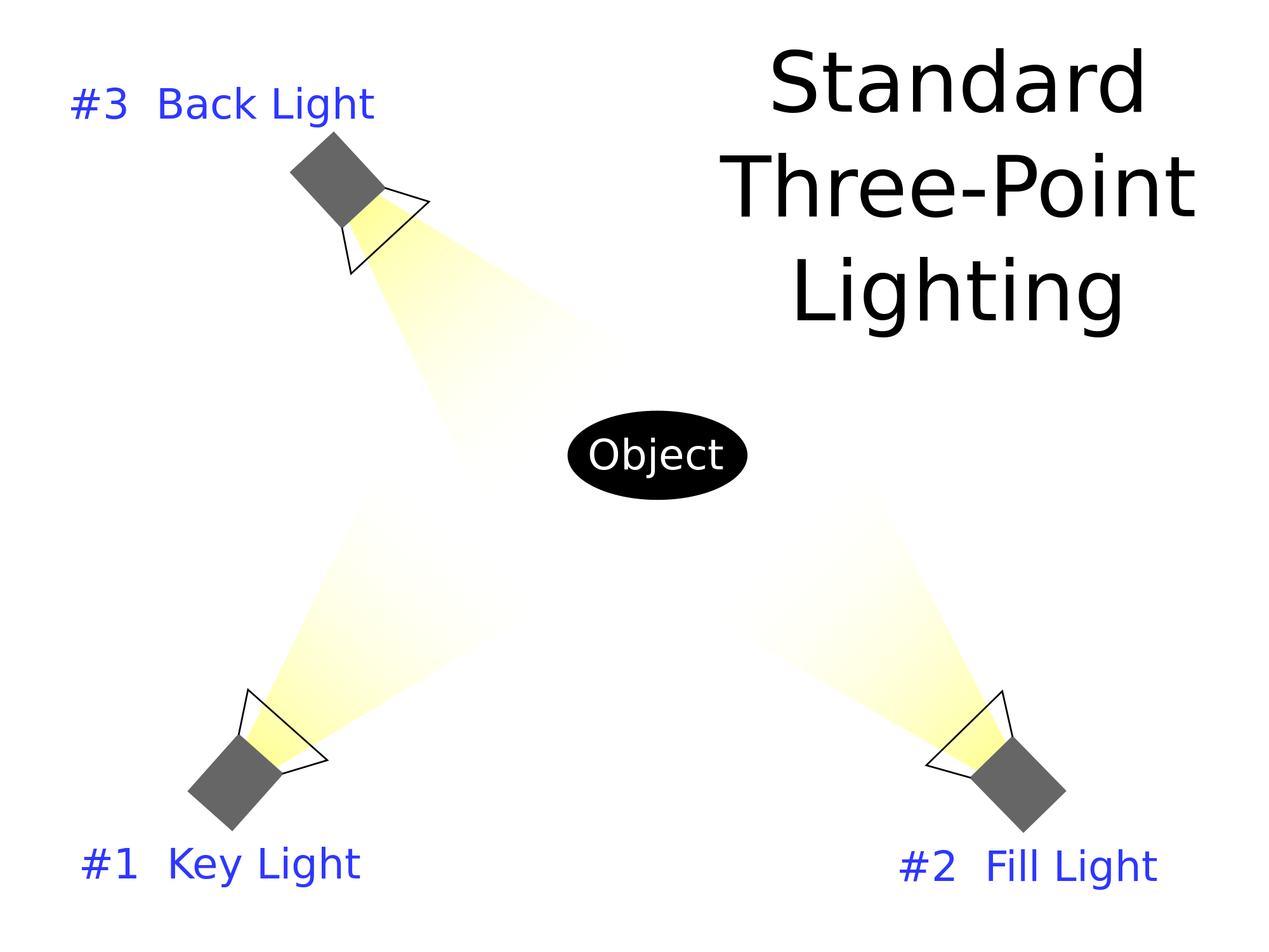
In the video below it shows a way to set up 1,2,3 point lighting and what its job purpose is and what it solves.

https://www.youtube.com/watch?v=w3xYPOiPtE4

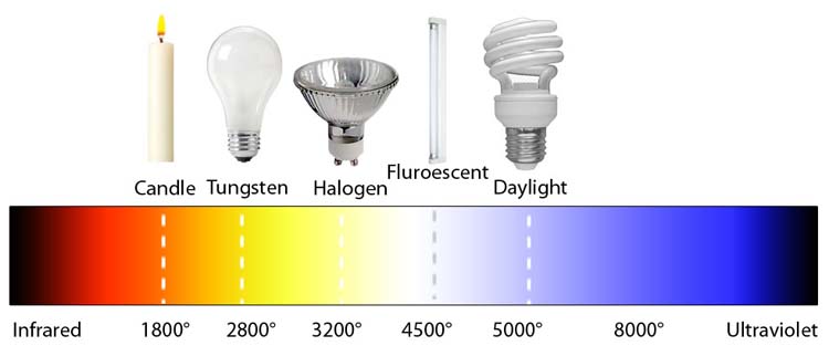
Image result for temperature of photography light

Temperatures used to gain any specific lighting.

However if not having access to studio lights which is the case for most unless in a school studio. lighting techniques can be improvised like using natural lighting or using natural lighting that contains patterns, using the flash, holding multiple phone torches to the aimed area being photographed, using led lights or even fire lighting.

Tableau and Staged Reality

Definitions:
Tableau: Tableau is used to describe a painting or photograph in which characters are arranged for picturesque or dramatic effect and appear absorbed and completely unaware of the existence of the viewerhttps://www.tate.org.uk/art/art-terms/t/tableau
Staged Reality:  a celebration of images that were made consciously.
http://staged-photography.tumblr.com/
Three Images I’m Inspired by:
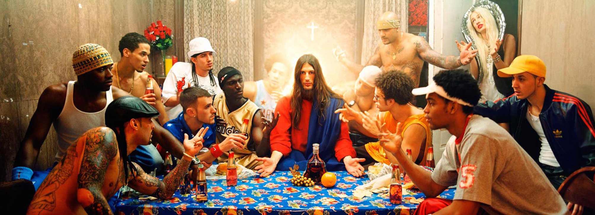
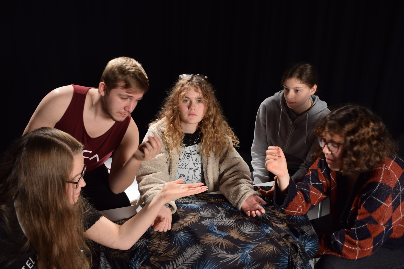
David La Chapelle's 'Jesus is my homeboy'.

Eugene Delacroix's 'Liberty Leading the People'.
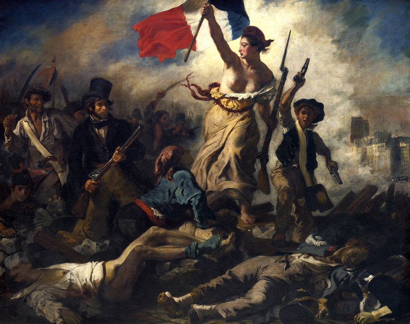
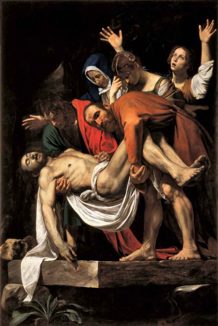
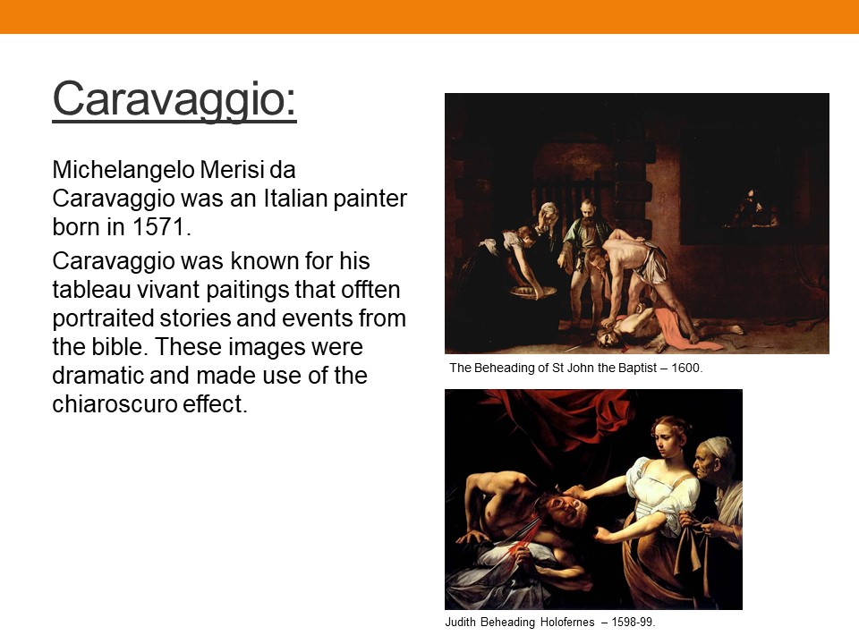
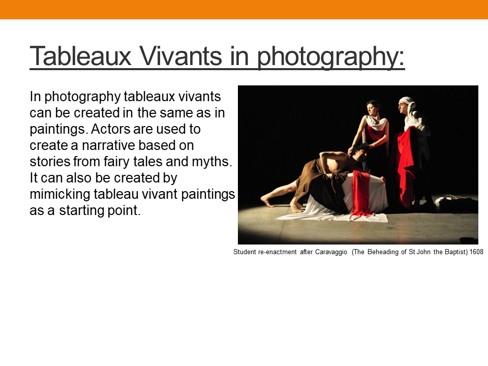
Caravaggio's 'Deposition'.
Class Tableau Inspired Shoot:

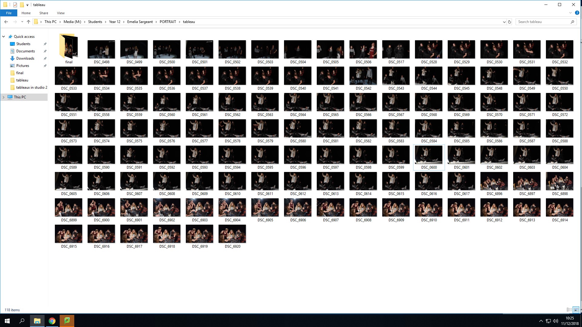
Contact Sheet:

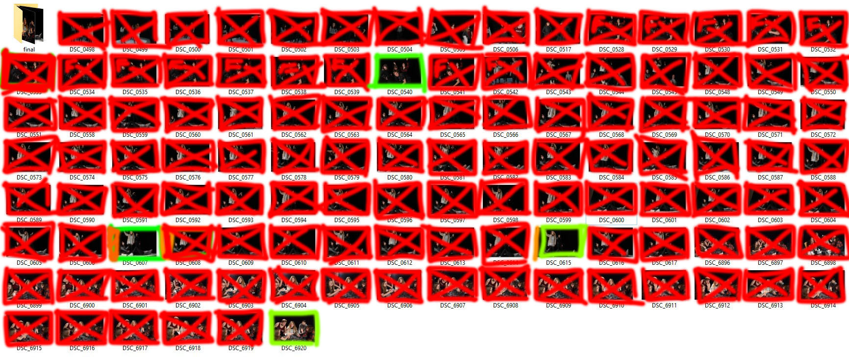
Manipulated Images:

CLAUDE CAHUN AND CLARE RAE COMPARATIVE EXHIBITION ESSAY


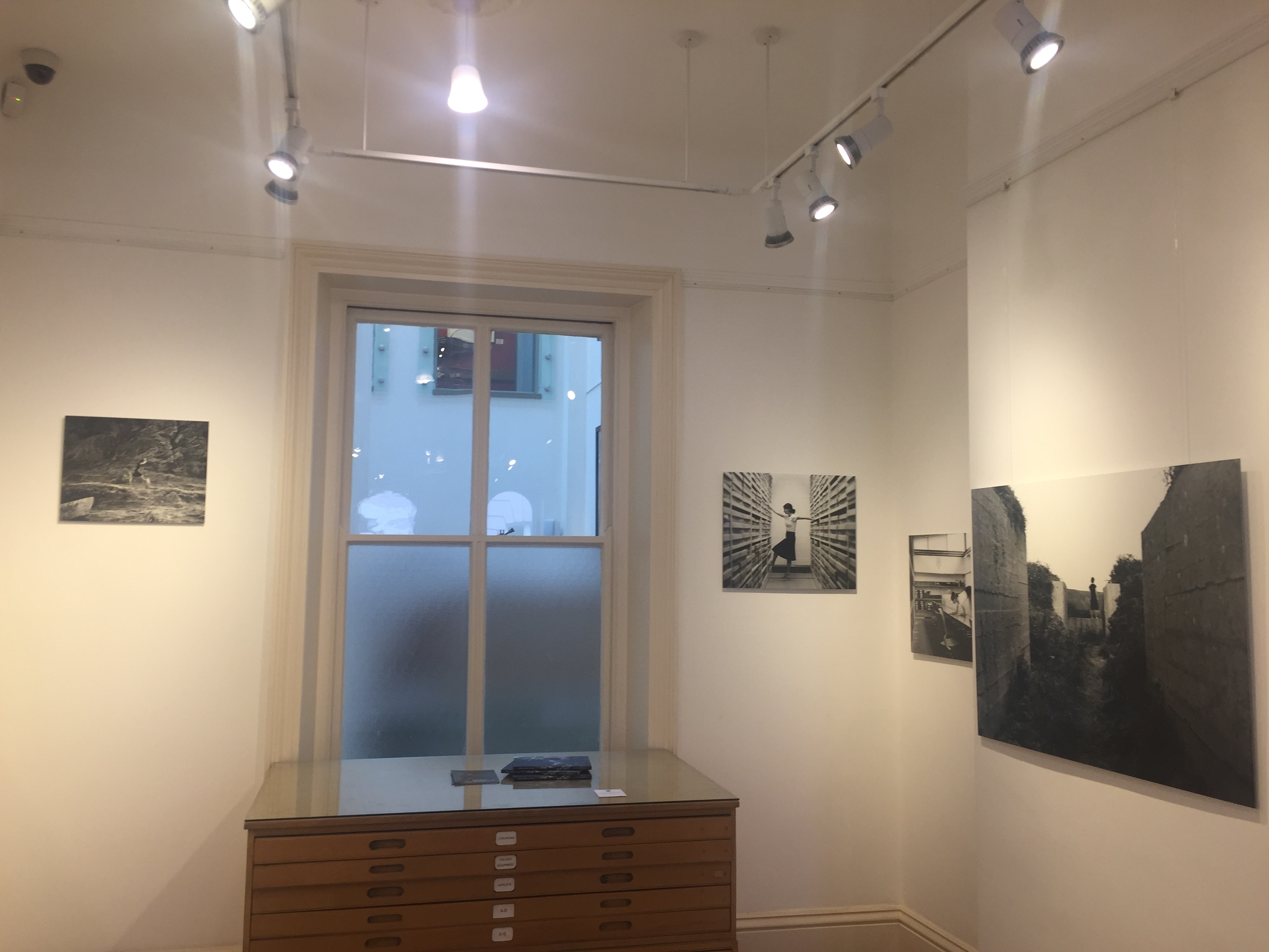
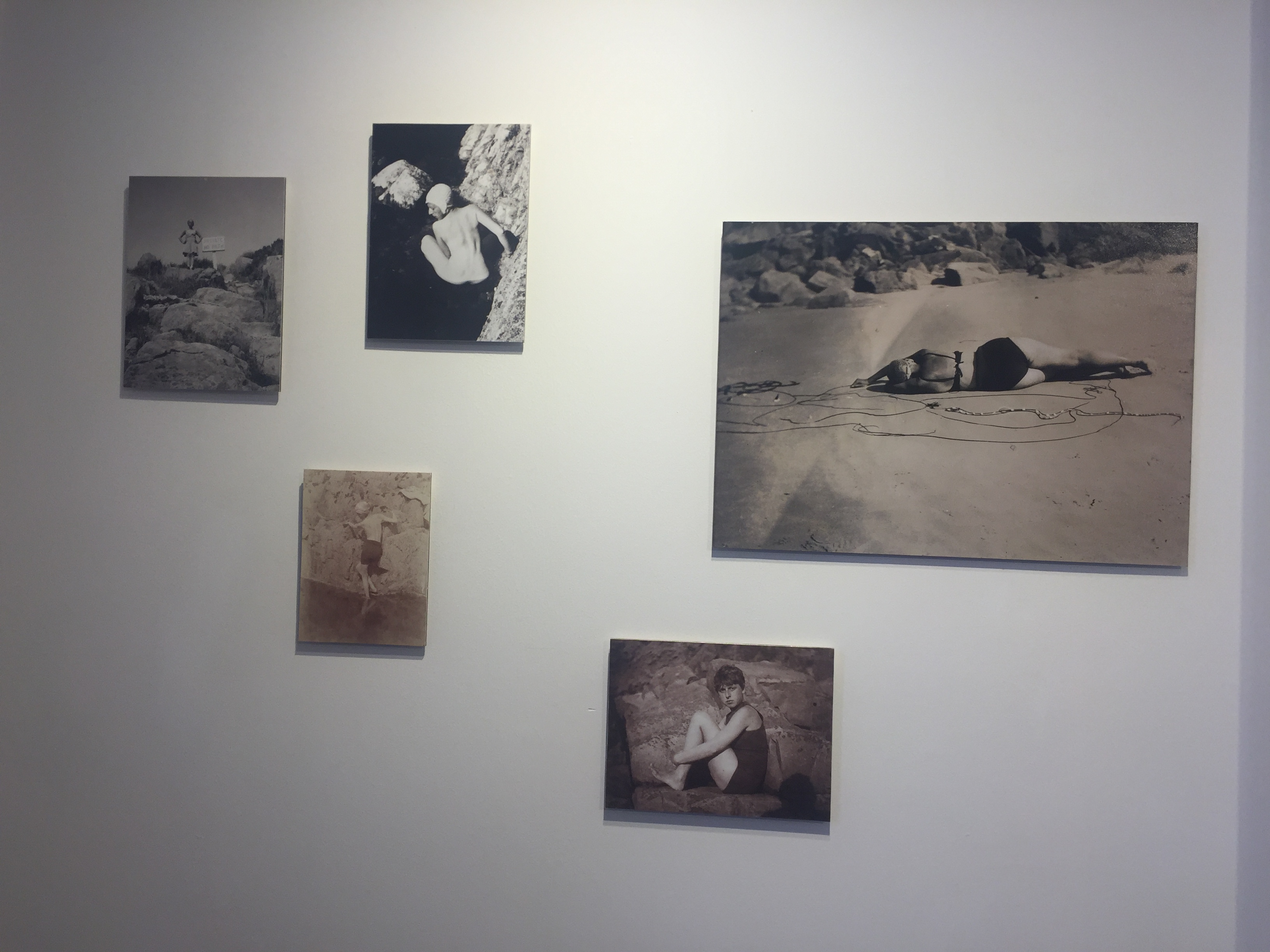
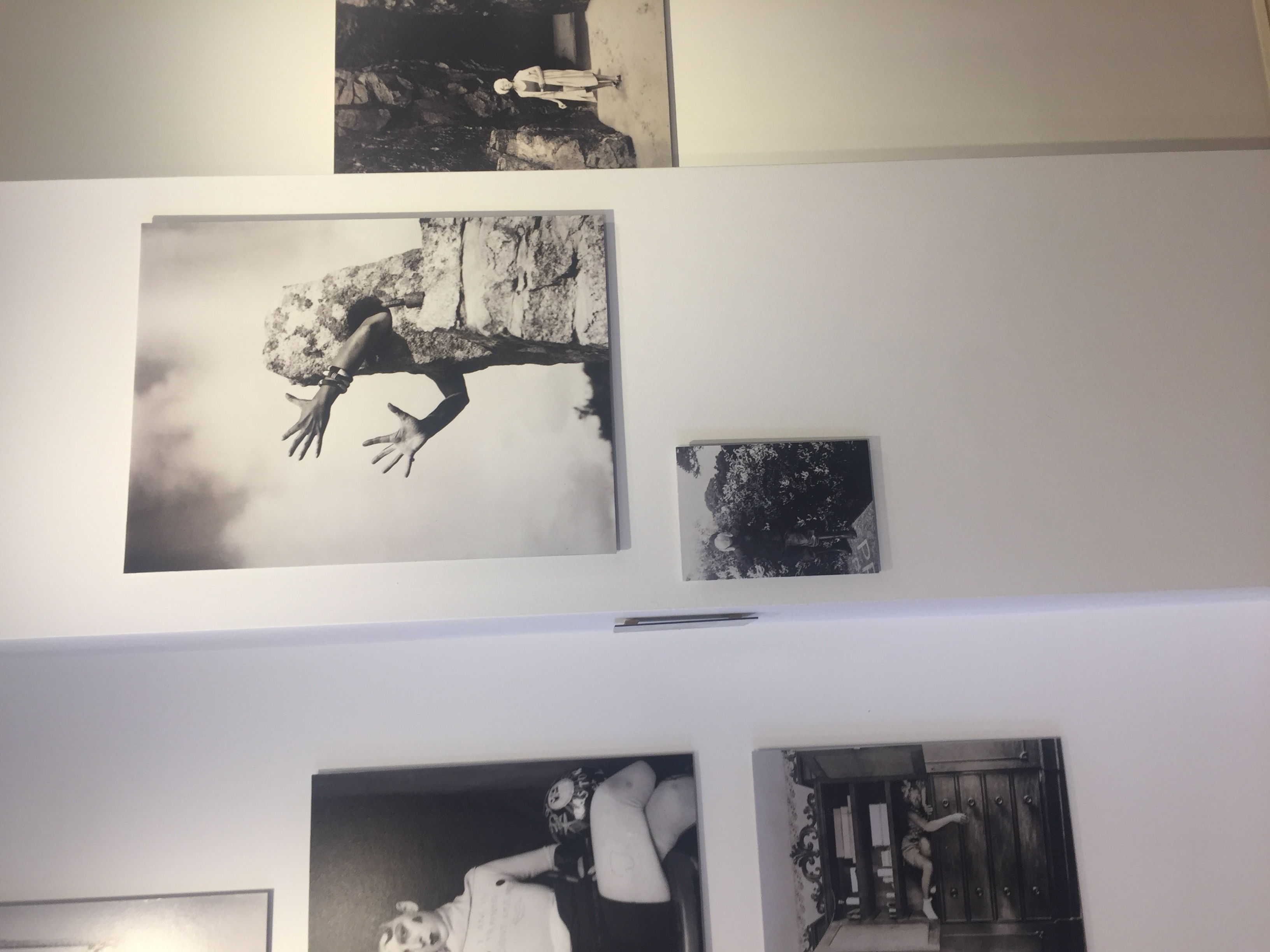
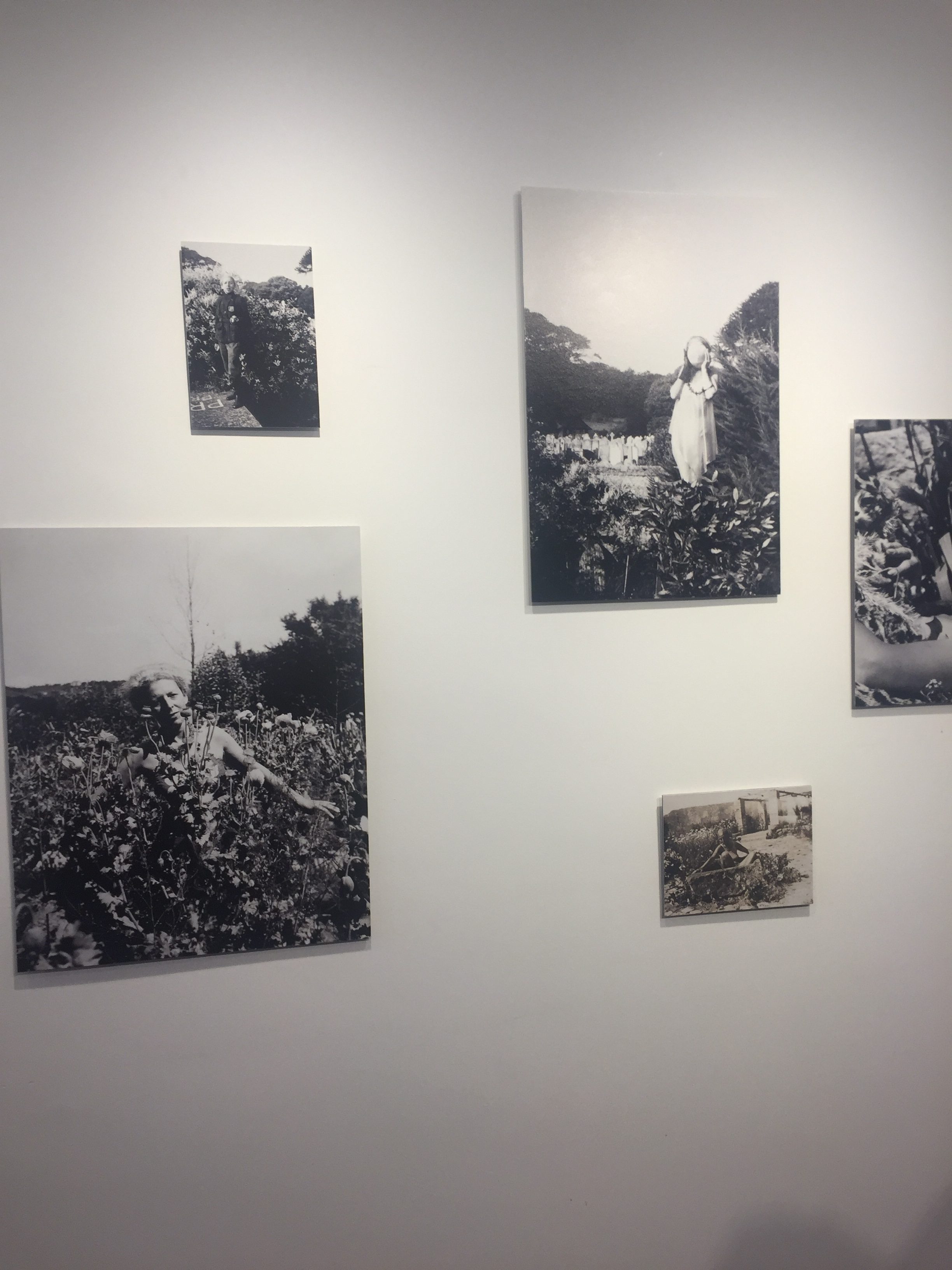
On Monday the 10th of September as a class we walked down to go see an exhibition of Clare Rae and Claude Cahuns work at the prestigious CCA gallery.
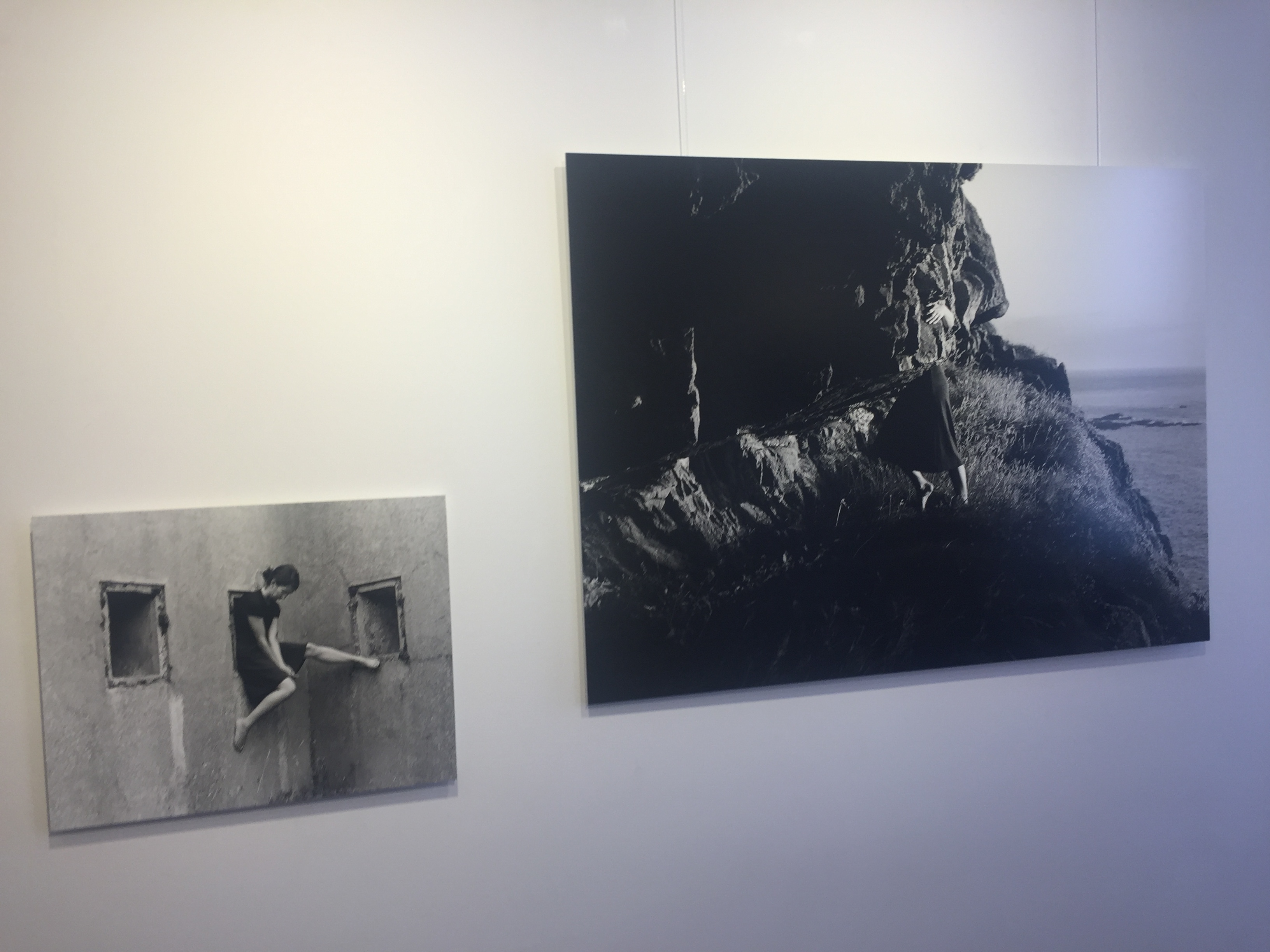
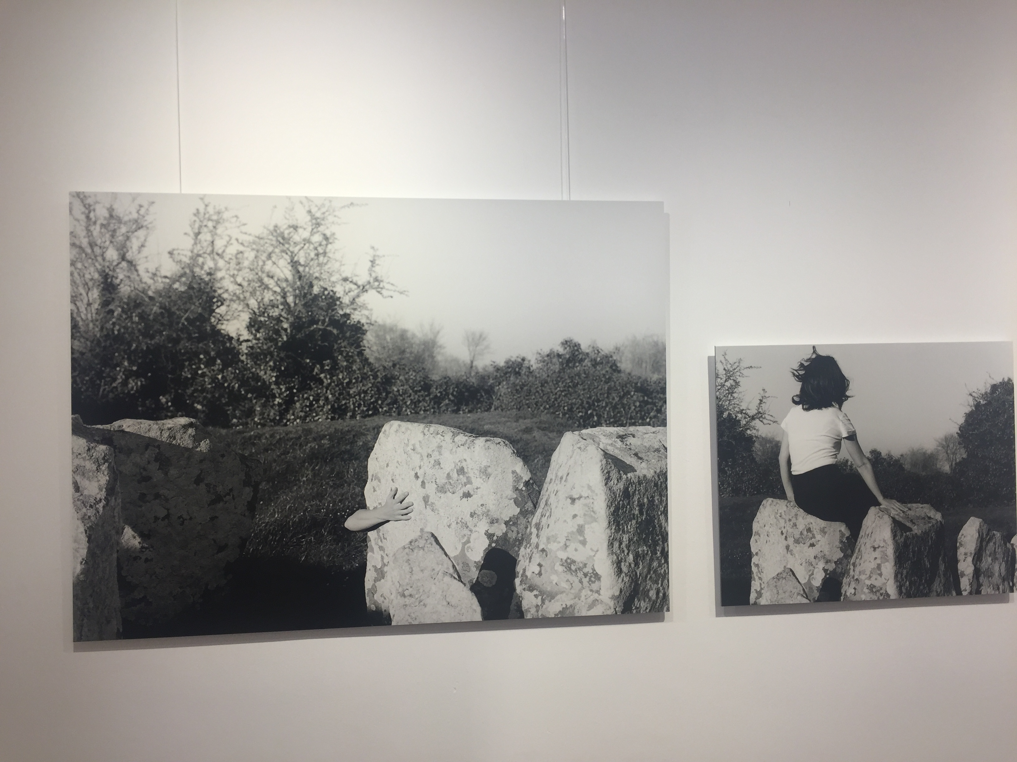
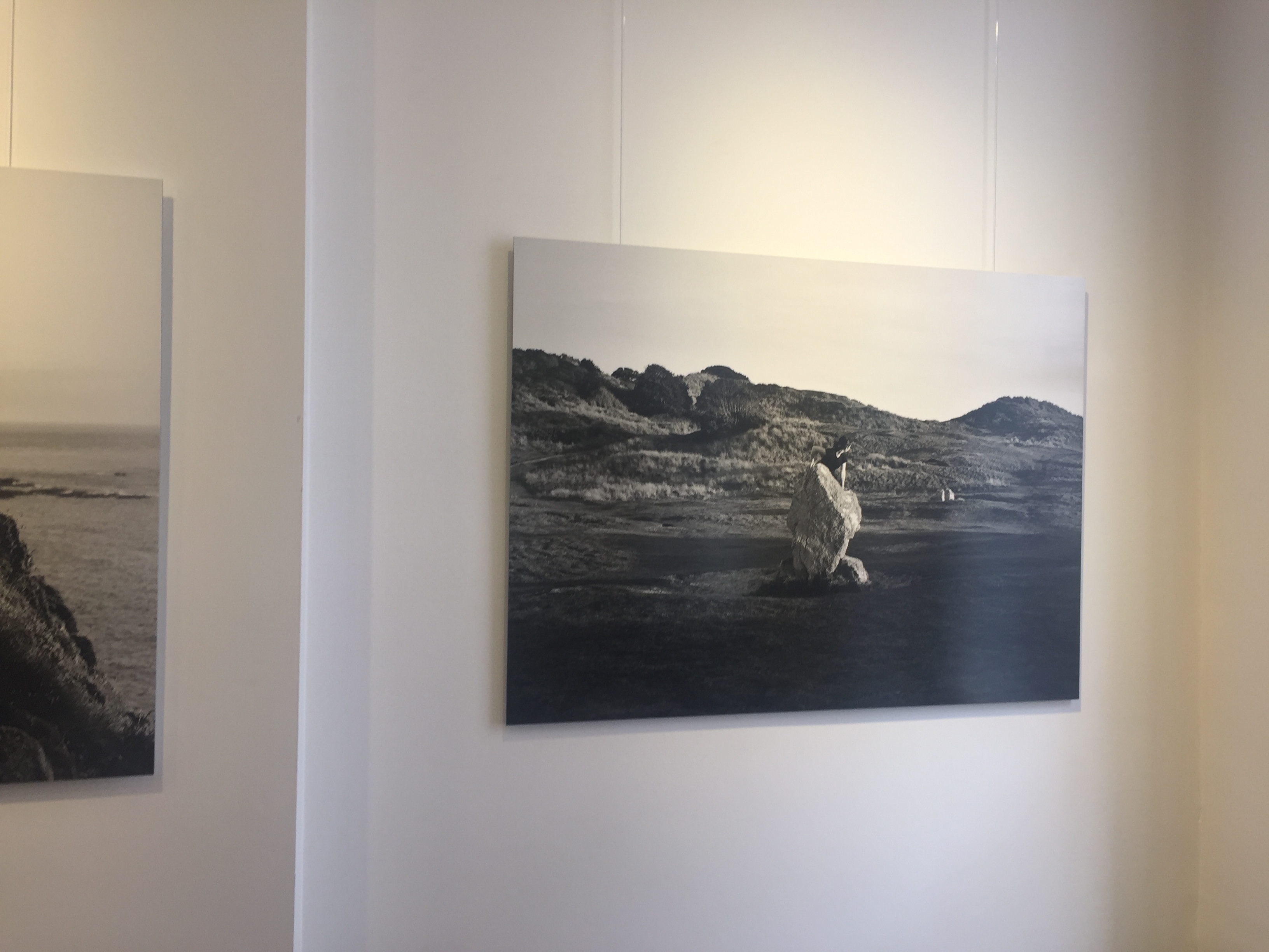
In her photographic practice Clare explores ideas of performance and gesture to interrogate and subvert dominant modes of representation. Her work is

informed by feminist theory, and presents an alternate and often awkward experience of subjectivity and the female body


Recent projects have engaged with site specificity, involving works

rks that are captured and displayed within the same environment. A central interest within her practice is the exploration of performance document

ation, specifically how the camera can act as a collaborator, rather than mute witness, to the performer.

Claude Cahun’s photographic self-portraits present a mirroring mix of mystery and exuberance. Born in France, she lived most of her life on the island of Jersey with her stepsister and long-term love, Marcel Moore.


Also known as Lucy Schwob and Suzanne Malherbe, both women adopted their preferred gender-neutral pseudonyms during early adulthood. Moore, although often invisible, was always present – typically taking the photographs and also authoring collages – and in this sense was as much artist collaborator as she was Cahun’s personal support. Described in her own words as a “hunt”, through a combination of text and imagery, Cahun’s exploration of self is touching and at tim

es unsettling. From circus performer, clothed in layers of artifice, to a stripped-down Buddhist monk grounded by integrity, Cahun is engaged in an ongoing dialogue with multiple maenings. Tragically in line with the fragmentary nature of her outlook, much of the artist’s work was destroyed following her arrest and subsequent imprisonment for resistance against the Nazis. What remains bares interesting parallel to the title of Cahun’s diaristic publication Aveux Non Avenus, translated as Disavowels, which enigmatically suggests that for all that is revealed and given, much is still hidden or has been lost.

In my opinion Claude Cahuns work was hung really badly was not pleasing to the eye. All of her work was hung to close together and had no chronological order from date time or even grouped into

categories. The work was not done justice by the lighting ether the light was to yellow therefor completely washed out many of her images causing them to be discoloured to the human eye, it would have been alot better to have white lights. Also the work was not framed my guess was that this was intentional so it did not ditract from the images them selfs, which i do agree does work and it makes the exibition look very modern and clean cut. Futhermore the images  had no numbers they only had a sheet on the other side of the room that told you everything but i feel it is better to have the names under the images because it straight away makes you think in depth about the title and how it realtes to the picture also the title can make you completely

Response to TOM HUNTER

The Image we were Imitating

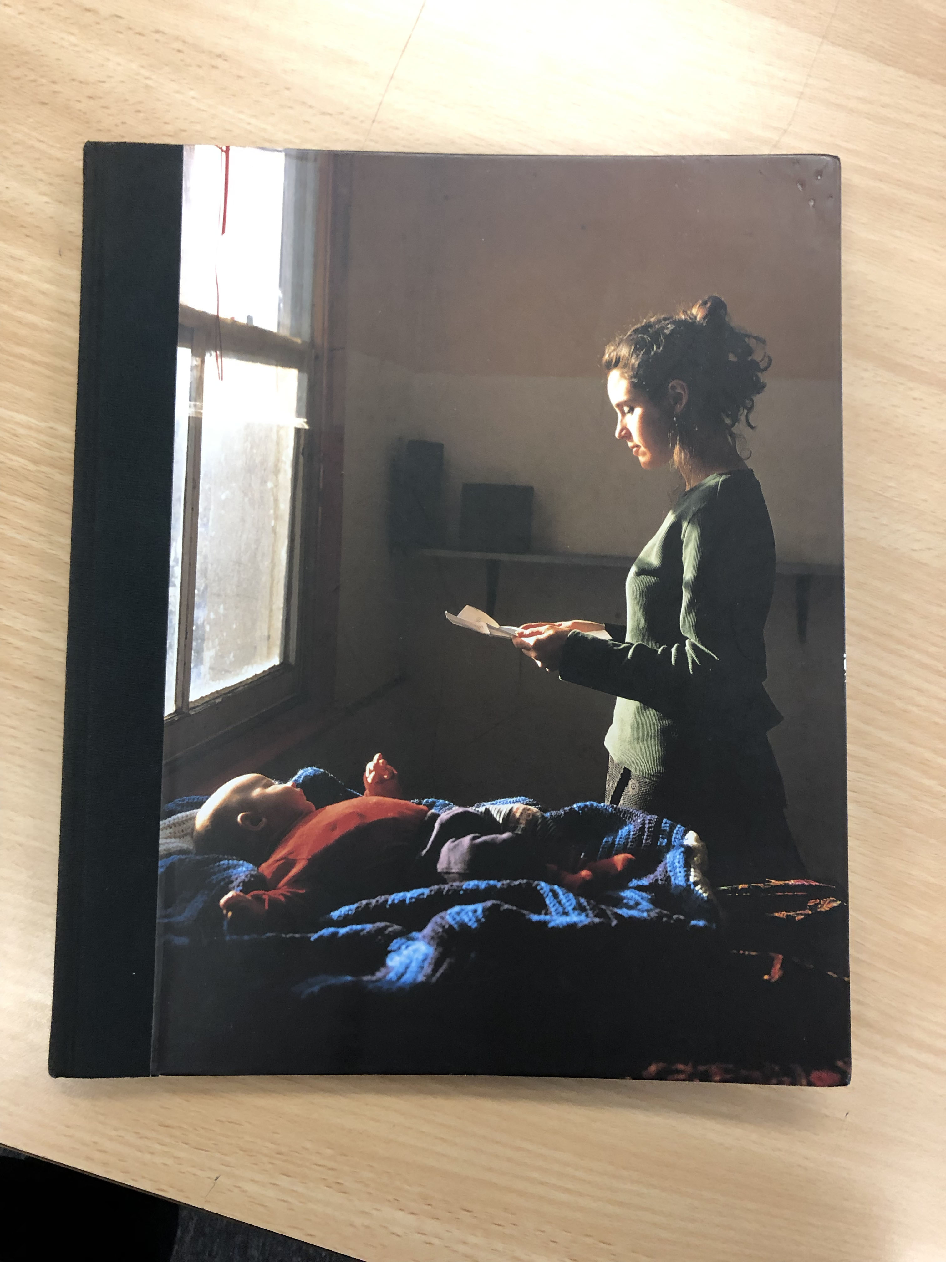
Contextual Reasons: Tom and his neighbours were receiving letters addressed to “Persons Unknown” saying they are non longer welcome to live in semi-derelict squats from the local council. Tom therefore wanted to capture “the dignity of squatter life” in order to show the council that these were real people they were putting in danger and that they would be greatly impacting their lives.

In the end his famous image ” Woman Reading a Possession Order,”  got a dialogue going with the council – and they infact managed to save the houses.

References:

The book we found the image we were studying and re-enacting is called “Tom Hunter”. It is a collection of images from different projects of his which includes work from, Tom Hunter and the modern world, Persons Unknown, Traveller Series and Life and Death in Hackney.

Here is a link to an article written about Tom and his Persons Unknown project which gives deeper contextual reasons and some background behind the photos.

https://www.theguardian.com/artanddesign/2009/nov/04/photography-tom-hunter-best-shot

Action Plan

We first gathered props such as the headphones, water bottle, chairs, table and cloth and bottle cap. These props were all intended to give our image the likened look to the real picture captured by Hunter.

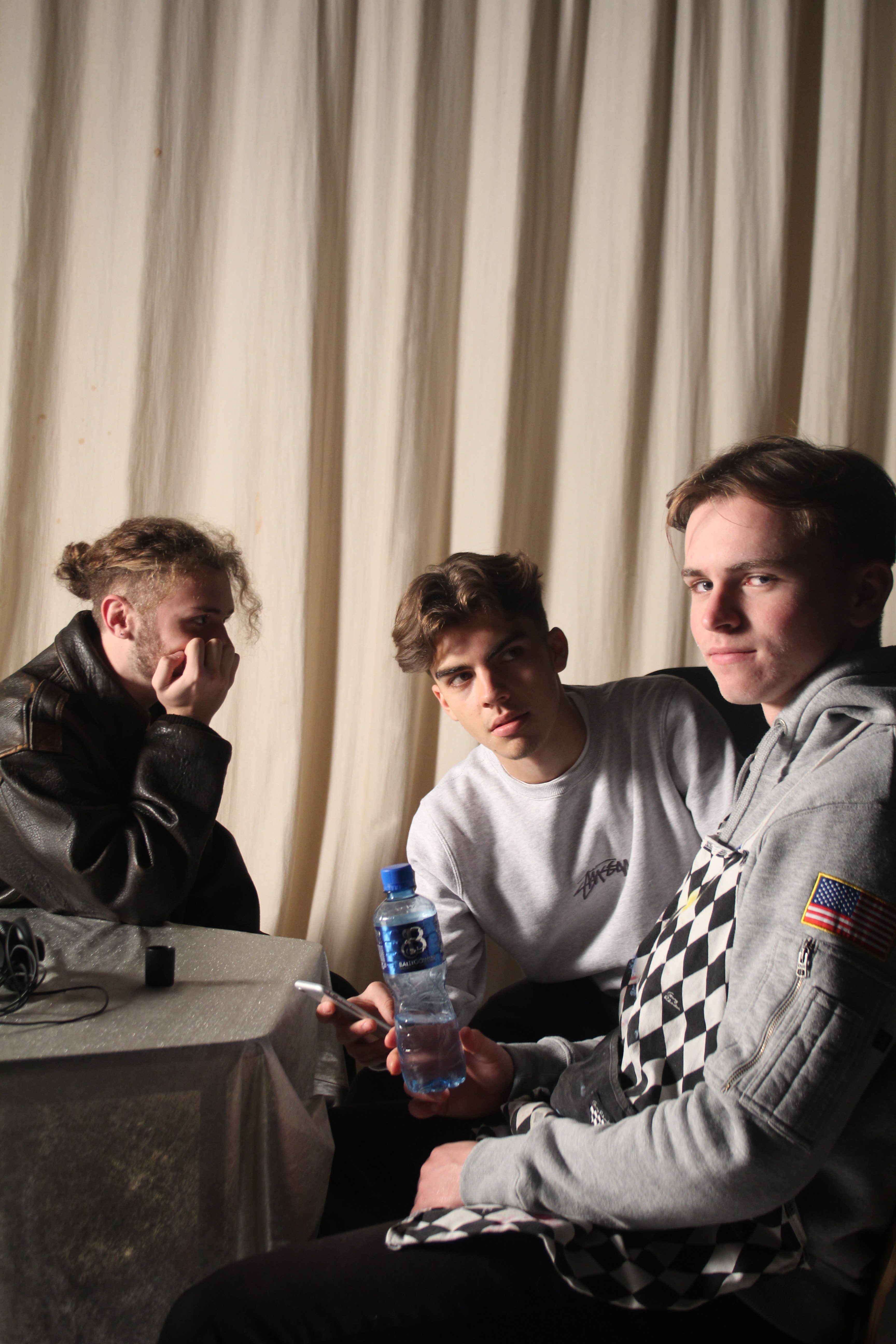
We then sat each other in the correct positions in order to have each of the three people sat in exactly the same position as the models in the photograph and they posed with similar facial expressions.

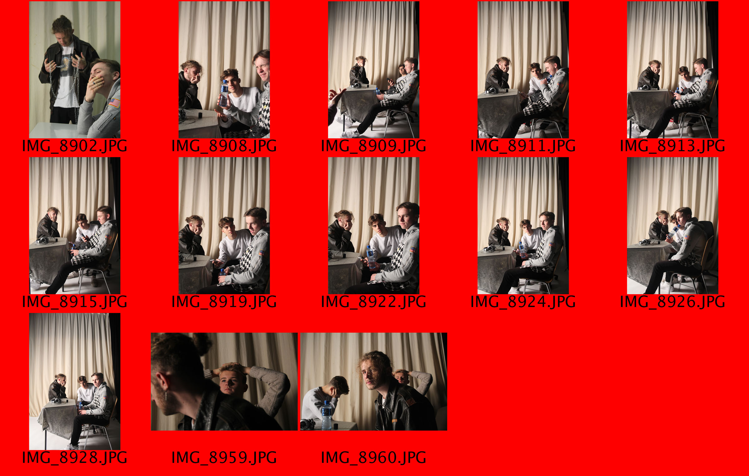
Technical Features – We then set the camera to an ISO of 800 and made the shutter speed faster to 1/10 second. There was a slightly higher shutter speed so the image was sharp incase any of the models moved slightly.

Contact Sheet

Final Image Response:


Visual Features – These include a fairly plain range of colours being mostly greys, whites and creams with a lighter tone due to the side lighting and a strong contrast between the shaded and non-shaded areas . There is quite a large depth of field and 3D effect created due to the fact that the 3 models in the photo are all sat at different distances from the camera, meaning that their shadows create a visual element of distance when the shadows are overlapped.

Planning For Tableau And Staged Reality Photography

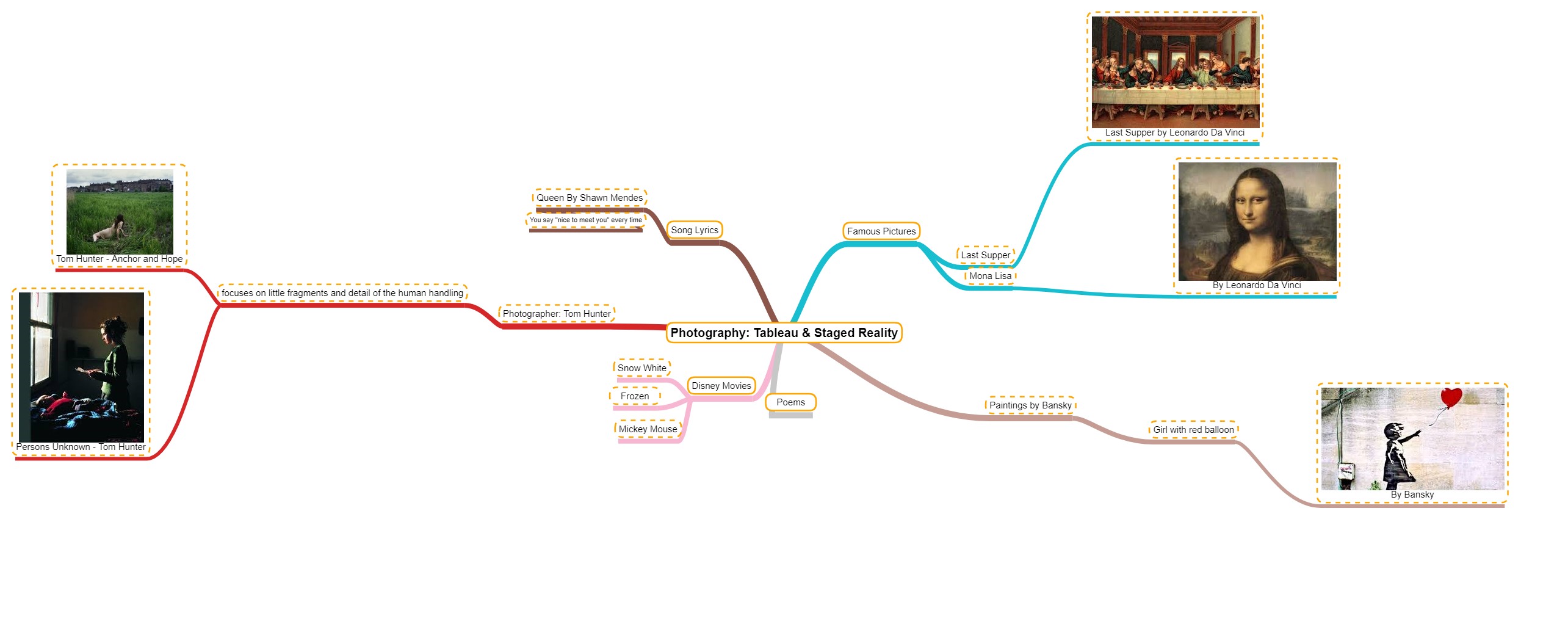
I have decided to look at Tom Hunter and his styles of Tableau Photography.


In this mind map I have explored different ideas for my tableau portraits. I have explored Tom Hunter, Disney Movies and famous paintings including Bansky. I have decided to explore Tom Hunter and Disney movies in deeper depth to help me decide what I am going to do for My Tableau.

For Disney I would look at scenes in different Iconic Movies:

Snow White:

Image result for iconic snow white scene disney

Frozen:

Image result for iconic Frozen scene disney