Monthly Archives: December 2018
Filters
7. Constructed Portraits | Photo-montage | Composite | Collage | Creative
This week’s tasks are designed to encourage you to explore your creativity by looking responding to Constructed Portraits.
- Photo-montage
- Composite portraits
- Collage
History of Photo-montage (Europe 1910 onwards)
- A photomontage is a collage constructed from photographs.
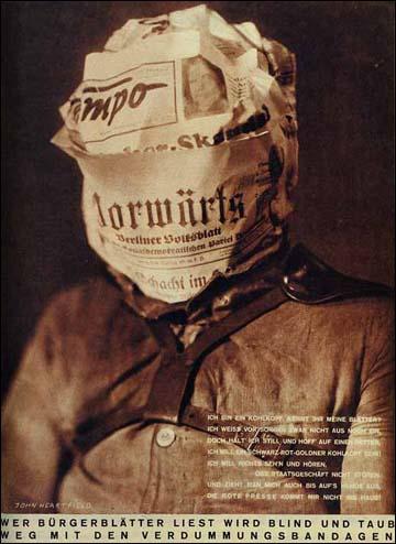
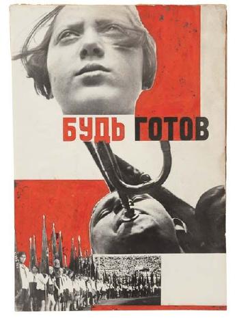
- Historically, the technique has been used to make political statements and gained popularity in the early 20th century (World War 1-World War 2)
- Artists such as Raoul Haussman , Hannah Hoch, John Heartfield employed cut-n-paste techniques as a form of propaganda…as did Soviet artists like Aleksander Rodchenko and El Lissitsky
- Photomontage has its roots in Dadaism…which is closely related to Surrrealism




Pop Art developments (USA and UK 1950s-)
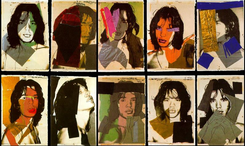
- Photomontage was also used to great effect by various Pop Artists in the mid 20th Century
- Pop art was a reaction to abstract expressionism and was similar to DADA in some ways
- Many Pop Art images and constructions tackled popular consumerism, advertising, branding and marketing techniques
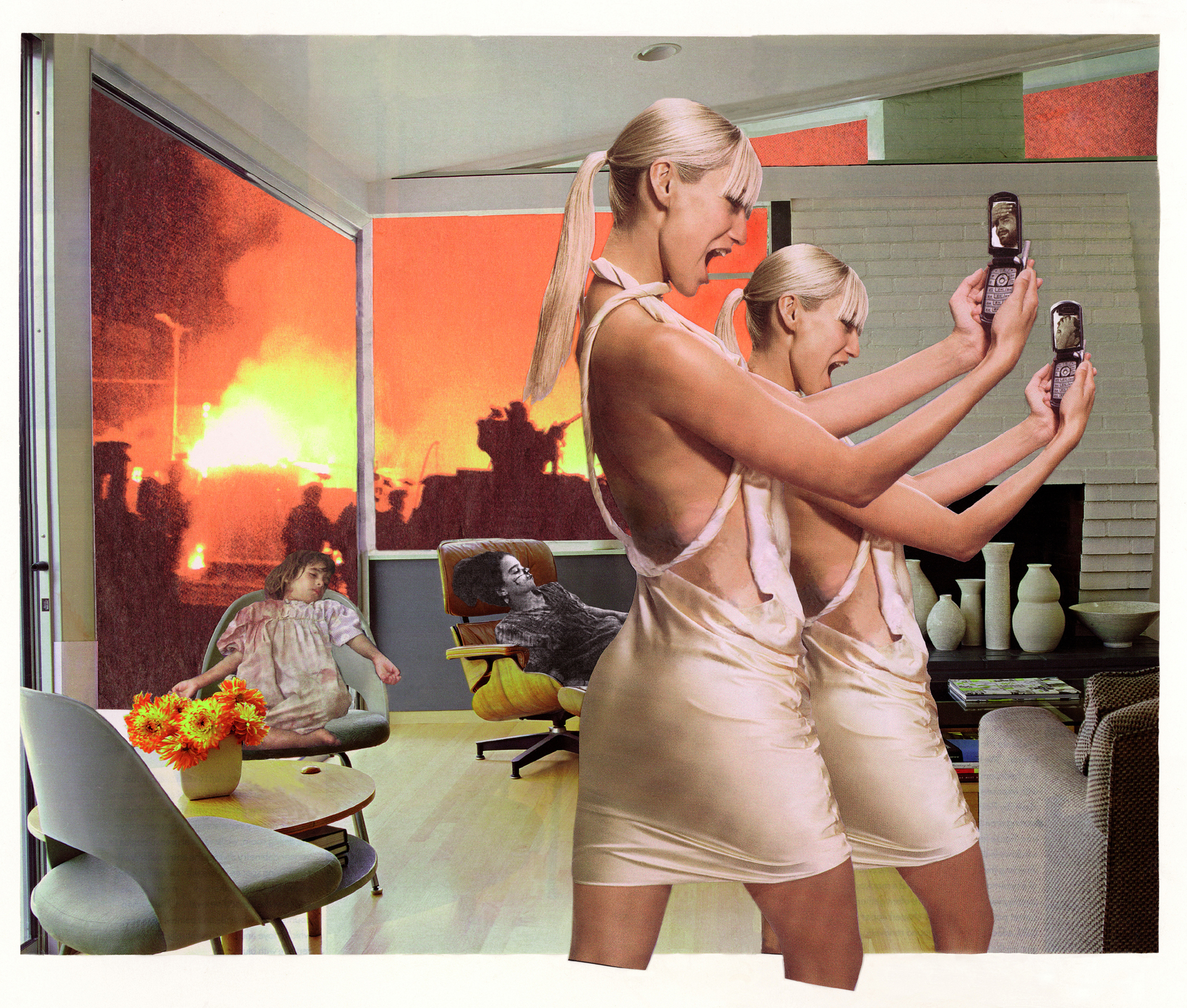
- Pop art also explored political concerns such as war, and gender roles too


Examples and Inspiration
- richard hamilton / kurt schwitters / peter blake /
- soviet art
- sammy slabinck
- john stezaker
- jesse treece
- jonny briggs
- david hockney
- hannah hoch
- Annegret Soltau
- Brno de Szou
- Joachim Schmid
- Jesse Draxler
- Peter Kennard
- Eugenia Loli
-
Sarah Eisenlohr
- Grete Stern
- Jerry UELSMANN
- Duane Michals
- Edmund Teske
- Man Ray
- El Lissitsky
- Martha Rosler



.jpg)


In her artist statement Montana based artist Sarah Eisenlohr explains that her collages use places of existence to create fictional ones in an effort to demonstrate the ways in which humans have transformed the earth. These scenes often carry undertones of spirituality and faith. “I consider the figures’ desire for shelter, warmth, and something stronger than themselves as symbols of serenity that I seek through spirituality, while the use of sublime in my work points to a relationship with the divine,”

California based artist Eugenia Loli draws inspiration for her surreal art collages from vintage magazine images. Loli intends for her images to serve as a snap shot from a surreal movie from which the viewer can create his or her own narrative.
Task 1
- Create a blog post that includes a clear understanding of the history and background of photo-montage.
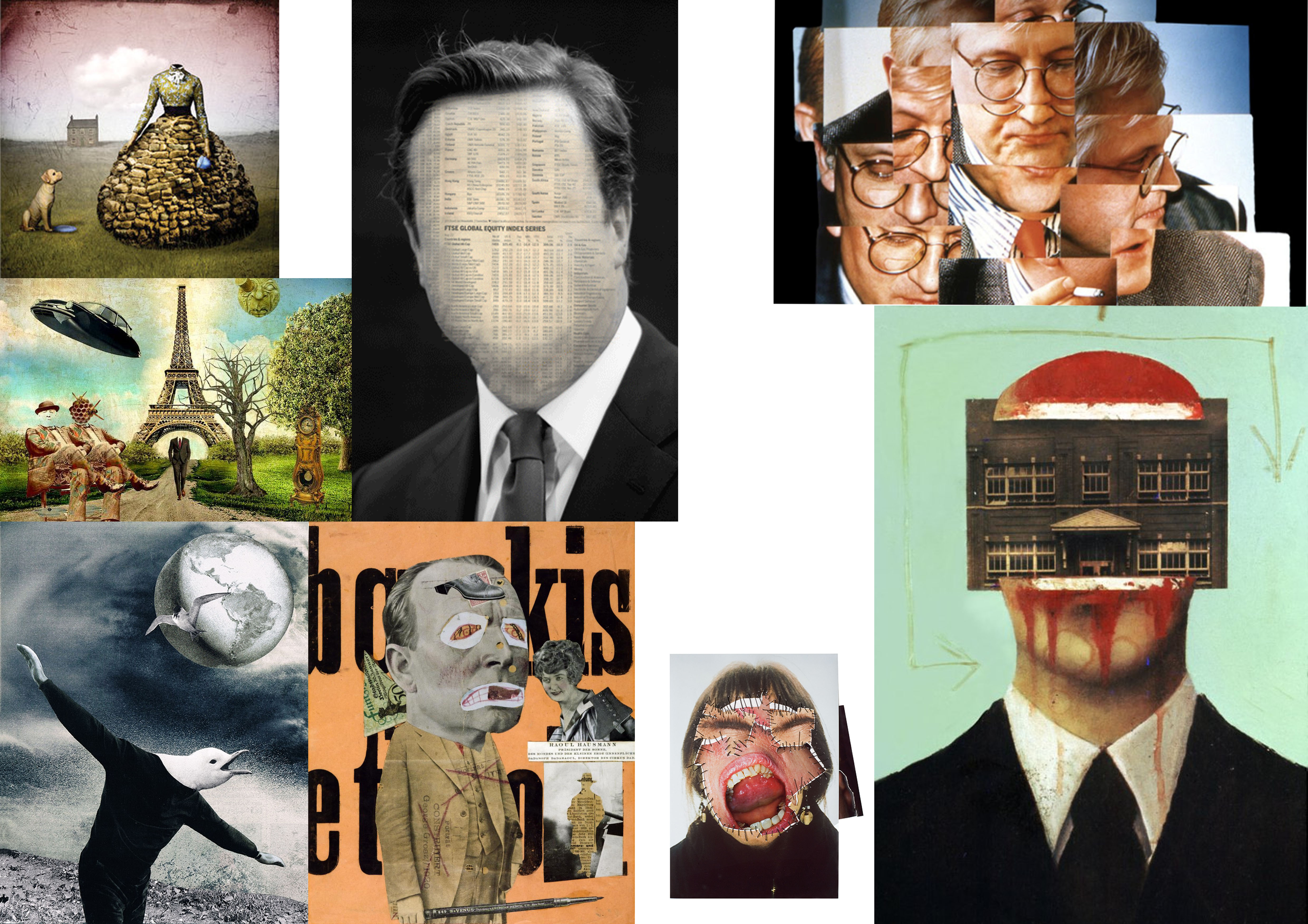
- Include a moodboard / mindmap
- Add examples of Early – late 20th Century Photomontage eh Hannah Hoch
Task 2
- Choose a specific photo-montage artist and write/create a CASE STUDY
- Include a detailed analysis of 1 x key image by the artist
- Add TECHNICAL -VISUAL-CONCEPTUAL-CONTEXTUAL understanding
Task 3
- Create a set of 3-5 photomontage using a mixture of your own imagery (portrait) and “found” imagery….(this could be archival imagery)
- Ensure you include a sense of identity and place
- Show your process clearly…remember to add screen shots etc
- Evaluate your process…describe and explain
Complete over the Christmas Break…and see you all on Tuesday 8th January 2019
KEY COMPONENTS AND DISTINGUISHING FEATURES of PHOTO-MONTAGE
- A NARRATIVE, CONCEPT OR THEME (A MESSAGE OR A COMMENT)
- ARCHIVAL / VINTAGE IMAGERY COMBINED WITH OWN IMAGERY
- SUBVERSION OF MEANING—-POSTMODERNISM
SOURCE MATERIAL YOU CAN USE
- NEWSPAPERS
- MAGAZINES
- ORIGINAL IMAGERY (from studio, tableau, other portraits etc)
- INTERNET-SOURCED IMAGERY
- BOOKS
TECHNIQUES
- MANUAL CUT-N-PASTE (SCISSORS, SCALPEL AND GLUE)
- PHOTOSHOP –
- selection tools (to cut and move elements of images)
- free transform (CTRL T)– to move, re-size and shape elements
- layers and layer masks
- opacity tool
- blending options
- distortion
- proportion
- scale
Ensure you have enough evidence of…
- moodboards
- mindmaps
- case studies (artist references)
- action plans
- photoshoots + contact sheets (annotated)
- appropriate selection and editing techniques
- presentation of final ideas and personal responses
- analysis and evaluation of process
- compare and contrast to a key photographer
- critique / review / reflection of your work
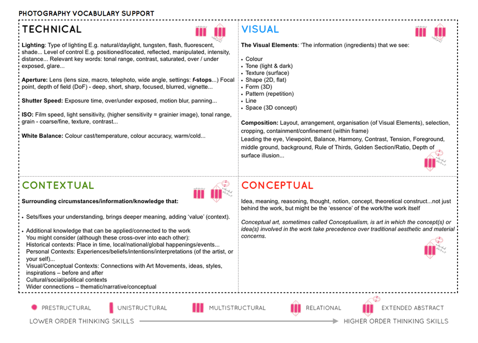
Ensure you discuss / describe / explain your images using key words and vocab…
studio1 finals
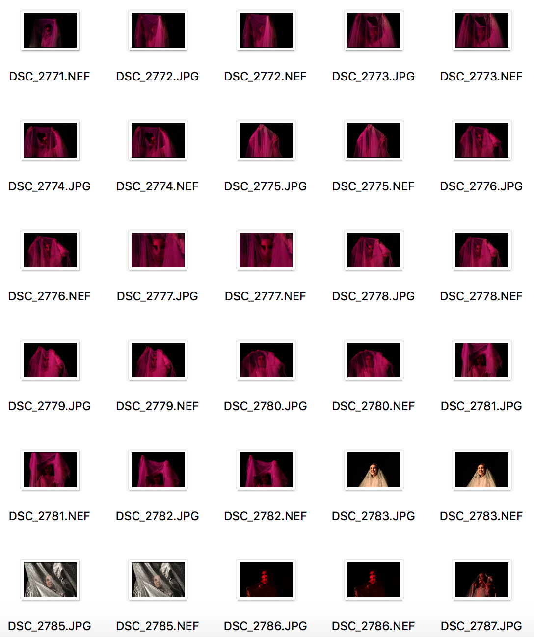
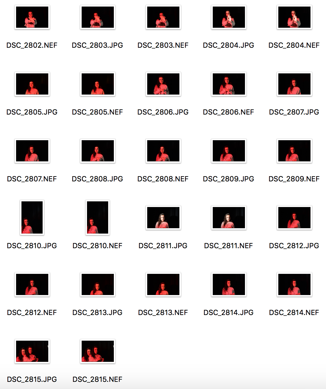
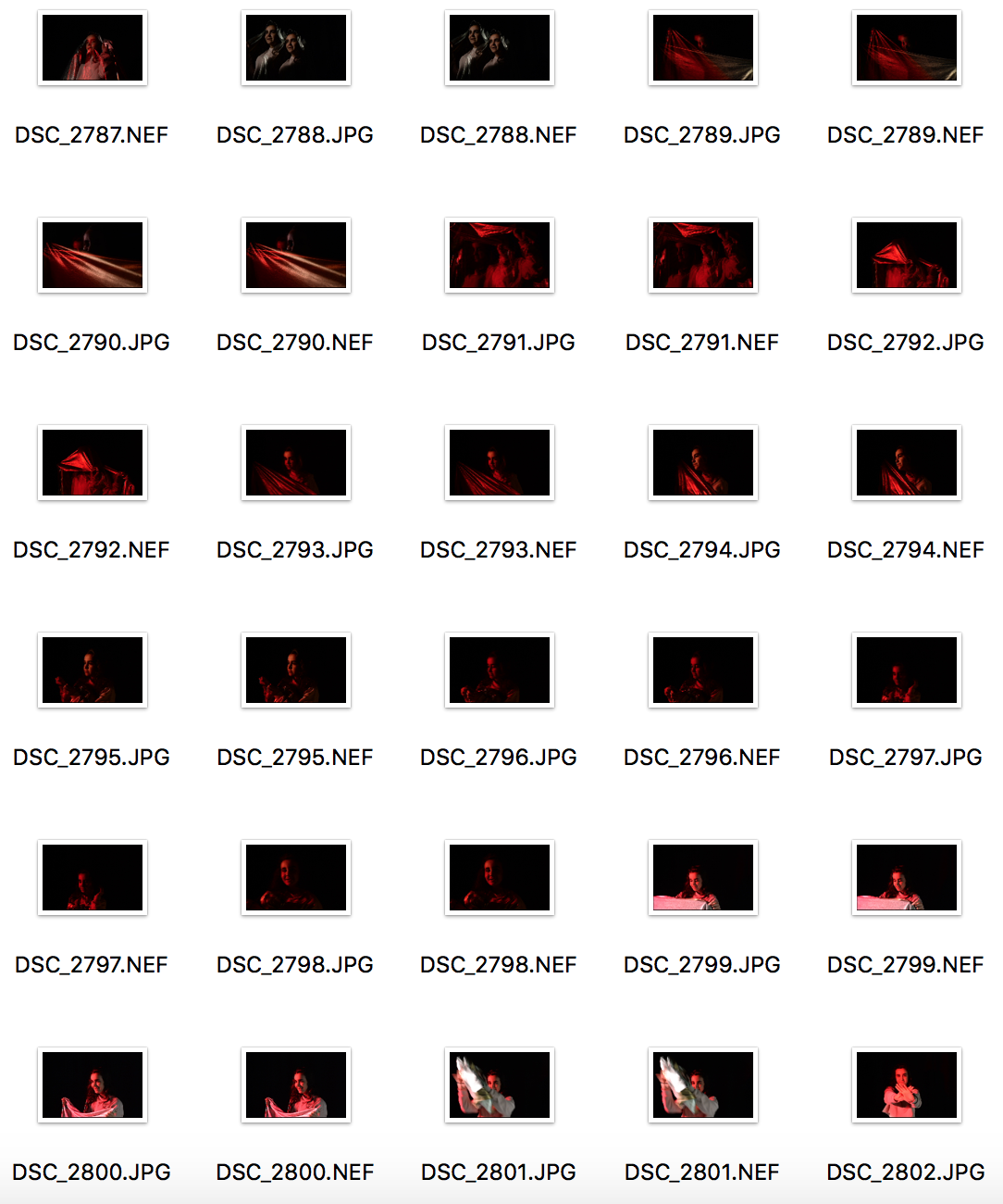
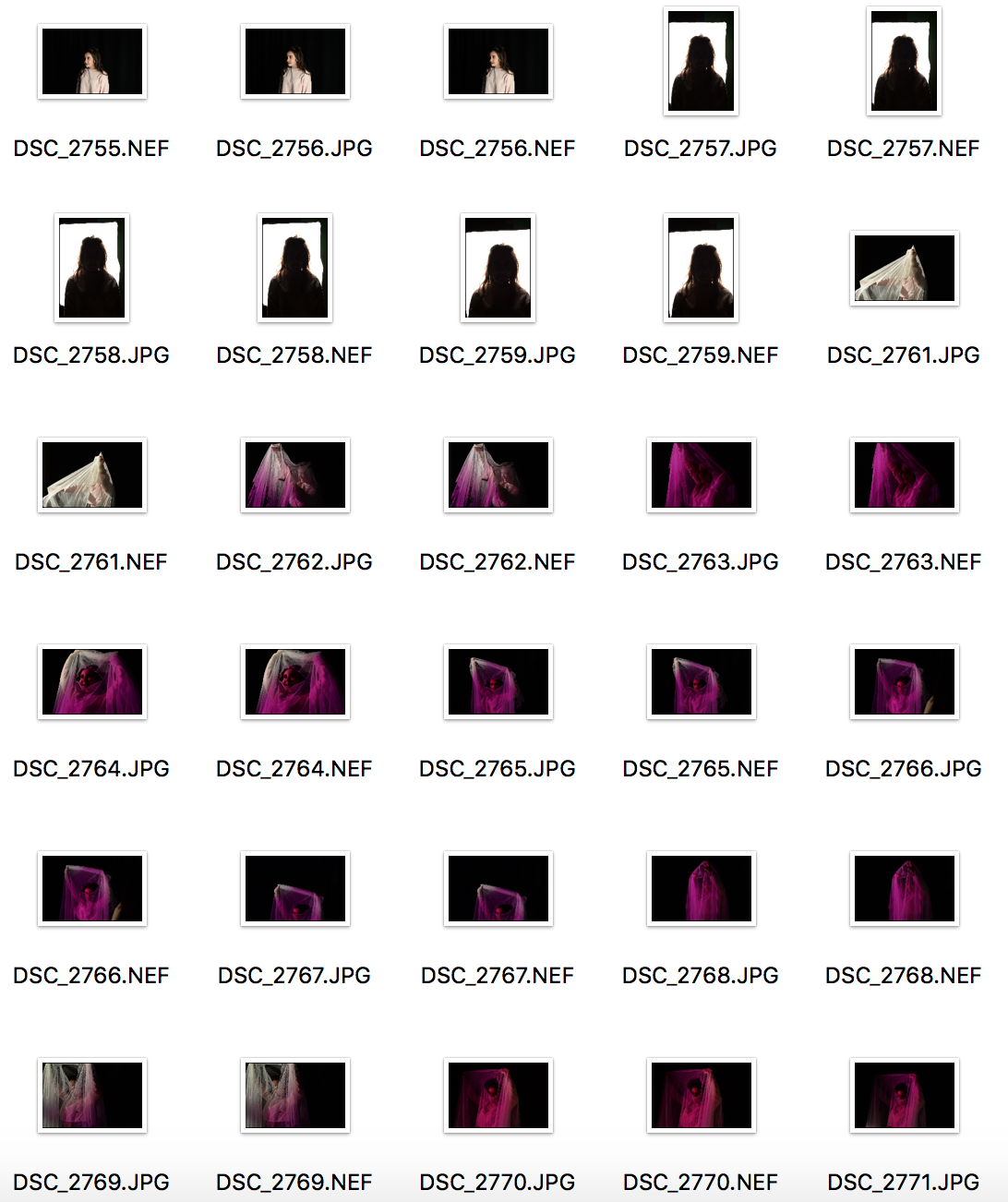
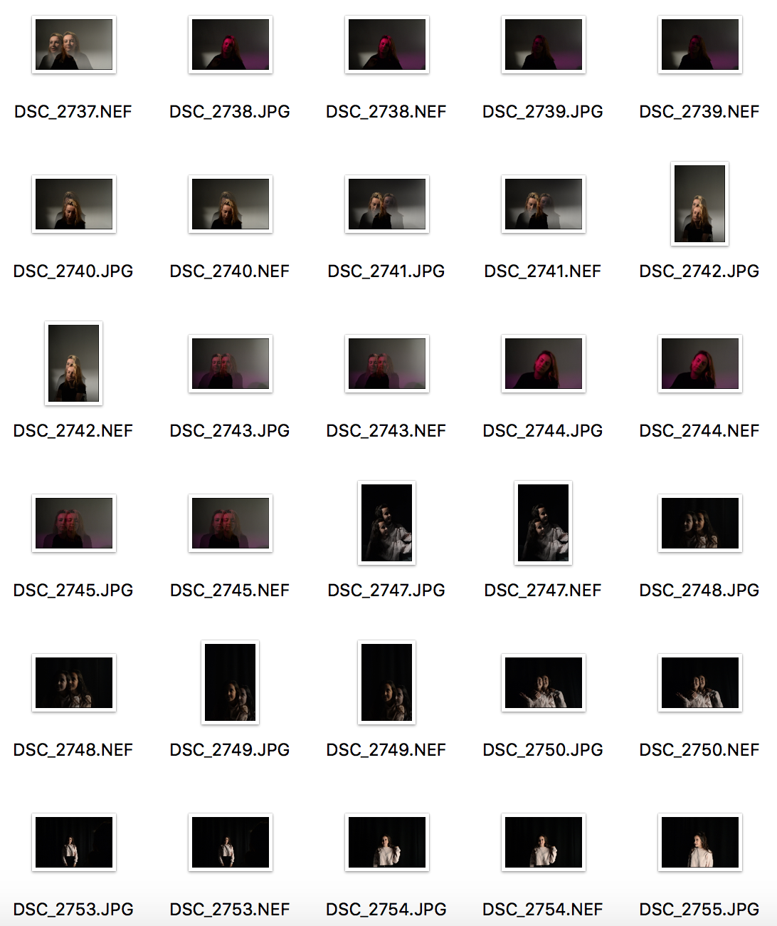
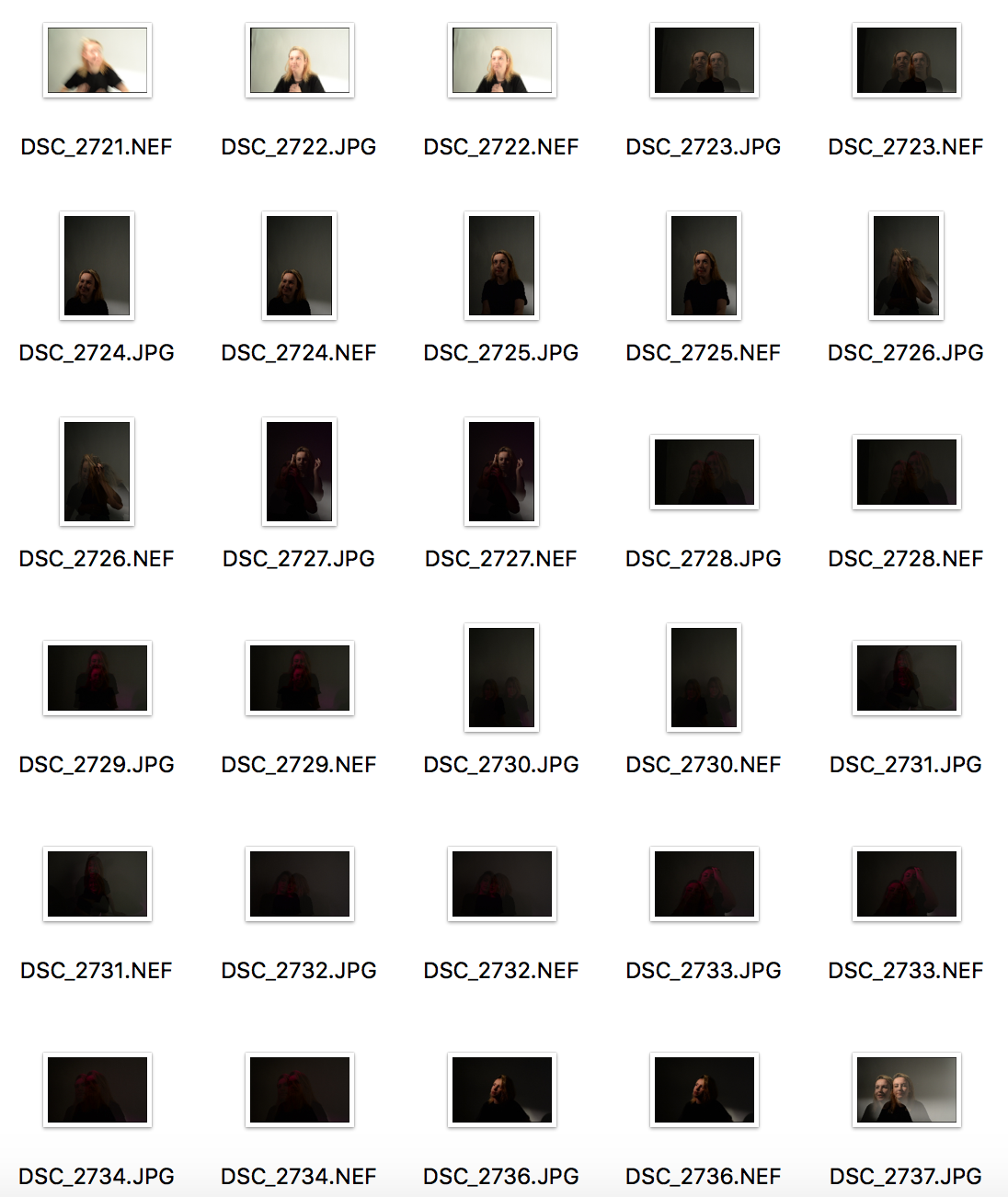
In the studio, I initially took about 300 photos. I narrowed them down to about 9 and edited each of them so I would have a bigger choice of photos to choose from for my finals.
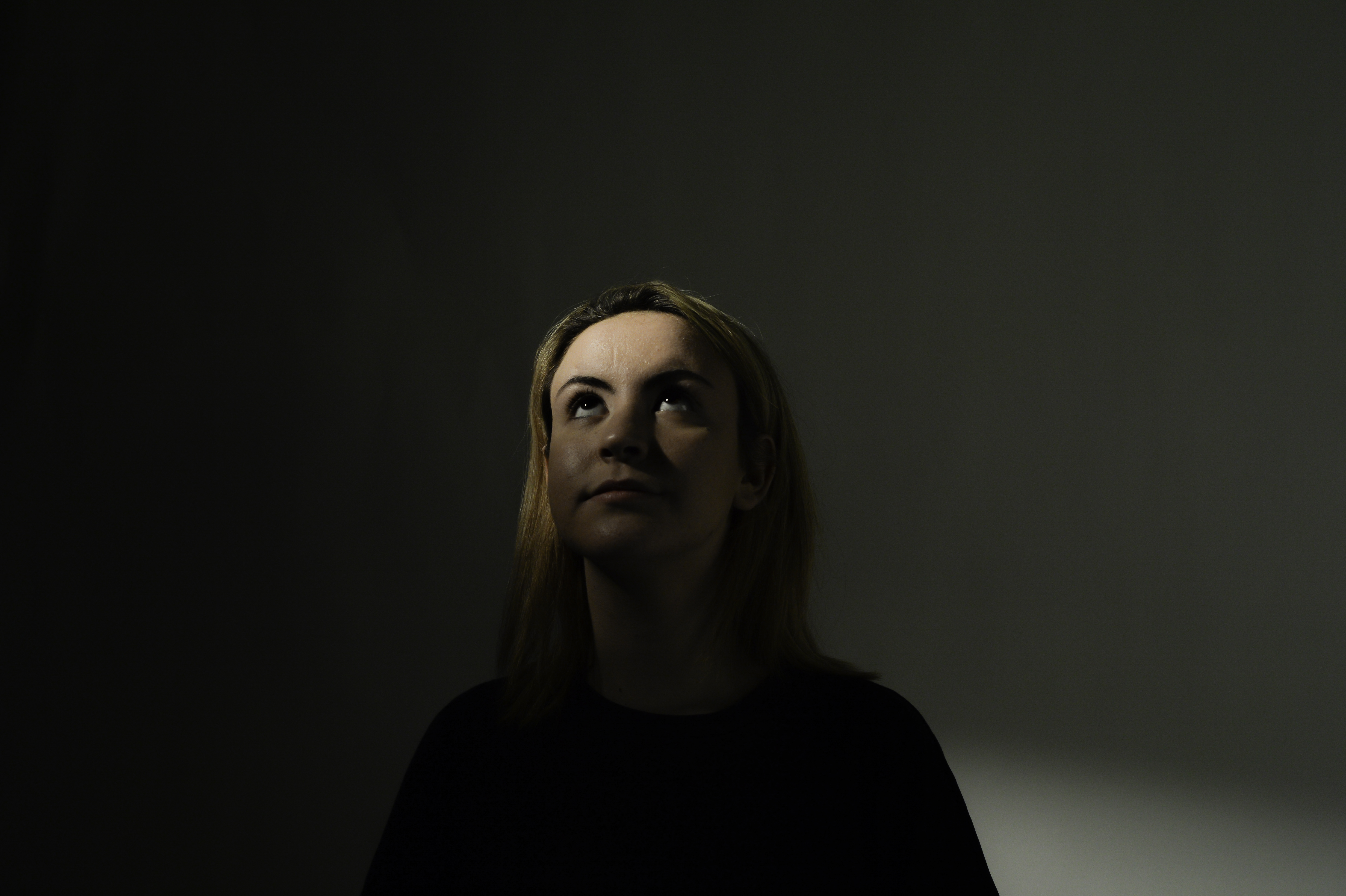
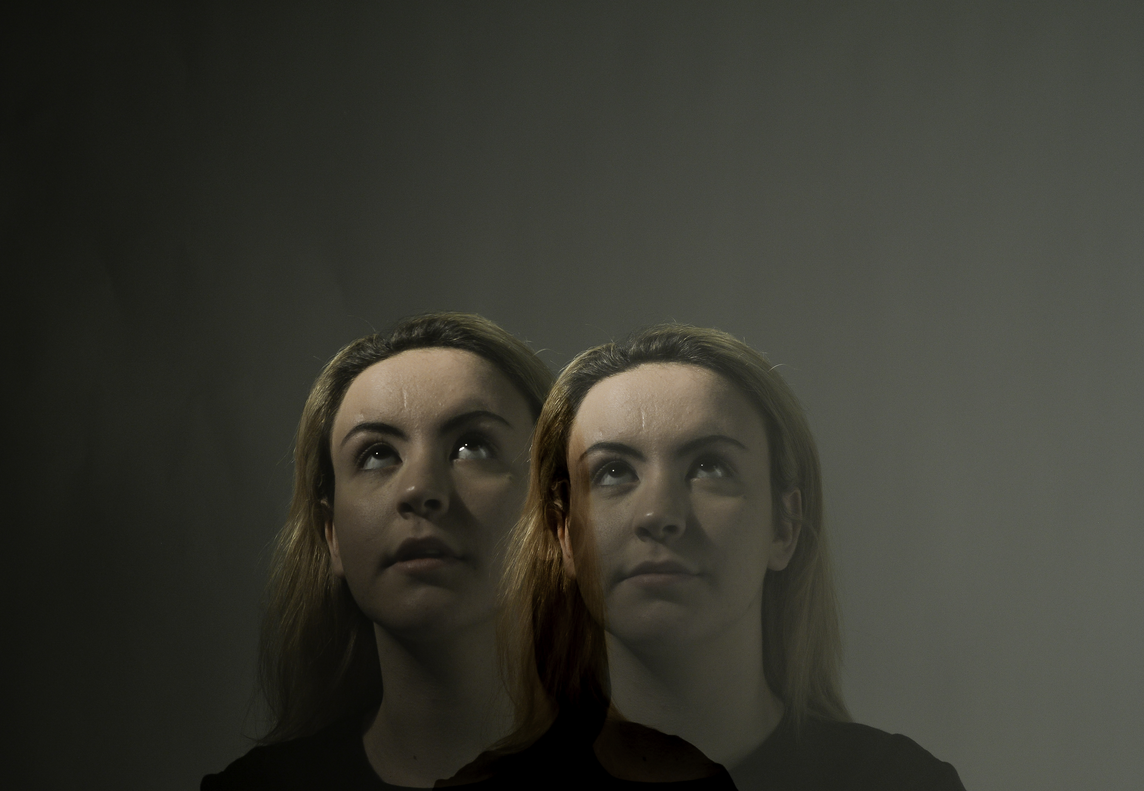
using double exposure, I created the effect of two people being present.

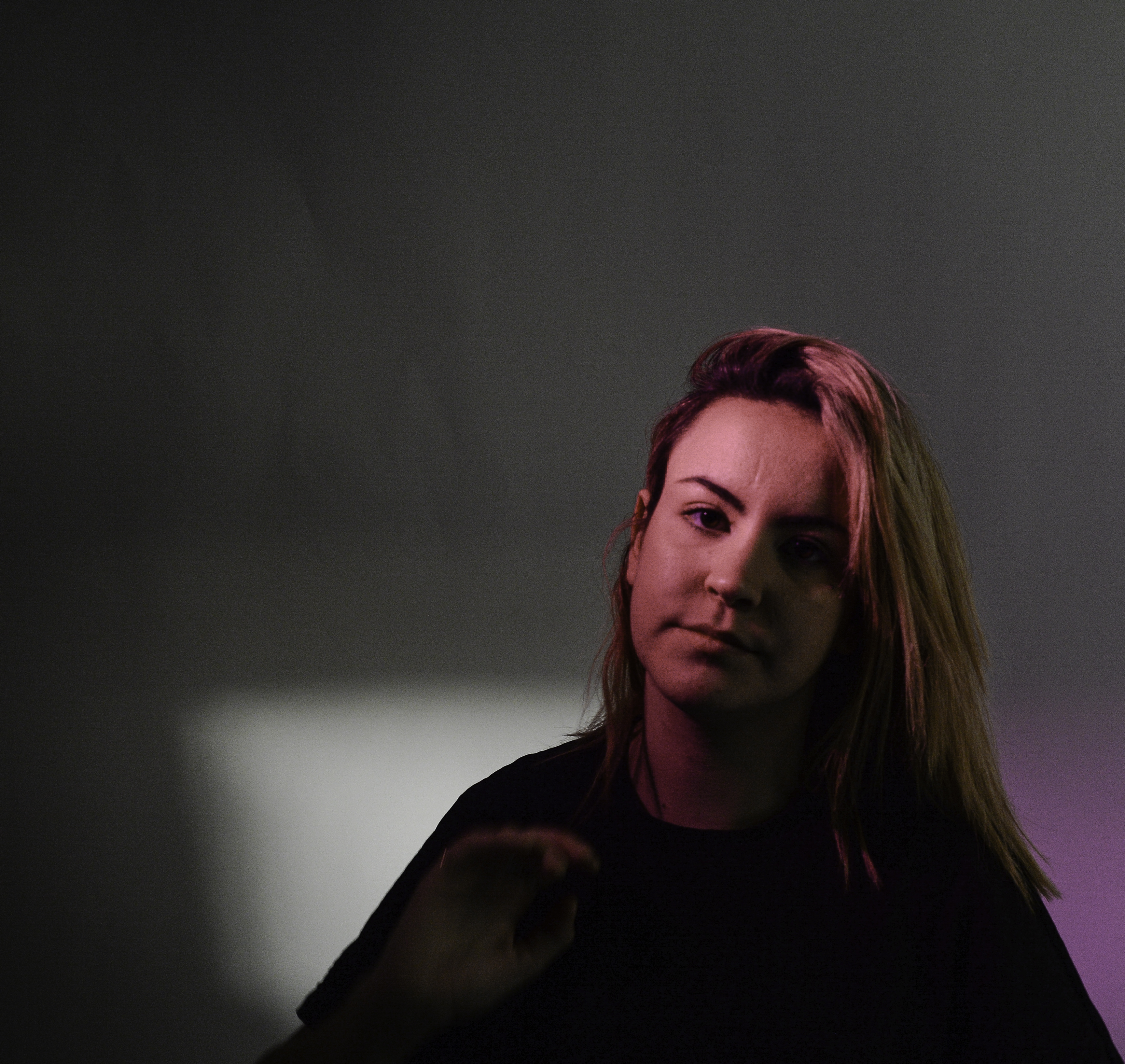
Here, I used a pink filter of the one point light.
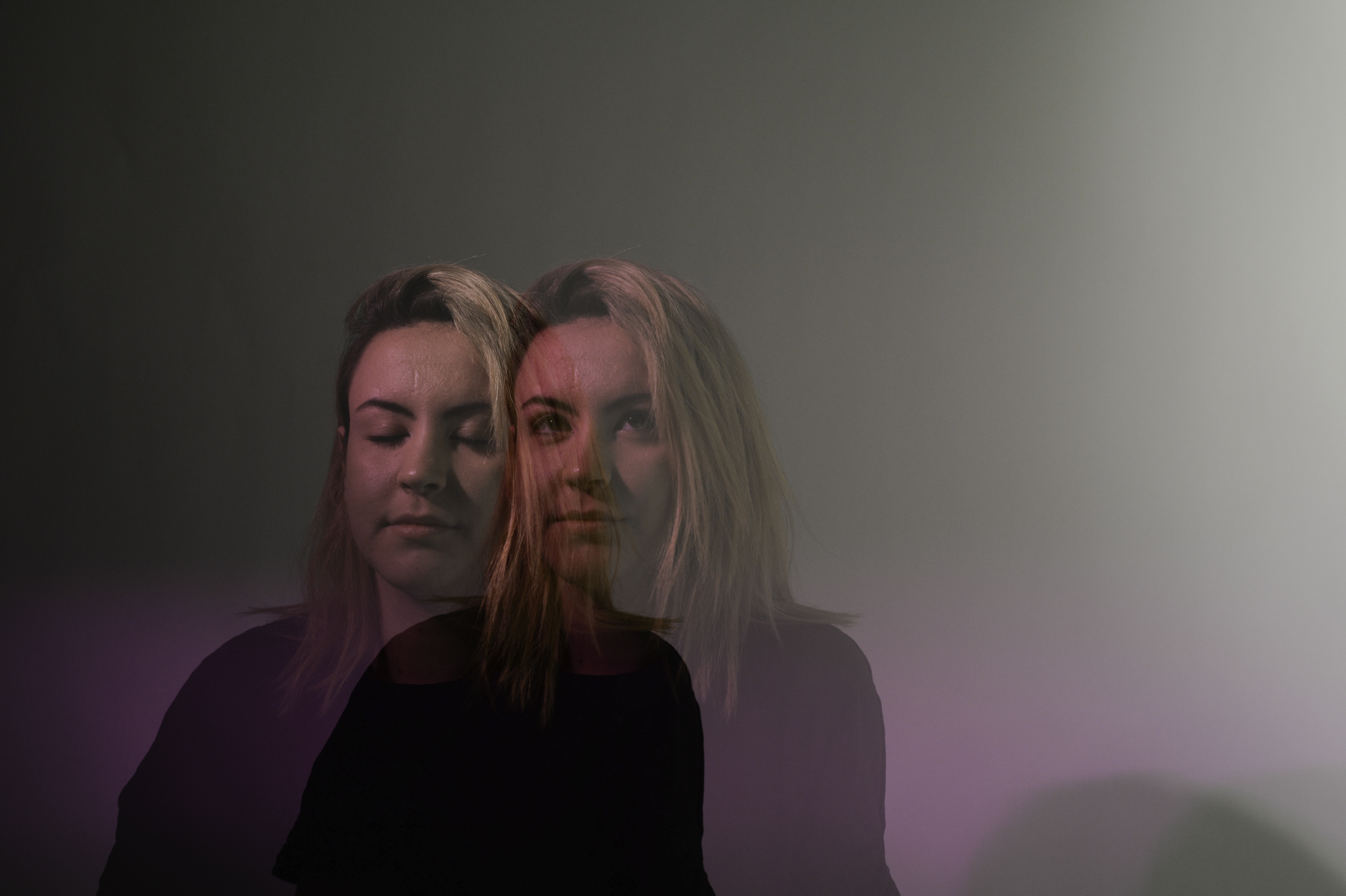
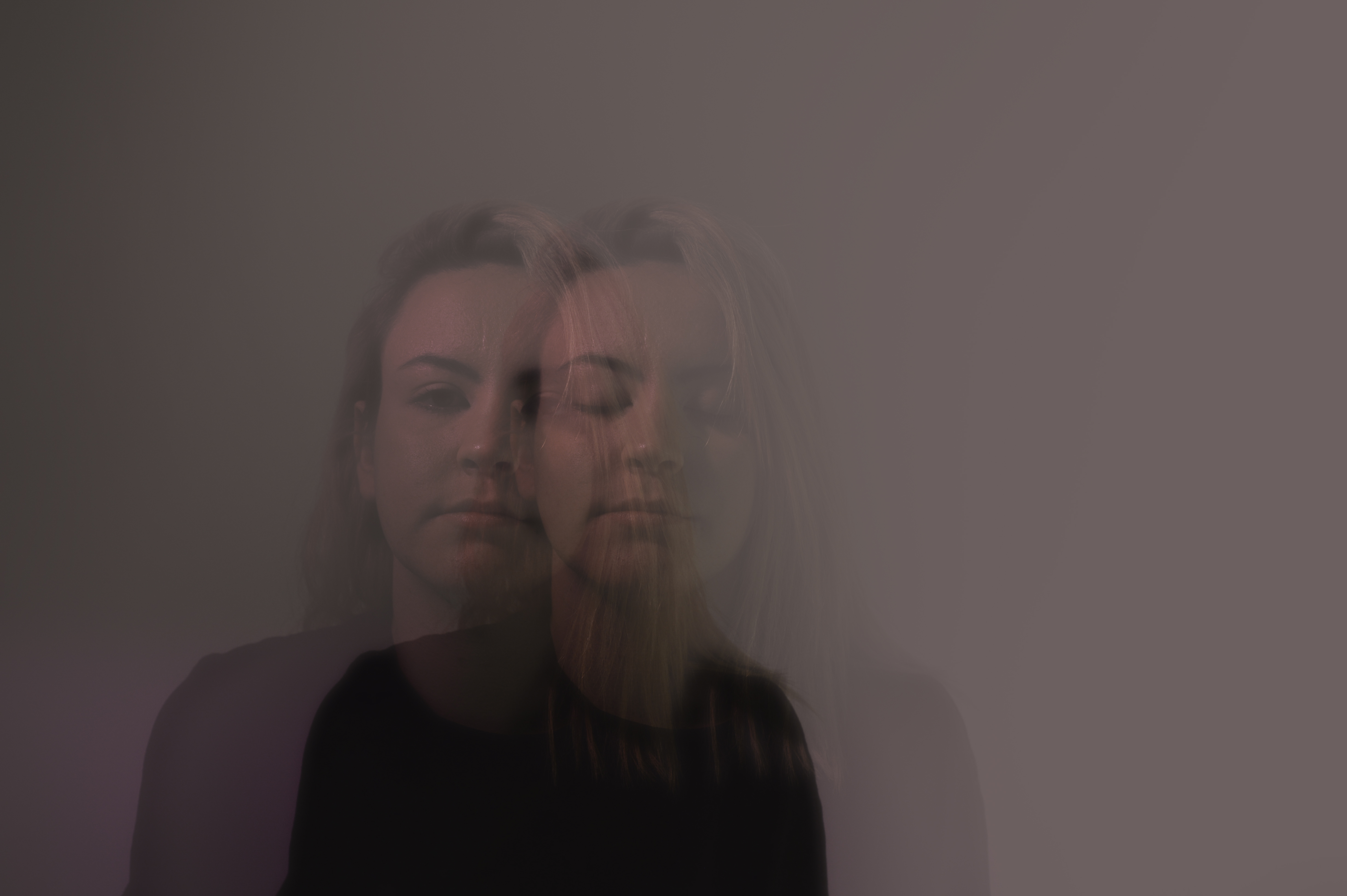
For the next three photos I increased the haze so that they would look somewhat surreal, almost dreamy.


~ tableaux and staged reality ~
Tableaux is used to describe a painting or photograph in which characters are arranged for picturesque or dramatic effect and appear absorbed and completely unaware of the existence of the viewer.
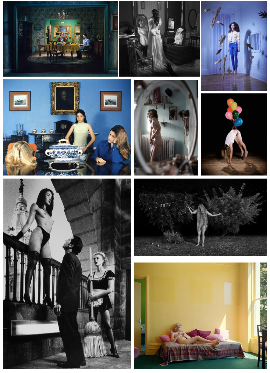
The term was first used in the eighteenth century by French philosopher Denis Diderot to describe paintings with this type of composition. Tableau paintings were natural and true to life, and had the effect of walling off the observer from the drama taking place, transfixing the viewer like never before.
It can be used to create surreal landscapes and visions, expressing or pursuing existing ideas, thoughts and situations,
Tableaux photography is staged, and the final outcome was made purposefully with an idea in mind.
CCA Galleries – Clare Rae and Claude Cahun Comparison
Clare Rae is a photographer based in Melbourne, Australia. Her work has recently been placed in the CCA Gallery in Jersey, the work that has been put up is the work she has done that has taken inspiration from Claude Cahun. Some of Claude Cahuns work has also been put up to show the viewers of the gallery how Clare has taken inspiration and what she has changed from how Claude Cahun worked. Claude Cahun normally used her body in her images. In response to this Clare Rae has used her body in her images. She describes this as a private performance for herself. Her work shows her body as a piece of art. She is trying to present an alternate view of the female body.
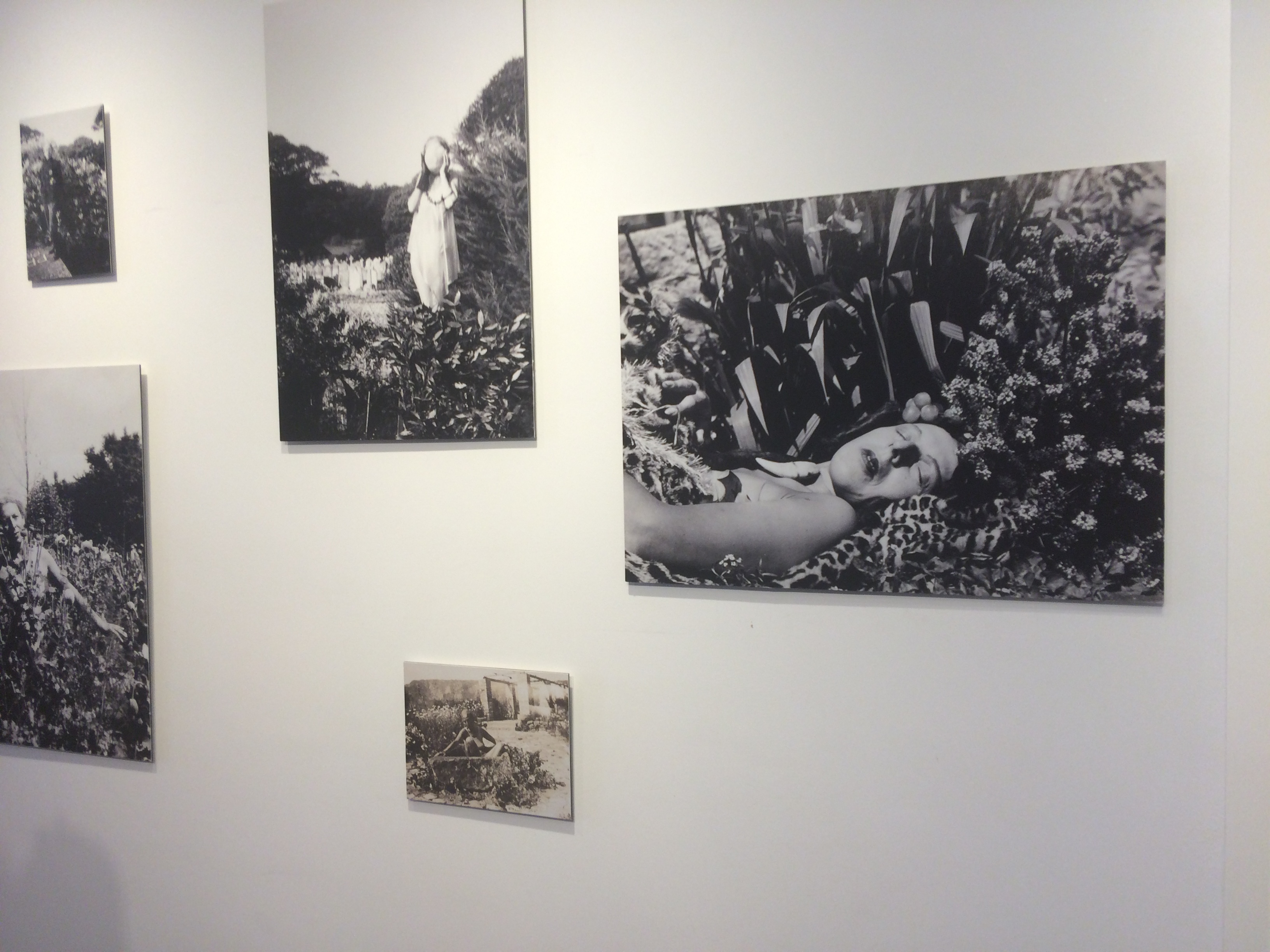
Clare Rae like Claude Cahun worked mostly in black and white while taking images for this project. Though she used the same colour scheme to get contrast between lights and dark’s, Clare Rae normally used lighter background colours, so that in black and white it would become a lot brighter with the darker colours over the top. This is different from how Claude Cahun worked as she normally used backgrounds that were a lot darker and overlapped lighter colours on top.
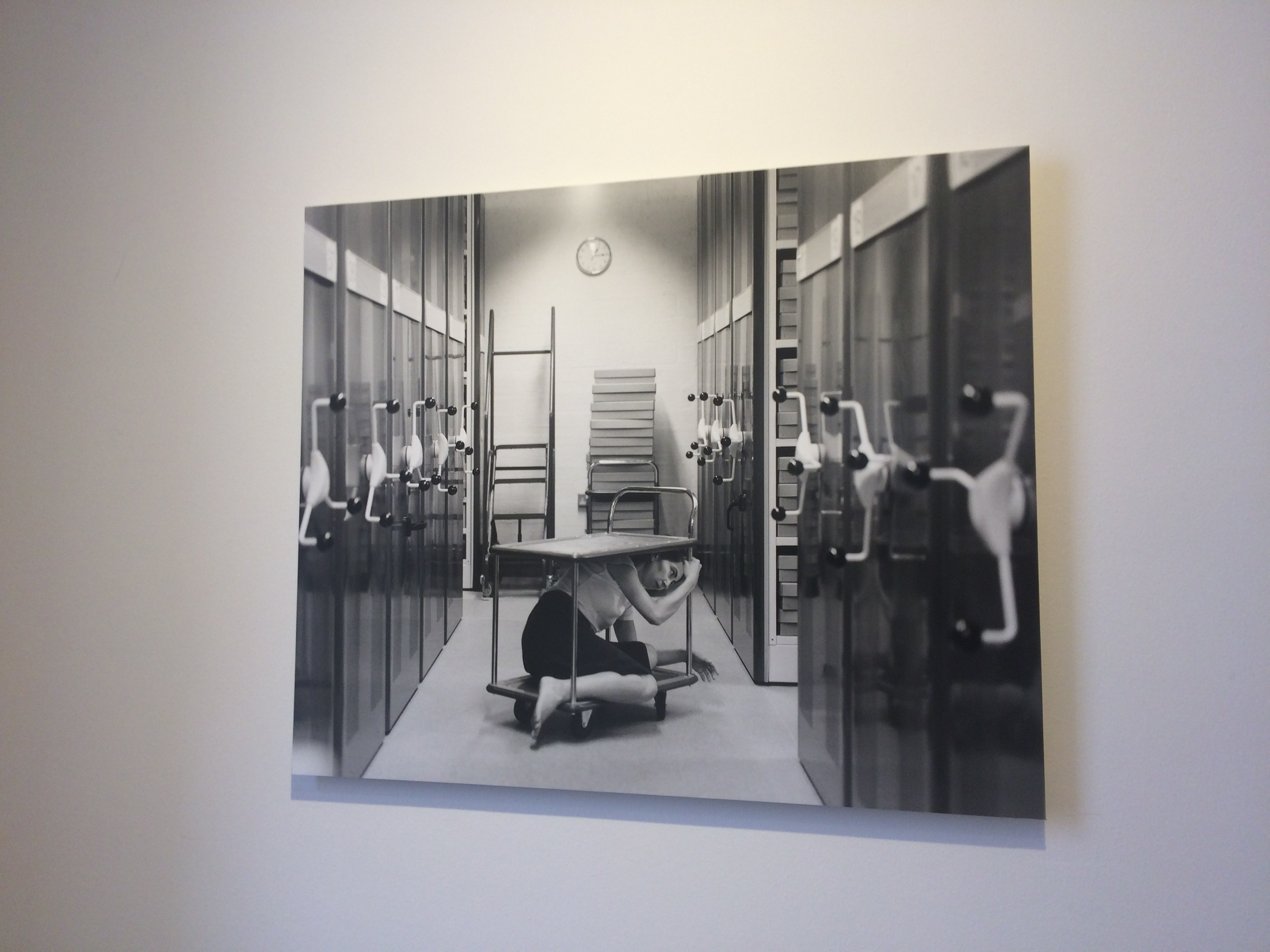
This is my favourite image in the CCA Gallery. It shows Clare Rae interacting in the environment in a way that makes her seem trapped.
Due to using their bodies as an art piece, both would have had to think about what they were wearing a lot in their images, to get what the wanted displayed in each image they took. They had to interact with the environment around them, this means that a lot of thought would have had to go into how they were going to pose themselves in their images.
In conclusion, the images produced by both people could be taken in multiple ways and have a different meaning for every person.
Tableaux&Staged Reality 2
EXPLORING TABLEAUX/STAGED REALITY PART 2
In this part of the project I focused mainly on staged reality, as I was re creating these paintings
These 3 images are the ones we chose as a class to explore as they were some of our favorites. We chose these images due to the different angles of lighting within the images and the angle the photo has been taken from. The meaning behind these images is strong.
 Eugene Delacroix ‘Leading the People’
 Carravagio ‘Deposition’
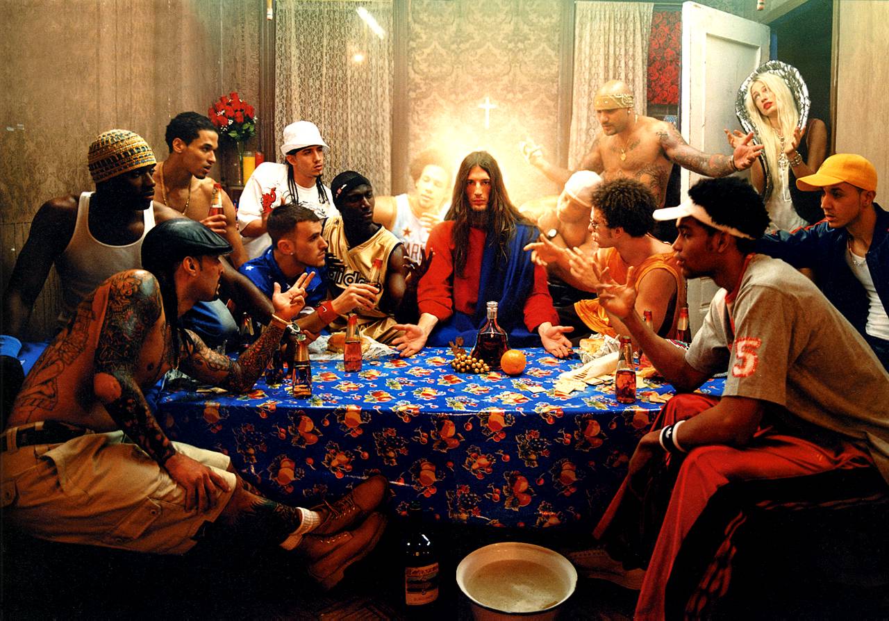 David La Chapelle ‘The Last Supper’
MY RESPONSE;
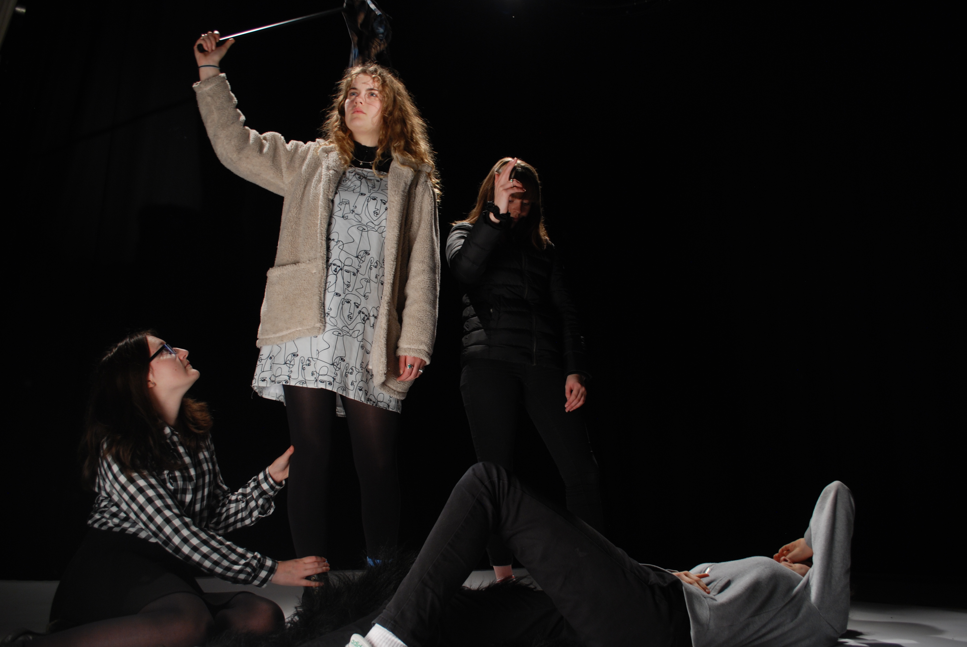
When taking these photos, we had an allocated director, photographer and lighting person, along with the cast of the image. The director was there to order the photo, in order to get out image as close to the one we were copying. It took many tries to get a good image because there was many people to order and the lighting had to be perfect, along with the photographer getting their settings correct to make sure the photo looked sharp and clean.
This photo is my favorite response from experimenting with Caravaggio’s photo ‘Deposition’. As I feel that the characters are in the right place and the image is sharp. We added our own twist on this image, by dressing the person being held in a gorilla suit, just to make it more creative and give it our own feel. 
When photographing the ‘Leading the People’ by Eugene Delacriox, we struggled getting the lighting in the right places to highlight the right parts of the image. I chose to show these two images from this shoot, because the first one has the lighting in the right place, but the whole frame wasn’t shot. Whereas in the second photo you can see the whole frame with acceptance of the flooring slighting in the photo, but that could easily be edited out. 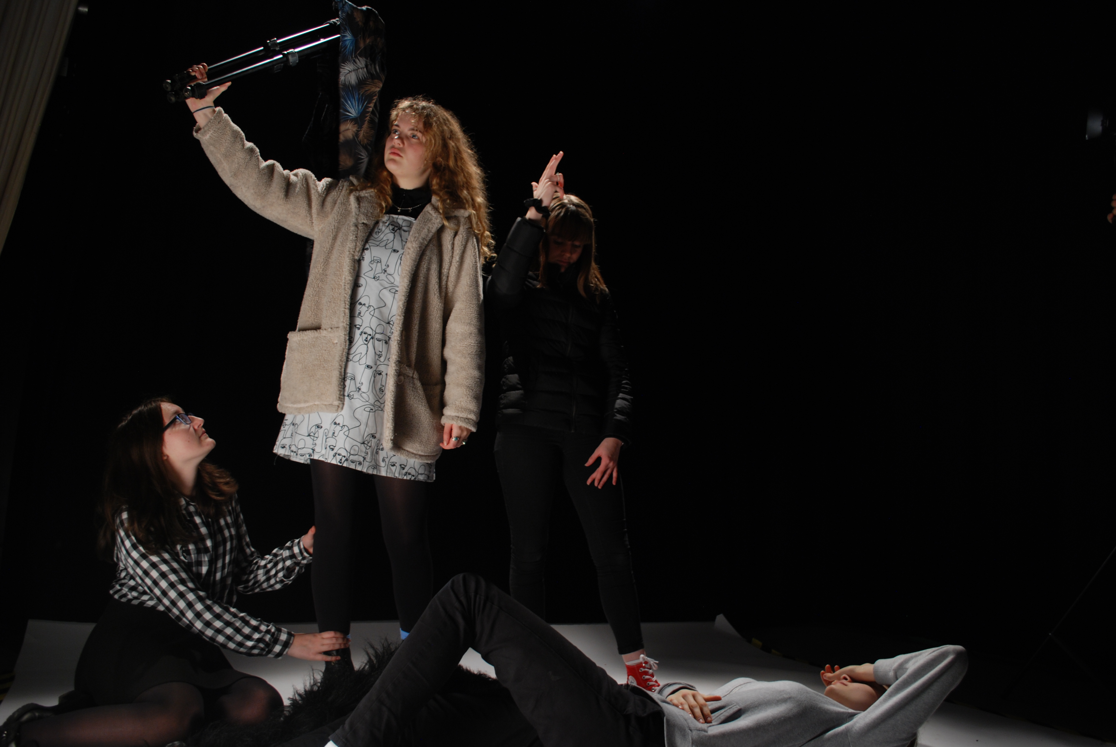
The final shoot we did was to reenact the image by David La Chapelle, ‘The Last Supper’. When photographing this image I was in charge of the lighting, I had to have a light in front of the set up and also one from behind to create the type of lighting that was created in the original.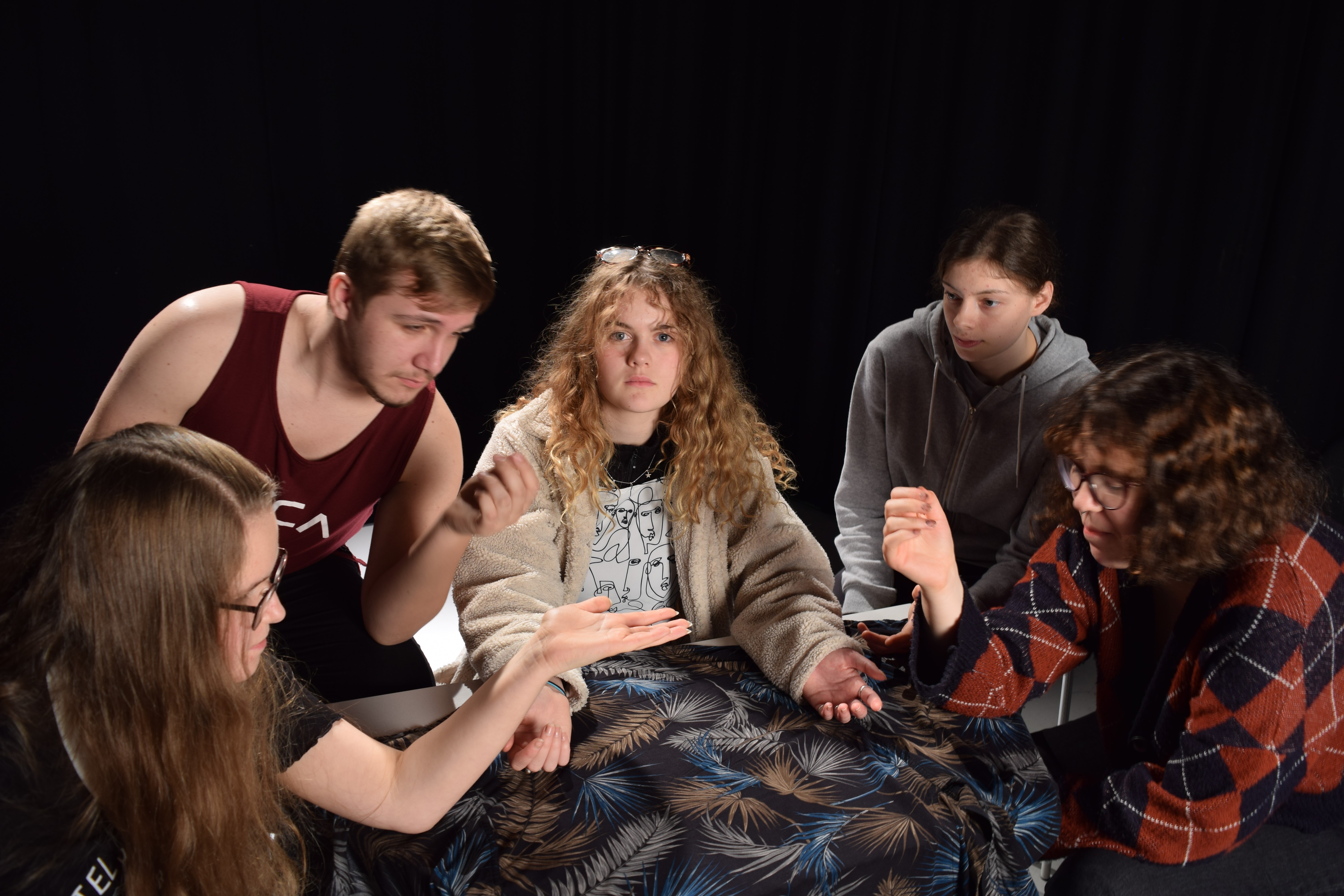
EVALUATION
During this second part of investigating tableaux/staged reality we had to set up the people as they photo had theirs set up, we also had to get the correct lighting to make the photo look something like the original. I found staged reality very difficult because, I like being able to have freedom to change things and set things how I want, whereas in this part we had to follow an image. In staged reality and tableaux there isn’t room for you to do what you like and have the ability to be creative. It was frustrating as it took a while to get characters in the right place and then along with the lighting, it was too boring.
Tableaux&Staged Reality 1
TABLEAUX
Tableaux is a french word that stands for living picture, it is a static picture containing models to portray certain characters from paintings of to reenact a story. They are carefully posed with props and scenery, it combines aspects of theater and visual arts.
RESEARCH
TOM HUNTER
Tom Walker is a British photographer and film maker who was one of the first to have a one man show at the National Art Gallery, Walker was born in 1965. His photos mainly re-imaged or made reference to classical paintings. When beginning his photography he focused mainly on local issues and sensationalizing news headings, one of his well known photos is the ‘Woman Reading a Possession Order’, he said he just wanted to take the picture to show the dignity of a squatter.
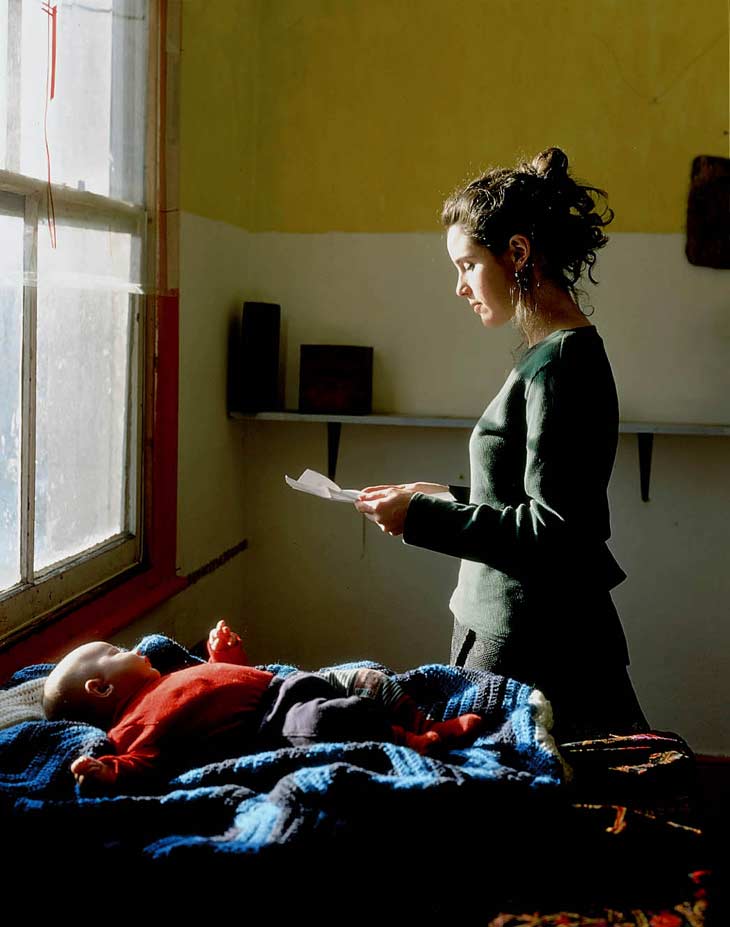 ‘Woman Reading a Possession Order’
ELI REZKALLAH
Eli Rezkallah was a photographer who switched the roles of gender in advertising. He used reveres sexism to show that all genders are equal and are capable of doing each others jobs. Some people have commented on his work has being sexist but it is just him trying to beat stereotyping. 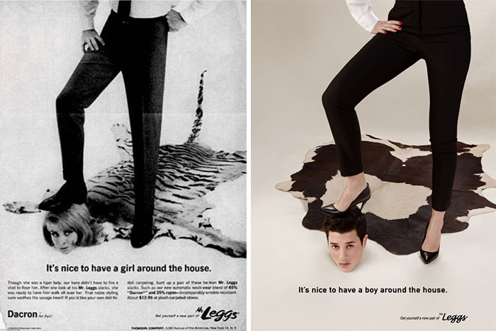
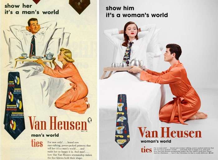
He believes that he got his inspiration from growing up with his mother and sisters during the war as they did all the jobs a male would do, he said “they lived like nothing was happening, so my work is a prettier version of their reality”. He started Plastik as a platform for his and his friends work, to show case their work and ideas to everyone.
TIM WALKER – FANTASY BASED
Tim Walker was a British fashion photographer, who regularly shot for ‘Vogue’ and ‘Love Magazine’. His work is very fantasy based and was influenced by children’s fairy tales, with the way that the models are posed and look, along with props. Walker was part of a project called ‘Checkmate’ for Vogue. The images within this project are inspired by the Alice in Wonderland scene containing the giant check board and the odd players around it.
This image created by Walker is a fascinating image to look at. The different angles of the walls around the model give it a beautiful abstract feel to it. The angle of the model with their forward foot creating a straight angle, designs an odd appearance of the model, giving it the fantasy feeling to it. 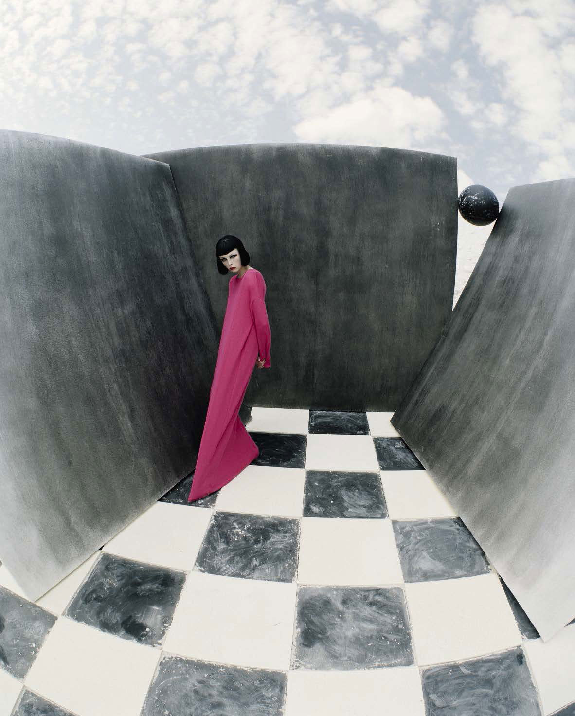
The colors and costumes in this image give it the fairy tale look, the darkness of the image makes it feel as if these are the villains within the story due to the all black costumes and makeup. The main model in the middle is showing their white eyes which gives it a creepy, chilling feel as they are looking directly into the camera and making contact with the viewer. The dramatic detailing in this image portrays the Alice in Wonderland theme.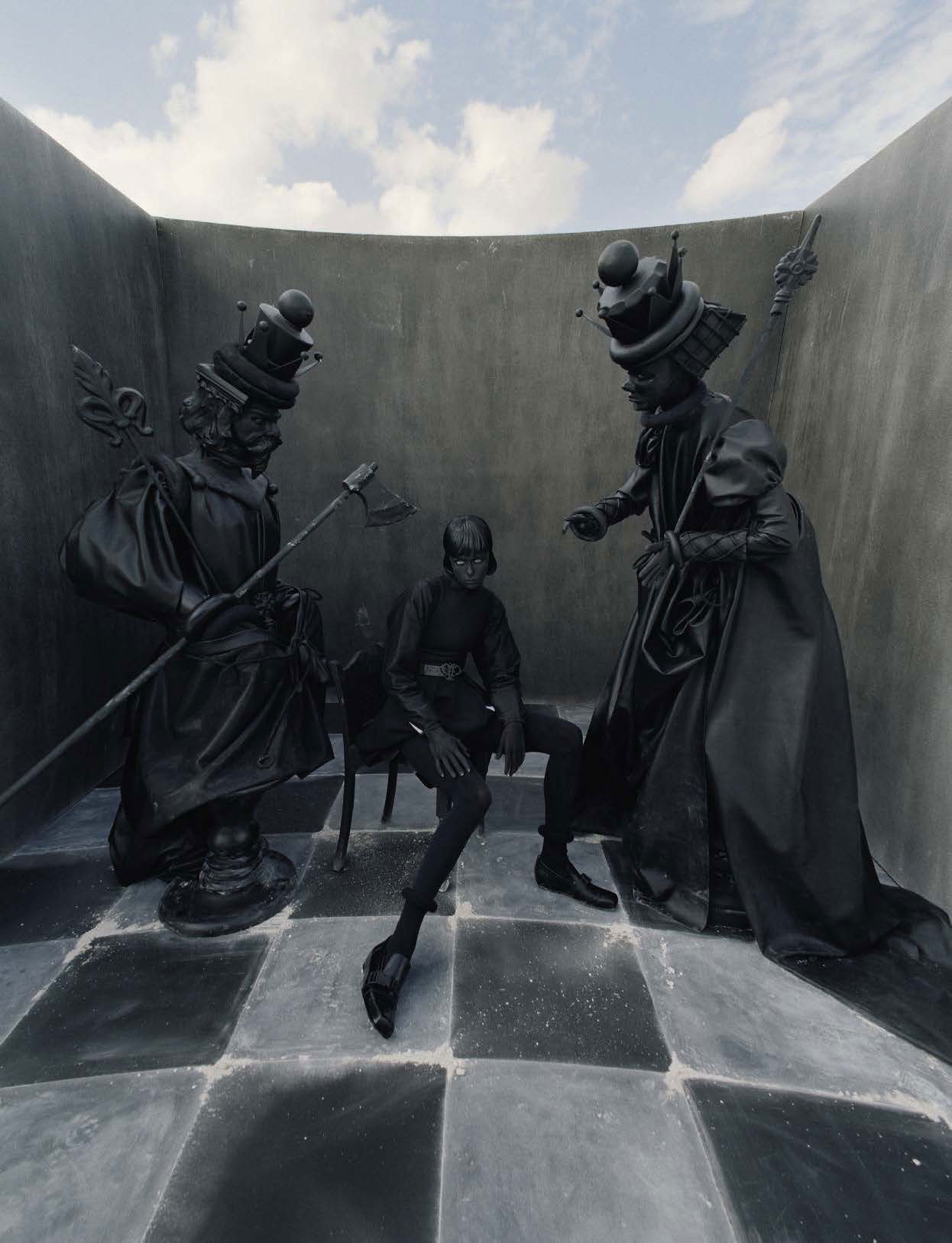
EXPLORING TABLEAUX/STAGED REALITY PART 1
I am focusing on gender roles, portrayed in images, along with fantasy scenes.
I am exploring gender roles within fairy tales, mainly within Little Red Riding Hood, it is a European fairy tale that goes back to the 10th century by many European folk tales. The story involves a little girl in a red hooded cape, she is sent through the woods to deliver food to her ill grandmother. A bad wolf is then presented as a problem as he wants to eat the girl and the food in her basket, he approaches the little girl and tells her to pick some flowers which she does. The wolf then enters the little girls grandmothers house pretending to be the little girl and then eats her whole. Later the little girl arrives at her grandmothers house and notices her grandmother is looking very odd. The girl and the wolf have a small conversation and then he jumps out of grandmothers bed and begins to eats her, a near by hunter heard the girl screaming and came to the girls aid with an axe, he fought off the wolf and the girl and grandmother came out unharmed.
There are many underlying stories within this fairy-tale, but the one i’m going to focus on is the portrayal of gender roles within this story. In the story males as show as the stronger more powerful gender. This is evident within the story as the huntsman fights of the wolf and saves the girl. This is showing that women couldn’t look after themselves or defend themselves in any situation and that they always need to be saved whatever the circumstances. This story is still within society and still showing that men are the strong gender, rather than having equal genders. Also little red riding is targeted by the wolf, which again says that women are easy targets. The wolf was played by a man and this is telling society that men have the power to control women and do what they want with them, as if they were objects.
I’ve decided to focus on Little Red Riding Hood because I want to show how gender roles are created in children’s fairy tales and that these hidden messages within these stories have a huge impact on the way society treats one and other depending on their gender
These images are scenes from the book. I am going to copy these as these represent the gender roles that are present in this story.  In this image the wolf is representing the male gender, you can see the look on the girls face, she looks scared and unease by the presence of the wolf. You can see that the wolf won’t let her leave and she is too frightened to, encase she gets hurt. This is a strong representation of male domination, as the wolf has power over her.

This image is showing the male gender as the strongest and most powerful, they can do most damage. In this image the male as defeated the wolf and the girl is clinging onto him because she is scared and believes that, that man is the only thing that can look after her and save her. This images shows that women have been brain washed into thinking they are incapable without men and that they must rely on them to survive.
MY RESPONSE;
This is the best photo I cam out with, but it is not my strongest image because I don’t like tableaux photography and I find it difficult to produce a photo looking like something else. I like to go off on my own tangent and make stuff up as I go. Having a strong structure and a concept behind a photo made it hard to really portray the story and characters. 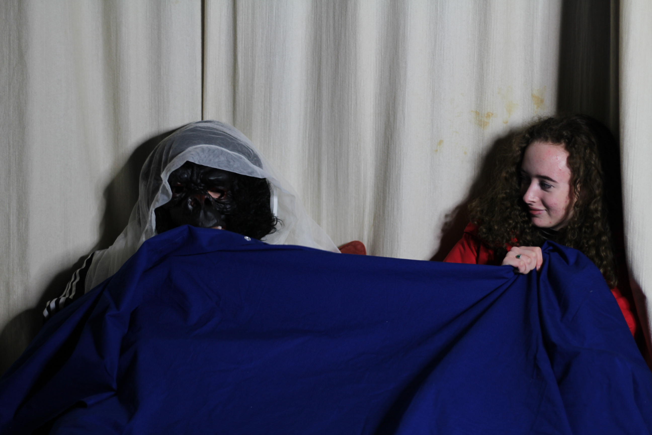 I edited this image into black and white as it shows more texture within the photo, it also makes the shadows more defined and it looks more like the original image I was copying from.
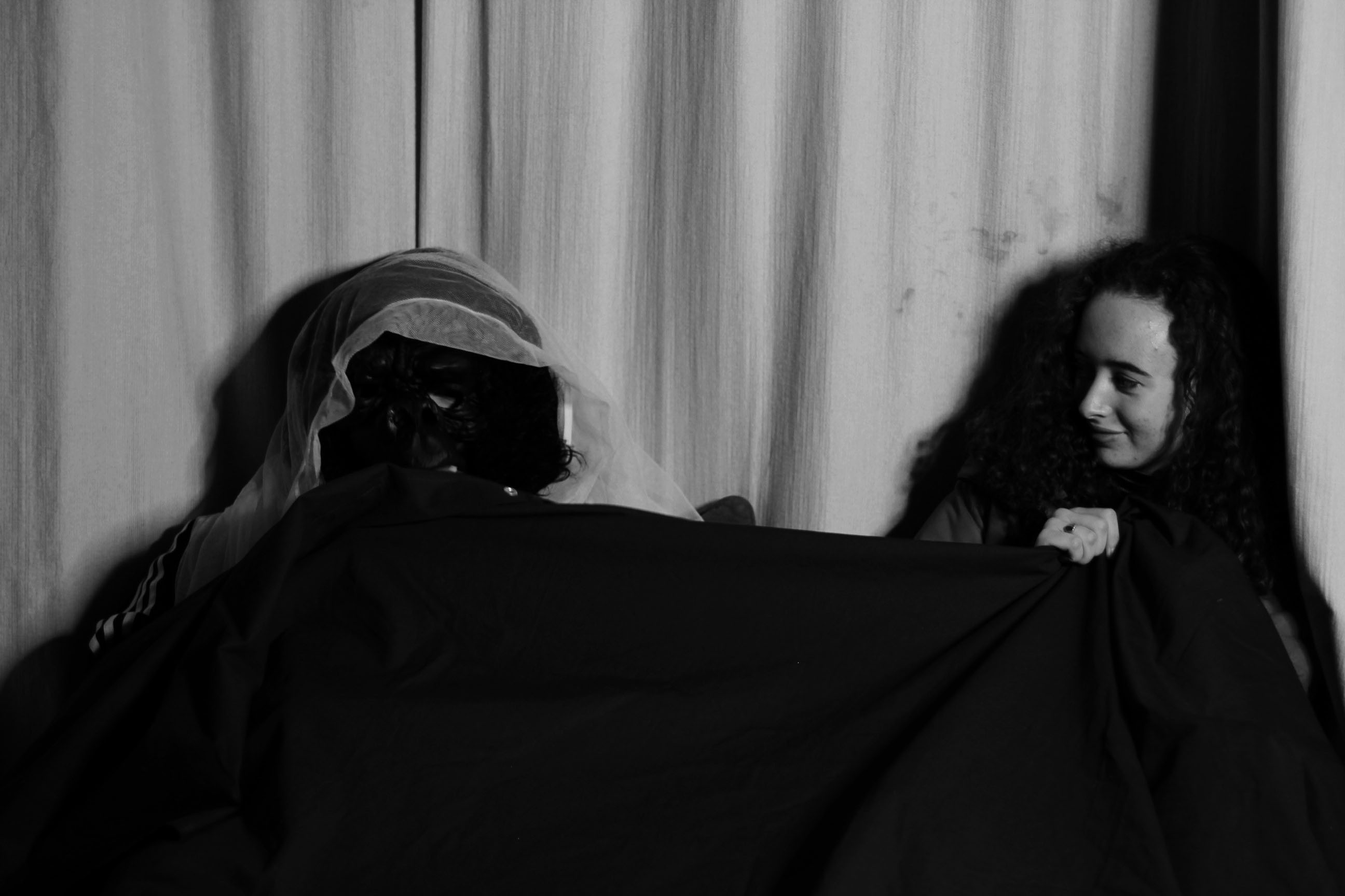
EVALUATION
Overall for this project I feel that the images I produced where poor, this was too bad the bad lighting I had set up and the angle that it was coming from, along with not taking enough images during the shoot to be able to have a variety of images to pick from. The final image I cam out with does represent the concept I was trying to show, which was gender roles, my image shows the girl isn’t comfortable with the masculine figure in her bed. Personally I do not like tableaux and stages reality photography as I don’t enjoy recreating images as I like to be able to have freedom in what photos I take and how I take them, instead of recreating a replica.
Natural Light Experimentation
Definition:
Photographic lighting: is the illumination of scenes to be photographed. A photograph simply records patterns of light, colour, and shade; lighting is all-important in controlling the image. In many cases even illumination is desired to give an accurate rendition of the scene.

https://en.wikipedia.org/wiki/Photographic_lighting
The Shoot:

Manipulated Images:

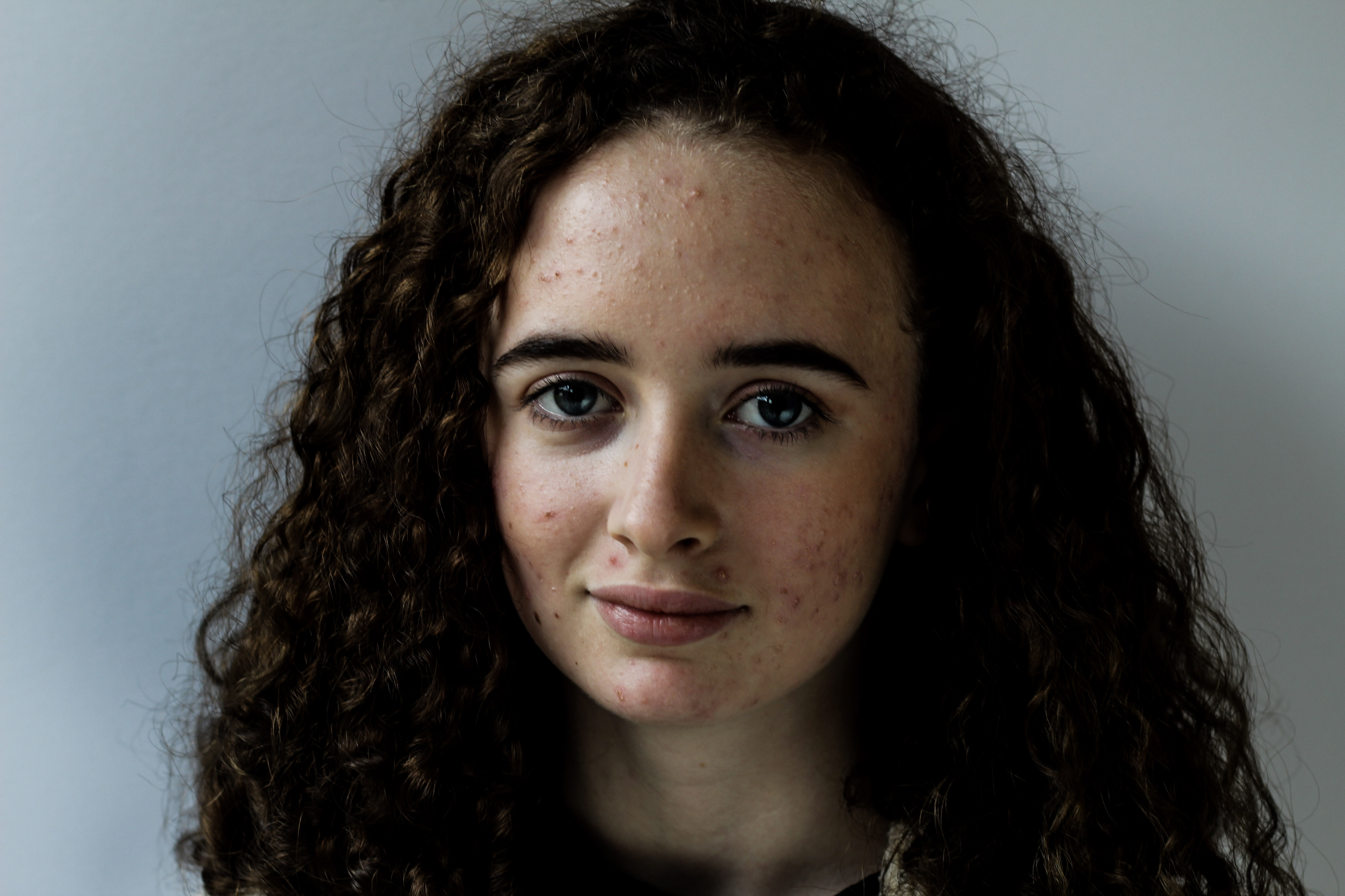

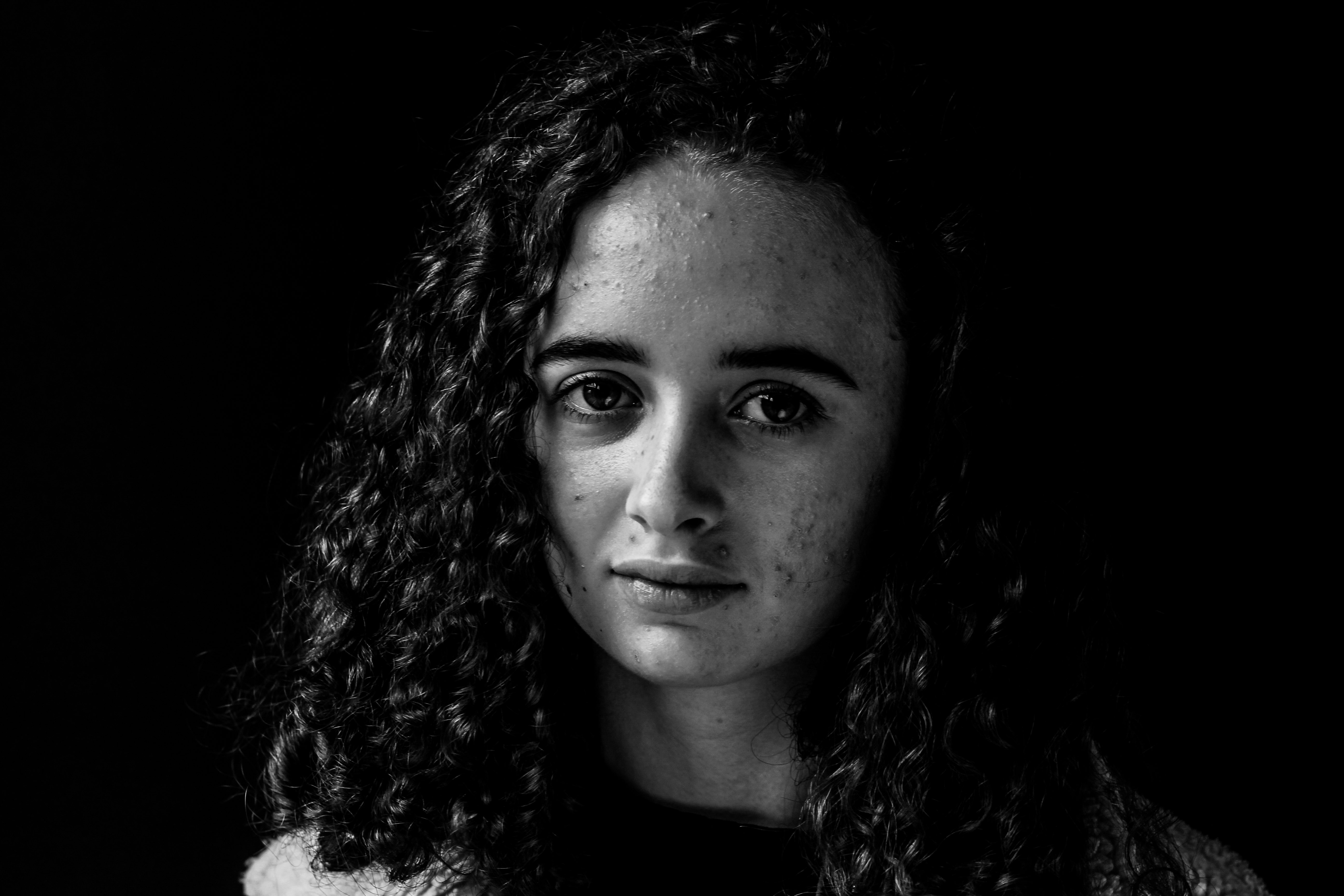
Analysis:
For this photoshoot, I got my model to stand next to a window to use the natural light to create a soft chiaroscuro. I also used a reflector to reflect some of the light lost from reaching the face. I then used adobe lightroom to manipulate my images, adding from presets and then adjusting contrast, highlights, shadows.
studio1 edits
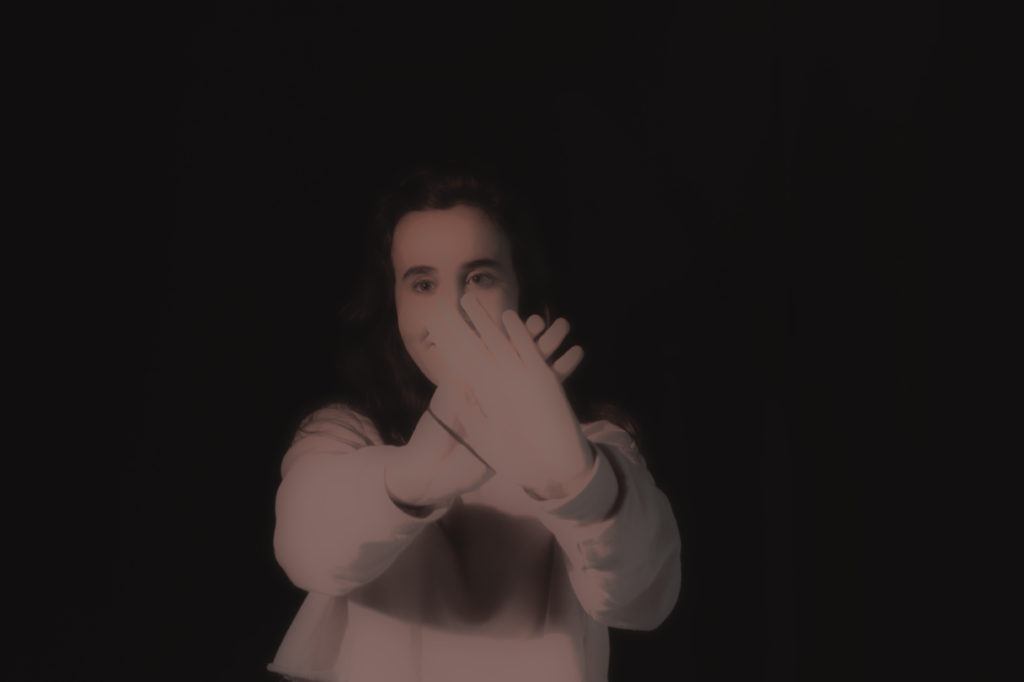
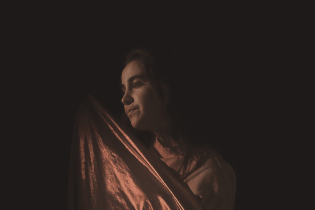
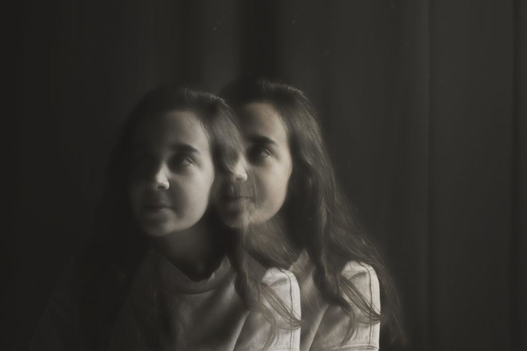

For the four previous photos I took them using a box light and a magenta filter. I didn’t do much in terms of editing in photoshop: all I altered was the saturation to tone down the vivd, harsh pink colours and to give it a ‘cloudy’ sort of look.

In this piece I wanted to keep the vivid colours, so all I did in terms of editing was change the exposure so the figures were more dominant.

All my other photographs had been rectangle, so I decided to change it up and have this in the format of a square. I added some noise to this photo as it gave the pink filter more of a texture on the models face. I also decreased the exposure as it made everything slightly darker except for the models face which, in turn, made it stand out.
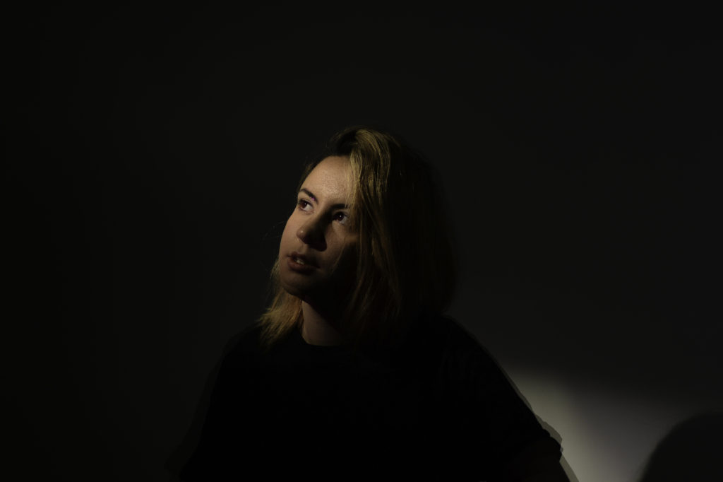
In this photo I had the model sit down so the light would catch the top of her head. I decreased the exposure and selected the history brush and brushed over her face to gain the light back. This created an effect like just her face was glowing.
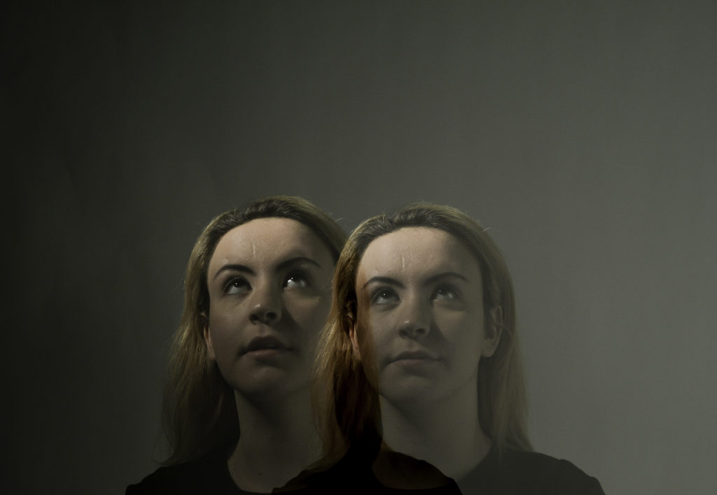
I used the double exposure setting on my camera to take this picture. My goal was to have a slight difference between the two figures, but not t

I had the model sit on the ground so I would be able to catch the light on her forehead. I wanted to enhance it a little more so I used Lightroom to edit this piece. Using a brush and selecting exposure, I brushed over the highlights on her head and eyes to strengthen the light.
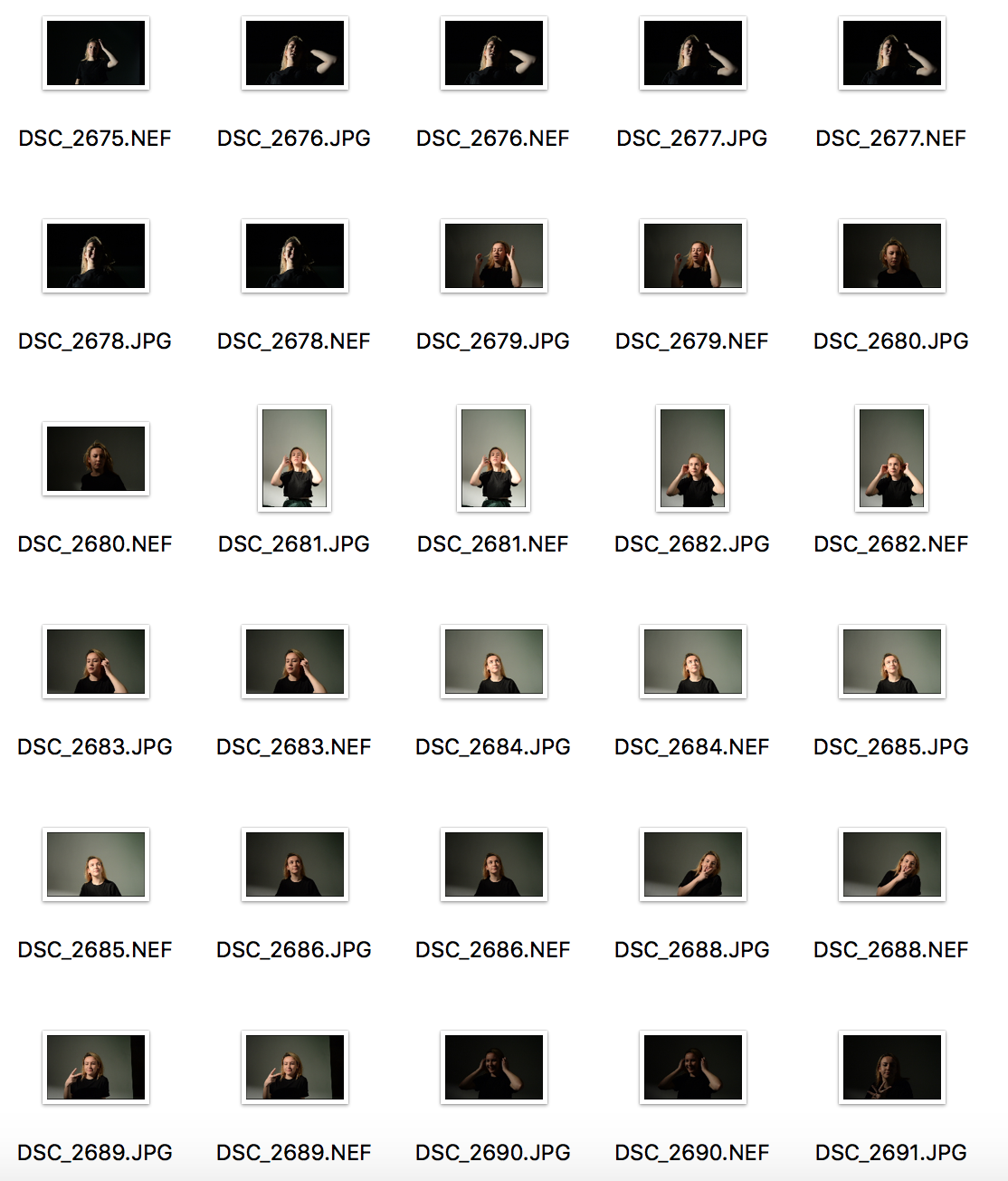
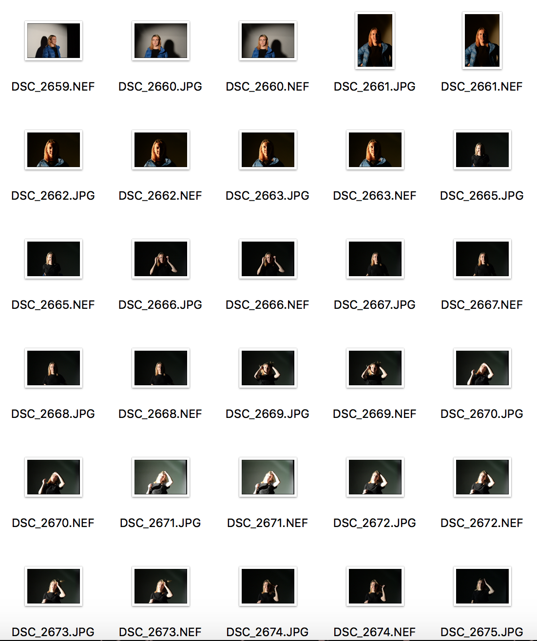
studio1 contacts
