WICKED
‘Wicked tells the incredible untold story of an unlikely but profound friendship between two young women who first meet as sorcery students at Shiz University: the blonde and very popular Glinda and a misunderstood green girl named Elphaba. Following an encounter with The Wonderful Wizard of Oz, their friendship reaches a crossroads and their lives take very different paths. Glinda’s unflinching desire for popularity sees her seduced by power while Elphaba’s determination to remain true to herself, and to those around her, will have unexpected and shocking consequences for her future. Their extraordinary adventures in Oz will ultimately see them fulfil their destinies as Glinda The Good and the Wicked Witch of the West.’
https://www.wickedthemusical.co.uk/london/about
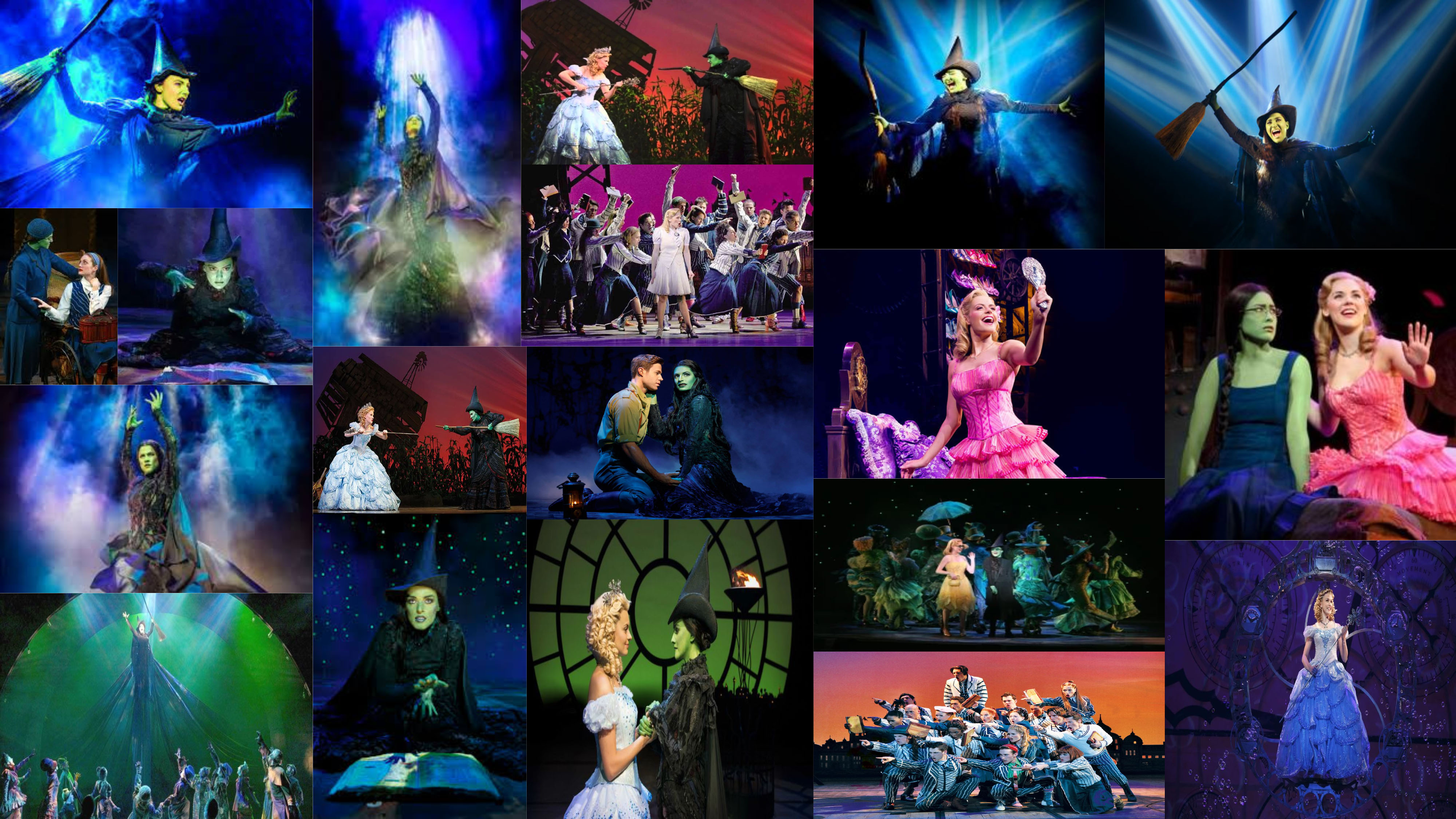
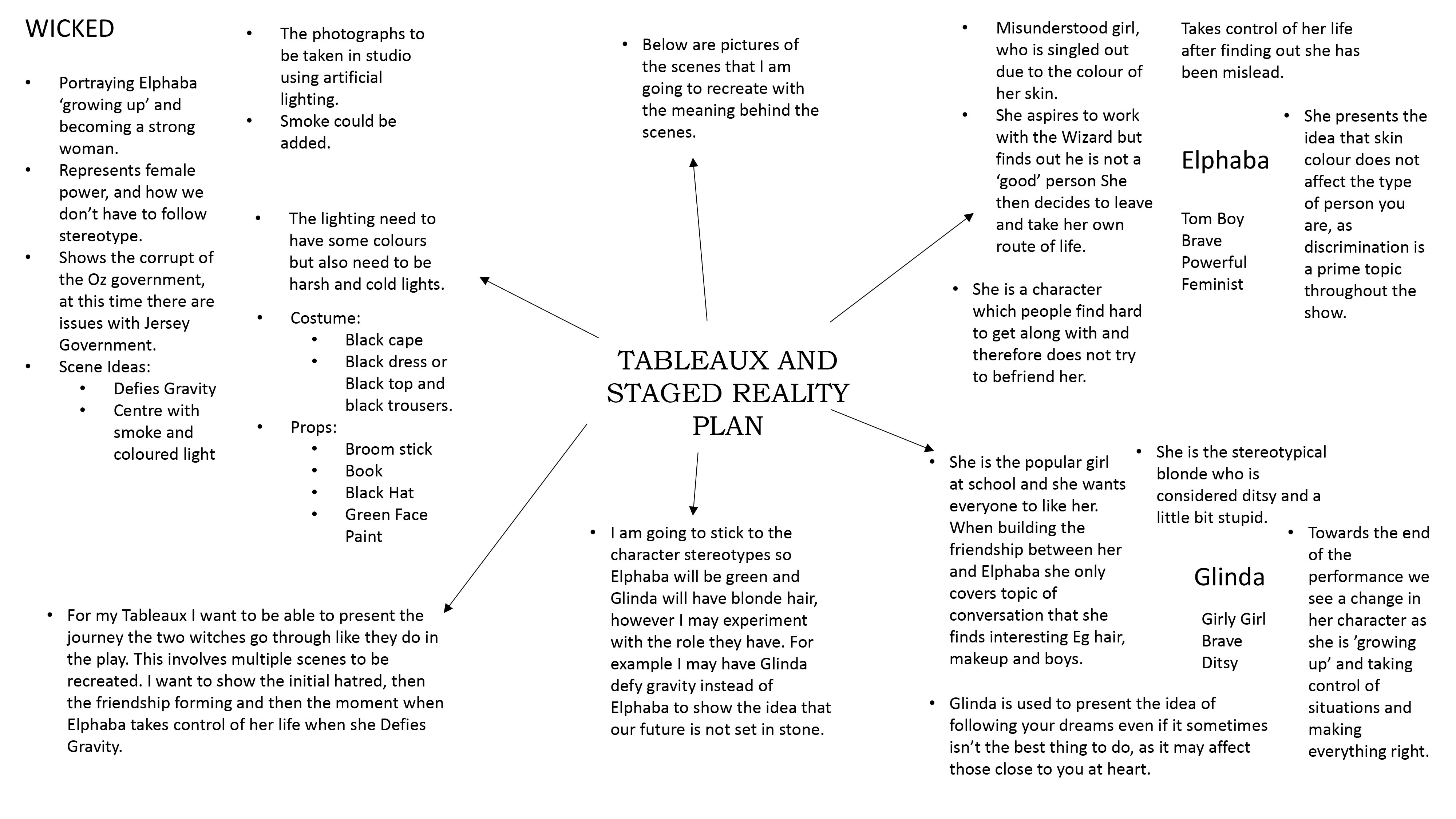
Defying Gravity
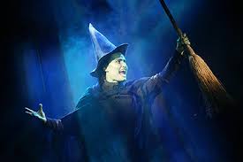
In the defying gravity seen we see Glinda and Elphaba caught in a room, needing to make a plan and fast. When the protagonist Elphaba casts a spell to make a broom stick fly she decides she will escape using that. She then invites her good friend Glinda to join and escape together but Glinda declines as it is not in her nature to rebel. The Guards break into the room and take Glinda Elphaba is seen traveling down the stage saying “It’s not her she has nothing to do with it I’m the one you want” The guards let go of the blonde girl and stare at Elphaba in awe as she takes to the sky.
Popular
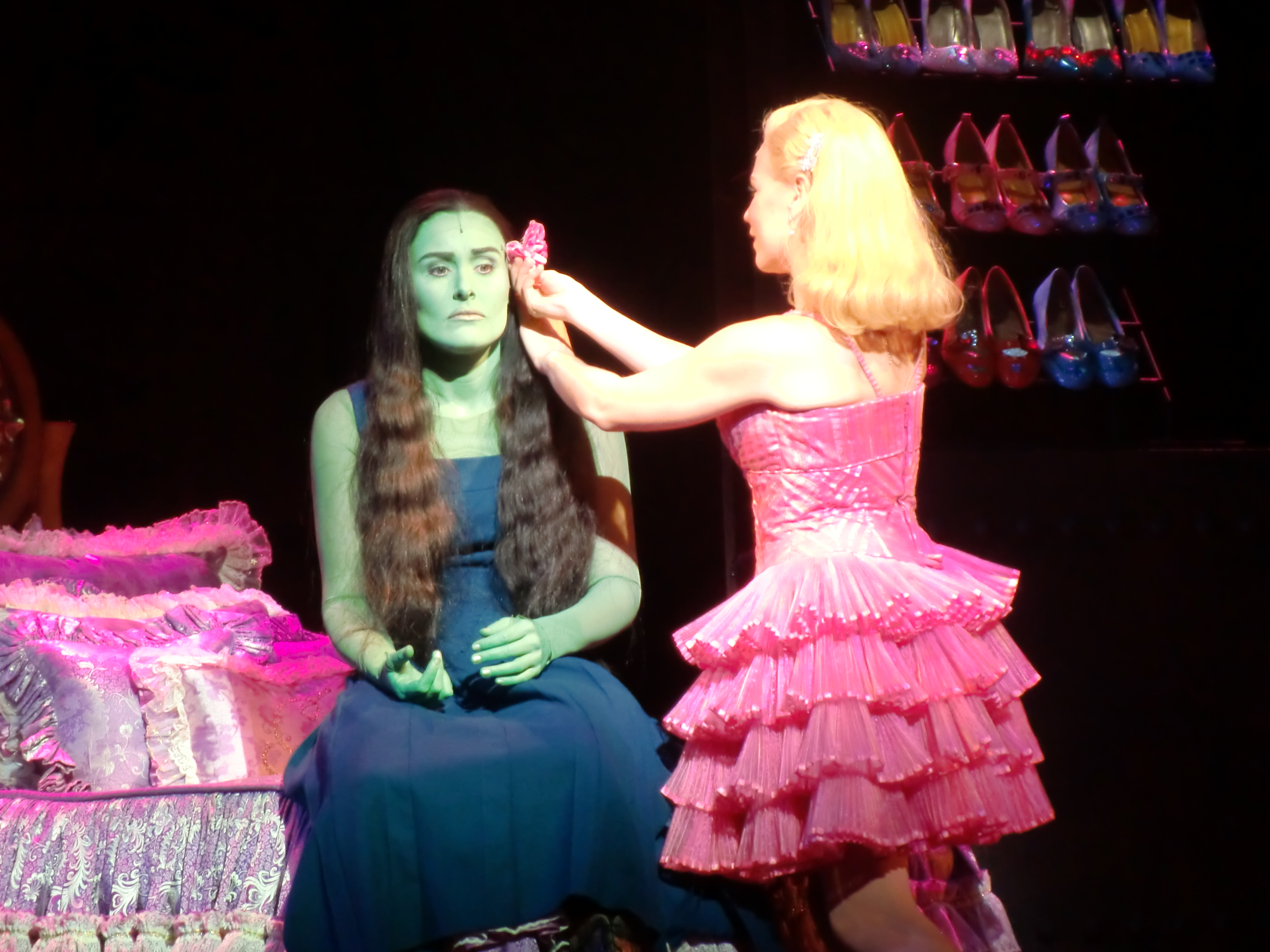
Popular is the scene where we know the two girls are attempting to get on, but of course on Glinda’s terms. This scene is Glinda giving her new friend Elphaba a make over to make her more popular and appealing to other students at the university. Of course she “Glindafies” her making her seem like a duplicate. We see Elphaba go through the different stages, from taking her hair down to tossing her hair. Eventually, a pink flower is placed in the green witches hair, creating an emotional reaction with the audience. Elphaba is then seen running of the stage in tears.
No Good Deed

In no good deed we are faced with Elphaba rising onto the stage with her spell book screaming Fieryo, the name of the boy she loves. This man has been taken by the guards to be killed. The green witch is then seen casting a spell to try and keep her loved one alive, but then backtracks and reminds herself on the damage she has caused to her loved ones. She then comes to the conclusion that she is Wicked.
Contact Sheets
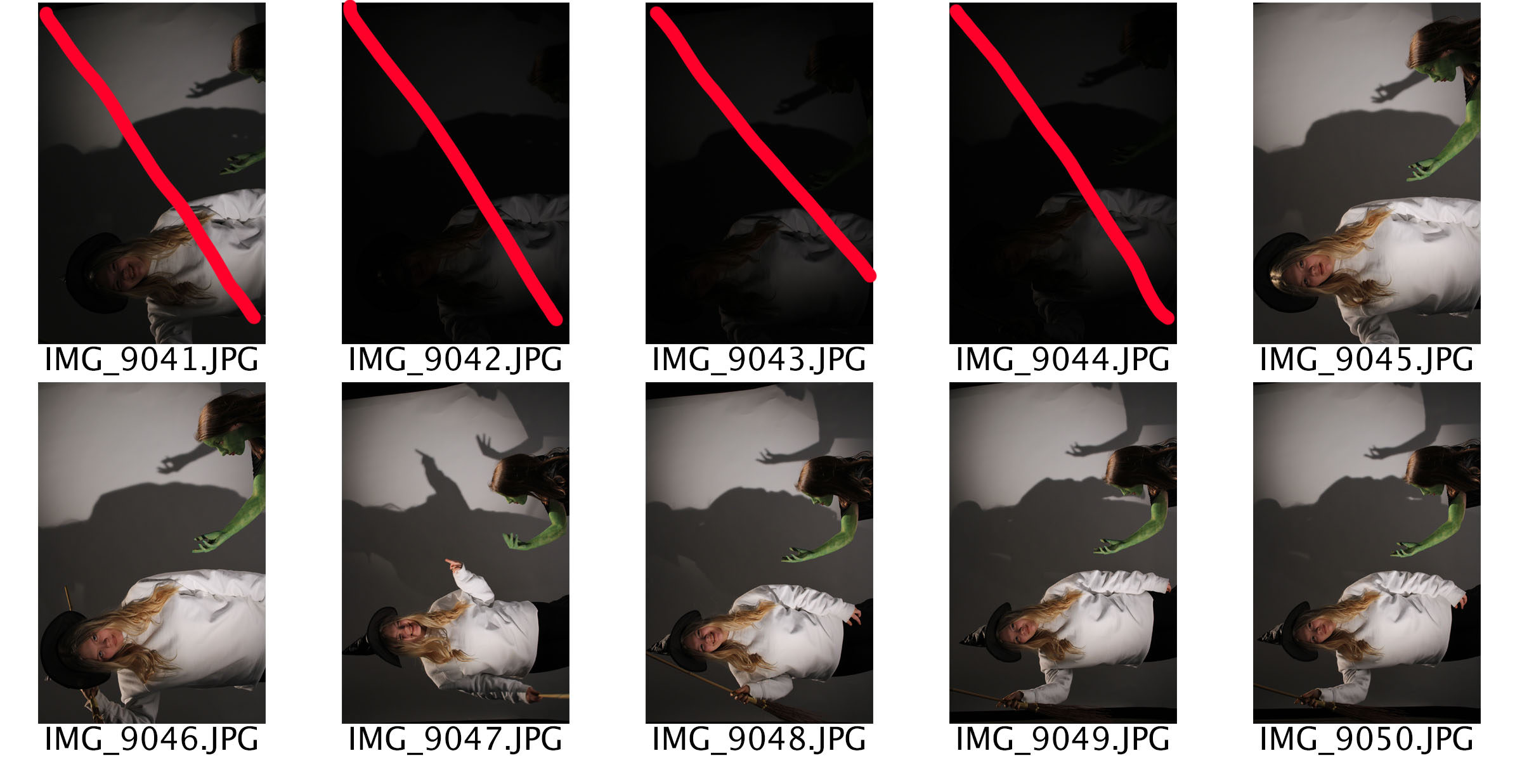
Edits With Story Telling
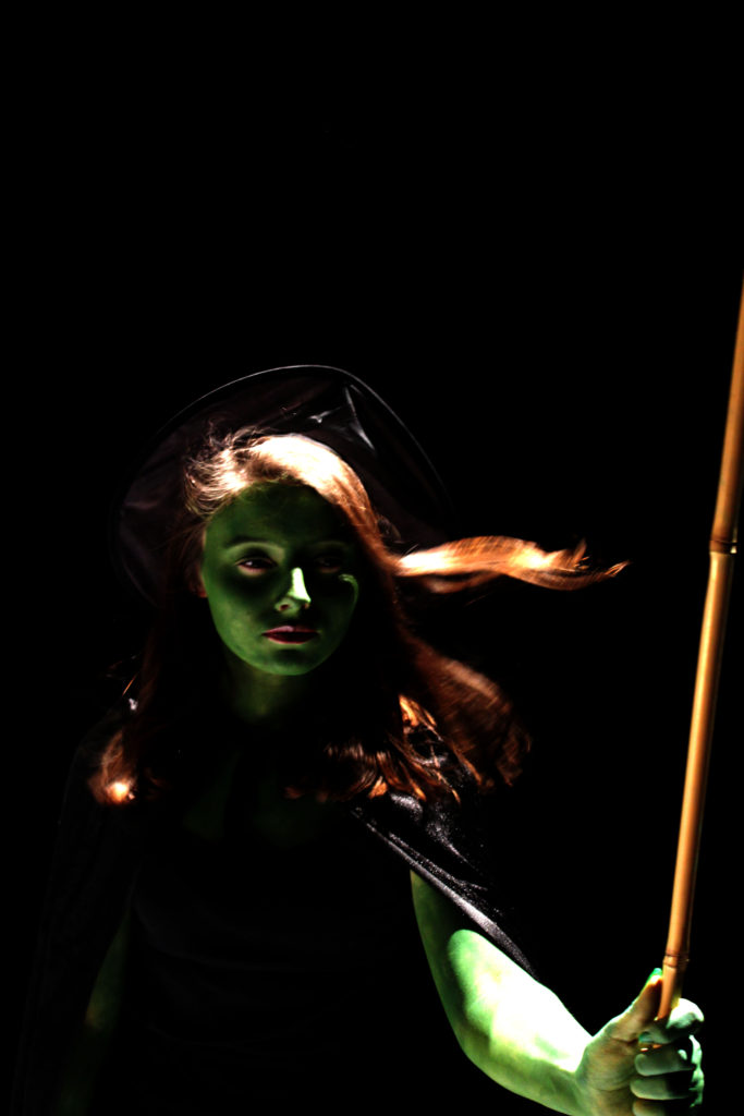
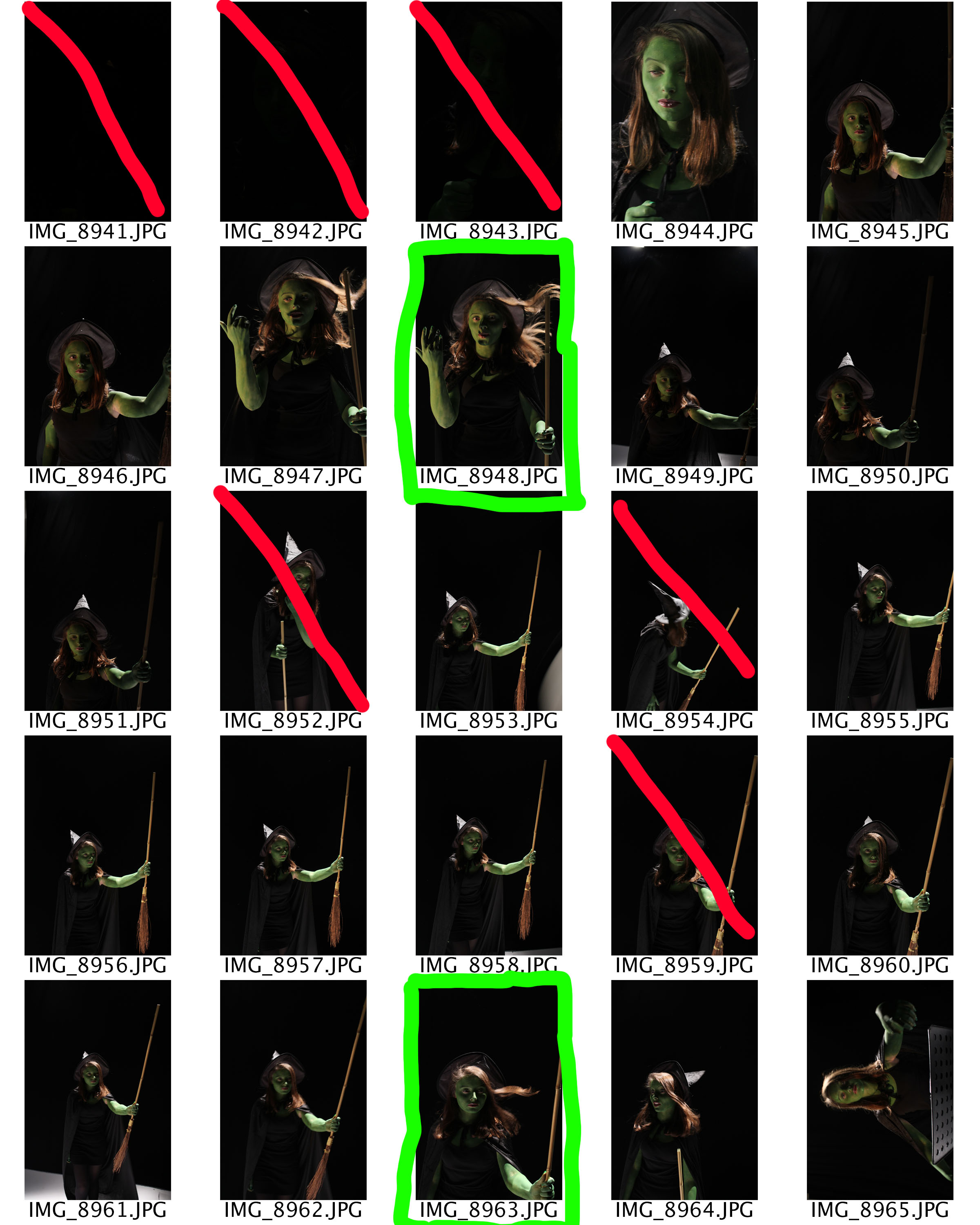
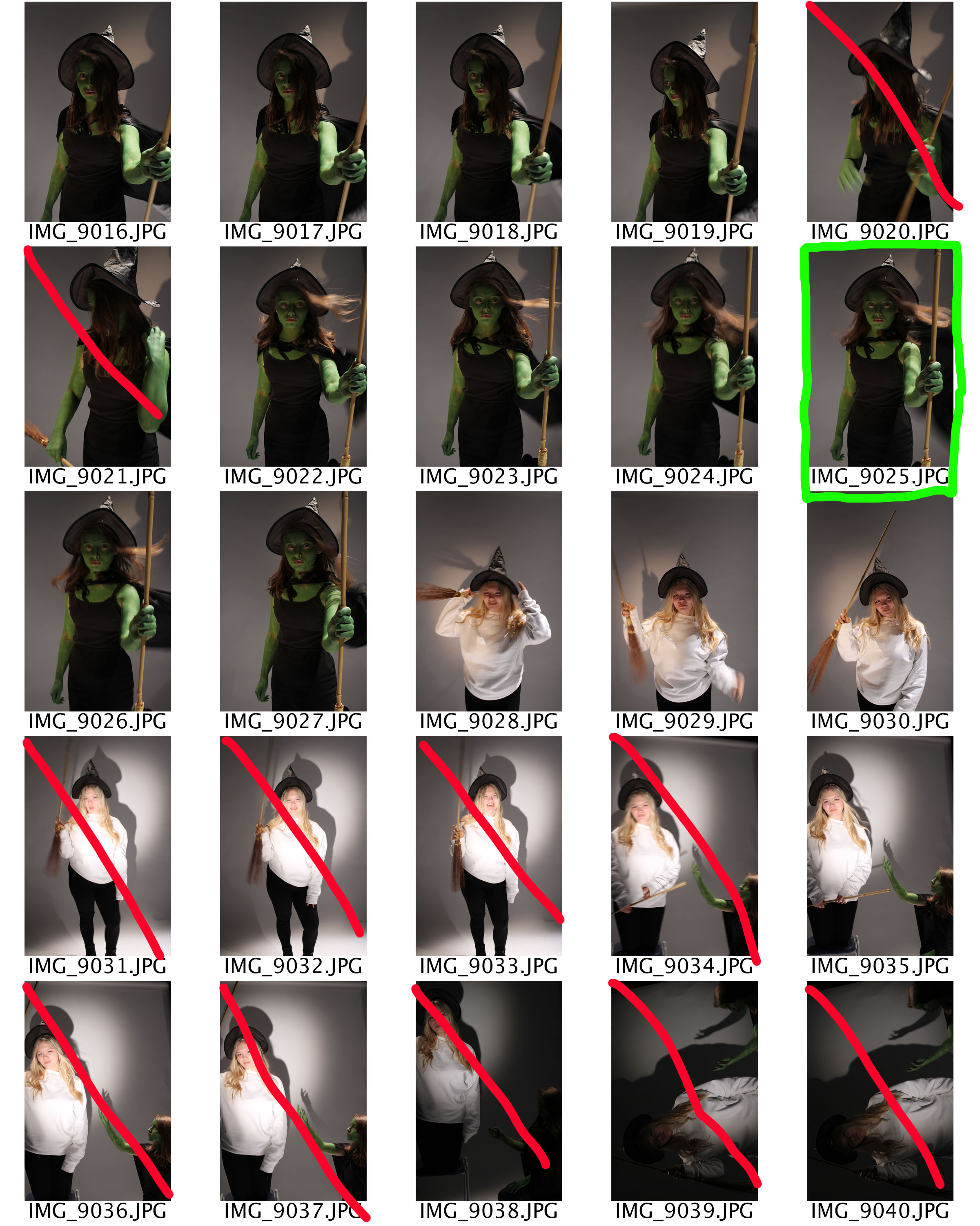
This is my photograph showing the Defying Gravity scene. The protagonist Elphaba is seen in the centre of the image with wind blowing through her hair, presenting the idea that she is in the sky. She is holding her broom high into the air, showing she is proud and is looking towards the broom. The fact that she is not looking at the lens presents the idea that she should not look back and that she is determined to succeed in what she does now. The story behind this shows how she does not need to do as people say and that others should not determine the life that she lives. It portrays her empowering character as a role model to others, it is used to present the views of feminists and how men do not rule to world. This message can be used in any context, for example it could show that A Levels do not define who we are and won’t stop us reaching our hopes and dreams if we fail them. The purpose of this photograph is to inspire others. When editing this image I decided to make the image darker allowing her different tones of green to be presented and allows Elphaba to stand out from the background. To achieve this I just levelled and and adjusted the curves.
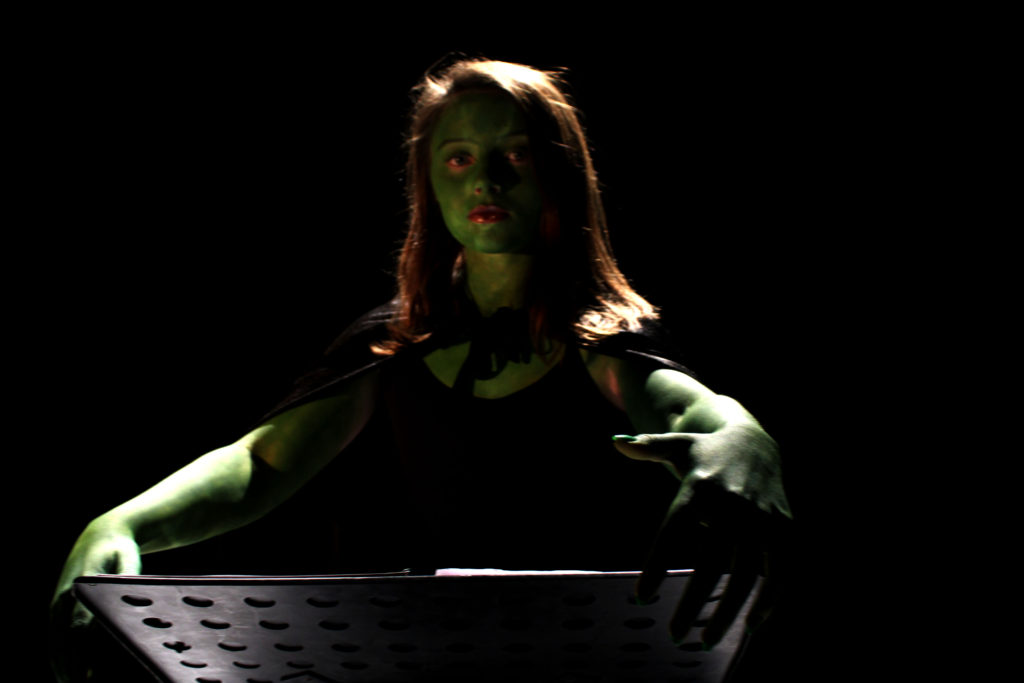
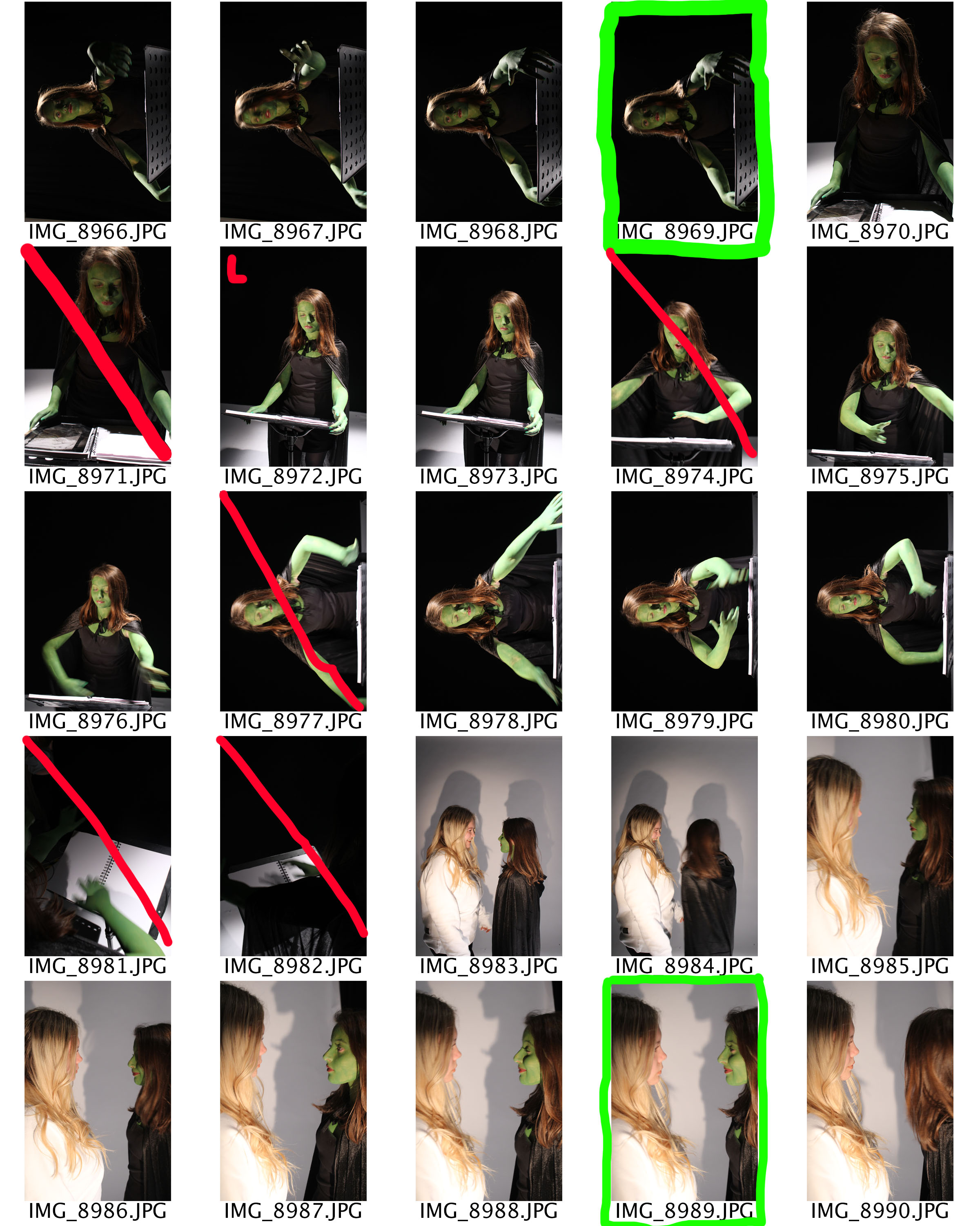
In my no good deed Tableaux we are presented with the green witch in the centre of the frame. She has her spell book open and is casting a spell, shown by her hand movements. The neutral facial expression and direct eye contact with the lens implies the worries and concerns the character has. To story trying to be told is that magic can not fix up our lives. Obviously, we can not cast spells in real life so when transferring this message into the real world it is essentially saying think before we do something as we do not know how it is going to affect others around us. This is a sensitive image as multiple emotions can be interpreted by my models face. Unfortunately, the face of the model is not the main focus point is is sort of out of focus, this loose some of the overall effect and may lead to misinterpretations of the photography. To edit this photograph I just levelled and and adjusted the curves in order to make the image seem naturally darker.
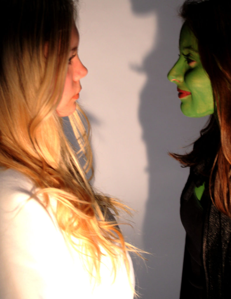 Within this photograph we have the two witches staring at each other, which was inspired by the ‘What is this feeling’ scene. We see Glinda staring at Elphaba with neutral facial expression and sort of squinting her eyes which informs us that she despises the green witch. On the other hand, Elphaba has a smile on her face which informs viewers that she finds it funny that Glinda loathes her. To edit this photograph I just levelled and and adjusted the curves in order to make the image seem naturally darker.
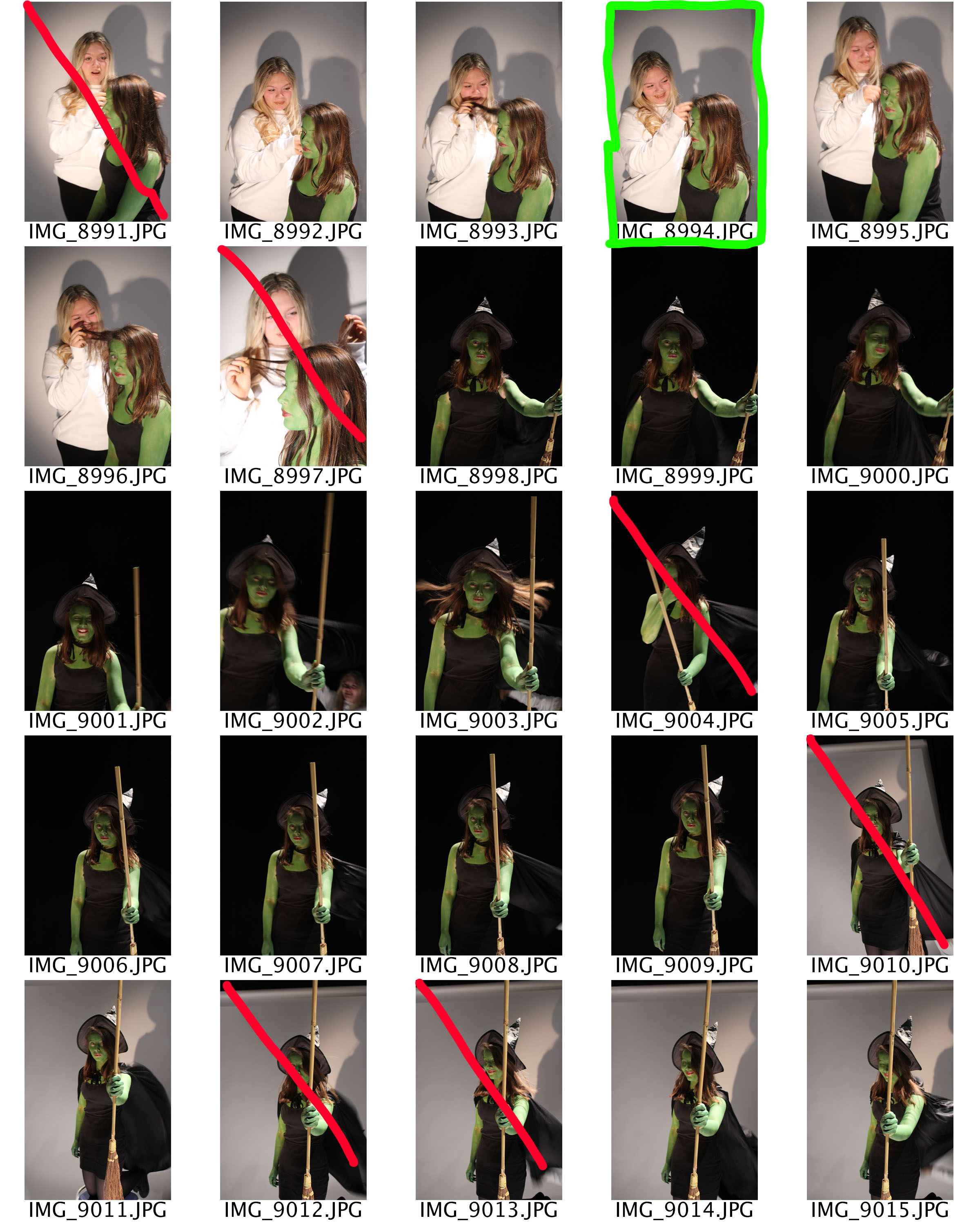
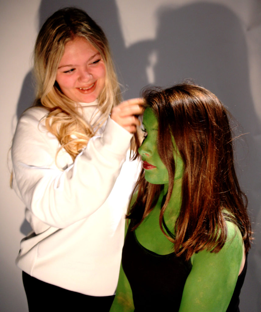 In my final image I wanted to capture the personality of Glinda and the moment when the two girls finally bond. We can see Glinda playing with the hair of Glinda with a big smile on her face, this informs viewers that Glinda is a girly girl and enjoys giving others makeovers and playing with peoples hair. In contrast Elphaba does not seem that fazed by it showing her tomboy side. The contrast shows that for the two witches to be neutral the green witch has to compromise and try and begin to like what Glinda wants. This presents the idea that girls are only concerned with hair, makeup and their phones, but clearly they are not which is demonstrated by Elphaba. Due to the harsh lighting, it allows the two witches to stand out from the background allowing the message to come across better. To edit this photograph I just levelled and adjusted the curves in order to make the image seem naturally darker.
Comparison
When comparing my work to The Entombment of Christ (Deposizione) (1601-3) there are some similarities and differences. The main difference is that my tableaux covers issues that teenagers face today, whereas the artist research shows a major event which took place in 1601. A similarity is the of plain backgrounds which allows the story to be the main focus point allowing the storyline to be outlined clearly within the photograph. Another difference is that my tableaux is a photograph which allowed me to experiment more with lighting, shutter speed and depth of field, compared to the painting made in 1603. Moreover, a lot of thought has been put into my tableaux as I considered costumes, lighting, props, background and facial expressions of my models. Doing this allows a full story to be told, I learnt this from when I researched The Entombment of Christ (Deposizione). In my Defying Gravity image I took inspiration from the painting to use the chiaroscuro effect which has allowed parts of the models body and face to be lit up and gradually get darker, which has allowed a more dramatic effect and tone to be added to my final image.
Evaluation
To evaluate I believe that my tableaux was successful, due to the techniques and skills I have acquired from doing a class tableaux. I was successfully able to create a story within a picture, which is clear for viewers to understand. I have also been able to put in multiple elements to create a successful Tableaux. If I was to do another tableaux I would aim to look at a more religious approach, as I believe the final images would be able to produce a more meaningful representation of a story to viewers, as everyone would understand. I would also at potentially looking at a different editing strategy in order to make the images more dramatic. Although I enjoyed looking at this style of portraiture I do not think that I will continue this idea.
