TABLEAUX
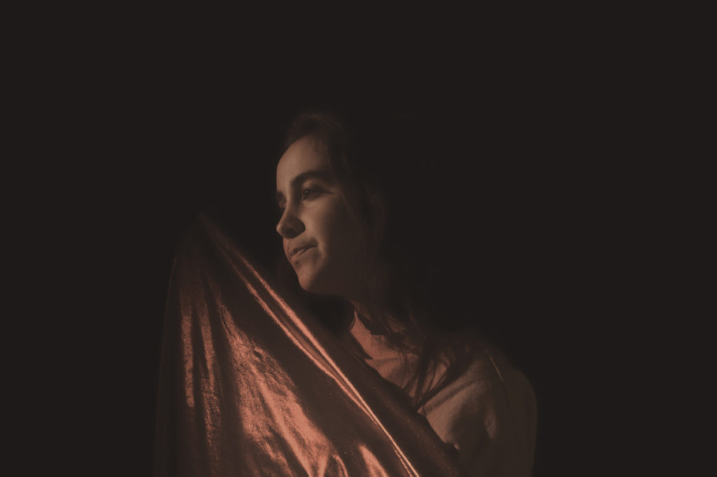
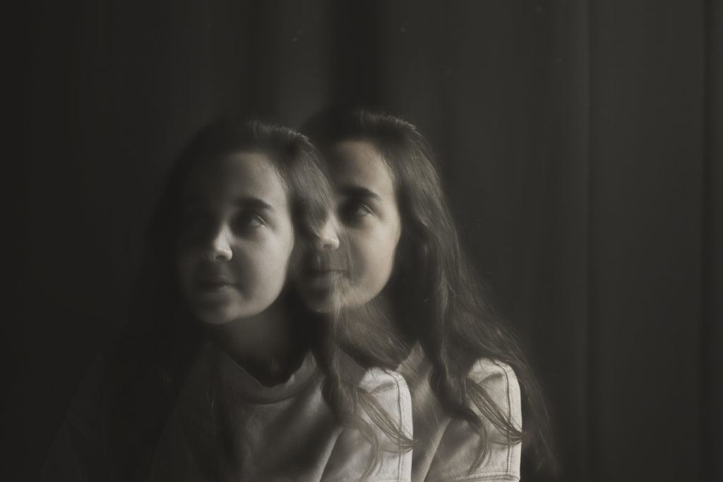
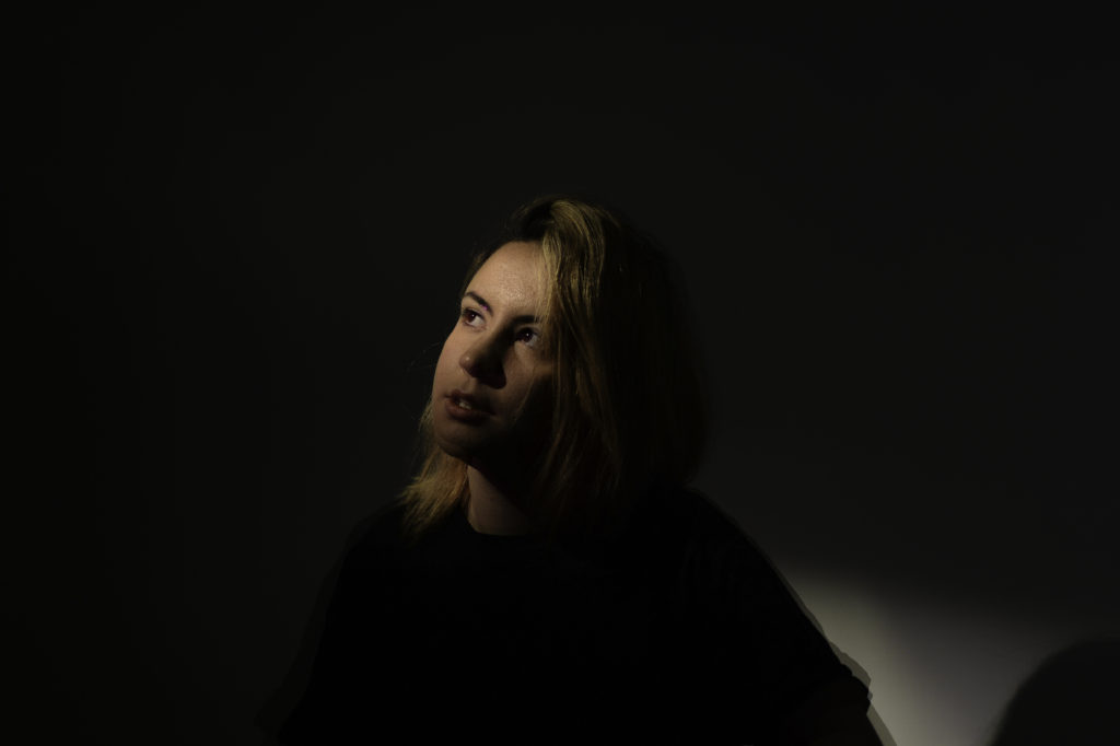
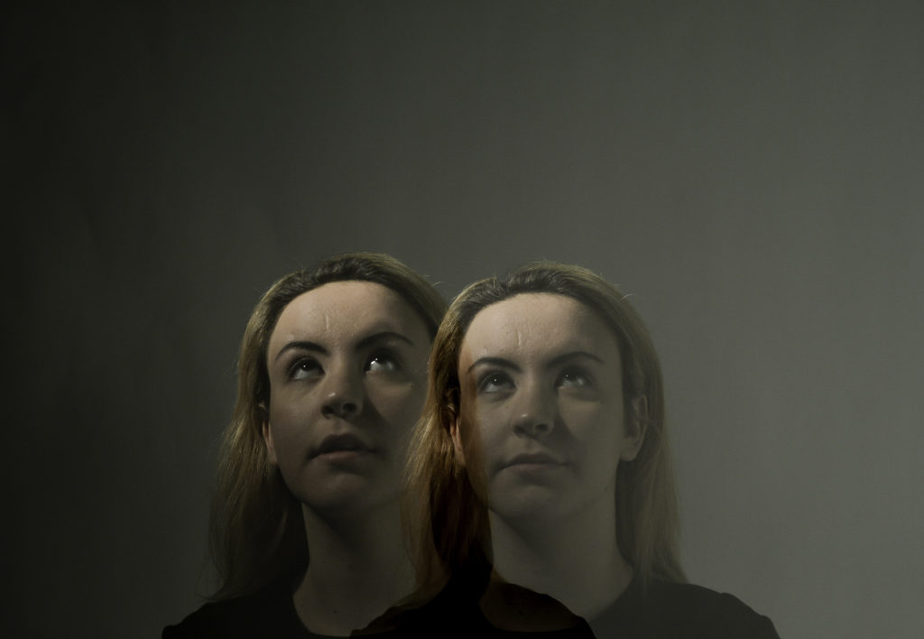
Tableaux is a french word that stands for living picture, it is a static picture containing models to portray certain characters from paintings of to reenact a story. They are carefully posed with props and scenery, it combines aspects of theater and visual arts.
RESEARCH
TOM HUNTER
Tom Walker is a British photographer and film maker who was one of the first to have a one man show at the National Art Gallery, Walker was born in 1965. His photos mainly re-imaged or made reference to classical paintings. When beginning his photography he focused mainly on local issues and sensationalizing news headings, one of his well known photos is the ‘Woman Reading a Possession Order’, he said he just wanted to take the picture to show the dignity of a squatter.
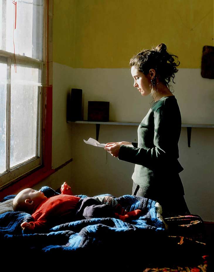 ‘Woman Reading a Possession Order’
ELI REZKALLAH
Eli Rezkallah was a photographer who switched the roles of gender in advertising. He used reveres sexism to show that all genders are equal and are capable of doing each others jobs. Some people have commented on his work has being sexist but it is just him trying to beat stereotyping. 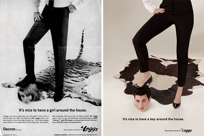
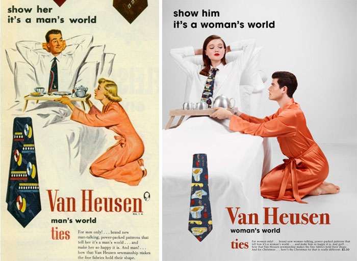
He believes that he got his inspiration from growing up with his mother and sisters during the war as they did all the jobs a male would do, he said “they lived like nothing was happening, so my work is a prettier version of their reality”. He started Plastik as a platform for his and his friends work, to show case their work and ideas to everyone.
TIM WALKER – FANTASY BASED
Tim Walker was a British fashion photographer, who regularly shot for ‘Vogue’ and ‘Love Magazine’. His work is very fantasy based and was influenced by children’s fairy tales, with the way that the models are posed and look, along with props. Walker was part of a project called ‘Checkmate’ for Vogue. The images within this project are inspired by the Alice in Wonderland scene containing the giant check board and the odd players around it.
This image created by Walker is a fascinating image to look at. The different angles of the walls around the model give it a beautiful abstract feel to it. The angle of the model with their forward foot creating a straight angle, designs an odd appearance of the model, giving it the fantasy feeling to it. 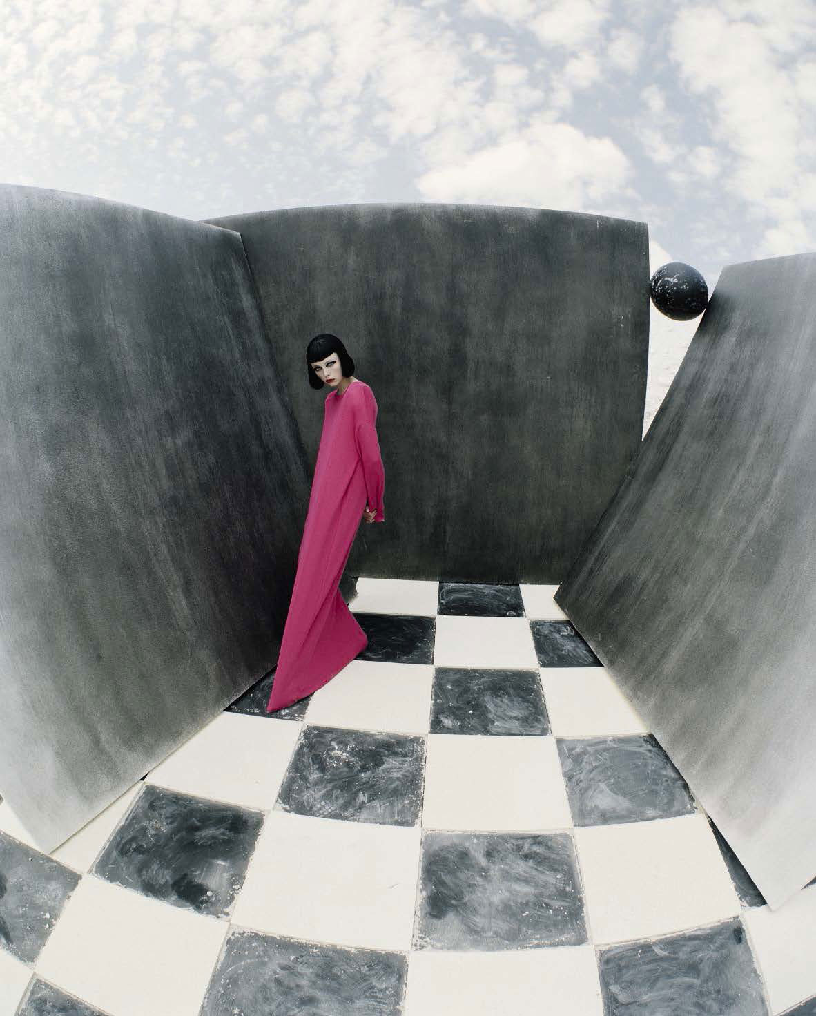
The colors and costumes in this image give it the fairy tale look, the darkness of the image makes it feel as if these are the villains within the story due to the all black costumes and makeup. The main model in the middle is showing their white eyes which gives it a creepy, chilling feel as they are looking directly into the camera and making contact with the viewer. The dramatic detailing in this image portrays the Alice in Wonderland theme.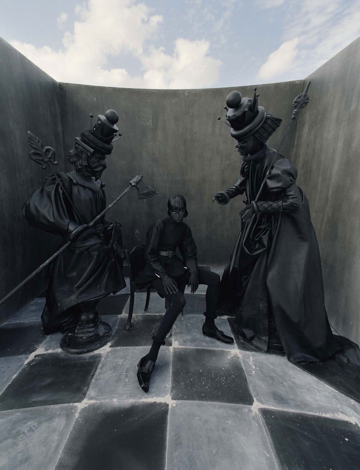
EXPLORING TABLEAUX/STAGED REALITY PART 1
I am focusing on gender roles, portrayed in images, along with fantasy scenes.
I am exploring gender roles within fairy tales, mainly within Little Red Riding Hood, it is a European fairy tale that goes back to the 10th century by many European folk tales. The story involves a little girl in a red hooded cape, she is sent through the woods to deliver food to her ill grandmother. A bad wolf is then presented as a problem as he wants to eat the girl and the food in her basket, he approaches the little girl and tells her to pick some flowers which she does. The wolf then enters the little girls grandmothers house pretending to be the little girl and then eats her whole. Later the little girl arrives at her grandmothers house and notices her grandmother is looking very odd. The girl and the wolf have a small conversation and then he jumps out of grandmothers bed and begins to eats her, a near by hunter heard the girl screaming and came to the girls aid with an axe, he fought off the wolf and the girl and grandmother came out unharmed.
There are many underlying stories within this fairy-tale, but the one i’m going to focus on is the portrayal of gender roles within this story. In the story males as show as the stronger more powerful gender. This is evident within the story as the huntsman fights of the wolf and saves the girl. This is showing that women couldn’t look after themselves or defend themselves in any situation and that they always need to be saved whatever the circumstances. This story is still within society and still showing that men are the strong gender, rather than having equal genders. Also little red riding is targeted by the wolf, which again says that women are easy targets. The wolf was played by a man and this is telling society that men have the power to control women and do what they want with them, as if they were objects.
I’ve decided to focus on Little Red Riding Hood because I want to show how gender roles are created in children’s fairy tales and that these hidden messages within these stories have a huge impact on the way society treats one and other depending on their gender
These images are scenes from the book. I am going to copy these as these represent the gender roles that are present in this story.  In this image the wolf is representing the male gender, you can see the look on the girls face, she looks scared and unease by the presence of the wolf. You can see that the wolf won’t let her leave and she is too frightened to, encase she gets hurt. This is a strong representation of male domination, as the wolf has power over her.

This image is showing the male gender as the strongest and most powerful, they can do most damage. In this image the male as defeated the wolf and the girl is clinging onto him because she is scared and believes that, that man is the only thing that can look after her and save her. This images shows that women have been brain washed into thinking they are incapable without men and that they must rely on them to survive.
MY RESPONSE;
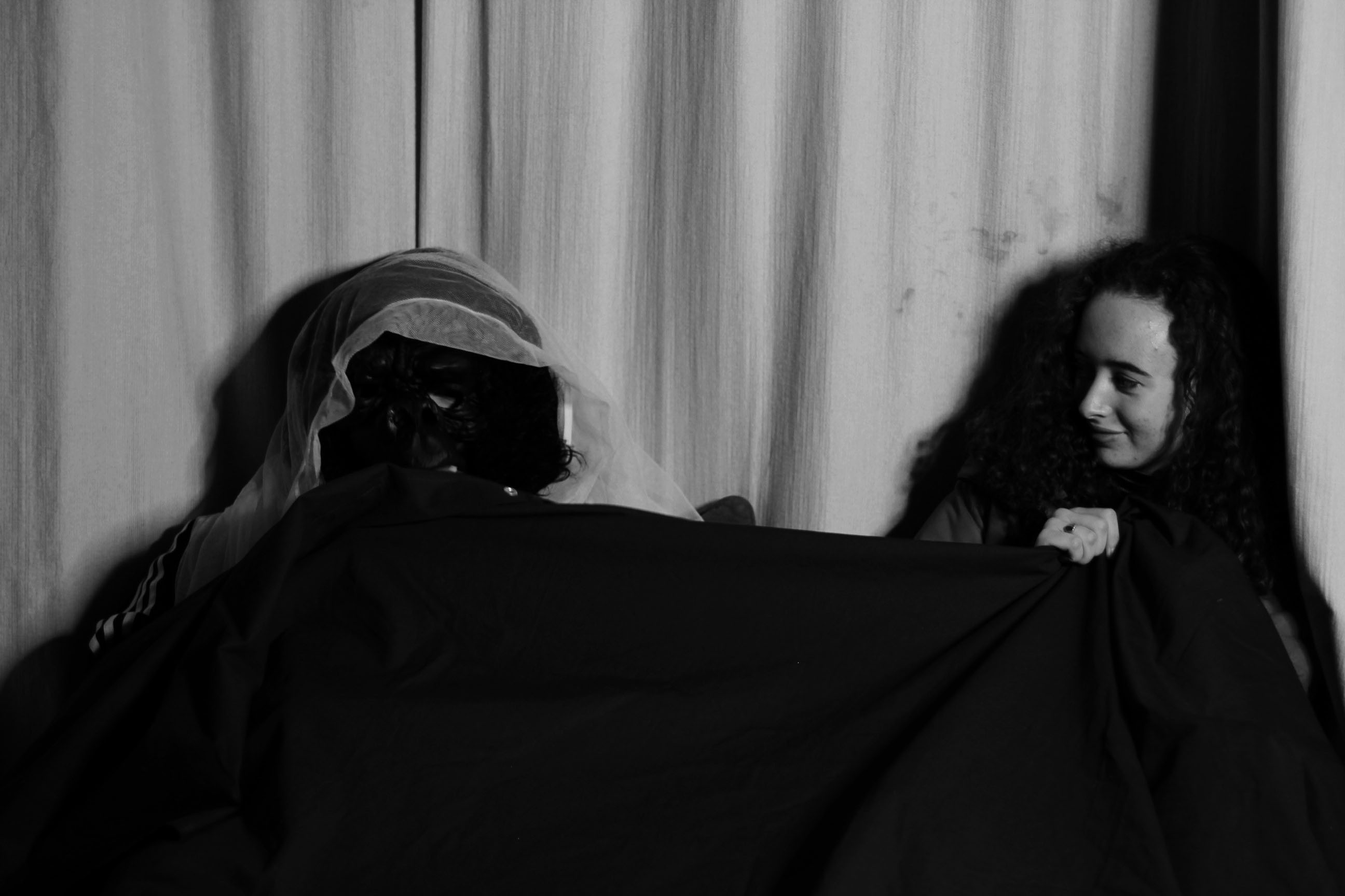
This is the best photo I cam out with, but it is not my strongest image because I don’t like tableaux photography and I find it difficult to produce a photo looking like something else. I like to go off on my own tangent and make stuff up as I go. Having a strong structure and a concept behind a photo made it hard to really portray the story and characters. 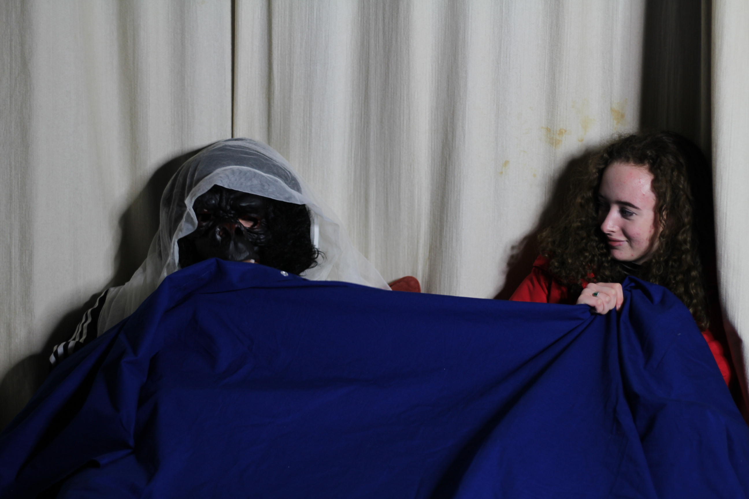 I edited this image into black and white as it shows more texture within the photo, it also makes the shadows more defined and it looks more like the original image I was copying from.

EVALUATION
Overall for this project I feel that the images I produced where poor, this was too bad the bad lighting I had set up and the angle that it was coming from, along with not taking enough images during the shoot to be able to have a variety of images to pick from. The final image I cam out with does represent the concept I was trying to show, which was gender roles, my image shows the girl isn’t comfortable with the masculine figure in her bed. Personally I do not like tableaux and stages reality photography as I don’t enjoy recreating images as I like to be able to have freedom in what photos I take and how I take them, instead of recreating a replica.
 Eugene Delacroix ‘Leading the People’
 Carravagio ‘Deposition’
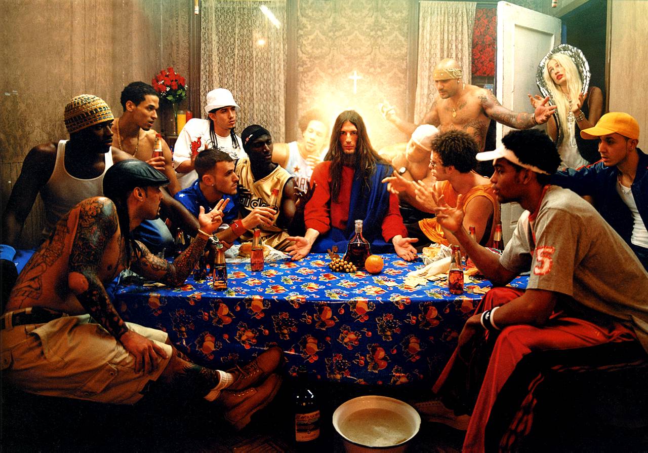 David La Chapelle ‘The Last Supper’
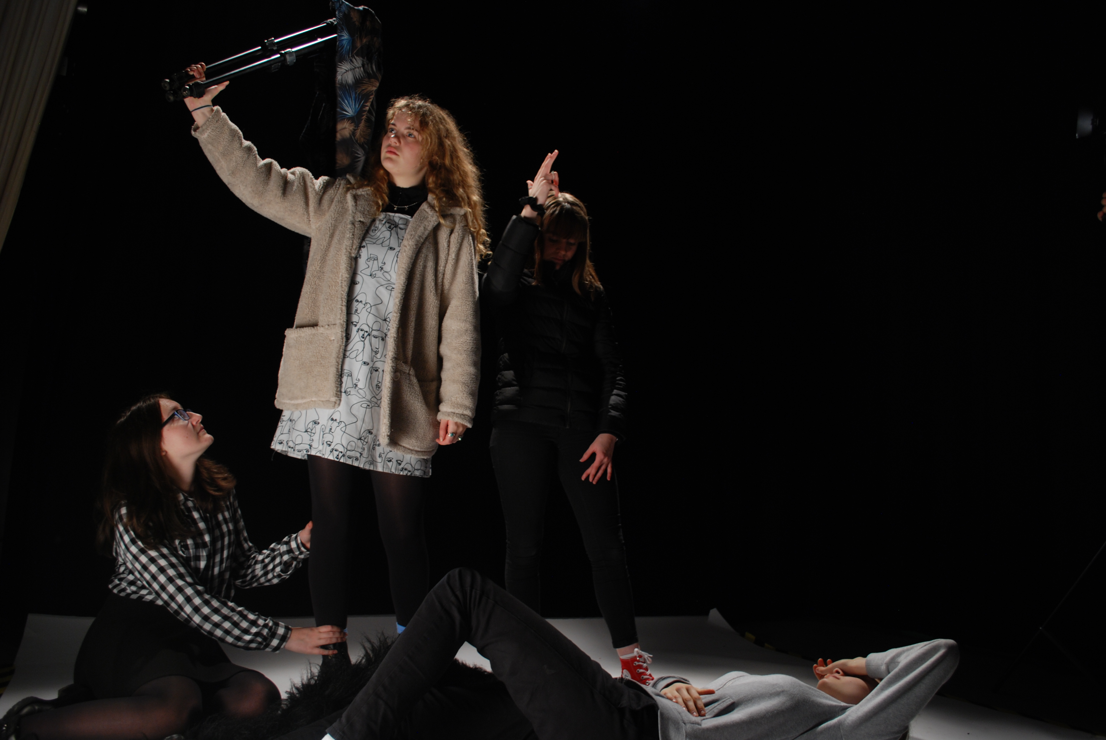
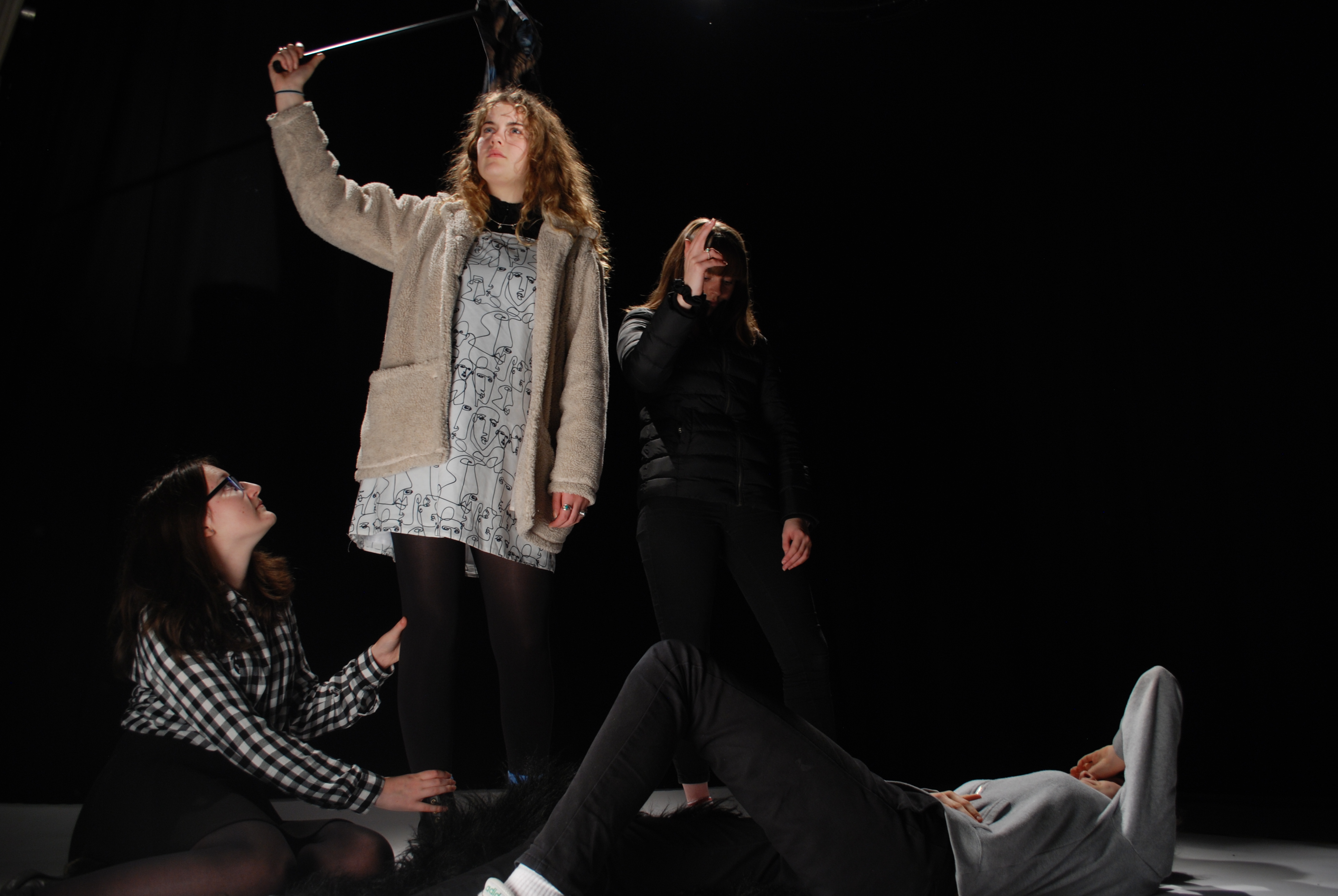
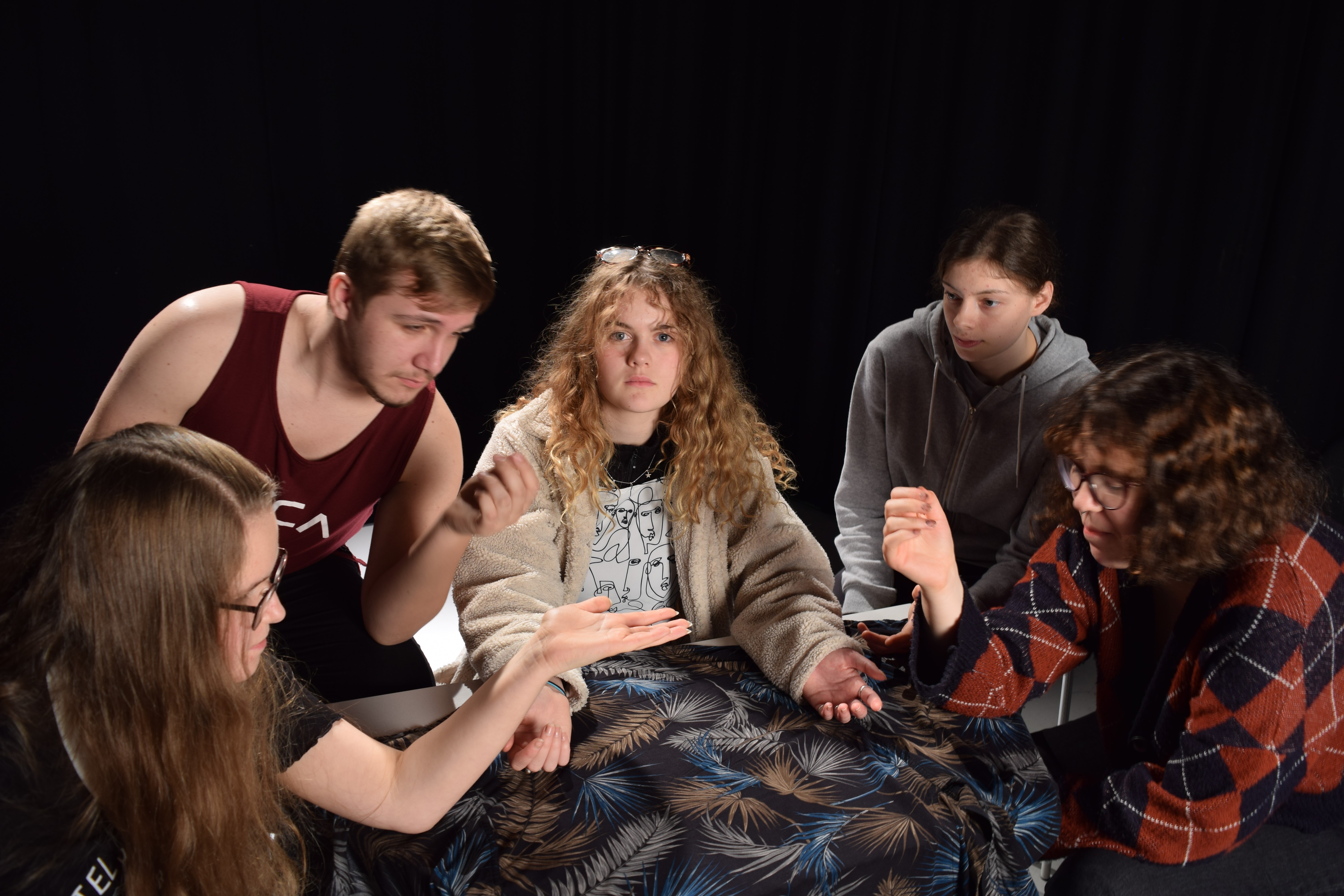

 ‘Woman Reading a Possession Order’


 In this image the wolf is representing the male gender, you can see the look on the girls face, she looks scared and unease by the presence of the wolf. You can see that the wolf won’t let her leave and she is too frightened to, encase she gets hurt. This is a strong representation of male domination, as the wolf has power over her.
 I edited this image into black and white as it shows more texture within the photo, it also makes the shadows more defined and it looks more like the original image I was copying from.