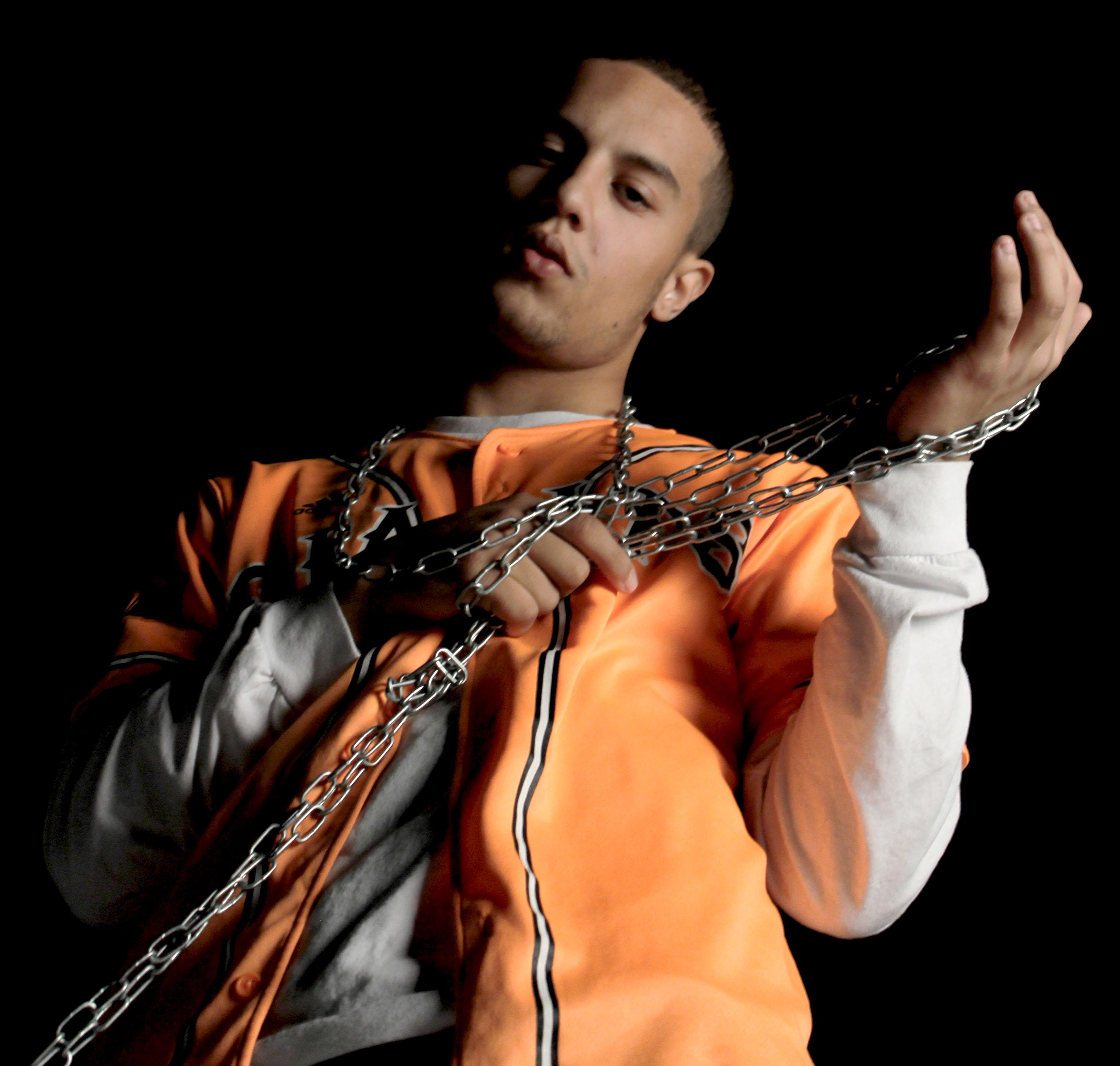
As far as editing goes I decided to be subtle with this image mainly focusing on adjusting levels and color balance. I mainly tried to emphasize the Rembrandt lighting and the slight orange reflection the the sleeve of the white tee shirt. I did this in order to avoid a tacky looking image while still incorporating a sense of drama into the image. Due to the composition of the image i decided to slightly de-saturate the image as I believe the less vibrant tones better compliment the metallic chains.

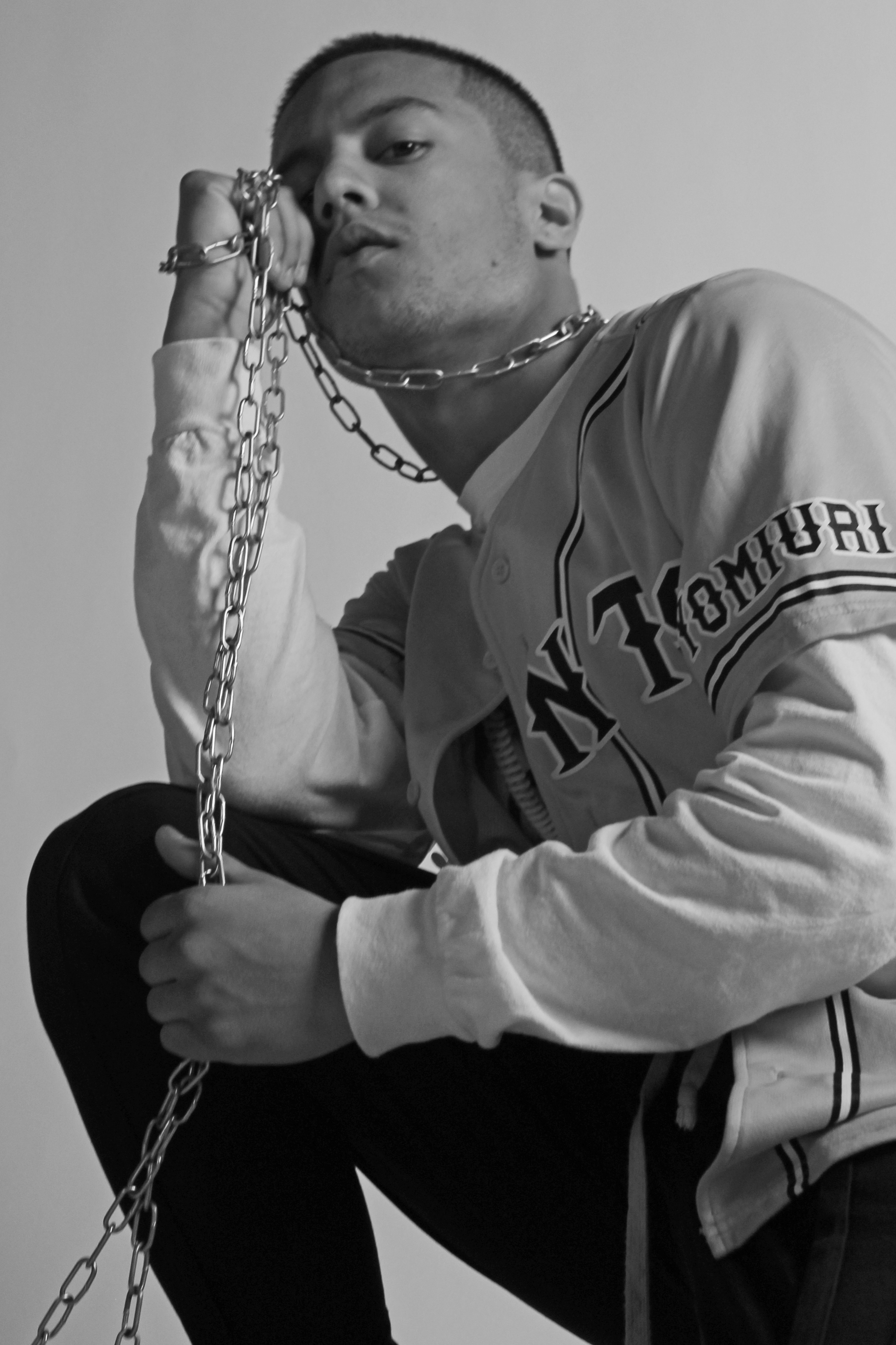
Here I decided to experiment with the dodge/burn tool and as a result of this I decided to make the image black and white in order to hide any undesirable changes to color caused by this. I also used the channel mixer in conjunction with the saturation tool to create a softer looking image while still maintaining a reasonable amount of contrast. I also cropped the Image to better fit the Fibonacci curve in order to lead the viewers eye through the image.
