Daily Archives: December 13, 2018
Filters
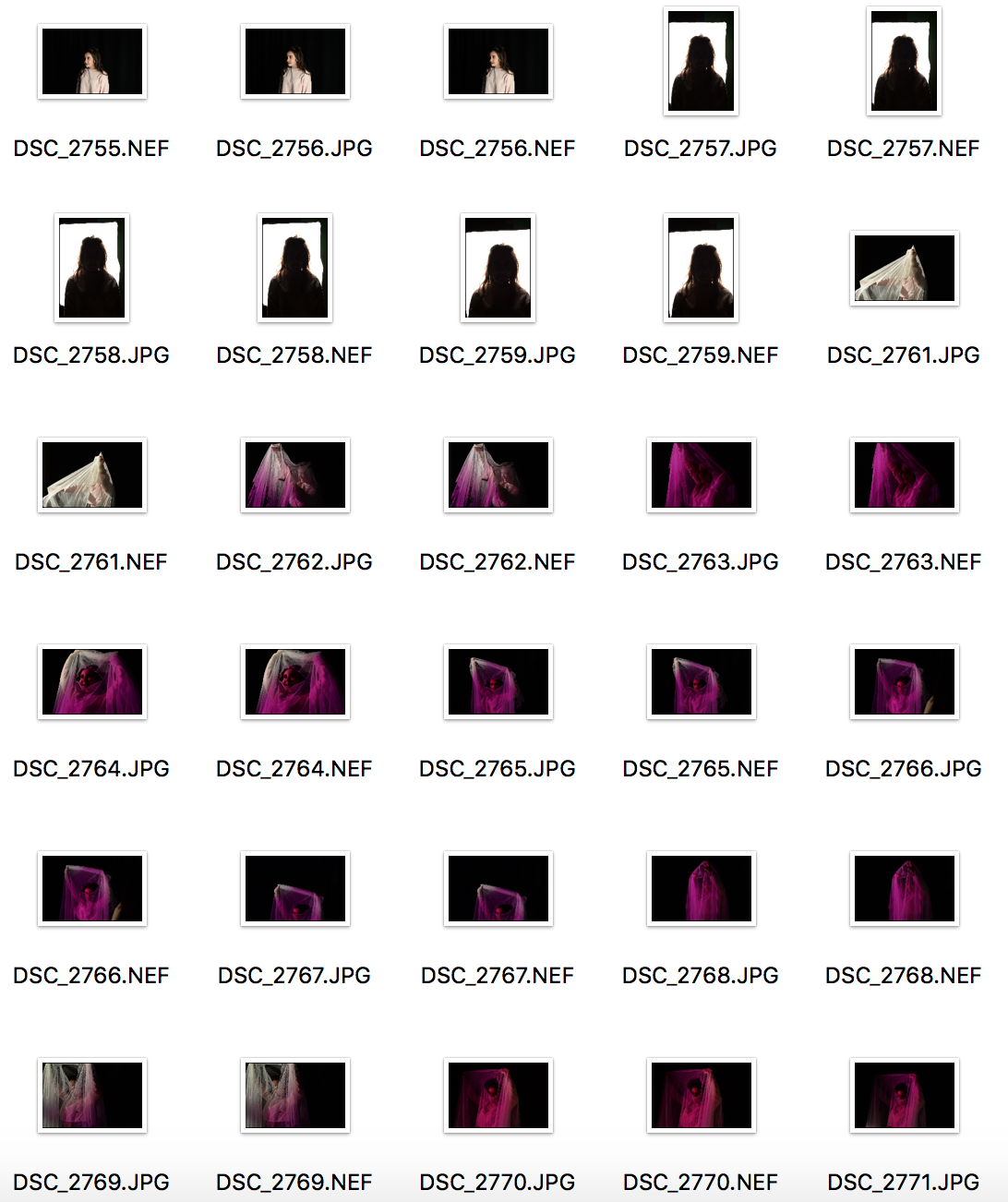
Staged Reality: Fairy tales Snow White Images

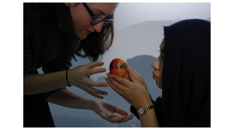
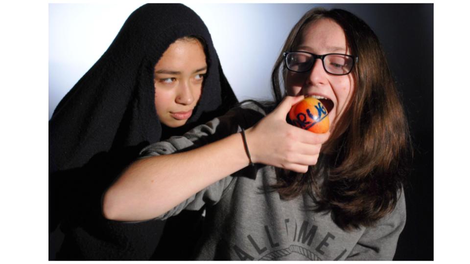
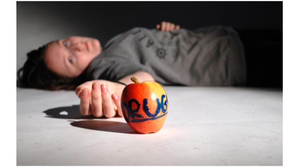
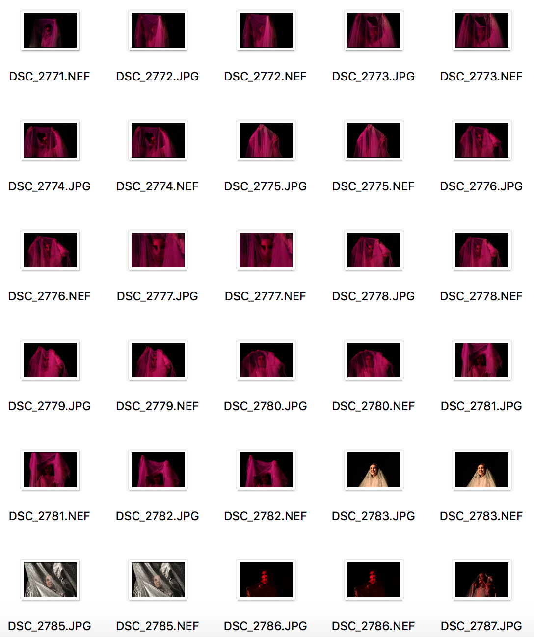
Staged Reality: Fairytales Snow White
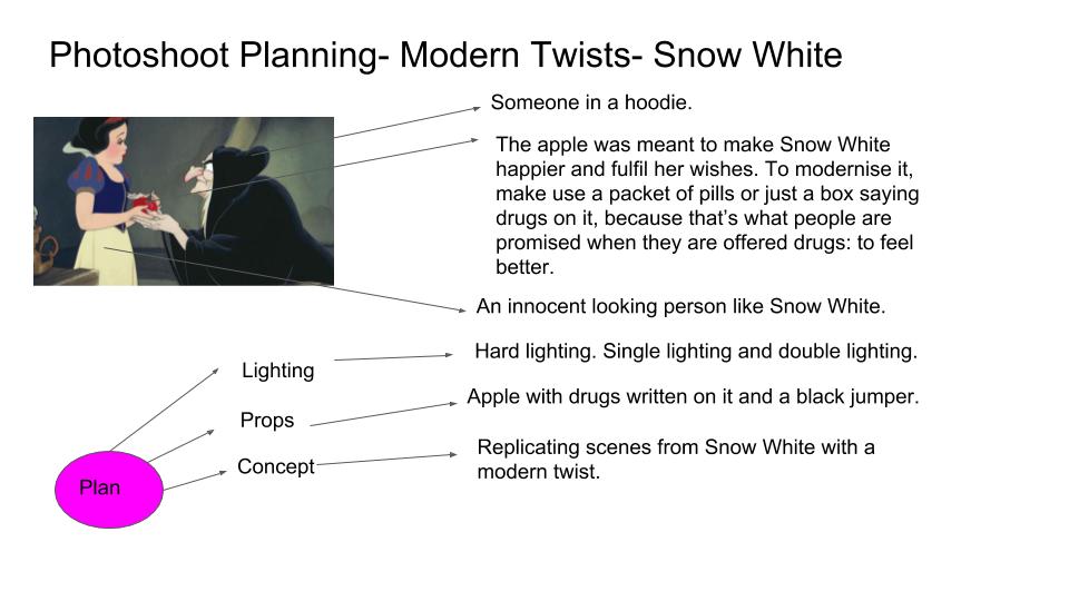
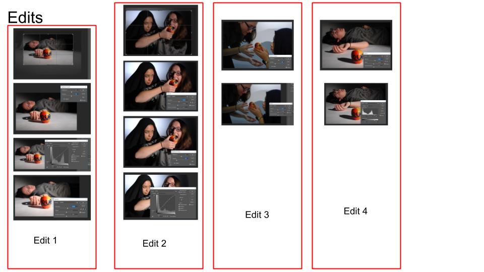
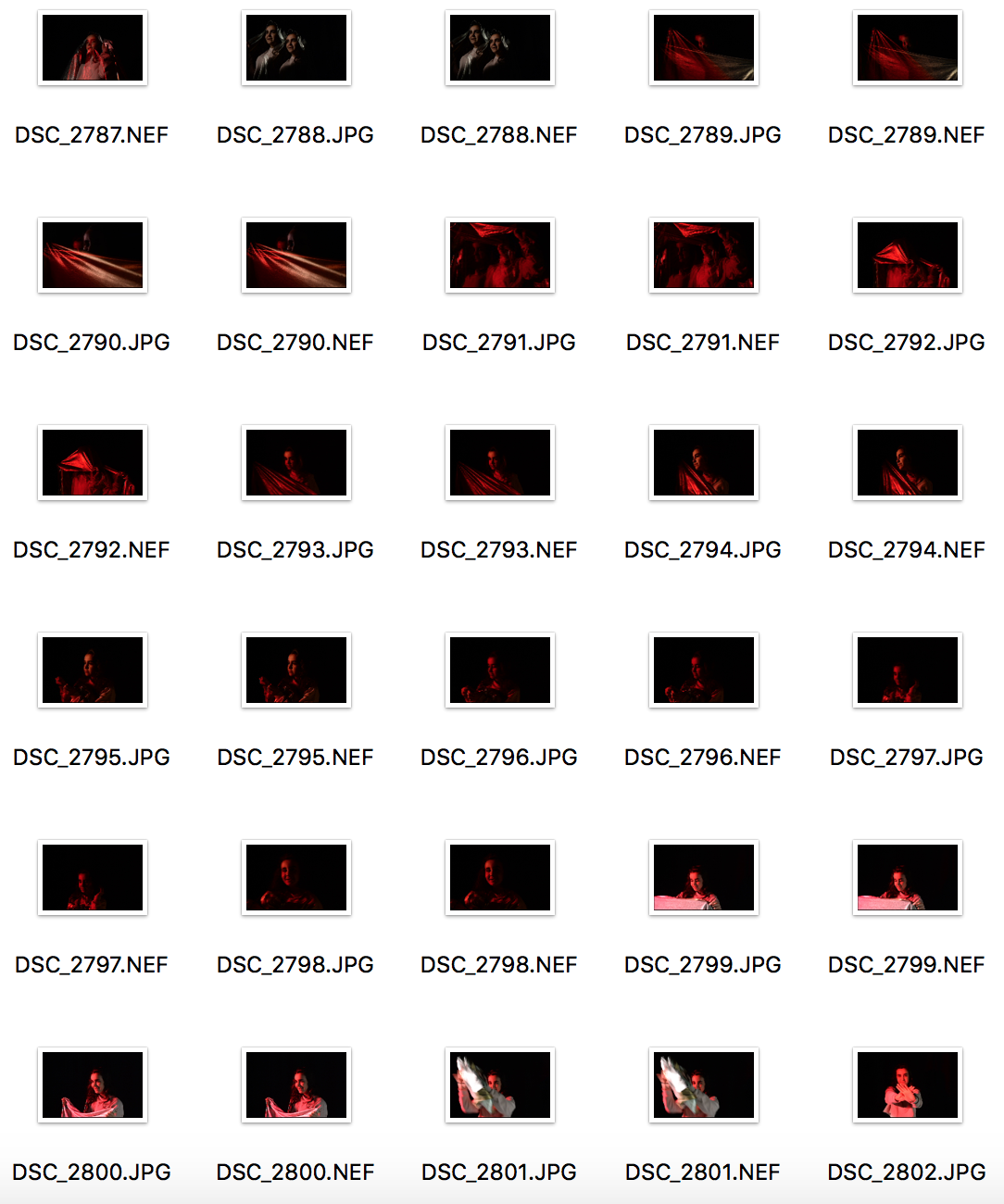
Staged Reality: FairyTales
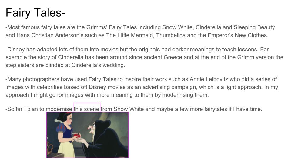
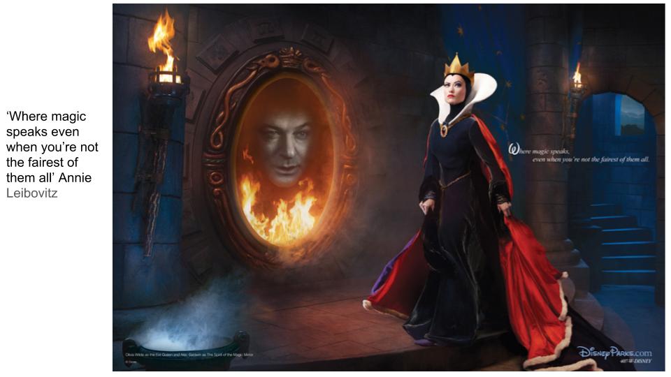
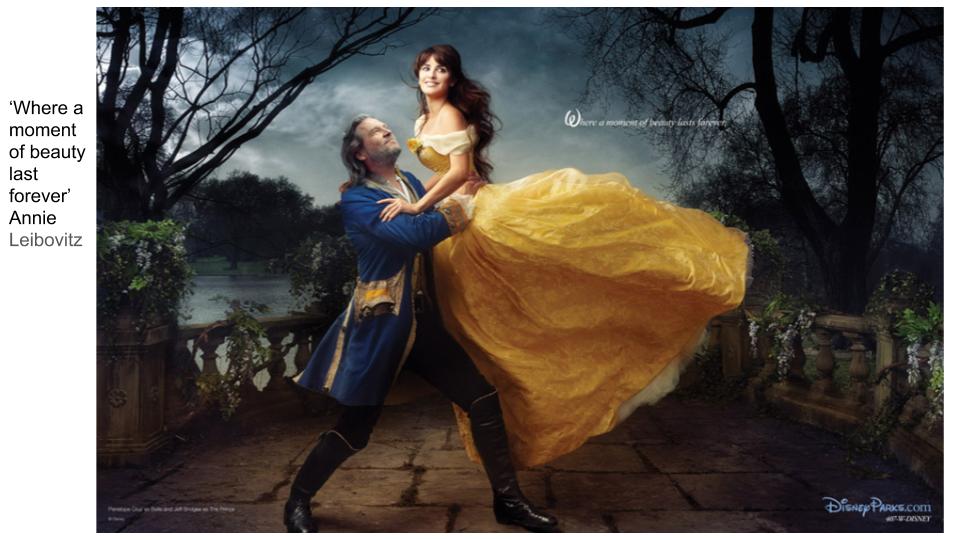
Philip-Lorca DiCorcia – My Own Responses and Development
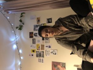
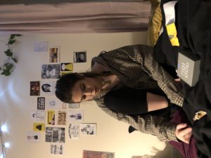
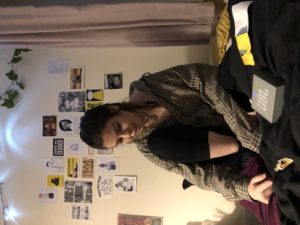
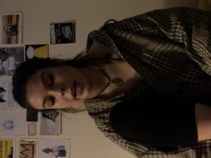
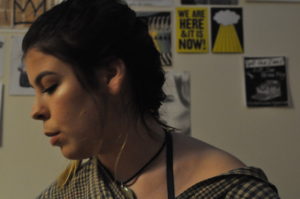
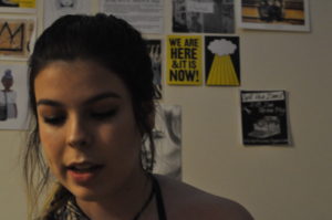
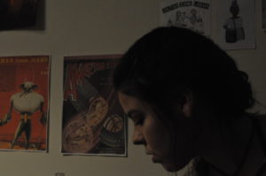
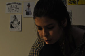
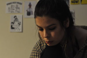
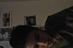
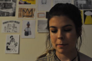
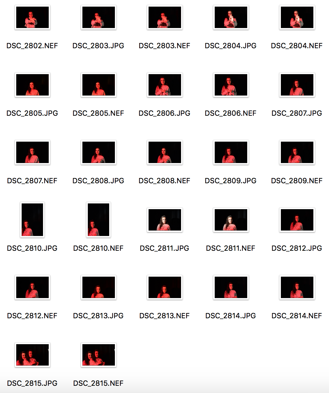
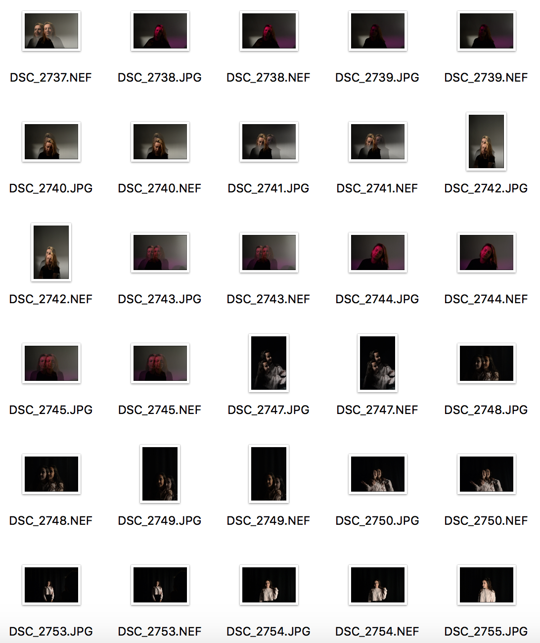
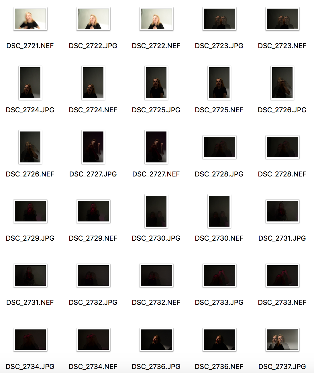
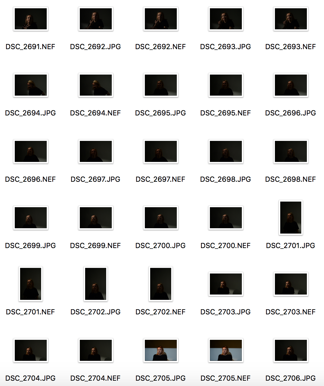
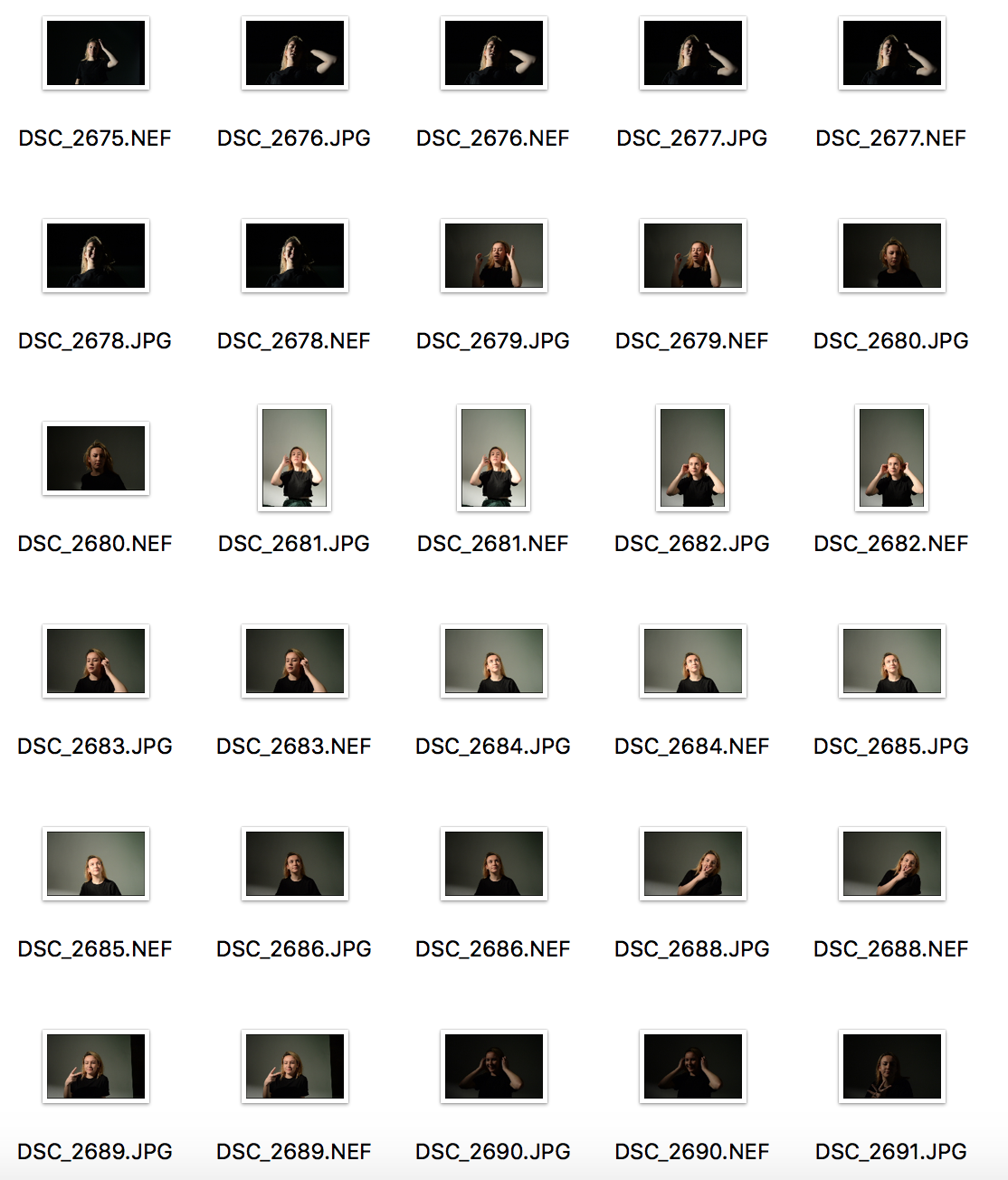
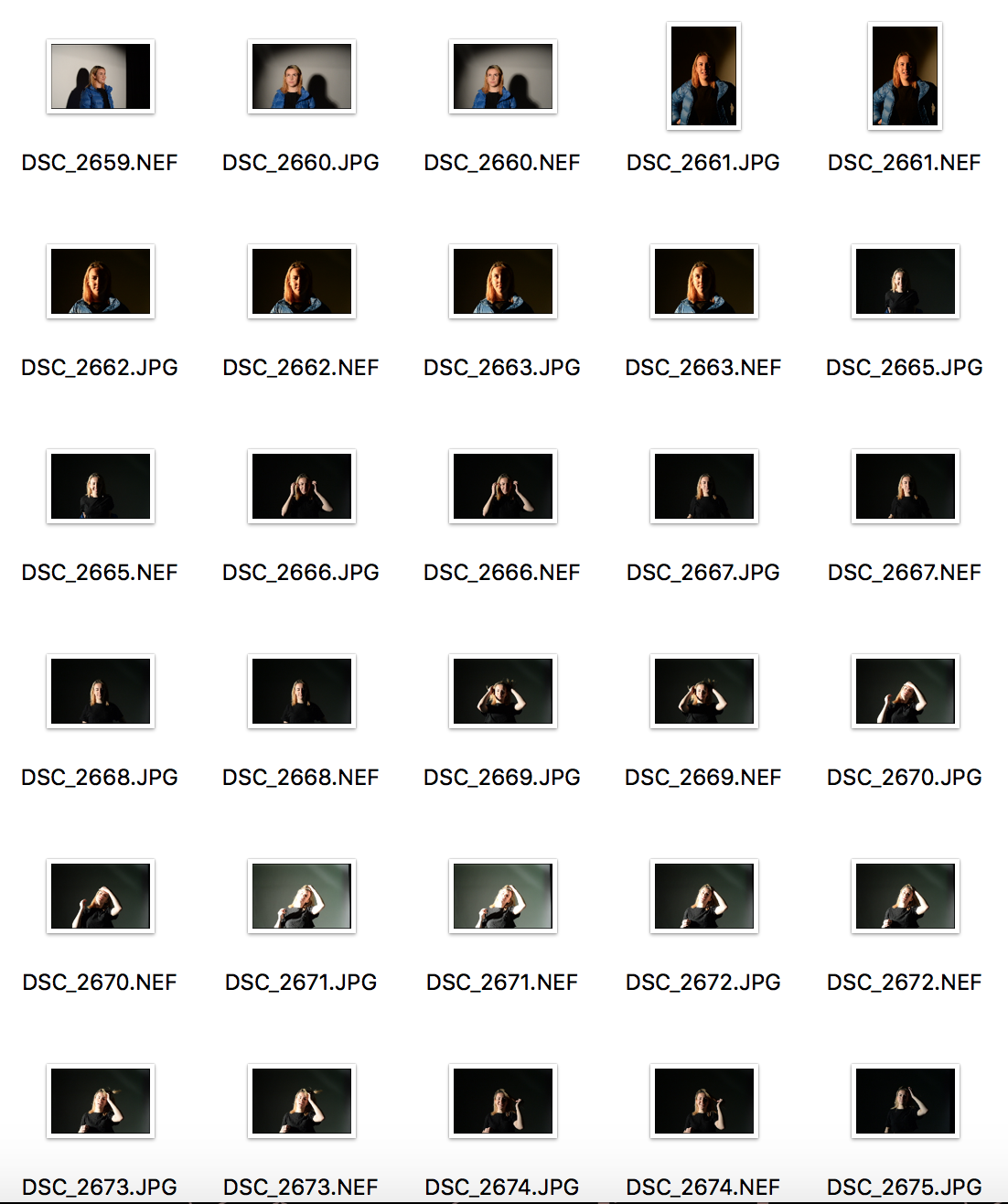
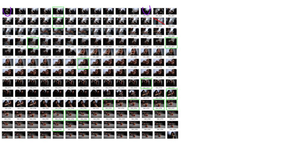
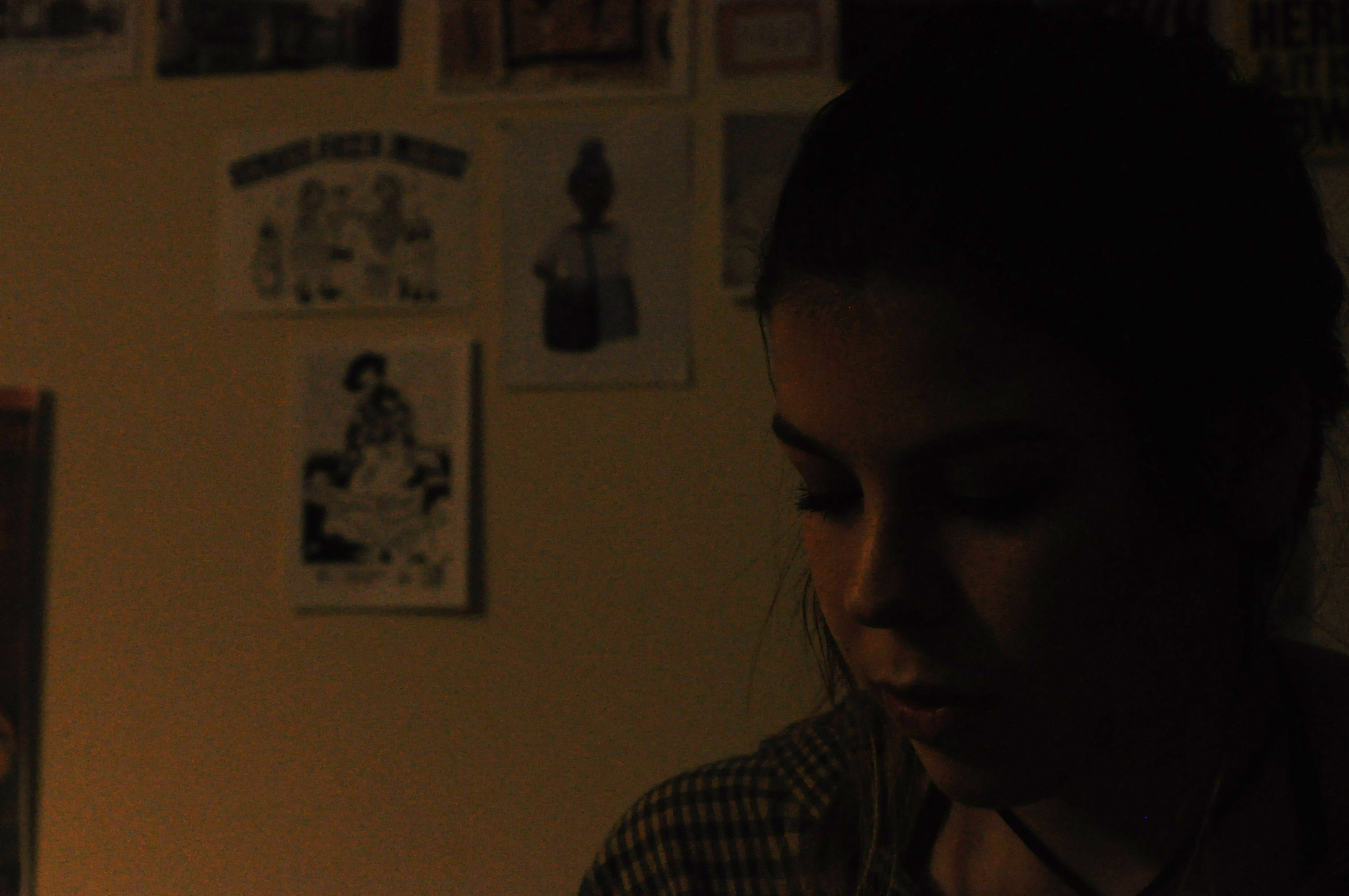
This is what I produced for my own personal photo-shoot in response to Hustlers. I have produced some images with a subject sat in their own bedroom. It is a little different to what Philip-Lorca diCorcia produced. With some okay outcomes I feel this has been a useful experiment for the process and could maybe be used later on in the project.
Contact Sheet of Outcomes
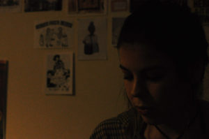
Below shows two of my better outcomes from the shoot, I feel that they have the more filmic qualities that I was trying to capture in response to Philip-Lorca diCorcia, although the images have not turned out completely clear I feel they could be something that I could work with and edit into if I came to use them in the future.

Response to Street Photography
The Action Plan:
Originally I wasn’t to ken on the idea of Street photography, as this wasn’t normally my cup of tea. My initial plan was to go out into town (Jersey) and just walk around and see what happens. I had planned to start at the top of town and slowly work my way down. i want to take photographs on different days including different weather conditions. I wanted to do this as I hoped there would be a contrast in the public’s behaviors and emotions expressed through their body language and facial expressions. Amusing to have capture more stressed and unpleasant facial expression and body language on a wet, windy day compared to a warm sunny day which would most likely present the opposite emotions. Fortunately I was lucky enough to have gone traveling around Europe with my family, and after looking closely back at my photographs that I took on the holiday it was clear that street photography can come a lot more naturally than most people would believe. So i had a new action plan, as well as my local photographs I used most from my travels as they proved to be a lot more of extravagant out come.
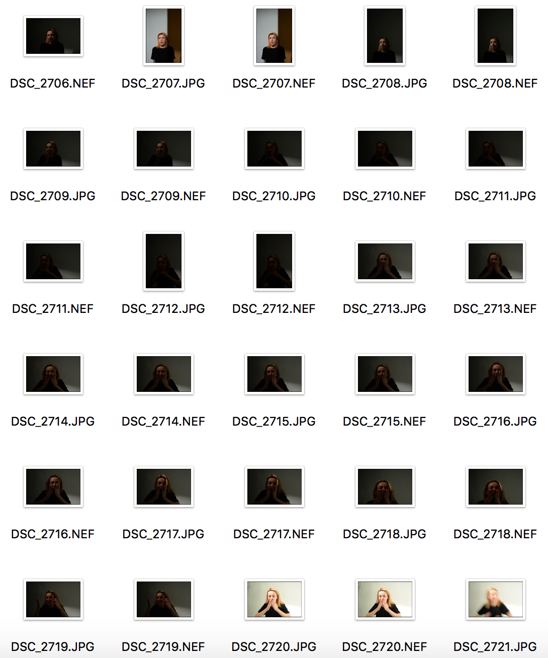
Contact Sheet:

My favorite images:
Original to edited


This image was particularly one of my favorite images as it if originally such a busy image with so much going. Including different types of people, a famous statue on the right in Barcelona, and the trees providing the image with a feel f symmetry. For the edited version i turned it in to an older looking image using the specific filter however emphasized brighter colors in the original image as white so the image still has the contrast of colors. From a darker gloomier feel to the image with the sharp white shades seeping through.


I took this image whilst walking through France, Marseilles, this particular shop really stood out to me whilst passing by due the vibrant colors emphasized by the products in the shop. The is some what formality to the image, this is seen through the layout of the shop with the man tidying up, giving an extremely natural feel to the image. When editing and manipulating this particular image I wanted to try come thing completely different to my previous image. So therefore to completely contrast i emphasized all the brighter colors so they poop out of the image. However to make the images brighter the natural light needed to be dimmer so I manipulated the exposure to a much lower setting. This image to me now has a completely different feel and story to its original image.
Philip-Lorca DiCorcia
“Reality has become a parallel universe with photographers returning with different versions of what it truly looks like.
-Philip-Lorca DiCorcia
Philip-Lorca DiCorcia (born 1951) is an American photographer. He studied at the School of the Museum of Fine Arts. Afterwards diCorcia attended Yale University where he received a Master of Fine Arts in Photography in 1979.
DiCorcia alternates between informal snapshots and iconic quality staged compositions that often have a baroque theatricality. Using a carefully planned staging, he takes everyday occurrences beyond the realm of banality, trying to inspire in his picture’s spectators an awareness of the psychology and emotion contained in real-life situations. His work could be described as documentary photography mixed with the fictional world of cinema and advertising, which creates a powerful link between reality, fantasy and desire.
DiCorcia’s photographs straddle truth and fiction by combining real people and places. He insists that his pictures suggest rather than explain a full narrative. His brand of storytelling results in unstable, unfixed images that point in certain directions but never provide a definitive map.
DiCorcia’s series like Heads, Lucky Thirteen, A Storybook Life and Hustlers – can all be considered his dynamic explorations of conceptual and formal domains of interest. His images consists of black humour and can be interpreted in various ways by different viewers. His work is planted with issues and concepts like commodification of morality, identity and art, as the selling of reality.


In 1989, Philip-Lorca diCorcia shot his dark and defining series, Hustlers, that was shot against the backdrop of devastation and despair during the AIDS pandemic in the late 1980’s and early 90’s. In the 1990’s he visited Los Angeles five times in order to photograph Hollywood male escorts. Hustlers was a courageous foray into the twitchy tenor of the post-Reagan era. He sought out male prostitutes on Los Angeles’ Santa Monica Boulevard, offering them the money they would earn from having sex if he could shoot their portrait. He took the pictures starting out in motels and later moved to the streets. Philip-Lorca diCorcia admitted that some of the first subjects fleeced him out more than double the going rate, and professes he found the transaction process awkward. ‘Most of them didn’t believe I only wanted to pay them for their picture, they were like, “Is there anything else I can do for you?”.
In 1993, 25 photos from this project were exhibited at the Museum of Modern Art. The show was titled, Strangers and each image was labeled with the subject’s name, age, hometown and money they charge. The photographs as a series are quite powerful and hold filmic qualities, this set of photographs of the male prostitutes look like stills from movies depicting the Hollywood reality as opposed to the dream that so few can harness.
I feel personally that Philip-Lorca diCorcia chose to shoot in Hollywood as Hollywood is where movies are created and ‘dreams are made’, I feel for me the locations and the filmic qualities are toying and playing with that idea as his photographs show the reality of what many have to live with in Hollywood.
In a moving coda, diCorcia shares a personal story in the new edition of Hustlers that puts this work in a somber new light: “During that period, 1990-1992, the government officially condemned homosexuality,” he writes, “while AIDS made death commonplace. My brother, Max Pestalozzi diCorcia, died of AIDS on October 18, 1988. How much is too much? My brother was very free. I loved him for it. Freedom has its price, and we never know at the onset what the toll will be. He died unnecessarily. I dedicate this book to him.” –(Found in an article on the Time)
Time Article about Hustlers: http://time.com/3803327/trade-philip-lorca-dicorcias-hollywood-hustlers-drug-addicts-and-drifters/
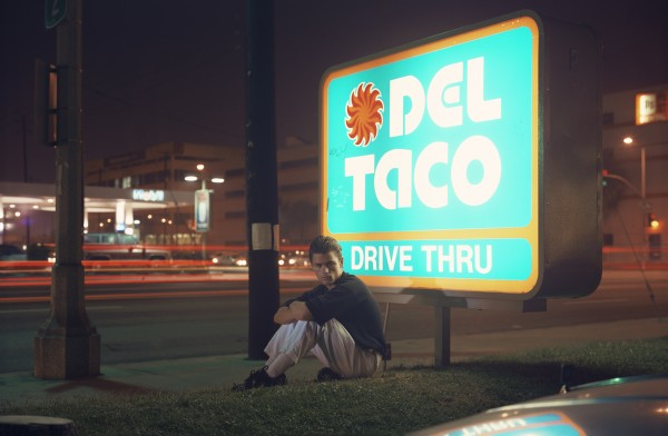
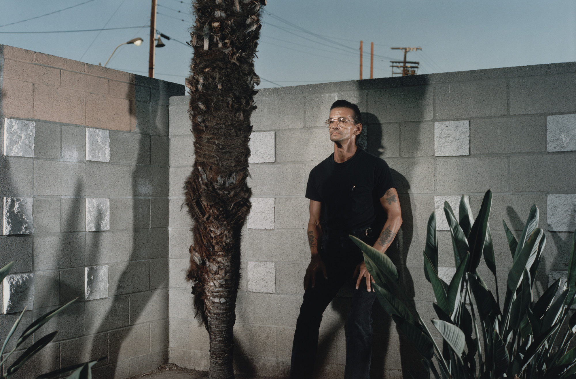
My Own Response
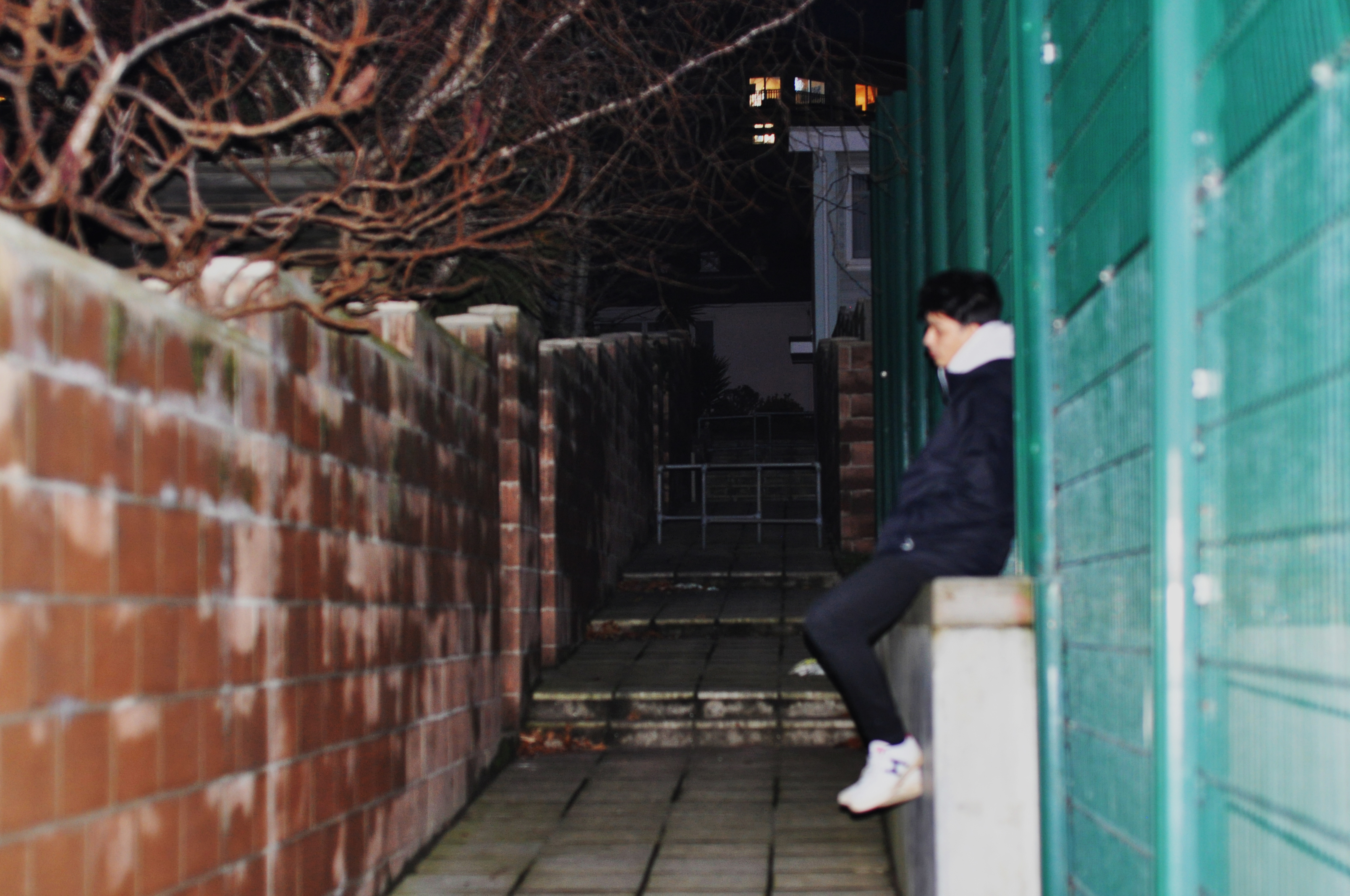
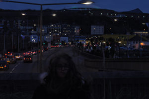
This was one of the photographs that I was able to produce from the shoot that I did, unfortunately I timed it wrong and it had gotten too dark for the photographs which made it difficult to be able to see the focus and get the right lighting for the photographs however this means that when I go to do my own personal shoot I will be able to time it better.
Tableaux Vivants and Staged Reality
Tableaux: A group of models or motionless figures representing a scene from a story or from history; a tableau vivant.
A tableau vivant is French for ‘living picture’, is a static scene containing one or more actors or models. They are stationary and silent, usually in costume, carefully posed, with props and/or scenery, and may be theatrically lit. It thus combines aspects of theatre and the visual arts.
A tableau may either be ‘performed’ live, or depicted in painting, photography and sculpture, such as in many works of the Romantic, Aesthetic, Symbolist, Pre-Raphaelite and Art Nouveau movements.

Above shows a tableaux photograph by the theatre company Ludovica Rambelli Teatro recreating one of Caravaggio’s paintings that would have been drawn from live actors. Many tableaux photographs are responded to and from paintings.
Below shows a different tableaux photography by Ryan Shude, his work is not so much recreated from paintings but is still set up and staged.

Class Response
As a class we produced a response to the painting ‘The Raft Of Medusa’. This is an example of tableaux photography, with the resources we had we tried to recreate this in a well way.
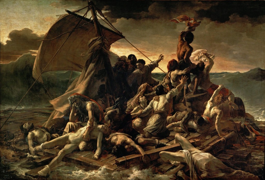

Raft of Medusa – Tableaux Vivant
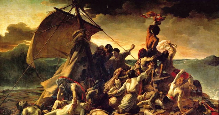
We have tried to recreate the Raft of Medusa painting, shown above. Below are the best outcomes that we got from the small photoshoot.
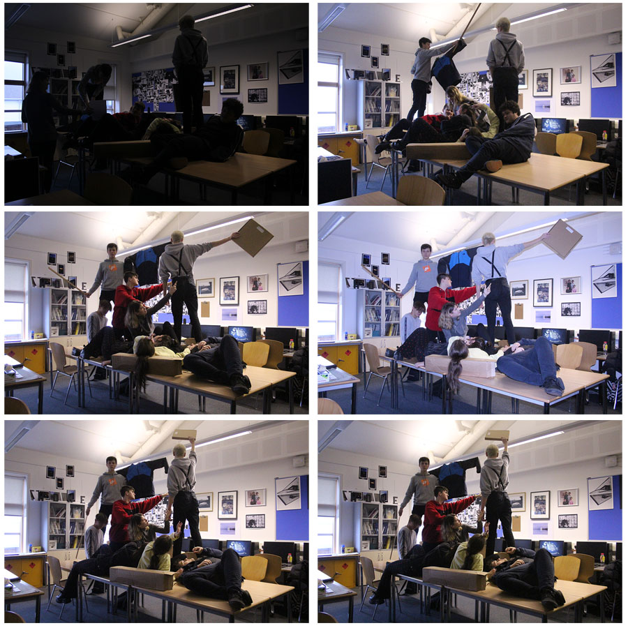
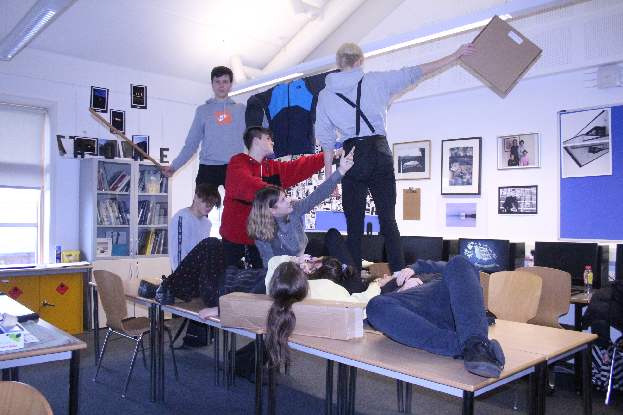
Below is the best overall outcome for this small photoshoot. This is the best image as it shows everyone in very similar positions to the real image, though we did not have enough people to get the fill every spot for every person in the painting. The blue tint on the image also creates a strange atmosphere like in the original image.
Studio Photography – Image Manipulation
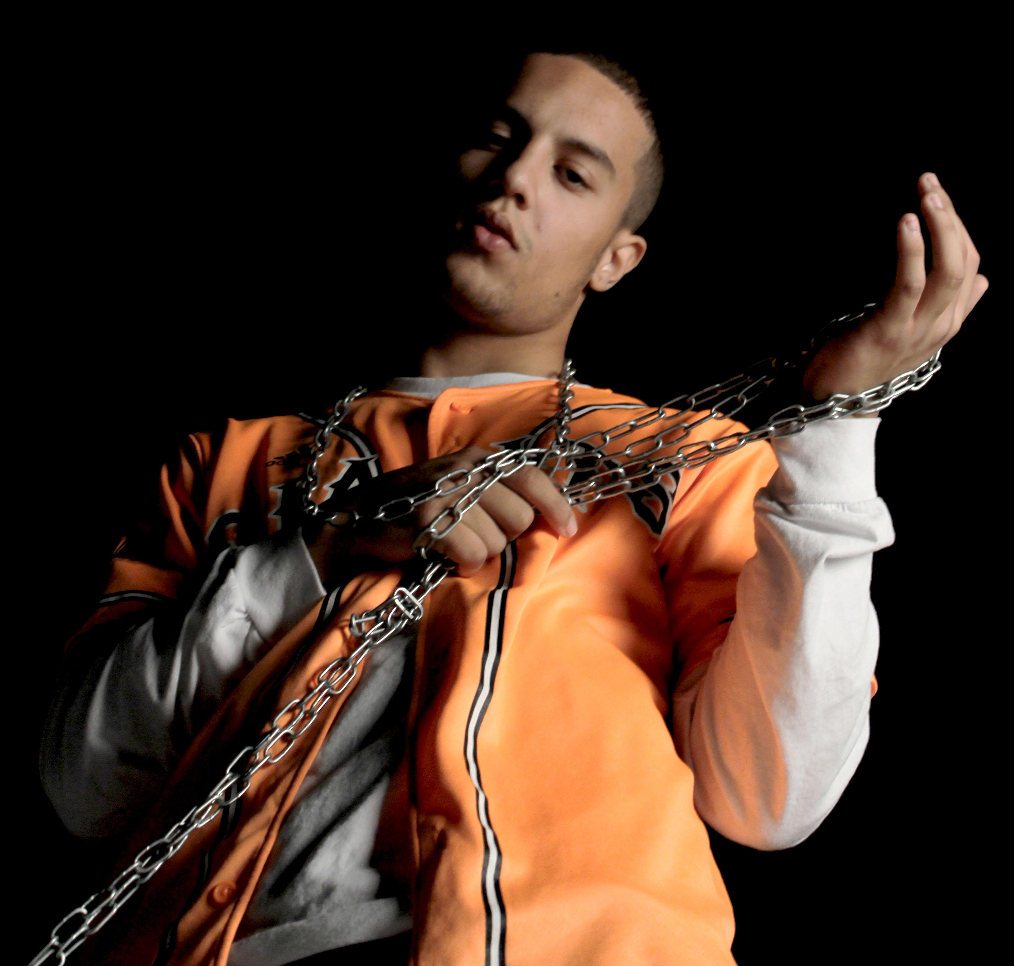
As far as editing goes I decided to be subtle with this image mainly focusing on adjusting levels and color balance. I mainly tried to emphasize the Rembrandt lighting and the slight orange reflection the the sleeve of the white tee shirt. I did this in order to avoid a tacky looking image while still incorporating a sense of drama into the image. Due to the composition of the image i decided to slightly de-saturate the image as I believe the less vibrant tones better compliment the metallic chains.
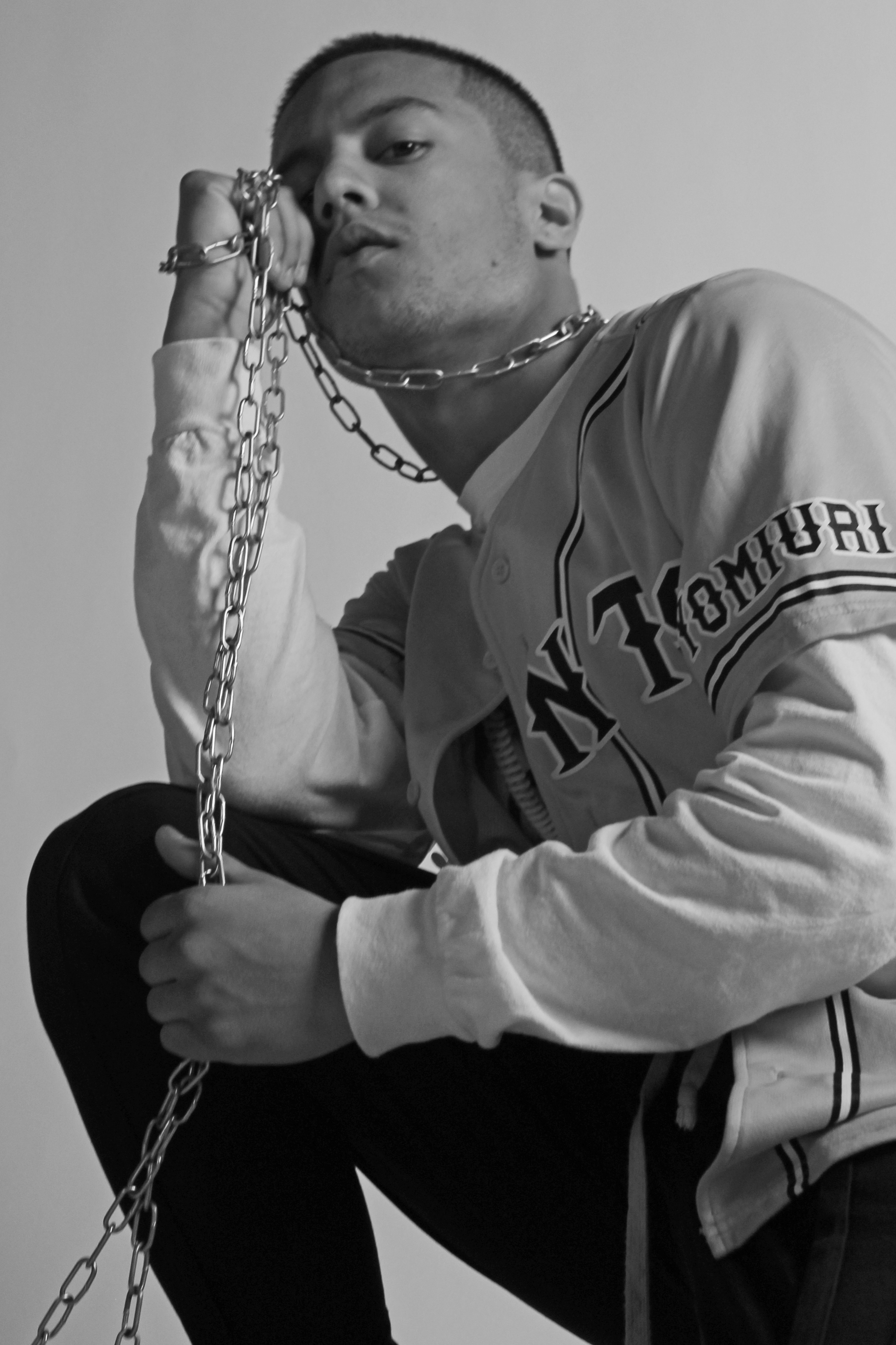
Here I decided to experiment with the dodge/burn tool and as a result of this I decided to make the image black and white in order to hide any undesirable changes to color caused by this. I also used the channel mixer in conjunction with the saturation tool to create a softer looking image while still maintaining a reasonable amount of contrast. I also cropped the Image to better fit the Fibonacci curve in order to lead the viewers eye through the image.

