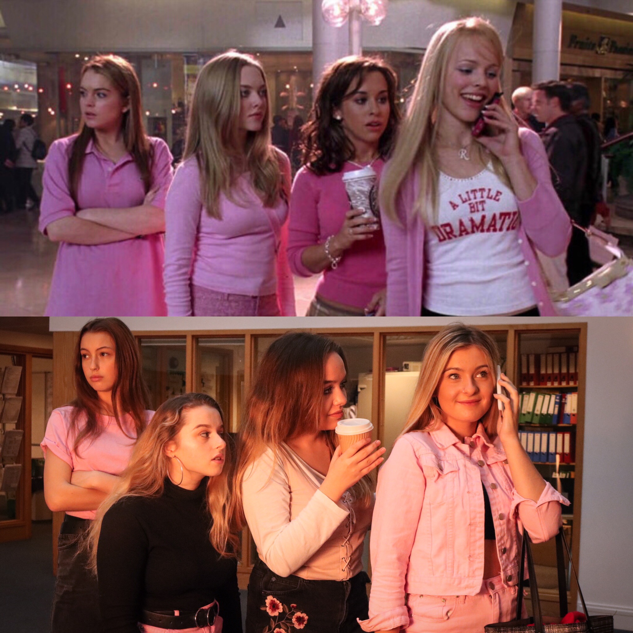
For my attempt at tableaux vivant photography i decided to re create a scene from the film “mean Girls”. The film follows a character named Cady Heron who was educated in Africa by her scientist parents. When they move to Illinois she experiences public high school, and befriends a group of girls -Regina, Karen and Gretchen- who are names “The Plastics”. Cady soon realises how the group of girls got their nicknames. This film was released in 2004, and depicts a stereotypical picture of how girls act. I chose to recreate a scene from this film as there are many interesting concepts and also because this film represents teenage girl culture.

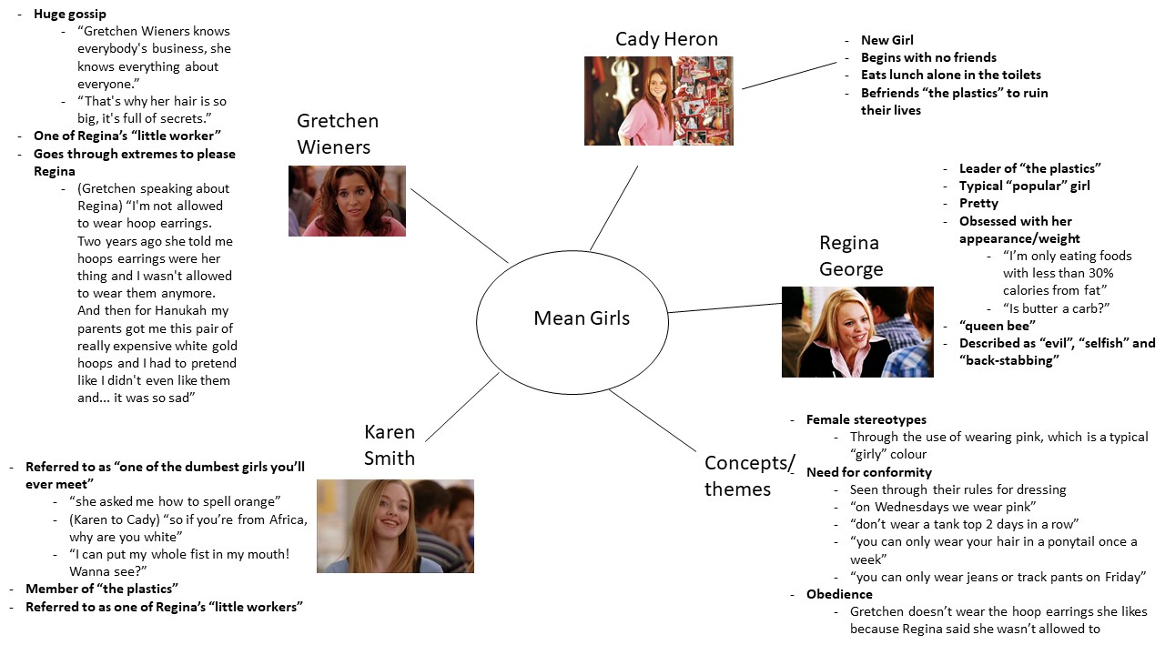
Each main character in the movie have their own personalities and characteristics, yet they are also very alike due to the underlying theme of conformity. Below is a mind map where I have analysed each main character, along with their personalities, and also themes and concepts:
Mind map
Mood Board

This is a mood board of screenshots from “mean Girls”. This mood board has helped show how the colour pink, is very symbolic throughout the movie. I appears many times, and seems to symbolism femininity and womanliness for the characters in the film. As it seems to very important throughout the movie, I will make sure to incorporate the colour into my final piece.
Image I’m recreating
Context
This screenshot was at a part of the film where all the girls went shopping at the mall.
Technical
It is clear to see that the 4 characters are the main focus of the photograph, as they are all pictured in the middle of the frame. It is also sharp and in focus
Visual
I like how they’re all wearing pink, as it’s very bright and attractive to the eye. I also makes them stand out among everyone else in the background. It is also very aesthetically pleasing how each of the characters’ outfits complement each other well as it makes the image go together well. All of the characters also have different expressions and body poses, which adds interest as there’s more diversity within the image.
Concept
I chose to recreate this image because it is very rich in themes and underlying concepts. Firstly, you can clearly tell that there’s a lot of pink in this image. The reason there is much of this colour within this scene is because the colour pink represents femininity throughout the film, as it’s a colour stereotypically associated with females. Secondly, it’s clear that there is a hierarchy within the friendship between the girls. You can see that (from left to right) Cady, Karen and Gretchen are all posed staring directly at Regina (far right) as if she is very important, meaning that he hold great power and authority within the group. You can also tell that there is an underlying theme of conformity, is can clearly be seen through the fact that there all dressed in the same colour as if it brings them all comfort to look similar and not stand out.
It is also important how each of their poses represent their personality. Cady (left) is stood with her arms tightly folded, showing she is feeling quite self conscious trying to fit in with the rest of the girls. Another way we can tell she is feeling self conscience is by the fact that she is not particularly engaging with the other girls, instead she is looking away with a rather anxious look on her face. She’s also stood and the end of the group of girls which represents how she feels quite distanced and different from the rest of the girls. This is also seen through her choice in shirt. Although it is pink, like the clothes of the rest of the girls, Cady is wearing what could be considered a stereotypically masculine choice of shirt, which further shows although she is trying to be like the other girls she is not 100% comfortable dressing stereotypically “girly”. Karen (second from the left) Is stood at the end of the original groups of girls (excluding Cady) which shows how she is the “sheep” of her group due to her not being as “socially bright” and relying on the rest of the girls as an example on how she should behave. She has also got quite a blank expression on her face which further portrays her as being the “stupid” member of the group. Gretchen (third from the left) is standing very close to Regina – the groups’ leader- and she is also staring very intensely at her. This symbolises Gretchen’s desire to please Regina and it also shows the characters desire for praise from Regina. Lastly, Regina (Right) is the character who has the most attention in the image. This is achieved by a combination of many things. For example, all the other characters are looking at her which shows her importance in the group, and she also seems the boldest and most confident as she has a very happy expression on her face and seems care free as she talks on the phone.
Photo shoot plan
For my recreation of the image I will take my image in a part of the school where there is a large window so it best resembles the background of the original image. I will also have 4 models each specifically assigned to represent each character. With the help of my models, we have also decided on the appropriate clothing which resembles each of their specific character the best. For the photo shoot, I plan on using a soft box light to make sure that my image has a bright undertone to it like the original photograph, and also so the quality is sharp and so the picture is clear. To get the image accurate, I’ll also be getting my images to use props like a coffee cup and a phone.
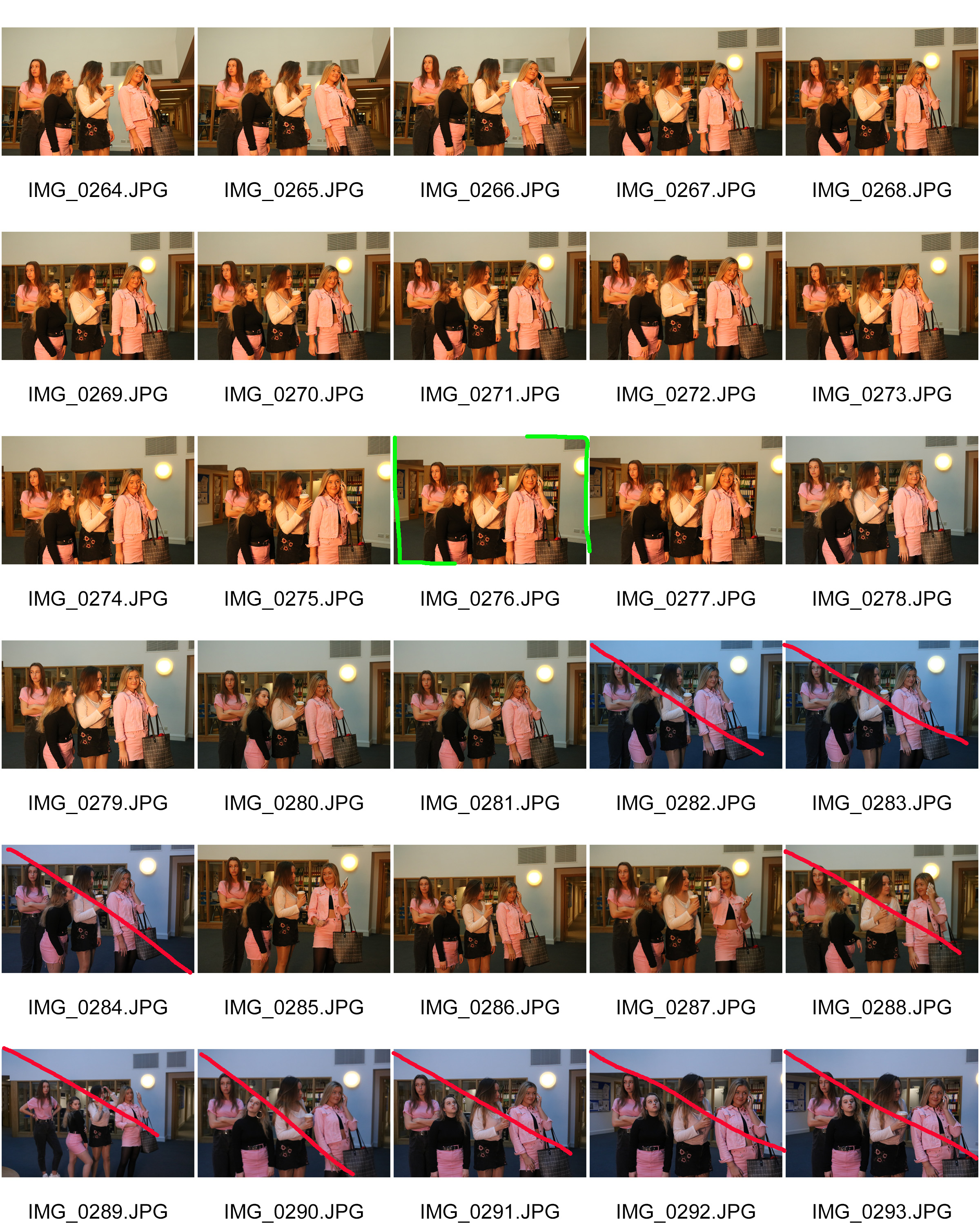
Contact Sheet
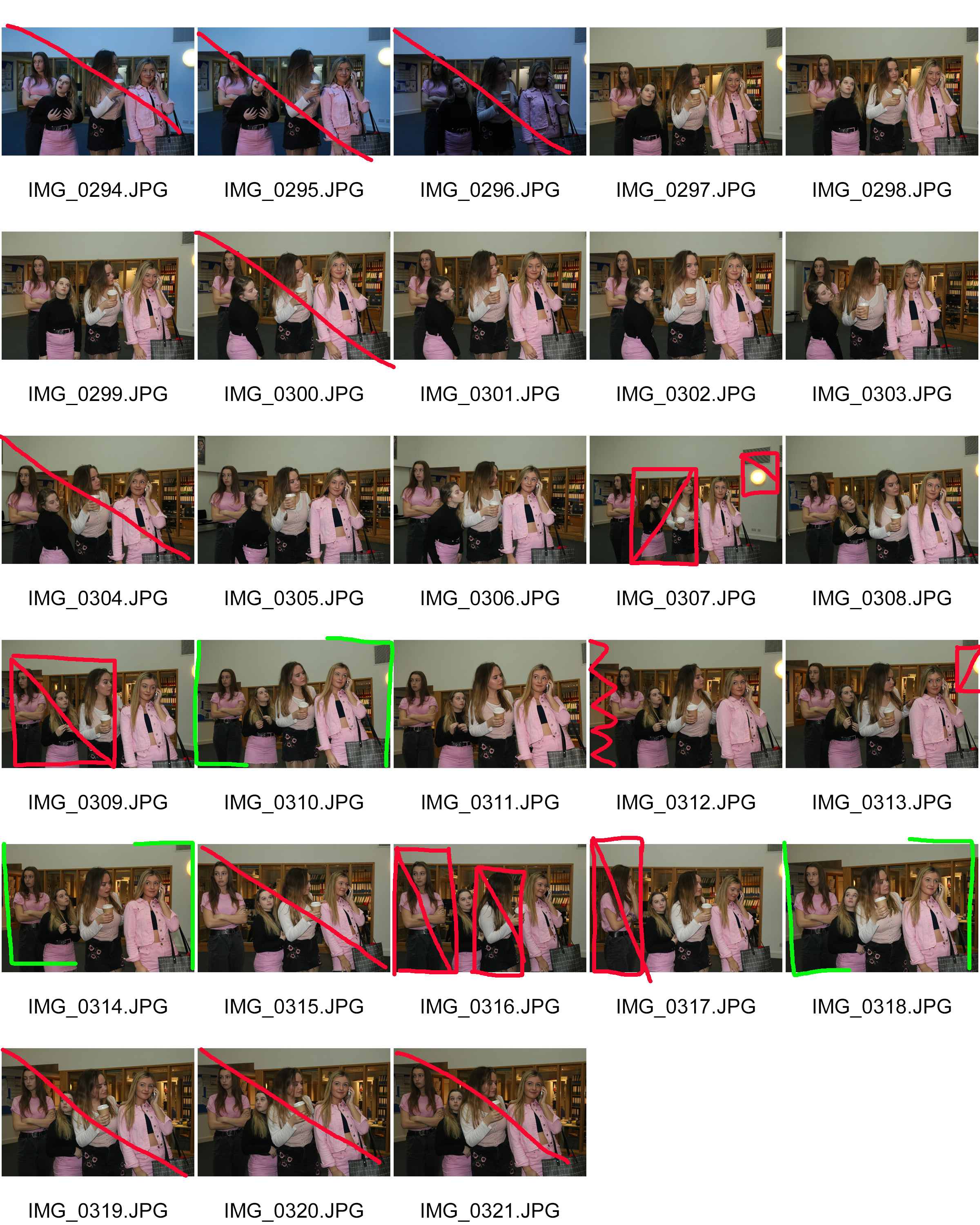
Best outcomes
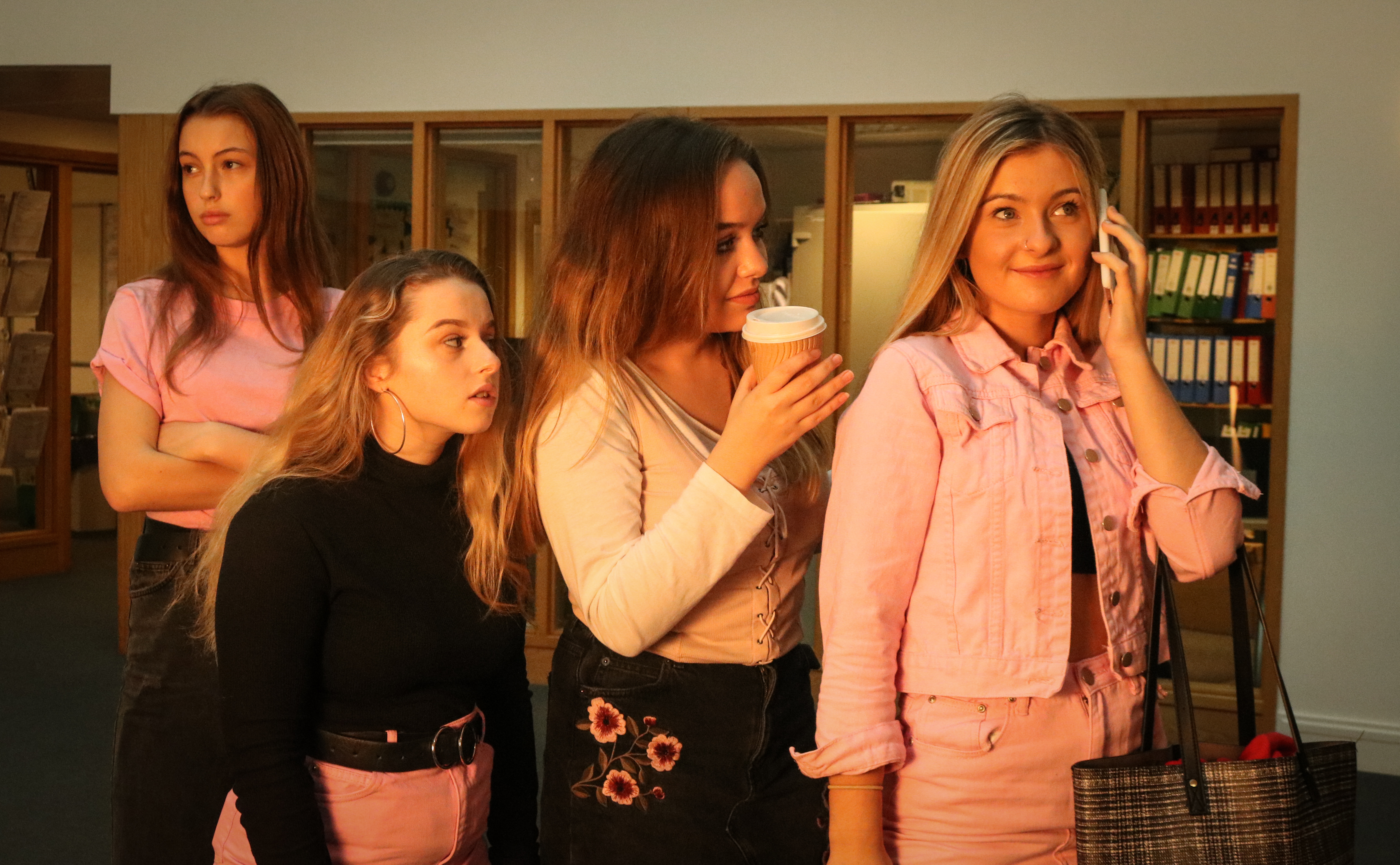
 I cropped both of these images and added a slight vignette to the outside of both images to make it look more like a film scene. I decided to choose the first image as my best final outcome because it was brighter as I used a soft box light, and I thought that it had more of a similar tone to the original image.
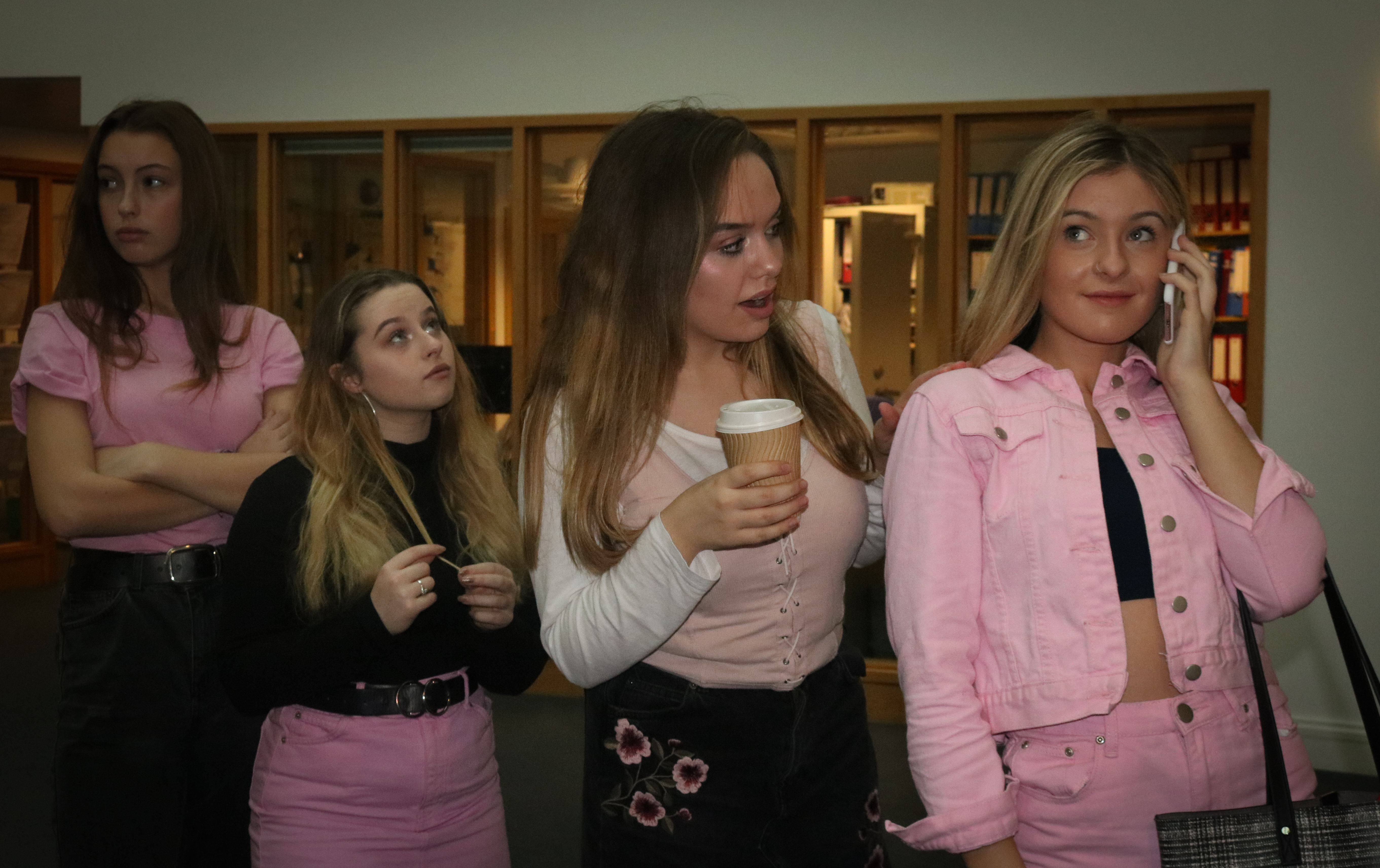
Best edited outcome
Visual
Visually, I have made sure to position my models as close to the original image as possible. I also made sure to use a background as similar as possible to the background of the original image also. I chose to add a slight pink tint to this image using light room as pink was a very meaningful colour throughout the film. This is also the reason why my models worse pink close in in the photo shoot. The image also turned out very clear and sharp, which was due to the soft box light I used in the photoshoot
Concept
I wanted to make sure the models I chose for each character represented the concepts and individual personalities of the original characters from the film. I made sure that the model on the left, playing Cady, was wearing Jeans and a pink shirt as the jeans and the plain pink shirt represents how she was attempting to appear like the other girls yet she still didn’t feel comfortable doing so. On the other hand, my model on the far right was wearing the most pink out of all the models as it represented the original character’s status within the film. As she was the most important character in the group, she was also the one who wore the most pink.
Comparison between the original image and my final outcome