THE RAFT OF MEDUSA:
WORK STRATEGY:
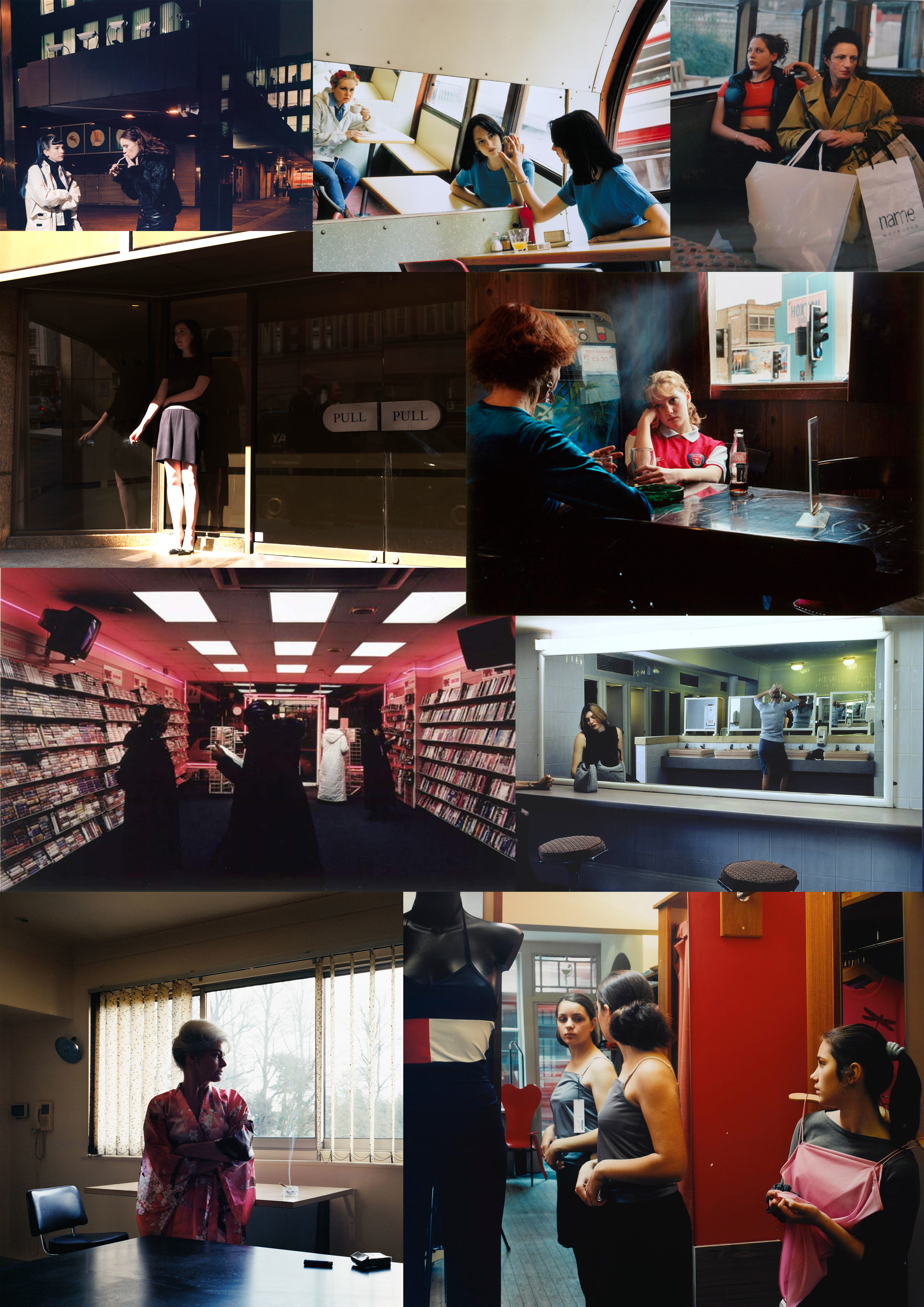
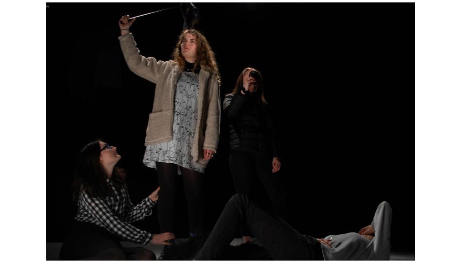
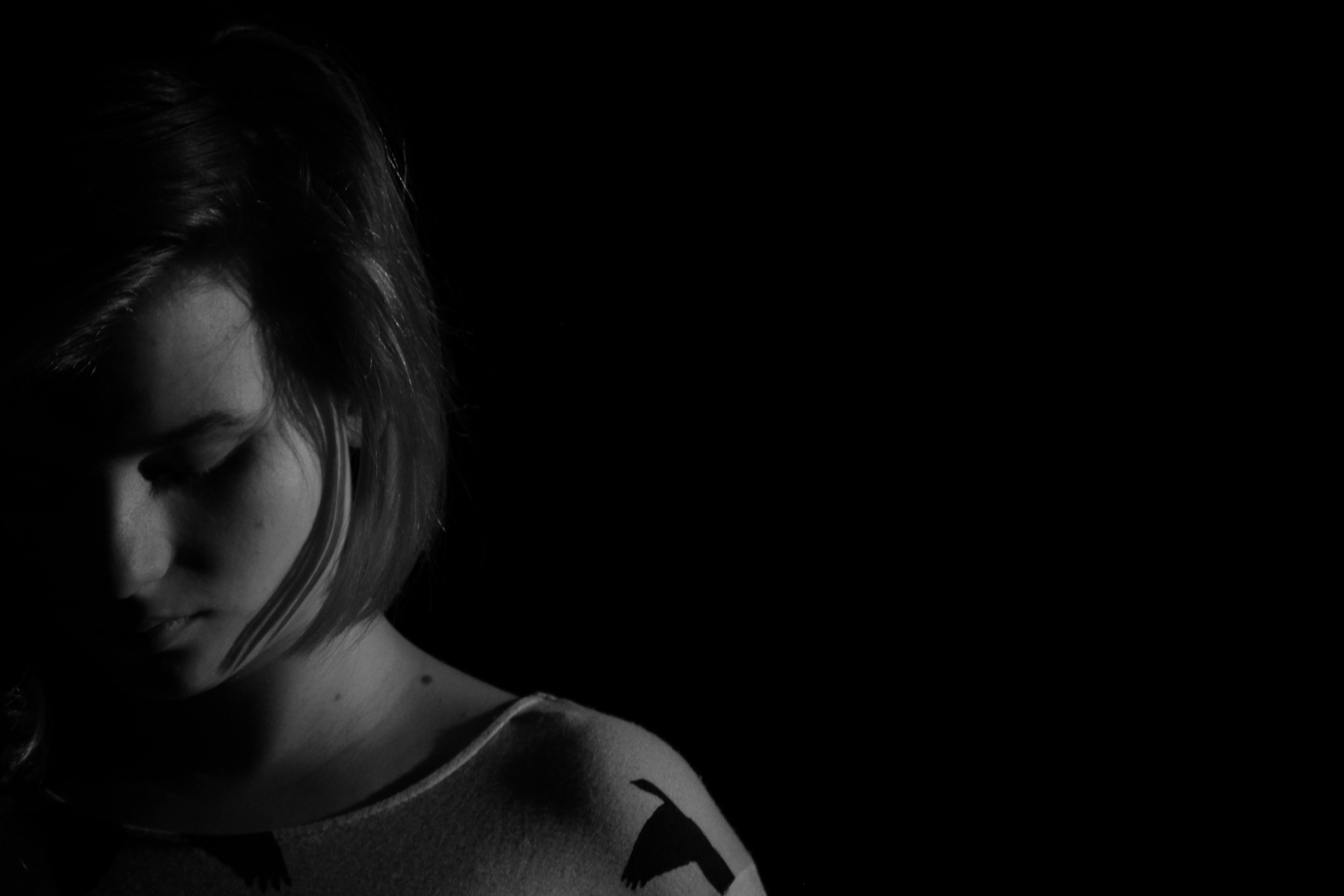
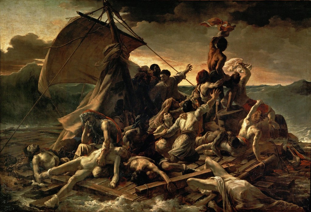
WHO – for this photo shoot, there were multiple models in order to recreate the raft of medusa.
WHAT – the main objective of this photo shoot was to try and stage the raft of medusa, adopting similar mannerisms as the people depicted in the painting.
WHEN – the images were taken during school time, indoors where artificial lighting as used ti light the room.
WHERE -the images were captured inside a classroom.
WHY – to understand the ways in which to direct people and think about aspects such as mannerisms, lighting, facial expressions and positioning.
HOW – I used my regular DSLR camera for this photo shoot, using the artificial lighting provided.
IMAGE ANALYSIS:
VISUAL:
The recreation of our image includes a lot of similar aspects as the original, trying to recreate similar facial expressions and positions as the subjects in the painting. Central in the image is main subject, holding up and waving a cloth to try and get attention, it is the first thing that the eye is drawn to due to the height at which the subject is at, towering above almost everyone else in the image. There is a sort of power play going on in the image, with two of the subjects being above everyone. This positioning is trying to convey the different states of the people on the raft, some healthier than others, whilst some are on the brink of death. We used a few extra props and stood on the table to symbolize the raft, and used a coat to symbolize the sail.
TECHNICAL:
The classroom environment we were in made it difficult to capture a similar lighting as in the image. There were direct lights which were pointing from up above, to try and correct this and create chiaroscuro lighting, we only kept one light in the room on .In order to have a very crisp and sharp image, a tripod was used to stabilize the camera whilst the image was being taken. The limited lighting in the room meant that the ISO had to be fairly high, being set to 6400 to avoid being under exposed, furthermore the f/stop used for this shoot was also quite large at f/3.4.
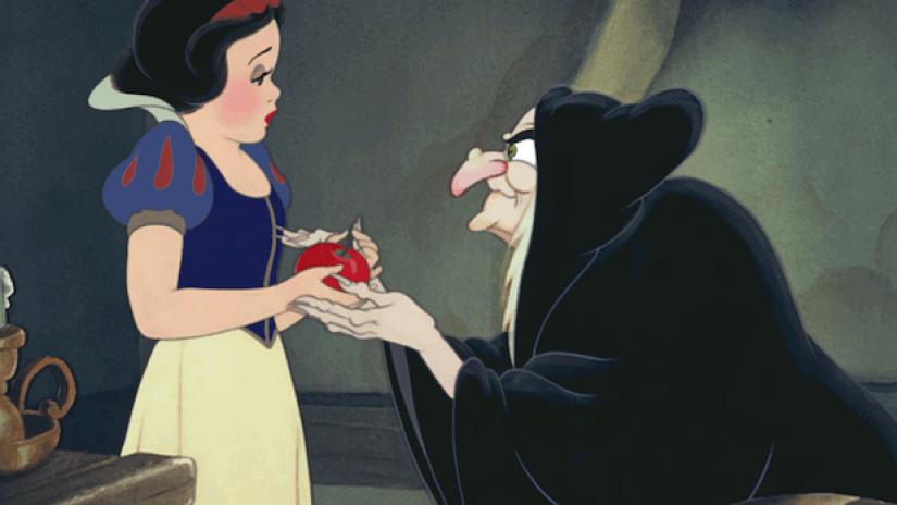
CONCEPTUAL: The Raft of the Medusa (French: Le Radeau de la Méduse) is an oil painting of 1818–19 by the French Romantic painter and lithographer Théodore Géricault (1791–1824). Completed when the artist was 27, the work has become an icon of French Romanticism. At 491 cm × 716 cm it is an over-life-size painting that depicts a moment from the aftermath of the wreck of the French naval frigate Méduse, which ran aground off the coast of today’s Mauritania on 2 July 1816. On 5 July 1816, at least 147 people were set adrift on a hurriedly constructed raft; all but 15 died in the 13 days before their rescue, and those who survived endured starvation and dehydration and practised cannibalism. The event became an international scandal, in part because its cause was widely attributed to the incompetence of the French captain.
CONTEXTUAL:
Géricault chose to depict this event in order to launch his career with a large-scale uncommissioned work on a subject that had already generated great public interest. The event fascinated him, and before he began work on the final painting, he undertook extensive research and produced many preparatory sketches. He interviewed two of the survivors and constructed a detailed scale model of the raft. He visited hospitals and morgues where he could view, first-hand, the colour and texture of the flesh of the dying and dead. As he had anticipated, the painting proved highly controversial at its first appearance in the 1819 Paris Salon, attracting passionate praise and condemnation in equal measure. However, it established his international reputation, and today is widely seen as seminal in the early history of the Romantic movement in French painting.
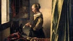
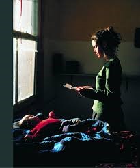
TOM HUNTER:
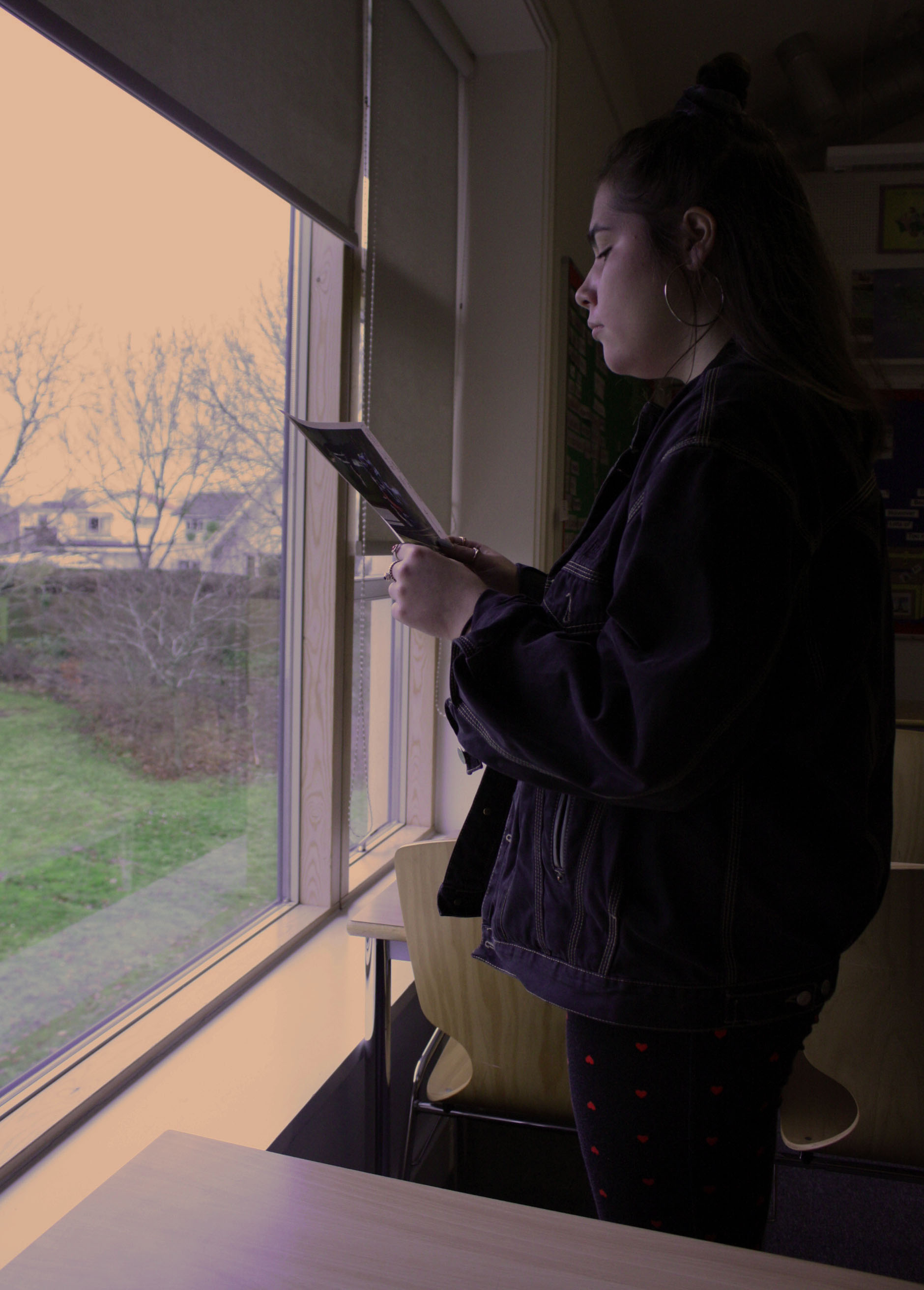
IMAGE ANALYSIS:
VISUAL:
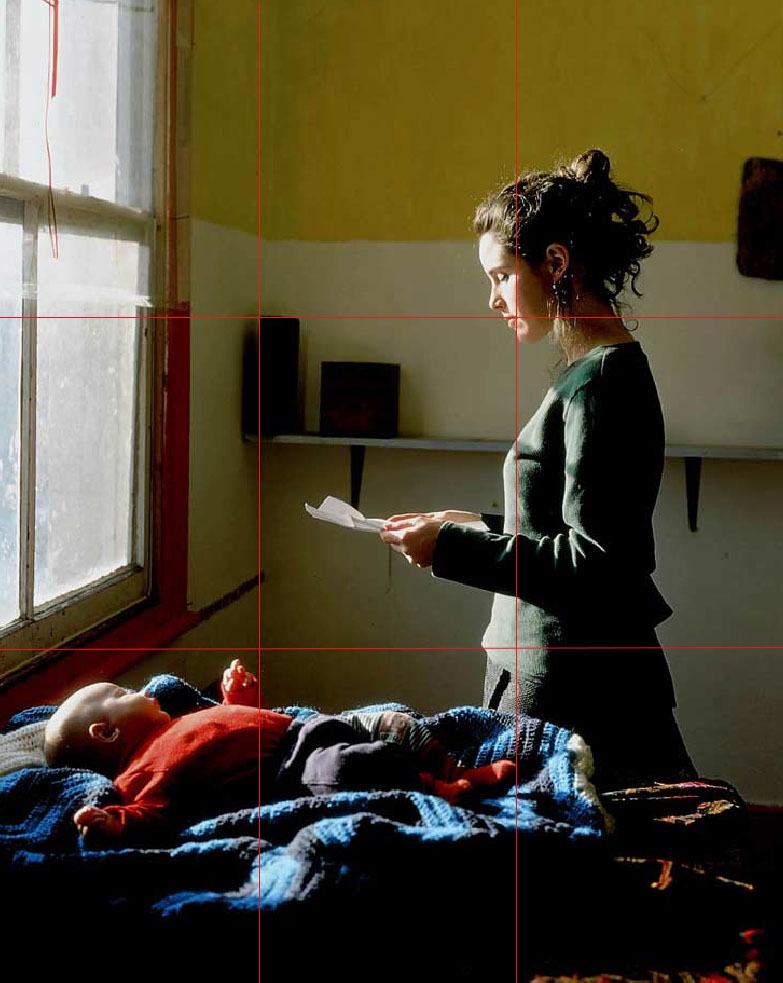
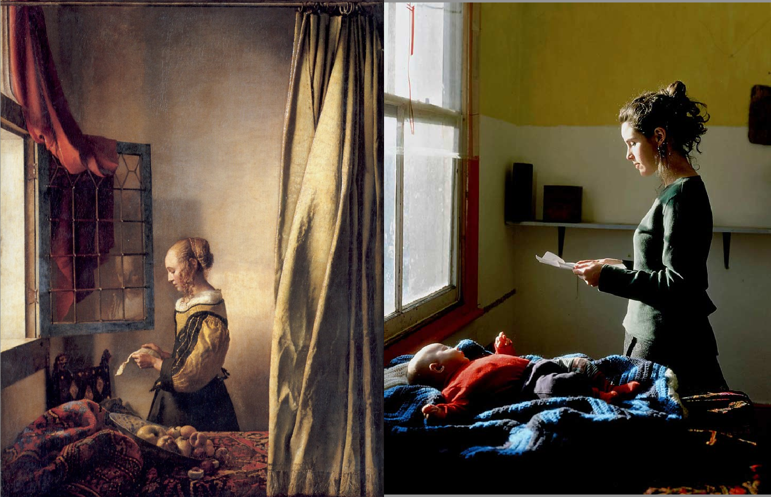
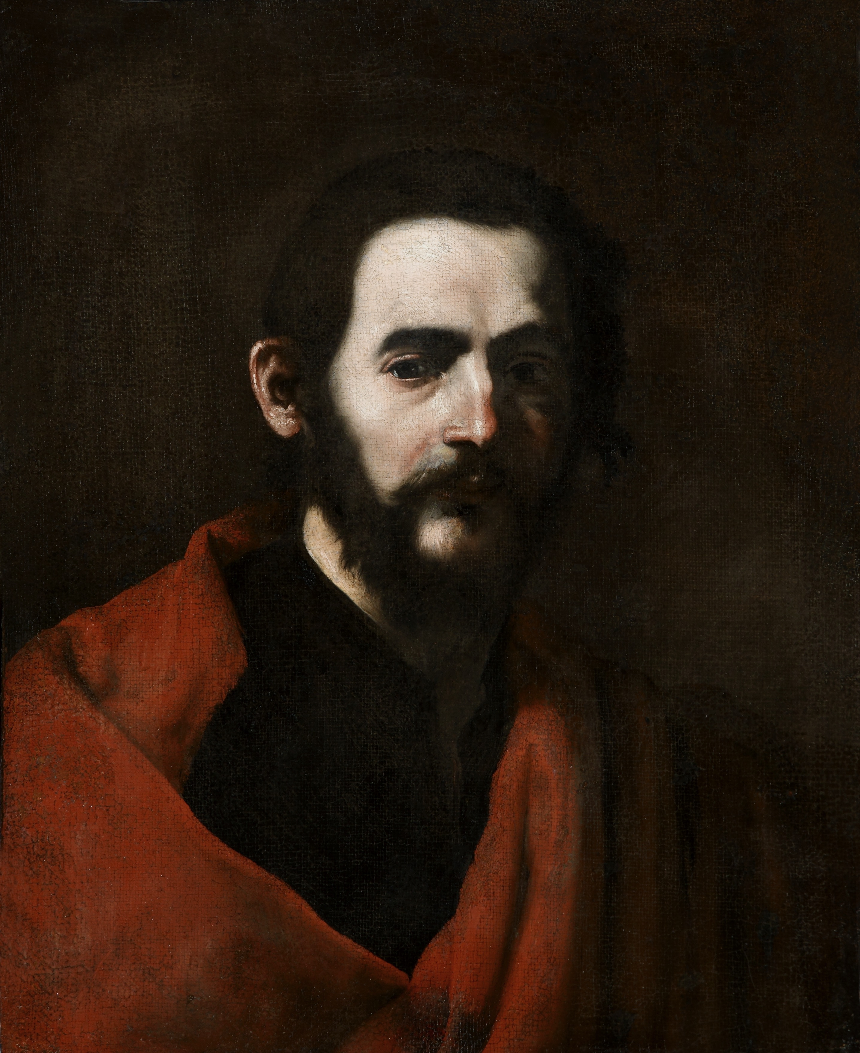
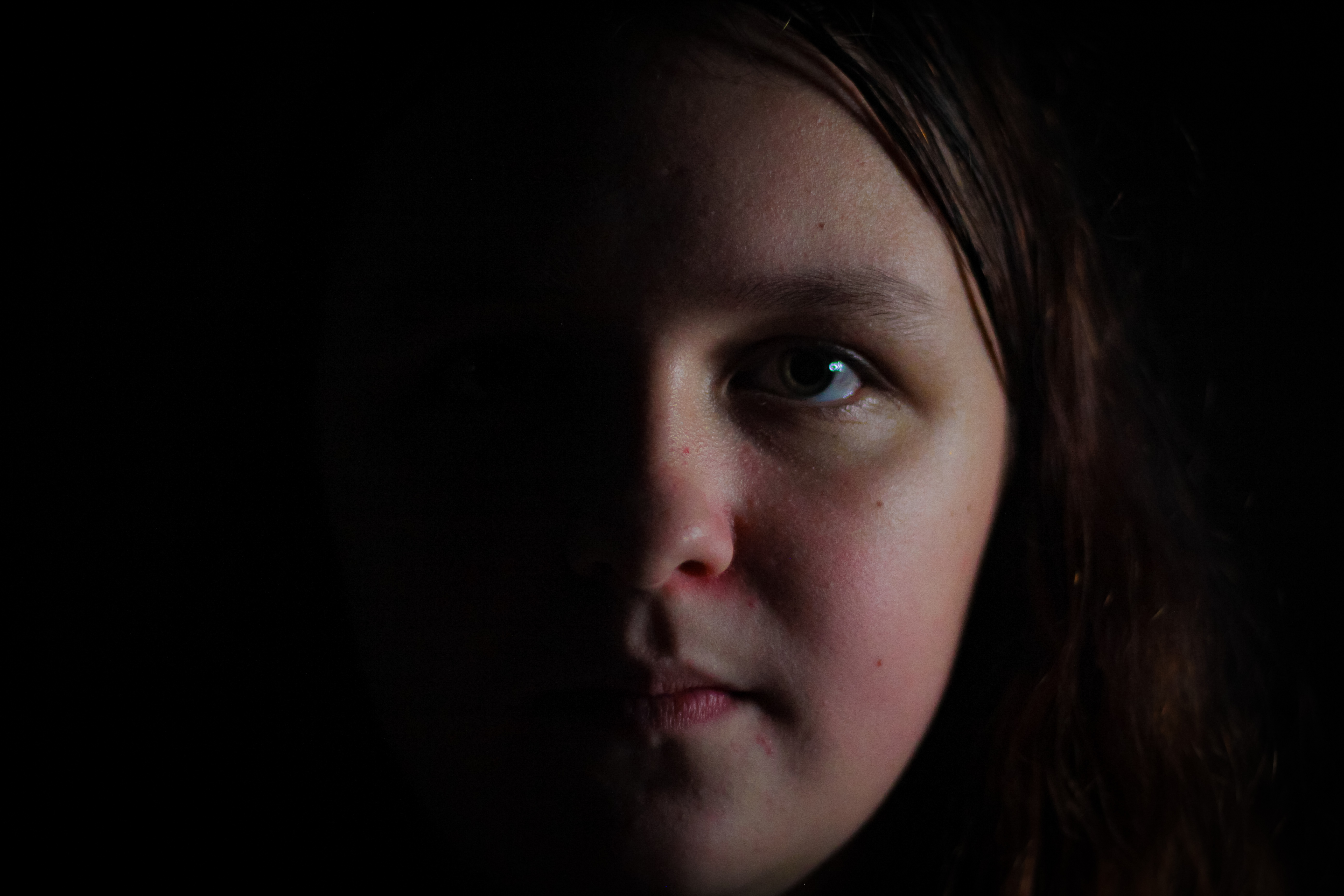
The image below holds a lot of emotional attachment. The baby on the bottom left corner is only noticed after really looking at the image for an extended period of time as the mother is the focal point of the image. The eye is first drawn to her rather than the surroundings. The color in this image is also very bright and saturated. The overall feeling of the image is bright and colorful with the light coming in from the window and the bright lemon colored wall in the background of the image. There is a lot of natural light hitting the front of the model’s face, giving the image a very natural and organic look, as if somebody was simply documenting the woman’s day. The baby in the bottom left corner of the image adds a lot of emotion, yet at the same time blends in with the environment, almost as if it has been forgotten. The subject in the image is not making eye contact with the camera and does not have any clear facial expression suggesting that possibly a sense of shock has hit her, and she is frozen in time. The image almost feels like an invasion of privacy from the angle from which it is taken and the lack of contact made with the camera.
TECHNICAL:
The exposure of this image is very balanced, with the highlights and shadows working together to create a very harmonious image. The way in which the natural lighting hits the subject from the left hand side of the image suggests that no additional lighting equipment has been used in this photo shoot. Again making this type of photography seem more documentary style. The colors in this image are also well balanced, possibly being more on the over saturated side as the orange clothing on the baby is very visible and bright. There is a clear foreground, mid-ground and background, with the baby being in the foreground, the woman reading the letter in the mid-ground and the shelf and wall in the background.
CONCEPTUAL:
Filipa had just had her first baby. We spent the whole day trying things out: we had a bowl of fruit, then we tried some curtains, then incorporated the baby. The light was perfect, a late winter sun coming through the window, really low, like the northern European light.
I used a large-format camera, which really captures that light. And I used the Supachrome process to print it – old-fashioned even then. The exposure was about a second, so it was like sitting for a painting: she had to stand still. I was waiting for the light to pour into the lens, rather than snapping at something.
I phoned her up last week and she’s still happy with the picture. It’s a record of her, her child and her home at the time. The great thing is, the picture got a dialogue going with the council – and we managed to save the houses.
CONTEXTUAL:
I was living in Hackney in London, in a whole street of squats, having spent two years travelling around Europe in a doubledecker bus. Everyone got a letter addressed to “persons unknown”. The council wanted to knock down the street and build warehouses. The Tories had brought in the Criminal Justice Act, which was designed to stop parties. Every time you saw a picture of a squatter or a traveler, it was to go with a story about how antisocial they were. I just wanted to take a picture showing the dignity of squatter life – a piece of propaganda to save my neighborhood.
I took this in 1997, for my master’s degree show at the Royal College of Art. The 17th-century golden age of Dutch painting had had a massive impact on me: the way they dealt with ordinary people, not kings, queens and generals. I thought if I could borrow their style for squatters and travellers, it would elevate their status. In this shot, inspired by Vermeer’s Girl Reading a Letter at an Open Window, my next-door neighbour is reading the possession order.
RULE OF 3RD’S:
This image follows the rule of 3rd s, as can be seen when we divide the image into blocks. The woman is sectioned mostly in the last third of the image, yet the letter she is holding positions itself in the very center of the image, becoming a very clear focal point of the image.