David Bailey

David Bailey 


David Bailey was a Biritsh Photographer, born in Leytonstone, London, United kingdom. He was born on the 2nd of January in 1938 currently being (80 years old).  David Bailey being on of the many photographers to have a chance to photography famous people, from Johnny Depp too David Beckham

Bailey developed a love for natural history which them developed his love for photography.  Bailey suffered from undiagnosed dyslexia which resulted in him having to be home schooled.  However, having this happened Bailey claims to have only attended over 30 times which then led him to wanting to drop out of school at the age of 15.

in 1959 Bailey became an assistant photographer to John French, in  1960 he was a photographer for John Cole’s studio Five, which led onto Bailey being contacted by British Vogue Magazine where he worked for about 15 years, first on staff and later as a freelancer. He also freelanced for other magazines and newspapers.

Bailey’s fashion work and celebrity portraiture, characterized by stark backgrounds and dramatic lighting effects, transformed British fashion and celebrity photography from chic but reserved stylization to something more youthful and direct. His work reflects the 1960s British cultural trend of breaking down antiquated and rigid class barriers by introducing  a working-class or punk look into both clothing and artistic products.  He is thought to have inspired the role of the photographer, Thomas, in Michelangelo Antonioni’s film Blow up 1966.

Bailey also directed television commercials and produced a number of books and documentary films. In 1972 he began publishing the fashion and photography magazine Ritz. Although he continued to photograph celebrities for publications such as Harper’s Bazaar and The London Times throughout the 1970s, ’80s, and ’90s, he began to turn his attention to television commercials.

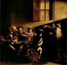
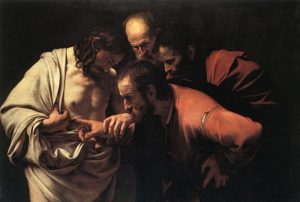
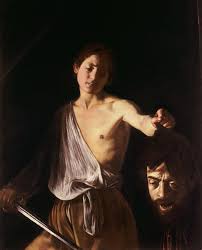
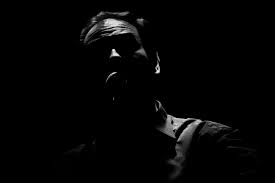
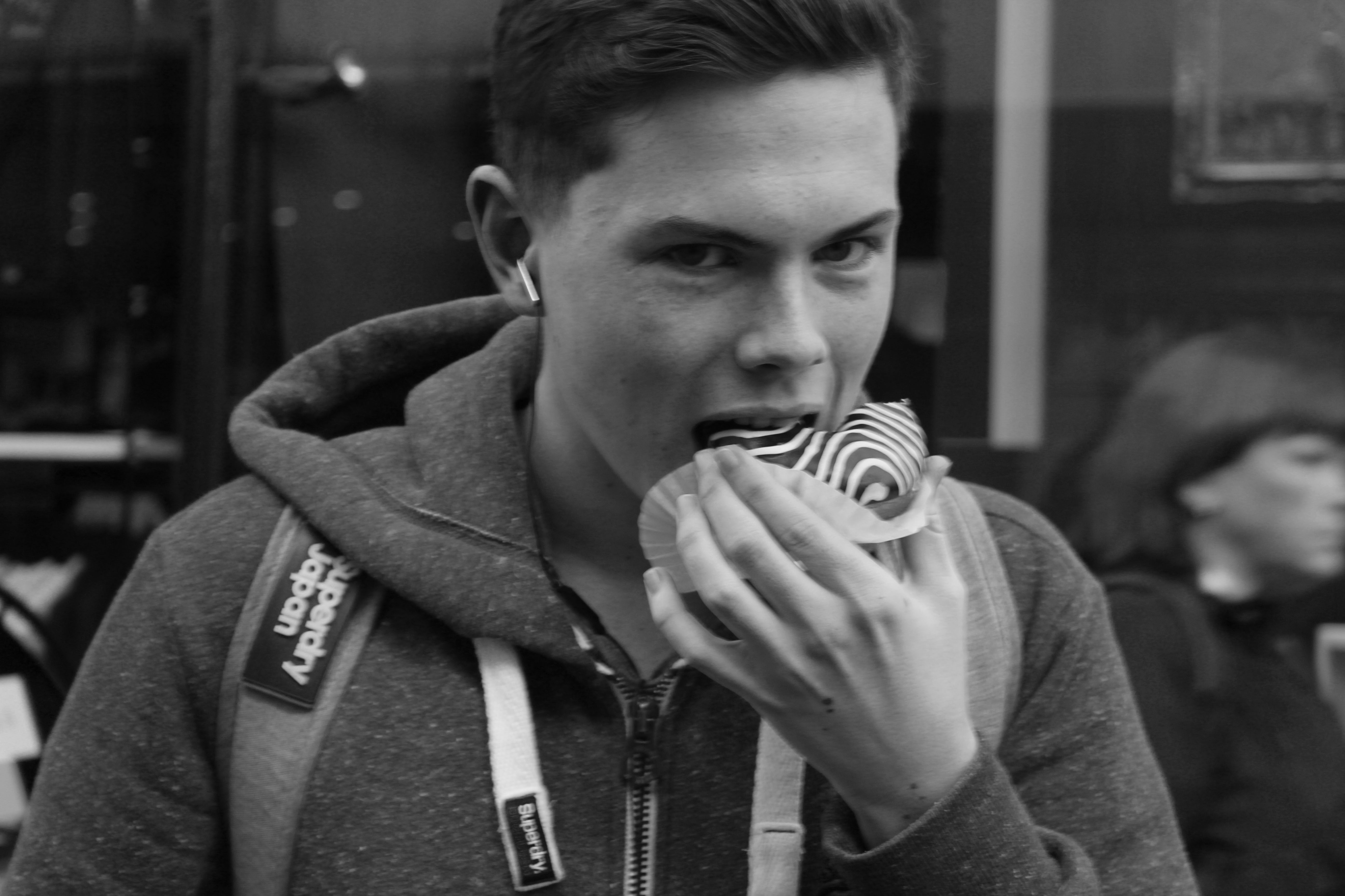
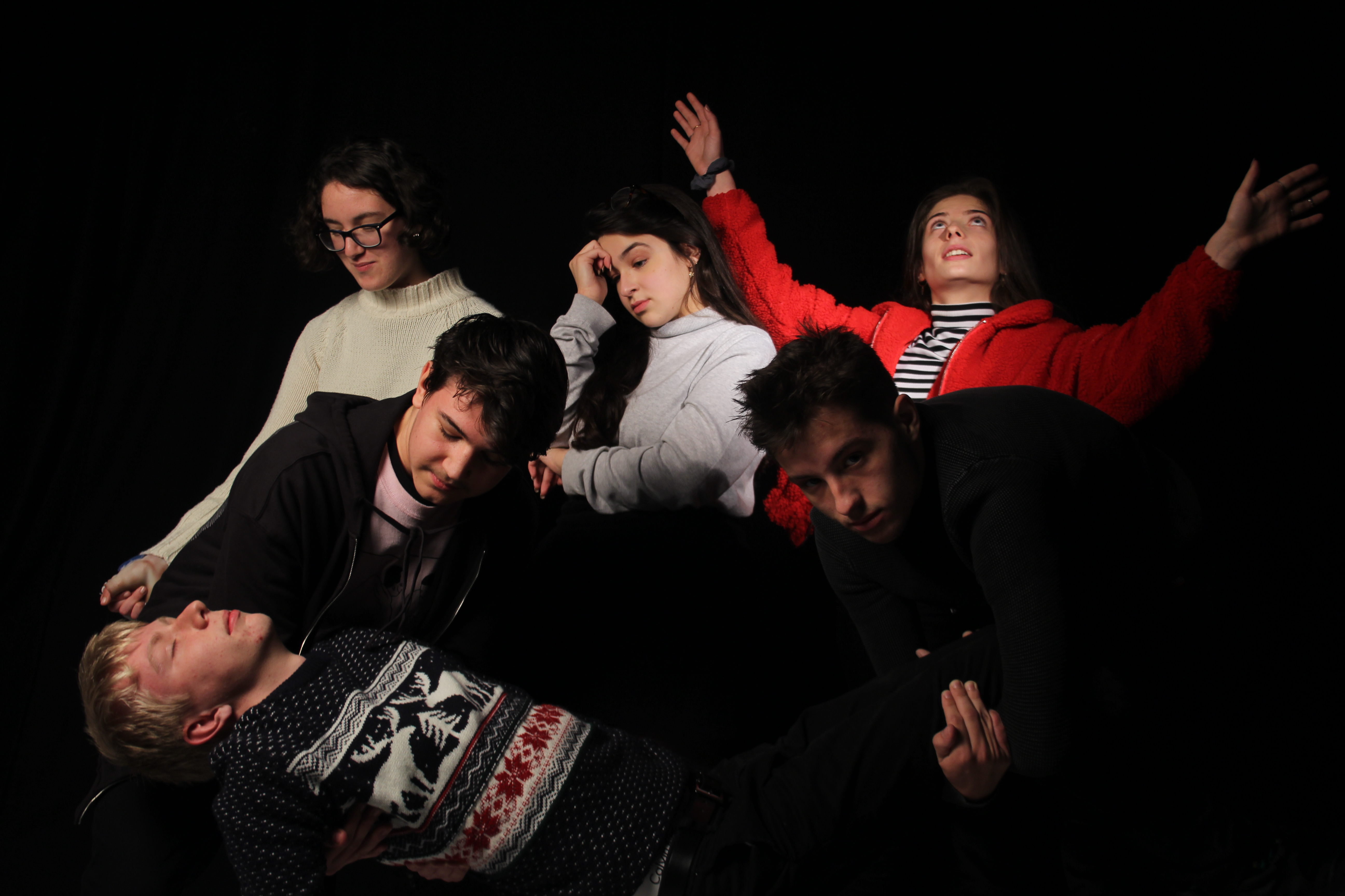
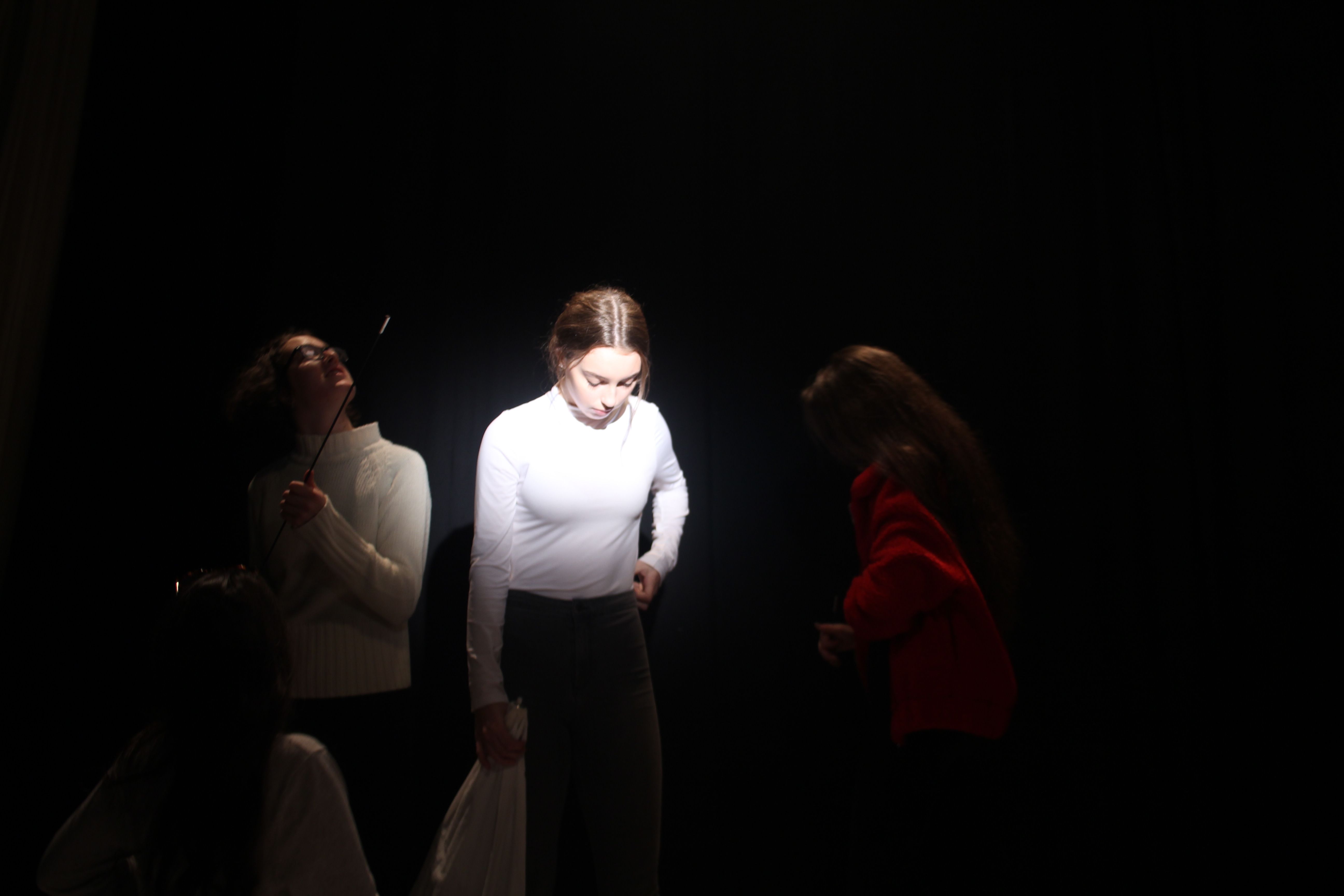
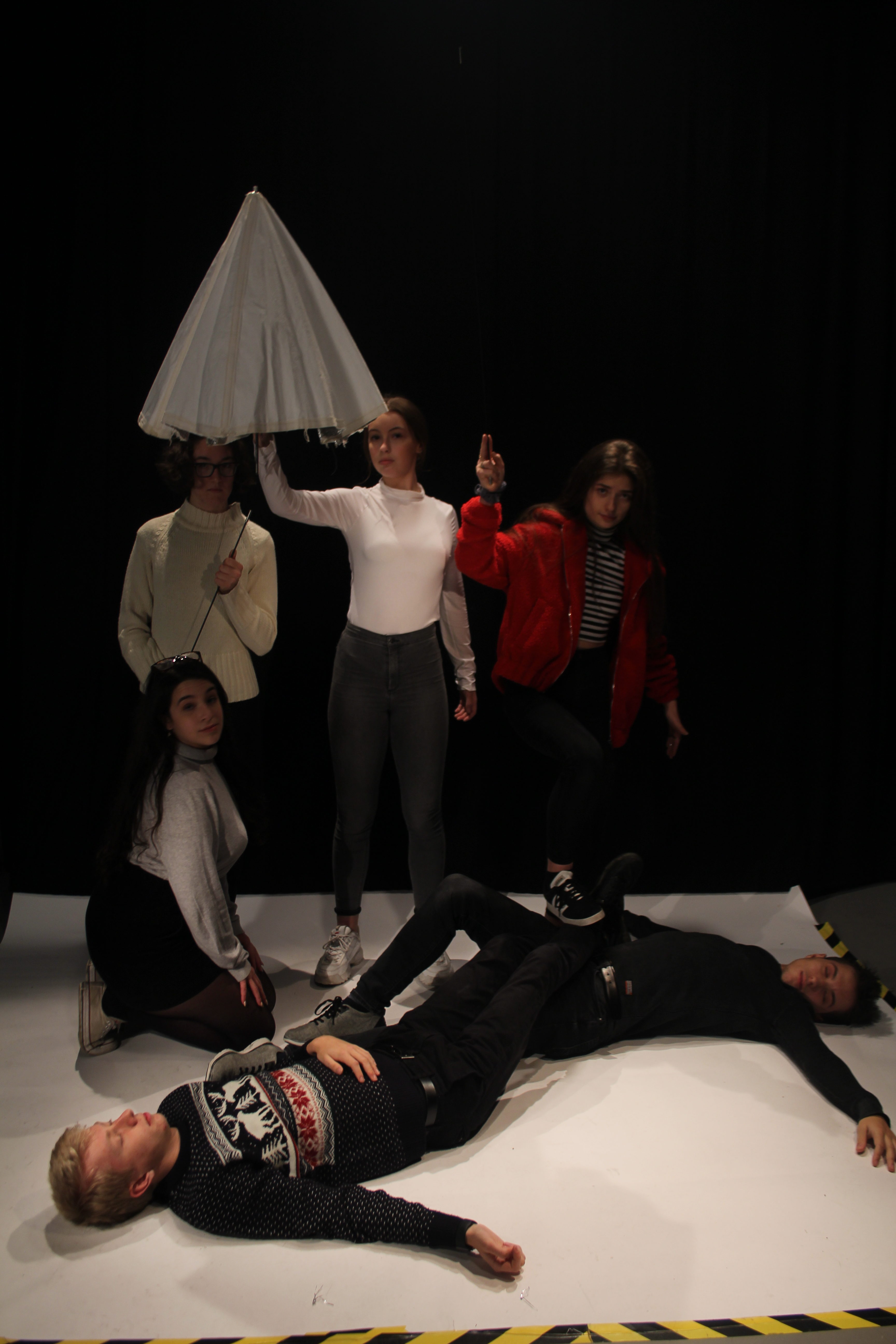
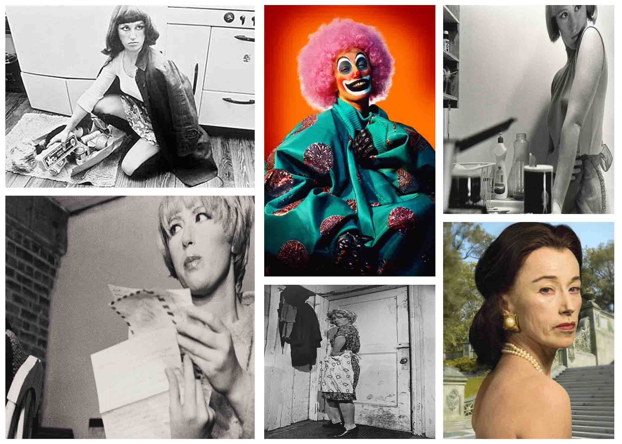
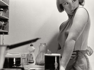
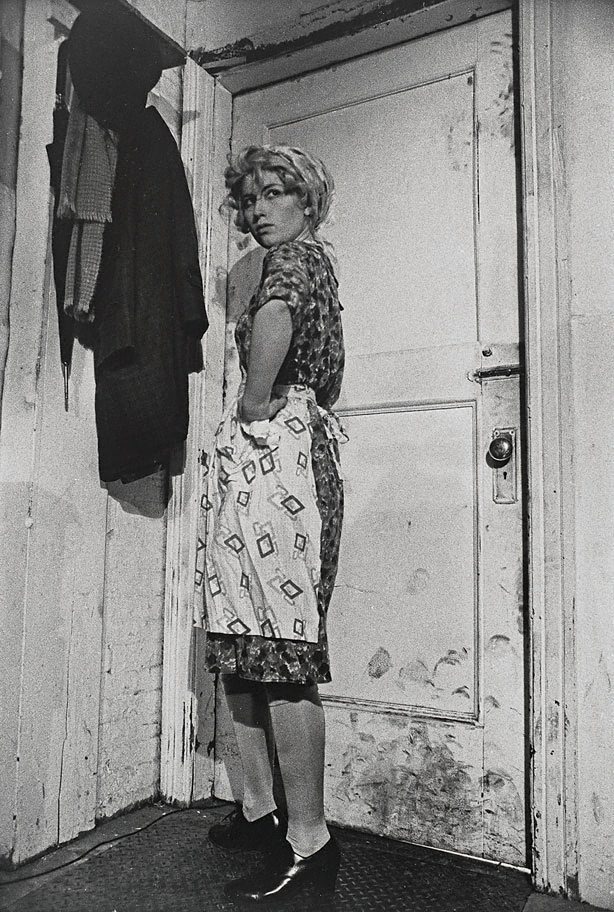
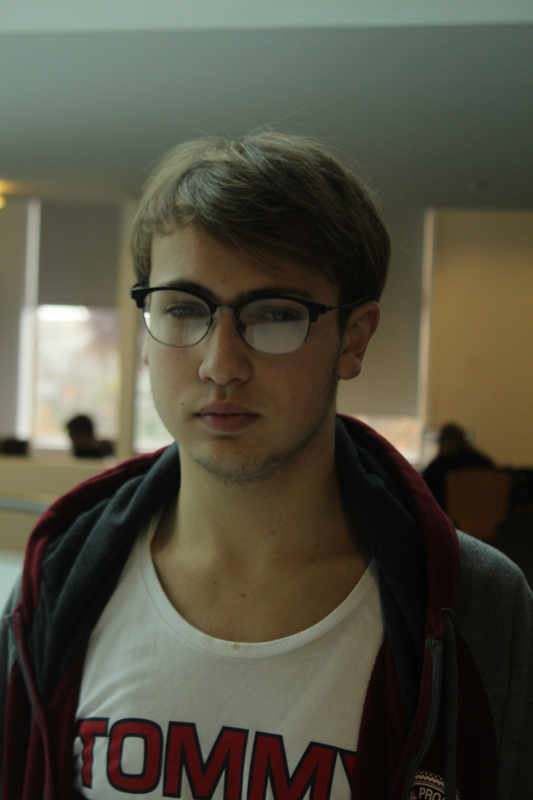
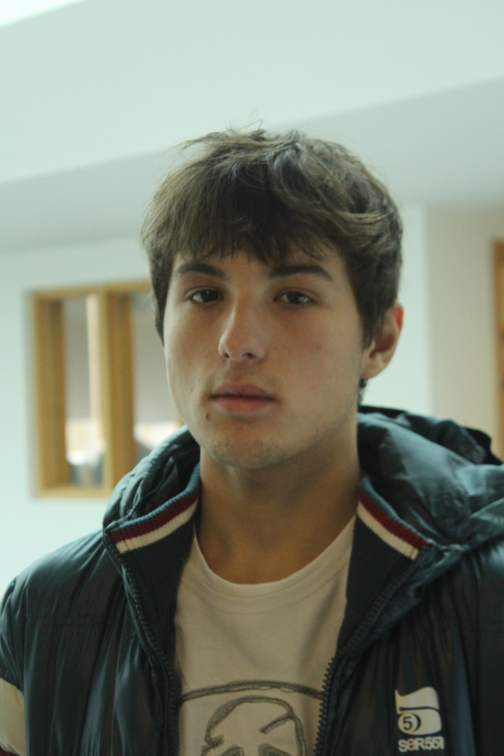
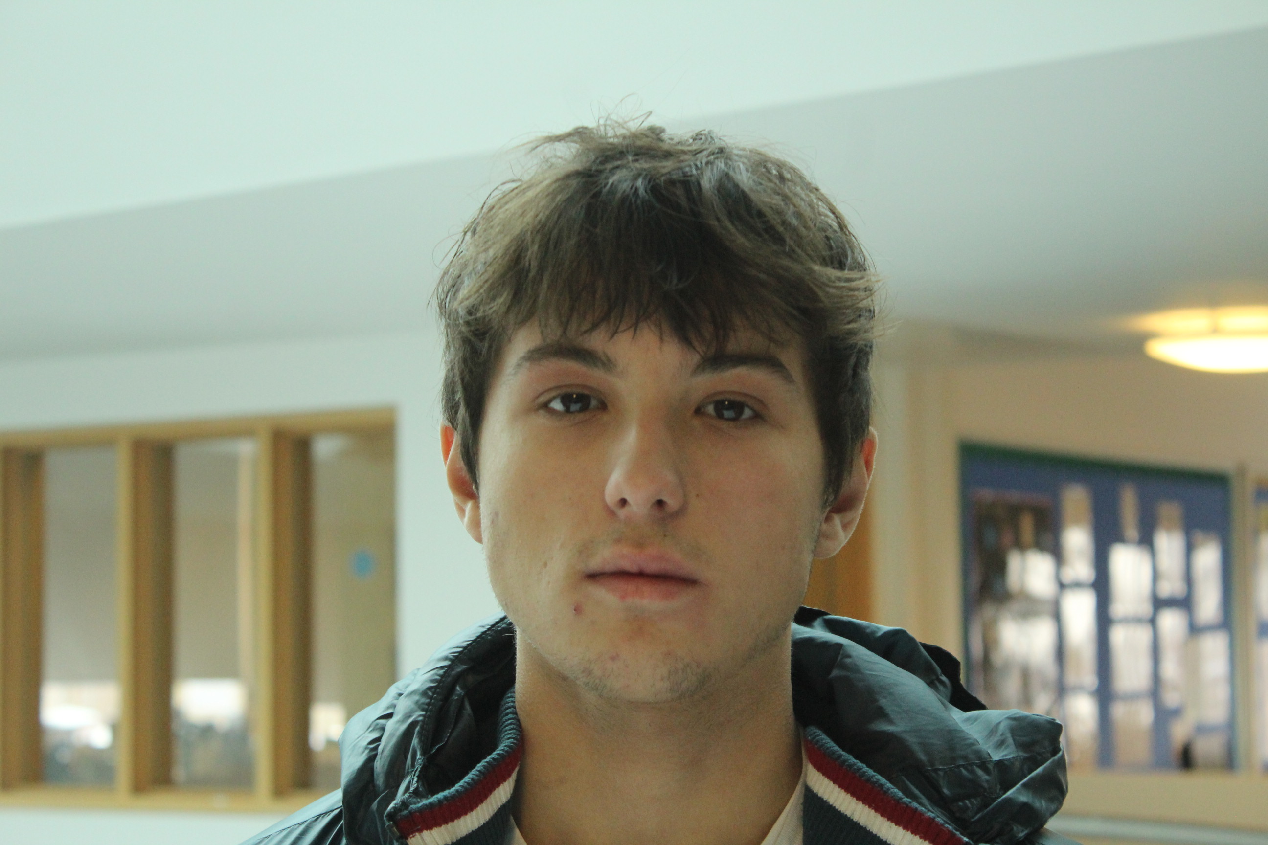
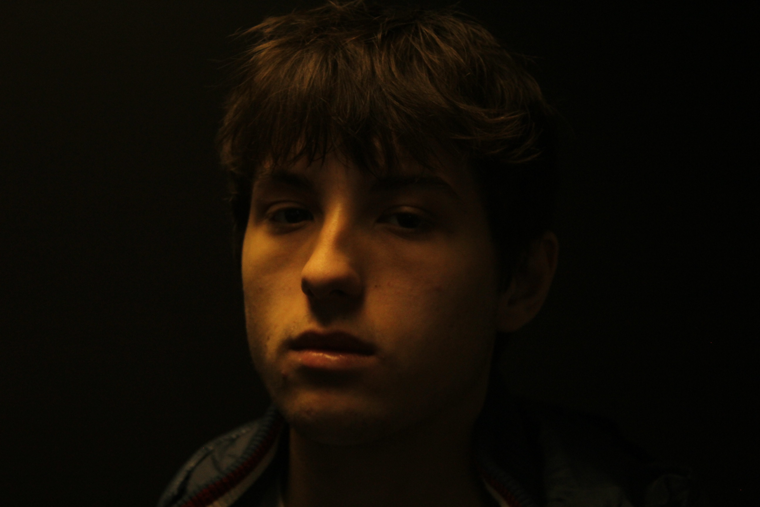
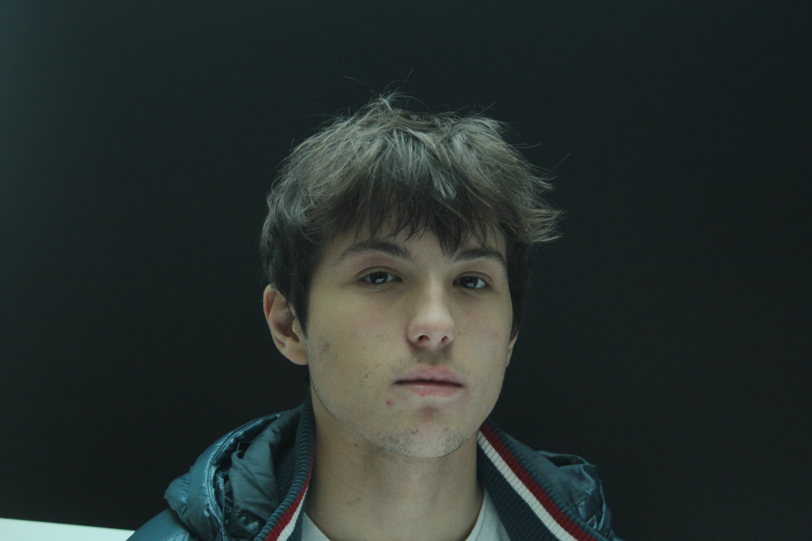
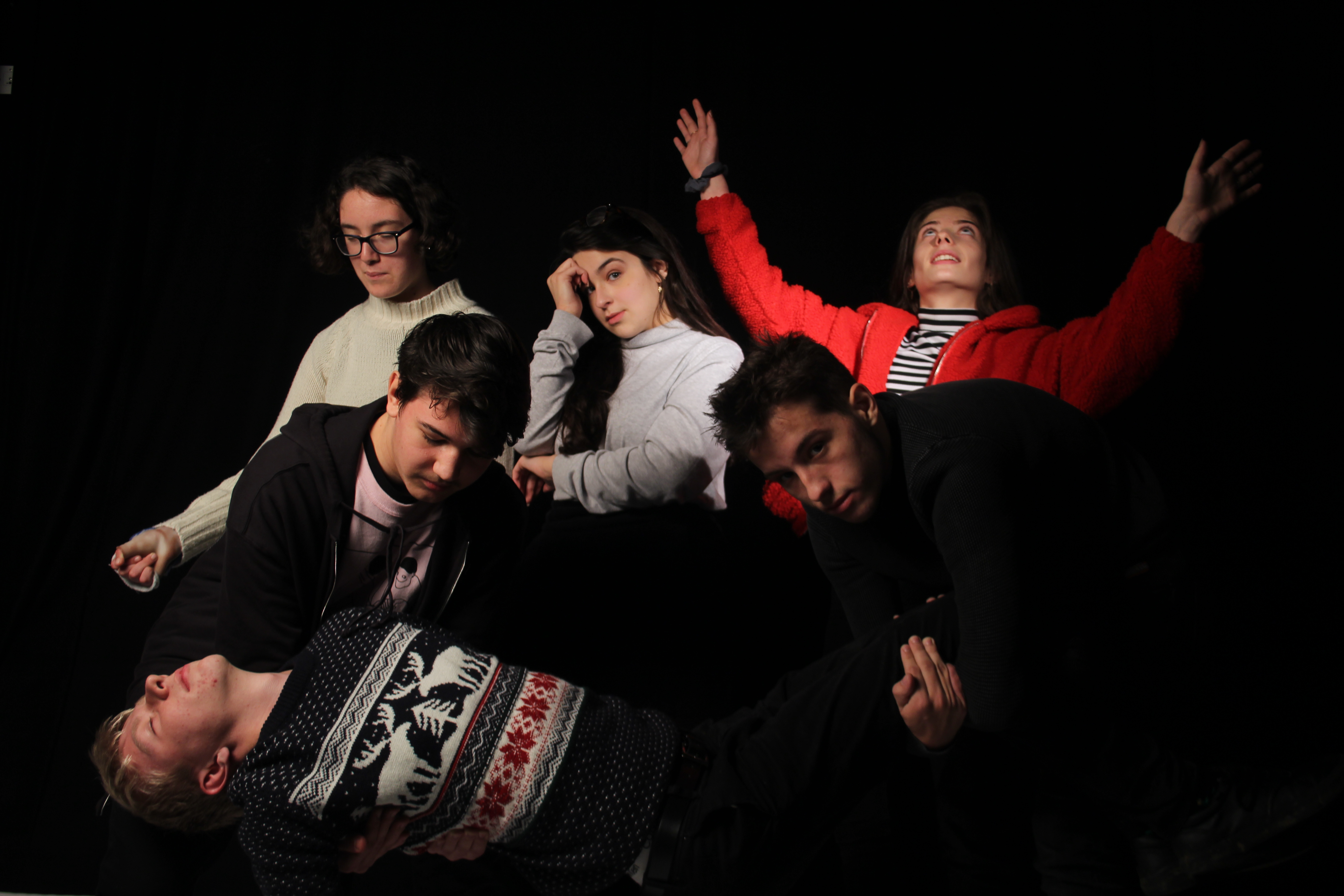
Here are some examples of his most famous portraits:

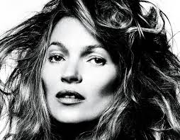
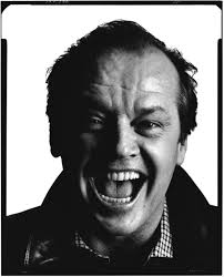
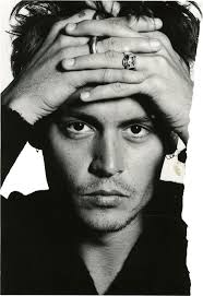
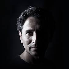
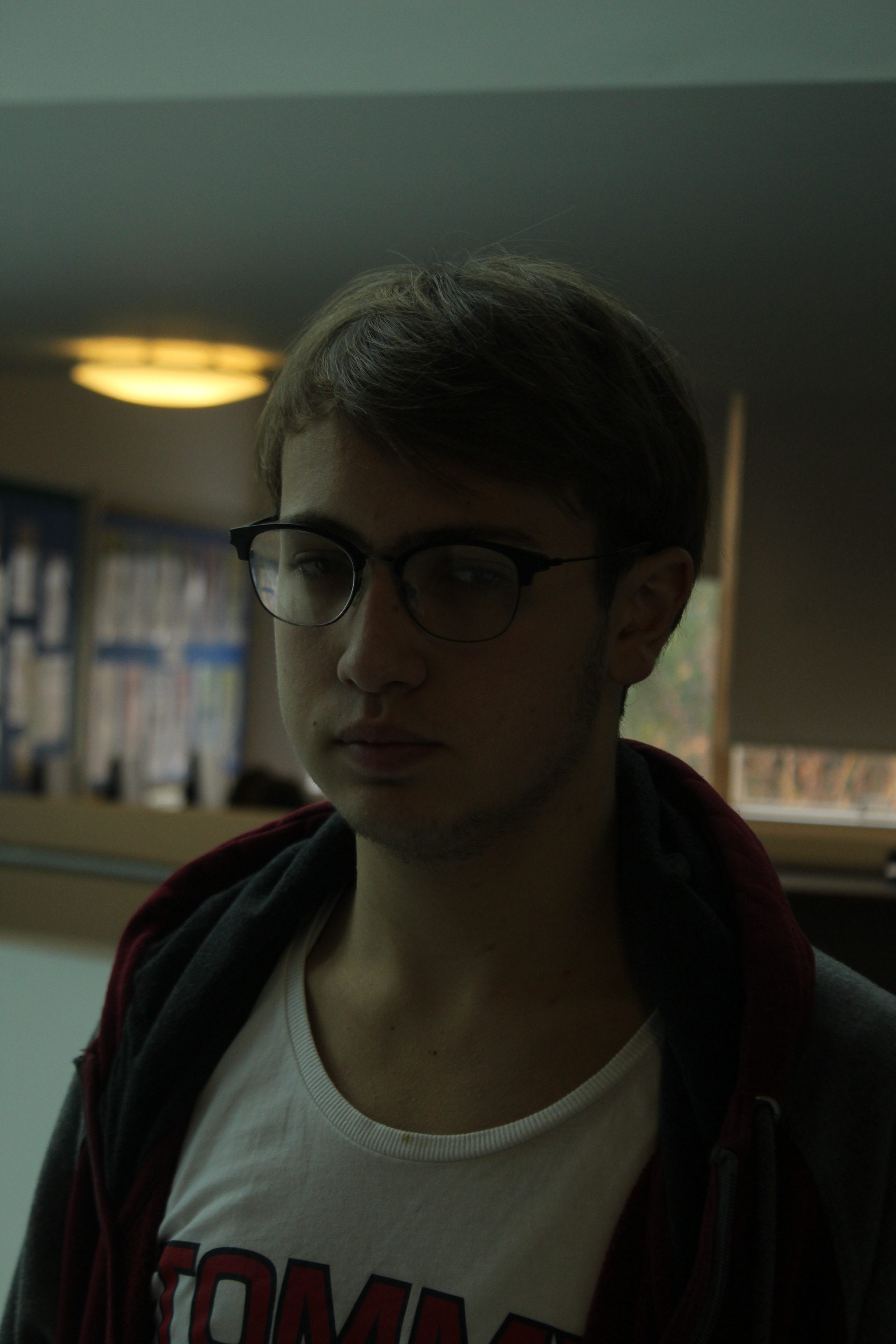
David Bailey relies on heavy lighting and works particularly well with high intensity on shading.  This effect works well as it captures only certain features of the individuals faces.  however with the technique of chiaroscuro artist usually tend to put the shading in the background and brining it into the face, but with Bailey’s work the background tends to be a lighter colour meaning that all tones of darkness and greyness are all focused on areas like the hair and some patches of the models face.

Chiaroscuro

CHIARSCURO


What is It and when was it first used:

Chiaroscuro, in art, is the use of strong contrasts between light and dark, usually bold contrasts affecting a whole composition. It is also a technical term used by artists and art historians for the use of contrasts of light to achieve a sense of volume in modelling three-dimensional objects and figures.  Some evidence exists that ancient Greek and Roman artists used chiaroscuro effects, but in European painting the technique was first brought to its full potential by Leonardo da Vinci in the late 15th century. Like photographers and cinematographers centuries later, painters realized that the contrast between areas of light and dark heighten the impact of an image. As the Renaissance gave way to the Baroque, a style that emphasised drama and emotional intensity, some artists developed an exaggerated form of chiaroscuro known as tenebrism, from the Italian word tenebroso, meaning gloomy or murky.

Here are some examples of artists who rely on this technique to produce some of their amazing outcomes.

  • Caravaggio
  • Georges De La Tour
  • Leonardo Da Vinci
  • Joseph Wright
  • Henry Fuseli
  • Rembrandt
  • Ralph Gibson

These are 3 examples of Chiascuro from a long time ago:

This is how we interpret Chiaroscuro in the modern day world, baring in mind to make these shadows is a lot easier than it would have been for Artist like Caravaggio.

I have learnt about using this technique when I was doing my art GCSE. Having looked at Baileys work before I chose to adapt my work to make it sort of similar to his. I did this because when it comes to taking photos in black and white that has always been my strong point.

People use this technique because not only do they like the contrasting effect it makes they also believe it intensifies certain feature that you wouldn’t be able to see as much having the image being taken in just natural lighting.

The principal and lighting technique of chiaroscuro ^

Street Photography Part 2:

These are a couple of examples that I took for street Photography:

This is the original image
Another final outcome that I am happy with

These are my contact sheets from the street Photography trip

contact sheet 1&2

From this trip if I have learnt one thing is that confidence is key, which is something that in this trip I was lacking too do. Simply because I had watched videos on some of the reactions that famous people received when just photographing random strangers. However having analysed my contact sheet even further I can notice that most of my images are quite blurry, this could have been becuse my shutter speed was too low so the camera was unable to capture the pictures I was after. when I was on this trip in town no comments were actually made so most people I photographed the worst thing that came out of it was sometimes an evil look but nobody actually asked what was going on which also surprised me.

My technique for this trip was simply to sit on benches, lean against shop windows or just simply stand in corners and photograph people  as they continued through there everyday life.  this actually worked sometimes at my own expense apart from there are just some images of buildings instead of people but it was all part of the fun .  Another thing that I have noticed from these images are that there is  quite a lot of backs turned away from the camera, which again was partially my fault for not having tried to capture the front of them but as I was looking at them I realised that even getting 3-5 perfect images would have been great as most photographers will take between 200-500 images and only select 5 or so to actually be published which in this case is what I have done.

Out of all my images there are not very many that I would say worked. The two images at the top of the post are both from people I know but they weren’t 100% sure what I was doing.  I feel like the top image is well focused on the idea that that is how some people approach the idea of portraits as the boy on the right is smiling but seems also confused as to why there is a camera in his face whereas the boy on the left does not seem very happy with what was going on.  furthermore, as I said earlier its warpped around the idea that it is unknown what your going to capture. when I was walking down to go to this trip I was nervous but excited and what I was going to see and capture but not through my eyes but through a camera lens and doing something where your out in a public place sourrounded by people most of the time poeple do become confused but rather smiley as soon as a camera is pointed right to them. (unless they’re just generally grumpy)

Group Tableau Pictures

As a group we Decided on two images and we would copy them.

Firstly we did Carravagio ‘Deposition – the image below.

Our version and how we made it look like the image:

  1. Starting Point:

2. Process:

This is the process of the director telling us what positions we were going to do and what poses we are going to do. Firstly we looked at the image and decided how was going to be the director and the lighting helper and how was going to reenact the image.


This is based on the second image we focused on a image by

I found these images too over exposed, to sort these problems out we ended up lowering the brightness of the light so that I didn’t over expose the image. I also I would crop the image so you couldn’t see the sides and the lights.

4. Positions:

5. Final Trys:

These out the outcome of the original photo and how we re in acted the image in modern day.

Best Outcomes:

Group attempts at tableaux viviant

As my first attempt at Tableaux viviant, we decided to recreate the following image as a group.

Image result for the entombment of christ (caravaggio)
The Entombment of Christ Painting by Caravaggio

Context

This piece depicting Christ being entombed was created between 1603-1604, for a chapel in Vallicella, Rome.

Technical

This painting was painted with an oil on a canvas. It contains dark toned colours and hardly any brightly tones colours.

Visual

This painting shows Christ being entombed. In the painting you can see him surrounded by 5 other people, 2 men holding him and 3 women crowding around him with sad and distressed looks on their faces. This painting is also quite darkly pained, and there’s not much light incorporated into the photo, making the painting convey negative feelings to the audience.

Conceptual

As the painting is quite dark, as I mentioned before, I think that it it is trying to convey how upsetting it was for people to witness Christ being entombed as the colour black is usually associated with death and negativeness. The way Carvaggio painted this darkly, also clearly shows that he himself pictures this moment quite darkly, which shows that the painter was a religious man who is saddened by this event. The way Caravaggo painted Christ as the only person in the painting wearing bright white, clearly shows he wanted Christ to stand out as the most important person in this image, which shows he probably hold Christ in high regards, and thinks highly of him also.

Process

Our group being directed into out positions, before we moved onto positioning the lighting correctly.

Here you can see a member of our group directing the rest of the group in order to get us into a similar position to the people shown in Caravaggio’s painting. During this process it was important that the background was dark, which was the we decided to use the black backdrop. It took some times in order for the member of the group to be positioned properly, and for the lighting to also be set out accurately. After we all knew where we were standing and how we had to pose out bodies in order to achieve an accurate representation of the original painting,  the directer along with the photographer moved onto the lighting. A light was placed focused on our group that we all stood out and also so that the background was a dark colour in comparison to the people posed.

Contact sheet

Final outcome

This was the best image outcome captured by the photographer. In this image we have successfully been able to position ourselves similar to those that were pained in the painting. We have also successful been able to convey our assigned characters’ emotions on our faces, which is an important element in tableaux. The background is also very ark which helps us to convey the elements of darkness and death from Caravaggio’s painting into our image. This was achieved through a black background, and also by the strategic placing of lighting which made the actors stand out even more compared to the background.

Analysing the process

While experiencing this process I learnt many important things that I will use, and take into consideration when I do my own tableaux photo shoot.

Firstly, I learnt that the most important part of tableaux is the positioning of the actors along with their expressions, rather than how you actually take the image itself. The majority of the time in this photo shoot, went into making sure we looked accurate and also into making sure the light and the background complemented each other so that our image would convey the same concept that the painting did.

Secondly, I noticed that the director has to be very clear with their instructions, and that they also need to have a very clear vision in their head of how they want the scenery to look. Since a huge part of obtaining a successful tableaux image is planning, I know that when I come to do  my own it has to be well planned so that it turns out accurately. I also now know how important scenery/location and lighting is in order to make a successful tableaux image.

Tableau and staged reality photography – Cindy Sherman


Moodboard of images by Cindy Sherman

Tableau photography is a static scene containing one or more models or actors. They are usually in costume and are planned out carefully to create a certain scene.

Cindy Sherman is a postmodern photographer who started work in the 1970s and is still working today. She’s been important in the areas of “studies of the de-centered self, the mass media’s reconstruction of reality, the inescapably of the male gaze, the seductions of abjection, and any number of related philosophical issues.” She uses herself as the subject in almost all of her photographs except only a few. These are staged photographs that she takes in her studio. It’s important that they’re staged because we know that this is some sort of message embedded in them that she is trying to get across to us.

Sherman 1977


In this image, Sherman is shown to pose in the kitchen, in front of the sink with an apron on. This is clearly making a statement on the gender stereotype of women’s place in the house, which was typically in the kitchen. This looks more of like a 1950-60’s setting, where the role of women were pretty fixed within society, and they were berated for being anything else otherwise. Sherman may have been fighting against these stereotypes and making the voices of women louder when it came to their rights and how society saw them, and going against the tainted norms to make a change.


Untitled film still #35 (1979)

In this image, a woman is shown standing by a dirty door, in typical house wife clothes of the 1970’s. Like many of her works, and the one I mentioned above, this portrays the stereotypical view of women and their duty to the house hold.

Window Lighting & Using Reflectors

Window lighting is soft light caused by natural light being diffused through a window. This is also a cheap and effective method of getting expensive; studio grade images.

Natural/window lighting also allows the photographer to move more easily from location to location without the hassle of moving movie equipment; such as lights and reflectors.

During the photo-shoot, reflectors were also used to reflect the light towards the model. Reflectors are useful as in flat lighting, a reflector can add interest or drama to the shot. https://www.shawacademy.com/blog/a-beginners-guide-to-lighting-a-photo-with-a-reflector/

Best Images 

Tableau Vivant

A tableau vivant, French for ‘living picture’, is a static scene containing one or more actors or models. They are stationary and silent, usually in costume, carefully posed, with props and/or scenery, and may be theatrically lit. It thus combines aspects of theatre and the visual arts; a group of models or motionless figures representing a scene from a story or from history.

Paul M Smith, uses MULTIPLE EXPOSURE TECHNIQUE

Tableau In Class

The two paintings which the class recreated were “Deposition / The Entombment of Christ” by Caravaggio, and “Liberty Leading the People” by Eugène Delacroix.

Image result for caravaggio deposition

The Entombment of Christ – Caravaggio

Image result for french revolution painting

Liberty Leading the People – Eugène Delacroix

Class Responses

Editing Of Class Response

Own Tableaux Response

Using Paul M Smith’s work as inspiration

Image result for paul m smith photography

Image result for paul m smith photography

Images by Paul M. Smith, from the collection: “Make My Night”     http://www.paulmsmith.co.uk/

For my Tableaux Vivant and Paul M. Smith response, I would like to merge together and edit three separate images of the same subject; wearing different outfits, in different poses, and the in the same frame.

I will be responding to the renaissance work “Supper At Emmaus” – by Caravaggio; featured below.

Images

Image 1; used as base image for the final edit.

Edit

I have edited this image by using a base image as an anchor-point to synchronize the other images and the props, to do this I have also set the opacity of the other images to 50%.


After wards I cut out and set new layers for the crucial parts of the layering images e.g: Shadows, subjects. And then used the eraser tool with low hardness to ensure a smooth transition between the anchor image and the layer images.

Final Edited Image

Tableau and staged reality – Planning

For my tableau and staged reality photography, I’ve decided to center my theme around gender stereotypes, specifically with women. I will be looking at what women were portrayed as in the 1950’s, with the photographer I will be getting my inspiration from being Cindy Sherman.

I will be basing my work off of her images, and may throw in a few ideas of my own. I will be using other people to replicate these images and show the gender stereotypes. Items for both images I will be taking should be objects such as aprons, old-styled dresses and kitchen appliances. The places where they will take place will be simple, either in a kitchen or by a door, like in the original images done by Sherman.

Images by Cindy Sherman which I plan to replicate:

Untitled film #35 (1979)


Image result for cindy sherman 1954 untitled lucy
Cindy Sherman Untitled film still #56 1980

Sherman 1977