What is 3 point lighting:
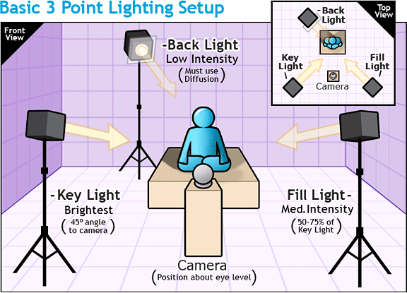
Three-point lighting is a standard method used in visual media such as theatre, video, film, still photography and computer-generated imagery. By using three separate positions, the photographer can illuminate the shot’s subject (such as a person) however desired, while also controlling (or eliminating entirely) the shading and shadows produced by direct lighting.
Diagram:

Examples:

A portrait with three-point lighting: a 300 watt key light, a 150 watt back light, and fill light from a bounce board.
My own aim, action plan and technical features:
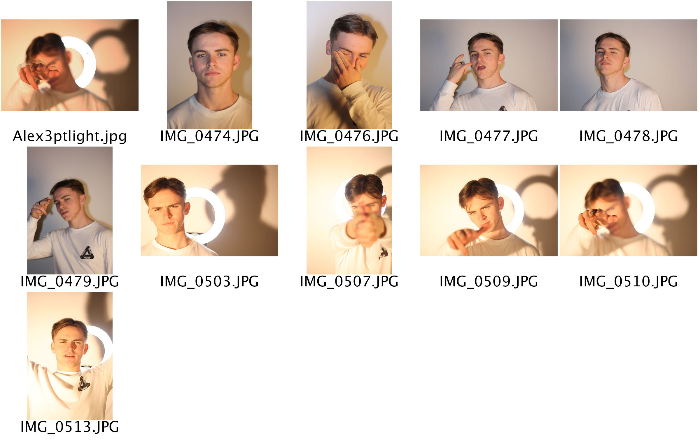
The aim for my 3 point lighting shoot was to use 3 different lights to capture a selection of images that demonstrate I can use the technique correctly whilst also trying to create images that are clear, in focus, and presentable. The lights were placed in 3 positions for some, with one in-front, one to the side and one on he other side. In a lot of the other photos there are a light in-front and behind the model and then a light slightly to the left. The technical features of these images included a wider aperture to allow a lot of light into the lens with a quicker shutter speed to keep the images harp incase the models move.
Contact Sheet:

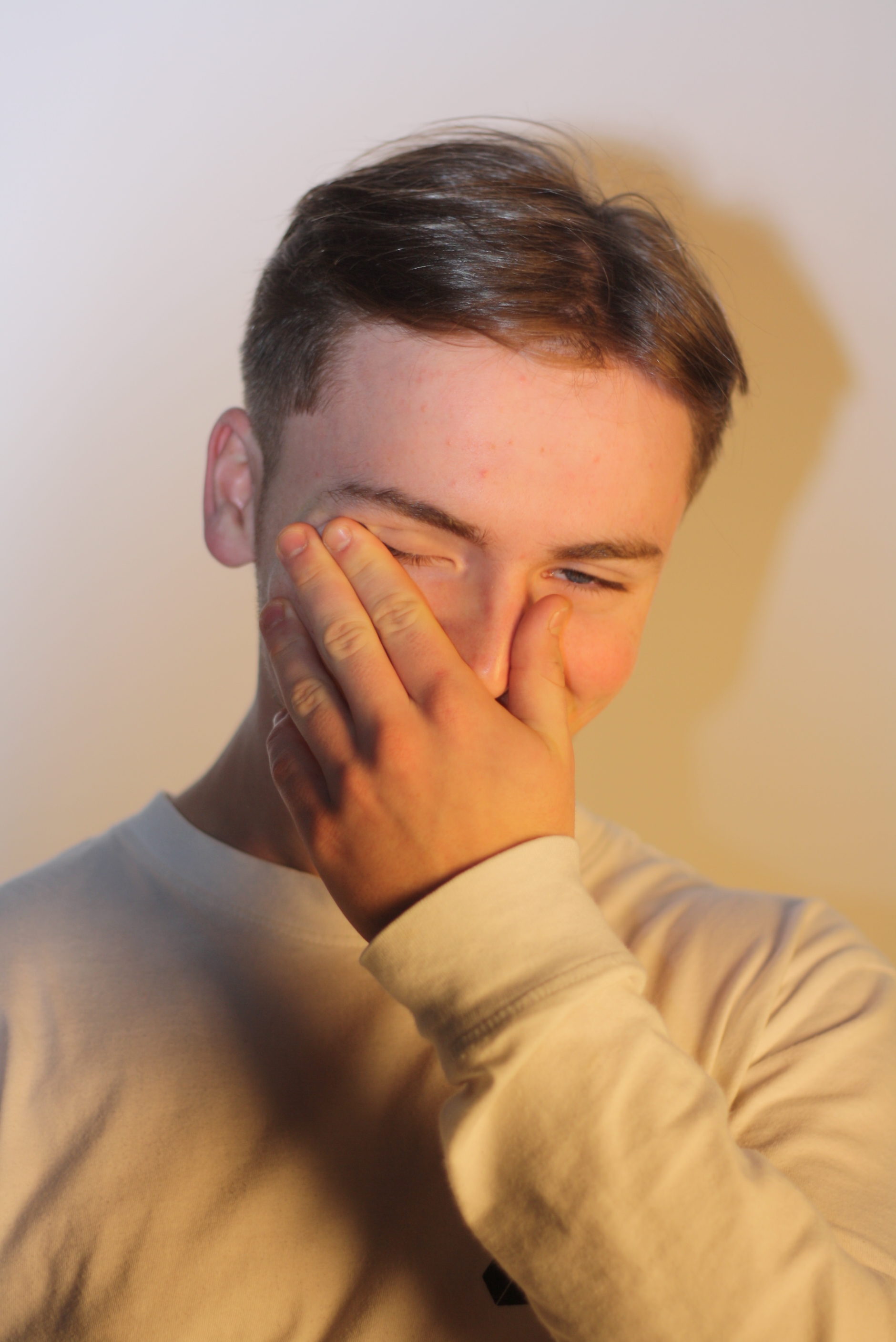
Final Image Outcome:

Visual elements of this image include:
Visual elements of this image include a very simplistic array of colours which mainly consist of whites and yellows. The tone is fairly light and the texture, very smooth. There is a fair depth of field due to the shadows on and around the model which also creates a 3D object effect.


