Photo Montage

Photo Montage is the process and the result of making composite photograph by cutting, gluing, rearranging and overlapping two or more photographs into a new image.Sometimes the resulting composite image is photographed so that a final image may appear as a seamless photographic print. A similar method, although one that does not use film, is realized today through image-editing software. This latter technique is referred to by professionals as “compositing”, and in casual usage is often called “photoshopping” (from the name of the popular software system). There are many methods for combining images that are also called photo montage, such as Victorian “combination printing”, the printing of more than one negative on a single piece of printing paper, front-projection and computer montage techniques.

Mood Board:

Photo Analysis:

Image result for photomontage photography

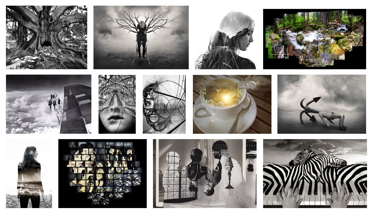
This image shows women putting on make up. The image has been split into lots of different segments and been move around and put back together. Each segment had the same amount of space between it. At a glance it looks like there might be two women doing their makeup, but the more you look at it the more people there seems to pop up. There is makeup spread all over the table in front of the women. The way that the segments have been arranged it gives the image a sense of movement. The lighting seems to be coming form behind the camera, and it is not too strong as there are not any strong shadows being made. The shutter speed was likely to be quite quick as the images are all in focus and the women seem to be moving, so the easiest way to have captured them was with a quick shutter speed. The white balance seems to stay the same through out all of the segments.

Environmental Portrait

Environmental Portrait Moodboard

An environmental portrait is a portrait executed in the subject’s usual environment, such as in their home or workplace, and typically illuminates the subject’s life and surroundings. The term is most frequently used of a genre of photography. By photographing a person in their natural surroundings, it is thought that you will be able to better illuminate their character, and therefore portray the essence of their personality, rather than merely a likeness of their physical features. It is also thought that by photographing a person in their natural surroundings, the subject will be more at ease, and so be more conducive to expressing themselves, as opposed to in a studio, which can be a rather intimidating and artificial experience.

Video:

WEEK 6- PHOTO MONTAGE ARTIST RESEARCH

Eugenia Loli

Loli was born in Athens and grew up in the Northwest of Greese and lived in a small village in the mountains. While growing up in Greece, she liked to draw a lot, but because of the lack of economic opportunities, she decided to cast aside her aspirations of becoming an artist and decided to go into the tech field. She studied computer programming, which in turn led to a life in blogging, animation, and eventually, film making. Combining the latter two, she filmed a number of music videos for local artists in the Bay Area in 2012. She lived in California Bay Area with her french husband and before this she lived in Surrey, England. Without doing the moving she did, it created visual narratives of objects and people in new and utterly surreal contexts, because without her multifaceted experiences, she might not be the artist she is today.

Her creations..

Analysation picture
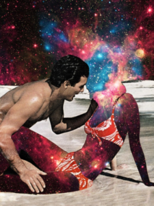
Technical analysis 

When looking at this photo montage, we cannot securely tell which type of lighting, lens, shutter speed or white balance that the man in the image has been taken in due to there being no background for us to see if there was natural lighting involved, absent background means we also cannot see if the original image was taken in a short or long depth of field or if the shutter speed was fast or slow.

Visual analysis 

When looking at this image, i can see that the picture has been edited with Photoshop due to the very neat editing on the human out shape which couldn’t be done with hand manipulation.  We can see that the galaxy background has been edited so that it blends in with the head. The outline of the human is shown to be wearing a bikini and therefore shows that this is a woman and that the original picture could have been taken at a swimming pool/ beach as the man is also shown to have no top on.  The subjects have also been shown as located on a moon due to the light grey surface they are lying on.

Conceptual analysis 

When visually looking at this image i firstly notice the artificial human who has been shown with a galaxy effect, thus ten draws me in to look in more detail and i noticed that the galaxy on the women head to the background as been blended so that its like the woman and the sky are as one. This suggests to me that the situation the artificial woman is in is ‘out of this world’ and that she feels very happy, so much so that her mind is everywhere which has been shown with her relation to the sky. However, the positioning of the male could also suggest that the main focus is on him and not the woman. The way that the man is leaning into the artificial woman could show that the man thinks she is ‘out of this world’ as the galaxy is outside the world and the image could be what he seed her. Overall this image is very up to debate.

Contextual analysis 

After doing thorough research, there was no information on what the image was about. Therefore, Loli left this photo montage u to debate.


John Stezaker

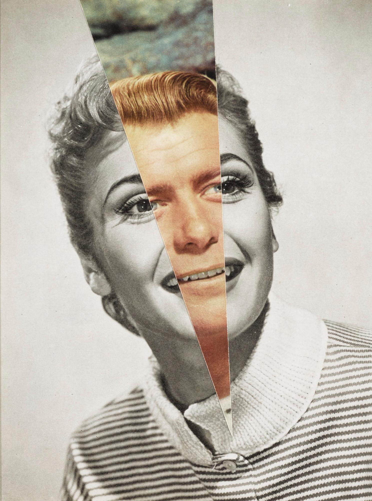
Stezaker was a British conceptual artist who was born in  1949. In his photography he takes a very imaginative look towards human beings and this shows in his work which has known to be described as ‘surreal’. His work aims to re-examines the various relationships to the photographic image: as a documentation of truth, purveyor or memory. In his photo montages, Stezaker appropriates images found in books, magazines and postcards and use them as ‘readymades’. Stezaker adopts the content and contexts of the original images to convey his own meanings. I believe that he has met his artistic aim. This was shown in his Marriage series. In the series, Stezaker focuses on the concept of portraiture, both as art historical genre and public identity. Using publicity shots of classic film stars, Stezaker overlaps famous faces, creating hybrid ‘icons’ that dissociate the familiar to create sensations of the uncanny. Coupling male and female identity into unified characters, Stezaker points to a disjointed harmony, where the reconciliation of difference both complements and detracts from the whole. In his correlated images, personalities (and our idealisations of them) become ancillary and empty, rendered abject through their magnified flaws and struggle for visual dominance.

His creations..
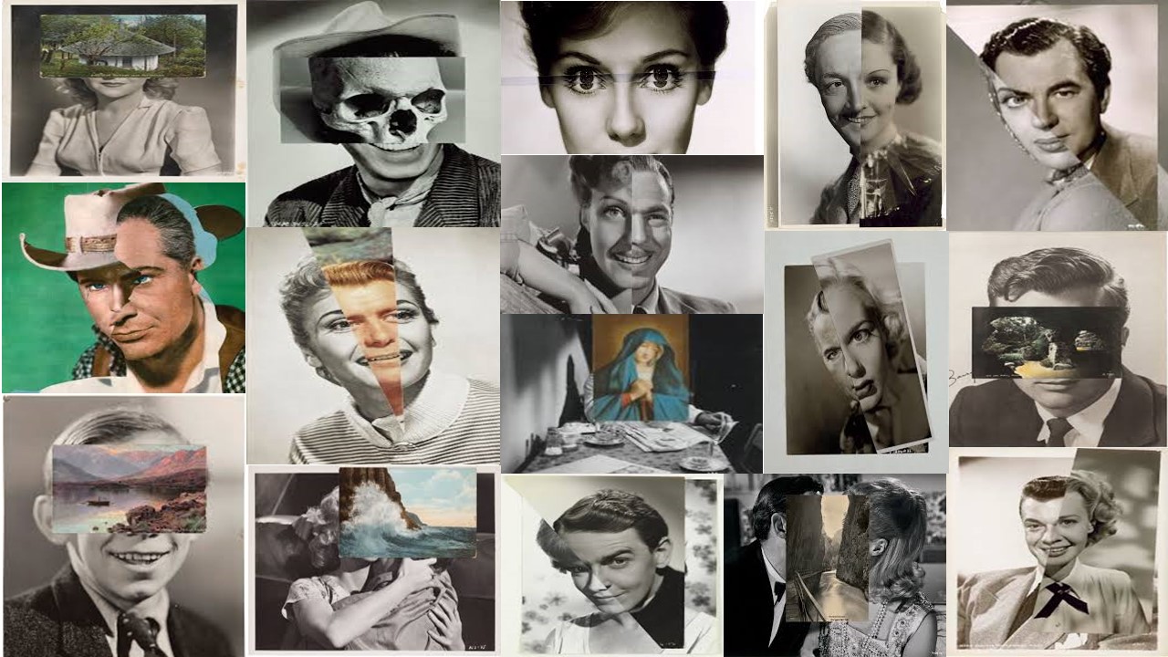
Analysation picture
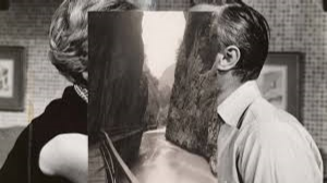
Technical analysis 

When looking at this image, we cannot clearly tell the type of lighting that this image was taken in. However, due to the indoor scenery, this gives us an idea that the original picture was taken in artificial lighting. We can see from the background that the image was taken with a shallow depth of field as the background of the two people is blurred and this was therefore also taken in a quick shutter speed. The picture which has been layered on top is seen to be taken in a wide depth of field, in natural lighting and to have had been taken with a quick shutter speed due to the fully focused, outdoor, fully focused image. Due to the layered image being taken outside, the white balance of this image would have been taken with  the ‘outdoor’ setting.

Visual analysis

This image has been edited to be black and white which allows us to see the different tones. We can also see the this image is 3D due to the depth of field and the layered image. I think that the way the top image was layered has been done with a purpose as it cancels out the peoples faces so we cannot see if they are kissing or not. The two walls on the side of the top image seem to represent the two faces on each side, while the gap and the river represent the gap which is under that image. Suggesting that the two people are not kissing.

Conceptual analysis 

I think the reasoning for this image being layered on top is because Stezaker wants to cancel out any intimacy between the two people, and doing so he has used the river and rocks to show their separation.  This could suggest he has recently gone through a separation with a partner and he is showing this through this image. This image is very up to debate and has a lot of different concepts.

Contextual analysis 

After researching about this image, i came to a dead end and Stezaker didn’t publicize anything about this image. He has therefore left this image up to debate.
Photomontage — Artist comparison

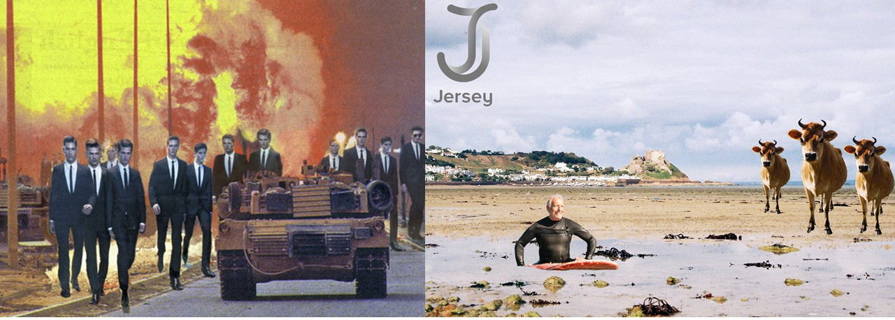
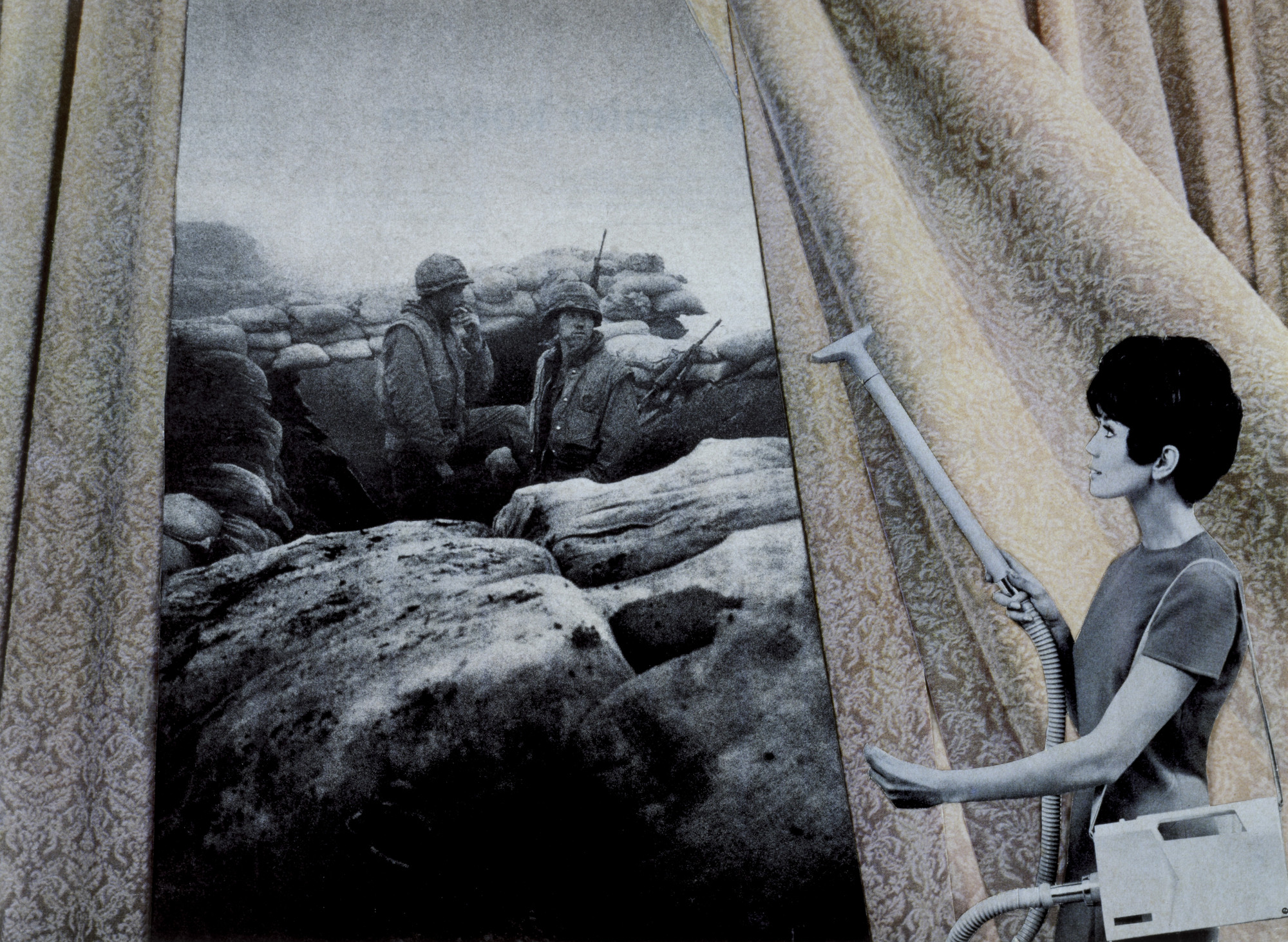
When looking at Rosler’s work and comparing it to mine she aims at more sensitive topics like war and the people behind war as shown in the image below. Where as I was going for a less serious and more jokey topic. Her work, specifically this image, influenced me because of when I put one cow in I thought that the image looked empty so to get some inspiration for what to put in the to fill some of the empty space I saw this image and thought to repeat the cow and put it in different places and with different sizes. If I had other pictures of cows I would have used them but as I didn’t I decided to use the same one but just change the size of it.

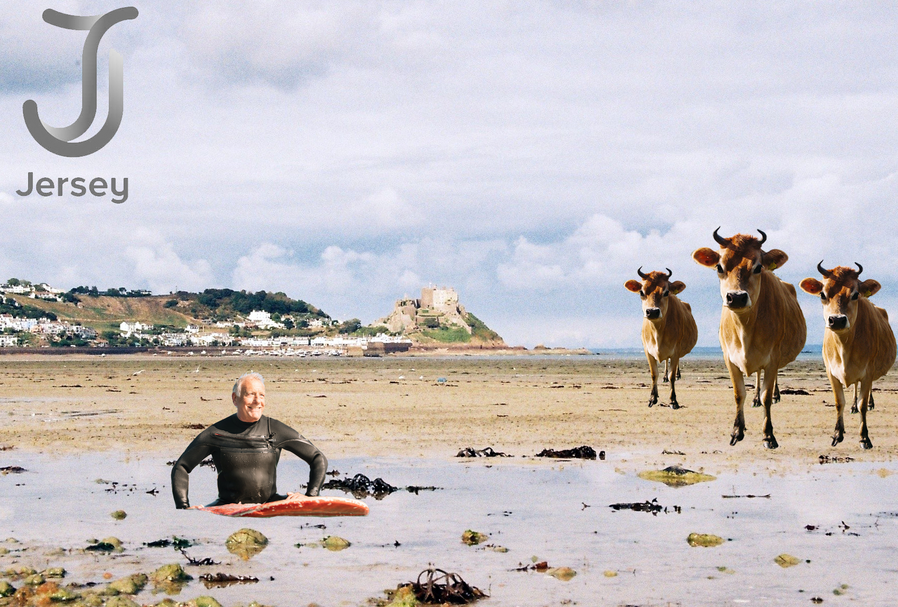
Photomontage — Final Image

When making the image I decided to make multiple copies of the cows and change their size, also the visit jersey logo had to be slightly larger than I originally planned because of the shade of it and it almost blending in to the sky in the photo.

I think that the background image is good because it means that any messy edges are not as apparent, the reason for this is because it was taken on 35mm film, and so was the photo of the bull.

Studio lighting portraits


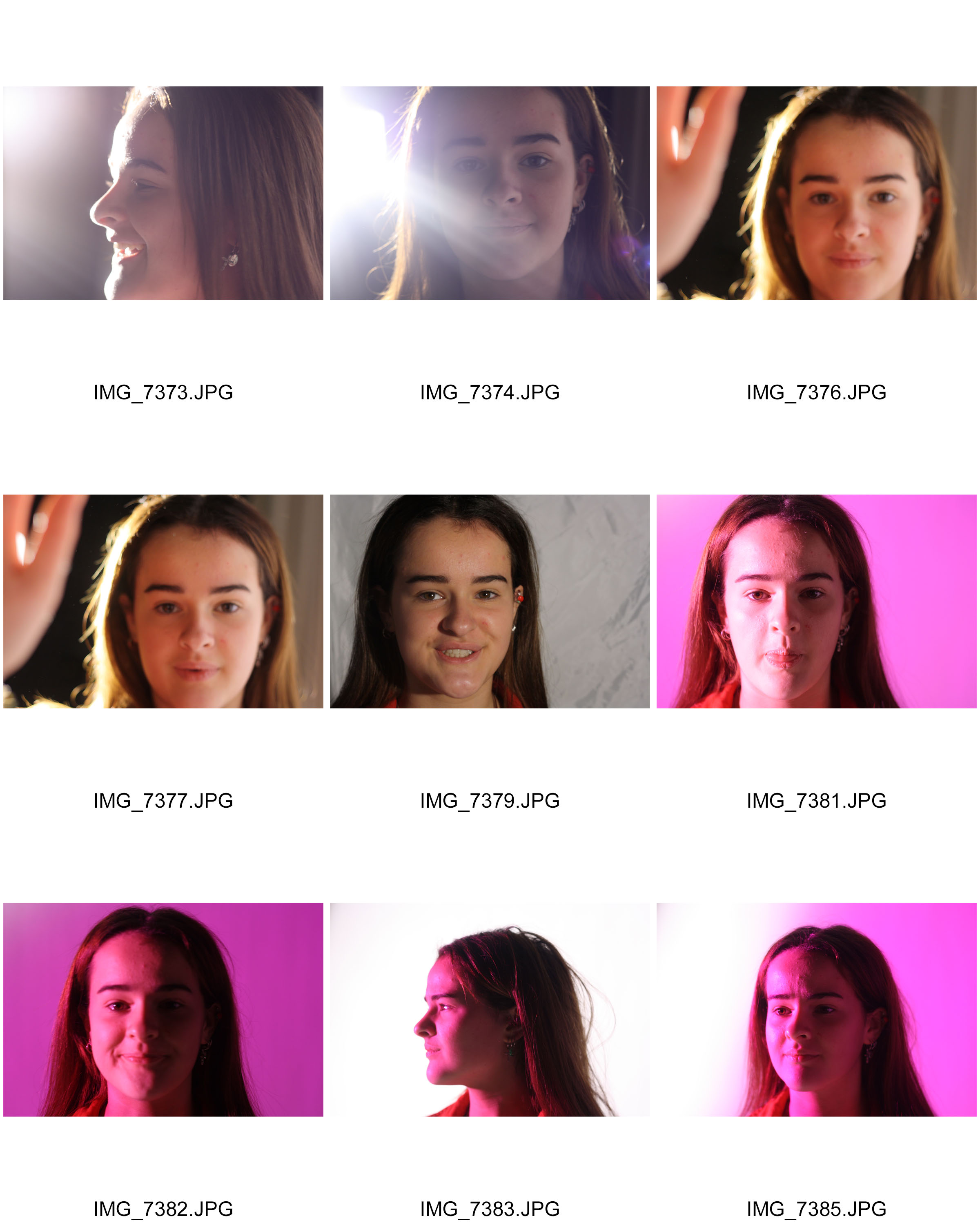
In class we experimented using different studio lights and color filters. The problems i faced were a lot of my images were blurry. This was because my shutter speed was to low and my focal point of the camera was not set to the middle. Next time i do this i am going to try work on this in the studio. Making my images in focus and have a specific focal point and focus.


Jesse Draxler and John Stezaker artist References – Photomontage

Jesse Draxler

Image result for Jesse Draxler

Image result for jesse draxler artist eerie

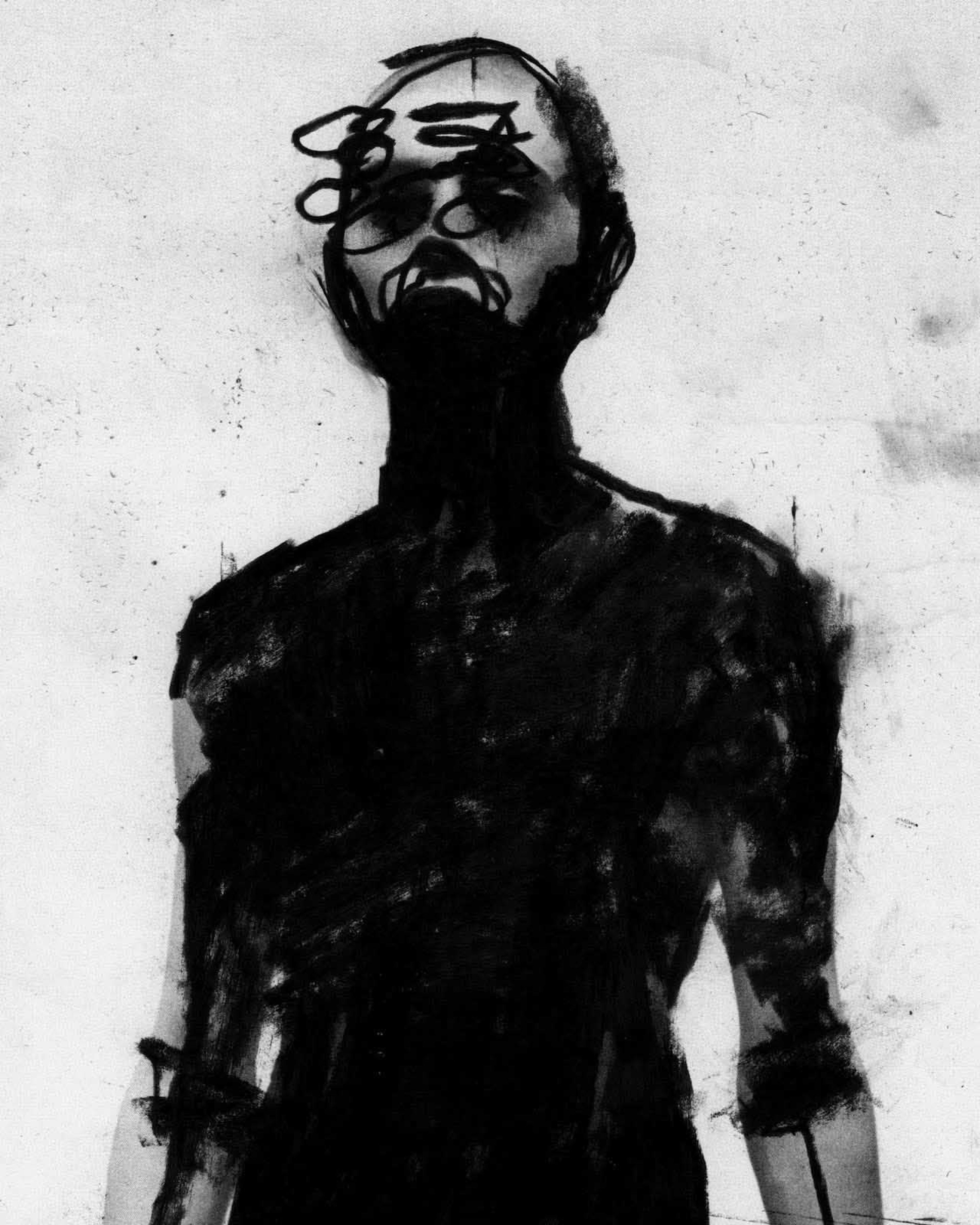
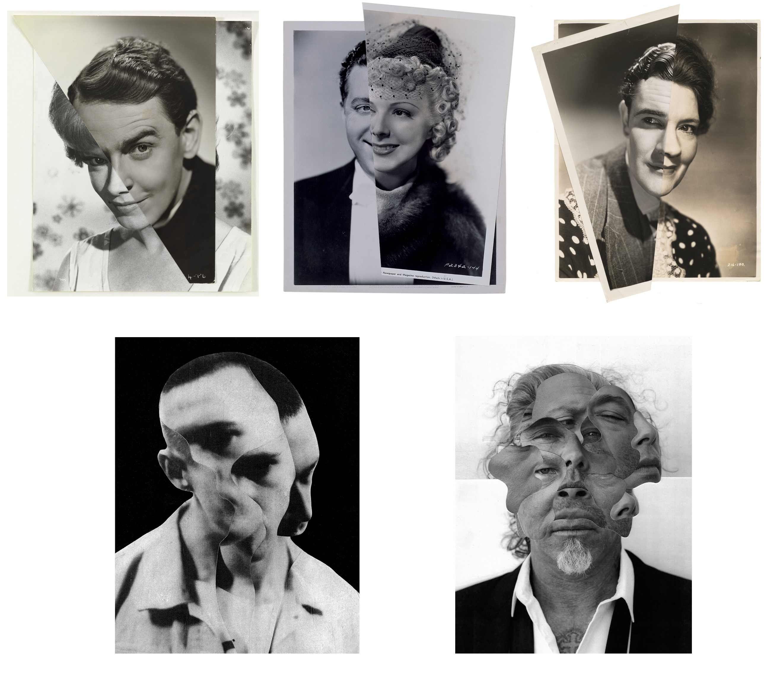
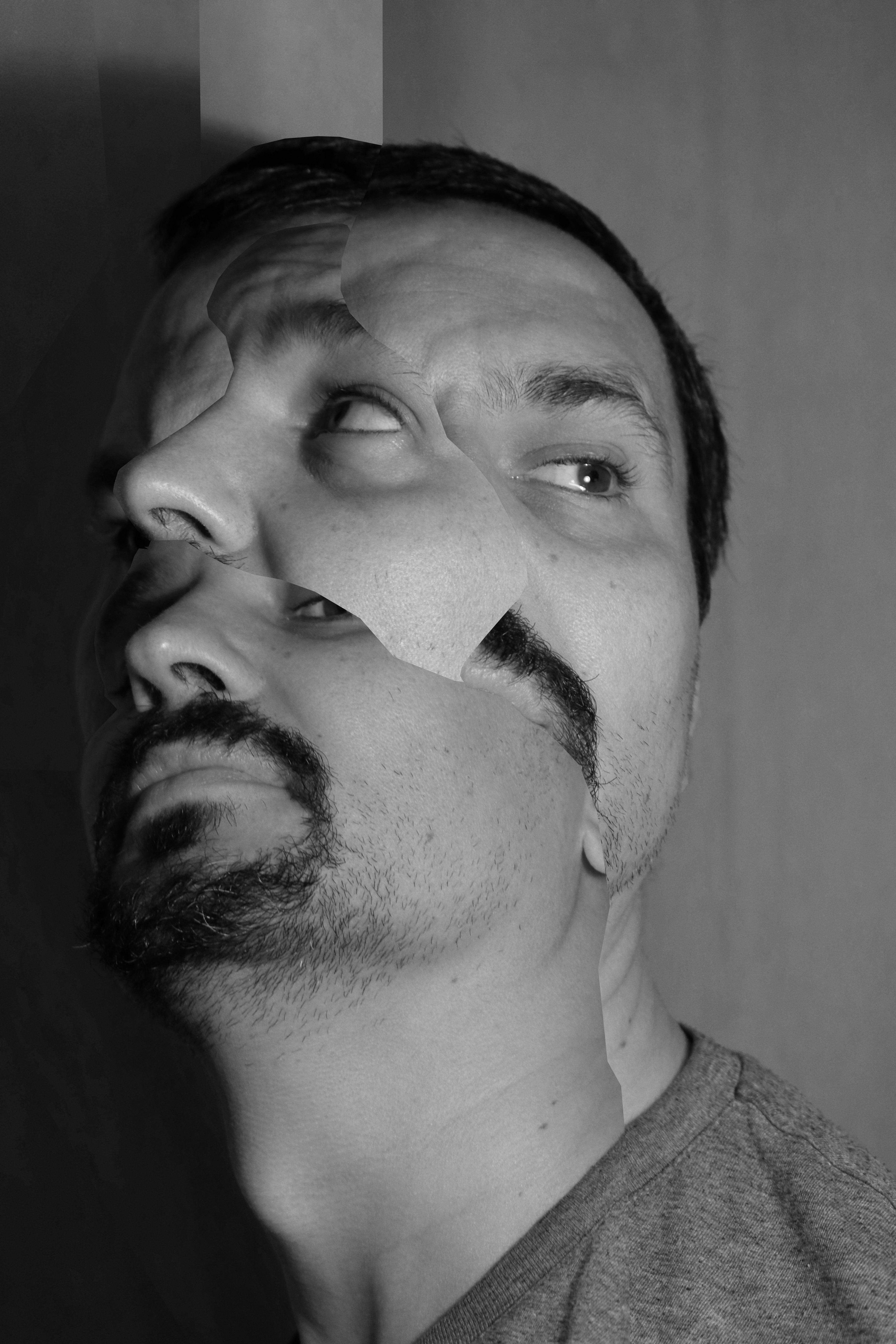
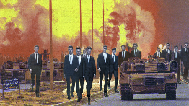
Jesse Draxler is an American artist, born in 1981 in Wisconsin, lives and works in Los Angeles, and has obtained his Bachelor of Fine Arts from the College of Visual Arts in St. Paul, Minnesota. His work primarily involves own photography and archived images which are then heavily manipulated and distorted to create eerie scenes which are always presented in gray scale for a sinister and vintage effect.

John Stezaker

Image result for john stezaker

Image result for john stezaker

John Stevaker is an English conceptual artist and was born in 1949, in Worcester, and graduated with a higher diploma in fine art in 1973 from Slade School of Art in London.

In the early 1970s, he was among the first wave of British conceptual artists to react against what was then the predominance of Pop art. His work is surreal in tone and is often made using collage and the appropriation of pre-existing images such as postcards, film stills, and publicity photographs.

MoodBoard

Responses

Chiaroscuro Lighting

Chiaroscuro, (from Italian: chiaro, “light,” and scuro, “dark”) technique employed in the visual arts to represent light and shadow as they define three-dimensional objects.

Some evidence exists that ancient Greek and Roman artists used chiaroscuro effects, but in European painting the technique was first brought to its full potential by Leonardo da Vinci in the late 15th century in such paintings as his Adoration of the Magi (1481). Thereafter, chiaroscuro became a primary technique for many painters, and by the late 17th century the term was routinely used to describe any painting, drawing, or print that depended for its effect on an extensive gradation of light and darkness.

In its most dramatic form—as in the works of those Italian artists of the 17th century who came under the influence of Caravaggio—it was known as tenebrismo, or tenebrism. Caravaggio and his followers used a harsh, dramatic light to isolate their figures and heighten their emotional tension. Another outstanding master of chiaroscuro was Rembrandt, who used it with remarkable psychological effect in his paintings, drawings, and etchings. Peter Paul Rubens, Diego Velázquez, and many other, lesser painters of the Baroque period also used chiaroscuro to great effect. The delicacy and lightness of 18th-century Rococo painting represents a rejection of this dramatic use of chiaroscuro, but the technique again became popular with artists of the Romantic period, who relied upon it to create the emotive effects they considered essential to their art.

Some examples of Chiaroscuro lighting
Chiaroscuro Lighting Technique and How It Works
There are lots of ways you can add depth to your shot - you can place objects in the foreground and background, use a shallow depth of field, or employ the parallax effect. But chiaroscuro is one method you should know and use every time your shoot involves lighting.

In essence, this lighting technique seems simple enough -- use dimmer and brighter lights in opposing succession to create contrast (light/dark), however you'll soon find out, when handling such unwieldy things as lights, that it's true what they say: cinematography is basically painting with light -- and painting ain't no easy task.

I created a mood board to show some examples of chiaroscuro lighting: 

Photomontage — Artist Study Martha Rosler

Martha Rosler is an American artist. She works in photography and photo text, video, installation, sculpture, and performance, as well as writing about art and culture. Rosler’s work is centred on everyday life and the public sphere, often with an eye to women’s experience. Recurrent concerns are the media and war, as well as architecture and the built environment, from housing and homelessness to places of passage and systems of transport.

The work of hers that appeals to me is her photomontage work. The reason for this is that it has a message, the images aren’t just face value they are trying to make a statement. Sometimes the statement that she is trying to make is slightly controversial.

What she does it either takes or obtains images and then overlays parts of hem on-top on on another normally making it look obvious that she has done it, she doesn’t try to hide the fact that she has made adjustments to the images.

Here are some examples of her work:

Image result for martha roslerImage result for martha roslerImage result for martha rosler

Photomontage — Idea plan

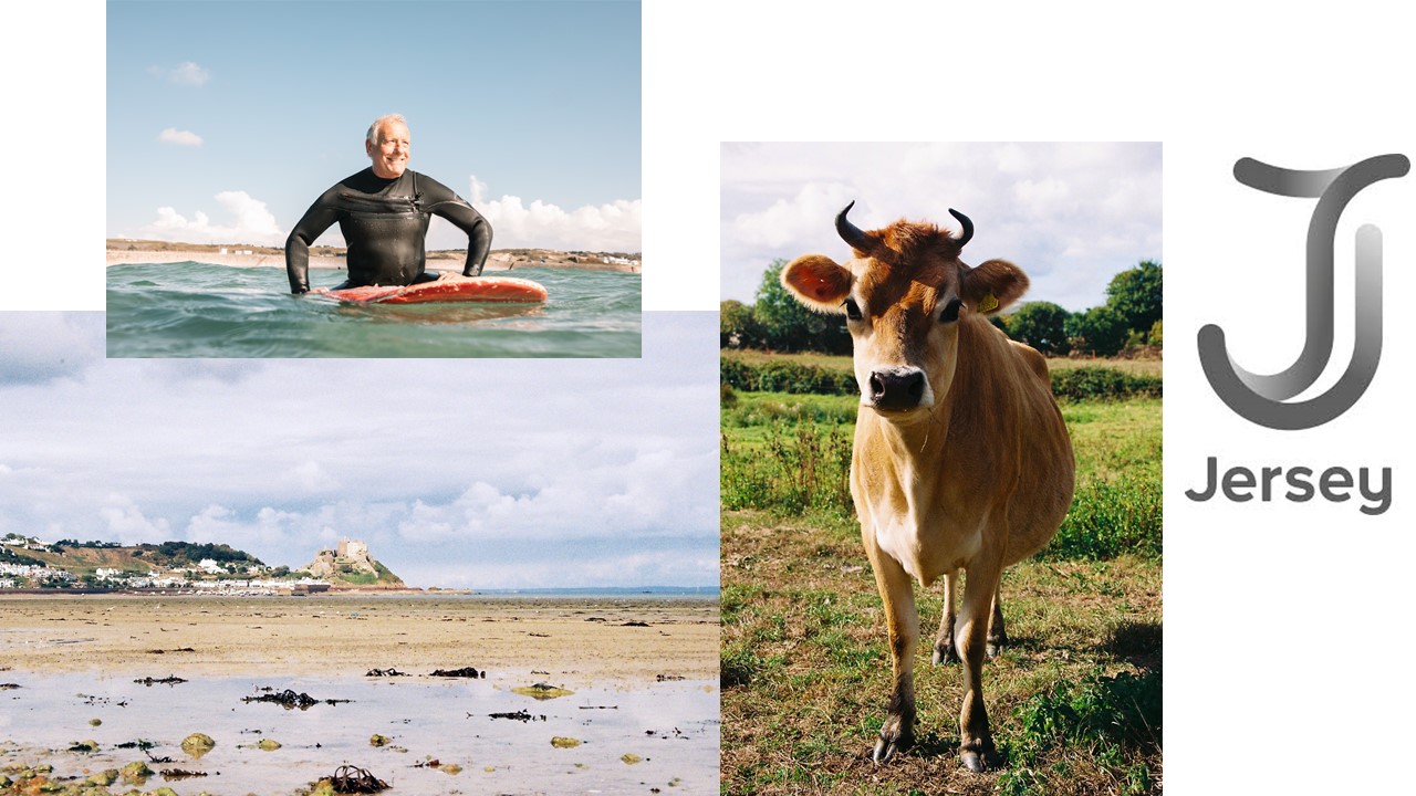
My thought is to try and make something that imitates the “visit Jersey” adverts, the reason that I am going to do this is that I already have a large selection of images that  are of Jersey land marks and ‘Quintessentially’ Jersey things. Therefore I will find a landscape of a castle or something that is clearly from Jersey and then overlay somethings like Cows and surfers.

The cow and the landscape are my images and the other two are taken from the Jersey tourism, my plan is to use the landscape as the background and then cut the cow out and put it on the right of the image. I will also cut out the surfer and put him is the small puddle at the landscape. Finally I will use the magic wand tool  and get rid of the background of the logo.