Studio – Lighting Techniques – Natural Lighting

Natural Lighting

Light Intensity, White Balance & Temperature

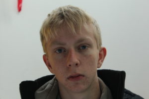
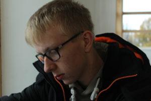
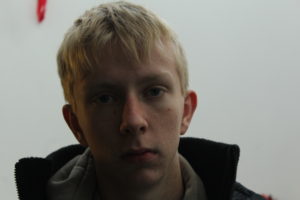
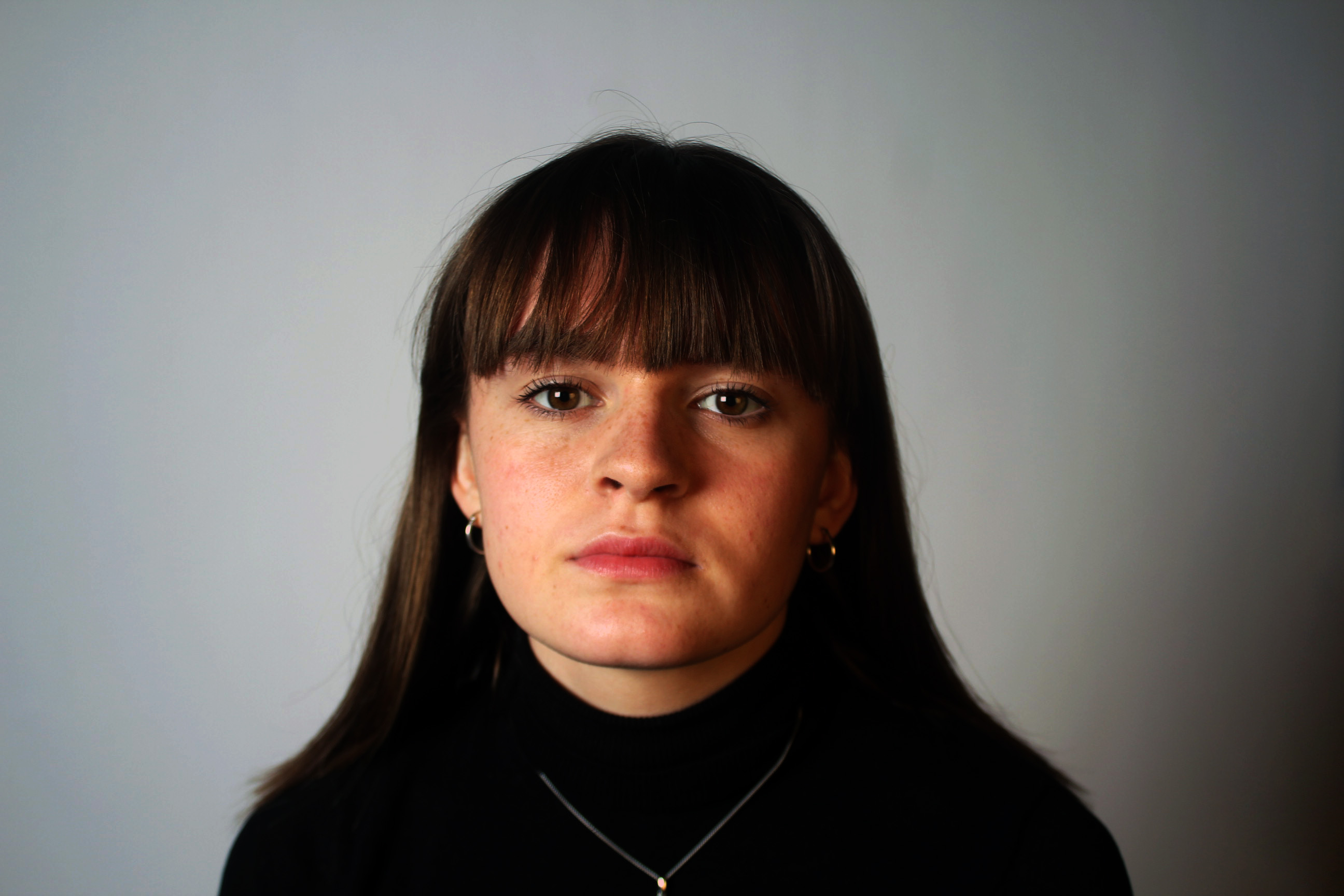
Light intensity refers to how harsh or soft the light is and can change quickly. Direct sunlight usually produces harsh light, especially during the middle of the day. This is not ideal for portraits because shadows are short and deep and contrast will be high. As I was next to a window here and inside: the light is soft and cool toned, there is no warmth from the sun or any artificial lighting. I’ve found that when taking photos in the day it is better to take them inside as there is no harsh lighting. If you are shooting outside in the sun, the subject will have warm tones and the lighting will be harsher. However you can still shoot outside and avoid harshness, for example, shooting in the “golden hour” produces a soft, diffused light and is more flattering than the harsh sun. Clouds covering direct sunlight can create a softer more diffused light as well making or a more flattering cooler toned portrait.
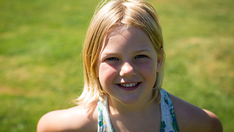
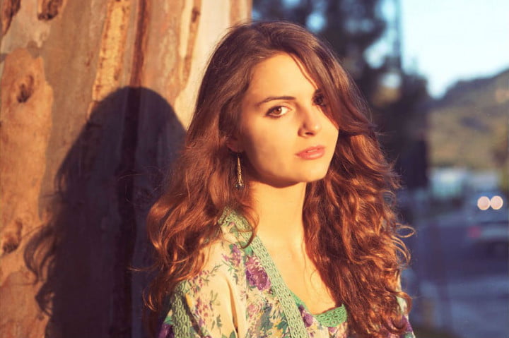
Examples of harsh direct sunlight and golden hour:

Light Direction

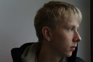
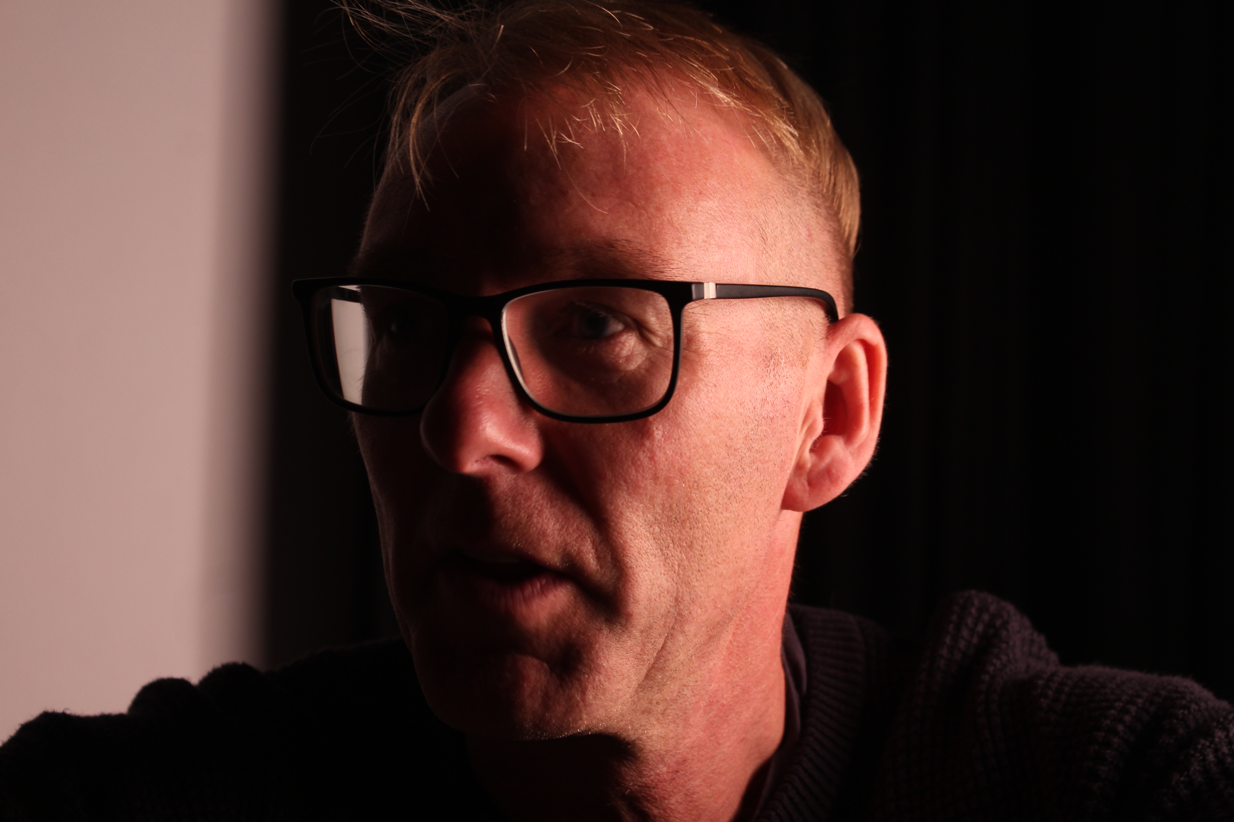
This is the direction that the light is coming from, the direction of light on your subject is one of the most important aspects of creating a strong portrait. The way light hits your subject will display the highlighted features, the emotional appeal and the viewer’s perception. Back lighting, front lighting, side lighting and top lighting are the four main types of directional lighting. Here I have used side lighting as it can easily be done by moving your subject into a doorway or next to a window. Side lighting gives more depth to a person and can help to create stronger emotions.

Reflectors

Reflectors are often used by photographers to redirect light towards a given subject or scene. Many reflectors have a black side that can be used to block out light instead of to reflect it. Reflectors are also great for bouncing a flash when there’s nothing around to bounce off of. There are white, silver, gold and black reflectors which all do different things. The white side casts a very soft, clean light and is useful in studio where flash is used, or when there is good light outside like during a sunny noon-time shoot. The metallic gold material casts a very strong warm light onto the subject.  The black side isn’t actually a reflector at all.  It’s an anti-reflector, black reflector to cast a shadow on certain areas of the image.  For example, if the lights are producing too even of a light on the model’s face, a the black side of the reflector can cut out the light on one side to create more artistic shadows. The silver side is great for shooting in low light or where a strong light is needed; however, the light is often too strong for mid-day shooting.

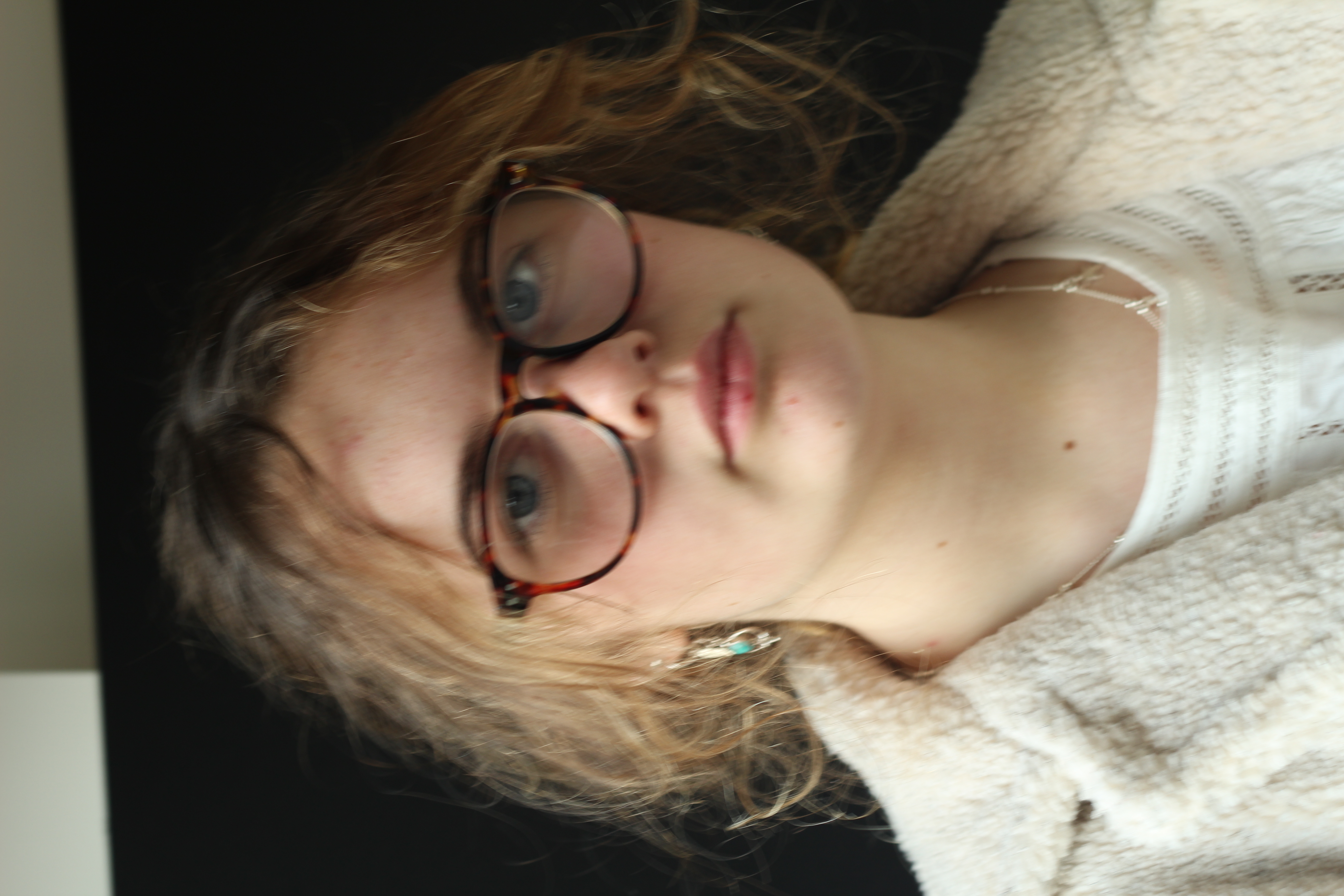
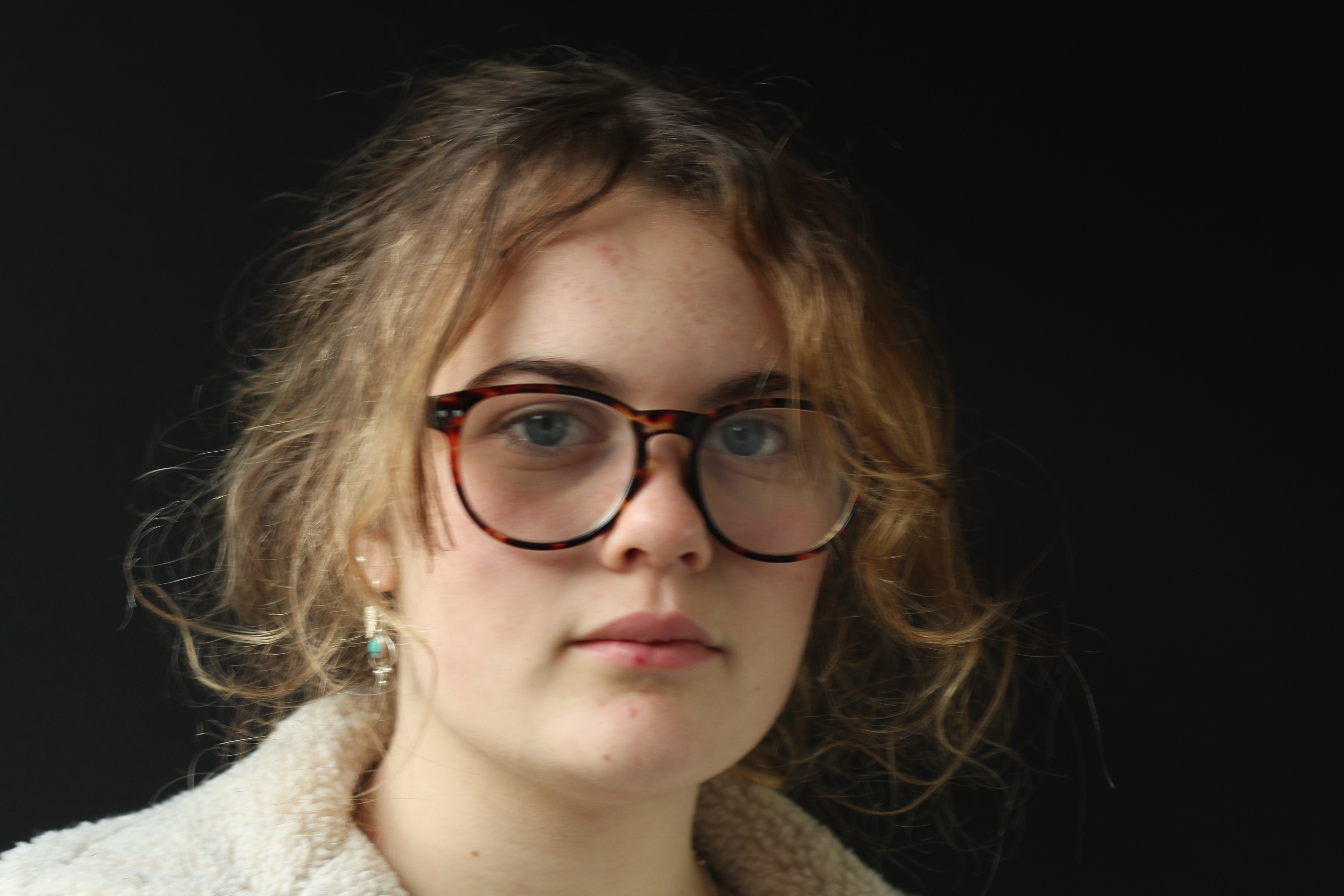
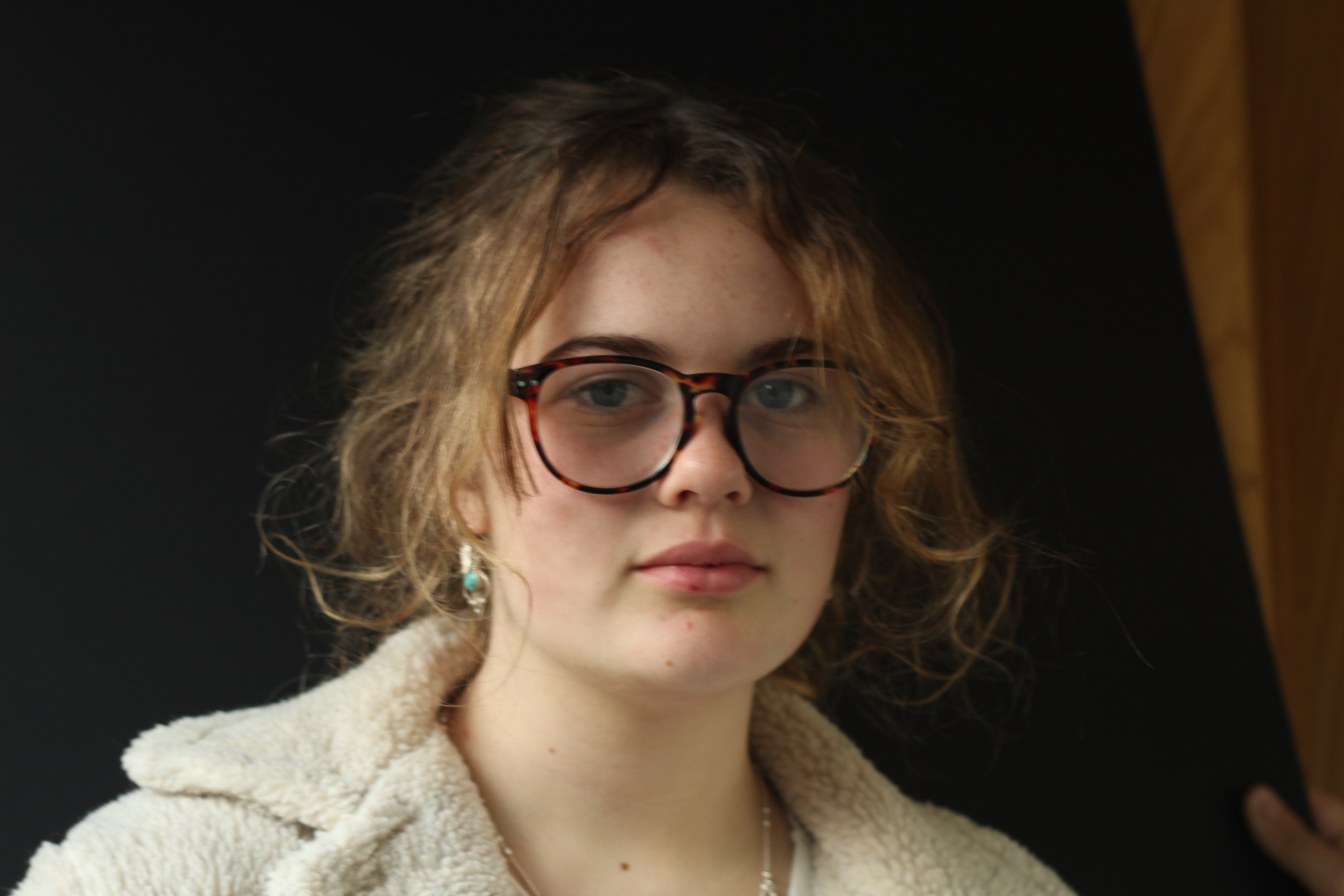
Gallery of my photos:

Best Outcomes
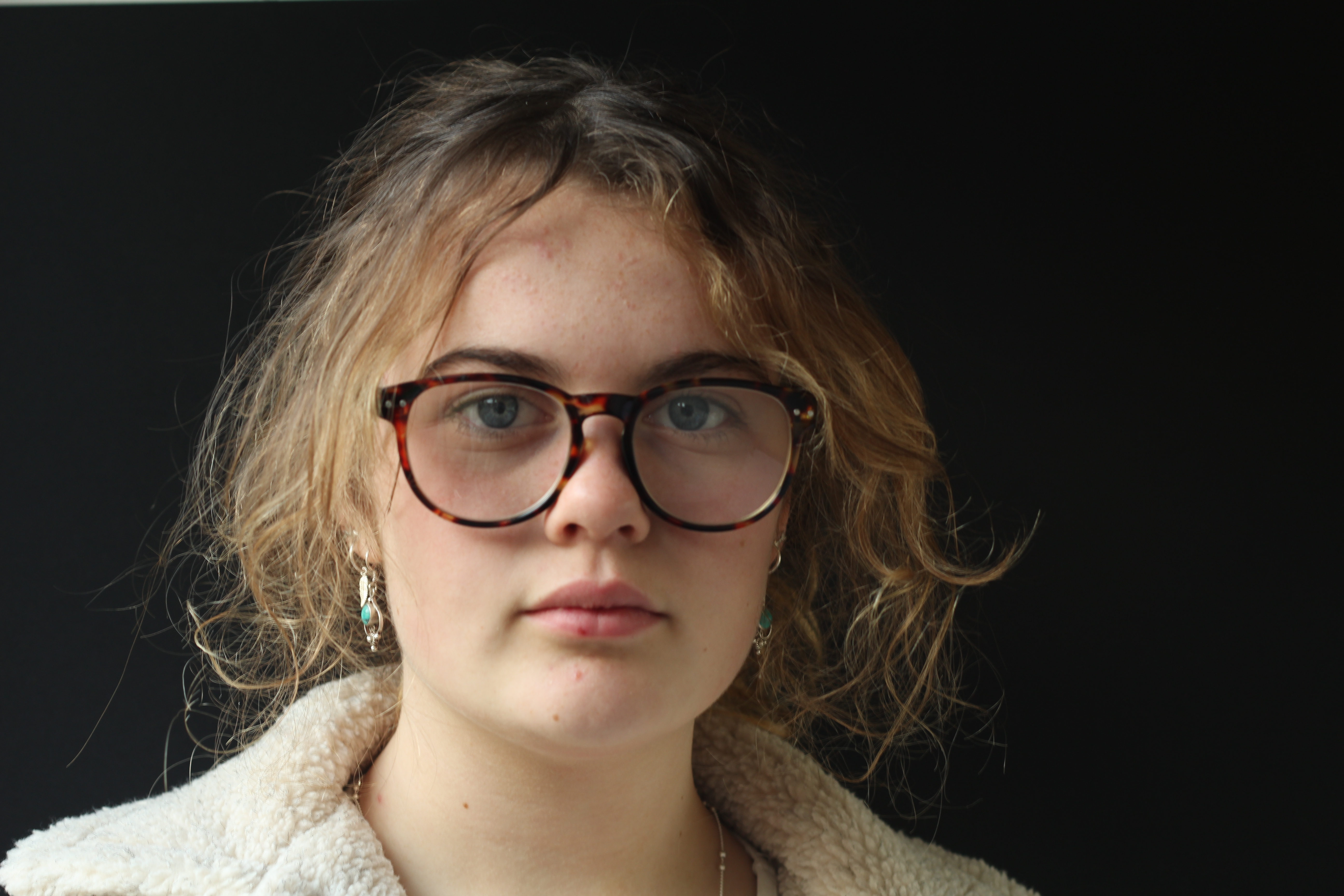
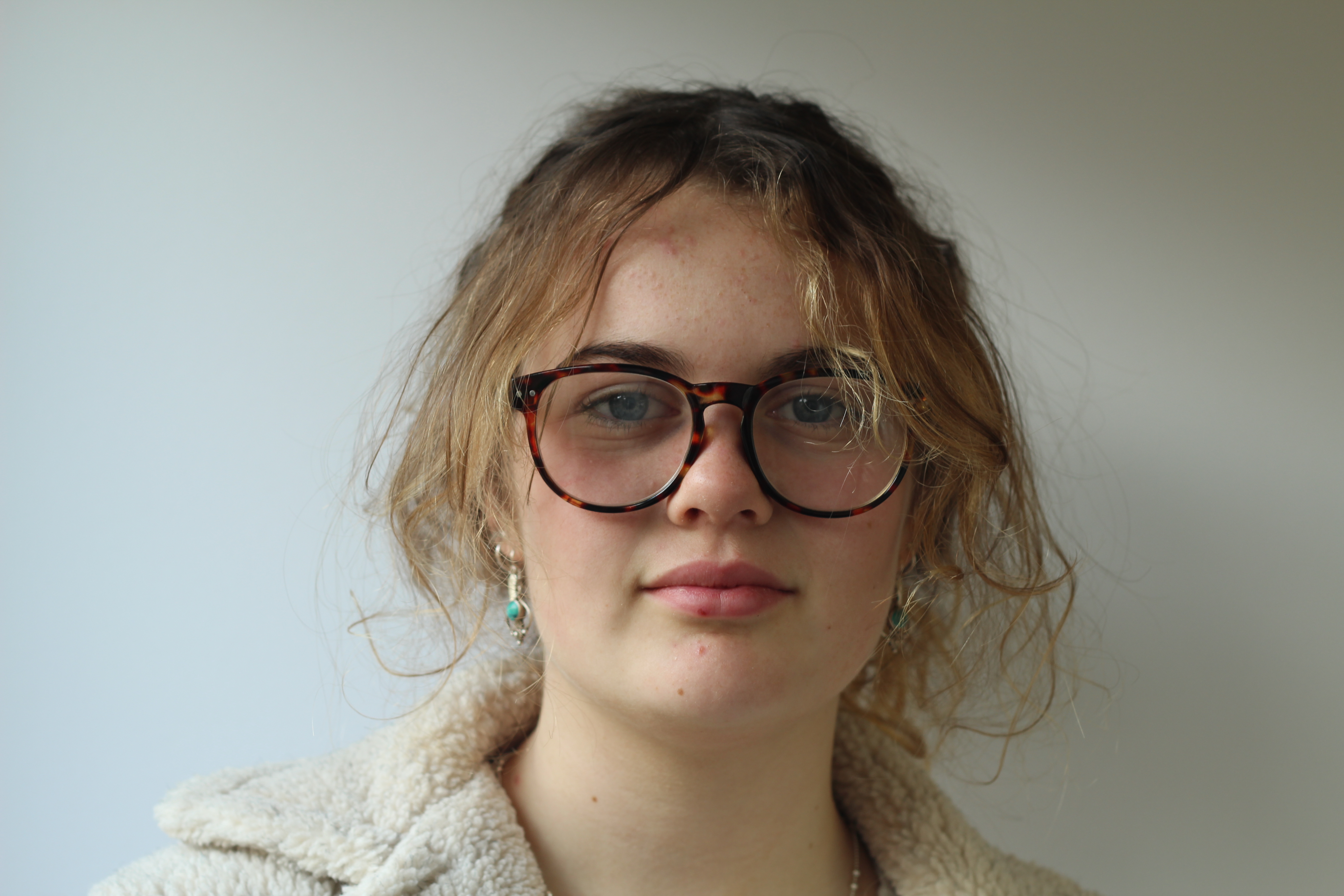
Portraits- Natrual lighting

Natural lighting

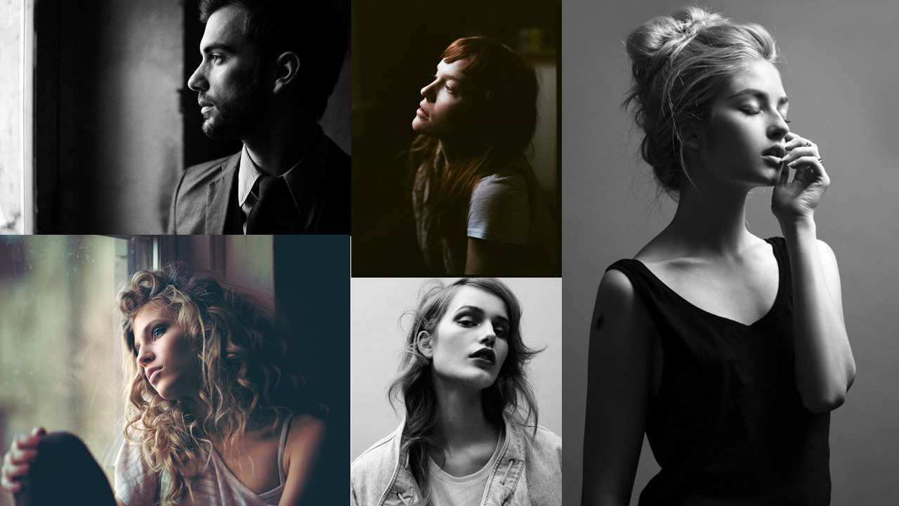
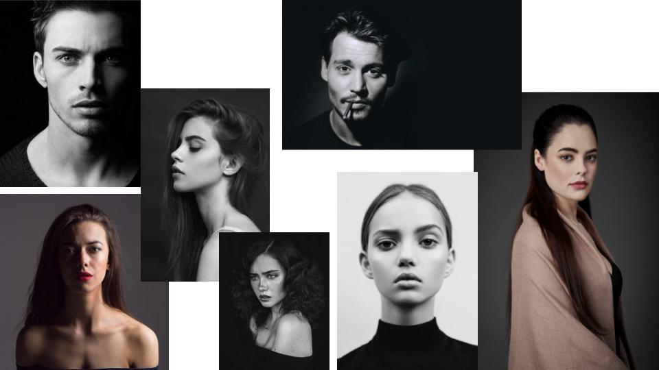
Natural lighting is the form of lighting that is mostly used in portraiture. Natural lighting can come at different intensities, temperatures and directions. These are all important to consider as all these factors can cause things like shadows, so you must use the lighting to your advantage in order to achieve the outcome that you want. I also used reflectors in this photoshoot so I could choose how the lighting illuminated certain parts of my models’ faces.  Below is a mood board that I used as inspiration on how to use natural lighting in portraiture:

Mood board

not my images.

Contact sheets

Best outcomes


Using reflectors

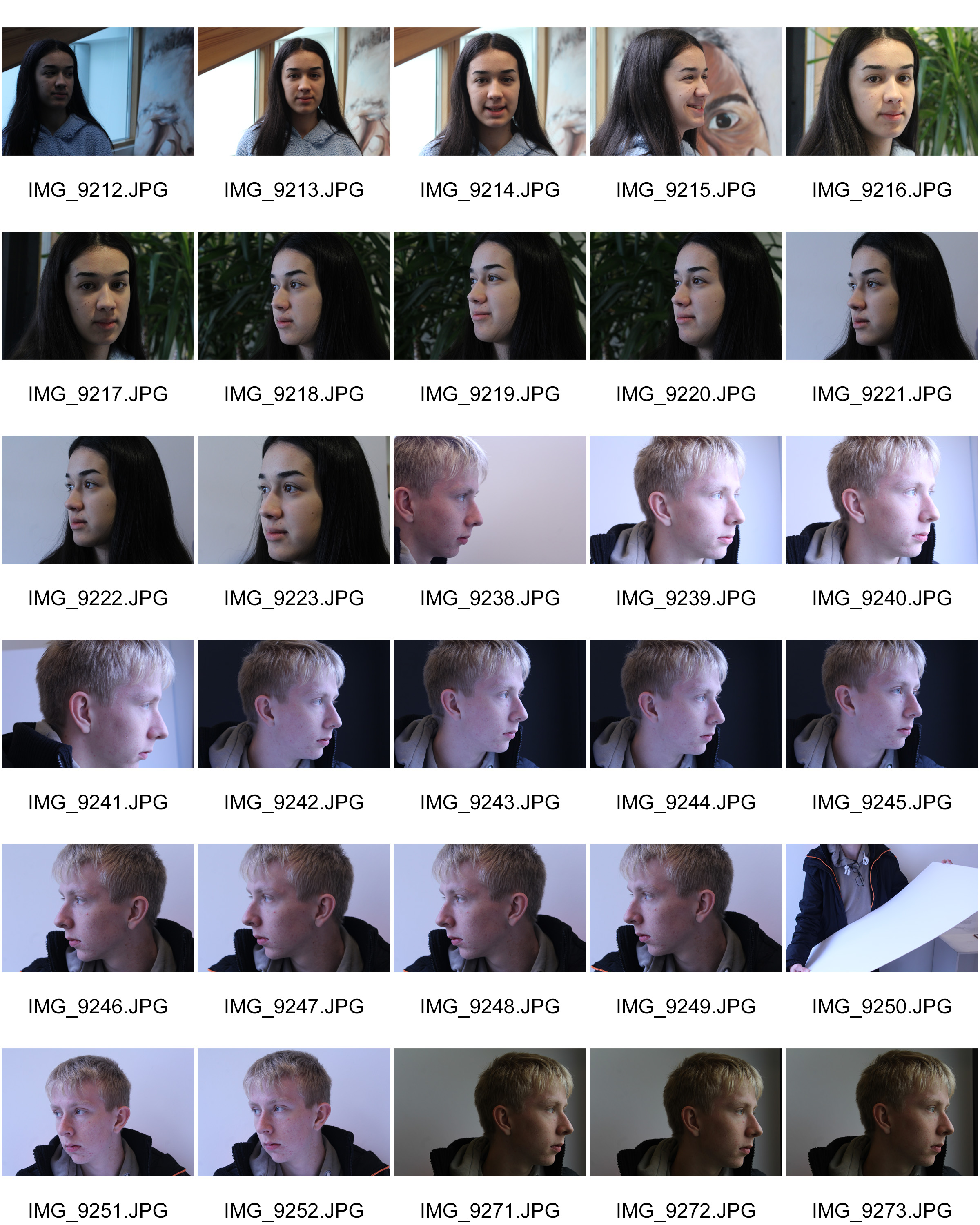
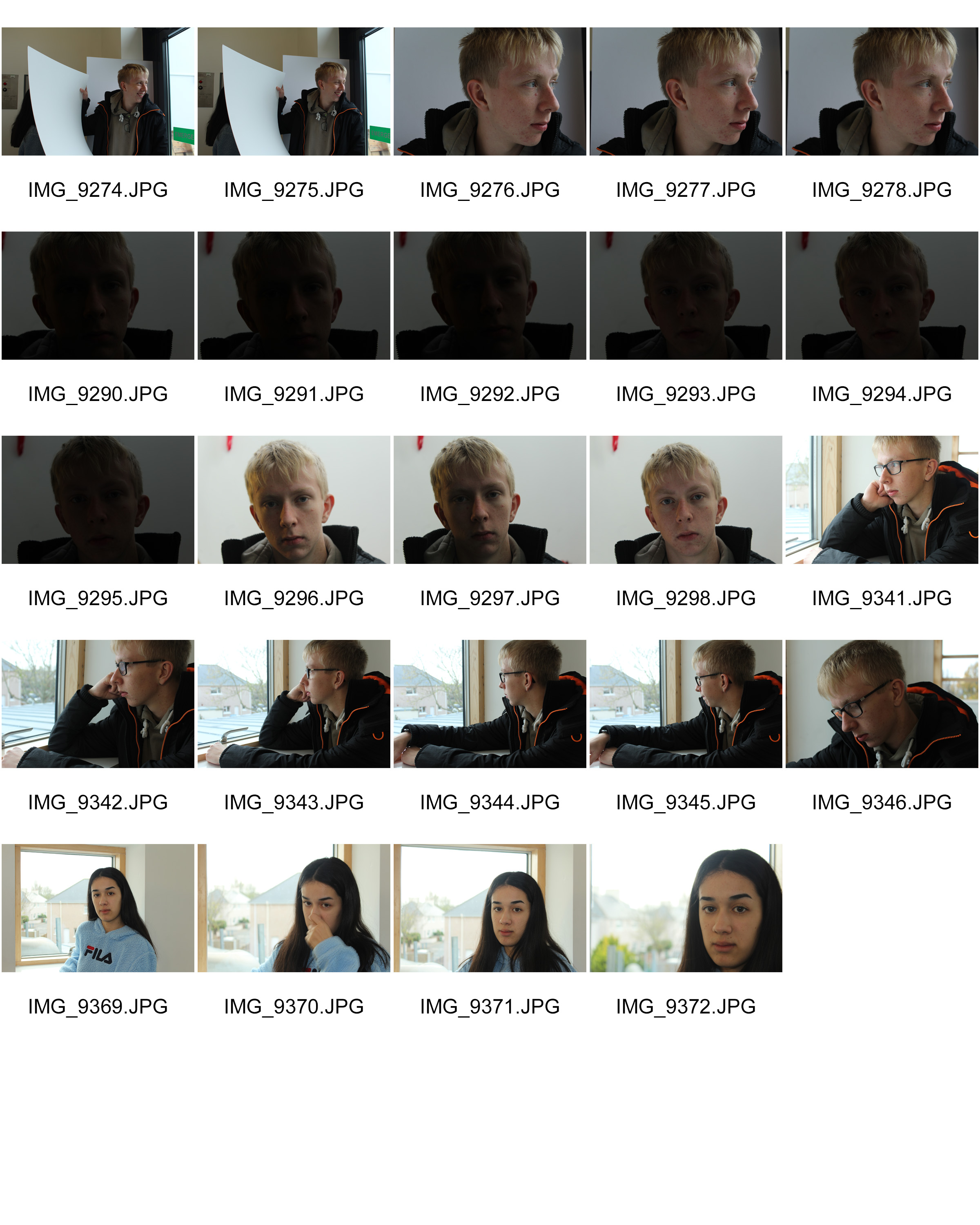
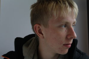
Below are 2 examples, using my own images, showing how using reflectors can change how a portrait look:


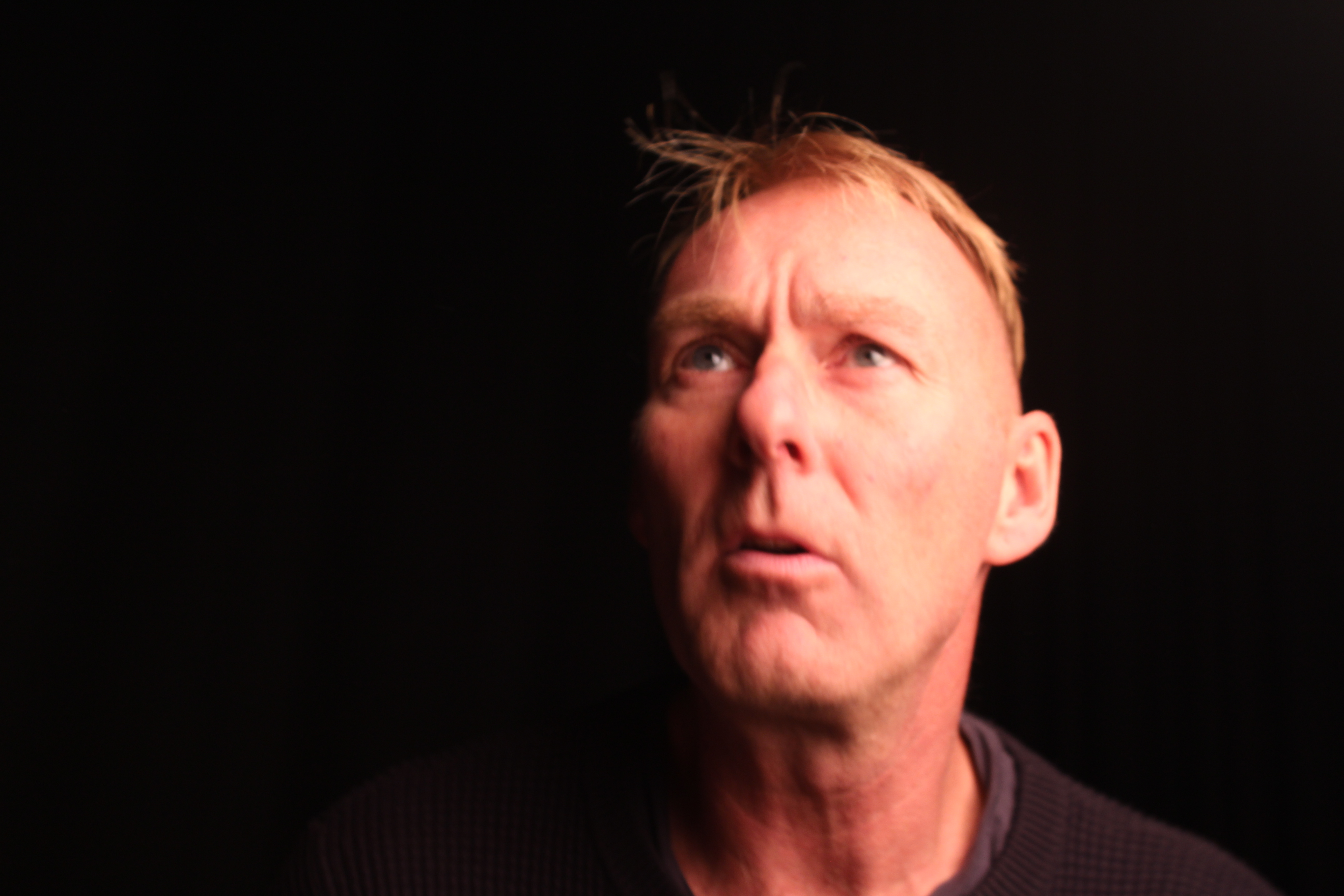
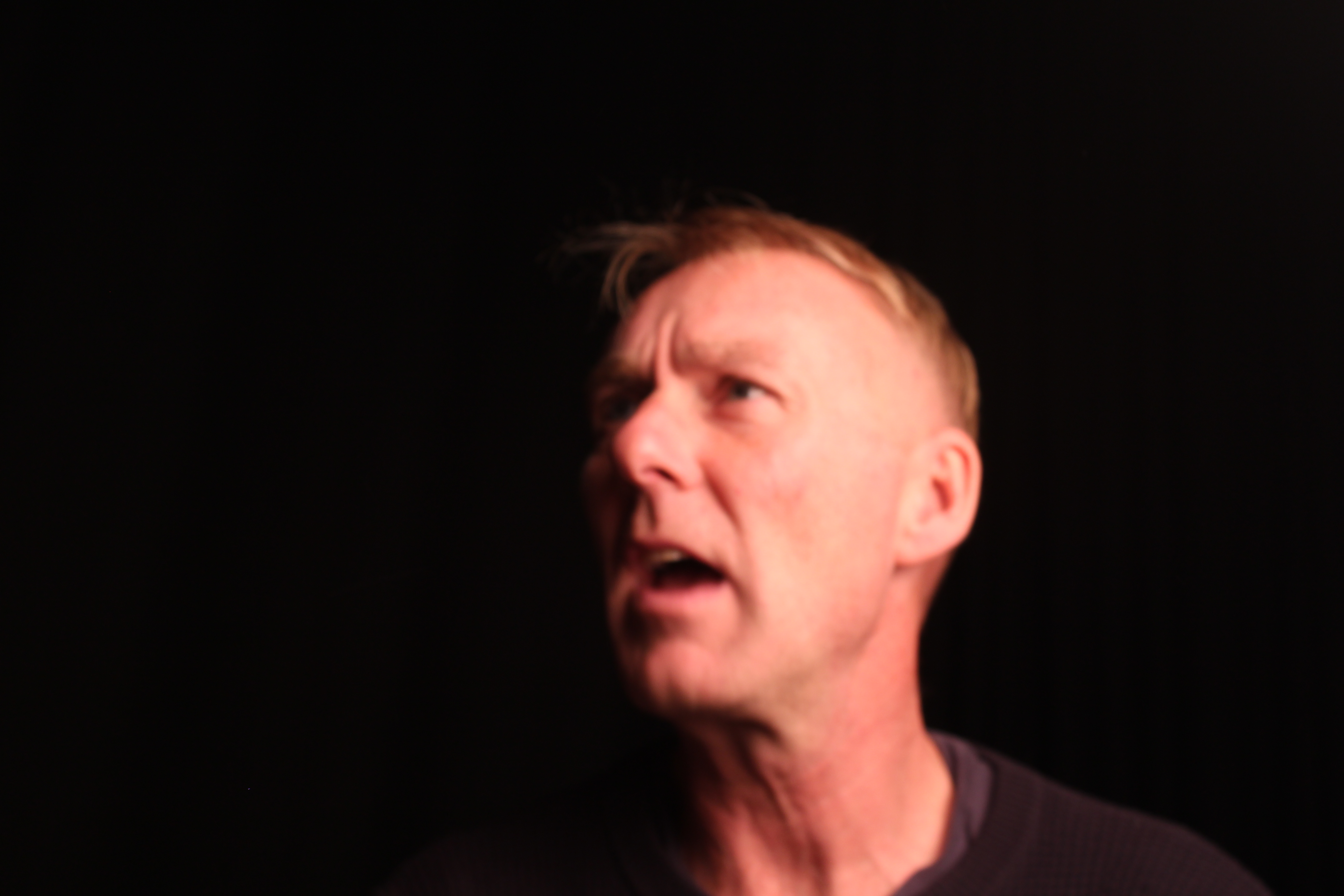
The images on the left were taken without a reflector. You can tell as the parts of the faces that aren’t in direct contact with the light, ended up shadowed. The images on the right are taken using white card as a reflector. You can tell as it made the other side of the face ended up lit up.

Analysing

Technical

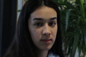
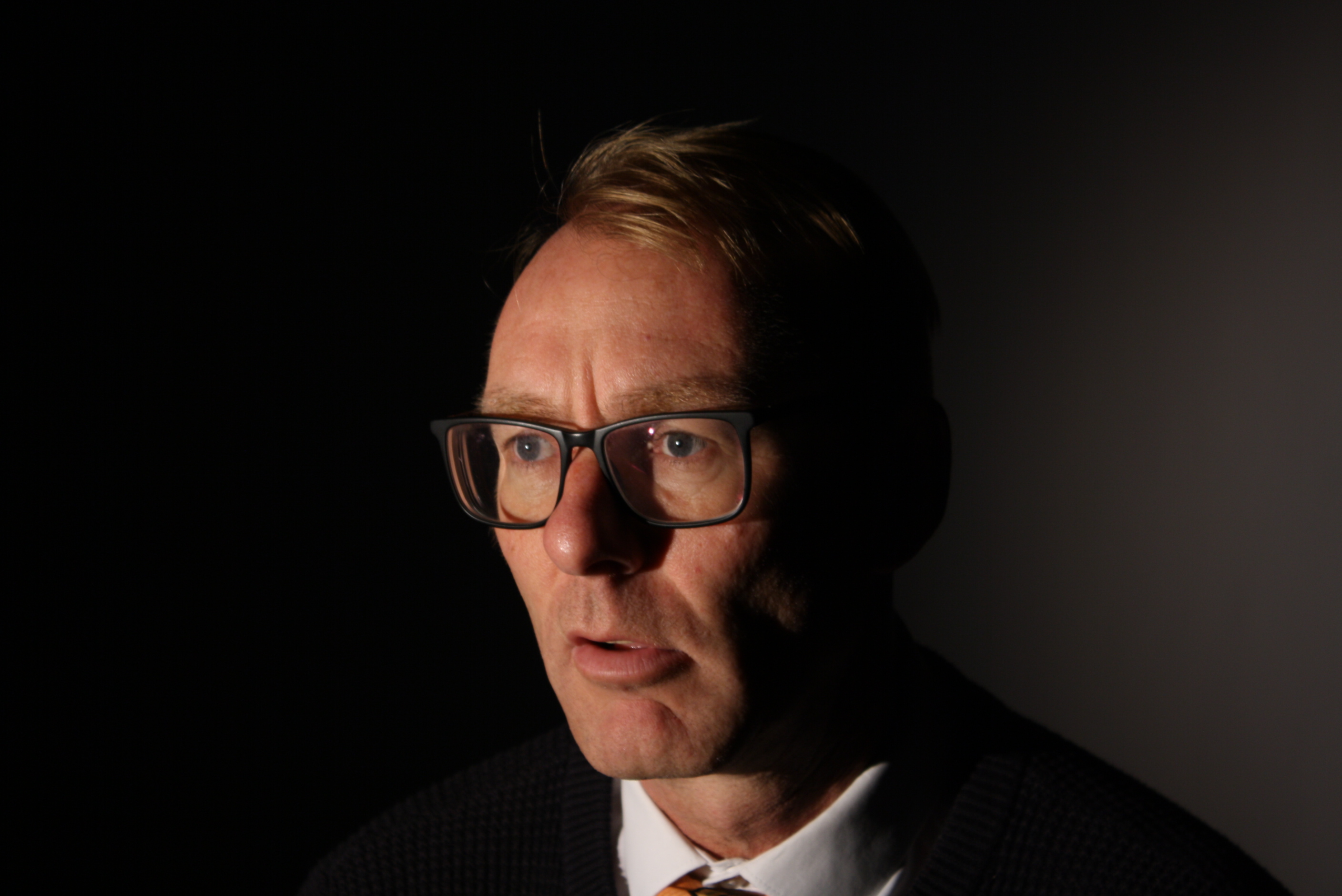
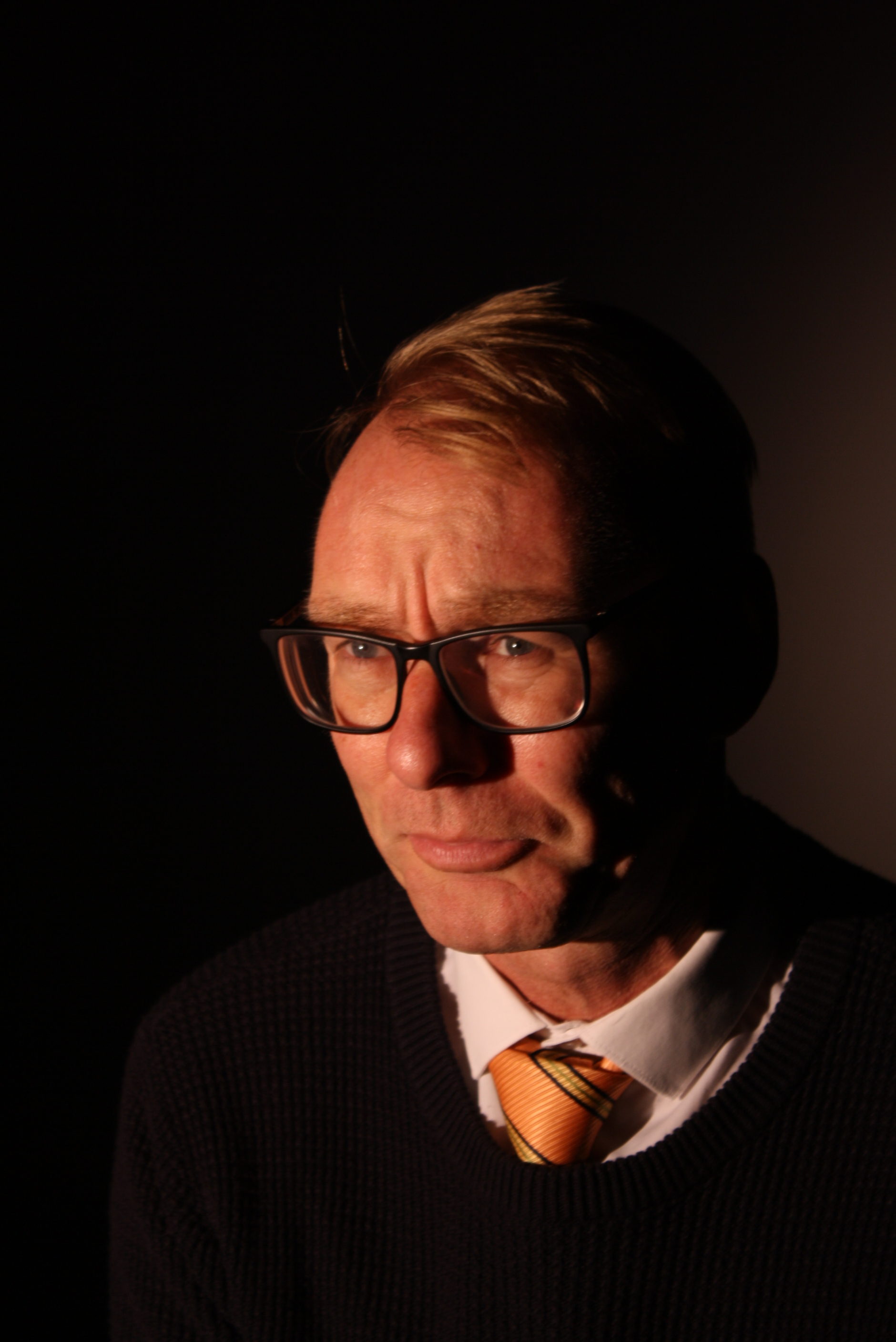
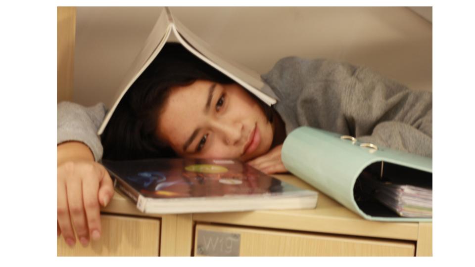
when taking this image my ISO was set to 800, and my shutter speed was set at 1/60.  These settings meant that this image had a long exposure time, so that it wasn’t dark and under exposed.

Visual

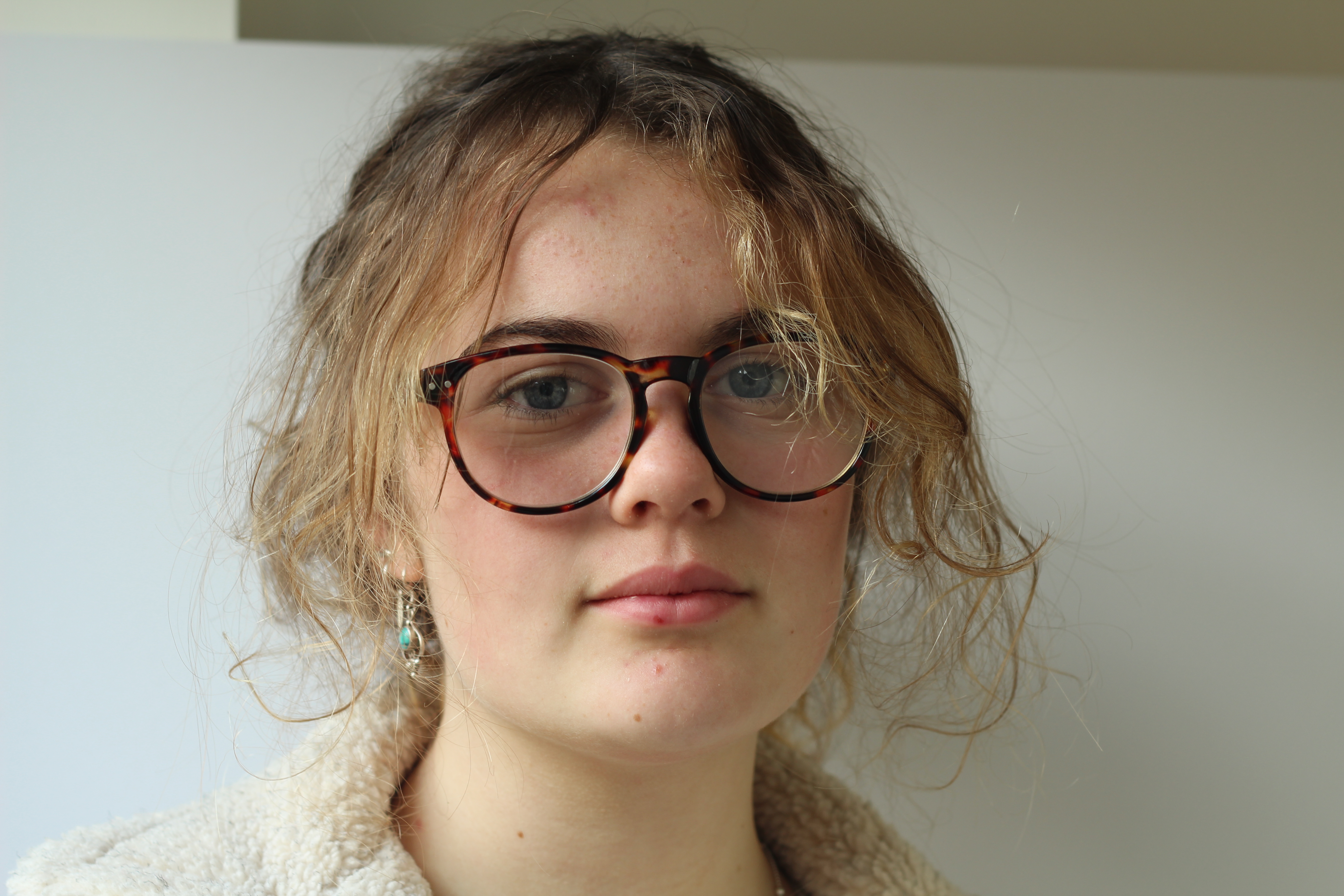
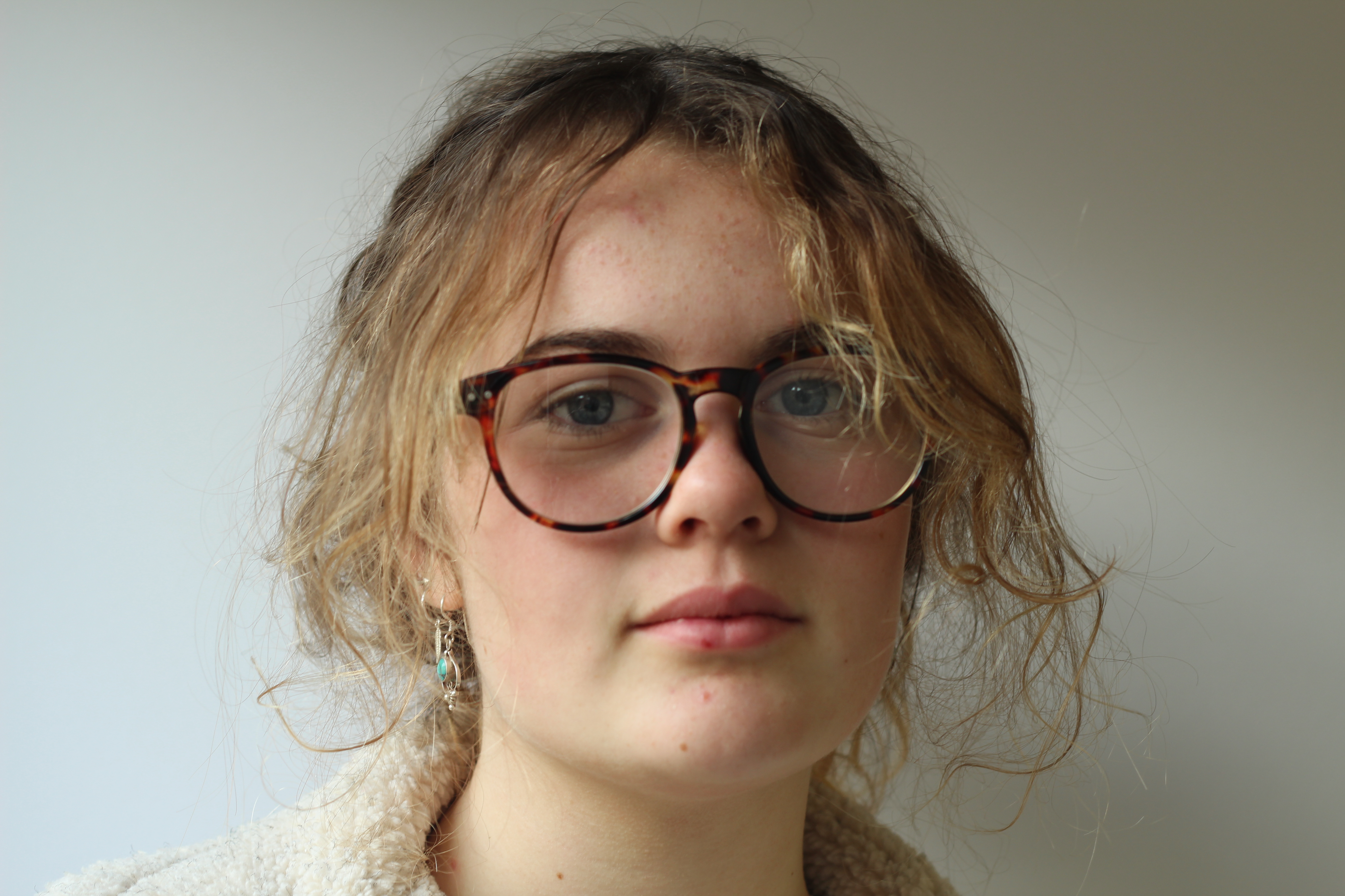
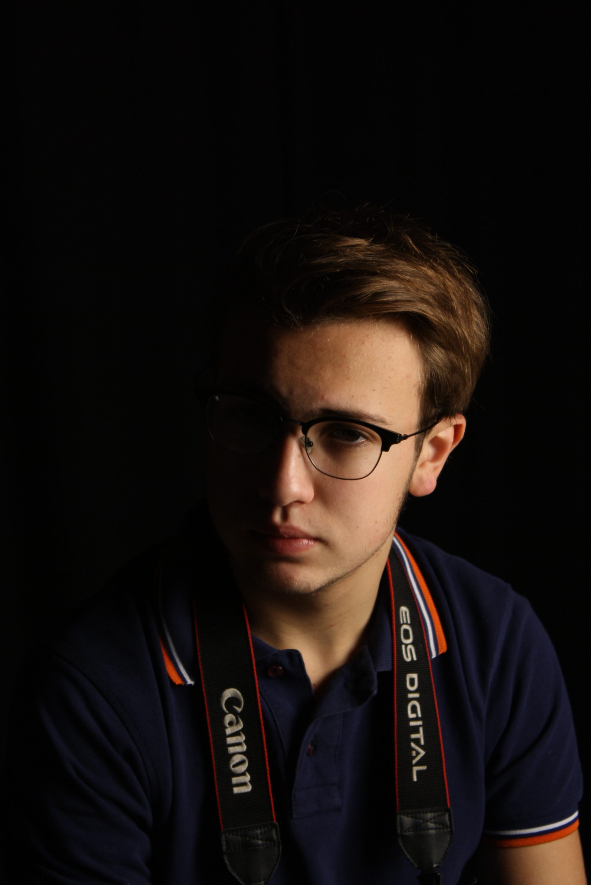
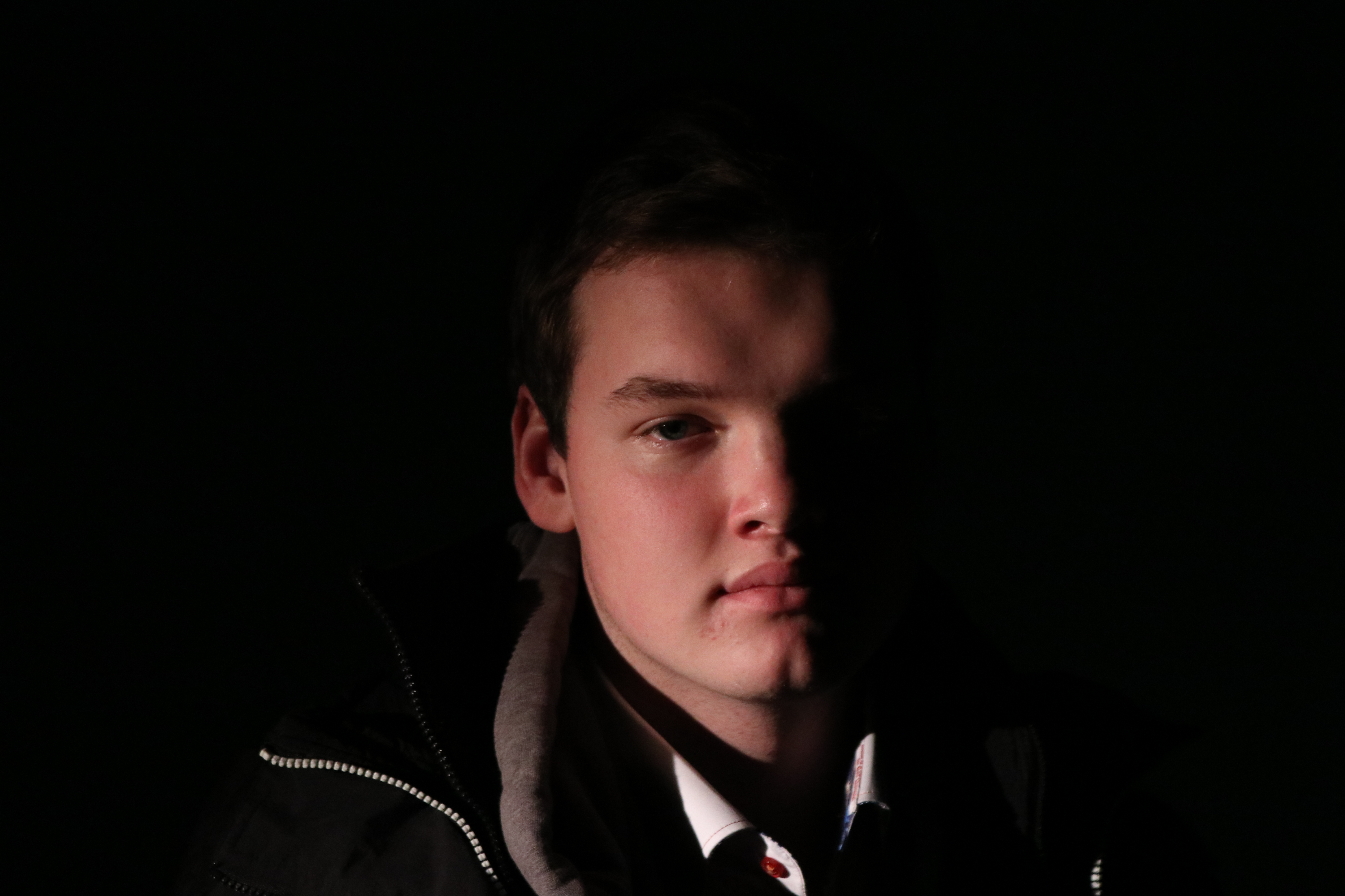
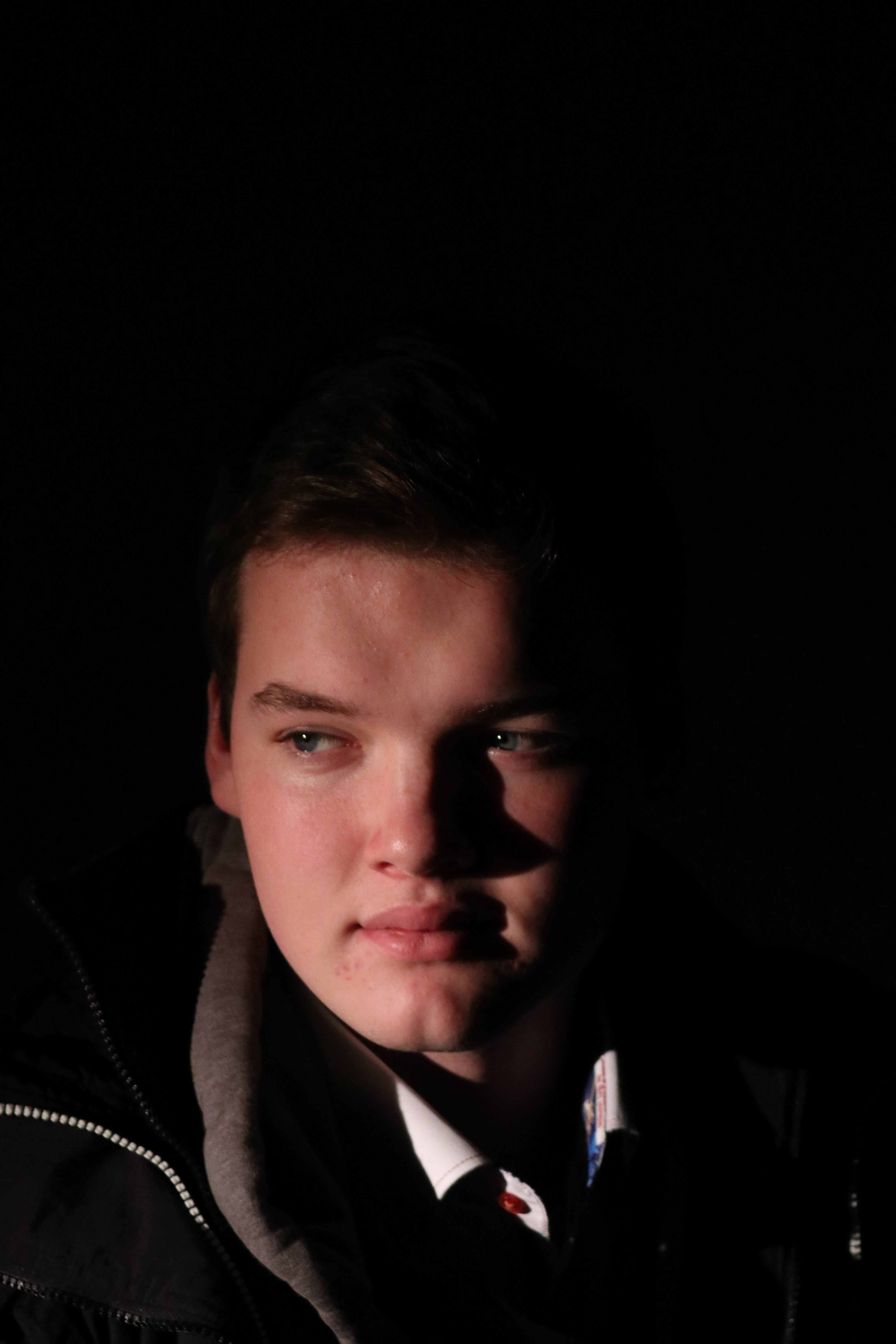
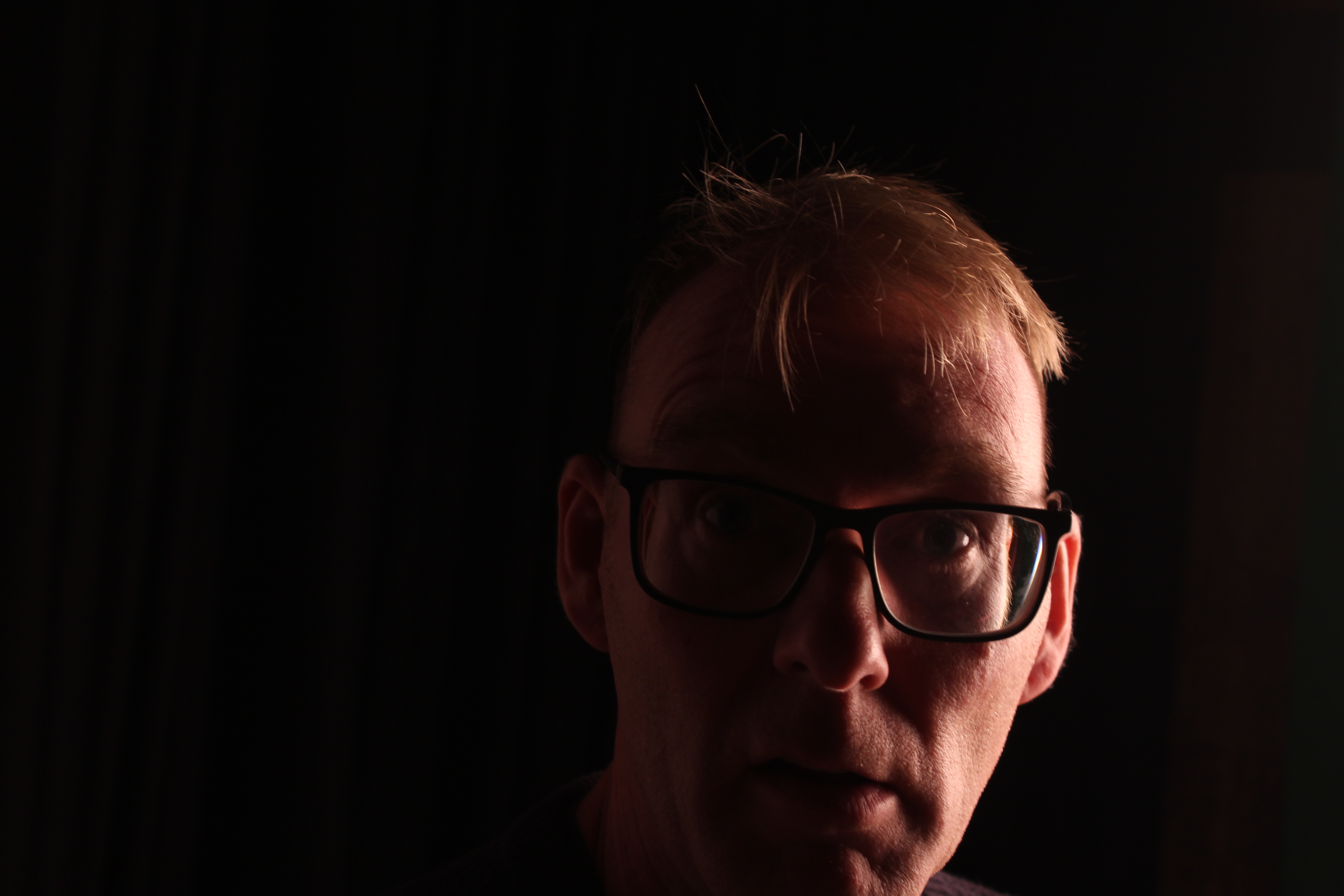
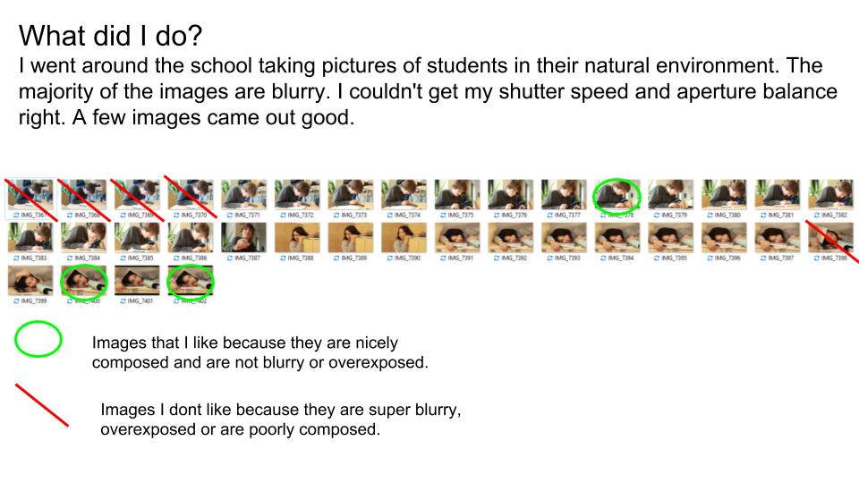
I think this is one of my best outcomes due to how the lighting looks on the model’s face. I like how part of it is lit and the other half isn’t, giving the image a chiaroscuro effect. I think the image would’ve also looked good if I had also reflected the light onto the other said of the face too. However, I think the chiaroscuro lighting and the slight low-key lighting in the image pair together nicely to create a really dramatic and mysterious image. I also like how the model is positioned nicely in the middle of the image, as it adds symmetry to the photo. However, I think the image would’ve looked a lot better if it had been taken with a better background as the plant in the background would’ve been less distracting.


Studio Lighting – Post 2 (Studio Lighting)

Studio Lighting:

Photographic lighting is the use of different lights to create illumination of scenes or subjects.  In many cases illumination of an image is desired to give an accurate rendition of the scene. In other cases the direction, brightness, and colour of light can be contro manipulated for effect. Lighting is particularly important for monochrome photography, where there is no colour , only the interplay of highlights and shadows. Lighting and exposure are used to create effects such as low-key and high-key light.

Mood Board:

My Response:

Best Images:

6. Tableaux and Staged Reality | Portraits

What is Tableaux Vivants?

Image result for tableaux vivants
Stage Performance after Caravaggio (Italian Renaissance painter / dramatic use of chiarascuro lighting)
Image result for caravaggio re-enacted
Student re-enactment after Caravaggio (The Beheading of St John the Baptist) 1608

CLICK HERE FOR LINK TO TATE DEFINITION

tableau vivant (often shortened to tableau, plural: tableaux vivants), French for ‘living picture’, is a static scene containing one or more actors or models. They are stationary and silent, usually in costume, carefully posed, with props and/or scenery, and may be theatrically lit.

Tableau Ideas and Starting points

  • re-create or re-enact an existing story-based photograph or painting, or scene from a film or even an album cover
  • You could …illustrate a poem, story, song lyrics, fable, moral, mythology, legend, dream etc
  • You could portray…one or more of The Ten Commandments
  • You could elaborate on…one or more of The Seven Deadly Sins

             Tableau Photography is staged. Think of it like theatre.

              Tableau Photography is dependent on a defined NARRATIVE, theme or storyline

Blog Post 1 / TASK 1 .(extend and complete for homework)

  1. You must develop and PLAN a story / part of a story that involves at least 1 x character.
  2. You could / should explore gender roles, masculinity, forms of social commentary, sexism, feminism, equality, isolation, belonging, alienation, disenchantment, political agendas, hierarchies, power, status, imperialism, bullying, environmental concerns etc
  3. Include props, backgrounds, costumes and outfits and mise en scene that connects to your theme somehow.
  4. Introduce symbolism and metaphor in your image(s) and produce a series of images (like stills from a film)
  5. You may want use the lighting studio…or experiment with suitable locations (connect the location to the theme / storyline)

Final Outcomes : a choice of

  1. 3-5 photographs that clearly show your understanding of TABLEAU and STAGED REALITY
  2. GIFS / TIME LAPSE / SLOW-MO
  3. STOP FRAME ANIMATIONS
  4. A SHORT FILM (can include sound , soundtrack)

Blog Post 2 / TASK 2 (minimum 1 x blog post)

  1.  Choose a Tableau photographer to research from the list below
  2. Analyse and evaluate a key image by your chosen artist : A CASE STUDY
  3. Demonstrate creative links to your own idea

COMPLETE TABLEAU UNIT BY FRIDAY 14th DECEMBER

Example 1 :

Just a few notes on DiCorcia’s working methodology:

  • Dicorcia’s work is a mixture of documentary and staged tableaux for which he is best known
  • Well known for his use of lighting in street photography
  • While shooting Hustlers, he paid his subjects, causing controversy in the photographic community
  • DiCorcia only plans / stages his photographs up to a point and then relies on something unexpected to happen
  • He does digitally manipulate some of his images by removing or adding items
  • He does not direct people
  • Very often he does not know his subjects
  • He usually has his camera on a tripod
  • Sets his photos up so that the viewer can assert his/her own interpretation to the image – open narrative

DiCorcia has no patience for visual passivity. “I’ve been trying to create photographs in which the emotional and psychological content is time-released… From the very beginning, I was fighting against this media-created idea that imagery is so disposable that it’s exhausted within a very short amount of time.” His tendency is to slow time down, an apprehension that has nothing to do with entropy. Instead, it is a seduction into the act of looking.

Example 2 : 

  • He uses a large format camera and tripod
  • He uses polaroids for planning out his scenes
  • Draws inspiration from iconic Victorian paintings and recreates the scenes in a contemporary setting
  • Infuses the mood of the Victorian paintings into his modern industrial settings
  • His work is socially aware and pays tribute to art history
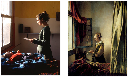
  • He uses well known art motifs in his work, e.g. the window as in Vermeer’s paintings
  • His portraiture pays tribute to the Dutch Renaissance and pre-Raphaelite master painters
  • He simulates similar colours and tones as those used by Vermeer
  • His portraits are of the disenfranchised people living close to the margins of society
  • His work is a blend of fictional and factual
  • He most often replicates Vermeer’s methods of portraiture:

… amongst the art historical references glimpsed within Hunter’s oeuvre, the voyeurism of Vermeer is most discernible. Subjects are often shown full figure, in private spheres (e.g. sites of domesticity), and set in the mid-ground in order to include something of their environment.

Birch, Tim


You must show that you know and understand that…

Tableau Photography makes use of symbolism and metaphor.

Allegorical paintings / photographs contain metaphor and symbolism

Pictorialist Photography was the starting point for  Tableaux art

Narrative is vital to successful tableau / staged reality


here are some examples that could inspire your own ideas…

Research each of these examples…

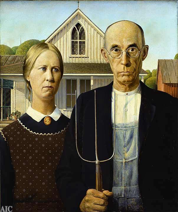
Grant Wood, American Gothic 1930
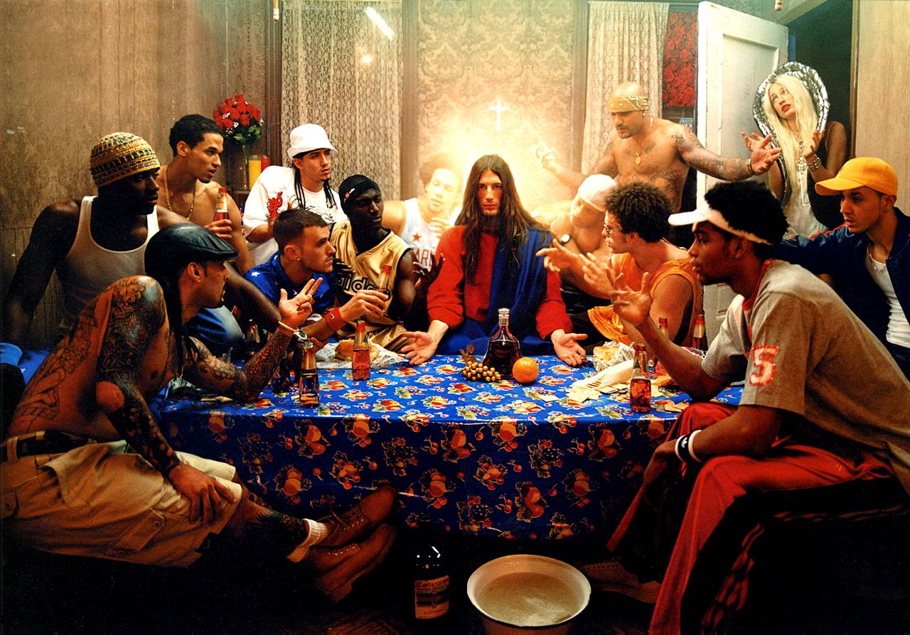
David LaChapelle, Last Supper, 2008
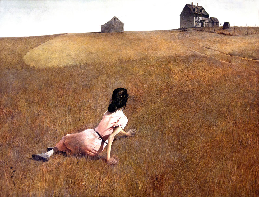
Christina’s World , Andrew Wyeth, 1938


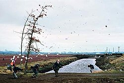
Jeff Wall, A Sudden Gust of Wind, 1993

Image result for edward hopper
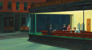
Edward hopper, Nighthawks, 1942


Image result for yinka shonibare photography
Yinka Shonibare,Diary of a Victorian Dandy, 1992
yinka Shonibare, Fake Death Picture (The Suicide – after Manet), 2011
Image result for lottie davies photography
Lottie Davies
Image result for jeff wall
Jeff Wall
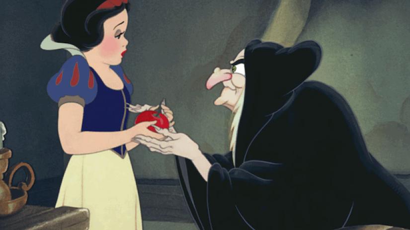
Snow White, 1938, Disney Productions
Image result for paul m smith photographer
Paul M Smith, Lads Night Out
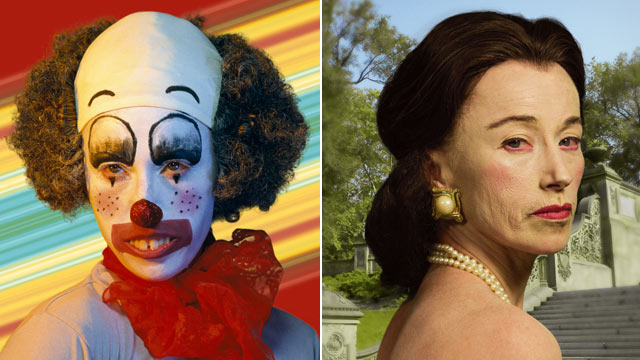
Image result for cindy sherman
Cindy Sherman, Untitled Film Still, 2003
Image result for alex prager
Alex Prager, Staged Reality
Image result for ryan schude
Ryan Schude
Image result for greg crewdson
Gregory Crewdson, Staged Reality
Image result for philip lorca dicorcia
Phillip Lorca Di Corcia, Cruise, 2015
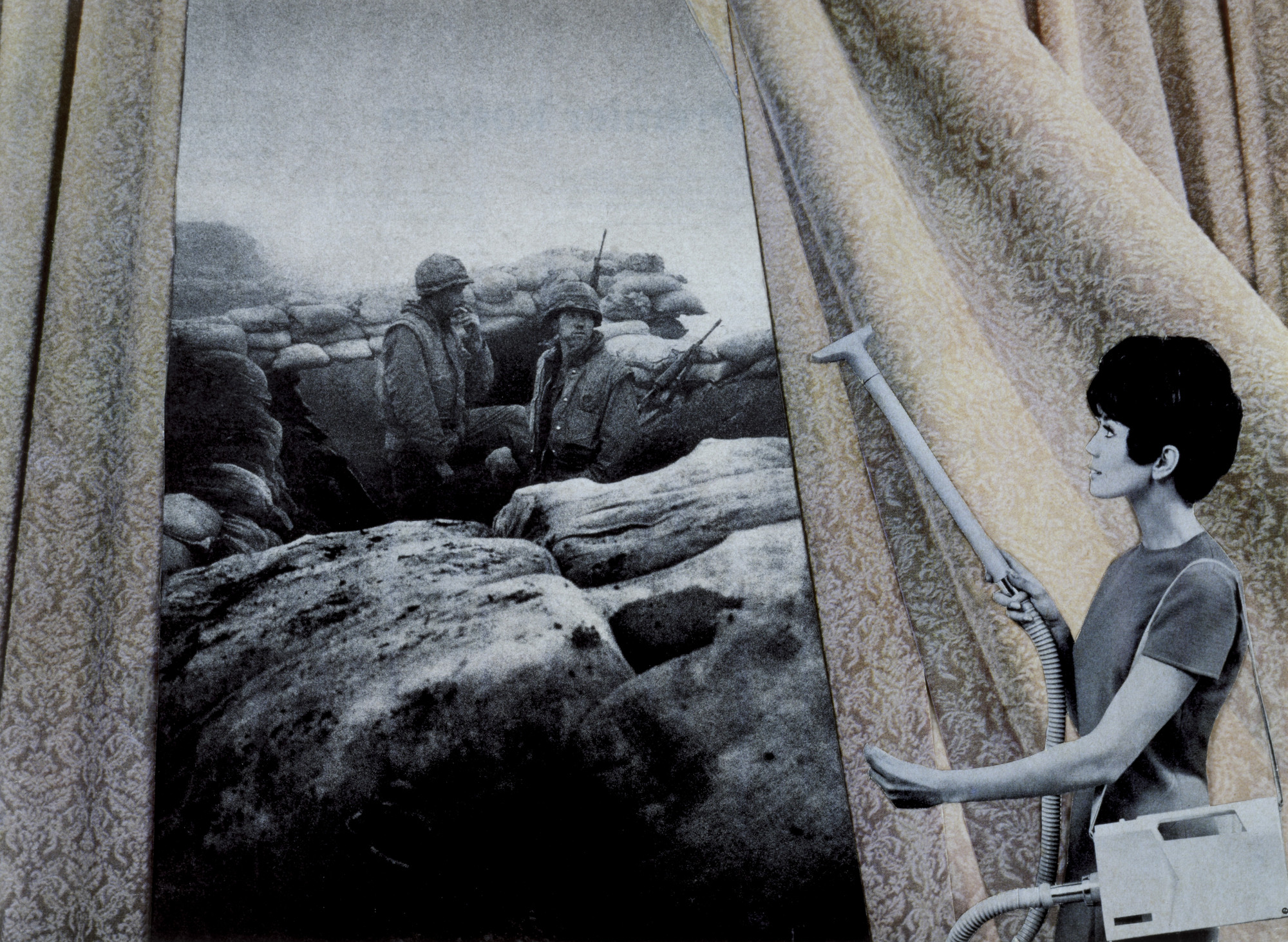
Image result for Martha Rosler
Martha Rosler, Bringing The War Home, 1967-72—Tableau / Conceptual
Image result for hannah starkey
Hannah Starkey, Untitled, 1999—Women in everyday urban setting, from a woman’s perspective
Image result for tom hunter photographer
Tom Hunter, Woman Reading a possession order, 2012 (after Vermeer)
Image result for liberty leading the people
Liberty Leading The people, Eugene Delacroix, 1830
Image result for gerard rancinan
Gerard Rancinan, Raft of Illusions, 2005
Image result for french tableaux photographer raft of medusa
Gerard Rancinan, Raft of Illusions, 2005
Image result for the raft of the medusa
The Raft of The Medusa, Theodore Gericault, 1818

Historical / Contextual Example :

The Raft of The Medusa…Theodore Gericault

https://www.khanacademy.org/humanities/becoming-modern/romanticism/romanticism-in-france/v/g-ricault-raft-of-the-medusa-1818-19


Ensure you have enough evidence of…

  1. moodboards
  2. mindmaps
  3. case studies (artist references)
  4. action plans
  5. photoshoots + contact sheets (annotated)
  6. appropriate selection and editing techniques
  7. presentation of final ideas and personal responses
  8. analysis and evaluation of process
  9. compare and contrast to a key photographer
  10. critique / review / reflection of your work

Picture

Studio Lighting

Contact sheets

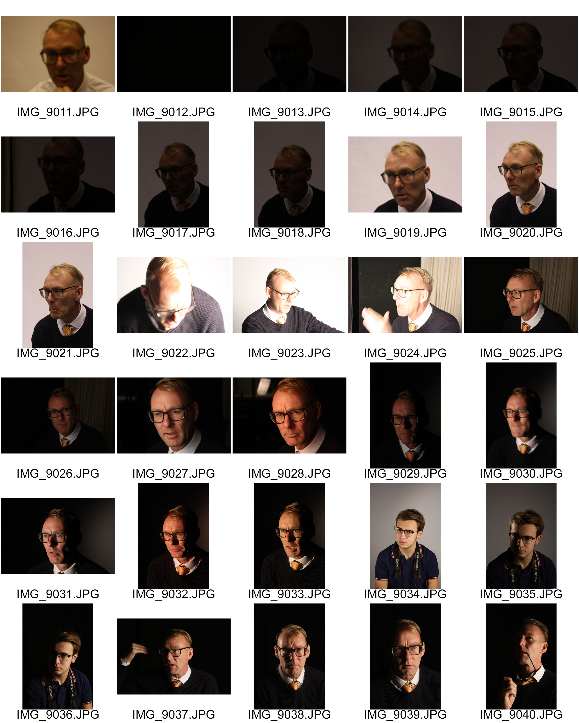
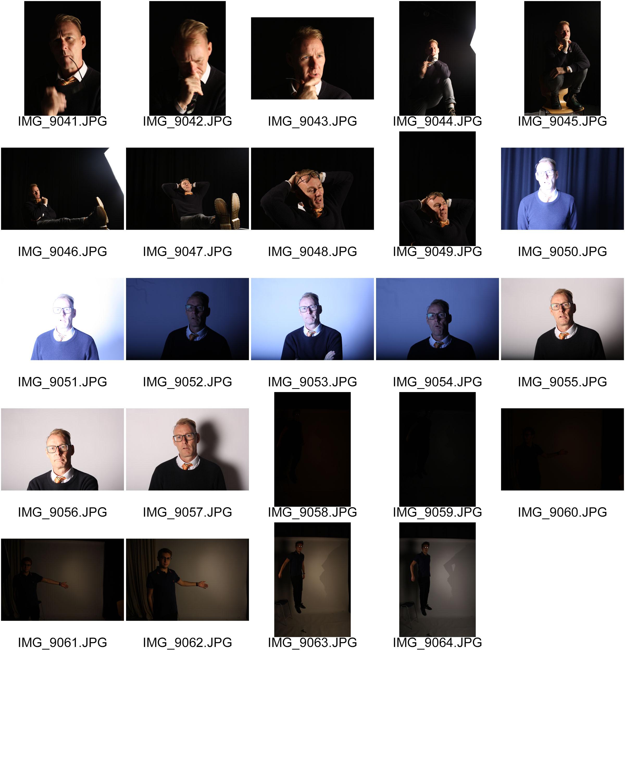
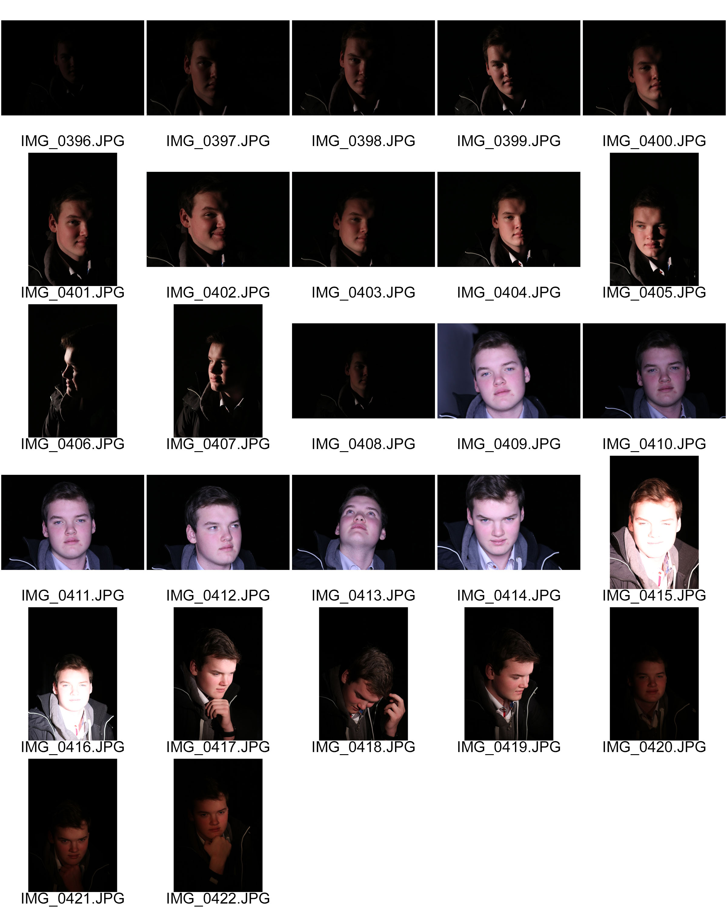
Here are my contact sheets to help me cut down to my final images. These are all the unedited photos compiled side by side in order to pick out the best of the lot.

From these images I was able to isolate and identify the photos I wanted to work with

Final edits

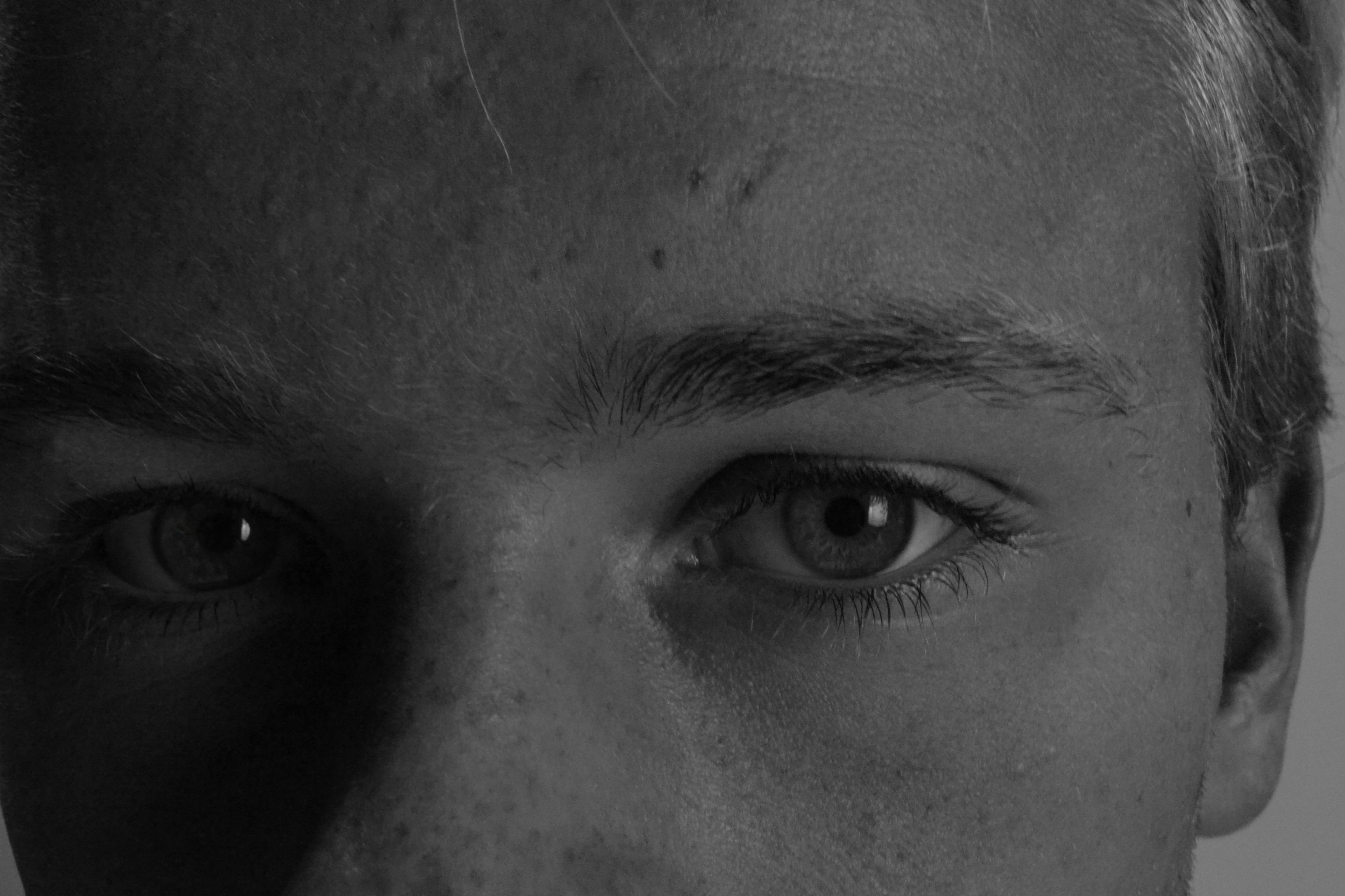
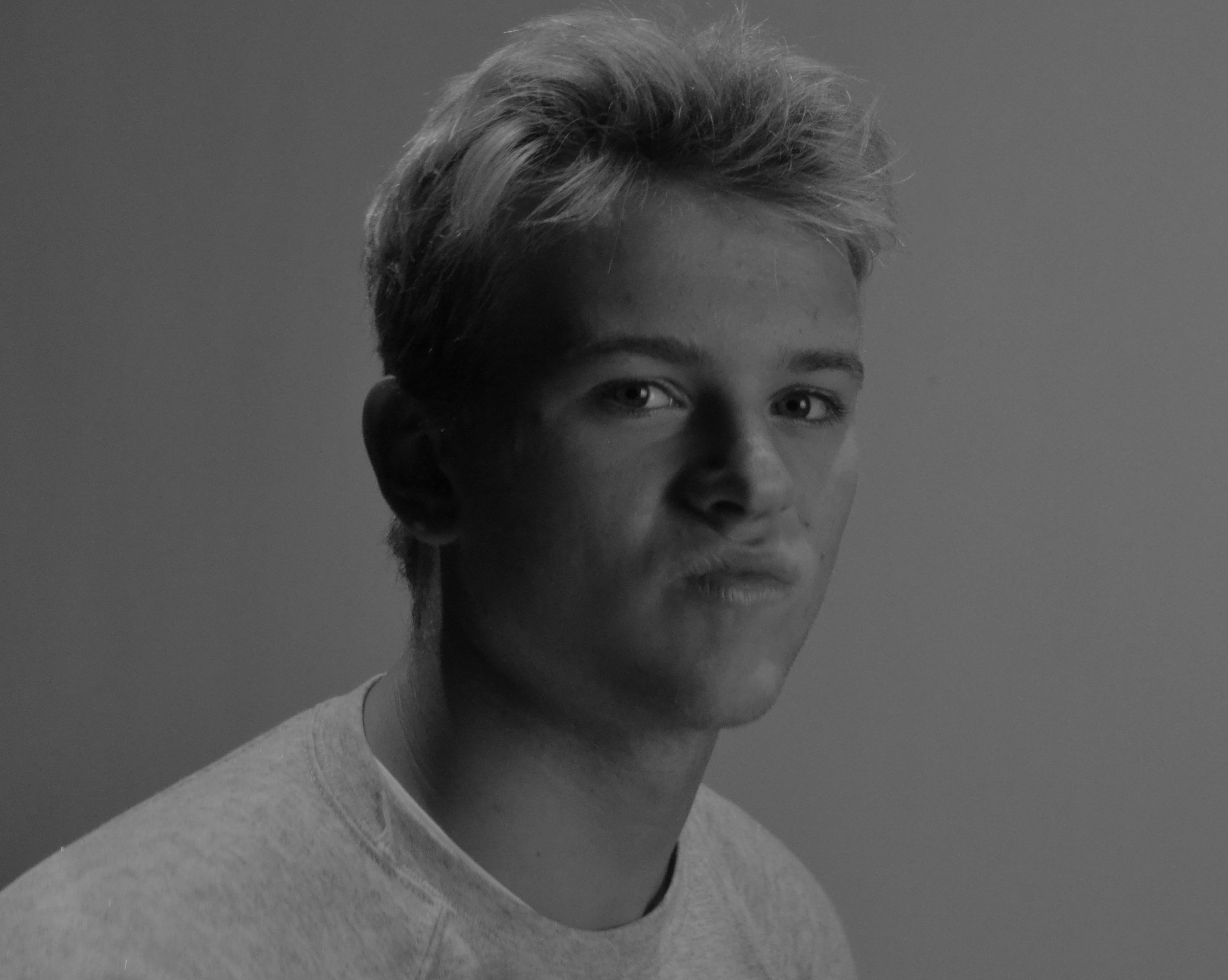
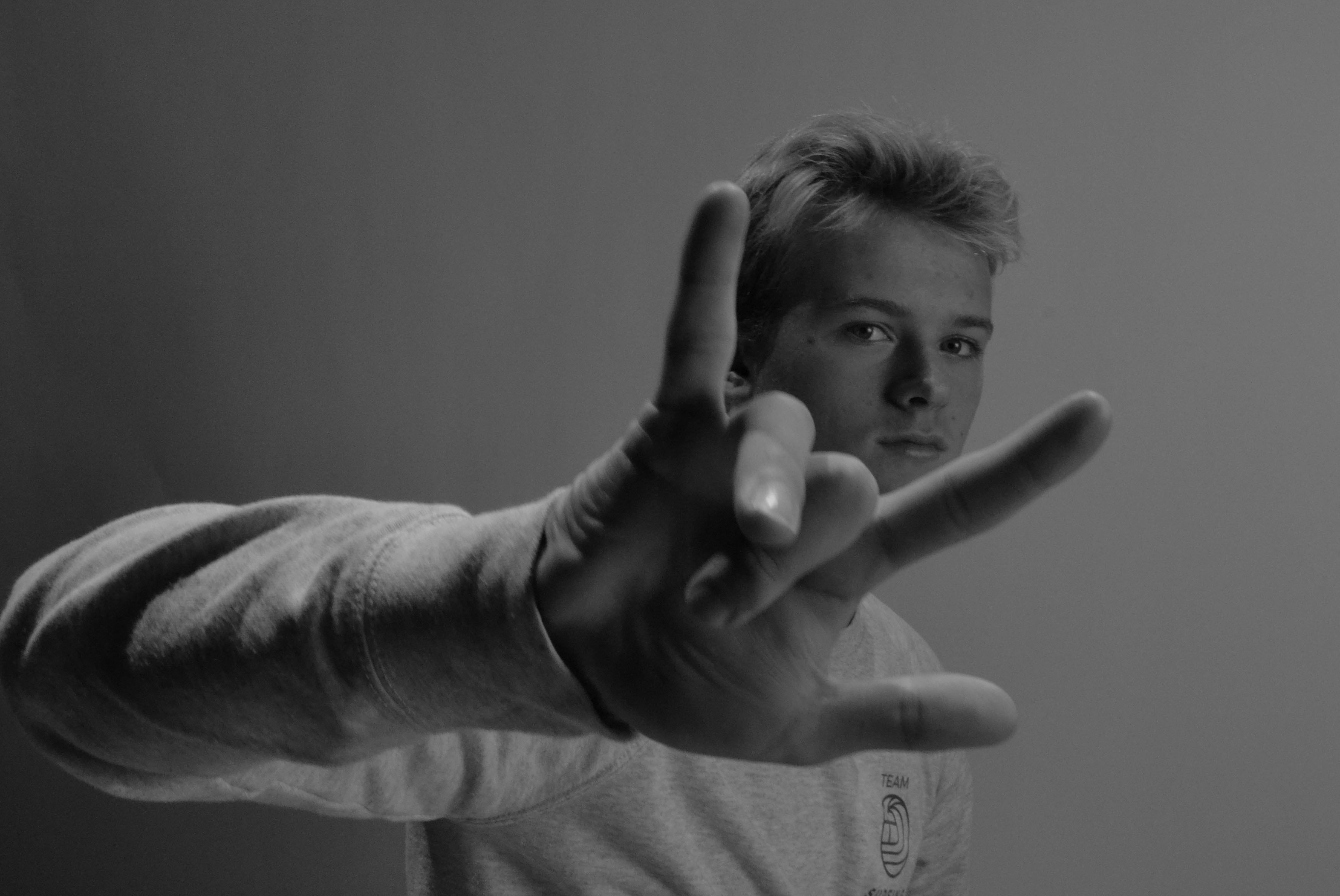
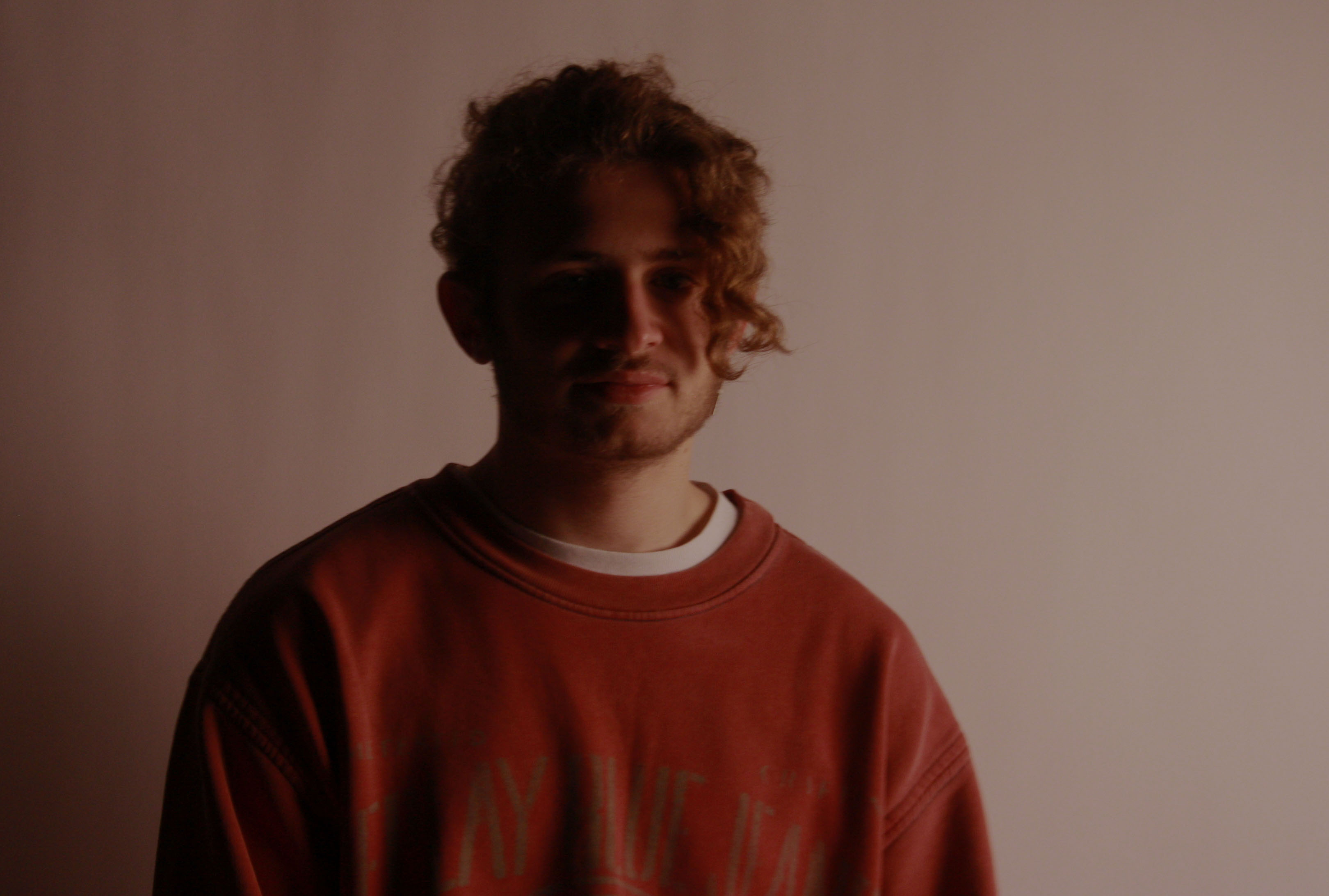
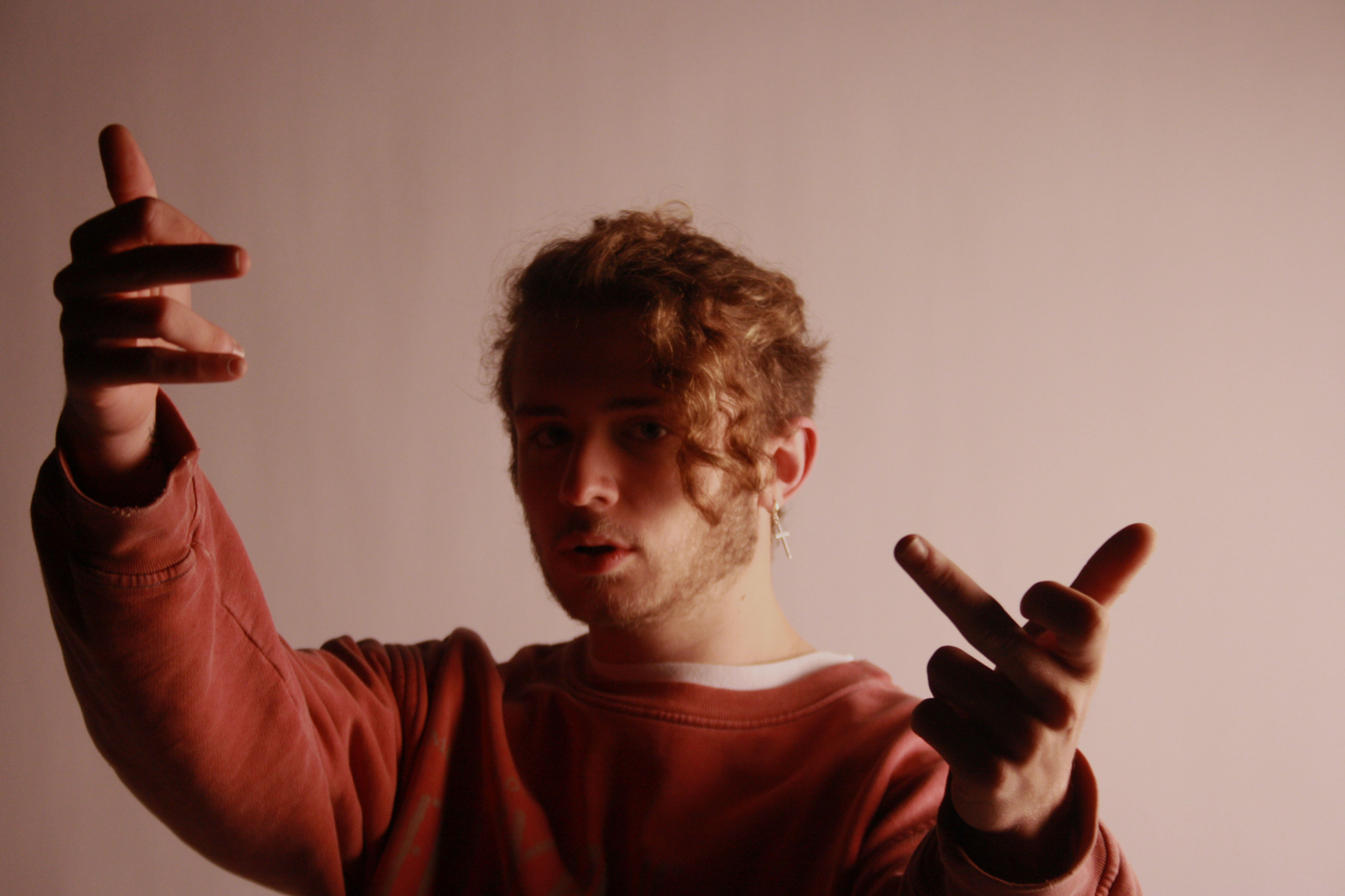
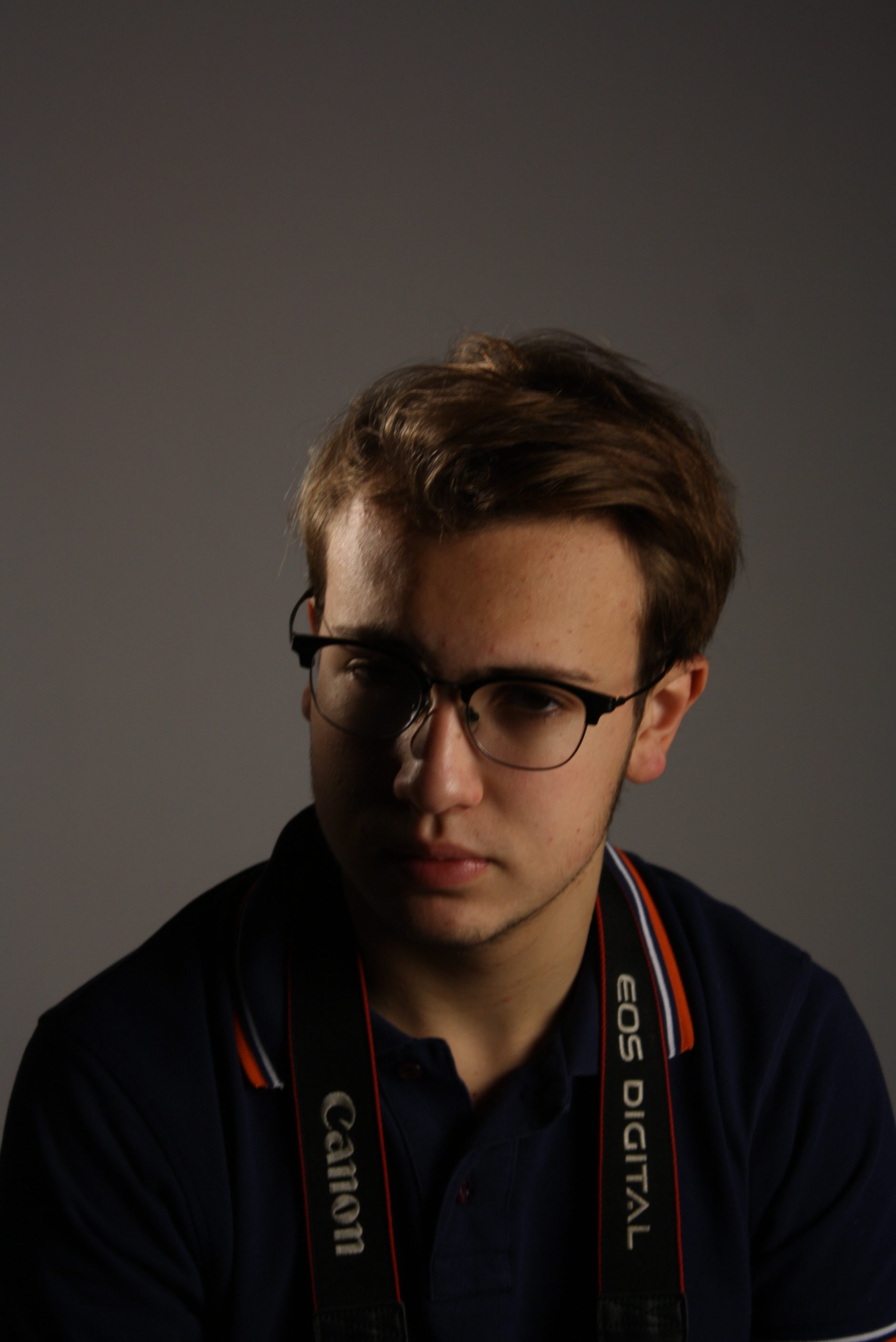
Here are all my final images some edited, some left unedited due to achieving the perfect lighting effect I was after.


Desaturated with a heavy exposure drop

Just a drop in exposure with a crop of the background

Desaturated with lowered exposure and raised contrast to highlight the shadows on the subjects face

A close up of the subjects eyes, desaturated and exposure dropped slightly

Desaturated with contrast dropped slightly

Desaturated

Lowered exposure and vibrance toned slightly down to give faded pink effect

Unedited, I really like the shadow created by the lighting falling on the subjects hand gesture and face.

Street Photography — Photoshoot

These were the main images from the photoshoot and some turned out as intended some had issues with exposure and focus. I then chose my final images from this and then took them to photoshop to edit them.

My main goal for the street photography project was to show the character of the roads and streets of Jersey. I tried to do this by having a main subject in the frame, mainly a person or part of a person. The reason that I did this is because it makes the viewer focus mainly on the front subject and then there is still a noticeable amount of detail that can be seen in the background.


Studio Lighting

What Is Studio Lighting?

Control over lighting offers the photographer control over the final image.

Often photographers work with available light — the sun, ambient light, firelight or available artificial lights. Our knowledge of varied exposure tactics offer us many options for making use of available lighting, but, there are, admittedly, times when we want to control illumination as well as subject as well as the camera and exposure settings.
Studio lighting — strobes, reflectors, diffusers and so forth — offers us that control. https://www.harding.edu/gclayton/photography/topics/010_studio_lighting.html

Three Point Lighting

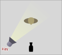
A common general lighting setup involves a key light, a fill light and a backlight.

The key light provides the main illumination of the subject.

The fill light offers illumination to surfaces turned away from the keylight, providing a better ratio of light and dark tones.

The back light either illuminates the background (or backdrop), or is used on the back of the subject (hair light or rim light) — often aiming to creating rim lighting.

The Three Point Lighting Technique is a standard method used in visual media such as video, film, still photography and computer-generated imagery. It is a simple but versatile system which forms the basis of most lighting.

Experimentation

The aim of this shoot was to experiment with different white-balance, ISO, shutter speed and studio lighting.

The final ISO, shutter speed, and white-balance to execute a well lit studio photo shoot is ISO: 800,  Shutter-speed: 60, and white balance for tungsten light.

Favourite Outcomes from the Experimentation

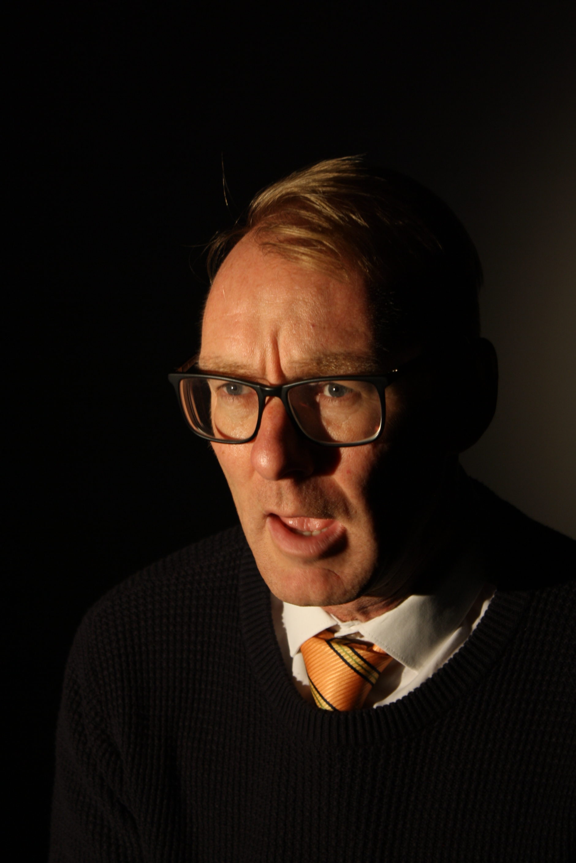
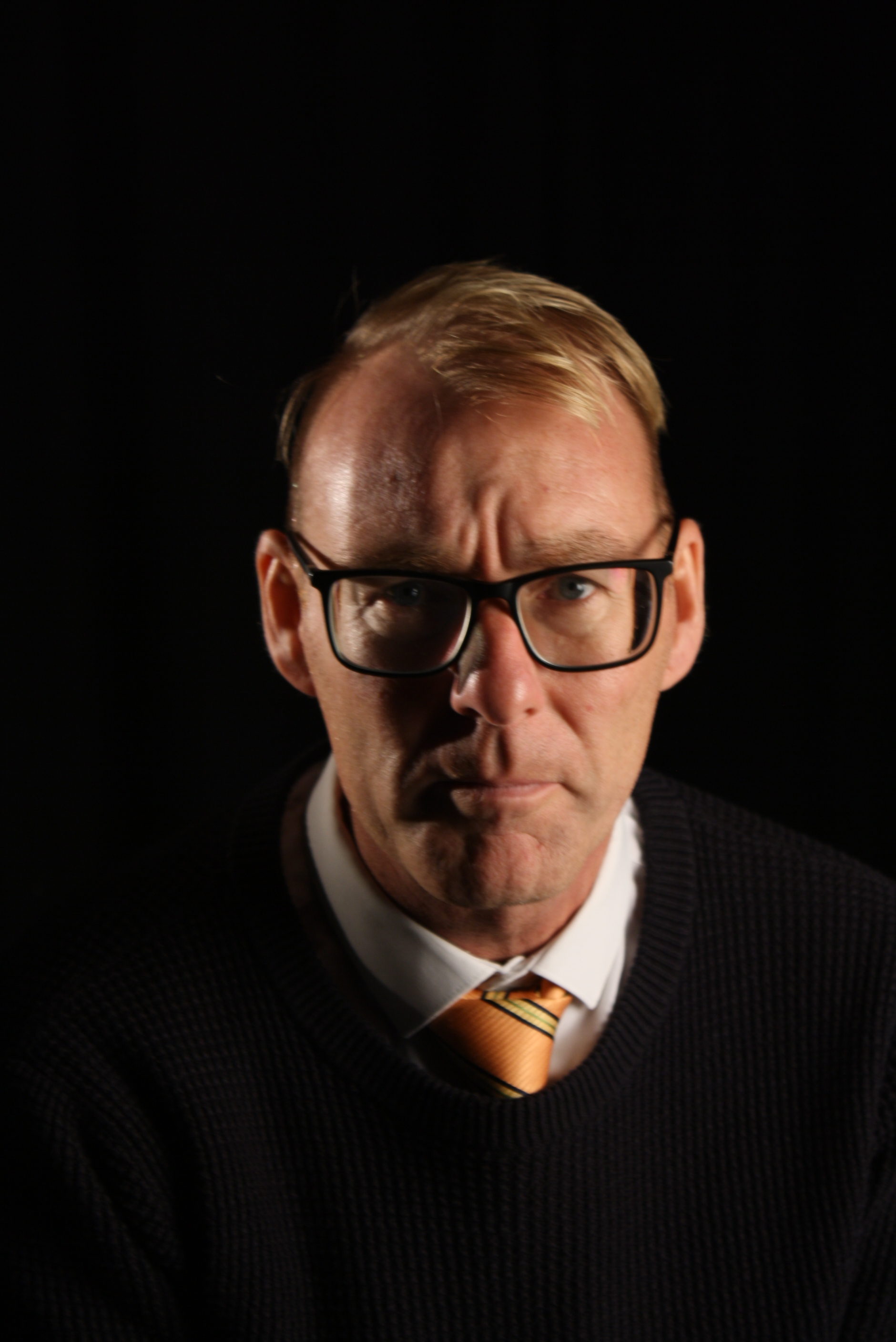
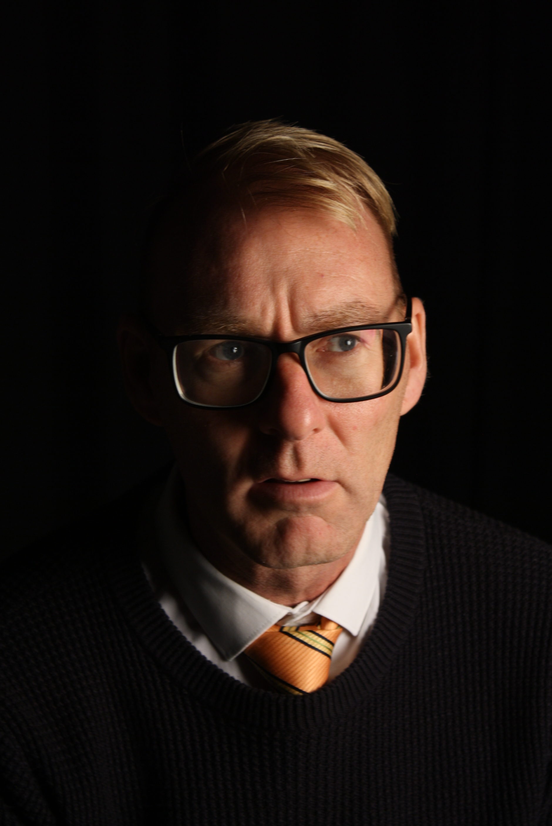
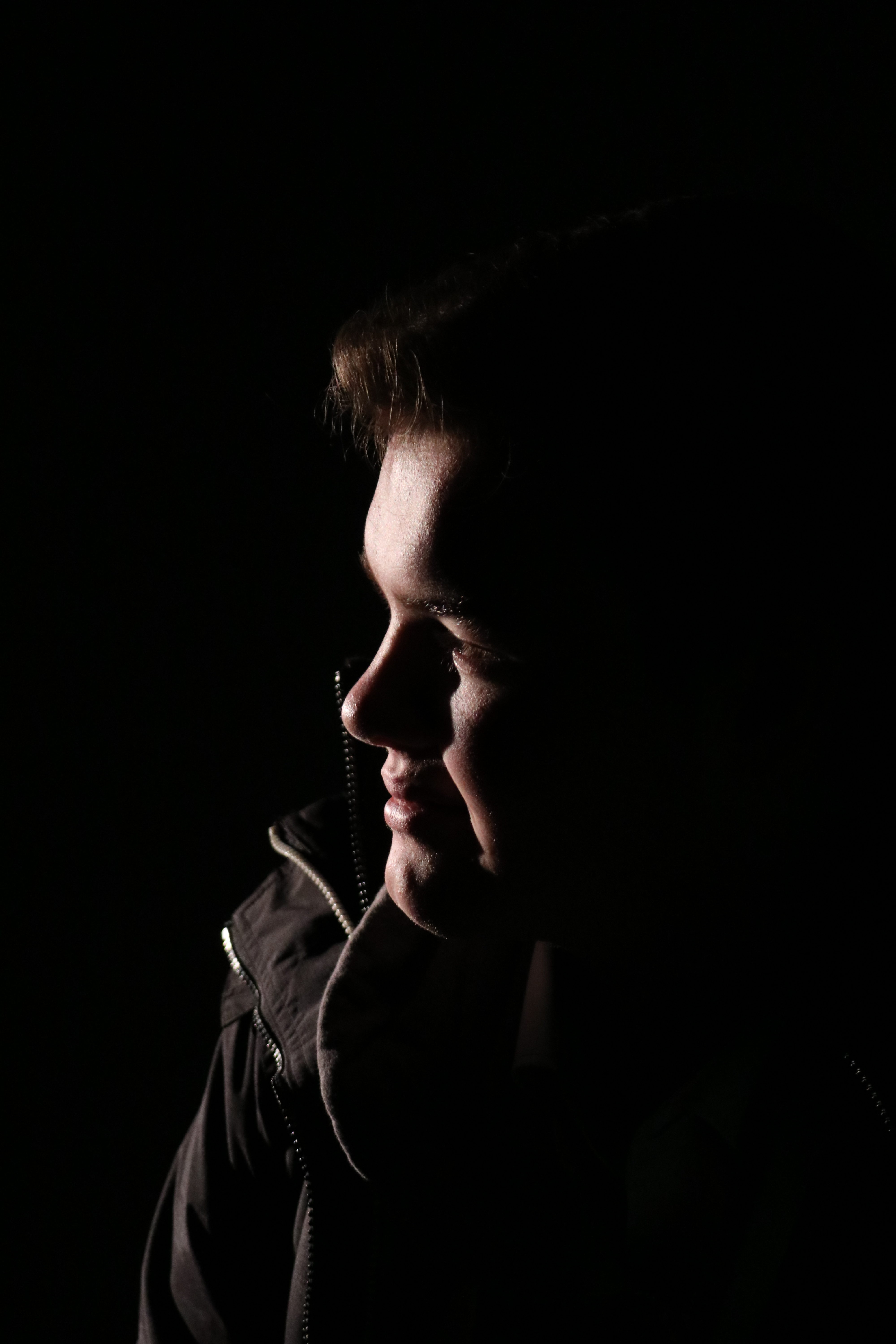
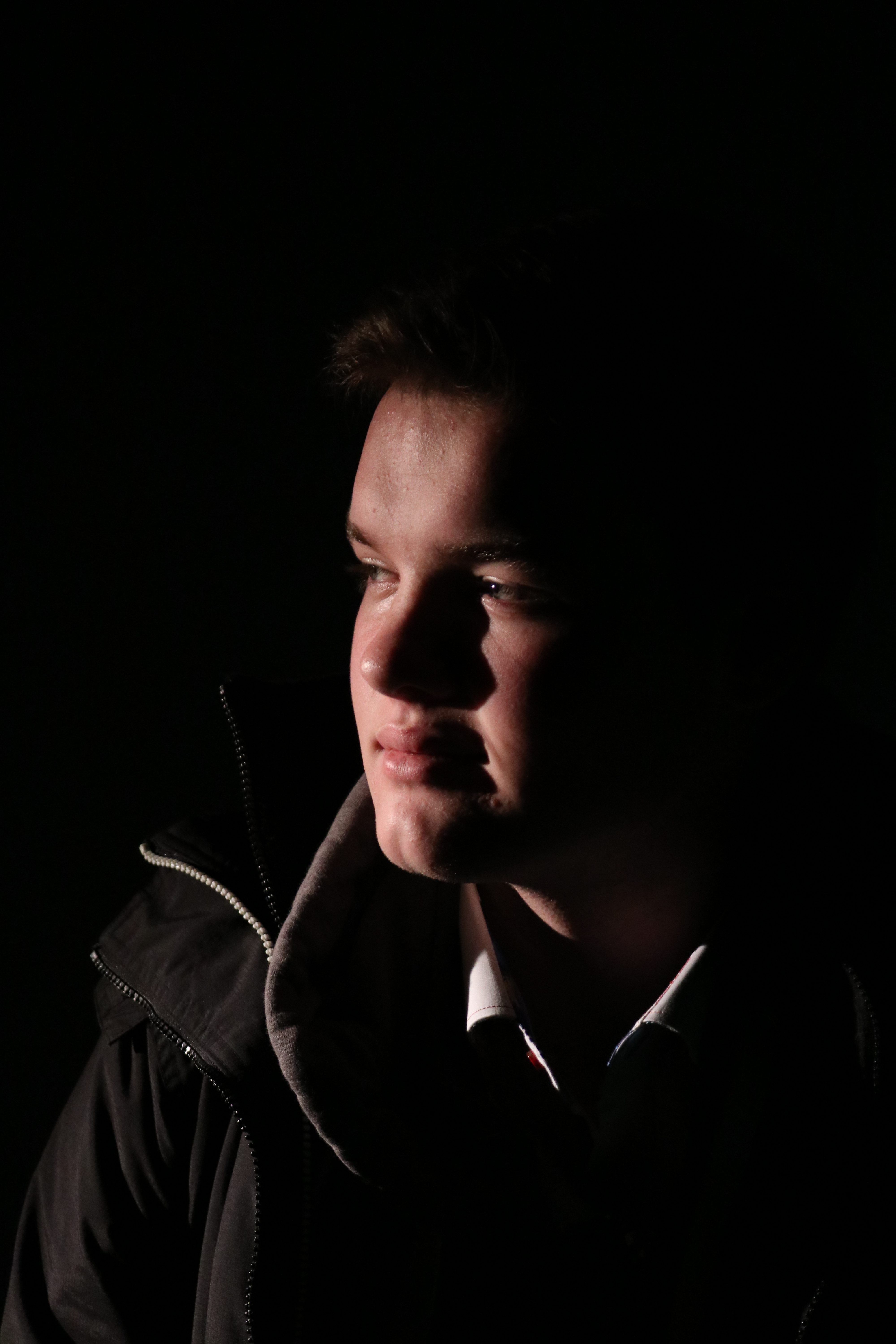
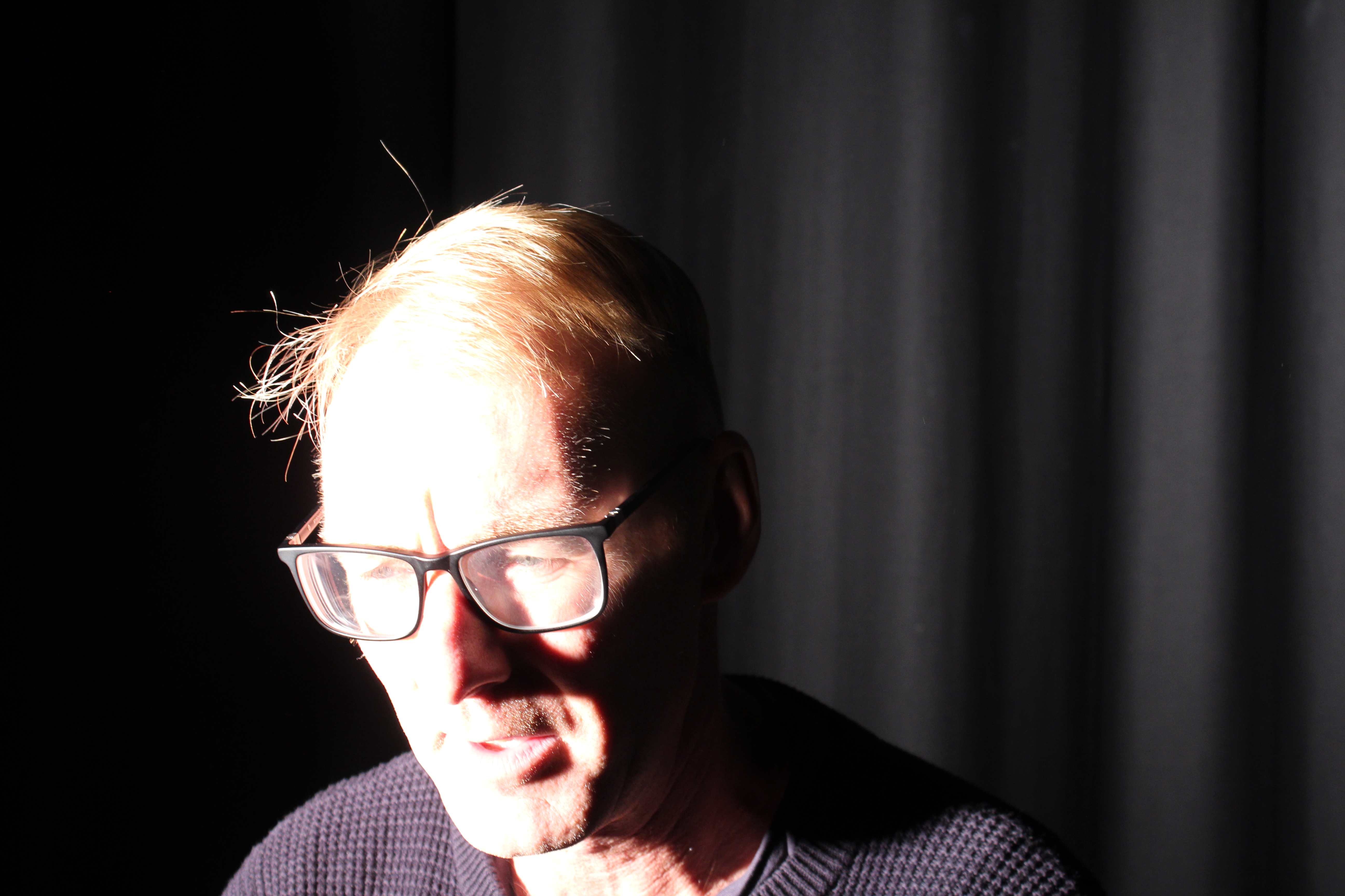
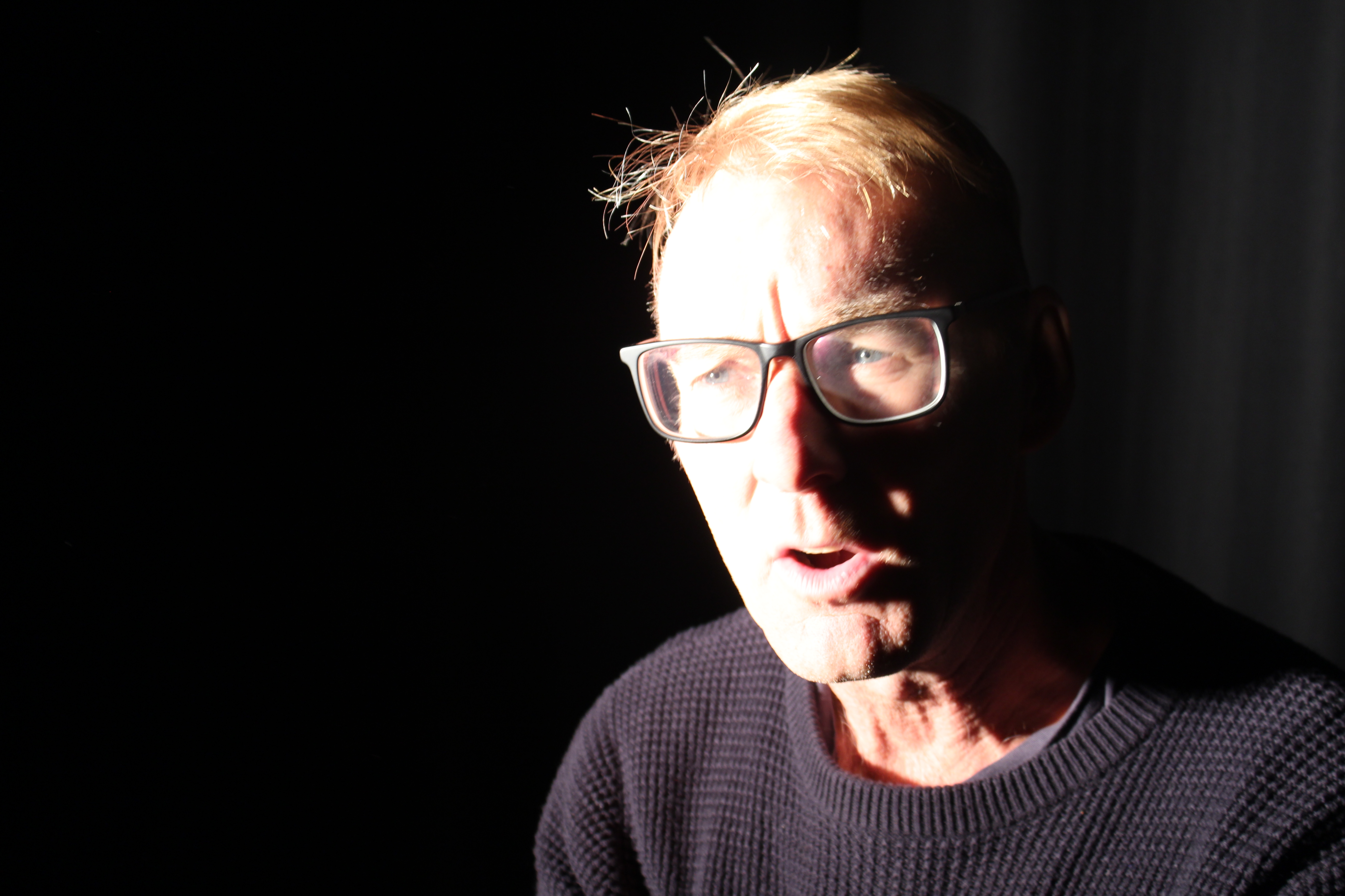
Studio Lighting; Low Key, Chiaroscuro

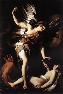
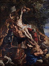
Chiaroscuro lighting is an artistic term dating back to the Renaissance that is noted by the contrast between dark and light. It is often times used in a bold manner so that it has a noticeable and dramatic effect on the entire composition of a work

Examples of Chiaroscuro lighting

Giovanni Baglione. Sacred and Profane Love. 1602–1603, showing dramatic compositional chiaroscuro

Peter Paul Rubens’s The Elevation of the Cross (1610–1611) is modelled with dynamic chiaroscuro.

Chiaroscuro Shoot

Favourite Outcomes for Chiaroscuro/Low Key lighting

Studio Portraits 1

ONE POINT LIGHTING

One point lighting is formed by one main lighting source, it could be the sun or a studio red head light. The single source of light creates a a natural yet dramatic look, that draws people attention to the subject as they are lit up. One point light tends to hit people straight on and flat, which creates shadows from the subject. One point lighting is used when using the chiaroscuro.Image result for one point lighting

Here are some photos from using one point lighting. I used manual focus which meant I had to constantly adjust my technical settings so that my images weren’t over exposed. My shutter speed was firstly set to 1/80 which was too slow as it was letting in too much light, meaning my photos become over exposed and too bright, I had also not yet adjusted my white balance, these are the first few photos I took;
I then moved on to adjusting my shutter speed to a faster fraction, which was 1/400 and that made my images to dark as the camera wasn’t allowing in enough light, this is what the images looked like;

Finally I adjusted my shutter speed to 1/250 and my white balance to the tungsten setting. This allowed me to take sharper images, with more focus. But when the subject moved it meant I had to change my shutter speed to a faster fraction to make sure  capture the subject sharply and in focus not a blur. This is what my image looked like;

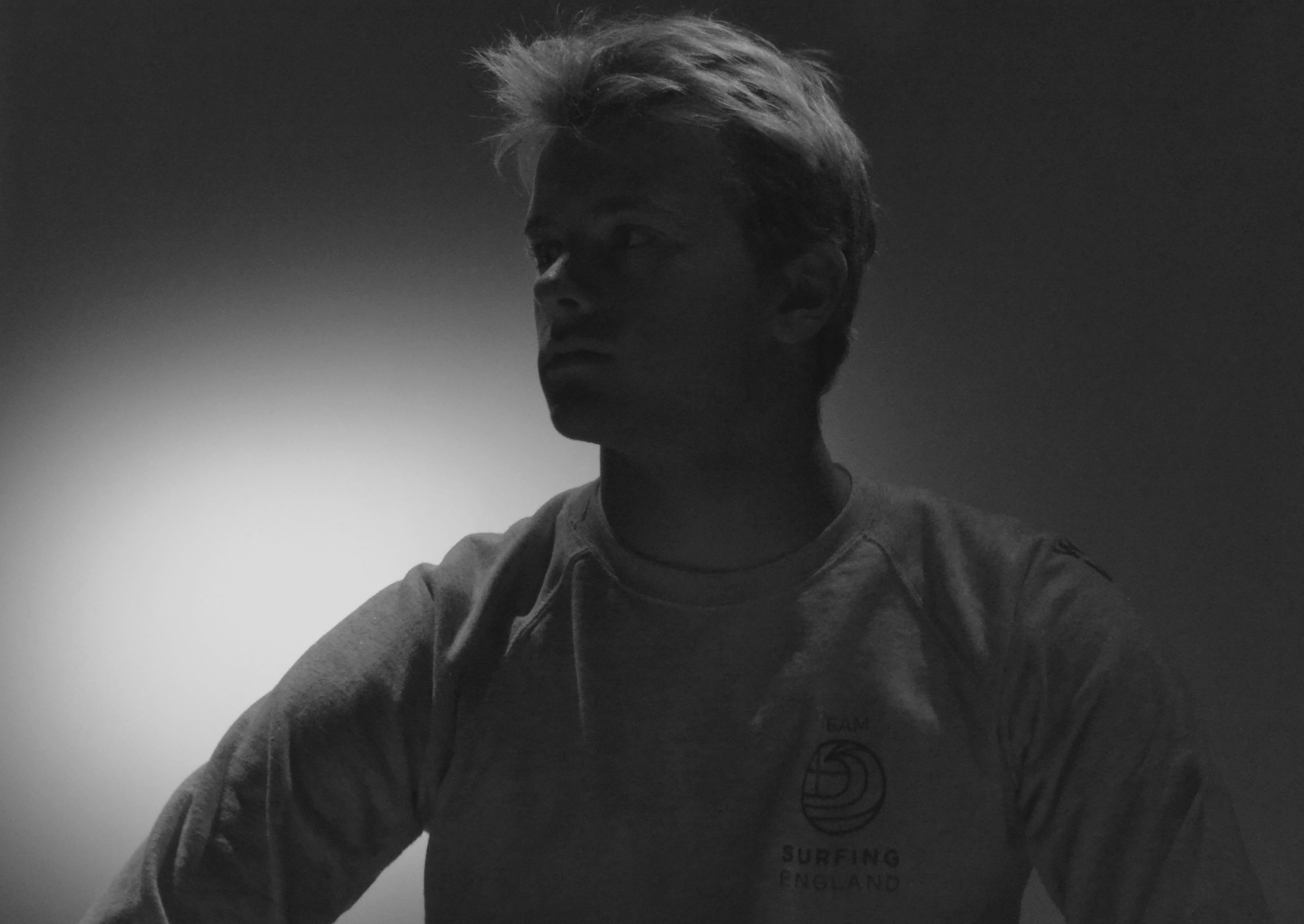
In this image the focus is off this is because I hadn’t adjusted my focus lens and also my subject was moving and I wasn’t on a fast enough shutter speed to be able to capture him sharply.

When taking these images, I managed to take e a few images in the style of Chiariscuro, this was done my shining the light on the side of his face which created a shadow on one side and highlighter the other side.

EVALUATION

This was my first time in the studio so I had to learn how to change my settings to fit the type of lights we were using, along with getting in the right place and angle to take the best photos. This shoot was definitely a learning experience as I learnt types of lighting, and what settings are best for different types of lighting. In the next shoot I need to take more photos, as in this shoot I didn’t take enough as I was to busy trying to get the angle I wanted instead of working with what I had.


Studio Lighting

Final Piece

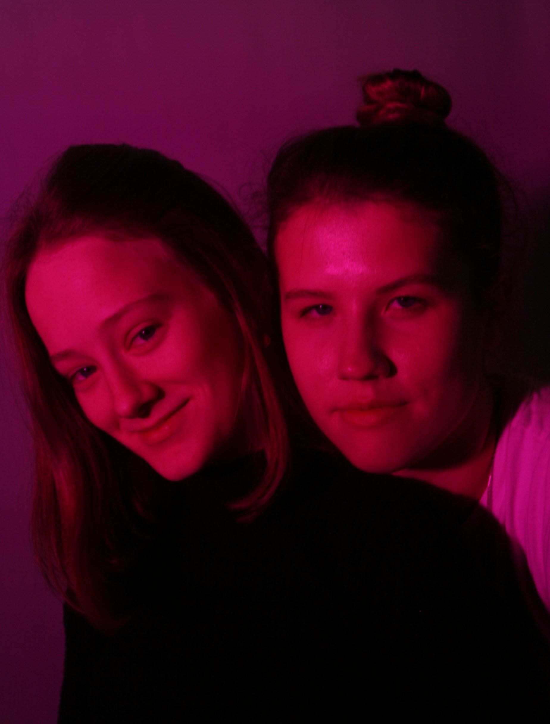
In this particular photo I used the white background in order to capture the pink to its fullest. I got a friend to hold the pink infront of  the white spotlight and angle it directly towards the two girls. I chose Marli and Kristy as I thought their height differnce would make from and intersting picture and it expressed a feeling of individuality as we are all the same age and from the same place yet we are all so different. No one person is the same, whether it me in height or race or brains, I wanted to express a sense of unity by putting to very different people so close to each other, a tall Lativian and a small South African. I purposely had Marli’s shadow fall onto Kristy as a symbol of solidarity and harmony between the countries there represent and the values they express and how no matter what we all stand as one.

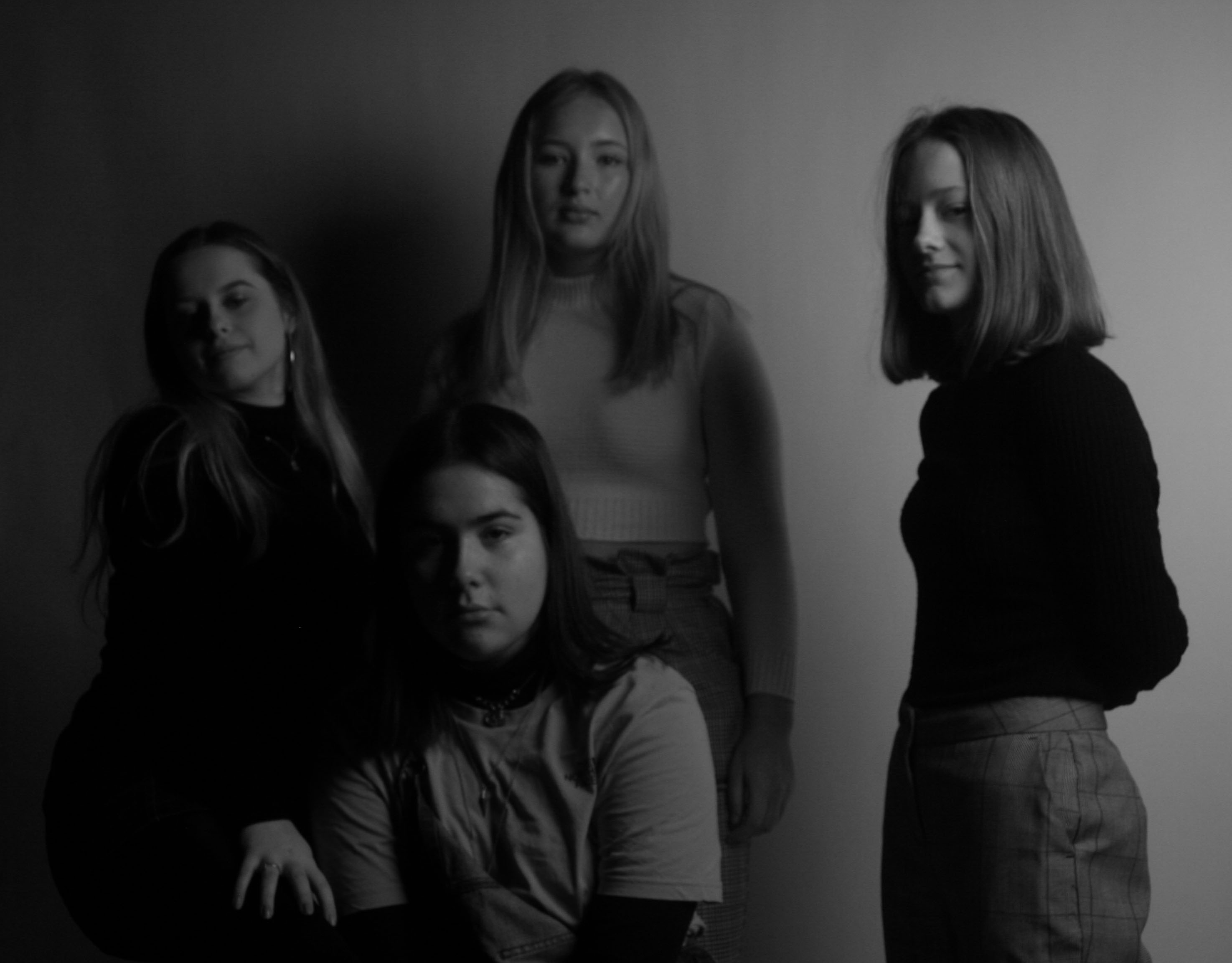
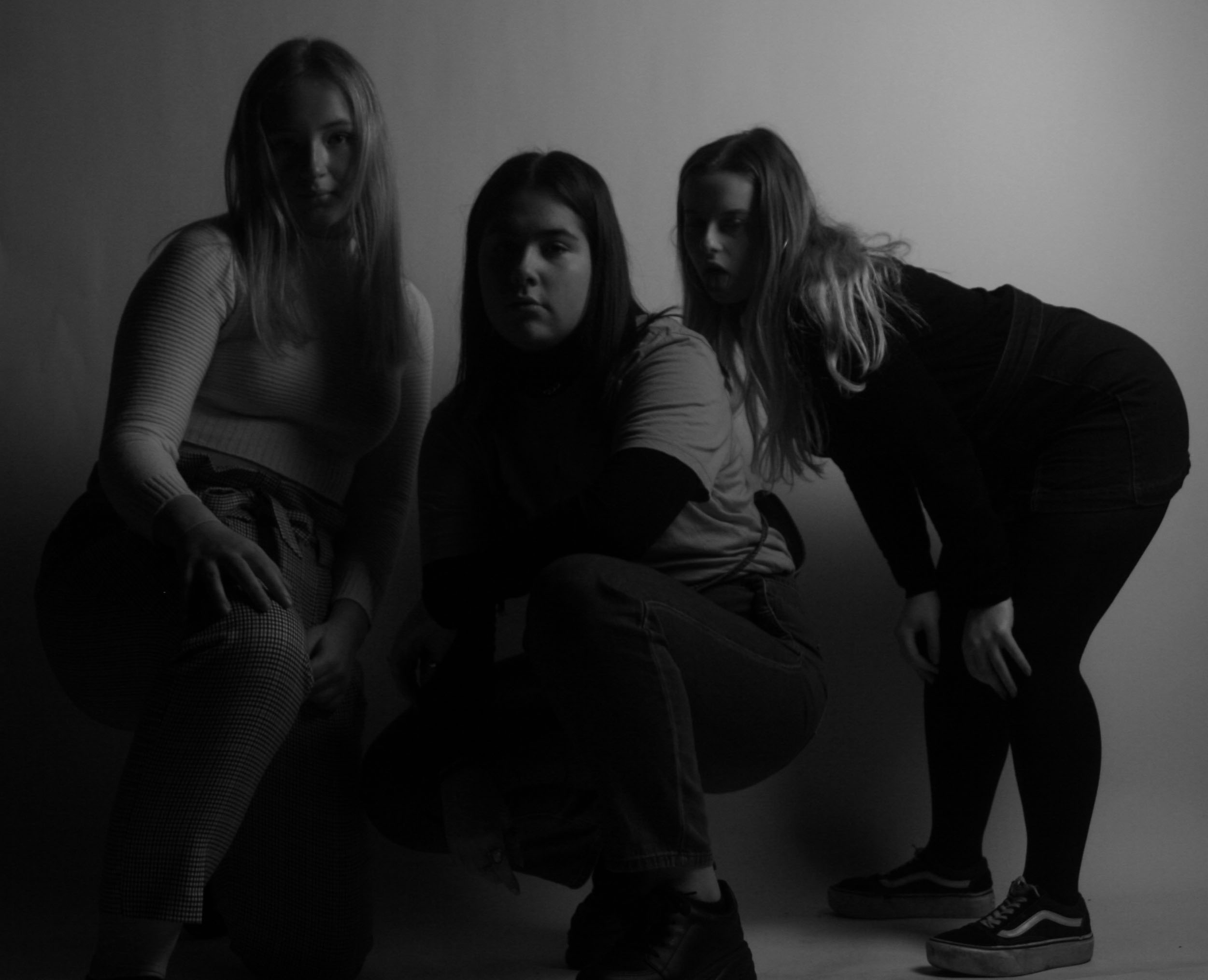
In this photo i had the black curtain drawn and had the softbox on and no flash was used as I wanted to display chiaroscuro and any naturally occuring shadowing from the soft box. Yet I didn’t want the spotlight on because I felt it would have been to harsh and I wanted it to feel as subtle as possible. I wanted the tall at the back inorder to capture everyones faces clearly and also to create a clear foreground and background, as well as a reptive structure which is created by the pairs they are standing in. I purposly avoiding having a leading eye as I wanted all persons to be the focal point which symbolies equality, everyone has there chane to be in the spotlight and recieve attention. I put this photo into black and white to resemble the idea of ‘yin and yang’ and how opposites attract in harmony, this filter also creates a cool temperature and tone.
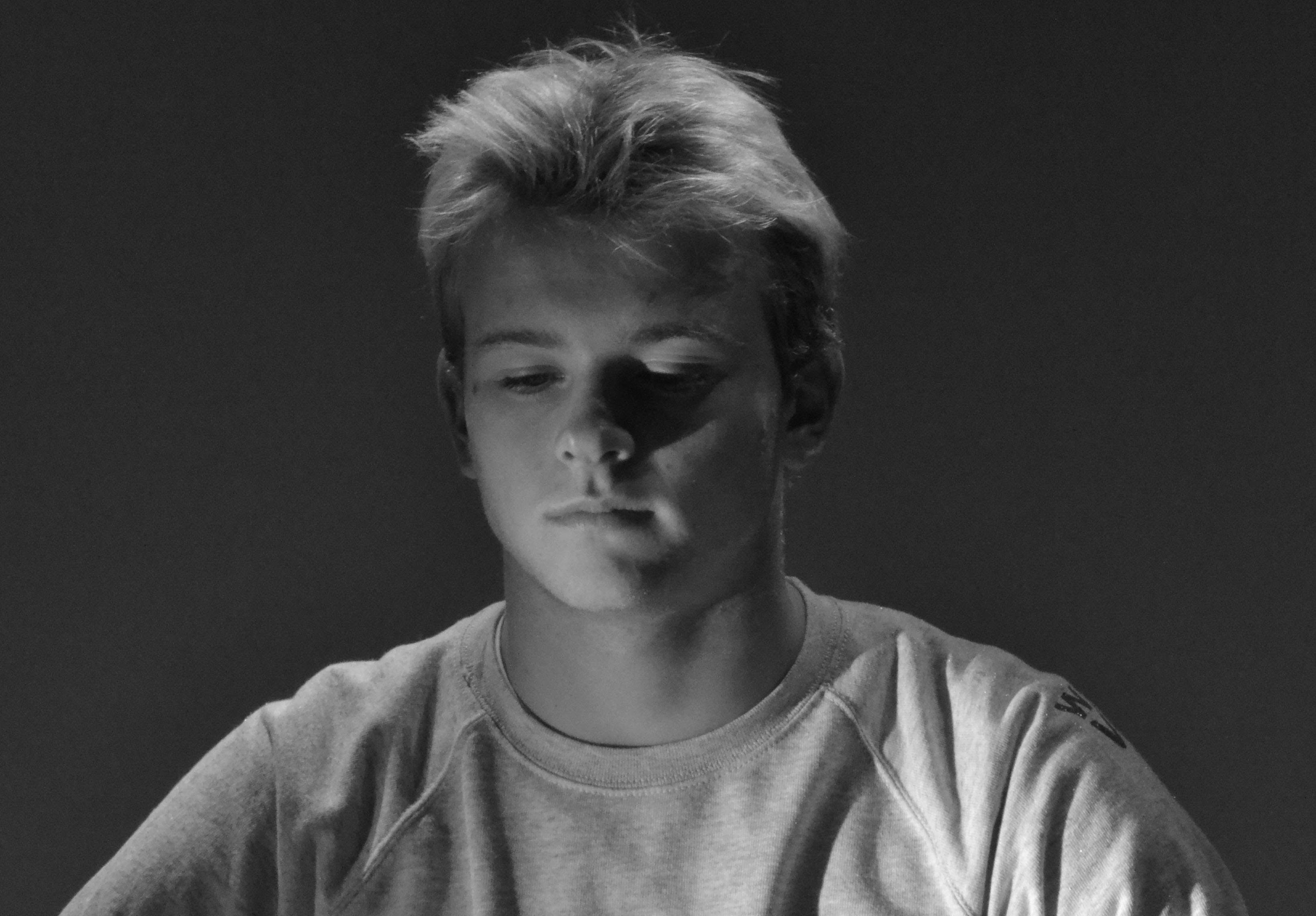
In this photo I had a pink filter over the white spotlight and the white background again. No flash photography was used as I wanted to capture the naturalistic  I wanted Kristy to get down to Marli’s height to show a sense of integration between us and how we should all respect each other and we should always put ourselves in the other persons shoes before making a judgement, it’s all about us being on a level playing field. Also I specifically asked Marli to wear black and Kristy to wear white to symbolise ‘yin and yang’ which describes how seemingly opposite or contrary forces may actually be complementary, interconnected, and interdependent in the natural world, and how they may give rise to each other as they interrelate to one another.